

Hi Everyone,
I hope you’re all doing well this last weekend in April.
This is actually a big shopping weekend. It caught me by surprise because no one tells me these things. However, going on right now is the semi-annual WayDay weekend. It’s the 25th-27th.
Perigold has an “insider deals” sale happening concurrently, offering up to 30% off.
In addition, Serena & Lily has once again put their entire line on sale, but this time it’s ending at the end of the day on May 5th.
Okay, now that we’re done with some business (so Laurel can afford to buy milk for the children), it’s time to get into the blog post about creating effortlessly beautiful interiors.
It was inspired by a comment made by the lovely Madonna.
Here’s what she said:
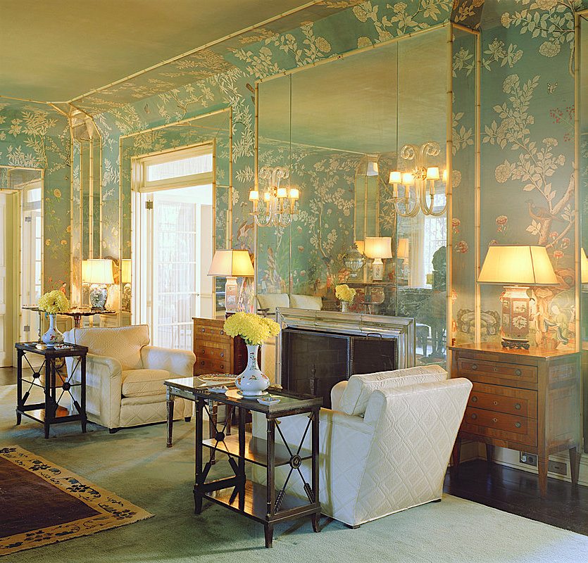
My first thought when I saw that first photo of the room with the red sofa was, my gosh, it looks like the homes people had when I was a child in the 70s and 80s, only now it’s being done right! It feels really familiar, but James Farmer got all the details right.
The scale, proportion, lighting, color palettes, patterns, surprise elements and sense of drama are all spot on. AND he manages to do even the most formal rooms with a style that is still comfortable and inviting. There’s a trick to that, but I don’t know what it is exactly.
The first part of her comment about James’ style hearkening back to a much earlier decade is exactly right.
However, it goes back much further than that.
It really began in the 18th century with furniture designers and the aristocracy that employed them, such as George III of England and King Louis XVI of France.
You know the names of the furniture designers: Chippendale, Sheraton, and Hepplewhite.
Then there were the neoclassical architects:
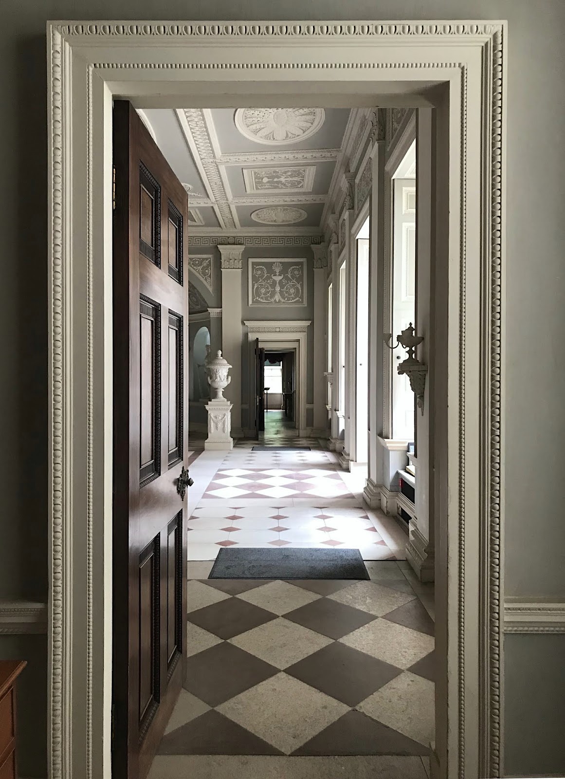
Robert Adam Entrance Osterley Park
- Robert Adam
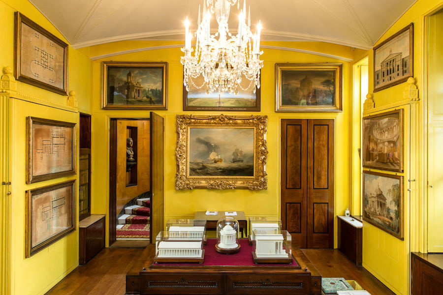
- Sir John Soane. (Above is his museum)
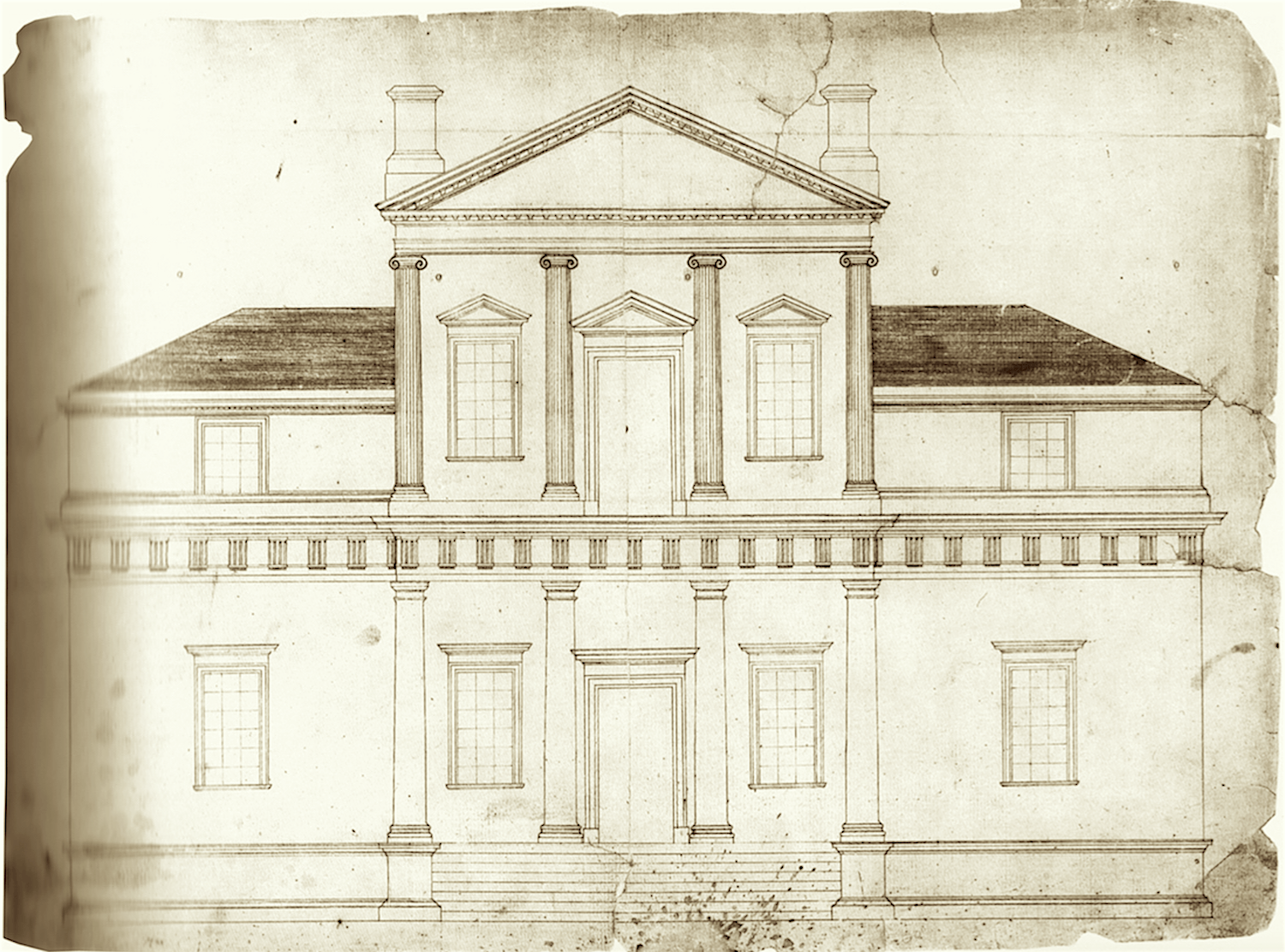
- And our own Thomas Jefferson, whose home, Monticello, you can see in the elevation above, designed it in the classical manner.
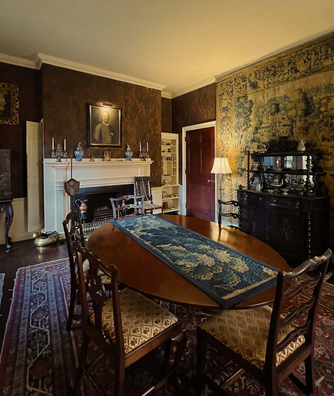
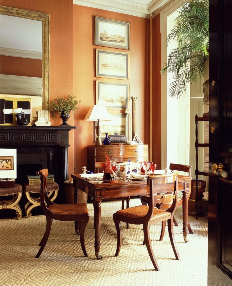
But then, came the Victorians, and interiors became dark and heavy. Although I rather like this handsome dining room below, in an image I took in 2023 at the Nichols House Museum on Beacon Hill.
Then, in the early 20th century, Elsie DeWolfe came along and made interiors light, vibrant, and beautiful again.
Beautiful Interior by Elsie DeWolfe for Marlene Dietrich via Gracie Studio
Dozens of greats followed:
Sister Parish
Albert Hadley
Nancy Lancaster
Billy Baldwin
Mario Buatta
I cherish my Mario Buatta lamps I got at Stenella Designs on Etsy!
With virtually every designer I highlight, you will find many of the same neoclassical elements, but with variations on a theme.
- They all favor classical architecture and furnishings, but mixed with a bit of the contemporary for interest.
- You will always find antiques, or antique-looking pieces, be they painted or stained.
- There are always elements with antique gold, as well as black and white.
- Classical Art, Accessories, and Sculpture
- Throughout the rooms are elements of Chinoiserie, especially blue and white porcelain and Asian designs.
- And Natural fibers such as bamboo and rattan.
- The furnishings are always beautifully proportioned.
That is, the furniture is proportioned for people, not the size of the room.
Please don’t argue with me. ;]
Does the height of your dining table change with the size of the room or the ceiling height?
No, it doesn’t. Well, neither should anything else, unless it’s stuck flat against the wall or floor.
So, for Madonna and the rest of us, you DO know how to put it together.
Look at what the designers we admire have done and perhaps re-read blog posts that reveal in depth what they choose. If you missed the James T. Farmer epic post, please see it here.
My favorite designers all have the same basic style but with their own unique flavor.
Furlow Gatewood is overall less colorful and has a greater focus on the cooler tones.
Mark D. Sikes (below) is the same, but also slightly more contemporary.
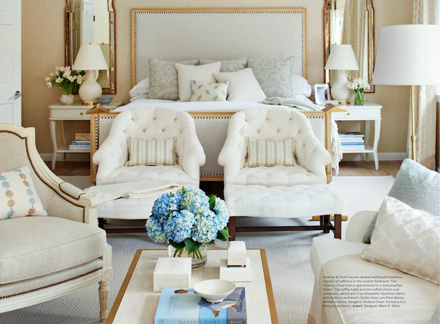
House Beautiful_Nov2016_pale master bedroom by Mark D. Sikes.
Suzanne Kasler tends to stick to more monochromatic palettes, as well.
Gil Schafer, too, but like James T. Farmer, tends towards the warmer colors. Above is the parlor from his former New York City Greenwich Village one-bedroom pied-à-terre.
It is important to know that just because you’ve never done something doesn’t mean you can’t. You’ve been given the tools; we just need to learn to trust ourselves and stick to the sources that understand the principles.
The problem is, the best new furnishings that follow the rules are often very expensive.
That’s why I’m keen to share the best sales and sources that you’ll also find in Laurel’s Rolodex. That is further augmented by the Laurel Home Paint and Palette Collection.
There is also the 333 Rules & Tips Guide. This is a large volume of helpful rules about proportions and sizes. However, it has some holes.
So, for the fall, I am creating a new, greatly expanded version that will include many new chapters.
It’s not a course. It’ll be more of a Decorating Bible, neatly organized and concise.
Anyone who’s purchased any of my guides will get a special discount code.
There will be more info coming out about the new guide in the coming weeks.
In the meantime, below are several blog posts that will remind you of the most important guiding principles to create classical and effortlessly beautiful interiors.
The Guaranteed Way To A Beautiful Room (It’s Not The Wall Color)
Best Proportions for Interior Trim-The Secret to Getting it Right!
You will discover the best proportions for club chairs. However, there are similar posts for sofas, end tables, lamps, coffee tables, dining tables and more! Please use the search box to find those posts.
Wainscoting Done Right (and the One Thing You Must Never Do)
In closing, I know that each of you has inside you the ability to create a beautiful home.
I know this to be true because dozens of you over the years have sent me images of your beautiful interiors. I can’t recall one time when I wasn’t beyond impressed. And this is from readers who never formally studied interior design or worked in the industry.
Naturally, when money is tight, it’s more of a challenge for sure. But then, dozens of you have found great treasures for very little expense or even for free.
Understand that I’m not saying interior design is easy, or that you won’t need a pro’s help. Everyone needs that. But know that you have cracked the code. You can do this!
xo,

***Please check out the recently updated and Spectacular HOT SALES!
Also, if you’re doing some shopping on Amazon, please click this Amazon affiliate link or the graphic below.

Thank you so much!
I very much appreciate your help and support!
Related Posts
 The Living Room TV As We Know It Is Over
 Mistakes Guys Make When Decorating To Impress Women
 Astonishing Home Makeovers You Won’t Believe
 An Old Snob Has A Change Of Heart Over Laminate Products
 Update on My Search for a New Home
 Beautiful Boston Holiday & Christmas Decor 2022
 Interior Doors from Plain to Not-So-Plain


6 Responses
Really inspiring article. Beautiful interiors feel best when they balance style and comfort naturally. Thanks for sharing.
I’ve used your blog post and purchased your relodex to help me achieve a beautiful space. I’ve also found (through a friend) a local interior designer who has multiple “tiers” of service. I chose the bottom tier, which is Consulting. She comes to my home, consults with me about my ideas, and then translates them into a beautiful interior. She gives me paint colors, furniture, and rug sizes, and ideas for where to make my purchases, then I handle the rest. It’s an hourly fee, and well worth it. Don’t get me wrong, she sounds just like a fairy godmother, and she is, but if she thinks one of my ideas stinks, she tells me, and she explains why!
I am confused about Mark D. Sikes bedroom photo, or is it a living room with a bed? Why are there so many chairs and a couch in a bedroom? Or Is it a living room where you can take a nap on a gorgeous bed? Or is it just supposed to be editorial, like Paris fashion week? It’s more an idea than reality?
Hi Laurel,
With all of your fabulous posts, you may be searching for new topics. How about “ how to successfully combine different wood tones in a room to avoid matchy-matchy”?
Your great fan,
A.S.
Hi Anita,
I’m not sure I could turn that topic into a blog post, but I can explain my philosophy here. Let’s leave finishes like cerused wood off the table and focus only on brown stained wood. I find that as long as the wood tones don’t have a strong yellow or purple-ish undertone on a cool toned brown, they all look good together. For example, there are about five different wood tones in my living room from medium, golden oak (the floor) to medium fruitwood on two dining chairs, mahogany shades on chair and sofa legs plus the end tables, and a dark fruit wood stain on the cherry dining table. (with a much lighter yew wood band) It was supposed to be medium but it’s darker. Still, I like it a lot. Either is fine.
What I don’t like when there’s one tone on all of the brown pieces. And, if there are large pieces, they are better in rooms that are either mostly white, or else, have a medium to dark color on the wall with light and white accents. I’ve written about that one, here and in other posts.
There is an image of a dark cabinet in this post about Gerald Bland that shows a handsome 18th-century Mahogany cabinet in front of a charcoal gray wall.
Hi Laurel,
I think we can all agree that your guidance has helped us amateurs achieve lovely homes. And we certainly appreciate it. For me, hiring a designer is a luxury I can’t afford. But I’ve managed to put together a home that is comfortable & still impresses my friends.
Happy Sunday! 😘
Thank you, Mary. I bet your home is beautiful!