

Hi Everyone,
I hope you had a beautiful Mother’s Day. Mine was quiet, but both of my sons called me, and that is all I could ever want. Before I forget, there’s an important note at the end of the post.
Oh, I have to say thank you for all of the lovely, kind comments. I don’t always answer, but I read each one and am very appreciative!
This is the final installment for the two-story living room with the ugly stone fireplace surround.
Instead of a part 3, there is an addition to part 2.
So, please click the link below to skip to part 2. Or, begin at the top, if you’re new to the post.
Part 2 Begins Here
Hi Everyone,
Thanks for your kind comments on the last post about the two-story Great Room.
Some of you wanted to see more ideas for two-story living room decor, and frankly, I love making these boards. They’re fun for me, and it’s a good way to examine why the space is bad and what we can do to make it better.
I decided to make this its own post because the two-story great room post is already pretty long.
What I love about this post is that it not only ties into the great room post, but it also ties into other recent posts about:
- The Horrid Gray Trend (and how to make it go from hideous to stunning!)
- The Trick to use to create effortlessly beautiful interiors. (Home in on your style and then look and see how your favorite designers do it.)
We also recently took a close look at the colorful work of James T. Farmer.
Today, however, the look is more Gerald Bland, Mark D. Sikes, and there will also be a Steven Gambrel-influenced space.
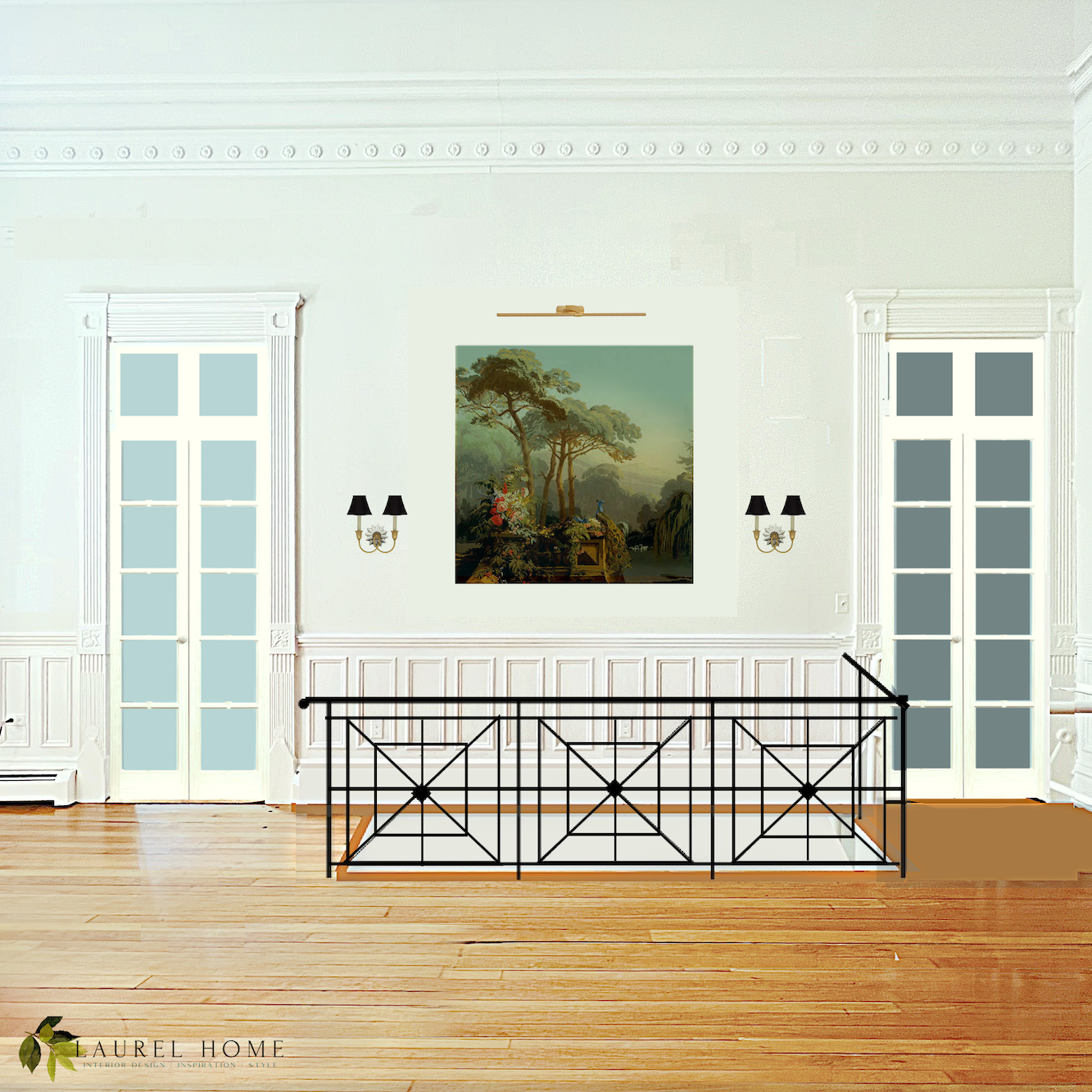
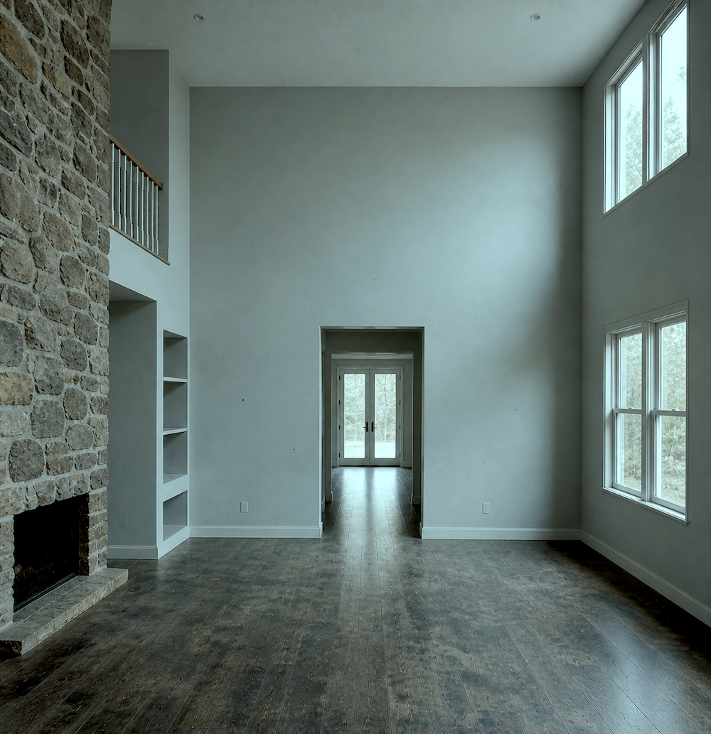
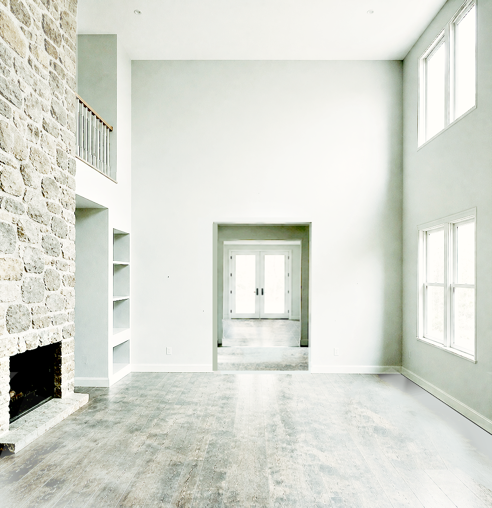
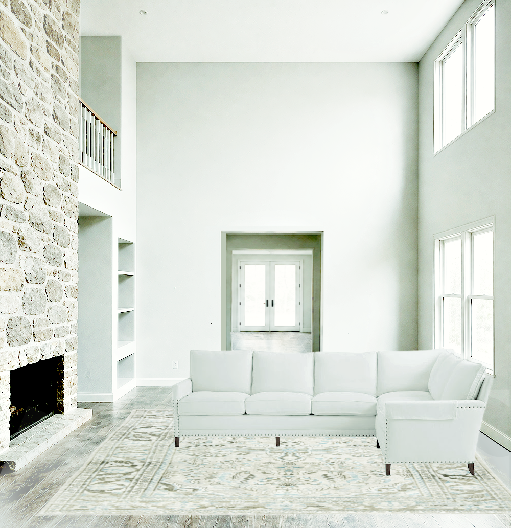
But first, the hideous two-story living room created for me by ChatGPT.
This is a wonderful use of AI. He nailed my prompts:
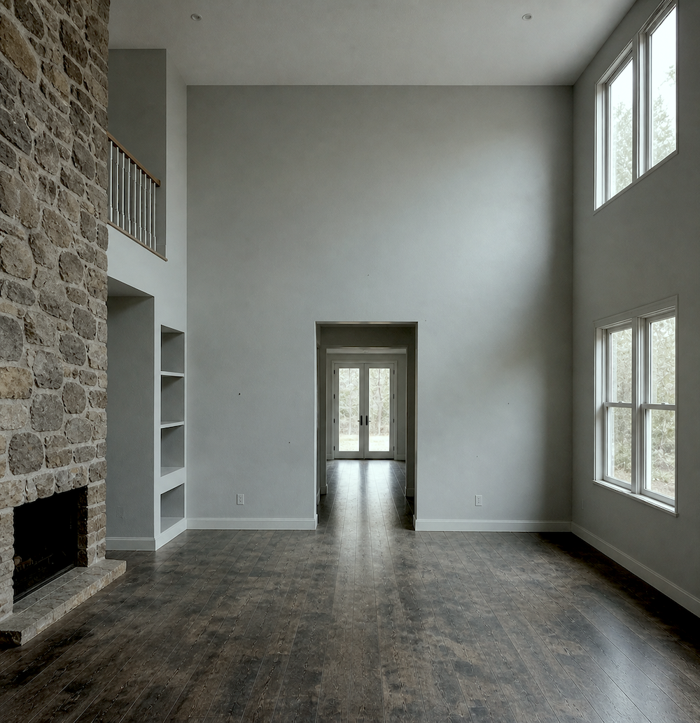
- Ugly Field Stone fireplace surround. Check
- Greige-ish hardwood floor that looks like it barely survived a fire. Check
- Depressing prison gray walls. Check
- And a charming cell block high up, to finish off the theme for a warm, cozy, family-friendly home. :/
I mean, aren’t you just dying to run up there and hang out?
Although if I walked into that dark, dank entry, I would probably turn around and make a mad dash back outside.
What if you tweaked the color, Laurel?
Sure, although I don’t think it will help.

See? It’s still dreadful. It’s not the paint color or the furniture. Although big, puffy, bloated furniture will make it worse.
Especially if it clashes.
Top that off with the neon icy-white LED lights.
Gag. I can’t!!!
Okay, please hang in there.
The problem is the architecture, or lack of it.
The bones.
Some call it the envelope.
If that’s wrong, it’s very difficult to make a good-looking room, whether it’s one or two stories!
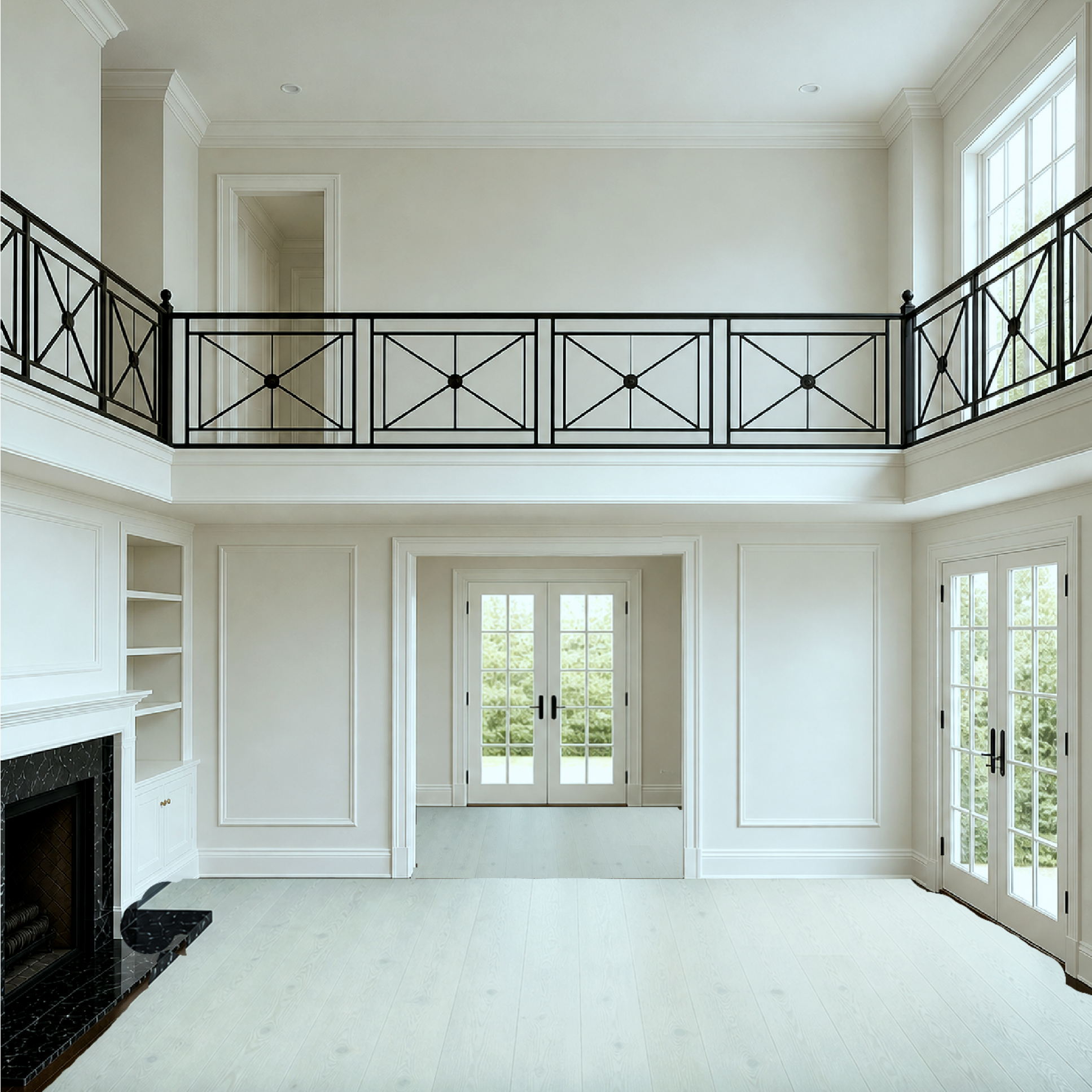
For my first prompt, I asked Chat to make this room into an elegant space with a catwalk and Chinese Chippendale-style railing.
In addition, I requested an elegant traditional fireplace, rich, chestnut hardwood floor, pale, creamy white walls, mouldings, etc.
I showed him this inspo image for the catwalk and room idea, also created by AI, to ensure that no sales of this horrid chandelier are made.
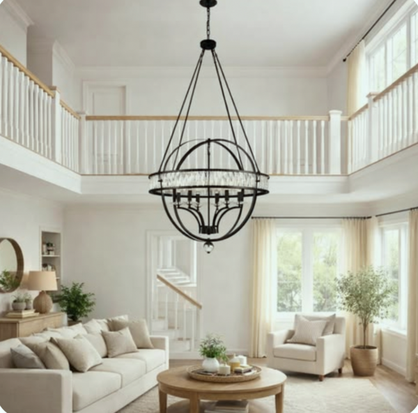
LOL on the light fixture. Huh? And what is that weirdness going on with a staircase that looks like a mirror reflection? Well, never mind.
Let’s look at Chat’s version of this virtually renovated two-story living room.
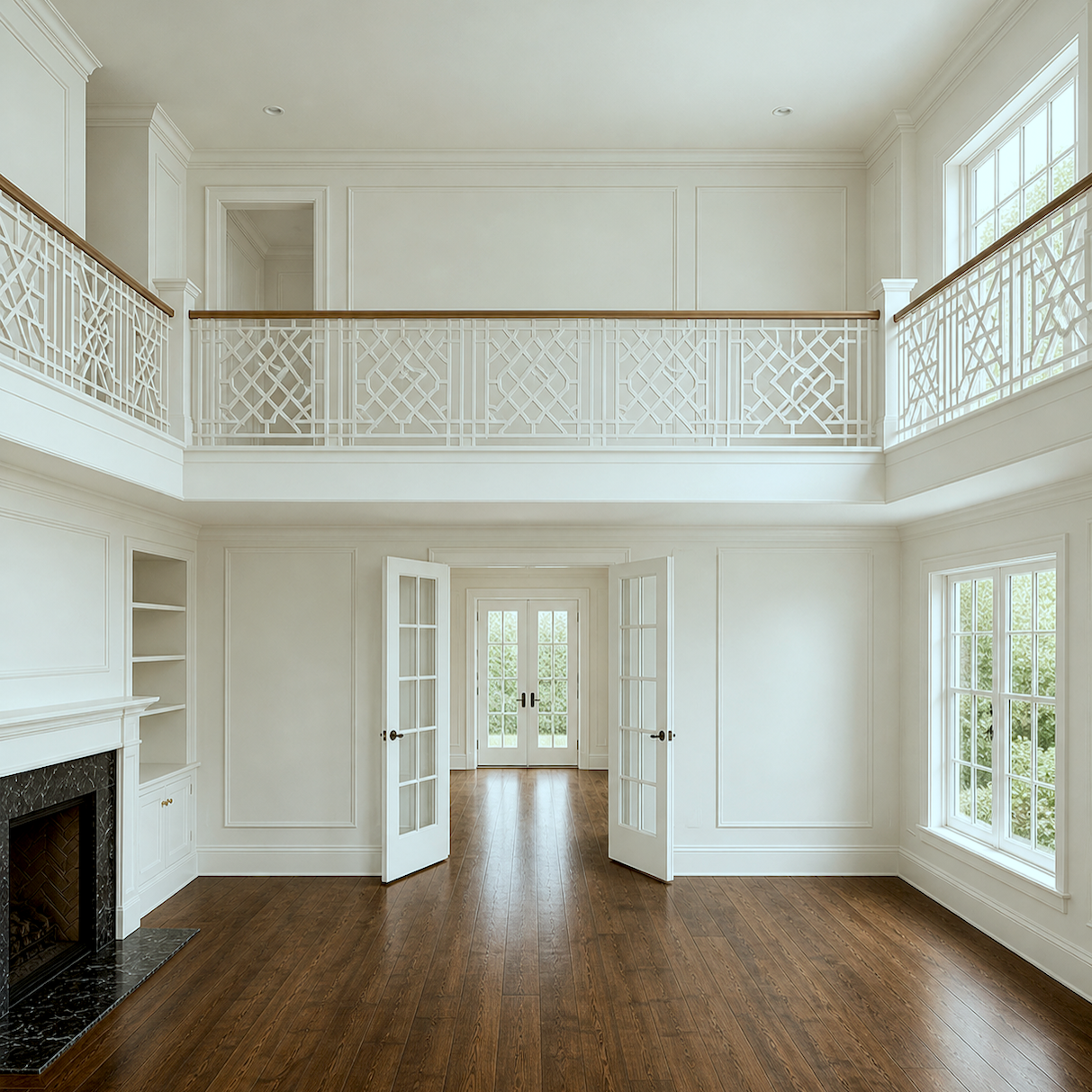
Okay, it’s difficult for the AI to make a Chippendale railing, but it’s a lot better than I could come up with.
The French doors aren’t centered on the wall, but I can fudge that.
Ummm… Laurel. That is not the same room.
Hmmm… I see… Would you like your crow cooked medium or well-done?
Guys, those of you doubters, it IS the same room! That is the point of this post on two-story living rooms.
Transforming something hideous into a thing of beauty.
I also asked him (Yes, him.) to make me the same room with a wrought iron X railing.
Remember??? Of course, you remember unless you subscribed less than two years ago.
This is after I started to work with it in Picmonkey. Sorry, it’s a bit rough around the edges– Literally!
However, I really love it with the black X railing on the catwalk.
Okay, let’s see what I did with this space.
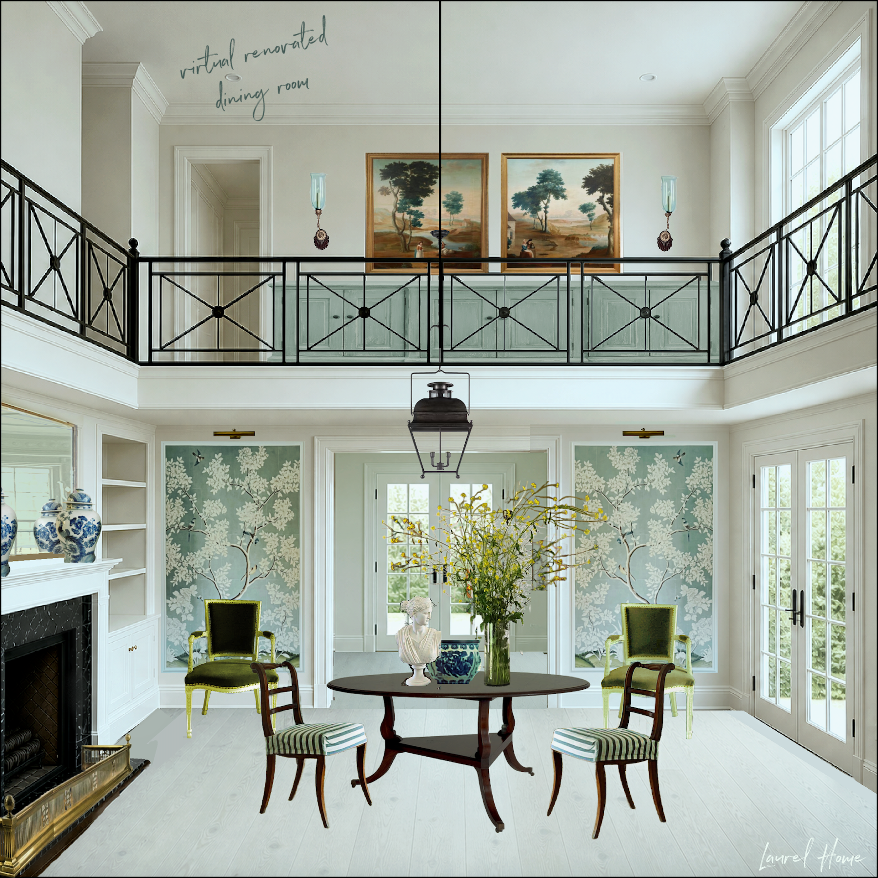
The chairs are both from Gerald Bland, but I changed the color of the green ones. The blue and white Chinoiserie pieces are mine. The Gracie panels are also mine. The bust is from Steve Cordony, and the flowers, I don’t remember.
Upstairs, the art is also from Gerald Bland.
The sideboard is taken from the one I used for the long wall by Sarreid. The sconces are similar to my Anglo-Indian sconces.
Some of you will ask to see this with the dark floor. I wish it were easy to switch back and forth, but it’s not. This is a classic look used by many A-List interior designers, and I love it. This is one of my favorite posts about white floors.
However, I know it’s a tough sell for some of you. That’s okay. :]
What about the other railing, Laurel?
It’s coming!
Unfortunately, I can’t make the railing see-through, but there is a cabinet behind it.
This room has my favorite analogous green with a touch of chartreuse palette.
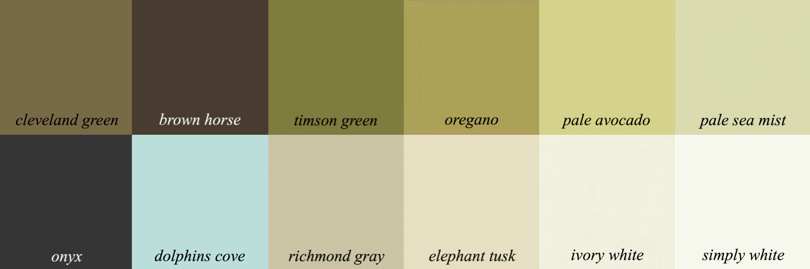
This one is from the Laurel Home Paint and Palette Collection. I could easily make this exact palette from the colors in the collection.
Now, I know I’m going to get comments about the art upstairs and downstairs. WE can see it in the rendering because we are standing outside of the room, but people in the room will not, unless they are maybe plastered against the wall we can’t see. And then, they’ll have to crane their necks. Still, the art needs to harmonize, which I think this does.
Okay, I saved the best for last.
I wanted to see if I could take those “cold gray-blue walls” and do a Steven Gambrel number on it. The inspiration is here.
I also used one of the rooms from that home as a shell for this dining room.
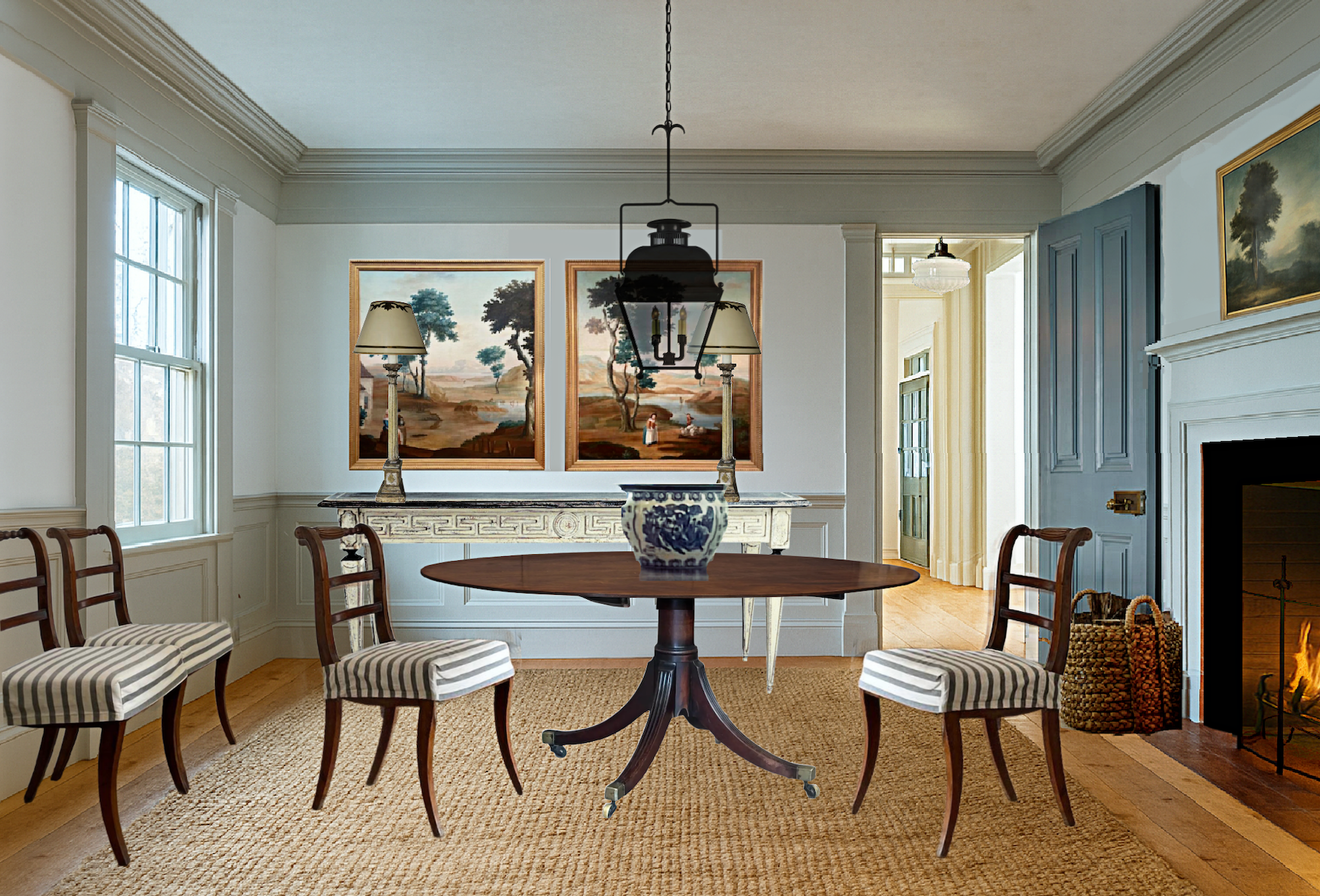
Yes, I know. It just goes to show that I like what I like!
This one Chat did a light floor at my request.
For this two-story living room, I did a living room. However, dining rooms are also living rooms because they are rooms for living, as opposed to “dead rooms.”
Okay, I have to go now.
I will be back very soon with the blue-gray living room. Sorry to leave you hanging, but I’ve hit my wall.
Laurel, wait!
Yes?
Please also do at least one more room with the stone- no catwalk. As beautiful as it is, my husband would freak the freak out if I even suggested such a thing. It’s not happening.
So, if you can, please help those of us who, for whatever reason, can’t do a major renovation.
Sure, I will. Promise. In the meantime, please look at the two-story great room post for more ideas that aren’t as invasive.
xo,

*********************************************************
Part 2 Begins Here
Saturday, May 9, 2026
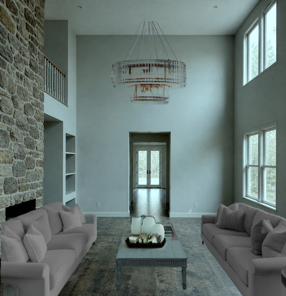
Let’s bring that prison two-story living room that ChatGPT made for me.
I decided I wanted a rug this time. I got on Annie Selke’s site because I wanted to use the beautiful Hexile rug. I couldn’t find a decent perspective shot; however, they have one of those “See this rug in your room” thingies.
Okay, great, at least I can get a rug in perspective by uploading one of the ChatGPT renderings.
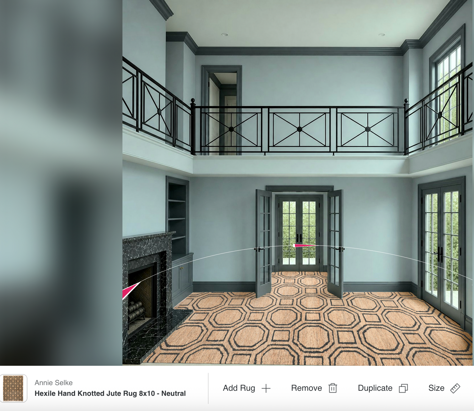
The scale is much larger than it actually is, and I can’t control that, but at least it’s in perspective. For my final board, I cropped out the rug and used the eraser on Picmonkey to get rid of the excess on the left.
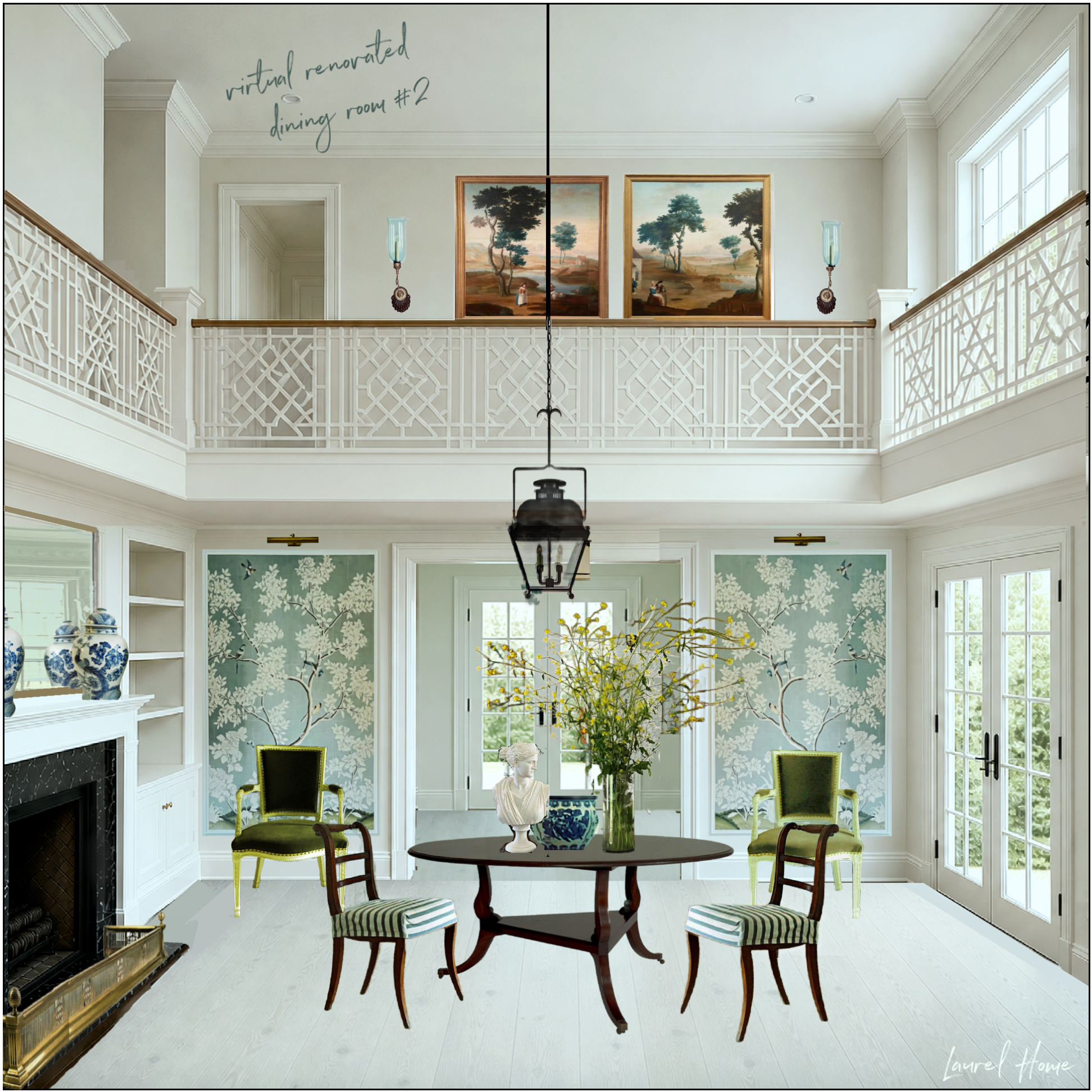
Before we move on, a few of you complained about the too-narrow catwalks.
You’re so right, and I apologize that I forgot to mention that. When Chat created the catwalk balconies, I asked him three times to make them wider, but he never did. So, I just left it because, from a conceptual point, bringing those two balconies out a couple of feet won’t make a significant difference. They can come out however far we like. The x boxes will be more square is all.
Still, if we’re adding a bookcase along the wall, there should be at least four feet of space between the wall and the railing.
Are you ready to see the rest of this two-story living room transformation?

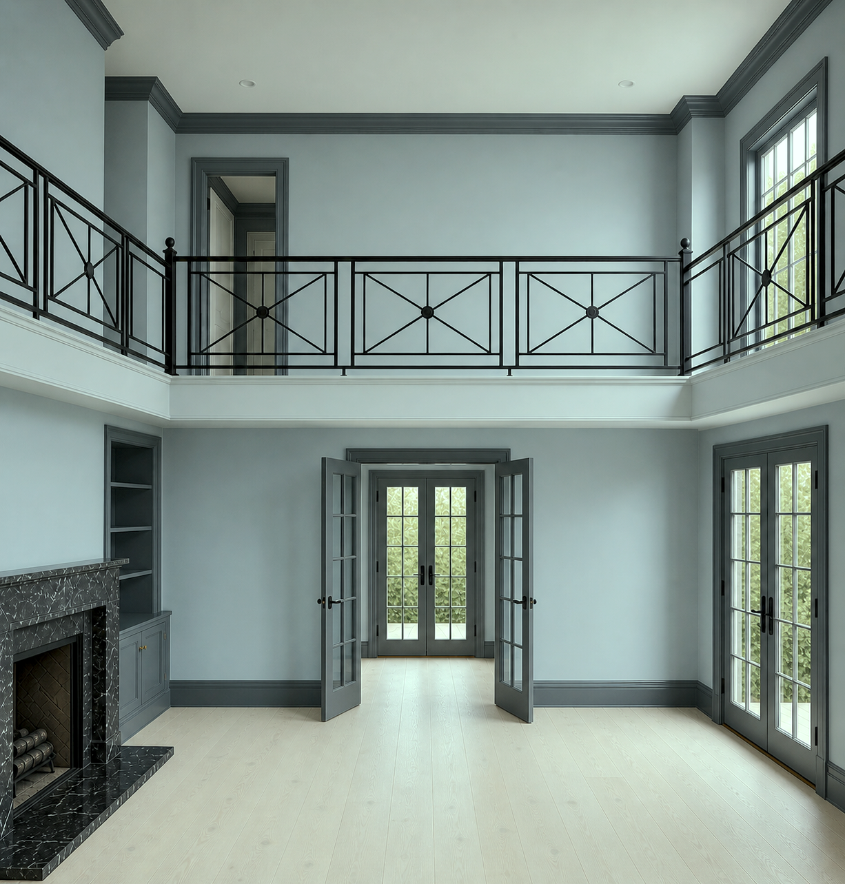
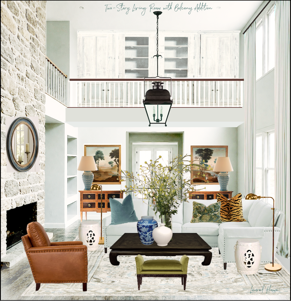
This one’s my favorite! And, it’s proof that gray can be a gorgeous color— IF one works with it correctly.
Why does this work?
The mid-tone cool blue-gray is the lead color, and it looks very much like Benjamin Moore Nimbus Gray. (not to be confused with Nimbus, which is a warm, much lighter greige color.)
Oh wait. Benjamin Moore got the memo and changed the bloody name to Beneath the Clouds!

As an aside, Nimbus Gray/Beneath the Clouds is now in the newly updated Laurel Home Paint and Palette Collection that I introduced last September. However, it almost made it into the original guide because I went so far as to make a graphic for it in 2016. Here’s what readers who own it have to say about it.
Yes, the actual tenth anniversary of the original Paint Collection is tomorrow – May 10th!
More about that in a sec; we need to finish the post and continue with why this room works when others fall flat!
We have a lead color– Nimbus Gray. It is the predominant color in the room– at least 50%, including subtle variations.
- To that, other analogous shades of gray create a harmonious palette like the colors of water and sky.
- The variations are like an orchestra. We need all four string instruments for the orchestra to sound full and rich.
- There are black accents which look wonderful, as well as charcoal gray-blue and a much lighter gray.
- Aside from the varying shades of gray and blue, there are accents of white, gold, and the rich brown leather chair.
- There are a few bright notes with the ginger jar and yellow flowers.
The art is where it all comes together, but in a way that feels natural, not like we tried to pick the colors out of the artwork to use for the room furnishings and decor.
Which one of these do you like the best? Please let us know in the comments.
Sorry, no shopping widget today. But, there are items you may recognize from the newly updated Hot Sales and other blog posts.
Laurel, this is all very nice. BUT, catwalk additions aren’t in the budget for our two-story living room. And on top of it, Dear H wants to keep the stone, and we can’t afford that $15,000 antique marble mantel.
Ya know?
Yes, I do know. I know all too well, for there was a time I couldn’t afford so much as a new lamp.
Okay, I’m up for the challenge.
Next time, we’ll look at the two-story living room with the ugly stone fireplace, and I will show you how to make it a lot less ugly.
I will not add any architectural details. At least nothing major.
This is exactly the kind of thinking I’ll be sharing in Laurel’s Decorating Bible, coming this September!
In the meantime, it’s Mother’s Day tomorrow, and coincidentally, as I said, also the 10th Anniversary of the Laurel Home Essential Paint Collection. It’s a two-part paint guide that features 144 + 12 new Benjamin Moore paint colors. Part 2, the palette collection came out six months later and ever since, they have been sold together as one two-part paint guide!
As a way of celebrating and saying thank you, I’m offering 10% off ALL of my interior design guides this weekend including Monday.
To learn more about my interior design guides, please start here.
If you’d like to see what dozens of readers had to say after purchasing, please go here.
When you go to order, on the second or third screen, you’ll see “Got a code?”
Yes, you do. The code is: THANKYOU10
However, it is only good through 11:59PM on May 12th. After that, the code will expire.
These guides make wonderful gifts, so if you need a last-minute gift for Mom, maybe she would like a guide, or all of them!
xo,
Part 3 – Monday, May 11, 2026
Hi Everyone,
This is the third and final part of this post about a two-story living room that could really use some help.
As promised, I’ve created another version of this room, keeping the stone and with minimal to no architectural changes.
However, a lot can be done with paint and other finishes.
The first piece of business is the stone. However, I have already addressed the ugly stone issue in a post from 2022. In that post, there’s a ton of information about how to treat the stone to soften it and make it blend in better. And, these are centuries-old legit techniques with probably a dozen names, such as lime wash, parging, German Smear, etc.
There’s also a sister post about ugly brick fireplaces.
Here’s the deal that’s frequently ignored regarding the stone fireplaces.
And this goes for all homes with a rough-hewn stone fireplace, whether it’s a two-story living room or a one-story interior.
It’s such an obvious thing and is the overwhelming reason these fireplaces feel out of place.
The reason is that they are out of place because they are rustic, and the way to help make it work is to balance it out with other rustic elements.
Now, I am not suggesting that everything has to be rustic. In fact, I would recommend not doing that.
Of course, there are dozens of ways one can go with this; however, this time, we are beginning with a totally monochromatic palette.
The stone is white-washed or lime-washed. Again, if you missed the link about how to fix ugly stone fireplaces, please check it out here.
As you can see, the fireplace is no longer this looming albatross.
The floor is still rustic but also softer, and the walls are much more pale.

I used one of the new Laurel Home paint colors from the Williamsburg collection, Harwood Putty. It’s a beautiful off-white that’s slightly cool, and the palest blue-green. However, it sometimes looks quite white.
We used a hardwax oil finish on the floor to bring out the grain and finished with an antiquing wax.
From there, I selected a pale rug with a pale sectional.
In the next image is the basic plan.
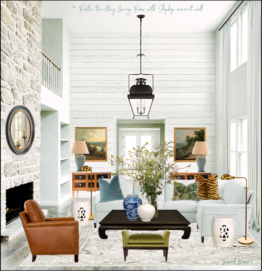
I added a shiplap wall. This is a situation where rustic shiplap is the perfect complement to the rustic stone.
The rest of the furnishings in this two-story living room is what you’d probably expect from me.
Of course, you can add some door and window casings. Yes, there should be stuff in the bookcase.
However, it does look kind of empty on top of the art.
Therefore, I did two other variations.
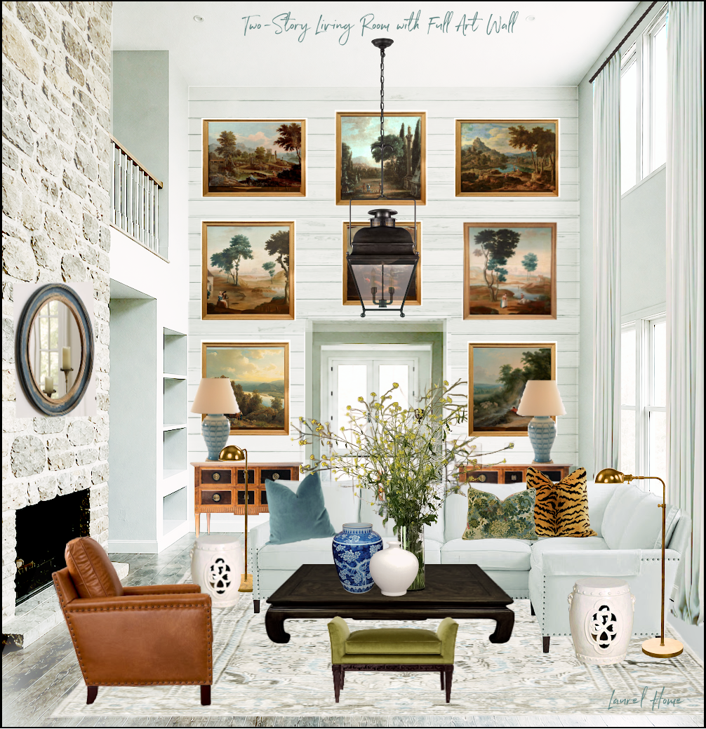
The one above might be a bit much. Or, it could be spectacular.
The one below might be the best solution.
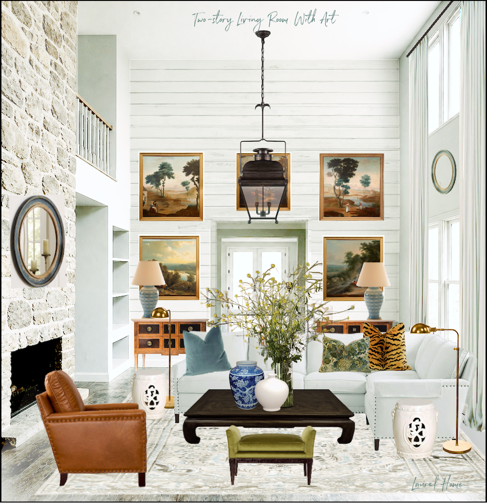
This is one of those cases where I’d start with the two pieces. One can always add more.
Or, you could also do a Furlow Gatewood-type wall with a variety of art and objects.
Okaaaaaaayyy… there’s one more idea for this two-story living room.
This time, I did change the architecture, but only added one balcony. There would need to be a door to the balcony from the adjacent room. I did not put the door in.
The balcony would need to be at least four feet deep. The built-in cabinet has a rustic antiqued painted finish. Of course, it could be something else, but it can’t be very deep.
I really love this one! It’s not a cheap fix, but it adds so much value.

Please pin to Pinterest for reference.
If big architectural changes are not feasible, there’s still hope. With the right balance of finishes, paint and furnishings that work together, ugly rooms can become beautiful rooms.
xo,
I’ve decided to extend the Laurel Home weekend sale for one more day. So, it is now ending May 12, 2026, at 11:59PM. Use promo code: THANKYOU10 for 10% off on all of my guides, including the already discounted bundles!
To learn more about my interior design guides, please start here.
If you’d like to see what dozens of readers had to say after purchasing, please go here.
When you go to order, on the second or third screen, you’ll see “Got a code?”
Yes, you do. The code is: THANKYOU10
However, it is only good through 11:59PM on May 12th. After that, the code will expire.
***Please check out the recently updated HOT SALES
Also, if you’re doing some shopping on Amazon, please click this Amazon affiliate link or the graphic below.

Thank you so much!
I very much appreciate your help and support!
Related Posts
 Faux Fireplace, a Great Idea or a Disaster?
 Bathroom Design Inspiration – Revisiting an Old Project
 Are Green and White Rooms Trendy or Passé?
 50 Living Room Decorating Rules You Need To Know
 The Most Exquisite Gardens and Landscaping Ever!
 The Best Upholstery Fabrics For Pets and Slobs
 The First Renovation Tour Of The Upstairs Living Areas! (Parts 1 & 2)


26 Responses
Great breakdown of how design details and room structure impact the overall feel of a space. Creating comfortable and visually pleasing environments can also contribute to well-being, which is why I enjoy reading both interior design and health-focused content.
Really enjoyed these transformation ideas. The discussion about improving architectural elements instead of relying only on paint colors is spot on. We see a similar approach in interior surface renovation projects where architectural films can completely refresh walls, fireplaces, and cabinetry without major reconstruction.
All of these iterations are just WOW! I’ve been AWOL for a bit recovering from a hip fx but I’m so glad to be back to see you work your magic. I’m so happy I stumbled on to your website many moons ago. Thank you for providing all this wonderful eye candy again and again!
I love this post! Thank you for doing the last iteration. Many people don’t have the option of making significant, expensive architectural changes regardless of how beautiful they make the space.
Having spent 20 years in Bucks County, PA where old stone homes are kind of a trademark, I don’t find the stone fireplace ugly per se. But the cavernous space and lifeless color were certainly not helping. Your changes made the room warm and classy without totally breaking the bank. You’ve inspired me to rethink my builder grade fireplace wall.
We recently remodeled the adjacent kitchen to be more of an “unkitchen” and the fireplace no longer seems to fit the vision. Ahhh…the proverbial snowball effect. Thanks again for a brilliant post.
Laurel, you always exceed my expectations! I love your use of color and especially whites, teal and chartreuse. I don’t have a two-story great room, but my primary bedroom has a very high ceiling with light yellow grasscloth, and dark wood stained floors and doors and four white painted closets. However the white paint on the closets and trim has a grey undertone. Your two-story great room shows just how beautiful a bright white can be. You have inspired me to find a brighter white and perhaps add some dark wood stain to the beams on the ceiling keeping the rest of the ceiling white.
the carpet and throw pillows are wonderful. what a beautiful comfortable room to be in.
any sources for the carpet and throw pillows? If so, thanks in advance.
Your creativity and imagination are exciting and inspiring…
I’m about to embark on converting the ‘office’ into a sophisticated woman’s study…
Looking at all you’ve done for ideas…
Hi Sandra,
Thank you so much. The rug is in my Hot Sales Rug page. https://laurelberninteriors.com/fabulous-rugs-sale/
The tiger pillow is in the Hot Sales Vintage Widget. https://laurelberninteriors.com/hot-vintage-home-furnishings-on-sale/
You also might find pillows in this post.
Happy belated Mother’s Day, Laurel! After reading part 1, I was obsessed with the 2nd iteration of the dining room with the Chippendale style railings. So sublime! When you teased us with the cool blue-gray prison room, I thought to myself, “I’m not sure I can like that color.” I’m just not a cool blue-gray kind of person! Boy, did you prove me wrong (WHY did I doubt??) You made that room sing! It’s so rich and cozy that I can imagine myself lounging on the gorgeous sofa with a good book in front of the fireplace, glancing up every now and then to admire my room :] I’m super-excited to see what you can do with the room without any major changes. I do not doubt that you will work your magic. Thanks for the inspiration!
Thanks so much, Sheree. I surprise myself, too!
Your posts are always so amazing. They are such a wealth of information that I have to read, and re-read them again and again. I’m just amazed at the transformations here. My absolute favorite rendition is the one with the Chinese Chippendale style railing. It’s just gorgeous! Happy Mother’s Day, Laurel.
Happy Mothers Day to you! Thank you again for sharing your wealth of knowledge to help me love my home again!
From a reader with no vision, I can’t say it enough….…amazing, amazing, amazing!
Beautiful job making this room come to life. It is like you have performed CPR when most would resign to putting the room on DNR.🙂
Happy Mother’s Day!
Absolutely love the transformation! Lovely!
Laurel,
Your redesigns make me want a house with a two-story living room. I love the catwalk idea! It reminds me of the coolest libraries I’ve been in. Thank you for your guidance for all of us who are trying to make our homes comfortable and beautiful but aren’t sure where to start.
I am obsessed with the “green with a touch of chartreuse” palette. All your palettes are amazing, but this one is particularly spectacular; every room you design with it is to die for. I’d love to see a widget in this palette:-)
I think that you did a great job with that hideous two-story room, Laurel! My favorite iteration is the second one with the iron railing like you have in your apartment, and the beautiful Gracie panels.
As for the “fake catwalk” comment, it IS merely for decoration, and its purpose is to break up all that verticality in the room. If one were designing a room from scratch, one could do a 4 foot catwalk, but installing one in that room would look ridiculous.
Hi Diana,
Right now it looks like it might be 15″ on the right side, at least which was not my intention and I tried to get the AI to fix it. I suppose I could have with another hour of work, but since it’s not critical and we’re not actually building anything I used the time for the more significant parts. The catwalk should be a minimum of 36″ wide.
Absolutely amazing. I love the all white one. I don’t have one of those endlessly high rooms, but my take-away is that any room can be totally transformed into a welcoming and warm space. You are a master at that. Many thanks for exploring the benefits of Chat-GPT too.
Hi, Laurel, This post- both parts, so far, really hit home for me because we have one of those two-story great rooms with a catwalk hall to the bedrooms upstairs, where you can give a speech to the entire home from the upstairs hall. We built the plan in 2002 and kept it as it was (loud and cavern-like) until seven years ago when we had an idea to do picture frame moulding and then create the “feel” of a lower ceiling by keeping the lower portion of the room white BM Chantilly Lace) and painting the top portion of the room dark grey (BM Chelsea Grey). My husband did the work (he does excellent work!) and it is so much better and more interesting. I would still like to change out an old wall unit that houses a tv and music, and records and cds (yes!), but they need to live somewhere in this room. If you’d like to see our before and after, I can share. For the record, we would never do the two-story room again. The LOUDNESS of the room alone is good reason to not do it. Thanks for your wonderful blog and all that we learn from you!
It would be interesting to see what this looks like with a 4′ wide or so catwalk. I’m picturing bookcases and seating to cozy it up, but then I lean more Historic-English-Man-Study in my aesthetic.
Hi Alicia,
Yes, I forgot to mention that the catwalk is pitifully narrow due to the AI not understanding my request made three times to widen it. Finally, I gave up and hoped you guys would understand, but I should’ve said something in the post.
Hi Laurel,
I’ve been a fan for ages, and own all of your guides. (People, these are worth every penny!!) I’ve been waiting to see if you continue the “Tight Budget” post from 9/11/25. It was reminiscent of a beautiful Back Bay or Beacon Hill home, and you did a magnificent job with the living room while working with a budget. Could you please continue this post with the same theme of a Back Bay type dining room, bedroom, etc, imagining it’s the same house, with the same budget approach, like in the 9/11/25 post? I keep referring back to that one to re-read, it’s that good! I LOVED watching your own exquisite Back Bay labor of love unfold! Thanks for sharing with us.
Hi Jules,
I’ll take a look at it shortly and see what I can do.
Laurel: Do you really like that fake catwalk? It is way to narrow for anything except decoration. It seems like it would be a maintenance nightmare. Why not put in a realistic width catwalk (wide enough to be an actual walkway) in your pics?
Hi Kia,
Everything is conceptual. I tried to get the AI to make it wider three times. Of course, in real life it needs to be a minimum of three feet wide.