

Hi Everyone,
I hope you’re all doing well now that the holidays are behind us and we are taking our first steps into the new year.
So far this year, our weather, like the entire eastern half of the United States, is unseasonably mild. We are enjoying a rainy day in Boston. It is more like early November. While it can rain here in January, typically, the precipitation is in the form of snow. Remember the big blizzard last year when a bunch of us when out for dinner in Beacon Hill?
Today, I have for you a special treat.
We are going to examine the exquisite Gerald Bland style. However, before I do, thank you so much to the 1,142 readers who took the time to fill out the short survey I shared on Sunday. Apologies to those who had a problem seeing the survey. Very late in the day, I finally figured out a way to share the survey so that everyone can see it. So, if you were one who was having a problem, it should be okay for you now.
Okay, let’s dive into our Gerald Bland style post.
Who is Gerald Bland?
Gerald, like our dear, recently departed Furlow Gatewood is an antiquarian, a collector and dealer of fine antiques. Both of them have exquisite taste. And both have a love for furnishings in 18th-century neo-classical pieces (and other time periods). Both love white slip-covered furniture. (Me too!) And, both tastemakers love classical architecture.
However, that is where I’m going to end the comparison.
What sets them apart is that Gerald also loves the avant-garde, a genuinely modern side. One sees this occasionally in his home, but it’s found more abundantly in his exquisite shop in New York City. All of this is featured on his beautiful Instagram account. Please follow Gerald Bland if you’re not already.
Some of you may recall this pair of incredible paintings I shared in this post about over-scale art for my living room. (One day!)
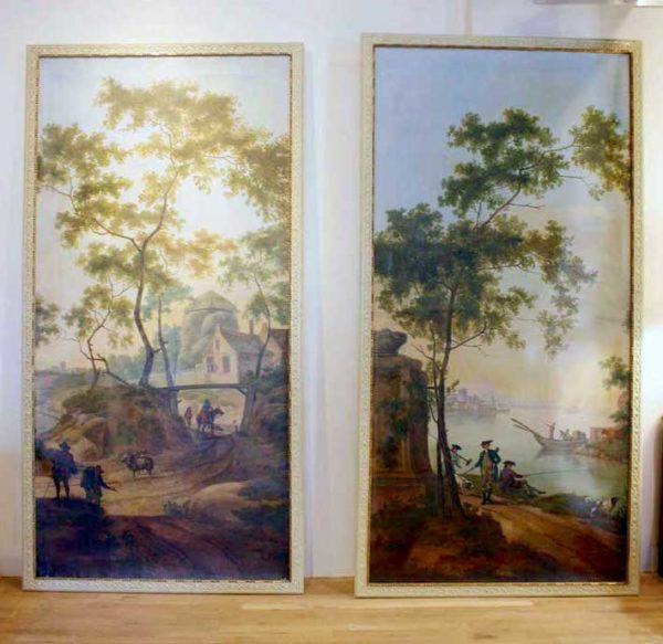
It looks like they were sold! They are attributed to the Circle of Jan Van Os, an 18th-century Dutch master. I don’t know how much they cost. However, based on other pieces, I imagine the pair went for well into the six figures.
I’ve been putting together loads of images and beautiful furnishings.
The reality is that I could divide Gerald Bland’s style into at least a dozen categories.
It could be an entire college course. Therefore, I’ll do my best.
However, the point of all this is how it translates for you if you’d love to imitate Gerald Bland’s style.
So, let’s first discuss the basic envelope and how you can achieve the look.
Then, we’ll explore Gerald Blands furnishings style.
We’ll begin from the bottom of the room.
Floors
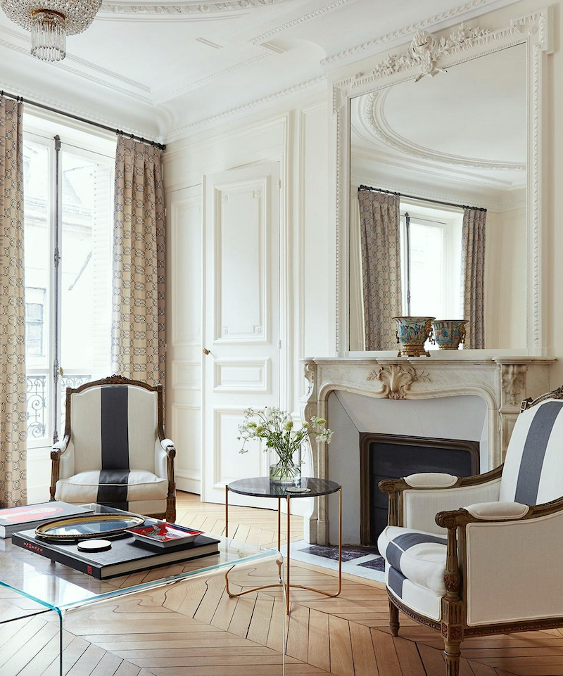
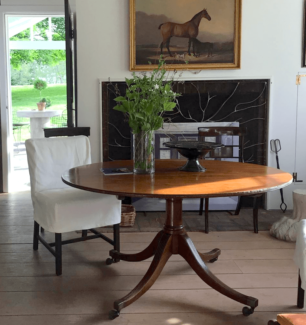
Gerald has hardwood floors in all of his homes (country and city) and in his New York City antique and contempory home furnishings store. The shop has the lightest floors. It looks like it might be Rubio Monocoat in one of the lighter finishes. We looked at his floors in this post about painted floors.

In his country home, in the picture above, they had the floors stripped, and it looks like a clear polyurethane was put over that. However, this might be some sort of a waxed finish. I don’t know. But, there’s no dark stain, and it’s not at all shiny.
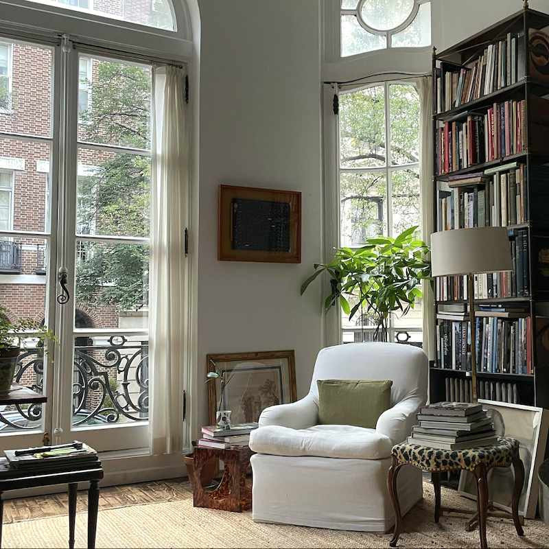
The city apartment, at the moment, has floors with what looks like a natural stain. But, they are mostly covered, so I’m not sure. From what I can see above, they look neither light nor dark.
Gerald Bland’s floors are either left bare, or there’s a natural floor covering in the form of area rugs. On close inspection, he seems to prefer seagrass. Great choice– especially with his cute doggies. Seagrass is rugged and not expensive. Although in the city apartment, that looks like jute.
Most of Gerald’s walls are painted white.
Please don’t ask me which one. ;] However, if you were holding a gun to my head, I’d probably say White Dove.
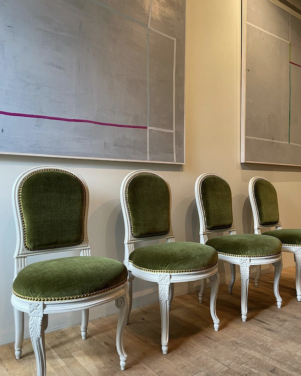
There’s one area of his shop, however, where instead of white, he chose a moody charcoal gray.
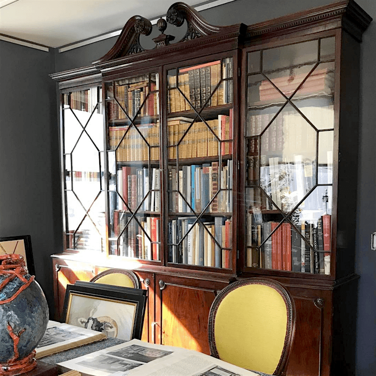
Above, you can see it juxtaposed against a fine Chippendale-style breakfront. In front of that are Louis XVI oval-back chairs. He is selling them on 1st Dibs! Yes, he is. You can have them for $38,000 plus shipping and tax.
Below are some of my favorite pieces he’s selling on 1st Dibs.
It’s only a tiny fraction of what’s in his shop. (please click on any image to learn more.)

No, I don’t know the wall color, either.

Above is Benjamin Moore Gray 2121-10.

Benjamin Moore Anchor Gray is a little cooler and looks beautiful with wood tones. However, most blacks and grays look good with wood tones.

Kendall Charcoal is another good one.
You can get the fantastic Samplize paint samples here. They have all the Benjamin Moore colors, Farrow & Ball, and others. They use actual paint for the samples, and you can move the samplize samples around on the wall. Plus, there’s no mess and no paint to dispose of. Brilliant idea.
Next up is the architectural detailing.
Gerald Bland’s exquisite country home was built during the Greek Revival period, around 1820-1840. The distinctive door casings are typical of the period. The ceilings are mostly high. I am estimating 10′-11′ in the main living dining room. However, in the adjacent parlor with the gold ceiling, (below) it looks to be no higher than 8 feet.
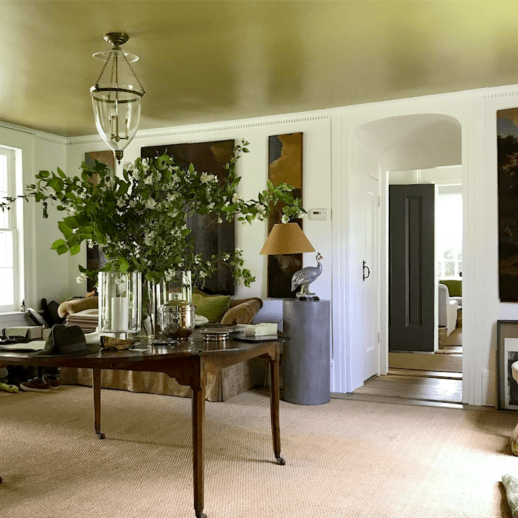
Painting the ceiling gold is both unexpected and brilliant. It adds instant warmth and a touch of drama. But, because the color is deeper, it lifts the ceiling height, making the room appear taller than it is. Also, please notice the tall height of the doorways and windows. These elements also make the room appear taller.
No, you don’t have to change your doors and windows.
But, if you only have 8 feet to work with for ceiling height, you could add a picture frame moulding between the door and the small crown moulding.
This is what AB Kasha does in their delicious Parisian apartments like the one above. If you look at their Instagram, you’ll notice they sometimes feature before pics. You’ll think your eyes are deceiving you because the before photos show a dark, nothing-special room. In the after images, the rooms are light and bright, and the ceilings appear to soar.
For an eight-foot ceiling, I would do a small crown, maybe only 2 inches.
It can be a bit larger, but to really make the ceiling look taller, I think that a small crown on the wall is best. The trick is to put it so that it expands over the ceiling more. The baseboard can be six inches high, and if there’s a chair rail and wainscoting, that looks nice at about 35″ tall. To learn more about wainscoting, please check out one of my favorite posts.
Here are more tips to make your ceilings look higher.
Please also notice that there is no contrast between the trim and the walls in Gerald’s home. This allows the furnishings and art to take center stage.
This is key to the Gerald Bland style. It’s simplicity is what makes it incredibly refined and elegant.
Next up are the furnishings.
Gerald Bland’s style is the very definition of eclectic. It is a mix. However, remember me talking about the 80/20 rule? Gerald instinctively never veers beyond 80% trad, 20% contemporary, or vice versa.
Most of Gerald’s case pieces are 18th century, either the real thing or at a later date.
However, you will never find any ersatz proportions or weirdness in his furniture.
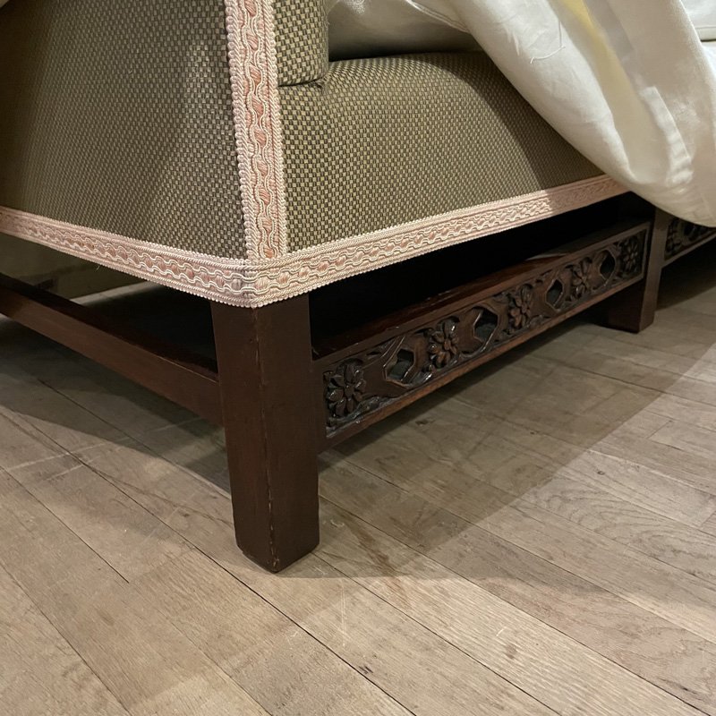
As I said before, his furniture is largely slip-covered.
Look at this sofa, he’s selling in his store.
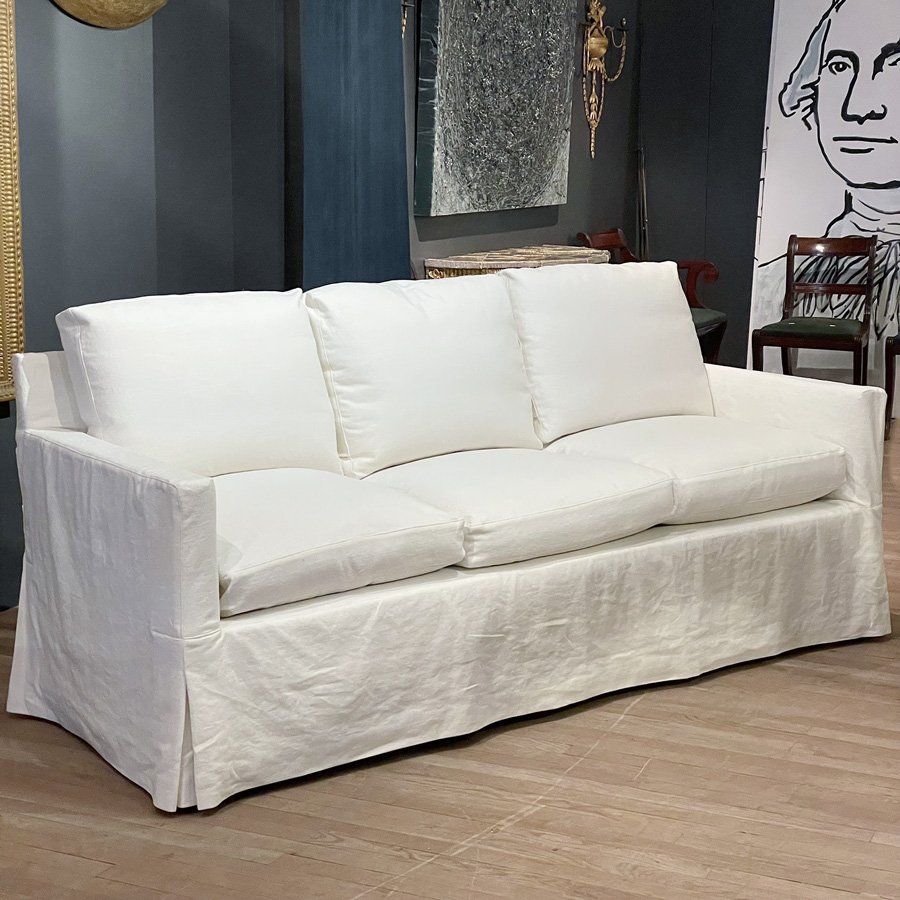
It looks perfect, very much in the manner of Billy Baldwin, who did upholstery and decorating for the mid-century New York socialite Babe Paley.
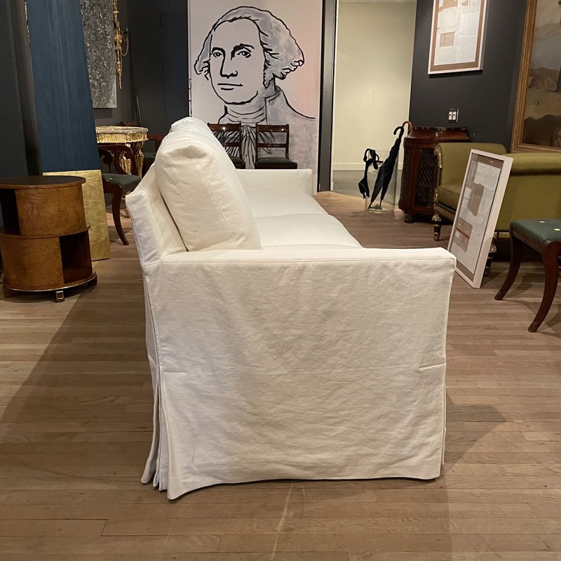
But, let’s lift that slipcover to see what’s underneath.
Oh my. How gorgeous! This gives this piece two different looks. And, here, we can see a close-up of Gerald Bland’s shop floors with their matte-bleached look. Rubio Monocoat enthusiasts, do you think that is what they used? I have to say I rather love it!
Gerald also does a lot of furnishings in the Regency, Adam, and Georgian styles. These are all neo-classical styles of the late 18th-century styles into the early 19th-century.
There is virtually no pattern except maybe a touch of damask on a stool or a tapestry accent.
What about colors?
Ahhh… this is where Gerald has my heart. Dang, but he’s taken. His lovely wife, Mita Bland, is an accomplished artist, too. She does amazingly beautiful interior renderings!
It is apparent that the Bland’s favorite color is the same as mine.
Chartreuse. And, other shades of green.
Where Gerald Bland’s style deviates from others in the most interesting way is his modern side.
It’s this other side of him that he needs to express, and I have an immense amount of respect for that. The reason is that whatever he puts together, even if individually, isn’t anything I would choose, looks amazing together. That is his genius.
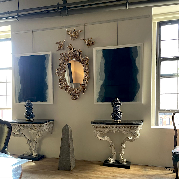
The above vignette is mostly classic contemporary. However, the Rococo consoles live happily alongside that wild contemporary mirror.
Modern art grounds the entire vignette.
I know. It’s not Ethan Allen.
And, like other acquired tastes, like caviar, for example, this might not be appreciated by everyone. But, for those it speaks to, it’s perfect. Gerald has been studying and collecting his entire life, I believe.
However, interjecting a modern element into a traditional vignette gives it the necessary tension to make the design soar to another level. Otherwise, a room can begin to feel a little stale.
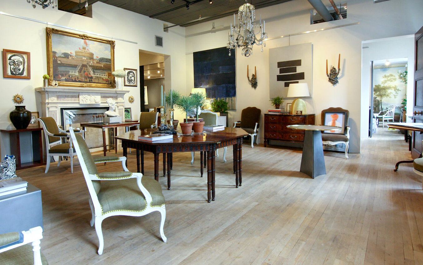
The photo above is from his shop from a few years ago. I adore that dining table! And, way in the distance are *my* Jan Van Os paintings. I fantasize that one of you saw them on the blog and called them up and purchased them. That would make my day if that was the case.
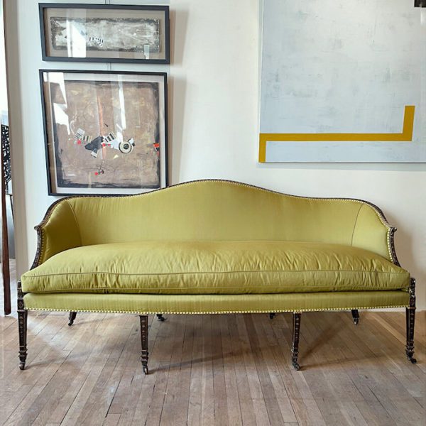
Above, an exquisite Sheraton sofa with a beautiful chartreuse fabric.
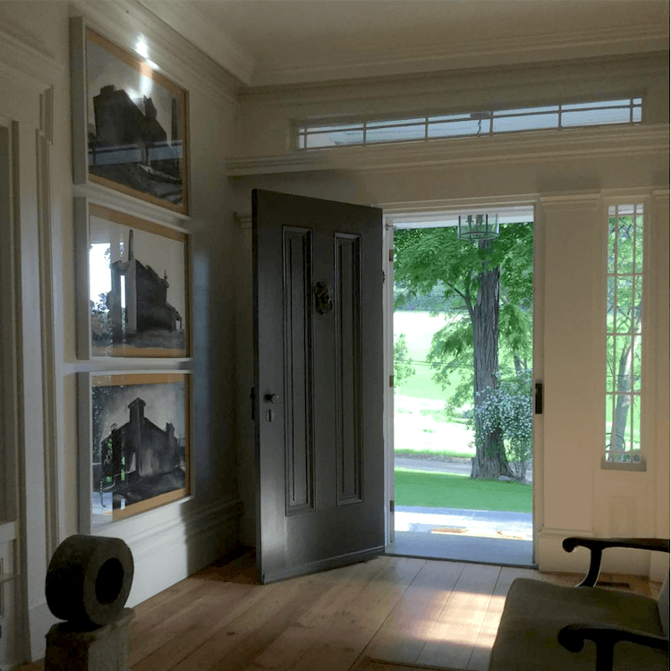
All of the doors in Gerald’s country home in upstate New York are painted black. No, I don’t know which shade of black. lol
Gerald frequently moves furnishings between homes and his shop. See the sofa above?
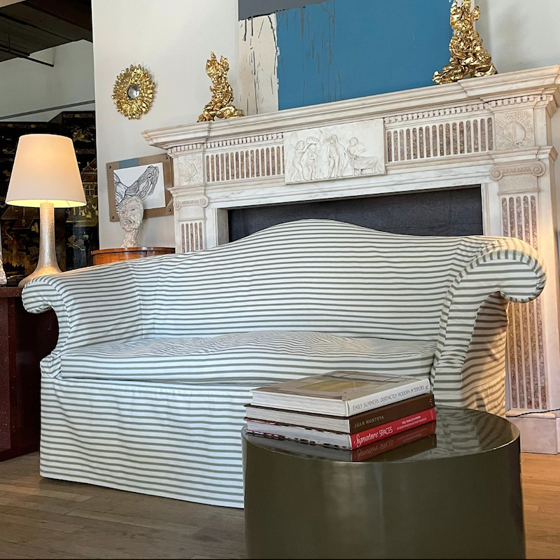
I don’t know if it’s the same one as here, but if not, it’s close. No matter, it’s mine! Haha. Not really; it’s not in the budget. However, I have long admired Chippendale sofas that are slipcovered. They tend to look somewhat formal, and the slipcover makes them more casual and accessible.
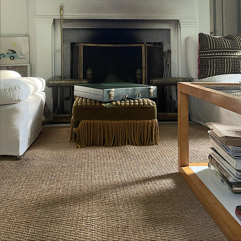
This one has to be my favorite vignette. There’s the seagrass rug, but what’s going on with the ottoman? It looks like the cute doggies had it for lunch. No matter. It’s that English Country Lord style. AKA: Old money.
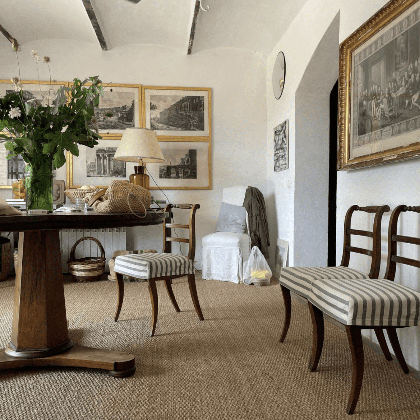
I don’t know where this is; maybe another room in his upstate home. They also made the striped cotton into slipcovers for the Regency dining chairs. Just wonderful!
Okay, I have put together a big widget full of home furnishings in the Gerald Bland style.
The majority of the furniture is reasonably priced. Of the more expensive items, there isn’t a less expensive alternative unless you’re fortunate to find something somewhere else.
Please make a note of these wonderful chairs for sale at Gerald Bland, Inc.
And now for the selection of home furnishings– in the manner of the Gerald Bland style.
I want you to know that I could keep on with this until Friday. It’s so much fun. Alas, it’s late. I hope you enjoyed taking a closer look at Gerald Bland’s style. Please be sure to follow him on Instagram if you aren’t already.
xo,

PS: Please check out the newly updated HOT SALES!
Related Posts
 Ben Pentreath And The New Guard Of UK Classical Architects
 Is Your Baseboard Heater or Radiator Making You Crazy?
 Confused About Your Paint Sheen? Here’s Why
 I Wanted Charming Home Decor, But Ended Up With Blah
 Come See the Plans for My New Living Room Wainscoting!
 The Living Room TV As We Know It Is Over
 Little Known Secrets On The Design Process


30 Responses
Slobbering over that gorgeous still life painting with parrot. I mean it’s gorgeous.
Dear Laurel, as so many have said, you really are such a great teacher! You have such an entertaining way of drawing the attention to seemingly unimportant details, and we know what they say about details! This was a great post, but all of your posts are so much fun. Thanks so much for your hard work. I feel like I’m taking a workshop!
PS I have been using White Dove for 25 years at least, and am patting myself on the back so hard right now for having just bought a jute rug for my bedroom, which looks so luxe. Happy New Year!
I love that he painted that ceiling gold. I have a lovely large living room and have always wanted to have the ceiling gold leafed, or if that would be too costly or labor intensive, at least a good imitation of gold leaf. I think it looks gorgeous, and casts a very flattering light on people.
This was a beautiful article. I have to admit I have not opened and read a lot of your post recently. I got discouraged and wanted to see what you had done to your place. You have such a great place and was wanting to see the wonderful changes you have made. I do understand it is best to live in your home to get a feel how you live in it before you make costly changes. Please let me know if I have missed a post on a room that you have completed. I have seen several ideas for the kitchen and stairwell but do not know if you have implemented any new design. You are so talented and I know at times it is hard for a decorated to do their own home. I would love to see.
Hi Daria,
You haven’t missed anything. Nothing has even started yet. I have talked about some of the reasons why in another post. We are scheduled to begin this June. Thank you for your kind words, too!
How nice to read that chartreuse is your favorite color! It is also mine. I had chartreuse velvet pillows made as some of the throw pillows on my greatroom sofa and I get compliments on them constantly. Thank you for this lovely post! As others have commented, these type of posts are why I read your blog. They are so informative and since I’m a visual example type brain person, I can see examples rather than read about them. Gerald Bland is one of my favorites, if not my favorite. The best advice I gleaned from your blog thus far was the 80/20 rule. Oh boy has that helped me decorate both of our homes. One is 80 modern and the other is 80 classic. Your insight has allowed me to enjoy adding surprising pieces into both homes that elevate each space. People comment on how interesting it is that I mix styles. I love that you taught me that. Thank you!
One question- I made the decision to paint my foyer and powder room ceiling gold but I want a reflective gold foil look. Is that a paint or do I need to start looking for a wallpaper? I’ve only seen gold metallic paint in tiny bottles at craft stores. Looking forward to hearing your response.
Hi Diane,
Thanks for the lovely note. I’d have to research the paint for an answer to that one. Many years ago we did a gorgeous gold metallic paper on the ceiling of a powder room.
Oh how I love this post! Bland nails the carefully collected room. His bid to the artful mixture of classic and modern is accomplished in a way that shows us that it is, with contemplation, OK to display admiration for the best of any design era. Your widgets are fabulous!
As to the damaged ottoman: Since it is purposefully situated to put the damage on full display, my guess is that there is a colorful (or perhaps historical) story behing the damage that he wishes to preserve. A conversation starter.
Laurel,
I love your post. I also love slipcovers. I am having slipcovers made for 2 wingback chairs. The person I hired sent me to a fabric store to pick out my fabric. I told the woman at the store that so and so sent me (she new who I was talking about) to pick out fabric for my slipcovers. She proceeded to tell me that slipcovers are on their way out! I said I didn’t care because I love them. Needless to say I did not purchase my fabric there as I thought her comment was rude especially since the seamstress sends her customers there for fabric!
I too think those floors might be done in Rubio Monocoat natural. I did my shelves in my kitchen with that it’s just the perfect thing to put on wood. It finishes it, but doesn’t give it a shiny new look. It’s so nice to know that he used white dove in his house. I’m re-doing a little home in Scottsdale and I used White Dove on all the walls and did the trim in white dove in a semi gloss. My doors are all black! I faithfully used my Laure home Paint Guide!!
Love this post!
I’ve been an admirer of Gerald Bland since I was first introduced to him on your blog. His livingroom in particular is the ideal combination of comfort and refinement. While reading an article in Town and Country Magazine I recently came across a quote by him, “The first and last thing you learn from looking at Andrea Palladio is to value strength and purity of form”. Henceforth, the term “strength and purity of form” will be in my mind whenever I choose anything for my home. Thank you for another wonderful post.
I wasn’t familiar with Gerald Bland. Thank you for the introduction.
Laurel, What a fabulous post! I love Gerald Bland’s style and have for years. Everything you posted was just beautiful and the widgets are spectacular. I love this kind of post! I used to love the high/ low in Metropolitan Home. More, please…XOXO
I have been inspired by Gerald Bland’s style for several years. Now I know I am looking at 80%/20%! THAT gold ceiling idea!!!
Thank you Laurel for feeding us value information with your delightful humor!
His style is not exactly mine (ha! one could only wish), and I could never live with bare floors, but exposure to what is superb can only elevate one’s taste level. The items in the widget are so beautiful, each and every one, and thank you once again, Laurel, for the hard work you put into posts of this kind.
I’m in love! I started following Gerald Bland a few years ago after you referred us to his instagram page. So refined, yet live-able and crisp, yet warm. Gorgeous taste! I so appreciate your approachable writing ✍️ style, Laurel!
The Parisian apartment is pure eye candy. I appreciate his style, except for that fringed ottoman. Ew.
I literally drool over Gerald Bland’s house (and shop) everytime I look at his Instagram—which is almost daily! I can only hope to find similar things in thrift shops. But love this post! Thanks.
Thanks, Laurel. This is my favorite kind of post – I love how you take such a gorgeous look (Gerald Bland is one of my favs!), identify what makes it work, and then follow up with a “get the look” shopping list. It’s a mini master class and so much fun. Thank you for the time and heart you put into each post.
Hi Laurel
Great beautiful post
Unfortunately, ur pop up to enroll keeps coming back and blocking ur article. I enrolled twice to get it to go away but it wouldn’t.
What an informative post, Laurel. A lesson in how to build a beautiful environment. I appreciate especially once again your attention to how to visually raise the ceiling (literally and figuratively). You are a superb teacher. I like the ottoman vignette too. Perhaps some of the “old money” is in that attache case.
A couple of years ago I scored a Kindel Philadelphia Marlboro Sofa from their Winterthur Collection for $350 on Craigslist. It was done in silk that had essentially decomposed. I took it down to the frame, filled with carded wool batting from a sheep farm in upstate NY, covered the batting in an organic cotton tight weave barrier fabric, and finished it off in linen (Yes, I reupholstered it myself). I also made slipcovers for it in white linen with straight skirts to the floor (Yes, I sewed them myself). I have to admit, when I made the decision to approach the slipcover in that style I was a little concerned whether my choice was right. My slipcovers slide over the sofa and fit like a glove and really do look beautiful. I feel very happy with myself right about now and 100% vindicated. Gerald Bland’s slipcovered camelback sofa is a dead ringer for my own. Apparently, I’ve learned a thing or two from you over the years, Laurel. As always, thanks!
Echoing Mac: this kind of post is my favorite on your blog. What I especially like about Gerald Bland is the mixture of classic/antique and contemporary. Please keep pointing out (as you have before) that doing everything in one style/period can be a bit flat, and that mixtures (not hodge-podges) make rooms vibrant and interesting.
That was so interesting and I love everything of his style. I’m a slipcovered girl. Everything in my home(almost everything) is white slipcovered. It’s so fresh and easy and lets everything else stand out. I had dogs and it also allowed them freedom. But the look is never out of style and I love seeing the mix of antique and contemporary-my favorite. I could keep studying him til Friday too. Oh and the floors. I now want those matte natural floors.
Thanks for that journey!
Beautiful! I love the ‘deconstructing style of…’ posts.
Happy New Year!
So much to take in, here. But all that slipcovering is spectacular! I love how it takes away the “you can’t touch anything in this room” to, perhaps, “I love dogs but don’t want them wrecking my furniture” (well, except the ottoman).
ANYWHO…the first photo confirmed what we decided to do with our new floors/old stairs & doors dilemma. Which means you’re an excellent teacher and, apparently I’m learning something in spite of myself.
Hi Laurel,
I love this post! I must admit I never heard of Gerald Bland but I will follow him now!
About the seagrass rug…. It’s difficult to see in the picture, but do you think his seagrass rug has a band around the perimeter or not? What is your preference?
Thanks!
Following up on survey feedback, Laurel, I love everything about this post! It’s informative, inspirational, and gorgeous. Posts like this are why I read and subscribe to your blog. Thank you!
I discovered Gerald Bland’s style 2 years ago. I am a white slipcover and green loving gal so I really love his style-he does it so well! Thank you for all of your hard work to put this post together. I am hitting Chairish now!