

Hi Everyone,
Phew! This post has been epic! But, it’s done. Hooray!
I don’t believe I’ve ever done a three-part post with two anchor links. The first link that says part 3 goes to the final installment, part 2, was from last Wednesday. If you’re here for the first time, would like to review or whatever, please begin from the top of the page.
I managed to whittle it down to only 16 colors, even though the original title said 12.
In reality, there are often many colors that are so close it really does not matter. And I will be sharing a fantastic visual example of why it doesn’t matter.
Today, we are definitely finishing all of the colors. You’ll find a widget you can save to social media and also a shopping widget if you’re interested in getting some samples.
Part 3 Begins Here
Hi Everyone,
Today is the second installment of some my favorite Benjamin Moore Timeless colors. It’s impossible to do only 12. One reason is that there are some Farrow & Ball colors, as well. If you read part one and wish to skip to part 2 please click the link below. Otherwise, please start from the top.
Part 2 Begins Here
(Part 1 begins directly below)
Hi Everyone,
Oh man! I took photos for another post, but another topic is on my mind.
I alluded to a little surprise in my Hot Sales Love Note I send to subscribers.
Love Note, Laurel?
Yes, that’s what I call it. What would you call it? Marketing Bullshit Note? ;]
Anyway, the surprise is that, after over nine years, I am planning an update to the Laurel Home Paint and Palette Collection.
But, here’s the deal.
It will be in phases.
- Update #1 will be later this month.
- Update #2 will be in late September, as we celebrate the 10th Anniversary of Laurel’s Rolodex! I know, I can hardly believe it myself.
Then, in November, please expect the usual Etsy Guide update, along with an update to 333 Rules & Tips You Need to Know.
Here’s the good news:
Current owners always receive free updates — unless you’d like to purchase any of your guides again. You don’t have to, but the option is there.
So, let me get this straight, Laurel. If I purchase any of your guides right now, I will automatically receive all of the future updates for free?
Yes, that’s right. You will. And you’ll also be privy to the current pricing. Everything will be going up in price and the 333 Rules & Tips you need to know is going up substantially; when, I’m not sure. It is way underpriced for the immense amount of information that will help make your life easier and also yield better results when you furnish and decorate your home.
A new section, titled “Renovation Rules & Tips You Need to Know,” will be added, and that will also include information on kitchens and bathrooms.
Oh man! I could’ve used that one, but I will put all of my years of experience, plus my personal renovation injury, sorry, I meant (and please forgive the kind of icky word) journey.
I also plan to make annual updates to the paint and palette collection. There will still be 144 colors, but like Farrow & Ball, some will be archived. The information will still be available.
While it’s an evergreen guide, the thing is that I wrote the two-part paint and palette guides in 2016. And since then, I’ve been researching and studying, as well as sampling dozens of paint colors.
Getting back to the topic at hand regarding my 12 Favorite Benjamin Moore Timeless Colors
Laurel, can you really whittle it down to only 12?
Are you kidding? Of course not, but if I put 150 paint colors, I’d never get the post out, and I’d have to charge you. haha
Still, these are some truly feel-good timeless colors. At least I think so.
But here’s the most important thing to remember about paint colors.
The wall colors are only one element in the room. If it’s a traditional or even a wannabe trad home, the bones must be there. It makes ALL the difference. We’ve seen it in spades in my bedroom.
Additionally, if you’d like to see more colors, there’s a nearly five-year-old post about my 20 All-Time Favorite Benjamin Moore Paint Colors. That you can see here. There are a few from that list, but this list includes some new favorites.
The beauty is that these 12 Benjamin Moore timeless colors all work well together, allowing you to create a coordinated home palette.
Okay, let’s begin.
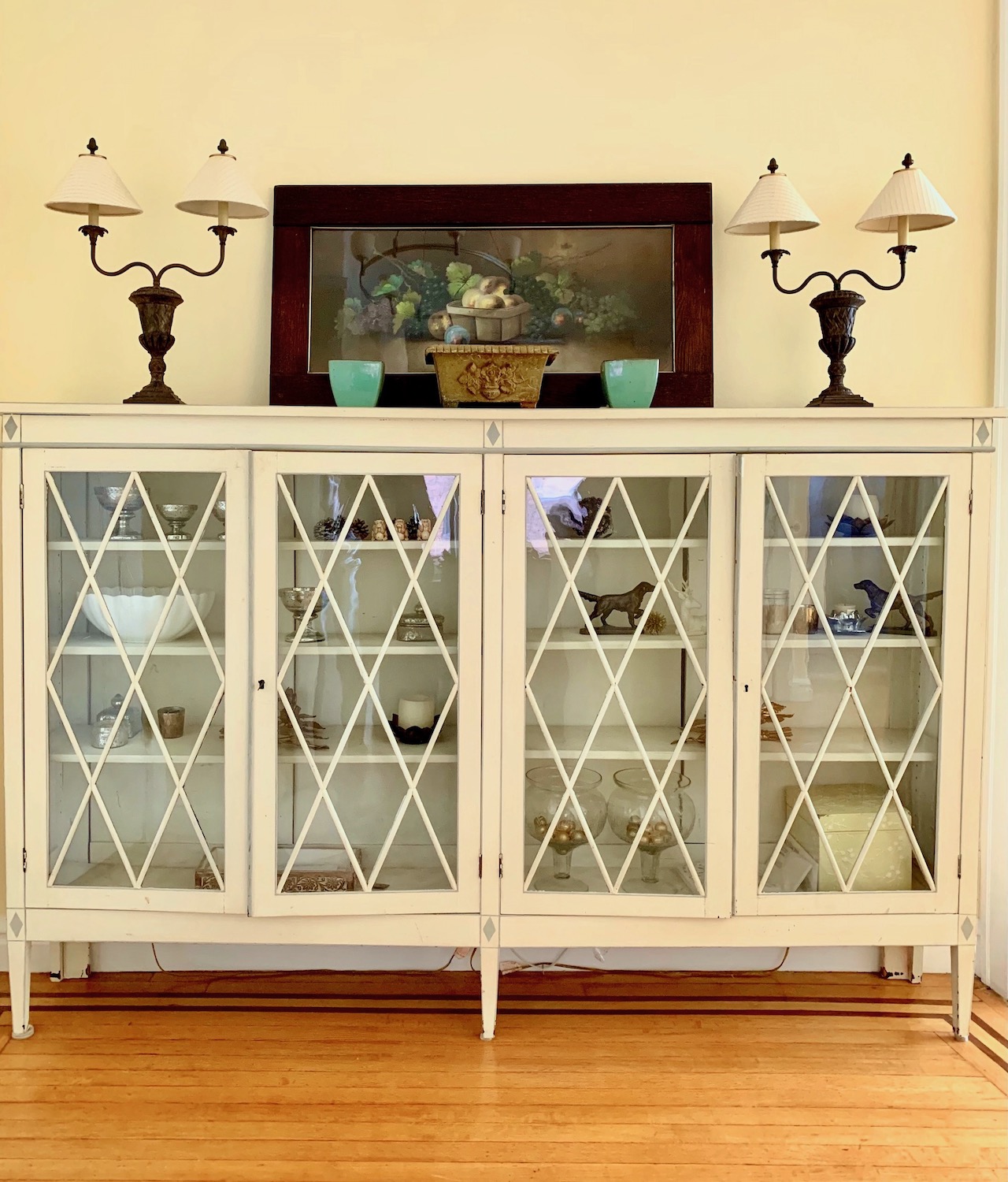
There are three shades of white, and please forgive me if your favorite didn’t make the list.
However, I am offering you more than three shades, and here’s why.
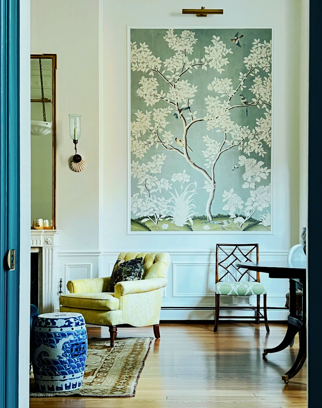
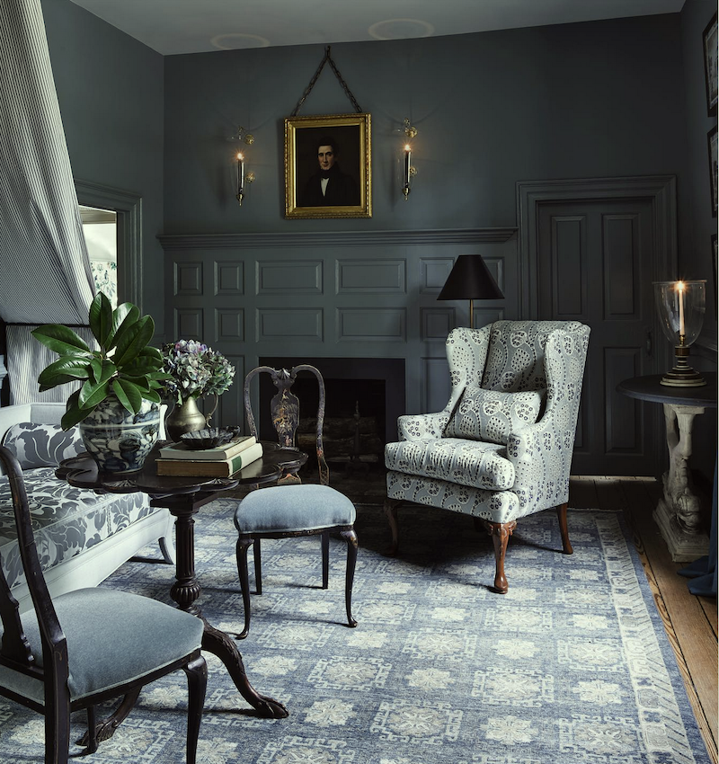
Below is a tight shot of the crown moulding, picture rail, and panel moulding, taken close to the garden door. I promise we’ll be getting to that. However, in the meantime, this post is about my favorite timeless paint colors.
Most of you who have been reading for a year or so will remember the debacle with my bedroom’s paint color. Ugh. I’d prefer to forget all about the painting (and floors).
My point in sharing this image is that the walls and trim are the SAME color.
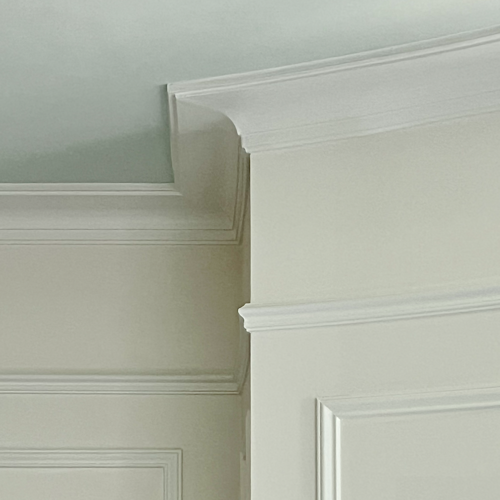
Benjamin Moore COTTON BALLS oc-122.
Oh, Laurel. That can’t be true. If the walls are Cotton Balls, the trim looks more like Chantilly Lace.
Yes, you are right. Or, at least some other shade of white with far less pigment in it.
Yet, they are the same color, only different formulations. I don’t mind it because I love the tone-on-tone look.
However, there is no better demonstration of my point than what you are seeing here.
Don’t sweat it, because “It’s all a big crapshoot anywho.”
Oh, I know you will. After all, I am still sweating when it comes to selecting paint colors.
Anyway, my long-time love-child is:
COTTON BALLS oc-122
Now, some worry that it will look GREEN. That’s because the colors on that fan deck page are all green. If there’s any green, it’s exceedingly passive.
Still, if there’s a lot of green outside your windows, your walls painted Cotton Balls may indeed appear green. But so will all of the other shades of white. If you’re really worried, then use Simply White to counteract the green.
In any case, I’ve found Cotton Balls to be a chameleon of sorts.
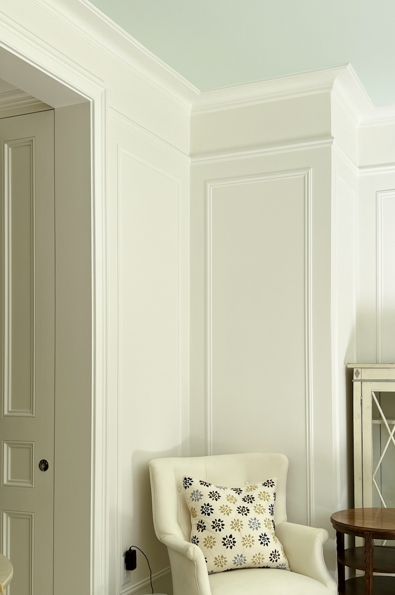
While it looks rather creamy here, this was taken at 3:30 today, and the sun was already out of sight as it sets in the west-northwest at this time of year. Most, it reads as a soft, warm, white. And sometimes it looks pretty darned white. But it always looks beautiful.
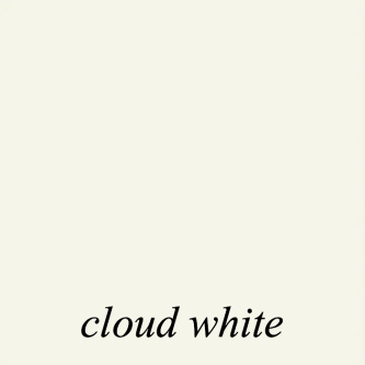
The color out in the embrasure hall is different.
It is CLOUD WHITE oc-130.
It is also the trim in the living room with
MOONLIGHT WHITE oc-125 as the wall color.
Those two whites are wonderful together. Cloud White is a hair brighter, which adds a subtle touch of interest. What’s funny is that the contrast is greater with the All Cotton Balls in the Bedroom.
Here’s the thing with Cloud White.
In natural daylight, in my often fairly bright south-facing living room, it is as lovely as can be. And it’s also exceedingly lovely in the embrasure hall, although I’m not fond of the recessed downlights. That was a result of renovation fatigue. But, in the grand scheme, it’s not a big deal.
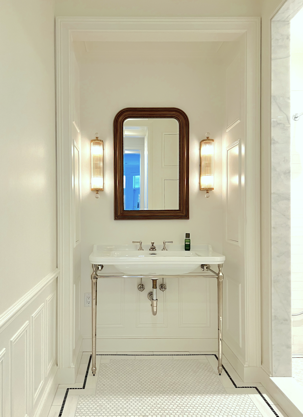
The bathroom is another story.
All the lights in the bathroom are LEDs and emit a very warm glow. I did LEDs because I didn’t want to have to mess with changing bulbs every year or so. The Cloud White in the bathroom looks very creamy, almost yellow. But so would the others. Again, it’s fine, and it tends to photograph more yellow than it is.
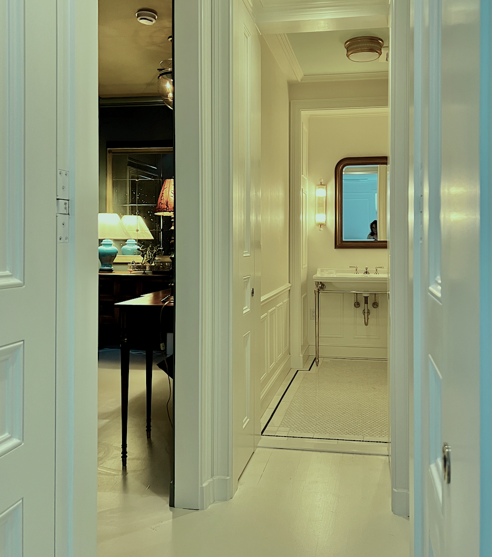
However, the other fixed elements give away the fact that the entire room is washed in a very warm light. Again, it’s not quite this yellow. And yes, the hall and the bathroom are the same color, along with the trim and walls. Here, too, with everything painted Cloud White, the bathroom trim looks brighter than the walls. So, can you see why it’s best not to stress it?
Too much. ;]
This one is more accurate.
What are the three white paint colors, Laurel?
Okay, for a good all-around warm, beautiful white, I do love Cotton Balls, followed by Simply White. Cloud white is also a beautiful, warm, creamy off-white.
It’s not as creamy as Ivory White/Acadia White (the same color), one of the Laurel Home Collection white paint colors.
What about White Dove, Laurel?
Well, my white floors are White Dove, and it has always been on my list as a great wall color. I mean, since forever. However, they keep messing with the formula, and now I’m unsure. It’s probably fine, but when I looked at it recently, it was kind of muddy, and so was Swiss Coffee. I am sure they are still great white paint colors. The best is to try out a few and see what works best in your space.
The last color I recommend wholeheartedly is SUPER WHITE oc-152
Below is one of the mood boards from the Palette Collection.
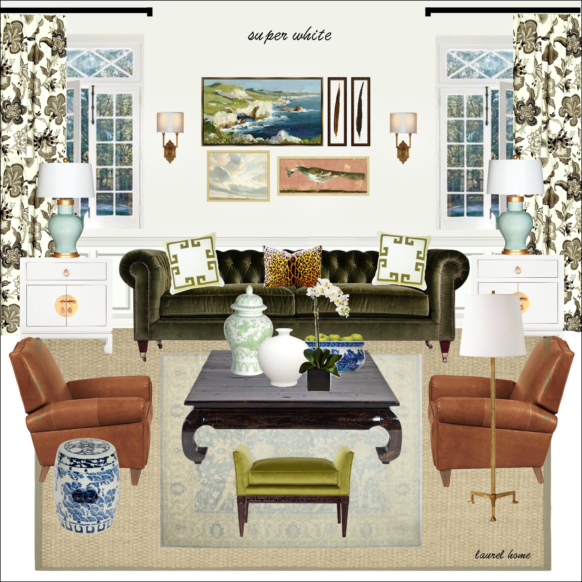
I used Super White for all of the trim when my Bronxville apartment was painted in 2020. It is a lovely, clean white. It looked wonderful with Benjamin Moore’s America’s Heartland.
However, please check out WHITE HERON/OXFORD WHITE. It’s a hair deeper.

The three shades of white are in bold caps, and their subs are in lower-case below them.
COTTON BALLS
simply white
CLOUD WHITE
moonlight white
white dove
SUPER WHITE
white heron
chantilly lace
Seriously, you are covered, even with only the three in bold, but there are situations where the subs might be better for a variety of reasons.
I had a big job, and I can’t believe it, but it was in 2005. We used cotton balls for the trim in every room, and there was a wide range of colors. It looked terrific everywhere.
Oh, gosh, we have NINE more of my favorite Benjamin Moore colors.
I’ll complete three more, and then we’ll finish on Monday or Tuesday.
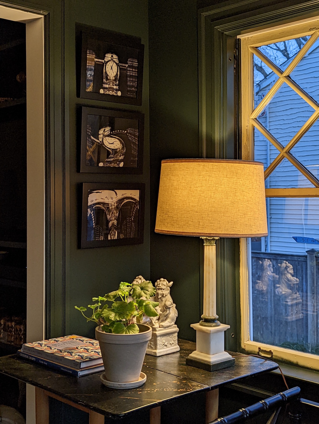
The next color is KNOXVILLE GRAY hc-160, the color I used in my lower-level entry.
The more I live with this dark, moody color, the more in love I become with it. It looks rather drab on the chip, but it is a dark green that everyone will love, even folks who don’t particularly like green. This one’s different. It’s like stepping into a pine forest; it’s cool and refreshing in the summer and warm and cozy in the winter.
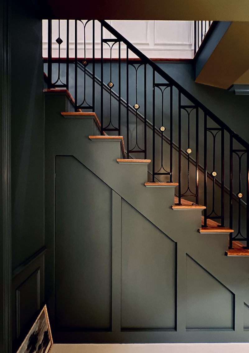
For more images, please check out our recent post, where we covered the lower-level entry.
BTW, that’s Cloud White on the wainscoting upstairs. So, you see, juxtaposed against the deep color, it looks pretty darned white.
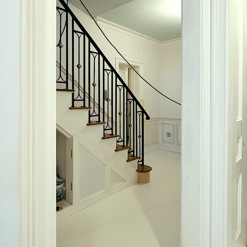
Everyone loves those hidden doors under the stairs! I get a bang out of watching their eyes light up when they see me opening them.
While I love the ceiling color, NEWT GREEN, it’s not going on the list because it’s not going to be a color everyone will love.
The next color is a dupe for Martha Stewart’s Bedford Gray. It was featured in one of my favorite posts about the best exterior paint colors.
It is another Benjamin Moore Historical color
ROCKPORT GRAY hc-105

Rockport Gray hc-105 above
and Martha’s Bedford Gray Below

All of the restored antique homes that dot her 150-acre property in Katonah, NY, are painted this color.
And only this color, trim, doors– everything. And it’s all jaw-droppingly beautiful.
This is the quintessential Colonial putty color.
It’s not green, gray, or beige, but a combination of all of them.
It’s a true pewter gray.
This color can be used indoors, as well.
Tiffany Leigh Design. She has a beautiful, fresh contemporary/new trad style.
Patrick Biller Photography – Oh, check out this stunning home on his Insta!
The last of the timeless Benjamin Moore colors I love is the new color for my bedroom ceiling.
It is a most ethereal, pale green with a bit of blue. I still have Opal Essence in the hall and bathroom ceilings, and it’s lovely, too.
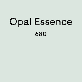
But for the bedroom, Opal Essence felt a bit too much. I know it doesn’t look like a big difference, and it’s not. So, if you’re looking for a beautiful pale blue for your ceiling, I very much recommend both of these.
Okay, more coming soon! I hope you’re having a terrific 4th of July weekend!
xo,

*********************************************************
Part 2 Begins Here
Wednesday, July 9, 2025
Hi Everyone,
Oh, I hope this oppressive heat breaks soon, as they say it will!
Today, we will finish with the remainder of my 12 favorite Benjamin colors.
haha
The not-very-funny joke is on me.
12?
How about 112?
In any case, it’s probably at least 22.
So, let’s dive in.
I’m beginning with another white color from the Williamsburg Collection.
It’s a whisper deeper than White Heron, and for darker colors or if a less stark white is needed, this one might be the ticket.
HARWOOD PUTTY cw-5
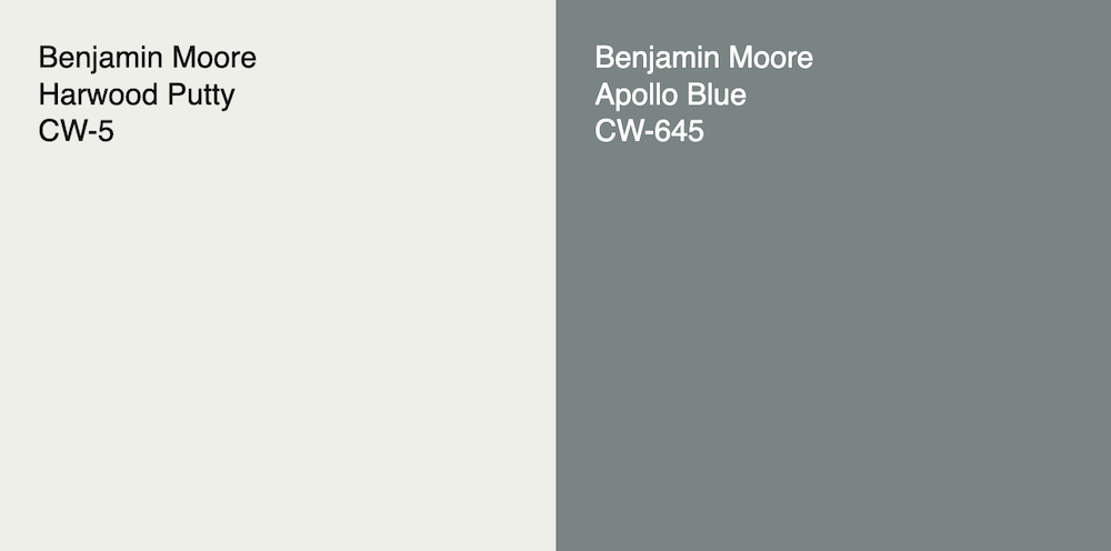
This color looks gorgeous with all the other colors.
Below the walls are Harwood Putty, and the trim is Williamsburg Wythe Blue, not to be confused with Wythe Blue in the historical collection.
🙄


The Benjamin Moore company is the King of confusion, with its dozens of clones throughout the website (same color, different name or different number), and some, obviously, meant to demean and confuse. (to sell more paint?)
My favorite color quagmire is that one of their most popular white paint colors, and one of the primary players in my own home,
Cloud White oc-130 has a palindrome of sorts with the color White Cloud 2159-70.
Cloud White vs White Cloud
Huh?
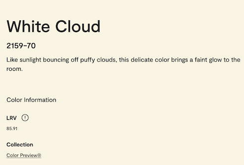
Imagine coming home from vacation and, upon seeing your newly painted house, you are met with YELLOW White Cloud walls instead of the soft, Cloud White walls.
I’m sure it’s happened hundreds of times.
The glorious Heckfield Place Hotel in England
Yes, they changed the name, for obvious reasons. It’s now Jockey Hollow Gray hc-108.
If they can do that, they can change Cloud White to something else, like Baby Gromitz White. That works.
You know. Both of my babies projectile vomited for the first seven months of their lives. Good times.
(Yes, I consulted with their pediatricians and was reassured it was not anything serious. Cale weighed 22 pounds when he was seven months!)
The Next color is one I looked at a lot, and that is APOLLO BLUE from the Williamsburg Collection.
Remember when we were looking at this idea?
And there’s more about the color in this post.
While there are a few Williamsburg colors in the Laurel Home Paint Collection, this was the newest collection at the time and not totally on my radar. However, I’ve since discovered that, like the Benjamin Moore Historic Collection, there are some exquisite colors on there.
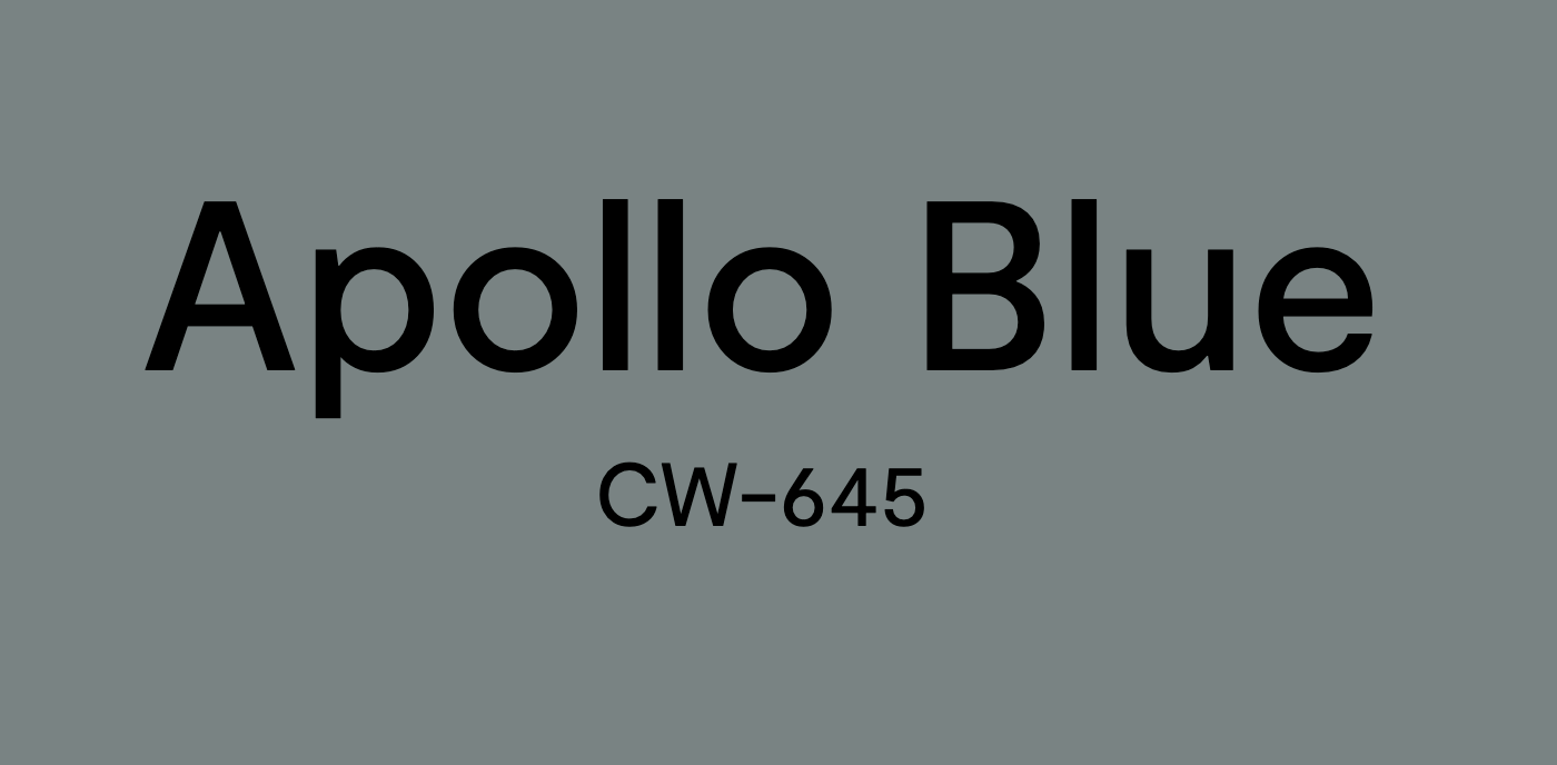
Heather Chadduck Instagram – Benjamin Moore Apollo Blue Nelson Galt House Williamsburg
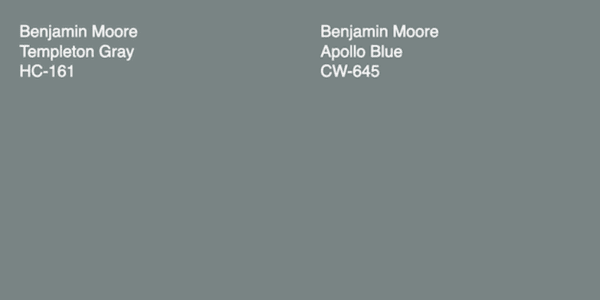
Apollo Blue is one I sampled for the downstairs entry, and it would have been beautiful; had I sampled it, I’m sure I would have loved it. It is also very close to the lovely TEMPLETON GRAY.
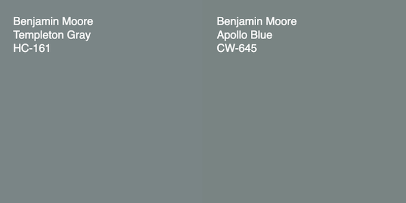
And Templeton is the 1st cousin to Knoxville Gray, just a shade lighter.

Incidentally, early this afternoon, I was walking down the stairs with the lights off and happened to notice the less dominant blue tone popping through.
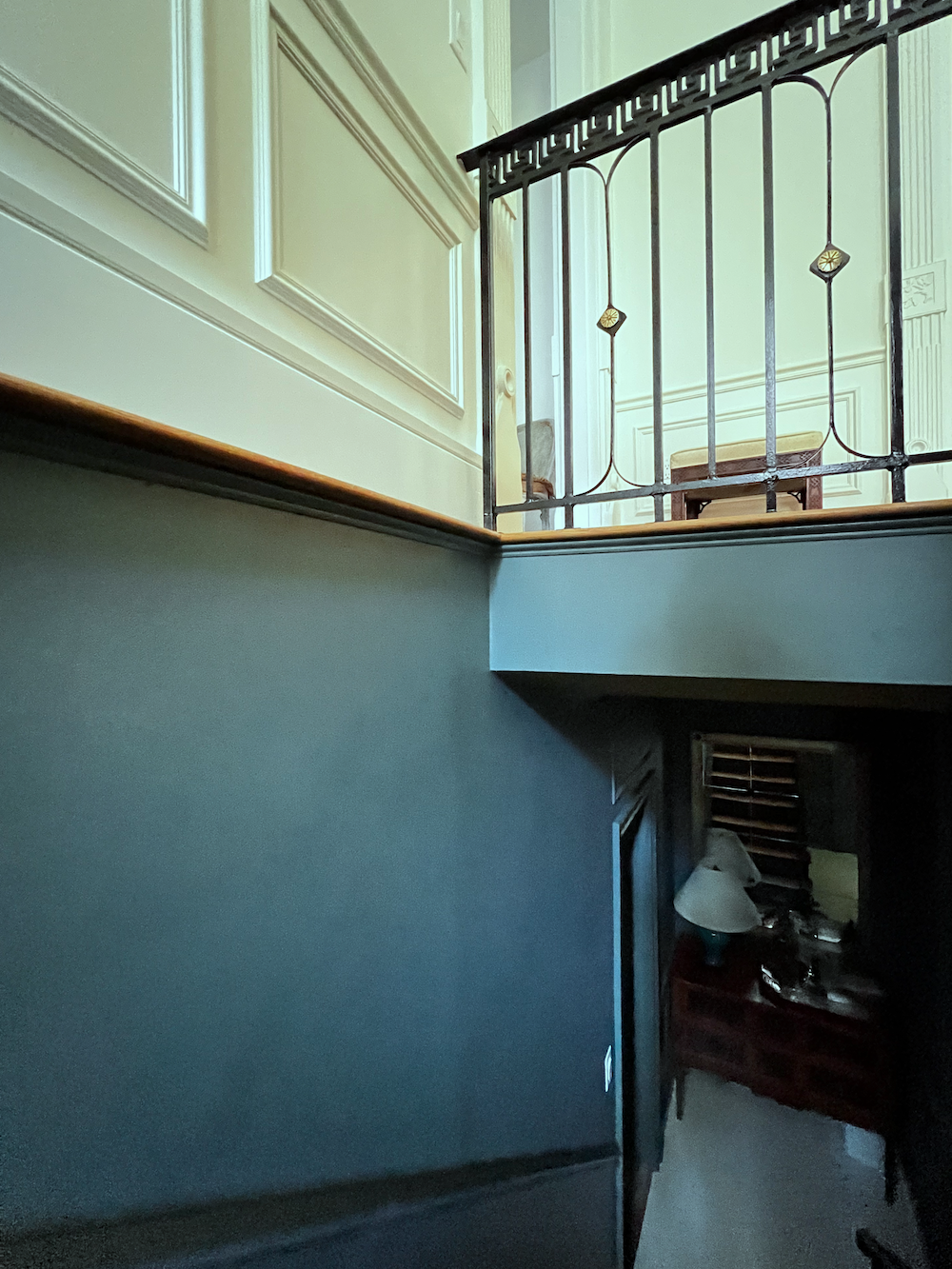
But as you can see, the color looks more blue on the staircase portion than below it. If you’d like to review this fantastic color, here’s a link to the recent post about the lower level entry.
If you live or are visiting Boston, a trip to the Beacon Hill Bookstore is a must-see the gorgeous three-story shop on the iconic Charles Street, designed by Cathy Kincaid.
I took the photos below a few days after it opened.
![]()
![]()
The entire main floor is painted in Farrow & Ball Light Blue. And it is absolutely glorious.
Story Time.
In February 2024, I was at a tea and tour at the bookstore, and I asked the guide what the paint color was. The woman smiled broadly as I’m sure she’s asked this 20 times a day, and without one second hesitation, “It’s Farrow and Ball Light Blue #22. “I said, half jokingly, it looks pretty green to me.”
Then, a young woman on the tour looked back at me like I had three heads and said quite emphatically:
“No, it’s definitely blue.”
I said, “Yes, there’s blue in the color, but I see it as a sage green– a green-gray with blue in it, but I would classify it as a shade of green as that is the dominant color.”
She said, “Well, we all see color differently.”
Uh huh. 🙄
Didn’t she know who you were, Laurel?
Who am I?
Oh, Laurel!
I mean, what was I supposed to say to her?
“Listen, you pratonizing little twirp, I’ve been specifying colors since long before you were born, and it’s part of how I make a living. And if I say it’s green, it’s green. Okay?”
Did you say that, Laurel? Would serve her right!
Of course not. I said nothing and let her think I’m a clueless old woman. sigh…
Additionally, the lights in the store accentuate the green. So, let’s look at the color without the lights.
It looks so gray, Laurel.
Yes, and this is a wonderful lesson. Paint colors that appear gray and dull in small doses become brighter and appear much less gray on the walls.

Below is our Benjamin Moore equivalent.
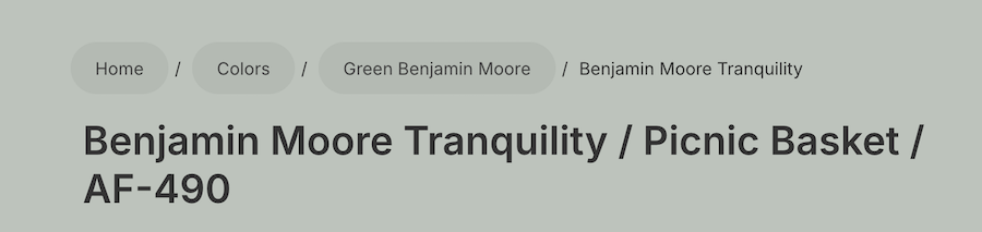
On the Benjamin Moore conversion chart, which sorely needs updating, too, I have Picnic Basket.
What happens is that the F&B fan decks are sometimes way off color, and all of them are different.
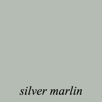
So, that year, PB was a better match. It’s not terrible, but the Laurel Home Paint Collection Silver Marlin is better. Actually, it’s not bad here. And yes, there’s another clone– Tranquility in the Affinity Collection. Picnic Basket is in the Color Stories Collection.
However, to drive my color point home. The color below, Benjamin Moore Blue Porcelain 1641 is blue.
Although this one, too, has green in it, the dominant color is blue.

Below is a desaturated tint of blue with little or no green.

Compare this to F&B “Light Blue.”
Okay, ’nuff said.
Another very beautiful historic blue color is Benjamin Moore *WOODLAWN BLUE hc-147.
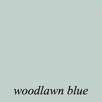
While it, too, has a lot of green in it, I would say it flips to the blue side of the spectrum.
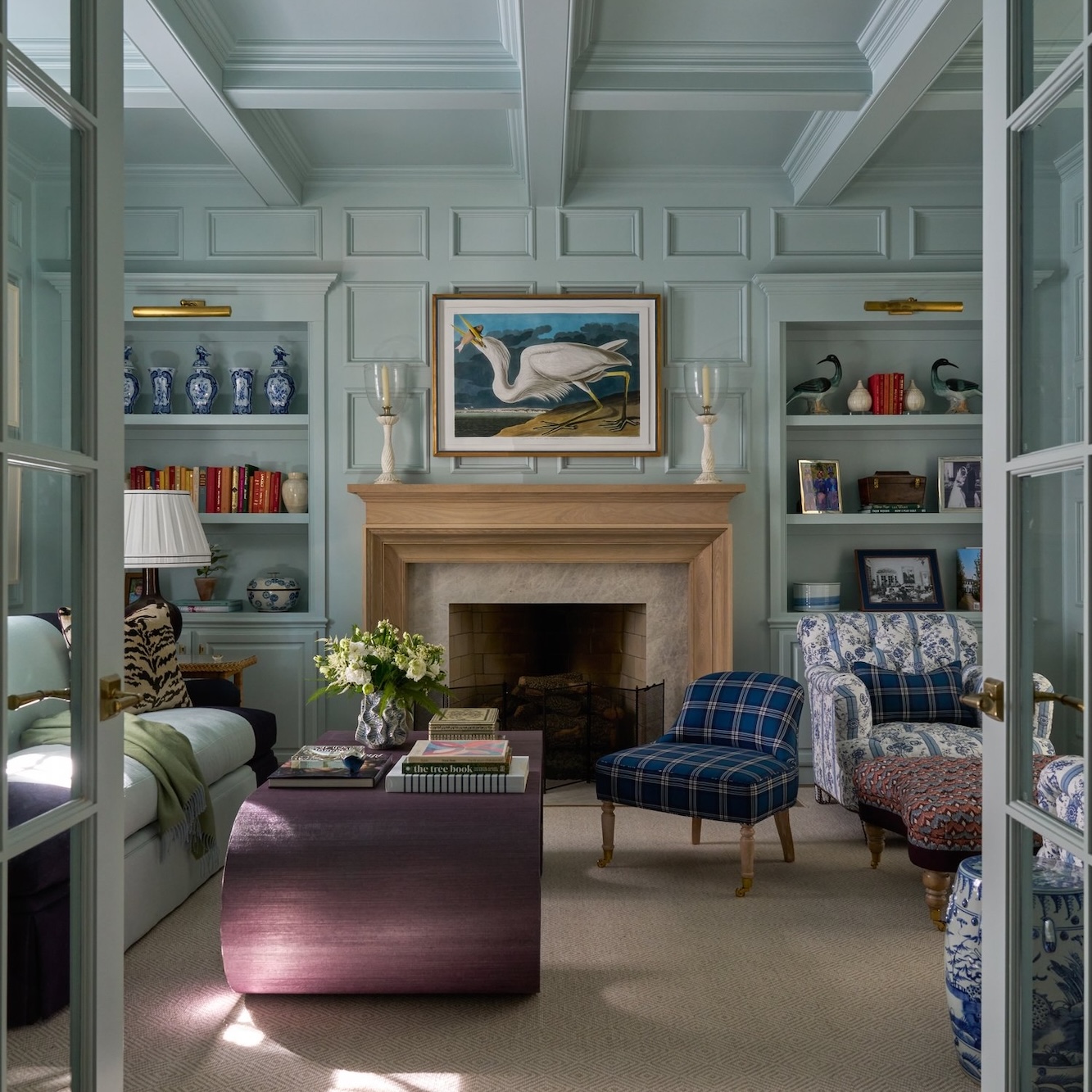
Avrea and Company University Park Wentwood living room Woodlawn blue hc-147
However, do you know what makes this room so outstanding?
Yes, the architecture– all of the beautiful mouldings and millwork. However, the color is the icing… Woodlawn Blue makes a fantastic background for art, and as you can see, it acts as a neutral.
Okay, we have to stop for now, but I should be able to finish this up on Thursday. There are some amazing colors coming up!
If you need some no-mess color samples, I recommend the Samplize samples, which you can get here. They have a backing, but I just taped mine to the wall.
xo,
*********************************************************
Part 3 Begins Here
Sunday, July 13,2025
I was debating making a separate post for the final group of paint colors; however, it makes sense to have them all in one post.
Okay, this took much longer than I had anticipated. You’d think after 13+ years I’d have a handle on things, but no. It’s the same with estimating how long it takes to get ready to go somewhere.
Anyway, I have come up with my 12 colors, plus 4 white paint colors.
As I said, it could’ve been hundreds.
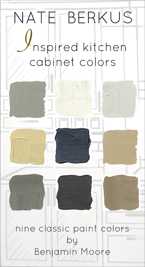
First, I made a graphic, and then we’ll do a brief review of the colors we haven’t looked at yet.
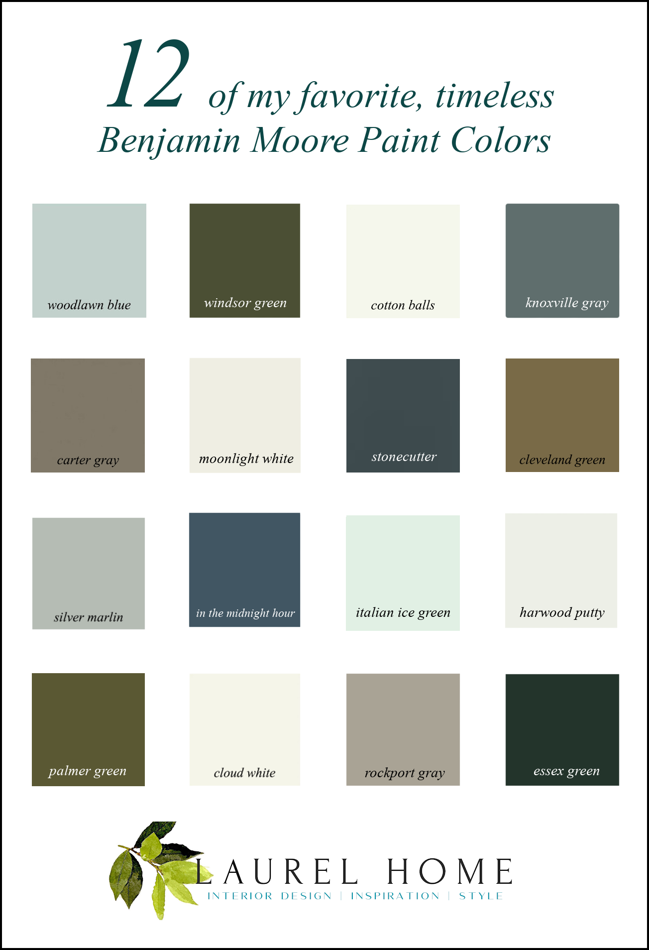
Please pin to your Pinterest boards for reference
Another color I looked at for weeks during my renovation was both Windsor and Palmer Green from the Williamsburg Collection.
Below is the rich, beautiful WINDSOR GREEN CW-505
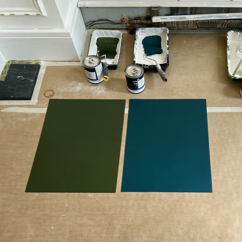
It’s a stunning deep green and reminds me of Tory Burch’s green living room. Only her walls are velvet.
Remember when I was looking at all of this (below) about 16 months ago?
It’s fun to compare what I was thinking of and what I ended up with.
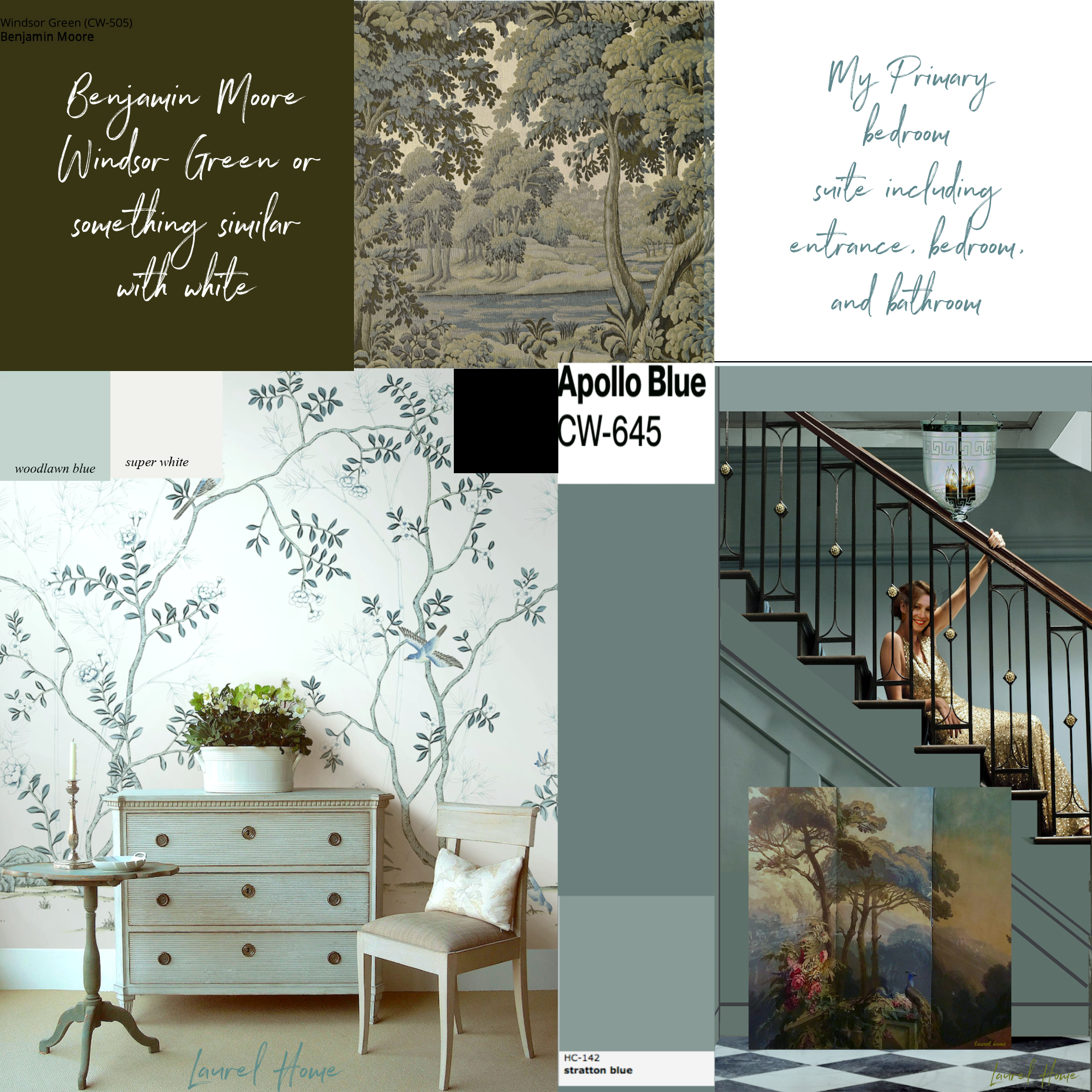
This is a wonderful color, but like many others, it should not be used in large rooms.
PALMER GREEN cw-475 is the quintessential Olive green, and frankly, it needs to go in my collection. I love it!

Palmer Green looks gorgeous in Holly Browning’s Home.
However, if you want something a little less green, then you can’t go wrong with CLEVELAND GREEN 1525.
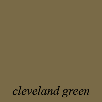
Cleveland Green is a similar color to these fabulous deVOL cabinets.
CARTER GRAY cw-80 is one we’ve looked at a few times. It’s one of those colors that will change with the light, from gray to taupe to a toasty brownish green-gray.
STONECUTTER 2135-20

I came across it recently and love its quiet sophistication. It’s adaptable for traditional and contemporary interiors, alike.
This is an AI pic I found on Studio Dearborn’s Insta account!

The back of Darryl Carter’s gorgeous cabinet looks a lot like Carter Gray. No, I don’t believe it was named after him. :]
Above are beautifully styled shelves by John Jacob. This color is similar to Carter Gray, too.
Let’s bring down that graphic once again. My fingers are a bit fried at the moment. haha
ESSEX GREEN hc-188 is one many of you will remember because of how gorgeous it looked in Melissa Tardiff’s sunroom she had built a few years ago.

This is also a great example of how a warm light bulb will add yellow to a paint color. So, it’s advisable to test with the lights on and off.
IN THE MIDNIGHT HOUR is a new color never discussed. While there are so many fantastic dark blue colors in the Laurel Home Paint and Palette Collection, there’s always room for another.
I chose this color because I found a swatch somewhere of a dark blue gray that doesn’t skew purple. The closest I found was this lovely color. And it’s a favorite of other people, as well.
While we’re on the subject of colors looking different in photos from what they are. Please check out these rooms, all painted in Templeton Gray. It’s the twin, maybe fraternal, we’re not sure of Apollo Blue.
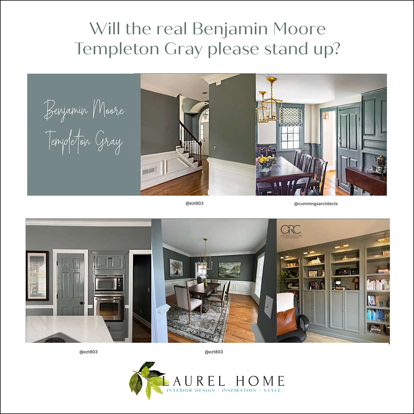
Yeesh, is right! This is a perfect example of why one should never choose a paint color from a photo. And, also why when folks ask me “What color is this? You’ll get a cheeky response from me, something like:
“It’s gray.”
The last color is a new one on the blog. I wrote something about it about an hour ago, and my WordPress decided to log me out and didn’t save what I wrote. Anyway, I’m planning on adding this one to the Laurel Home Paint and Palette Collection.

Blanc Marine Living on Instagram
You also might enjoy reading these two posts:
Six Drab paint colors: Should you try them?
And this post below, written after I met Nate Berkus in 2017.
Okay, after over a week of this, we’re finally finished.
If you’re looking to get some samples, please head over to Samplize. They’re so easy to use and no mess. Plus, the test pots are horrid, positively awful, and less than useless. Below is a shopping widget for all of the colors in the graphic.

Have you had a chance to check out the Nordstrom Anniversary Sale? It’s really good this year.
This link will take you to some of my favorites from the sale. It’s my annual Ground Zero post for the sale, where you’ll find the latest updates and faves.
There’s also a link to the ground zero page under the HOT SALES section in the main navigation menu.
I’ve added a whole bunch of new items and will be adding more later today.
There are also some fabulous items on regular sale. The difference is, everything on the Nordy sale is definitely ending on August 3rd. However, if there’s something you want, please know that some popular items sell out very quickly.
If so, I would keep checking back because items might become available if they’re returned.
xo,
***Please check out the recently updated HOT SALES!
And also, if you missed the above announcement, the Nordstrom Anniversary Sale is in full throttle now!
There is now an Amazon link on my home page and below. Thank you for the suggestion!
Please note that I have decided not to create a membership site. However, this website is very expensive to run. To provide this content, I rely on you, the kind readers of my blog, to use my affiliate links whenever possible for items you need and want. There is no extra charge to you. The vendor you’re purchasing from pays me a small commission.

To facilitate this, some readers have asked me to put
A link to Amazon.com is on my home page.
Please click the link before items go into your shopping cart. Some people save their purchases in their “save for later folder.” Then, if you remember, please come back and click my Amazon link, and then you’re free to place your orders. While most vendor links have a cookie that lasts a while, Amazon’s cookies only last up to 24 hours.
Thank you so much!
I very much appreciate your help and support!
Related Posts
 Stunning Architectural Features That Make a Big Difference!
 The Hidden Entry Doors With Wainscoting Are Finished!
 The First Renovation Tour Of The Upstairs Living Areas! (Parts 1 & 2)
 Renovation News and Deets!
 The 6 Best White Kitchen Cabinet Colors + Duplicates!
 Is There A Code-Compliant Chic Staircase Railing?
 My Room Isn’t Blue. Can I still Do Blue and White Chinoiserie?


38 Responses
Appreciate the effort that went into this post. I came across it by searching ‘benjamin moore newt green’, and even though it was briefly mentioned, I stuck around to read the rest of your post and insights. Thank you!
Thanks so much, Alyssa!
STONECUTTER!
I don’t normally comment, but I just had to. The last time I ended up painting my grandparents’ dining room before they passed I asked them if I could surprise them. It had been a generic blah concrete looking grey beforehand.
Tiny little room. Real low ceilings. One window facing north.
I swear it was teal in some light, black in others, sometimes hunter green, sometimes navy. And it managed to make all the mishmash of wood tones of all their random furniture, every single one, just look so good. I was looking at my fandeck the other day and was kinda surprised how light and grey it looked compared to my memory. And you know what?? It’s still one of my absolute favorites with or without the nostalgia.
And now, silly as it is, I feel validated someone else, a professional at that, thinks it’s timeless too.
Hi Laurel,
Have drapery wooden rods, finials and rings gone out of style? Thanks
Stunning colors and home Laurel!
Hi Laurel, Love all of the dark colors. Especially loved seeing Melissa’s sunroom. It is so pretty in person! XOXO Nancy
Gosh, these colors are amazing! Makes me just want to paint SOMETHING! Thank you for all the time and effort you put into creating this 3-part post, Laurel. (FYI, there’s a small typo near the top: “And I will be sharubg a fantastic visual example of why it doesn’t matter.”)
Thanks so much, for sharing the typo. I use Grammarly and sometimes it does wonky things and I don’t always catch them.
Hi Laurel, You’ve put together a beautiful and well conceived color collection. I wrote last time that the painters were in the next room. I almost went with Palmer Green in our den. I loved how rich it looked but decided at the last minute to go from a formerly dark shade to Tree Moss. The room needed a lot of sanding and cabinet work so it’s a slow process. Hopefully no regrets…
Hi Laurel,
My daughter just painted her kitchen Windsor Green. It’s quite the departure from the normal light colors she’s done in the past.
It’s really lovely in her kitchen.
Desperately want to paint butler’s pantry woodlawn blue but torn which two colors to paint kitchen cabinets (walnut island) to complement since it’s open through casement- if I use cotton balls on casement trim- would I be too off to choose kitchen cabinets from this list?
Carmen & Laurel –
It’s “Haint” blue or blue green…Haint is an old term for a malevolent spirit. Used this color to paint porch ceilings or more to protect from evil doing and mischief.
Oh yes. It’s Haint. Thanks for the correction, Dorothy.
Love this roundup! Timeless colors like these really help create a seamless indoor-outdoor transition. We’ve seen quite a few clients lean toward these shades when coordinating their exterior spaces, especially when trying to match natural wood tones. Great inspiration—thanks for sharing!
I thought Cathy Kinkaid did the Beacon Hill Books store.
The Glam Pad blog featured this recently.
Did Heather Chaddock do another Beacon Hill book store?
Hi Susie,
Yes, my bad. I will fix that error.
Here’s some trivia for you, Laurel: Many languages do not have a word for “green”. What we call green, they call blue. So in Japan, people stop at an intersection to wait for the light to turn “blue”. And before someone chimes in, yes, there is a more recent word for green in Japan, “midori”. However, it’s still far more common for people to call a color we would describe as “green”, “blue”. Japanese seem to reserve “midori” for very specific shades of green. I lived there three years and never quite figured out what to call green and what to call blue.
Hi Laurel, Talk about timing of your posts. In the next room are two painters prepping our wood paneled den for a refresh. In 2016, my husband was up to the job and I chose HC 101 and loved it. I did the color drench look. Since we use the room mostly in the evening, after a time, I wanted a lighter look. So I’m going with BM 508 Tree Moss. I’m doing the color drench thing again and going with slightly more sheen. My decor has a lot of olive green throughout. So I stayed in that family.
I LOVE the colors you have chosen for your home and have learned so much from your blog.
The beautiful photos today have got me thinking I need to change my White Dove walls to one of those gorgeous “not” green/blue/gray colors. When I built my house the painters were pressuring me to make a decision. I tried everything (dozens of colors) and finally gave up and told them to just make everything White Dove (or was it Dove White?). And I’ve been perfectly happy with that – till today :)))
Transplanted Yankee growing up in the South. F&B Light Blue #22/BM Silver Marlin is called Tain’t Color here by REAL Southerners. It’s Tain’t Green, Tain’t Blue, & Tain’t Gray. What our kitchen cabinets in our post Civil War home were painted. Now I know what to look for when fixing up my current kitchen. Thanks.
Hi Carman,
Taint Blue is the one I’m familiar with. I think it began from the color of the ceilings of porches. But I’m not 100% on that.
Hi Laurel,
I’ve had that same “bookstore” conversation with some folks. I wonder if there’s any scientific evidence on how colors can be perceived differently.
Hi Mary,
I have evidence that this is true.
Hi Laurel,
The room in Woodlawn Blue is restful. It’s one of my favourite colours – except I do it in 50%. My ensuites are gorgeous in this colour. My neutral is Smoky Green/Quiet Moments (why BM has to have 2 different names for the same colour, one for Canada and one for the US , I don’t know.) Anyway, it’s my comfort colour and my neutral; changeable to light gray, or light green or light blue. I’ve tried a white in this new house but will be repainting soon to Smoky Green. Thanks for all that you write about colour and furnishings and lighting – you are a gold mine! Cathy
Hi Cathy,
Yes! I forgot to mention that extra layer of confusion, as the American system also has different names for the same color. This is the result of having so many fan decks, especially the color stories that was meant to replace the classic colors. So, they kept some of them and gave them different names and numbers. Oy!
Yes, I love Quiet Moments too, and used it for a number of clients.
Just curious does the finish make a difference in the color, flat, satin, semi-gloss? Which finishes did you use on your trim and walls?
Hi Dianne,
Yes, it does, and so does the formulation, as well as the store it’s coming from! I wrote about it quite a bit on the blog at this time a year ago through September.
I wish we could go back 30 years. There was ONE Benjamin Moore fan deck. We could use oil-based paint for the trim. There was flat, egg shell, satin, semi-gloss for the trim. Maybe one sheen higher.
Now, Benjamin Moore has nine formulations which means nine different bases for the same color! Plus, I guess it’s a different base for each sheen level. Then the colorant gets added.
In addition, their test pots SUCK!!!!!!!! DO NOT USE THEM! They lead me down the wrong path where my bedroom was concerned.
Thanks for another fun read, Laurel. Back in the 80s I painted the trim in my reproduction colonial style house a color called Clam Grey….don’t remember the manufacturer, but it looked like the F&B Light Blue. It was a sage green to me but most of my guests insisted it was blue.
Knowing how conscientious you are about giving credit where due, please note that the interiors of Beacon Hill Books & Cafe were designed by Cathy Kincaid, not Heather Chadduck.
KathyAnn
These colors are magical. I love them all. Thank you for sharing your expertise!
Hooray for Cotton Balls!!
Hi! When I read the beginning of the post, I hoped cotton balls would make the list. So glad it did! It is so lovely in your home. I’m a f&b girl Two reasons. The way the light changes and there are a smallish number to choose from which makes it easy to decide. If I wasn’t so far down the f&b road I would try your Benjamin Moore guide. Happy holiday!
I adore your ceiling colors and want to put them on my ceilings if I ever get to repair my water damaged home.
However, I never see any color schemes including my favorite color/s — blue/purple. Are you adverse to those hues. I cannot live without them. I’m going to list a few of BMs blue/purples below. Please take a walk on the wild side with us because I absolutely know I am not alone in this obsession.
Persian Violet
1419
Bistro Blue
1421
California Lilac
2068-40
Oriental Iris
1418
Blue Pearl
1433
There are probably many others in the BM line, but these few will suffice for now.
And I really cannot stand red/purple except in the smallest of doses as an accent as in flowers in a room.
Guide us please Laurel.
Hi Laurel,
I took your recommendation for Cotten Balls years ago & never looked back!
I painted my entire Maine home in this beautiful white. It gives the Scandinavian look that I love in the Northern light.
Your home is stunning.
Xo,
Julia
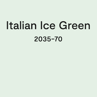
The review of your 12 favorite BM colors is helpful. I appreciate how much time you have invested in learning which BM paints work best in your home. The paint in my home is all BM from courtesy of a former owner. I plan paint over the BM sleigh bells with a paint from Clare or Portola that comes closest to looking like cloud white or cotton balls – yes wish me luck! I also love your use of Italian Ice Green. I plan to use this color on my powder room ceiling. Thank you also for the heads up about the forthcoming prices changes for your deliverables.
Hi Laurel,
I remember how stressful it was when you were trying to get your rooms painted. But it’s all behind you now. Thank you for sharing what you’ve learned over the years & all of your experience picking paint colors. You’ll be saving so many folk from what you went through.
I chose Opal Essence and Simply White in my 2016 home (Simply White was the color of the year) and I loved it’s vanilla color. I absolutely love my OpalEssnce ceilings and am happy to have found your blogs at that time!
Hi Gilda,
I still have Opal Essence in the bathroom and hall to the bathroom. Although I don’t notice it unless I look up, but it’s beautiful, too!