

Hi Everyone,
Oh, man. I tried to make a video about the best white paint colors for kitchen cabinets.
I even took a shower and put on make-up.
Alas, it’s horrible. Oh, it starts out okay.

I am 1000 times better in the silence of your imagination.
What inspired this post is that yesterday, Mel, my lovely kitchen designer from Crown Point Cabinetry, came over.
She measured both manually and with her laser. It’s a great way to double-check, kind of like using the paint color by name and its number when placing an order.
If there’s something to be OCD about, measuring is definitely one of them.
We also went over the fine points of the design. And, it’s all done. There are a few small tweaks from what you saw about six weeks ago; please scroll to the bottom. But, overall, it is the same.
So, after we discussed the design, Mel asked me what white kitchen cabinet paint color I had selected.
“Hell, if I know. One of them,” I quipped.
The perfect professional, she ignored me and whipped out her paint chips.
She began holding up one white paint color at a time.
They are all from Sherwin-Williams. While I am familiar with many such as Alabaster and Dover White, they are like people I met at a party ten years ago. Many Benjamin Moore white paint colors are like old boyfriends. Some are even like old husbands. ;[
Many may recall a post I wrote a while back, but I have updated many times about the best white paint colors. I selected 20.
Still, even 20 is too many.
Then I wrote a post about the only six white paint colors I’ve used for walls and trim.
Another old post revised more recently is about the one white trim and wall color that works every time.
Is there such a thing?
Originally, when I narrowed it down about eight years ago, I went with Cotton Balls. Recently, I also included Simply White. And, I should also include Chantilly Lace.
Chantilly Lace is the whitest of those three. One more color that is Universal is Super White. I used it in my old apartment on the trim, everywhere but the bedroom.
What about White Dove, Laurel?
Ahh, yes, White Dove, by Benjamin Moore. It is probably the most popular shade of white in the entire colorverse.
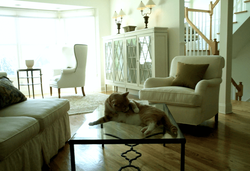
I used it for many jobs and for myself, for the trim, doors, ceiling, and panel surround in my old Bronxville Bedroom. I spent 2.5 years looking at it in all kinds of lighting situations. This room also had three windows facing south, southwest, and west.
On the south and southwest walls, the color sometimes looked almost gold! It looked like a crisp but slightly creamy white paint on the opposite wall. (See above) Same room. Same color.
This was five years ago, in the days before Samplize. Samplize is terrific. I highly recommend you get their samples as they are movable, reusable, and often over, and there’s no messy paint to deal with or waiting time for it to dry.
Mel showed me about four white paint colors, but the fifth one stood out.
It was warm and soft, not too bright, not too gray or yellow.
It was Sherwin Williams Greek Villa, and I said, “That’s it!” We looked at it in the kitchen.
Everything looks fine in the kitchen because there is almost no natural light. But, when compared with Alabaster, the more well-known color, it looked better with the Calacatta Marble I’m hoping to use.
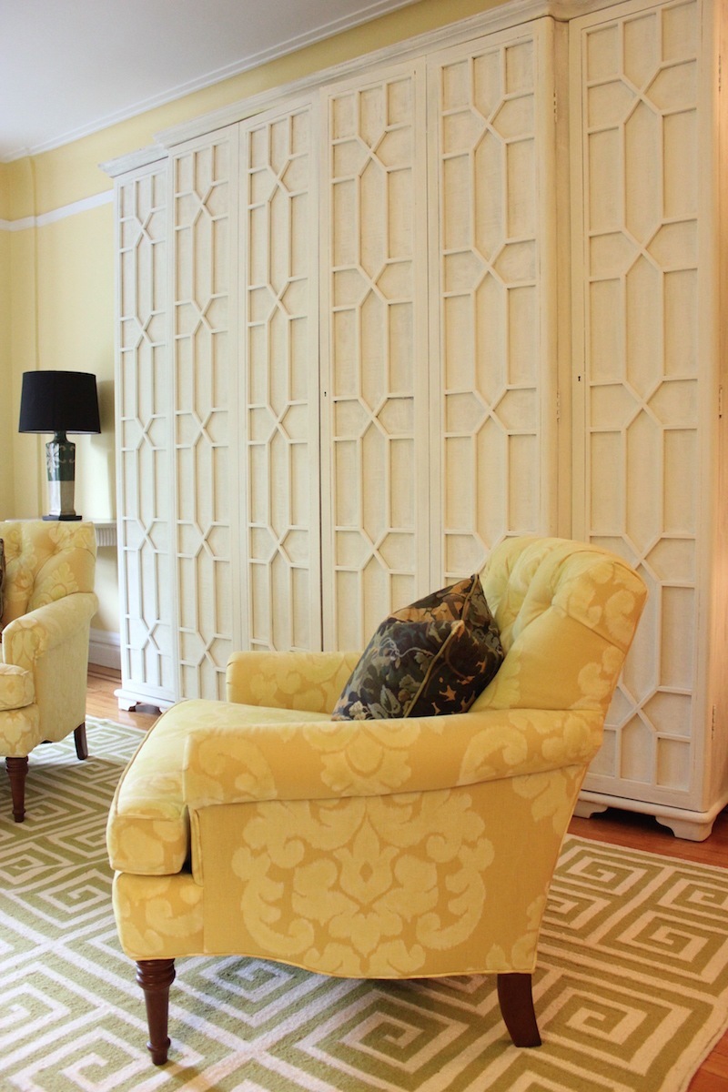
In addition, it’s a separated at birth twin with Simply White and Farrow & Ball Wimborne White, my favorite F & B shade of white, see above in this lovely DeVOL kitchen.
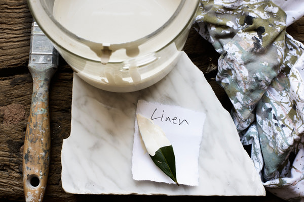
DeVOL says it’s their proprietary color, Linen.
Oh, if they so so! ;]
You might enjoy this post where I suggest which Farrow & Ball colors DeVOL is riffing off of.
Above and below, a kitchen painted Wimborne White. For more of this lovely design by Nancy Keyes, please check out this post.
Okay, here’s the thing.
Strictly speaking, I should have the tile and counters all picked out before choosing the cabinet color. Why haven’t I done that? I haven’t done it because I’m trying to get as many tangible, fully, or partially sponsored items as possible.
However, I’ve had enough experience to know that finding a tile to coordinate with Simply White, Benjamin Moore’s Color of the Year in 2016, should not be too difficult. In any case, the colors are more forgiving because of the windowless kitchen.
Now, did selecting the color yesterday stop me from obsessing about looking at other white kitchen cabinet colors?
No, of course not. Yes, Laurel, the self-proclaimed paint color expert, haha, obsesses about her paint colors too. It’s EASY telling someone else what to do and not easy when selecting for ourselves. If that is not true for you, you’re in the minority; I’m pretty sure.
Why do we do that?
Well, I think the indecision and second-guessing happen for many compelling reasons.
- Color can be quite unpredictable.
- We don’t want to make a costly mistake.
- We’re sure there’s something better out there.
Ya know… The Bumble mentality. :/
If there were only ten white paint colors in existence, then we’d be able to narrow it down far more easily and quickly. Instead, there are 100s of white paint colors.
But, are there really? As you are about to see, there is this illusion that there are hundreds. There aren’t really, and colors which skew strongly to yellow, green, blue, lavender, and pink are NOT white.
Have you ever noticed how many colors have white as part of their name? However, they are anything but white.
This one’s not even a pale color!
Here’s another point to keep in mind. Benjamin Moore has dozens of duplicates with different names and numbers. However, they are the same formulation. Thankfully, they’ve come clean about this on their rebranding that happened last year.
Soooooo… I will make a list of the best white kitchen cabinet colors. (Not in any particular order.)
AND, yes, I am sharing their duplicates, not all of them, by any means, or I’d be writing this for a year, but some from Sherwin Williams and Farrow and Ball. There are also some twins in the same company.
The lead colors are by Benjamin Moore. I am trying to clarify what goes with what, but it isn’t easy.
As you’re about to see, this has been a very interesting exercise.
Please note. I am sure to have left off your favorite white paint color. It is unintentional and doesn’t mean your favorite is a bad color.
1. Benjamin Moore CHANTILLY LACE

This is a terrific white kitchen cabinet color for a clean, crisp look.
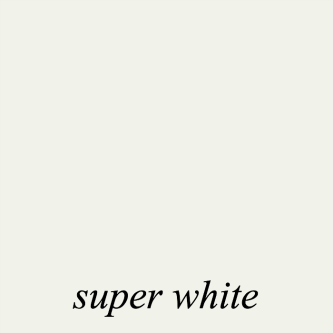
The trim and ceiling are painted super white in this image taken in November 2020, just before I had a buyer for my apartment in Bronxville, NY. The color looked creamier in person, but Super White is a lovely, clean, yet still warm white.
Ahhh, there’s my darling Joe who passed away peacefully 13 months later. May he rest in peace.
and its Benjamin Moore Twin, SUPER WHITE
Subs for Chantilly Lace and Super White
Sherwin Williams – HIGH REFLECTIVE WHITE

Sherwin Williams – WHITE SNOW

Farrow and Ball – ALL WHITE

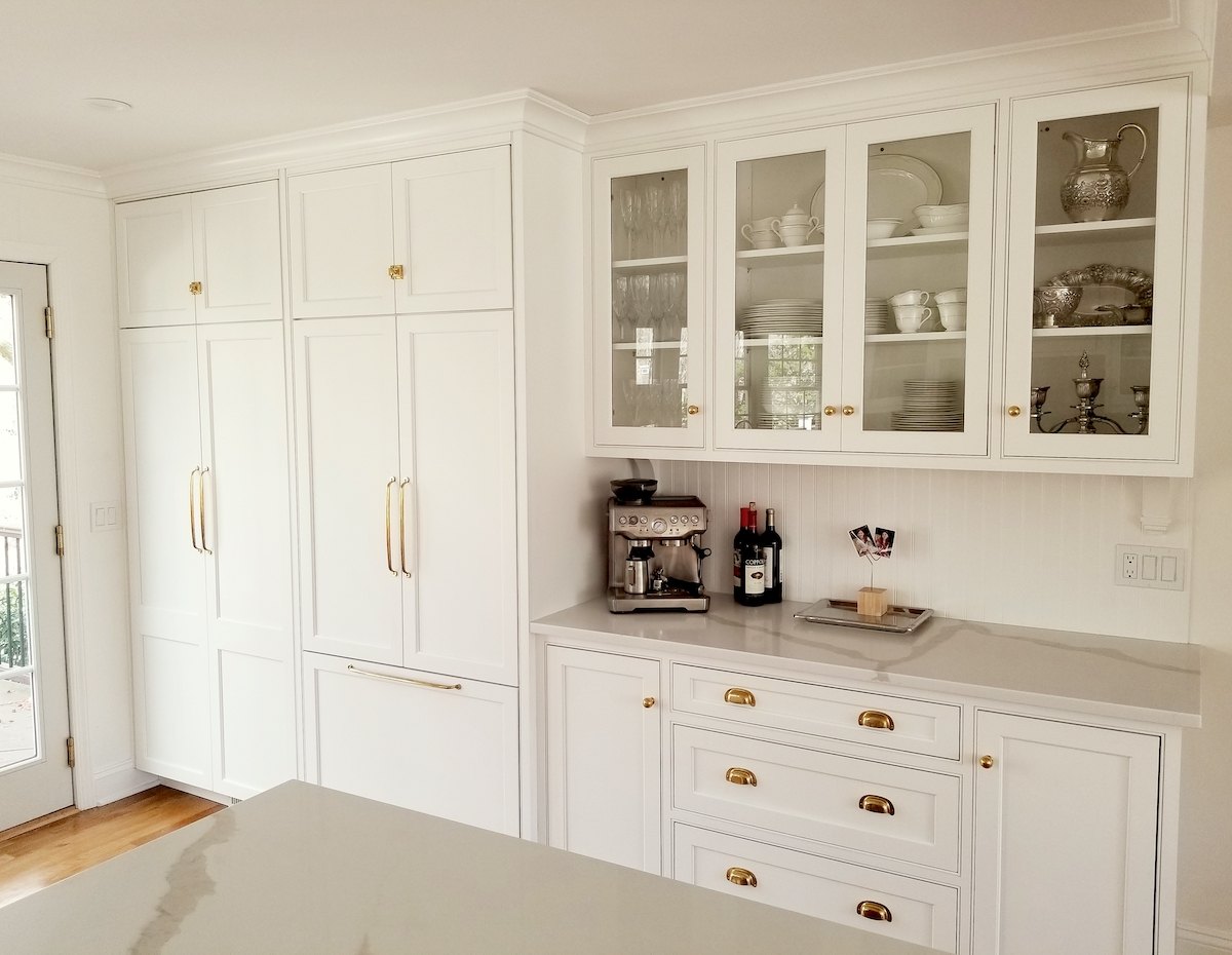
2. Benjamin Moore – WHITE DOVE
We used Benjamin Moore’s White Dove oc-17 in the Bronxville Kitchen, with Calacatta marble, which was stunning. White Dove has a good amount of gray and a chameleon-like quality, making it a great choice.
Many colors are very close to Benjamin Moore and other companies. A great paint color is a great paint color.
Subs for Benjamin Moore White Dove
Sherwin Williams – Alabaster – It is also one of the most popular white paint colors at SW.

and its twin
SW – GREEK VILLA (the color for my new kitchen cabinets!)

Farrow & Ball – WIMBORNE WHITE is also a similar color.

(Please note: that these samples are photos of the colors found online. They look much closer in real life than they do on the computer monitor.)
They are all, also very close to the color I lived with for 18 years, seen below in our old townhouse.
Pratt & Lambert ANCESTRAL (This color)

I loved this paint color. It was in our bright living room, but always beautiful, soft and warm, and never yellow. I miss my Snooky. (Peaches) He passed away in December 2014. Incidentally, this pic is from 2002.
From my old living room in 2013. I painted the cabinet Cotton Balls. I love showing this room. I lived here for at least two years before I realized that the “crown moulding” is ENTIRELY on the ceiling!
3. Benjamin Moore COTTON BALLS (below)

4. and its twin (SIMPLY WHITE)
For the rest of this lovely kitchen, please go to this post.
Subs for Simply White by Benjamin Moore
Sherwin Williams GREEK VILLA

Sherwin Williams ALABASTER

Okay, never mind, twins. They’re Quintuplets!
Wait a sec; do they have the same counterparts, Laurel?
Yep. Pretty much they do. Look, the paint companies want you to believe that every color they have is unique and, not only that, unique from their competition.
Sorry, they’re not. Well, they’re not different enough to break into a cold sweat. Let’s put it this way. If Simply White works, then White Dove is also going to work, and Wimborne White and Alabaster. So, just pick your favorite from your favorite company. Of course, always test first!
I’m not saying that there aren’t subtle differences. However, there are subtle differences between the same color from the same company and coming from a different paint can!
There are also HUGE differences with the same color from the same paint can but on different walls in the same room!
Please reread that last sentence three times. :]
This is why I can’t make a video. I can’t chirp away why you must do this or that. When I say on video what I just wrote above, I look like a crazy old woman on a day pass from the place where they put the mentally ill.
Not to interrupt myself, but a little break won’t hurt. In case you think everything is like a fairy tale here in Boston, there is just enough hideousness to make us appreciate even more what we DO have.
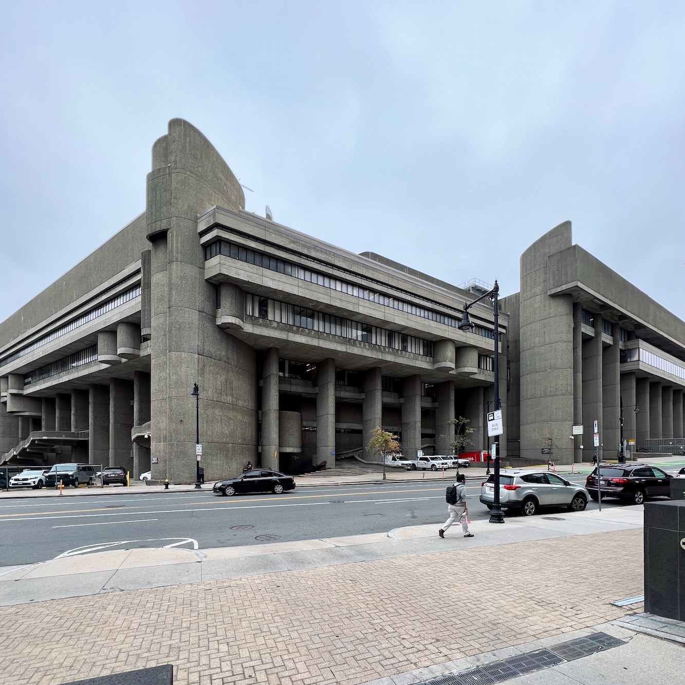
I discovered this Boston uhhh… bastion of what-on-earth-were-they-thinking last year after I walked Cale to the north (train) station.
This is what happens when you don’t properly vet your builder. lol
Bostonians, please stay mum. Does anyone else want to take a guess?
Is this where they hold the semi-annual Restoration Hardware tent sale?
Oh, hahahaha! Very good! And, no, but you’re verrrry close.
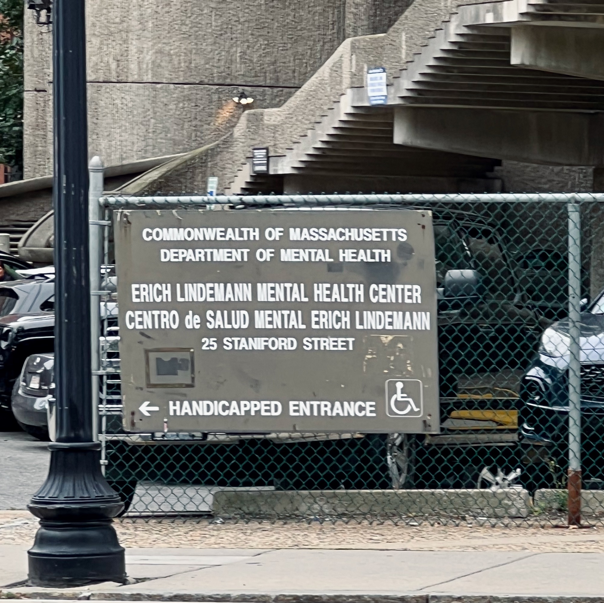
But, of course. If you weren’t crazy before, you soon will be.
I did look this place up and it is a well-known eyesore that went horribly wrong during construction. (ya think?)
Hope you enjoyed that little palette cleanser.
Let’s keep going with the best white paint colors for kitchen cabinets.
My Kentucky long-distance client from several years ago did IVORY WHITE everywhere. For the rest of her gorgeous new-build home, please go here.
5. Benjamin Moore IVORY WHITE

I have used this color many times. It’s the better version of the popular Linen White. LW is great as a trim color with warm dark colors, and it’s good in brightly lit rooms. However, ivory white always looks good. This is also known as Acadia White.
I keep wanting to say, “It’s just a wee wink____” like that seriously perky, adorable blogger, Kylie M, on Youtube who talks about every paint color that God ever created. However, I am incapable of actually uttering those words.
Ivory/Acadia White is the creamier first cousin of White Dove.
Subs, Yes, everything, is the same that goes with the other colors so far.
Sherwin Williams ALABASTER


6. Benjamin Moore SWISS COFFEE

Sherwin Williams SHELL WHITE


Okay, that’s it for today. I hope you enjoyed this exercise!
xo,

***PS: Please check out the newly updated HOT SALES
***Are you planning on doing some shopping on Amazon sometime soon?
All you need to do is click the link above and forget about it if you’re not ready to shop now.
I will earn a small commission at no extra expense for any orders you make within 24 hours of that click. I very much appreciate your support of this website.

***
Related Posts
 25 Seriously Jaw Dropping Urban Gardens
 Perfect Architectural Proportions – The No-Fail Formula
 The Bright Light at the End of the Renovation Tunnel
 My Special Day of Design with Interior Design Stars!
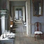 Gustavian Swedish Style-How To Get The Look for Less
 You Might Get Burned By E-Design Decorating!
 A High-Low Ben Pentreath Living Room – Can It Be Done?


41 Responses
This kitchen is truly magnificent! The choice of colors, furniture and accessories is wonderful. I, unfortunately, have a small apartment so I was forced to furnish my kitchen in a minimalist style. Despite the small space, my small kitchen looks very good and is similar to the one you described in the article. I made the best use of the small space and I am satisfied 🙂
I love the warm whites! Story time: We redid our kitchen this year and there were three white options from our cabinet maker that didn’t have a significant upcharge. I forget what they were really called but they were Whatever White, Snowblind, and what they call “Coconut.” We went with Coconut. It’s quite lovely but definitely darker than White Dove. So when our actual cabinetry arrived I took one of the doors to the Benjamin Moore store and, at this point in our redecorating journey, my BFF Ian who owns the place and I dithered and hemmed and hawed and finally landed on “Muskoka Trail.” So we painted the trim that color. The walls are Cotton Balls. Part of the trim is the new Dutch door we installed. Our exterior trim happens to be “Ballet White.” So we gave the painter “Muskoka Trail” for inside and “Ballet White” for outside. Friends, they are the. Same. Color. Really really. I guess we know what we like!
This is the kitchen that looks suspiciously like your renovation plans, Laurel, except for a family with six children!
Hi Laurel,
Thank you so much for this post! It is so timely since my husband and I have been agonizing over the paint color for the cabinets in our kitchen renovation. Everything we had been looking at seemed either too white or too creamy for what we were going for. We decided to go take a look at look at SW, and found that Greek Villa is just the right color for our kitchen. So thank you, thank you, thank you! It is a huge relief to have finally settled on a paint color.
Laurel, I sincerely appreciate your decorating tips a gorgeous pictures. I find your content inspirational. However, as a mental health professional who specializes in treating obsessive compulsive disorder, I have concerns about the reference to ocd in your post. Ocd is a debilitating condition. It’s not a joke. In the future, I hope you will be sensitive to people with mental health issues.
Although it’s in the fan deck, S-W High Reflective White is properly a base paint that doesn’t have enough colorant to cover well by itself. Some stores don’t carry it or don’t recommend it as a paint; although some may sell it with a slightly grayer Titanium Dioxide tint to provide “hide”. Choosing higher quality paint that covers better would best insure good results. I credit this knowledge to Kylie M, especially her March 2023 article with comments that is worth reading for those considering a very high LRV white.
Oh my gosh, that “mental health” building catapulted me straight back to Chandighar, a city in the Punjab, India. I don’t think I’ve thought of their main government buildings, designed by Le Corbusier, for decades. I hated them, and they were the most heavy, depressing constructions, inside and out, that I’ve ever seen. How nasty to foist those atrocities on a foreign country that boasts of wonderful Mughal buildings, including the Taj Mahal.
I painted my living room with what I was told was the equivalent of BM Cotton Balls, although I can’t recall the name. At any rate I now wish I had chosen an even white white because of the orientation and greenery outside. Oh well, one generally learns well after already having done it.
Can we talk about spaces dedicated to mental health? Eyesore doesn’t even begin to cover it. Schools, hospitals, government buildings. I get it, shoestring budgets. But who wants to enter let alone stay in some of the most uninspired, often neglected, window-less, drab offices and corridors? I’ve worked in the field for what feels like forever and have forever wanted a space that engages, inspires, supports people who I think we can all agree truly need a lift. Windows at eye level would do wonders. But I don’t expect miracles overnight. Architecture is hard to change, so where to start? With color? All the “are-they or aren’t they grays, blues, beiges, greens” that are lovely in homes don’t work in an institutional spaces without the right lighting, accessories, etc. So what color would you paint an interior counseling office with terrible light, no natural light? What can be done on this front? Love the inspiration you bring every week, Laurel.
So, turns out it’s not so easy to take a picture of a white wall and make it communicate anything! Let’s just say, I love it, it feels serene and sophisticated to me, and the painters don’t complain too much about it! It’s giving “Daryll Carter” to me! Thanks for everything Laurel. LOVE your blog – it’s the only one I read.
Hello Laurel,
I wanted to see if you have ever had any issues specifying SW High Reflective White? I too prefer BM, however it seems like the painters or contractors recently have requested we choose from SW. So anyways, I think 2 or 3 times recently I had a painter (different painters in my stories) tell my clients that it is not a color to choose. One said that color did not come in wall or trim paint (That had me really confused since we have used it in the past, when looking for a crisp pure white). Another this past month told the client that they could paint the doors and trim that color, but the finish on it looks really horrible (again I was very confused how the color of the paint could affect the finish). I am likely ignorant on some of the technical details of paint. Do you know anything about this? Much thanks – I look forward to your advice and stories and can’t wait to see your kitchen.
Hi Lindsey,
There is nothing that irks me more than a painter, or anyone doing work that the designer had a hand in, who is offering unasked for advice, knowing she is working with a designer who has helped her select the paint colors.
It’s not his place to question it; not with the client, behind your back. It’s not only unprofessional, it’s downright rude. Therefore, I would call him out on it, calmly but matter of factly, I would ask him if our client asked for his advice. If she did not, then it’s totally not cool to offer it without speaking to me first.
I’ve never specked Sherwin Williams. I remember about 20 years ago, a S-W rep approached me to set up a meeting. I told her that I was all set and good luck with S-W getting a foothold in the marketplace because of the BM stronghold. (at least in New York). Well, by golly, about 5 years later, I realized they had done what I said was unlikely to happen. Brilliant marketing. Bravo!
Pratt & Lambert Puffball is my favorite. I used it in my east facing living room with cathedral ceiling and open staircase both in dark knotty pine with a stone fireplace. It’s stunning and the soft white slightly cream color stays the same color on the walls regardless of shadows or light location. Very uniform. In the evening, the lighting turns Puffball into a richer cream color. It is so stunning and soothing at the same time.
Hi Cherie,
I recall that name. I’ll have to look at it again.
Hi Laurel,
I love the information on “light reflective value”.
After your recommendation, I used Cotton Balls in our house in Maine and I love it.
So happy that your project is progressing so quickly.
I’m from Boston and yes, hideous building 😂
How about BM Sea Pearl? Gil Schafer says it is their white of choice. I have to take a look at it.
Hi Adriaan,
In my research, I did find that, too, and of course, looked it up. It’s a little more beige than I’d like for my kitchen. Gil often uses another shade that’s a deep cream, almost a pale gold. It’s in at least two of his bathrooms that I love. I think you can see them here.
I used Greek Villa for the wall & ceiling & trim paint in my calacatta marble bathroom and it’s perfect to my eye.
I have Swiss Coffee on the walls throughout my home and I love it. It goes especially well with cool wood tones (like a dark antique brown).
Years ago, when I first learned to play bridge, I heard the term “card sense”, and, yes, some people have it and some don’t. (I don’t.) I think some people have “color sense”, too, and it works pretty much the same way. Sadly, I also don’t have color sense and have to rely on Laurel! I’m in the middle of painting my home office Swiss Coffee, and it is a lovely, soft white. Thanks, Laurel. Your color sense is transforming my house!
SW Greek Villa is my new fav color! We have DE Swiss Coffee on all of our trim – and now the cabinet maker is customizing his laquer paint for it. I wish I started with Greek Villa everywhere. Just brighter and a little fresher.
I, like so many others, relish in reading your posts. Your talent and humor make my day! I’m grateful that you’re sharing the work on your Boston home with us — I love everything you’re doing. In fact, Sherwin Williams Greek Villa reminds me (on my computer monitor) of the Benjamin Moore paint we used on trim throughout our Victorian here north of Boston: Royal Silk 939. In our home it looks gorgeous — warmish but not yellow, almost like there’s a drop of black in there. To give you a better idea of the paint color, the “white” of the beautiful blue and white Minton tiles surrounding our fireplace works beautifully with Royal Silk. Thank you again for your posts (and for your Essential Paint Color Collection and Ultimate Paint Palette and Home Furnishings Collection)!
So – what I get from this post is that BM Simply White, White Dove, Cotton Balls, SW Greek Villa, Alabaster, FB Wimborne White and PL Ancestral can all be subs for each other?
And BM Chantilly lace, Super White, SW Highly Reflective White, White Snow and FB All White can be subs?
And BM Swiss Coffee, SW Shell White and FB James White also are subs for each other?
OMG… I must have purchased samples of all of these colors over the last 5 years. F&B Wimborne White is my true love, but I just discovered SW#9503-Cheviot. I think it will be beautiful in my kitchen.
The cabinetry I selected for my kitchen and butler’s pantry only came in Sherwin Williams paint. I chose Dover White, a soft, warm white, and have been extremely pleased with it.
Loved hearing about the new colors. I am going with Swiss Coffee Benjamin Moore in my renovated kitchen. Just needing details about how the cabinets should be painted and with what to keep from chipping. Any suggestions are welcomed. Thanks Laurel!
OH MY GOODNESS–I am so relieved. I have always wanted to suggest that you give us the Sherwin Williams equivalent paint colors but thought you might be “above” SW.
Hello Dear Designer!
I went with BM Simply White 6 years ago after reading your suggestions on the best whites. This has served me well! I love reading your email newsletters! Thank you for being so entertaining and instructional!
I have a friend who has done her kitchen cabinets in the whitest of whites.. It’s a white that isn’t seen in nature, really. She lives in a mid-century ranch home with the huge fireplaces all the way to the ceiling. I’m a fan of antique whites and chalky whites, like Dover and Kestrel (I’m using Greek Villa in a master bath remodel now, which is why this post attracted me). Anyway, I wonder if you have any opinion about pure white cabinets or walls. I have avoided it, but Leanne Ford seems to pull it off!
Last year I bought a fixer-upper & hired a contractor to do some work before I moved in. One of his assignments was to paint the interior. Swiss Coffee for the walls & Chantilly Lace for the trim & ceilings. It looked great & I thought it would be a nice neutral to hold me until I started decorating.
I also had him hang new maple doors. Turns out the creamy undertone of the Swiss Coffee doesn’t work with the pinky undertone of my doors.
I’m living with it for now. It only bothers me, my friends don’t see it & think I’m crazy.
Our house is long and skinny for the view. It’s completely north or south facing. Every color was beautiful on one side and painful on the other. We ended up with SW Aesthetic White. It’s good on the south side and dingy in the corners on the north side. I just don’t look at those corners.
Help!! Cotton balls looks like translucent egg whites on my trim in my South and West facing bedroom and on the doors in my windowless hallway. It looks fine in my North facing rooms. Eeek raw eggs!
I’ve been been debating about the color for my kitchen for four years. Finally,I decided white and after loving the Ivory White kitchen on this site so much,I thought for sure that was it. I painted a swatch, looked at for a few days and it looked liked lemon yellow with my West facing room. 4 different swatches later, it is now Simply White, same color as all the trim in my little home, and I love it. I wish I could say the same about the Decorator’s White on my ceiling in another room. Looks like a gloomy rainy day sky. I try not to look up. My husband still can’t believe it took 4 yrs to pick white!
I literally laughed out loud at ‘I’m 1000 times better in the silence of your imagination’. My kids thought I had lost it 😂
We used Greek Villa in our first home…it’s a good one! Currently have Alabaster on my trim and really like it. Oddly enough I typically go for Ben Moore wall colors but end up with SW for trim. Go figure.
And on the topic of misfit color names, we chose BM Soft White for my daughter’s room, and it is most definitely NOT white. In fact it is a pale, peachy pink. The aforementioned, very literal-minded kids had a field day with that one, too.
Keep on keepin’ on, Laurel! Thanks for the great post to start my Wednesday.
Love your posts about white paint-and thank goodness for Samplize!
I’m confused-I don’t remember seeing you mention that your cabinet makers- Crown Point Cabinetry-were able to accommodate you-I thought you had chosen a new builder. Did I miss a post?
Hi Debra,
Just reading quickly through comments as I’m trying to change my hideous sleep habits. Crown Point is making my kitchen cabinets and I’m thrilled with them. However, I do have a new GC. That is completely separate. He will install the cabinets, however.
Laurel, I can’t believe it. We are under construction in maine and just painted acres and acres of Greek villa!! Would you like a few I phone photos? I absolutely love it (luckily).
Hi Susan,
I’d love to see it! Thank you!
I have been delving deeply into “color theory” renovating our new Florida home. Before we moved, we paid a professional to come in and paint the main floor rooms of our house in MA (in order TO sell it) and we chose SW Alabaster.
I’m not sure if the painter actually got the white paint tinted or not, but the color did NOT look like any of the chips or photos I’m seeing here. It was white: plain, stark, cold white. I can provide pics. And this was in every room, with different lighting in each. What happened?
In redoing the hall bathroom here in FL, I chose BM Chantilly Lace after much deliberation. What a difference! Yes, there is a difference in whites, and choose carefully…
Hi Frances,
Unless you mixed the paint yourself, you can’t be positive that what you’re seeing is the color you ordered. Mistakes are made all the time. However, the lighting in Florida is different than the lighting in the northeast. However, Alabaster is not a stark white. It’s light reflective value is only 82. Chantilly Lace is 92, B. Super White is 89.
Moore White Dove is 85, Swiss Coffee is 84 as is Greek Villa. The higher the number, the more light reflected and the brighter the color. BM Black is 3.26 to be precise. Ivory white is 85.
Alabaster is actually the deepest of these colors. Although, the difference between 82 and 85 is minimal.
This evidence leads me to believe there’s a possibility of a few thingsat something went wrong and I could conjecture, but that’s all it would be.
However, there can also be other things at play that are draining all of the color out of your walls.
I enjoyed this post and I love your choice of Greek Villa for your paint. I feel like when I see it against the other paints, (to my eyes on my iPad), it has a wee hint of pink in it. Which brightens it, I think, I like it though. What was the surprise you mentioned that would be at the end of your post?
Hi Colleen,
All of my interior design guides are on sale. (as of 2:30 PM on the 10th) The biggest sale– ever! I suck at marketing my own stuff. lol However, I’m super proud of each of them, and there’s a ton of helpful information in each of them.
I just finished my new kitchen in Swiss Coffee and I am very happy with it. I must say I stressed over the colour and at the end went with my original idea. The new house is open concept [I know, Laura!] but so far it’s working for us. The walls are Cloud white, another hard decision. I enjoyed all your info and found your blog to be the best!
I love your yellow walls in your NY apt and have recently started to use yellow on the dining chairs, which I bought 2nd hand. I visited NY in 2008 and purchased an art piece of the Flat Iron building and it’s on a yellow background, so the yellow is a nice change from the colours I use. Also bought an old long yellow bench that you can see from the main room. So exciting when it all comes together.