

This is a two-part post about how I’m developing my interior color palette. The newest post is underneath the first post. So, if you’ve read part 1 please click the link below, otherwise please begin from the top.
Part 2 Begins Here
Hi Everyone,
This is an exceptionally busy time in my renovation. Many decisions need to be made—NOW! One of the most important is developing the interior color palette. This is done in conjunction with the furnishings and especially, the finishes.
We’ve discussed this many times*** because many people struggle with creating a cohesive color scheme.
That’s why I created the Laurel Home curated paint and palette collection. You can find out more about by clicking the link. Its aim is to help folks figure out their paint colors and interior color palettes, which include not only the paint but also the colors for everything from the floor to the furnishings.
*** In fact, there is a lot of overlap in this post from last November!
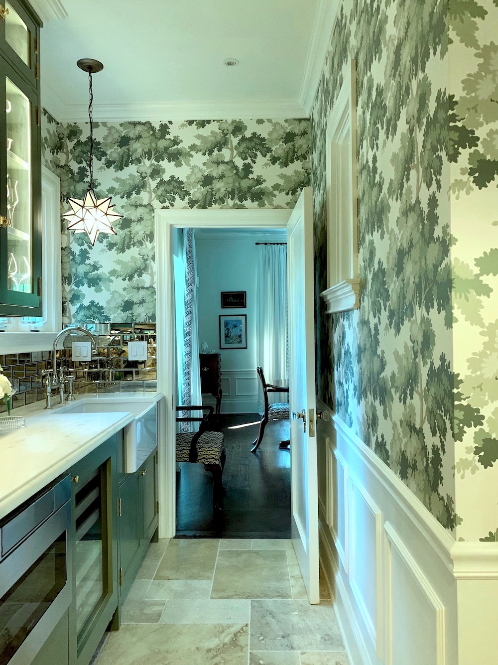
However, the plan in the lower entry has changed because the huge electrical panel sticks out too much, and wallpapering over it will look odd.
But, here’s the thing, and I’ve said this before, but it’s an important point. If you take one thing from this post, this is it.
Please do not make everything match.
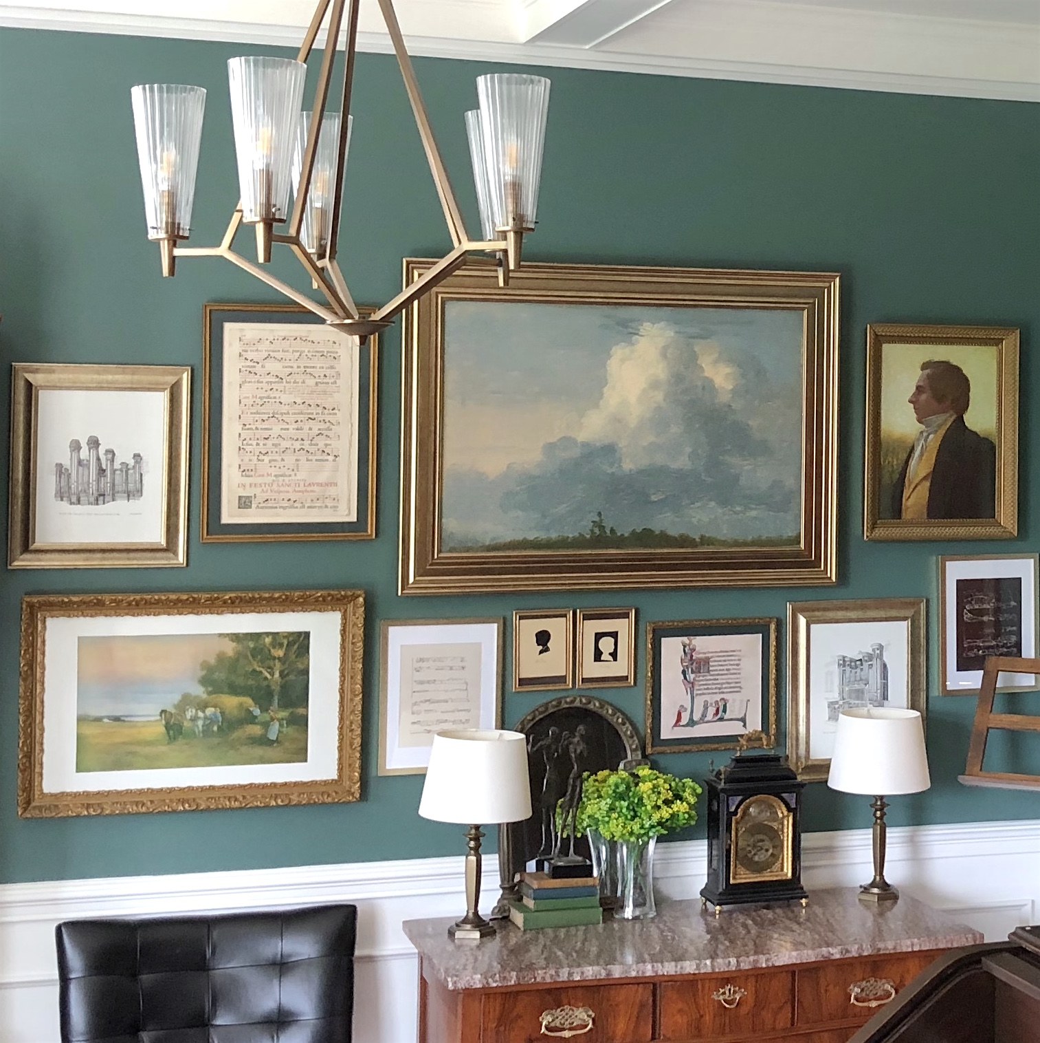
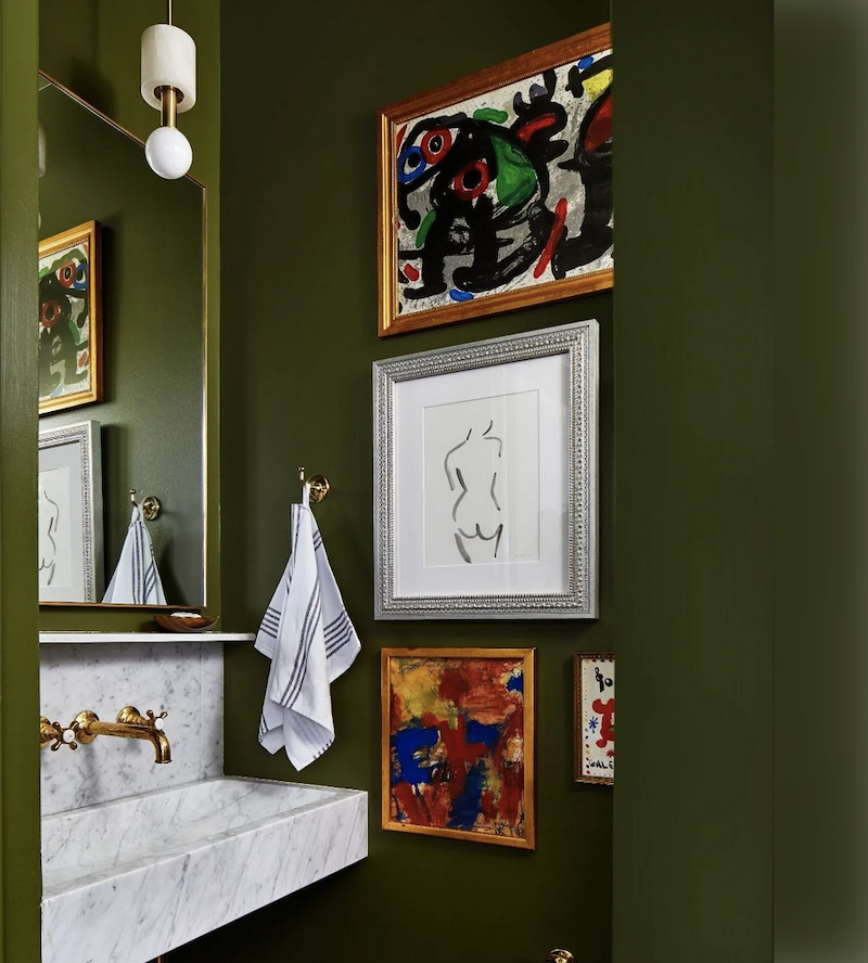
It looks too contrived, and that’s not a good look. In other words, I find it best to use many variations of the same colors throughout the space(s). This is what you see in fine art paintings, and it’s one reason why I love to use artwork to help develop an interior color palette.
The work has already been done. There’s no need to reinvent the color wheel. (pun intended)
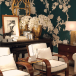
For me, in all of my homes, there’s only one piece of art I need.
It’s this one: my beautiful vintage Zuber screen, which I purchased in New Preston, CT, in 2000 for $2,000. My wasband thought I was nuts, and he wanted me to sell it to a client.
Are you freaking kidding me?
Over my dead body, I’m selling it. If the house were on fire, after the kids, the cat, keys, and wallet, this is the next thing I would grab before heading out.
Laurel, are you sure you wouldn’t have grabbed the screen first? ;]
Very funny.
But, Laurel, you lost me when you said not to make everything match. What if everything clashes?
Let me ask you something. When you walk in a forest in the middle of summer with a zillion shades of green, have you ever thought? “Oh dear, this forest sure has a lot of clashing colors?”
No, you have not.
Clashing colors are subjective. But, it’s more commonly noticed if there are only two or three colors. It’s like the navy pants and sweater clash because one skews slightly red and the other slightly green. However, if you put on a white jacket and a patterned scarf with many shades of blue, the colors won’t clash. It’s like that.
However, here’s a better example as it relates to an interior color palette.
Remember this post about the redend point that barftastic COTY in 2022?
What are they calling this look now? Mob chic? lol
Now, where was I when you interrupted me, had that excellent question?
Oh yes, interior color schemes and how I discovered what I love.
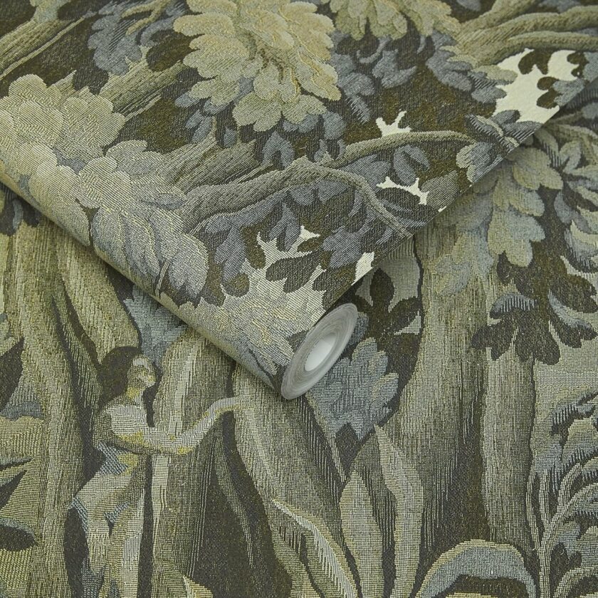
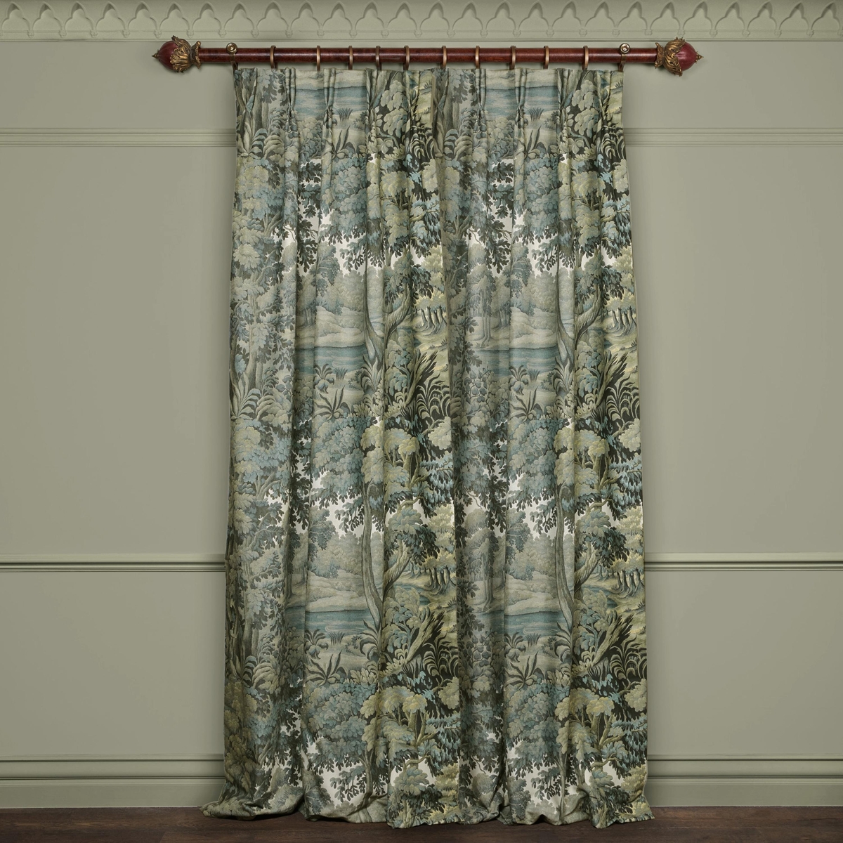
Ever since 1998, when I was forced to come up with a design for a living room and a watercolor rendering in only one week, I have found my favorite scheme and layout in a book.
It was a room with a sofa and four chairs. The colors were muted greens, with some brown, gold, and bits of black. Two of the chairs slipper chairs were upholstered in a verdure tapestry. I was in love.
The tapestry was something like this.
Oh, that reminds me.
I just saw that Veranda has proclaimed that tapestries are IN!

Ummm… Yeah, they’re definitely in and have been for the last 600 years, give or take.
I still adore the tapestry pillows I’ve had since 1997!
But, how does the Zuber screen translate into a real-life scheme?
We’ll get to that.
And, are there other colors one can use?
Yes, absolutely.
However, let’s begin with what we know.
I love the colors in the new entry hall, but I don’t know which wall color, just yet. I have to get samples, just like everyone and I’m going to start ordering my samplize samples this week.
Oh, one quick tip.
You know how they always say to look at the colors in the room they are going in? Well, for a windowless room like my bathroom, the lighting is so horrifyingly bad that I am going to use my upstairs windowless bathroom to check out the colors.

However, an obvious possibility is the popular Farrow & Ball Green Smoke. (Above)

I do love one of the Laurel Home Collection colors, Jack Pine.
This was from a wonderful post about talented Laura, who used Jack Pine for her living room walls. She did this room for about $1,100 back in 2018.
(Also, please check out what she did with the family room a year later.)
Remember that because there is not a lot of natural light, the lights will almost always be on. And, most of you know I like them warm.
My electrician who has a lot of affluent clients says. “Most people want as much light in their closets as possible, so I put in 4,000 kelvin lights in closets all the time. Never had a complaint.”
Darling man, I am not most people. No, I didn’t say that. I kept my hand shut! I said the 3,000k lights would be fine.
If not, I have a little trick.
It’s called golden beige masking tape.
Don’t laugh! The guys keep a huge roll of it here and believe me; its best use is for taming too-bright white LED lights.
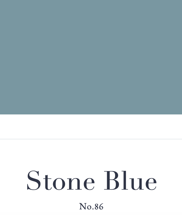
This means the color might be a little more blue than green. In fact, I read that the walls in the TV show Upstairs/Downstairs are Farrow & Ball Stone Blue.
Is this possible?
Yes, it’s completely possible.
Look up Oval Room Blue. You’ll see it can look anything from a medium blue-green-gray to a fairly bright teal.
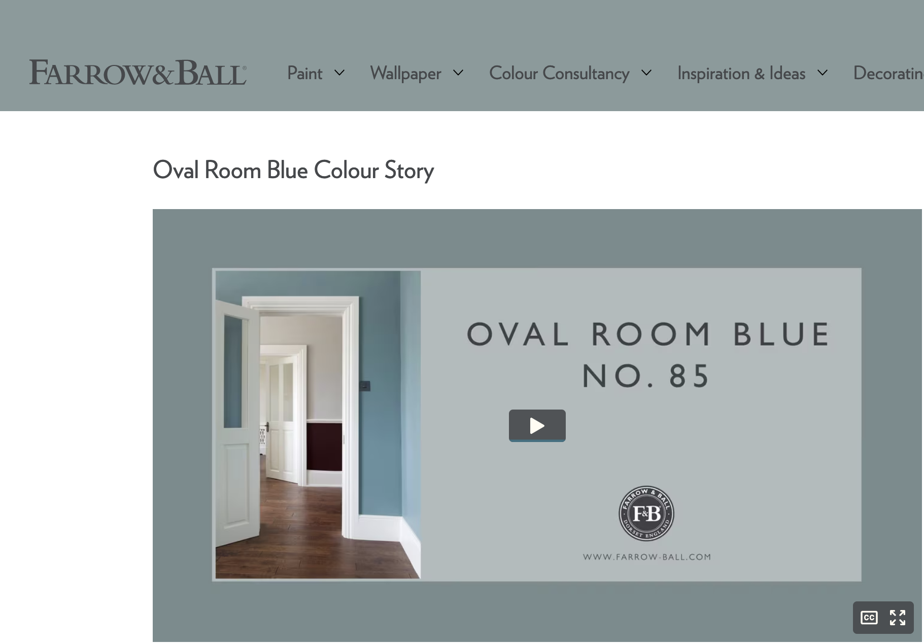
Even Farrow and Ball’s images show Oval Room Blue looking quite different from each other.

See what I mean?
The above Oval Room Blue looks closer to stone blue. However, Oval Room is the color I currently like best for this space. We’ll see when the samples come. Stone Blue is a contender for the den.
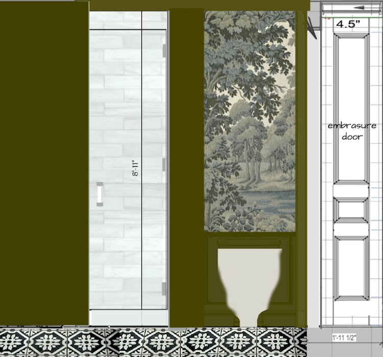
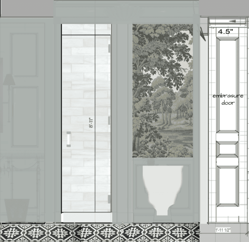
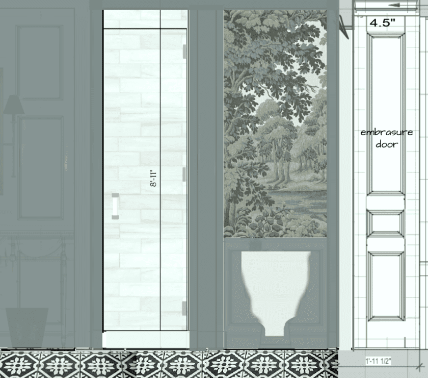
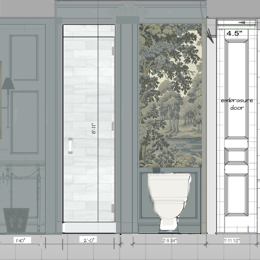
In the meantime, I’ve been thinking a lot about the downstairs 425-square-foot suite of rooms, including the entry, embrasure hall, primary closet, and the largest space, the bedroom.
Of course, they all need to work together.
However, it’s not just the wall colors to be considered for the interior color palette; there’s the floor, too.
And, all of it is wood.
Why did you do that?
I did it to get this job going. I made that decision last August or September. Nothing was happening for weeks on end.
Last week, I finally got some wallpaper samples.
One of them I got I’m going to call the new Raphael by Sandberg.
I don’t care if every other blogger and designer is putting it in their home.
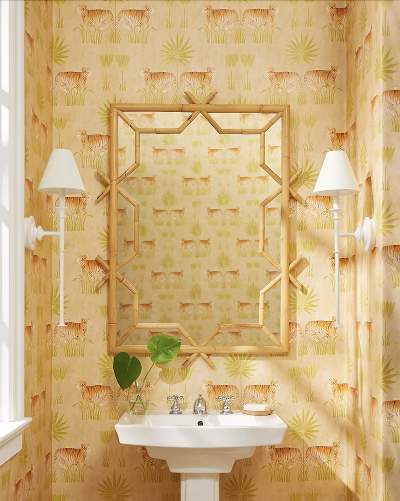
It’s the House of Hackney Plantasia. It looks like a mural, but it’s not really.
The sample looks exactly like the photos.
However, look at this powder room.
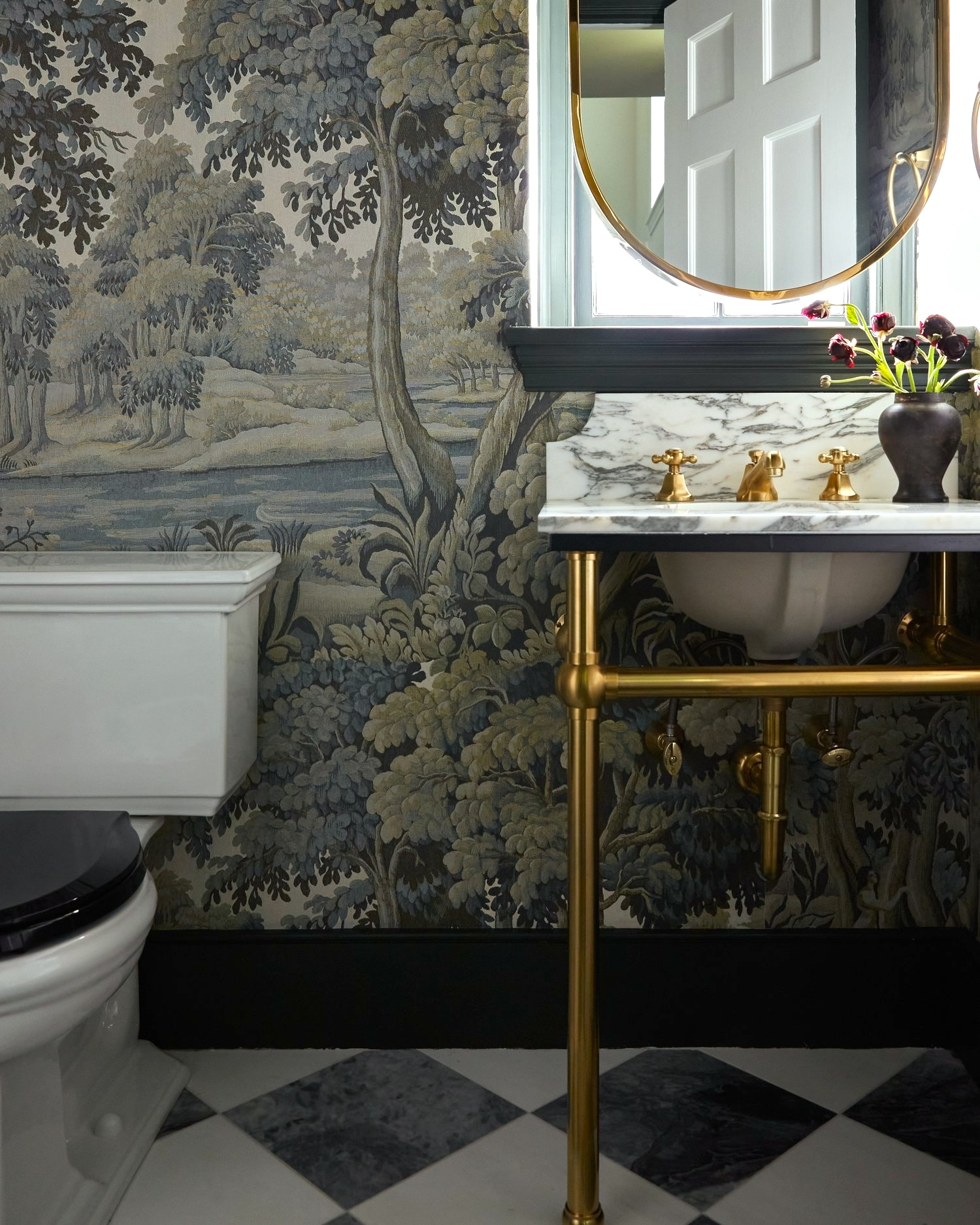
via Far Studio on Instagram – House of Hackney Plantasia Sage
Mine will have wainscoting, and I am also thinking of putting the paper only in the WC area and behind the vanity.
I’ve long thought I wanted a dark bathroom. Remember this post about dark bathrooms?
The bathroom is small—not micro-small like my Bronxville bathroom, but small enough that a dark scheme in a windowless room will be fantastic. That might be counterintuitive, but if you’ve ever been in a beautiful windowless dark bathroom, you’ll know what I mean. It’s very soothing. Not having windows can be a good thing in small doses.
Okay, that’s all the time we have for today.
But, Laurel, what about the bedroom?
What about it? ;]
What are you doing in there? Is that going to be dark too?
I’m sorry, but I need to stop for now. It’s daylight no-sleep-savings time. Rest assured, the colors will be an ongoing off-and-on topic for weeks. However, I promise it will all come together.
The final words for now are that the principles I’m discussing apply to any interior color palette you’re working with.
xo,

***Please check out the recently updated HOT SALES!
There is now an Amazon link on my home page and below. Thank you for the suggestion!
Please note that I have decided not to create a membership site. However, this website is very expensive to run. To provide this content, I rely on you, the kind readers of my blog, to use my affiliate links whenever possible for items you need and want. There is no extra charge to you. The vendor you’re purchasing from pays me a small commission.

To facilitate this, some readers have asked me to put
A link to Amazon.com is on my home page.
Please click the link before items go into your shopping cart. Some people save their purchases in their “save for later folder.” Then, if you remember, please come back and click my Amazon link, and then you’re free to place your orders. While most vendor links have a cookie that lasts a while, Amazon’s cookies only last up to 24 hours.
Thank you so much!
I very much appreciate your help and support!
*********************************************************
Part 2 Begins Here
Sunday March 17, 2024
Hi Everyone,
The other day, my painter asked me if I had selected the colors for the ceilings and trim downstairs.
I said:
“I’m working on it.”
Ha.
Only it’s not really funny. Picking paint colors is very difficult!
Wait a second, Laurel. Aren’t you the paint color expert who wrote a guide about what are the best Benjamin Moore paint colors to use?
Uh-huh…I did write a two-part guide, and I’m very proud of it! (That was like giving birth to quintuplets over two years!)
However, I’m not fond of the word “expert.”
I’m experienced, is all. I’ve made a lot of mistakes, and that’s how I got better at it. But it’s still not easy. That is, for oneself. If a client needed help, I’d figure out the entire house in a couple of hours.
I learned many years ago never to choose colors at night with artificial light.
Why?
The reason is that when you look the next day at what you thought was so fantastic, the night before is actually the perfect shade of awful.
Lucky me, my ensuite bathroom has no natural light except for some indirect light about 25 feet away.
I’ve decided to put this delicious wallpaper in the WC niche. That might be the only place it goes.
The shower tile is Bianco dolomite, a very pale gray stone with an extremely subtle horizontal vein.
I don’t want to get off topic, but I can’t wait to show you the tile for the kitchen backsplash.
Laurel, it seems awfully late for you to decide on paint colors and backsplash tile.
You’re right, it is. But, even if I had, I most likely would’ve changed all of it, anyway. haha
Choosing paint colors is a lot like giving birth.
If you’re like me, you do it once and swear you’ll never do it again.
But, then, you forget.
It’s universal. All women forget how excruciating it is.
That is until we give birth the second time.
If you’re one of those freaks of nature who giving birth is no big deal, please try to understand that it’s normal for it to be agonizing. Thank you.
Anyway, picking paint colors is exactly like giving birth for those of us who swore we would never do it again but did.
In this case, there’s an extra dose of evil: I must choose the colors in artificial light. Plus, my current lighting is terrible.
Remember the interrogation room, bathroom?
Well, it looks more friendly now that it’s primed, but that overhead light is not staying!
This leaves the den or the upstairs bathroom to check out the colors.
Laurel, just use your freaking guide!
Hold on, I am, and please stop interrupting because my brain has already turned to mashed potatoes! Thank you again. :]
But, there’s more. And it’s something I’m keenly aware of with my guide.
The published colors often only slightly resemble how they look on the chip. I find that colors that look nearly black only look like a mid-tone color when viewed online. Then, some very grayed-down colors look overly bright on the computer.
One thing I love to do is to ask the room.
What color would you like to be?
My bathroom has been pretty shy so far and has not given me much information. Some rooms are like that.
When that happens, I ask myself, “What would I like to see?”
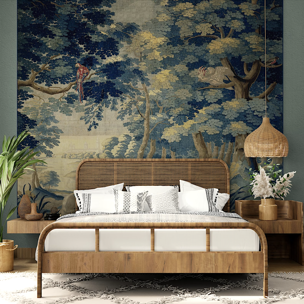
Well, I found a fantastic photo, but the file was way too small. However, I found a beautiful image of it on Instagram. There are two, but I am only posting one. This designer used the Plantasia wallpaper in sage on a fantastic headboard.
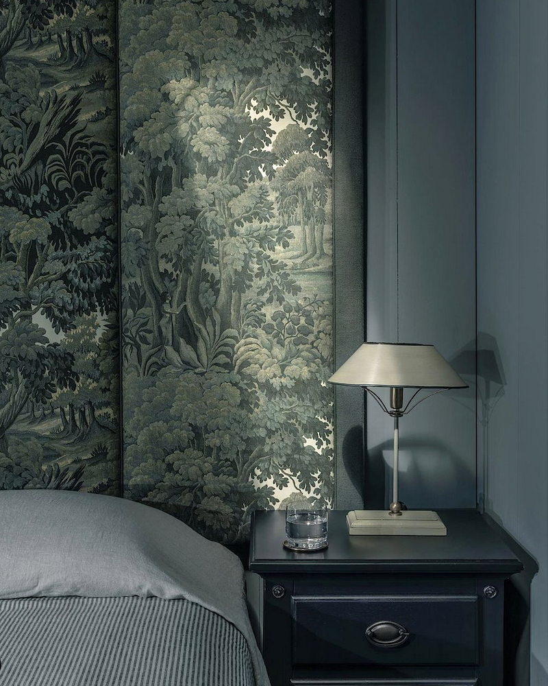
Both of these talented ladies have gorgeous pages on Instagram. Please check them out and follow!
I just realized that Plantasia also comes in a cotton/linen print.
This might explain why the colors look more vivid in the photo from House of Hackney. The colors in the paper are not quite this saturated. However, another problem is the paper is not very photogenic. The gray leaves look more blue-green in person, no matter the lighting.
Still, the other night, I looked at colors and saw one in the Benjamin Moore Williamsburg collection.

It’s called Tavern Charcoal. However, there’s a distinct and very rich green undertone. It’s incredibly beautiful.
I really love it. I can picture it behind the Gold Carlotta mirror from Ballard Designs.
And my beautiful white Piaf sconces from Visual Comfort.
(Please also check out the HOT LIGHTING sales page. I just added a bunch of gorgeous new lights and all are on sale!)
Or, the Portola, on sale at Serena & Lily. (The entire site is currently on sale!)
But then, this afternoon, I put the large paint chip I have on a different wall, and it didn’t look at all green. It looked like pure black.

Above is a lighter shade and also very beautiful, called Palmer Green and also from the Williamsburg collection.
So, I began doing mock-ups on picmonkey. These are very rough. But it’s better than nothing.
Palmer Green Bathroom
I love this Bancha (by Farrow & Ball) bathroom. It’s a bit bright for the Plantasia.
Please check out six Farrow & Ball colors they never should’ve archived.
So, do Bancha and skip the wallpaper.
Yes, I could, but I love the paper in the little WC niche.
Please know that I’ve looked at a zillion colors– in the dark. haha. I tried these colors, but I don’t know what they are at this point.
This is lovely. It could be something like Quiet Moments or Silver Marlin, both in the Laurel Home paint and palette collection.
This one looks like Night Train from the No-Fail paint colors post. It’s old but gold, as they say.
However, here’s a reader whose no-fail paint color failed!
Please note: I’m not sure about the floor. That would have to be a stencil.
However, this one is my favorite. I think it looks old-world and neither too light, nor too dark.
I have a good idea about the colors. So, please come back Monday for more, and see which mural I’ve selected for the bedroom. We’ll also discuss ceiling and trim colors.
I promised the painter I’d have answers for him on Monday.
Happy Saint Patrick’s Day!
xo,
***Please check out the recently updated HOT SALES!
There is now an Amazon link on my home page and below. Thank you for the suggestion!
Please note that I have decided not to create a membership site. However, this website is very expensive to run. To provide this content, I rely on you, the kind readers of my blog, to use my affiliate links whenever possible for items you need and want. There is no extra charge to you. The vendor you’re purchasing from pays me a small commission.
To facilitate this, some readers have asked me to put
A link to Amazon.com is on my home page.
Please click the link before items go into your shopping cart. Some people save their purchases in their “save for later folder.” Then, if you remember, please come back and click my Amazon link, and then you’re free to place your orders. While most vendor links have a cookie that lasts a while, Amazon’s cookies only last up to 24 hours.
Thank you so much!
I very much appreciate your help and support!
Related Posts
 A Dazzling Ralph Lauren Room & How to Get the Look!
 My Adventure to Hudson, NY and Easthampton, MA
 A Fall Color Interior Palette Inspired by McGrath II
 How to Make Budget Window Treatments Look Expensive
 Home Furnishings for My Newly Renovated Boston Duplex
 The Spectacular Unknown Furlow Gatewood Homes!
 Interior Doors from Plain to Not-So-Plain


39 Responses
Love how you explained everything about the ideas and about the measurements and paint selection. i mostly buy the paints myself when i want to paint my house cuz i only need elegant grey shades with a hint of white on my walls.
I’m going to admit that we just had our bedroom and upstairs sitting room painted colors we picked directly from a very old (2010 Benjamin Moore fan deck! They look good so far in the empty rooms and I have a good feeling about how they’ll go with our art and bedding/furniture.
(Now, I am sweating my grout choice because there is always something to sweat about!)
I don’t know how much wall space you need to cover but have you ever looked at the Judarn mural by York, from Anthropologie? It’s like 9’ by 13’. I had to use two of them to cover my windowless powder bath, and matching the two end to end had its caveats that only worked because the ugly secret seam is hidden behind a large wall mirror. But it is so very lovely.
Hi Molly,
I wrote about the Judarn mural in this post from April 2017. I was considering doing it in my Bronxville apartment.
I’m wild about that Serena and Lily Tigress wallpaper!
Curious to see if the never-fail-goes-with-everything-Cleveland Green would work with that beautiful paper.
What experience have you had using any shade of green in a bath or powder room and it reflecting on your skin? :/ Speaking of green, Happy Saint Patrick’s Day!
Hi Jenine,
The color is gray with a blue-green undertone. I’m more concerned with the lighting. Right now, the walls are white, but if there was a mirror in there, I am quite sure I would look ghastly. Plus, the intense glare gives me a headache. But one shouldn’t look too good in their bathroom. Otherwise, when they go for a walk in the verdant woods, they will be scary looking, indeed!
The wallpaper also comes in a fabric? Since I sew all my own drapes & pillows, I’ve become a fabric hoarder. I need to track down some of that fabric ASAP!
Laurel, loving today’s blog! Plantasia – such a timeless and rich jumping off point for your colour scheme. And it has the greens and greys that you cherish. I quickly Googleized it and…I heard your voice emanating distantly from the back of my head…”and Grey loves Brown”. Before me was an image from Anthropolgie of a Plantasia background contrasting with a rich brown cabinet in front of it. Very striking. It was a “wow” moment. What do you think about trying some rich brown paint? I also recall your Downton Abbey palette blog post that had some similar striking effects.
Hi Randy,
The color I love, that rich dark olive veers on brown. I’m not doing that one because I don’t have the guts, lol. However, I did just order a beautiful dark brown Edward Jones toilet seat in a mahogany piano finish.
Recommend BM classics “Scenic Drive 697”. It’s a calm and comforting green gray. The name of color sealed the deal for me.
Hi Lorrie,
That’s a beauty, for sure!
In my former home I used BM Wethersfield Moss in the dining room. It was divine—every day and every time. Please check it out. I love reading about your Boston renovation!
Hi Linda,
Over the years, when selecting colors for clients, I always began with the HC colors. I would estimate, that at least half of my specks came from that section of the fan deck. I feel quite strongly that Benjamin Moore has way too many colors. Plus, there are dozens of duplicates, adding to the confusion. Still, some colors are so close, they might as well be the same color. In fact, if you have two fan decks, you’ll see that the chips are not perfect matches. The worst offender for this is Farrow & Ball.
The reality is that these slight differences don’t really make that much of a difference.
What makes the difference is the room itself; the lighting, number of windows/direction they face, and what’s outside the window, plus the floor color is a big one. My wood floor with strong yellow and orange tones tints the walls a pale gold! And the color is classic gray. Only the wall near the small vestibule sometimes looks like classic gray, but just barely.
I find the warm grays can sometimes jump from violet to slightly green and in the same room!
I cannot wait to change the color in the room I’m currently living in.
I love your color palette and can’t wait to see your apartment finished!
Regarding paint samples, any designer can get unlimited samples through the paint companies by establishing an account. This is where using a designer for a color consultation really pays off. Purchasing enough samplize samples to make decisions would probably cost as much or more than hiring a designer or color consultant. Ditto for buying those small pots and painting on poster board. And you get experience AND the samples.
Which color do you look best in? This is the mirror you will be using for makeup and getting ready. Just a thought.
I see the paint color “Green Smoke” in a lot of rooms in magazines.
Please go with a darker shade that can play with your Alpha wallpaper! It just bosses around lighter colors. From a “color” expert- a preschool teacher!:)
I second Jennifer’s advice to skip the Samplize and go directly to paint samples. I was tasked with selecting interior paint color for my sister’s new house. She was moving halfway across the country to the city where I live, and she wanted “white” walls. I did use Samplize on the walls of the empty new house, moving them around through the day. (But that was, in retrospect, unnecessarily expensive. White is hard. I bought too many.) My choice was BM Cotton Balls (thank you, Laurel!)–it looked great in every room–but Sister and her husband would need to be convinced once they arrived. Thus 7 or 8 various paint samples painted on separate boards was more efficient. (I also noted the LRV (light reflectance value) at the bottom of each poster board so there wouldn’t be any question of “how white is this one?”) It made the decision easier and eased the stress of the move. oh–they chose Cotton Balls.
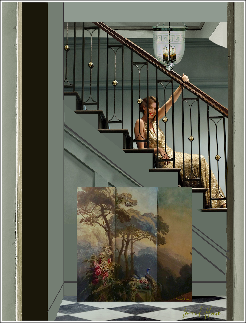
As always, I love reading your posts. This picture of “you” on the stairs makes me chuckle every time I see it. Thank you for your service.
When I was about 26 I lived in a rented room in a lovely home owned by an artist/painter. She had painted many murals directly on the walls and had huge landscapes and portraits framed everywhere. “My” bathroom had black wallpaper with beige Turkish figures on it – amazing!! However the two sconces flanking the mirror and weak overhead light were nothing like enough lighting to see my face clearly, let alone try to apply makeup or deep clean my teeth. Do consider where you intend to primp before installing a moody bathroom downstairs 🙂
Hi Julie,
Yes, lighting is very important and there will be ample lighting when needed.
I can’t wait read more about your color palette. I purchased a home three years ago with a cohesive color scheme (yes, lucky me). BM sleighbells a silver blue is in the entry, sitting room, living room, and upstairs hallway. This seems work well with the green tones of BM Nantucket mist (primary bath and Kitchen). I plan to paint a west facing guest bedroom FB kittiwake and another guest bedroom FB verte de terre or FB oval room blue.
Please expand on the light bulb trick with the masking tape! Does it smell weird when the bulb gets hot?
Hi Ellen,
I should’ve elaborated. It’s not for bulbs but for instance my range hood has very white lights that are flush. They do not get at all hot.
So, it’s use is limited. However, in the case of a light bulb, a cream-colored shade will help warm the light.
Yes, PLEASE say more about golden masking tape for light bulbs that are too bight!!!
Laurel, what is the name and make of the can bed at the top of this post?
Hi Martha,
I had a tough time tracking it down because it was on Etsy but I found the company on eBay now. They sell tapestries, not beds. But maybe if you contact them, they can tell you where it’s from.
Hi Laurel,
Check out Benjamin Moore Mystic Lake CSP-745 it’s supposed to be close to F&B’s Oval Room Blue, which I think I found on one of your past blogs, reported to be a toned down teal.
At 70 I’m back to picking colors for a new build, I’m about to start. My bedroom will be that color along with Sylvan Mist for the bath. These are new colors created by BM using up to 5-6 colors to make new colors compared to 2-3.
I love the wallpaper and have been looking for something for the half bath with no window. I am keenly interested in your color schemes, people may think it is easy but it is anything but.
I am painting the open floor plan BM’s Opal then bedrooms Mystic Lake and October Mist, all the ceilings will be White Opulence which is white with a hint of pink. The kitchen cabinets will be CSP color Estate Sale and the island will be BM Jojoba. Unless of course you show me something else I cannot live without, LOL!
Good Luck,
Cindy
P.S. I buy the paint samples and paint canvas which I buy at Hobby Lobby, so they can be moved around the rooms in different light, a lot cheaper and they can be reused.
Golden beige masking tape?! Please say more about this! Do you wrap the entire bulb in it? Too-bright LEDs are a scourge, and any hack to deal with them is extremely welcome! I read somewhere to paint amber nail polish on your bulbs, but I’ve never tried that.
Hello Laurel! Your home is coming together beautifully. Regarding green paint colors, do you remember a post you had quite awhile ago about going into a store and the walls caught your attention? The owner shared the color name and used it in their dining room as well. They were painted Benjamin Moore Rolling Hills 1497. I was so taken with the post I wrote down the color and will someday have to use it somewhere. It is described as a mossy green/gray. It seems to me it might be perfect somewhere in your home. Just a thought.
Love your design, you’re SO talented!1 I’m a Bostonian as well and I’m just thinking about that dark teal color… it’s gorgeous and rich but it’s going to be mighty dark and cold in those long dreary New England winters!
You’ve done a Herculean job on your reno, and how tedious it was along the way! You have the patience of a Saint! Thank you so much for sharing your journey with us! Karen
We recently bought an old (circa 1767) farmhouse in WV; think pine floors, big windows, huge sills, gorgeous hand built cupboards, etc. The house had been renovated, thankfully keeping the spirit and flavor of an old house intact. These colors were used in the house, and I have to say, I’ve not wanted to change any of them: dining room-SW Black Magic-it is simply divine with the SW Greek Villa trim on the built in cabinets, fire place mantel and any trim on the windows, crown moulding, etc.; master bedroom-SW Blue Peacock-my first reaction to this absolutely gorgeous blue/green/jewel color was that I would have to change it, but now I just love it; upstairs bedroom-SW Abalone Shell-the most beautiful, soft pinkish that plays well with black accents in the chandelier; great room-SW Elephants Ear-it’s a huge room (800+ sq feet) with a ton of windows. This color changes depending on the light, but take a look at it as it is green/gray/brown at different times of the day. It’s a gorgeous color! Keep in mind this is a BIG house at 5700 sq ft and the rooms are huge. Good luck with your color palette and keep the updates coming!!
This is why I always buy the paint myself and never rely on the painter. I learned years ago that even when a specific brand of paint is specified in the contract, painters typically buy the brand they usually work with (often the cheapest). Not only is this a problem with color, it’s also a quality issue, especially when it involves exterior paint.
I completely agree about embracing a windowless room with dark colors. Especially dark bathrooms.
They can be so dramatic & beautiful.
The wallpaper you’re considering is going to make your heart skip a beat every time you enter your bathroom. You’ll never regret your choice.
Trying to respond to Lisa’s comment but it’s so hard to reply and navigate with all these pop ups I might not respond directly to her comment. My experience.. I just finished painting a house addition with Farrow and Ball (shadow white, schoolhouse white, green smoke, red earth, Verte de terre). I didn’t color match (I experimented) bc in the end while the color was close, the different ingredients in the paint make a big difference. While BM might have the code for the color, there are so many different ingredients that make up the paint that BM will and can’t duplicate that do create differences in the look and the way the color moves and changes throughout day. Expensive but I don’t regret it. I might color match BM for our bedrooms. BM is beautiful paint as well
A word of warning…go directly for the paint samples. I wasted too much money on the Samplize squares and while they were lovely to have , they are just not big enough to get a sense. I had to in the end buy the real sample paint
to really see what a color would do in a room. Just sayin’
Hi. I’m curious if your painters will use true FB paints, or will they color match?
I know some insist the color match is true to the color but FB is so unique, as I’ve found often.
Ps. I have a dining room in FB oval room blue and I love it.