

I’m sorry I left most of you hanging the other day.
As promised, I am sharing my two favorite choices for a mural downstairs.
Oh, hold on a sec; I’m getting a message:
WE INTERRUPT OUR PROGRAM FOR AN IMPORTANT BREAKING NEWS STORY!
Please tune into our sister station for the latest concerning an important development in the killer spiral staircase saga. This one’s a doozy for sure!
Then, please come back to see the two beautiful murals! No worries, we’ll wait for you to return. ;]
If you have already read Part 1, please click the link below to read Part 2. If you’re here for the first time, please keep reading so the post makes sense.
Part 2 Begins Here
Hi Everyone,
Happy November!
Okay, yesterday we looked at tentative plans for the downstairs entry, hall, and staircase area.
I also answered several of the comments while I was getting my hair colored. lol
As I said, we’re continuing this topic, and I thought we would be focusing on lighting today, but let’s put that aside for now.
I have some exciting news on that front, as well.
The only thing I have to say is that all of the lighting rules are in the 333 Decorating Rules & Tips (You Need to Know) Guide. Please note that my helpful interior design and blogging/website guides are going up in price at the end of the year.
However, there was one comment by Constance that brings up my choice of colors, a cohesive color palette, as well as a wall mural and its colors I want to address.
Here’s the comment:
So enjoy following your journey, Laurel. Not just the renovation information but, perhaps more importantly, how your home/community enhances your life and well-being! You’re truly an inspiration in that regard.
Related to your request for feedback about the downstairs entry, I offer you only comments based on my experience as a homeowner and most certainly not a design expert. For me: Lighting and continuity. I never really understood the power of light in design until I moved to my second waterfront home and was astonished at the colors we chose because of the light. It was completely obvious when choosing between variations, but never the colors I thought would be chosen when seeing options in a different light. Trust yourself in the mood you want to experience every day you walk down those stairs.
In regards to continuity, I love the idea of continuing the black and white floor to bring continuity between the levels. Bravo. I don’t, however, recall teal as being a color you love or one that will be incorporated/blended throughout the downstairs area. For me, the continuity between spaces brings harmony to homes.
You have such attention to detail that I feel sure whatever you choose will be fabulous.
Okay, Constance has brought up some great points. But, I have to laugh. Obviously, she doesn’t own the Laurel Home Paint and Palette Collection. For if she did, she’d realize that I adore the warmer shades of blue. Like, I’m mad crazy about them.
Currently, there have always been teal, turquoise, and green accents wherever I’ve lived. If one goes through the hundreds of blog posts, this is a prominent color in most of the color palettes.
I figured out early in my design education that I adored the verdure melange of greens.
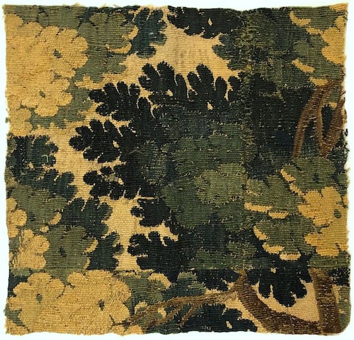
Like this beautiful verdure tapestry fragment, above.
There’s a new source on Etsy that sells these gorgeous wall tapestries and they are quite reasonably priced!
Every color palette for all of my homes for the last 23 years has emanated from one source.
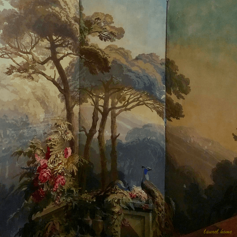
Yes! My prized antique Zuber screen I’ve had now for 23 years. I love it as much now as I did then.
There it is. Yes, it may end up on this wall between the new sconces!
But let’s get back to the cohesive color palette and my love for teal.
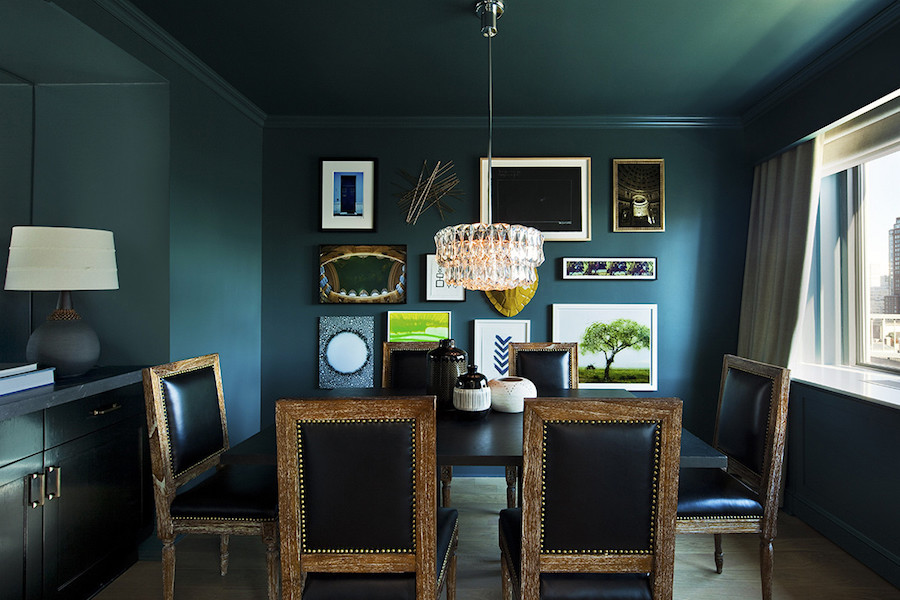
Now, I don’t expect everyone to read every word or post. I’m amazed that you’re here at all!!! However, a few weeks ago, I did mention in this post I was planning on painting the den a color similar to the one below.
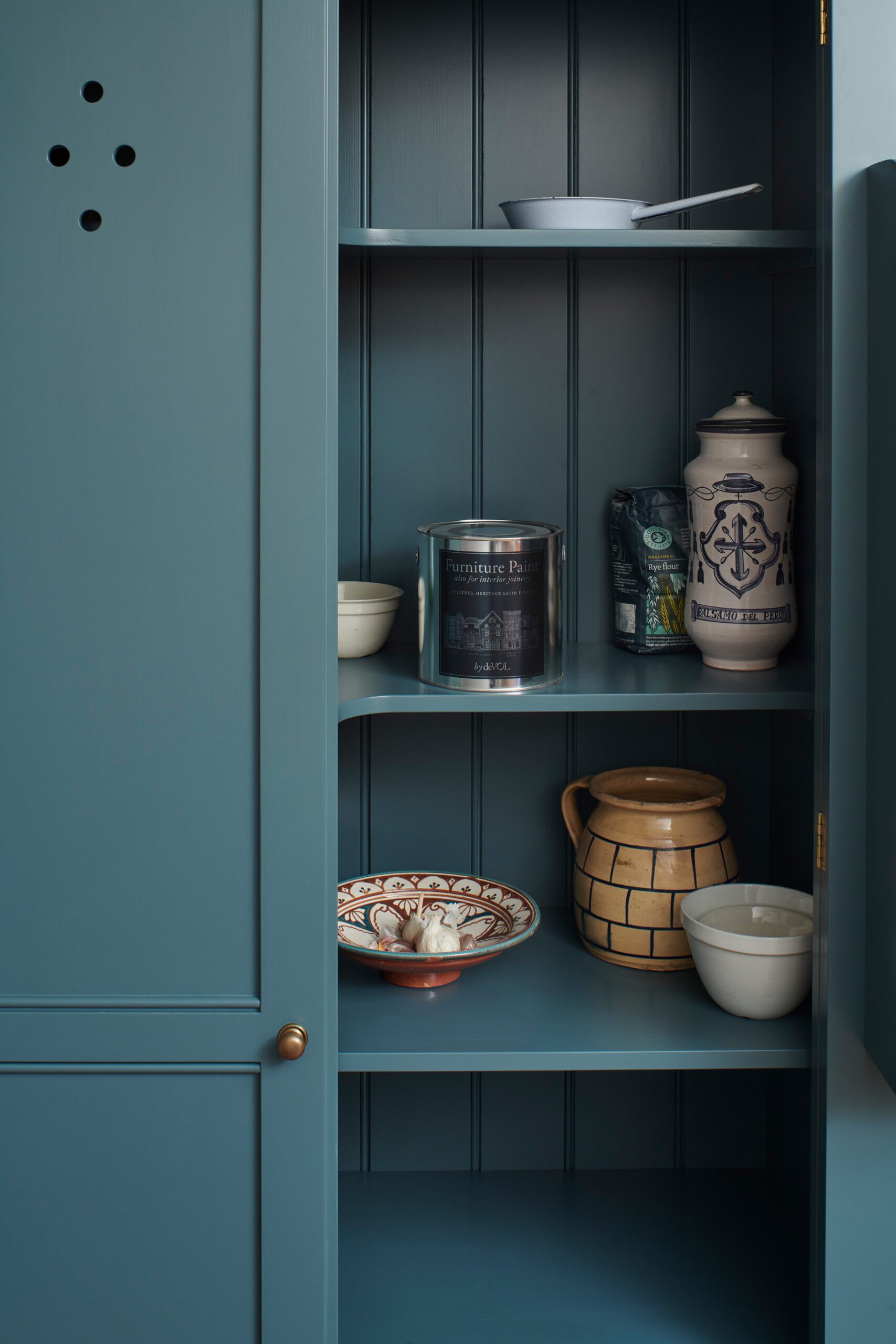
Clerkenwell Blue Cabinet by DeVOL kitchens
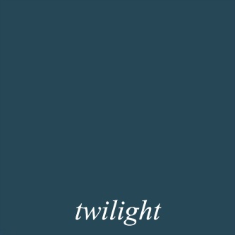
This one looks a bit more blue, but the color might very well be Benjamin Moore Twilight.
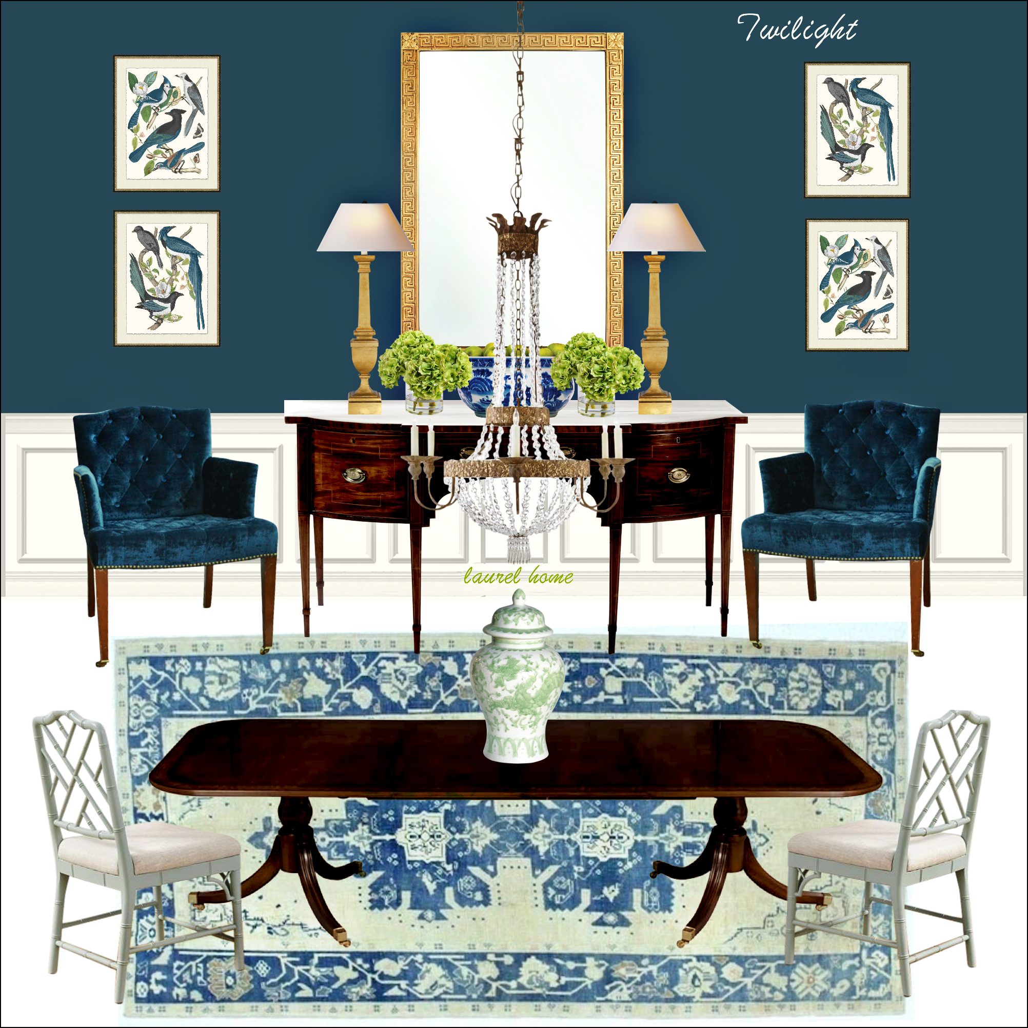
Above is a dining room mood board I made using Twilight as the key color for the Laurel Home Paint & Palette Collection.
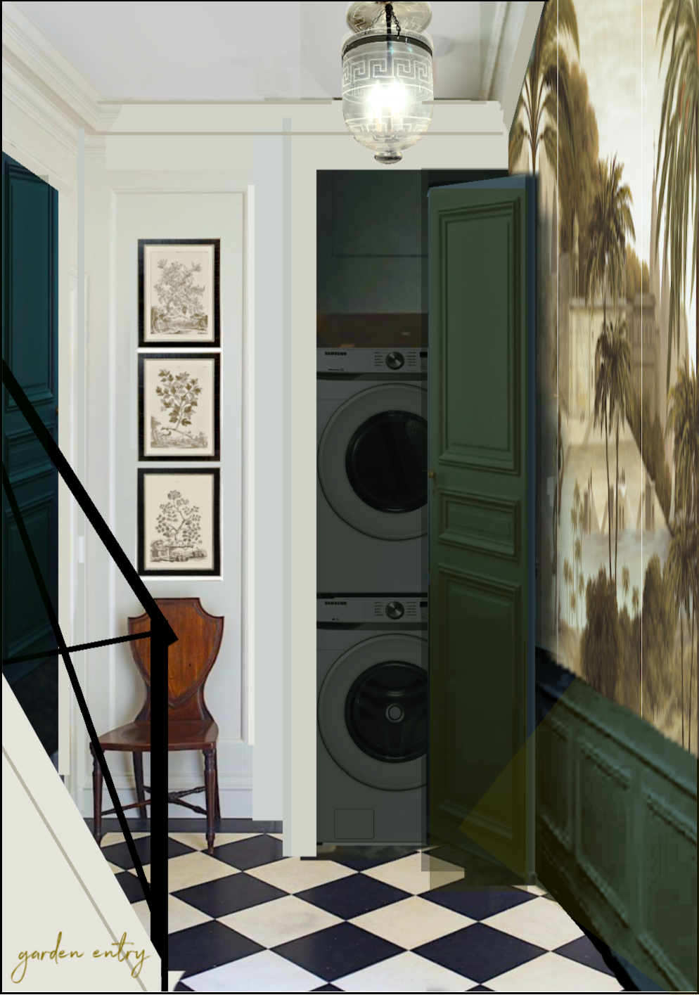
Above is Benjamin Moore Narragansett Green hc-157 in a beautiful room by Nate Berkus
Another beautiful, very deep, rich teal is Benjamin Moore Narragansett Green.

And, deep is what I want.
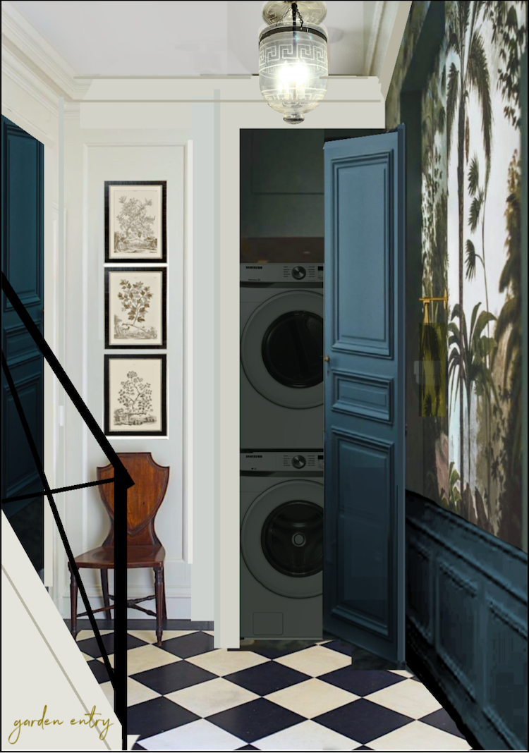
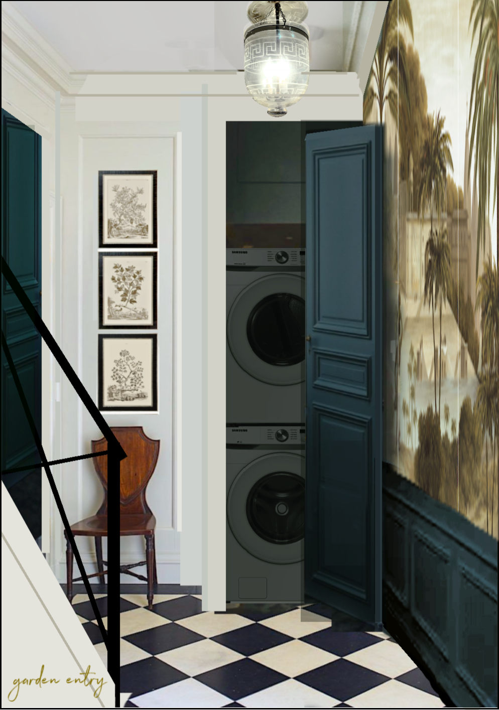
Someone commented about maybe running the deep teal color behind the chest. I could, but the problem is, what happens next to the door? And, where does it stop? Does it go up the stairs?
No, I don’t think that would look good. And I don’t think it would look good in the area where the hidden doors are either.
Then, there’s the linen closet wall. There’s about 15″ of wall between the closet and the stair wall with hidden closets.
Since I don’t wish the space to look too choppy, I love the idea of only doing the deep teal only under the mural.
Could I do the mural from baseboard to crown and leave off the wainscoting? Yes, I could. However, the pattern will be larger, and I like how the wainscoting anchors the wall.
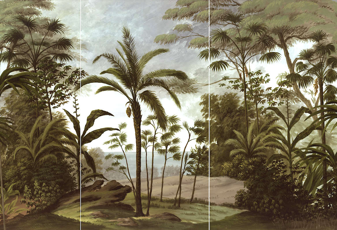
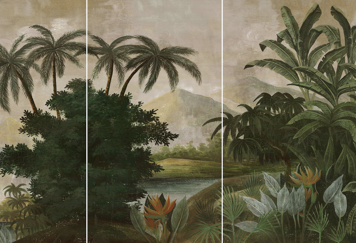
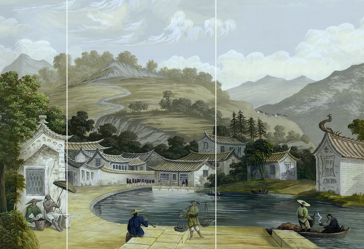
Let’s look at my three favorites for the mural. All of them are from the beautiful French Mural Company Ananbo.
Please also check out their gorgeous Instagram account.
The one in the Instagram photo is called Bali
For all of them, I’ve trimmed them to fit in the space I have.
Since each panel is 100 cm wide, I’d need to order three panels and trim one or two. All items can be custom ordered in increments of 10 cm height-wise, from 140cm to 400cm. So, if you’re looking at some of their hotels with mad HUGE murals, it’s because it IS huge. But, your mural could be half the size or less.
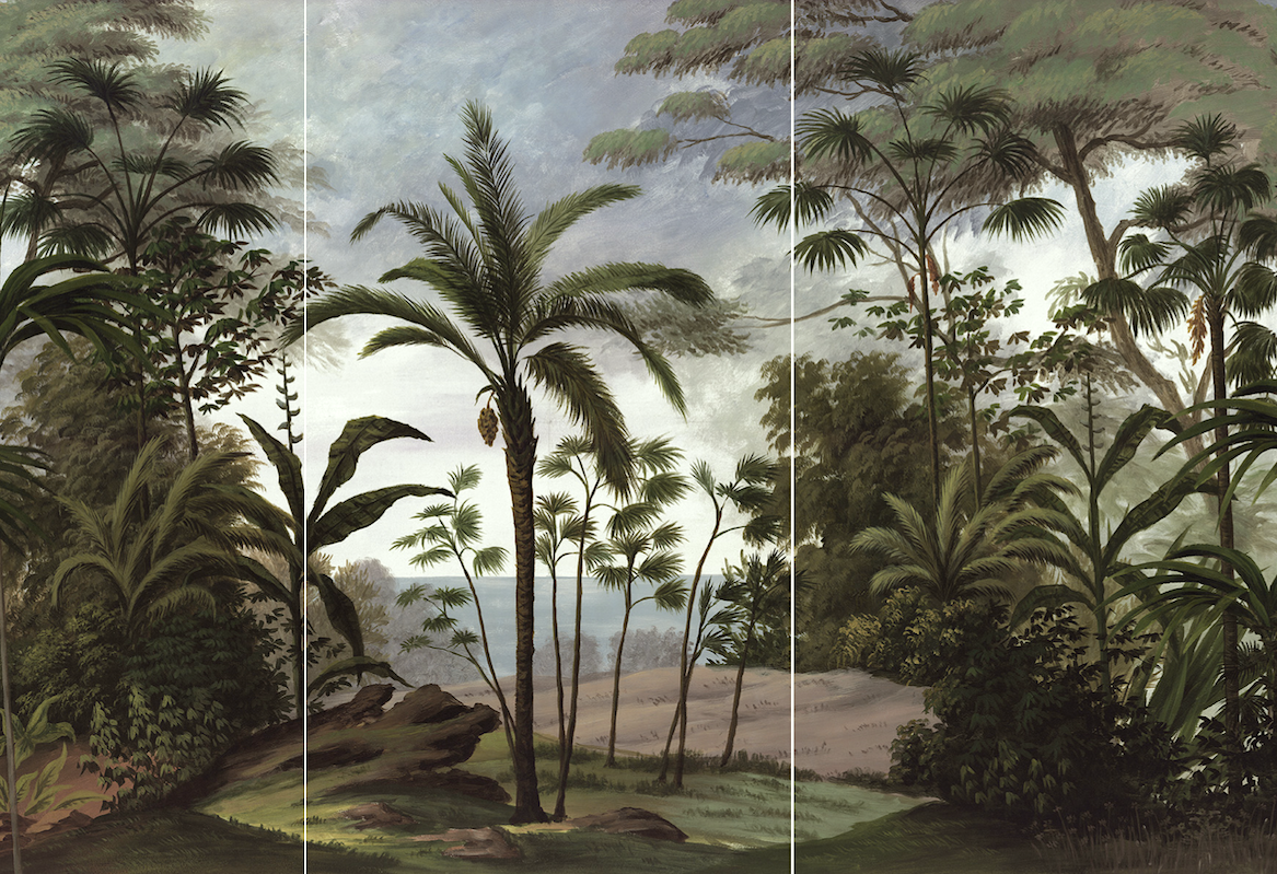
Ball is quite dramatic and not as golden as it appeared on Instagram. I did brighten it up a bit. However, of course, I would need to order samples of all murals under consideration. While I love the moody quality of this mural, I think I want something a little more uplifting.
No problem. Ananbo specializes in DREAMY images!
I think it would work better if the colors were more like this. However, they aren’t, and it still looks a little heavy.
This next mural, I adore, but it’s not right for my small entry hall downstairs.
Laurel, why do you want something tropical?
Is that a trick question? ;]
Why not?
These murals are beautifully rendered, and I find them transformative in that looking at them takes me to a far-off exotic land where there are no packs of testosterone-laden males riding motorcycles without mufflers and revving their engines at eardrum-shattering decibels… :/
Plus, Ananbo knows how to create an exquisite, cohesive color palette!
The compositions are enigmatic and balanced in terms of light, medium, and dark.
There’s one other thing, and this isn’t really a factor, but the Victorians were known to love decorating with exotic furnishings from India and the Far East. Therefore, I’m 100% on trend with the 19th century. haha
However, I also don’t want an image overpowering the space.
One color I want to see is ochre or gold. It is so beautiful with the shades of teal and green. I never tire of that combination.
This next one I also love, but I don’t think it’s “the one,” either.
This one looks amazing with Narragansett. At least, here, it does. Narra does look brighter on the wall than on the chip. Of course, I will get samples from Samplize!
Twilight is beautiful with all of them, too. It’s more saturated. Still, with mostly artificial light, this deep color will most likely look quite dark. Yes, please.
Oh, one thing I forgot to mention.
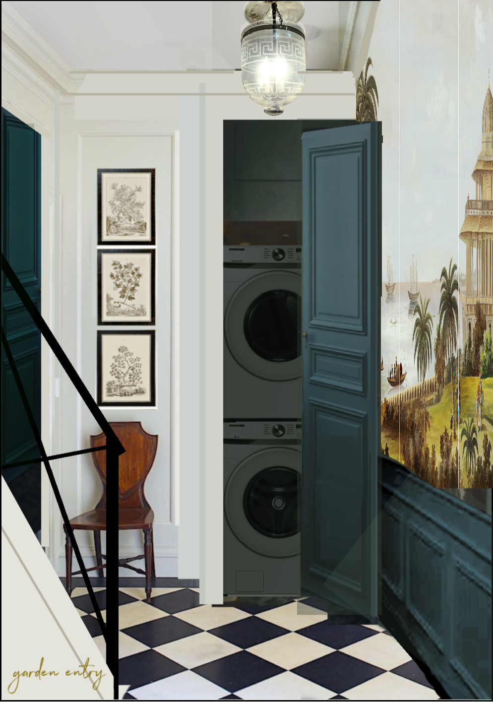
There are 13″ above the doors for about 9 inches of wall and four inches of crown moulding. So that, too, would be painted a creamy white. Only the doors and mural wainscoting would be the dark teal.
I also love this combination with the black and white floor and black iron stair railing. The wood-tone accents bring warmth into the space, as well. Since I’ll be passing through this area a lot, I want it to give me joy.
Laurel, if you like the mural above, why wouldn’t you do it? We all know you love Chinoiserie.
Yes, I do; this piece is in the number three position. That’s because there are two others I like even more.
However, you’re going to have to wait to see them until Thursday, I’m afraid.
WHAT? You can’t keep us in suspense like that, LAUR—REL!
I’m sor—ry (but not really, hehe). However, I’m busier than a one-armed paper hanger. (One of my Mommy’s favorite sayings.)
Look, I was at a house party last night. And, I have been forced to go on a chocolate tour tomorrow morning. Then, I have mahjong in the afternoon. See what I mean? Very busy. ;]
But for real, in between and afterward, there’s always stuff to do for the renovation. Plus, the blog, website…………
And then, I am working on updating my guides for later this month.
I have decided to release them the weekend before Thanksgiving. In recent years, I’ve done it on Black (Kaching) Friday.
But, it’s a super burnout and wrecks Thanksgiving pretty much every year.
Last year, I did the updates on November 30th.
Even worse. That’s because it was hanging over me all during Thanksgiving!
This year, I plan to send out the new Rolodex and Etsy Guide updates the weekend before Thanksgiving. That way, my holiday will only be semi-wrecked. lol
Laurel, I just subscribed to your blog about three months ago and have no idea what you’re talking about.
Okay, sure. I’m talking about my exceedingly helpful digital interior design guides that thousands of readers have purchased since 2015. Two of them get updated every year.
To find out more, please start on this page.
You can also find the link in the main menu, which says Rolodex + Paint + Blogging Guides. From there, you can get more detailed information on each guide. I created each of these, and each is a labor of love.
Okay, in closing, please be assured there will be a mad-good update on Thursday evening, November 2nd.
Please get ready for some very exciting news! Well, let’s just say if all goes according to plan.
*********************************************************
Part 2 Begins Here
Hi Everyone,
Well, the surprise wasn’t quite the one I was expecting to share with y’all. If you missed the drama with the spiral, please check out the latest in the renovation news and deets.
In the meantime, I promised you two more gorgeous murals from Ananbo:
and
I love them both, which is why I put them in alphabetical order.
Here they are below.
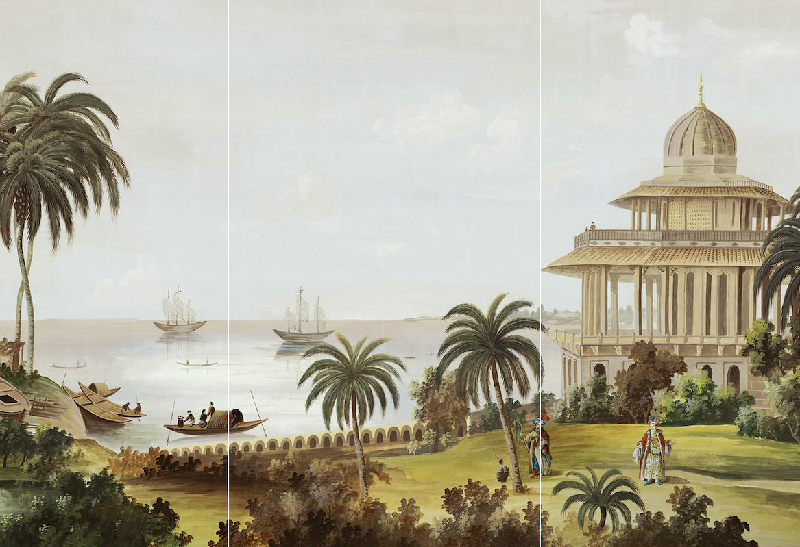
India by Ananbo
Above is Benjamin Moore Narragansett Green
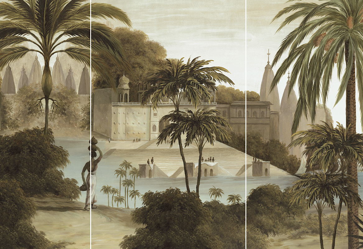
Varanasi by Ananbo
Now, here’s where it gets interesting. I manipulated the murals to be something like they would be on the wall. It’s not perfect because of the obtuse viewing angle, but it’s an idea of the pattern and colors.
Here’s India with Narragansett Green.
I have to say I kind of love this one.
Now, let’s see the Varanasi.
I think this one looks a tad too somber.
Let’s try it with a greener color.
It’s better but still not quite right.
Okay, one more try.
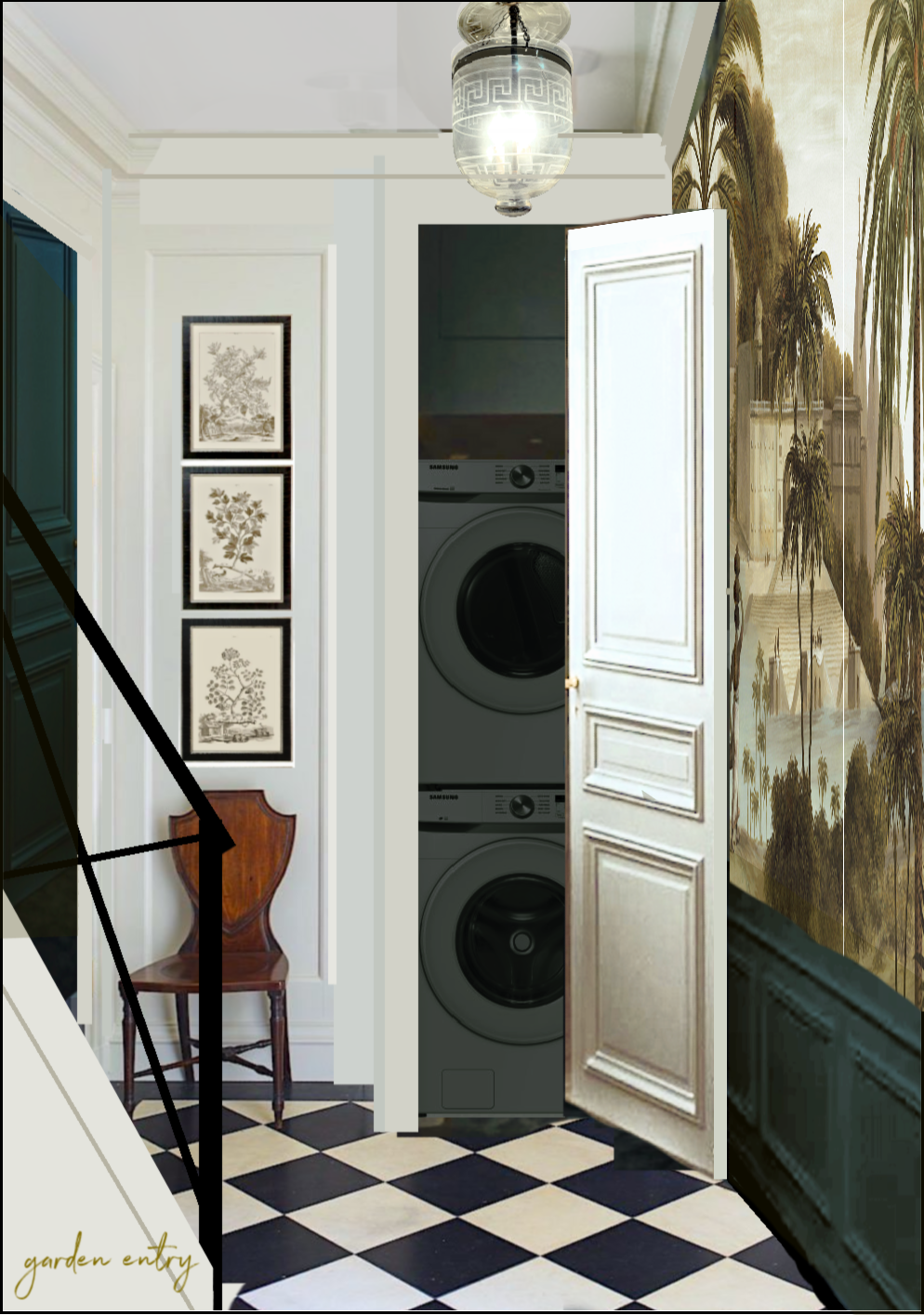
Let’s go back to the white door.
Oh, so interesting. This is the slightly greener wainscoting. Maybe Essex Green, like Melissa T used in her gorgeous sunroom.
However, the white door provides a bright note that keeps this one from looking too sad. I love this one, too!
Okay, so it’s this version of Varanasi above or this version of India below.
Why not the white door with the India, Laurel?
Great question! Well, I could try it, and probably will, except I already love it with the dark door. India is mostly very pale, with maybe 1/4 medium and 1/20th dark tones.
However, Varanasi is mostly medium tones with maybe 1/3 pale tones and only very few dark tones. The wainscoting gives the heft needed, and the white door brings on some much-needed freshness that makes this mural very beautiful.
I’m torn; not so torn I’ll need stitches. ;] but I really cannot decide. One is a hotel in colonial India, and the other is a hotel in Paris.
Well, Laurel, what’s happening in the embrasure hall, bathroom, and bedroom? Doesn’t that factor into your decision?
Ahhh, now, you’re thinking like a designer! And, yes, it most certainly does.
However, I think I have my answer. Which one do you prefer?
A. India with a dark door.
B. Varanasi with a creamy white door.
I’ll look forward to reading your responses!
xo,

Please check out the recently updated HOT SALES!
By the way, it’s BLACK NOVEMBER. Yes, indeed, the holiday season has begun. But, you know, Thanksgiving is only three weeks away, and Hanukah, if that’s your holiday, is pretty early this year.
There is now an Amazon link on my home page and below. Thank you for the suggestion!
Please note that I have decided not to create a membership site. However, this website is very expensive to run. To provide this content, I rely on you, the kind readers of my blog, to use my affiliate links whenever possible for items you need and want. There is no extra charge to you. The vendor you’re purchasing from pays me a small commission.

To facilitate this, some readers have asked me to put
A link to Amazon.com is on my home page.
Please click the link before items go into your shopping cart. Some people save their purchases in their “save for later folder.” Then, if you remember, please come back and click my Amazon link, and then you’re free to place your orders. While most vendor links have a cookie that lasts a while, Amazon’s cookies only last up to 24 hours.
Thank you so much!
I very much appreciate your help and support!
Related Posts
 Wait Until You See the Two-Story Great Room Glow-up! (Parts 1 & 2)
 The Elusive White Marble Countertops Are Difficult to Find!
 It’s Easy Being Green | Green Decorating
 Bathroom Art Ideas You’re Gonna Love
 Classic White Kitchens – How To Avoid The Sterile Look
 New York Gift Show | New York Now Show August 2013
 Easy (and affordable) Ways To Fix A Boring Room


98 Responses
I’m the Etsy tapestry source 💖 thank you so much for the backlink 😍 I’ve moved out from Etsy 😌 Please stop by the new Romantic English store— Best verdure selection reproduction on planet earth, with hands down the best price possible✨
To clarify, do you always recommend a whole-home color palette, or is it ok for each room have its own color scheme and personality? I have a muted color palette inspired by Charcoal Pyne Hollyhock in my bedroom. It is very restful, but I’m considering using more vibrant/energetic colors for the public spaces in my home.
I’m not drawn to any of them. Would you consider a moody mural of the Boston Harbor or Public Gatden? Same feel. Same colors.
India with the dark door, for all the reasons stated, especially in this location as Alice stated earlier.
Laurel I like the India Mural with the darker color. I have Inchyra Blue from F n B and I love it. Love the teals too.
Such a treat to be included to weigh-in, since I have no skill whatsoever! I’m with Caroline Smith and Andrea. I loved A until I saw B. Somehow, it enhanced the beauty of the mural – or is it the elegant detail of the door that wooed me. But, the person who said “neither may be right”, may be right too??
Wondered if there any any rules of thumb when choosing lots of sky and water (open space) vs. green foliage from top to bottom?
No doubt that your choice will be dream-worthy!
India, dark door, BM Essex Green
I like the India best. I think it has more depth of color and perspective. In regards to the teal doors, one thing that has been bugging me is whether or not the linen closet door across from the W/D door will also be teal? It seems to me that it should, but you hadn’t mentioned it. Thanks for sharing your journey, humor and expertise, Laurel. I’m enjoying the ride.
Hi Laurel. I prefer the India with the dark door. I actually love the dark teal that you showed with the Varanasi screen but having been to Varanasi numerous times, I’m brought back to the cremations held there in that most holy place for Hindus. It’s much more somber to me, but maybe that’s because I couldn’t get around the meaning of the place. I love love love the India with the dark doors.
India with the dark door
India with dark door!
India!
India. It’s brighter. It looks very similar to your throw pillow upstairs — the colors anyway.
A. India with a dark door. Are you counting the votes?
Hi Laurel,
I prefer the lightness of “B” to “A”, however, I also like Voyage a Nankin shown in your previous post. Just sayin’.
INDIA WITH THE DARK DOOR
Really love B. This feels more like Paris IMO. However I do agree with the comment about A India the perspective this one provides is really breath of fresh air for a garden level hallway
India gets my vote too!
India. Dark door. The sea in the distance with those buoyant tall ships wafts us out of any sense of being enclosed “below stairs” or restricted space. Really lovely.
I vote: India with the dark door. Reason: the contrast between India mural and wainscoting/dark door complements the contrast in your checkerboard floor. So this combination flows better than Varanasi with the white door. India mural creates a focal point also because it’s like a highlight on the wall, with those sunny greens and golds. Choose India with the dark door!
Varanasi (B) gets my vote. I love that the mural itself has interest everywhere you look. For me in A the sea takes up a lot of space in the center of the mural. Of course, it really only matters which one appeals to you and if the sea is what you love about it, then that’s the one for you.
My husband likes the Varanasi with the white door, and I love India with Narragansett Green. Both are great choices!
India with the dark is perfection! It is coming together so beautifully, I know you must be excited.
Laurel, I too love teal blue in a deep midnight hue. I used Benjamin Moore’s Washington Blue in my dining room and absolutely loved it. It has a slightly more red undertone than some of your choices but is definitely teal. It might be the perfect compliment to the first Bali or Voyage murals.
India has sky and water. What could be better?
As far as the door color, we need to see both with the door closed please!
I like the dark door for reasons I cannot articulate, but really need to see it closed in dark and white.
Both are beautiful, but if you are wanting something uplifting, perhaps India is the right choice for that wall. The cream door and trim would look stunning with India’s creamy clouds and also prove uplifting.
The India mural and creamy door combination would help lighten up your small entry space downstairs.
I’m a person who will wear a blue dress with gorgeous green stone earrings. Better, deep blue with pink ones.
With your photos. If you take them and make beautiful full color photos in whatever size you can, maybe 10×10. Then look at one at a time. I like to put one around a corner (different areas of course) so I’m surprised to see it.
Do you feel joy?
Which talks to you?
Then trust your soul.
Varanasi with the white door. I like it best because I love the aqua of the water and I am not a fan of chartreuse. But, I know you love chartreuse so India might be better for you. Whatever you do will look fabulous.
India!
India, with a dark door! I absolutely love everything you do!
India Absolutely! Lovely! Dark door adds drama…pulls everything together.
Choice A for sure. It brings chartreuse downstairs and it’s brighter in my opinion. B is too subdued and will fight with the brightness of the black and white tile being so fresh and crisp
India with the dark door. Seems brighter yet has drama.
India with dark door
India with the dark door!
India with the dark door. Your instinct is right.
I vote for India, just love the dark door and wainscoting with the scene.
I prefer the lightness and sky and horizon of the India mural, but I like the white door. Seeing the two choices rendered this way has solidified for me that the white door on the wall separates the door wall from the the mural wall with the dark wainscot so for me, that look flows better than having the dark color creep over onto the door. I know, this is not one of the choices you gave us, but until you had these two renderings, it just was not clear to my eye what would flow the best. That said, your attention to detail while still considering the gestalt is a rare talent and when all is finished, it will be so very very lovely.
I like India with the dark door! This mural has more colors in it, particularly a bit of chartreuse which I know you love. The other one falls a bit flat to me. Of course, I don’t know what the plan is for everything else nearby. 🙂
I love the India mural with the dark door. Beautiful!
The softness of B with the creamy door gets my vote. I see the entire mural vs A where all I see is the gold/yellow which appears to be “in your face”. I actually liked A best before you imaged it in your home. So happy for you that your dream is becoming a reality.
India with the dark door would be lovely!
My favorite is India with the dark doors and wainscoting, beautiful!
Hello Laurel!
My vote goes to India with dark doors. So gorgeous! Being from the Maritimes region, I guess I will always favour a seascape. Aside from that, I think that the big expanse of pale sky acts like a window of sorts in the small space. It brings the eye out to the horizon, creating a sense of depth and distance. My favourite colours are all of the teals, turquoises, aquas, and blueish greens, so I really like Twilight as well, on both doors. This is going to be so beautiful, Laurel. Can’t wait to see it done!
I love the India with the dark teal. Beautiful combination.
Since you are having some troubles choosing is it possible that maybe neither is correct? You adore/love your screen, will a mural dissipate the uniqueness of it?
I am chiming in only because I didn’t see anyone mention the tiny touches of red (I think) in India. Those very small pops of color add a lot, engender though I already preferred India with the dark door.
So happy the worker will be okay, and the mean staircase didn’t do more damage!
Dark door. The way the grasses and landscape look with that dark is beautiful.
I’m with Carolyn Sorahan – having witnessed cremations at a Hindu temple in Kathmandu, as soon as I saw Varanasi I thought it was a cremation site. So glad the voting seems heavily in favor of India.
I’m going to be your problem child. I’m not wowed by either one. Personally I am drawn to Voyage. It appears to perfectly pick up Narragansett Green and has the gold or ochre you like but is a softer shade than in India. What is stopping me from being excited about the ones you are considering is the fact on my screen neither of them appear to pick up the paint colors you like and you’d have to go with a duller green to make either of them work. It must be my computer since no one else is having a problem with them. If you are set on the two you are having us weigh in on and the paint colors do work together, India is best, with a dark door.
I’ll be so relieved to hear the spiral stairway is no more. I’m sorry to hear someone had to get hurt while dismantling it. It has always looked like an accident waiting to happen but I never dreamed this would be how it would happen.
India. I just really like that scene. How do you think it will look as you are coming down the stairs and seeing it from the top down?
India with the dark door, I like the amount of light in this mural!
I prefer the Varansi, but the India is the right choice. Its perspective and use of distance give the impression of a vast expanse and opening up that will completely transform the narrow space. I wouldn’t normally comment but didn’t see this mentioned above. I find this very important in selecting art for spaces!
India with the dark door. Beautiful!
Looking at the earlier post, I think the dark door to match the wainscotting is right, although I do prefer the pics with Twilight as the colour comes up a richer blue with less of a green tinge — maybe a paler shade of that? With the dark door, the paler mural with its large expanse of luminous sky (India) is the one to go for.
India for the win!
Dear Laura,
Have so enjoyed following along with your remodel and learn something new everyday. Your home is going to be lovely! I prefer India. Mainly because I’ve been to the city of Varanasi on the Ganges River and although I found it extremely fascinating I would not want to be reminded everyday about the cremations I saw there. In the Hindu religion to be cremated on the banks of the Ganges River in Varanasi is the ultimate send off. I actually prefer the 3 panel at the beginning of your post. Love the greens in that one.
India!! For reasons others have given.
Hi Laurel,
Enjoying your reno updates and appreciate the detail and effort that you’ve put into the design. I like your mural choices, but I personally like the Samoa mural. Samoa has the ochre and deep teals. It reminds me of your Zuber screen.
Thank you for sharing your talent! -Donna
My choice is 100% India, with the dark door. It’s bright, happy and inviting! Varanasi is the total opposite. 😊
India with the dark door. Just lovely.
India with the dark door (for all the reasons others have stated)!
I think the wainscoting and mural need to wrap around on the wall and replace the three prints. Both are great murals!
India and the dark door
India/ dark door- when I envision descending the stairs and seeing this, I would park myself on a tread, projecting myself into the image as I stroll toward the hotel. The breeze is light and the air laden with the sea. I am there.
Hi Laurel, My vote is A for India and the dark door. I like that the upper portion of the India mural is predominantly light or pale. To me it relates better to the creamy white walls. I adore the dark wainscoting and doors in Narragansett Green or Twilight! Not much of a fan of the Essex Green. Bottom line is there’s no doubt in my mind that it will all be amazingly beautiful no matter which you choose. You’re incredibly talented, thanks for allowing us to follow along!
B. Varanasi with a creamy white door.
And I have surprised myself with this answer because I am usually a maximalist when it comes to color. You are correct in noting the brightness it brings, and a bit of extra cohesion with the space. The creamy white door means the mural reads more like framed work of art. But both options are delightful.
Hi Laurel, My vote is A for India and the dark door. I like that the upper portion of the India mural is predominantly light or pale. To me it relates better to the creamy white walls. I adore the dark wainscoting and doors in Narragansett Green or Twilight! Not much of a fan of the Essex Green. Bottom line is there’s no doubt in my mind that it will all be amazingly beautiful no matter which you choose. You’re incredibly talented, thanks for allowing us to follow along!
Laurel,
I love all that you are doing and sharing. The India mural with the dark door is wonderful! Thank you for your constant inspiration.
I do agree partially with Jeanne who prefers the older format. I get why you are doing this, and it works for you and most of your readers, which is what is important. I just looked forward to Sundays after church and Wednesday evenings when I could sit down and devour every word of your latest blog post. The more frequent posts have me off kilter and I just can’t devote as much evening time to catching up multiple times a week. It has been harder for me to keep up with the shorter posts, so feel like I am missing too much. But as always — fabulous content and not too commercial at all.
India with dark door! Been dreaming about this for 2 days!
India with a dark door. I know this sounds silly, but it’s a harbor, albeit in India and you are in Boston, which has a very famous harbor – it just seems serendipitous!!
BTW, in my new build I’m doing Sherwin Williams Riverway, which is a fairly deep teal, in my library. With Visual Comfort antique brass library lights on the bookshelves and sconces in the window reading nook. Squeal!!!
Hands down India with that gorgeous green door and wainscoting;-)
A A all the way!!! Sounds kinda like a cheer. There is just no contest.
I much prefer the India mural.
India with the dark door all the way! It is rich and timeless. The cream looks a little more contemporary to me.
Regardless of which mural you choose, as they are all beautiful, you must go with the dark door. It must match your wainscoting color!😘
My preference, based on the photos, would be the India mural, but I would like to see each one with the dark door and the white door closed, not ajar, before I make up my mind.
I prefer India by far. The Varanasi looks quite dreary to me!
I am sure whichever you choose will be beautiful!
India with the dark door.
For me it’s hands down, India. Especially with all the lovely gold you like. I am in favor of the lighter door, so that may throw things off.
I can’t imagine how excited you must be at this juncture, I am nearly beside myself with anticipation. Thank you!
Hi, Laurel.
The India mural and dark door are dreamy. Love it with the tile, too!
The winner for me is the India with the dark door ! The India is gorgeous because there is rich color but plenty of open sky and water at the top to avoid any oppressiveness, yet it is beautifully framed by the dark door. It will be gorgeous.
I choose A. The dark wainscoting gives heft and drama, in a space that’s not sat in long enough to tire of it; similar to a powder room. I loved it the moment I saw it, and marched into my dining room to picture it there myself. I have a peacock green velvet coach, visible from the dining room. I may just try it
I prefer A. The B mural is too dark and contrasts too much with white door.
I lean towards B.
India with dark door. I think your floor is better with the lighter tones in India and the Narraganset paint colors. Really lovely combination.
Most of the examples of rooms you have shown have a really nice contrast of colors- a “perkiness” which this reinforces. I also feel that green is great coming off your kitchen.
Love what you are doing.
Pick B.! Varanasi with creamy white door. Hands down.
My vote would be the Varanasi with the white door. (I was surprised I liked it better with the white door—but it very much enhances the mural that way).
I love the richness of the Varanasi image and colors, and the fact that the artwork extends nearly all the way to the top (vs. India, which features so much pale sky). Both are gorgeous, though!
I prefer the India with dark door. The paint color sets off the mural and is more mysterious. I think the India mural is a scene that draws you in and lets your imagination wander.
Hi!
I love the India with the dark door. Your reasoning makes so much sense! 😊
I have become quite fond of a Welsh artist named Sarah Evans. Just search her name (not sure if you like links or not). I think her color pallete would look good with your choices. Not too expensive. I’d buy some but I’m still furnishing a home right now.
Just had my master bathroom done in a Ananbo Wallpaper (in a Grisaille countryside mural). They were easy to work with when ordering the custom size for my space. Even though it came from France it arrived promptly. Pricing was better than many of the custom murals. It is stunning wallpaper & transformed our larger master bath (12×17).
Hi Laurel,
I have a small hallway right off my kitchen. I’m painting all the trim & doors in the hallway & kitchen BM Quiet Moments. Once the painting is completed I’m hanging wallpaper in both spaces. (no room for a mural)
My living room is paneled. The entire room, paneling & trim is painted QM.
This is how I’m making my space cohesive.
Is that a brass sconce with a green shade that I see on the mural wall? If so, can you share a link to it somewhere? Yum!
Your home is coming along beautifully!
I painted my powder room Benjamin Moore Narragansett Green and still love it over 10 years later. I share your love of dark, moody, blues and greens! Your home is going to be gorgeous!
Hi, Laurel!
Looking forward to the next two murals! Our family watched the Disney Cinderella directed by Kenneth Branagh for our Halloween Movie Night, and not only is it one of the most exquisitely beautiful movies, but Cinderella’s family home is full of chinoiserie wallpaper! I like best the sets from series in the brownstone on West 35th…Nero Wolfe. 😊
And I’ve got your guides on my Christmas list 🎄
Hoping this week sees lots of reno progress!
What was the trick you said you use to create the cohesive color palette?
Hi Chris,
I’ve always used my Zuber screen for inspiration. Of course, your inspiration could be something else. It could be a photo, a piece of art, a rug, a piece of fabric or wallpaper. Or, my other favorite is nature.