
Hi Everyone,
It is now October 31, 2023. This is a two-part post and part one is from June! Oh my. The first part is about the small entry upstairs and part 2 is about the downstairs small entry. If you’ve already part 1 and wish to jump to part 2, please click the link below. Otherwise, please begin from the top.
Part 2 Begins Here
Hi Everyone,
The renovation has stalled for a few days because the final plans aren’t quite finished. And, they won’t be finished until I send the architect some more feedback.
Since I also need to do a blog post, I thought I would do the mid-week post sharing my design of the front entrance hallway, upstairs.
In addition, for non-designers, this information might also be helpful to you if you’d like to play with designing your own spaces.
Yes, you can. I learned how to do this in one day. I learned it in one day because I had no choice unless I wanted to flunk out of interior design school.
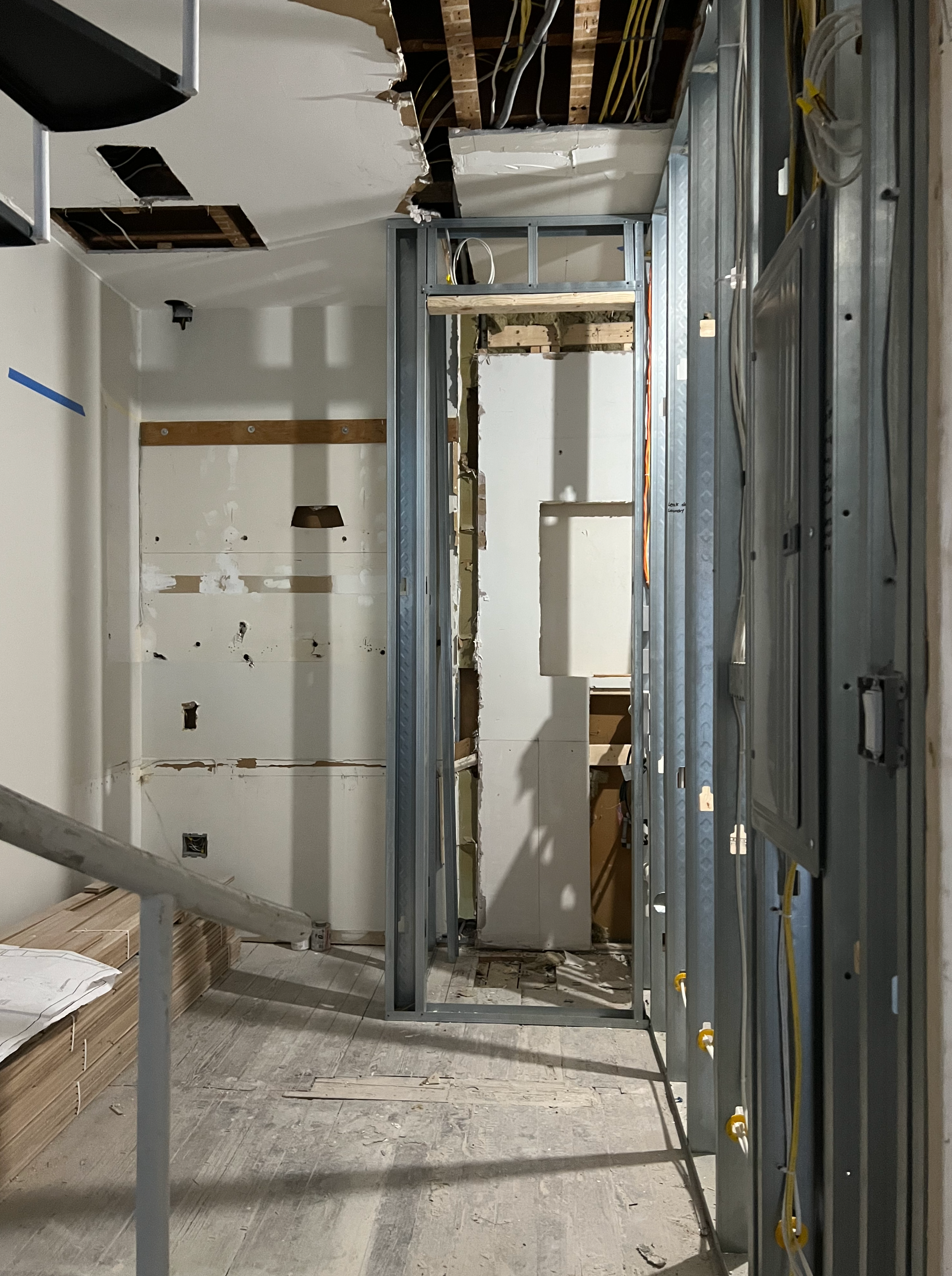
Anyway, the upstairs is finished except for the small entry, off the kitchen.
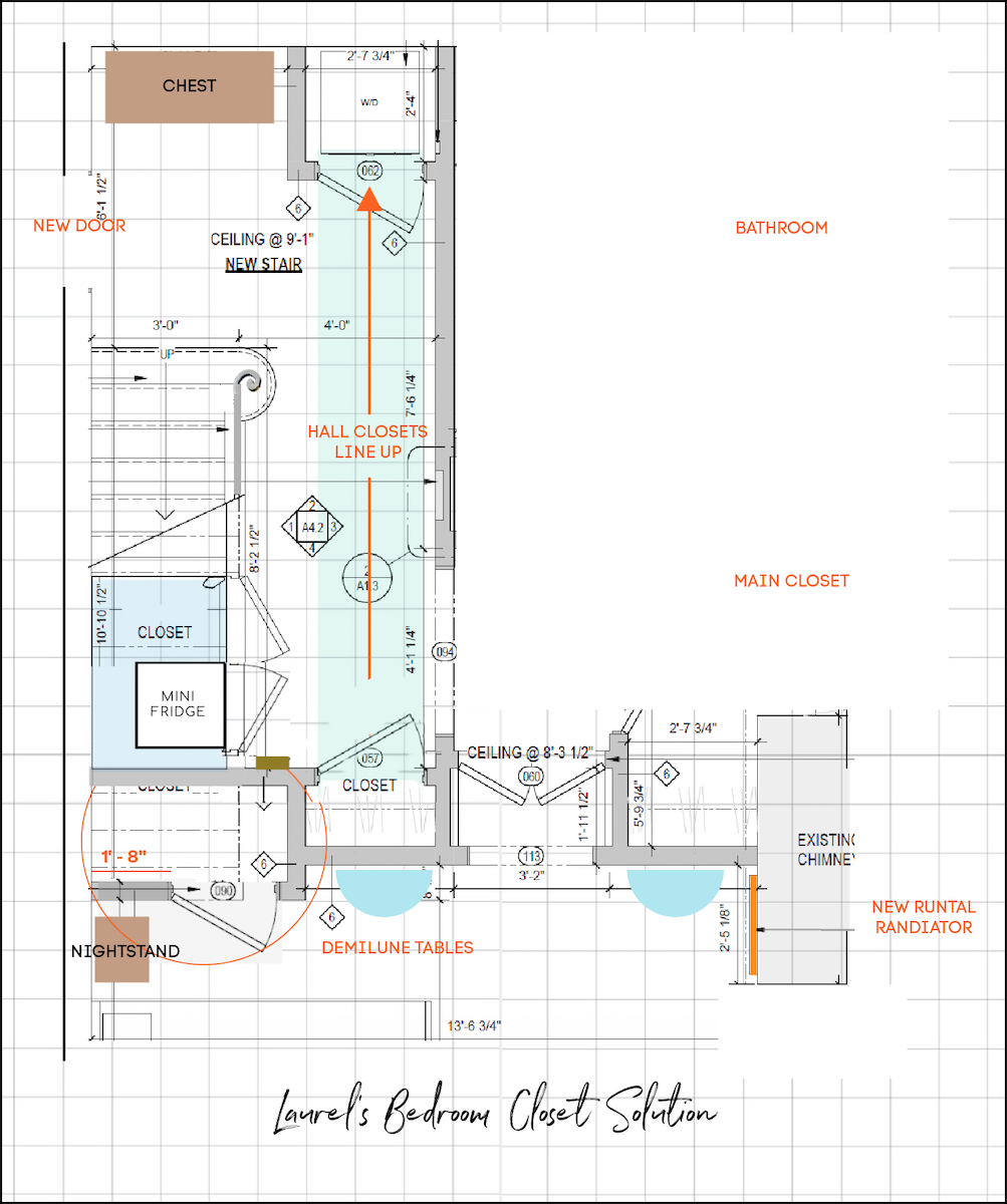
What’s happening downstairs? The floor plan is 99% finished. I say 99% because I haven’t received the final draft of the floor plan. There are a few small changes from the last version you saw here. The best one is the bedroom closet under the stairs is now accessible without having to move the nightstand. I figured that one out about a week ago and gave myself a massive high-five for figuring that one out.
By the way, today, June 21st, is the 30th monthiversary of moving to my Boston duplex.
Imagine if I had attempted this renovation two years ago. Well, fortunately, I didn’t.
The rest is just tweaks on some lovely drawings sent by my architect. I know I said this before, but I’m so glad I listened to my guardian angel, who very gently screamed in my ear:
WHAT THE HELL ARE YOU DOING, LAUREL? DO YOU THINK THIS BUILDER WILL UNDERSTAND HOW TO BUILD YOUR VISION FROM THESE PRIMITIVE DRAWINGS?
Well, he probably could’ve done okay with most of it but not all of it. The embrasure door hall, I’m calling it, was a bitch to design. This is where the architect has been super helpful.
As for the small entry downstairs, we have worked out a contingency plan in case the building department decides to enforce the absurd building code that lumps my private, non-egress staircase in the same category as ANY staircase in a dormitory, convent, or monastery.
However, everyone is sick of hearing me bitch about that one, including myself. haha
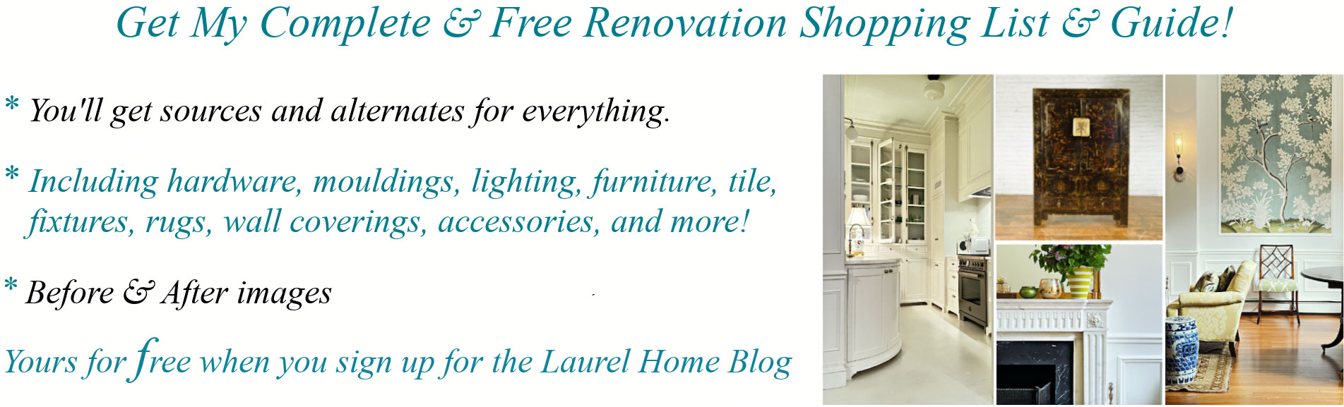
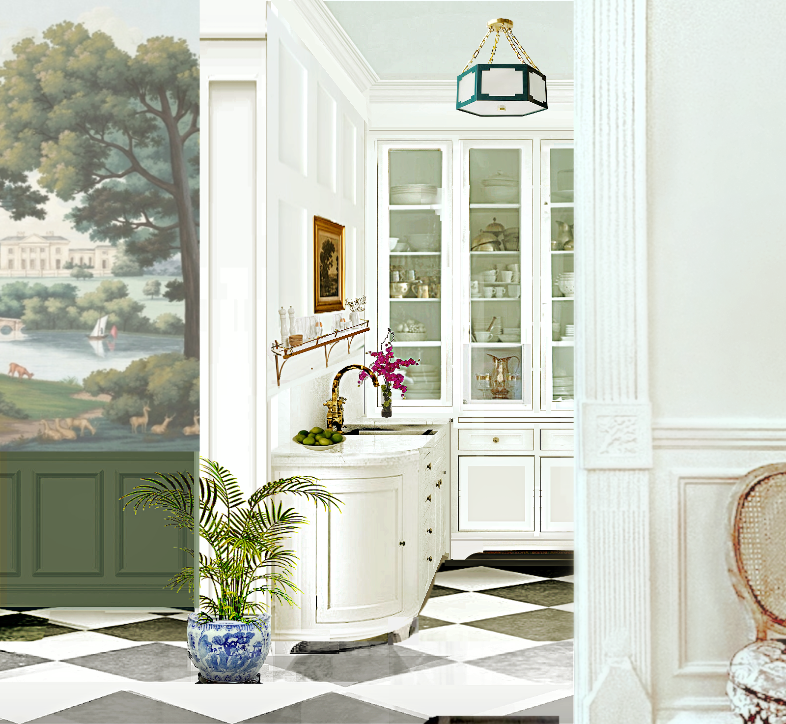
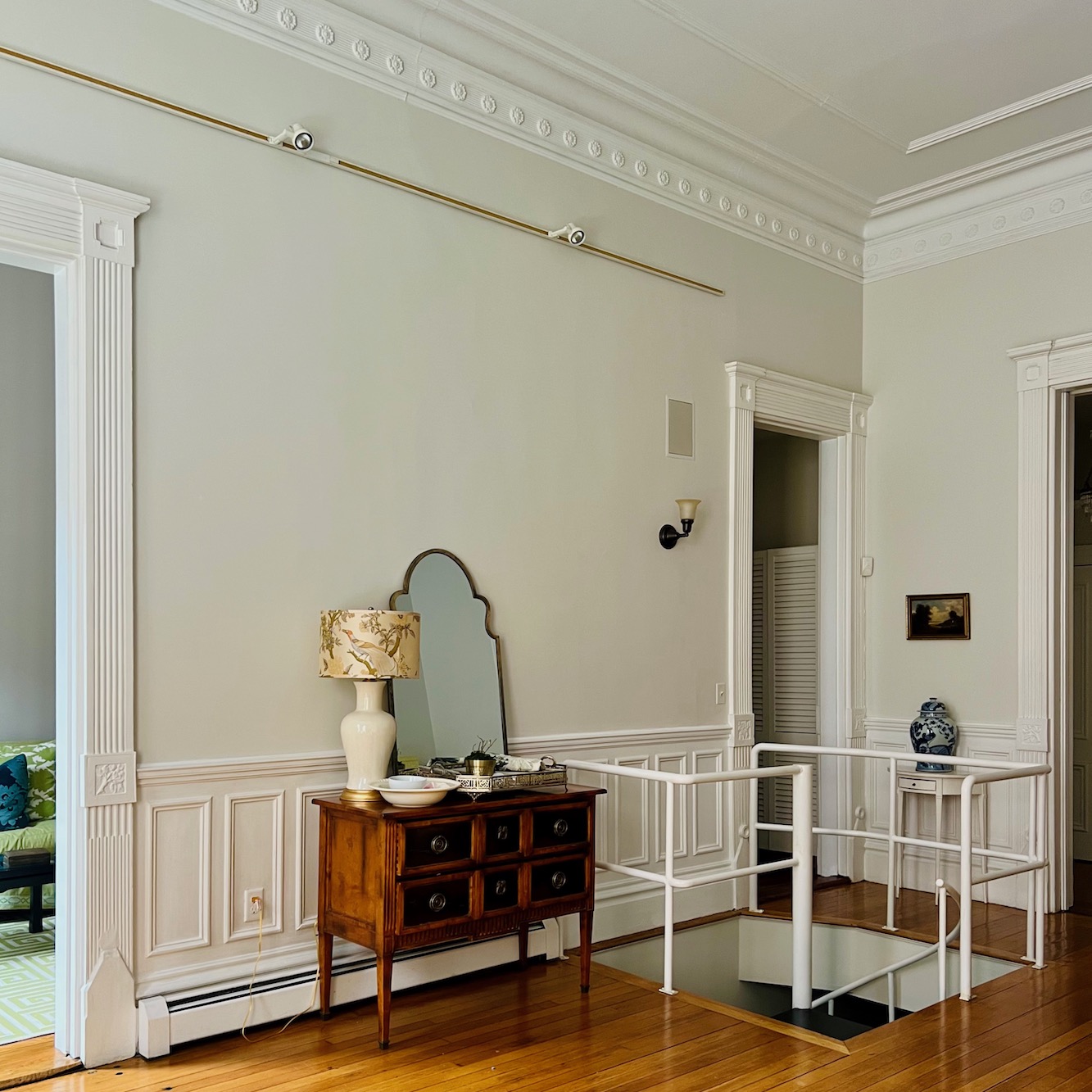
Okay, for today, I am sharing a design for the main, upstairs small entry.
But first, let’s look at it, as it now is.
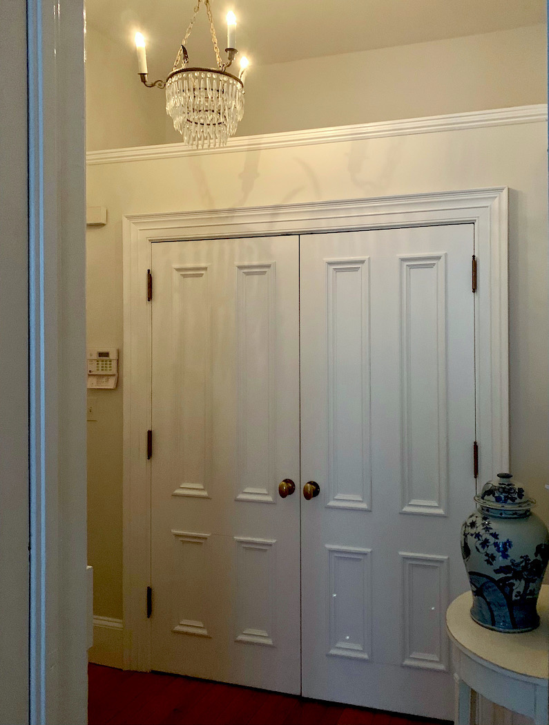
And below, is how you’ve seen it for over a year! (just the small entry, not the kitchen)
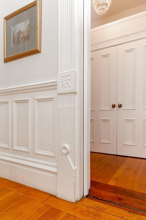
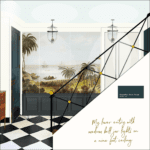
This is the conceptual design. If you don’t know that term, it means what it says. It’s the design concept, not necessarily 100% what it will end up being. We can see that it will be a white kitchen with big glass doors in the back and a checkerboard floor. The small connecting entry has a gorgeous panoramic wall mural and dark green wainscoting.
I realized today that whenever I’m working on a space architecturally, I’m ALSO decorating it.
Duhhh, Laurel. Doesn’t everyone do that?
Uh, well, yes, they should. However, it appears not to be the case.
I can’t tell you the number of times I spent pulling my hair out trying to figure out why the architecture was done the way it was. Did they give any thought to where the window treatments would go?
One of my favorite examples is the client from about 20 years ago who had built a lovely custom home in northern Westchester County, New York. It was lovely except for the fact that they had built the living room with the windows ONE INCH away from the fireplace. On the other side of the window was three feet of wall.
The solution was either Roman shades or drapes pulled back to one side.
The client didn’t favor that look but realized she had no choice.
Okay, I have a few images to share with you.
Let’s begin with another The Mural Source gorgeous panoramic mural.
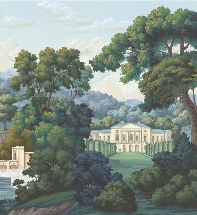
Those colors!!!
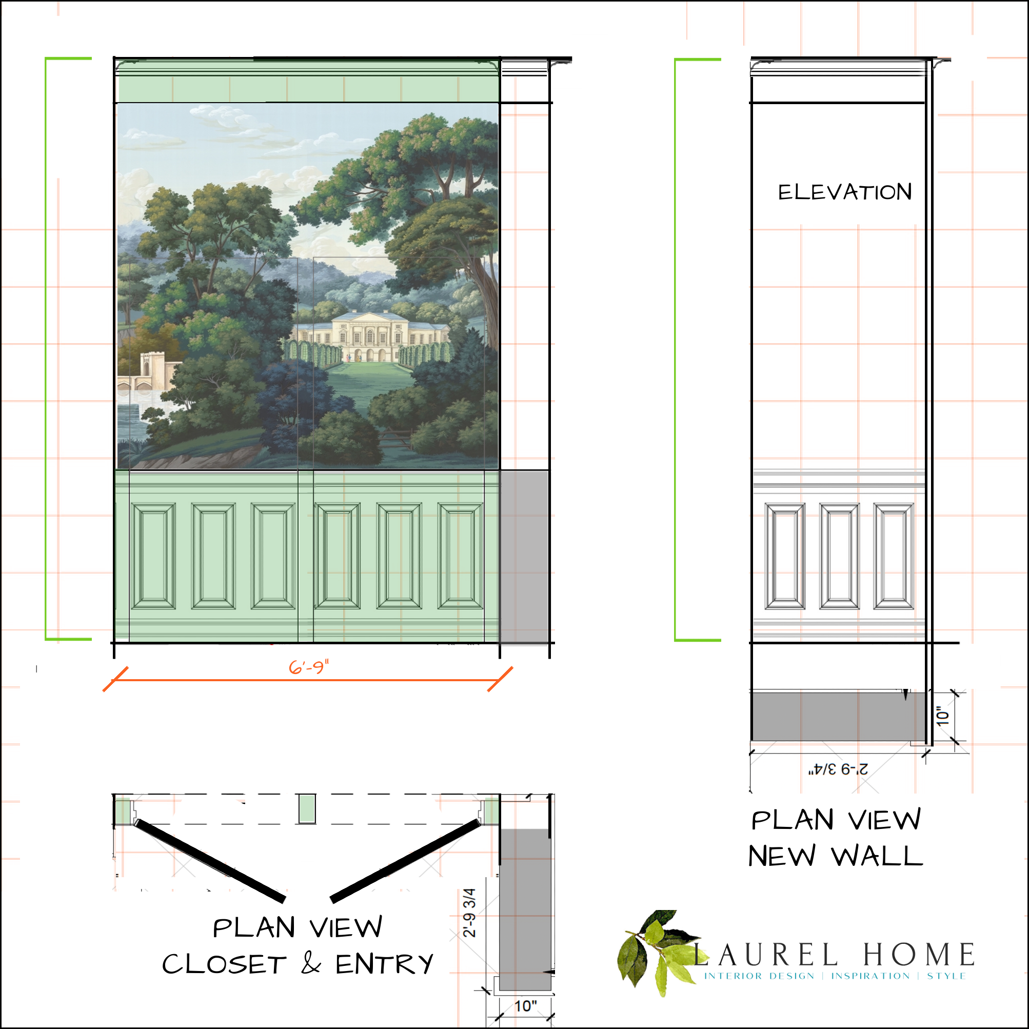
Now, let’s look at the technical drawings I did today.
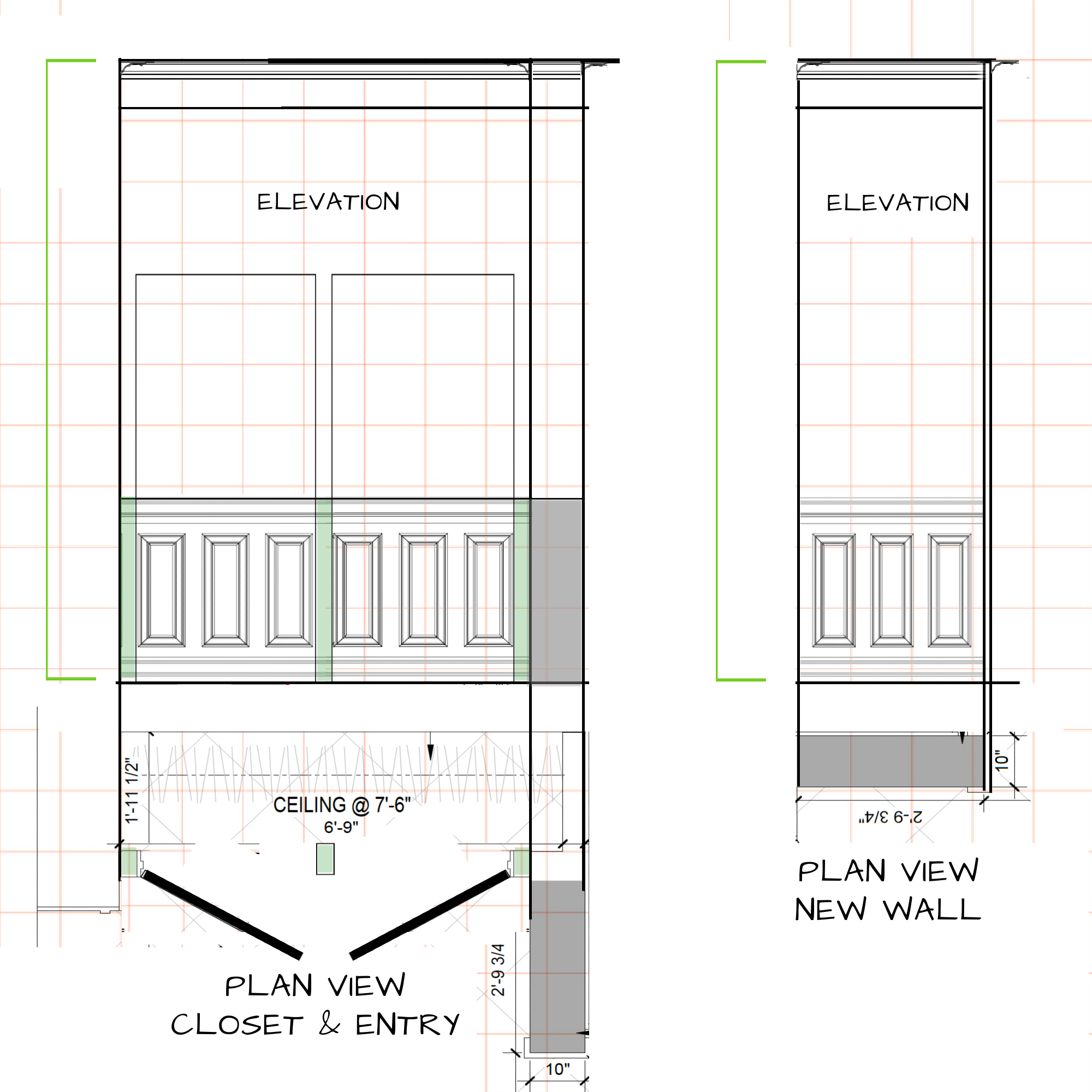
At the bottom of the page above are the plan view of the closet and the new wall that’s getting pushed back about 18″, shown in the correct orientation, and then, to the right, turned 90 degrees so that I could do the wall elevation on the same page.
For non-designers who might not understand what’s going on, I shaded the corresponding areas in the plan and elevation in green.
An elevation shows elements as they are in real life, not how they look in perspective. So, it’s representing what you see in the plan view as it is on the vertical plane. It’s an important element in the design phase as it gives the designer and builder additional and important information.
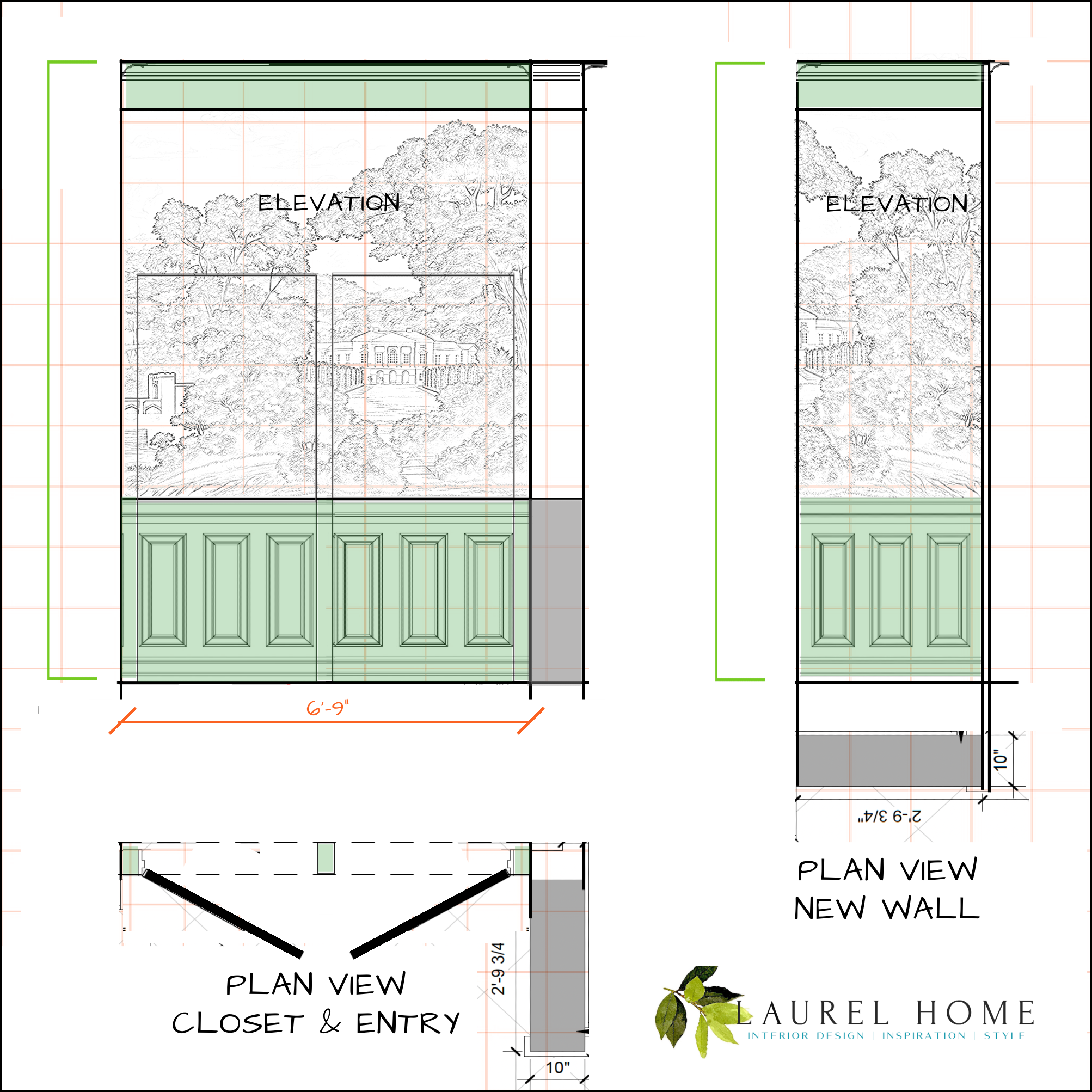
Above, I took it a step further and indicated where the mural would go. It shows how the jib doors relate to the mural and wainscoting. The doors are 2′-11″, and I placed them so there will be minimal cutting into the wainscoting panel moulding.
To the right is the new wall that’s getting widened from 4″ to 10″ and pushed back about 18″.
Above, just having fun showing how the mural will look with the jib doors when it’s finished.
I think this small entry is going to be smashing and functional too.
Laurel, aren’t you worried about the paper getting wrecked?
No, remember? I don’t worry about anything. ;]
Not even this darling man who wishes me dead.
Well, now, we can’t end on that depressing note.
I adore hidden storage. Well, who doesn’t? There’s just something so satisfying about a beautiful wall that’s hiding something cool behind it. Therefore, please enjoy two of my favorite posts from the summer of 2020, where I highlight hidden storage and, in this post, hidden doors.
I hope you enjoyed this post about the design plans for my small entry. If you’d like to learn more of the renovation backstory (or are having trouble sleeping), this post details many reno challenges.
*********************************************************
Part 2 Begins Here
Hi Everyone,
We crossed, I believe, one of our last major hurdles this morning.
The bloody copper pipe. At 10:30 this morning, 10.31.2023, three professionals put their collective heads together, along with me, who had was only along for the ride, and decided that moving the pipe only requires entry into one other unit directly above me. All that will be required is to bleed her pipe at the end of the job. No biggie.
My pipe isn’t connected in any way to two of the units, and the other unit it is connected to only has baseboard heating.
For today, I would like to discuss my downstairs small entry and hall, which also includes the new staircase!
While this isn’t the primary entry to the apartment, I will be passing through it quite a bit. It’s actually a larger space than the entry upstairs; seven feet wide by 14 feet long. It also will include three closets for:
- washer/dryer
- linen closet
- And under the stairs storage for mini fridge and more!
It is also the entrance to the bedroom suite.
It’s an opportunity to create something quite lovely as my goal all along has been to bring the downstairs back to the 19th century.
Alas, as we discussed on Sunday, almost in the middle of the space is the ugly electrical panel.
I have decided to do another wallpaper mural on one wall only, and will make sure it is obvious where the panel is located. The wall is 7′-6″ long.
***By the way, I did find out that the electricity in my unit can be turned off by the mother electrical panel, which is located quite far from my unit. In effect, unless that unit were not accessible for some reason, my unit, in an emergency, would not be required to be accessible, as it could be shut down by the mother panel.
However, of course, it still must be accessible.
Okay, so what’s going in the small entry downstairs?
For quite a while, I was thinking of a wall color like this. What I really love is the cool old wainscoting. Still, it’s not quite the feeling I’m going for.
However, I came across this image of the gorgeous James Carter entry. I wrote about James in this post about some of my favorite classical architects.
I definitely want to continue from the upstairs entry and kitchen, the black and white checkerboard. I love these floors so much.
Plus, it’s a great way to tie the two spaces together.
Then, the other day I came across this gorgeous hall (below) on Ananbo’s Instagram.
Ananbo is a French mural company I’ve admired for the last ten years. They were featured in this post about wall murals.
There may also be some beauties in this post about grisailles murals.
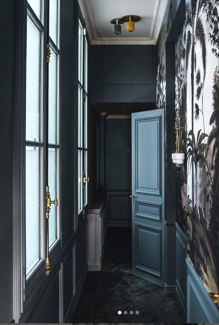
Maybe I could combine the two?
I love how enigmatic this hall is. However, for me, I don’t want the entire space to be dark. I also really like the Bali mural. However, there is another mural I like even better.
What this also did was help me visualize how a mural would look in a space only seven feet wide. The stairs are three feet and the hall parallel to the stairs is four feet.

The door color looks like a clone of on my Laurel Home Essential paint colors I love, Twilight.
Okay, here’s the framework below for the new entry, except for the staircase.
This is the view if I’m standing against the linen closet.
You can see the linen closet near the bottom of the image above. We are looking at the washer/dryer closet straight ahead.
The space to the left of the washer/dryer is 48″ wide, and my Milling Road chest is 44″ wide. So, that will fit there perfectly.
Okay, I did a rather rough rendering– two versions. Please note there’s no chest, but there will be, with a table lamp. Plus, the proportions are a bit off. The idea is to check out the colors and basic design.
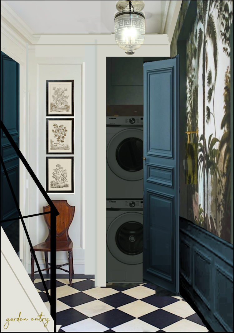
And another below with one variation.
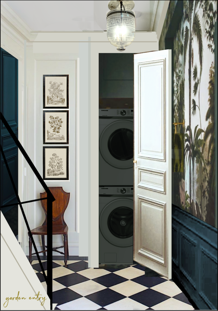
I also did this version with a white door. Only the wainscoting and entry door would be the deep teal.
I love both of them. Of course, the door will be mostly closed.
Which one do you like better?
Also, the checkerboard will be a little larger, most likely.
So, for Wednesday’s post, I’m going to go over the mural possibilities. And, we’re going to begin talking about the lighting again. I must do this lantern. Actually, two of them. However, I see so much crap on the Internet regarding sizing, and much of it is sooooooo wrong!
Therefore, there will be a lot of goodies coming up.
Happy Halloween!
xo,

PS: Please check out the newly updated HOT SALES!
***Are you planning on doing some shopping on Amazon sometime soon? Please help support this website and click on the link before you do your shopping.

All you need to do is click this link and forget about it if you’re not ready to shop now.
I will earn a small commission at no extra expense for any orders you make within 24 hours of that click. I very much appreciate your support of this website.
Related Posts
 Laurel’s Home Renovation 2024 – News & Deets!
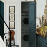 A Laundry Closet Entrance Combines Beauty & Function
 Under the Stairs Hidden Closet – Finalizing the Plans!
 Architectural Details That Will Elevate Your Rooms – Parts 1 & 2
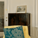 14 month Renoversary! and I’m Back In My Bedroom!
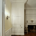 Happy One-Year Renovation Anniversary + Lots of News!
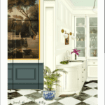 Jib Doors – So Cool, Yet Such a Nightmare to Build – Parts 1 & 2


48 Responses
Def prefer the dark door and whatever mural goes with it.
I am thoroughly enjoying every step of your journey. And I am sure every time you pass through a room/hallway you’ve decorated, it will make your day happier. I am wondering, though, about a comment you made about possibly putting a mirror above the chest in your garden hallway. If I had to watch myself coming down the stairs every time I came through that area, it would not make my day happier. It will be an easy choice when you are on site to see what “belongs” there.
The twilight colour is divine and I would use it on the door. Perhaps,I am alone in this opinion, but while the mural upstairs will look beautiful, I find the one downstairs overpowering and makes the space look too busy.
Hi Laurel, These renderings are gorgeous! I love everything you have planned for your remodel, it is absolutely stunning! I prefer the twilight door color on the laundry room. I like the flow of the color with the mural, It just feels a bit smoother. Although both are pretty, the twilight just adds more character to the entrance in my opinion.
Laurel, that Ananbo version really is smashing. I find your rendering with the Twilight door makes the area seem more serene and the transition from the mural to the end wall is smoother (“organic” if I may say) and less abrupt than with the white, which with the dramatic floor surface and pendant, gives it a fair bit of dazzle. Perhaps why I prefer the Twilight version is because its slightly moodier color is more clearly differentiating the appearance of your smaller entry from the main one making both unique.
I love these two rough renderings so much. I don’t have a strong opinion on the color of the door, but I wanted to say that I love the mural idea; I love that color of blue; I love the floor, and I especially love that light fixture! You have mad interior design skills, Laurel :] Your whole place is just brilliant!
I vote for both doors painted blue. It looks so lovely! I may get the courage to paint my door blue in my laundry room now. It is a primed steel door that I wanted to paint blue but procrastinated now for a year!
Either are (is?) lovely. Both have good and less good points (neither have bad points). Just a stray thought. Have you considered mirroring the entire front of the door, edge to edge? The door will disappear when closed and reflect the mural. It will brighten, open up and enlarge the area and it will act as a sound barrier for whatever is going on behind it. It will not look like a mirrored door but just blend into its surroundings.
I’m enjoying and learning from your whole process–thank you again for the work you do. Since you asked, I personally prefer white for the whole end wall including the door to the laundry.
So enjoying following your journey, Laurel. Not just the renovation information but perhaps more importantly, how your home/community is enhancing your life and wellbeing! You’re truly an inspiration in that regard.
Related to your request for feedback about the downstairs entry, I offer you only comments based on my experience as a homeowner and most certainly not a design expert. For me: Lighting and continuity. I never really understood the power of light in design until I moved to my second waterfront home and was astonished at the colors we chose because of the light. It was completely obvious when choosing between variations but never the colors I thought would be chosen when seeing options in a different light. Trust yourself in regards to the mood you want to experience every day you walk down those stairs.
In regards to continuity, I love the idea of continuing the black and white floor to bring continuity between the levels. Bravo. I don’t, however, recall teal as being a color you love or one that will be incorporated/blended throughout in the downstairs area. For me the continuity between spaces brings a harmony in homes.
You have such an attention to detail that I feel sure whatever you choose will be fabulous.
Once again, your topic hits with some thing I’m working on. If you have a “ small” entry then I have a “tiny” entry, one of those where you walk in the front door and are immediately confronted with the staircase, going upwards after several feet. My husband just last week finished all the woodwork and basecoat painting as well as renovating the original front door.
But I don’t mind my tiny entry, it can still be charming. I enjoy your discussions of small every ways and will consider several of your points.
Hi Laurel,
All is looking really good.
I was looking at your rough rendering… had it ever been considered to run the crown molding from the W/D door wall straight over to the other side where your new door will be – to create a single plane from one side to the other? Then, bring the wall down from the cornice just a little and have an arch or slight arc(“bridge”?) thus creating more of an intentional recess for your M.R. chest? That way the W/D corner might not look like it was added onto the corner. As long as the right side of your new door jam on the stair wall would not extend into the “recess” – going beyond the now extended crown molding, W/D door plane. This is harder to explain than I thought… but actually kind of simple if it would work in the space.
Just another finger in the pie : )
Thank you Laurel for getting my “wheels” to turn, – B.
Hi Bill, yes, it was considered, and many earlier iterations had a double closet on that side, but it’s a little too tight. I’m hoping as it is, the door won’t have to overlap the washer/dry closet. All of the doors open out into the hall. Even if it does overlap a little, if the door opens from right to left, out in the hall, the first vision will be the mural, not the side of the closet.
Your design and design process is so interesting and well thought out… love the rich depth of your color choices …
I’m sorry you had to read a nasty comment – and on a design blog, no less…
It’s always such an informative and fun day when your blog arrives… I really look forward to that bit of cheer and brightness…
Thank you for all you do – for your devoted readers… and design aficionados…
I love how your project is coming together, and while I adore the rich moodiness of the teal color, because it is a garden entrance, I think the white door brings the brightness of outdoors into the space. It would also help to see them closed in your pictures.
Hi Wendy,
It’s the entrance on the “garden level,” however, the actual garden is on the extreme opposite end of the space and requires entering two more doorways and then another 12 feet through the primary bedroom, before arriving at the actual door to the patio and small garden. Still, do you remember Melissa T’s stunning sunroom? It is painted exceedingly dark green and it is magnificent.
Have you thought of having the molding on the wall left of the door mirror that on the door? It looks like the wall and door are about the same width. The door wouldn’t quite disappear, but it might have a bit of the hidden door effect. I prefer the white door for sense of space but the color is beautiful. Glad things are moving along with the reno.
Hi Becca,
They aren’t the same width. The closet wall is about 32″ and the wall with the chest (where there’s currently a chair) is 48″. Since this is a conceptual design, I didn’t take the time to stretch that wall and add the chest instead of the chair. In addition, I left the moulding that was in the image I used. The renderings are comprised of dozens of images. So, this is not necessarily the final design in terms of mouldings. Plus, the way they’re depicted is a little wonky. For the purposes of figuring out the concept, it’s not an important detail.
In reality, I’ll probably put my big mirror over the chest. However, I could layer that with a print or two. The mirror will help reflect some light from upstairs and also magnify the light coming from the table lamp and lanterns.
I prefer the white door because it makes the hall appear wider on the wall where the Milling Road chest will be located. The teal door, although lovely, chops that wall in half and makes the chest area seem rather squished. Your design is fabulous!
Hi Les, the door is 28″ wide and the entire wall is 84″ wide, so the door is 1/3 of the wall. The door casings would be white. Sorry, my proportions are not accurate in the rendering, plus perspective makes the door appear a little larger than 1/3 of the total.
Your garden entry is going to be beautiful, I love the Twilight color and think the doors should be painted Twilight as well. Adore the lantern too.
Hi Laurel, I’ve been following you for a while, but first time commenting. When I first looked at the two images I was on my phone and preferred the white door. Now on the larger iPad screen the twilight door wins. As someone mentioned – being in the space brings a whole different perspective so you will know best. And it’s only paint and can be redone. Both are beautiful!
Darn Laurel – You took down the comment everyone is talking about a person being mean. I would have loved to have read it but I certainly understand hitting the “disappear forever” key.
Your designs are perfection and they show a person who is truly patient even when you don’t think you are. You have been blessed with contractors who listen and I know they don’t talk down to you or they wouldn’t be working on this job.
Looking forward to this magazine worthy home.
Hi Diana,
I believe she said something like, “A double hall??? What a waste of space!!!” I discussed it with my architect who disagreed with that comment. Besides, I adore the plan. As it was, before it was gutted, there was a tremendous amount of “wasted” space. There has and must be a dividing wall because of the electrical panel.
I like the doors being twilight to match the paneling. Carrying the dark color around onto that wall makes the space feel more cohesive. Have you also thought of having a lower section of paneling behind the chest being twilight, too? This would draw the entire entry together.
I also am wondering if you have ever considered bi-fold doors on your laundry closet and on the one opposite it. Seeing your illustration makes me think they’d be a good choice. I realize they will be closed most of the time, but when you are doing laundry, the door would be able to fold against the paneled wall and be less obtrusive and the other closet door couldn’t bang against the mini frig closet. They would be nearly the width of the paneling sections, too.
It’s exciting to see your remodel coming together. Do you think they’ll make your deadline? It’s hard for me to believe it will be near to completion by the end of November. My fingers are crossed.
I always look forward to your updates. I vote for the white doors, being in the basement, I would want it to be as bright as possible. Brings attention to your mural wall as well.
Hi Lana,
We do not refer to this as the basement. lol It is the gahhhhhden level. Upstairs is the pahhhhhlah level. ;]
Love the white door. It brings out the white in the mural better than the teal and area feels more spacious to me. White allows the mural to be the star of the show and the door to disappear into the wall. Excellent use of every inch of space!
Laurel, that teal is absolutely beautiful! I think both your door choices are gorgeous, but to my eye, the light door will look better with the chest and the lamp. I am afraid the teal could compete a little with the vignette you have planned, but of course I could be completely wet! Either way I’m sure whatever you do is going to be fabulous. Thanks for letting me come along for the ride!
Laurel, you must do all the doors in Twilight. It would make such a gasp-inducing entrance. It would be stunning!!
Your “ illustrations” of your designs are amazing. You even “ shrunk” your lovely mural!!! What program are you using? Your kitchen looks amazing. How in earth did you get those visuals??
Both look great but I prefer the one with both doors in the teal. That said, that is one of my all-time favorite colors (or possibly #1 favorite) so I’m entirely biased.
Sorry but I laughed at the wild crazy comment. He must really be miserable to take the time to post such drivel on an altogether uplifting, inspiring venue.
I like the lighter door, but I won’t be living there, so who cares!
I’m just enjoying your entire project, and hopefully learning a thing or two. Thank you….
Just from looking at your two drawings and nothing else I like the dark door better. But I’m not in the space so can’t judge which will fit better. But, try not to lose sleep over it, they both look great so it’s win win. If you end up changing your mind, it’s just paint and you can change it <3
Hi Laurel! Big fan here. Love watching you design your new home! I prefer the light door, but also love the dark one. Can’t wait to see the finished space.
Hi Laurel, I enjoy reading your blog and am very interested in your renovation. I am sure it will be beautiful. I really wanted to comment on that hateful comment that was left for you. I am sure that was upsetting to read. There are a lot of angry irrational people out there. I hope you are able to focus on the supportive comments and fans out there instead.
It’s very lovely. Love the mural.
Laurel, Sheldon Slate (upstate NY, Vt, Maine) has ‘sample’ squares of various shades and tones that when mixed on floor or wall hold some alchemy that, in the right room and right light and right wood, can evoke the same color sensations of your mural (I love, also). Maybe a tiny floor somewhere?
Hi Laurel,
I love the way this all coming together and I love, love, love the mural. What do you think of having a mural on one wall only? I’ve seen it successfully used on the headboard wall of a bedroom but I’m considering placing a mural on the space above the washer/dryer/sink in my laundry room ( Nine foot ceilings ). It’s really the only wall one gets a peek at from the kitchen.
Anyway, wish you all the best!
I am enjoying seeing the plans for your lovely home. So beautiful! I have a question about the Scott Yetman space. That staircase is fabulous! However, in my town, it would NEVER pass code. Our spindles have to be close enough that a baby could not get their head between them and, potentially, fall through them. This staircase is just waiting for such a situation to occur. Can you offer an explanation???
That hate comment is seriously disturbing for me to read. I see it was posted after 1am so I suspect the man was drunk or under some influence though. It can be a hateful place on the internet these days but I’m holding onto the positive stuff like your blog and other design blogs I love. I hope the powers that be see the common sense in your staircase issue. To me it’s ridiculous and needs logical thinking not categorically just looking for which rule to follow.
Well, Laurel, at least you know that your contractors do not want you to disappear! That should make you feel a little more loved, –Jim
I can’t wait to hear what your solution for the bedroom closet door is either. You’re being cruel not telling us! 🙂 We are all so invested in your project. I had forgotten what you had planned for your entry, the fact you were doing a hidden closet behind your mural. It is so clever. The entry has a totally different vibe when you walk in than it does with the closet doors. My one question about your plan is why are you painting the wainscoting green in this area? I realize the green goes beautifully with the mural. Will the crown mouldings be green, too? I think my mind’s eye struggles when I look at your conceptual photo because all your other woodwork is white and you see both at the same time. Obviously, I have no design training, so my observation has no merit. I’m trying to understand when it is appropriate to have wainscoting different colors. Is it the same as painting rooms different colors? We do that all the time and think nothing of it. I’m keeping my fingers crossed that the powers that be see the light and realize your stairway is not a public fire escape route.
Laurel, When bloggers say that they get messages from trolls I imagined it was something like “I hate your design” NOT “I would be delighted to see you vanish from the face of the earth.” What is wrong with people!!! I hope you don’t get many of those messages.
Thanks for the update. The number of time that you have refined your plans (making them better each time!) has been eyeopening. It shows how much attention to detail is required for a smashing outcome.
Thank you, Maggie! I imagine he’s trying to get attention, and his life is an unimaginable hell. God bless.
I’m really enjoying “watching” you plan and solve! Your ideas are creative and practical at the same time. I appreciate you writing about the whole process and I’m anxious to see the finished home. It will be exquisite!
Hello Laurel,
A time or two ago you showed the drawings of your nightstand which was sort of in the way of your door under the stairs – rather tight. Sorry if you went over this already with a solution. The idea that occurred right off the bat was to just make the door one of those concealed/secret doors that are flush with the wall – no trim etc. – one push and they open, one push and they close. Today you mention the “jib” door(a nautical term?) – maybe that was your solution for this? Since you had mentioned the items stored would seldom be accessed, the nightstand could stay in place. Just a thought. Always fun to try and solve a “puzzle”.
Best to you, – B.
Hi Bill,
Thanks so much. No problem. I’ve talked about this in many posts and it’s true that it’s difficult to know what’s been gone over and what hasn’t. That door, in most iterations, has been a jib door. However, I’m planning to do wainscoting, so it will be further concealed by the moulding.