

Hi Everyone,
We’re taking a short break from the renovation to look at some fantastic Farrow & Ball paint colors in their archive collection.
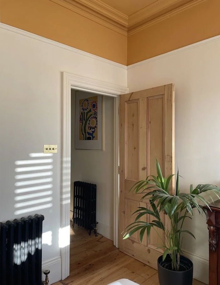
One might think these colors are of the unfortunate variety. This paint color is one of the worst.
In fact, they are anything but duds and deserve an exalted place alongside F & B cult classics such as:
- Down Pipe
- Hague Blue
- Oval Room Blue
- Wimborne White
- Calke Green
These, amongst a few others, will most likely never be archived.
So, if these colors are so fantastic, why does Farrow & Ball retire them?
Beats me! ]
However, what a rep told me, in the New York showroom, years ago is that they bring out new colors every year, and if the new color is too close to an existing color, it gets eliminated. She didn’t say this, but some colors probably don’t sell very well, which might be another reason.
Still, the Farrow & Ball archived colors we’re about to see were deeply loved by many.
This first color is quite perplexing it was retired because it only came out three years ago, and I loved it straight out of the gate.
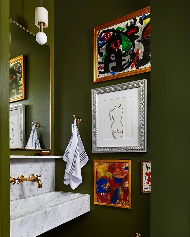
SAP GREEN

This is a rich, vibrant green that’s not too yellow, brown, or bright. It’s a very livable color and universal, as it goes with EVERYTHING. And, it would be fantastic in those difficult north facing rooms where everything goes green.
Well, I say go with the flow!
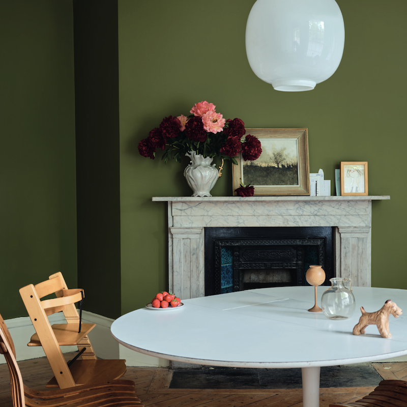
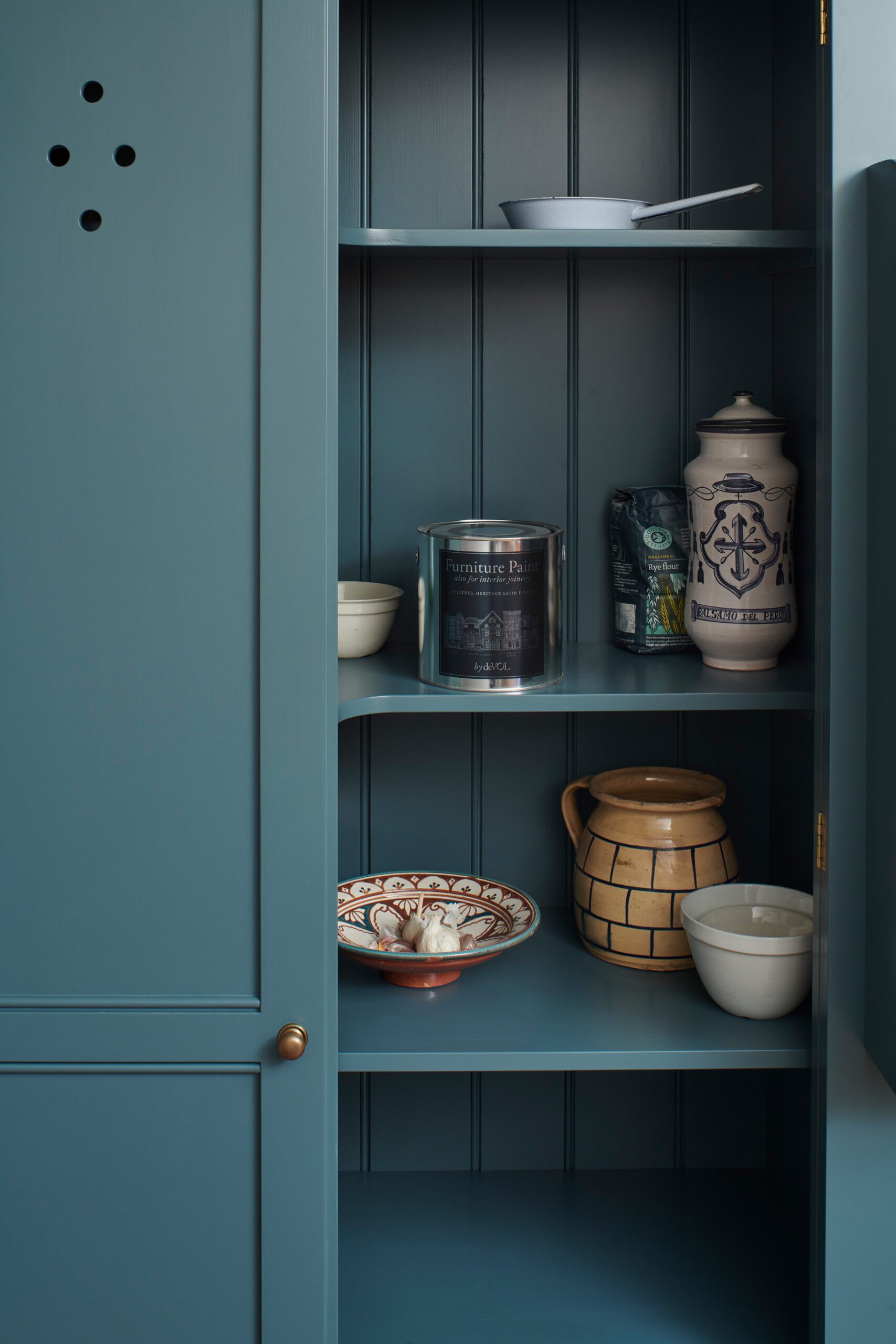
Below is a comparison between three fabulous mid-tone shades of green.
Sap Green

Calke Green that we did in Mary’s pantry and island.
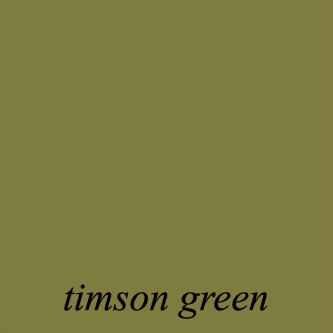
Benjamin Moore Timson Green is one of my Laurel Home Paint and Palette Collection colors.
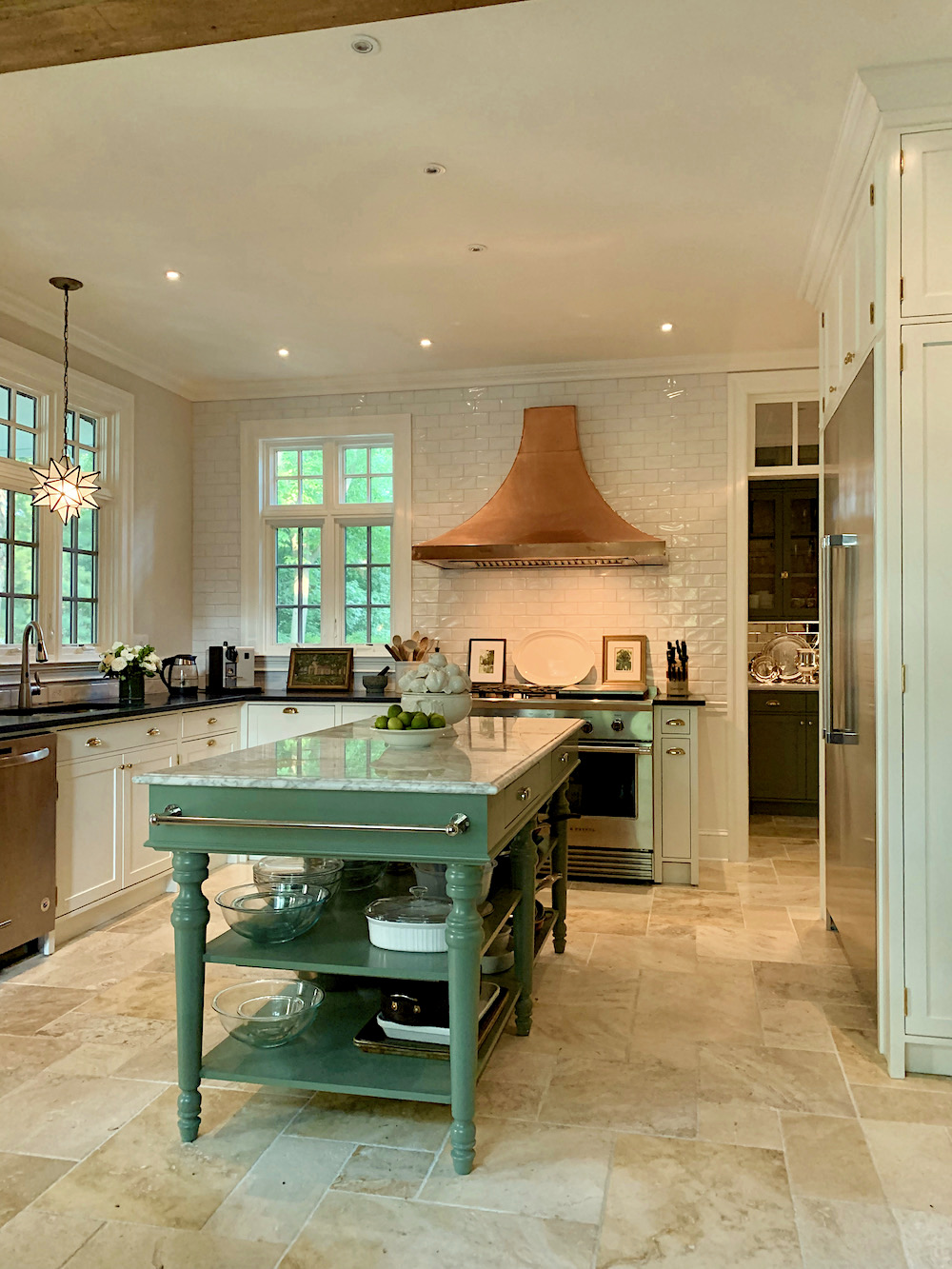
Mary’s kitchen, which you can see more here if you missed it.
Trad Chap on Instagram – Calke Green
However, I have to say I love the shade of green, Bancha, that came out in 2018.

Design by @zoefeldmandesign
Photo by @stacyzaringoldberg
Gorgeous bathroom
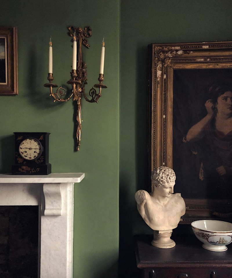
The next color they sadly retired is one we’ve talked about before.
PANTALON

Oh, I know what you’re thinking. You’re thinking it looks like sewer sludge. Right?
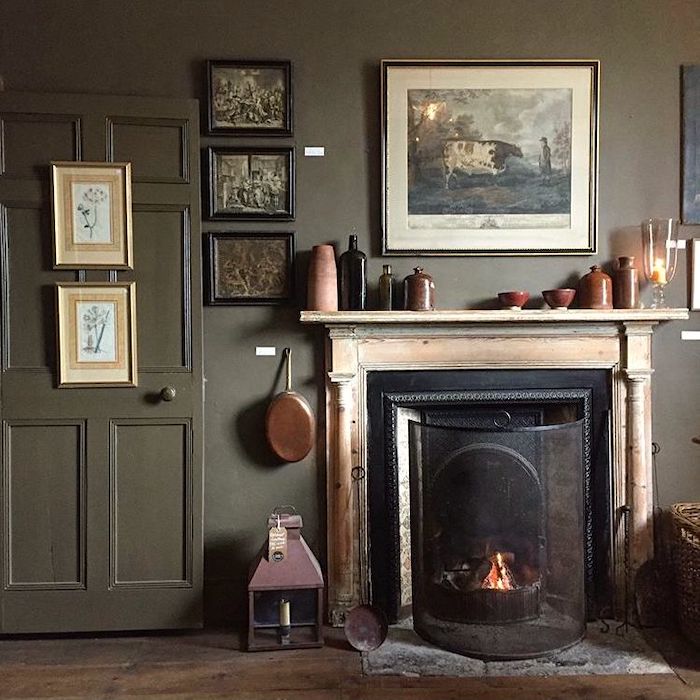
However, sewer sludge is a fantastic wall color and one of the best backdrops for art. When it’s on the wall, it reveals it’s warm, deep olive undertones that make this such an incredible color.
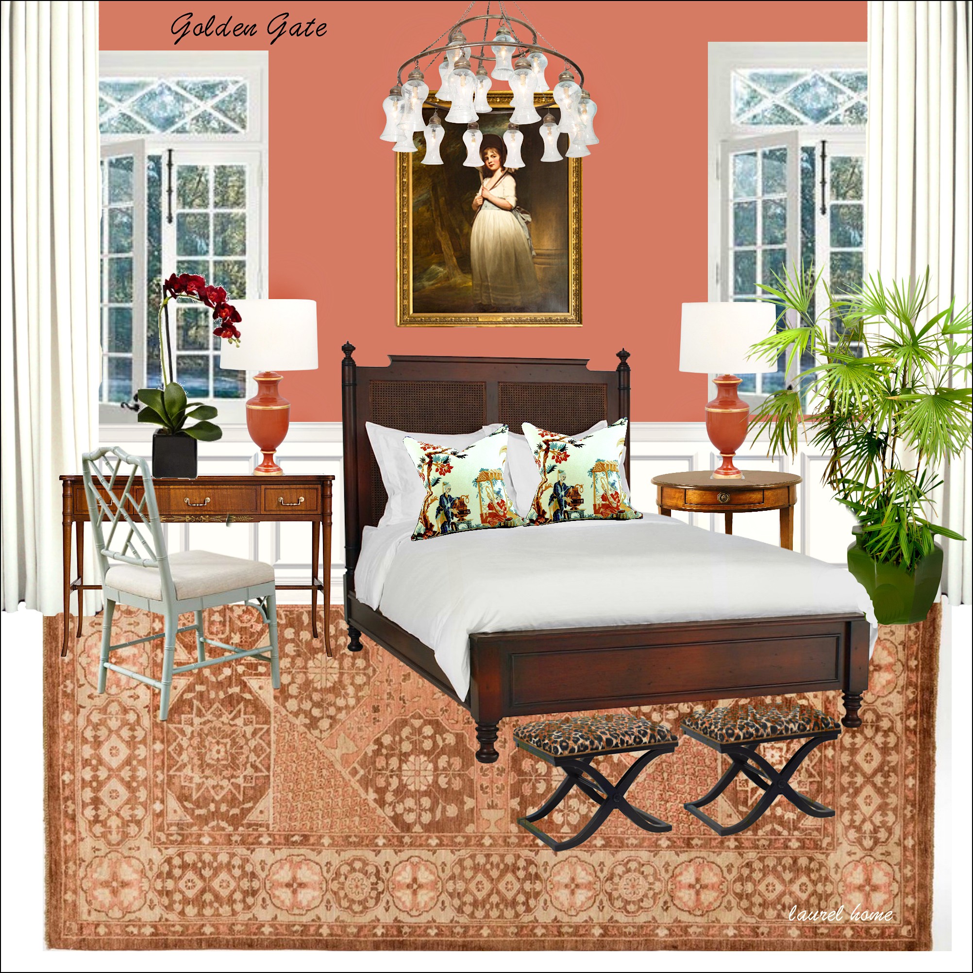
The next archived paint color is the most delicious shade of coral.
BISQUE

As in tomato bisque, I suppose. It’s not too pink, orange, red, or bright.
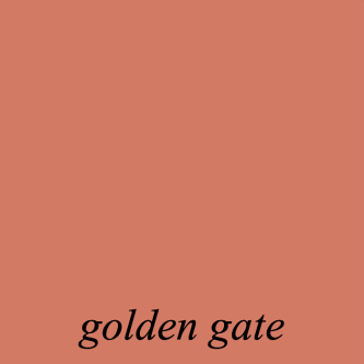
It resembles another Laurel Home Paint and Palette Collection color, Golden Gate.
I used to have a Steven Gambrel image of a beautiful coral bedroom. Alas, the copyright trolls have invaded again. The other day, I received a demand EMAIL for me to pay $87,000 for 37 images. Isn’t that hilarious? I reported it to Gmail as a phishing attempt. Still, I’ve been busy once again, slashing up posts and taking others down altogether. In the last 8 months, I’ve removed 100s of images.
Here’s a link so you can see two coral rooms that Steven Gambrel did.
Let’s keep going with our beautiful archived Farrow & Ball paint colors.
Another color that’s been mentioned numerous times is:
ORANGERY

https://galeriemagazine.com/gil-schafer-love-letter-dutchess-county/You can see some gorgeous Gil Schafer/Miles Redd collab featuring Orangey here.
Now, I know that some of you believe it is an oxymoron to say gorgeous and orange in the same sentence.
If you don’t, you’ll love this post about the best shades of orange paint.
However, if you’re not in love with Orangery, it probably means you’ve never been in a beautifully decorated room with this color on the walls– especially at night.
The experience is similar to getting a hot oil massage while eating a crème brulée in a sunbathed vineyard in northern Italy at the beginning of May.
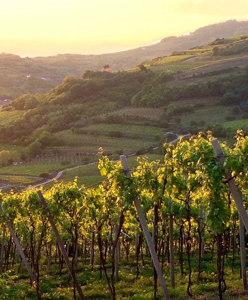
Photos above and below by me. And, you’re free to share any images I post that I took or created, as long as you give me credit and LINK BACK to where you found them.
That is actually very beneficial because it helps boost my rankings, and I become Google’s darling once again.
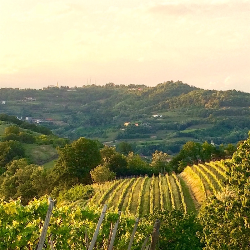
Unfortunately, there was no creme brulee, but I thought I was in the middle of a movie or a painting while standing in this slice of heaven during my 2016 trip to Italy.
Orangery via Farrow & Ball website
While we’re on colors that you think you hate, haha, the next wonderful color is the Farrow & Ball archived color:
STRAW

Straw is a beautiful golden yellow with a touch of brown and green in it. Fine, you can call it mustard if you prefer. However, like sewer sludge, mustard is a magical color and another gorgeous backdrop for art.
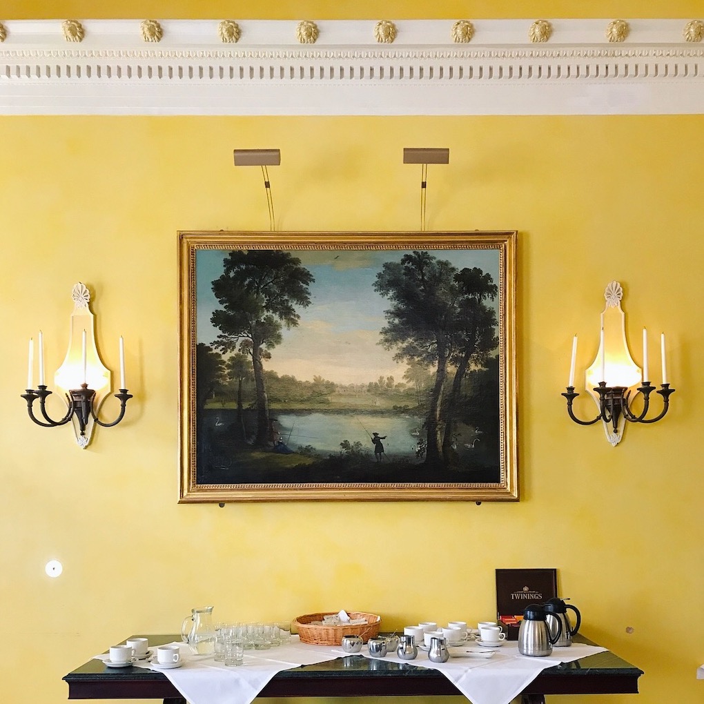
Sir John Soanes Yellow – University of Cambridge – beautiful yellow walls detail – photo LBI
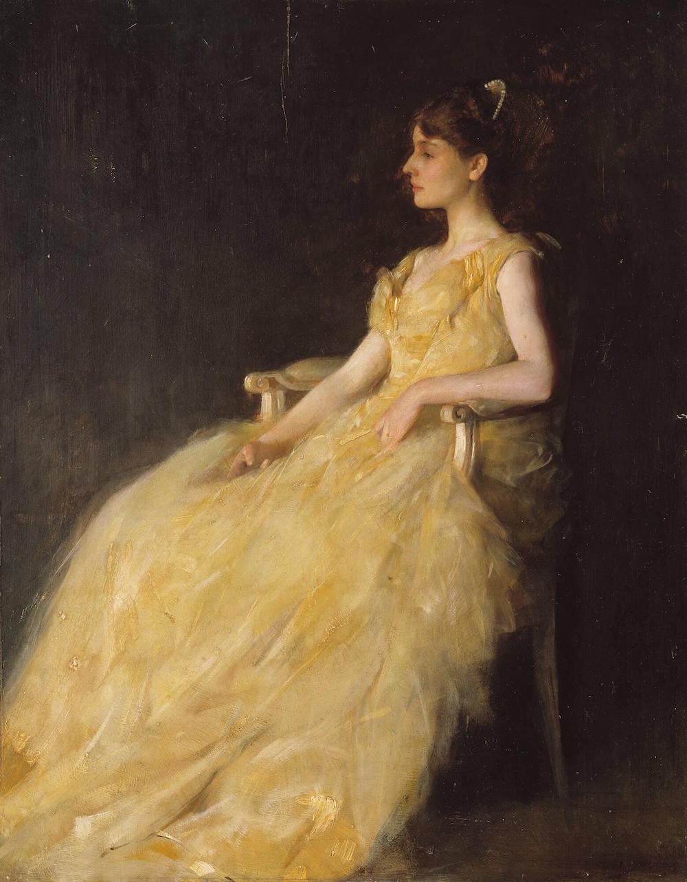
THOMAS WILMER DEWING (BOSTON, 1851 – 1938, NEW YORK) LADY IN YELLOW, 1888 Oil on panel-Lady in Yellow Isabella Stewart Gardner Museum
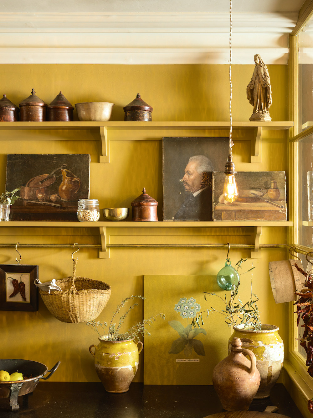
Shaker Devol Kitchen painted Farrow & Ball Straw.
This is from the DeVOL NYC Bond Street showroom. However, the image was found on the Farrow & Ball website. Oh, while researching, I saw that DeVOL is now selling its fabulous paint colors. Alas, only if you live in the UK.
If you love these yellow shades, you’ll love this post about the best yellow paint colors.
Our Sixth and final Farrow & Ball Archive Paint Colors is
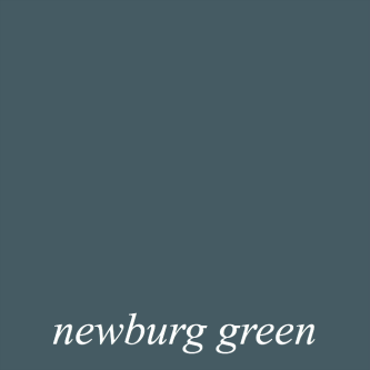
COPPICE BLUE

This saturated teal is not as deep as the lovely Hague Blue or as light as the perfect mid-tone oval room blue. And, it is less gray than Inchyra.
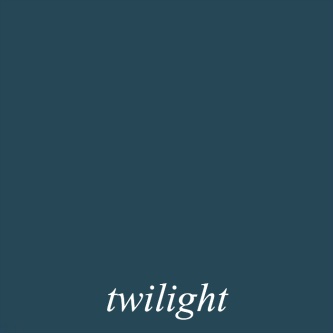
It’s not as deep as the Laurel Home deep, rich teal, Twilight.
It is a tad brighter and green than Benjamin Moore Newburg Green.
It is close to DeVOL’s Clerkenwell Blue, at least in this image.
I haven’t talked much about my den/second bedroom, if at all.
However, for the last two years, I’ve envisioned the room being a color like this. I don’t want it super dark. But, also not too pale.
But then there’s another lovely archive color in the same family, but a little lighter. That is Farrow & Ball:
BERRINGTON BLUE

This one is lovely too! The lighting in my place does odd things, if you recall from this post written not long after I moved to Boston.
Of course, I’ll be getting some samples from Samplize.
I love that they carry Benjamin Moore, Farrow & Ball, and Sherwin Williams.
If you’d like to get some Samplize samples, please click here to go to their website.
I hope you enjoyed these fantastic Farrow & Ball paint colors from their Archive Collection.
If you’d like to see more of my favorite F & B paint colors please check out this post.
And, these are some wonderful Farrow & Ball kitchen cabinet colors.
The new colors for 23-24 are coming out soon, but if you’d like to see last year’s F&B colors, along with Benjamin Moore color matching, please go here.
What do you think of these colors? It’s fine either way.
***
My contractor said that his guys will be working all this coming week. So, things are cranking up quite a bit now.
xo,

Please check out the recently updated HOT SALES!
There is now an Amazon link on my home page and below. Thank you for the suggestion!
Please note that I have decided not to create a membership site. However, this website is very expensive to run. To provide this content, I rely on you, the kind readers of my blog, to use my affiliate links whenever possible for items you need and want. There is no extra charge to you. The vendor you’re purchasing from pays me a small commission.

To facilitate this, some readers have asked me to put
A link to Amazon.com is on my home page.
Please click the link before items go into your shopping cart. Some people save their purchases in their “save for later folder.” Then, if you remember, please come back and click my Amazon link, and then you’re free to place your orders. While most vendor links have a cookie that lasts a while, Amazon’s cookies only last up to 24 hours.
Thank you so much!
I very much appreciate your help and support!
Related Posts
 Rooms With Light Walls Look Larger, Yes Or No?
 Sophisticated Twin Beds – 20 Ideas For Grownup Bedrooms
 She Fears Her Trendy, Painted Antique Table is a Mistake
 Bookshelf Styling-The Ultimate Guide with Templates!
 Decorating With White Furniture Without Having a Nervous Breakdown {part II}
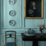 The British Are Coming! Superb Interior Design from the UK
 The Death Of The Boring Beige Living Room


14 Responses
I recently painted my living room a BM color that looks like (but isn’t) Straw. I’d seen it in historic homes that I toured in Savannah. With white trim; it just glows during the day and at night in lamp light. Everything looks lovely with it..plants, art, mirrors, wood and painted furniture. I absolutely love it and I would have never considered it before my trip to Savannah. Good bye to depressing gray.
Sounds gorgeous, April!
Although this post was about paint colors, I found the photos of Mary’s kitchen and pantry to be a great example of mixing various styles of pulls, knobs and latches together. Seeing how you used them together on cabinetry proved that they don’t have to match. Actually, using various styles makes sense and adds to the charm of the room. I now have a much better understanding of what you discussed last week.
The color palette you are considering for your den will be beautiful. Deeper colors make a room cozy and inviting. I find greens and blues such as you referenced also make your wooden furniture pieces glow. I also love how darker walls set off a white ceiling.
I learn so much every time I read your blog and therefore I’m making my Amazon purchases through your link. I feel like it’s my way of paying for a subscription to your service.
F&B is now churning out new colours every year, so every year more get archived. Most of the new colours will disappear quite quickly, not the sign of consistent quality of colour selection. What I find most annoying is that the archived colours are not available in sample pots when all one needs is a touch-up somewhere. (I know F&B advise not to do this, but I do it regularly with no problem.) One colour I regret is Minster Green, a good mid-dark colour neither bluish nor yellowish; the other is Ringwold Ground (but at least I’ve got sample pots of that!).
All change is for the worse…
Your posts are always informative and entertaining, Laurel!
The Steven Gambrel bedroom was truly inspirational- in 2020 painted my north facing bedroom SW 9005 Coral Clay, which warms up the room and works fabulously with brown furniture.
I have been following you for at least 15 years. I love to read your blog and I am excited to see your final renovation. When I read this blog about color it brought back memories of 30 years ago when I signed up for “Decorating Classes” from our local Designer who was very popular in our area. He told a story about a friend who loved to entertain. At some parties people would come up to her and ask her if she was ok because she looked ill. The designer took her into the different rooms she entertained in and said that as soon as she walked into that room all the color would drain from her face and did make her look sick. Naturally, the designer helped her pick colors that went with her skin coloring and not only did she receive compliments on how good she looked but she said she actually felt better too. Color plays a huge part in our lives.
Wanted to paint front door a strong dark dark dark purple colour. Designer/owner of decor store in Oak Bay Victoria BC selling FB paints had encyclopedic knowledge of archived colours. He recommended Bible Black. It is fabulous. Also their exterior paints hold up very well.
https://www.decoetcompagnie.com/gb/11098-paint-bible-black-225-farrow-ball.html
Interior is mainly Wimborne White with some Wevet. Super happy with them as well. Someone described comparison of FB paints to other paints as comparing a genuine terra cotta planter pot to a plastic one that is the colour of terra cotta. I find that is true on the Estate Emulsion finish.
Laurel; Thanks for all your great posts! So interesting and informative. Crème brûlée during massage in Italian vineyard in May is one of the best descriptions I have ever read, of anything.
Love those blues. I’d be happy with any one of them.
Laurel – two or three years ago (perhaps more?) you did a post showing how a lovely reddish paisley wallpaper pulled together your friend’s living room and all the disparate paintings she had as a gallery wall. I’ve done so many searches for that post and haven’t been able to find it. Do you have a link? The F&B Orangery color here reminded me of it; that a strong color can actually bring things together in an unexpected way. Thank you! (I’m trying to convince my significant other of the wisdom of this and your example is the best I’ve seen).
I’ve always adored Fowler Pink; used it in previous homes and recently chose it for my current dining room. My FB samples are somewhat ancient and ragged!
You can still get all Farrow and Ball’s archived colours. I have been using their paints for years. The stockist I use told me to always hang on to the old colour cards because even though the colours have been archived, they are still available. I have a collection of old colour cards!
Enjoying your posts. Thanks!
Marble fireplaces, of which I have several in my 1860s house, present a tricky challenge when it comes to wall paint. I think those greens make the marble glow. They are just fantastic colors. In fact, I love all these colors!
Gorgeous colours and photos, Laurel. A feast for the eyes and soul. Thanks.
Those pictures you took are beautiful! The way the light hits was perfect.