

Over the years, I’ve focused on one paint brand more than any other, by far, and that is Benjamin Moore.
I think it’s an excellent product, and I have also specified it more than any other paint brand. And, for a good reason. It’s the largest brand in the US and highly accessible for most of us. Plus, I think it’s an excellent brand of paint. They’re a little antiquated in terms of their marketing, but that’s okay.
Another company I love is Pratt and Lambert.
I’m not sure what happened to P & L because it seems that they have fallen off the radar. At least that’s my perception. Although, I still think they have a spectacular line of paint. I did look them up, and they are alive and kicking. However, compared to Benjamin Moore and Sherwin Williams, and others, they are a lesser-known brand is my impression.
When I lived in northern Westchester between 1991-2012, I was within an easy drive to two locations that sold P & L. In 1996, when I first began my business and painted our townhouse, we went with Pratt & Lambert. I was happy with the paint, but that was back in the days of stinky non-low VOC paints, as well as oil-based paints for semi and high gloss trim colors.
However, over the years, I have been intrigued by the English Company Farrow & Ball.
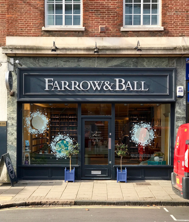
Above is my photo of the Farrow and Ball store in Cambridge, UK, taken while I was on that incredible tour of English classical architecture in the fall of 2017.
The only problem back in the 20th century is that Farrow & Ball paint was not accessible except through a showroom in the D & D building. And, it was double the price of Benjamin Moore and Pratt & Lambert.
Still, I specified their beautiful wallpapers at least half a dozen times, between 2005-2014.
My favorite pattern is the gorgeous Ringwold wallpaper. Their wallpapers use the same colors that are in their paint line.
 farrow-and-ball-ringwold-wallpaper-Schwarz-house beautiful
You can purchase the Ringwold and other Farrow & Ball wallpapers here.
However, this post is about 16 magical Farrow and Ball PAINT colors.
Although, quite frankly, there are a lot more than 16. In fact, out of the 156 or so colors, there are probably only about 16 I don’t like. Maybe this should’ve been the 16 suckiest Farrow & Ball Paint Colors.
Oh, please tell us which of the Farrow & Ball paint colors suck, Laurel?
Umm, haha, sorry, guys, but that’s a slippery slope. And, I’ve had enough tsuris for one month, thank you very much! Truth be told, even with the colors I don’t like, in the hands of a gifted designer, they will easily prove me wrong.
So, why am I talking about Farrow and Ball at this time?
There’s a very good reason.
Well, the paint has been sold in retail stores for about the last decade-plus/minus.
However, I recently found out that you can buy the paint ONLINE!
And, not just the paint, but samples, both card samples, and sample pots. Plus, all of their beautiful wallcoverings. Plus, everything else you need, down to the wallpaper paste, primer, and paintbrushes.
Okay, here’s the 364,000 dollar question. (Adjusted for inflation, lol)
What about the price of the paint? Isn’t it like double the price of Benjamin Moore and maybe even more than double the others’ price?
Yes, no doubt that Farrow & Ball paints are more expensive. However, there are a few other things to consider.
One is coverage. I read an article wherein this woman’s experience, Farrow & Ball, covers better than other less expensive paints. That means you’ll need less of it.
Okay, my bad. I can’t find the article now. However, I will say a few things based on my experience and what I’ve read and also heard from many of you.
The opinions vary from “It doesn’t make one iota of difference” to “Are you kidding me? The difference is HUGE.”
The only time I have used Farrow and Ball paint for a client was for this job. And yes, the paint was gorgeous. I believe the color was light blue. The clients used it in their small family room/breakfast room and also on their kitchen island. The family room was dark, so the color came across as a medium blue-green-gray. However, it looked like a light blue-green-gray on the kitchen island. Interesting.
So, I’m not the one to say whether it’s worth it or not.
However, I’m sure that amongst some of you, there will be plenty of opinions. :]
The only thing I can say for sure is this: It would certainly be worth it if you painted it with another brand and the color didn’t turn out the way you thought it would and then either had to live with it or repaint it. There would be no economy there.
Therefore, if you can swing the extra money, I have always maintained that it is better to get the paint brand that makes the color.
Yes, I know. Some of you will disagree with that. However, color-matching IS a crapshoot. I know this from my painful experience at the beginning of my career.
One other interesting point that I have heard is that Farrow & Ball doesn’t use black in their paints. However, that is not true. I know this because, on their website, they list each color, and there’s a short video about each of them with a brief description. And, many of the colors, they say, do have some black pigment added to the mix.
Okay, it’s time to get into the 16 winners. At least these are amongst my favorites. Also, in some cases, I’m going to add some other colors in the same family. Therefore, it’s really a few more than 16, but I’m trying to reign myself in, is all.
Oh, if you’d like to follow along, here is a link to the Benjamin Moore conversion chart. Please note that for some Farrow & Ball colors, there isn’t an exact match. In addition, just to make us all a little confused than we already are, I have found some inconsistencies with their color cards.
Please note that these are all taken from the main collection of 132 colors of Farrow & Ball Paint Colors.
WIMBORNE WHITE is a creamy off-white that is quite versatile, soft, and classic.
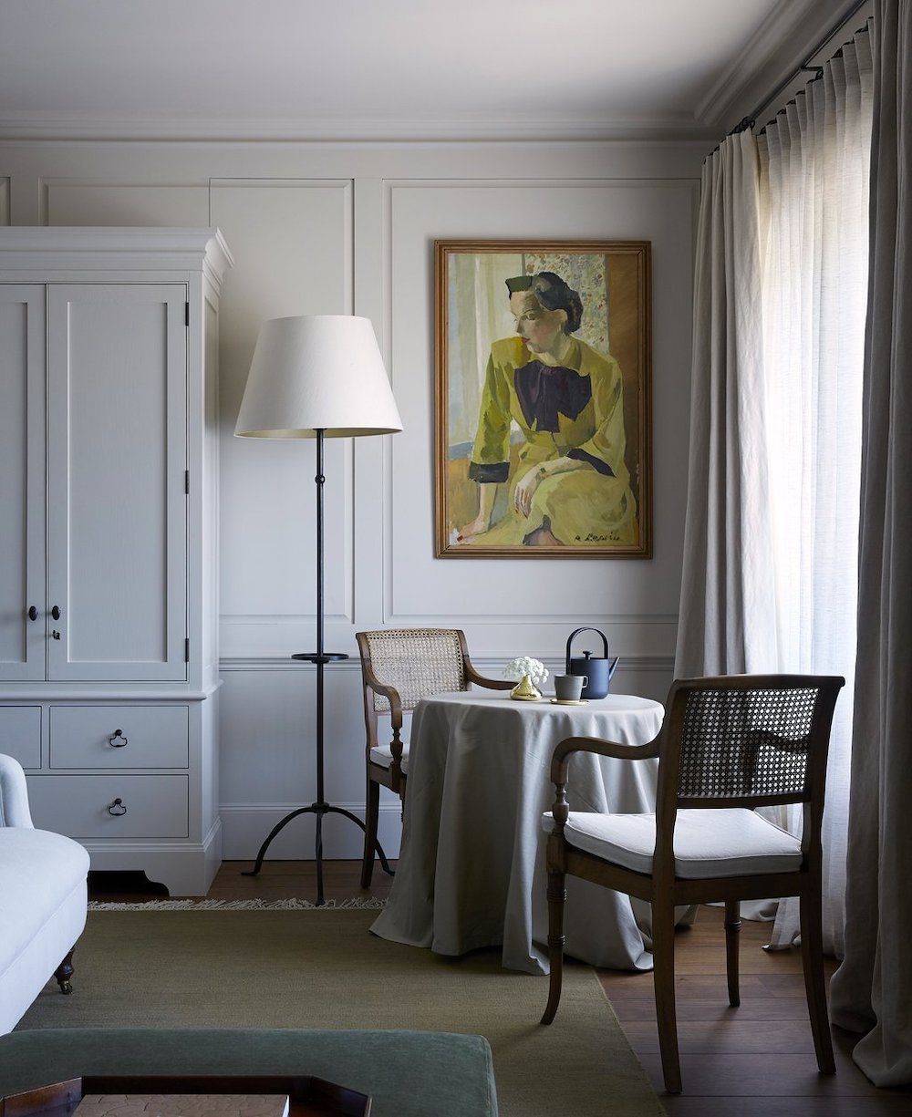
Above is from the incredible Heckfield Place Hotel.
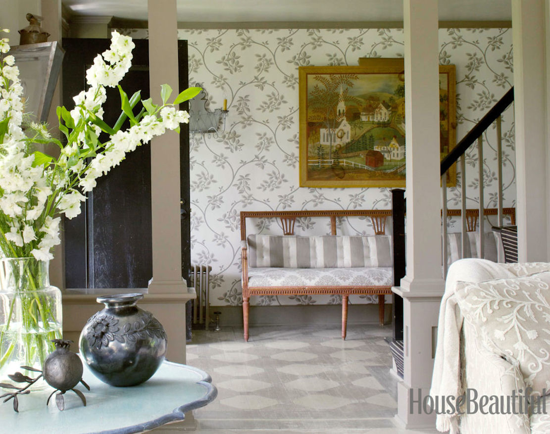
This is a lovely, ethereal neutral which can look ever so slightly lavender depending on the light. The other colors that go with it are, Wevet, Ammonite, and Purbeck Stone.
Borrowed Light is a pale, delicate blue. It works well in low-light rooms. Or, in a sunny room as well. This is also a terrific color to paint your ceiling.
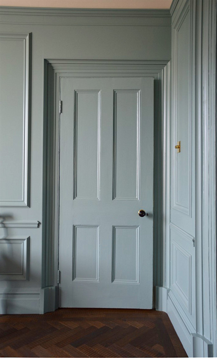
BLUE GRAY – Also, try Light Blue, which is a bit of a misnomer as it has a lot of green in it.
FRENCH GRAY is a soothing green-gray. Sometimes, it can look more green than it does above. Farrow & Ball says that it’s a popular color for a front door. I think it would be amazing with red brick.
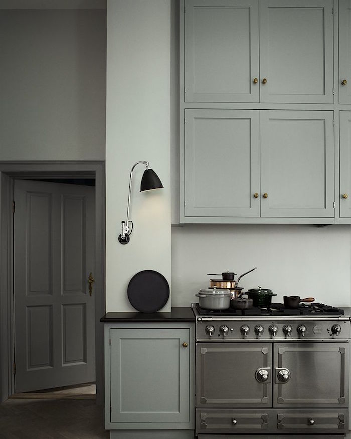
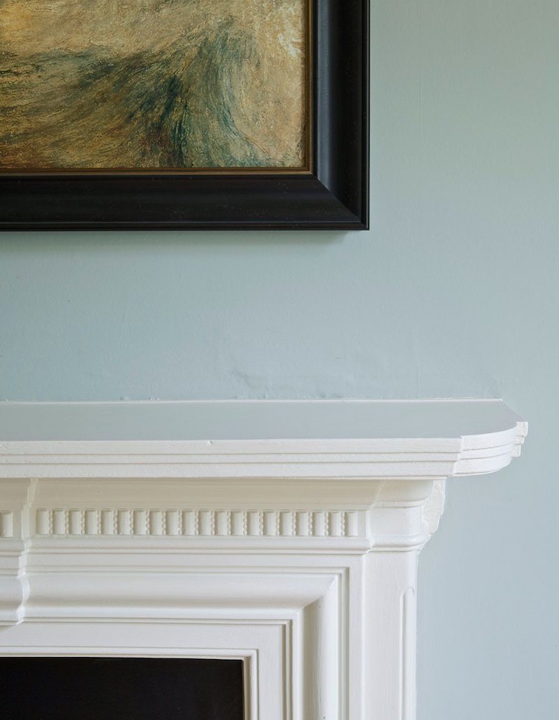
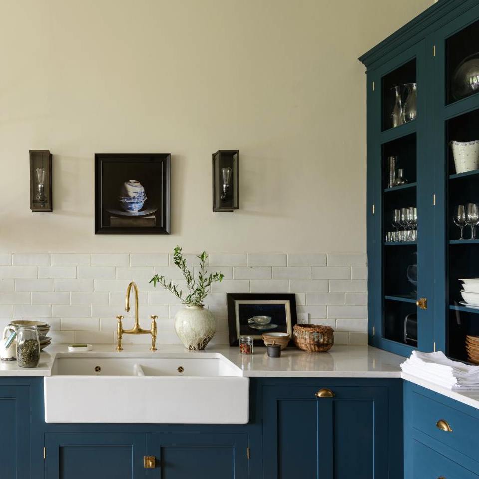
LAMP ROOM GRAY is a smokey blue-gray that is sensational for cabinetry. It can look brighter in well-lit rooms.
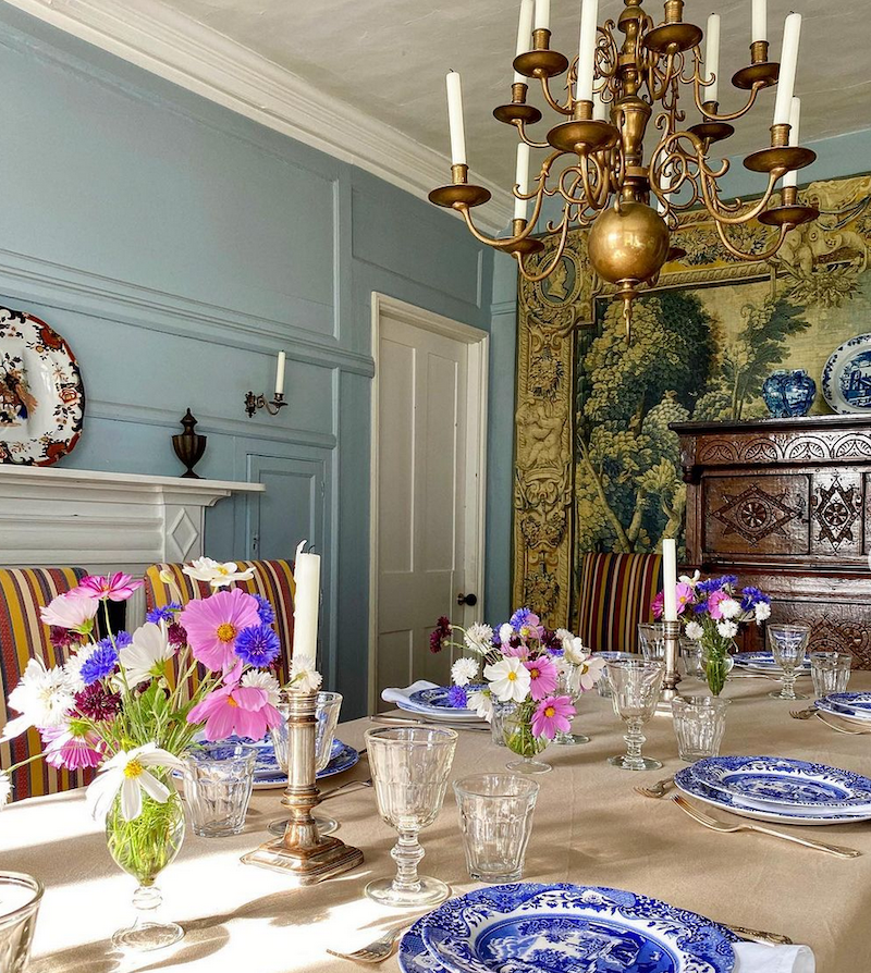
This fantastic dining room is from the incredible Instagram account of British interior designer Carlos Garcia. Parma Gray is a vibrant blue-gray that looks fantastic in older homes.
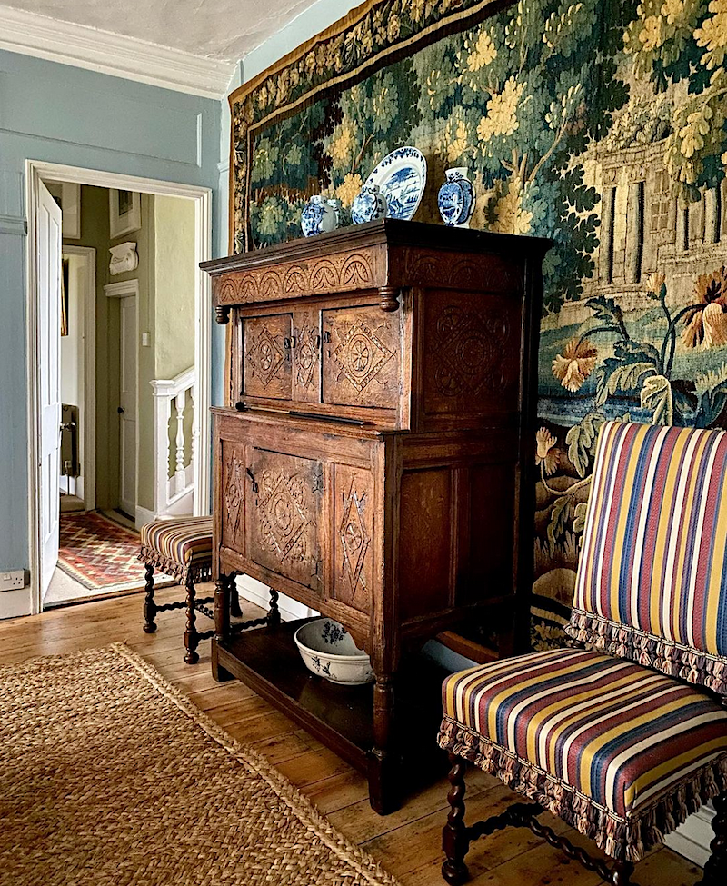
Just have to post another pic of that exquisite tapestry in Carlos’ dining room. Please follow him on Instagram!
There are a couple more photos of his stunning home coming up. My sister had a request for “cozy rooms.” I think that Carlos’ style is the epitome of English coziness. But, it’s a style that I think most Americans would appreciate as well.
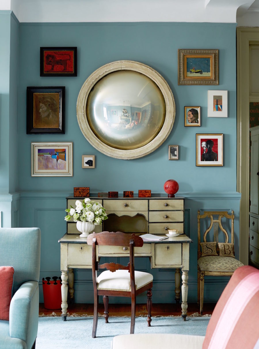
Yes, this is the incredible living room of Sheila Bridges, who we were just talking about. She’s been one of my favorite interior designers for the last 25 years.
Sheila designed the fantastic Harlem Toile.
ST GILES BLUE is the color that Ben Pentreath painted his glorious dining room. It’s breathtakingly beautiful. I was there. Trust me on that one! However, what makes this room, in addition to the Farrow & Ball paint color are the furnishings, especially those black and white prints. That’s what makes a strong color like this work so well.
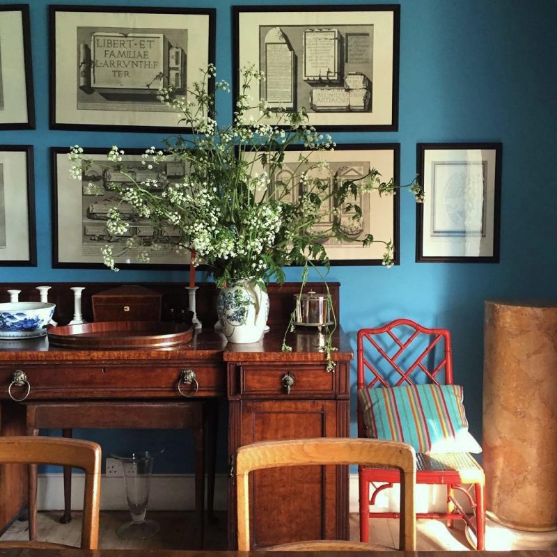
HAGUE BLUE is a rich, saturated navy with a touch of green which I adore. I don’t care what you say; this shade of blue has no equal. ;] Okay, if you’ve found one, please let us know. Not that there aren’t other great dark blues, but this one is exceedingly special. It also makes a great front door color.
![]()
Last January, I took this photo shortly after I moved to Boston while strolling around Beacon Hill. Pretty sick, isn’t it.
This is a cheery yellow-green, but will look deeper in darker rooms. Ahh, you guys know how much I love yellow-greens and chartreuse. This is another image from the fantastic British designer Carlos Garcia.
GREEN GROUND is an extra color. It’s just a shade brighter than cooking apple green and a true soft chartreuse. The photo above is courtesy of The College Club of Boston, a bed and breakfast inn, just a 3-minute walk from me here in Back Bay Boston.
BREAKFAST ROOM GREEN – This is another photo from Carlos Garcia’s Instagram. Love them greens. I’m not 100% sure that this is Breakfast room green. But, it’s one of Farrow & Ball’s most popular colors, and this certainly does look it.
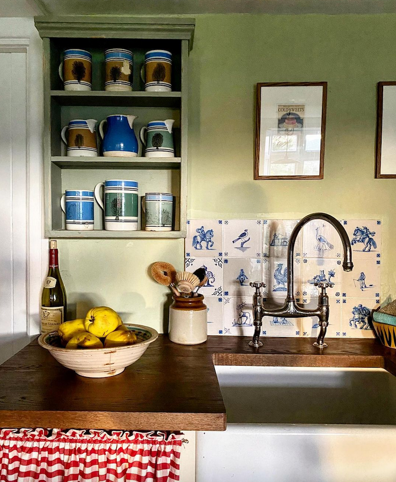
CALKE GREEN is the quintessential English Library green. A classic, if there ever was one.
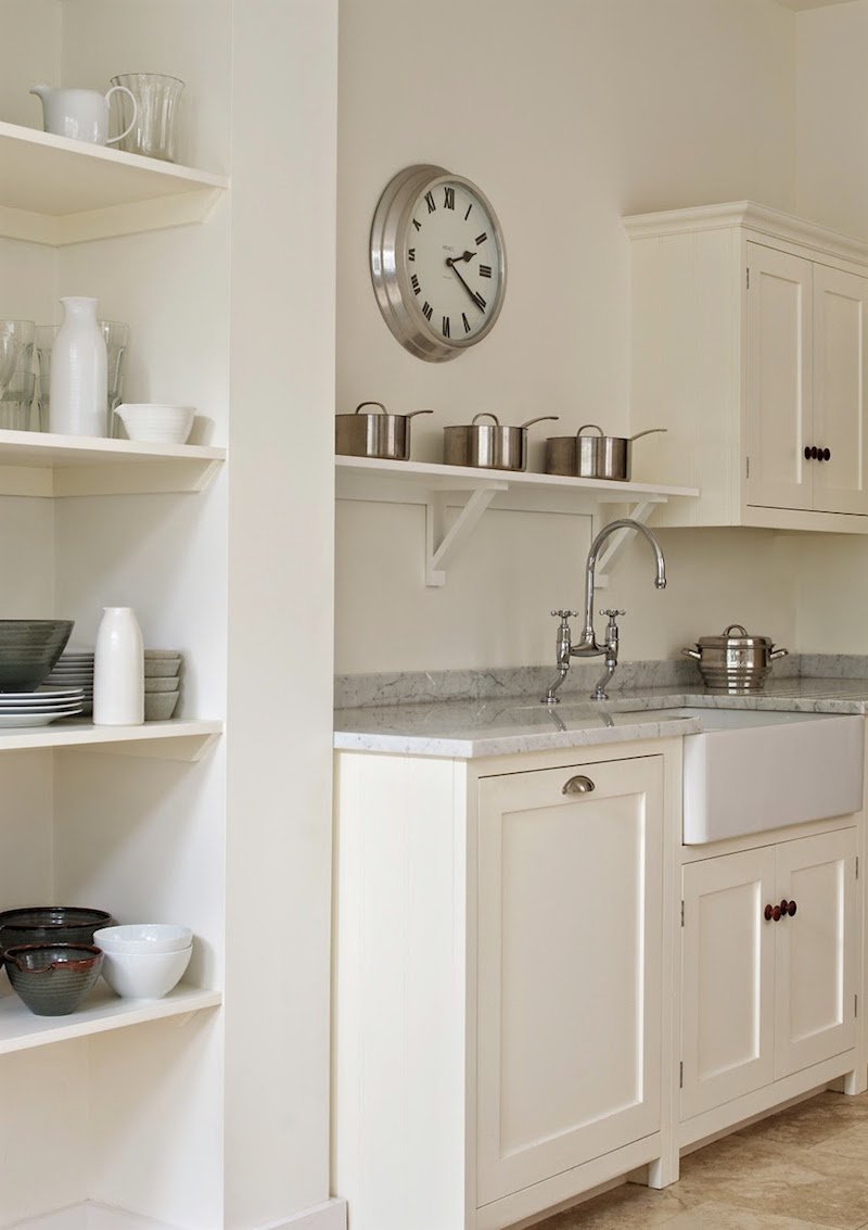
And, please come see Calke Green in this kitchen and pantry renovation.
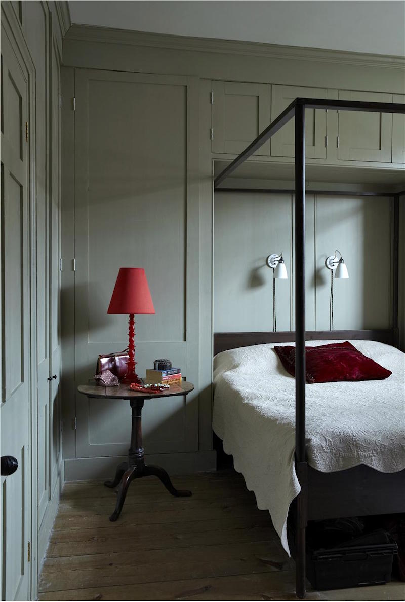
MOUSE’S BACK – is a rich, deep neutral, with a green, toasty undertone and makes a wonderful backdrop for art.
INDIA YELLOW looks like the gorge gold at Heckfield Place. It’s similar to the archived Orangery. For more of the wonderful Heckfield Place Hotel, please check out this post.
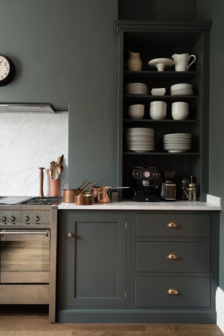
DOWN PIPE is probably my favorite F&B color. In fact, it has become quite the cult classic with many fans! This is another one that makes for a great front door color. For more great exterior doors, please go here.
RAILINGS is my favorite Farrow & Ball shade of black. It’s actually the darkest navy. This is another one that, in gloss, makes for a stunning front door color.
Whew! I did it!
You might also enjoy reading about 12 of my favorite Farrow & Ball Kitchen cabinet colors for the perfect English kitchen.
For quick linking to all of the colors in this post, I made a widget of all of the colors. Clicking on any image will take you directly to the Farrow & Ball site, where you can learn more about the colors and purchase samples and paint!

And below is an image you can pin to Pinterest for reference.
Did you see some of your favorite Farrow & Ball paint colors? Did I leave out your favorite? Please let us know.
xo,

Please check out the newly updated HOT SALES!
In Loving Memory of my incredible Step-Dad, Mark Raffel, who would’ve been 100 years old March 30, 2021. Some of you may recall that 25 years ago, he helped me immensely when I started my business, Laurel Bern Interiors. I’ll always be grateful!
Related Posts
 The Death Of The Boring Beige Living Room
 Six Problem Ceilings – And How To Fix Them
 The Most Amazing English Country House Of Them All
 The Guaranteed Way To A Beautiful Room (It’s Not The Wall Color)
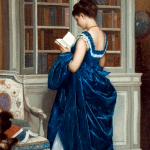 Creating A Chic, Cosy Home Library-Best Colors, Lighting and Furniture
 12 Gorgeous Bedrooms + Common Questions Answered
- 80+ Timeless & Classic Home Furnishings You Will Love!


43 Responses
One of my all time favorite F&B “blue” colors is Pigeon. It’s one of those colors that, depending on light, can look blue, blue-green, or grey-blue. It’s just gorgeous.
I feel like I *need* this paint now! Sounds magnificent. P.S. I love “English cozy”.
Wonderful post, Laurel. My personal experience with Farrow & Ball has been extensive: (Hague Blue (dining room), Cornforth White (entryway), Pavilion Blue (bathroom), Terre de Vert (guest room), Charlotte’s Locks (laundry room), & St Giles Blue (son’s basement room).
I also used Benjamin Moore paints and some Sherwin Williams paints. My painter uses SW, and I didn’t realize that when I said I wanted Benjamin Moore Simply White and he said ‘sure’, he meant the color-matched SW version. I put a stop to that after the Sherwin Williams color-matched Benjamin Moore Classic Gray came out lavender. Since then I only use Sherwin Willams for its own paint colors, and same for the other brands.
I live in a suburban area that, in terms of style, is about 20 years behind most cities in the US. Thus, no local painters I have found have ever used F & B. I am not a painter. This is my first house. So there was a learning curve.
1) I ordered F & B online and it always arrived in like 3 days – it’s incredible!
2) American primer may not worth with F & B paints. My painter used a generic primer with Hague Blue and melted on the walls. Lesson learned. It is an additional expense, but a little F & B primer goes a long way.
3) BM & SW cannot compete with the depth and color complexity of F & B. I like both American companies, and have Sherwin Williams Sea Salt in my bedroom (gorgeous color), SW Urbane Bronze on my kitchen cabinets, and Benjamin Moore Easter Bonnet (a brilliant light pink/purple, in my daughters’ room). But as I said, F & B is like a completely different species.
For those wondering in what way, This Old House says: “The chief difference between a $50 premium paint and a superpremium one that costs twice as much is the type and amount of pigments. These finely ground minerals comprise up to 70 percent of the paint’s weight, compared with about 30 percent for an ordinary premium brand. Lift a can from Fine Paints of Europe or Farrow & Ball and you can feel the extra heft of the pigments. The payoff: more vivid colors, fewer coats, and a longer-wearing finish. https://www.thisoldhouse.com/painting/21017536/all-about-interior-paint
4) I read an article about how house paints cost more in parts of Europe, but are therefore expected to last much longer. Americans love to do things on the cheap, but we expect things to last and are offended when cheap things don’t deliver. That said, my understanding is that there are paints with great depth that may have better application and/or longevity than F&B, like Little Greene, and Zinsser primers. Plus, there are some F&B colors that seem to apply better than others.
5) Consumers like to feel good about the choices they make, and I think most are happy whether they decide F&B is not worth it, or is worth every penny. And both sides are quite opinionated.
5) F&B exterior house paint was, price-wise, a bridge too far for me. We used SW Extra White and it’s beautiful.
I am such a FB believer. Thanks for posting this. We just sold our cottage style home in Chicago a few months ago and when we bought it, it was covered in textured/faux finish 90s tuscan blech. It was a low light property and we did every room in some sort of FB color and it was just gorgeous (Elephant’s breath, Hague Blue, Charleston Gray, Dix Blue, Borrowed Light). I will honestly always spend the money going forward. It was worth every penny. Elevated our whole property and the way the colors change in the light throughout the day is just gorgeous. I was having trouble choosing and they have a color consult service. They sent someone out to our house and the fee was applied to our order. Totally worth it, she was fabulous and steered us toward warmer colors, which worked much better for our low light house. One word of warning is that if you have little kids, it’s not super durable since it’s clay based. We were young marrieds when we bought our house and redecorated. Zero appreciation for crayons on walls, etc. This is not playroom or kids’ room paint, just FYI. Still, I’m an FB’er for life, lol.
Great to see a group of brilliant Farrow & Ball colors, Laurel! Right now, I’m totally lusting after their Setting Plaster. I’ve been watching tons of UK home shows and the color from raw plaster is so appealing. Maybe that’s how US plaster is applied – I don’t know. But then I found Setting Plaster at Farrow and Ball. I keep seeing that warm color in rooms online and in magazines. I’m like a dog – SQUIRREL – with a juicy bone.
Hello French Gray! Love it!
And my eyebrows popped up with joy with the mention of matching paint and wallpaper.
I am a retired designer.l have been going to paint shops that are retail but cater more to professional painters with great success.They seem to have older,more experienced mixologists that are masters at matching colours.l find Sherwin William’s seems to have a few more of these outlets.lf you dont want to or cant buy the expensive Farrow and Ball it is a good option.
What white BM wall color is compatible with BM Chantilly Lace
I’m so glad you shared your F&B favorites… I’m in love with their paint, and have purchased about 20 sample pots (to date), but haven’t actually painted anything yet -I’m too indecisive!
My favorites are Hague Blue, Borrowed Light, Railings, Calke Green, Wimborne White, Yeabridge Green, Babouche, Stone Blue, and Teresa’s Green.
I am torn between Hague Blue and Railings for my lower kitchen cabinets. And Borrowed Light is definitely going somewhere in my house.
To Debra who commented about the Green Smoke kitchen cabinets, the decorator you’re talking about is Charlotte Reiss, whose company is called Vivi et Margot. I absolutely adore the inspiration photos and the colors you selected, Laurel!
C2 Paint is the brand that does not use black in their paints. Love the photos and the colors!
Thank you for this Laurel. I needed a reminder to order a Farrow & Ball colour card. Now I will have the whole range at my fingertips. One reason F & B is so popular is their wonderful colours, and the reason that they cost a bit more is that they use much more pigment in their paints than other brands. Plus, they are an import, so that adds to the overhead. Still, designers swear by it, which is enough for me. I also have bought a few containers of Fine Paints of Europe. There is nothing like it for a mirror-glossy shine. I’m a convert.
THANK YOU Laurel on this post! I JUST found out New Orleans has a shop that carries F&B! Spruce Nola.
What about Elephant’s Breath? I’ve seen some lovely rooms w that one on Houzz.
Do you think F&B made in the US is of the same quality as EU F&B? Has anyone done a comparison?
Hi Laurel – beautiful post, thank you! In the photo of the Lincolnshire Hall kitchen with the Hague Blue cabinets, do you have a guess as to the color of the wall paint?
sorry, French Gray for front door and sidelights… not a solid front door
I love the French Gray… my house is a white cottage, and has red/orange brick columns..what would be the complementary white for my window? Thank you, Laurel
Great post on many of my favorites Laurel. I’ve used so many of these colors for my clients and find most of the F&B colors to be so beautiful even if they are not the right option for the space. My client favorites are Wimborne White, Pointing, Mole’s Breath, Elephant’s Breath, Pigeon, Charleston Grey, Brinjal, Setting Plaster, DeNimes, Stiffkey Blue and of course, Railings. I love that deep blue black and find myself recommending it again and again. I’ve done custom enameled furniture in the F&B colors, too and my resource did a good job matching the colors – a modern buffet in Brassica, a vintage Chinoiserie hutch in Incarnadine and an English china hutch in Railings that I combined with William Morris wallpaper. What I love most about F&B is the quality of their colors – it’s hard not to find a color that is both lovely and appropriate for the setting your a designing. I tell my clients that more is not better – having 2000+ paint colors to select from is not a good thing as many of those colors are just not well-balanced in my experience. I’d rather have a smaller set of terrific options than look for an iffy needle in a haystack. That’s another reason I’m grateful for you Laurel – you always help your readers find those rare needles! (Cococo Home is one recommendation from you that I’ll always be gratful for – adore that company!
First room I painted in F&B made me a convert. I have used Tallow to brighten a dark bedroom, it looks like candlelight; and Light Blue made a world of difference to a long dark hallway. I have used Oval Room Blue, Stiffkey Blue for the dining room, Parma Grey, Ammonite, Pavillion Blue, Wimborne White. My tiny front entrance is painted India Yellow, fabulous colour. Doors are Yearbridge Green. I painted my kitchen cabinets 9 years ago with Slipper Satin (uppers) and Mole’s Breath (lowers) with Modern Eggshell. Not a chip, and I have a very hard used kitchen. I am currently repainting the lowers with Hague Blue, and have changed the living and dining room to Old White, another sleeper colour that is so many different shades at different times. I simply love this paint and find it great value. I say you get what you pay for, it does show the difference in quality over the long run. Have also used it for furniture, it lasts longer and looks better than chalk paint. Stored properly it also keeps well, may not be recommended but i have used paint years after first application with great success.
Hi Laurel – great post as always! You continue to inspire and educate us. I have a question: Recently you posted a photo of a dining seating area; the chairs around the rectangle table were slipcovered in casual white fabric (it looks like twill or denim). The slipcovers are short and pleated. The chairs appear to be a parson’s style.
I am wondering if you may have and source information on the slipcovers? Thank you!
I love Ben Moore but sometimes only Farrow and Ball will do. I cheaped out a few years ago and got the Ben Moore equivalent of St. Giles Blue and it was fine. But I just had a living room painted in the real thing and there’s no comparison–the Farrow and Ball really does live up to their reputation of having deep, beautifully changeable colors. Even the painters commented on how beautiful it is. Their wallpaper is stunning too.
I’m a big fan of F&B, started using it over a decade ago when we didn’t have all these small shops popping up in the US. Back then, they had to ship it directly from the UK if I recall. What I most love is the velvety texture and luminosity that cannot be matched by other paints in my opinion (haven’t tried Fine Paints of E). The colors always work, they are well tested in all light conditions and anchored in old, historic colors. I’ve used All White in a big LR, after 10 years it still looks freshly painted. I also used Wimborne White, Dimity, White Tie, Pointing, Slipper Satin and Oxford Stone. I will say this, they really take a long time to settle and develop the color, after about 1-2 years I can see the colors where they should be. We never used primers, just 2 coats over existing color, painter wasn’t going ‘to fuss’ as he said, and it covered like a charm. I don’t think you’ll need less of it honestly, actually, probably a bit more, it’s a heavier paint. The one sheen they have for regular trim is just perfect, I’m not one for much shine and it went over old, oil based trim like butter. I cannot recommend it enough! My only fear is that they will grow ‘too big’ and that almost always affects quality in the long run.
Thank you Laurel, I never get tired of seeing Farrow and Ball colors in actual rooms and not on samples. Thank you, also, for the shout out to Pratt & Lambert. Recently I was trying to locate a source for their paint. I had fallen in love with one of their colors and computer matches were not getting it. At Lowes somehow they had access to the formula. The color was unusual but I also always had success with their paint, wish they were still more widely distributed.
I painted my dining room (below the chair rail) F&B Cromarty, much to my husband’s dismay–$100/gallon!! “This very light green grey is named after the Cromarty Firth estuary, a place of swirling mists mentioned daily in the Shipping Forecast. A neutral yet atmospheric colour, Cromarty brings a muted softness to any room, creating an easy to use finish that is neither too green nor too grey.” That’s exactly how I view it, and the paint color ties my living room and family room together perfectly, not to mention it blends perfectly with the old lovely wallpaper in the dining room. I happened to have enough paint left over to paint my remodeled laundry room, and it’s a totally different look, since the laundry room is light-filled, while the dining room is dark. F&B is simply delightful paint!!
Hi Laurel,
Great post! Just wanted to post my opinions based on real world experience as I have used many of your favourite F&B shades in my former home.. I have used Parma Gray, Hague Blue, St. Giles Blue, Cornforth White, Breakfast Room Green, Pitch Blue, Railings, Rectory Red and Slipper Satin. I agree with many of your choices and have high praise especially for Parma Grey and Hague Blue. I wish I still owned my old brick home as I would have painted my shutters and doors Hague Blue; I swooned when I saw the brick home with the blue door in your post. I have used Parma Gray in a couple of rooms; it’s really more blue than gray and it is a great shade of all purpose blue that is fresh, sophisticated and yet a little unexpected. In my opinion, light blue is one of the most difficult colours to select if you are an amateur decorator, as like pink, many of the lighter shades that look so fresh and subtle on the paint chip can morph into the visual equivalent of permanent thorn in your side when it gets slathered over the plaster. No amount of furniture, art, window treatments can temper or soften your oh so “soft” shade. Parma Grey is a good shade to keep on hand to avoid this all too common decorating disaster. Hague Blue is like you say absolutely phenomenal! I used it on interior doors on my old home, but I can see it being a very sophisticated choice for a wall colour. St Giles Blue, while a gorgeous colour is not for the timid and faint hearted, a great choice if you like bold. Cornforth White is a beautiful all purpose neutral. I used in a dark hall and I also used it as a trim colour with Pitch Blue. Subtle but gorgeous! Breakfast Room Green is cozy but fresh; I painted my office this colour and Satin Slipper as the trim colour; it was spectacular! The room was very dark and green sometimes dies a bit in the dark but not Breakfast Room Green. Some green’s, IMO can read as expectedly pretentious drab especially when used in home offices or libraries, Breakfast Room Green is a great shade to use if you want green but want to avoid drab. I painted my bedroom Pitch Blue; a very pretty, preppy, fresh blue which was great paired with white and turquoise. I used railings for my railings and it was as expected:). Rectory Red is a beautiful red, but for red lovers only. Finally Slipper Satin is just a gorgeous shade of white that would work in many instances. While I haven’t used it personally, I have seen Churlish Green in high gloss used to paint the interior of old porches and old cabinets and it was absolutely spectacular! If you have an old heap of a room where everything is crooked and has been on the bad end of too many goobered up paint jobs… this is the shade to turn a wreck of an abode into aged charactered home with patina. Finally with regards to price, Farrow and Ball certainly does cost more and they also advise using the paint with their recommended primers which adds even more to the considerably hefty price so that definitely needs to be factored into a decorating decision. My two cents, and I’ve painted a lot …. it’s worth it for some of their one of a kind colours like Hague Blue and Churlish Green. For colours like Parma Gray, while not necessarily as unique, it’s still worth the price knowing you’ll have an all purpose blue that will work across multiple applications. As for the neutrals, you may want to splurge because you love it, but I think neutrals are easier to choose and it’s easy to find something you’ll love it multiple price ranges. Happy Decorating Everybody!
What a GORGEOUS post! And oh so very helpful!!! Getting ready to start my kitchen remodel. Does anyone know which F&B to use on kitchen cabinet (sheen/formula)?
In my old house we painted our kitchen Brinjal. It completely changed the whole house. Every day I loved walking in that room. Upstairs our bathroom was Hague blue. Although the paints are expensive, they cover well and they bring a lot of joy!
Our living room is hague blue and we love it. Granted it’s not light and airy, but it’s cocooning and cozy yet also dramatic and moody. It makes our furnishings seem classier than they really are. Also our living room is more of a library and it seems to tone down the busy-ness of all the different book buildings.
I’m considering painting a built in bookcase in my bedroom a classic French blue. Certainly, I will be checking out this paint line now! Also, I’ve always loved the depth of Ralph Lauren’s line.
All the colors are gorgeous.
When cross matching paint, there is one lady I go to. She copies from the color, not from a code. She hits it every time.
Don’t know what I will do when she leaves.
Thank you for all you do to assist us in our endeavor to make a pretty home.
Hi! I’m a long time fan. So glad you did a post on F&B.
Love their saturation for indoors. One of these days you should also look at Fine Paints of Europe. They do a high gloss kit for front doors…oh my! I went down the rabbit hole AND drank the Kool Ade!!
Laurel, This is the most wonderful eye-candy article! I keep thinking Hague Blue Hague Blue Hague Blue. And I want to paint my dining room St. Giles Blue Just like Ben Pentreath. It’s not too dark, Not too light, just Perfect! And don’t get me started on paint matching. It rarely goes well unless you are a master painter that takes the paint store guys a six-pack of beer every week for their troubles. And even then it’s sketchy. Benjamin Moore whites are almost impossible to get right. Just buy the brand of paint you want! AND I’m going to treat myself with some beautiful paint colors this spring. Laurel you make my day at least once a week! 😘
Hi Laurel,
These are gorgeous colors and gorgeous spaces
Makes me want to paint again, almost 😉
Thank you
I love F & B. We used it to paint our sunroom which is actually my music room. I have a satin black baby grand in there and didn’t want it to “stand out” so we painted the room F & B Off Black in the Estate Emulsion. The room has a soft white trim and 12 ft ceiling and lots of windows so it is still bright and sunny. I painted myself having painted a lot and with various paints over the years including BM and P&L. The F& B covered in 1 coat but I still applied a 2nd coat. Couldn’t be happier with the result. It was worth the cost IMHO. (BTW love your blog…long time reader….never commented I don’t think…I’m a dentist…not a designer….well maybe of teeth LOL!
I painted my kitchen in Green Ground when we remodeled two years ago and I still love it. It makes me happy every time I walk in. The consistency is oddly like pudding, but it covers beautifully and dries to a lovely soft sheen (I used the Modern Emulsion). And, as silly as it sounds, knowing I’ve used a British decorating staple satisfies the Anglophile in me. 😉
Good morning Laurel,
Farrow and Ball paint is wonderful. It has a depth to it that the others can’t compete with. Their paints go on so smoothly and somehow the consistency is different. It’s hard to describe.
I am missing my pavilion grey kitchen in the UK and thinking of painting the LR ceiling borrowed light!
This post has made me homesick! Bw laura
You neglected to mention the very important fact that the paint is full spectrum…having all visible wavelengths!
I kept holding my breath waiting for a pic of my favorite French kitchen with Green Smoke cabinetry by Farrow and Ball. It is dreamy. I think the owner/ designer is Vivienne Margot. Please forgive me if I got her name wrong, but I’m willing to bet most of you know who and what project I’m talking about. <3 to all!
So glad you have shared these gorgeous colors and I join Susan in loving Pink Ground. I used it in 2 bedrooms of my daughters after they were grown and left home. The room on the south side is a delicious, soft and gentle pink, the room on the north is a delicious, soft and gentle apricot. I adore both, even with that unexpected surprise that I should have known.
I would NEVER color match a F&B color. One reason I would not color match F&B is because it must be painted over the recommended undercoat in order to achieve the proper color. I have had painters use the wrong undercoat and that was a disaster. It had to be completely redone. That is how sensitive the color is, which is part of its beauty. It is expensive in the US because it is not made here but buy it in Europe, and it would be perfectly reasonable for the quality, based on my conversation with my UK friends about its price. The estate emulsion finish has a look that is alive and soulful. I realize that does not matter to everyone who is painting their house. Personally, I’m not enamored with the glossier interior sheens.
I’m a great fan of F&B, despite the eye-watering price. Slowly I’m re-doing the lower walls in our house wherever the plaster is straight on to the interior stone walls which bring up damp from below in some areas (the house has no foundations). We were badly advised when we started out and used an oil-based primer, THE thing one shouldn’t do. Sanding the walls back to bare plaster is a horrendous job but worth it. F&B primer followed by F&B paint, no problems since.
I love a lot of the colours you feature, and have kept some of the photos as I find it useful to have pics of the colours in situ and to see what people put with them.
My favourite? French Gray and all the related grey-greens. I also love Lichen. I just wish we had bigger window areas so that I could use these on the walls, but with small windows throughout, it’s Ringwold Ground or Lime White for the walls plus New White in the kitchen. Least favourite? If St Giles Blue was wiped from the face of the earth I wouldn’t object!
Laurel!!! What about Pale Powder? It is the most beautiful, interesting colour and everyone that sees it, LOVES it. It’s really special.
Thanks for a great paint post. I’m in Ireland so it’s the Benjamin Moore paint that is expensive here, Farrow and Ball is nearly cheaper 🙂
Pale powder is my favourite, it’s one of those colours that really stays with you.
You missed my favorite, the gorgeous Pink Ground.
Oh, you’re so right, Susan. That’s a great pink. In fact, I didn’t have the energy, but one of the Ringwold papers was in Pink Ground. That client adored pink and there was plenty of it in her home! Her name is Susan, too. :]
Here’s the post with the wallpaper!