

Hi Everyone,
Well, now that it’s hot as hell and sticky to boot, I thought it would be a great time to go over the best exterior paint colors. ;]
Like interior paint colors, it’s a daunting subject and no less forgiving.
So, before we get into my favorite exterior paint colors, let’s discuss the best way to narrow down the choices.
Here are some things to consider if you don’t know where to begin:
- Where is your home located?
City, country, beach, mountains, Arizona, Maine, Hawaii, Georgia…
- What style is your home?
Is your home modern, traditional, rustic, formal, or casual?
- What is it made of? Brick, siding, shingle, stucco, stone, or a combo of two or more elements?
- What are the other nearby homes like?
- What’s going on inside your home? Naturally, the exterior colors should relate to the interior colors.
- And finally, what size is your home?
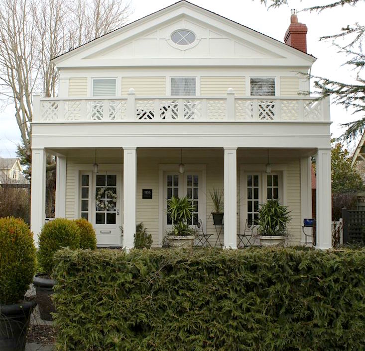
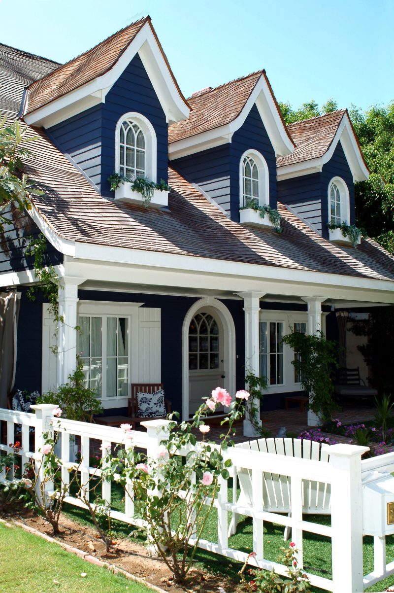
I read a while back that a large house should never be white.
Well… okaaaaaaay, if you say so.
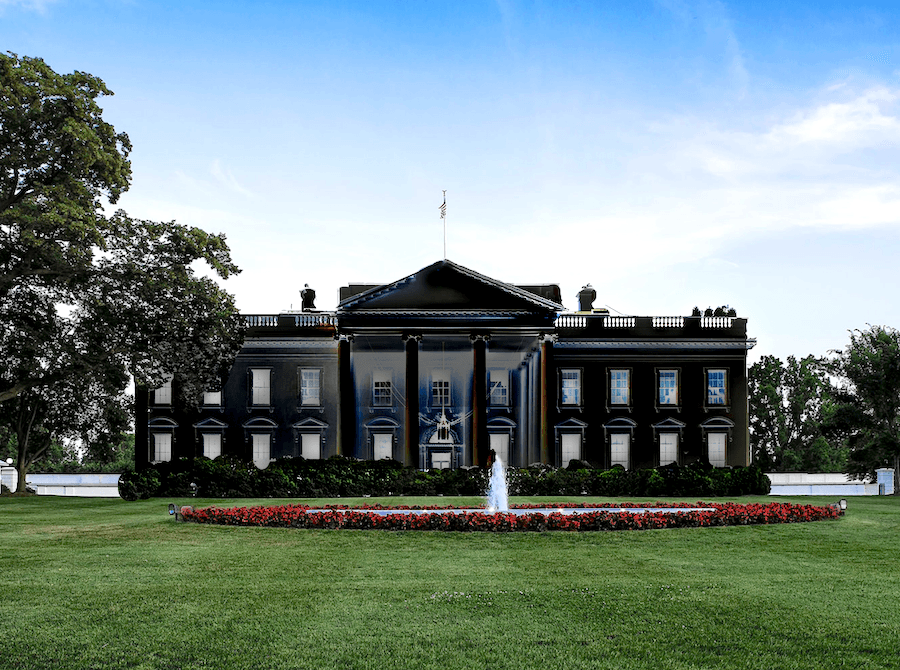
The Blackhouse
I think, if anything, it’s the opposite. Large homes look better in lighter colors, IMO. But again, if there’s a lot of architectural interest and white trim, a dark house can look terrific, too.
Before we get into some of my favorite exterior paint colors and combinations, here are a few essential things to know if you already don’t.
Exterior paint colors behave differently than interior paint colors.
How so?
Well, one of those is that the exterior paint colors almost always appear lighter outside than on interior walls.
And if the house is in bright sunlight– very much so. Of course, if it’s in shade, the color will be deeper.
So, a lovely soft off-white inside might look too bright for what you have in mind. Therefore, I would first sample a shade or two deeper, when you begin the decision process.
But ALWAYS test your colors!
However, not like this. Sorry if this is your house. Like inside the home, it’s best to look at the colors one at a time. No worries. I did this too— 30 years ago. I feel it only adds to the confusion.
For paint testing, I highly recommend Samplize, those fantastic self-sticking ready-made paint samples. You can use them over and over, too.
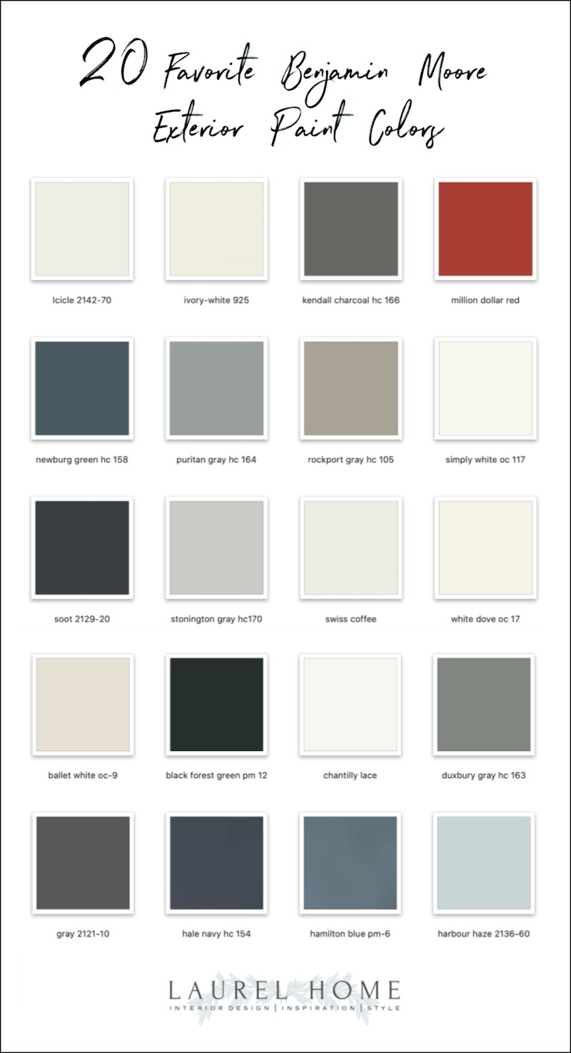
Okay, let’s look at some of my favorite exterior paint colors.
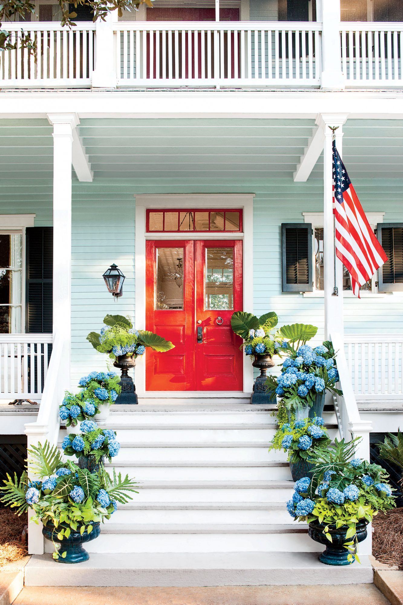
Love this home. But, there’s a problem. It looks like an aqua-blue, right?

However, they are saying the body of this lovely home is Lancaster Whitewash. (the color above.) That doesn’t look anything like the body color. But, just as bad is the door color. They are saying that it is Benjamin Moore Classic Burgundy.

This is Benjamin Moore Classic Burgundy. See what I mean? This is why when folks ask me, “What is that color?” it drives me a little coo-coo. As I always say. “Just match what you see.” I wrote more about color matching off of a photo here.
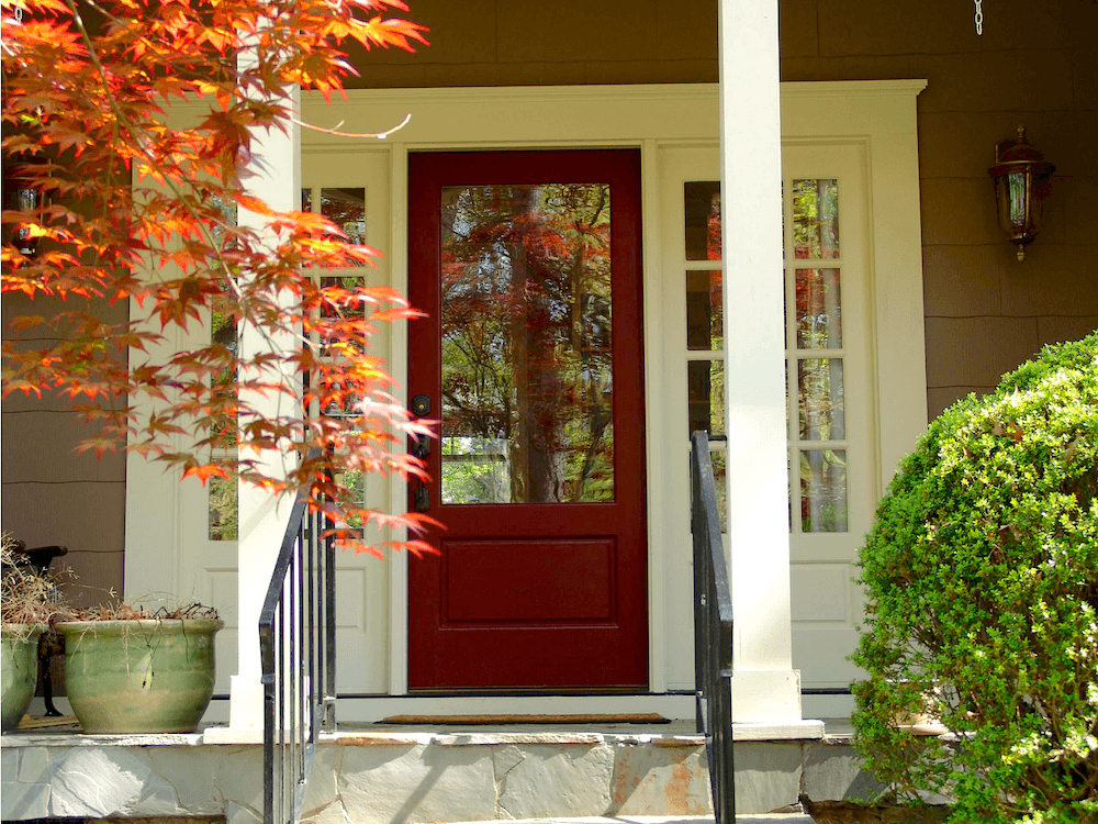
Above is another home with a Benjamin Moore Classic Burgundy front door.
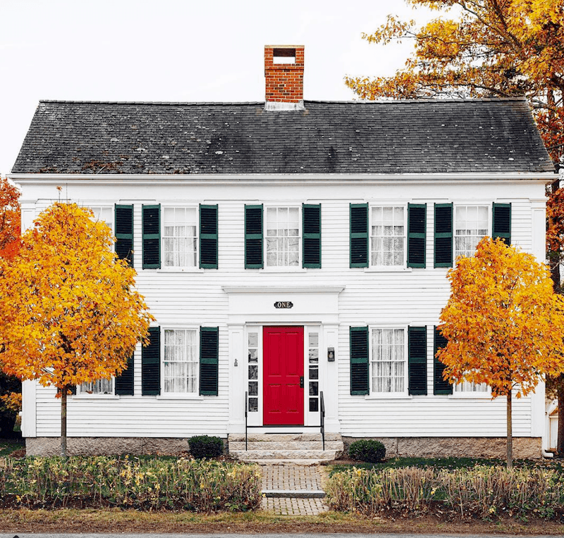
PJ Havel Kennebunkport Maine Benjamin Moore Heritage red door

Benjamin Moore HERITAGE RED, a classic no-fail shade for red doors.
For more fabulous front door paint colors, go here.
And one of my favorite posts are the incredibly beautiful front doors of Beacon Hill.

Black forest green pm 12 – is that cool darkest shade of green.
You often see it done for the shutters on a white home.
This reminds me of Melissa T’s gorgeous sunroom in Essex green you can see here.
Let’s continue with some of the best white and off-white exterior paint colors.
We’ll also be looking at more favorite coordinating door and shutter colors.
This Federal home near where I used to live is a long-time favorite. It is all white. And, certainly, painting a house all white or any ONE color is a valid design choice. In fact, it was commonplace to paint a house all one color in the 18th century. More about that in a bit.
Julia Berolzheimer – Gal Meets Glam – photo- Hector Manuel Sanchez – Lizzie Cullen Cox – Southern Living

The shutters are Benjamin Moore Blue Porcelain 1641

The body is Benjamin Moore Simply White oc 117

The shutters look like DUXBURY GRAY hc – 163
I just think the architecture is incredible in this lovely home. All of it. The colors and the landscaping too. It all needs to work together.
Benjamin Moore ICICLE – with TARRYTOWN GREEN hc Door

Tarrytown Green

icicle

Benjamin Moore Ivory White 925 is another lovely off-white.
ACADIA WHITE ac-43 is Ivory White’s identical twin – From my client’s home in Kentucky.
WHITE DOVE – oc-17 is an enduring classic and a beautiful exterior paint color. For more homes in white dove, please check out this post.
SWISS COFFEE – oc-45
I love it when folks paint their home to match the dog. :]
CHINA WHITE – is not my favorite interior color because it can go rogue and look like a pale muddy pale gold or go gray and cool. But outside, it’s a mellow cream.
source unknown

BALLET WHITE oc-9 – is a little deeper than Swiss Coffee but will look off-white outdoors.

The shutters look like STONINGTON GRAY hc-170. This is a classic gray with a slight blue undertone.
Tim Adams – Architect – Photo by Emily Jenkins Followill
Handsome home in Florida- via Traditional Home. The trim and shutters look like REVERE PEWTER hc-172. I love this classical Florida style.
Remember when I was pretending to look for a classical home in Florida?
Yes, this is the same house. I know… Sick. And talk about the inside and outside connecting!
Bruce Wilkin in Oak Bay, VANCOUVER Island, BC
Oh, what a beauty!
LANCASTER WHITEWASH hc-174 is a classic cream.

Another nice one is MONTEREY WHITE hc-27.
White Dove goes with most of the light to medium historical colors– or any of the other white shades. But please test first.
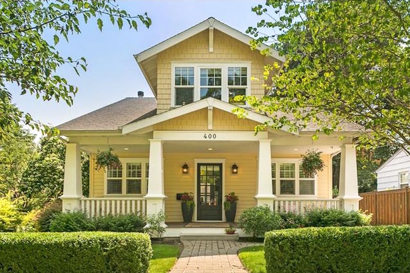

HAWTHORNE YELLOW hc-5 looks fresh and unexpected in this charming one-and-a-half-story craftsman bungalow. The image was taken from a real estate listing, and the home is no longer for sale.
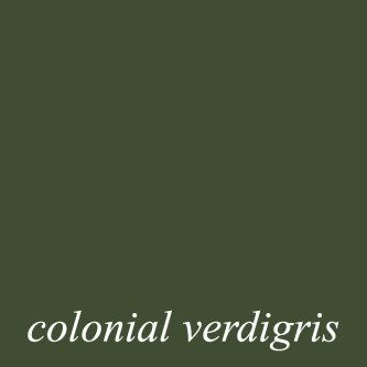
The front door looks to be Benjamin Moore COLONIAL VERDIGRIS – cw-530
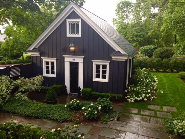
RACCOON FUR
Another fabulous off-black is the color Nancy Keyes used on her charming garage.
HALE NAVY hc-154 – is a classic and popular navy. I love how fabulous it looks on this home.

Although it might look a little closer to PURITAN GRAY hc-164

KENDALL CHARCOAL hc-166
I think it’s closer to Kendall Charcoal. This is a beautiful four-square by Donald Lococo.
And now, my very favorite exterior paint color
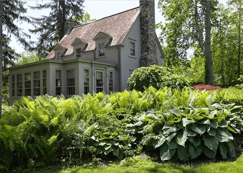
If I were a house that needed to be painted, I would want to be one of Martha Stewart’s houses in her compound in Katonah, NY. I’m quite familiar with her home as I used to drive past it on my way to clients for years.
Martha turned this 150 neglected farm into a glorious compound with several houses.
There are several buildings of various sizes, each of which is painted this ONE COLOR.
This is an accurate 17th-18th century way of painting country homes–particularly in New England and Salt Box styles. You can see more houses like this here when I visited the historic Old Deerfield village three summers ago.
The color is said to be Bedford Gray. The closest I could find is the color below.

ROCKPORT GRAY – hc-105
It’s a warm, putty color with a whisper of green, some beige, and a lot of gray. There is a lot of stone on the property, and the color looks amazing with it and lush property all around.
I found a closeup!
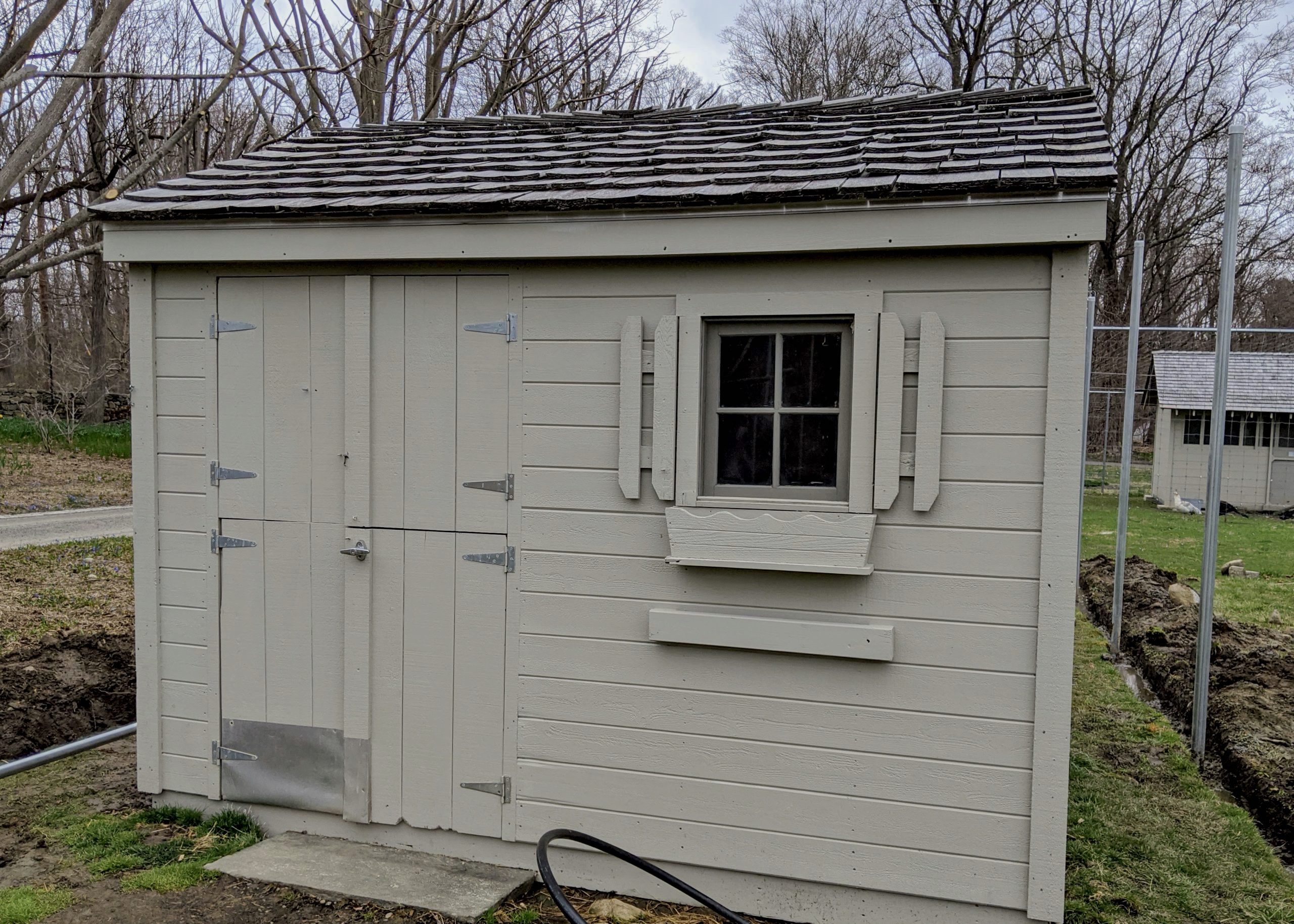
The shed looks terrific in Bedford Gray!
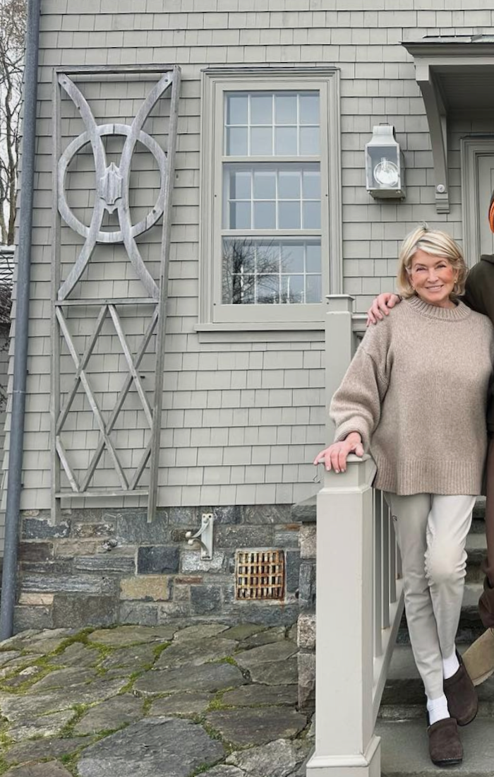
Hot Damn! Martha looks good! I got this from her Insta.
See? The color looks more pale above than below.
But no matter; it’s 150 acres of heaven!
Also, you might enjoy checking out the best paint colors to go with red brick.
Please pin for reference.
And, please pin this one, too, if you like.
I hope you enjoyed this collection of my favorite exterior paint colors.
Many of these colors are in the Laurel Home Paint and Palette Color Collection.
xo,

***PS: Please check out the great HOT SALES! Some are ending soon, and some are getting a jump on the big July 4th weekend, plus Amazon Prime Day pre-sales.
If you shop at Amazon, an easy way for you to help support this website is to click this link.
For any orders placed within 24 hours of that click, I will earn a small commission at no extra expense to you. I’m very grateful for your help!

Related Posts
 The Best Swivel Chairs And Swivel Gliders, too!
 Gray Walls? The Perfect Color Palette To Make Them Sing
 Reddish Laminate Floors? What Wall Color Will Work?
 12 Of The Hottest Kitchen Trends – Awful or Wonderful?
 It’s Only The Laundry Room, Nothing To Fear Sweetie
 Here it is! A Palette For No-Fail Paint Colors
 Roman Shades Weren’t Built in a Day


32 Responses
Thanks for sharing.
Planning to do oyster white for base and trim. Trim around front door and front windows, side door, back doors, Garage door: Colonnade Gray. Front door and shutters in Ambler slate. I’m using SW Superpaint. My front stucco is under roof overhang. Should I do stucco in flat or satin? Porch ceiling flat or satin? I planned on gable siding to be SW satin and front door and shutters in gloss. I’m not sure if I should do satin or gloss for oyster white trim and what sheen for the colonnade trim around front windows/front door, side and back doors and garage door?
White houses are 100% my fav! Navy blue with ivory trim is a hot second. I really don’t love Martha’s gray without some kind of trim color. It looks blah to me.
Great post! Love Martha, Stewart’s monochromatic historic home. Ironically, I have chosen Rockport gray, and wondering if this look would work for my ‘84 solid brick ranch? No shutters, just an arch over the windows and new black roof.
Hi Cat,
I can’t say from here.
The question of an outside color would be very simple for me as it would always be one of the whites or off-whites, and it would have a red tile roof (I live in fire country in southern California). As indecisive as I can be about many decorating issues, a white house has always seemed like a happy and peaceful house to me.
Hi Laurel, I little late to catch up today because of a computer glitch. Many of these houses are on my Pinterest boards as they are so pretty and inspiring. Loved seeing our little “carriage house” garage. We still love it and we like it with our all white-house. I went down the rabbit hole when I saw the mention of Melissa’s sunroom, so I smiled reliving our kitchen renovation, etc.
Thanks as always!
XOXO Nancy
Hi Laurel
I want to thank u for taking a lot of time to help all of us. U save us time and $$$$.
I live in a”controlled “ condo so have to follow rules. I’m so tempted to buy some peel and stick wallpaper and cover my garage door with red stripes .WOW, I would get a lot of Management letters but it would be fun.
U r a joy
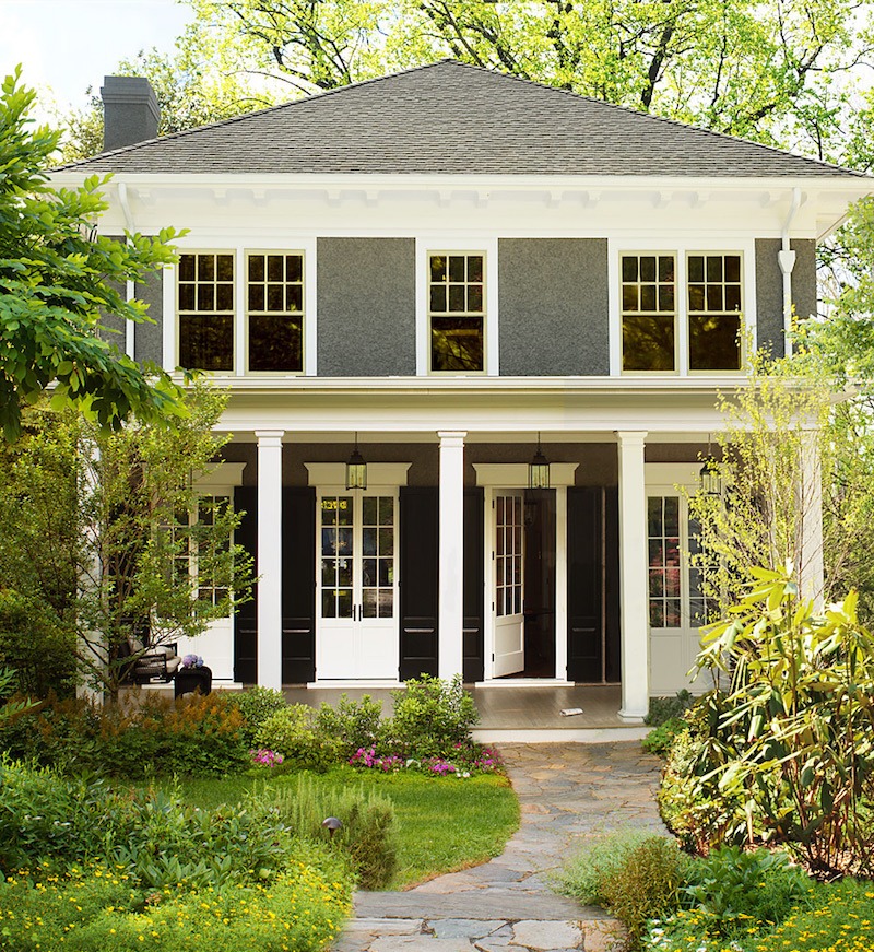
The Blackhouse – LOL! Well, I guess it would help the secret service agents blend in – and I agree with you that the lighter color suits the house better! Talk about “historical color”. Anyway, there are so many beautiful houses in this post – eye candy! We just bought a house and will be painting it in the next few years, so thank you for all of the ideas.
Our last home was in a coastal town and we painted the exterior HC-164 Puritan Gray with OC-66 Snow White for trim. We just moved to an island in the PNW and will be painting this one Puritan Gray as well. In my humble opinion, it’s the perfect mid-tone gray for a traditional style home.
Yes, Laurel – but what color do you paint an ugly house? Hah! We have a rural home and the structure has been heavily added on to over the years – about a quarter of the house is from the 20s, a quarter of it from the 50s, and half of it is an oversized 70s folly complete with double story wedge shaped addition that, while groovy and nice for living, in no way relates to the modest midwestern farmhouse vibe of the previous portions. To add insult to injury, the previous owners left us with a nearly new metal roof that will last forever, in a distinctly purple shade of burgundy. Thankfully the roof is not a prominent feature from most angles but it’s not invisible either. The house needs new siding (currently it’s a nice color – but the weathered cedar shingles were installed and maintained very badly) and I think I’m going with some sort of tan/toast color to help this hulk melt into the natural surroundings. I’m not crying, I’m laughing!
Hi Julie,
I’d paint it one color, preferably white.
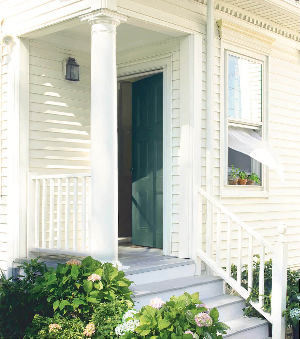
Colourwise, I can totally relate to the house with hydrangeas on the entrance steps being Lancaster Whitewash and Burgundy Red, and looking nothing like those colours. I am in Australia, and have just painted my laundry and the bathroom next door to it in Dulux “Antique White USA” – a warm creamy white. Because of the different light due to the different window position in each of these rooms, the laundry looks warm beige and the bathroom 2 steps away, looks cool pale green. I’m not too unhappy with the look, just surprised that the two rooms were painted out of the same tin, but look totally different. : )
Laurel, Fantastic column, incredibly timely! We just bought a cottage near Beaumaris on Muskoka lakes.
It’s Lake country about 120 miles north of Toronto with many old line NY, Pittsburgh, New Orleans families and their compounds-some from late 1800’s. Had their own railway cars! I know you would love the place…
I picked Gentleman’s Gray 2026-20 Moore- BUT saw your Hale Navy HC-154 in this post- AND the windows are Pella (10 years old but virtually perfect) with cream yellow? painted aluminum exterior.
Not sure that window trim can be repainted and last. (cottage is currently brown/brown metal roof)
Do you think that Hale Navy will go with Cream? (can’t change the roof but looks silver most in most weather)
When we saw the place in April under snow I said this can be a Laurel Bern/Ralph Lauren dream! Incredible dotted
island views in every direction.
We’d be incredibly grateful for your comments. You should open an office there! You’d probably know some of the families.
Love your columns-really appreciate your opinion, Lori and Russ Payton, Toronto.
Hi Lori and Russ,
I wish I could help you, but I would need to be there.
Oh this post is soooo helpful and funny. I also laughed while considering Laurel’s question on the style of our medium-small 1989-built house in a leafy suburban neighborhood.
-Large Palladian window in front, next to front-loading garage
-Cute dormer window over garage crying out for lace curtains, a window box and a yodeler
-Mexican tile dancing all over the front stoop.
-Traditional-ish mahogany front door with a giant, flat arched window over it
-Brown commercial brick with dirty yellow/white specks
-Native Texas coastal prairie instead of grass front lawn (it really is a prairie with 650 native plants/flowers)
We don’t seem to have a style. 😂 BUT since we do have so much going on, the whole-house-one-color scheme might work really well for us. As for color, I’m going to study and discover what color seems to run through our south-facing setting. Love the Samplize, will be using that, also Laurel’s Rolodex and Paint Guide, which helped us choose colors for the interior of our house.
Ty for this post.
Hi Lisa,
I’m struggling to take that all in, but appreciate your kind words!
HC = historical color
99.9 sure lol
Thank you, GG. Yes, Historical Color. I get comments in my email, and occasionally if it’s something like that, just shoot back a quick answer.
Laurel- what color door is on the Hawthorne Yellow Craftsman. I didn’t see that mentioned. Thanks!!
Hi Kimberley,
I just added it to the post. I don’t know for sure, but it looks very close to Colonial Verdigris cw-530. That is from the Williamsburg Collection.
what does hc stand for?
what does HC stand for?
thanks,
Marian
Could you do this post topic again using all stucco examples, pretty pretty please?! 😁 Also… the Black House. 🤣
Thanks for this wonderful post, Laurel. Have you written about how to choose a paint sheen for the exterior of a house?
Great post, Laurel! Anyone looking for a durable door finish in a custom color might benefit from my experience: I had a south-facing front door that faded and chipped no matter what kind of paint I used. When I remodeled the entry, I wanted a front door with a lasting finish in a warm red but couldn’t find that paint color anywhere. I took a dinner plate in this shade to an automotive body shop in my area and asked if they could match it. They said yes, and I had the new door shipped directly from the manufacturer to the shop to be painted. The door is now not only the perfect red, but has an extremely durable finish.
Thank you, Katherine. That’s a great idea!
Oh oh oh that China White home with putty color millwork just takes my breath away. That color scheme is timeless and would go with any color decor you wanted. Absolutely love it.
The white cottage with the red door and nice landscaping is a Hedgewood design located in Vickery Village in Cumming, GA. It is a beautiful neighborhood in which I used to live in the suburbs of Atlanta.
Thanks for letting us know, Staci.
Loved this post–especially THE BLACK HOUSE!!!!
That was MAGNIFICIENT! Thank you so much for posting! You see these paint colors and somethimes you just can’t imagine how beautiful they would look on the right property. The “Black House” was very unique and I can’t imagine what it must look like at night, but if I lived there, I’d have outside lighting to make it show, otherwise it gives off a creepy Halloween feel. Loved this paint post!