

I began writing about the paint colors and selection in these two posts, here and here. But from now on, I’ll be adding information to this one, diary-style, with the newest entries at the top. I hope it won’t be [too] confusing.
Sunday August 25, 2024
Hi Everyone,
This will be a relatively short entry, but it contains some good information about the paint colors that will be used in my newly renovated home.
We will resume the paint colors in a sec, but first, a brief update about the hardwood floor finish.
I met with Gary, the floor guy, last week, and we decided that after the painting is done, he’ll sand off the new board finish and restain it to better blend in with the old wood. Then, the current finish will be screened. If you don’t know, that’s where they take off the top layer of poly, buffing it until it’s perfectly smooth.
Then, they are going to finish the entire floor with semi-gloss oil-based poly—yeah, the super-stinky stuff. I will give my neighbors plenty of warning and then vacate the premises for a few days. I’ve decided. I love the depth and rich luster of oil-based poly. Water-based is fine and essential for white floors.
Oil-based poly also adds a translucent amber color, which will also help to create a richer finish.
Alas, our oil-based polys are not what they used to be, either. I adored our fabulous Fabulon in our townhouse in New York. However, I have read that it, too, has changed.
Gary recommends Woodline Poly, another Bona product. I need to research this one. Gary will also make some samples with scraps of the old and new wood. I am sure the floor will be much better when finished.
Okay, Chris brought over several test quarts of paint.
Yes, test quarts. We feel they’re more accurate.
But remember when I said I always specify the paint color AND number? Well, I did so this time, but when he went to buy the paint, he didn’t specify the name, only the number. However, he forgot the OC in front of the number.
Hence, four of the colors were quite wrong. So he went back to the paint store. Fortunately, it was only about 3/4 of a mile away.
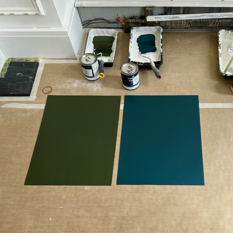
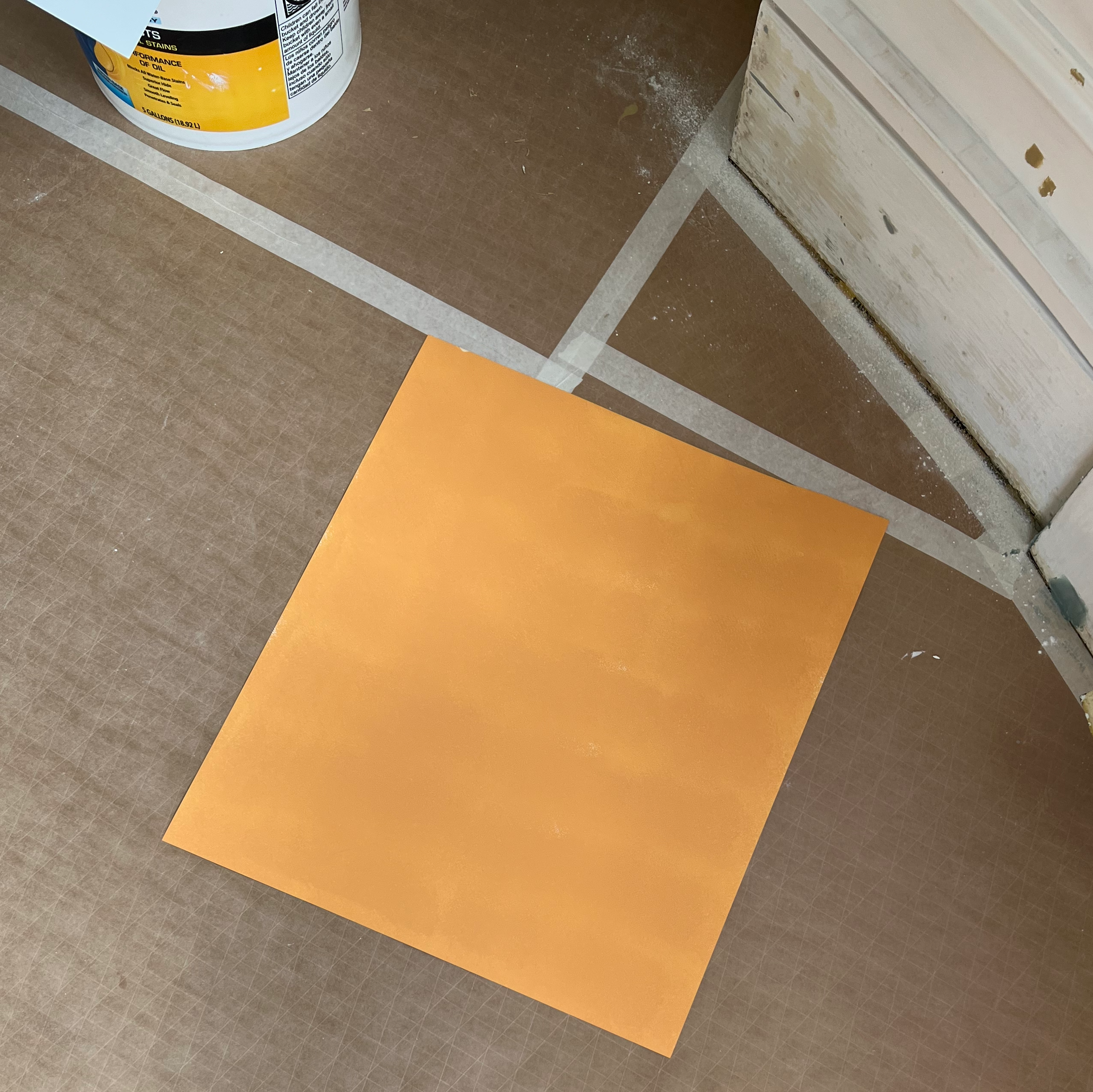
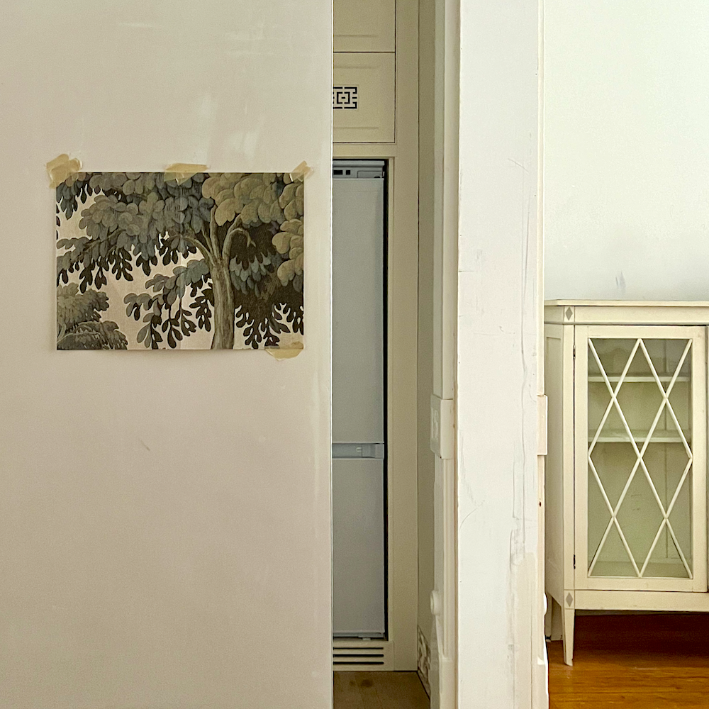
Young Alex expertly painted on the colors. Resting on the floor are Benjamin Moore Windsor Green and Dark Harbor.
Beautiful, aren’t they?
I think so, but these colors will not look like this on your vertical wall.
On the right is Dark Harbor csp-720. In the middle is Fair Isle Blue csp-715. And, on the left is one of the 144 Laurel Home paint collection colors, Galapagos Turquoise.
Dark Harbor, is gorgeous, but way too dark for what I’m looking for, in the den. Although it looks lovely to hear, Fair Isle fell flat because the pink light sucked out its green undertone. However, Galapagos, one of the highly saturated dark teals in the Color Preview fan deck, was gorgeous.
Below, you can see it on my new closet doors! Please also notice the new wainscoting!
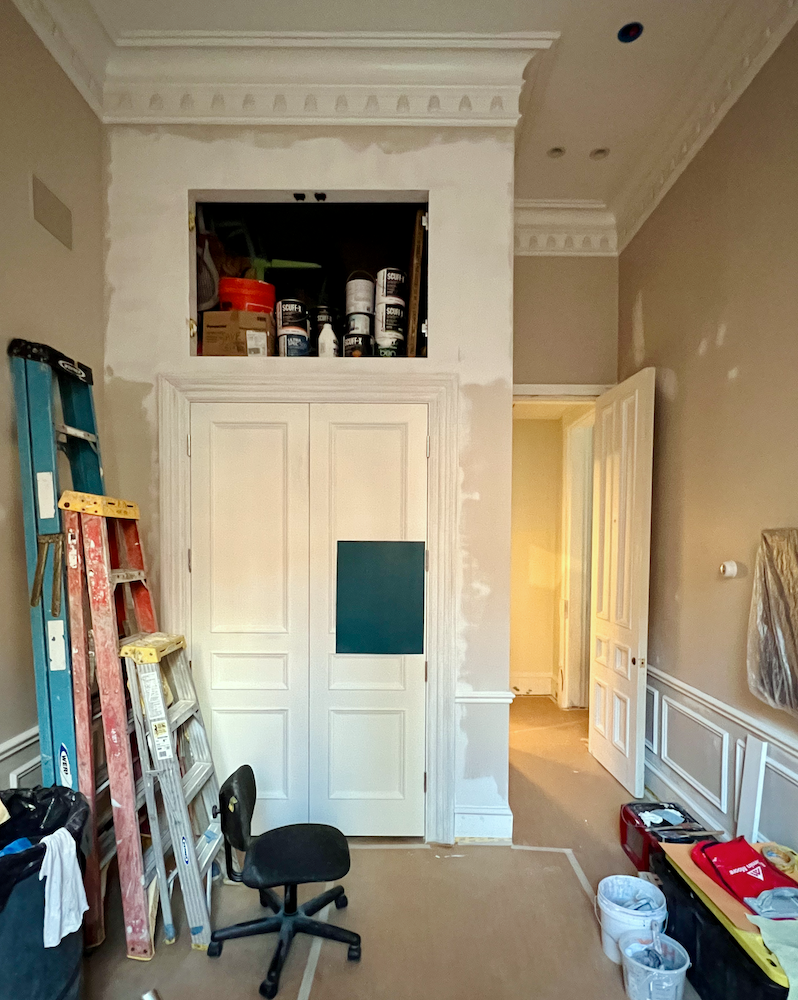
Muuuuuuch better, don’t you think? Below are the Motel 6 doors some misguided soul put into this historical 19th-century gem.
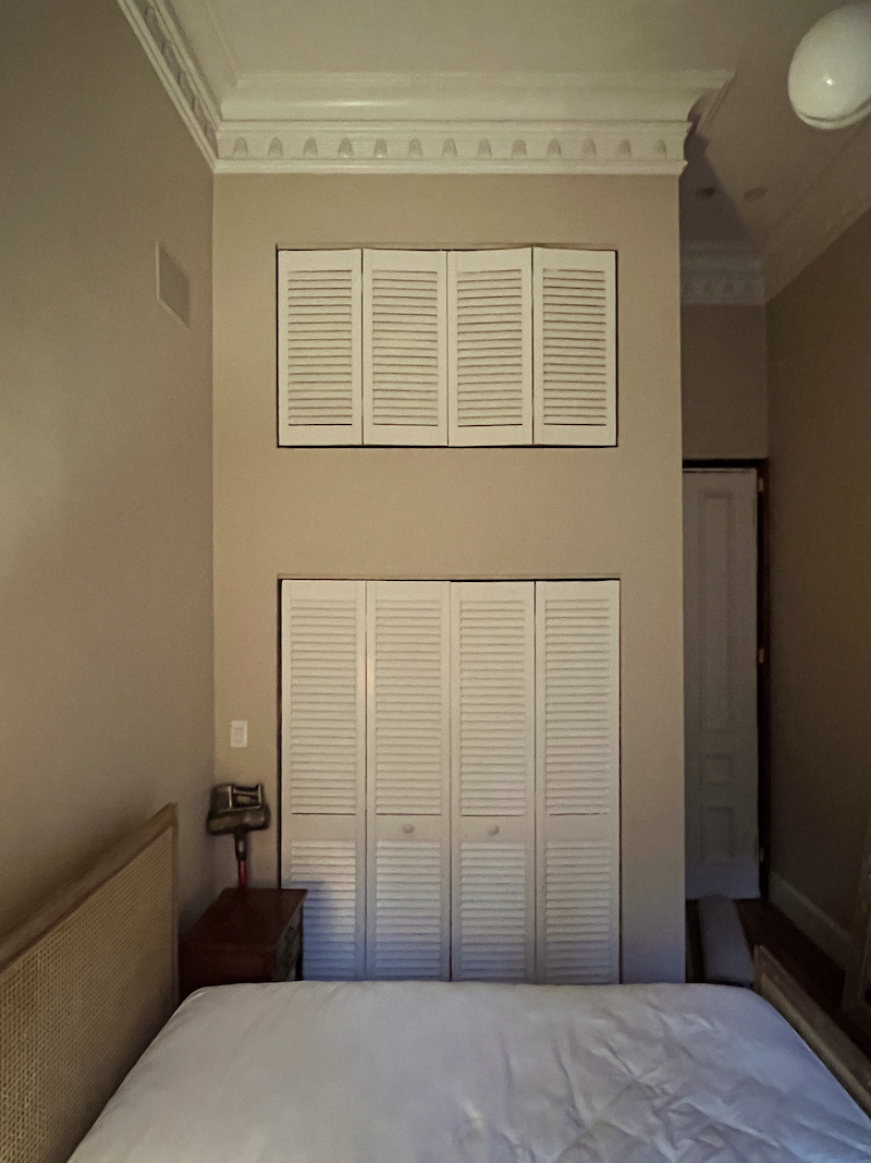
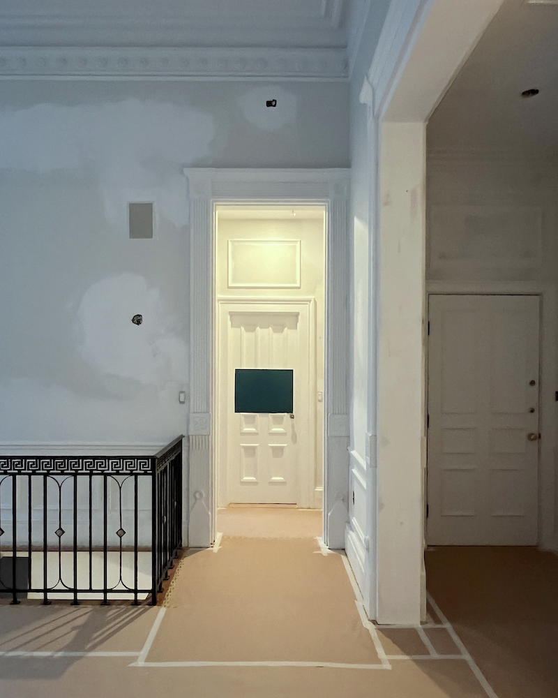
A previous owner added the beautiful plaster crown but left these horrid doors. So, we narrowed the doorways by one foot. There are jib doors up top and the beautiful new panel doors on the bottom. The door casing is a composite of three separate pieces.
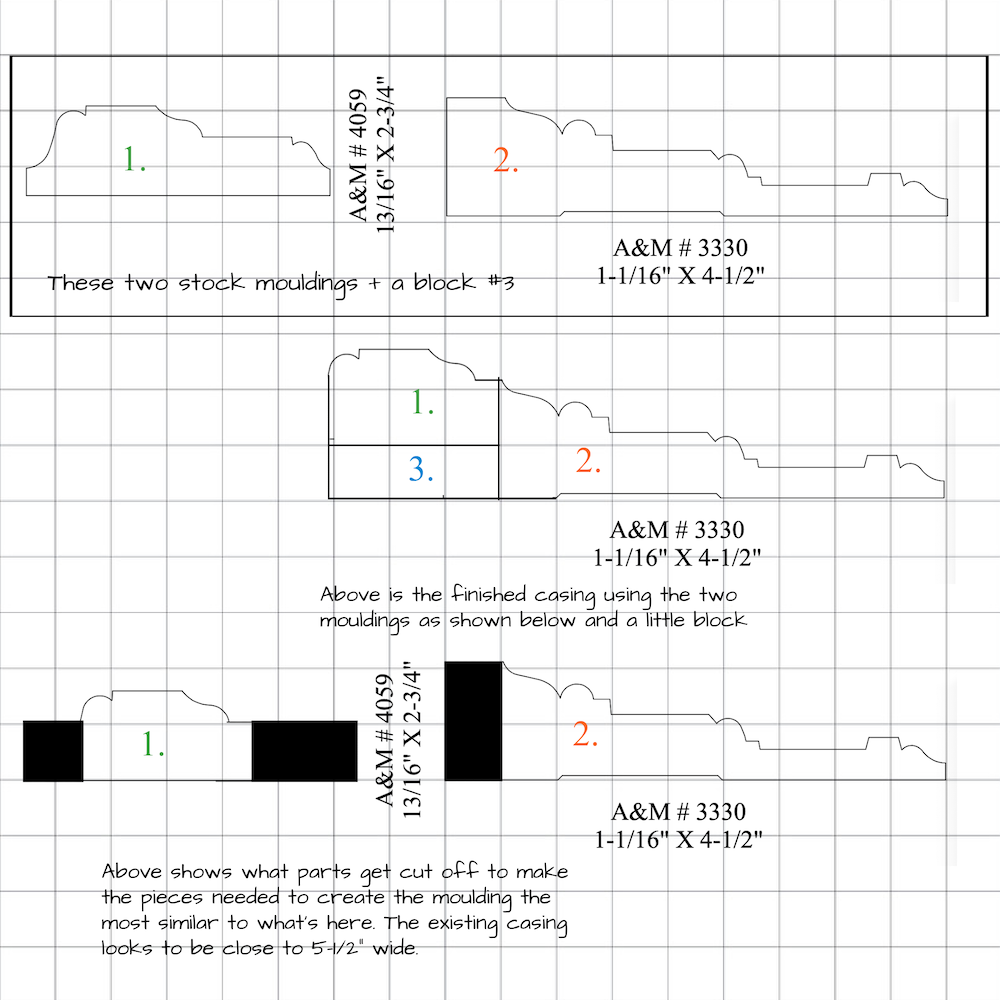
It is as close as I could get to the original window casing, using only stock mouldings from Anderson & McQuaid in Cambridge, MA.
Okay, back to the den paint colors.
I was all set until I saw the color at night.
This was only at 6:30, and the sun had over an hour to set. By the time it was dark, Galapagos Turquoise looked like navy blue with the recessed downlights only.
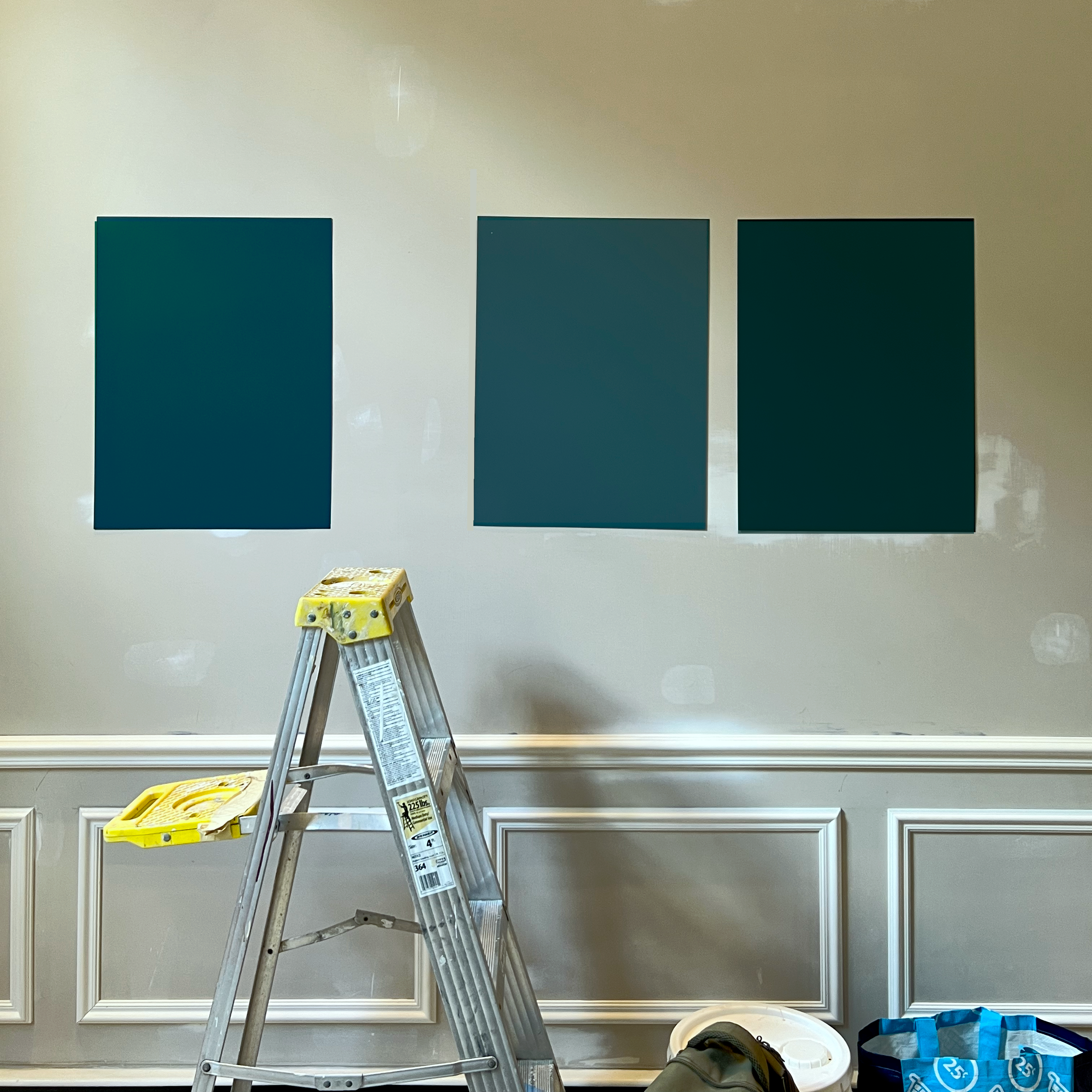
However, today, at 4:00 PM, you can see Galapagos below, with a sliver of Dark Harbor draped over my Zuber vintage screen.
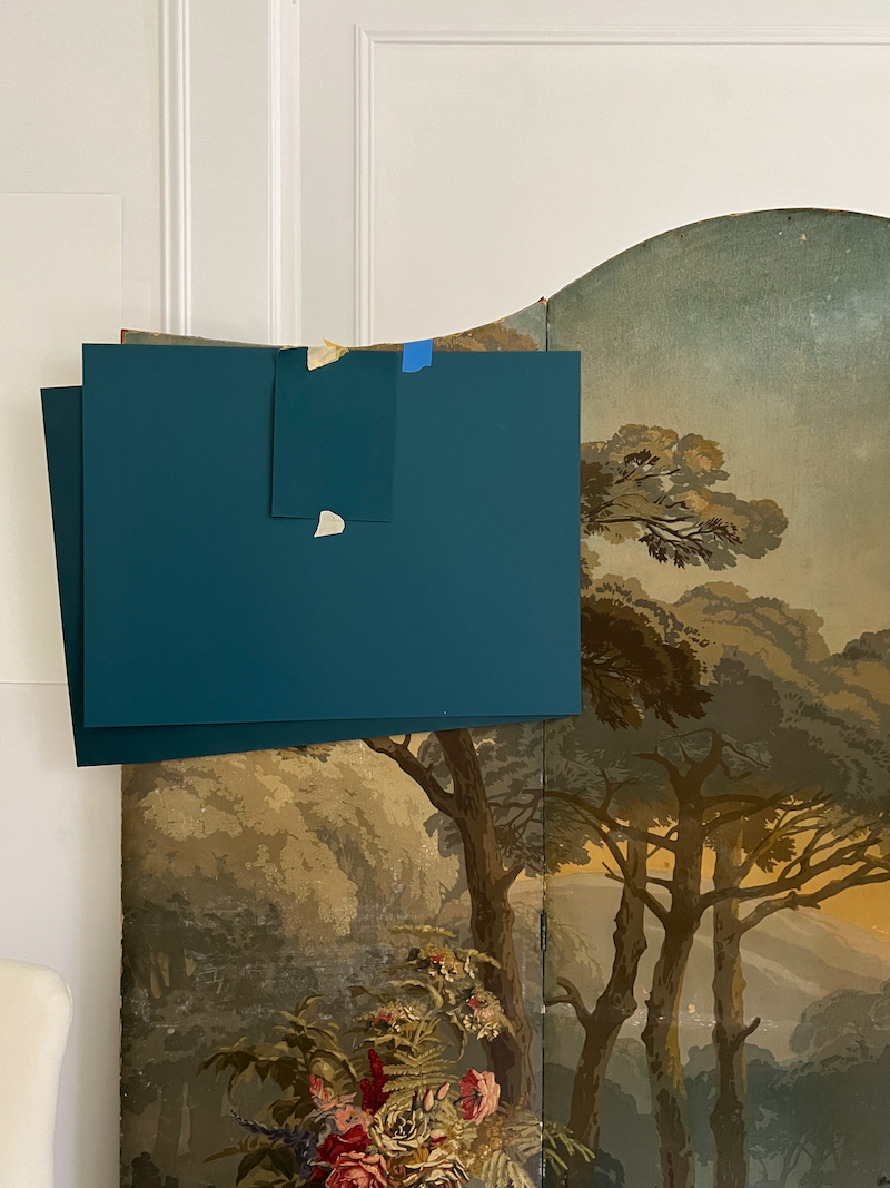
The smaller sample in front is a color that took my breath away the instant I saw it. It’s Cerulean from House of Hackney. Yes, they’re the company that manufactures the exquisite Plantasia wallpaper. (for sale, here).

Anywho, I went back to the Johnson Paint store this afternoon and picked up four more test quarts of teal paint colors. These all have more green in them and are either a hair brighter or a little more than that.
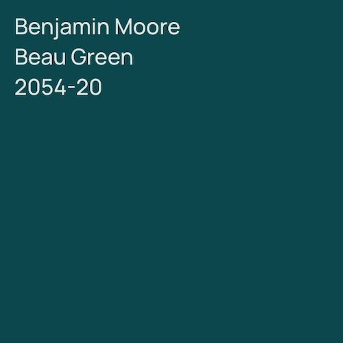
One of them is beautiful Benjamin Moore Beau Green 2054-20, one of their featured colors in 2019.
Please stay tuned for more!
xo,

***Please check out the recently updated HOT SALES!
There is now an Amazon link on my home page and below. Thank you for the suggestion!
Please note that I have decided not to create a membership site. However, this website is very expensive to run. To provide this content, I rely on you, the kind readers of my blog, to use my affiliate links whenever possible for items you need and want. There is no extra charge to you. The vendor you’re purchasing from pays me a small commission.

To facilitate this, some readers have asked me to put
A link to Amazon.com is on my home page.
Please click the link before items go into your shopping cart. Some people save their purchases in their “save for later folder.” Then, if you remember, please come back and click my Amazon link, and then you’re free to place your orders. While most vendor links have a cookie that lasts a while, Amazon’s cookies only last up to 24 hours.
Thank you so much!
I very much appreciate your help and support!
***
Wednesday August 21, 2024
Hi Everyone,
Thank you, as always, for your kind words of encouragement.
The emphasis these days is on painting. Therefore, this is going on a page in diary style, which began last April.
The prep is taking a long time, but the painters have far exceeded my expectations going into this project. At this point, we will not make our August 30th deadline. However, I think one month from now is realistic.
In the meantime, Chris is bringing over more samples for the new paint colors tomorrow.
He is getting quarts of the samples. While I realize that’s much more expensive, the one-cup test samples have proven unreliable.
In addition, based on my observations and research, the formulation of some of the colors appears to have changed.
Let’s take White Dove oc-17. The old LRV was 90 and now it’s 83. That means White Dove is 7% darker than it was about 10 years ago, give or take.
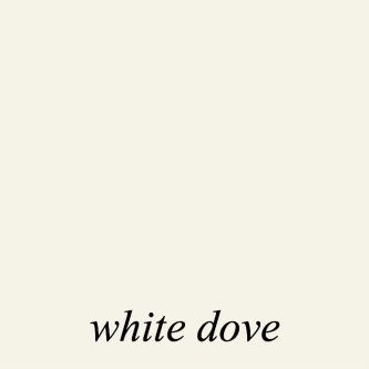

Above, in a side-by-side comparison, the old White Dove (left) was taken from the Internet in 2016, and on the right is the new White Dove. Well, I’ll be. It does look darker!
I mean, I know many of these colors so well that I’m pretty sure I could pick them out of a line-up.
We’ve already been duped twice.
First with Swiss Coffee and then with their plain White. oc-151.
Swiss looked like a golden light beige, and OC-151 is a grayed-down, very pale lavender. The worst is the crown moulding.
In fact, every shade of white paint I’ve looked at is off!
When I look at my old fan deck, oc-151 is entirely different from what I have in my bedroom.
Let’s look at a side-by-side comparison of both White oc-151 and Super White oc-152.
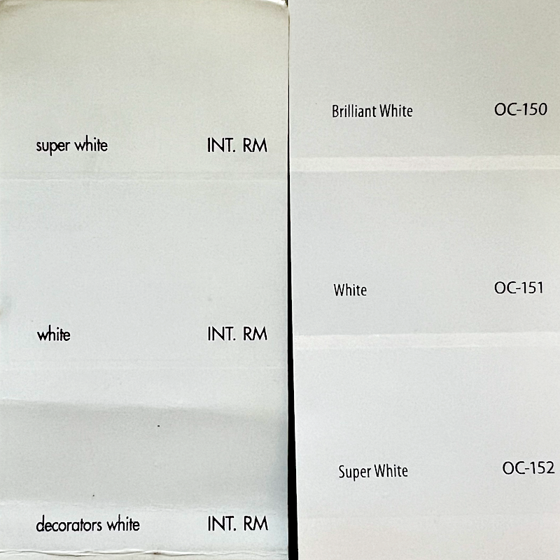
The fan deck on the left is old, and the one on the right is new. Can you see the difference?
Indeed, the old fan deck colors are significantly warmer than the new fan deck on the right.
I realize I recently wrote a post about the perfect shade of white for my bedroom. I was purposely ambiguous because OC-151 is not the perfect shade for my room. Please see below. If you can’t see it in the image, unless you are color-blind, it is obvious in person.
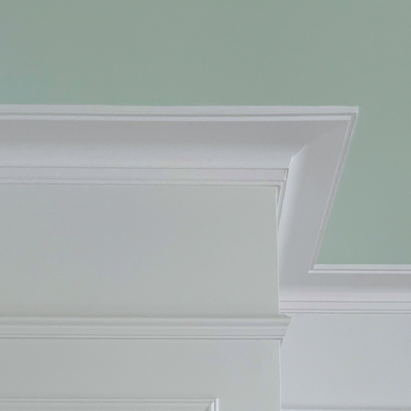
Don’t get me wrong. It’s not a hideous color; it’s just not right for my space because of the oft-mentioned red brick reflection.
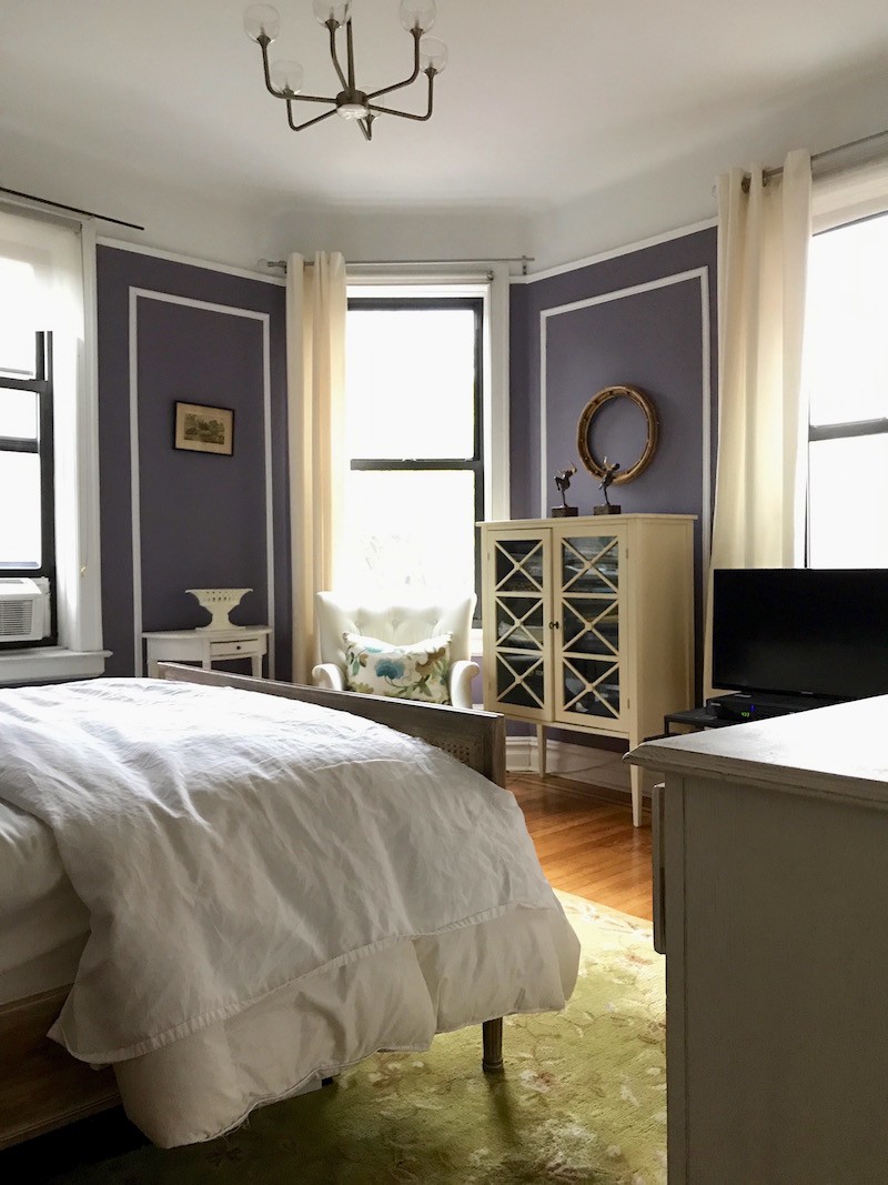
Some of you would love it, and that’s fine. The biggest problem is that the crown moulding accentuates this purple color, and it looks terrible juxtaposed against my pretty aqua ceiling. I love it as it’s constantly changing colors and always looks beautiful.
The other issue, which is more obvious in some areas than others, is that the satin trim is a different color from the wall in flat. The walls are a lot less purple. Please notice that in the image above.
Italian Ice Green is wonderful! However, it does not help OC-151 look less purple but rather accentuates it.

What went wrong for us is the white oc-151 wasn’t tested.
There wasn’t time because I had to move back into my room the next day. Of course, that was a mistake. I was going from my memory after living with it for several years in Bronxville, plus Chris’ recommendation.
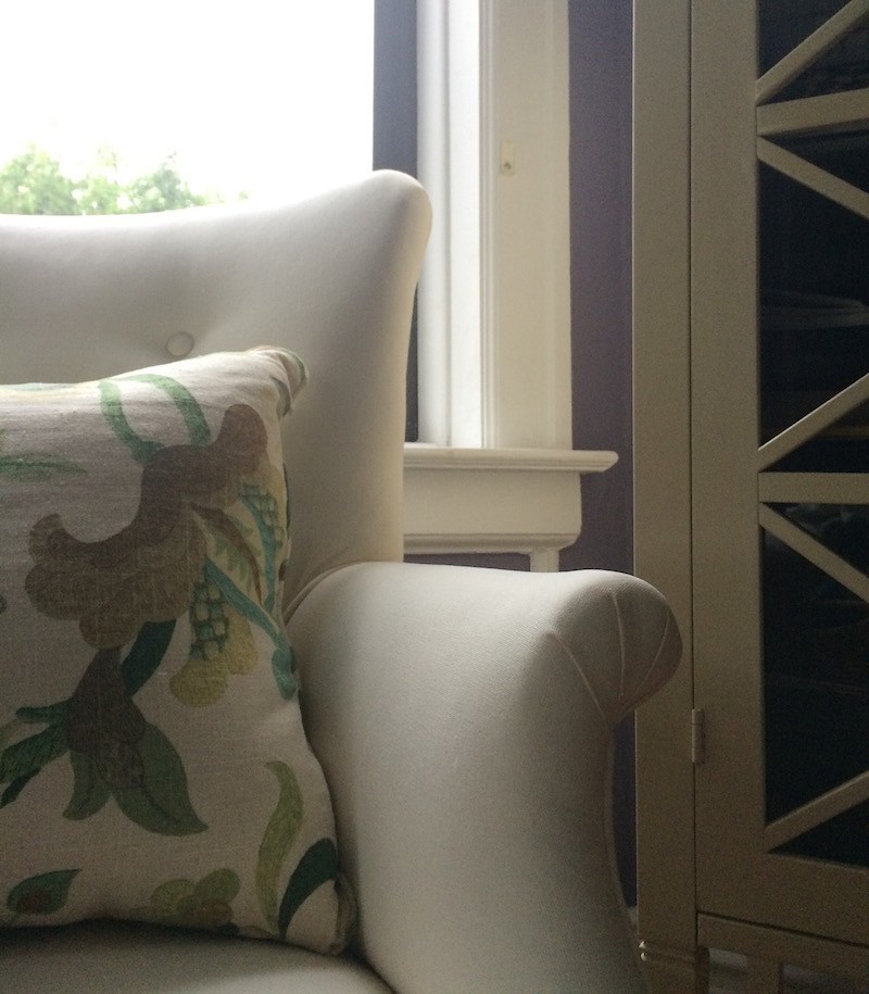
Here’s the proof. That chair is ivory white. Behind it is the trim painted in oc-151. However, that was painted well before I moved there at least 15 years ago. Below, the ceiling was also painted oc-151. Even though the walls are Tropical Dusk and definitely a deep purple, the ceiling and cove where it meets the wall are sans purple.
Now that we’ve had two failures, this baseline tells me exactly what’s required.
The lesson here is to do the necessary sampling before painting. If you are still not sure, painting a small wall and letting it dry is a lot better than painting the entire room and getting it wrong.
Below is another image showing the wall and trim on the far left. Then comes the primed panel wall and another off-color shade of white paint.
Our lovely cotton balls looks very lemon-y in the big poster board and like it should on the smaller square sample.
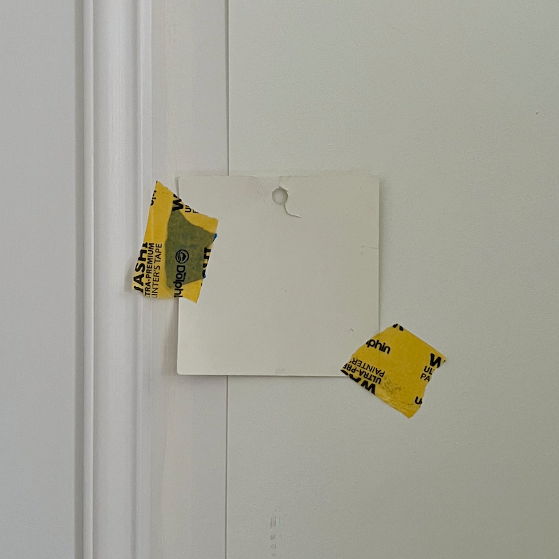
Please also observe, that the oc-151 trim is a very close match to the paint color in the new fan deck. (Please see below.)
So, what IS the best shade of white for my bedroom?
For the bedroom, Cotton Balls oc-122 will be perfect as long as it’s close to the original formulation. It will not look purple or pink.
However, one thing I like about the oc-151 is its depth. So, I am thinking about a slightly deeper color on the big fan deck, one page over. And that is Cloud Nine oc-119 or 2144-40
So, that combination is what I’m 95% sure I’m doing for my bedroom.


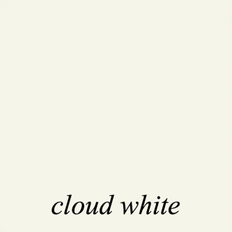
Cloud White oc-130 might work too, for the trim. I’m fairly positive I’d like Cloud White oc-130 for the embrasure hall and bathroom. Please note that Italian Ice Green typically looks lighter on the ceiling than it appears here. However, it would look best with a clean white, like Cotton Balls, near it. I would continue cotton balls for the frieze and switch below the picture rail to Cloud Nine.
We are doing the Scuff-X formulation with the walls in matte and the trim in Satin.
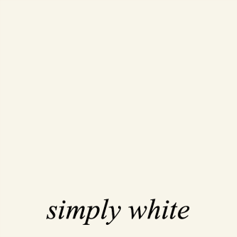
Above, we can compare Simply White to Cloud White and see the subtle difference. Simply is more beige by comparison, and White Dove, below, is a little more gray and a bit deeper.
It’s not that Simply White and White Dove aren’t great colors—they are. However, I have a red brick issue outside my two bedroom windows, and it’s like my windows were tinted a deep pink.
While I have that issue in the living room, it is far less pronounced because we don’t have the red bricks from my little garden. Also, we’re getting more sky reflection in the living room.
Interestingly, for most of my career, in Westchester County, New York, I had the opposite problem. Westchester is heavily forested and many homes I worked on skewed green.
Please note that Benjamin Moore makes an off-white color named White Cloud, which is actually a buttery yellow.

Oy! They sure know how to sock it to us! Aren’t clouds typically white? I would call that Whipped Butter.
It is a different color. It’s horrible of them to do that to us. I wonder how often someone has wanted Cloud White but instead asked for White Cloud. After all, it’s White Dove.
Chris is going to make some samples for the lower level entry, and upstairs den colors as well.
We need to stop for today, but we’ll continue with the upstairs colors either early Friday or Sunday morning. I hope that after Chris makes the big samples for me tomorrow, I can make some concrete decisions.
Many of the colors we’re trying are from the Laurel Home Paint and Palette Collection.
Laurel, do you have a new deadline?
Yes, I think everything major should be finished by Friday, September 27th. Of course, it still won’t be fully done. However, I’ll no longer have workers in my home every day.
Now, I must sort out the polished nickel exposed plumbing for the bathroom sink!
There is also news coming up soon about the hardwood floor and more!
xo,
***Please check out the recently updated HOT SALES!
There is now an Amazon link on my home page and below. Thank you for the suggestion!
Please note that I have decided not to create a membership site. However, this website is very expensive to run. To provide this content, I rely on you, the kind readers of my blog, to use my affiliate links whenever possible for items you need and want. There is no extra charge to you. The vendor you’re purchasing from pays me a small commission.
To facilitate this, some readers have asked me to put
A link to Amazon.com is on my home page.
Please click the link before items go into your shopping cart. Some people save their purchases in their “save for later folder.” Then, if you remember, please come back and click my Amazon link, and then you’re free to place your orders. While most vendor links have a cookie that lasts a while, Amazon’s cookies only last up to 24 hours.
Thank you so much!
I very much appreciate your help and support!
***
Wednesday, April 10, 2024
In case you’re wondering where I am, everything’s fine. I needed a couple of days to get some things done. I’ll be back tomorrow with some wonderful news about the bathroom.
Monday, April 8, 2024
This is going to be the shortest post I’ve ever written. haha
Well, almost
I got to thinking… After reading your comments for the last couple of weeks about my “moody bathroom.”
Maybe I need to go back to my original idea. Remember?
Yes, from one year ago!
Of course, this was before the embrasure hall idea had fully jelled.
The bathroom isn’t the same. The niche is only 48″. In one of the iterations, it was 60″; however, with this layout, that wasn’t possible.
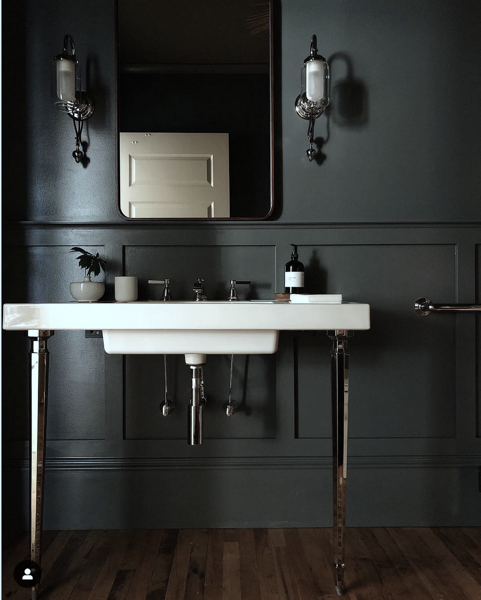
Presenting the 2024 version of my primary bathroom.
Order in the court!!! Order in the court!!!
Guys, geezzz. Please calm down! haha! I know some of you are breathing a massive sigh of relief. Others might be disappointed. Please don’t be. I’ve come up with some big changes I think pretty much everyone will like. Everyone means me, myself, and I. Haha. No, I’m only kidding.
However, many of you may not have considered what the mirror will be reflecting.
While the image above doesn’t convey the embrasure door hall accurately, it will be seen in the reflection in the mirror, particularly if I mirror the entire four-foot niche.
I think I should not do this light fixture in the bathroom. It would be better in the bedroom as it will blend in better, which I want it to do.
Laurel, what is that gorgeous console?
Yeah, I love it too.
I will explain more in Wednesday’s post. However, as far as I know, it’s from Kohler but it says “discontinued.”
Yes, this was one of the sources of my moody bathroom inspo. No one does a gorgeous, moody room better than Jean.
Please stay tuned when I reveal more of my plans.
I hope many of you got to enjoy the eclipse!
xo,
***Please check out the recently updated HOT SALES!
There is now an Amazon link on my home page and below. Thank you for the suggestion!
Please note that I have decided not to create a membership site. However, this website is very expensive to run. To provide this content, I rely on you, the kind readers of my blog, to use my affiliate links whenever possible for items you need and want. There is no extra charge to you. The vendor you’re purchasing from pays me a small commission.
To facilitate this, some readers have asked me to put
A link to Amazon.com is on my home page.
Please click the link before items go into your shopping cart. Some people save their purchases in their “save for later folder.” Then, if you remember, please come back and click my Amazon link, and then you’re free to place your orders. While most vendor links have a cookie that lasts a while, Amazon’s cookies only last up to 24 hours.
Thank you so much!
I very much appreciate your help and support!
***
Sunday, April 7, 2024
Hi Everyone,
We’re back to paint colors today because, yes, my Samplize samples arrived on my doorstep only 20 hours after I ordered them this past Friday.
Naturally, I dropped everything and ripped open the package.
Before I get into it, some of you mentioned that I am entitled to free samples from Benjamin Moore.
Yes, I suppose I am. However, I am still recovering from 2016. I contacted my rep numerous times when creating my paint and palette collection. I never got them. Finally, I went over her head, which I hated doing, but after months of waiting, I had no choice. I was not going to pay for new fan decks and larger samples.
That did the trick, and they sent over many more samples than I wanted or needed. In the meantime, I love my Samplize samples, especially the matte Farrow & Ball samples. Some of the Benjamin Moore samples are matte, but many have a plastic sheen that can cause glare and difficulty seeing the color. That’s my only complaint. The samples are as rugged as can be.
While a backing comes off, I don’t bother; I just tape them to the wall because otherwise, it’s more difficult.
The larger sizes help to bring out the colors.
So, what is the verdict, Laurel? Does Down Pipe live up to your expectations?
Yes, it did. Most of the time. Sometimes, it looks vaguely teal, blue, or even olive. But sometimes, it just looks like charcoal gray.
As for Kitty Gray. It is actually a lot lighter and greener than Down Pipe.
However, I also liked the color below.

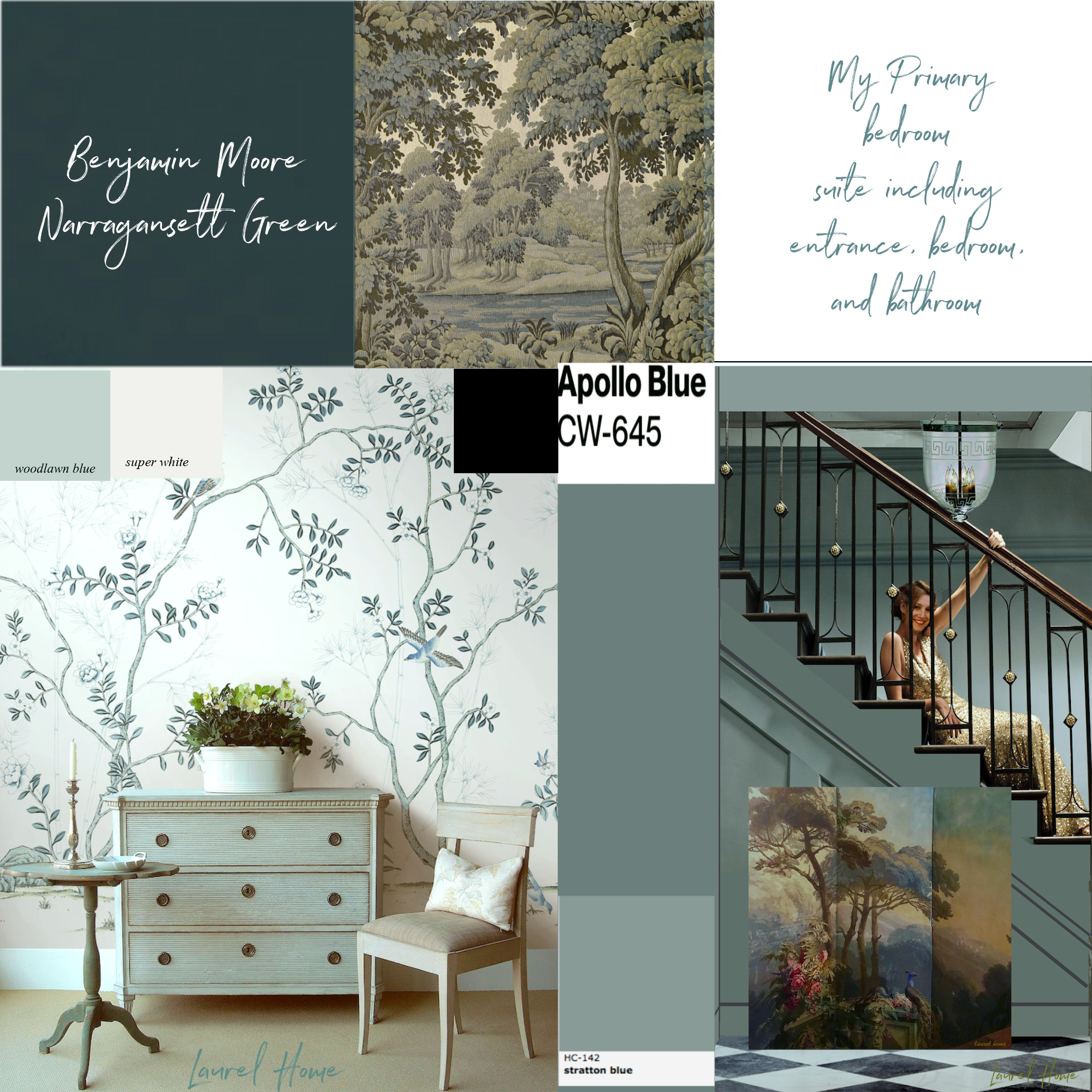
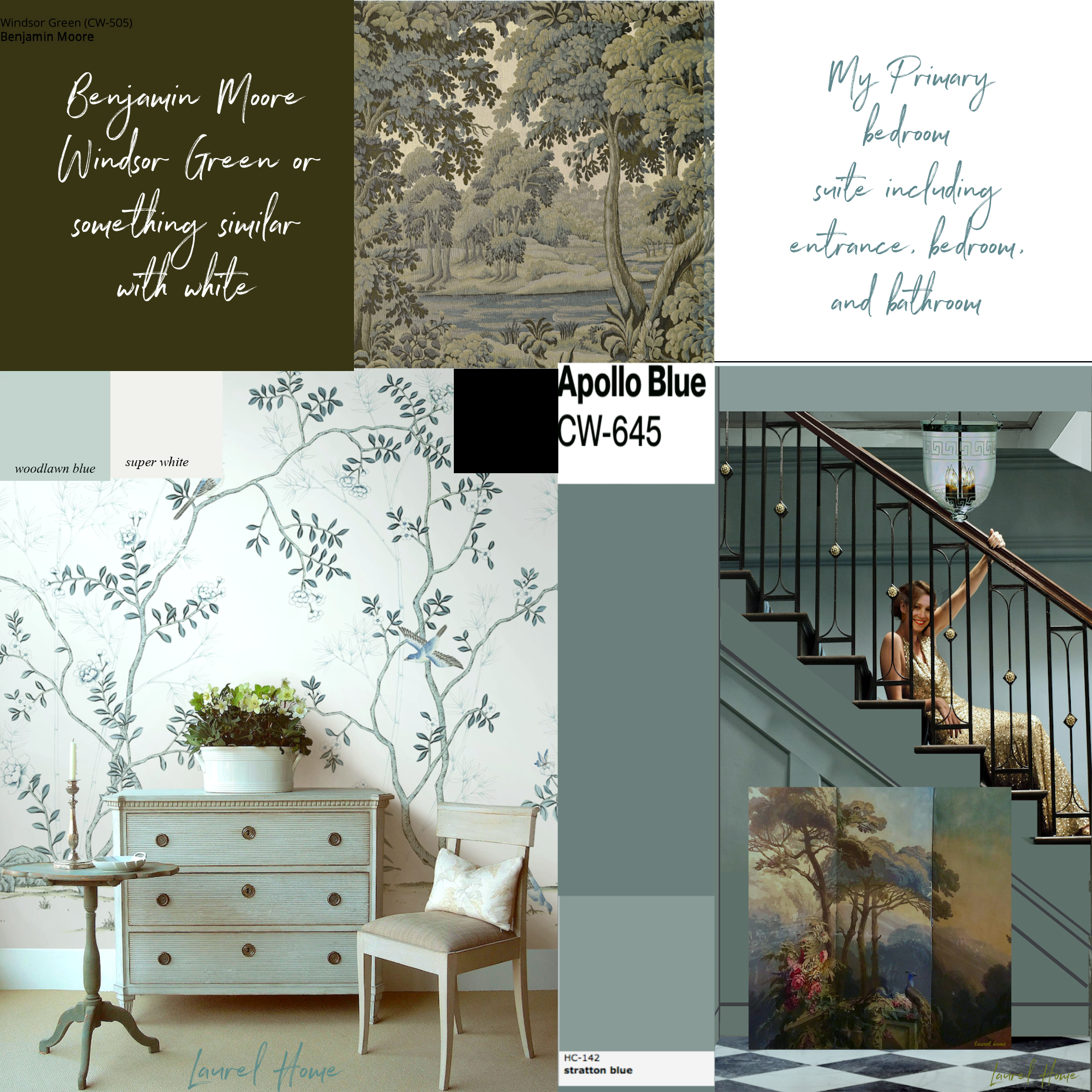
Narragansett Green hc-157 AKA Navy Masterpiece 1652.
Why, oh, why did they do that?
Theyz messin with us, obvs. (My spell checker is hyperventilating.)
Oh, I can’t decide. And what’s more is, although I was in denial, there needs to be a thread of white in the bathroom.
A big thread.
Because of its proximity, the bathroom is like the head on a body. The embrasure hall is the neck, and the bedroom is the rest of the body. They need to be in dialogue with each other.
Bath says:
Hey Bed, I see you found your white. Have you seen mine? It seems to be missing.
No answer.
What about the staircase entry, Laurel?
I think it’s fine to keep the white confined to the black and white floor for that area and the washer/dryer. lol
I also don’t think the bathroom should be all white.
So, here’s the plan so far.
haha
It’s haha, because I’ve hit the proverbial wall.
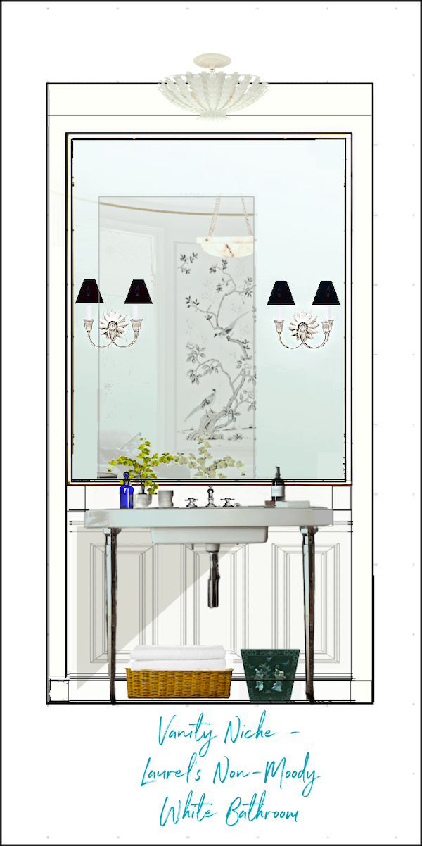
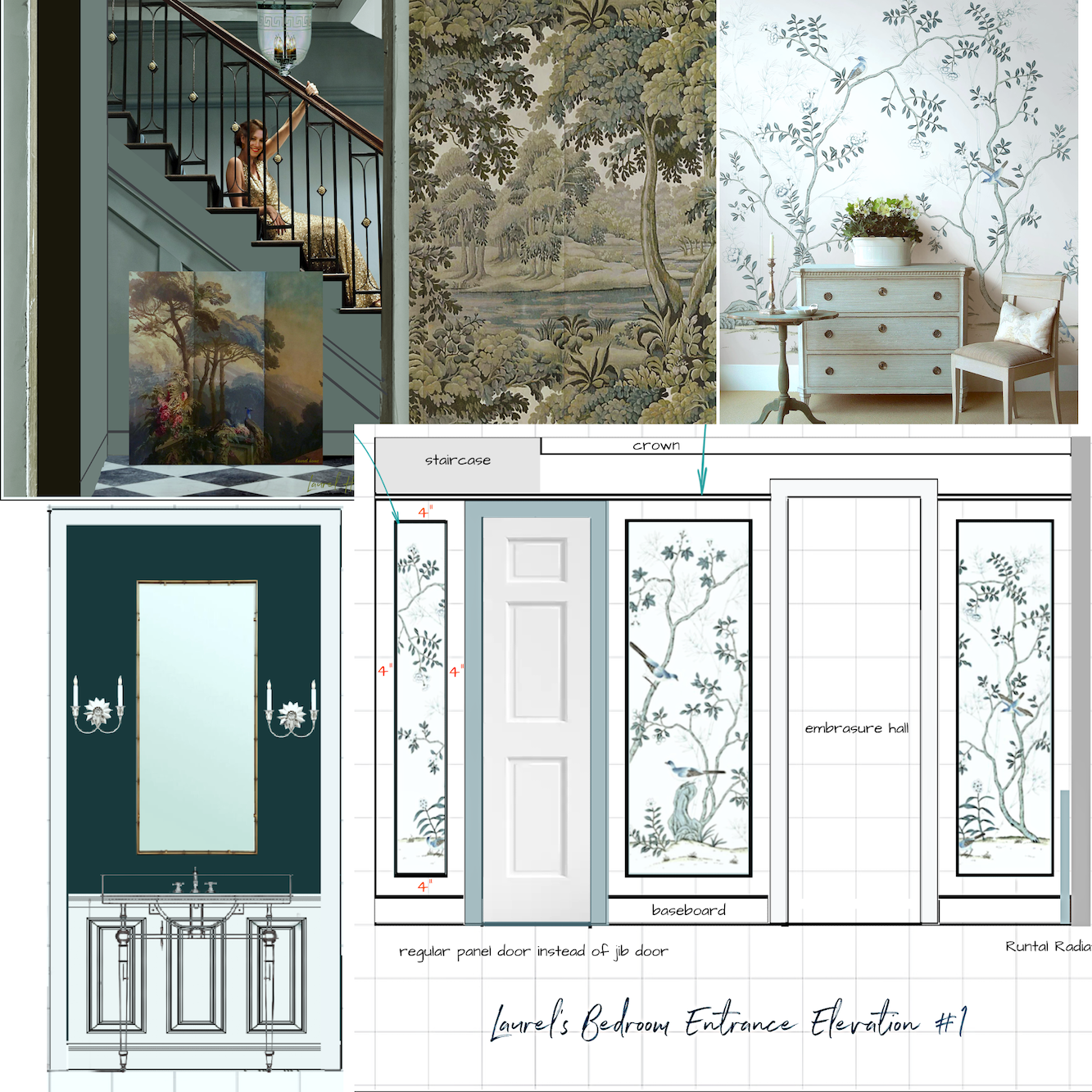
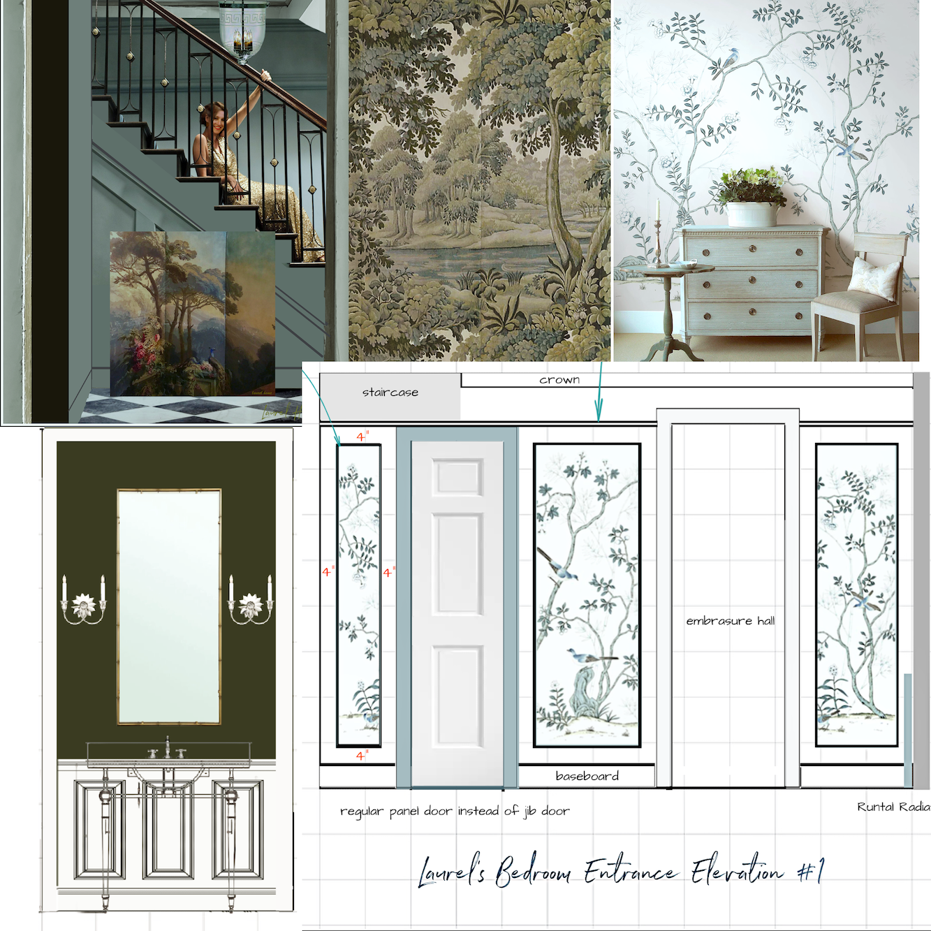
Let me show you a few vanity elevations.
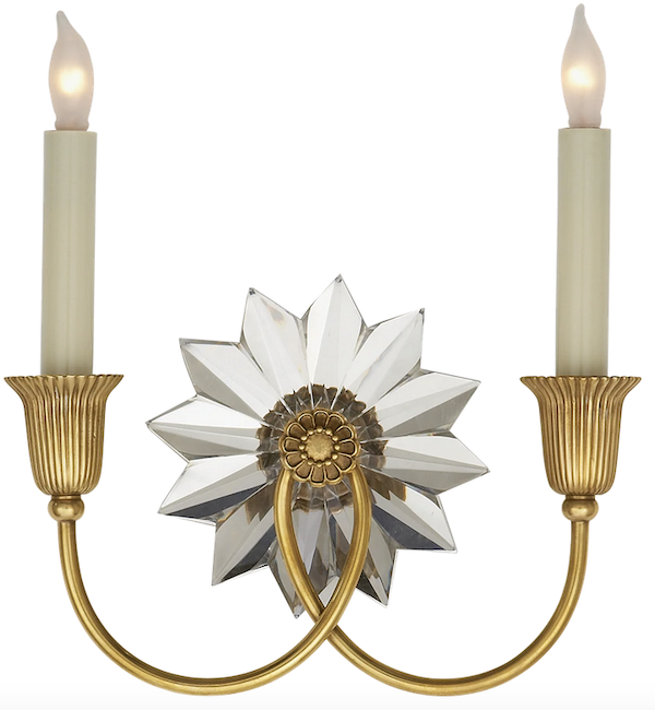
These are a little rough, but I think they convey the idea. Oh, before I show you. Last night, I had to dig through a mountain of boxes, and I found the Visual Comfort Huntingdon sconces I bought last summer. I specked these for a client once.
I cannot begin to tell you how beautiful they are in person.
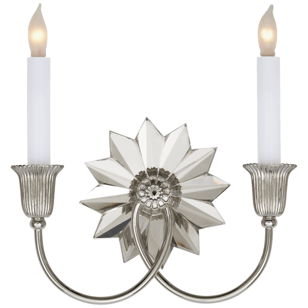
This doesn’t even come close. They sparkle like you can’t believe. They also come in gold, as you can see below. Both are on open box sale as of yesterday. You can see them on the Hot Sales Lighting Page.

For this one, I filled up the entire area above the vanity with a framed mirror. I think it looks a little blah.

This one is Narragansett Green, all the way. Ballard Designs carries this mirror in a size that’s 20″ x 50″. That’s a very unusual size but perfect for this vanity. It leaves 18″ on each side for the sconces.

Above is the Farrow & Ball Down Pipe.
It’s not bad—none of these are bad—but it’s not knocking my booties off, either.

Above, I did Narragansett for the wainscoting only. It seems a little off. I would make the side cabinets also white.


Above is Narragansett Green with white wainscoting.
Stunning. Although the white does kill the moody feeling.

The last one is Windsor Green or something just a tad more olive. I also tried Artichoke, but it is too brown
I also made some more mood boards.
What do you think?
I like them both, but for these reasons, I lean a little more towards the green:
- There’s already a lot of blue, and there will be a blue den. I decided that one months ago.
- It’s also a little more interesting because it’s not blue. Please remember that the Plantasia wallpaper is only going in the toilet area. It’s a tiny accent, not the same proportion seen on the board.
- I am not going to do a blue casing around the bedroom door. No worries.
Please also remember that the shower is lined with light gray dolomite.
The olive green will look beautiful with that.
I need to wrap this up. But did I tell you we don’t seem to have the legs for the vanity?
It’s been quite a week!
xo,
***Please check out the recently updated HOT SALES!
There is now an Amazon link on my home page and below. Thank you for the suggestion!
Please note that I have decided not to create a membership site. However, this website is very expensive to run. To provide this content, I rely on you, the kind readers of my blog, to use my affiliate links whenever possible for items you need and want. There is no extra charge to you. The vendor you’re purchasing from pays me a small commission.
To facilitate this, some readers have asked me to put
A link to Amazon.com is on my home page.
Please click the link before items go into your shopping cart. Some people save their purchases in their “save for later folder.” Then, if you remember, please come back and click my Amazon link, and then you’re free to place your orders. While most vendor links have a cookie that lasts a while, Amazon’s cookies only last up to 24 hours.
Thank you so much!
I very much appreciate your help and support!
***
Tuesday April 2, 2024
Hi Everyone,
This is exceedingly rare, but it is 9:36 PM on a Tuesday evening, and I haven’t written a word for the blog post.
That’s because I’ve been busy obsessing working on my paint colors.
Laurel, I still don’t understand. You wrote that guide you’re always talking about. So, just go pick your own paint colors. Done.
Well, sorry, no, it isn’t done. It’s not done for anyone, not usually. The guides are a starting point. Yes, they might be an endpoint, but it really depends. There are so many variables when choosing paint colors. It’s a lot more—and I mean a lot more than just getting the undertones right.
It’s the actual color. And that color in relation to the other colors.
Plus, there’s the lightness or darkness of a color. (It’s Value.)
And the brightness known as chroma.Finally, well, not finally, because this is only a small part of it. But, the paint colors need to fit together and make sense.
The good news is that there isn’t only one way of doing things.
That’s also the bad news.
There’s too much choice! This is why I created the Laurel Home Paint & Palette Collectio, which includes 40 paint palettes with mood boards.
In the last few weeks, I’ve taken dozens of photos of samples hanging on the wall and created dozens of color boards.
The best thing to do is begin by looking at the givens.
Givens are things that aren’t changing. They are things like tile, flooring, art, and furnishings that you wish to incorporate. I find that it’s good to be flexible whenever possible. If stuck, throw your initial idea out and try going in a different direction.
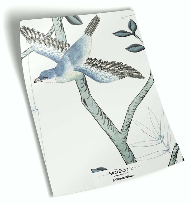
For me, I know I have to have this lovely wallpaper (Solitude in the White colorway) in the bedroom from the Mural Source.

Please note that while the paper has blue birds, from a distance, it reads more teal than blue. The birds are a true blue, but there aren’t many.
It’s also important to try not to have everything match PERFECTLY.
That’s right. Don’t try too hard to make everything match in a clone-like fashion. It’s boring.

House of Hackney – Plantasia. (Anthropologie)
You can also find it at Perigold
This paper is only going in the WC niche in the bathroom. There are so many shades of green in this wallpaper, but I adore the deep olive shades the best. Well, I love all of them, but those deep notes are my favorite. It’s the same for me in an orchestra.
Other givens are a pale gray dolomite tile in the shower.
The vanity is also light gray marble. (Unless I put the one I have upstairs and get something else for downstairs.)
My toilet is white.
The floor will most likely be black and white or a very light gray.
Okay, let’s begin with the new garden-level entry.
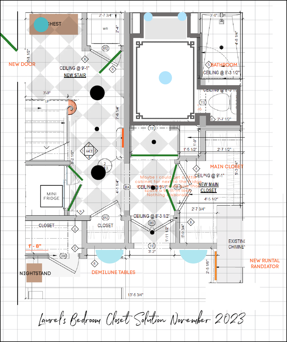
Above is a floor plan to help make things more clear.
I have looked at dozens of shades of teal in the mid-range.
I mean – DOZENS of shades of blue in Benjamin Moore, and Farrow & Ball.
I want this little room to be like a warm hug, welcoming and restorative.
After much deliberation, my final choice for the wall color is Apollo Blue cw-645 by Benjamin Moore.

I love it because it has a lot of gray in it.
Many years ago, I read something a designer wrote, that has stuck with me.
It was something like, “Most people wimp out when choosing paint colors. So, don’t be afraid. Go with a shade that’s one darker and grayer than you think it should be, and you should be fine.”
This is the best advice advice for choosing paint colors
Sometimes it’s going with a color two shades deeper and grayer. Mid-tones are often the most difficult shades to get right.
In my case, except for the bedroom, all other areas have only indirect lighting during the day, if that.
The other problem for me is the LED lights. Right now, I have a mix of incandescent and LEDs. I find the LEDs tend to suck the color out. Maybe I need better bulbs that render paint colors more clearly.
Every time I go downstairs, it’s a nightmare because of the lighting. So, I’ve been mostly looking at the paint color samples in the kitchen.
So, now we have this reach muted historical teal for the entry. The doors will be black.
Chic.
So far, so good.
Then, we come to the embrasure hall. All along, I’ve been envisioning it being white.
There are no walls unless the embrasure doors are closed. The white embrasure hall will be lovely with the bedroom wallpaper.
However, I’m not as keen on it with the cozy Apollo Blue entry.
The bathroom color has been my biggest struggle.
It needs to be moody. It’s not an option. While it was slow in telling me what it wanted to be, now it’s positively screaming at me.
Dark and moody!!!
There are enough white or very light items in the room. Plus, I’d love to put some simple sepia prints on the six-foot-long wall across from the shower and toilet.
There will also be a towel bar and white towels, + accessories, and light fixtures. Let’s not forget those.
So, after reviewing dozens more moody paint colors, everything from Narragansett Green to every moody blue-gray-green you can think of and some you’ve never heard of, most likely.
My favorite every time is Farrow & Ball Downpipe.
I’ve never used it, although I’m so well-acquainted with this legendary color I feel like I have.
After staring at it in all kinds of light, I’ve realized why it’s so beloved.
In this case, it is the undertones. They are chameleon-like and pop out beautifully. I see blue, green, and olive. Oh, I looked at a lot of olive greens, too. Super deep ones are so dark, you’d swear they are pure black at first.
Still, I’ve searched in vain for a Benjamin Moore substitute. On my conversion chart, I have Flint from the Affinity collection. It’s right there in terms of value. However, it lacks the complexity of Downpipe. Another close call is Rocky Coast, which I put in the Laurel Home Collection.


However, there’s another color that is very close to Downpipe but it is a hair more blue-green. That’s okay.

Below are two boards:
One with Kitty Gray
And the second with Downpipe.
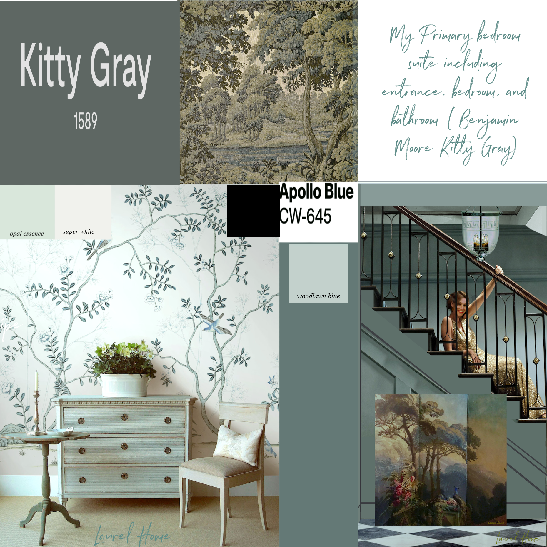
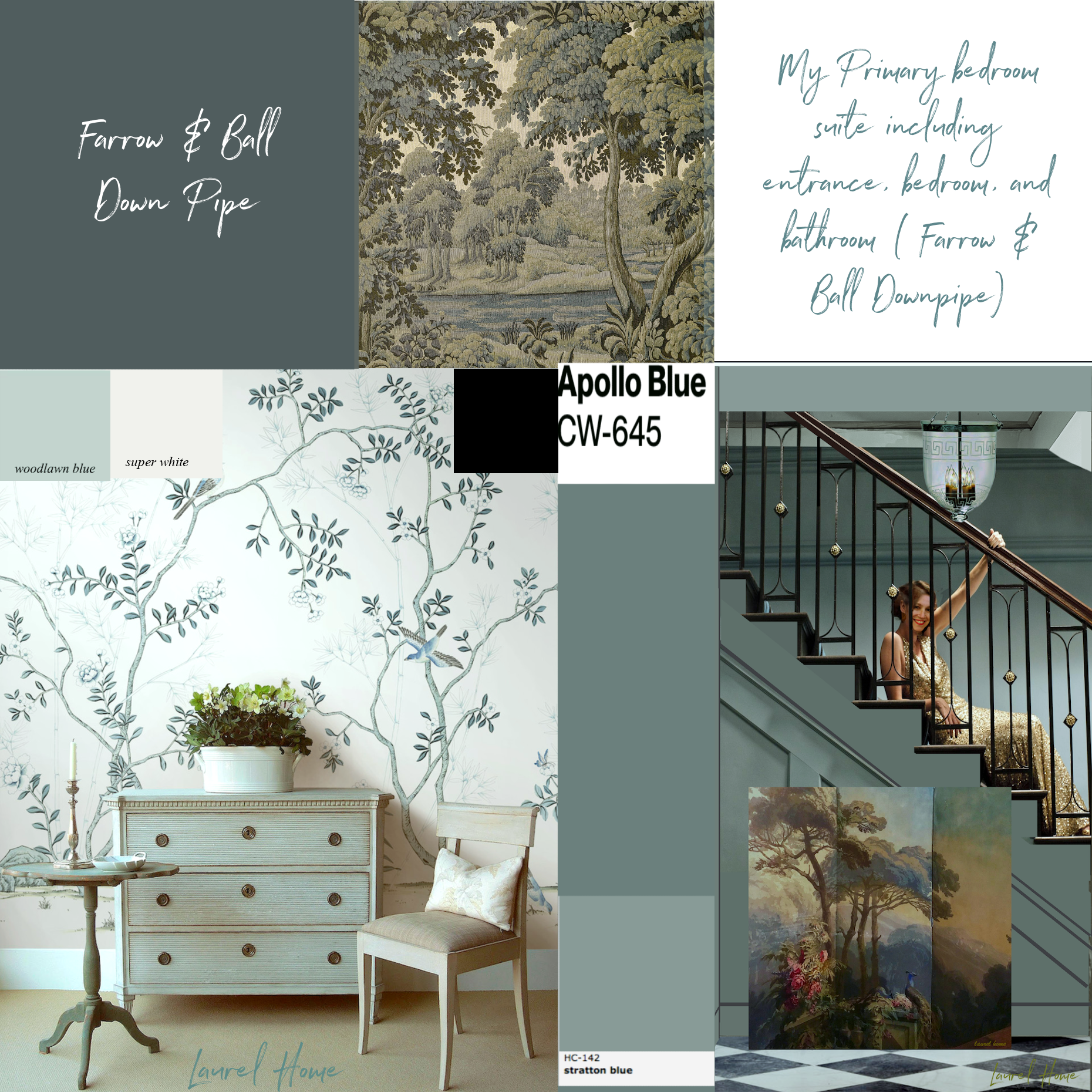
I like the Kitty Gray, but I adore the Downpipe.
Still, I must get some samples. I’ll order those tomorrow from Samplize.
In the meantime, there’s still a problem.
Do you know what it is?
Oh dear, sorry. We’re out of time. Well, it’s fine to guess. I’ll have the answer for you on Thursday evening, and a solution I like a lot.
xo,
***Please check out the recently updated HOT SALES!
There is now an Amazon link on my home page and below. Thank you for the suggestion!
Please note that I have decided not to create a membership site. However, this website is very expensive to run. To provide this content, I rely on you, the kind readers of my blog, to use my affiliate links whenever possible for items you need and want. There is no extra charge to you. The vendor you’re purchasing from pays me a small commission.
To facilitate this, some readers have asked me to put
A link to Amazon.com is on my home page.
Please click the link before items go into your shopping cart. Some people save their purchases in their “save for later folder.” Then, if you remember, please come back and click my Amazon link, and then you’re free to place your orders. While most vendor links have a cookie that lasts a while, Amazon’s cookies only last up to 24 hours.
Thank you so much!
I very much appreciate your help and support!
Related Posts
 Laurel’s Home Renovation 2024 – News & Deets!
 The First Renovation Tour Of The Upstairs Living Areas! (Parts 1 & 2)
 14 month Renoversary! and I’m Back In My Bedroom!
 22 Renovation Mistakes No One Bothered to Warn You About (Until Now)
 Hardwood Floor and Primary Bathroom Update!
 The Paint Disaster Downstairs & What I’m Doing About It (Parts 1 & 2)
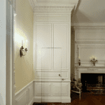 Happy One-Year Renovation Anniversary + Lots of News!


122 Responses
Laurel,
First, I need to thank you for sharing your vast knowledge with all of your loyal followers! I have learned so much, yet still know nearly nothing!!! Paint colors, especially, are so difficult to choose. I think you need to write a book on your journey of lovingly transforming your gorgeous home! I would buy it immediately!
Sorry, I had to go back to older posts regarding the Kathryn Console. I mistakenly thought you had located it and just needed legs. Never mind! Very happy that the new floorboards in living room that are too light are going to be corrected. And it is so fun to see the paint swatches being considered.
Oh, but you need the Kathryn console, also.
Laurel, I just looked on Amazon and saw Kohler K-6839-SN Kathryn Octagonal Metal Legs, vibrant polished nickel. 2 left in stock.
I have to admit to being really lost at this point. Could you start a new thread making it clear what you are trying to do in each area?
My impression is that the entryways will be tealish long with the study, the kitchen, living room bedroom, bathroom/s ‘white’ with the pretty green ice ceiling, the study also tealish..
Help me see the whole picture as it exist right now.
In your bedroom, it looks like you’re choosing whites with a touch of green. That’s what I’d try! Hopefully that will neutralize the red. Cloud Nine is neighbors with AF-25, Paper Mache or Icicle 2142-70, which I was going to suggest. I think you’ve already considered & rejected Aegean Teal?
Cannot wait to see it all finished!
Hi Laurel,
I love where you’re headed with the dark teal. It’s going to be stunning.
My house is teal. But I’ve had so many people refer to it as green. I guess that’s predominant undertone.
I applaud your efforts to choose the paint colors you will love
. I am wondering if the red tones cast from the exterior brick differ depending on the time of day (and year) when the sunlight is brighter, adding yet another dimension to the color challenge. Brick Reds can be so tricky and exhausting I imagine while they’re messing with your color palette – yet charming, too in aggregate. I wonder if you’ve heard anyone tell you aww they’re all just white! They look the same , what are you fussing about! (But – You know what’s what!!!!)
When I posted my comment yesterday about the Federally mandated changes to paint formulations I didn’t proof-read thoroughly enough. I was in a situation where I needed to repaint a wall where I had mounting holes from a corona CANAPY we were removing. Instead my post said it was a CANARY. I want to reassure anyone who read that and may have been puzzled, I did not have a canary installed on my secondary bedroom wall. I always strive to do no harm to canaries during my decorating attempts. Thanks.
lol – not a problem, Risa. I fixed it. I wish there was a way for people to edit their comments. I often find typos of my own.
I’m don’t know what I’m going to do when this renovation is over! Your posts are the highlight of my week! I’m hoping you start buying up local properties and renovating them so the party keeps going 🙂.
Paint is political. Who would have guessed? But it makes total sense when you understand that like the limitations placed on varnish formulations, paint is now regulated by a nameless, faceless bureaucrat in some office far, far away. A bureaucrat who isn’t struggling with paint colors in a remodel.
Why do I say this? Well, a year ago I needed to touch up a wall in a bedroom where we had a corona canapy over a bed. It was Benjamin Moore’s Mellowed Ivory, a color which gave off a pale green vibe in a north facing room. We had used it unaltered several years ago.
The lovely man at the Benjamin Moore store couldn’t match it from the new, revised formula and had to do a custom match to the paint sample I had from the original paint. He told us that the federal government had changed requirements for paint components multiple times in a relatively brief period of time. Some grace had been allowed during COVID because of supply change disruptions. Anyway, the official “recipe” Benjamin Moore had for Mellowed Ivory was no longer accurate because of the change in the allowed paint under the current regulations. He said he was going to contact Benjamin Moore and give them the information from his custom match which was accurate for the color. His match was perfect and was a seamless match for my bedroom wall.
I would guess that other colors have had the current updates applied and might result in the same situation we encountered.
Could you put uv film on the bedroom windows? Might change the reflection color a little. Or shutters? A couple of years ago I was looking for a white for two upstairs bathrooms, one without a window. I had swatches of white dove, chantilly lace and simply white. The white dove looked really grayish in the bathroom without windows. I couldn’t understand why but your post today explains—it is different than it used to be. Simply white was nice but went with chantilly lace as a basic white without overtones. Looked good in both baths. Looking forward to how your samples turn out.
Hi Laurel,
I made a big mistake selecting my bedroom paint color. Since I was trying to pull out a shade of blue-green in my rug, I sat with my paint samples & fan deck on the rug. I found the perfect color & was so excited that I rushed to the paint store & bought 2 gallons.
But once it was up on the walls it looked different. Apparently color swatches look different laying horizontal on the floor than they do vertical & up on the wall.
Oh well…it is what it is.
August 22
The ink on printed fan decks fades and/or changes over time. Pantone, as I recall, recommended that their color decks used in the printing industry be replaced yearly. I suspect that some of the problem is that your old color chips are no longer accurate. In any event, specifying color is hard.😏
Hi Caryl,
That’s something I too, considered, but that does not appear to be the case as some of the whites like Cotton Balls are a good match between the old and new fan decks. Plus, the old colors are exactly as I remember them. The photos of my old bedroom show that oc-151 is not purple.
I do need new fan decks. The last time I got replacements for the 2 big ones, not only did they not fan because the pages stuck to each other, they each quickly fell apart because the screw holding the pages together was insufficient.
The other issue is the new paint chips are not matching the real paint samples. It’s the paint sample that’s off.
Risa in her comment, above, hit on the primary issue.
Paint is HARD! White paint is worse, I went with Cloud White for the entire house as I could not be here to do any samples. Boy, did I stress over that choice. It looks great in every room, I even did the ceilings in CW and the mouldings, just different finishes.Sure, it shows no scope of imagination, as Lucy Maud would say, butI think it works this space.The kitchen cupboards are Swiss White as is the mantle in the dining area. I use lots of colour in the soft furniture. Perhaps too much info about me,lol.I just think your space is lovely and a little bit of creamy white will feel wonderful in the cold, damp,Boston winter months
Discontinued or not – someone has that dang sink, still in their stock! Unless you’re okay with an alternative, or you must find something else now, or you are just “over it”, with your perseverance I am sure you can find it!
P.S. Your taste is fan-freaking-fabulous. Whatever you come up with, whether it is my taste or not, is always perfectly balanced, with rythm, proportion, and style. Poo poo to doubters. Don’t they know not to taste the soup until it’s finished!! Have faith that it will all come together!!
So, yesterday, I saw the light. I was sitting in the tub in our main bathroom, the one with white walls, white and black checkerboard floor and dark grey marble vanity with wall to wall mirror and lighting and I thought to myself, why on earth did I promote a dark, moody primary bathroom? Dramatic, captivating and sophisticated, yes. But, sigh, gloriously impractical for my aging eyes which need light to see clearly. A primary bathroom for me needs a little more brightness than that provided by a task light or a couple of sconces, I guess its that reflective value from the walls that one reader referred to. Your latest rendering of a light coloured main bathroom fits the bill. It is terrific. Still, I hope you consider a moody dark powder room.
I think you could pull off either the moody or the white, and I can see either one ending up gorgeous in your space. But only you know when it just clicks, and I know from personal experience that the more you have to torture yourself to get to the answer, the more you might need a different question — sometimes the volte face from what you were convinced you wanted is necessary to make things click. (Ask me about my attempts to minimize the hideous and huge yellow brick fireplace/chimney in my large family room with a toned-down wall color, only to realize what I really needed was to lean into the yellow and go bold with a high contrast wall color 🙂 ) So while I think you could have done a great dark and moody bathroom, the rendering you’re showing here looks like a literal sigh of relief, in all the right ways. Can’t wait to see more!
I find that pedestal or freestanding sinks never work in the master bathroom. Where are you going to put your hairdryer, the base to your electric toothbrush, comb, and brush, make up, and all the other little things that need to go in a drawer next to the sink?
I think a vanity is the only way to go, and you will avoid a disappointing rip out, going down the pike. If you don’t like anything readymade, consider repurposing an old chest or bureau with a new lacquer finish, just my opinion.
Hi Hazel,
I’m going to put those items in the cabinets next to the sink. :]
Please enjoy this old post about bathroom vanities.
Good call – I am relieved for you!
I think the choice of white in the bathroom will be beautiful. I am wondering if you still plan to use the mural in the water closet. Would it make sense to have a moody water closet in a white bathroom, or will you be going in a different direction in that space as well?
Ahhhhh!!!!!! PERFECT
So you’re going white. Ok. You’re allowed to change your mind.
Just give me a minute to wrap my head around this.
Keep the dark mood ! but make the colour above wainscoting one or more shades lighter.
Yes Downpipe is a beautiful colour I have it in my cellar on all the doors.
Wow, I’m so happy about your change. I’ve lived in a basement area for years (there is a light, walk out part to it as well) and my experience is that the dark bathroom will be a black hole at the end of a dark hall. I think it’s the context – if the dark bathroom were upstairs in a light area it may be wonderful. But in a light deprived area, it’s doubling down on dreary, er, moody.
You probably are aware of this company but may I suggest you check the Build with Ferguson site. They handle many brands and price ranges of bath consoles. I think you might find what you are looking for. I found them when searching for Kohler toilets. I just bought new Kohler toilets from them and they are a joy to work with.
The white bath will be beautiful and make the ensuite feel much more cohesive. Are you keeping the dark wallpaper behind the toilet? You may want to rethink that, too. Now that you are going with a light and airy bathroom, it might be a real jolt to see that in the w/c. Would it be wrong to use the same one you are in the bedroom?
Can’t wait for your next post. This is like a cliffhanger in a TV series and having to wait until the next season to find out what happens!
Hi Susan,
I know the Build site very well. Unfortunately, the Kohler console is discontinued. It says so on thir website.
Laurel,
Your last choice is a breath of fresh air! I find moody, depressing.
Pat A.
Re: Bathroom. Well, glad to see you’ve got the lighting down near face level. White bath is so classic, and is just waiting for small pops of color or art or stunning neutrals.
Now, about the moody GREEN bath…What color do you turn when you’re in there and dont feel so good? Feng shui has it right.
I am so relieved that you have decided on white (or I assume a slightly off white) in your bathroom! Personally I just can’t conceive of your main bathroom being moody. I would make the powder room moody, as someone else suggested. I saw a dark royal blue powder room in a real estate ad this past week that had a real shine to it. It was gorgeous. Are there paints now that shine, or is something else painted on top of the colour? It’s interesting to me to see that even as a decorator, your ideas and decisions shift and change. I love every single change you’ve made. Your home will be absolutely stunning when it’s all done.
I was in eclipse totality today at midday, and it was very cool. Our area closed most of the schools so the kids could experience it with families, and many businesses closed for a bit to get out and see it. It was fun to have all the neighbors out in the street to experience it.
I think you could put your Moody bathroom in the upstairs guest bath and it would be perfect.
Perfect! Just like in a kitchen, a nice white in a primary bath is classic and easy to live with.
I had been wondering why the Gracie type wallpaper in the bedroom and the Plantasia were going to be in adjoining rooms. Might there be a soft color rather than white that you might use in the bathroom?
So much fun to see each reveal! Thank you.
Hi Denise,
You can’t see one from the other, but even so, I think they coordinate very well.
The color change? Whew 😅.
My son painted his master bedroom in Narangasset Green, with Cotton Balls on the trim. It’s such a beautiful color, and it feels so relaxing and inviting too. If you like deep color, this is an amazing pick.
Any of your choices are going to be gorgeous! IMHO, I’d go with the big mirror. You’ll get a lot more light, good since this is your primary mirror for make-up, dressing. Also, remember, it won’t be a flat gray square, but a reflection of the other wall. Hate to comment on color. Because I’m seeing 3 different Narragansett on my screen. You keep telling us never to choose a color unless we are in the room where it is going, I agree! My preference is for darker wainscoat. That quote about darker and grayer is one I’ve lived by for decades. The bluer side of the spectrum seems more skin tone friendly to me, but I would keep it below sink level. You don’t want to wake up to Elfaba every morning! The idea of using the wallpaper in the top of the alcove appeals.
Your apartment is blooming in front of our eyes. Can’t wait to see the final result. Its going to be a dream come true!
Hi Jill,
I say it is ideal to select in the room it is going unless for some reason it’s not feasible and then it is better to choose in another room that has the same or similar lighting situation. There is only one overhead light in the bathroom. Today, it just got a dimmer, but for now, it is still the only light in the room.
I like the idea of the wallpaper on the mirror wall and maybe a pale silvery grey with it. Not sure the olive green would be a good morning color for me. I painted my powder room Palladian blue hc 144 and even with a window it still is a little more intense and turquoise than I thought. I would get a real paint sample pint of your fave and paint several poster boards with it and see how you like it when there’s a whole lot of it!
Okay, Thanks for the tip. ;]
My daughter and sil just remodeled their master bath. He said, “Let’s do green walls with this gorgeous light gray dolomite.” My daughter said, “Green in the master bathroom?! No way!” But then he brought home a hundred green paint samples and there it was … a gorgeous deep green that was clearly meant for that tile. The project is done, and Laurel … it’s dripping gorgeous.
Okay, since you asked for opinions:
I prefer the larger mirror. It will reflect more light and contribute to the feeling of an enfilade. It feels more grand and expand the space visually. For your niche, this is an easy decision for me.
As for using white, put it on the ceiling rather than painting it the other color. Also, I forget what you are planning for the floor, but a white inset marble/mosaic border in a marble floor would be lovely, and you could incorporate your Greek key in the corners. Also, you’ll have a white toilet, and possibly white grout in the shower, and your vanity and shower walls will the sort of a shade of grey white.
As for the other color, I feel kitchens and bathrooms should avoid any prominent color that can be associated to illness. Sorry to be graphic but that means no browns, pea greens or olive/brown greens. For that reason, Windsor Green isn’t my choice.
In a recent post you recommended going one shade darker and grayer than one might initially be inclined. Of what you showed, I prefer Down Pipe. Another option is SW Rock Bottom. I know you’ve looked at a million colors and don’t normally use SW (me either) so I didn’t comment on this previously. However, I’ve painted furniture, windows, and doors this color and have been impressed every time. I think it would work with your papers.
A hard no to the olive paint shade/s. But this is my personal preference. I can see how you are pulling the olive from your antique screen, but the toilet wallpaper is enough, imho.
And I agree with another poster that the olive around the mirror will make you look green. My pale olive skin already looks green with the wrong makeup colors. I have no idea how it will affect your reflection though. It would make me look like a B movie monster.
The Apollo Blue is stunning to my eye.
Laurel, i appreciate you formatting your blog posts to put most recent ones on the top left where they are easily found as it avoids some searching around and missing some of your posts.
Those sconces are gorgeous and as Mary E. Says should be prominent, i.e. good decision to go with narrow mirror. I also wonder if the lovely polished legs of the basin could complement the sconces and “stand out” (groan…) more by themselves with a suitably dark backdrop, by not painting the lower wall white. To me the white wainscotting introduces another element to this small space that diminishes the drama that the metals of the basin and the sconces provide. Leonard Cohen’s final album was entitled “You wanted it darker”. Of course he wasn’t talking about your bathroom. But dark and moody ain’t all bad.
Hi,
While I like the paint colors, and the darker greens are my preference there, I’m wondering why you’re not doing a wallpaper there on the vanity wall? I feel it would be such a beautiful vista to walk towards from your bedroom and the hallway. I think you can create the more moody look in there that way with the interest, texture, and depth even if you paint the wainscot white. That could be the plantasia or something else. I think with those sconces and the vanity it would be perfect.
Hi Cathy,
I considered doing so for all the reasons you state, but then realized it would hardly be seen but would also be too busy in this small space.
I love all the discussion over paint colors. I obssess as well. I am confused about such dark colors in a primary bath. Just not something I could live with. Powder room, yes.
I don’t know why, I haven’t found the comment section in the last few months… I thought you turned it off or something- but today I found it.., Oh Laurel— it’s going to be fantastic!!!! I love the Apollo blue- I did a house in San Diego down by the ocean and we painted the exterior Narragansett green. It turned out amazing sometimes it looks blue. Sometimes it looks green. I look forward to reading your post and seeing the updates.
I prefer the entire alcove for the vanity to be the dark color. The olive green works if you want to distinguish it from the rest of your interior but I don’t think you have to do that. The bluer color is more in keeping with the flow of the rest of the home.
Hi Laurel,
Posts about paint colors sure bring in the comments. I love reading through them all.
I think you’re moving away from your original plan of doing a moody bathroom. The white from the vanity, floor, & any towel or accessory is plenty.
I love love love your sconces. They need to be shown off. I think the best way to do that is installing them on a dark wall. As opposed to a larger mirror.
And you know my opinion about your paint choices. APOLLO BLUE! And only Apollo Blue. Except in the areas to be painted white.
Hi Laurel,
I cannot imagine the decision fatigue you must be experiencing! I just used the Windsor Green this fall to begin repainting all of our exterior doors and I LOVE it. I also love it in your inspiration board, I feel like it picks up the ground line in the bird print and the deeper colors of the Plantasia; I feel like it is warming and connects you to the nature in your beautiful mural wallpaper selections. I like the blue shades as well, but they feel cooler to me. Both color families are beautiful, I think it just depends on if you want a warmer feel or a cooler feel. I say “cool-er” because I do think some blues can have warm undertones too. I can’t wait to see the dark walnut toilet lid. I can’t wait to see what your final decision is!
Laurel,
I’m worried you won’t get the moody feel you want if you go white with the wainscoting! I’m sitting in a small room painted Rolling Hills. This color was chosen from your paint guides and makes me happy every day. I think it could be smashing in your bathroom-floor to ceiling.
Best,
I like the bigger bathroom mirror with the sconces on top of the mirror, but I agree it isn’t quite right…at least by itself.
Have you thought about doing a mirror on mirror?
I did large mirror that runs the length of the double vanity with some pretty molding around the edges. Then I did Venetian mirrors (sadly not antiques) above the sinks & right on top of the large (plain) mirror. It looks very elegant.
Obviously I wouldn’t do a Venetian mirror on top of a mirror with bamboo edges, but I’m sure you will figure out something awesome no matter what you end up doing. Just wanted to suggest a mirror on mirror as a possibility. I enjoy your posts. 😘
Hi Laurel,
Lovely progress! I have used the VC sconces and they are amazing; perfect for your bath if you have some additional light sources.
REGARDING WALLPAPER: I would skip the Plantasia in your water closet—-such a small space where the beauty of the paper would be hidden since the full scale/scene does not appear to fit on the 2 1/2 foot wall? Have you considered framing the wallpaper in perhaps three sections to hang on the long bathroom wall?
REGARDING PAINT: Yes, skip anymore blue. A contrast of green w/ yellow undertones would be stunning w/ white wainscoting. I am a huge fan of Farrow and Ball. Have you sampled Bancha? FB samples are generally in flat finish; I prefer the Modern Emulsion finish particularly in a bath.
Best!
Sarah
Hi Sarah,
In addition to the sconces there are four other light sources, all on dimmers!
One issue I missed until it was too late, was the placement of the wall switches. (Although, on the architect’s plans they are tight to the door.) Unfortunately, they are a little too high and too far into the room. That wall is only six feet long.
oops – what I get for not proof reading before sending. I meant to say filling the wall above the vanity with the mirror. sorry!
Hi Laurel, well I am still dizzy after reading this latest post and the comments. I decided to get off my ipad an look at the colors via my laptop – and wow – what a difference. I was not a fan of the greens while looking at them on the iPad – but happen to like them better via my Microsoft laptop. So that just says I am not sure of the colors. My thought is that you’ll decide after looking at the samples at different times of day. The boards all look good to me via my laptop. I will offer one thought – which is contrary to what the others have responded. And again, I am just a lay person not a professional. I have been in some beautiful hotel bathrooms – one especially in Paris many years ago. Lots of marble and lots of light and was twice the size of the bedroom – so French :). Your new bathroom is so lovely yet with no source of natural light. Or am I overlooking a window in the area? Wouldn’t filling the wall above the mirror add more light to the space? As I said, I am no professional – just my thought.
I like the last story board the most. It feels warmer to me and that will be reflected on the face. With LED concerns, I agree CRI is ultra important. Add lumens and Kelvin and it starts to get frustrating. I have CRI < 90 at 3000 Kelvin in my studio for painting. And I have 2700 Kelvin in my bathroom. It took 4 try’s to find the proper look that was also dimmable from 2%-100%. And had enough lumens to properly light my face. I have 2 on each side, equivalent 160 watts per side. Wouldn’t work for your fixture but it’s the idea. LEOOLS 8.9inch Long LED Light Bulb Matt Opal Porcelain Warm White 2700K Dimmable E26 Base 8W Led Tubular Bulb,CRI90,600LM,60 Watt Equivalent,Outside Frosted Glass for Cabinet Display Cabinet etc,4Pcs
On another note, A great light for effect is, https://www.parclighting.com/products/led-flame-bulb – very authentic as a gas light, not too orange. Not an everyday bulb unless it’s dedicated to that style. Small lumen output like a real flame.
Laurel, I used the BM equivalent of Downpipe in my “boot room/laundry” and also in my kitchen pantry nook. Both are wainscoting/shiplap. The boot room is very bright with windows on four sides and the pantry nook is dark. The color came out lighter than I expected, especially in the bright room. It hits a bit more moody in the pantry. Also, it looks more gray than anything. Little blue or green comes through for me although I know it’s there. Good luck. All your options are gorgeous.
Hi Laurel,
It is all stunningly beautiful, I think I lean a little to the Windsor Green but all of these options would be perfection to me. And your bedroom wallpaper is sublime. I have one question: The wall that goes up the staircase that will be Apollo, how will that play out with the plan for upstairs? Will Apollo be on the entire living room wall opposite the fireplace? Or do you plan some kind of transition?
Thank you for sharing your journey with us.
When in doubt I look to Kasha Paris for guidance, and all their bathrooms are light and airy. In fact, I’ve never seen a dark and moody working bathroom before, and I think there’s a reason for it I would go with white, off white or a very pale color for the bathroom and woodwork in the hallway, otherwise it will feel extremely heavy.
I look to them too, and have written about them numerous times.
I have only one concern with the olive colour – how will YOU look in the mirror with that colour and sconces on? Greens, particularly olive, can make your skin tone look drab. I’d go with Narragansett or Downpipe.
I like the Windsor color because it draws out the green in the wallpaper better than the Narragansett, which seems to have too much blue undertone. The narrow mirror with the sconces mounted on the dark walls will be stunning. Having the wainscoting white gives good balance to the room and also makes the bedroom/bath area feel more like a suite. You don’t need to worry whether it “matches” the colors used in your bedroom or entry. Like you have said, some variation makes it more interesting. As I recall, the embrasure hall is going to be white, which will provide the separation needed. All the trees in a forest aren’t the same color either, yet they still compliment each other.
I am curious where the color marked “staircase” on your mood boards is going to be used.
On another subject, I think painting the alcove you created in your upstairs bath, where the closet used to be, a deep mustard color would be beautiful. A golden color would enhance the color of your chest so much. I don’t know what color the rest of the room is, but it could be very dramatic to introduce an unexpected pop of color in that little spot.
Hi Laurel!
I say Windsor Green. While the other choices are pretty, they seem too matchy-matchy to me, and devalue the impact of the other color and pattern choices in your gorgeous home.
Also, I was just wondering, with so little natural light available to the interior spaces in your downstairs, whether or not you explored the idea of interior windows or transoms. (I’ll admit, while I read every post, I don’t read every comment…) Thanks for your engaging and informative site. xo
White towels should do it.
For vanity wall, I like the Narragansett and the longer, thinner mirror flanked by the gorgeous sconces. If your sink is white and you use white hand towels, will you need more white?
For the bath, I like the olive better than any of the blue/green shades, mostly for how lovely it is with the wallpaper. I like the version with the white wainscot best. True, it’s not moody, but the contrast is more interesting to me. It’s so hard choosing paint! The place is going to be soooo gorgeous, though, you could choose any of them and it will be lovely. Congratulations and good luck with the final choice.
Hi Laurel
Just mouth-gasping gorgeous! Your project has been my escape from reality. I’m guessing you will do something spectacular for the ceilings! Thank you in the comments for the scoop on LED light bulbs.
Best to All
I think the arch, with the right proportions, would look classic. I’m like a dog with a bone and you know your space better than anybody. I find this one of the most interesting projects I have had the pleasure to read about. I wait for the next installment.
Apollo’s a great choice. Sometimes the right white makes or breaks. I like FB’s suggestion chart of complementary whites in FB HOW TO REDECORATE. Remember it is winter light.
Okay. I know you’ve been all over it and back but when i see the board (i prefer downpipe as well) i feel like it actually needs to be darker than that. It’s almost too close in shade with the teal hallway color. What does FB have that follows the one shade darker and greyer thought? Ifeel like with the slight lighting change between rooms and the lovely mural it may not even read as a different color right away. Much love – Britt
Hi Laurel. So many beautiful color choices with your wallpaper samples and loving reading your posts on your progress – very exciting.
Your lighting: look into the concept of CRI – color rendering index – and find LED light bulbs that have a CRI of at least 90 or above. Yes, low CRI LEDs do tend to suck the color out of your paint, solid surfaces, wallpaper and just about everything else. Low CRI bulbs make everything look washed out because they don’t show the full spectrum of color.
And just a note on grey paint colors for your readers. Chroma is defined as how colorful or how gray a paint color (in this case) appears – the higher the chroma, the more colorful or saturated a paint will appear. When the chroma is lower, the paint will appear less colorful and more gray. Therefore a grayer paint is actually a paint with less color – no gray added. And of course, our lighting, both inside the house and outside (including what’s reflected) will always take front and center – as you have said to your readers! Lighting is always the boss when choosing paint colors!
Hi Caroline,
Yes, CRI. I forgot that term and was too tired to look it up. Thanks for sharing the info!
I think the Kitty Gray looks better with the wallpaper. The Downpipe makes the wallpaper look a little drab. Just my 2 cents! You chose an amazing home to work with. I wish you the best!
We *just* finished painting our rear entry foyer in Apollo Blue! It’s also very similar to the color of our kitchen cabinets. You’ll love it!
I truly love what you are doing with the downstairs – well everywhere, actually! I’m all in for deep, moody colors – in fact my good friend/interior designer and I used to talk about “a shiver” when everything was just perfect. That’s what your home is for me!
Hi Barbara,
I’m thinking of every “wait until you see the bathroom” I’ve ever been in. They’re all dark, never light. That’s not to say that a light or white bathroom can’t be drop-dead gorgeous.
Hi,
Laurel have you noticed the seams of the Plantasia mural? I am afraid of the seams. I have been looking at this paper for a powder room but I don’t know if I can live with the seams being so visible and appearing wrong. You need A and B pieces to make the repeat, however in the photos on the website, when pieced together, the colors don’t line up well and almost as if the lot is wrong, or the color way is incorrect, or the repeat is off. Is it just me or is this an accurate historical representation thing that is lost on me. The seams are just sooooooo evident and look really wrong to me. Is it just me???
Hi Christie,
YES! On Anthro. I have no idea what the hell they did, but yes, it looks like they through together two or three vastly different dye-lots and then stuck it to the wall with scotch tape. That paper is way to expensive to treat in boho fashion. However, I’ve seen it in numerous real-life installations and there’s none of that.
Laurel- your home is going to be stunning! I’m a huge Benjamin Moore fan but Downpipe all the way! 😊
Have you considered this BM color Porch Swing CSP-750, Stratton Blue is also a matching color to it!?
Cindy
Hi Cindy,
Yes, yes, yes. You name it, I’ve looked at it. And, I specked Stratton Blue a couple of times for clients and it’s beautiful.
PS – I LOVE both of the papers! Especially the bluebirdy one.
On my screen neither the Kitty Gray or the Downpipe went all that well with the Plantasia – probably just my Chromebook’s screen and the way the Plantasia sample appears on it – but if I had to choose I’d definitely go with the Downpipe/Apollo conbination. I don’t understand why you are using the brighter upstairs rooms to choose paint colors for the darker downstairs! That’s not what you would tell us to do!
Hi Liz,
The kitchen has similar lighting conditions to what I will be having. It’s in the same part of the house as the bathroom, just one floor above. I’ve looked at the colors in all lights. I do recommend looking at colors in brighter light to begin with even if it’s going in a windowless room.
Apollo – swoon worthy!
I, too, am confused about the color palette. Why are we not talking about the upstairs? I love Apollo Blue for the downstairs entry and I also like the Downpipe. I have to say that my need for a light filled living space is fundamentally different from what pleases you, Laurel. I do love the Apollo Blue and even the Black door for your downstairs entry as I can see from your visuals that it will be stunning and enveloping, as if one is entering a secret space, your private space.
But I am not so attracted to the Downpipe for your bathroom. Can you mock up what the downstairs bathroom would look like? The embrasure doors will be white leading into the Downpipe? Will you see the Downpipe from your bedroom?
Hi Ramona,
The downstairs will be painted first is why. Yes, I’ll see the downpipe as I’m leaving the bedroom, however, there will be a nice sized mirror reflecting mostly back from the bedroom and hall.
The final color choices here are breathtaking – as in: I literally sucked in a deep breath, uttering, “Wow,” when I saw them! Beautiful Laurel, just beautiful! The payoff is in the patience.
Apollo blue for the win!
I love the idea of using just Apollo Blue everywhere. I guess I’m not seeing or understanding why you’re bringing in Down Pipe. I’m going to wait to see how it looks when you’re all done.
I’m sure you’ll prove me wrong.😉
Hi Mary,
It’s a valid choice to use the same color everywhere, however, I’d like to differentiate the three spaces that aren’t the bedroom. The embrasure hall, is really all doors except for a little bit of trim. More about this, tomorrow!
Like the others, follow your heart and eyes. F&B for the win! Live apollo too, that bathroom will be gorgeous.
I’d go with Down Pipe. You deserve it!!
If Downpipe works, just order it and stop looking for a substitute. Five years from now you won’t remember the difference in money you spent – only that you still love your choice. For a renovation this expensive you don’t want to pinch pennies on something you are going to see and enjoy every day. You deserve this “splurge”. I remember not wanting to spend $40 on a porcelain tea cup I saw, that a friend surprised me with as a birthday present. How silly of me. I drink out of it every day and it gives me such pleasure!
Laurel, all of this is GORGEOUS! I am making a rare comment to say: go with the F&B Downpipe over the BM dupe (Kitty Gray). You won’t regret it! I am a decorator in DC and while there are many BM colors I love and use, and their quality is excellent, you CANNOT match the complex undertones of F&B. ESPECIALLY for a moody color. I believe these undertones come from their use of natural pigments and clays. Yes, F&B is more expensive, but for your bathroom you don’t need very much. That difference in cost is not material, as the accountants say, to the cost of your entire project. Plus, they give a 10% trade discount and will ship your paint to you if you need. Can’t wait to see your gorgeous apartment be completed! I’ve been following along since the beginning.
Did I miss something? Love the Apollo Blue. Have you chosen the color for the upstairs living room, heading down into the mid range Apollo Blue? Is it all white upstairs?
Hi K,
I need to begin downstairs because they’ll be painting that first. Fortunately, there’s building going on right now, the bathroom! The painters don’t like to paint when there’s a lot of dust in the air, so it’s buying me a bit of time.
Not to muck up the works but… have you looked at Sherwin Williams Urbane Bronze? SW 7048
Jemma
Hi Jemma,
I’m not on SW as much as BM, but I do know that color. I love them olive greens. That one is quite handsome!
I saw the Kitty Grey – meh. Downpipe…oh, my! The board came ALIVE!
Thanks to Anne for the GE Relax bulb suggestion. Anything to get away from blue light! So enjoying this stage of the project. Reminds me of learning about figure sculpting in college – first the skeleton, then the muscles, then the skin, then the drape (if any). Anthony Frudakis and his students first taught me about sculpture, and your work, Laurel, is like great sculpture! Congratulations!!!
Hi Laurel,
I have to tell you I swooned when I saw Apollo Blue with the papers. The Kitty and Downpipe, are great colors but they fought something for me. Of course, I am looking on a computer screen and recently made a HUGE mistake based on color without seeing it in person.
I just can’t with any LEDs. I have hoarded lots of incandescents but will eventually run out. Hope something acceptable shows up soon!
XOXO Nancy
I wish you were making all decisions for me, Nancy. I have stopped myself dozens of times from contacting you. I always think. “Oh, I hope Nancy will like this.”
I must get samples. My sitch is bad because my classic colors BM fandeck is ancient. I haven’t gotten one in a while, but many just disintegrated and they did a Farrow & Ball and created a finish that didn’t fan.
I really HATE LED lightbulbs that have the cold white/blue light. After a lot of trial and error I found GE Relax bulbs. Lowe’s carries them, as does Amazon. They are the closest thing to incandescent out there.
Thanks so much, Anne. My guess is they are 2700 kelvins with a CRI of 90 or above. I see a lot of photos with bright white lights and I feel sick looking at them.
My guess about the remaining problem is the 5th wall color?
I hope you go with Downpipe. I had a FB color matched in BM and it was lovely but in a later space I used the FB version and there was no comparison to the depth and richness of color. For some colors FB really is worth the extra price in my opinion. PS Most of my house is in BM so no shade to them!
It becomes more and more breathtaking with each post!
I also love that Apollo Blue. I think that advice about going a shade grayer is definitely accurate for mid toned colors. They can easily look too bright/saturated once up on a wall. It can sometimes be a challenge to find a color that’s grayer though.
Any updates on your hardwood floor finish and how it is playing into your paint selections? I so look forward to your blog posts-you’re a rock star!
Hi Julie,
You’re so sweet. However, I want everyone to know the truth. The struggle is real! At least it is for me. Yes, the floors are coming up.
What a little jewel box of a home you’re designing! It looks to be as charming as one of Furlow Gatewood’s creations. Question re the powder room: you don’t mind the extreme contrast of dark moody walls and gray floors with stark white fixtures (toilet)?
Hi Allyson,
That’s a great question. I will have several sources of light, however, will keep most of them fairly dim. In addition, The toilet seat is a dark walnut; very retro. But, no, I don’t mind that.
Laurel, my head is swimming after looking at all the color samples you posted. No wonder you are the pro – I could never do this. Anyway – my eye kept going back to your last board with Down Pipe and Apollo Blue. I like it the best. But, I am looking at these colors on my ipad – not in your space with your lighting. My guess is once you put up your samples, the best matches will make themselves known. Love your wall paper choices.
Ooh Laurel, I love the Apollo Blue
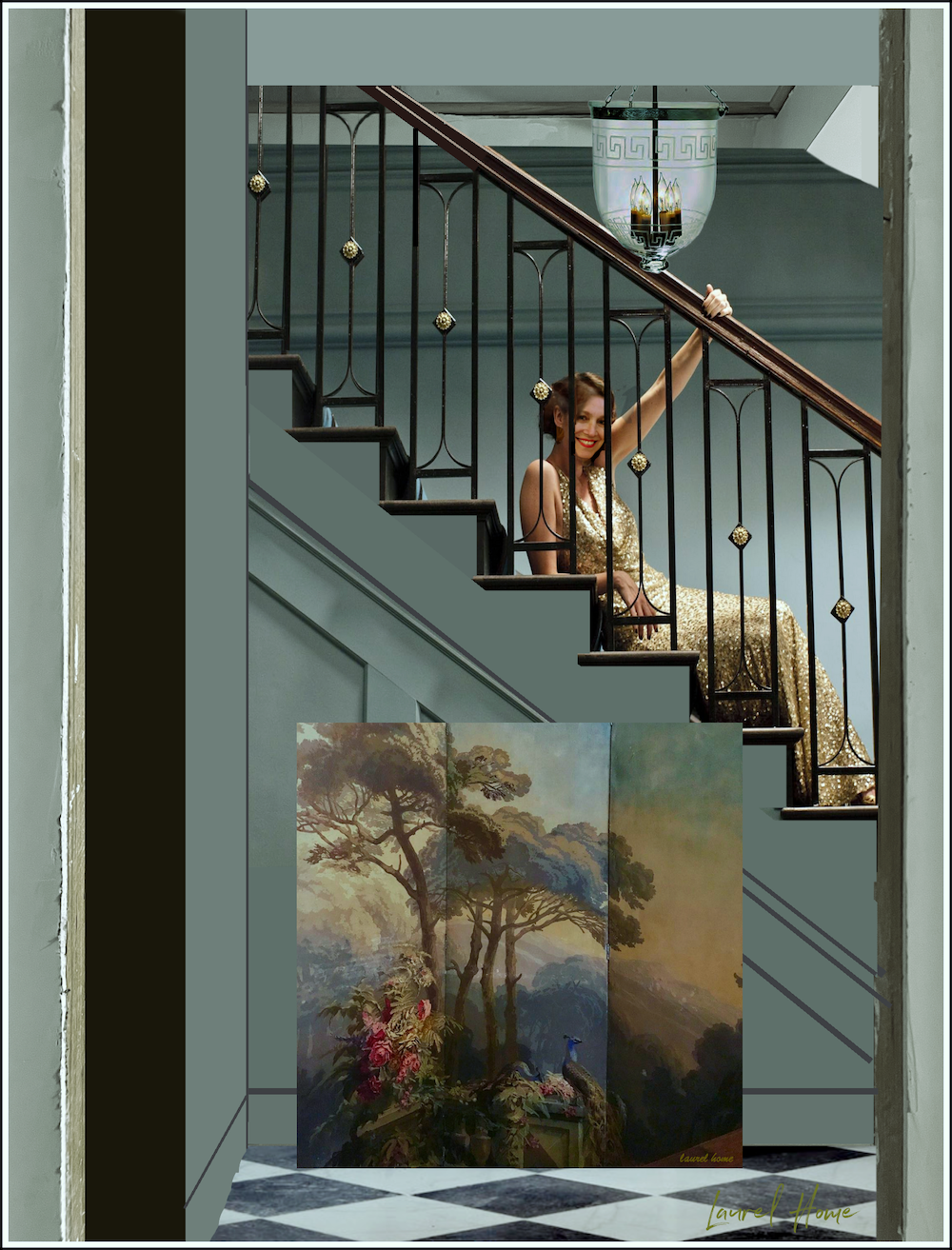
and you look gorgeous slinking on the stairs 😉
Paint, the final frontier! Good luck with ALL the choices out there. I know whatever the choice, it will be beautiful.I can’t even give an opinion, I found the last round of paint choices painful and I was going with a white. Can’t wait to see the finished product, any thought to the arch in the bathroom niche?
Hi Evelyn,
At one point, I was thinking of an arch-like opening with corbels. However, it’s such a small space, only 8 x 8. Although, my New York bathroom was not even 5 x 7.
Hi
I love the paper and colours you’re thinking of. Have you considered Benjamin Moore – Intrigue?