

Hi Everyone,
This is parts 1 and 2 about my selection for a bedroom mural. However, the first part is really in this recent post.
The paint color selection is very much tied into the wall paper selection. This is why it’s important to knock that out first. If you’ve read part 1 from last Sunday, please click the link below.
Otherwise, if you wish to review or are landing here for the first time, please begin from the top of the page.
Part 2 Begins Here
Hi Everyone,
I am still immersed in paint color selection and learning much as I go along.
Yes! Even though I’ve been at this for 36 years, I’m still learning about paint colors.
Like Martha Stewart says, “When you’re through changing, you’re through.”
If you missed this post about how I’m developing a color palette, please check it out here.
And before I forget, I was just interviewed for a satirical article on Bored Panda about bad interior decorating. Please check out what I had to say, here.
What have I learned? Here are some things, not in any particular order. Some of them concern comments I’ve read recently.
- I once said that Narragansett Green and Newburg Green are twins. Well, siblings, yes, but twins, no. However, in my defense, it may have had something to do with the fan deck I used then.
-
Fan decks showing the same color can vary by a lot.
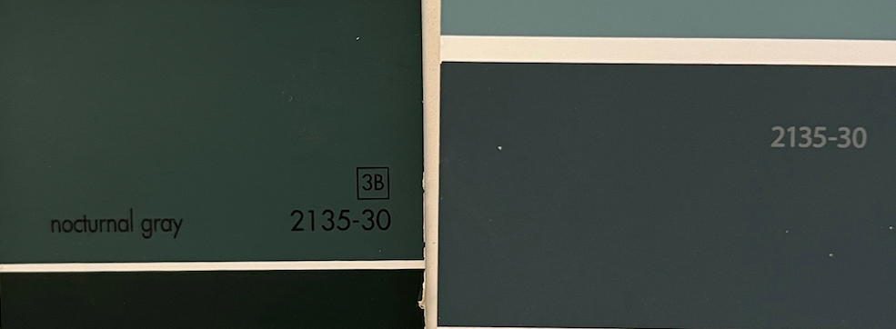
Please observe the difference between the same color (Benjamin Moore Nocturnal Gray 2135-30) on two fan decks. In addition, Benjamin Moore has finally come clean about their dupes. Many of the hc colors are also duplicated elsewhere but with a different name.
For example, Narragansett Green hc-157 is also known as Navy Masterpiece 1652. Its sibling, Newburg Green hc-158, is also known as New Providence Navy 1651.
All of these issues only make it more confusing when making your paint color selection.
This one I’ve said before, however, it bears repeating.
The color you see in a photo of a paint color could look entirely different from how it will look in your room. Often, very dark colors photograph a lot lighter than they are. It’s all about the lighting and how the camera sees the color.
- If there’s a warm light on, it doesn’t mean that all colors will absorb the lighting the same way.
- Someone pointed out in a comment that I should take the wallpaper into a paint store, pick one of the mid-tones, and have the clerk copy it.
Based on my experience, I would not do that. There are thousands of colors to select from, and you need only one. Color matching, unless handled by an expert, is quite risky.
A well-meaning Bostonian is warning me that a blue paint color selection in my den, will make the room feel cold. And with our harsh winters, even more cold.
I respectfully disagree, as the room will be a “warm” blue, not an icy blue. I find rooms feel cold when:
A) The temperature in the room is cold.
B) The lighting in the room is cold.
A rich, teal blue makes a beautiful, energizing backdrop unless you dislike the color.
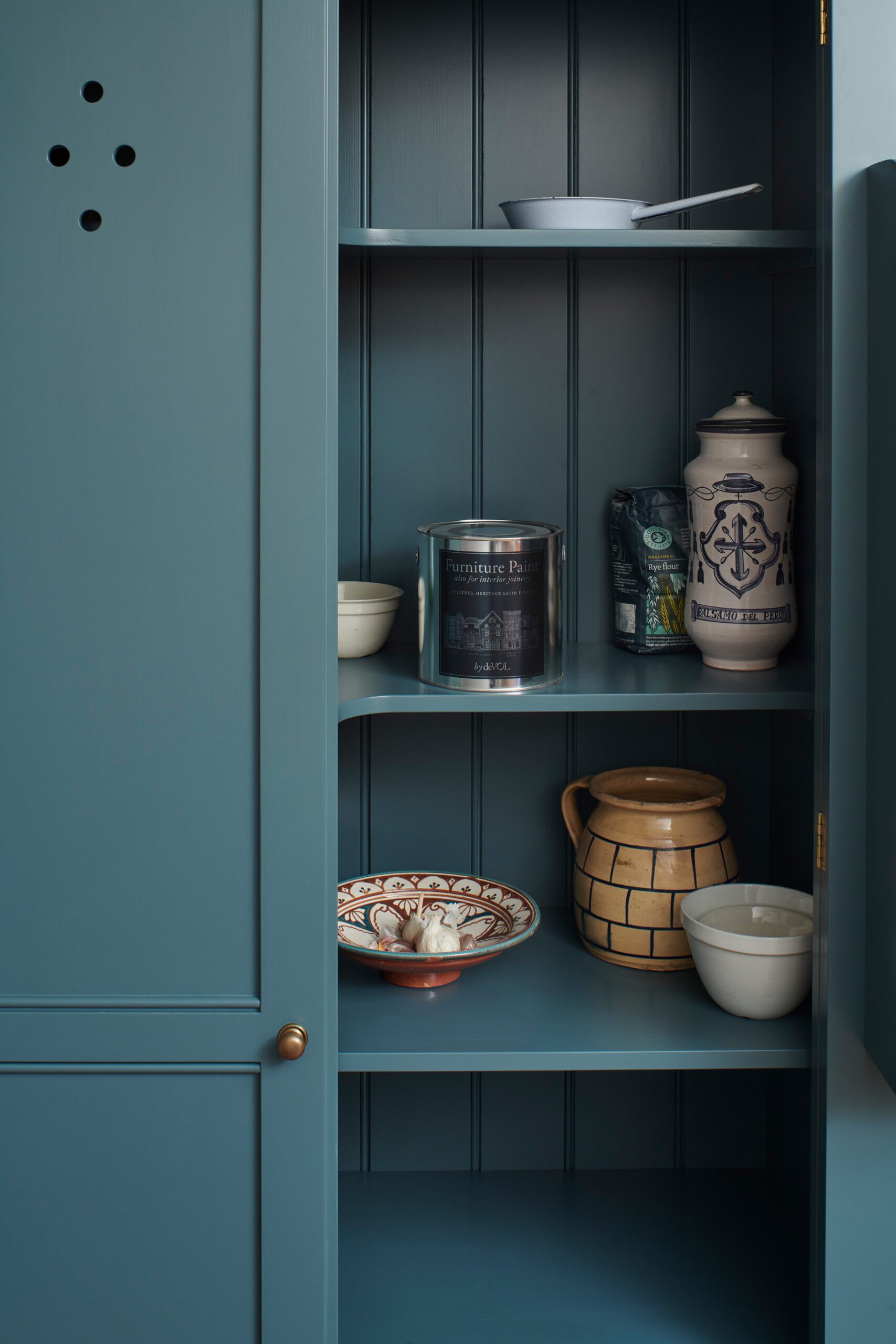
Clerkenwell Blue-FurniturePaint-deVOL
Does looking at this color make you feel cold?
My den’s current color, Cat Gromitz Greige, is terribly sad, and although technically a warm color, it leaves me feeling cold. I can’t wait to change it.
Right now, I’m focused on the downstairs. Mary had a great point about waiting to decide on a mural. While I get her point, it would make my life more difficult because paint color selection is a little easier if one knows what wall covering they’re doing.
I am no longer doing a mural downstairs.
Someone was concerned I was doing too many murals in a small apartment.
First of all, the apartment isn’t particularly small at 1215 square feet, and it’s on two floors.
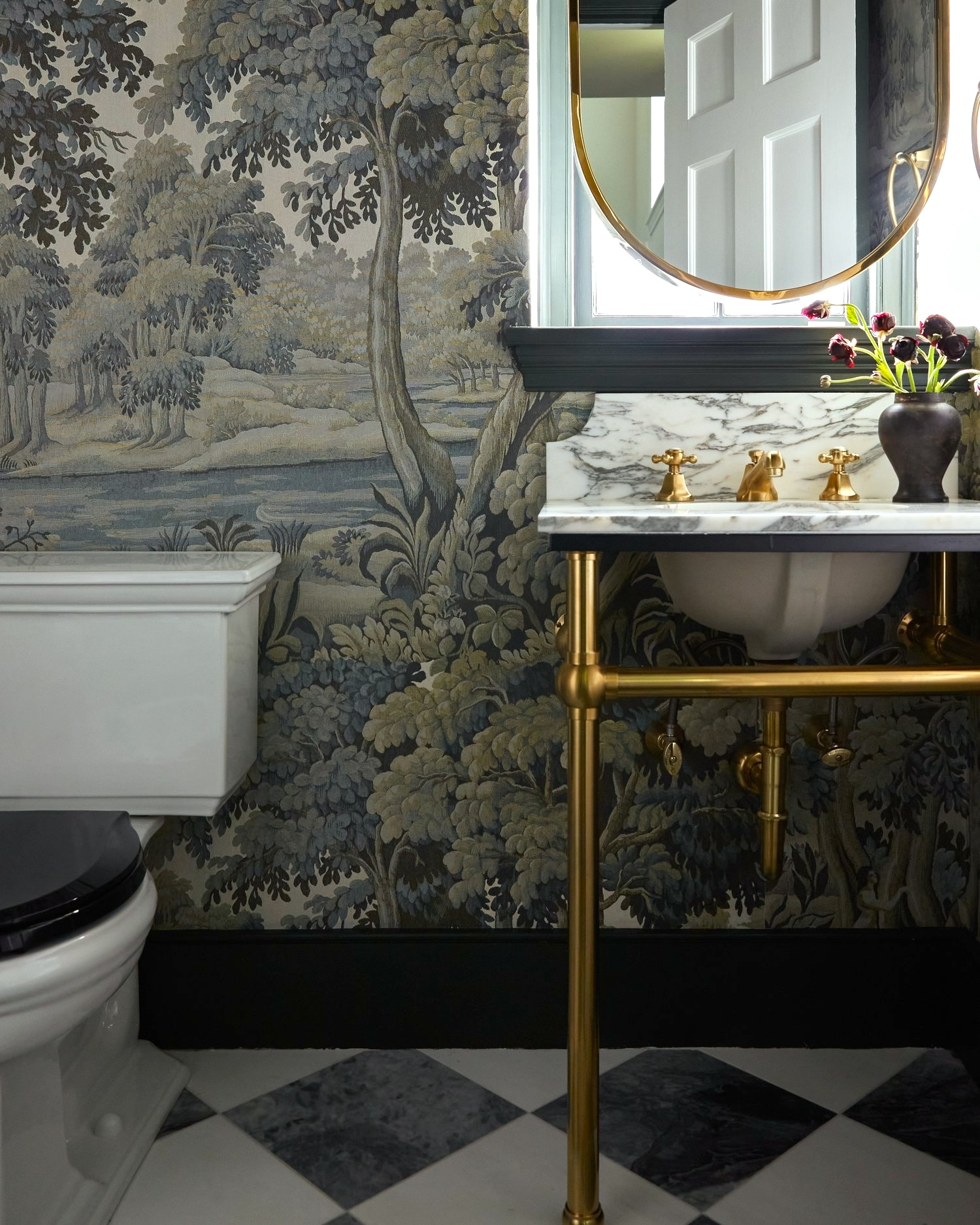
Downstairs, I am using the Plantasia mural only in the WC area. The wallpaper can only be seen when in the bathroom.
Now for the wall color selection.
Someone said that dark colors should never go in a primary bathroom.
Why not? Please, let’s not repeat the “You won’t be able to put your makeup on properly.”
Well, I usually put it on without a mirror. haha So, I guess the wall color won’t make much difference. I have a theater background and it seems every dressing room I was ever in was painted black.
My bathroom has no windows, and I am going to embrace its darkness with the moody bathroom I’ve always wanted.
However, not everything will be dark.
The shower is pale, and the center of the ceiling will most likely be pale. The floor will be black and white. The toilet is off-white, and the console sink is pale gray marble.
The wallpaper has elements of light, medium, and dark.
I’d like to put up some prints in gold frames on the long wall perpendicular to the shower.
Here’s what I think about selecting a color to coordinate when the wallpaper only takes up a small percentage of the viewable space. Of course, the color needs to coordinate; however, pick the color you want to see, which is not necessarily the obvious choice.
Laurel, can’t you do a pale color in a windowless bathroom?
Yes, you can. :]
So, what color did you select?
I’m not sure because I need the bedroom wallpaper sample to make a final decision.
I’ve looked at dozens of colors.

Maybe this one. (above) It’s an archived Farrow & Ball color. I need to see if I have a sample.
Otherwise, I love Downpipe. In real life, Apollo Blue was a miss as it was a little too bright and green.

It looks good here, but not so much in real life.
Moving onto the bedroom mural, it is impossible to see the wallpaper in the bathroom WC niche and the bedroom mural at the same time.
I don’t spend much time in the bedroom during the day, but that might change when it’s finished. I already love the bedroom. It’s now a real room, completely separate from the rest of the space. There’s a small but beautiful entrance.
So, I did receive the sample of Fenimore in Sky we were just talking about. It looks exactly like it does in this photo.
It’s really lovely, and I love the light antiquing. However, it’s not right for my bedroom.
But, I ordered a sample of a mural I discovered on Wednesday evening.
Wait! Please hang on a second. It shipped on Thursday; maybe it’s here!
Yes, it was there, and the envelope was quite wet, with all of the rain, but inside the paper was okay.
Oh, I like it! Based on what I saw, I was a little concerned about the background color, but it’s perfect.
Okay, I will have this all together for you on Monday evening.
xo,

*********************************************************
Part 2 Begins Here
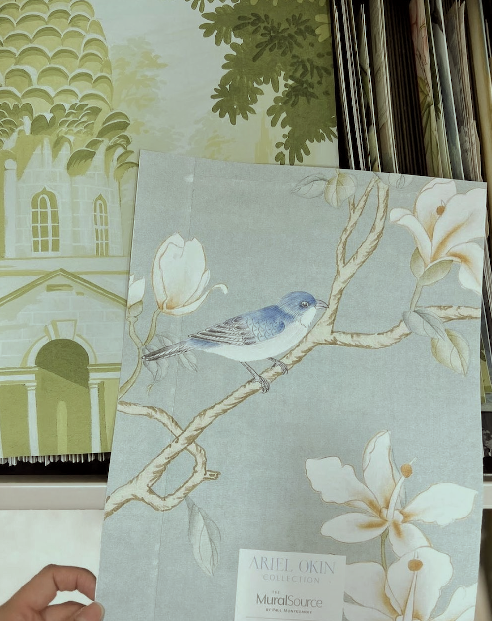
As promised, I am sharing the mural I’ve selected for the bedroom.
While I love the Belva antiqued and could do the antiquing after I get it, I’d still want a more muted palette.
The other thing is that I think it would be lovely if it were one wall or two panels flanking something. However, because of the room’s configuration and bed position, I feel it needs to be tiled around the room. I am planning panels, so with the moulding, there will be about 7 inches between panels.
In addition, there are breaks with the two doors, one doorway, and one window. The other long expanses will have the bookcase or bed/nightstands in front of them. Plus, if I do the long drapes, there’s more to break up. Plus, there will be other furnishings that will break up the pattern.
Like I said, I’ve pored over The Mural Source website too many times to count.
However, every time, I discover something I’ve never seen before.
I had seen the paper I selected before but perhaps overlooked it because it wasn’t as splashy as some. However, that’s a good thing!
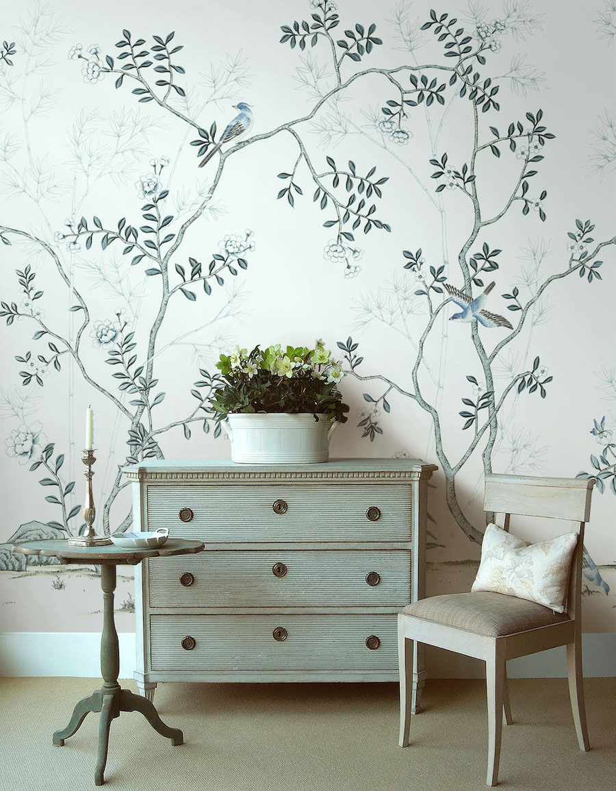
The paper is called Solitude White.
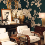
Doesn’t this look like a Loi Thai vignette? For those who don’t know Loi, he used to have a fabulous antique shop in Bethesda, Maryland, that specialized in Swedish Gustavian antiques like what you see above.
Loi also had an equally wonderful blog. Naturally, he amassed a large following on the blog and Instagram. Several years ago, he closed the shop and the blog but still does interior design and posts regularly on Instagram.
It’s one of the best pages out there.
So, I changed the one panel between the door and window and here is the rendering of the room, still set up like a living room.
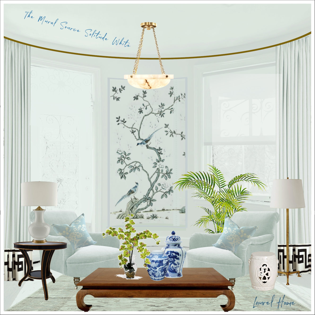
In addition to having a Gustavian feel that I love, the darker charcoal grays and soft black add some heft.
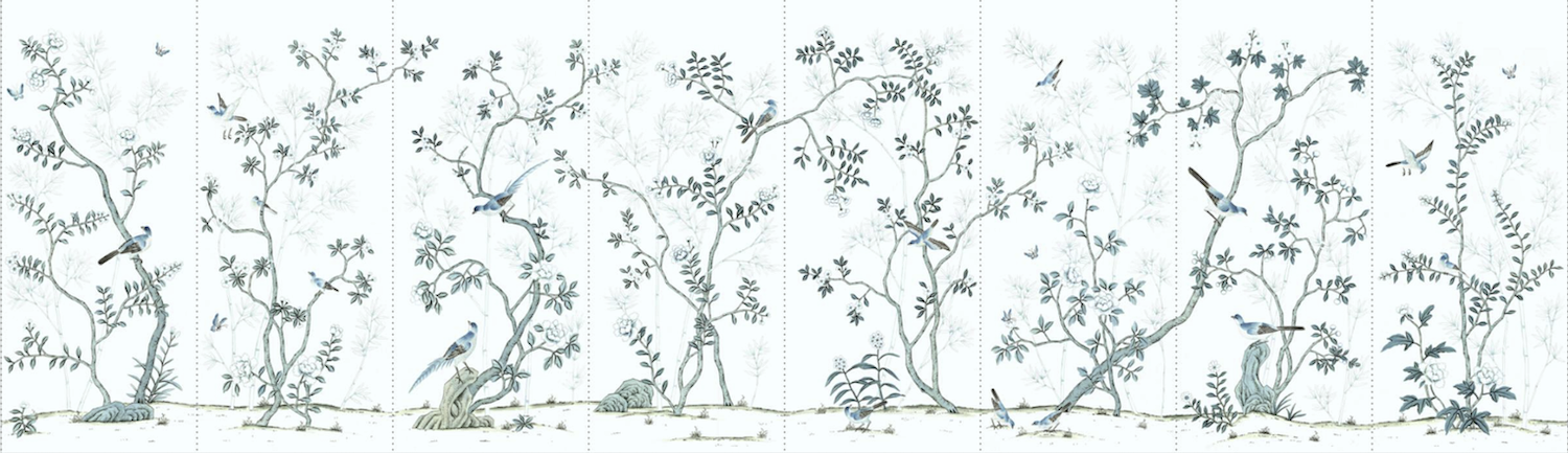
Here is the entire mural.
How do you feel about all of those birds, Laurel?
Oh, gosh. I know that some people don’t want to see people or birds. However, I love ’em! You know, I’m exceedingly allergic to mosquitoes. I have scars particularly on my wrists and ankles from them. Those bloodsuckers get high when I’m wearing Eau De Off, and then they bite me despite it. Anyway, it’s my understanding that bluebirds love to eat mosquitoes.
Subsequently, I’m fine with having a bunch of them as roommates. ;]
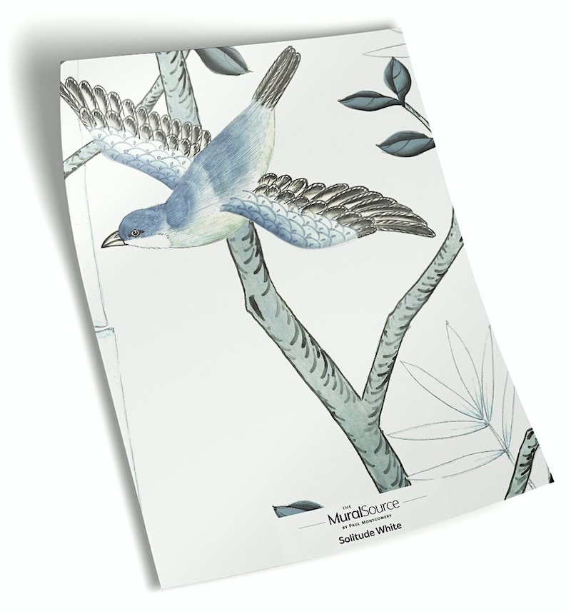
Above and below are some detail shots of the Solitude White Mural from the Mural Source.

Who needs a hand-painted mural? I mean, there’s nothing wrong with having one if it’s in your budget. However, these printed murals look like their hand-painted originals. Do you see the difference between a rendering drawn at real-life scale and one blown up 10 times its original size? (below)

Yes, of course you do!
Even though you don’t see the bathroom wallpaper from the bedroom, I think there’s a nice flow.
Well, since the wallpaper is only a tiny part of the bathroom, have you selected a bathroom wall color yet? Are you still insisting on it being dark?
Ahhh… Yes, to both; I think so. However, it’s time to stop. I will pick this up for Wednesday’s post.
In the meantime, much is happening, and most of it is in and around the kitchen.
xo,
***Please check out the recently updated HOT SALES!
The Big Serena & Lily sale is ending at 11:59PM PT on March 26, 2024!
There is now an Amazon link on my home page and below. Thank you for the suggestion!
Please note that I have decided not to create a membership site. However, this website is very expensive to run. To provide this content, I rely on you, the kind readers of my blog, to use my affiliate links whenever possible for items you need and want. There is no extra charge to you. The vendor you’re purchasing from pays me a small commission.

To facilitate this, some readers have asked me to put
A link to Amazon.com is on my home page.
Please click the link before items go into your shopping cart. Some people save their purchases in their “save for later folder.” Then, if you remember, please come back and click my Amazon link, and then you’re free to place your orders. While most vendor links have a cookie that lasts a while, Amazon’s cookies only last up to 24 hours.
Thank you so much!
I very much appreciate your help and support!
Related Posts
 A Dazzling Ralph Lauren Room & How to Get the Look!
 I (virtually) Furnished TWO AB Kasha Parisian Interiors!
 Reno Rant # One – You Won’t Believe What’s Going On!
 40 of the Best Etsy Home Furnishings for 2024
 The Spectacular Unknown Furlow Gatewood Homes!
 15 Hideous Fabric Mistakes (I Made Most of Them)
 Renovation Update 10-2022 Please Forgive My Sins!


23 Responses
I like it! Good choice!
Love, love, love your mural choice birds and all!
Laurel,
I love the softness of the mural. I think it will be very calming for your bedroom. I like the two center panels best as the birds are a bit further apart from each other. I am a nature lover so birds are definitely great for me (not people though on murals or wallpaper).
Thank you for all you share with us.
Have a happy Easter!
Dottie
It’s beautiful. Swedish Gustavian is my favorite style.
I love Gustavian. Good luck with the mural!!
I had an original mural on canvas in the entryway of my modest house. It was on 4 walls, painted in the 1940’s. It was a pleasing outdoor scene. Wish I could post photos here.
But we planned to do major renovation to this house. So, we donated it to the local historical society who hired a conservator to remove it from our walls and stretch/ frame it. The panels now hang in a public building. The artist was a prominent citizen if my tiny town and her artistic work apparently commands some buyers.
I miss my mural when I read about the trials Lauren is having with her murals!
That rendering is the bomb, Laurel. It’s going to be lovely! Good choice. But, back to the rendering. Can you tell us a bit about the software/apps you use to make these? It would be helpful to me, as I’m trying to choose a mural for my dining room. The Mural Source is a good resource, I agree. Thanks for sharing.
Hi Cynthia,
I use Picmonkey for all graphics and renderings. I’ve been playing around with it for nearly ten years!
Oh, that mural is perfect! The comment on the dark colors “grounding” the space was what I realized was missing from those other mock-ups…my eyes could never “rest” on those images very well.
Excited to see the final paint colors! (and Alison’s link to the color test was fun – I came out “normal” for once 😂)
Love it! Love it! Love it!
It works perfectly with the surrounding spaces & colors. You never disappoint. All of your choices are bang on. I’m so glad you found this mural. I can’t wait to see it installed.
The Solitude White Mural is perfect for your bedroom courtyard!
Your entire design is fabulous, and the murals make it even more so! The birds are gorgeous! I love it all and can hardly wait to see the end result! Thank you for sharing so we can live vicariously through your renovation. learn along the way, and get inspiration. Nothing compares to beautiful historic buildings, and you have not only retained the character, but you are enhancing and improving it so much with all the details. You’re so lucky to be designing for yourself so you get to live there and relish the fruits of your labors and boundless talents!
Nice mural. It is perfect. High quality too. Wow, does your bedroom have a high ceiling! Those lovely birds will have room to soar. BTW, your comments in the Bored Panda article were so grounded and made so much sense that I hope they get quoted again in other publications. I hope your readers read the article which has photos of some of the most horrendous “what were they thinking” decor abominations imaginable. A fun read.
I love that gray mural displayed in the bathroom. The overall look is beautiful.
It’s reassuring to learn that Laurel herself hesitates so much about paint colours: we can all feel less stupid! My own experience tells me that the surface area of the paint is important. Paler colours tend to look more intense over a large area, and conversely, dark colours look less dark and one sees colours and undertones more clearly.
But indeed, paint deck samples vary — I keep all the F&B paint decks and there are distinct variations between decks. Some colours come up a bit different in real life: Vert de Terre is much brighter than I’d thought; Cabbage White is much bluer, for instance. The light is also important, and coloured ceilings will affect the wall colour if it’s pale. Your mood too. Mary Evers is right: make sure you’re not tired or depressed when picking colours — you’ll get it wrong.
Another thing is that texture affects colour perception: different fabrics and paint don’t look the same even though the colour may be identical. I’ve got a plain cotton and a velvet which are the same colour (F&B Stone Blue), and yet the texture of the velvet makes it look much better than the cotton.
And I cannot agree with Maria Killam: colours do vary with the lighting. LED lights ruin a corner of my Fox Red ceiling in the sitting room, whereas the halogen sconces don’t (but halogen bulbs are disappearing here). Another practical example: back in November I ordered samples of fake fur to make a throw. One is absolutely stunning (the feel is amazing), and on a grey velvet upholstered chair it was perfect. After long consideration I ordered that one. Ouch! The weather here was so gloomy that we had electric light on all the time (there have been exactly 7 sunny days in the last 5 months) and I got tired of waiting until January for a bright day. In moderately bright daylight, and even more in sunny daylight, the fur and the grey velvet look hideous together: the fur has a violet undertone which is never in the velvet — one changes with the light, the other doesn’t. Greys I find particularly difficult in this respect, and muddy greens are the same: what is olive in one light can be brown in another. So I’m stuck with a length of expensive fabric that I can’t use! Another first-world horror show…
Hi GL,
I feel your pain. Ouch, indeed!
One thing I’m learning is LEDs do things to the colors that are quite different from incandescent and halogen bulbs. For instance, the smokey grays I was looking at, look positively dead in the bathroom, but the color I feared would look too green, is a beautiful muted gray-teal. This is with a warm 2700 kelvin bulb.
Of course, the lighting is going to be a lot different than what’s there now, so in the end, it’s going to be a bit of a crap-shoot. Still, the color I’m leaning towards now is one of the Benjamin Moore historical dark grays. More about that soon!
Happy Sunday, Laurel, A question: will you be using paint colors from your own guide of colors that you always suggest? Just wondering…..
Hi Leslie,
Some of them, yes. While the colors in the collection are all terrific, they might not be right for every situation. However, they serve to begin as a jumping off point. For example, one might want a shade of red, but one of the reds is a little too orange and another is a little too pink. Then, it is likely that the perfect shade lies somewhere in between.
In addition, the palettes show what colors and families of colors look good together. While the colors in the palettes are all from the collection, it doesn’t mean that all will be used on the walls. No, one of the colors might appear in a fabric, a vase, wall covering, art, a rug… etc. Or, some of the other colors might go in other rooms.
Thank you for reminding me of what needs to be done when a paint color is being selected.
Something else you should add to the list is to not pick a paint color when you’re tired. I’ve found that that is when you just settle.
I’ll be selecting a paint color for my bedroom soon. I’ll be sure to follow your advice when the time comes.
And I can’t wait for Monday’s update.
If you want murals everywhere, why not? You have such incredibly good taste that I can’t imagine you make a big mistake. I just had my small bathroom painted Benjamin Moore’s “Dark Harbor.” It looks terrific with a white pedestal sink, white traditional style toilet, and brushed gold accessories. I will probably change the light fixture for one with more linens. I hung a large gold-framed painting. The room doesn’t seem particularly bigger or smaller—just very dramatic. I got the idea from you!
Laurel, I was at the point of saying “Amen ” as I read through your points on paint color. Your advice is one I learned after making so many mistakes in my home owner’s life with paint. The cans in the basement are my proof. I also learned that wall paper in a bathroom with a skylight that gets lots of sun and has good ventilation will dry out the paste. And the sheets will come tumbling down. Even after calling the wall paper hanger back twice to re-paste. 🙁
Wondering if other readers know about a fun test you can take for small amounts of color blindness beyond the typical red/green. I had to concede, after years of argument with my sister, that although it’s not enough to change anything in everyday life and would not notice it except when we are choosing colors, I don’t see blue as fully as others do, and so have a tendency to describe things as green, or slightly blue, when they are more clearly on the blue end. You can take the test here:
https://iristech.co/test-vision/#instructions-1
Great advice Laurel and I will never again ‘wing it’ or adopt the Australian adage ‘she’ll be right’ until I have seen a sample in situ.
I can never decide what I like best anyway so in my case it’s often what can be sourced and is affordable that determines the end result. If you can’t get it, you can’t have it so I find all images of beautiful fabrics without an attribution or identification just drives me crazy. That’s the reality of a smaller market and is a truly 1st world prob!
Anyhow I just can’t wait for your next post. Just what is the new, gorgeous-er mural you have fallen for?
Bloody hell, the wait will kill me!