Hi Everyone,
Thank you so much for your kind comments regarding my LED recessed lighting. And also for so many wonderful recommendations!
I realize it’s unusual for me to go this long without a post. However, there has been too much going on this week in all aspects of my life.
What’s funny is by accident, I discovered the best cheat for selecting paint colors.
We’ll get to that in a sec.
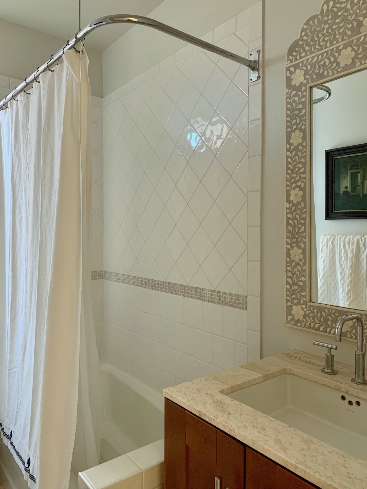
For my primary bathroom walls, I love the look of Paper White. It’s the palest shade of gray with the slightest whisper of green like I had in my New York apartment shortly before I left. I do believe the super replaced the four recessed lights with warm LED bulbs. It also looks terrific in my upstairs bathroom, which is painted Marilyn’s Dress.
Things will get better in the bathroom and kitchen when we can get rid of the cheap overhead yellow LED lights.
Marilyn’s Dress is a beautiful pale, cool gray-blue that looks terrific under warm LEDs. However, it is a touch more blue than I would like for the downstairs bathroom. Paper White is a hair lighter, grayer, and greener, making it exactly what I want.
Laurel, what about the white you’re going to use upstairs?
Ahhh… that is a great question. It’s funny, but I’ve been surprised at how yellow Greek Villa looks in my kitchen. That is because of the LED lights, especially the aforementioned overhead light. Since the toe kicks haven’t been installed yet, I took one near the fireplace, and Sherwin Williams Greek Villa is gorgeous.
However, I prefer not to use Sherwin-Williams, mostly to keep things as simple as possible. So, if you recall, Benjamin Moore Simply White is a close match. Now, the living room is a completely different ballgame.
That’s because the two huge windows are south-south-east facing. On a clear day, throughout the year, I have bright, warm sunshine from about 10:00 AM to 3:00 PM, give or take an hour or two, depending on the year.
If it’s overcast, well, it’s gray.
Currently, the walls are Classic Gray, and the trim is Super White.
I would prefer to paint the walls, trim, and ceiling one color. While I used Super White on the trim in my Bronxville living room and it was beautiful, it was paired with buttery yellow walls. (Americas Heartland). I think that Super White would look very stark with the kitchen, and in general.
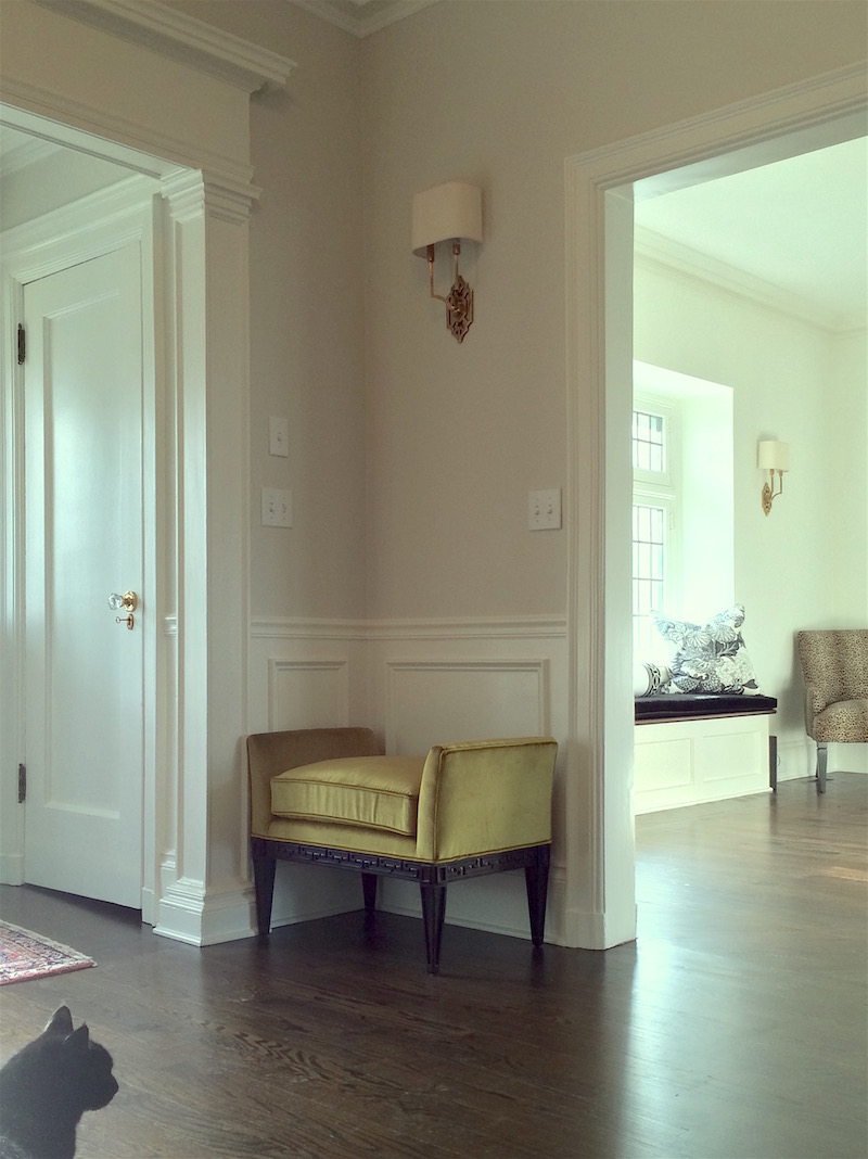
During the day, because of all the red brick, the living room can look slightly pink on the small walls on the edges of the bay. The center between the windows always looks like a dirty, pale, yellowish gray. Classic gray is actually a greige with a whisper of lavender in darker rooms, and it is very lovely, as you can see in Mary’s (of the gorgeous kitchen) entry. (below)
Please also note that the trim in the entry is cotton balls as are the trim and walls in the living room.
Yes, they are the same color! This is why it’s best not to get too riled up about which shade of white you end up using. The only time I’ve ever gotten in trouble was when I chose a very warm, beige-ish white (White Blush 904) and used it on a job, everywhere, including the youngest son’s room, which was a clear yellow.

Oops!
That was back in 1997!!! I had only been in business for a year. Experience and mistakes, really are the best teachers.
Back to Classic Gray.
In bright rooms, Classic Gray reads as a dirty off-white.
This is not a color I would’ve selected for my bright, large living room and I can’t wait to get rid of it.
So, why not continue Sherwin Williams Greek Villa in the living room?
I certainly could.
But, here’s my cheat for selecting paint colors.
The other day, when I was vacuuming, I noticed the Greek Villa fridge panels hanging out in the living room. Forget the damned toe kicks. lol. Now, that is a sample!!!
Haha. I checked the cabinet panel with my small sample from Sherwin Williams, and it’s an exact match. Or, as exact as my human eye can tell.
It looks lovely in the living room and the marble fireplace mantel.
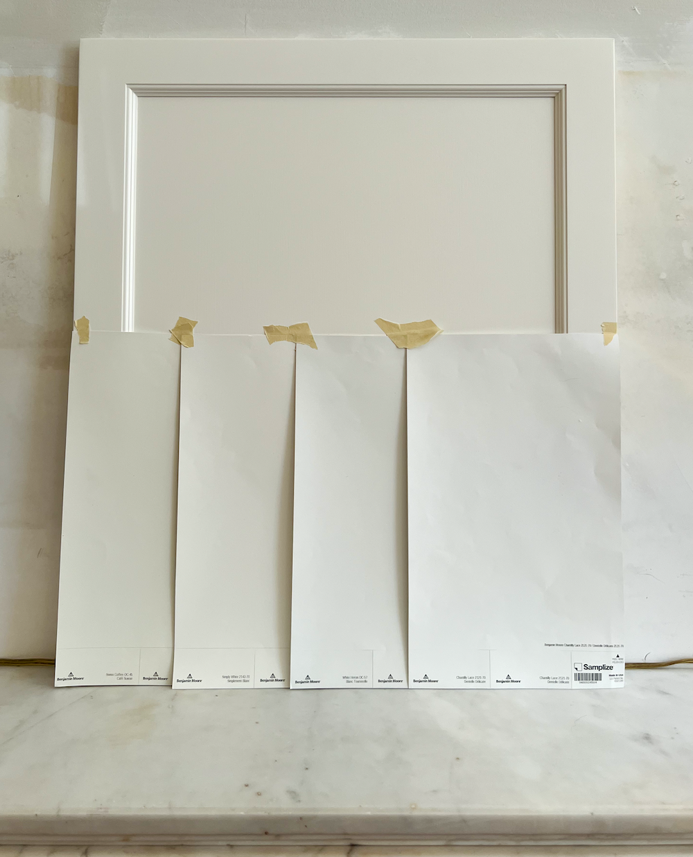
However, let’s look at the top Benjamin Moore contenders in front of it.
From left to right are:
Swiss Coffee, Simply White, White Heron AKA: Oxford White, and Chantilly Lace.
Laurel, where’s Cotton Balls?
I don’t have a big sample of it. I got samples of colors I either don’t know or colors I recommend, but am less familiar with that I think might be possibilities.
I also left off Super White because it’s even more white than Chantilly Lace. I can see why these are amongst Benjamin Moore’s most popular shades of White Paint.
All of the colors are close to Greek Villa.
However, in these samples, Simply White is still the closest, with Swiss Coffee in second place. All of these, except for White Heron, are part of the Laurel Home Essential Paint Collection.
Swiss coffee is the grayest and deepest color on my shortlist. However, it has an undertone that is more green than yellow. This will help counteract any red that reflects off the color during the day.
For a crisper but still soft white, White Heron, AKA Oxford White, looks very lovely at night.
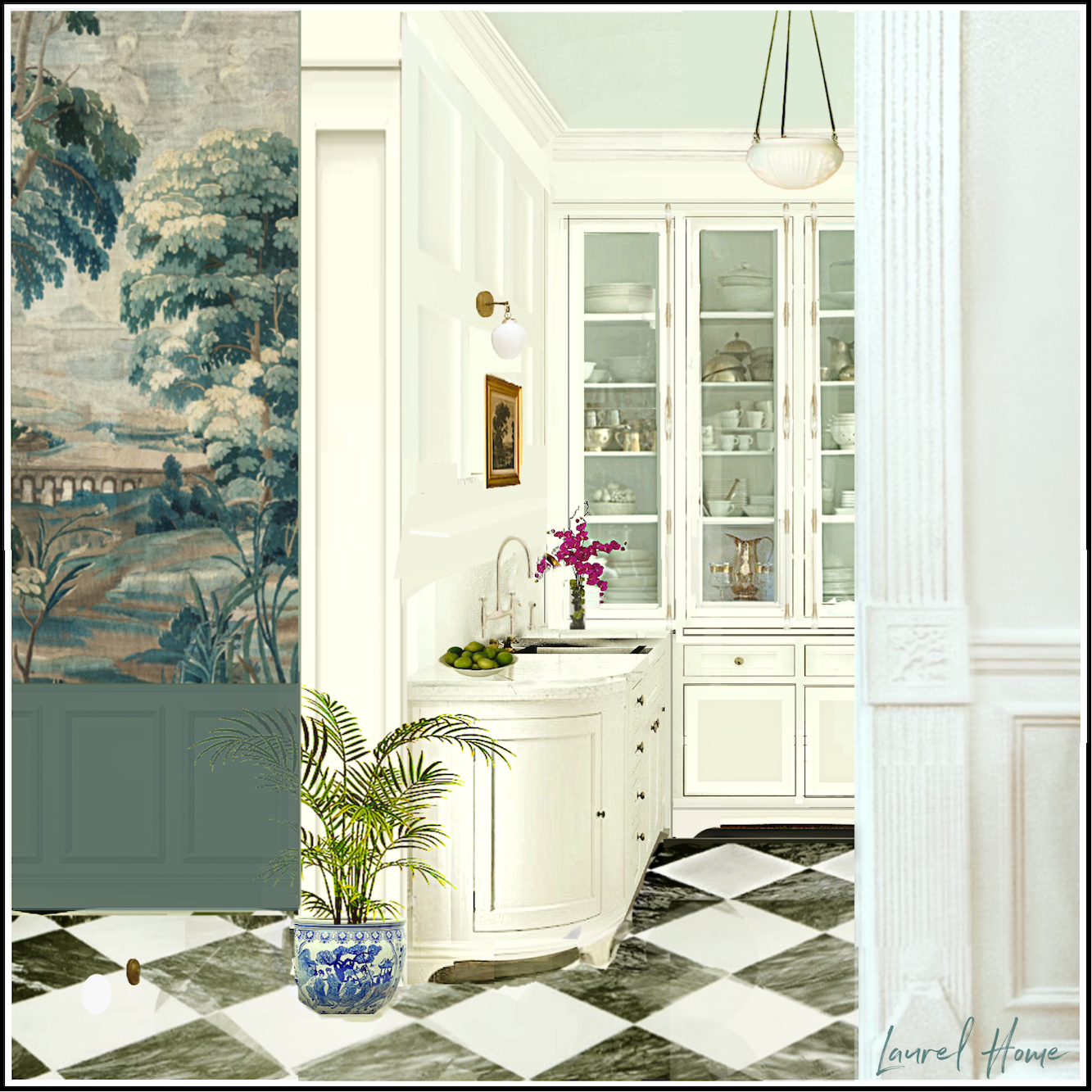
Downstairs, the Solitude White Chinoiserie Mural from The Mural Source needs a bit of tweaking of the background.
Please see a rendering of it in my bedroom, here.
The background is a tad pink. One doesn’t notice it until trying to pair it with a white. The best white with it is Decorator’s White with Chantilly Lace in second place. However, I would like the Mural Source to tweak the background color to make it a little creamier. White Heron is my favorite at this point. However, I could really go with any of them for my primary white paint color.
Laurel, White Heron is a white that’s not on any of your lists, like your 20 Best Shades of White Paint or the Laurel Home Paint Collection.
Yes, I know. =] You see, as time passes, I have been learning and refining my knowledge with y’all. White Heron/Oxford White wasn’t strongly on my radar until about 2017. It is a little creamier than Chantilly Lace but not as creamy as Simply White, Cotton Balls, White Dove, and Swiss Coffee. In many ways, it might just be the perfect shade of white paint.
Okay, I see some of you going wild in the back of the room.
I presume that’s because you’re a big White Heron/Oxford White fan. Right? Please let us know in the comments. I’d love to hear your reviews of White Heron.
If Swiss Coffee and Decorator’s White had a baby, it would be White Heron. ;]
As I said in the Laurel Home Essential Paint Guide, the differences between many of these whites are so slight that they are interchangeable. I’ve always maintained that there is too much choice, with numerous duplicates, just to add to the confusion.
I found it interesting that even though White Heron appears to be a little brighter, it’s actually 3 points darker in Light Reflective Value (LRV) than Simply White. White Heron feels crisper because it has more gray than Simply White, but it is still a soft, warm, non-yellow-looking white.
Another interesting thing I discovered when looking at three White Heron samples is that they are all a little different from each other.
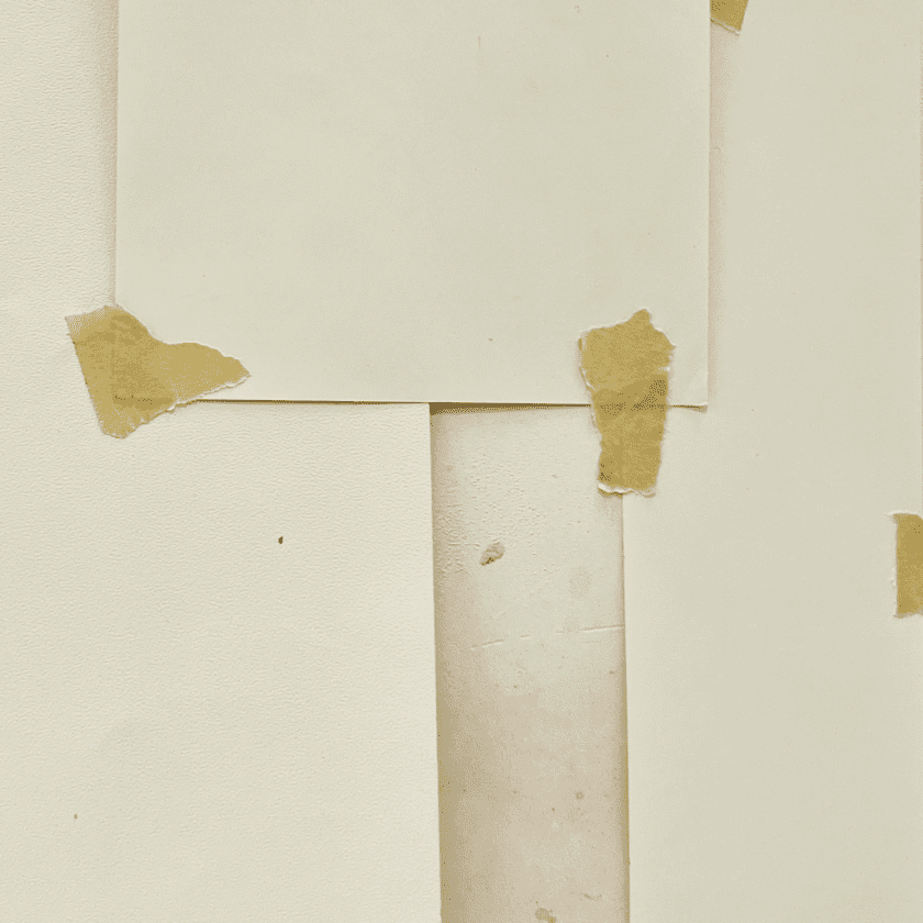
These were taken in my kitchen with the lights on, of course. The ones on the top and right are older and by Benjamin Moore. The one on the left is by Samplize, which I just got. They could easily be three different colors! However, when you purchase the paint, it can also vary slightly. So, if you’re having a room painted, if you can swing it, have the painter begin with the smallest wall to ensure there are no big surprises.
In the meantime, I discovered a new source for murals that I adore.
I’m not going to tell you who it is just yet. However, I wanted to share a new entry rendering using one of the murals.
What do you think? It’s taken from an old tapestry. This is the same company that produces the fabric for my bathroom curtain. I hesitate to use the word “shower” because the connotation doesn’t work for me. How about? Draperie de Salle de Bain.
I will be sharing all about this company. It is well-known in Europe but just emerging in the USA.
In closing, here’s the latest reno news.
The sink and legs for my new vanity just arrived two days apart!
The embrasure doors arrived this morning, and looked lovely, but at first, I was freaking out because their pocket is four inches larger than the doors. I wasn’t freaking out because they also forgot to send the hinges! Robert, my GC, flew on over while I cooled my jets. He assured me that they are the right size and that Brendan often makes openings too big because it is easy to fill in, but very difficult to take away.
The hinges were found and hopefully will arrive tomorrow.
Phew!
Okay, that’s the latest over here in Boston.
xo,

***Please check out the recently updated HOT SALES!
There is now an Amazon link on my home page and below. Thank you for the suggestion!
Please note that I have decided not to create a membership site. However, this website is very expensive to run. To provide this content, I rely on you, the kind readers of my blog, to use my affiliate links whenever possible for items you need and want. There is no extra charge to you. The vendor you’re purchasing from pays me a small commission.

To facilitate this, some readers have asked me to put
A link to Amazon.com is on my home page.
Please click the link before items go into your shopping cart. Some people save their purchases in their “save for later folder.” Then, if you remember, please come back and click my Amazon link, and then you’re free to place your orders. While most vendor links have a cookie that lasts a while, Amazon’s cookies only last up to 24 hours.
Thank you so much!
I very much appreciate your help and support!
Related Posts
 How To Transform A 60″ Desk Into Comfortable Dining For TEN!
 Having Trouble with A Kitchen & Living Room Makeover
 A Boston Condo With No Storage & 6+ Ways to Make It Better (Parts 1-3)
 Gustavian Swedish Colors That Might Surprise You
 Is There A Code-Compliant Chic Staircase Railing?
 3 Totally Unexpected Things I Discovered On My Italy Vacation
 The Trick To Mixing Modern and Traditional Furniture