

This is an important announcement. If you are drinking anything other than clear water, you need to put it down until you are finished reading.
Oh dear.
I seriously fell down the proverbial rabbit hole on Monday.
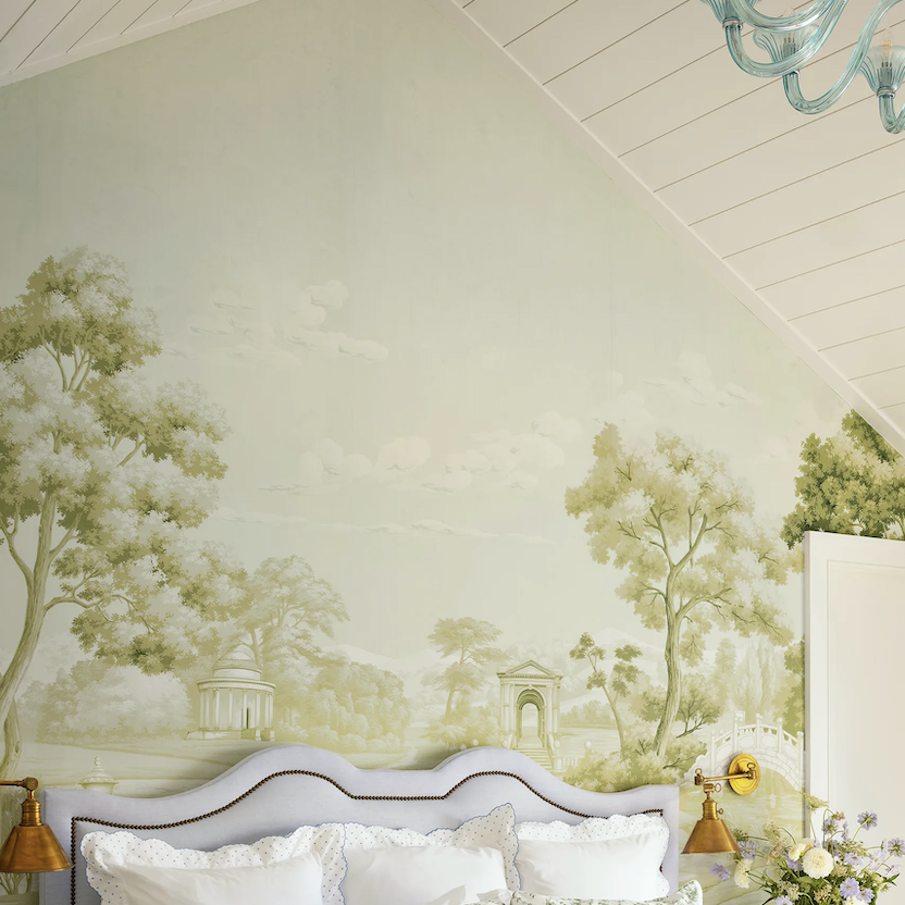
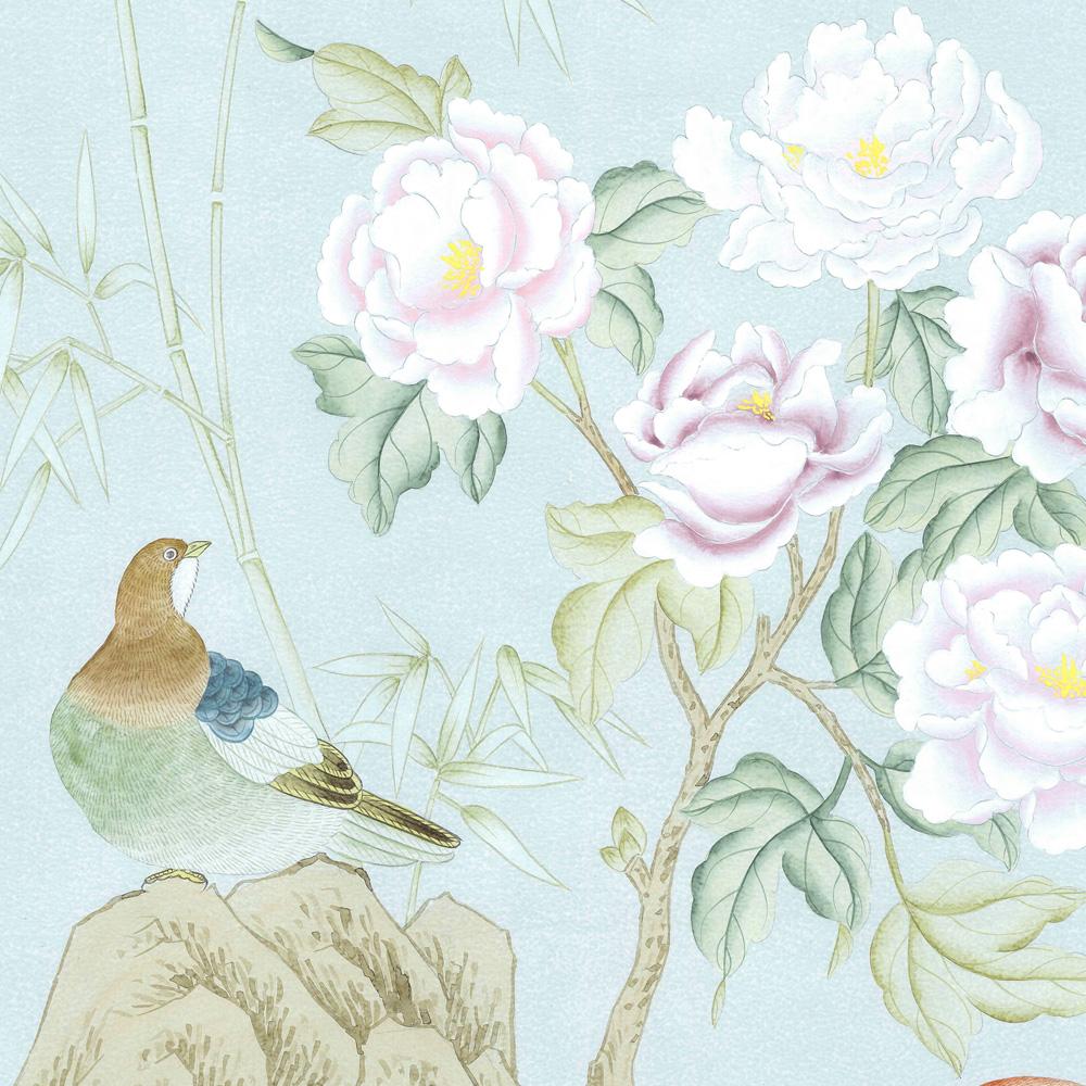
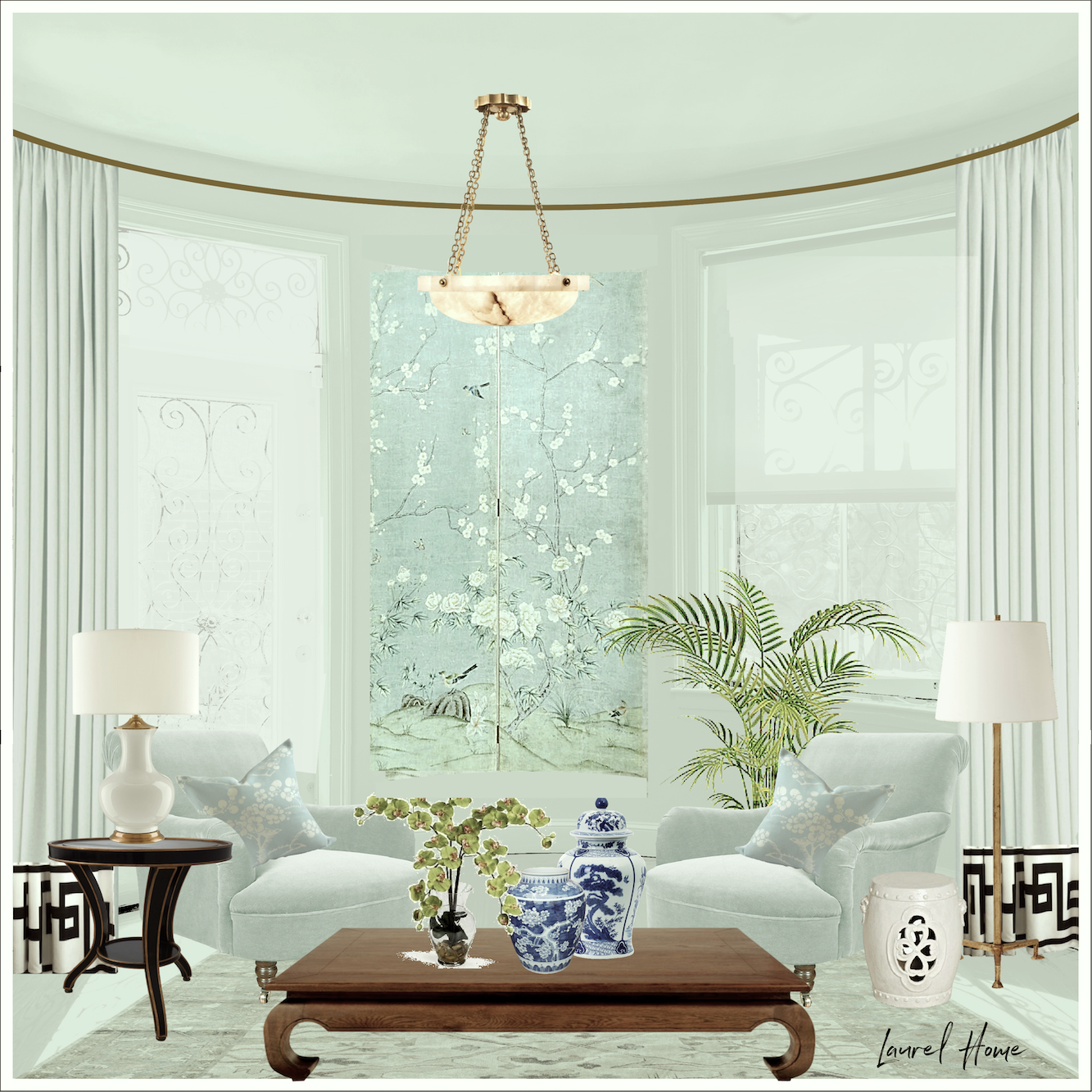
After months of poring over every mural on the Mural Source website, I settled on one that’s very pretty. It’s the Fenimore in the Sky colorway. It’s one of the newer ones in the Ariel Okin Collection. If you don’t know who Ariel Okin is after reading this, you’ll begin to see her name everywhere.
She looks all of 18, but she’s been married for 5 years and has two kids, so I reckon she’s at least 21. ;] However, she’s an up-and-coming superstar in the interior design industry, which is appropriate as she’s exceedingly talented.
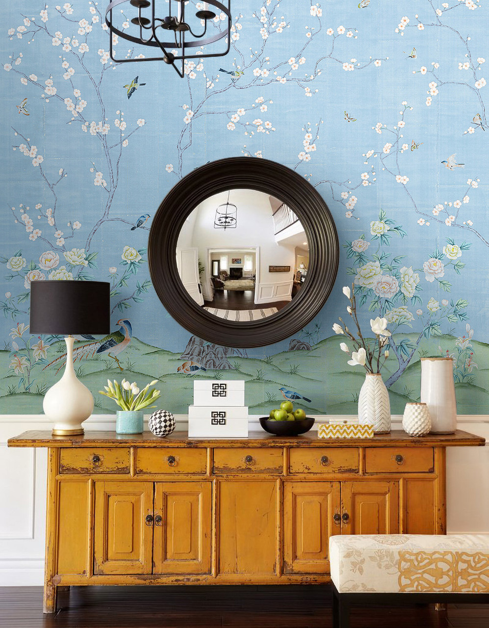
Some of you may have seen this drop-dead exquisite mural recently in Architectural Digest.
This is not the entire image. After years of being hassled and threatened by copyright trolls, I must be very careful. Anyway, I was all set to do this one last week.
I love it, but I don’t think it’s quite right.
That’s when I decided, based on my choice of the Plantasia for the bathroom, that the best color would be the soft, muted gray-blue with a touch of green.
The problem is that the images of the whole murals on The Mural Source website are very tiny files, and difficult to see the design. I’m sure it’s to thwart thieves from stealing Paul Montgomery’s beautiful artwork.
For designers, there is an online catalog and they can be enlarged; not super huge, but a little better. The only problem is that none of Ariel’s murals are there. They are only two years old and the online catalog, in magazine form, was done before that.
However, The Mural Source has a gorgeous Instagram page, and Ariel Okin’s Instagram is sublime. Between the two, and also googling Fenimore mural—Sky, I came up with some gorgeous images of the pale gray-blue mural with delicate white flowers and small birds.
Here’s a pic I found on Ariel’s Insta showing her collection with beautiful designer fabrics.
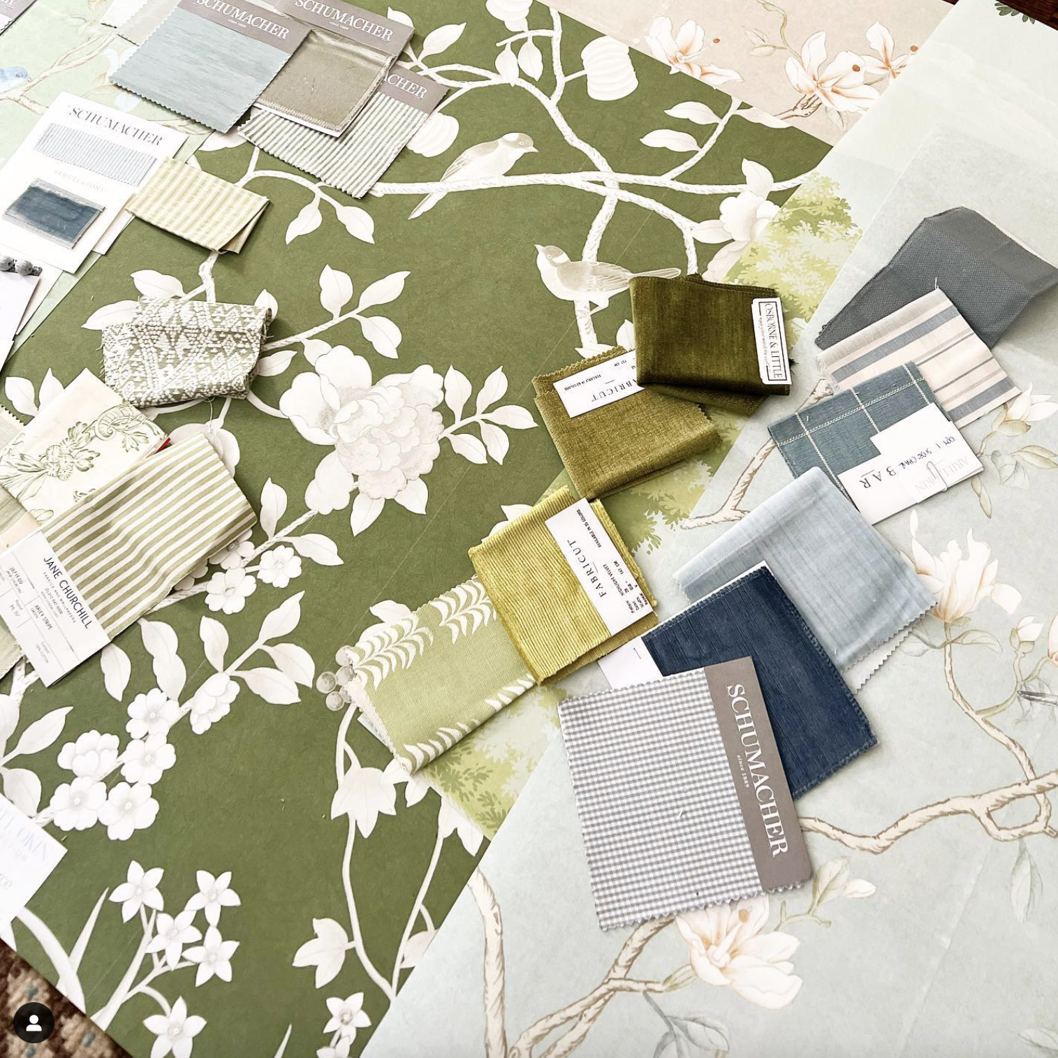
Fenimore Sky is in the bottom right corner.
The image on the website is a bit more saturated.
How Ariel’s collection came to be.
A few years ago, she needed some custom murals for clients.
- She wanted more muted colors.
Check.
- And, she wanted the tea paper effect, as they did everywhere before the 20th century. (Remember the Dufour murals?)
HUGE check!
My problem is I’m like Ariel because I want something from murals A, B, C, and D, and then I’ll have my perfect mural.
The obvious choice would be to have Paul create a hand-painted beauty just for me.
That’s not in the budget. Besides, he promised me a freebie becaull of the great press I’ve given them over the years. I’m happy to do so. I only write about brands I truly love. I’m not into traditional collabs because they want one to jump through ridiculous hoops, and I don’t have time for that. So, it’s better if it happens organically.
I was all set to order, and I began my email to Paul Montgomery on Monday.
We last corresponded in February 2022!
Hi Paul,
It’s Laurel Bern, the Anastasia bedroom mural blogger formerly from New York and now living in Boston.
I hope all’s well with you.
Well, I can’t believe it’s been over two years since discussed doing another mural! It’s been a long road but I expect the renovation to be finished sometime in June. It began last June.
Okay, I hope your offer still stands, because I’m dying to do another one of your murals again. However, instead of the entry, I’d love to put another Chinoiserie mural in the bedroom…
It was at this point that I thought I would dig up an old pic of the bedroom to show Paul where his mural would be going and how lovely the bay is.
So, I found this image from before I moved to the apartment in December 2020.
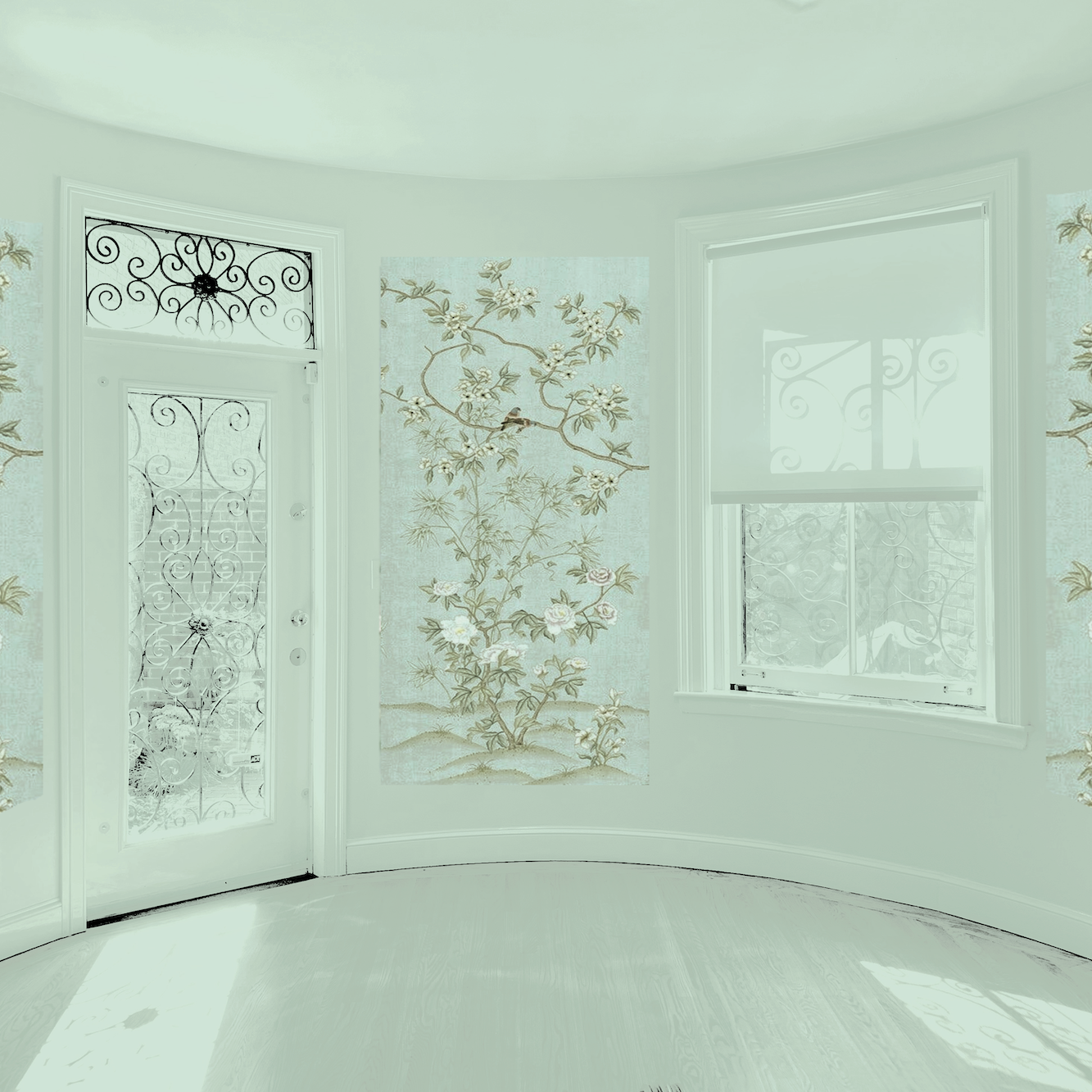
And I added a lovely Fenimore Sky panel between the door and window.
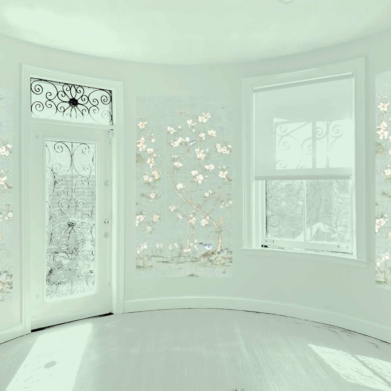
Oh dear. See what I mean about the low res image?
Well, I’ll just grab another mural in similar colors from 1stdibs, as they have a few of the murals in high resolution.
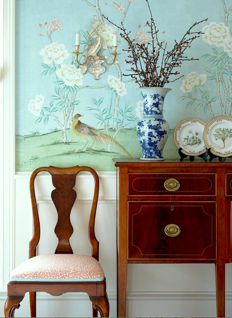
Other sources where you can see some beautiful Mural Source images are Caitlin Wilson (The names are changed, but it’s The Mural Source’s products), The Well Appointed House, and Mintwood Home.
Okay, I took a bit of the Imperial Garden Mist.
I realize the image is far clearer, and this is a gorgeous mural! The problem is that this isn’t what Imperial Garden Mist looks like as I manipulated the colors.
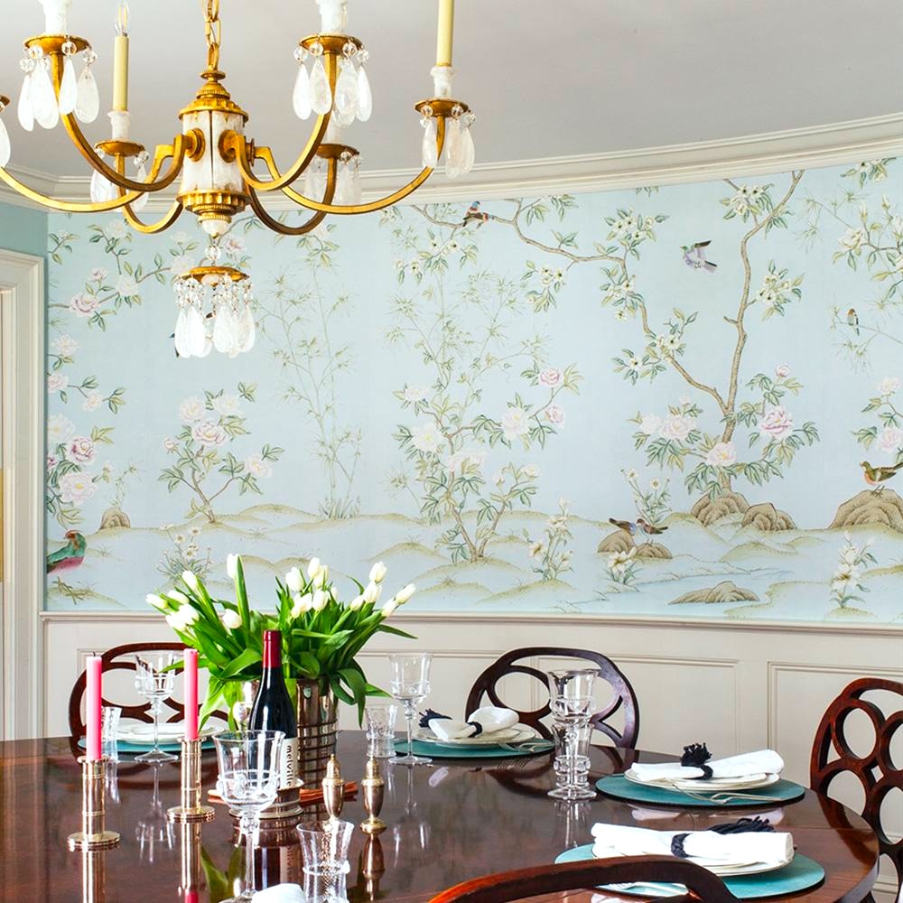
It looks like this, and below in this lovely dining room.
Paul is a superb colorist. No one is finer at putting together combinations of stunning color schemes.
However, I’m not a purple person. I wouldn’t mind a little if it were a more muted purple, but this is too much. Plus, I would prefer the background to have more gray-green in it. That is possible. They can manipulate the background to a certain extent. I don’t know about any of the other colors.
In addition, though this is one of their loveliest patterns, it doesn’t have the tea paper effect I adore.
However, murals do.
One is Maysong, and my favorite is Maysong Spring.
I’ve featured it several times on the blog.
I got a sample of this a few weeks ago.
Yes, it’s stunning!
However, it’s one of their top sellers, and while I love it, I don’t want quite that much color for the bedroom mural.
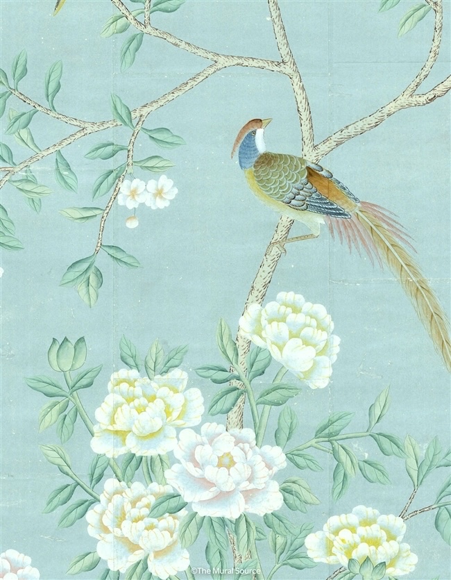
But, there’s one more mural.
Belva has the tea paper effect and a lovely design. It also comes in three colorways.
This is a lovely piece, but the colors are too clear for me. I would do this for a client who wants a more pure blue.
Okay, I’ve scrolled through the Mural Source’s Insta several times.
One day I found Belva. Years ago they were making screens and antiqued the wallpaper; in this case, they used Belva.

I manipulated this one to look more like the colors I’d like. However, I adore the antiquing they did here.
The only thing is, I don’t want to impose on them to do this extra work. They are kind enough to give me a freebie, and that’s enough.
Still, that didn’t stop me from spending hours making renderings of the proposed bedroom mural.
That was on the 18th.
Today is the 19th.
So, let’s take a look at what I created.
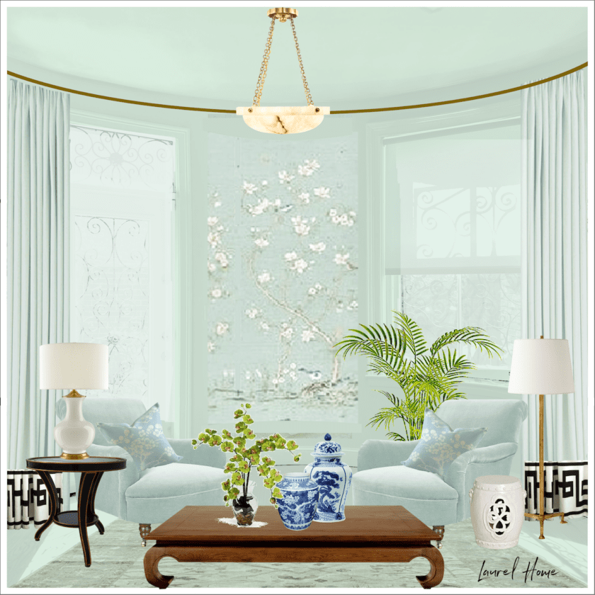
Yes, I know it looks like a living room. But here’s the thing: This mural isn’t just here. It would be on all four walls.
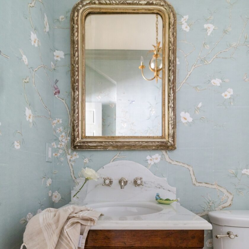
I found some other images of this mural and both were bathrooms.
This is such a pretty paper. However, if there’s such a thing, it might be a little too pretty.
Above is Imperial Garden Mist.
This is also a manipulated color. It’s lovely but not quite right. It looks better with Paul’s colors.
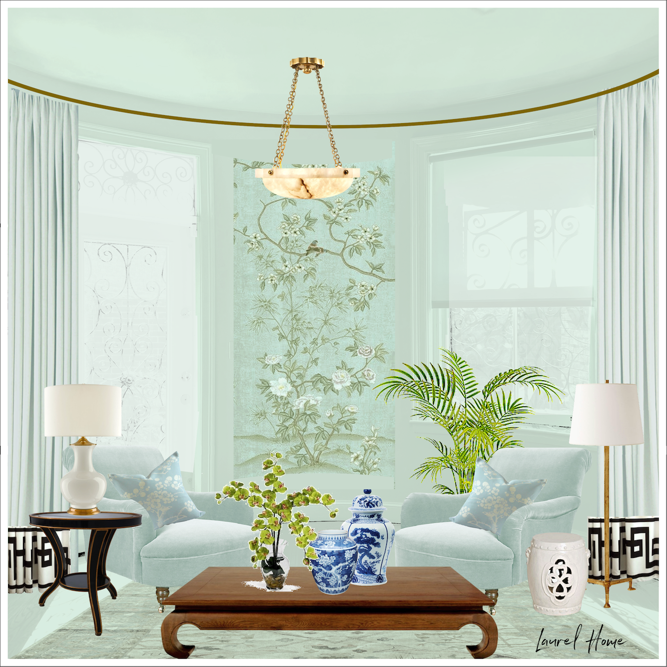
Okay, one more bedroom mural possibility.
That’s kind of stunning. It’s the Belva, with toned-down colors and antiquing.
Hower, I’m chicken to ask them to do this. I could antique the paper, but this is an intense desaturation of all of the colors. Therefore, unless they’d like to add something to their line (and no, I have no aspirations to have a collection), it would be imposing.
Today, I went downstairs to see a new paint color from the Williamsburg Collection in the overly bright bathroom.

It’s a very muted medium gray blue with some green in it, but not as much as the night train.

I didn’t realize this until I googled it later, but this is a famous paint color!
The fantastic Heather Chadduck used it in her living room at the historic Nelson Galt House, the centerpiece of Williamsburg. She did the sickest renovation, which you can see in this glorious video made by Quintessence. I swiped this off Heather’s Instagram and color-corrected it as it looks quite purple on her page, and I know Heather did not do a purple rug.
 See what I mean? Below is the wall color
And see how awesome it looks with the Plantasia?
The only problem is that Apollo Blue doesn’t look great with the Fenimore. It’s not the color; it’s the depth.
It’s like there’s this hunky “wait til you see the bathroom” on one end of the embrasure hall.
And by comparison, on the other end of the hall is the nursery.

Younger than springtime, am I…
Sorry. ;] ;] ;] That is the strangest-looking baby Picmonkey ever created.
Well, they always said I’d grow into my face– eventually.
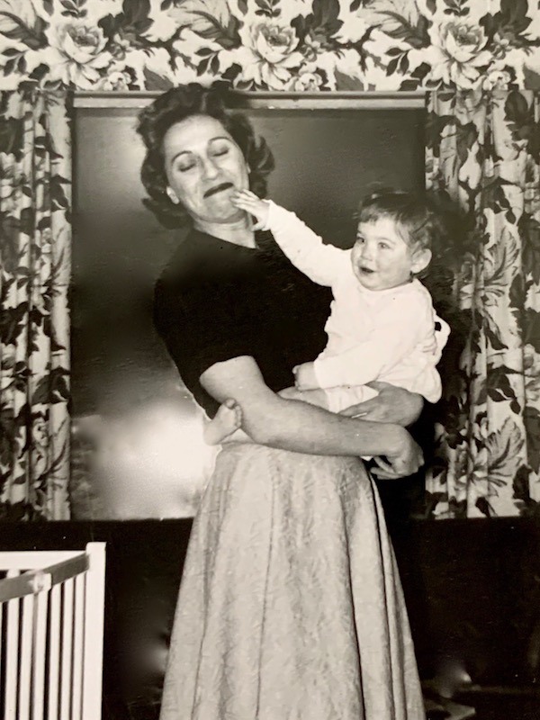
The real baby me, with my darling Mommy, summer of 1957, Chicago, IL.
I’m not saying that the Fenimore paper is babyish, even though every nursery on this side of the Atlantic has one of these murals adorning the walls over the crib.
What I’m saying is that it’s not quite right, although I do love it. I ordered a sample, so it’s possible I might change my mind.
I’m sold on everything else, just not the Fenimore mural.
No, I need something not quite as sweet that can hold its own against the deeper colors in the entry and bathroom. Yet, still look appropriate for a bedroom. I’d like to keep the hall creamy white. So, that means a healthy dose of white in the wallpaper would be great.
Laurel, this sounds too complicated. Do you have to do a bedroom mural?
Everything’s complicated and no, I don’t have to do anything, but I do have to do a mural in the bedroom. ;] I mean, the panorama is right there in the natural bay. It’s begggggggggging for a mural!
Alas, I took yet another stab at it, thinking about the Apollo Blue and the Plantasia, and then the right mural for the bedroom jumped out at me. Well, two of them did, but one of them has the edge. However, you’ll have to wait to see which one because it’s way past my bedtime of 8:00 PM, so I need to grab my bottle and blanky and lay me down to sleep.
By the way, the design for the railing is 100% complete. Jerry Kenneally has been awesome to work with. I think it will be ready in a few weeks.
xo,

***Please check out the recently updated HOT SALES!
There is now an Amazon link on my home page and below. Thank you for the suggestion!
Please note that I have decided not to create a membership site. However, this website is very expensive to run. To provide this content, I rely on you, the kind readers of my blog, to use my affiliate links whenever possible for items you need and want. There is no extra charge to you. The vendor you’re purchasing from pays me a small commission.

To facilitate this, some readers have asked me to put
A link to Amazon.com is on my home page.
Please click the link before items go into your shopping cart. Some people save their purchases in their “save for later folder.” Then, if you remember, please come back and click my Amazon link, and then you’re free to place your orders. While most vendor links have a cookie that lasts a while, Amazon’s cookies only last up to 24 hours.
Thank you so much!
I very much appreciate your help and support!
Related Posts
 The Frieze – One of Architecture’s Hottest Elements
 The Ten Best Laurel Home Blog Posts in 2022
 The Beacon Hill Hidden Garden Tour 2022
 Farrow & Ball Colors 2022 + BM Matching + Review
 Our Ugly Brick Fireplace – He Vetoes Painting It!
 Furlow Gatewood, A Creative Genius For The Ages
 The Dark Wood Trim – Ack! Husband Insists It Stays!


35 Responses
Hi there,
I love your blog and really enjoy reading your weekly updates about your beautiful home. I very much like your style and attention to detail.
I am currently looking for a chinoiserie style wallpaper and love the olive green and cream one in this article shown on the mood board above with Fenimore sky. I have looked high and low for it but am coming up blank. Are you able to shed any light?
Many thanks.
I love the color-manipulated mural in what appears to be a livingroom, but is not. What I love most though are the Greek Key Motif curtains. I couldn’t recall the name but remembered you wrote about it on your blog. Thank you, Laurel, for all of your sharing. I’ve learned so much exquisiteness from you, including jute and seagrass, which I plan to put in my galley kitchen. I’ll add the Greek Key Motif to my drapes in the livingroom. I like the large size and spaciousness. Have not decided on the color: black or terra cotta. Who knew that today I would make the most awesome decision about my curtains? Thanks again and best wishes on your mural!
Hi Gwen,
The pattern is in this post about how to make budget window treatments look expensive.
I love the curtain wallpaper duo in the photography with you and your mom. Do you have any memory of the colors?
Hi Karen,
No. We moved when I was still a baby.
P.S. – My opinion: you don’t need the mural to have white in its background. Just have them print the regular mural colors lighter, possibly. But there’s no need for white. This is because your furniture, millwork, and even your surrounding bedroom walls, if necessary, can provide the white color that will visually connect this room to your adjacent white hallway. I hope this thought helps as well.
Dear Laurel,
Let me see if I understand you.
You want a mural that’s a bit less “precious” looking than the ones you saw featured in nurseries.
You want a mural with muted tones. This is to coordinate with the tones in your bathroom. And it’s also because you yourself prefer muted tones.
You would “soften” the colors in your mural, with antiquing, if you could.
How’m I doing so far?
If I understand you correctly, then I believe the “Belva” mural with toned-down colors is your best choice for your bedroom. Here’s why:
It’s less “precious” than the Fenimore mural. The reason? Belva has a bit more detail/complexity in its design. Designs with less complexity remind us a bit more of watercolor images in children’s books, possibly. Though “Where the Wild Things Are” breaks that rule immediately! Nonetheless, Belva is more like nature itself – complicated. So it mimics both your bathroom mural and nature itself by providing that complexity. In other words, it’s more realistic, less abstracted than the other designs.
Belva would work well “toned down” to more muted colors, as your final mockup suggests. I think that mockup is the best proposed design for this room. Softening Belva slightly would also accomplish one more aim: see next point.
Belva “works” with this room because you have something else in the room that’s competing with your overall design. And that’s the ironwork on your door and transom window. It’s dark. It’s pronounced. I see that you softened it somehow in your final three mockups. I’m not sure how you did that. But point is, even with the ironwork softened, somehow, the ironwork will still compete with your mural for attention. Belva helps this situation because it’s not as detailed, as complicated as Imperial Gardens. There’s a lot of open space in the Belva design, still. That helps it balance the ironwork nearby, visually. I believe this is also why you liked the possibility of the Architectural Digest-featured mural originally. That is, that mural had a lot of open space in the design, rendering it softer, less likely to compete with the ironwork nearby – more apt to complement that ironwork.
Imperial Gardens doesn’t have that
advantage . It competes with the
ironwork a bit. And Fenimore may have
this same advantage. But Fenimore
renders “less sophisticated” to the eye,
because as I said, it has less detail and
complexity in its design. So that’s why
Belva’s your best choice for this room’s
features and design.
Finally, as for the thought some others wrote that you should only have one mural in your modestly-sized home, I disagree with them, agree with you. Here’s why:
You’re right: the mural in your bathroom is small. All it does is create a small feature in a nook. Therefore, it doesn’t take the air out of your remaining mural design. It’s an hors d’oeuvres, not the main course in your design.
Upstairs mural:same, although, this is the more filling of the two hors d’oeuvres! Upstairs mural looks perfect next to your kitchen, btw. – just perfect.
My mom always told me that the primary bedroom in a home isn’t one the general public is even supposed to see/visit. And if you think about it, that’s mostly true. So what you do with that space really only has to please you. It should be your personal sanctuary. Do whatever accomplishes that with your design!
Even if your bedroom were available for viewing, to casual observers, you have plenty of space separating this design from the other, smaller murals. So there’s no way the bedroom mural will overwhelm your total design.
I believe most folks who think it would overwhelm things are thinking in terms of all the older houses they’ve seen where each successive room is wall-to-wall wallpaper. And yes, that starts to appear heavy. But that’s not what you have going on in your overall design. Rest assured, even with a mural covering your every wall in your bedroom, because it’s balanced as “meal” vs. “two hors d’oeuvres,” it will work as one total design.
I hope this helps you. I really like your final three mockups of your bedroom space. But I love the last mockup you showed, of Belva, especially. I think if you rendered things exactly as you indicated, it’s going to be a gorgeous design. I hope you get to do this!
Susan (Dr. Suse)
Hi Susan,
Thank you for this detailed comment. The iron scrollwork is going bye bye. Maybe not today, maybe not tomorrow, but soon and forever more!
Laurel, Your entire apartment/ home isn’t all that large. One stunning mural is plenty. Don’t ruin your hard work by just too many exquisite details. The eye won’t know where to look. A word to the wise…….
Charles
Thanks for your concern Charles, however, restraint is my middle name. There is only one mural upstairs in the tiny entry and only a small portion of it can be seen from the living room and from no other place in the apartment.
Downstairs the Plantasia wallpaper is only for the bathroom WC niche and can only be seen once in the bathroom. It will be a lovely accent I know I will enjoy a lot. I am no longer doing a mural in the entry. The main mural will be in panels, in the bedroom, and is a very simple design. Only a tiny bit will be seen from outside the bedroom and only if standing in the right spot. None can be seen from the other.
However, my final choice for the bedroom is what pulls it all together.
I have to say that I like that last Plantasia mural the best. I prefer muddier tones in color because they are a lovely background for everything. I would take the mural to the paint store and have them match the second to the darkest tone from the mural in the leaves for your trim.
I am not very fond of the lighter blue bedroom mural though I really like DeGournay types of murals in small doses. I honestly think it would get boring after a while. Maybe use it smaller framed panels.
Plantasia is a little too dramatic for the whole bedroom.
Hi Betty the Plantasia is for the bathroom WC niche, not the bedroom. It doesn’t work in big doses because of the repeat unless there are other things in front of it hiding the fact that it’s not really a mural.
Ok, so I’m the odd one out so far, but I like the antiqued Belva with Plantesia…but I’d switch them. I like a moody bedroom, and a bright bathroom. First, bc the bedroom is really light with the windows, vs. the bathroom is really dark. And I like dark powder rooms, but not master bathrooms. I just wonder if flipping the murals would make more sense in the space (but of course, I’m looking at the very white bedroom images and feeling lost in the space, which isn’t reality). I just wonder if the star of the show, with the current bedroom mural choices, would be overshadowed by the incredible brightness from the windows. And I’m having a hard time figuring out what to look at with all the light. It’s like looking at a triptych where my focus is being drawn away from the center, rather than focused on the center.
Just my thoughts. I like all the murals! But I like Belva & Plantesia best together.
How fun to be so much closer to the finishing touches!
I feel because the bathroom is windowless is a wonderful opportunity for doing a moody bathroom. It’s not a place I spend a lot of time in and by primary bathroom standards, it’s tiny.
My choice would be Fenimore Putty rather than Sky which I think would over time become a little blah for me despite how much I love the design. We are similar in age and I find myself gravitating away from confected prettiness and towards a point of difference where black or gold/bronze highlights provide unexpected but grounded points of interest and especially if there’s a lot of the bluey/green elsewhere in the property. Sorry to be a contrary! It will be beautiful whatever you decide xoxo
I like Linda’s idea of working it out with Paul Montgomery. Get what you really want, and if it causes more work, then maybe just pay for that? Not having gone through anything like this process, I can’t even imagine what it must be like to have to make SO MANY decisions and experiencing “decision fatigue!” I do love that you asked us to give our opinions :] I’m excited to see what you show us in the next blog post!
My head is spinning with your murals. At last count there are … three? Won’t they dilute one another’s effect? All are lovely. But isn’t one enough?
lol, No, one isn’t enough. Please see my response to Charles.
Laurel,
Totally agree about it feeling too nursery-like. I think a deeper darker background color will help remedy that and give it enough visual heft to stand up to the Plantasia. I know you have a relationship with Paul already, but go to Etsy and put “G-005 Grand View Garden for Chinoiserie Handpainting on Blue Gray Slub Silk DP-26” in the search box (I believe you discourage adding hyperlinks in the comments). This seller is happy to do custom colors. You can get a good dose of the cream you want and the Harbor Blue. And while I agree with Birdie that too much of one thing makes all of them feel less special, I think that a Chinoiserie panel is different enough from the scenic murals to work, as I’m sure you already know. Can’t wait to see the new railing design!
Many years a fan of your humour, opinions and knowledge.
Too much of a good thing?
One mural per home keeps the use of the decorating item unique.
On a baby, the eyes start 50% down from the top of the head. If you reduce the size of the face, and start the eyes about where the ears are, you’ll get a more normal-looking baby. Anyway, what about YR Mural? They have such lovely things, and are the “actual” artisans who make DeGournay, methinks. They did mention it once, but DeGournay made them take it down. Half the price of DeGournay, which still isn’t cheap, but a good buy.
ol. That’s very funny, Cynthia. I believe it’s the same 50% rule for adults if I remember correctly from drawing class. Yes, we had to draw people as well as interiors.
Re: YR Mural. I’ve seen them for many years. I don’t know if it’s the same people or not. Maybe they once worked for De Gournay under another’s supervision. However, they do use De Gournay’s as well as The Mural Source (Paul Montgomery’s) images. How they get away with that, I have no idea. They even credit de Gournay with Montgomery’s work. Bizarre. They need to put up their own images from their own installations. The fact they are missing leads me to believe they’re not as good.
In addition, I just found this forum on houzz by doing a search. https://www.houzz.com/discussions/1001193/where-to-find-cheaper-chinoiserie-wallpaper-murals
Based on what people said, as well as the images some posted, I would not go with YR Mural. I can see that the detail is missing and there are sometimes scale issues. The lead times are painfully long and the finished product sometimes doesn’t match the sample. That would drive me bonkers.
Laurel, I am with Evelyn who I quote “much prefer(s) the depth and tones of the Plantesia mural”. The others are pretty and very sweet – and maybe as you said “too sweet”. I think you nailed it when you suggested it gave off a nursery vibe. What did look more in line with your design style was the screen where you manipulated the colors to look aged – antiqued and elegant. Anyway, that is my opinion. I am sure you will work this out and we will all be going “Yes! perfect” when you post. P.S. Wonderful news about the railing 🎉 am dying to see your post on it.
I like ones done all in sepia tones, sorry.
Hi Susie,
Why are you apologizing? The sepia murals are lovely!
Laurel, That baby photo was just SCAREY!!!!
Hi Kristin. Indeed it is! I just posted the real baby me in 1957.
I think it would be easier to make your decision once everything else is done & in place. It’s so hard to visualize everything at once and how it will work together.
Do you need to make a decision right away? Can you decide later, after everything else has been installed? And you’ve lived with it all for a bit?
Trying to make all of these design decisions would give anyone decision fatigue. Waiting will give you a clearer head.
First of all, a mural, like art, is a personal choice. You have to go with what you love. It sounds to me like what you really love is the antiqued version of Belva. The reason why you aren’t choosing Belva is because of the added expense. – or effort – to have Belva antiqued. My best suggestion is to contact the supplier, explain your dilemma, and ask about the antiquing. If you can come up with a workable solution, then I think you will have your decision made. If not, at least you have a better understanding of what your options are.
GM Laurel custom is the way to go.
Have you considered having an artist custom paint your mural. That’s what I did and I love the results. Also, I didn’t want something that everyone else had. He was able to adjust the color and add special features that personalized it for our bedroom. I would love to send you pics if you’re interested.
My 2 cents worth, I much prefer the depth and tones of the Plantesia mural, the lighter ones are pretty but remind me too much of a nursery. I like the sophistication of the deeper tones which remind me of how you plan a room
Hello Laurel, love your blog!
My suggestion would be to stay with your first choice of BR mural, and then bring in more of the darker shades (from Apollo Blue & Plantasia) into the room via other decor & accessories for balance. An alternative might be to find a (different?) right-depth (med-dark) paint color that works well with the BR mural, and allow Plantasia BA to stand alone — perhaps adding 1-2 decor pieces in lighter-depth shades (white, ivory, cream?) for balance with BR.
Hi Laurel,
My favorite is Fenimore – Sky.
Second favorite is Imperial – Garden Mist
Sky has the right feel for a bedroom. Once up you will adore it. Right colors and right mood.
Best of luck.
Warmest regards,
Michelle Eaton
Eaton Interiors
Stark looking murals with so much light not what l could sleep with preferring the superb muted tones comparsion of Plantesia