The Laurel Home Essential Paint Color Collection Is Here!

Page updated November 30, 2022


Hi Everyone,

Below is what I wrote in May 2016, when I released this paint collection of 144 beautiful and essential Benjamin Moore Colors.

Oh Man. I bet some of you thought I was just messin’ with your head.

She ain’t ever going to come up with that paint collection.

But I said I was and unless there’s a God forbid natural disaster, it’s going to happen. It’s just that I really pulled out the stops here and it took me HUNDREDS of hours to put this together. This has become more like a paint-color Bible!

And let me tell you that I’m absolutely bursting with pride over this one and can’t wait to tell you what it’s all about.
 

Screen Shot 2016-05-18 at 12.20.57 AM


paint-collection


Please note that the Part I the paint collection is sold with the paint palette collection that was released six months after Part I .


Here’s why I created this paint collection.


Over the last couple of years, I’ve received hundreds and I mean hundreds of inquiries about paint colors. I get it. They drive you nuts. And I know why too.

Then, when you finally figure out the wall color (hopefully, it’ll be okay) there’s the damned TRIM!

WHAT COLOR DO I PAINT THAT???

ARRRRGGGHHH!

That is how the idea of the Laurel Home Essential Paint Color Collection was born.


What if I could come up with a few dozen wonderful Benjamin Moore Paint Colors, along with the trim colors and give people a hand here. I can’t possibly help everyone but this is the best way to help as many people as possible.

As I was selecting the colors, the Paint Collection grew into something far greater than just a list of colors. Lots of people do that and it’s certainly nice, but it’s not really answering some of the questions so many of you have.

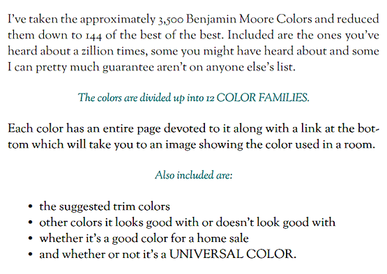
This collection is now a 250 page PDF guide that is crammed with information you can’t get anywhere else.


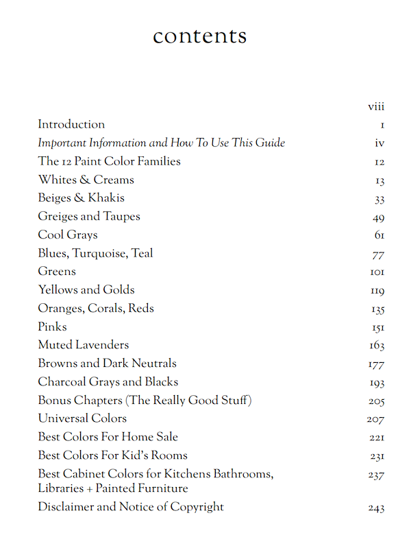
HERE’S WHAT’S INSIDE

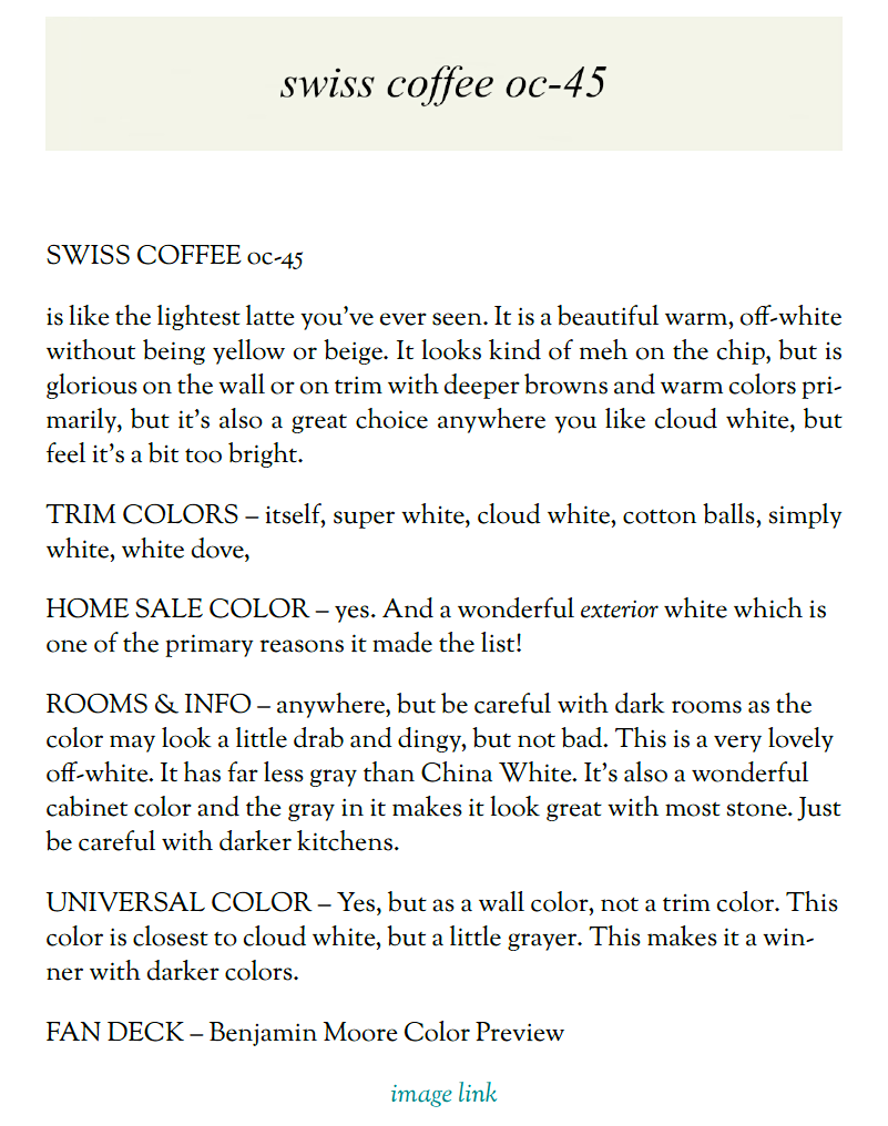
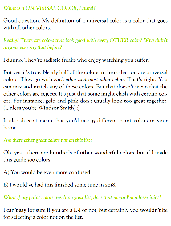
Screen Shot 2016-05-17 at 11.40.51 PMMORE DETAILS (note these are screenshots from the guides)
Screen Shot 2016-05-18 at 11.29.57 AM

Screen Shot 2016-05-18 at 11.40.20 AMmore info

Each color family has from 9-21 colors, so it’s very balanced. Below are the colors, without the names, of course. The actual colors/numbers are inside the guide along with the fan deck they come from.

*NOTE*  The graphic below is designed to be a pinterest pin, so please feel free to share! If you scroll down, you’ll find the white hover P which will take you to your pinterest page.

LH Curated Paint Collection


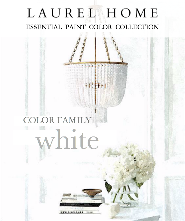
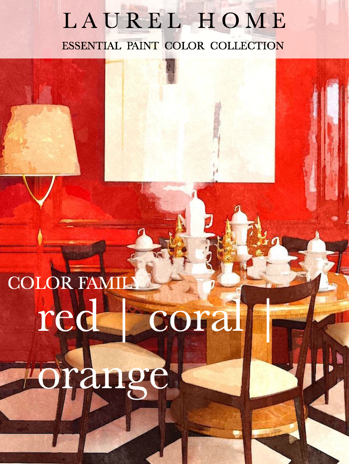
Each of the 12 color families has an image to lead it off. Here are three of them.


white on white  

There is a 5-page preamble discussing white paint colors that I think is going to be very helpful. While there are 12 whites in the collection, I am going to tell you the only FOUR white trim colors you’ll ever need for any situation if 12 feels too daunting. At least one of those four trim colors will be a choice for each color.
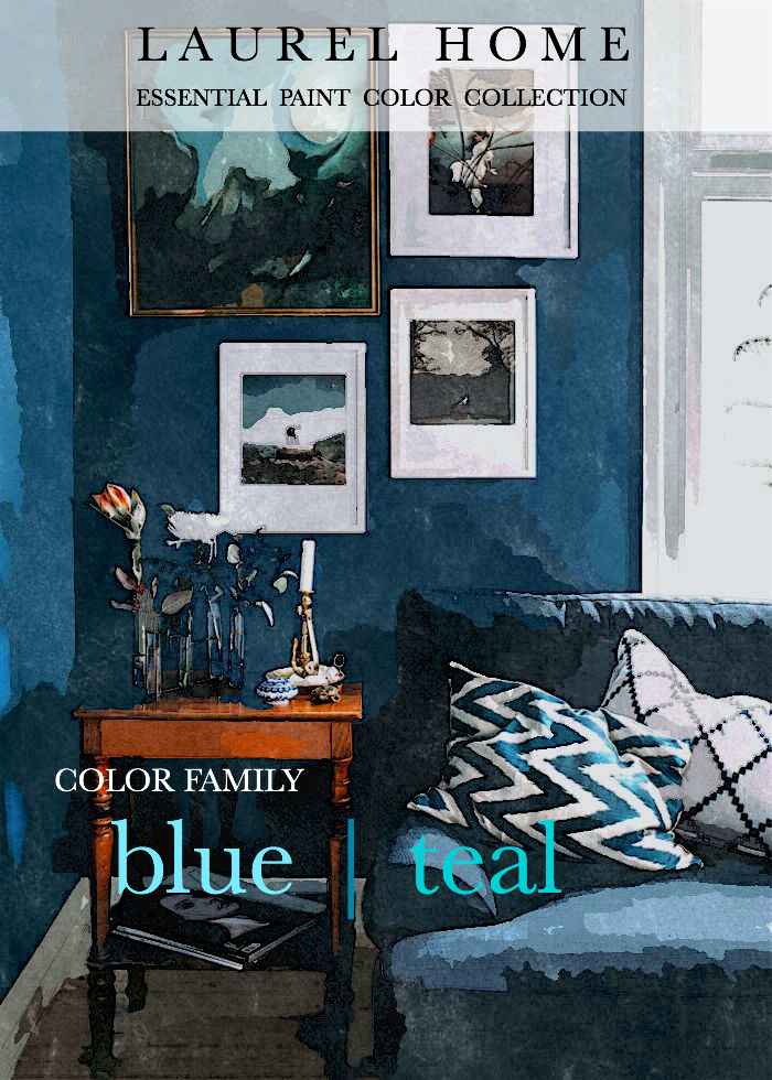
 

blue teal

red coral orange

Pretty, huh? Well, I like how they came out.

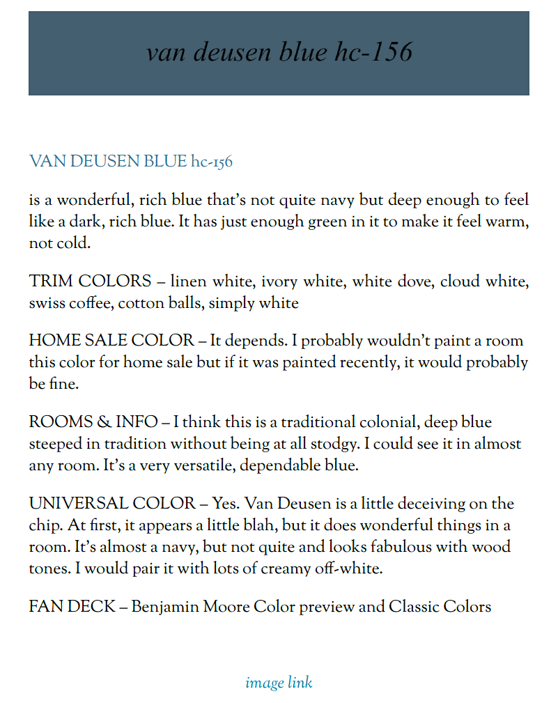
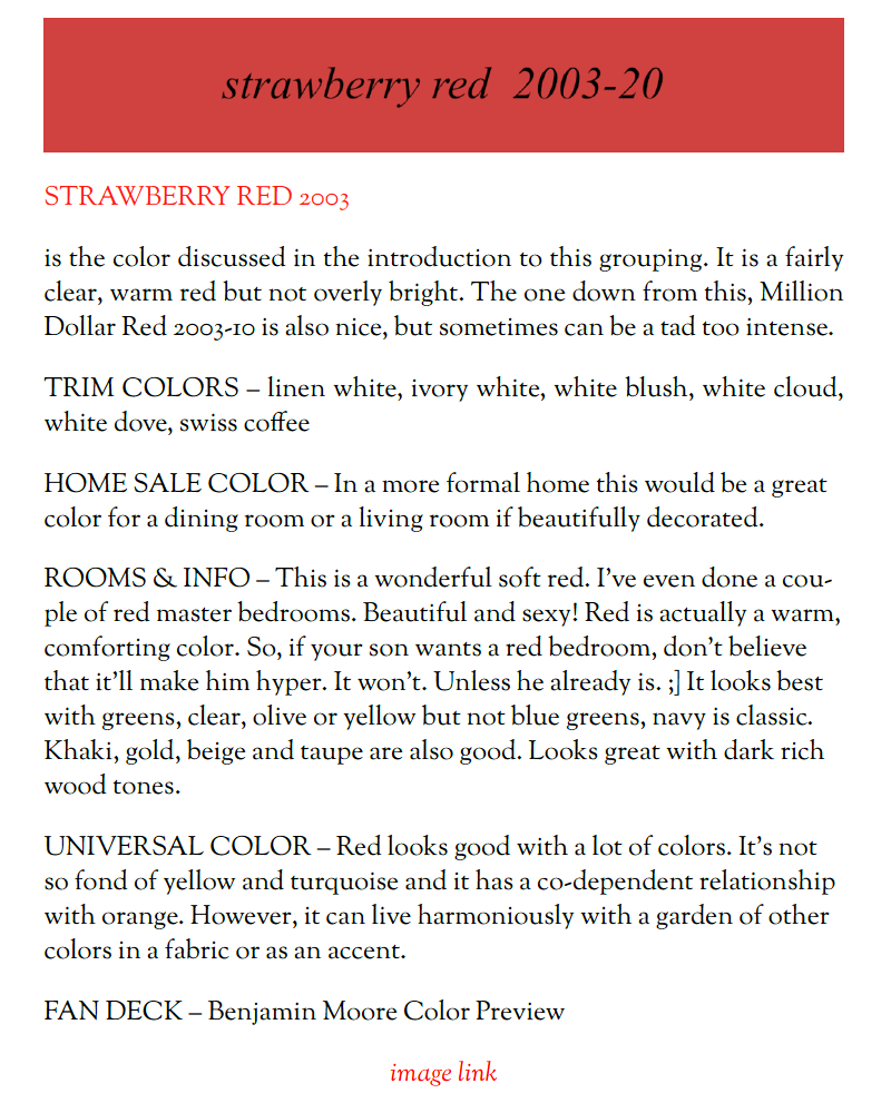
Each color gets a full page with a link to an image showing the color in a room setting.


Here, let me show you a few screenshots so you can see exactly what I’m talking about.

(note: the image links won’t work here because these are screenshots, not the actual page)

Screen Shot 2016-05-17 at 11.42.59 PM

Screen Shot 2016-05-17 at 11.44.32 PM  

Screen Shot 2016-05-17 at 11.46.16 PM  

BUT THERE’S MORE!


Behind the paint color pages are FOUR BONUS CHAPTERS!


  • A listing of the Universal Colors with graphics for easy reference
  • The best colors that will appeal to home buyers with graphics
  • A listing of great cabinet, built-in and furniture colors
  • The best colors for kids’ rooms

Now, maybe you can see why this took me nearly a year to put together!


This product is sold only in conjunction with its sister product, the Laurel Home Ultimate Paint Palette and Home Furnishings Collection.

 

paint-color-palettes


To find out more about, Part II, The Laurel Home Ultimate Paint Palette & Home Furnishings Collection click HERE.

(You’ll also find all of the wonderful testimonials in part II)


paint-collection


The price is at an amazing deal for nearly 500 pages of wonderful colors, palettes, furniture, advice… on and on…


paint-collection

***You do not need to have a Pay Pal Account in order to purchase. There is an option to use your credit card.***


To purchase now, please click the button below.


paint-collection


Many thanks,

PS: Please also check out the many new bundles on the Purchase Products Page. You’ll find a lot of additional ways to save!

51 Responses

  1. Hello! I just joined this blog. Has been so helpful! I am from Birmingham Alabama and I am struggling with a kitchen cabinet color! My home is very English (not white./modern). My kitchen is open to my den which is painted Putnam Ivory. My den gets great light so the color is good..however, my kitchen does not get good light and is dark because I have a Florida room off the back. Anyway, I want a classic cream that is not yellow! I tried 1/4th of Putnam and it looks yellow due to lighting. I just tried Floral White as a sample and I am debating. Any suggestion..I do not want yellow or white/white. My den is warm with dark green mohair chairs, antelope rug… probably going with Quartzite on the countertops in Sea pearl. Thank you in advance!

    1. Hi Jennifer,

      I see that you are struggling with your colors which is exactly why I wrote this nearly 500 page guide.

      The page you are commenting on is only Part I. There is a link to part II near the bottom of the page, or in the side bar or the link, more help for your home if you’re looking on a desktop, laptop or tablet. There’s a link in the menu on mobile, as well.

      Part II are 40 palettes with room boards showing the colors, palette families, furniture, sources… on and on…

      It’s almost like having me in your home. Actually better because there is no way that I could convey all of this info in 100 hours of being in your home!

      I am not doing paint consults any longer but if I were, the absolute minimum even for one paint color, for me to come and assist is $500.

  2. Laurel!
    You had me “cracking up” when sharing your article on trim colors. It was like you were inside my head. I have a design degree, teach art and know the importance of choosing the right trim color. In trying to keep life simple, minimize the stash of paint cans, I have made three trips to the store for trim color. ( my loving spouse tossed the empty paint can of trim ). And…. everyone, family, thinks I’m crazy!
    Thank you for simplifying life and having fun with design choices.
    Joan

    1. Hi Joan,

      Only three trips? That’s nothing! The first time I painted over 20 years ago, I must’ve had at least a dozen shades of white and at least that many trips to the paint store!

  3. Dear Laurel,
    Thank you soooo much for all of your articles and I always learn something new.
    This weekend we painted our bedroom Newburg green! I used your paint palette guide to help me decide. And did not overthink it. It’s gorgeous. And my very conservative, afraid of dark colors husband absolutely loves it too.
    You are priceless:)
    Terry

  4. Please, please, consider publishing a book (hardcover, of course). Your knowledge and design talents need to be shared in a more permanent medium than PDF. So glad I found you! Nancy

  5. Okay so I’m confused – your website says if you sign up for the newsletter you get the the PDF on paint colours free but then you sign up and then you’re charging for it?

    1. Hi Andrea,

      They are two separate things. One is a guide that explains how to choose paint colors.

      The other that is not free is a curated paint collection of 144 colors that took me a year to put together.

      Hope that cleared that up.

  6. Laurel, Thanks for your hard work in compiling this very helpful guide. I am one of those people who, when confronted with a huge paint deck, goes down every bunny trail (and hole) and becomes paralyzed. I ordered your guide for the sheer relief of having “essentials” 🙂 After agonizing for longer than I care to admit over colors for a secondary family room and our master bedroom–I have now purchased two of the colors you recommended. A pale blue for the Master and light green for the Family Room. Fingers crossed! Thanks again!

    1. Hi Susan,

      PLEASE TEST before painting!!! (there’s a link in the guide near the begining for that too) Please, please, please!

      As I say in the beginning of the guide, the colors are meant as a starting point, not an edict from the Queen. :]

      I don’t want anyone crossing fingers and hoping for the best. I want them to feel confident in their choices!

      Most likely, it’ll be fine, but it’s better to be 100% sure, IMO.

      1. Hi Laurel, Master bedroom & family room are now painted using two of your recommended paint colors and we’re super happy with the outcome! (I understand the value of test pots/painting but also know I can get stuck in that mode.) I had already determined the basic direction of color choice–your guide was the affirmation/help I needed to choose & move forward! Btw, I had one unexpected outcome that I don’t think testing could not have prevented. We had a large painting over our bed that looked fine with test paint, but once the entire room was painted a “clean” blue, looked “dirty”. We moved that painting to the family room, now light green, and it’s perfect. Fingers uncrossed 🙂

        1. Hi Susan,

          Paint colors are so light dependent and yes, even with testing surprises can happen but maybe not as much. And yes, when one tests and sees dirty on one wall and clean on another that can create confusion. Which one is it?

          Well, in that room in THAT particular lighting situation, it’s both! This is the primary reason why I don’t get overly hung up with undertones because they can change–with the light and quite dramatically too! Great you found a happy home for your painting!

  7. I just downloaded your Laurel Home Essential Paint Color Collection and I really love it! I was one of those people agonizing over which white to paint my kitchen cabinets after I emptied my kitchen, tried White Dove as top coat #1 and found it to be too stark for my kitchen. Maybe I don’t even want white cabinets?

    When, oh when will you have your color palette guide ready for us?

    Thank you!

    1. Hi Marge,

      I am planning on having that for September. In the meantime, if you want a creamier white, try Ivory White or Swiss Coffee. Or even Linen White.

      I am also working on a kitchen and bath guide.

      1. Thank you, Laurel. You’ve hit upon a winning formula that is both useful and fun. I look forward to your next publication.

  8. Laurel, THANK YOU for the work you put into this guide for us! It is so worth the purchase.

    Maybe you’ve answered this question elsewhere on your blog, but I can’t seem to find it:

    What is your advice on varying tints/shades from room to room? For example, if I choose Marilyn’s Dress 2125-60 for my family room, can I go with Stormy Monday 2112-50 for the adjacent living? Or should I stick with the hue on the same strip but at the same tint level as Marilyn’s Dress, which would be Cement Gray 2112-60? Years ago I heard someone say you should stay on the same tint or shade “level” (40, 50, 60, 70, etc.) from room to room.

    What do you say?

    Laurel, you are just fantastic. I have learned so much from you. Thank you!

    1. Hi Rebecca,

      Thank you so much. You could possibly do either of those choices.

      But here’s the deal. You can paint the entire home one color. Now stand in your living room and look out into the hall and then the next room.

      Well, you probably don’t have this situation, but if you did, you would see that in each room, the color looks different. Whoa!

      Once I painted my kitchen a pratt and lambert color called sesame seed and then my den was very close to BM 521 which is a greener color.

      But from my living room, the two perpendicular walls between the two rooms looked the same.

      I have seen situations where two walls next to each other are the same color only one looks so different from the other that it looks like a mistake!

      It’s the lighting. It’s the most important factor.

      And finally. You are never going to stand there just staring at your wall color. Not after the first month. So, happy painting. :] Go with your instincts. Do your testing and it should all work out fine.

  9. Laurel, this book looks amazing! I found your site after having paralysis over paint schemes for our new home (that is stuck in a 1978 time warp and needs color so badly!).

    My question for you is if the basic color principles and swatches in this book can translate to other brands of paint? My husband cannot be convinced to shell out for Benjamin Moore but my dilemma is more based in basic shade/color family coordination than some magical, perfect can of paint, anyway. Would your book still be a helpful purchase to me knowing my husband is probably going to insist on Behr instead and I’ll need to coordinate what I see in your book to the shades that brand offers instead? Or is it really very brand specific in principle and advice?

    We are on a budget but seeing how amazing your free advice is, I’d really like to buy some of your paid resources if they’d be at all useful to me. I just cannot swing Benjamin Moore on our home reno budget. What say you on the applicability outside of that brand?

    1. Hi Taryl,

      Absolutely! I think it would be very helpful. The collection is not meant to be the end of all of everything. It certainly can be, but as I say in the introduction, a color that’s one up or one down on the strip of paint chips might be better for your unique situation.

      Most of the colors are in the two big BM fandecks, so it’ll be easier when comparing paint chips if you acquire those from BM.

      In addition, I think that Behr can probably approximate the BM colors. I’m not 100% sure about that.

      But the other really cool thing is that there are the best trim colors for every color, so that becomes like a Rosetta Stone for figuring out trim colors for every other color, even if it’s not in the collection.

      Plus there’s lots of other advice and then the 66 Universal colors which all go with each other.

  10. Hi,

    I wanted to know if your color collection has complimentary colors for shaker beige (other than Lenox tan)?

  11. Terrific! I have read it 3 times in 2 days. One question: I noticed Nimbus Gray in the colors for kids rooms, but don’t see it elsewhere. Maybe I am missing it. Also, I am eagerly awaiting the next 2 parts.We had a washing machine malfunction and are now going to repaint and replace the floor on our mail level. Thank Heavens I now have this. I Love It!!

    1. Hi Merridy,

      Oh blimey! Well, I think I know what happened. Nimbus Gray was on the short, short, short list. In fact, so short that I made the graphic for it but forgot to delete it from the folder where I kept each grouping of colors located. I took the colors from the individual folders and forgot that one bit the dust. Eternity is another one. It’s in the universal colors but nowhere else. The blues and the blue grays were the toughest categories because there are so many terrific ones! Those two not in the main collection aren’t bad colors, but were redundant, most likely.

  12. I can’t seem to get the discount.
    Do I need a promo code? I have looked high and low for one in your emails and on your posts–to no avail.
    This is very confusing. For rolodex and paint guide cost should be $208 (right?), but it says $223.
    Please help. I’d like to get this done by the deadline.
    Thanks!

  13. I would like to order your Essential Paint Color Collection but have some concerns. We have a simple, single story ranch home, without much architectural interest and only eight foot ceilings. We like warm colors and since our home is not flooded with good lighting from outside, we prefer lighter or light reflecting colors. My monitor may not be displaying the colors properly but there seems to be a lot of gray, greige, dark blues, dark reds and other dark colors that we neither like or would consider using, even though we have tried to be open to it. In the last few years we purchased two bedrooms and living room furniture in Stickley Mission Oak, Onondaga 32, although we don’t have a nice little Craftsman home. Some greens look very good with the furniture and we have painted both bedrooms in a green color. Could I expect to find light warm colors for the rest of my home with your collection?
    Thanks,
    Faye

    1. Hi Faye,

      Yes, there are a lot of warm colors. There are 12 shades of yellow, cream and gold and also some creams in the white section. There are also some very interesting greens, many with a yellow base and some light ones too. And there are several khaki beiges, with warm-greenish undertones and some of them are also light or medium-light.

      It’s true that the colors don’t always reflect well on computer screens, but I think that you’d have more than enough to work with that would be to your liking.

  14. Hi Laurel,
    I’d love to purchase and read your colour guide, it is exactly what I’m looking for… Only thing is, I live in the UK and BM paint is only recently available, outrageously expensive, and usually not sold as tester pots. Farrow and Ball, Little Greene, and Paint and Paper Library are the general preferred paints for higher end refurbs.
    Do you think this guide would still be of value to me?
    Jenna

    1. Hi Jenna,

      Good question. The only way I could see it working for you would be to order the Benjamin Moore fan decks. All but about dozen of the colors are in the two main fan decks. (Classic Colors and Color Preview) From there, you could go to a place that sells the paint you like and match up the colors to those colors, or computer match. Sometimes other paint companies have the formulas for Benjamin Moore as well. I can’t vouch if the colors are accurate. But since the guide is not specifically matching anything and is meant to be a guide to colors that look good and work well together, it could work for you. That’s my take on it.

  15. I suppose I might be able to stop reading a few times today to switch out the laundry, but I’m thinking the television is on duty with my four year old and house cleaning can wait! Thank you, Laurel, for such an amazing compilation. Hubby and I are considering selling our current home and buying a new home and this is so timely for me. The current house needs spruced up and the future house is a blank canvas of opportunity! I am so excited to delve into your new “Essential Paint Color Collection” guide!

    1. Thanks for such a sweet note, Megan.

      Yes, the house cleaning can wait! lol And don’t forget to spruce up the home you are selling. It may be counter-intuitive. People often don’t bother and don’t want to spend the $ because they think that the new owners will want to fix it up their way. But even if they do, they still want “move in ready.” Your home will sell more easily and for more $ than if it looks like it needs something.

      We did just that 3 years ago and got full-asking price! We made our investment back and then some and had the accepted offer in less than a month!

  16. I just purchased your beautiful rolodex. Could you send the code for the paint collection?

  17. I purchased but am having trouble downloading to my device. I just sent you a reply emaIL to your confirmation. Please advise!

    1. Hi Natasha,

      I wrote you a few minutes ago. If it’s not in your inbox, please check your spam/junk folder. Don’t worry, we’ll sort it out one way or the other.

  18. Oh WOW. It’s here!!! I’d buy it just for the way it’s written.So cool.
    Congratulations, Laurel! Hooray!

  19. It’s wonderful! I spent the afternoon reading it and it is worth every penny. I am very excited to see the palettes when they come out as well. I am intensely curious about why one of my favorite color families is not part of the collection: reddish purples/plums/blackened reds. Is it not a color group that you use a lot or is it tough to work with for most homes? I am a huge fan of BM Carter Plum, Radiccio, and Raisin Torte. It has been challenging to come up with a whole house palette that incorporates them. I do have a lot of great ideas, though, after reading your chapters on Whites/Creams and Beiges & khakis. I’m glad you included Caponata in your collection, it is so lovely!

    1. Hi Eleanor,
      You are right. I was considering Amazon Soil which is in that family. I think those shades are sometimes very intense and I did have the Caponata. The next closest are the more browny deeper lavenders. Well, maybe it’s just one. Perhaps one day, I’ll expand that category.

      Most of the lavenders are a little hard to work with because they are a little or a lot on the bossy side. They really call a lot of attention to themselves. I think I prefer those colors more as accents than wall colors, but that’s not to say that you can’t use them. I think a lot of them look great with both wood tones and natural brick colors. They’re beautiful with all of the greens, golds, even red. But not so great with blue and gray which is so popular right now.

  20. Great guide to a wide spectrum of colors. Helpful for both for the person who likes explanations to better understand color nuances and for one who likes a go-to list of suggested colors.

    Laurel, where do you prefer broken link questions be sent?

  21. Fantastic!!
    I just spent several hours reading the whole book…and I can’t imagine how much work this was, but it is a great resource for anyone that has to choose color!

    Maggie

    1. Hi Maggie,

      Glad you enjoyed it. Yes, it was an insane amount of work. The part that took the longest was selecting the colors. I used some small magnetic boards and that was helpful to look at the colors together. But then putting the guide together was 100s of hours as well.

  22. Hi,
    I can’t seem to place my order on the website, is there another way to do this. I would buy the rolodex in a nano second but I live in Canada… it won’t allow me to bypass the rolodex.
    Good luck with all your projects, I’m a big fan.
    Annie Thaler

    1. Sorry, Annie no. There is an option to say “no thanks” to the rolodex. I have no other reports of problems with that. Perhaps clear out your cache and start afresh.

    2. Sorry, Annie no. There is an option to say “no thanks” to the rolodex. I have no other reports of problems with that. Perhaps clear out your cache/cookies and start afresh.

  23. I am interested in purchasing the color collection, but am a bit confused. Would I actually be receiving a link and I would need to print out the 250-page pdf document on a color printer? I don’t have a color printer right now, so this would be a challenge!

    1. Hi Natasha, That’s a good question and one that others will have as well.

      You do not have to print it out. You can download it on your devices which a lot of people prefer since it’s so portable. Please note that it must be downloaded. You have a bunch of chances to do so, but it’s limited because of the one in a million who has other ideas. If you wig out, no worries. I can reset your counter.

      However, if you would like this in a tangible form, there are places that will do it for a reasonable price. Here is a link that will take you to them.

      https://www.google.com/search?q=where+to+make+a+book+from+a+PDF&ie=utf-8&oe=utf-8

Welcome To Laurel Home!

laurel-aarons-18th-e1456449963926

Hi, I’m Laurel, and Laurel Home is the website and blog for Laurel Bern Interiors.
I’ve been creating new-traditional interiors since 1988. The blog is where I share all.

New Edition, November 2023! Get The Indispensable Guide For 100s of Home Furnishings And Interior Design Sources That Everyone Is Raving About

laurels-rolodex-final-book-cover-master 10th edition 23-24

laurel home archives

Categories:

Please click the image below for more info about my rockin’ Interior Design Guides for 2024!

Laurel Home Interior Design Guides 2024
Amazon ad

please click below to check out my favorite decorating & design books

Laurel Bern's Favorite Interior Design and Decorating Books
Subscribe To The Laurel Home Blog And You Will Receive A FREE Guide Where I Share How To Get Your Paint Colors Right, The First Time.