

Dear Laurel,
I’m one of those readers who often thinks I don’t like something until I read your blog. By the end of the post, I shake my head thinking, “Well, she did it to me again.”
Here’s a recent example. Remember that post you did a couple of weeks ago about the color orange? All of my life, I’ve proclaimed that the world would be a far better place if it banned orange from the kingdom. Well, except for oranges and orange juice.
I must admit that my prejudice was born from what you presented at the beginning of the post.
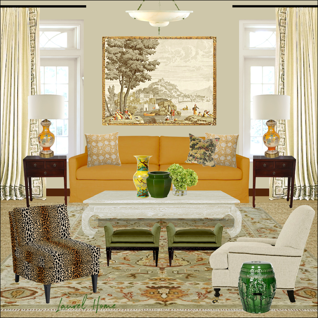
What happened is something I can’t explain. However, I can’t stop thinking about that image of that incredible orange sofa. I can’t even explain what shade of orange it is. Marigold, maybe?
I had to see the rest of that home, and so I trotted on over to the McGrath II website. Man, those ladies are phenomenally talented. But, how much does it cost to do a room like that? What I’m trying to say is, is it something that mere mortals can attain?
Anyway, the other day when I was walking around the woods near our home, I marveled at the gorgeous fall foliage we’re so blessed to have in New England. Then, it hit me. Those are the same colors the McGraths used in “my” living room! Am I right?
Am I asking too many questions?
Please help! I’m sure others must also love that room, not just me. I mean, if an orange hater can go wild over that room, I can’t imagine what it’s doing for the orange lovers. I guess the orange lovers already knew something I did not. Orange is a way cool color.
***
Hi Everyone,
Well, I had high hopes for this post. The problem is, it’s taken me way longer than it should. However, in all fairness, this is one of those posts where I’m pretend sourcing, creating a mood board, AND trying to write a blog post.
Here, let me at least make it up to you by providing this astonishing performance of Mozart’s 23rd piano concerto by Menahem Pressler, who was only 95 here. He will be 99 in two months.
I had this idea a week or so ago that it would be fun to do a color palette and mood board for every season.
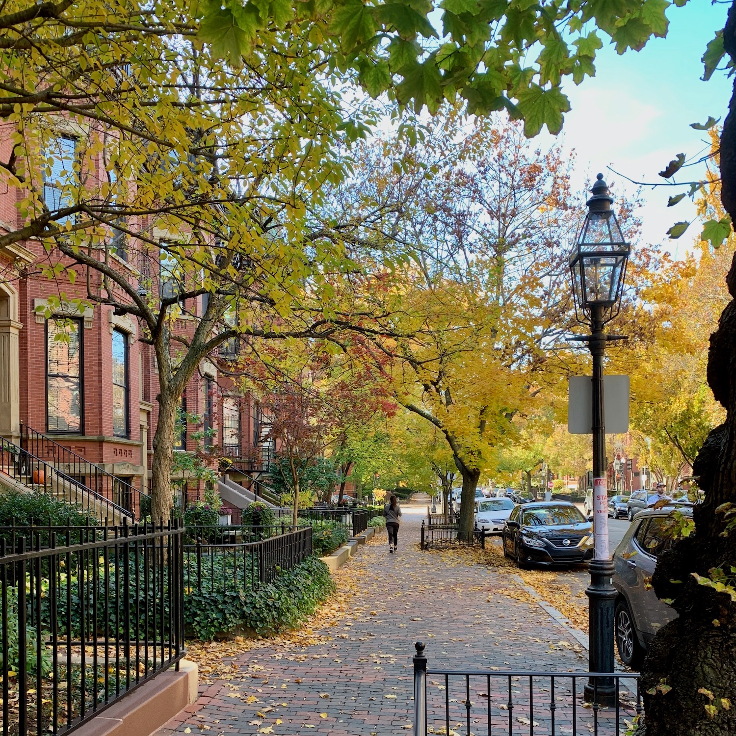
We’re not quite there yet, in Boston. This image was taken on November 6, 2020. That was the day I bought my apartment.
By the way, that letter up top is a work of fiction.
However, the fall color palette is not.
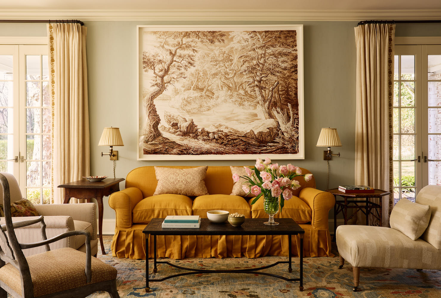
Not only was it inspired by the fall season but also by the room, as mentioned earlier by the mother-daughter team, McGrath II. Some of you may remember a Mother’s Day tribute post which included the McGraths as well as Jean Stoffer and her daughter.
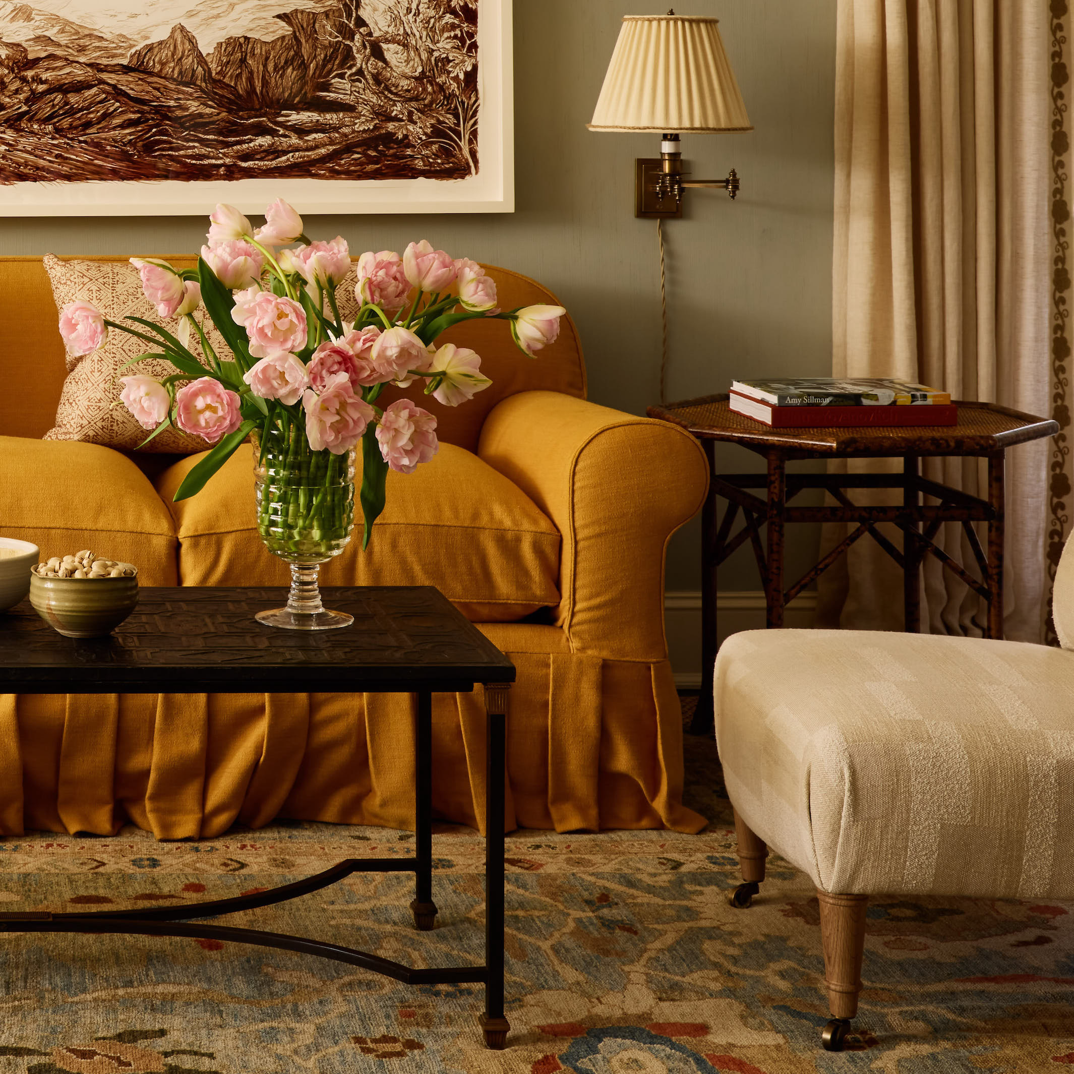
I teased you in the orange post with this vignette. Let’s zoom out.
Please note I have no idea where any of this comes from. And, that is rare. I don’t know about you, but I am made for that box pleated skirt and how it grazes the floor. It very well may be a super tight-fitting slipcover.
I am not going to post any more photos. I encourage you to look at the rest of this masterfully decorated and designed home here.
So, let’s say one wanted to do a room, or even in their entire home in the manner of the McGrath’s, but perhaps with a far more modest budget?
Well, I would start with the rug.
The rug, in this case, is the foundation for the entire color palette of the home.
So, if you’re stuck with where to begin, please read the 12-step decorating guide. It’s free. And also, consider starting with a rug.
Now where does one find such a beauty?
As I said, I have no idea. And it wasn’t for lack of trying.
I can tell you this, though. It was expensive.
How expensive, Laurel?
Well, like I always say: “If you have to ask, you can’t afford it.” ;]
It looks like a good size rug, and it is layered over a natural fiber rug. I love that, too!
What about that sofa, Laurel?
Well, here’s the thing. Either it’s an old sofa, or the McGraths had it custom-made. Of course, I’m surmising. But, again, I’m 99% sure will not find a sofa like this in the retail marketplace. And, even if you do, this one might just cost almost as much as your car.
I’m presuming you’re not driving a Tesla. Right?
You ARE driving a Tesla?
Well, that’s bloody wonderful. You don’t need me. Just hire the McGraths. haha
Okay, I found a cheap sofa on Wayfair.
Below is a mini widget with some of the items, similar to the board I made.

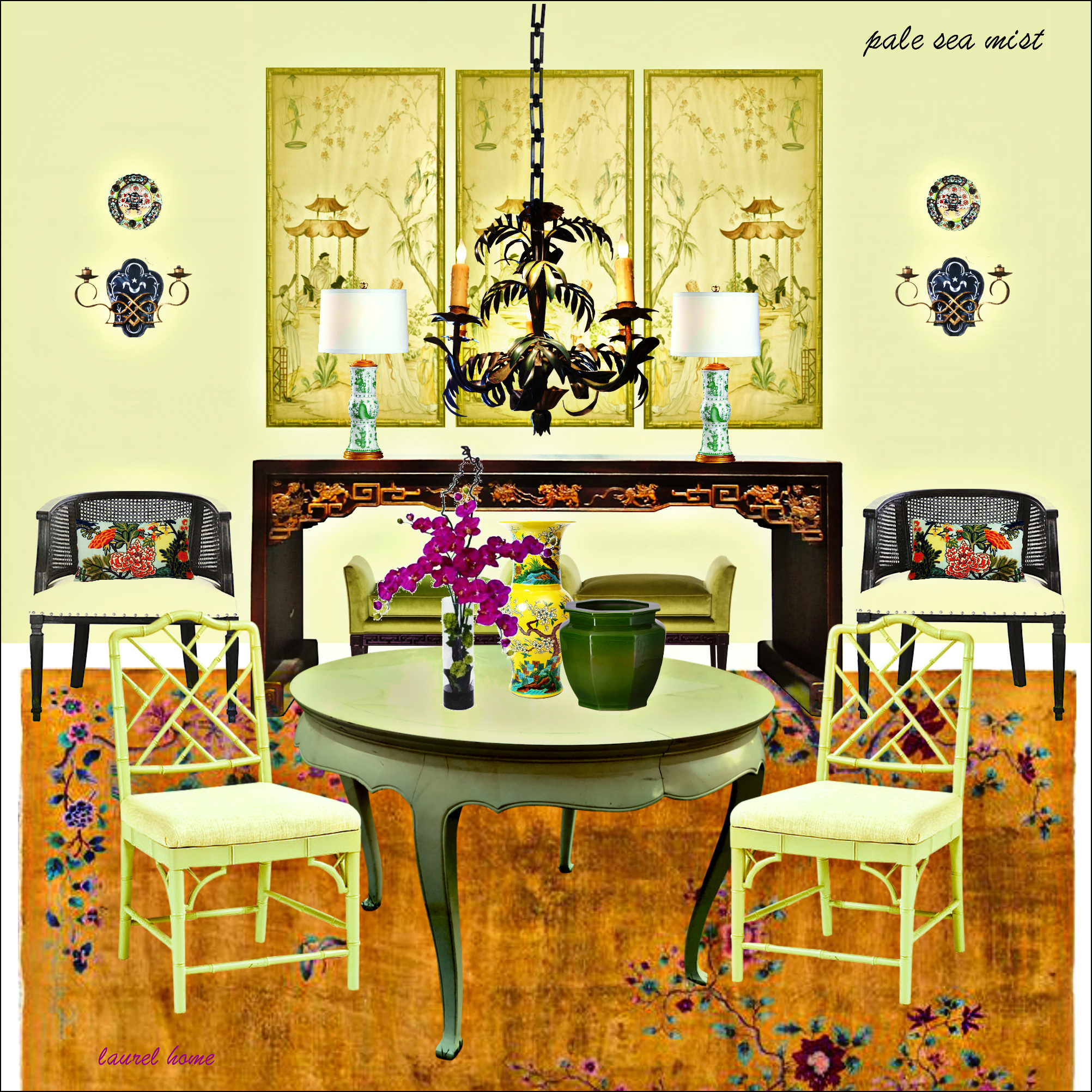
And, now, for the board. This is one of the most difficult ones I’ve ever made. First, let’s look at a progress shot.
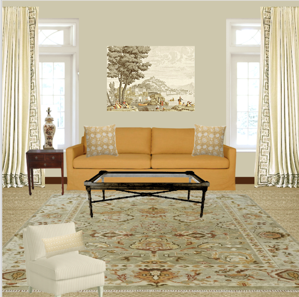
I always begin with the wall color. In this case, I chose Richmond Gray hc-96. FYI Benjamin Moore, in the lovely rebranding of their website, has confessed that hc-96 is the same color as Flowering Herbs – 514. It is the most muted green and looks fantastic in north-facing rooms. I’ve used this color several times. How did I make the sofa that color?
I do all of my boards on picmonkey. In this case, I used my color editor to do most of the work, then removed the background.
That rug is the closest I could find. I only wish it had that touch of teal. But, it does have the right feeling.
Those pillows are from McGee & Co. And, so kind of them; they named them after me. “Bern.”
This is not the palette, but it’s a similar one I made in 2017.
All of these colors are from the Laurel Home Paint and Palette Collection. If you don’t already know, it’s a huge two-part guide featuring 144 of the best Benjamin Moore paint colors, 40 mood boards, trim colors, and the best exterior colors. I spent hundreds of hours putting it together.
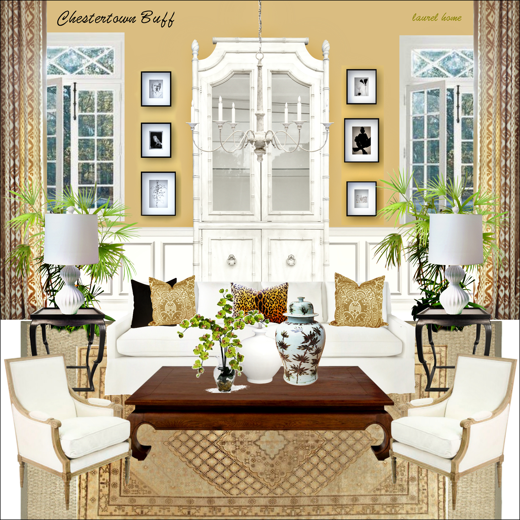
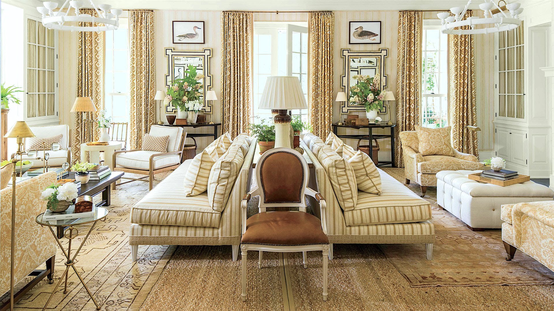
I barely remember making this board. It was one of the bonus boards I made the year after the paint collection came out. This was another nod to Mark D. Sikes, based on his super-gorgeous golden beige showhouse room several years ago.
Okay, time to look at the final mood board and fall color palette to go with it.
However, before I do, I want to stress that the colors in the palette, while paint colors, are not necessarily colors used on the walls and ceiling.
No, the walls could be white, and the other colors in the palette are found in the furnishings IN the room. But, yes, some of them could also be on the walls and trim.
In addition, these colors are not set in stone. They are a point of reference. So, if you’re not quite feeling it with a color in the collection, your perfect color might be the one above or below, or it might be on the next page of the fan deck.
And below are 12 colors from the Laurel Home Paint and Palette Collection that I selected for the fall color interior palette.
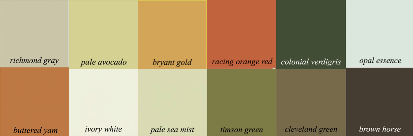
Another beauty of the collection is the paint palettes. That greatly expands the number of colors. But, more than that, the paint palettes go into paint palette families.

Okay, I hope you enjoyed this lovely fall color palette and the music, too. Please be aware that the prices for all of the Laurel Home guides will be going up in January.

la-route-des-indes- Papier-peint-panoramique-decoratif-Le-Bresil-Partie-1
(The art in the mood board is from Papiers de Paris.)
xo,

PS: Please check out the newly updated HOT SALES.
And, I apologize if you saw the “time-sensitive” note last night. Chairish said the sale ended “tonight” at about 9:00 PM on Friday night. Earlier, I saw that it was ending Saturday night. But, I must’ve read it wrong. No, I read it right. Somebody changed the “ending today” a few hours too early.
Related Posts
 Quirky Kitchen Elements that Add Up To Charm
 Can You Get Away With A Partial Kitchen Remodel?
 6 Easy Ways To Style A Chic Side Table!
 Hell’s Kitchen Design Heaven
 Dark Rooms – Are They Handsome or Depressing?
 The New Staircase Is Going In! – This is What It Took
 The Best Timeless Collectibles + China & Holiday Treasures


23 Responses
I LOVED listening to the beautiful music while reading the post. Thanks Laurel for the special treat!
Even though these are not my colors, I can admire the wonderful job you’ve done on this autumn board. This is not to mention all the other boards that I’ve admired in your 40-board collection. I think I’ve finally got my living room put together to my satisfaction, after years of trying, and it’s in no small part due to your help, both in the board and paint color duo I’ve bought and from your wonderful blogs that I’ve enjoyed ever since their inception. You rock, Laurel!
Ring a ding ding! This post hit the mark on so many levels. As an amateur, I’m stuck on my decor. It seems I’m halfway there and then I’m at a standstill. This post opened up an incredible source of ideas. It’s has me focused and given me a sense of direction. I read every post. Many thanks to you always.
Made my morning! The concert was so beautiful! Thank you for the surprise and for your beautiful posts.
XO
Hi Laurel,
A terrific post! I am not crazy about orange, but that sofa is stunning. I once did choose orange for a friend’s foyer and it was stunning. “There are no bad colors, just bad usage of a color”. Loved seeing the room with the Chinese Deco rug. I have been down the rabbit hole for a few days looking at them. I have several and the biggest one is in Marc’s office. Trying to talk him out of it, but might do better finding another one. We had to replace the seagrass in the keeping room and I have to cut the small hole for the lamp cords. XO
I love the duck prints over the mirrors. An unexpected delight!
Beautiful, inspirational mood board, Laurel. With your colour pallette and board, you are really showing us how it is done. McGrathII just get better and better, with a Manhattan business address and what seem to be increasingly well-heeled clientele. I wondered about that astonishing rug and sofa, too. A question l hope you will answer is how do they get those bottom sofa cushions to appear so sumptuous and plump? Will Lee Industries or Vanguard do this type of work or does one have to go to boutique or exclusively trade supppliers? Thanks.
Any idea where that glass and brass tripod table in the Mark Sikes show house room comes from? Perfect for a Manhattan apartment.
Found it! Mark D. Sikes. https://markdsikes.com/product/marmot-tripod-table/
Hi Laurel,
A Fall inspired room is always so cozy. But how would you take that same room & make it more Spring-like? Which is another favorite season.
You mentioned doing a mood board for every season. I’m fully behind that idea. But can the same Fall inspired room be tweaked for other seasons?
The two pillows in the Chestertown Buff mood board are lovely—as is the whole board. What is the name of the pattern?
The color orange or more specifically peach is a gorgeous accent color. I use it in every room in my home for a pop. Check out Serena and Lily this season , orange is their go to accent. Thanks Laurel.
A post like this for all seasons is a great idea. Looking forward to the “Spring” post.
Laurel, what a beautiful room! And the colors! Just love the color pallet of the room – especially the juxtaposition of light pink flowers against the gold orange of the sofa. And your pic of Boston in Autumn of 2020 – also so lovely. These colors make me wish I had artistic talent to paint. Fall in New England is special and one of the reasons that keeps us here, while all of our friends have sold and move onto warmer places.
Laurel!! Thanks for the heads up re the Charish sale… I ran right over there and found a Baker chest on chest … it’s perfect for my bedroom!! And best part??? I got it for $800!!! I am beyond thrilled. Thank you so much for your part in the hunt! Patricia
I’ve always wanted lamps in the middle of the room or by the side of sofas that don’t hug walls.
A truly sophisticated look but the ambient lighting making it not scarily so.
I’ve seen this done so many times in fabulous images, as in the Mark Sykes image above, but never in real life. In the images I always try to find the plug/socket points but they are never visible.
if I did this there would be trip wires all over the room and my husband who cant walk on a flat surface without going head first, would be the sacrificial calamity for the price of this penchant for lamps in the centre of the room. He is insured, however.
OMG I love your comment about your husband!!! 😂
I must move from the UK to Florida, Elizabeth !
I shall tell him, Deb ! x
Cords and outlets are typically airbrushed out of professional photography, from what I’ve seen.
We live in FL, where many homes are mostly built on concrete slab foundations, and have outlets in the floors. Makes it much easier to float furniture and lighting. Where it gets tricky is if you have an rug over the outlet that you want to use!
I once saw designer Phoebe Howard say that in that particular situation she’ll have a small hole cut in an area rug to run the cord thru 😬😬 , which can be stitched up later. Maybe in my next life I will have her funds and gumption!
I must move from the UK to Florida, Elizabeth !
Laurel wrote a post some years ago about a kit you could buy on to change a corded lamp to battery powered. The post is called “Make Your Lamp Cords Disappear Like Magic.” I was able to find it easily by typing “battery lamp” into the search bar. Laurel’s blog is like a design oracle. The questions to all decor conundrums are revealed to those that search.
LOL…