

Hi Everyone,
Sometimes it’s so difficult to come up with a clever headline. But, I like that one. Thinking inside the box. It’s okay to have limitations, as long as we allow ourselves the freedom to explore all viable possibilities.
This is part 3 and the final part of Cher’s living room.
So, first, a quick review of the design process thus far.
Part I went over some architectural changes. This requires far more time than I had. Gosh, all of it does.
Behind the scenes, I worked on a room layout.
Actually, I did that in conjunction with the architectural changes. Normally, I’d have all or at least most of the questions answered before doing this.
Part II explored numerous options for color and furnishings possibilities.
Oh, how I wish I had these tools 20 years ago! We began to get some of these online visual capabilities around 2010. But, before that, I had to rely on photos of inspiration rooms, and verbal explanations for why certain things would or wouldn’t work.
It wasn’t enough to say.
“No, you can’t do beige walls.”
Now, I don’t have to say a word. The pictures do all of the talking for me.
Colors, furnishings, and space planning can all be conveyed virtually. Many young designers don’t know anything else. But, as you can imagine, we sometimes struggled to get our clients to “see” our vision.
Speaking of seeing…
Many of you felt this room was too small for a living and dining area.
Well, let’s take a look.
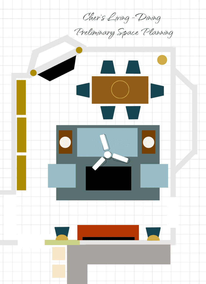
This was before I knew that Cher’s and Dan’s dining requirements for this room were practically nil. And I’m fine if they eat with their plates in their laps on the sofa. ;]
Before I did post # 1 from a week ago, I did this board above.
As you can see, I ripped out the entire bookcase, but I don’t think we can do that. Those gold things represent some 10″ deep etageres.
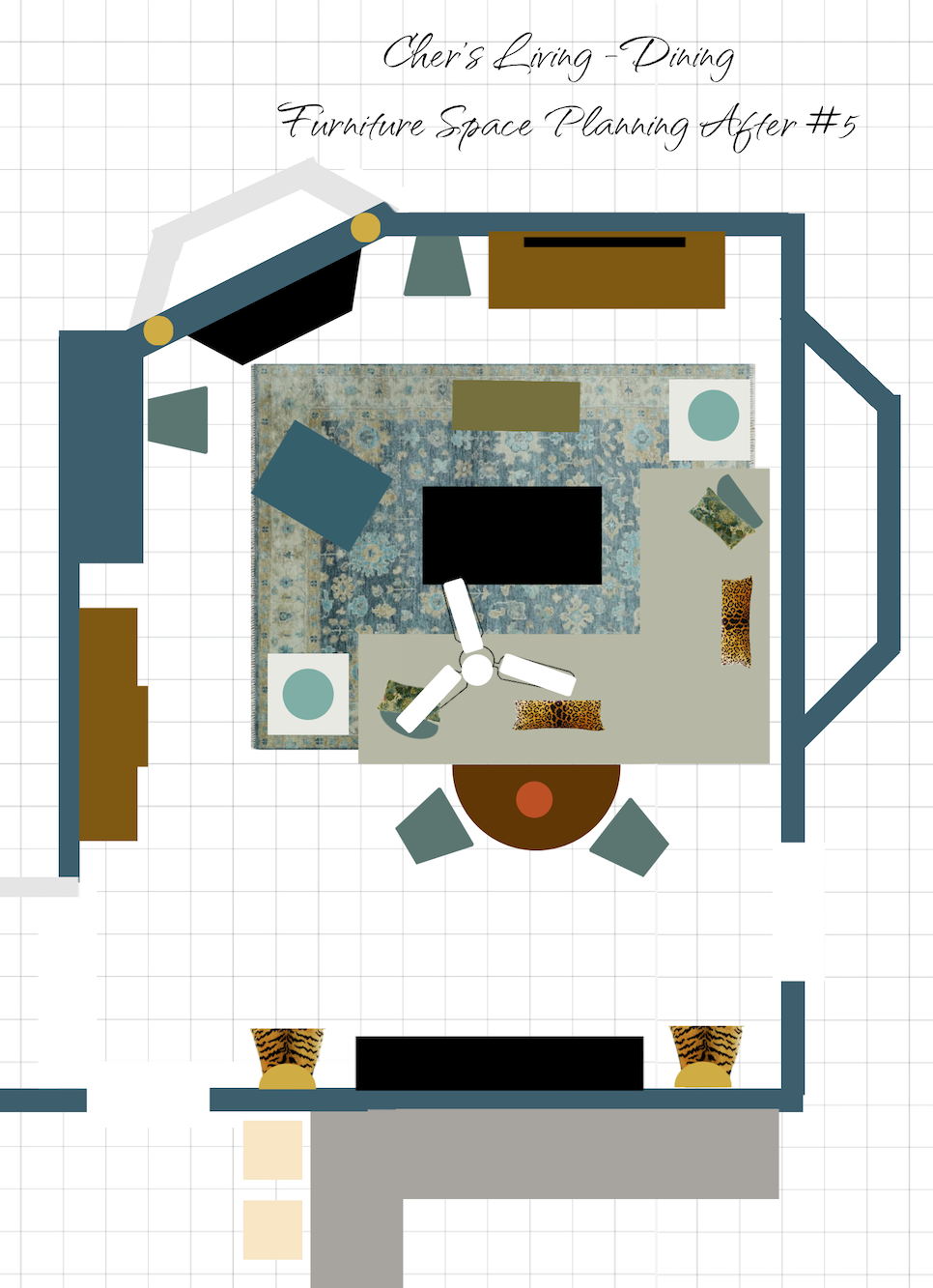
For the final space planning adventure, I put back the wall (sans bookcase) and decided to stay with my original idea, keeping the TV on the kitchen wall.
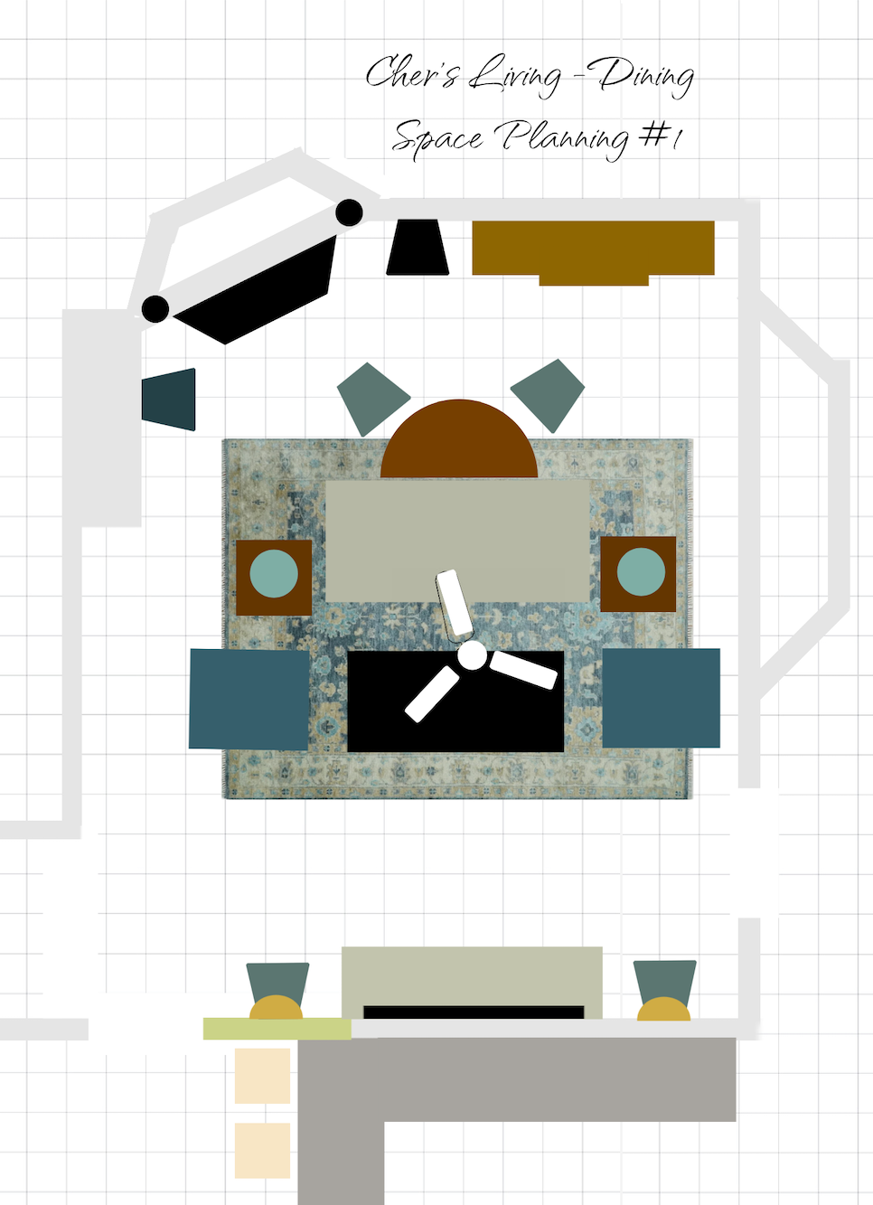
My issue is that to have a conversational grouping with a sofa and two chairs or a sectional, I think the breakfront will be too big on that wall. Even if we do a six-foot sofa, there isn’t enough room. We need a three-foot pathway, or at least 30″ and won’t have that with the breakfront on that wall. Therefore, the only place left is on the back wall, adjacent to the fireplace.
I’m okay with that.
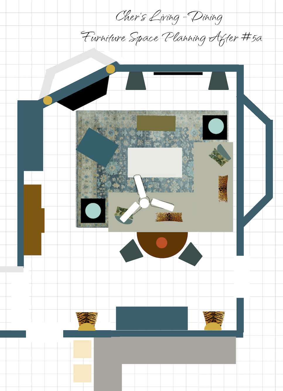
Some of these are slight variations on the first theme.
Laurel, why do you use squares instead of the shape of the furniture pieces in plan view?
That’s a great question. I could. In fact, it would be great to have an image library all set to go with pieces in plan view so that all I need to do is change the colors. However, for now, this works to represent sofas and chairs.
That is not a brownish border as part of the rug. I did it to indicate the color of the floor. If it’s all over the image, it’s too much. We don’t look down on a room like this; there are no shadows or bright spots. However, I think a border of the floor color around the rug gives a good idea of how the colors will look in the space.
The demi-lune table could be a drop-leaf table that becomes a round table, if necessary, to seat four.
However, that is a little tight as things stand.
Could everything get moved down?
Probably. :]
But, this plan isn’t ideal.
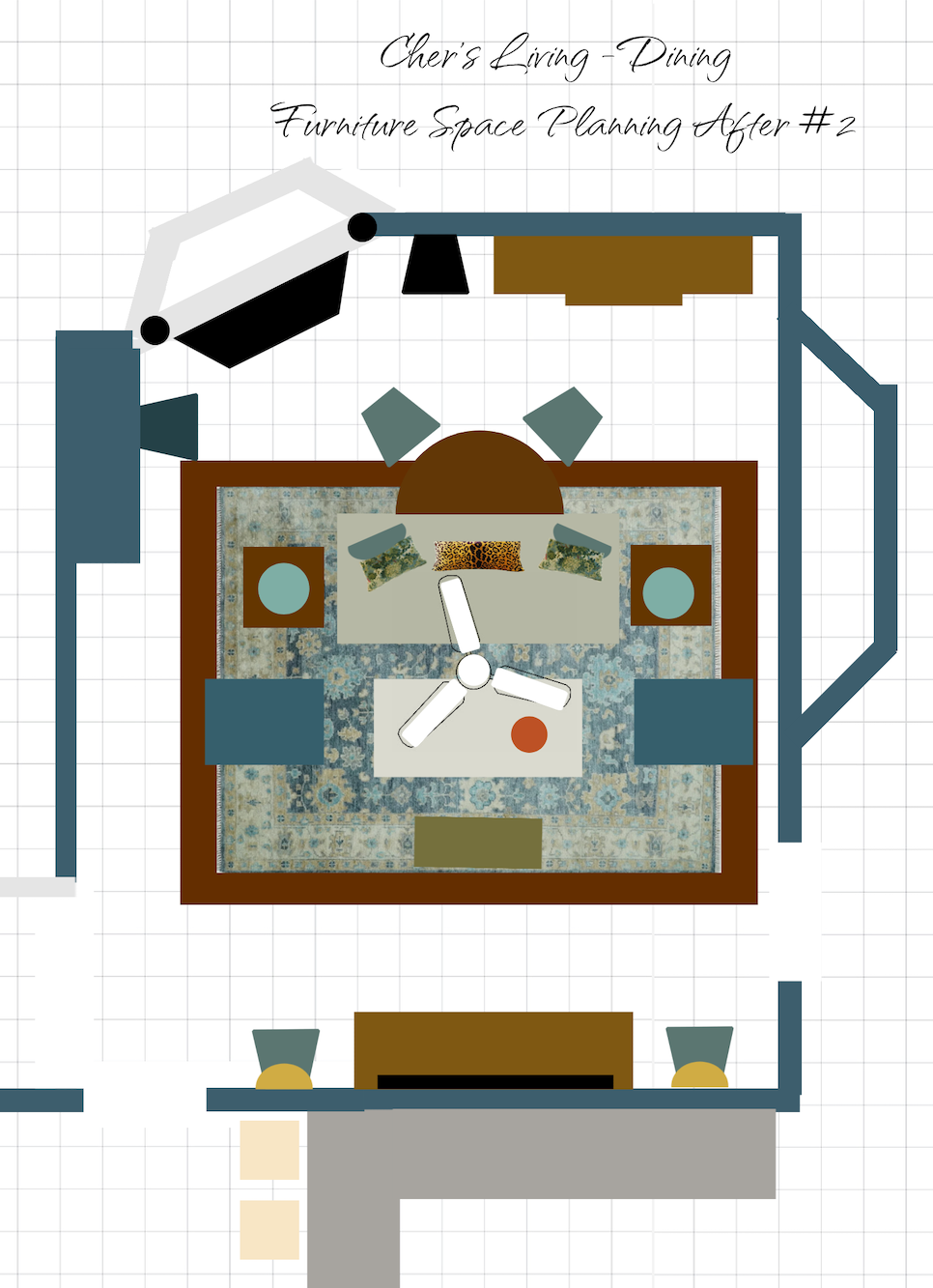
Above, I changed the rug. I love both the tone on tone rug and the ones with many colors.
Okay, that is all for the TV on the kitchen wall.
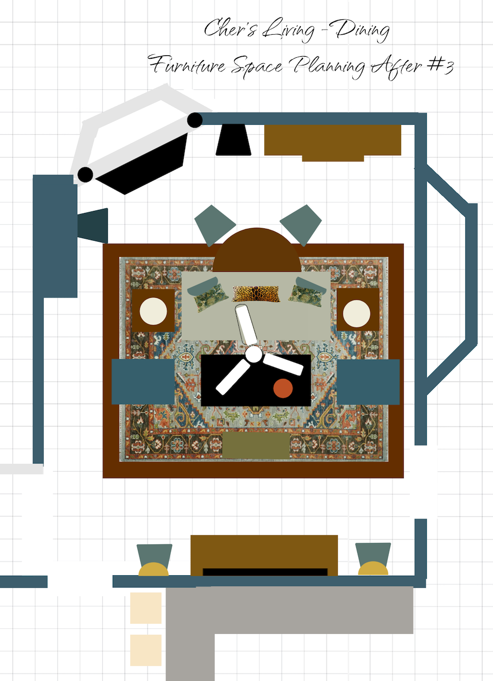
If we turn it all around, then Cher and Dan can see the TV and fireplace simultaneously.
In the first iteration, I created a sectional. And, now, we can put the breakfront back on the wall facing the front door.
However, there’s a problem with this layout. Do you see it?
It’s fine if you don’t. I didn’t see it at first, but then it hit me. The end table in the back overlaps with the TV cabinet.
Unless it’s essential, it’s not a good design.
So, I moved the TV cabinet back to the kitchen wall.
The TV can hang on the wall near the fireplace without any furniture underneath it.
In case it’s not clear, those are two dining or occasional chairs with wall sconces over them on the kitchen wall. Since there are now three wood pieces, all on this side of the room, I decided to paint the cabinet to match the walls. But, maybe in a slightly antique chalky finish.
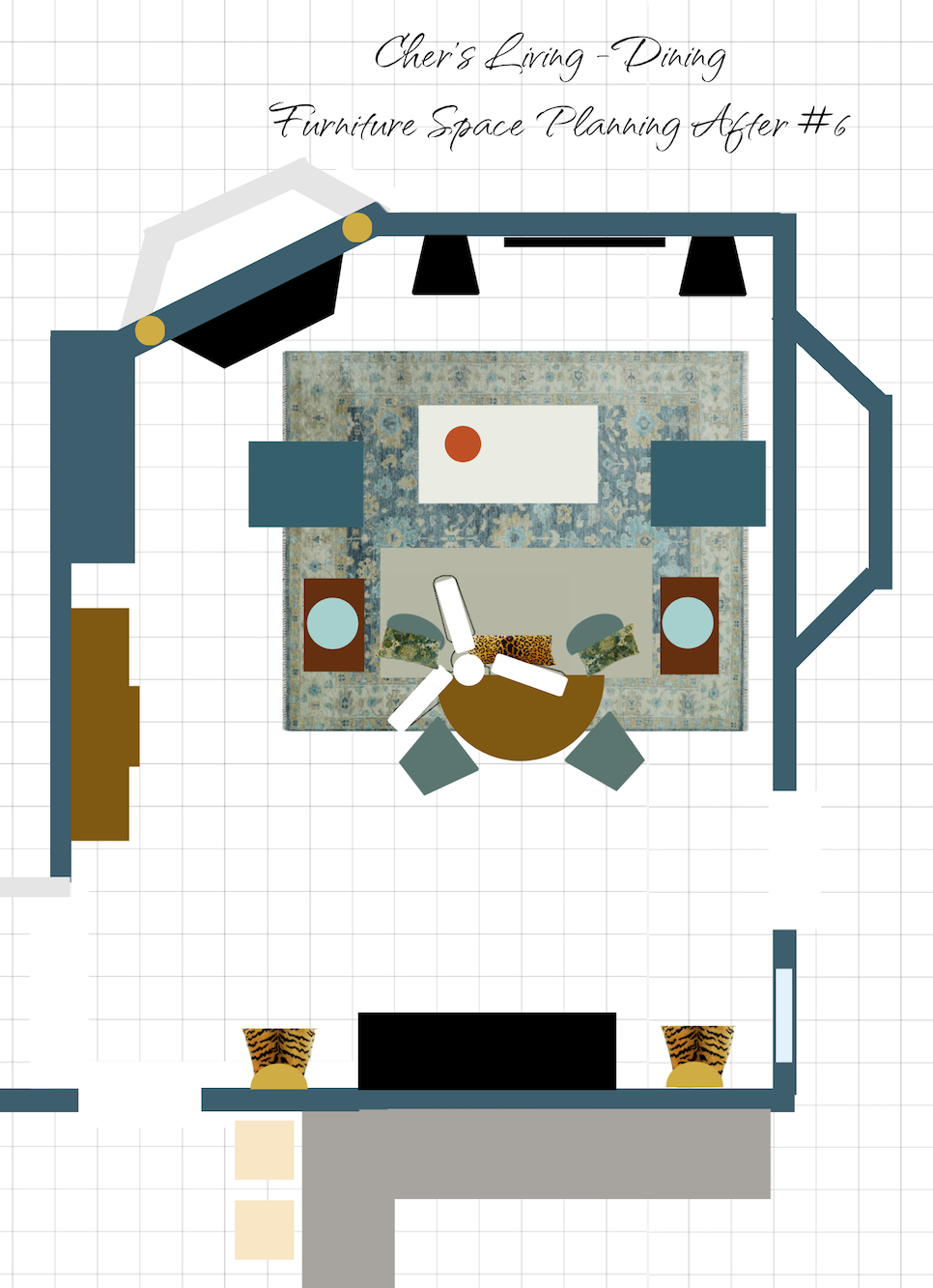
Above, we’ve gone back to a sofa and two chairs. I also painted the cabinet black. Black will be gorgeous with the Van Deusen Blue and a lovely counterbalance for the TV.
But, see the warm red dot? My eye is longing to see this color. It doesn’t have to be a lot of it. And, it won’t be bad without it but put your finger over the dot, and maybe you’ll see what I’m talking about. It’s okay if you don’t. ;]
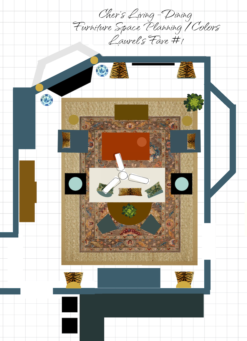
Now, we’re going to see some of my favorite space planning and color solutions for Cher and Dan’s living room.
After all, I feel that the seating area should face the fireplace. I bet some of you were holding your breath on that one.
Since they never use this room as their main dining area, putting a table at the other end is unnecessary.
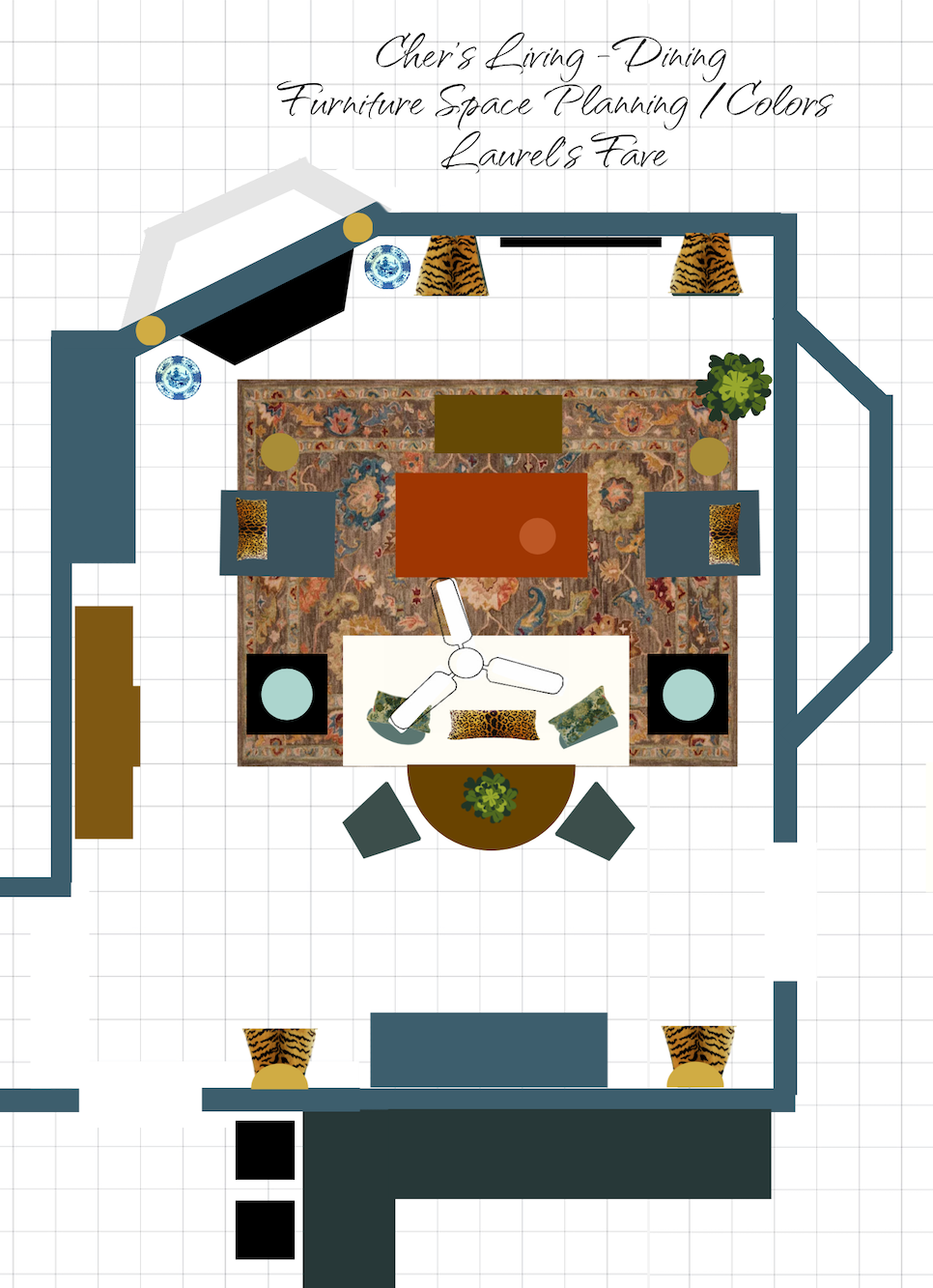
Above, I kept two pieces in stained wood, and all other wood pieces were painted. Of course, I also changed the rug. I love the colors in this rug.
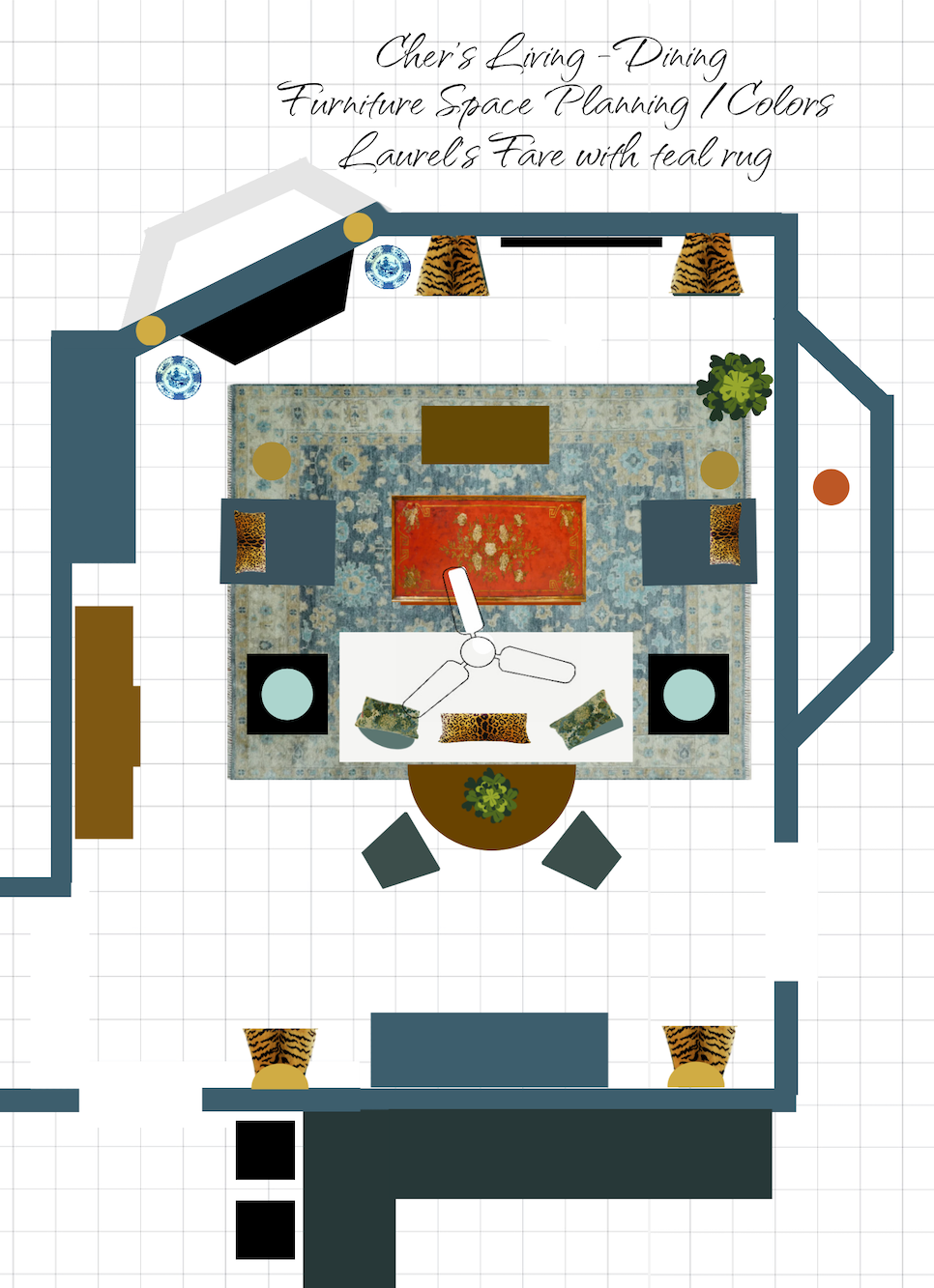
However, I also love the teal rug.
But then, I had another idea.
What would it look like with a slightly smaller rug layered over seagrass? Oh, I like this one too.
I love the cinnabar red coffee table. I’m also pleased with the space planning. This room is now warm and sophisticated yet still quite homey. And yes, they could swap out the off-white sofa for a darker one.
However, as I said, I also love the teal oushak-style rug.
So, for the last board, I added it to the space planning mix.
And, for funsies, I also changed the coffee table to one in the vintage HOT SALES widget. I have no idea why it hasn’t sold. If I knew for sure I’d have a place for it, I’d get it. I think this is an excellent price for this piece, too.
And, one last one.
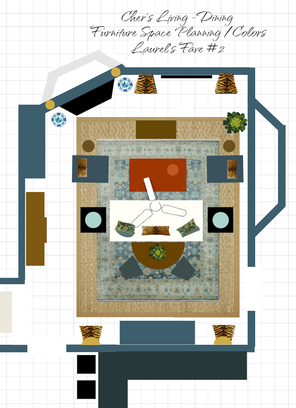
Oh, I can’t decide! But, I do love the colors in this last one.
Do you have a favorite?
Or, do you have a completely different idea for this space?
Before I go, some of you mentioned boxing the air conditioner in.
While that’s a great idea, in theory, it means building out at least that portion of the wall. It wouldn’t need to be the entire wall. But, here’s the problem. The unit overlaps the fireplace mantel.
That means the new built-out wall will have to overlap the mantel even more. Here’s what that would look like.
As you can see, it would mean ripping out the fireplace mantel and hearth and building that over again. While it’s something to consider, the unit does need to protrude some, so the holes aren’t covered.
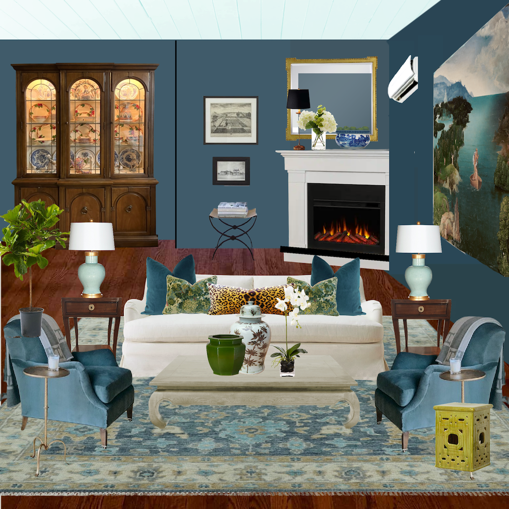
To close, I put together a widget of everything I could find that you have seen.
And, some things you haven’t seen. Sorry, no captions today. But, if you click on any image, you’ll get taken to its source to learn more.

xo,

PS: Please check out the newly updated and BIG HOLIDAY SHOPPING WEEKEND HOT SALES!
PPS: Sunday evening 1.15.2023
I forgot to mention in the post, an important point. Cher and Dan do not use the front entrance, except for the UPS guy, and perhaps on Halloween. Otherwise, they come in through the mudroom.
Still, there needs to be a pathway to get to the door. But, it doesn’t need to be more than three feet.
Related Posts
 New Staircase Railing Design – Ugh, It’s Not Working!
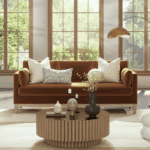 36 Cheap Sofas and Chairs That Look High-End!
 Staircase Design – Which Comes First Beauty, Or Safety?
 All About Hardwood Floors + How To Ruin Them!
 The Ten Best Laurel Home Blog Posts in 2022
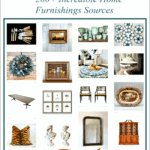 50 of the Best Etsy Home Furnishings for 2023
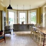 20 Timeless Kitchens You’re Going To Love Forever


40 Responses
Just lovely, nice job. Looking forward to seeing this couples finished new space!
What a relief to find Laurel’s Benjamin Moore colors. No more confusing visits to the paint store. The VanDeusen Blue we used in our dining room is such a cheerful navy. I always feel encouraged when I go in that room. Cheri and Dan, I look forward to seeing your “after” photos! Laurel’s given you so many beautiful options. Ballard Designs sells a narrow Suzanne Kasler TV wall cabinet that is like the one GL suggests. It is on sale right now and you might be able to use the additional 20% off that they offer. Also, it would probably be pretty easy to build it out for a lot less. It is nice to see it on the website to get an idea of the standard measurements for that type of thing.
This was an absolutely fabulous, and generous series, Laurel. Thank you so much!
Possibly my favorite widget ever. Just super.
Laurel,
I dont even know where I can start! You have put SO much time and effort into me, I feel so blessed and honored!! Don and I spent the entire weekend moving all of my “crap” out of my 900 sq ft apt into his neglected 2000 sq ft home. The home has so much potential!! With my ecstatic surprise, he is onboard for an update. Insert a cartwheel here….We are doing one room at a time. We have sat down together to read the series, and are super excited and inspired to totally transform the living room with your ideas. Several times we found ourselves having “ah hah” moments with your suggestions. We have some structural issues to fix, hopefully you wont have to wait too long to see our finished room. I promise you guys that we will send pics. Again Laurel, you truly have an eye for design, I plan on buying more of your books to help with the rest of the house. I know that it was a huge undertaking, but these kind of blogs are so helpful to “design challenged” folks like me! We are able to be inspired by things that we never would have thought of. Remember, I thought beige would look great….oh boy, not now! VD blue it is! More to come! Laurel, I am truly grateful!!
Whew, Laurel, so many ideas besides yours:) I particularly love all of the textures and the introduction of animal prints you added to the mix, and also the painted pieces. You have accommodated all of the needs, including the demilune drop leaf table, and the four chairs one would need for dining, cards or games. Like this homeowner, we also only use our front door for mail, so we do not have a runner in the space. I like like the TV sans anything underneath, as often TV’s are mounted too high for comfortable viewing. I also thought about painting that AC unit, but I am a stickler for not voiding warranties on expensive appliances…I’d want to check with the manufacturer, to make sure that the warrantee won’t be voided by using any paint. With such a striking color palette, and visually interesting dual purpose layout, I doubt the homeowners, or their fortunate guests, will pay any attention to the AC unit. Thanks for sharing this enjoyable and challenging design process with all of us. One of these days, I may have to share with you my current endeavors of how to fullfil original parlor design goals, when your husband spends the furniture budget from a big remodeling project, on a sports car, and the English Arm Sofa and Chairs you’ve been dreaming about for years are popped like a balloon! Sigh.
Laurel, a question. This all started because she wrote to you asking about the fireplace. Seems like we’ve talked about everything except the fireplace. The only thing I saw you write is that you would paint the bricks black. And then you said something about sheetrocking over it which confused me. What would you do with that hearth?
I totally understand Cheri and Dan’s need to do this renovation on a shoe string budget. I think by incorporating Laurel’s furniture arrangement ideas with their existing furniture, painting the walls, adding linen drapes and a few less expensive items such as pillows, vases and perhaps new lamps or shades and tables they’ll be able to achieve the look. I think Cheri’s white end tables will be beautiful against the VD blue paint. Her coffee table will look totally different in a new color, like black. I have been wondering if they might even be perfectly happy eating their meals, when they are alone, at the counter in the kitchen where their bar stools are. This would eliminate the need to have an eating area in the living room.
I agree with others who said she should buy a runner, for by the front door, that matches her carpet. This would help that area feel more like a foyer.
Looking at the colors in her print, it looks like it may have a deep burgundy in it. I’m wondering if accent pieces in a brighter shade of burgundy, like BM Magenta 2077, might be another color to consider for her accent pillows, vases, etc. adding that needed pop of color, if she doesn’t like the red. Magenta appears to have blue undertones which should compliment the VD blue and her sofa nicely. It would look lovely with the black door and other black accents. I’d buy a simple black console table for by the door and add a bright magenta vase to place on top of it, below her print. If they don’t buy a drop leaf table for behind the sofa, I’d still buy a pretty console table. Most of these things can be picked up for not too much at places like Wayfair.
You have taken a lot of time and brain food to put this all together with options, options, options.
Yes, in daily life, the sofa should face the fireplace for coziness and the tv for making the mind go blank.
I don’t know the age of your blessed clients, however, I find young people do not care for oriental rugs, I sold two high quality oriental rugs for pennies on the dollar.
Thank you so much for sharing your time and talent.
Stay well.
A huge thank you to Cher and Dan for sharing their home with us. May you be blessed with health , happiness and prosperity.Whatever you choose, know that you’re making a house a home. Dear Laurel thank you for all the work you have put into this series. Seeing is believing. My accent gallery wall color will now be wrapped around the room. Lets just say I had been “testing” the color out for a few years. (Valspar, Prescious Saffire, mixed by BM. I know we are not supposed to but a previous experience with V’s paint wasnt good and Ben has never been a problem.)
This has been fun and, as always, informative. Laurel, you put so much work into this. What a gift! Thank you to the home owners too.
The trouble with a TV on a wall without a cabinet below is that most of us have audio and video.equipment that connects to the TV. In this room, I would have a custom built-in created on the wall to the right of the fireplace. It would help to camouflage the a/c, house all audio video equipment, and leave space for decor and family photos. Cher will certainly have a lot of great ideas to work with. I hope we get to see a follow up once she’s done the room.
Thanks so much Gail,
Great ideas, but they can’t put a cabinet by the fireplace because the AC is already overlapping that wall
Yes to a little cabinet under the TV.
However, AV equipment can go anywhere these days; even in another room. Mine is in the adjacent closet about eight feet away from the TV.
What a delightful gift for Cher and Dan! I know this was quite a bit of work for you, Laurel, but it was a wonderful experience to walk with you through your process for creating a design plan. I loved your “favs”, every one of them. Thank you for sharing your talent with us.
To JoLyn Branch and Melissa Boudreaux, I recently used a free web tool on canva.com to create very basic mood boards to help my son decorate his NYC apartment. I’ve never created a mood board before, but it was easy to use. I asked him to send me pictures of every angle of his space, which I uploaded to separate boards. I was then able to save pics of furniture, art, rugs, etc from online sources and add them to the board. It helped SO MUCH to see everything in the space! Then it was easy to share the boards online with my son, so we could both play around with them. I do have pretty decent computer skills, but Canva does have tutorials, and there are plenty of YouTube videos you could watch! Hope that helps someone.
Some of this was confusing, but by reading the comments, I figured it out.
I like any number of the rug combinations, but I will choose Laurel’s Fav #2. But with a couple of changes.
Light couch with a black Ming table and red/coral on top of that table. I like monochromatic/adjacent color schemes but with a punctuation mark.
This has been a very educational series as others have noted.
I truly hope we get to see this room again sometime in the future!!
I could be wrong about the Ming table color, and the red one on sale is a fabulous buy. However, I just like that dot of the red/coral which could appear other places in the room to give the whole place a zing.
I tend to use orchids or cut flowers for this zing in my home.
Really, any number of these scheme or color choices would be excellent. But the sage sofa just does not do it imho.
Sorry, that I didn’t pick up on what a builtin would do to the mantel overhang.
Thanks for my Sunday training session, Laurel.
Really enjoyed this post and reading everyone’s comments. What is the oblong brown object in front of the coffee table? I like Laurel’s fave with the brown rug, beautiful colors. I prefer the rug horizontal so that it doesn’t intrude on the traffic path from the front door. If the demilune table were instead a drop leaf, more like a sofa table, it would keep any of the furniture out of the traffic path and there would be room for an entry runner. That way, with the TV cabinet and its drawers, it would be a very functional and attractive entry space. Definitely paint the AC unit the same color as the wall to blend it in, as so many people have suggested. Two dining chairs could flank the entry cabinet, and if four are needed, two on each side of the TV, or even somewhere else in the house, if possible. Lauren, you have created a beautiful, sophisticated space in a small area, and I can’t wait to see what Cher does with it. Would love to have your ideas on my crazy space, also with a corner fireplace that competes with a beautiful river view, not to mention everything else! we are getting ready to make some major changes and I really need a way to visualize spaces like you have done. Can you please tell me if there is software or an app I can use for that? I’ve looked and looked, but it seems like the only apps I find are games and not serious design aids. If anyone could point me to something like that, I would be ever so grateful! Thanks, Laurel for sharing your amazing talents with us! Loved this series!
Hi Jolyn,
The oblong thing is a bench. Totally optional, of course.
Monica, the TV is the thin black line. It shows up on the very top of the layout on the right side of the fireplace or on the bottom wall in the layout that is the farthest away from the fireplace depending on which layout you are looking at.
Laurel, huge amounts of great work. Thank you!
Cher and Dan, I hope you get playful and add a few pops of red, orange, yellow or gold in your blue & green color pallete as Laurel suggests. A hint of any one of those colors can really make your blues and greens feel ultra rich. A joy for the eyes. It’s similar to having a green meadow + blue sky and a few brightly colored orange or red flowers dotting the landscape. It makes me want to sing like Julie Andrews.
Great post! what program would you recommend for someone who is not computer savvy?
What a great learning experience! Thanks, Laurel for sharing your talent with us. Our previous home had a corner fireplace, and we ended up with a very similar seating arrangement so that we could enjoy both the fireplace and the tv. I prefer your last couple of arrangements because they were also more centered under the ceiling fan (yes, ocd! haha). Thanks also for the shopping widgets…I’ll enjoy the vintage fishing prints in our lake home!
What great posts! Thank you for the widgets. I love the red coffee table so much, I may have to redesign my living room from top to bottom the accommodate it.
Laurel,
Fabulous series of posts. Thank you for all your knowledge and inspiration. My favorite is what you labeled your fave with the brown rug, but obviously Cher does not prefer that color scheme as well. No worries, the teal rug is gorgeous as well. I too would love to hear your reasoning for not placing the sofa in front of the bay window? Thank you again for all your inspiration!
Love the designs! Could the heat/air unit be painted the same color as the wall? They have paints for metals, plastics, etc.
My favorite is the one you labelled “Laurel’s Fave” with the brown area rug and red/orange table. I love the colors in that rug and feel it would be so versatile. Along with others, I like the TV on the wall by the fireplace. I like GL’s idea of a separate runner in the entryway to make it feel more like an entryway. I love your widget, Laurel; I’m drooling over every item in it! Thank you so much for this 3-part series. I’ve enjoyed these posts (and all the comments by your wonderful community) immensely!
Thanks, Laurel. Great Sunday reading…
This is one of your best yet ! Your design process is so inspiring – and new software makes it easier to ‘move’ everything around. I hope Cheri will show her finished space –
She’ll be amazed at how well the space works and how easy it’ll be to live in it.
I do prefer seating facing the FP and TV, & painting the air exchange and wall the same color.
Fab tranformation, Laurel! Agree that fp and tv go together. The decor is to die for – Ming tables, exotic but practical oushaks/natural fibers, wood, brass, cozy fabrics and good mood lighting. Love the Celadon lamps. Timeless design. Great natural conversational/viewing grouping and traffic flow, too. Brilliant. One consideration that may bear on final floor covering decision – Not sure how much comes and goes between the front door and through to kitchen? If this is a main entrance, lots of wet, grit, and leaves tracked in between November and March here in PNW and unlike other places, we don’t tend to have “mud rooms”. I liked the larger rug option but thought about this potential traffic corridor issue.
I missed the previous post on colour schemes, so will comment on both posts here. For the space planning, I agree with Laurel’s (and others’) comment that most people would want the seating area to be facing the fireplace and the TV. That means starting from the second set of plans with the TV on the AC unit wall. On the whole, I would go with the last two plans, but there’s one change I would suggest. I would also prefer to eat in a cosy room rather than in what is a sort of hallway backing on to the seating area. Therefore I would pull back the sofa to align its back with the near end of the breakfront, thus leaving a bit more room at the fireplace end of the room. I would then put the Pembroke table under the TV; it could be pulled out, or simply used with only one of the drop leaves, for two people to eat, and the chairs would come out from the wall on either side of the table/TV. Obviously, this means a flat-screen TV and some means of hiding the electrical works. I think the best solution would be a very shallow box with hinged doors which could function as a gallery for a series of prints (plenty of examples on the internet, notably by Suzanne Kasler), or as a pair of larger prints, or as one single image (see below for an idea). The box would not, I think, interfere with the code-imposed distances for the AC unit. With this, the space between the sofa back and the kitchen wall becomes more of an entry, and could indeed house the sideboard on the kitchen wall and a narrow console table against the sofa back, with a pair of lamps plus decorative items. Battery-powered lamps are getting easier to find and will, I imagine, become ever more so. One could reinforce the distinction between living and entry spaces by keeping the rug or rug plus seagrass underneath within the seating area, and adding a runner along the entry zone.
On the colours, I think Cheri has given us a good idea of her preferences by picking out schemes 4 and 7 in the previous post. The Van Deusen blue is a great idea for the walls and several people have suggested painting the AC unit to match the blue walls, a no-brainer in my view. If Cheri wants to take things gradually, she could try painting the walls above the chair rail blue (but get enough paint to do the whole thing!), and then making sure she wants to go the whole hog or make the lower part of the walls off-white. Clearly, Cheri is not keen on the red/coral elements. Perhaps we could take items from Laurel’s schemes and put them together to make a hybrid of 4 and 7. Here’s my suggestion: the rug from 5 (for its pale centre), the sage green sofa and very pale grey-green coffee table from 4, a variety of cushions using a darker blue version of the two armchairs plus a cream-ground stylized floral pattern to go with the centre of the rug, Laurel’s picks for the side tables (or black ones, to pick up the black of the door in a smaller dose than the big coffee table) and small metal tripod tables, and plenty of brass accents. If this was the winter look, one could add a white slipcover to the sofa and revert to n° 4 for summer, changing the cushion covers for fun.
A suggestion for the entry zone kitchen wall: I’ve seen a pic (from the magazine Atlanta Homes) of a dramatic entrance painted monochrome in a dark blue (described as teal) relieved and made even more dramatic by two huge Audubon prints of what look like parrots, in bright blue against a white ground with olive green foliage. Stunning! You wouldn’t get the same effect here because of the wood sideboard (which I notice has lots of drawers, very useful in an entry zone), but it’s a thought. Or else a whacking great gilt-framed mirror. Audubon prints are easily available at very high resolution for free, for a DIY version; and … you know me … make your own mirror, you can have any dimension you like and it’s good for the budget.
Oh, one last thought, I’ve seen a pic of F&B’s Stiffkey Blue used for the walls of a room which combines this with brown wood, cream and beige, plus over the fireplace (mantel in the blue, hearth in off-white marble) a gold-framed painting of an exotic landscape with a lake and some improbable birds, the whole scene suffused with golden light. Something like that would really fit in well with the view of the lit-up interior of the breakfront.
Laurel, once again you have proven even small spaces can be multi-functional. I like #5, but with the seating arrangement in Laurel’s favorite with the teal rug.
The two wooden pieces balance each other and the room, too. Painting the cabinet black leaves only the breakfront in a wood tone making it look like an orphan. I love the idea of a small drop leaf table behind the sofa for dining. Due to the small space, when the table isn’t in use for dining, I would drop both leaves, move the chairs back against the kitchen wall and the table becomes a sofa table. This would also eliminate the two extra chairs, shown on that wall, which probably won’t be used much. I would position the entire seating arrangement a little farther back from the television and fireplace, perhaps 6 – 12 inches. Even small changes can make a room feel larger and less like everything was crammed into a corner. Cheri can give her own coffee table a new life by painting it either black or red, depending on the carpet she uses. You have given her so many great ideas to work with. Whatever she chooses to do, this room will be functional and inviting to be in. Thanks again for sharing your knowledge. Based on the number of comments, you have to know how much we all love these posts.
Hi Laurel,
This has been a really great series and I especially loved the dropleaf demilune dining room table behind the sofa as a way of providing some formal dining if desired. As for the air conditioning unit, if it wouldn’t violate any building code, I’m wondering if it could be painted the same color as the wall. One would still see it, but it wouldn’t stick out as much as pure white. —Carol
True. I think it would have to be taken down to get painted. Of course, paint can’t get inside the unit. I would probably spray it. I don’t know if that’s doable. So, instead of guessing, I just googled it. Yes, the cover can come off. There are lots of suggestions for painting.
I once put some wallpaper on some ugly speakers. haha. The sound wasn’t affected at all, and I enjoyed looking at the pretty paper.
I’m someone that loves a blue and green palate, like Cher. Though I see how pretty it is, and I have corals in other rooms, I doubt she wants coral in with her blues and greens. I bring in lime green, apple green or chartreuse to brighten my blues. Your palette book and paint guides have helped me do it well! I purchased them a few years back and have since redone my home in a way I finally love. I love the dining solution and wish I had the right space in my home to do similar, because the 2 of us always eat in the living room. Fun seeing your process!
I’m lost! Please clarify where the tv ended up. Thank you!
Great solutions Laurel,
My first thought was to put the couch in front of the bay window. Then you could see both the fireplace & the tv. Bad idea?
I can’t get over the furnishings you selected. Maybe it’s because you used my favorite colors. But the hit of red to balance out all the cool tones really makes it sing. I need to do that in my space.
Bravo!! I think this has been one of the very best series of posts you have done-real world issues in a regular house. And explaining your step-by-step process is so helpful. I am going to be redoing my living room this year and this post+ your decorating plan make me feel like I can do it!!! I have my eye on the teal oushak-style rug as my starting point!!
I have enjoyed all three of these posts, and appreciate seeing the thought process and options you’ve presented. I did wonder why none of your options ran the couch parallel to the bay window along the length of the room. I’m sure you have a reason. Can you explain so I understand?
Laurel
You never fail with design Love all 3 posts. I have a corner fireplace, which I do not like. I have a question. In one of the first drawings, the corner point of the rug landed at the center point of the hearth. Is this an issue. I have tried rugs, which mostly have to be off center in the room to fit. That corner of the rug really bothers me. I do not have a raised hearth. I finally chose a cow skin rug over hardwood.
Laurel, love this whole series – so interesting what you can do with what was originally quite a blah space. I’m really loving the sisal with rug overlay. I think it would balance nicely the dark teal on the walls. Also, so much better to have the TV and fireplace able to be seen together from the couch. Lovely!
Hi Laurel, I was confused when you said you would move the tv cabinet back to the kitchen wall, but I think I understand—you are moving the cabinet, but leaving the tv on the wall adjacent to the fireplace? Wall-mounted? Great idea. The low cabinet will be handy for storage by the entry—maybe even a bar or serving buffet during parties.
I am not in agreement with the TV being on a wall behind the couch….it makes no sense in a practical way. People don’t watch TV this way. Most people want to see their fireplace and watch TV. So to me the TV should be where you have the large piece of art. Other than that it was fun to see your space planning. Also I love the idea of the drop leaf table for meals!
Really interesting posts! My favourite is Laurel’s fave with the brown rug.I really like the earthy colors with VD blue. I still have a problem with the TV, if they watch it regularly, I feel the sitting area should be facing that way. I also don’t like the 2 black boxes close together [F/P box and TV].If you can afford a Samsung Frame then that would solve the issue.
Also, the Air Exchange unit, we have them in our new home, so ugly but necessary, you are able to paint the white shell the same color as the wall. Helps to blend them in.
Love the blog, my favourite Sunday thing, with a cup of coffee and Laurel.