

Hi Everyone; you so much for all f the terrific comments, from Sunday’s post.
I love these posts, but seriously, I really need about 50 hours, and I don’t have 50 hours. The boards are fun to make, but tedious. On top of it, I lost Six hours of work when something went horribly wrong on a board.
This is not what I had in mind, lol and I couldn’t get back the other 90% of the image!
If you missed Sunday’s post about a typical American home with common issues, I recommend giving it the once over, so you know what s going on. Or, at least what WAS going on.
So, here’s the late st.
Let’s begin with the air conditioner. I was told it needs to stay where it is because of the building code.
Apparently the code in Washington State goes like this:
All indoor wall air conditioning mini-split units MUST be placed so that they are within one foot of the ceiling and overlapping the fireplace mantel by a minimum of 10″ and not more than 15″.
In any case, you guys were right. The AC can’t go under the window sill because, indeed, the house does end at the wall. The bay is supported by something else.
The dining situation
As I suspected, there isn’t adequate room in the kitchen for a table and chairs.
Most of the time it’s only Dan and Cher. When the kids and grandkids come over, they dine in the rec room. In any case, there is plenty of room. I’ll make it work. Remember the studio apartment where I created a bedroom? (really a closet with a bed in it. lol) And there was also a dining/mahjong area, and a living/work area too?
The fireplace.
They need it and use it but are replacing the insert. Excellent. My solution for the surround is actually quite simple. I would normally do a honed black granite where the brick is. However, if they paint it a matte black, it’ll look great and they’ll save a lot of money.
I would sheetrock the front of it like it’s supposed to be. For the top, I would see if there’s a remnant of the honed black granite. OR, they could also do a dark slate.
I don’t have news about the fan. (I don’t think). But, I am hoping they change that thing.
Here’s the good news.
Dan has agreed to close up the bookcase and extend the kitchen wall.
The kitchen is another matter, but, I have a sweet story about the peninsula.
Dan’s dad built it. He built the island because he so enjoyed watching Dan’s mom baking.
See, I told you it was sweet.
Now, for the tough part.
I think I may have mentioned that Cher is bringing over her current living room furniture. That consists of a sofa, loveseat, coffee table, and area rug.

There is also a breakfront that’s been in the family for a long time and has sentimental value. Great. We can put it on the wall where the first sofa is located.
There is also a sideboard that will go under the TV.

Above is the furniture from Cher’s current home that she’s bringing over to her fiance’s home. The walls are beige. Cher says she loves this color. What strikes me immediately is there is an overwhelming amount of mid-tone colors, giving this room somewhat of a one-note feeling. No worries. This is a common issue. Even a lot of professionals decorate with one-note schemes.
In a painting on to the paint, Cher has used the painting below as her inspiration for the room.
These are nice colors, but there’s not enough variety in chroma. Chroma is how bright a color is. Again, these are all kind of in the middle. I feel the most successful color schemes have some tension to them.
It has taken me years to understand how a bit of clash is a good thing.
It’s like this. My son’s first jazz teacher told him. “If you play a wrong note, play it again and it won’t be wrong.”
In the forest there are thousands of shades of green. You don’t need thousands in your rooms, but variety is more interesting.
My favorite Barbara Barry quote is:
“Complexity is what makes rooms rich.”
She’s the master at subtle yet complex color schemes. I’ve learned so much from observing her work, so I wrote two posts in her honor a while back.
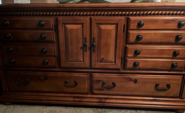
Cher is also bringing over two brown pieces of furniture. Above is an heirloom breakfront. It might be cherry or pecan.
This pine piece in a caramel stain is going under the TV.
Yesterday, Cher emailed me about a large three-piece in similar wood tones to go on the TV wall instead of the above sideboard.
I said, please don’t.
It is not a good design decision to have two big pieces of tall brown furniture perpendicular to each other.
Okay, here’s what I’m going to do.
I will share what I did, not necessarily in the order, I did it.
So, let’s dive in.
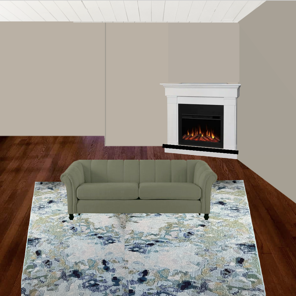
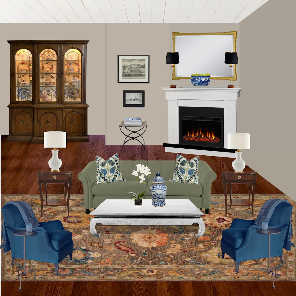
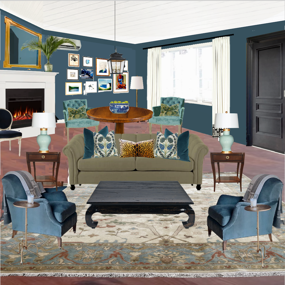
I began with Cher’s rug and a similar sage sofa with beige walls and the corner fireplace. I’m not too fond of the wall color with the rug and sofa.
Still, I will give it the “old college try.”

This is not the furniture layout — not even close.
While this is not terrible, and I feel there’s more depth, I also don’t think it’s uplifting. As most know, the weather in the pacific northwest is often gray and damp. Plus, I have a feeling this room is larger than Cher’s current living room.
So, the first mistake, and a common one, is that Cher is taking a paint color she loves in her current home and planning on using it in the new home.
She also doesn’t have a sound interior design plan.
Therefore, she needs my 12-step program.
I realize it’s overwhelming. But this is why it’s so fantastic to work on Picmonkey so that you can see everything you’re thinking of doing together. You could also use PowerPoint or keynote. However, Picmonkey has a lot more features.
You can use a photo as I did. Or, you can make your own perspective.
OR, just lay everything out on your virtual board. All of it works.
Cher’s third mistake was coming very close to picking up a piece of furniture that would not help elevate this room. I fully understand this. I can be pretty impulsive. That is why I gave it a full three hours before purchasing my stools. haha
My wonky numbering system begins here. It gets better later on. :]
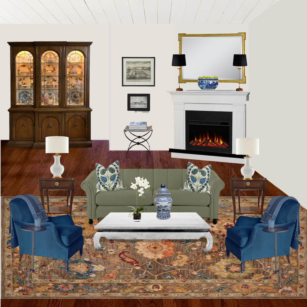
Okay. I tried, but I think the problem for me is the rug. So, let’s move on with a different rug.
1a
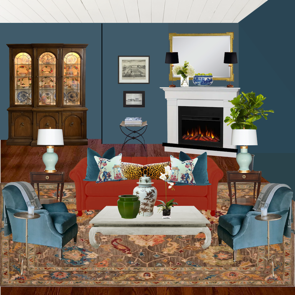
This is a hooked rug I found at Shades of Light. It is wool and full of warm, beautiful colors. (It also comes in other colorways.) Wow! What a difference already! And because there are many shades of brown and similar tones of coral and red, I’m no longer bothered by the difference in wood tones.
There’s that complexity principle in action.
But, I’m not nearly done.
I am not a fan of this wall color. This is why beige (okay, cafe au lait, haha) gets a bad rap. Beige, to me, is like white that needs some Zoloft. Rooms with beige can be absolutely gorgeous. Yet, beige, particularly if it sways a bit pink, is not an easy color.
Maybe Cher’s color is different from this beige. But, still. I think she can do better.
Beige colors that skew green are different. These khaki colors can be beautiful. In the early 2000s, I did zillions of rooms using colors like hc-96, hc-93, and others.
So, let’s do a warm off-white. This would be five parts coffee to 95 parts white milk.
2a
This vignette looks a lot fresher. It could work if there was a lot of colorful art to balance the contrast between the dark wood and off-white walls.
Okay, I’m abandoning Cher’s sage green sofa for now.
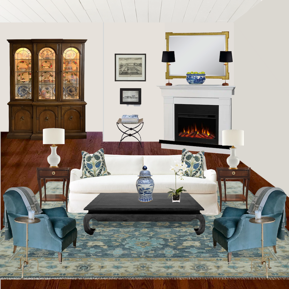
3a
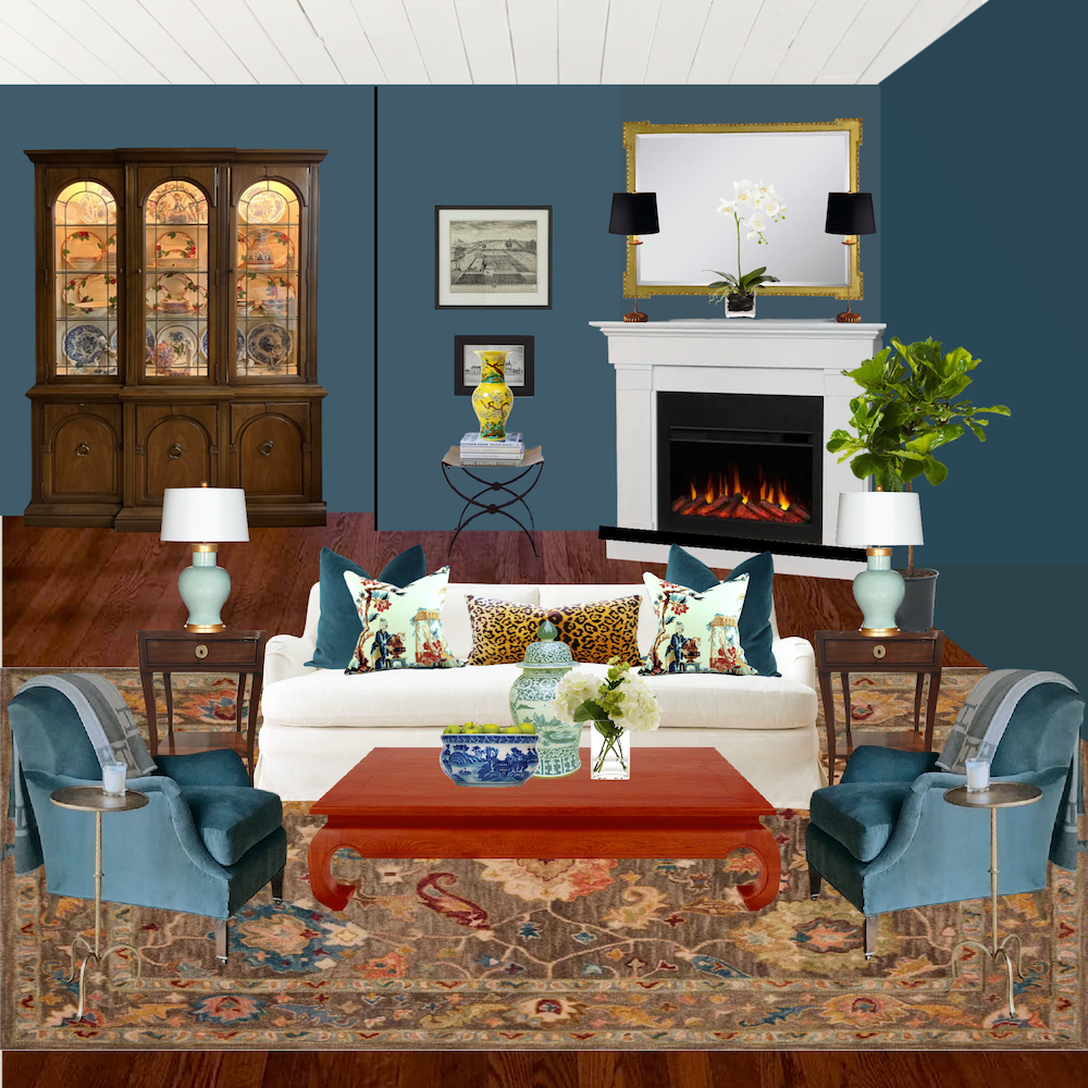
This is a white or off-white slipcover or even a pale natural linen color. Or, it could be upholstered in Crypton. I love this rug a lot. This idea has potential. But, I’m bothered by the brown breakfront on the white wall.
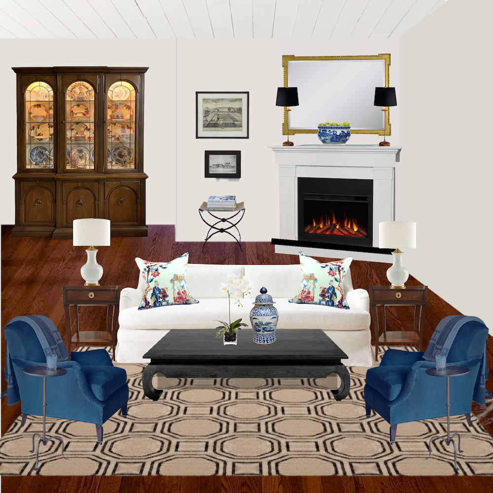
4a
Above, this handsome design, Hexile, is by Dash and Albert. This is a classic pattern on a jute rug. It’s neutral and chic.
I would be fine with either of these two ideas as a jumping-off point.
Even so, I’m fully aware that no matter how washable, some people will not do white, off-white, or even a pale natural linen color like Steve Cordony.
Okay, so what else can we do?
We need to make the cabinet blend into the wall better. It doesn’t have to be brown. It could be one of the deeper colors that go with stained wood trim.
Or, it could be a brighter color. It could be a beautiful, rich red or pumpkin color.
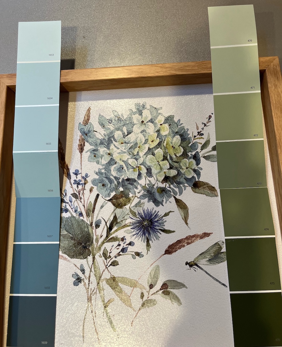
Okay, Cher presented me with a blue and green painting.
Now, the green that’s currently there might work. But, I sense that Cher wants a complete change.
She likes blue, and I’d like to try a very beautiful, almost navy, but not quite. It’s one of the many shades of blue in the Laurel Home paint and palette Collection. It’s Benjamin Moore Van Deusen Blue.
Van Deusen Blue is deep blue with a healthy amount of gray and a dash of green. However, I wouldn’t call it teal.
But, it looks excellent with teal and all of the blues.
Below is a screenshot I just took from the Van Deusen Blue page in the Laurel Home Paint and Palette Collection Guide.
Each of the 144 colors has a page like this. Then, 40 of the paint colors have palettes and furniture ideas to go with them.
Van Deusen Blue is a “universal color.”
I’ve deemed these colors to look great with every other color in the universe. Generally, they are the colors we see in nature. This could be a twilight sky or a deep ocean blue color.
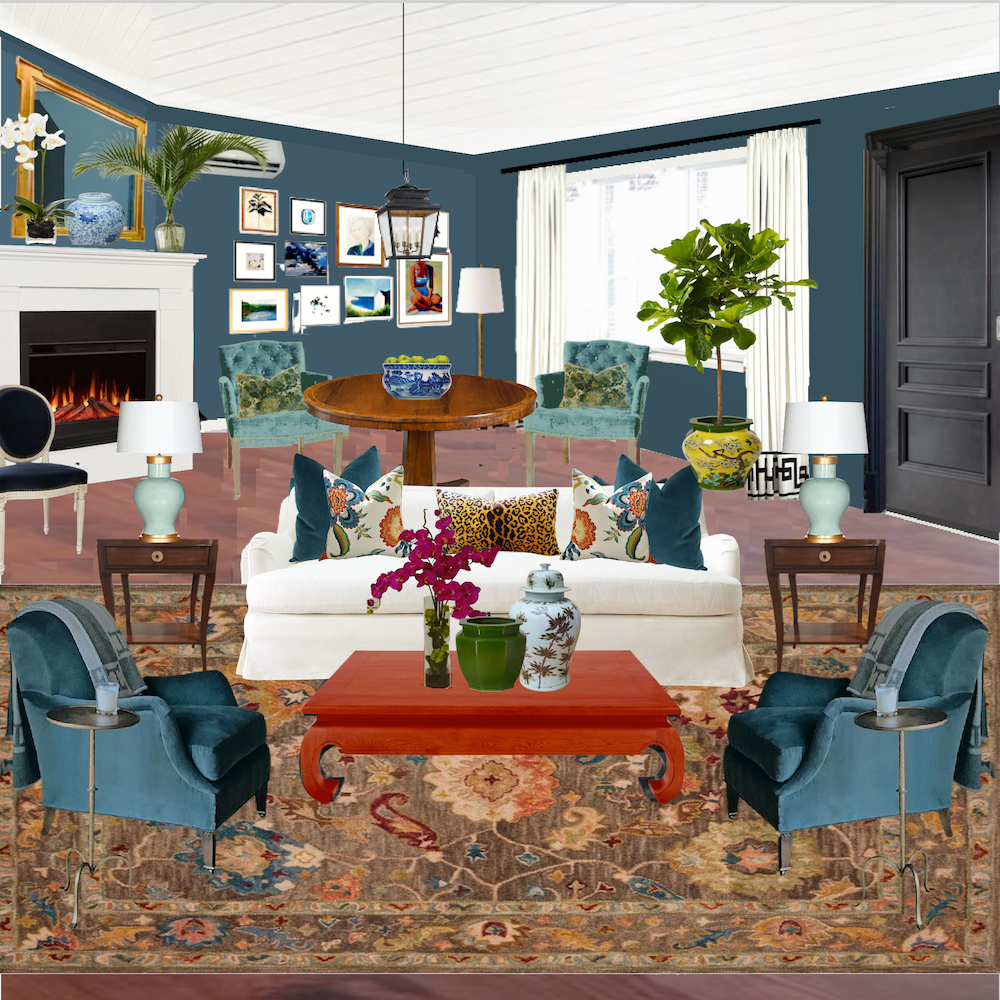
So, let’s stick with this view first. I will number these if anyone needs to comment on any of them.
The ones above are 1a, 2a, etc., because I forgot about them when I began numbering!

1
Some might not have comments, and some will.
2
Yes, a red sofa. Why not? We did an even redder sofa in this post a while back.
3
I love the red coffee table with this rug, too.
4
There are so many wood tones that doing a cooler palette on the furniture works beautifully. The cool tones bring out the warmth of the wood. I don’t think beige does that nearly as well.
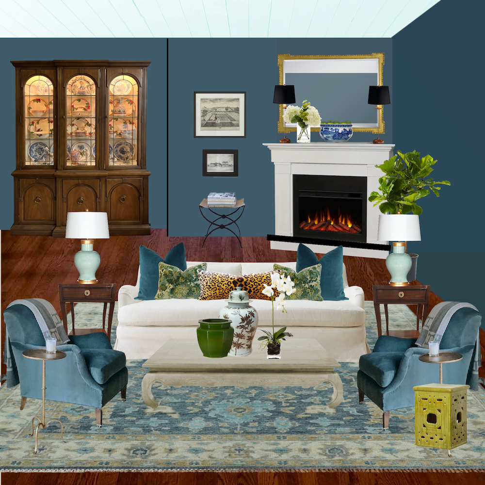
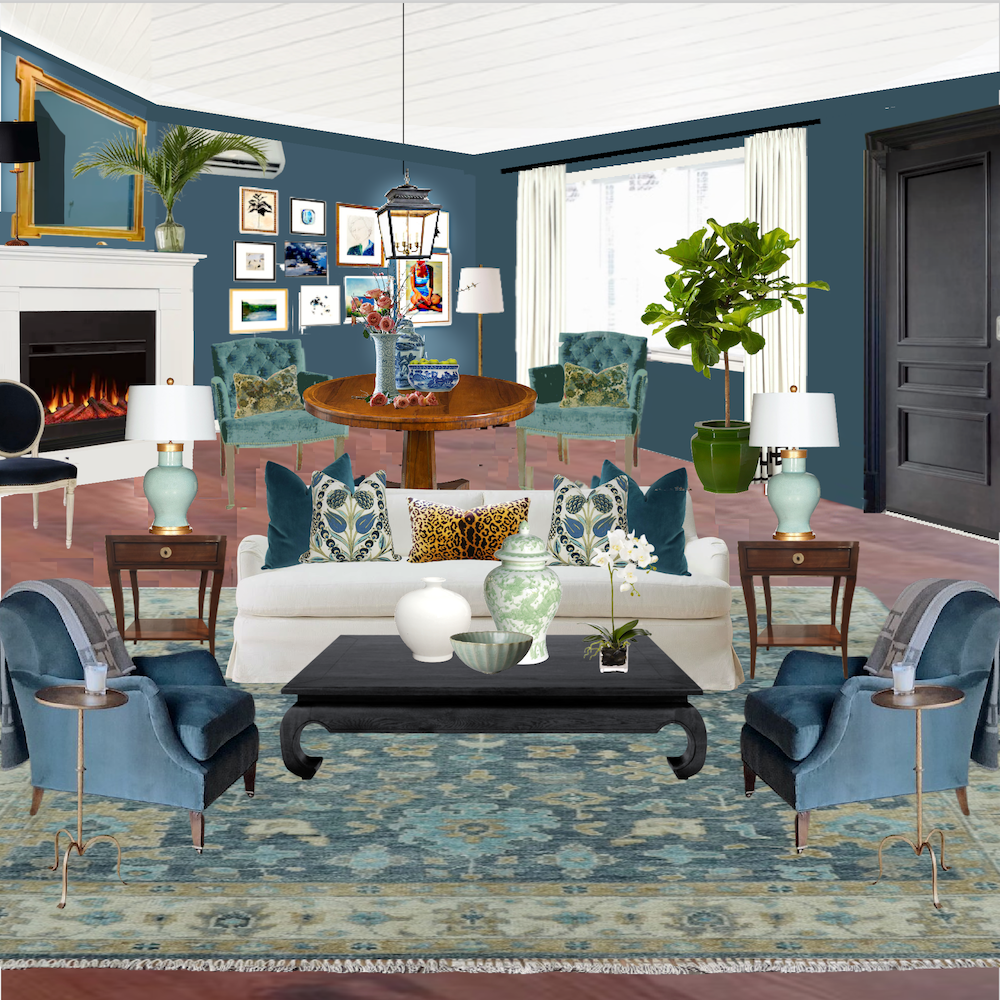
I spent the most time doing the view looking from the kitchen.
And, I did try using Cher’s sage green sofa.
5
6
7
No, they aren’t fully accessorized. However, I don’t think this sage color works for me as well as the other colors.
8
Above is the first one I did on Tuesday with a different rug.
I am not doing a floor plan for today. I can do a third post if you’d like more information about that and sources.
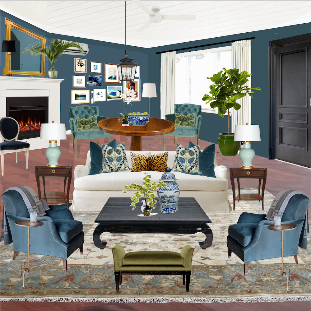
This is a sophisticated design.
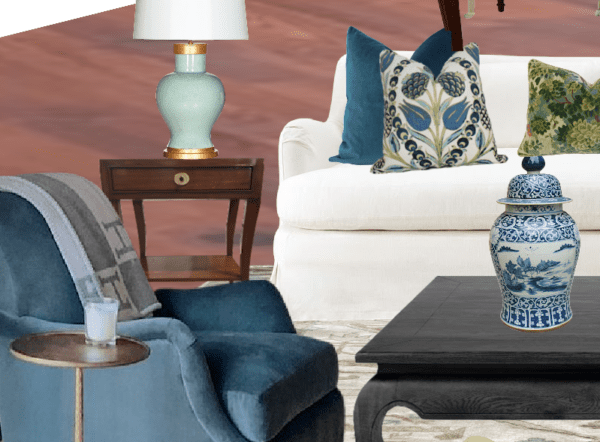
Yes, the front door and door casing are painted black. And, as there is a mix of brown wood tones, there’s an analogous mix of blues and teal. That, along with a healthy dose of white and more black accents and gold, makes for a well-developed, interesting room with a depth of tone and
BALANCE
By the way, I plucked that divine club chair off darling Jean Stoffer’s portfolio. Please don’t ask me to find it. Picmonkey does a surprisingly good job of removing backgrounds nine times out of 10. But, this also explains why the chic little drink tables are there.
Okay, I have a few more because I’m certifiably stark raving crazy.
9
This one’s fun. And, yes, intentionally a little clashy.
Oh yes. One of you had this idea for the AC. Thank you!
I also love the black and white Louis XVI-style chairs for the dining area. But, when I lost my image, I did have a screenshot of one iteration, but you can’t move the furniture in a screenshot, so I just stuck Louis in the corner.
Could you do a dark blue sofa?
Absolutely, or teal or terra cotta! There are about 50 billion ways you can go. Butr, this is already over-the-top.
10
This one might be my favorite. However, I can’t decide.
I need sleep, but I hope you enjoyed this look into my process!
I hope you enjoyed my process for creating a design plan. Please notice that paint selection is usually concurrent with the furnishings, usually not before, the furniture selections.
xo,

PS: Please check out the newly updated HOT SALES!
Also, please click the image below to learn about and to get your no-mess Samplize paint samples for all Benjamin Moore and Farrow & Ball samples using real paint! They’re a brilliant invention as you can move them around and re-use them too.
Related Posts
 My 20 All-Time Favorite Benjamin Moore Paint Colors
 Discover the new black in interior design!
 Happy 10-Year Blogiversary-Ten Years of Laurel Home!
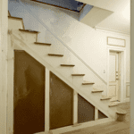 The Staircase Railing Installation Failure. Another Renovation Setback!
 Wanna See The Plans For My Bedroom Redesign?
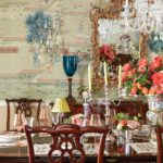 How to Find Anything on the Internet + Blog Theft!
 How To Create The Perfect Summer Home


71 Responses
Fabulous post. I would never have thought to put the chestnut toned rug with the Van Deusen blue paint but they are perfect together. And I think Cher’s sage green sofa needs to go. One thing I trying to do is to train my eye away from the obvious. I love numbers 1 and 3.
I picked up a pair of these blue club chairs on sale at kohls for around $200.00 each if you can believe it. They are perfect in front of our fireplace opposite our sofa. They may not be exactly the same as these because mine have tufted seat backs, but the color, size and shape are a dead match. I think the placement of the dining table seems odd so far away from the kitchen. I am not sure I would want to wend my way through the room with plate in hand to get to the table. I would place the sofa near the window in the same grouping, and move the table near the now longer kitchen wall.
Hi Robin,
Please see the post after this one. The layout was reversed. It’s all part of the design process.
The Van Duesen Blue walls were the key to making this room work!! Then changing out the rug!! I love 2 and 10. I love color and the red sofa with that rug looked great… thrn ( of course since I have slipcovered white sofas) I loved #10i loved how the rug pulled the walls into the design. As usual, I learned lots from your post! Thanks!! Martha
I love that color for the walls! It was helpful to see your process.
There are a few ways to hide mini splits – there is a ceiling mounted version that looks like a vent, and one that has a frame over it for artwork called “LG Art Cool”
Hi Tamara,
Thanks for the info. I’ve seen the LG units with the art which is a great idea. The problem here is the placement of the unit is overlapping the fireplace corner. That would be a very odd place to hang a piece of art. So, in some ways I think it might call attention to itself. I think the ceiling mounted version was mentioned in one of the three posts, when we were talking about the console mini splits. Yes, that was the first post. I don’t expect you to read every post or every word. And, there have been other posts about mini splits and hiding the AC units. Some of this might not be doable.
There is some controversy about how enclosed they can be, as well. Some contractors say absolutely not, and others say they work fine as long as there’s adequate ventilation. Maybe one day they’ll design units that are beautiful, and integrate with the wall or ceiling with a beautiful grille. That would be wonderful!
I love number 2, but Cher is gonna live up to her name!
“Baby, I read this blog, see, and…Imma need 43 thousand dollars.”
Just the first rug change alone made it so much more appealing! And the blue walls do make the cabinet prettier. Great job! So fun!
Laurel,
Great post! I appreciate the generous gift of your time and talent which is very informative and useful for those of us “Chers” out here! It’s very difficult to start a room from ground zero and from an economic standpoint we often have items we have to work into our designs. Sometimes the smallest tweaks like paint colors, accessories, hardware etc. can really change the look of a room. My favorite room is #8, such a cohesive look. Cher’s artwork as inspiration is very helpful as a guide to the color palette and mood of the room. I love and use Benjamin Moore paint in my home but Farrow and Ball’s guide on how light affects color has some helpful tips on using colors in different exposures. You always consider the look of the entire room as a whole in your designs and not just the disparate pieces. And I heartily agree with your advice on choosing paint color last!! Have a great day.
I scrolled up and down, up and down, but still came to the same conclusion. When I saw board #2, I exclaimed, “Wow, now that has punch!” and I love it. I almost always rule out white slipcovers. They are so pretty but with two shedding black cats who own the house and all the furniture within, it’s not feasible. Van Deusen Blue is glorious. I might use it in my living/dining area.
Can the mini split be painted?
You’re basically a genius. BRAVA!!
My favorite color combination is #2. Van Duesen blue is gorgeous with gold and black accents. I have this color and love it. The red sofa with pops of soft and bold colors and prints made the room feel calming yet still exciting, if that makes sense. I’m not crazy about gallery walls, maybe in a hallway. Hopefully we can see the finished project here, but does anyone have a finished home?
Great post with abundant design details and illustrations, Laurel. I’d love to see your floor plan for the space in your next post.
I’ll tell you what I love most about your blog, Laurel. You inspire and get people thinking. I enjoyed each of your iterations for the room and then began wondering what the space would be if decorated in the style of Gerald Bland, for example. Then, seeing the space in bright whites with navy — white slipcovers, blue and white striped dhurrie rugs, wicker, chinoiserie porcelain, tall palm trees and all. Then, as a more collected look — done in the manner of Ralph Lauren. It simply amazes me how one space can potentially become just about anything one can possibly imagine — limitless. Thanks for keeping me invigorated with a hunger to create!
Laurel, I love the blue walls IF there is enough natural light to make it not look like a dungeon. I have very little natural light in my LR so went with light walls. I like it much better than the darker that was here.
I finally figured out what was bothering me about all your boards…there are no baseboards or crown molding. Seems odd.
I would love to see more of this type of boards in future posts!!!
Laurel, like many others, I really enjoy these types of posts. It’s almost like we’re looking over your shoulder while you rearrange things on picmonkey.
I liked someone’s idea of painting the mini-split to match the wall color, so it recedes from view. I’m also one of your many readers who have found your 12 step plan to be worth it’s weight in gold. Well, it’s a pdf, so that analogy doesn’t work, but really so incredibly helpful. I refer back to it frequently. And Congrats Cheri! It’s going to be beautiful!
What a fun and interesting post! We have Van Deusen walls also, and love them!
Laurel, what are we looking for to get the BALANCE you spoke of, the COMPLEXITY of colours? I have your paint colour book, the one with all the mood boards and colour families. Is it making sure we don’t have all the colours in the same mid-tones, or all low tones, or even all deep tones? Looking at it and asking ourselves “ok, is there a little bit of drama somewhere?” I find myself looking at your paint colour family boards and comparing them with my rooms, and seeing where I can improve in my house.
Hi Laurel, this was SO FUN to see your process- especially working with existing pieces. It’s the reality if design work, for sure, except for that occasional start-from-scratch client (always my favorite!).
Having said all that- I love #10 the best, although I also love the addition of the green in #8! The white slipcover idea is great- it really does work, and it’s such a fresh look with the Van Duesen walls. I am definitely gonna steal that beautiful combo of the leopard pillow mixed with the florals- genius! As always, you teach us more about the timeless beauty of interior design done right.
I can’t decide which mood board I like best. I do know I love the blue walls. What a dramatic difference that would make. And I love the first rug you selected.
Laurel, you’re so good at coming up with solutions for problem rooms.
Oh, how I love these kinds of posts, Laurel! Yes, please do a follow-up with the furniture layout possibilities. Cheri, thank you for sharing your home with us and for leaving a comment. Painting the walls Van Deusen blue really elevates this space. And for those who are concerned with it being too dark to use in the PNW, from my understanding, using a color (even a “darkish” color) is preferable in dark, dreary climates, than using a white or off-white where the color can turn grayish and make the room feel really dreary. Is that correct, Laurel? I love reading the thought process of each iteration of your mood boards. And it is amazing how paint, a new rug, and some accessories can help so much. I recommend Cheri to scour Facebook Marketplace and thrift stores if she’s on a tight budget and she has time to do so.
My primary bedroom is Van Deusen Blue on upper walls over BM white wainscoting. We love it!
Laurel, I love your blog! I love your critiques and this wonderful, informative view into your design process. This is my first ever comment and it concerns the mini-split. (Why must these things be designed as if for an industrial space??! Aargh.) Anyway, I did a little online search and discovered that they can be painted to match the wall color, being careful to remove the cover off of the unit so no paint get on the mechanical parts. ???
I absolutely love 8 and 10. I would be inclined to purchase both rugs (if I had extra storage room) and use the lighter one for spring/summer and the darker for fall/winter. I am using VanHuesen in a guest bedroom in my new build (I think … after following you I’ll decide for sure after the house is built and I can see the natural light in the room) because it’s such a wonderful color. You really hit it out of the park on this project!!
This amazing! I cannot believe how beautiful each design is. I have used Van Duesen Blue in my living room after reading about it on one of you previous posts. I love its rich tone and have used green in the room. It is dark and I have white moulding and shutters, but I am thinking of adding a white wainscot to brighten the room. Thank you for the ideas and inspiration. By her comment it is clear Cheri is thrilled!
Thank you for this post. I feel like it popped out of my survey answers. I love the general idea of how you do the process and as a bonus I am struggle with a green and blue living room/ whole house palette and this was unbelievably useful.
This is sooo helpful! Thank you. I will be referring to this over and over again.
PLEASE continue with a floor plan for this space. This room is lovely but so challenging based on the fireplace, front door and kitchen entrance. You say you’re sure you can make this work – please show us what you are thinking.
Laurel, I love this type of post! So interesting and so much fun! More please…..
I, too, love this post. It trained my eye. Laurel, I am super grateful for what you have taught me. I see things most differently since finding your blog.
10 is a 10. I love how the black is spread around the room. I am trying to see my way to a medium dark color in my main living space. The Van Deusen Blue is a winner. You are going to do the furniture arrangement too?
4 works the best for me. I also might try it with the Asian coffee table in black.
As an amateur quilter, I use red and green color evaluator filters that help me find colors, textures and patterns that pop on a quilt. Maybe this is what you’re describing as chroma or tension? I immediately pulled out my green (cool colors) filter and looked at all versions of the room. The blue wall makes a huge difference, and that van deusen blue is beautiful. Why I haven’t thought to use my color filters for decorating, too, is a mystery! BTW I love your 12-step decorating plan and it’s VERY helpful. I’ve been able to clarify my thinking on what I do/don’t like in my house. Thank you!
Like others have said, this is one of my favorite post you have done. I love seeing the progression and options. I am in the process of furnishing a lake house with new and existing furniture trying to keep the rooms comfortable and easy (no one wants to be fussy at the lake), so I can relate to working with things you already have in order to save money here and there. I like the sage sofa! It looks warm, cozy and easy. The white sofa, while beautiful, elevates the room to a more formal sitting area where guest are going to be afraid of spilling on the sofa- even though it’s washable. I hope Cher considers her use of the room and what works for her family. I hope she shares the finished room- I love seeing other peoples homes.
The rooms are beautiful—I don’t have a favorite. One thing I’m wondering about is completely ignoring the fireplace. I realize the corner location is terrible, but in the winter, in a cold climate, there is nothing like cozying up by a fireplace. Couldn’t there be at least one comfortable chair next to it? Frankly, the older you grow, the more such things matter.
I agree with Jodi about painting the sideboard. My sister painted a dated China cabinet a beautiful darker green chalk paint, and it turned out gorgeous. There are definitely wooden case pieces I wouldn’t dream of painting, but anything where you don’t like the stain or the piece feels dated will likely be greatly improved. And chalk paint makes it so easy.
Cheri, thank you for sharing your home and decorating dilemma. One other idea that may help your budget is to slipcover your existing sofa in white linen or a washable fabric. That way you can see if you like it before spending money on new furniture.
Love the quote about complexity! So true. I used a similar blue in my bedroom (Van Courtland Blue by BM) and I just love it. I have a crushed velvet cover in terra-cotta on the bed and it sings. Go Blue!
My heart is full!! When I reached out to Laurel about my fugly fireplace, never in my wildest dreams did I think she would take me under her wing, small town Sedro Woolley, WA. I am truly grateful!!! LOVE the wall color the beige is going in the closets (I only bought one can) I really love #4 &7
I will be jumping off those. I bought a white ceiling fan, for those that were wondering. Budget is an issue, two people in their 60s finding love is priceless for us, but we can’t go too crazy. For now on the big items, I need to use what I have, if I can. This 2000 sqft house has similar, problems in every room. But for the sake of being overwhelmed and going to the poor house, Laurels books are going to help me sort out ideas and get inspired, and prioritize what my budget will allow me to change. She has a talent that is for sure! Now that you guys have the before, I will definitely pass on the after. Bless you Laurel!!
Hi Laurel, Such a great post! I favor #’s 1, 8 and 10. I particularly love that moss ottoman in front of the black coffee table against the Blue walls. The rooms sing on your stunning rug choices too! Awesome suggestions for Cher!
Leslie
Wow, that Van Deusen Blue is SO gorgeous. But I’m scared of the combination of that and PNW darkness. I love the white sofa and the rug in the last example. We had a monstrously ugly fireplace and I painted it flat black. It’s beautiful now, I love it. (I got the idea from one of your posts.)
It’s looking terrific Laurel. Would she consider painting the sideboard? My friend painted hers black with a fun color interior. Modernized but keep the family piece; looks amazing in her space.
There is nothing else I can say after reading all others comments as they say exactly how I feel about this post – it is wonderfully done..…what is even more astounding is my husband agrees with what you have done and the steps involved…..he told me I should really learn from this post! And he is a redneck country boy from South Carolina – WOW!!! I am saving this post for the future so I can remember that I, indeed, married a man that has some hidden taste in decor that I never knew! You have made my day, no you have made my week!!! Keep up this FABULOUS Post as you keep making life for me more exciting!!!
Thank you for sharing your design process. My head is spinning with all your ideas. I like your last mock-up the best. Painting the brick fireplace surround black and adding the black granite top would be a tremendous improvement. The black lamps on the mantle finish the look. The black door carries the color across the room, as does a black coffee table. A simple white fan, without a light, wouldn’t draw attention and would keep the fresh look you are achieving. If they think they need one with a light, they should consider a Minka Aire, low profile, in white, with three blades and a globe light that dims with a remote. I love the deep blue walls with the white drapes and the white sofa. The contrast is striking. The rich wall color compliments the warm color of the breakfront. I hope they can remove the chair rail. If not, painting it the wall color will certainly help. Although you show a square coffee table, if she paints hers black, she can still use it. I agree with others about the television being on the wall opposite the fireplace. I hope you can find a way for them both to be in the same focal point. I keep picturing the television on the wall to the right of the fireplace with the sideboard under it but would it work better to move the breakfront to the wall below the mini-split and put the television where the breakfront is, with the sideboard below it? Then the dining area would have the breakfront in it. It would also balance the room by having a wooden piece on either side of the fireplace. But I’m not a decorator and maybe this isn’t proper or doesn’t fit. Regardless of how the furniture is arranged, I wouldn’t do a family photo gallery wall in the living room. A beautiful print that draws out the colors of the decor would look so much better. Family pictures are much better in a bedroom, hallway or a more private area of a home. No one, but you, cares about looking at your family pictures. I think her painting would look nice on the wall separating the kitchen and living room, with sconces on either side over a console table. It would make that end of the room feel more like a foyer. I hope you continue this post with how you’d arrange the room. In another blog, I’d like you to go into more detail about creating tension in a room. I spend almost as much time studying your posts as you do preparing them. 🙂 Thank you again for sharing!
WOW Laurel! I think this is one of my favorite post series ever. By all means, continue! The visual progression is so very interesting. More of this please! In all seriousness, when you explain some of this stuff as you are doing the mock-up makes it more understandable. I am glad to hear how many hours it takes you as a professional to come up with this, not because I want you to work your butt off, but rather it points to the fact that we want a quick fix. Spend an hour or two in the store and have a polished,put-together look at the end. It obviously doesn’t work that way, even for you. No doubt it is extra hard when having to work within the constraints of budget and lack of architectural interest. Unfortunately, that is what a lot of us have to deal with and wonder why we can’t make it work. This was refreshing to see. Thank you!
Hi Laurel, this is so beautiful!!! I love the layers and the complexity. Lately, I’ve been seeing more of these dark colors but I have learned that the key is to make sure the color is not too dark so that it goes black in the room. Van Deusen Blue has become one of my very favorites! Colorful and not too dark, but rich and moody inside. I love what you designed here!
Michelle
Oh, Laurel!
You did it again…what a wonderful post! I almost drooled on my phone for real when I saw #1…you sold me on a yellow-green with that little olive bench! I LOVE that room! (And I like #4, but less, bc I like the other rug a bit more, but that’s just preference) And what’s so weird, is I’ve disliked almost all blues as wall color for since I had a pale blue bedriom as a child, but your many transformations made me eager to run out and buy Van Deusen Blue by the bucket! (But I restrained myself.)
I’m so looking forward to showing this post to my husband…he’s had a crazy-hard week, but we’ve made our 2023 goal to let our Airbnbs run along, and not add any new ones, so we can spend time now decorating our house. This post is so timely! Thanks to Cher (Cherie?) for sharing her house, and to you, Laurel, for sharing your hard work. I can only imagine how much time it takes. Thanks again for sharing, and describing, the process!
An incredible amount of work, Laurel! Almost overwhelming. Lot’s to consider. Cher’s place, that she’s moving from, is quite cozy and comforting and I can see why she may want to bring those calm sages, beiges and browns with her and that is a lovely breakfront. I think you have added some wonderful contrasts and elements that complement and support what she can bring to Dan’s and her new home. I like No.4 most. Hopefully they will consider the Van Deusen Blue paint and a carpet that brings in Cher’s favorite colors and others which serve to elevate the room so much. Perhaps they will consider – few cans of beige paint can be used elsewhere. The sage sofa is nice, and I can see how it limits things. Hmmm, yes, maybe an off-white sofa? After close to 30 years we turfed our old floral Lawson arm for a sleeker off-white Crypton track arm and never looked back! Grandkid spills wipe right up and it is washable, cozy chenille. I hope Cher, Dan, and yourself rest up and they take time to mull these amazing ideas some more. Usually some suggestions, like cream, float to the top and that they begin to use your step by step plan and the wonderful ideas you have given them to create their new home.
If Cher would really like to use her sage green sofa, then I vote for #7. The rug pulls in many different shades. She will definitely need some light things in the room to make sure it’s not too dark in the winter months.
love the gallery wall and the idea of a pop of orangey-red. Steve Cordony would give two thumbs up to the white walls.
Awesome post, Laurel, thank you. Your picture #4 is almost identical to what I’ve done in my living room, including the touch of chartreuse. I used a deep teal, more teal than Van deusen, on my walls, and added some contrast with appropriately placed khaki walls. The khaki is fantastic and a perfect neutral. I think you’ve given Cher lots of ideas and she could do this in stages. I think first steps, after paint, fireplace and wall work, would be to replace her chair that matches her couch with something like you’ve shown, coordinating throw pillows, and get a great coffee table. TV and art over the sideboard will go a long way. And I had to laugh, why on earth do they specify that an AC split has to overlap the mantle? What’s up with that?
This is so interesting! I like #9 – love that rug!
Laurel, This is one of the best posts!! (I say that a lot! 😉
But starting at a spot that most “regular” people would start at and adding different things REALLY shows the difference more bold choices make in the room. I am guilty of using too many mid-tones, so this was very instructive. I think the wall color made the biggest change, but my feeling is that if Cher wants to keep the green sofa the wall color needs to change… but hopefully to another dramatic color.
Laurel, I really enjoyed following your design process here. I really like the break front on the former bookcase wall and would love to see a post on the furniture layout for the room. I agree the wall paint colour Cher had in her former home would be better changed up especially for the amount of drab rainy winter days we have in the Pacific Northwest. I’m located just a bit north of there in Canada so am familiar. The art collage on the a/c unit wall lessens it’s impact nicely and the fireplace update is lovely. My preference is the off white sofa as it lightens up the space and gives it a fresher look especially with the blue walls, rug and chairs. I wonder what is Cher’s favourite of your design choices?
I scrolled down all of the images of the evolving design keeping my fingers crossed that the pair of blue accent chairs would survive the final cut! So many fabulous ideas. I do not envy Cher for all the decisions she’s facing, but wow, she is one lucky lady for having the benefit of your eye. (I’m guessing Cher doesn’t want to paint the dark wood pieces?) Great post, thank you so much for the hard work and all the insight you’ve shared.
Thanks to you, warm blue and vibrant coral has become a favorite color combination, it’s warm and classic, but as you say, adds such an exciting note! I love the coffee table’s potential for that pop. The gallery wall is a great solution to the A/C that can’t be moved. You have also given me a great idea to fancy up standard issue curtains that are sold too short for my windows! (Is that a better idea on paper that in reality?) Merci, Laurel!
Laurel, thanks for an insider’s view of your design process. I love the dark walls with the red sofa. I wanted to buy a red sofa years ago, but everyone told me I’d get tired of it. I know I wouldn’t have. Anyway, I have used teal and red in my home since the 90s and I love it! Also, I don’t know where the television would go in this room if the fireplace is the focal point.
Hi Laurel, I had an idea about the a/c, fireplace and bookcase–what about doing shallow built-in bookcase/paneling on the a/c wall that would box in the a/c without covering it, then extending the paneling over the fireplace mantel, then to the bookcase on the left, which could be covered with doors that blend in to the panelling so you wouldn’t see the shelves on the left side of the fireplace, but would still have them. The inspiration is some of the early American New England style panelled walls that have panelling over the fireplace and on either side. I googled early American fireplace walls, and there are lots of photos, usually incorporating lots of storage hidden behind the panelling on either side. Just an idea…. Loved the new ideas for color schemes!
Hi GGG,
In theory, it’s a great idea, however, it would require everything being moved forward as the air conditioner wall is already flush with the fireplace. A wall projecting out from a fireplace would look strange. If anything, it’s the other way around. The fireplace juts out from the walls on either side.
One of my favourite posts ever! It is amazing to see your process unfold. The second you changed the carpet (1a) the whole room came together for me. I tend towards Cher’s palette, but the room came to life when you added some ‘complexity’. And then each rendition further blew my mind. The Van Deusen blue! Gorgeous! We used it in our master bedroom (Toronto area) and it took my breath away (in a good way). You have given me some ideas to add some complexity. It is an amazing colour in these northern climes. Anyway, I am happy to follow you down the rabbit hole into a world of colour and ideas. Brilliant!
It occurred to me for pic #1A that one of the reasons the warm hooked rug looked so nice was because it echoed the warm (yellow) light pictured in the china cabinet. However, that yellow cast in the picture of the china cab is mostly an artifact of lighting and likely would not look so yellow in real life. So I wonder if the china cab photo should be color corrected a bit. On the other hand, it did not seem to be so obvious in subsequent layouts, so maybe an unnecessary task. The bold wall color is quite wonderful, but the room coming together would require Laurel’s hand in choosing pillows, art, accessories to make it a complete package, as the room layouts attest! And as to floor plan/layout? Yes, please! It would be wonderful to read about your process (like in this post) to see what possibilities there are. Thank you for this wonderful post.
For me, #1 and #8 absolutely soar, Laurel! What a gift, Thank you!
I totally agree with your post. I would like to see a pic of the real room after it’s completed. I didn’t know Cher had the China hutch that fit perfectly in that recessed wall and I’m glad they closed up the bookcase. The sofa with rollback arms takes up more space physically and visually and really wouldn’t elevate the design. I didn’t see the TV in there either. That room isn’t big and I was surprised she was able to actually fit all those pieces of furniture in there with room to walk around. I wasn’t far off when I suggested a blue gray type paint, getting rid of one sofa and using more streamline and smaller scale furniture. I thought she wanted to fit a typical dining table and chair to seat 4-6 which I didn’t see happening. For an amateur home decorator, I feel pretty proud of myself seeing some of my suggestions used. Great job Laurel!!
Betting Cher keeps lightish walls and sage sofa, in which case maybe paint chunky sideboard (or peninsula?) a FB blue or BM Van Deusen.
Washington’s bldg code for ac’s and splits is another reason to remain on the East Coast.
Don’t go mad; get some oxygen.
Would like to see the thought process on how you came up with the floor plan. Sofa facing away from fireplace and dining table and chairs placement are so inventive! I would have never thought to do that. Can tell I need to work on thinking out of the box. I love the final color scheme and pillows. Is there some way to paint that shiny white air conditioner the same color as the wall so it blends in more? Where did the TV go? Thanks for sharing your process, I learned a lot.
This was amazing! The deep rich paint colors just make the room so welcoming. I’m going to get out and experiment with Picmonkey as it helps so much to see the ideas. BTW you made a brief comment towards the end about the drinks tables. I LOVE my martini tables from Ballard Design! Tiny little tables that hold a drink or bowl of nuts. It was fun to see them (or something similar in your designs). I’m excited to see the layout and sources!!
Love how you develop the room.
I would go for the red sofa option for winter and then cover with the off white linen covers for summer. Beautiful.
That’s a great idea, Dorothy!
Great post! Would love a few links for some items on boards… specifically the rug in 5&8 🙂
Love the richer wall color…it makes such a difference. I hope Cher will consider it—if Dan chose the existing green he may really like the tone and depth of Van Deusen Blue, as well!
Green, teal and coral are ‘my’ colors so I love seeing how you used them here. Beautiful and inspirational work. Would love to see your thoughts for a floor plan.
Love the last pic and I adore the pillows on the sofa.
You have spent a lot of time on this and I thank you.
Laurel – the most important utensil in the kitchen is a very sharp knife with a good edge to it. It works every time. Well, my friend, you are the knife, good edge and works every time.
Injected humor takes the edge off of us and we need that.
Have a wonderful day.
Amazing! You inspire me to keep trying in my own home and never give up.
fun read, I have that couch, exactly the same and it is not going anywhere. fun to see it in your various interactions. I prefer the beige walls, I am a fan of light colors and lots of natural light. other than that, the furniture changes are good. I like your expression that a little tension is good, lots of tension here! I have an awkward corner that is part of my almost 200 year old house and also not going anywhere. not big enough to do what you did in the room and ignore the fireplace and make the room square, but an eye opener for me.
Laurel – wow – what a difference from the first beige wall version to the last one – incredible. It makes me want to try not to play it so safe with color! Yes, please on the layout and sources! I love how you handled getting table in there that feels integrated into the space instead of feeling like “a dining area”.