Hi Guys,
It’s mid-July and man, don’t we know it here in New York. So, if you’re somewhere that’s sweltering, I hope that you have air-conditioning and/or some cool water to jump in.
As for me… I have the former.
But still, during the day, it still feels sweltering. So, all I want to do is cool down.
And, what better way than to look at the coolest color of them all.
You might recall that in early April, I FINALLY did a post about some blue paint colors. I didn’t show any rooms, but we got to hear some cool blues music. Because those were dark blues.
And then, we did a summer home post a few weeks ago.
Today, I’m including a couple of the darker blues, more for balance and one shade of blue. The rest of these blues are medium to medium-dark.
Most run to the warmer side of blue. Blue colors that lean to the warm side are called cerulean, teal, turquoise and aqua. But, you probably already know that.
A misnomer that some make including me sometimes, is in regard to indigo.
Indigo is a blue that leans towards purple. And, it’s not that I don’t like indigo. I do if it has enough gray in it. But, I still prefer the warmer blues.
And, I love a beautiful cobalt blue, but usually in small doses
But, here’s something very important to know about blue paint colors.
Blue is a color that can go fugitive.
That’s actually something I did learn in design school. What that means is that the color that goes up on the wall could turn into something else. And, that’s especially true if the sun is hitting it. The color could go muddy, greenish or even more red.
Does this always happen with blue paint colors?
Some of these blue paint colors are quite saturated. And, we’ll discuss how to work with those colors. Because, as you’ll see, a saturated blue can make for an awesome backdrop for furniture and art.
Most, but not all of these shades of blue are in the Laurel Home Paint Collection. I will put an asterisk* by the name if the Benjamin Moore color is one that’s in the LH collection.
*DOLPHINS COVE 722
I don’t know the source of this image, so if somebody does, please let me know and I’ll add it in.
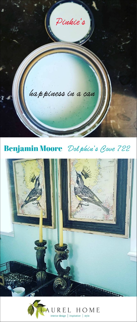
A faithful and lovely reader who goes by the name of “Pinkie Crabtree” on social media painted a room this color and adores it. So, a year ago, I made a graphic from the images she posted.
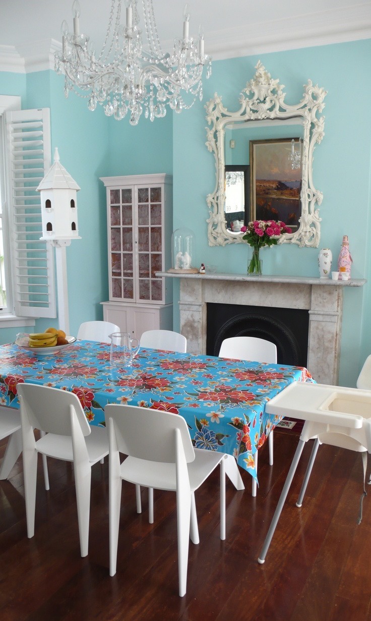
*TRANQUIL BLUE 2051-50
Miles Redd via Architectural Digest
Tranquil blue is the quintessential turquoise blue. Please note that in the images, the color looks close to the actual color. But in some cases, I don’t know what the color is.
This color is actually Farrow and Ball’s Blue Ground. But, Blue Ground is very close to Benjamin Moore’s Tranquil Blue. For a conversion chart matching Farrow and Ball to Benjamin Moore, click here.
Did you know that Anthropologie carries Farrow and Ball Paint? Well, I didn’t know that until today. So, good to know that you can order it through them if you don’t have a store nearby. Anthro has been collaborating with numerous brands such as Nordstrom.
Forgive me for interrupting, but have you checked out Nordy’s massive Anniversary Sale? Right now through the 18th is early access only. After through August 4th is the sale open to everyone.
Please check out this post for more info, if you’re interested.
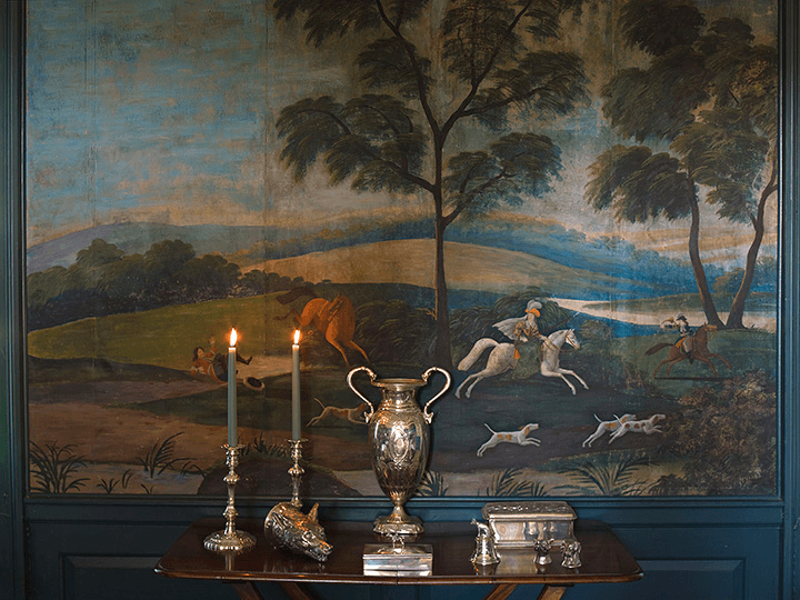
Mural from the dining room of the Ladew Gardens Manor House.
Those colors! How incredible is this!
*WILMINGTON SPRUCE 754
This is one of the most saturated colors in the Laurel Home Collection. I really did try to put in something for everyone. However, as you can see from the above image, it’s a very cool color. I don’t know if this color is Wilmington Spruce, but it looks like it. And, that’s all that matters to me.
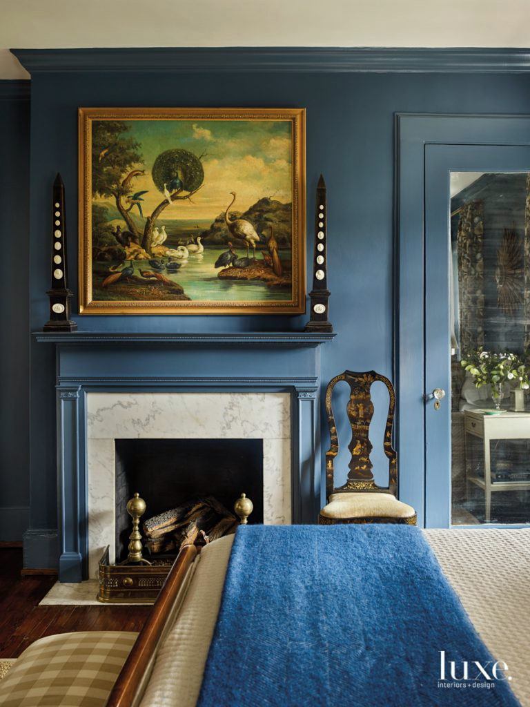
*JAMESTOWN BLUE HC-148
Sheila Bridges iconic living room – The color is actually Farrow and Ball oval room blue – However, it is a clone (or very close) to Benjamin Moore Jamestown Blue hc-148.
Before I go on. I know that some of you feel passionately about this and I respect that. However, please refrain from the speech about how much better Farrow and Ball paint is…
No one is arguing with you. F&B is wonderful paint and is formulated differently from Benjamin Moore. Can the average person tell the difference? Probably not. Maybe side-by-side, but even then I’m not sure. If you can, great!
I’ve used Benjamin Moore paints my entire career. They make a fabulous product. But, of course, if you can afford F&B and want to use it, by all means, do so.
One reason, I’m using these twin images is because sometimes I can’t get a decent image for a Benjamin Moore paint color. But, the images for Farrow and Ball are usually more interesting to me.
I don’t know what this color is, but I love the image of my favorite hotel in the the Universe! The JK Place in Capri. Oh, to be there right now! One day, I hope!
COOL BLUE – 2058-40
Of course, this is from Ben Pentreath’s gorgeous dining room. For another image of it, that I took– click here.
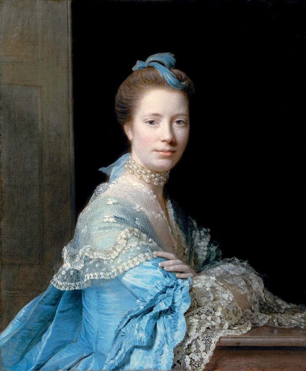
*BUCKLAND BLUE HC-151
18th Century Selfie – haha – Self-portrait with Lace Jabot (ca 1751)-Maurice Quentin_de_La_Tour
Handsome devil. And, I think he knows it! I read that he worked mostly in pastels. Very talented!
BAINBRIDGE BLUE
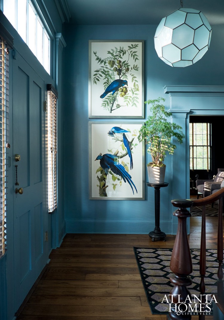
Atlanta Homes and Lifestyles stanton_madison_blue on blue entry
The rest of the house is wonderful, too!
I posted this image at least once before. I love it!
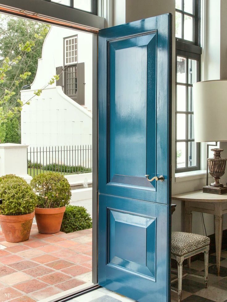
This gorgeous door is from the post about great front door paint colors.
Jean Abercromby, “Mrs Morrison of Haddo”, Allan Ramsay, 1767 photo – York Museums Trust
*CHAMPION COBALT 2061-20
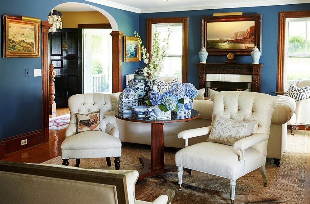
Kelli Delaney sitting-area – Looks like Benjamin Moore Champion Cobalt. For more of this beautiful living room, click here.
*GENTLEMAN’S GRAY
Luxe Magazine – Designers – Nina Nash and Don Easterling
Farrow and Ball – Stiffkey Blue – Benjamin Moore Gentlemans Gray
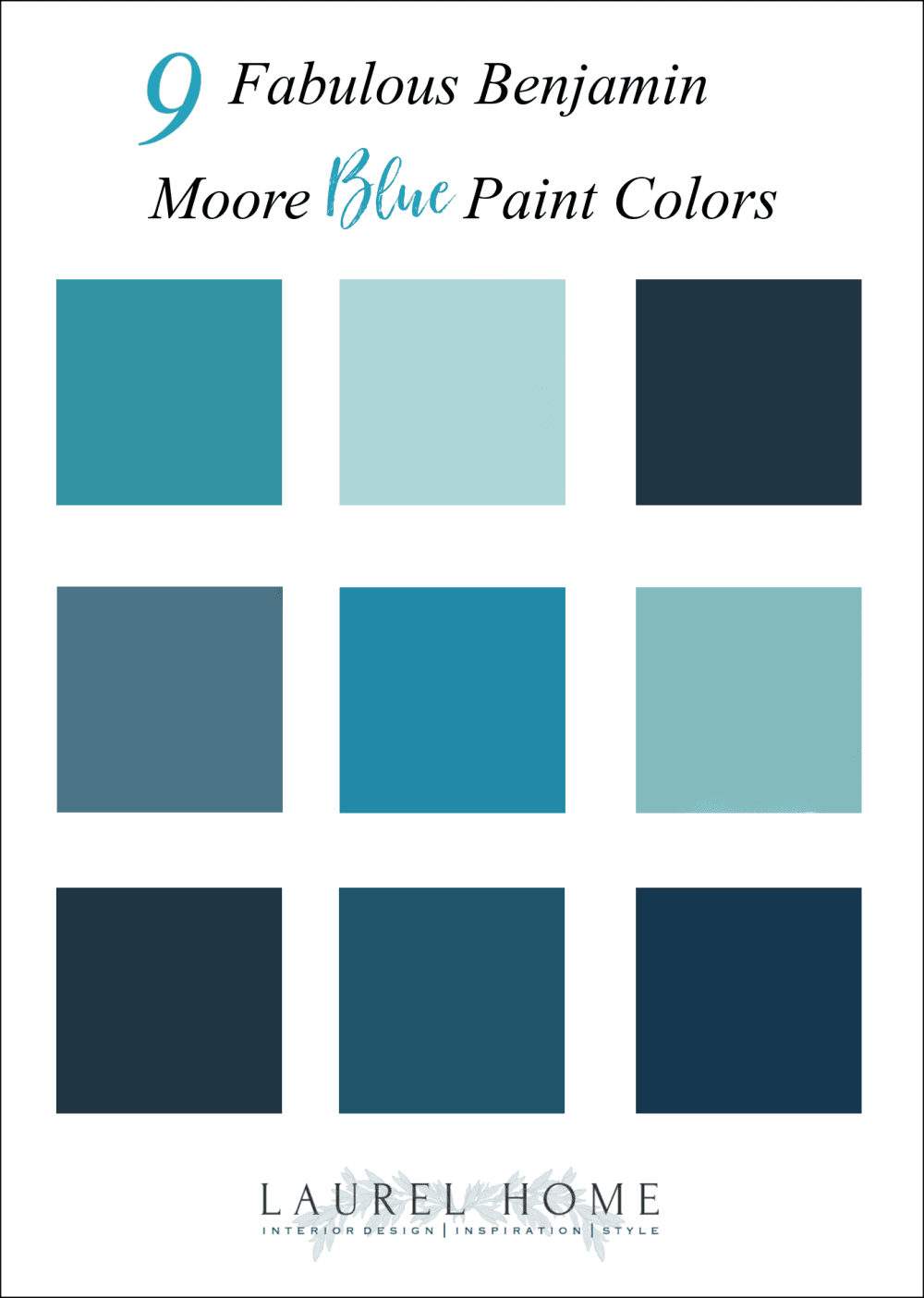
-Living_History
please pin to Pinterest for reference
Oh, gosh. I just checked the weather forecast and it’s supposed to get even hotter!
Well, stay cool everyone. I know I feel cooler looking at all of these beautiful blue colors.
And, please check out the newly updated hot sales and my favorites from the Nordstrom Anniversary Sale. I will be updating the beauty products for Friday. This is a great time to stock up on favorites because you won’t find these items for a lower price.
Oh, and Serena and Lily just put all of their gorgeous upholstery on sale!
use code: GOALS
xo,
Related Posts
Six Problem Ceilings – And How To Fix Them
Painted Hardwood Floors – Good Idea or a Bad One?
How Much Does It Cost To Do A Smart Kitchen Renovation?
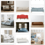
9 Fabulous Benjamin Moore Cool Gray Paint Colors
Love Me A Warm Color Scheme But Is It Going To Look Dated?
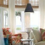
Everything You Need To Know About Classic Woven Wood Blinds
It’s My Dream Home Except For One Problem– The Wood Trim
33 Responses
Thank you for the inspiration Laurel. We painted our North facing drawing room Bainbridge blue, and it is a triumph! My husband could barely be talked into it, and now he thinks I am a genius.
The whole room is elevated without spending any further money. We’ve just switched around the paintings in the house to get the ones with yellow in them in the drawing room. The yellow pops against the blue. Even the tatty old beige/taupe sofas mauled by the cat somehow look better.
This shade of blue is not too dark or too light, there is not too much black, red, or yellow in it. It feels ultramarine without being shocking or garish. Thank you, again.
Oh, Laurel, don’t make me choose between even more blues! Just kidding—but seriously, I bought your paint color guide because my husband and I needed some serious help narrowing the options. Truly one of the most useful investments we’ve made as 1st-time homeowners restoring a big, old place. Whole house is being done with your help, and we appreciate your products so much. And we took your challenge…we used Wilmington Spruce and it’s super! Three other of your blue “Essentials”, too, but I won’t say which since it’s not for me to give away the goods. 🙂
Hi Jen,
Oh, you can say what they are. I’ve listed numerous of the colors but they are so spread out over the last three plus years that it would take someone days to find all of them. Plus, I haven’t mentioned all of them and there is so much more information that is not given out.
But thank you too, for this wonderful testimonial! I very much appreciate that! xoxo
Laurel, have you ever wrote about lighting switches and plates? How to choose them. Something white and simple or in bronze, traditional, modern, you name it. All details make design!
Hi Liz,
I am not apt to write about this topic. I’m sorry. It’s not anything I’ve ever gotten involved with and I guess it doesn’t matter to me that much. And, that’s just it. There are so many variations, it would be impossible. But, white works for me, usually. More important is that there are enough of them and they are in the best locations.
Hi Laurel,
Gorgeous colors! I noticed in several images that the trim/moulding is painted the same color as the walls. Is this something that is preferable when such saturated or bold colors are used? Can you paint the trim white? If you do paint trim the same color as the wall do you have to do that in every room of the house? And if not, how do you make the transition? So many questions!! Thank you for this blog by the way, I have been reading and re-reading your posts for years. So much content!!!
Hi Melissa,
Yes, too many questions. lol But, seriously, my brain short-circuits when that happens. But, yes, you can paint the trim white. No, it doesn’t have to be every room the same. If the trim is the wall color in one room and outside that room it is white, I paint the jam white.
I enjoy and appreciate posts about wall paint colors! But I have to say I wish more blog posts about interior architecture. Of course there are some informative ones at the blog already… but there are more posts about wall colors than interior architecture blog posts. People still notice color commonly than architecture. Yes, you said this many times Laurel …but I beg you to write more about architecture! Please please please!
Hi Val,
There are a lot of posts concerning interior architecture. However, I can’t point you to them at this time. Maybe try looking up words like “mouldings” in the search box in the side bar. I’m not saying that I can’t do a new one. Or, if you could elaborate more on what you’re looking to find out more about, specifically.
Hi Laurel,
Maria Killam taught me that all greens can work together. Because Mother Nature has all shades of green on earth. I was left thinking that green would be the easiest color to work with.
As for blues…I love them all! As long has they have some grey in them to tone down the brightness.
Hi Mary,
I agree that the greens do all work together. Of course, some might be in very tiny doses.
Amazing information as usual! I’m completely off with another topic though;]
Laurel, interior decorators work with architects for interior architecture? I’m wondering because I just realized that Rose Uniacke hired Vincent Van Duysen for her home. I’m wondering about Mark D Sikes then? And who do what basically and how to work with an architect if you’re the decorator? My question sounds silly, but I’m really intrigued!
Hi Lisa,
In my practice, I only worked with an architect directly, once or twice. Oftentimes, there was one and the client would show me the plans for review. Sometimes we had to tweak things and the client went back to her designer. One time, it was a builder and I redesigned the kitchen family room area. This job.
Aside from that, I can’t really say. Mark Sikes has a whole team of people.
Thanks for some great blues. I just recently had custom cabinetry built painted in gentleman’s blue satin finish, and it is stunning, i love it. Also painted a guest room farrow & ball de Nimes, and it looks really nice both with natural sunlight in the day and artificial light at night,
Thanks so much for sharing that Sara!
Love all these blues, Laurel! It’s my favorite color.
All of your photos show the same color on the walls and trim, which really gives a cohesive, sophisticated look to a room.
Keep cool this weekend–looking forward to your next post!
Thanks so much Diana!
Hi Laurel,
Blue is my favorite color and there are so many shades to choose from.Love this collection of ideas because I am getting ready to paint my dining room blue. Benjamin Moore’s Century paint is one I am considering and wonder if you have had any experience with it. Also I love the color of the door in the Bobby McAlpine photo and tried both links but could not find the name for that color. Could you provide that information? Your blog is amazing – Thank you for sharing!
Hi Kim,
Thanks so much! I don’t know the exact color, but Bainbridge Blue is one to look at.
Hello Laurel,
Thanks for this post. Beautiful colors! Blues and greens are my favorites…being a redhead, I have to love green :-), but all the wonderful blues speak to my heart.
Regards,
Candace
I love those deep vibrant blues with red hair!
I loved your post on “blues” but I fell in love with the self portrait of Maurice Quentin de la Tour! What a handsome, interesting, mischievous looking gentleman. Don’t you wish you could have known him? I googled his work and found some of the other portraits he had done and they are equally fascinating. Every one of his subjects looks happy. Amazing. They are not your formal or stodgy views of most portraitists (is that even a word?) of the time period. Anyway, thanks so much for another wonderful post.
Hi Gayle,
Yes! That’s why I put it up, in addition to how well it’s done and the lovely colors. But, it looks so modern!
Hello Laurel, This post is really dating me–I remember when the only choice was between Wedgwood Blue and Williamsburg Blue.
I am starting to get the feeling that colored paints work best when the room is flooded with ‘kind’ light, so that not only the color itself is highlighted but also the depth and richness of the paint. I think that the Dolphin’s Cove blue might work even in Taiwan to add a little color; in my apartment it is either gloomy or there is harsh, direct afternoon sun. I think that a blue like Dolphin’s Cove might stand up to either condition.
–Jim
Hi Jim,
I think that colors like that actually act as “neutral” colors because they definitely go with everything. I believe that Dolphin’s Cove is the color used by the Grace Home Stores. It’s a small chain of home furnishing stores. I don’t remember the other details, but when I was researching colors, I recall that info.
What timing! I have been mulling over doing a deeper blue shade in my son’s room, and I think I’ve about decided to go for it. Gentleman’s Gray was on my list, will have to check the others out.
Laurel, I’ve seen bits and pieces of your blog over the years via Pinterest, but recently came across a couple posts and started reading…next thing I knew it was 2 a.m! Such good information and very entertaining. I have a degree in design myself but have been on the sidelines for a few years with young children, and moving around with my husband’s job. We anticipate moving one last time next year and hopefully settling into a long-term home, so I plan to purchase the paint guide and Rolodex then as we do the inevitable ‘fixing up’ (because no, darling husband, I can’t just leave well-enough alone 😂)
Thanks for all you do, I find myself asking ‘What would Laurel do?’ When contemplating my house and decor decisions. Keep up the wonderful work!
Hi Elizabeth,
So happy to have you here. The blog does attract a lot of people from Pinterest for which I’m very grateful! I’ve also used Buckland blue a couple of times including my boys’ bathroom and it’s another really good deep blue.
I LOVE blue! These are great colors!
Elizabeth Bauer’s bedroom design in the February 2017 issue House Beautiful is swoon-worthy! I want to paint my bedroom that color but can’t quite figure it out. It appears to be a very light aqua blue.
I plan to paint my laundry room Cool Blue (or something very close).
Our temps here are in the 100s this week!
Hi Bonnie,
My rec whenever one sees a color that they like is to not worry about what it is, but what it looks like in the photo. So, all you need to do is match up what you see to a color that looks like what you see on the wall. It might take a few tries. But first start with the chips and narrow it down and then get your test quarts and make samples.
I can guarantee with 99% certainty that what you are seeing in a photo, is not how it will look in your room.
Dear Laurel,
I want to thank you for all your paint ideas and beautiful photos. I will never be able to afford an interior designer, so your blog is mine.
We live in a modest greek revival that we are slowly renovating. After obsessing about paint for weeks ( I have a grocery bag of paint sample cards) and picking a sample that turned positively glum (think 13 year old girl getting grounded), I came upon your blog and picked Lookout Point. It is perfect – pale blue with a hint of green – just what I wanted. I painted the ceiling Cotton Balls and it looked so great, I spend the last 2 weeks on my knees stripping the paint off the wide pine floor. I still need to put down the finish, maybe its just the fumes, but it looks amazing – better than I dreamed.
I have really learned a lot from you and enjoy your sense of humor.
Thanks again.
Janet
P.S. I love the blues in this blog. I’m not sure I have the spine to put them on a wall but my front door is a good place to start.
Hi Janet,
Well, this sure made my day. I love your darling note and kind words!
Jamestown Blue looks lovely to me here.. A friend who is an amateur artist, furniture designer, gardener and all around talented guy asked me recently what my favorite color was in interior design. I told him I love almost all greens, with lots of white around. His reply was “Oh but green is so easy to get wrong” ! As a person who sadly has no talent in interior design and needs a lot of help from the likes of you Laurel, I told him I disagreed and that I thought blue was easy to get wrong! I stay away from blue for that reason although I know I’m completely in the minority here. I do love that blue door however! And I like some houses with blue shutters. Do you think there’s one color that’s easier to get wrong than other colors? Or perhaps its possible to get any color wrong lol ! !
That’s a very good question Maggie. I think any color can go wrong because it’s only one element out of many. I always say that the most important element of any space is the architecture. The color is way down on the list.