

Hi Everyone,
Thank you again for all of the terrific comments for Cher’s and Dan’s home. They’re gung-ho for a big change and are embracing their new classic trad style.
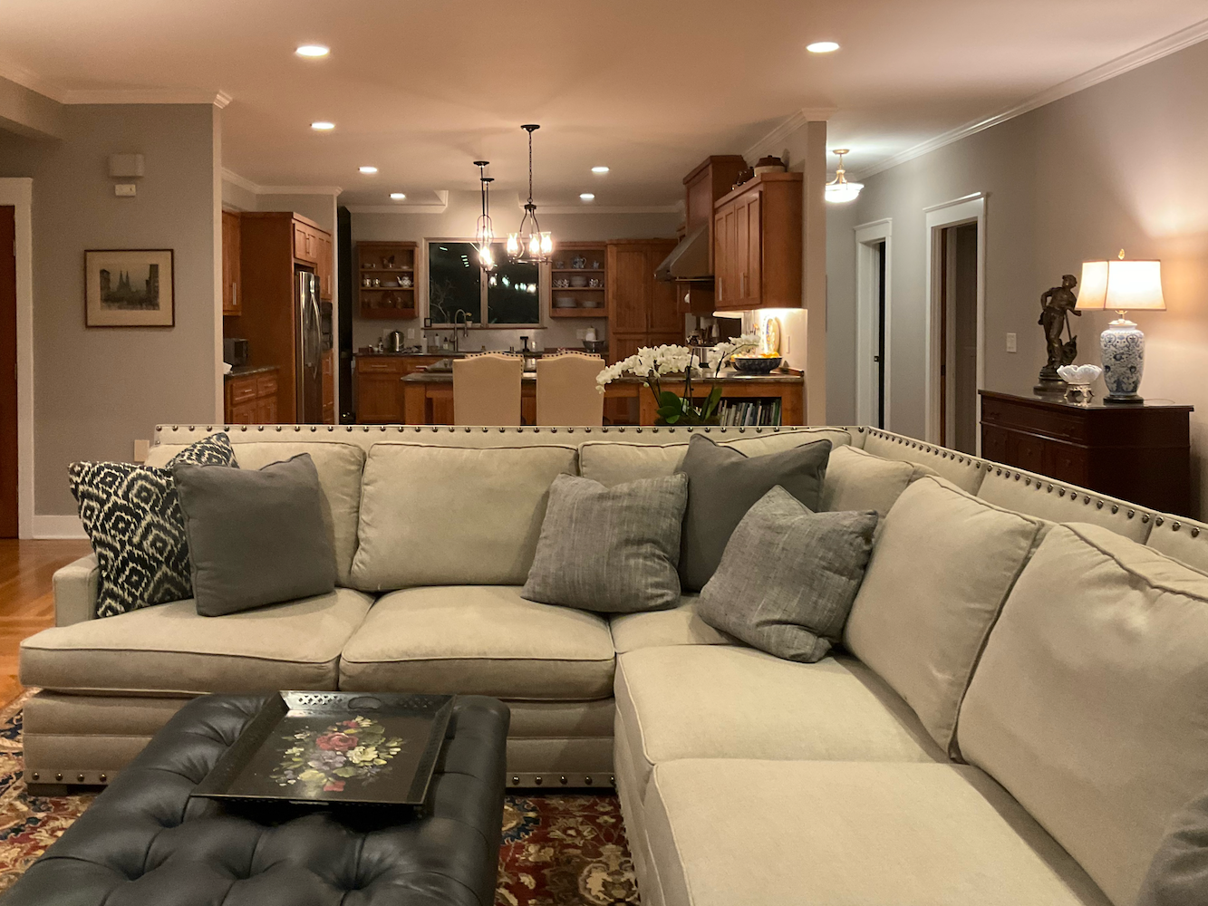
Recently, I received another Dear Laurel letter. This home is also a fairly typical, contemporary American home, but California style. The plan is open and quite spacious. An interesting coincidence is that there is another corner fireplace. However, unlike Cher’s home, this room is more oblong than square-ish.
What’s super interesting, that I did not realize right away, is that we have looked at this home before. But, not this room.
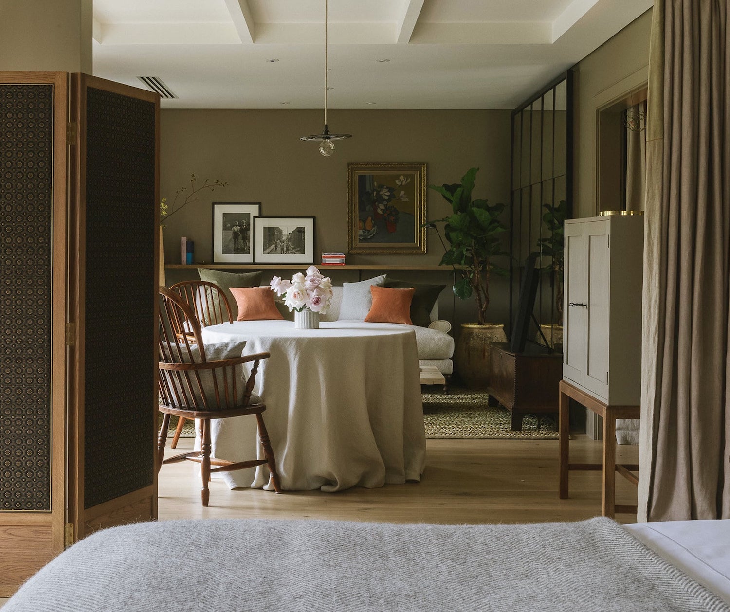
It was September 2017 and during my trip to England. To give myself a break while away, I let y’all give Mary some advice about her lovely dining room off of a charming sitting room.
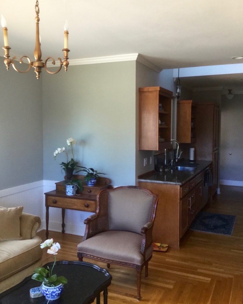
The dining room is to the right of the sitting room in the image above. Here, you can see Mary’s preference for more trad style furnishings.
Since they rarely use the dining room, but do use their family room, a lot, that became the focus for their redecorating efforts.
The family room is perpendicular to the sink wall, on the other side of the stained wood kitchen.
While many people don’t entertain much, Mary and her husband, both retired, entertain their friends from their local rotary at least once a month. Plus, they have a large family scattered throughout the state of California.
As you can see from the post from 2017, Mary’s tastes veer towards the traditional.
However, Mary’s husband prefers a more contemporary style. Therefore, the family room, a more casual space is a blend of contemporary and more traditional style furnishings.
The reason Mary contacted me this time was because she was searching on the blog for rules about how high and what size buffet lamps should be.
Below is Mary’s note to me:
***
Dear Laurel,
I have been following you for about six yearow and always learn something from your articles. I so enjoy your most recent one helping Cher in Washington with her challenging , and am intrigued by the buffet lamps on the mantel. That sent me on a search of your blog for an article on choosing the appropriate size.
I just bought an Eagan mirror from Pottery Barn for our built-in buffet that is eight feet wide by 44″ high.
Our ceiling is 9’ and the top of the mirror is 15” below the ceiling. I have two table lamps flanking the mirror. But they seem too short so I am considering buffet lamps instead to get extra height.
Do you think your readers would be interested in this subject of lamp height/ratio?
Should the lamps reach about 2/3 of the mirror height? So much is individual of course, but maybe there is enough that is general that would be a good discussion. I always look forward to your blog.
Thanks so much!
Mary.
***
Thank you, Mary!
I had to check, and there is information in the 333 Decorating Rules & Tips guide about whether to use one or two lamps on a buffet table, but no information about the size. There is lots of information in this post devoted to end table and lamp pairings, and this post about lamp and lampshade pairings.
Typically, buffet lamps run from 30″-36″ high.
They are tall slender lamps with smaller lamp shades. So, the height is not usually an issue for most dining rooms.
Although, these buffet lamps from a dining room I did in 2013, were about 39″ tall, if I remember correctly. They are from Currey & Co. and have been discontinued. (the wallpaper too.)
However, one doesn’t have to do a buffet lamp on a buffet table.
A regular table lamp can also be used on a buffet table.
Big 31″ tall lamps with presence on this console table from Serena & Lily.
Mary’s lamps are only 25″ high. I think 30″-32″ if a regular lamp is a better size for Mary’s family room. In addition, the blue glass feels a little light. I would also like to see some black lamp shades and more gold tones. But, I also want to see some color here.
She also sent some additional images of her beautiful furniture.
However, as with Cher’s home, I found some of the rooms elements could be tweaked for the better.
So, thank you, Mary for willingly submit your lovely home for scrutiny. If y’all saw my home right now, I’m sure many of you would have plenty to say. ;]
But… please know. I found the original real estate listing.
Well, I can’t believe it’s the same home. Mary and her husband did a terrific job of making this home look a lot better.
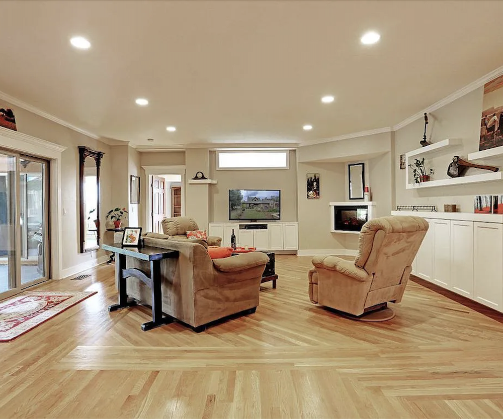
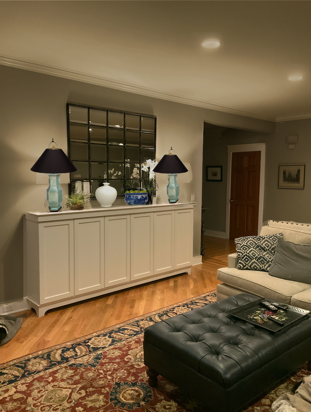
As you can see, these images were all taken at night, so of course, it’s only artificial lighting.
Okay, what is bothering you, Laurel? This is a lovely room!
It is! But, despite the over-all warm palette, I’m finding the space a tad cold. I think it could use a touch of spice, and a few other things.
For today, I’m going to focus on the basics, and then for Sunday, zoom in on specifics.*
The first is the lighting.
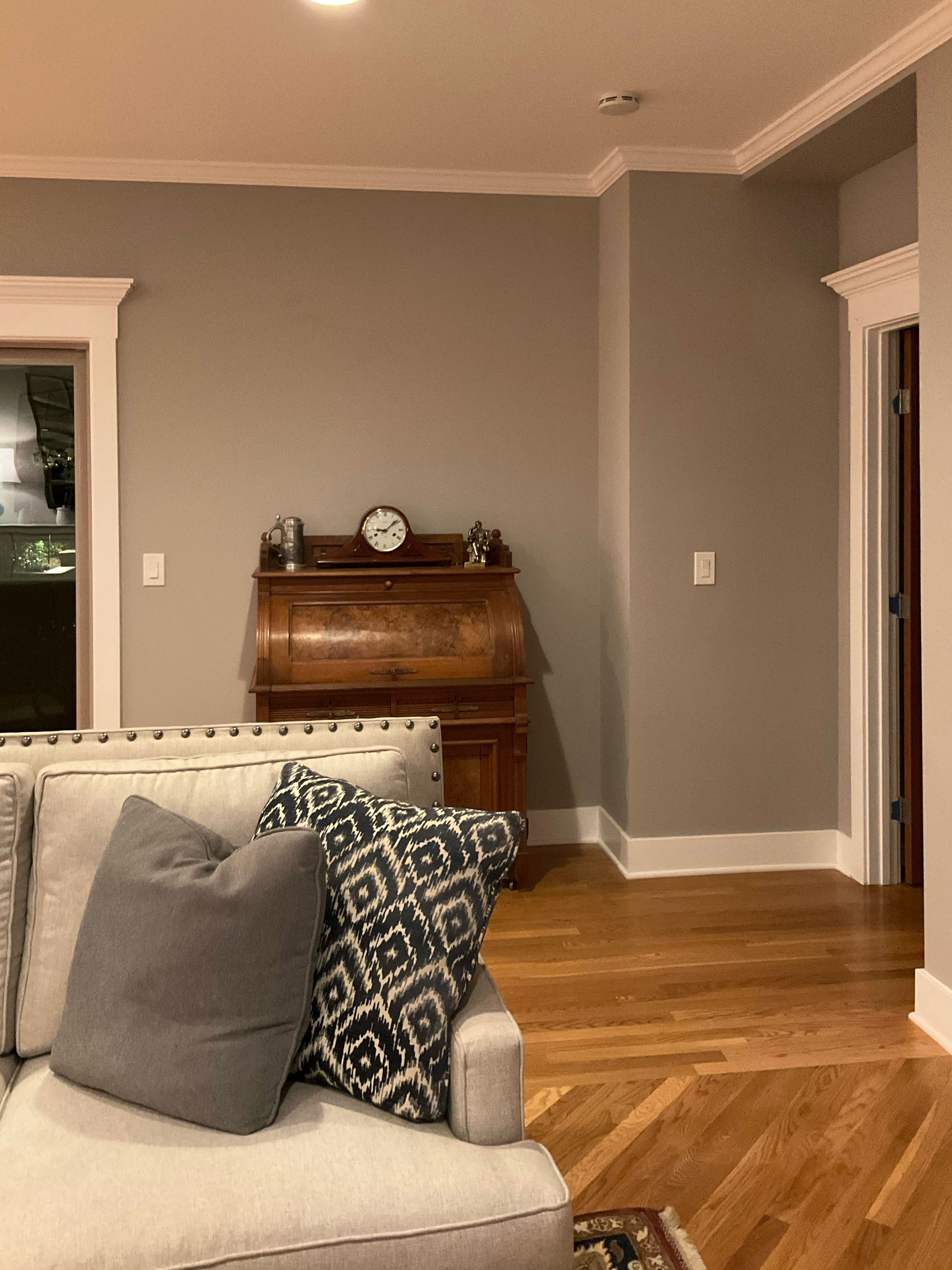
Mary turned the lights all the way up for the photos, but it is still too harsh and white, in my opinion, even if turned down. This is a big part of what is making the room feel cold despite all of the warm wooden tones.
The paint color, Requisite Gray from Sherwin Williams feels too cool and looks a little reddish compared to everything else.
However, the built-in pieces are a warm off-white. Mary told me that she is bemoaning that she didn’t select a lighter color.
Mary is right. The paint color is not working with the furniture or the wood kitchen cabinets.
Anchoring the room is a rich and dark oriental rug that they love and have had for a long time. That’s great.
Over the rug is a black leather ottoman.
I love ottomans if the room is primarily used for TV viewing. However, because they often have large gatherings of friends, too, this seating area is not ideal. If people are sitting on the sectional, some of the guests will need to put their drink on the floor if they need to free up their hands to share pics of the new grandbaby.
That is when Laurel gets up and knocks the drink over because if there’s a drink on the floor, it’s a sure thing I will knock it over.
Even if I’m 20 feet away, I’ll find a way to come in contact with the glass filled half-way with red wine.
In addition, drinks on an ottoman, unless there’s a thick, sturdy tray covering the entire ottoman, will also be unstable. I suppose they could give their guests sippy cups to drink their wine out of. That would work.
Therefore, at the very least, I would love to see a much larger coffee table. If we’re doing end tables, they might as well have lamps on them. In that case, Mary might possibly be able to do sconces over the buffet.
And, finally, for a large conversational grouping, it is best to have furniture on at least three sides, if not all four sides.
Otherwise, if you’re on the end, you can only talk to the person next to you.
Mary did an amazing job of rendering a beautiful floor plan! I’m impressed!
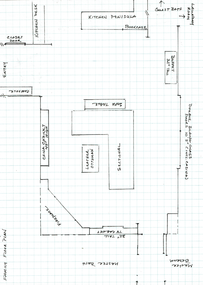
If we push the sectional back towards the kitchen, and over towards the glass doors, I believe there might be room to put two lovely slipper chairs that won’t interfere with TV viewing or the fireplace view.
Looking towards the kitchen.
So, for today, I am going to focus on only two things. The wall color and the coffee table.
*(That is not true, however, because I was having too much fun!)
But, before we do anything else, since we are not starting from scratch, let’s look at our “givens.” Givens if you don’t know, are the things that are not changing.
Let’s begin with the kitchen.
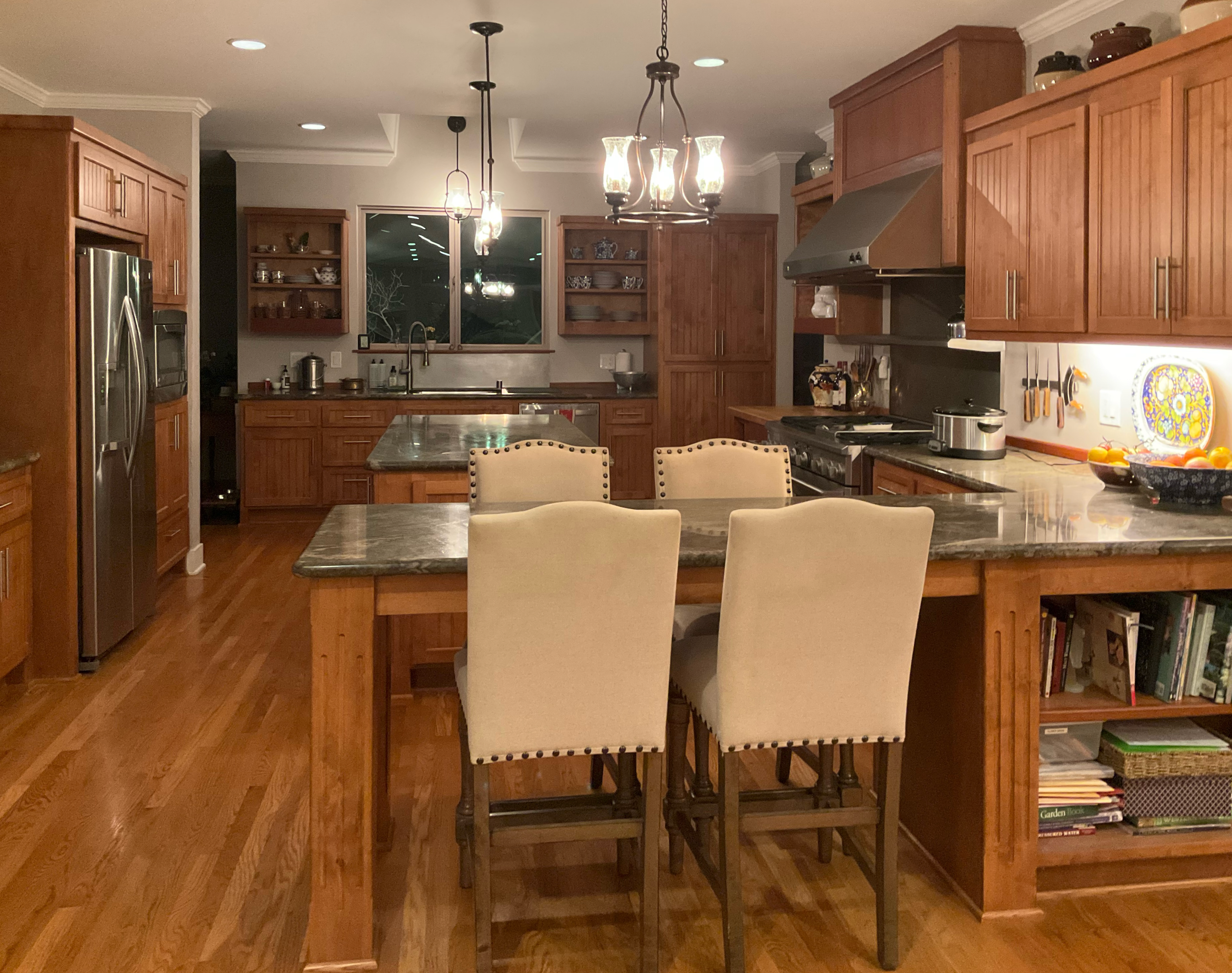
The stained wood stays. It is not for any of us to question why. It’s a lovely kitchen, however, I have some ideas for improvement.
The floor is a medium wood brown stain, and coordinates nicely with the cabinets.
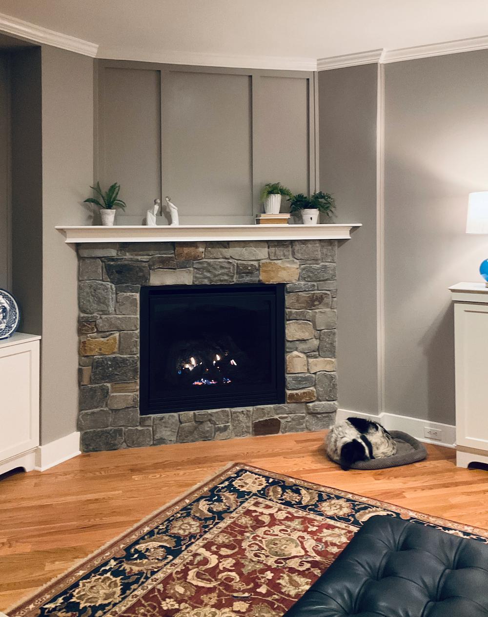
There is a stone fireplace with various shades of fieldstone. One thing I wish they had added is a hearth. Even though it’s a gas fireplace, a hearth looks so nice. It can also be a place to put a beautiful basket filled with decorative firewood and maybe some other accents.
I love the over-mantel detailing. However, I’m longing to see a smashing piece of art with some of the accent colors.
This is what’s missing in this room.
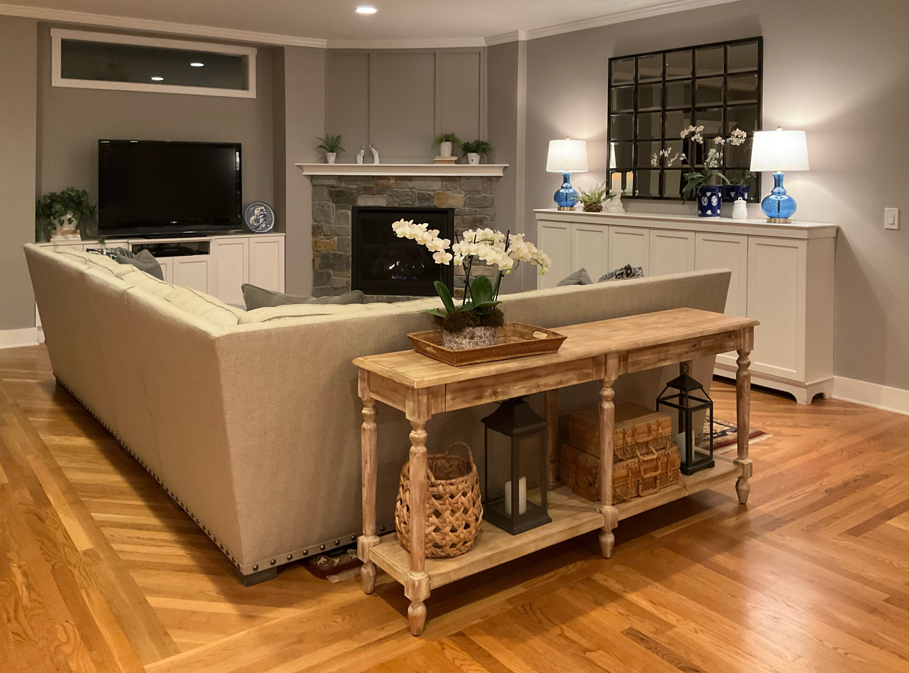
I feel the room needs more accent colors, and except for the rug, there aren’t any except for the blue lamps. That’s another reason why they’re not working. The blue seems to come out of nowhere ,and feels alone in the world. There needs to be additional blue shades, and some green is always welcome to help round out this neutral color scheme.
Next up are the lovely built-ins in a warm off-white.
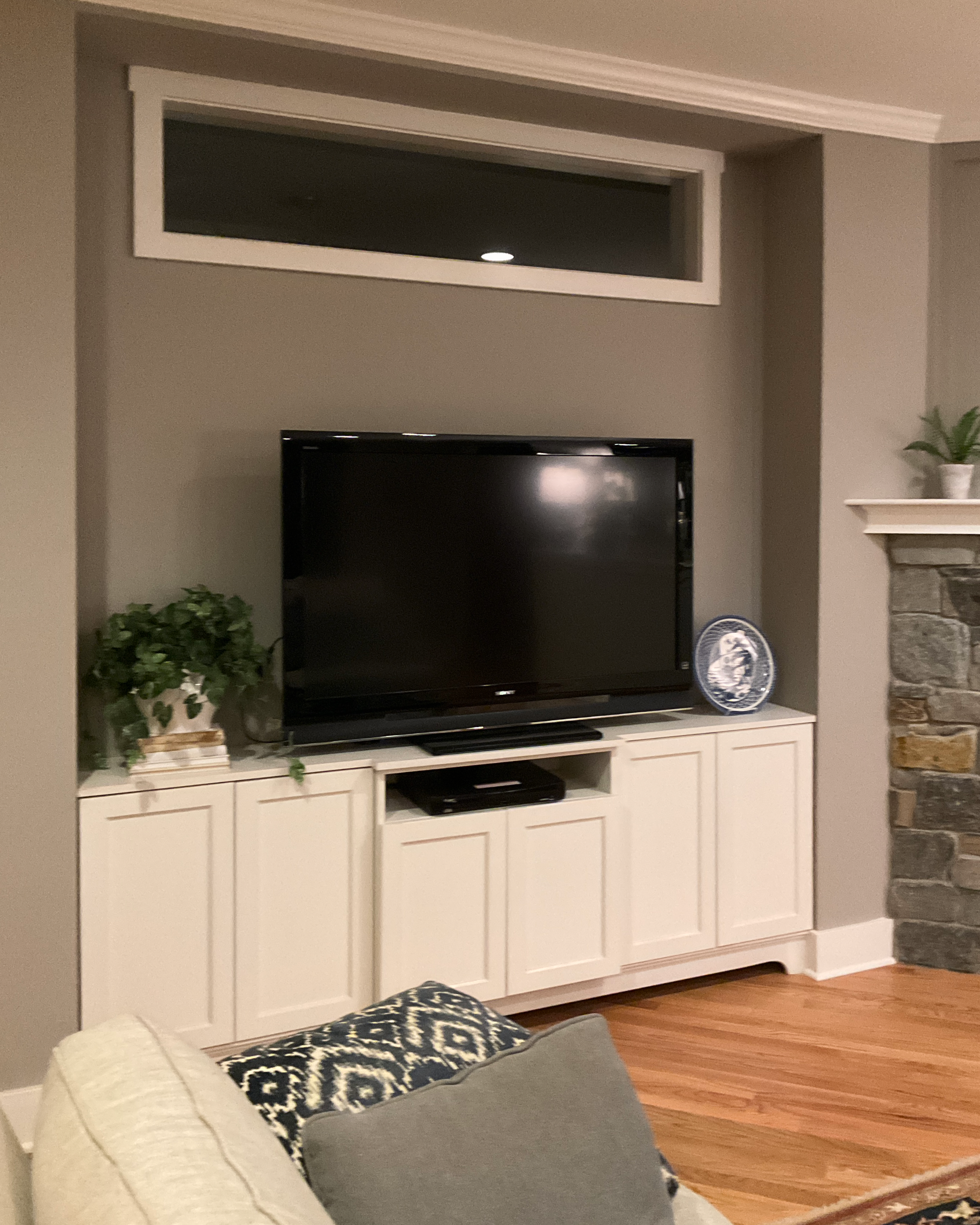
Truth to tell, because everything was taken with the lights full on, the colors might be skewed. However, lighting tends to mush colors together. So the fact that with the lights on, the colors look off means they are definitely off.
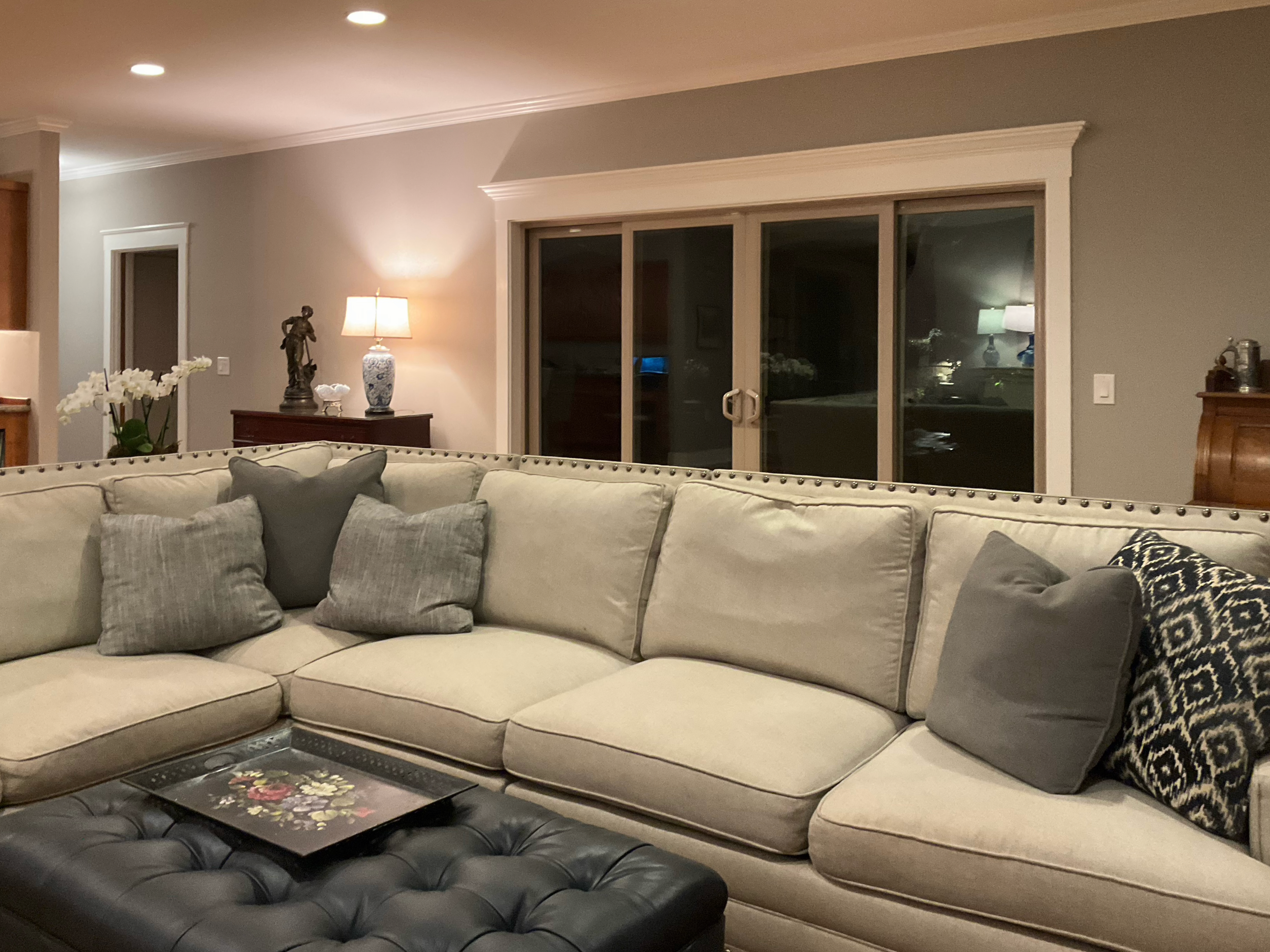
Of course, the sectional is staying. It is a light, warm neutral linen that looks perfect with the built-ins.
Okay, I’m going to throw the rest of the images up.
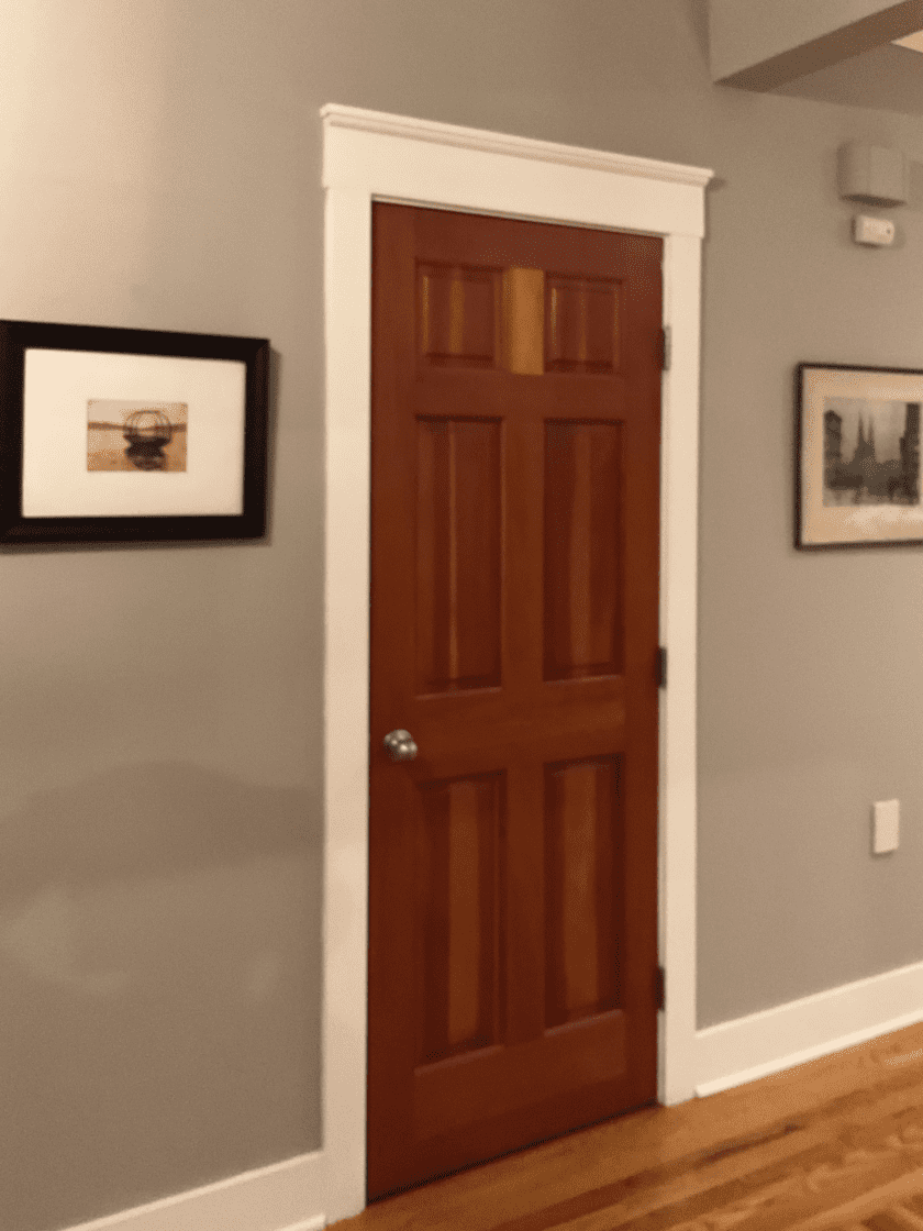
I do like the stained wood doors.
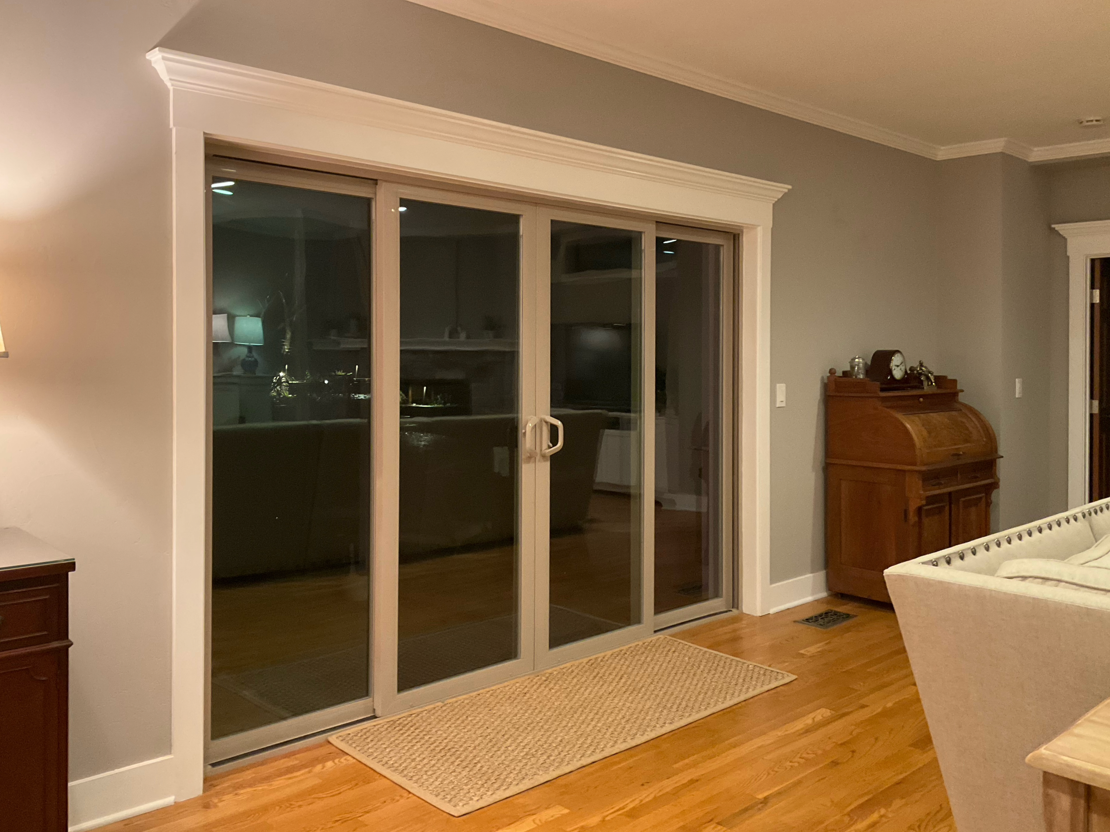
Yes, I would love some drapes for the sliding doors.
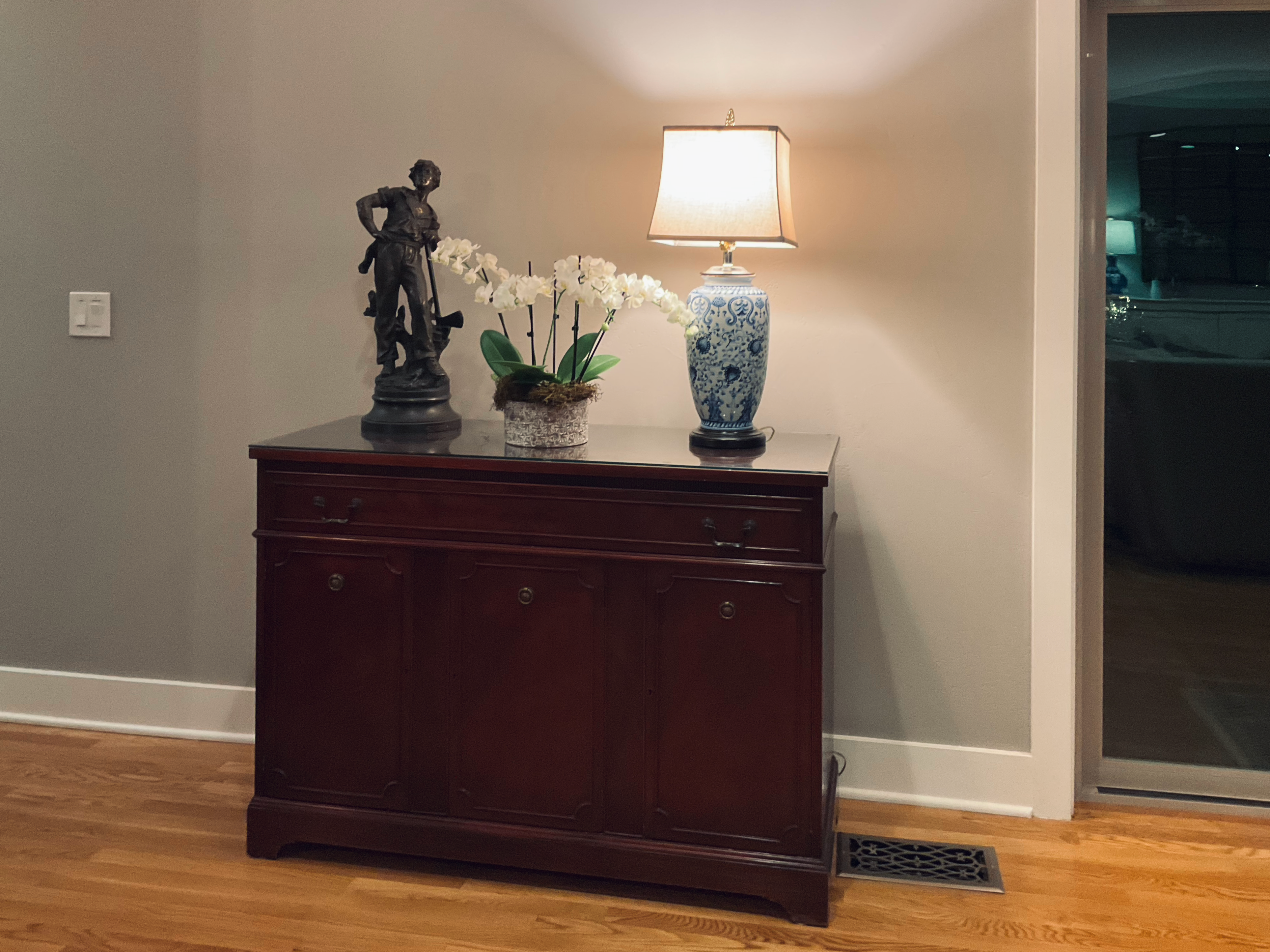
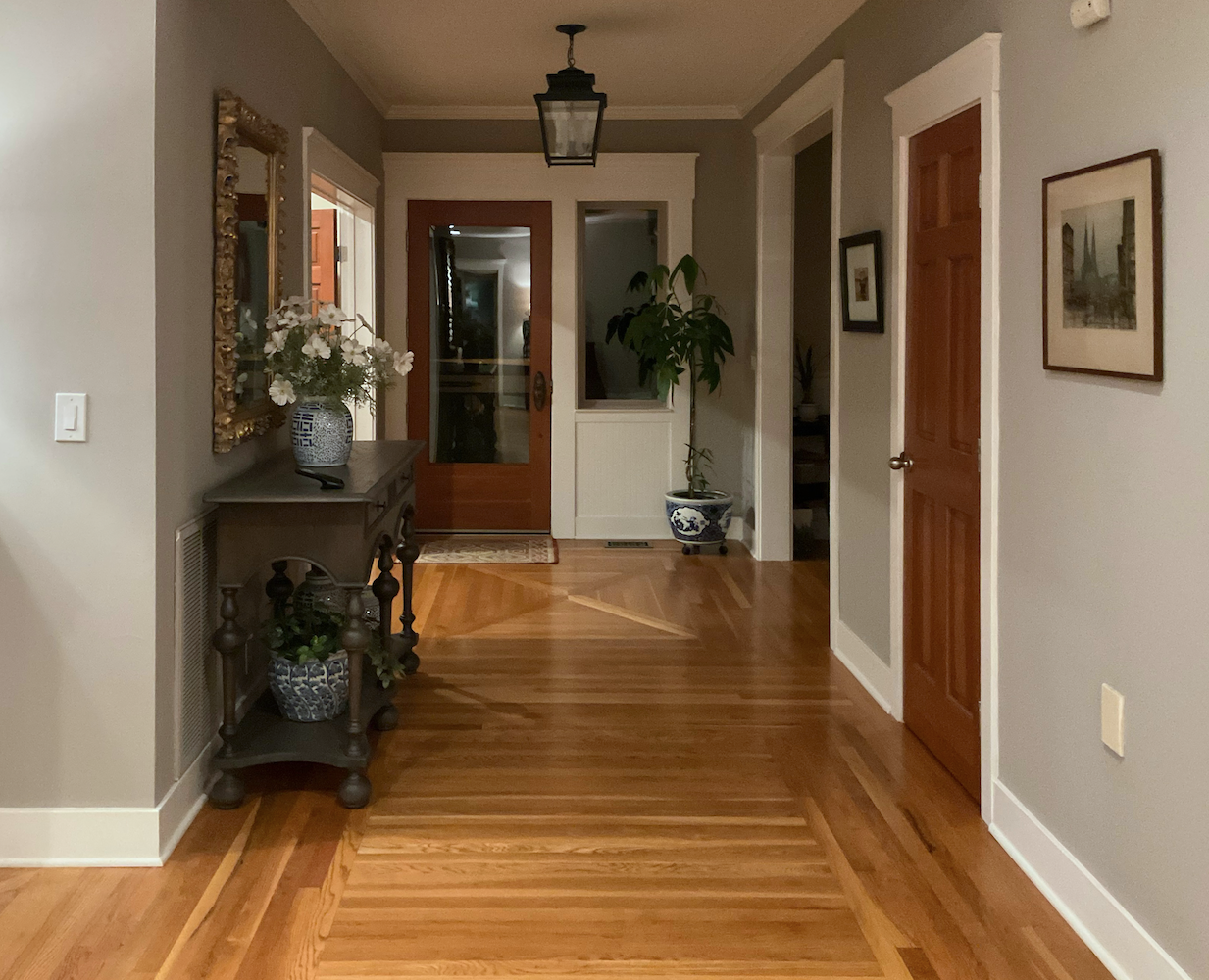
The entry is my favorite part of the house.
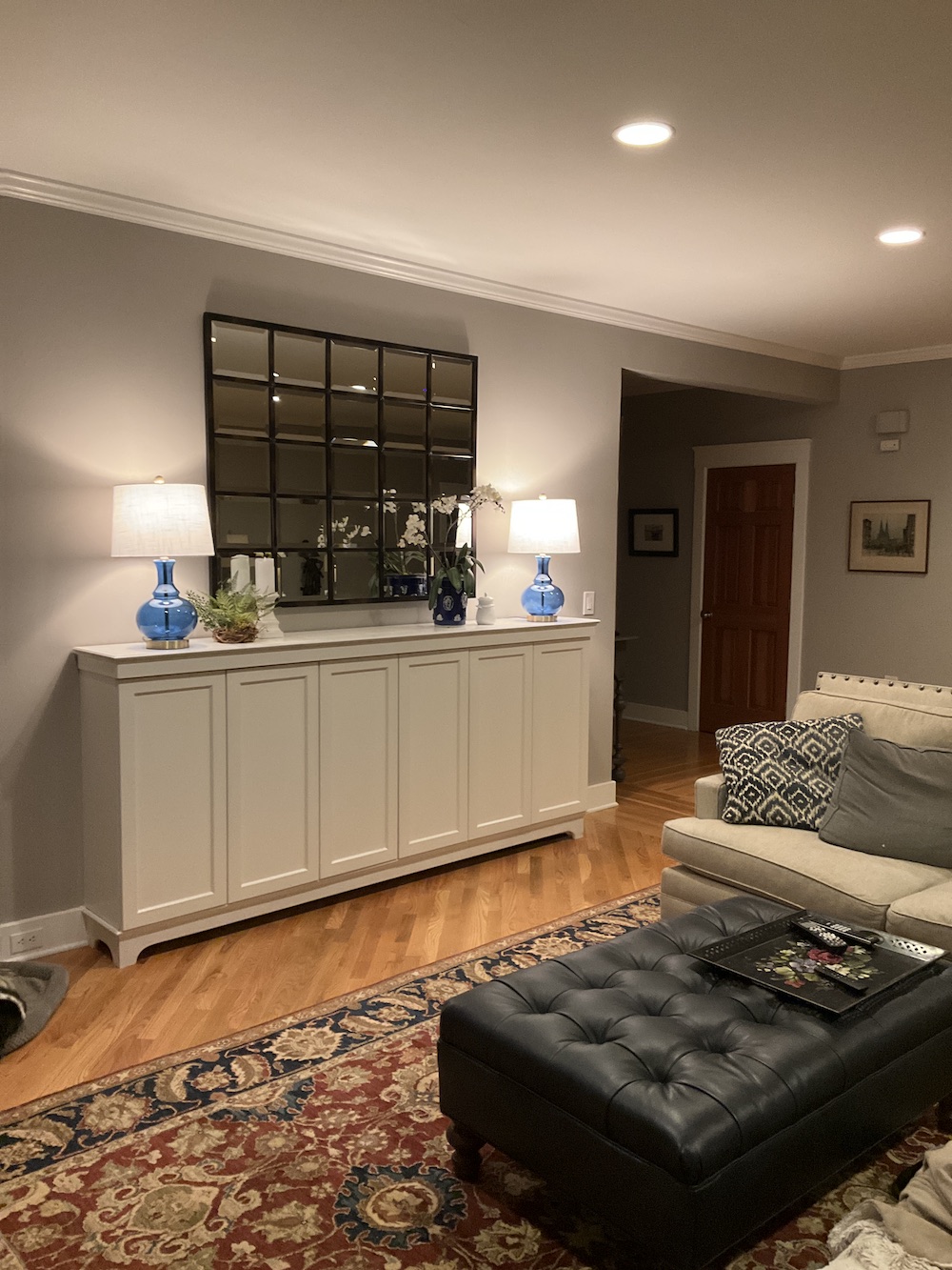
Here’s a view that includes the buffet, rug, ottoman, the sectional, and some pillows.
My first tweak is the wall color.
No, I don’t think it should be lighter; but, definitely warmer and greener.
Remember Heckfield Place? That exquisite hotel in England?
A color like this, I think would be lovely in Mary’s eclectic new trad style family room.
Above is a deeper shade of the same tone.
Another Heckfield Place post is here.
I love this place. And, I think it’s the perfect solution for an Anglophile married to someone who prefers contemporary design. Heckfield is a traditional design done in a contemporary way. Brilliant!
So, Laurel, what paint color are you thinking of?
Heckfield, if I know.
Sorry. It’s late.
There are numerous colors that could work.
I don’t know what the lighting is like. If it’s a dark room, Benjamin Moore Richmond Gray hc-96 is lovely. And so is Revere Pewter hc-172, and Sag Harbor Gray hc-95.
Another wonderful color is Farrow & Ball Light Gray.
You can get samples of all of these colors with the Samplize paint samples. They are terrific, and made with the actual paint. You can move them around and don’t have to deal with messy paint.
Okay, I’m bringing down the image again.
First, I changed the wall color and added some accessories to the buffet, along with some lovely table lamps.
Sorry, please excuse the exposed harps, and the perspective on the lamps is wonky, but I love the celadon color juxtaposed against the warmer, greener wall color. It’s adding a new color which I think is waking up that area in an attractive way. The black shades should have a gold lining for extra warmth.
By the way, you can go up to four inches in diameter greater than the depth of the buffet for the bottom of the lampshade.
Mary’s buffet is 14″ deep, so she can do this type of shade known as a “coolie lamp shade” that is 18″ in diameter at the bottom.
As you can see, the walls are warmer and a touch greener.
You’ll see in a sec that I added prints flanking the mirror and more greenery.
It’s a no-go for the sconces. No matter. We can work that out.
Okay, for the final image, I added a BIG beautiful coffee table I found, like the one I did ten years ago in Bronxville. For my image, I had to try six different tables before I found one that was in a good enough perspective.
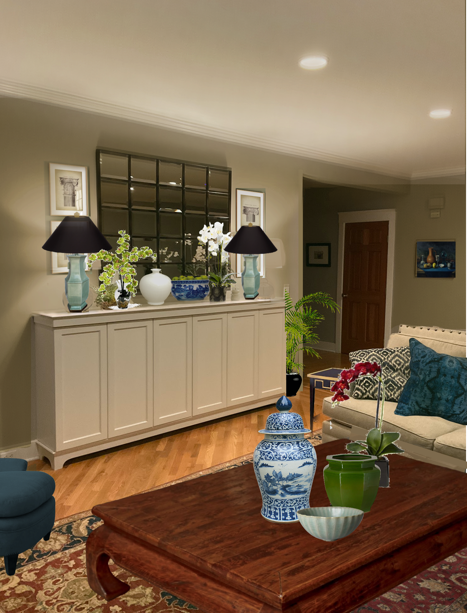
With this 60″ long coffee table, everyone can comfortably reach a spot to set down their drink or plate of food.
Yes, peeking out on the bottom left is one of the new chairs. I’m 95% sure this will work out, but I haven’t actually done the plan. Please remember to do your floor plans! Guessing is a great way to get in trouble.
I love these colors together. The room is still overall neutral but with some colorful accents to wake things up a bit.
Wait, Laurel! How did you hide the black ottoman?
Oh, haha! Very good observation. ;]
I found a rug similar to Mary’s and used it to go under the new coffee table.
One more exercise I did was to put together the original color palette and the new color palette.

Before
and

After
Okay, I’m going to end here.
Please let us know your thoughts in the comments.
What do you think about adding some cool hardware to the buffet? I realize they are the type of doors that open without knobs. However, I think the piece looks a little plain without something; maybe a beautiful drop pull? Perhaps something like this?
For Sunday, I’ll see if we can make the chairs work, and I’ll work on the kitchen. I am up for the challenge!
xo,

Related Posts
 He Wants To Keep His Big Black Sofa, But I Hate It
 A Secret for Creating A 25 Color Whole House Color Palette
 30 Astonishingly Beautiful and Best Front Door Colors
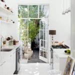 16 Tiny Kitchens That Prove Bigger Isn’t Always Better
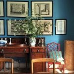 How to Figure Out Room Colors with a Colorful Sofa
 Is Your Baseboard Heater or Radiator Making You Crazy?
 The Color Orange – Love it, or Hate it?


45 Responses
Thanks for sharing such informative content. Amazing post.
Have you heard of Nor-east Architectural Antiques in South Hampton, NH? Their website has 7 pages of mantels – some georgian, some victorian, some ???. There are marble ones, metal inserts, etc. Might be worth a view anyway. I was at their store/yard 30 years ago to by a column for my house. They have some amazing stuff – I remember the multistory stiarcase from Dr. Suess’s huuse in Springfield, MA.
you really can solve any problem. kudos!
Thank you Laurel, I love these posts about room dilemmas! Sometimes I don’t even know what’s wrong (but feel something is not right) until you point them out. I learn so much and can apply at least a few of the issues you point out to my situation!
Love this post…so educational and fun! Can’t wait for Sunday’s update! Laurel, all the time and effort you put into each post is amazing and appreciated!
Love, love these post. I was wondering due to the expense of repainting if the wall color could stay? Get new rug with blue, green and color of sofa, could look fresh.
The homeowners have had the rug for a long time and love it, so unless they have another spot for it, it’s staying in this room. I don’t love the current wall color with the furniture, either.
Mary, what you and your husband have done to your home is terrific! Thank you so much for being willing to share with the rest of us. And bravo for reaching out to Laurel. She always has such great input, and I love her thoughts on this already lovely room!
Laurel, thank you for your input once again. I have loved these last few posts very much — so practical for those of us with design want-to, but without as much design knowledge. But I will also say, I have NEVER read one of your posts that has not interested me.
I “stumbled” onto your blog a number of years ago when my daughter pinned a beautiful picture from one of your blog posts. I usually don’t re-pin unless I like the content of the blog (and now Instagram) connected to the pin. That’s when I fell in love with your blog. I really don’t like that Pinterest has kind of done away with that connection since I don’t get to see what those I’m following (including you) are pinning. But maybe I just don’t have time to figure out their new “game”.
In any event, LOVE your blog and all the exceptional information you provide your very grateful readers.
I love the comparison of the color palettes at the end of the post. What a great idea to help us visualize how much bringing different colors into the decorating can elevate a room! Mary’s home is so lovely, and I want to thank her for letting us enjoy this process with her. We have a tufted ottoman (with a tray on it that I got from one of your Hot Sales!) in our family room. I love it because I like to put my feet up. But I do love the look of the one you chose, Laurel. Also, I want to let people know that there are many beautiful choices for cordless lamps these days (including floor lamps). Here is one resource, which has lamps that are a little on the pricey side: https://www.modernlantern.com/collections/all. But you can find cordless lamps on Amazon, Lowes, Target, etc. There are also many DIY videos and blog posts on how to make any lamp a cordless lamp. I so appreciate the time and energy you put into these posts, Laurel. They are so informative and such a treat!
Hi Sheree,
Thanks so much! I did a post featuring Modern Lantern several years ago. Here’s a link to the post about cordless lamps.
So fun, Laurel! I love your changes- wall color needs to be warmer, bigger coffee table, etc. I noticed some of the comments suggested lamps on end tables or the sofa table, and that would be great, but unless someone thought to put an outlet in the floor to go under a sofa there’s no way to run electrical cords to a floating furniture arrangement! Always a dilemma. I heard they’re coming up with some battery lamps that will help in these situations, so we’ll see what “they” come up with.
I’d like to see the mirror turned vertical rather than horizontal, if it would fit. Even though it will come very close to the ceiling, placing anything vertical always makes a room feel taller IMO. Also, since chunkier lamps on a buffet are a bit less trad than the tall buffet lamps, why not go with something a little more modern for the hubs (I think you said he had more modern taste). Maybe a nice light rectangular shade on a 28” lamp?
I’m sure you’ll get to adding some color with the pillows- can’t wait! Love your posts, Laurel- we all learn so much!
Thank you ladies for all your comments and suggestions. My husband Al saw the post this morning and he agrees with all your recommendations Laurel. He absolutely loves the coffee table (as do I) and agrees with all your changes. This is a man with definite opinions about decorating (and a good eye). He also likes the idea of the drop pulls on the cabinet and the art on each side of the mirror. He is looking forward to your Sunday post.
FYI… for you ladies that asked about the sitting room drapes. Unfortunately, I haven’t finished the windows treatments yet. Life and health intervened and delayed my progress completing window covering for both adjoining rooms. We put up slimline blinds as a temporary solution for light control, but I will probably make coordinating Roman shades after the drapes go up in the dining room.
What a fun post LaurelJanet R! It is so cool to see how a few tweaks really can pull a room together. My only comment is about the tufted ottoman: I am becoming obsessed with that look. I am constantly seeing a ottoman, sofa or chair with that style (Chesterfield?) in the background of movies or TV shows and I want to incorporate a piece someday. I know I could afford to buy an ottoman immediately, but feel I would have to cover it with an enormous tray for the reasons you give which kind if defeats the purpose. Also, the ones I’ve seen are in uninspiring colors, mostly brown. I’d prefer purple! Does anyone have any suggestions for me? Thanks!
The one thing that stuck out for me is the white window trim above the tv. It is very distracting. Laurel, would you suggest painting the window trim the same as the wall colour?
Cathy
I can’t edit my comment, but I also wanted to say that I love the entryway. It’s a gem.
I really like this home. At first, I couldn’t see your point about the paint color. I liked it, and wall color changes between day and night. However, after seeing the example of Heckfield Place, I see what you mean. It’s a beautiful look; lighter and a complex color that would change with light. I like the panel treatment that was done above the fireplace, and agree that artwork would be a plus. Also on drapes and the carpet. I love hardwood floors, but they need area rugs to warm up the home. I have learned so much from you, Lauren, and I often look up subjects with your name attached on Google when working on projects at my home.
Agreed, fabulous transformation already! Here are a few other ideas I am thinking: remove the buffet on the outside wall. Replace with an oversized piece of artwork to bring color and personalization into the space. (This will also be a great first impression walking into the home.) Second, select a neutral, textured rug to blend with the current flooring and layer a second color/printed rug under the coffee table. (There is already enough visual interest with the different hardwood patterns on the flooring.) Finally, the sofa table/ console table behind the other side of the sectional—parallel with the slider doors. Add two occasional chairs, behind the sectional—facing the kitchen. I think adding something with upholstery will warm up the space AND add further function. (Depending upon how heavy they are, they could be moved into the sectional seating area when needed!)
Lovely home Mary. That colour palette says it all. Wow! What a difference. Fabulous.
Laurel I think all of your ideas are wonderful, and add so much visual interest and to the space. This plan is just beautiful. I give great credit to Mary for her excellent job laying the foundation here. It is so difficult getting paint colors just right. I could see myself going down the same path. I have done it many times! The paint that’s there was so close. But green-grey vs. red-grey is what it can be down to. I vote a big yes to cabinet hardware.
I was honing in on the position of the rug, and also putting something under the fireplace that could help make up of the lack of a hearth. Could the main rug be scootched back a bit so it peaks out behind the sectional just a bit on both sides? And then could a seagrass rug be placed under the fireplace? I know the corner of the main rug would overlap a bit probably, but wouldn’t that be ok? I’ve never owned a gas fireplace and don’t know the safety rules around them, so maybe this would be a no no as far as fire hazard. Please disregard this suggestion if so. I know you absolutely couldn’t do that with a wood burning fireplace, but by the same token a hearth would be essential.
Mary has a beautiful home! Laurel,I love these types of posts because they help me with my home—in this instance, the need for color to warm/spice up a neutral color scheme. Seeing the before and after color palette was enlightening. It’s amazing to see you take a room to the next level with color and accessories.
The room was quite nice before, perhaps a little flat, and agree it needed tweaking but now it has LIFE, interest and depth. Much better! Can I just say that this is the ONLY blog where I actually learn something, great detail, explanations and pictures. Can’t imagine the time it takes to pull this together, but so worth it! Looking forward to Sunday’s post. Thank you Laurel 🙂
Mary, your house is beautiful! Laurel, you touched on the lampshade to add 4inch to the shade, that is great info! Does that usually work on mantels, and end tables as well? I also love the idea of gold inside the shade for a softer light, brilliant!
maybe for a future post: I am considering turning one wall of my small guest bedroom into a home office. Maybe do a post on the whole “home office” conundrum. Thanks!!
Love these posts too! And a big thank you to Cher and Mary for opening up their homes to comments.
Love the changes you suggest Laurel, I would also consider changing the trim color to a shade that contrasts less. I also thought that the rectangular cutout over the TV was awkward. Could that be sheet-rocked over? Then you could add some art over the TV.
So much better Laurel! That teal colour on the slipper chair and the toss cushion is just the accent colour the room needs with that lovely warm wall colour. And the knobs for the buffet are perfect…a bit of black and lustrous warmth of the gold. I’d love to see a bit more gold – we do see a bit in the floor and fireplace. How about that desk and smaller buffet areas too? Accessories and wall art could really enhance those spaces along with a lamp for the desk. Also I’m finding the mantle a bit too thin/insignificant. Couldn’t it be beefed up a bit? Of course I realize you’re just getting started and haven’t addressed the whole room. That sectional is gorgeous…so sophisticated and detailed with the natural look of linen. Kudos to you, Mary! I love this type of post, Laurel. I’m excited to get to Sunday for the next instalment!
Mary is very fortunate to have you on board! You always post the best stories! You help the readers visualize your concepts and your deliver your ideas with with humor! Mary has a beautiful home! I do love an upholstered ottoman with tray because of it’s comfort. Perhaps a couple of martini tables in marble with brass? These could be moved around where needed for a cup of coffee or a glass of wine. I like the idea of a little jewelry to brighten up the buffet. Perhaps a drop that is brass, a bit more modern?
Laurel, I agree with the rest of the commenters that these types of posts are very fun, interesting and helpful, so thanks! In looking back to the current photos, the basics are very nice, but it feels very “mid-tone”. Its amazing what small touches of bright white, black and colors can do to make the space more inviting. I especially like the green pot on the coffee table. I also noticed how the addition of prints on either side of the mirror make that wall feel more complete. On the wall color, I find it hard to tell in that lighting – would love to see in daylight. I am going to study my living room tomorrow to see what ideas I can use to liven it up!
Your changes have hugely improved the room, Laurel, although for myself I would choose a somewhat lighter wall color. For more warmth I would also increase the size of the rug considerably, and your idea of curtains is spot on. A painting would be wonderful as you suggested, and I also agree with hardware for the cabinets. These types of posts are always such eye openers and really enjoyable. Thank you for always putting out such interesting content; I’m sure it can’t be easy.
Mary may want to consider getting a sample of Ben Moore Brushed Aluminum. It is a great warmish gray with some green in it, and looks great with shades of blue and green. We have used it in a number of rooms in our house, and it looks good in all of them (though different in all of them) – including our dark living room. Love reading the suggestions!
Dare I suggest, would painting the recessed panels of the built-ins help? Maybe a deeper or lighter shade of the same color, adding visual interest without adding another “color”, a tone-on-tone effect? Basically, it would add some architectural interest and dimension without going over the top. I like the idea of hardware to liven them up, but the paint idea might just obviate the need for additional hardware, and it would be relatively quick and inexpensive to do.
Hi Quatorze,
I like your idea to paint the panels a shade deeper.
I also love the idea of knobs on the cabinet. Both cabinets or just one??
Oh, Laurel, I love your suggestions. That room at Heckfield is so calm and lovely. The paint was difficult to choose as each one looked very different depending on which wall it was on. It is a dark room most of the time and the white does look warm in the room, even though it is SW High Reflective White on the cabinets, trim and ceiling. I like the idea of a greener, warmer, lighter gray for the walls (I had thought a warm white might help make the room brighter?)
Your color palette is beautiful. I like the coffee table very much and see how it works much better in the room even though I love my ottoman (actually it is navy although it looks black in the photo). I thought it was interesting that the lamp shade could be larger than the depth of the buffet, that is great information and is helpful since the cabinet is quite narrow. Celadon is such a beautiful color. Maybe I confused you, but I would consider sconces in this room. I just don’t have outlets for lamps floating in the room away from the walls. All your suggestions are spot on. Can’t wait until Sunday.
Hi Laurel, I agree with all of your great suggestions including the curtains (I think the curtains add so much warmth to a room) and hardware for the buffet. I also wonder if she would consider taking the two cabinets on the right side by the peninsula off and adding (brass? and glass) shelving? I know you said no tinkering with the kitchen so scratch that if its really not going to be a consideration. I would also add two more contemporary standing lamps on either side of the sectional as there is little lighting in the room other than on the buffet (if there is a crawl space its relatively easy to add electrical outlets in the floor for the lamp cords). I think it looks like the owner didn’t have a spot for the desk. I would move that to a bedroom where it could be used as a functioning desk. On that wall it would be great for a large piece of art. I would also suggest adding books that interest the two of them and some seasonal flowers, again for warmth. I agree with one reader that overhead lighting is harsh and usually very unflattering. Adding more lamps would be a good alternative for lighting.
Hi, Laurel!
My husband and I have been enjoying following Cher, and now Mary’s, houses. Thanks so much, as one reader put it, for “taking it to the next level.” I went back to read the post about Mary’s drape dilemma, and I, too, am wondering what she decided! And I love the paint transformation you did. I have been looking at your 9 “no-fail” paint color post with a skeptical eye, but then I see each room and am in love. I’m currently working through a wonderful course on decluttering that makes sense to a big-picture person like me, and as soon as I’m through ( or maybe before 😉) I’m treating myself to your Paint Palette! Keep these type of posts coming…they are wonderful!!!!
Sorry, you added some nice vases and greenery to the buffet, I meant something even larger and more centrally placed to grab attention might be helpful.
Laurel, your tweaks are really bringing out the beauty of Mary and hub’s home. Amazing what your well chosen color changes and additions can do. Ah, yes, that lovely, refined, somewhat restrained buffet is a nice piece. I think perhaps the question about adding hardware to it is because it is not strong enough by itself to be a focal point, a “star” of the stage as it were? That Ming coffee table has star quality. Not sure I’d want to change the design of the buffet by adding hardware however I bet you could pull it off (bad pun) – maybe a nice sculpture or vase with floral arrangement on top of the buffet would be enough to amp it up.
Lovely home. Your tweaks take it to the next level. Many thanks to the homeowner who allowed you to use the photographs. A photo from my home could take weeks to improve!
Fabulous post!!! You are the queen of maneuvering the objects so we can easily visualize. The coffee table was a great change and made such perfect sense with the drinks/food. Personally I’m not a huge fan of the green/grey paint idea but only because I love bold, bright colors which most people don’t. Perhaps the drapes could be the bright bold color I’m missing??? The changes to the buffet were great and the black shades threw a bit of sophistication to the room. Mary’s kitchen is gorgeous and a beautiful background to this room. Oh, and I agree with the comment regarding lack of reading lamps by the sectional. I’m so looking forward to seeing what you do next. I learn SO much from these blogs. Thanks Laurel!
Oh these posts are so fun and so educational! Mary has a beautiful home and very nice furniture. Your suggestions for paint and additional accessories take it in a good direction — it is the magic that designers provide. So wish I knew of someone like you near me!!
Loving this post and last! Yes to the new drop hardware on the built-ins. And warmer paint. Fabulous art ove the fireplace will tie it together. Maybe an abstract piece with great colors but in a more trafitional frame. Anxious to hear what Mary and her husband think of the proposed tweaking to their elegant home.
“Heckfield, if I know.” I admit it, I snorted. My husband and golden retriever pup think I’m nuts. Well played.
Having a design background myself, I have often found that couples with such disparate styles end up with…an empty house, because they can never agree on anything. Or it’s a houseful of blah/style-less stuff because those were the only things both spouses could compromise on. So I commend your reader for what she’s done so far and think they’ve made some nice choices to blend their two styles.
I agree with all your tweaks, and dressing up the buffet with some hardware. The new paint color would be an instant improvement. Would love to see a dressier console table behind the sofa with a chunky ceramic lamp on top, and some different accessories.
Love these types of posts, Laurel!
All great ideas. And adding artwork & more colorful accessories will make the room feel more cozy.
But what I want to know is if Mary can share what she ended up doing for window treatments for her sitting room. I read her first letter requesting some help. I’d like an update. Mary, what did you end up doing?
I wonder how they ever read as there are no lamps next to the sectional. I am not a fan of ceiling lights and never use them as they are cold and not good for reading. Would love to know what you think, Laurel.
May I just say I am LOVING this series of blog posts – this house and the last. My great room has been frustrating me since we moved in a few years ago because it felt like it didn’t look quite right and I couldn’t put my finger on why. These posts have helped me figure out the why and get a plan in place to solve it. While I had color, I’m a compulsive matcher, and I realized from looking at these images that I didn’t have enough depth of color and tone – it needs to match less and have more variety within the color palette. I have throw pillow sample fabrics arriving any day for the first step! Without these posts I think I would have continued to be mystified, so THANK YOU.