
Hi Everyone,
If this post looks somewhat familiar, that’s because it’s a much-needed post update from late June 2019. However, there is new content and new insights. Also, blessedly, I edited a lot of the rambling crap out. lol
I’ve often been asked, “How does one achieve furniture and color balance in a room?”
Recently, we talked about scaling living room elements. Between that and all of my mood boards which are more like perspective renderings, I have found it is a great way to see if the furniture, style, size, and color balance are all working together.
But, Laurel, I can’t make those fancy boards, and I really don’t know how to get the balance right.
Okay, fair enough. You’re right. Getting the overall furniture and color balance in a room is not easy.
However, there is rarely only one way of doing things. In fact, there are usually millions.
Of course, that can make it even more confusing.
To be frank, this is why some designers, including myself, when we hit on a look we love or a formula of sorts, we stick with it, with only small variations on a theme. Through experience, we know that doing things a certain way will yield a good result.
This is why I love to share the work of designers who have something that resonates with me as being great design.
The best way to train one’s eye is to study what the masters do. I’m always learning, along with everyone else. There’s always someone who does it better.
That is until you get to the very top.
Those names you keep seeing are in the “they can do no wrong” group.
Still, I believe even the greats have their struggles. I believe this for the same reason the rest of us struggle. Interior design is inherently difficult. They just don’t share how they got there, only the gorgeous results.
Oh my! That reminds me. Thank you all for your great suggestions regarding the new stairwell. There have been some new developments I can’t wait to share with you in a brief, but I think very satisfying part III of the post. That will be coming over to you on Thursday evening. I have a more complete mood board of the stairwell.
What? You’re making us wait?
Yes, and it’s difficult for me to wait too. So, let’s be big girls and boys and focus on this post about color balance. Thursday evening is only a sleep away.
I generally think of OVER-ALL balance, including the furnishings; not just color balance. Still, it’s all interconnected. So, today’s post focuses on the overall balance in the room. However, color is a key component.
But, as we’ve discussed, sometimes something a little out of whack is good.
Still, for most rooms, there is ONE color with the largest percentage.
Usually, it’s the wall color because most of the time, the wall color is going to be repeated somewhere at least once. And maybe, numerous times.
But, the reality is; there are so many variables.
However, a good rule of thumb is to pick one color to be a “neutral” color and then build from there.
If it’s a cool color, the room will be overall cool but have warm accents. The opposite may also hold. We saw that put into motion in this post about blue and white rooms and how to keep them from looking too cold.
The one thing to avoid is to have equal concentrations of three colors. I think a secondary color can feature heavily, but the third will only be an accent. Incidentally, for most rooms, that secondary color is brown. Part of the color scheme is the floors and furniture.
There are also other things to consider with color balance, such as:
The contrast of the colors. Are they close together on the color wheel? (analogous) OR, are they opposite each other, like red and green? (complimentary)
Other considerations include:
- Room size
- Height of ceiling
- Amount of light
While researching this post on color balance, I found the most fantastic example, again, with the name Ralph Lauren attached to it. I realize we recently used Mr. Lauren’s fantastic style to learn from, but this post branches out from that lovely room.
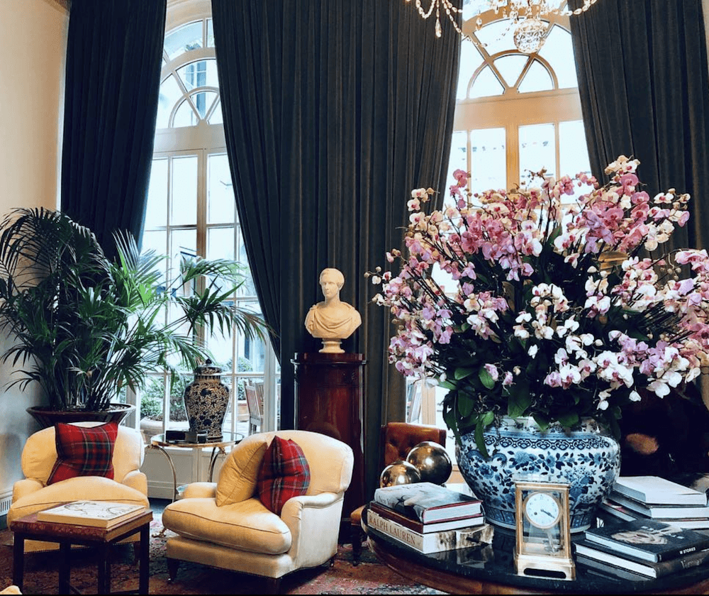
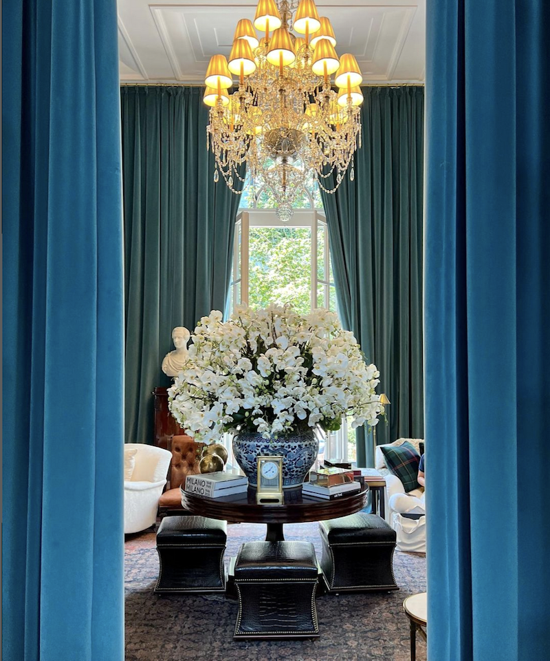
Today we’re taking a virtual visit to the RL Showroom in Milan, the Palazzo Ralph Lauren.
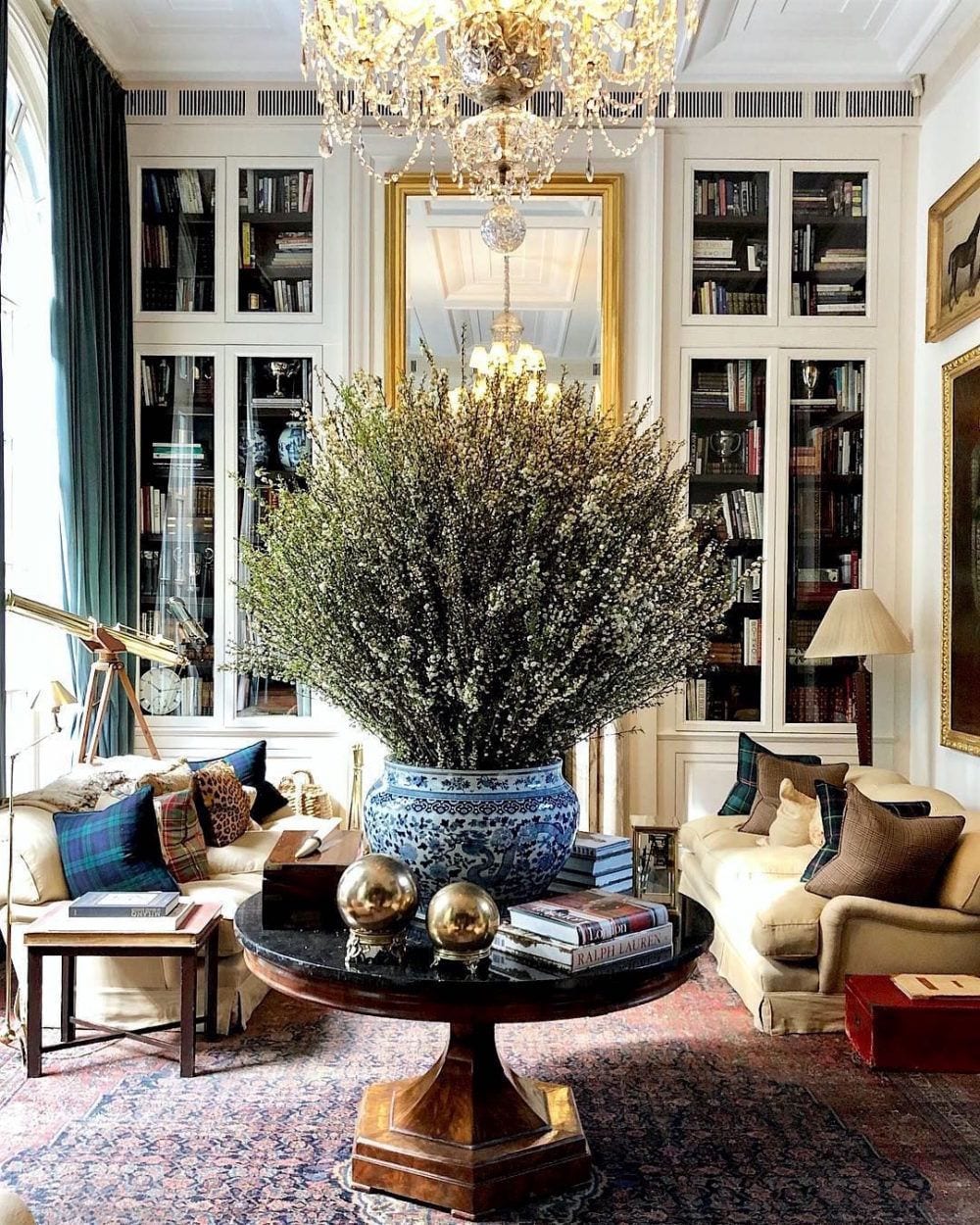
@stevecordony Instagram – @ralphlaurenhome showroom palazzo Ralph Lauren Milan. Four years ago, I discovered the incredibly talented Steven Cordony and his Rosedale Farm. Steve was in charge of styling the showroom.
The next images are from other fantastic Insta accounts, showing this magnificent showroom.
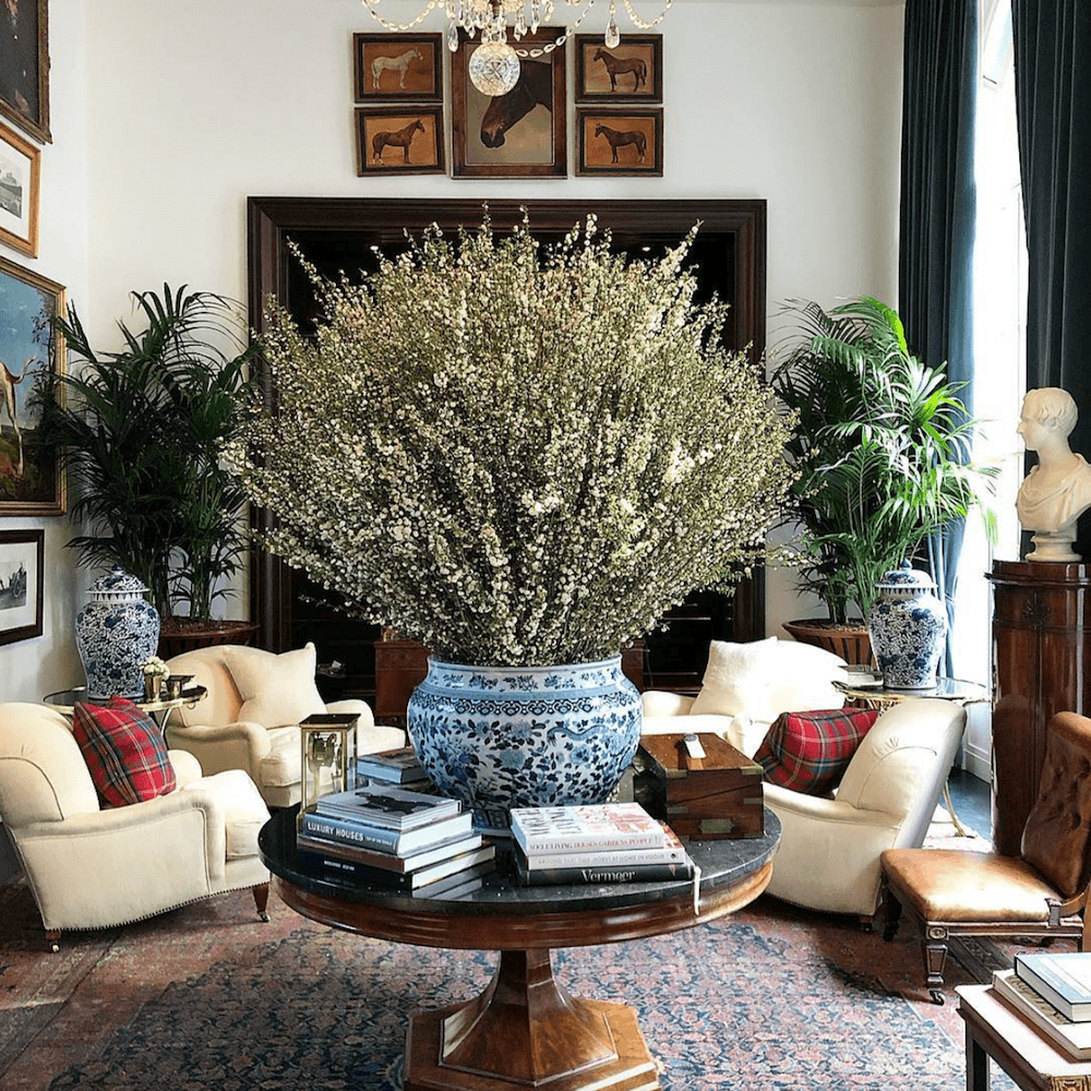
via @filippocirulli on Instagram – furniture and color balance Palazzo Ralph Lauren Milano – beautiful table styling
@mirea_debono on Instagram
Does anyone know where to find those wonderful brass orbs? I tried finding them. I didn’t spend long but came up dry.
via @umberto_corrado on Instagram
The above look is the winter styling. There is also a lighter summer look. I love how adaptable the space is.
@house.blanche – instagram
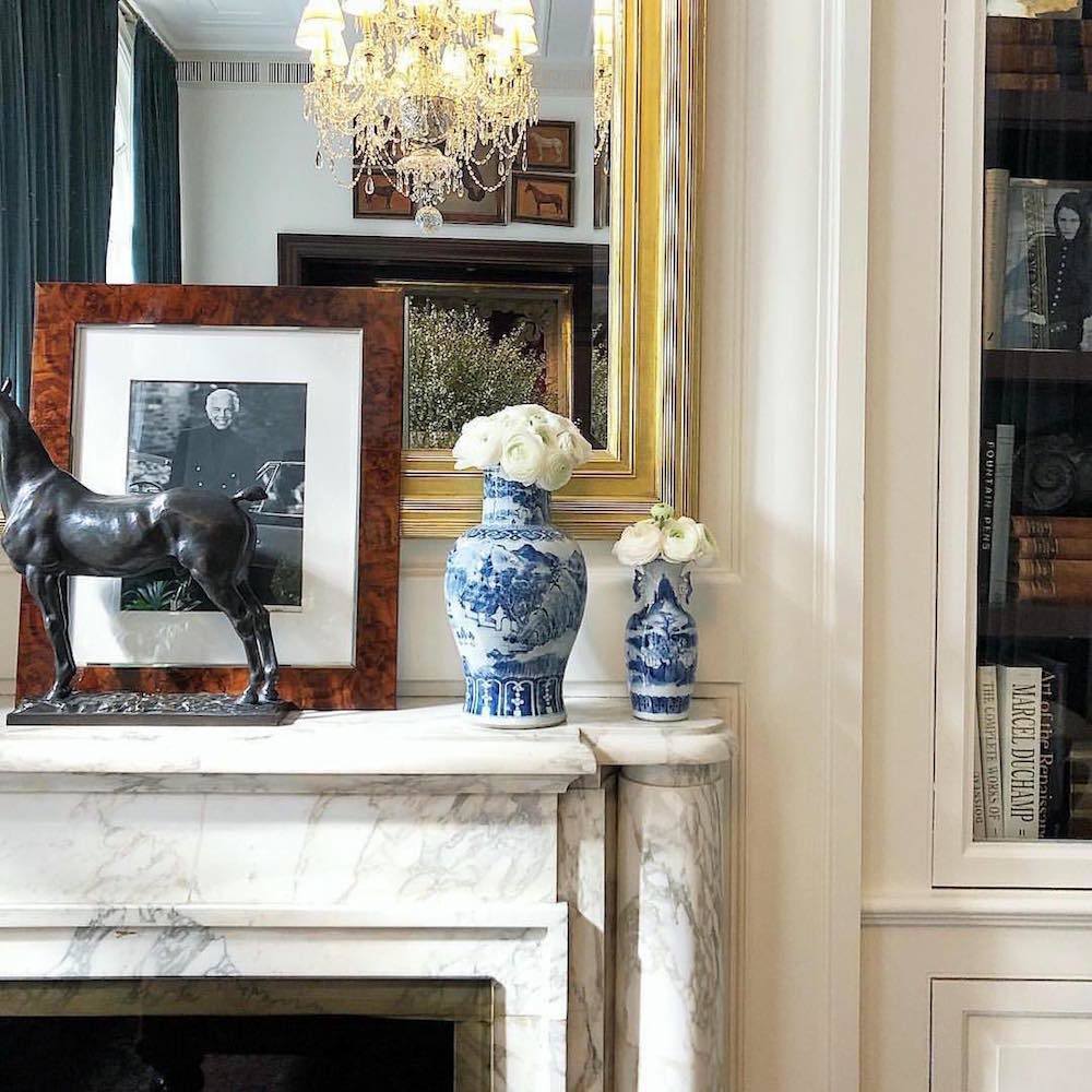
Steve is immensely talented. I love how he styled this gorgeous marble fireplace mantel.
via @stevecordony on Instagram
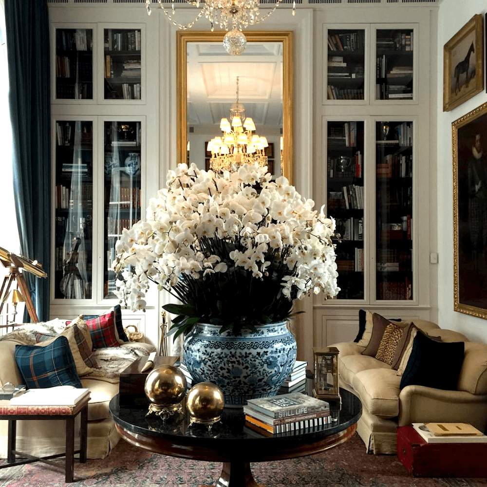
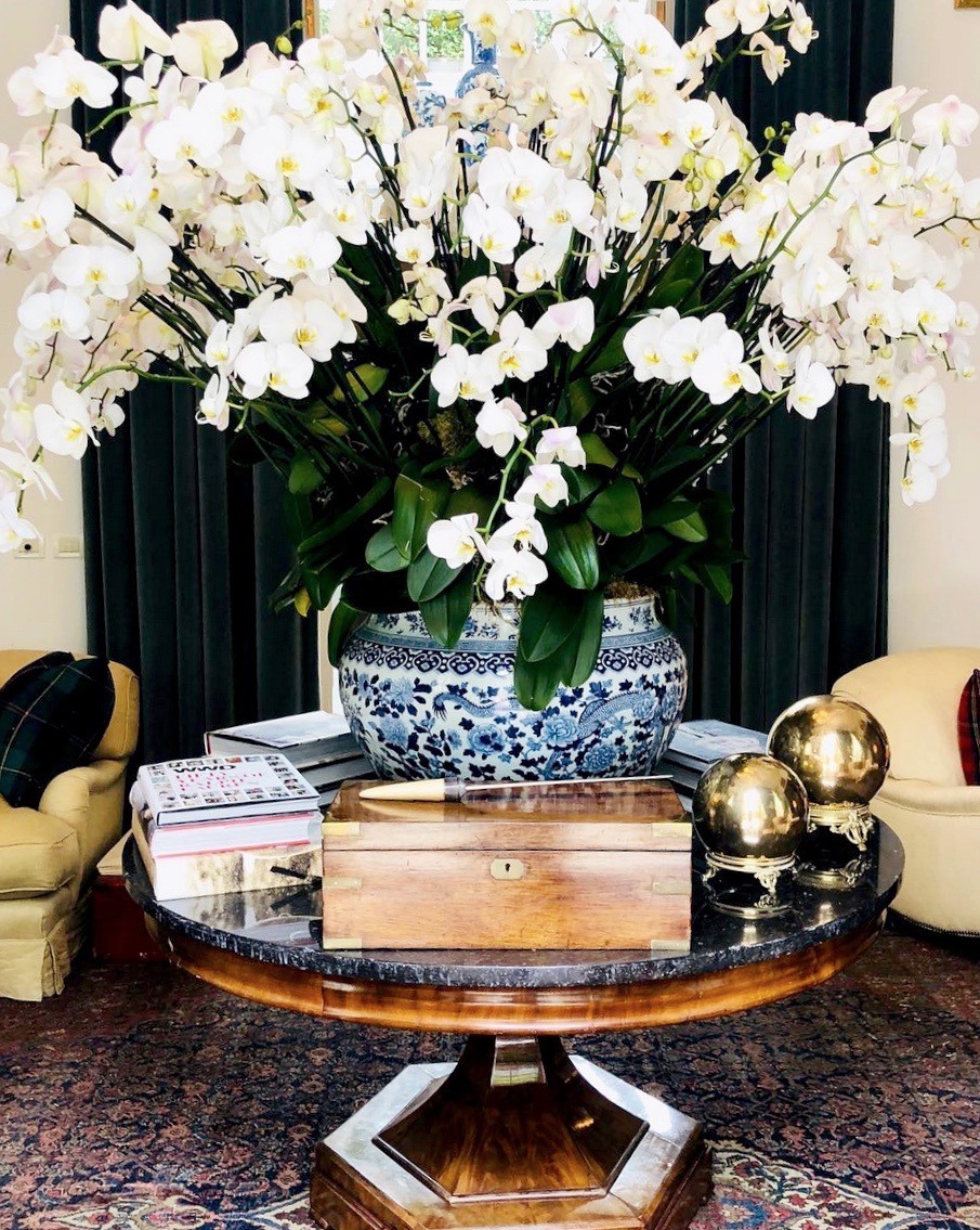
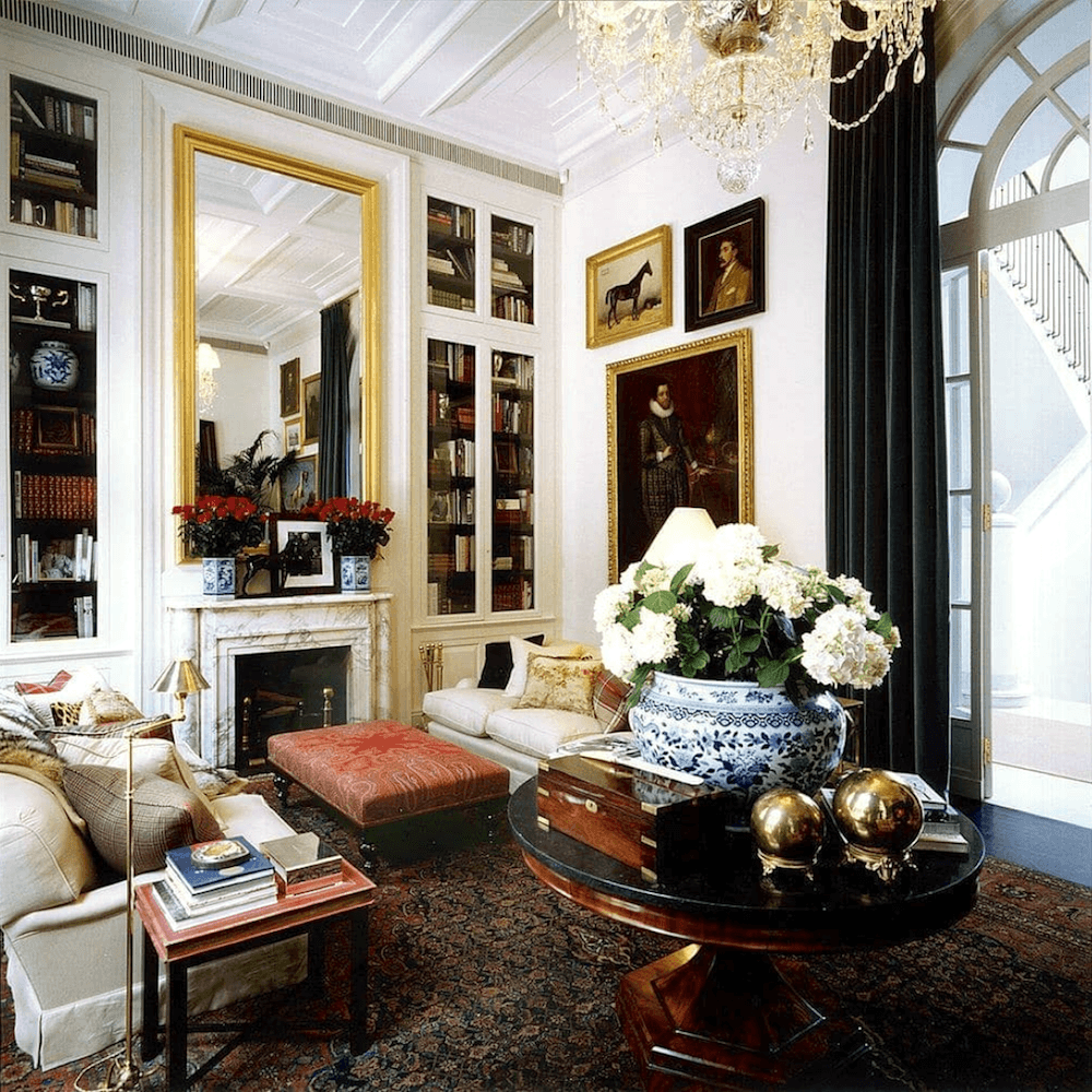
Finding the other side of the room wasn’t nearly as easy, but I love it too! The center hall table is a classic design element for a long living room with two seating areas. We saw it here in this stunning living room by Frank Babb Randolph.
via @pasotto_eleonora_ on Instagram
Whadaya think? I see some slightly confused-looking faces.
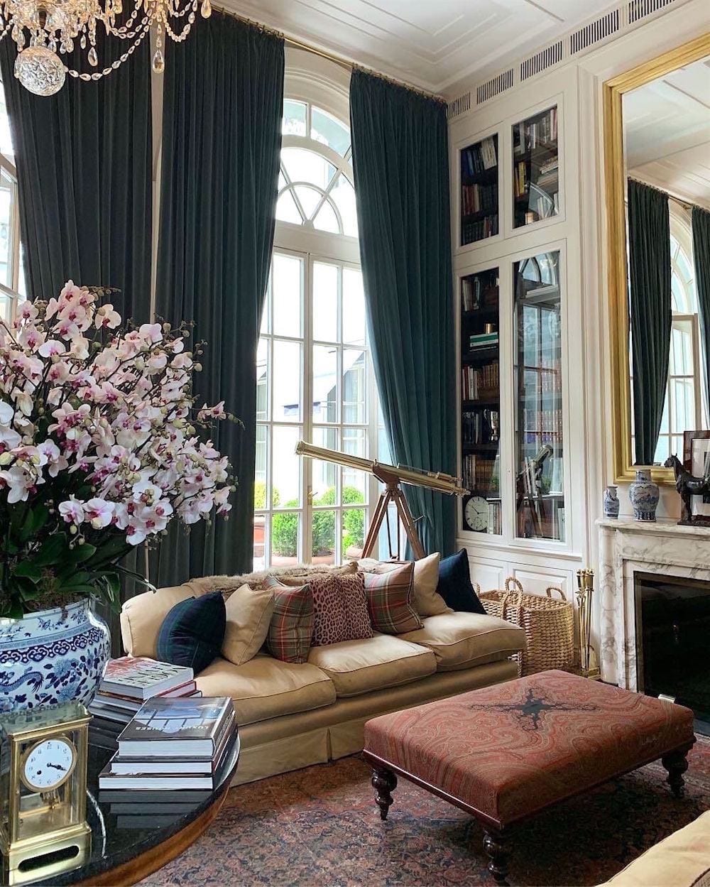
What do you think about the heavy dark green velvet draperies, Laurel? Is the color balance balanced? And what about what you said about the draperies matching the wall color?
Okay. Here’s the deal. This is not a normal room. This is the Miss Universe of rooms– even without any furnishings.
In further examination, the main color is the cream color of the walls and furniture. The secondary color is green. And then, there are pops of red and brown tones that serve as the accent colors.
The furniture has both light and dark elements.
The floor is anchored with a large and dark Oriental rug.
The other thing is the soaring ceiling.
The room can handle the dark draperies.
As for it not being the wall color, that is also fine. This is a case when it works to have a contrasting color.
But why are the drapes green? Why not dark blue?
Well, I suppose that a dark blue would’ve been fine. However, Mr. Lauren has dark green velvet draperies in.
However, I also thought I’d love to see this room with white or off-white drapes.
Well, guess what?
The Palazzo Ralph Lauren showroom has a summer look as well.
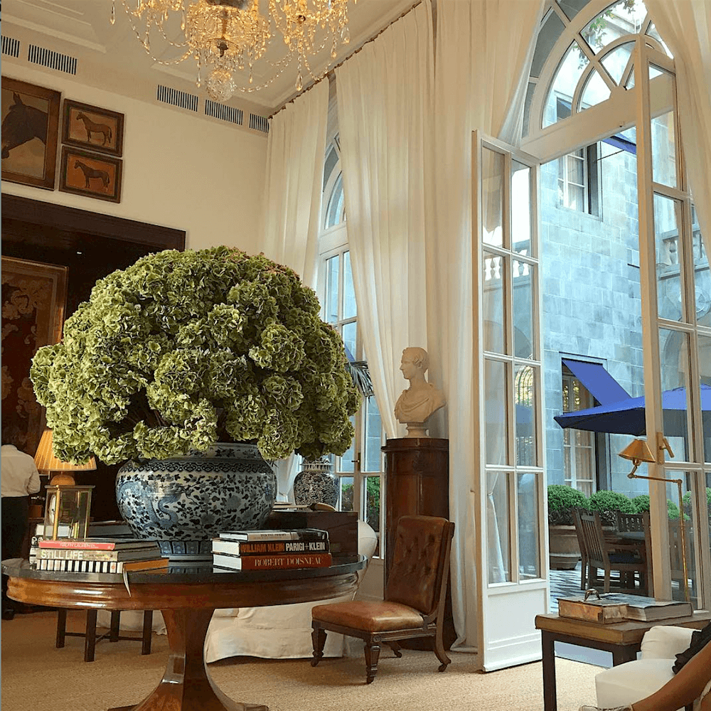
via @charlotte_abbigliamento instagram
Gorgeous! I love this room both ways! And, please note that out went the heavy oriental rug, and they brought out a big beautiful seagrass rug!
@ahekoyan on Instagram – Palazzo Ralph Lauren
via @carloemmepi on Instagram
And the color balance now?
Yes! I think it is still perfect because the rug changed along with the window treatments. However, even if they had left the heavy oriental rug, I would still like the pale curtains. And, I think the balance would still be wonderful because of the pale furniture.
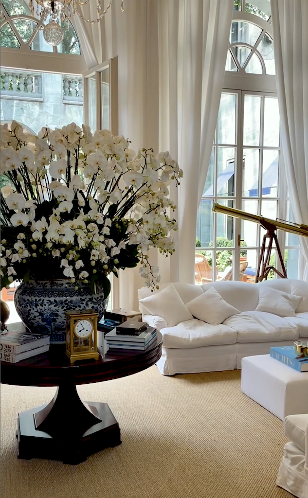
I found these two lovely, more recent images.
Above and below by @Elle_Lebois Instagram. It looks like the back of the drapes are blue. However, I think these are different than what was there in 2019. They look like a more vibrant green.
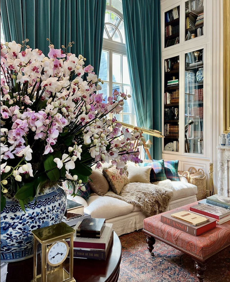
Elle_Lebois on Instagram – Ralph Lauren, Palazzo Milan
Please check out and follow Elle’s gorgeous Insta account!
But, Laurel, isn’t the incredible architecture what makes this room so sensational?
By golly, yes. You’ve got it!
Well, then, how are those of us with lower ceilings supposed to get this grand look?
Of course, your home will never have this kind of drama. It doesn’t have to, to be fantastic. Remember the gorgeous home of Maura Endres?
Well, her ceiling height is only eight feet high. However, her decorating is so stylish and charming that it makes me realize that soaring ceilings are unnecessary for a beautiful room. In fact, soaring ceilings are more difficult to work with.
Okay, I created another one of my “in the manner of” widget boards filled with Ralph Lauren furnishings we can purchase.
Some of these are his furnishings, but the majority of them are not.
To find out more about any of these items, click on any image, which will take you directly to that product page.

xo,

Please check out the recently updated HOT SALES!
There is now an Amazon link on my home page, as well as below. Thank you for the suggestion!
Please note that this website is a free service. However, it’s very expensive to run. To provide this content, I rely on you, the kind readers of my blog, to use my affiliate links whenever possible for items you need and want. There is no extra charge to you. The vendor you’re purchasing from pays me a small commission.

To facilitate this, some readers have asked me to put
A link to Amazon.com on my home page.
Please click the link before items go into your shopping cart. Some people save their purchases in their “save for later folder.” Then, if you remember, please come back and click my Amazon link, and then you’re free to place your orders. While most vendor links have a cookie that lasts a while, Amazon’s cookies only last up to 24 hours.
Thank you so much!
Your support of my work and website means the world to me!
Related Posts
 One Living Room Layout – Seven Different Ways!
 A High-Low Ben Pentreath Living Room – Can It Be Done?
 Easy (and affordable) Ways To Fix A Boring Room
 How To Get A Sunroom Like Tory Burch (for a lot less money)
 Easy Fixes For A Dated Living Room With Huge Potential
 80+ Timeless & Classic Home Furnishings You Will Love!
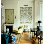 50 Living Room Decorating Rules You Need To Know


16 Responses
This article is a game-changer! It gave me the perfect tips for achieving furniture and color balance in my room. Can’t wait to create a harmonious and inviting space.
Hi there,
I don’t know what I’m doing wrong….but your storefront does not appear when I click on your amazon link….there is never anything to click to support you with purchases. I’ve tried multiple times over months.
Tami
Hi Tami,
I’m only writing this here, so others can see. (I responded to Tami privately).
I don’t have a storefront. These are affiliate links and if you click the Amazon link, it’ll usually take you to your home page. After you click the link, most things you purchase within the next 24 hours will earn me a small commission.
I never notice any rambling. I read these because I like the way you put your posts together. You have real talent.
always love the RL rooms … creates another world to be in…
decoration as inspiration … thanks for re-posting – the perfect uplift to the day…
These beautifully designed rooms are a magnificent commercial display -an actual ‘show room’ … including oversize floral arrangements.
I try to find some elemental principle to use in my surroundings … on a much smaller scale, of course…
Wouldn’t it be a dream to have that space with those furnishings…
Laurel,
You can find gold gazing balls on Amazon for about $35-$40. Then just find a nice stand to put it on.
Rules, rules, rules. Gah! And when to know when to break them. All trim should be painted the same through out. Did anyone else notice? The beautiful dark wood trim on the cased oprening? It is repeated inside the bookcases on the opposite side of the room and anchored in the middle with the round table. Beautiful space through every season.
I love this room, but not the green drapes!! The white summer drapes are divine. If I wanted winter drapes in this room, they would just have to be lighter — not light, but lighter. I think the huge, heavy, dark drapes made the room sad. It is unclear to me if the lighter looking green/aqua drapes are just photographed differently.
RL likes a lot of dark green, but I can only live with it as accent, usually in plants.
I am attracted to RL style, of course, but he always goes a bit too heavy for me. Maybe just too masculine for me to want to live in every day. I sure do wear some of his clothing basics though.
As ever, thank you for a thought-provoking post — I’m re-thinking some ideas for a near-future living room remodel! On a more practical note, I found a source for 5-inch, brass decorative spheres at Fete Home.com. https://fetehome.com/products/brass-sphere
I’ve never noticed any “rambling crap.” Ha, ha! All your posts are such a treat. Looking forward to Thursday.
OK, I decided I would try again to find such a palette generator, the closest I came was this and used one of your photos https://www.geotests.net/couleurs/frequences_en.html#cy It sort of does the job, but all that overlapping of the colors gets confusing. A better display would work I think
I did my living room exactly off the RL Milan living room. It’s my husbands favorite room. We have high ceilings, a large antique French chandelier large antique Persian rug, big cream Century down filled sofa in English style, lots of paintings in old gilt frames. Walls are soft white draperies a deep French blue and cream toile picks up the blue in the rug. I’ve got an antique bombe chest to put tv on. Helps to have good things I’ve collected over 35 years.
Laurel, this post is brilliant. helpful tips on color balance. I will get to the point. Have you ever found a computer palette generator from images, etc that shows the percentage of each color that is in the image? I have tried to find such a clever thing to no avail. You would think with toay’s technology (dare I say AI?) it would be easy. It certainly is not the be all and end all, but would be so helpful as a start point in many artistic and creative areas.
The thing I like about a Ralph Lauren room is PLAID. I like putting more masculine accents in my own room in my condo. As far as the “brass orbs” thing is concerned, maybe go to a garden shop and look for those mirrored gazing ball things. I went one better. I love browsing through thrift shops and I found two oversized plastic Christmas ornaments that had a gold-spattered look to them. Three dollars each. They are now each sitting in their own white urns.
Great post this morning.
I understand the concept of balance in a room. And I would like to think that I’m achieving that in my home. But I can only do it with one item at a time. I can’t tell what the room needs next until something is brought in. I had to see my living room with just the rug before I could decide on a sofa color. I had to wait until that was in place before I could decide what color the drapes needed to be. And so on. It’s the epitome of slow decorating. I could never decide on all the elements of a room all at once. But I’m only doing this once every 10 years or so. Not every day like the professionals.
Also…I’m loving these daily posts.
What’s up with every room having a huge oversized flower arrangements and the rooms being big enough that a big round table fits and 10’ high or higher ceilings. Most of us don’t have the luxury. The impact of color was totally lost on me