
Dear Laurel,
Recently, I’ve read that the gray trend is over and, gasp, we are going back to beige. Do you know? Is it really true? And, why beige, for Pete’s sake?
I have never liked the color gray; it depresses me. But give me greens, blues, and pops of my favorite color, orange, and I’m happy.
And I know you say not to pay attention to the trends, but still… Why is there still so much gray, and when is this gray trend ever going to end? I don’t get it.
Betty Sikovgrey
***
Betty is a fictional reader, and this is an updated version of an older post!
However, before we begin… I have a little musical accompaniment for you.
Piped in from heaven. (the link is here)
Wolfgang Amadeus Mozart Concerto for Flute and Harp KV 299
Emmanuel Pahud, flute
Marie-Pierre Langlamet, harp
Claudio Abbado, conductor, Berlin Philharmonie, 1998
I think it goes very nicely with this post about the gray trend.
And also to celebrate the Laurel Home 14th Blogiversary!
This image is four years old. Duh
Back to the gray trend!
Betty asks a very good question, and it’s one I’ve heard many times.
When oh when is this horrid gray trend going to be over already? Gray, gray, gray, Laurel. Yuck.
Well, sorry that you feel that way, because the answer is never.
Yes, that’s right. It’s not ever going to go away.
And that’s because the gray trend is NOT a trend.
I will explain.
Let’s begin with Mozart.
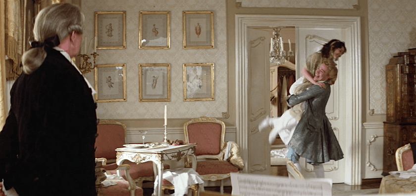
From the film, Amadeus. Please notice the predominant color of his home.
GRAY.
Mozart lived during the neoclassical period, which was the second half of the 18th century into the early 1800s. It’s the same period as the Gustavian Swedish style.
High-Low Neoclassical & Gustavian-Style Furnishings – Parts 1 & 2
Gray is as classic as this gorgeous home in Charleston, SC, built in 1772, at the height of the neoclassical period.
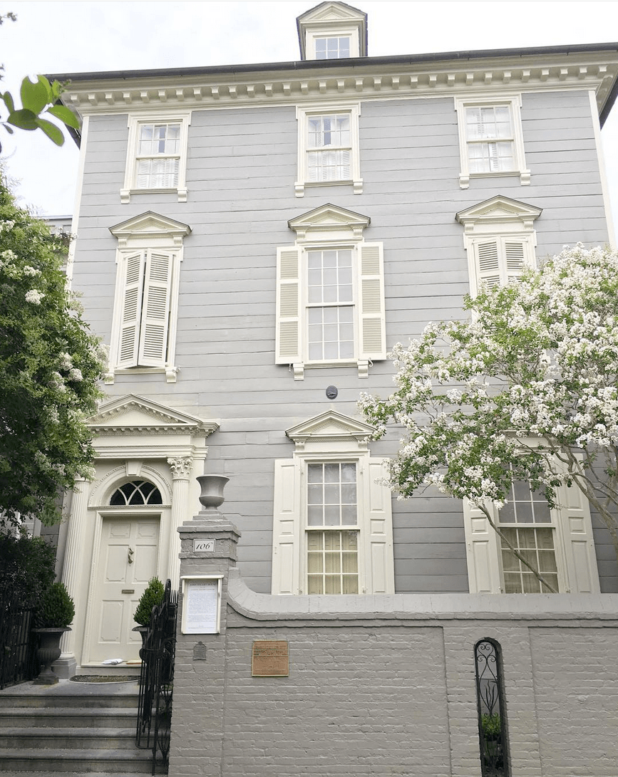
via @limestoneboxwoods – Instagram John Stuart House – A fabulous example of American Georgian or neoclassical architecture – Charleston, SC.
I think that most people will agree that this is a beautiful home, even those sick of the gray trend.
So, why does this gray look good and the “gray trend” look awful?
To begin with, we need to define “gray.”
Theoretically, gray is a color somewhere between black and white that is devoid of all color.
However, 98% of the time, that is not the case. Most shades of gray are actually very muted shades of blue, green, or violet. Some shades of gray are cool. And, some are warm.
Below are several colors that identify themselves as Gray.

So, what IS the problem, Laurel?
Right. The problem, I think, is three things.:
1. Boxy, boring architecture. Anyone who’s read this blog for a while is probably sick of me harping on this one, but it’s true.
2. The word “transitional.” In my opinion, that word should be removed from the English language. lol
Although I have been guilty of using it. Why should it be stricken? Well, what does it actually mean? It’s like the furniture can’t make up its mind. Can you imagine Thomas Chippendale designing a transitional chair?
Unfortunately, as I’ve also brought up numerous times;
Transitional” furniture is, more often than not, big, bulky, and boxy. Some transitional furniture is a completely made-up design– a bastardization of a traditional design.
The third problem with why so many are sick of the gray trend is how gray is used.
Here’s what I’m talking about. And please do not pin the following four room images to Pinterest or anywhere else. They are here for demo purposes only. If any of these are your rooms, please forgive me.
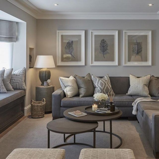
Now, there is absolutely nothing wrong with this room, except that it’s not balanced. I’m longing for a lot more white, more black, and some color– somewhere. Even a beautiful plant. And some brown.
In short, there’s a dominant mid-tone gray, and it’s dreary.
Gray needs warmth, so it loves rich brown tones and gold. It’s in the same way that its cousin, blue, does.
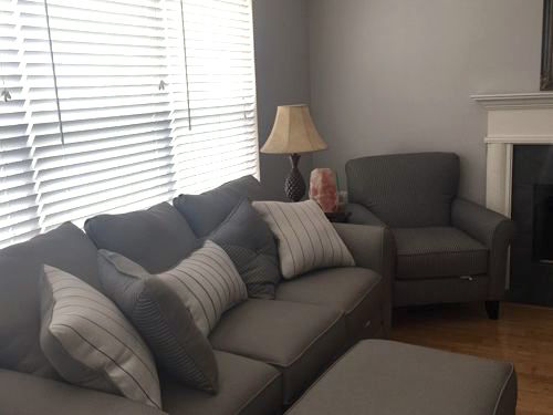
You know, that’s a beautiful fireplace mantel. That chair, shoved into it, needs to go. As we’ve discussed before, overlapping furniture is a massive no-no in space planning.
Here, we can see why some find gray to be depressing. I think the wall color is fine, and I don’t mind the furniture. It’s phenomenally bland and unsettling with all of the cramping going on.
The room needs more variety in tone, more white, black, art, maybe some color too.
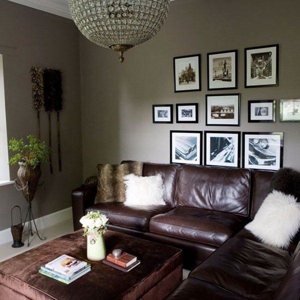
Oh, that glorious music makes me forget how bad this room is. And it doesn’t have to be. However, cranberry is not helping this gray. Gray needs some warmth, I think.
Then, there’s the art.
You saw that one before your eyes could focus. There should be a minimum of four inches of breathing space between the art and the sofa. This is a tall ceiling, so I’d probably raise everything about six inches, and it will be fine.
Do you want to find out 100s of rules and tips for furnishing your home?
Hmmm, are those some sort of dusters hanging on the wall? Maybe the cleaning service put them there.
I would also do a hunkier light fixture with a leather sectional.
There’s a beautiful lantern in the Hot Sales Widget that would be perfect. (Scroll to the bottom of the page.) Actually, both lanterns would work.
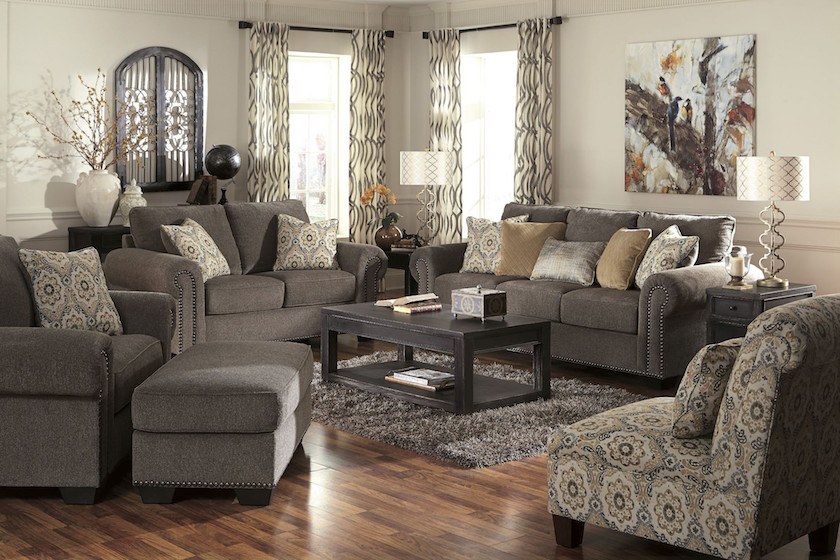
The above is from one of those furniture companies that sell cheap, crappy matching sets of, yes, transitional furniture.
No wonder Betty finds gray depressing. I am surmising that it is because when she thinks of the gray trend in interiors, she thinks along the lines of the rooms above.
This makes me sad because gray can be a charming color when used in the right way. Let’s take a look, and maybe we’ll be able to do away with the gray “trend” and put it in its rightful place in classic gray rooms.
Yes, gray is a classic colo,r and I am about to prove it to you.
Any color that is found abundantly in nature is classic.

source unknown
Is this gray exterior boring? What about the one below?

Gray and the not-boring beige can be seen here. Sublime.
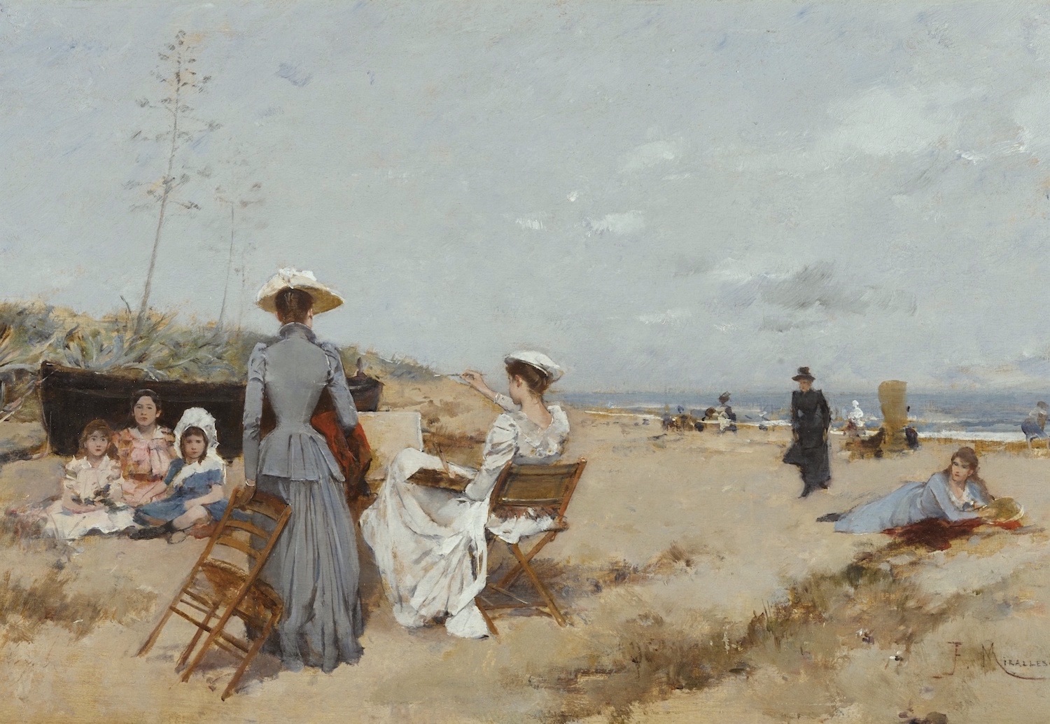
Francisco Miralles SPANISH PAINTING ON THE BEACH – Sothebys.com
And for a warmer beige, one of my favorite rooms ever!
The Greeks and Romans understood classical design, proportions, and color.
They embraced classical forms and loved gray. After all, gray is the color of limestone.
Andrea Palladio, an Italian Renaissance architect, embraced classical design and influenced thousands of architects of the 18th century.
The aforementioned neoclassical style of the 18th century also goes by these terms:
- Georgian (primarily Great Britain)
- Colonial (American)
- Federal (American)
- Adam (Scottish Architect)
The neo-classical style permeated everything from architecture, interiors, clothing, art, and music.
It was the time when my favorite composer (Mozart) lived and worked.
Below is one of the most famous architects of the neoclassical period, Robert Adam.
You can see his younger, handsome bro, James, here. He was also a renowned architect, but overshadowed by Robert.
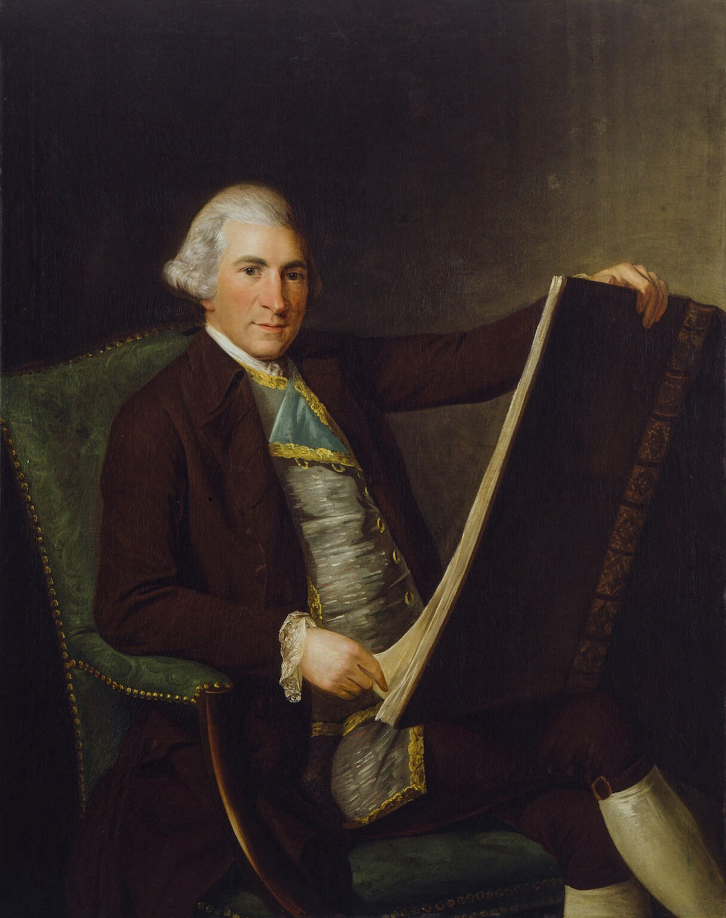
George Willison’s portrait of Robert Adam neoclassical architect
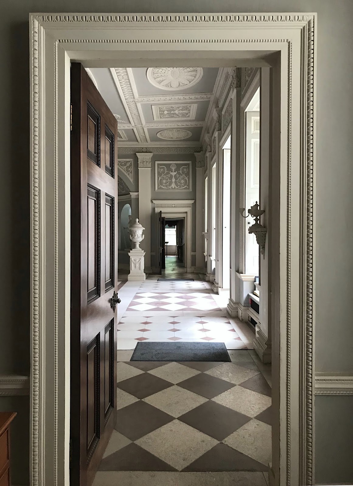
Entrance at Osterley Park by Robert Adam
Robert Adam is the18th-centuryy English architect who embraced the style of Andrea Palladio.
Thomas Jefferson in the US was our version of Robert Adam in the 18th century.
Let’s look at more examples of gray throughout the last few hundred years in art, interiors, and architecture.
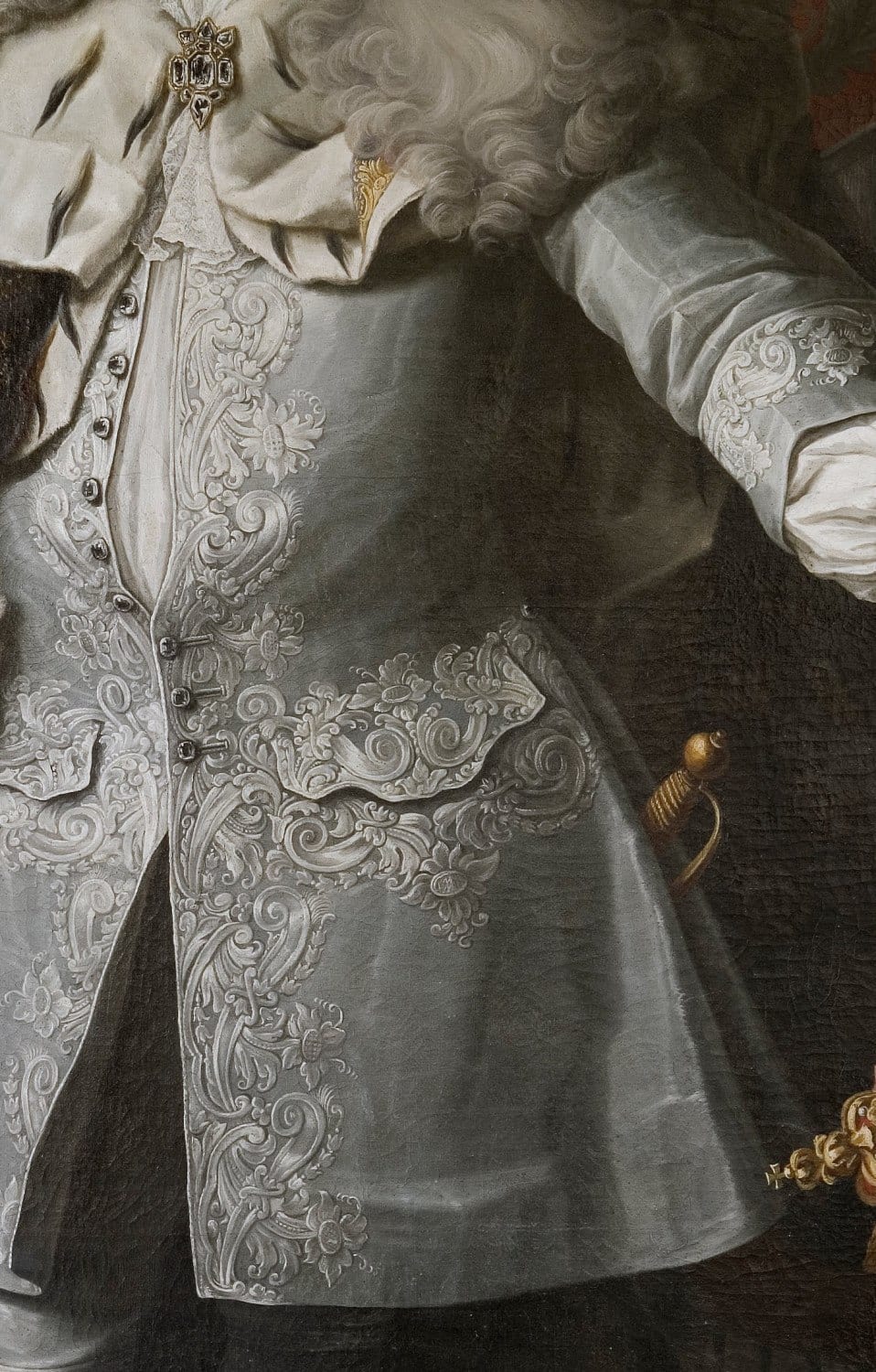
Excerpt of Fredrik, I King of Sweden,n painted by Georg Englehardt Shroder
I imagine some poor woman going blind creating this, but it sure is glorious!
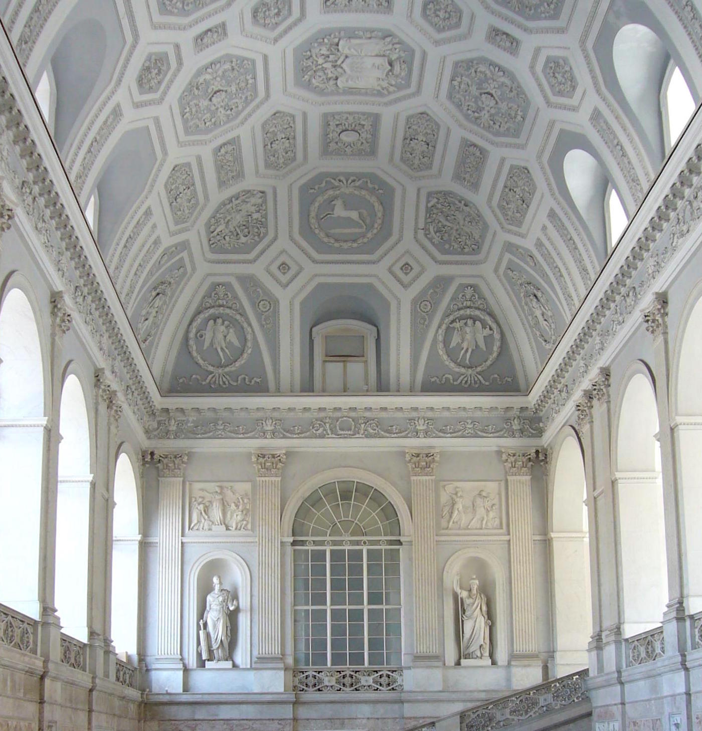
This phenomenal building in the neo-classical style went through several incarnations between 1730-1860. It is very much in the style of Robert Adam.
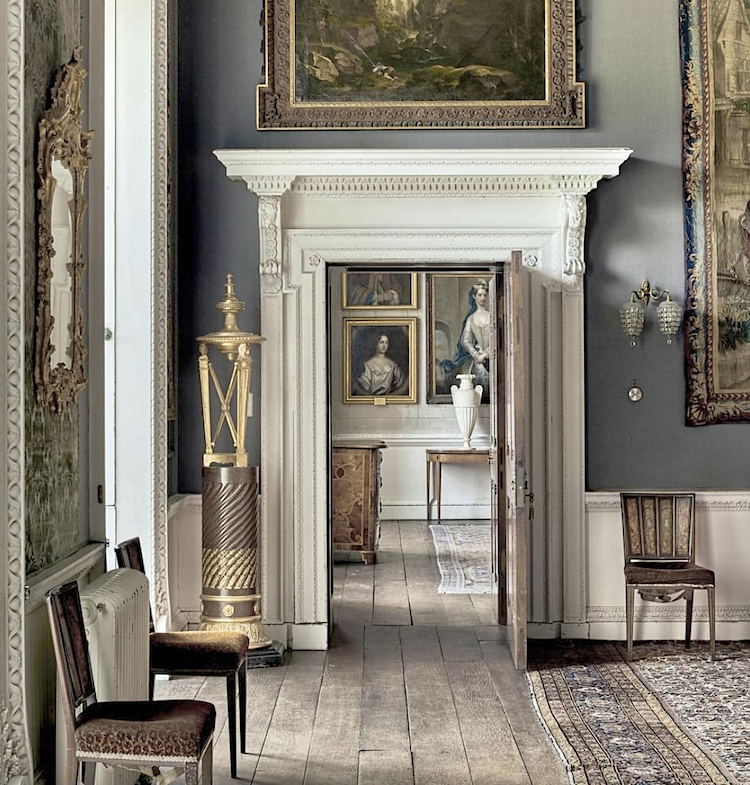
via @rupert.dixon on Instagram – Houghton Hall. This is a gorgeous Insta account with gorgeous images and architecture.
photo @horwoodphoto

One more lovely gray image from @rupert.dixon on Instagram – photo: @montgomeryphoto
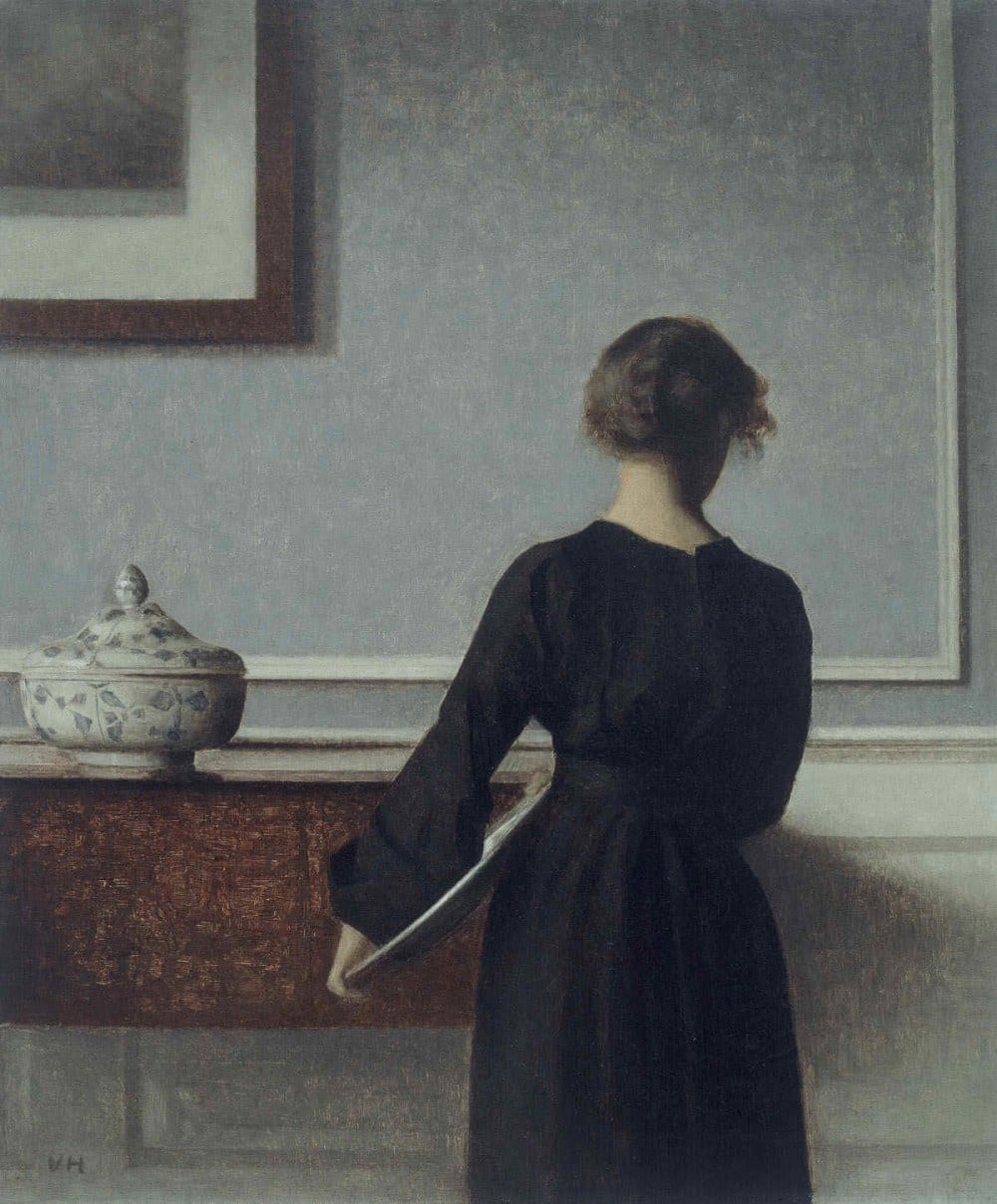
Interior with Young Woman from Behind (1904) by Vilhelm Hammershoi
How beautiful these colors are! And more Hammershoi here!
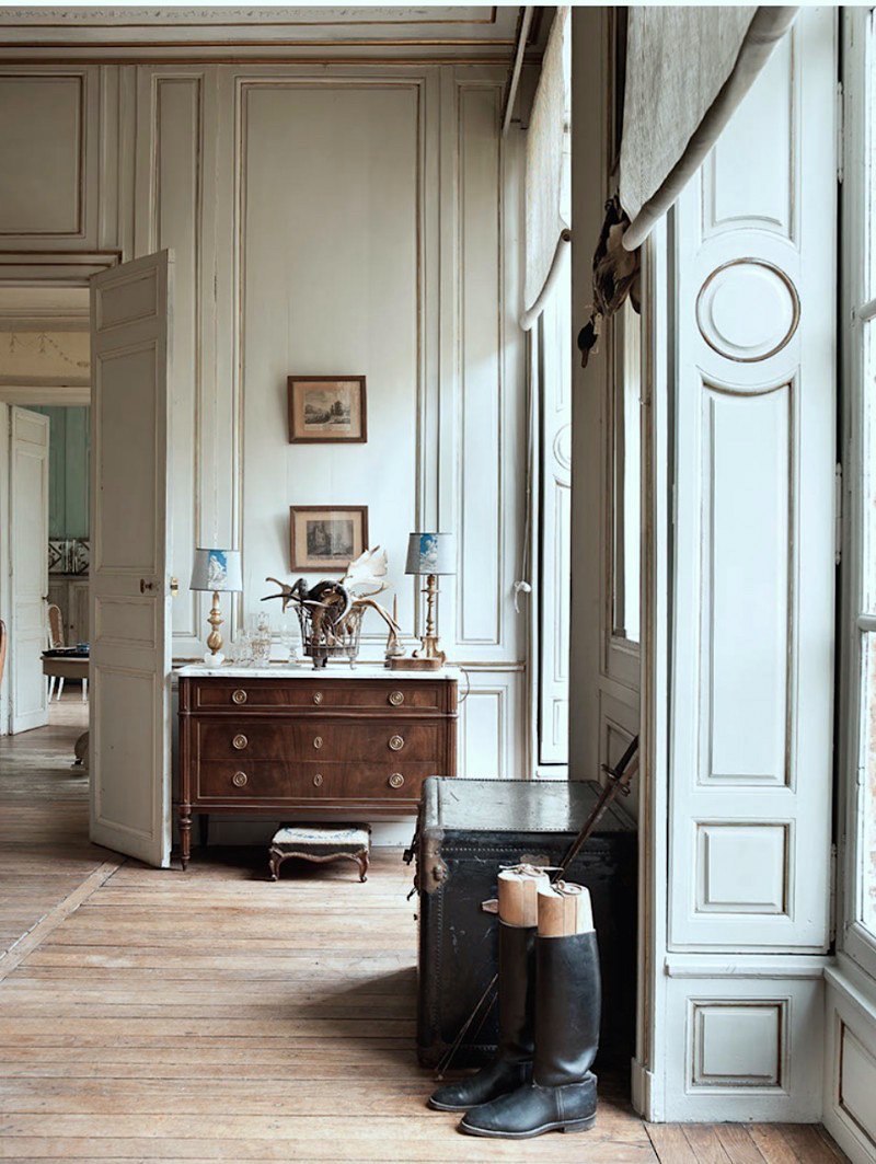
I’ve long adored this image with the huge windows and interior paneled shutters!
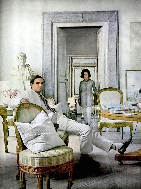
I first came across this photo a few years ago and thought it was some totally cool couple hanging in their pad in Tribeca or something like that. But no. The photo by Horst P Horst for Vogue Magazine was taken in 1966! This is Cy Twombly and his lovely wife hanging in their pad in Rome. Truly timeless.
BTW, I came across the entire set of these fine Horst photographic prints, which you can purchase here.
Below are some of my favorite designers who embrace gray in their work.
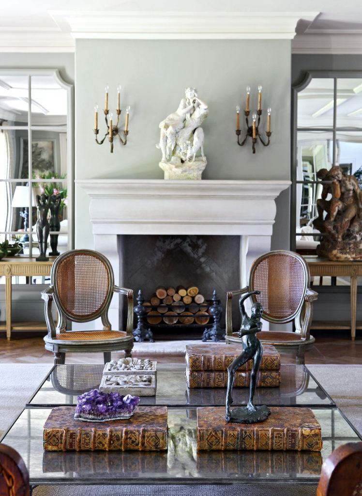
Above and below by the fabulous South African interior designer, John Jacob
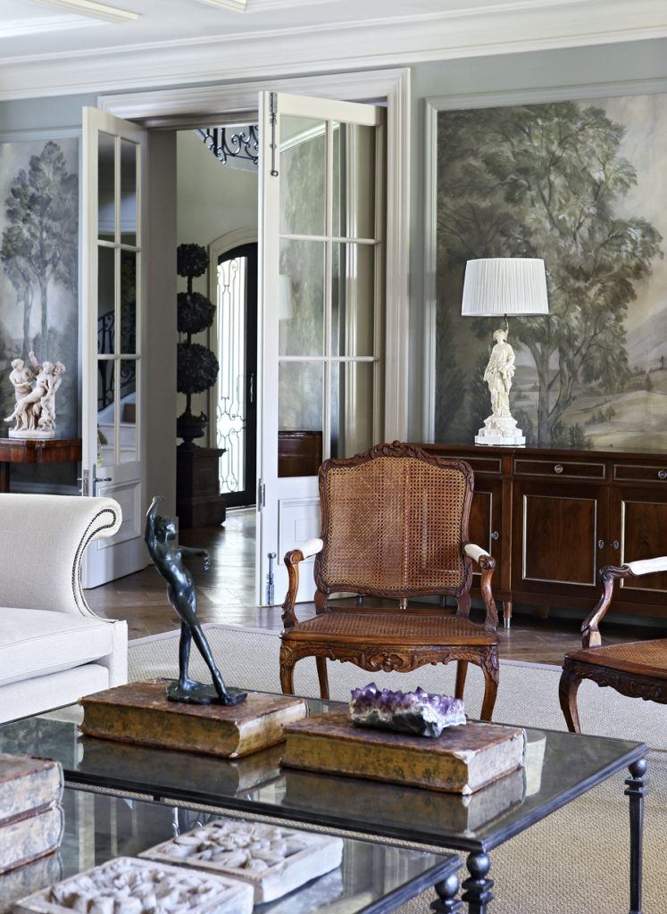
I adore the grisaille wallpaper mural. If you love it too, then you will most likely enjoy this post, which is all about grisaille.
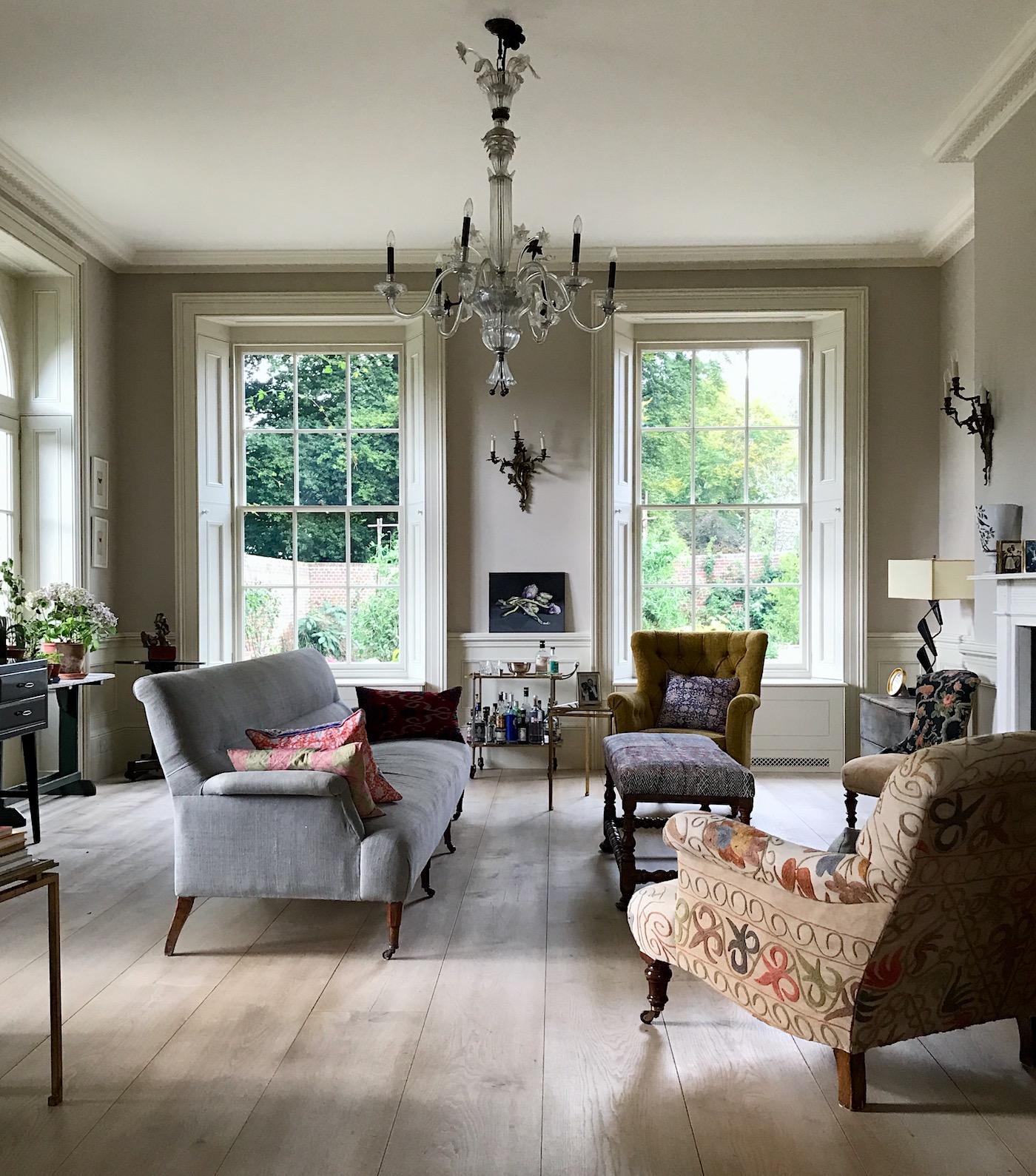
I took this image in the fall of 2017 during my trip to England. This gorgeous home (you can see more of it here) was designed by the young, classical architect George Saumarez Smith.
George, Francis Terry, and Ben Pentreath are all classical architects striving to keep the art of classical architecture alive. Thank God! I was so lucky to meet them during my trip to England in 2017.
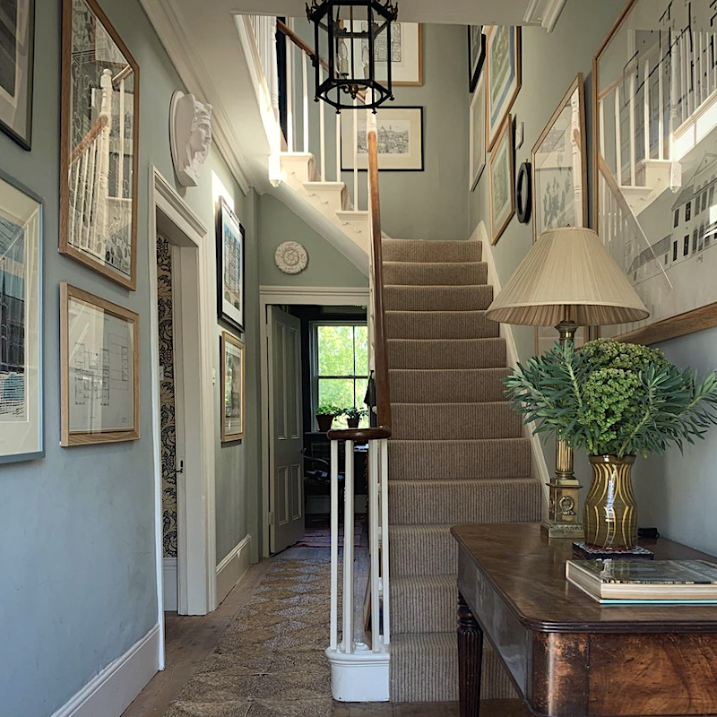
Above is from George’s own home. What a gorgeous entry painted in a cool gray. Does this look like that tired gray trend we wish would disappear? I don’t think it does.
George has various shades of gray all over his home!
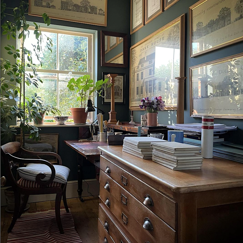
A cool, deep shade of gray-blue in George’s home office. I adore all of the beautiful architectural prints framed throughout his home.
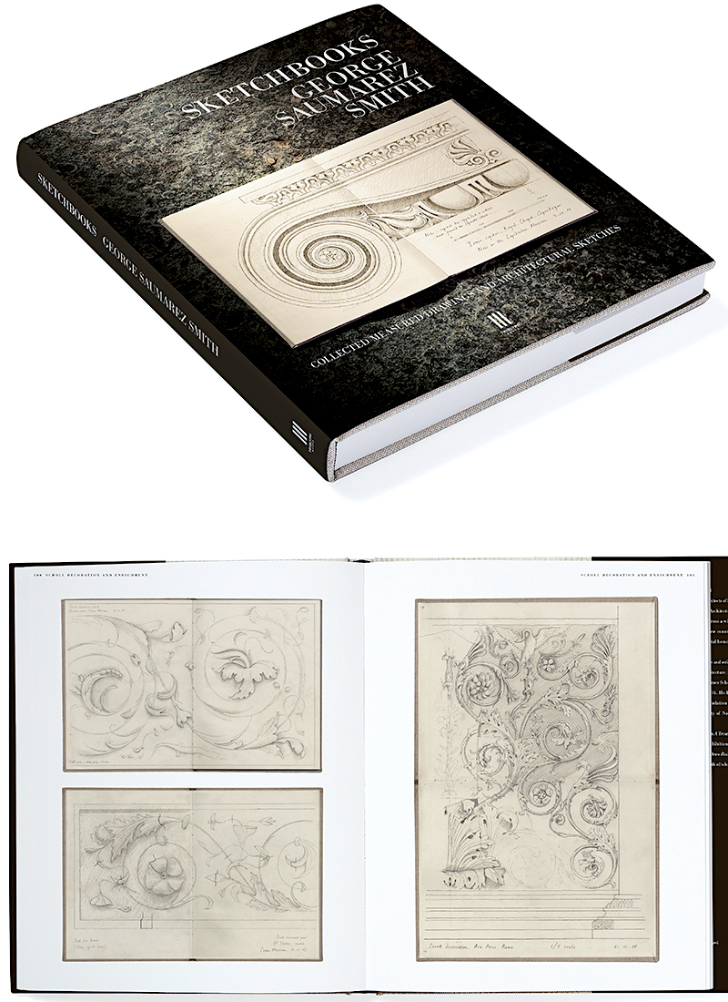
George recently published an exquisite book of his incredible sketches. You can find it here, and I also added it to my interior design and garden book list.
Below is something super interesting regarding the gray trend.
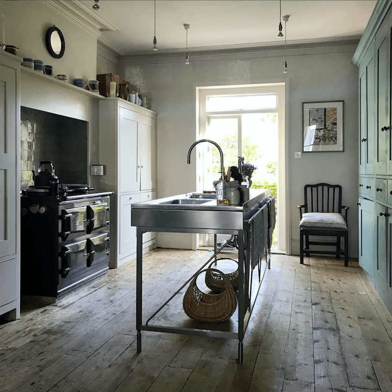
Above is George’s wonderful English “unkitchen.”
But, but, but…
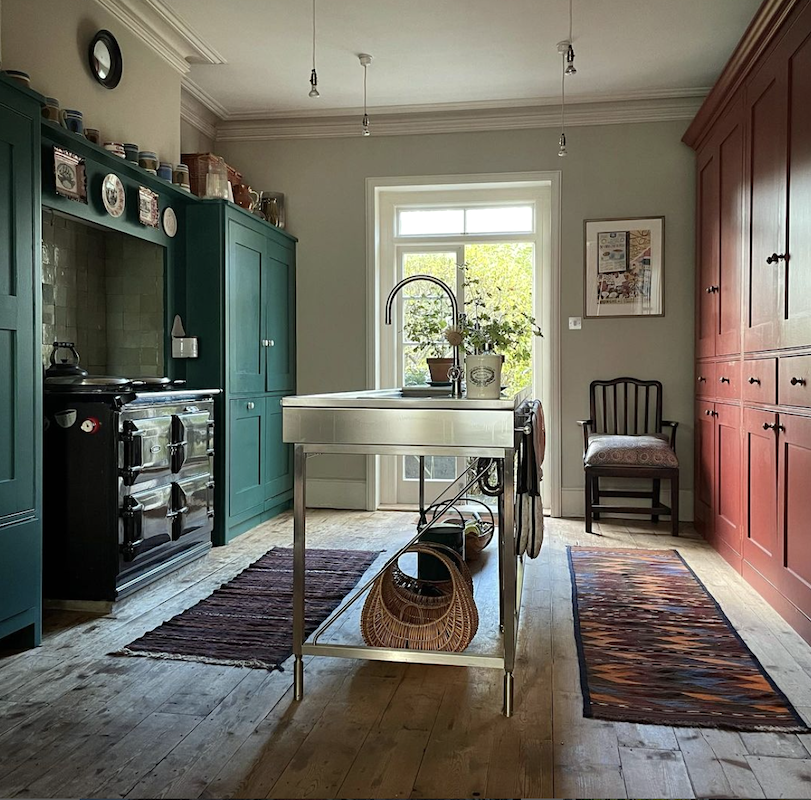
They repainted! What do you think? I think it’s wonderful, but I still love my classic white kitchen.
Please follow George Saumarez Smith on Instagram.
I was fortunate to meet Ben, George, and Francis Terry on my trip to England.
What cracks me up is that George works for a firm called [Robert] Adam Architecture.
And no, there is no relation to the Robert Adam from the 18th century. That’s what they say, anyway. I love stuff like that!
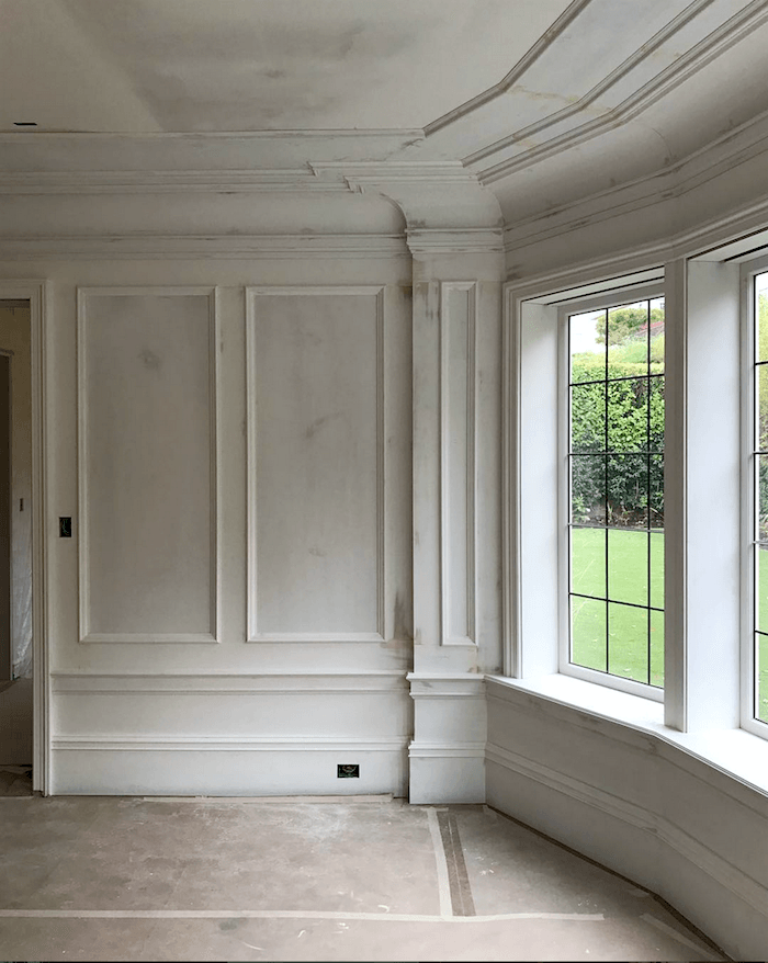
Does anyone else love rooms when they’re only primed? Or am I the only nutcase who does? lol
Adore Jessica’s work. You can see more of it here.
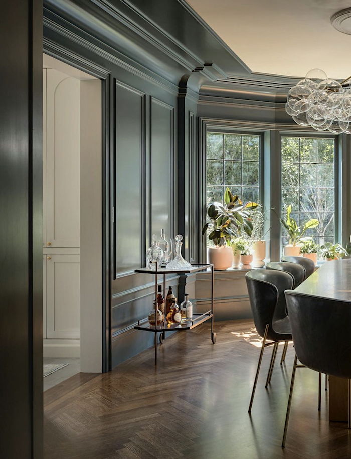
Here is the finished dining room. Although I love both, the chalky gray of the first one, I think, is so cool. I usually feel that way with primed walls. Please also follow Jessica’s exquisite Instagram!
No, the gray trend and gray paint trend are not over. And if used the right way, it can be one of the most glorious colors, IMO.
Below are some additional designers or firms I love who’ve been featured on the blog. Each has embraced the color gray in their interiors.
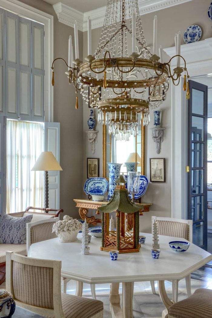
Furlow Gatewood (photo: Rod Collins)
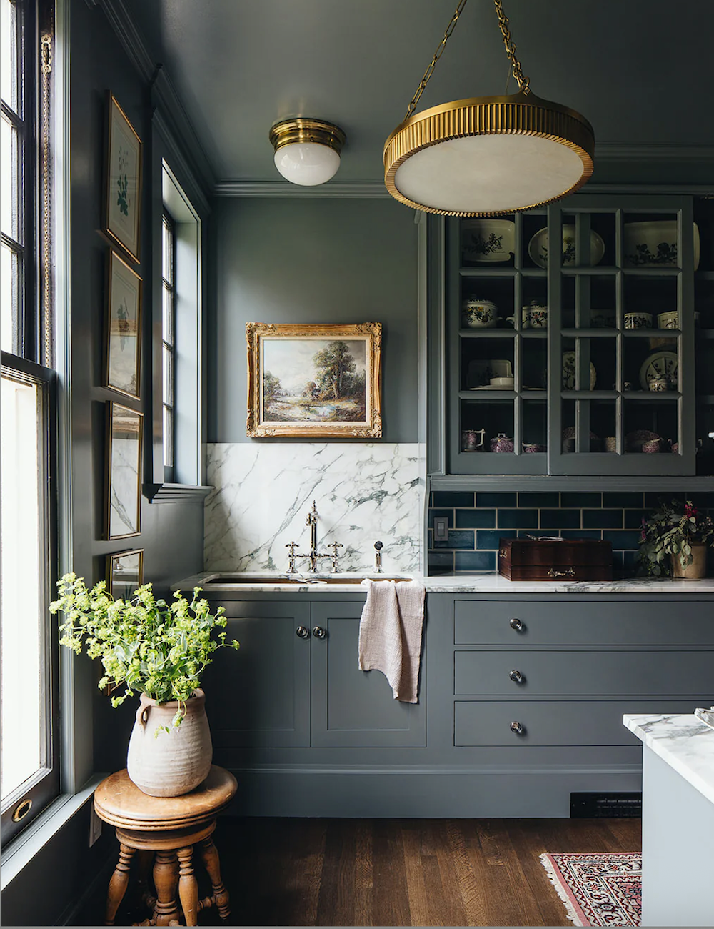
Below is Jean Stoffer’s magnificent butler’s pantry with cabinetry painted in a similar color to Benjamin Moore Templeton Gray.
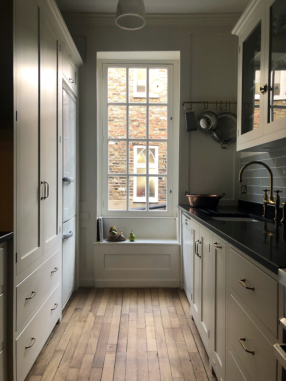
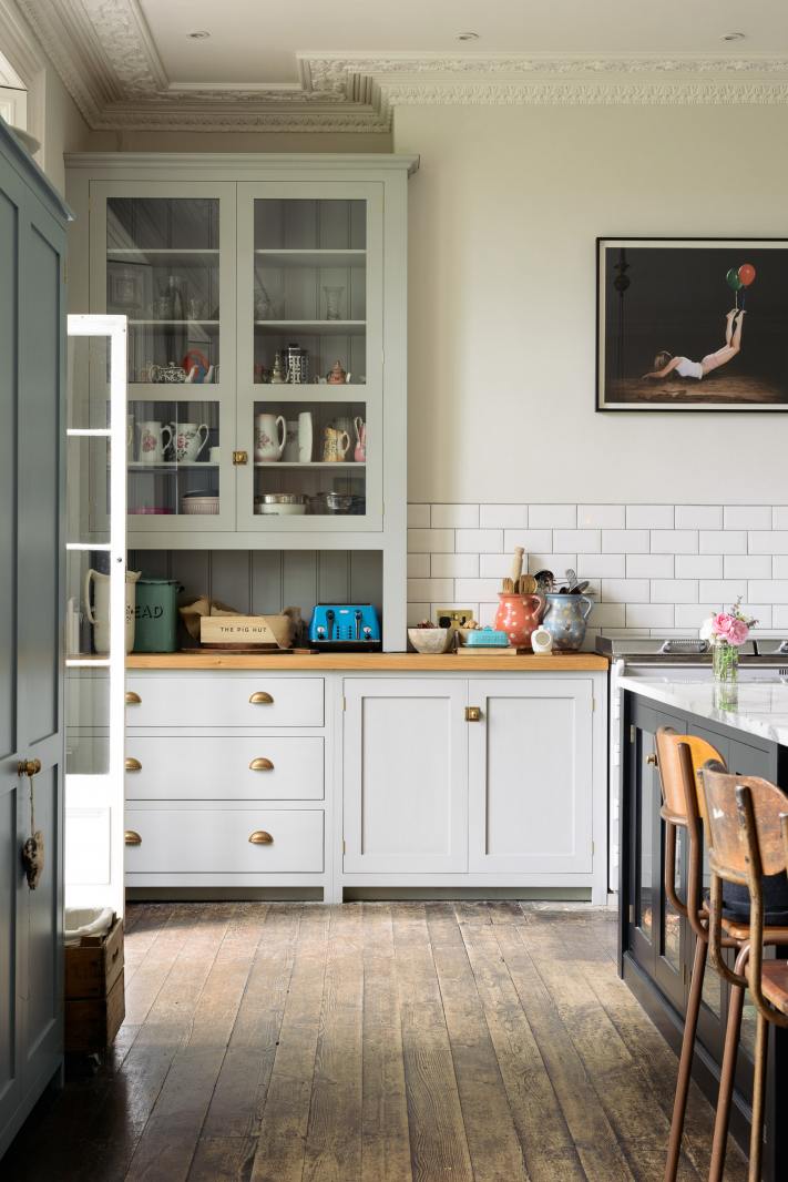
Above and Below DeVOL kitchens. Gosh, so many of them are some shade of gray!
Please click the links below for more ideas using the color gray and some of my favorite gray paint colors.
Nancy Keyes Stunning Gray and White Kitchen
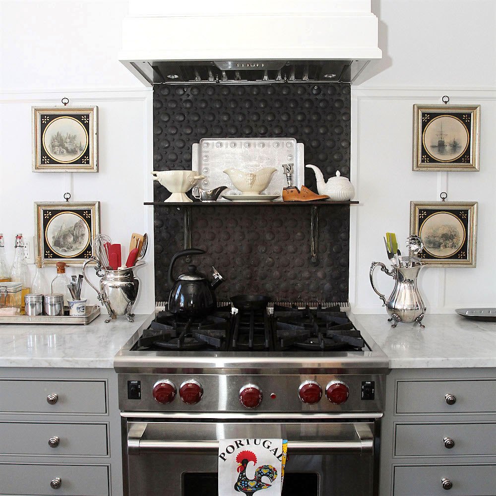
Dark Bathrooms and What You Need to Know
Can You Use Gray Paint in a North-Facing Room?
I’m sure there’s more than that, but that’s enough gray stuff for now.
xo,

***Please check out the recently updated HOT SALES
Also, if you’re doing some shopping on Amazon, please click this Amazon affiliate link or the graphic below.

Thank you so much!
I very much appreciate your help and support!
Related Posts
 Furniture Trends That Need to Go Bye Bye | Market Preview Fall 2015
 Door Knobs – The Good And The Not-So-Good + Sources
 25 Inspiring and Colorful Home Decor vignettes
 It’s Here! The Ultimate Art Gallery Wall Hack (aka: Template)
 The Shocking Truth About Restoration Hardware
 My Top 100 Timeless Furniture Pieces
 Decorating Paralysis – What Causes it? And How to Fix It