Dear Laurel,
I love your blog and have gotten your Rolodex and your paint collection and paint palettes. It’s all so incredibly helpful as we make plans to fix up our modest 60’s ranch home Aka – Boxy, Low Ceilings, plain, boring… I want a Georgian or Federal style colonial, but that ain’t gonna happen.
Our windows are far wider than they are tall.
The ceilings are only 8-feet. And there’s nothing else and no crown or other applied mouldings. I mean, Laurel, you rarely see low ceilings in any interiors in magazines and even in the examples on your blog. I’m not saying it’s your fault, but just that I feel it’s more of a challenge for your low-ceilinged readers. For example, your recent mirror post. I’m not trying to sound catty, but what about the rest of us with far less interesting spaces, along with low ceilings.
I guess I’m afraid that since the home wasn’t intended to have those things I love so much, it’ll look odd to add them? I don’t know.

But I’m figuring other people are in the same situation.
Thanks,
Alice
Alice’s problem is very common. Far earlier in my career, I worked on a couple of antique homes in northern Westchester County.
It’s always a challenge to make a ranch home look more charming. The two I worked on were inherently charming because they were old. However, I also worked on some 60s ranches and split levels that were NOT inherently charming.
However, we worked hard to make improvements.
Another point is that while eight feet is a lowish ceiling, it is not a super-LOW CEILING.
Seven feet is a low ceiling, and I once worked on an antique home with seven-foot ceilings, and the husband was 6′-1″.
That job took place in 2000-2001!
In fact, that was the client I was on the phone with on September 11, 2001, when both of our husbands were working in Manhattan, and there was so much confusion.
Through no effort on my part, this home built in 1800 was in the December issue 2004 of Better Homes and Gardens. So, it’s also fitting as we are now officially entering the Holiday Season.

Here is the home in the sleepy hamlet of Waccabuc, NY.
Oh, you’ve never heard of Waccabuc?
Right. And that’s just the way they like it! :]

Waccabuc is one of the most beautiful places on earth.
As I have a copy of the magazine, I’ll take you inside this historical home with low ceilings– only seven feet!
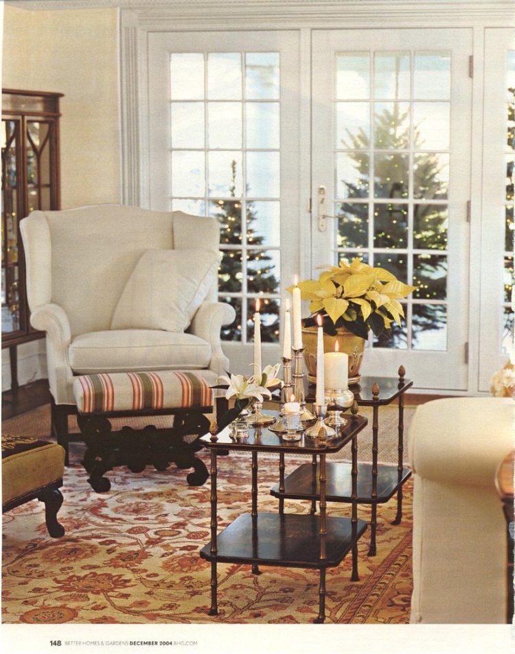
In the living room where we intentionally layered an oriental over seagrass. See? I was doing this back then!
The wing chair had belonged to the client’s mother.
Being it had sentimental value, we had it reupholstered in cream linen. The only thing that came with the project was the stools. Everything else, we did. I say “we” because I include everyone who worked on this project. I love those Chinoiserie tea tables from Brunschwig and Fils, and they no longer exist. However, very often, you can find vintage pieces like this on Chairish or 1st Dibs.
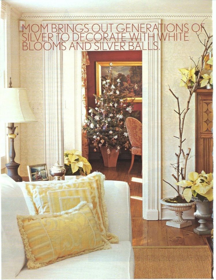
A shot from the living room looking into the dining room. And, please note. Those are NOT my pillows! I had given my fantastic client two beautiful Aubusson pillows as a gift at the end of the project. They removed them and put in this cheap crap. But, it’s a case in point that what you see in a magazine isn’t always the designer’s work!
However, those are the original mouldings.
The clients removed the paint from the fireplace before I became involved. This one would not have been painted in 1800.
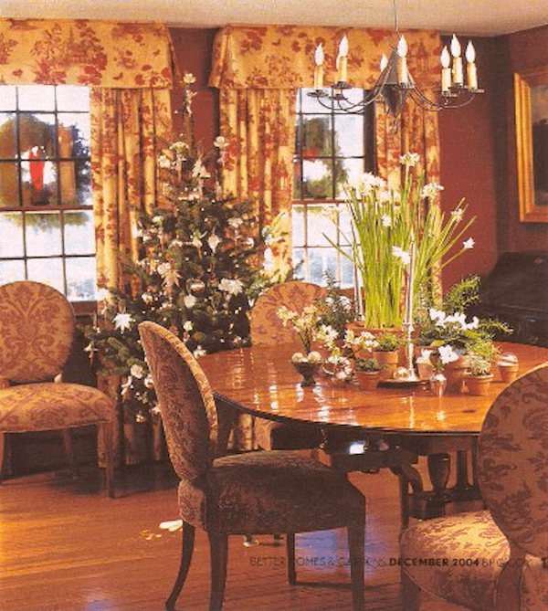
The dining room is my favorite. The trim is wood here, and there’s a lot of it which you can’t see here.
The only staircase in the home is behind this shot.
Again, please let me remind you that this is a low ceiling at only 7-feet.
We took the valance straight up to the ceiling, as you can see. I also made it proportionate to the seven-foot wall. Usually, a valance like this would be about 16,” but I believe these are approximately 13″. The beautiful toile is from Cowtan and Tout but was discontinued soon after we did this room.
The table and chairs are from Baker Furniture. This was the most amazing table, which is 54″ round, but it looks like they have the leaf in it. It’s discontinued. However, I recently linked to one that was on Chairish, and it sold shortly after that. It’s a great table. So, if I find another one, I’ll let y’all know.
The chairs are my favorite dining chair–ever.
They were part of the Charleston Collection and also no longer exist. Too bad. The scale and proportion are something I have never found again. And they are incredibly comfortable, as well.
The fabric, another favorite from Pierre Frey, I did in other colorways for other clients.
Ahhh… those were the days! But alas, nothing stays the same.
I do love how the stylist decorated the dining table.
The walls are a cinnabar color that was troweled on by decorative artist and designer Robert Hoven, and he also did the checkerboard floor below.
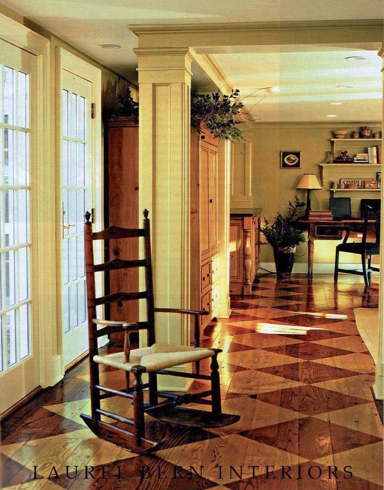
Beyond the dining room is the kitchen/family room.
Here, you can see how wonderful the mouldings and architectural details look. This area was completely gutted. I did not have anything to do with the architecture or kitchen, but I think that they did a great job.
I haven’t quite made the point yet, but perhaps it’s evident that just because a home is small or was built 60 years ago doesn’t mean that it can’t become a charming home filled with remarkable architectural detailing.
Okay, now, I want to address Alices’s statement regarding low ceilings:
Laurel, you rarely see low ceilings in any interiors in magazines and even in the examples on your blog.
Okay. I don’t expect Alice or anyone to wade through nearly 800 blog posts. Gosh, I wrote them, and I forget what I’ve done. lol
However, that’s why I’ve been trying to do these “catalog” type posts like this one so that at least you’ll have one place to find many posts in one area that cover one broad topic. The links to the other posts are interspersed throughout.
This post is primarily about low ceilings, spilling over into all architectural enhancements for boxy, boring rooms.
But, here’s the other thing. There are many rooms on this blog that are only 8-feet tall–tops! And, some might be slightly taller, but I don’t think they’re 9-feet. But, even if they are, a 9-foot room can easily translate into an 8-foot room.
So, I’m going to link to other posts that feature low ceilings. Plus, provide some inspiration pics, some you’ve seen and some you haven’t.
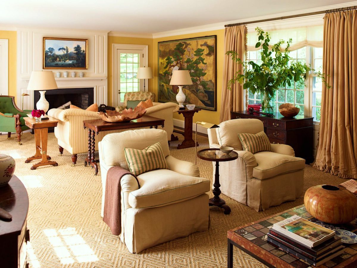
Gil Schafer is another one who understands low ceilings. I believe this is another beautiful collab with Miles Redd. I see the signature ruffle on the drapes that is totally Miles. This is definitely an 8-foot ceiling. I know that because the door is most likely 80″.
This space alone could act as a textbook for how to design a room under a low ceiling.
Gil is the king of proportion and scale.
However, I still can’t believe he got married. I don’t recall giving him permission to do that. Oh well… ;]
Sorry. Where were we?
Oh right. Gil’s and Miles Redd’s brilliant decorating. The furniture is not dinky. It doesn’t need to go on a diet either, however. lol
The crown moulding is actually relatively small, which is absolutely perfect. There is a flat piece underneath, and the curtain rod is hung on it as high as possible.
But, notice that the art is BIG, the plant is BIG, and the lamps are BIG.
These elements give this room the drama that it doesn’t get from the lower ceiling height.
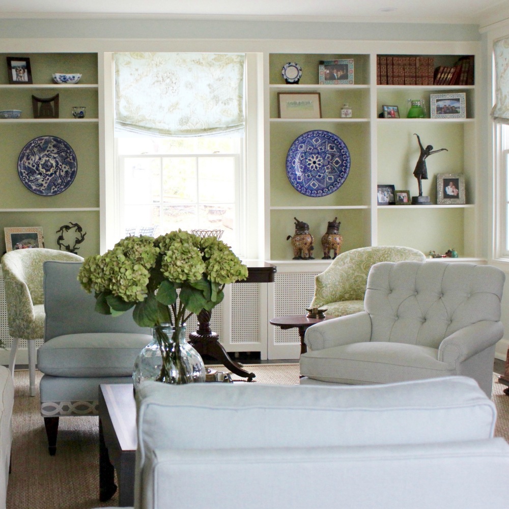
Remember the Mac’s living room. It, too, has an 8-foot ceiling height.
Let’s look at some more inspiration rooms with low ceilings.
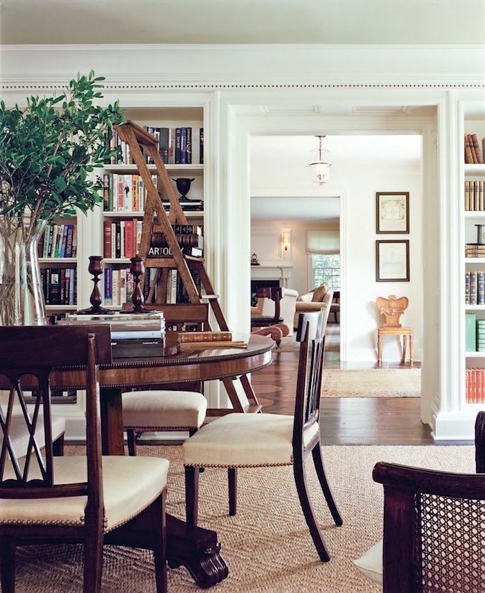
The first one is a Victoria Hagan classic. I am pretty sure this is an 8-foot ceiling height. One trick to raise the ceiling if you’re doing an extensive renovation is to make the doorways a little higher than normal. Of course, this means custom doors.
But, please check out Best Proportions for Interior Trim and Why You’re Confused.
So, if that’s not in the budget, you could also give the doorway more presence with a larger moulding over the door.
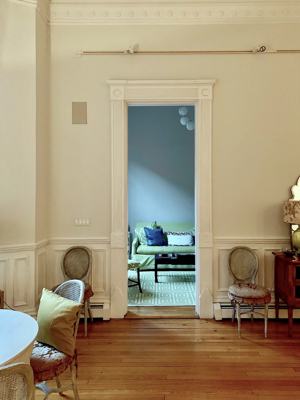
Above is a style of door casing that lifts the eye.
That’s really the name of the game, and that is bringing the eye up as much as possible. Although, in my living room, if the eyes were lifted any higher, they would fly out of one’s head.
Please check out this post about door casings.
Also, Mouldings and Doors, Too Many Options, She’s Stumped.
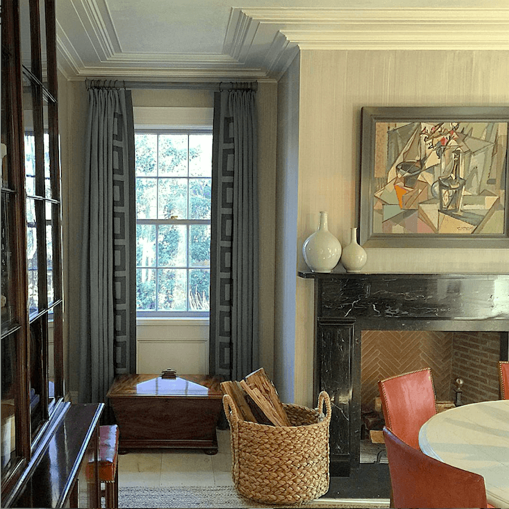
Steven Gambrel is another favorite designer who knows how to work with a low ceiling, so you don’t even notice it.
I can’t find it now, sorry, but I have seen crown moulding like this, and it’s actually a plaster moulding. I promise to do another post about crown moulding.
But, please check out Ranch House Decor Mistakes You Might be Making.
And, Can A Raised Ranch Become a Traditional Home?
And, another boxy boring ranch house with ideas to fix it.
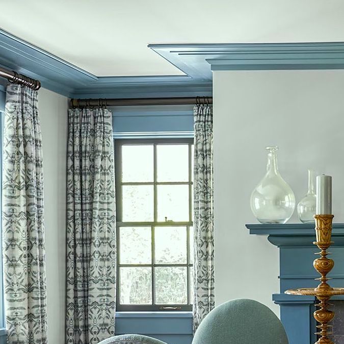
Elle Decor – photo: James Merrell
Another beauty by Steven Gambrel. This time he took the ceiling moulding and crown and painted all of the woodwork a mid-tone blue. But then he kept the walls pale. It’s a great look and gives the illusion of a higher ceiling.
Another favorite post is this one about wainscoting.
And I love this post about Problem Ceilings and How to Fix Them.
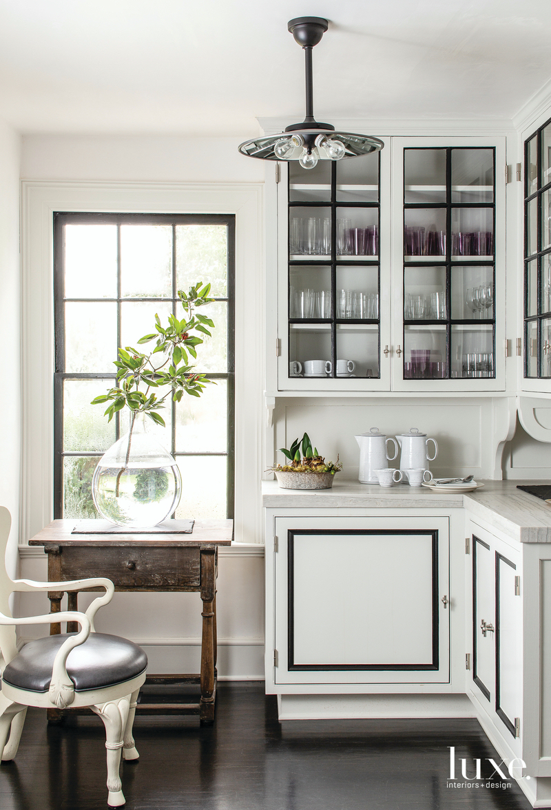 via Luxe Home (please click the link for more of this spectacular home.)
What a smart kitchen this is by Steven Gambrel. Yes, this is an 8-foot ceiling. However, the cabinets go all the way up and are finished with a small crown. The dark floors create an illusion of the floor receding. This makes the ceiling look higher by making the floor seem lower.
Another excellent post is an oldie, but it also has some good ideas for boxy, boring rooms.
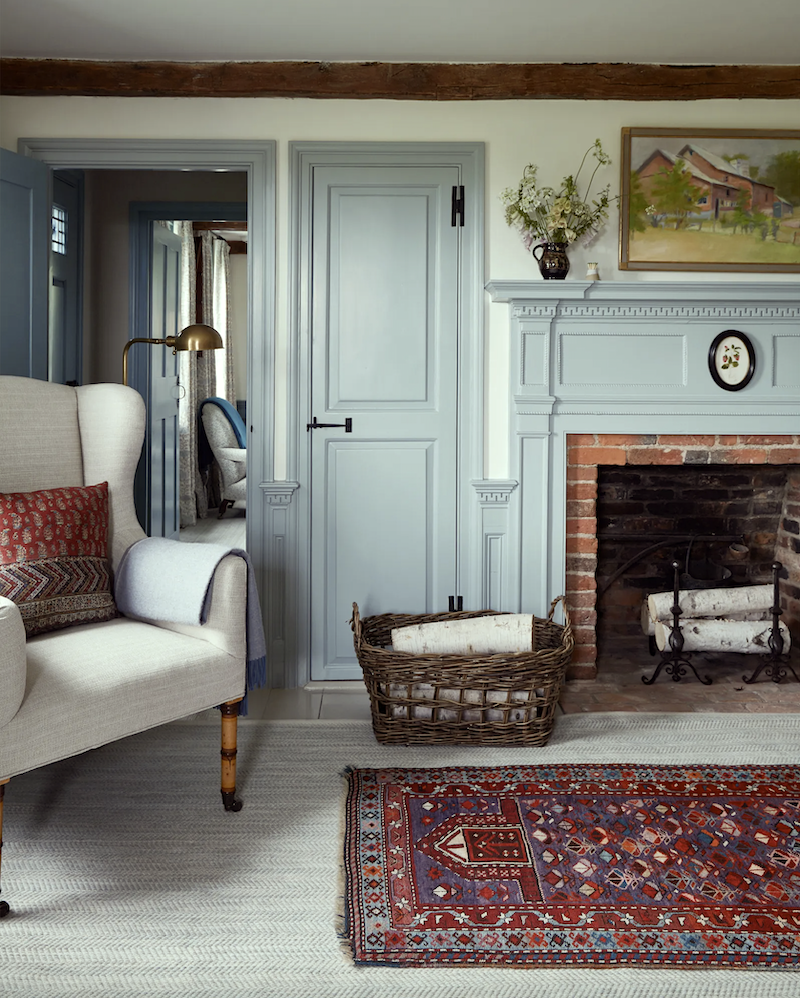
Above is another Victoria Hagan beauty. Despite the low ceiling, the furnishings and fireplace mantel have a presence. However, she doesn’t crowd the space with lots of furniture and knickknacks.
I’m still thinking of posts, and this is another favorite is the Best Builder Upgrades You Might Not Have Considered.
Easy and Affordable Ways to Fix a Boring Room – There are some lovely examples here.
Boxy Boring Bedroom and How To Fix It
Okay, that’s all I can think of for how to improve a room with low ceilings.
This is a big week coming up. But, for now, if you’re reading this and you own Laurel’s Rolodex, you should’ve received your link to the new edition.
The Etsy Guide has also been updated, and there are well over 200 sources in it now. We did remove a few shops that are gone, or their product line was virtually nil. There are one or two shops that we left in, hoping that they’ll return.
Below is more information about the Laurel Home Guides
(Clicking on the links will send you to the pages to learn more about each guide)

Laurel’s Rolodex is a unique shopping guide that shares hundreds of my favorite sources and, especially for decorators and designers, tells you the best sources that sell directly to the design trade, especially for decorators and designers.

The Essential Paint Color and Palette Collection (two volumes)
This is a must-have guide for anyone struggling with paint colors. If you don’t believe me, there are dozens of testimonials on the Palette Collection page.

Six-Figure Income Blogger. (This should be required reading for everyone who has a website and wishes to get the most out of it for their business) You do not need to be a heavy-duty blogger. But, once or twice a month consistently will do wonders for your business. But, it would be best if you learned some other things, as well. Believe me, when I say in the early years, I made every mistake and then some.

333 Decorating Rules & Tips You Need to Know – You’ll get a free Etsy guide with this guide, as well. There is so much information and much I’ve never seen anywhere else. The window treatment glossary alone is several pages.

Or, order the Etsy guide on its own. It’s 150 seriously cool vendors.
Etsy is known for exceedingly helpful, personable vendors and great pricing.
Please note: Some prices will be going up on January 1, and all free offers will end on December 31, 2021.
xo,

PS: Please also check out the newly updated HOT SALES and HOLIDAY SHOP!
Special Announcement: Serena & Lily Early Access Black Friday Sale.
And, it’s super good! 25% off EVERYTHING*, including items currently on sale!
*Gift certificates and art are excluded.
Please use the following promo codes: 11.22-11.23 is an unpublished VIP early access!
from 11.22 – 11.23 Use code: HAPPYDAY
from 11.24 – 11.30 Use code: ITSHERE
Related Posts
 My Top 100 Timeless Furniture Pieces
 Is It Classic Furniture or Something I’ll Grow To Hate?
 Here’s What You Need To Know Before You Install Marble Countertops
 5 Classic Kitchen Combos, Cabinets, Hardware, Lighting…
 Mark D Sikes – High-Low – How to Get the Look!
 8 Guest Bathroom Designs – My Secret Process
 Astonishing Home Makeovers You Won’t Believe




14 Responses
DEB: Yes it can! I have 7-1/2′ ceilings and wanted beams so bad I could taste it, but with my low ceilings it would have made everyone feel like ducking, with those over 6′ cracking their heads. My handyman came up with a fabulous solution… he attached wide pine boards, rustic side down on my ceiling and then ripped pine boards to the same thickness and nailed them on either side of the boards. This gave me 1-3/4″ thick (deep?) faux beams with the illusion of them peeking through the ceiling plaster. I love them!
Wow, those rooms looked much higher than 7 or 8’… could be a trick of the camera angle, or furnishings and/or moldings? Whatever, I’m jealous and trying to figure out how I can get that same feeling!
My dinky ranch… aka “rambler” here in Western WA… has a front door that dumps you unceremoniously into my tiny cramped dark living room. Which btw, has a straight shot into my dinning room & part of my kitchen (ugh!).
As for my ceiling height; after scraping all that hideous glittered popcorn off my ceilings (fun times!), I managed to gain just enough scooch to give me a whopping 7-1/2′ of ceiling height… oh how I long for 8′ ceilings like I grew up with!!
Thank you for the inspiration; and please do more articles with low ceilings and small rooms.
I live near the Winchester Mystery House.
I remember walking in to the last room of the tour and feeling squished by the excessively low ceiling. I’m guessing it was 7′.
Once I was inside for a few minutes it started to feel “cozy” with the seating and fireplace, but I’m not sure I could live in it. Beautiful work on the Waccabuc home, Laurel.
Wow!!!!!! I have no idea why I never thought about layering my Ralph Lauren wool rug over the seagrass rug I had. Mind blown!!!!!
I always get so much inspiration from your blog. My mind was also blown when I saw the door casing that made the ceiling look taller. I’ve got around 10 foot ceilings in my home and all my door casings are like that and I’ve always hated them. Now I know why they’re there.
By the way, I was in Boston a few weeks ago and thought about you. It was such a phenomenal place. Such great food such great energy. I admit that I didn’t do much shopping and that made me sad but I had to split my time between Boston and Newport.
Stunning rooms.
Laurel, please do a post about transforming noxious 80s modern ‘style’ homes with slightly vaulted ceilings and those horrible cut outs in the ceiling to your least favorite half circle windows. I know the solution for the windows from earlier reading, but how can I make my retirement home (I bought it because it was available at the right time, I could afford the mortgage and it had the most wonderful mature trees, including two redwoods, and five separate gardening areas largely with mature plants. The lot is small, as in manageable.) more like a cottage and less like truly bad late 20th century modern?
I have a lot of things to do here but need a long term plan. I just moved in a month ago.
I’ve been trying to puzzle if I can make white subway tile work with the surfaces already in the bathroom where I need to install a shower. But that is not what really stymies me. It is the ugly angles in the ceiling. I am also wondering if installing molding around the window, etc. will make the house fight with itself.
I know you had a post about how to paint the ceilings vs. walls in rooms such as mine, but I have even more weird sheetrock angles than a beehive with a psychotic queen bee. If the house were true 50s’60s modern, I would know what to do, but this creature has me stumped.
By the way, the builders in the area in the late 80s erected these monstrosities even in the most wealthy areas of this community.
Bleck.
On the plus side, I am very, very grateful to have landed this home in Northern California against all odds. It is sunny and cheerful and offers, as I said, great garden views.
Oh WOW @ those Steven Gambrel rooms. The first one (what I would call an un-dining room) is just the sort of room I love but rarely see. His use of the layered crown to lend importance to a lower ceiling is brilliant. Another stellar post you’ve given us…no surprise there.
Thank you, Thank you, Thank you for showing how to make a box look beautiful. Alas, your style is much more elegant than my current stage of life. Dark, rustic ceiling beams fit our durable but interesting aesthetic (at least I hope it is). But I am afraid to use them with my 8′ ceilings. Is there a way to make it work without feeling like they’re brining the ceiling down on your head?
Dear Laurel, I just love your blog! The pictures are beautiful and you are so informative. I have learned so much about decorating style. That is why I know will share my shock and grief for an old house that was on our town’s home and garden show years ago. It was a gorgeous old home with lots of details and charm. However, along the way it was remodeled. There is no architectural interest any more and it looks like it was opened up. It reminds me of the apartment in your old building that was remodeled. It makes me sick. Not surprisingly, it has been on the market for a while. I can’t figure out how to add a photo, but if you want to see it look up Baldwin St, Hudson Oh on a reality website. Thanks for letting me vent. My family can’t understand why this bothers me so much. You do!
It is amusing to me that low ceilings in houses are thought of as a pity. I generally prefer them! It feels so cozy to me. Our tallest ceilings in our little 1940s cape/colonial are 8’4″. The ceilings upstairs are 8 foot and have a sloping roofline around the dormers, and I absolutely love it. It’s fun to look at beautiful images of interiors with tall ceilings, but I would never feel totally comfortable living with them.
It is always remarkable to me how often Laurel hits on a topic I am struggling with.
I am moving from a Victorian house with 11’ ceilings to a cute bungalow with 8’ ceilings. I am stymied about pendant lighting. I haven’t had to consider ceiling height for decades in my Victorian house. Now I have to figure out chandeliers in a short ceilinged room. ARGH.
I don’t otherwise mind lowered ceilings in this bungalow because I think they are in keeping with cottage coziness.
Hi Laurel – just a friendly fyi to you 🙂
I ordered your 333 decorating rules ands diving in to it today. This recommendation caught my eye on page 3 of the introduction: Save your PDF’s to your desktop. You may not realize that anything saved to the desktop is NOT included when you back up your computer. Only items in the C Drive is backed up. Not sure if it’s the same for Apple, but it is true for Windows based computers. I hope you do not find this nit-picky, but changing your language will save some people a lot of heartache someday. I’m excited to read all 333 recommendations – thanks for all you do!
when i got divorced we sold a ten room victorian that was just my style. i bought a 5 room ranch built in 1950; as just me this is what i needed. here’s how i changed it: ceiling molding in every room; plain flat varnished whatever wood doors i had a carpenter add molding to each one to have 4 rectangles on the surface; for aesthetics but really TO KEEP HEAT IN, ALL THE PICTURE WINDOWS WITH CASEMENT, AS WELL AS REGULAR ONE, WERE REPLACED WITH 6 over 6 windows. built in floor to ceiling bookcases on either side of the fireplace. and even though this is only my peeve, i hate brick and had the fireplace faced in granite. the house had those luann sliding closet doors, all out and the front hall was really the closet and space to walk through. i took a sledge hammer and knocked out the closet. nice little entry with a shelf of glass with lamp etc. on what used to be the back of the closet. a thousand other things but the highlights of what needed to go first.
Paint color in Victoria Hagan Room – can anyone make a guess what matches the color of the mantel in the photo. Yes – I learned the photo color not the real life color. It doesn’t appear to have green in it like Lookout Point or Palladian or Wythe Blue. I’m color challenged. Hagan’s whole house is beautiful. Thanks for the post.
Laurel, I love these post with all the links -SO MUCH good information!! I hope that they will be searchable (maybe under “catalog posts”) so when we need to look up a topic –we can find it again.Hope you have a wonderful Thanksgiving!!