

Originally, I had put this large palette of colors together nearly four years ago.
This was after I received a note from someone who used my favorite no-fail whole house color palette.
You can see that no fail paint palette in this post.
And, she wrote to tell me that one of her “no-fail” paint colors had failed.
uh oh… That’s no good!
I quickly read through the note to find out that her failed color is Benjamin Moore Horizon 1478.
She said the paint color looked like Crest Toothpaste and that her husband was horrified.
Please review 21 interior design mistakes you need to stop making, so that you can avoid many of the mistakes that I and others have made.
Okay. Let’s first examine what the problem could be.
I used Benjamin Moore Horizon before we sold our home several years ago.
This was after a lot of research. And, I had heard so many great things about it from trusted sources. The master bedroom and bathroom were both painted Horizon. It is a light gray with a hint of blue-green. However, the bedroom faces south-east. It’s a bright room.
And, the bathroom has no windows except for a skylight. So, yes, it is a dark room. Truthfully, I thought the color looked great in both rooms; especially the bathroom. Our bedroom, architecturally, was very boring. Therefore, I think more mouldings and artwork could’ve made the color that much nicer.
The color in the bathroom matched our gray carrara marble perfectly. However, it did not look anything like Crest Toothpaste.
So, what happened here that the color failed so miserably? Here are some possibilities:
- The paint was mixed incorrectly.
- She used a painter who unscrupulously went out and “computer matched” with a cheap off-brand. Look for paint in a plain bucket. If he can’t show you the original bucket, I would wait until he’s gone and then change the locks. Have a male call him with a stern voice and say: YOU’RE FIRED.
- Somethin’ is going on with the lighting in the room. It could be either the natural light. Or, it could be artificial light. If the paint is going green, what bulbs are you using? What happens if you switch the bulbs with something else? Of course, this is in a room that has no windows, or a room too dark to use without lights on.
- Something is reflecting into the room to cause the light to be tinged with that color.
- There are some odd angles going on.
- OR, it’s a north or northeast facing room.
This is why I say: no matter how glorious I say a color is or you read the same thing in 16 other places; you must always test and compare what is on the wall to your paint chip!
And, also remember that the paint color is not going to make the room. It’s everything else; particularly the architecture.
Alright, that was the lecture. Now, for the fun.
Remember, a while back I did these two Downton Abbey paint posts?
60 Downton Abbey Colors Like You’ve Never Seen
The Most Romantic Paint Palettes Ever (also based on Downton Abbey)
Color palette inspiration can come from anywhere. As most of you know, I’ve frequently used art for inspiration. Nature also inspires me.
But, what is a challenge is capturing a palette from nature unless we have a visual. So, paintings or photos of nature work best.
In this case, I took a number of images from the TV series Downton Abbey and used them as inspiration for a whole house color palette of 25 colors.
These are colors you can mix and match. Like in the other Downton Abbey posts, I took photos I found and turned them into beautiful watercolors. There are a few different apps that do this. I believe I used sketcher. But, it depends on your device, what’s available.
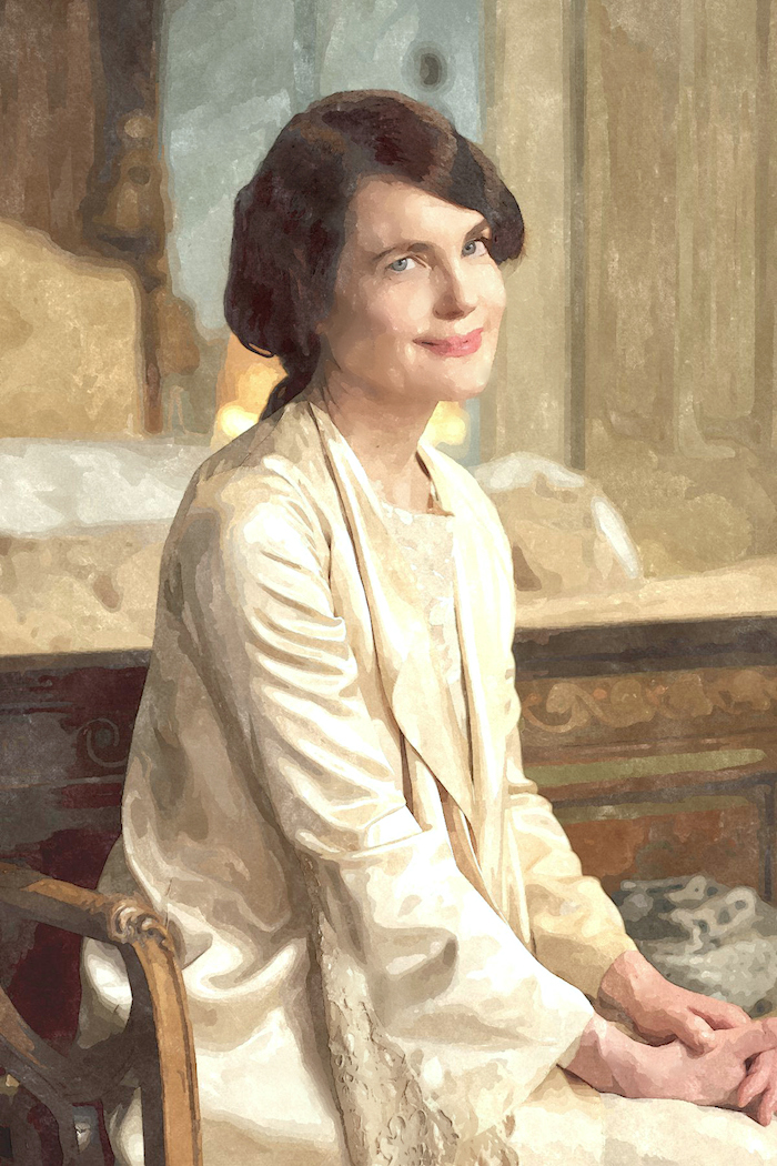
I’ve had lots of requests to do a paint palette around the pale blue, gray, green images, particular. And, also for Cora’s bedroom.
But, especially this image, below.
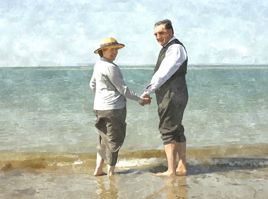
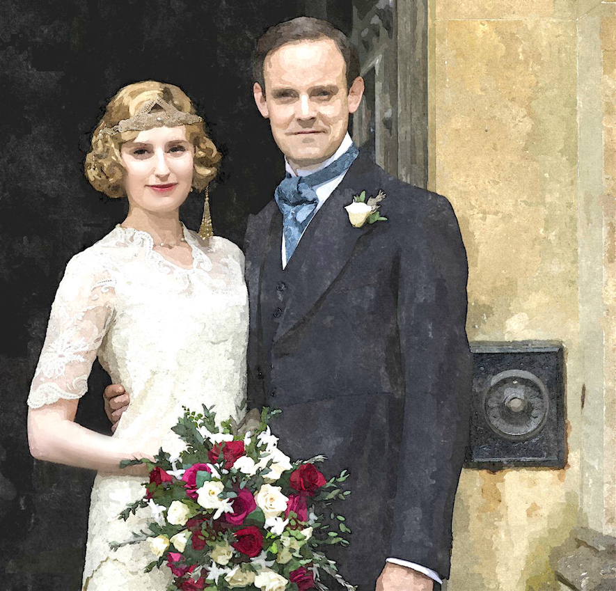
Awww… it always makes me so happy to see these love birds together.
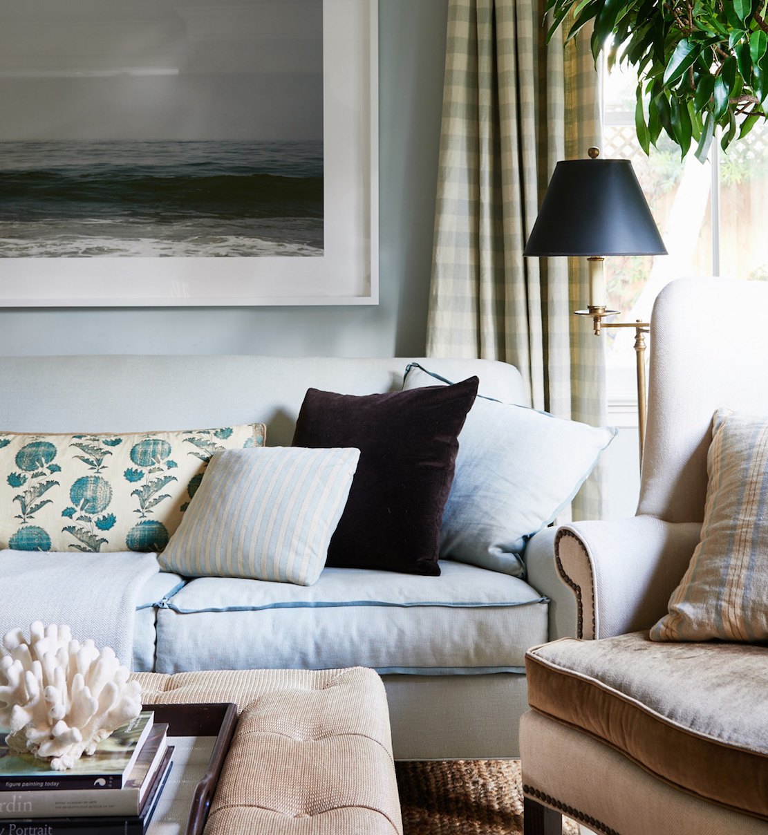
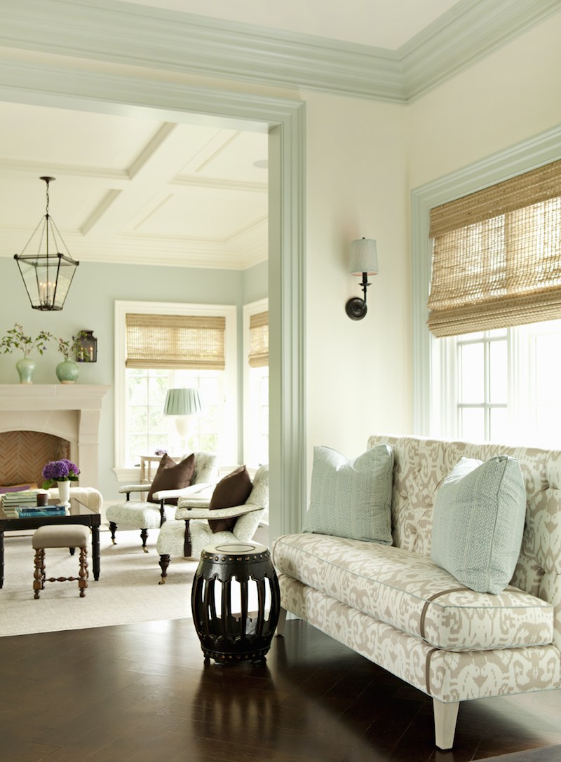
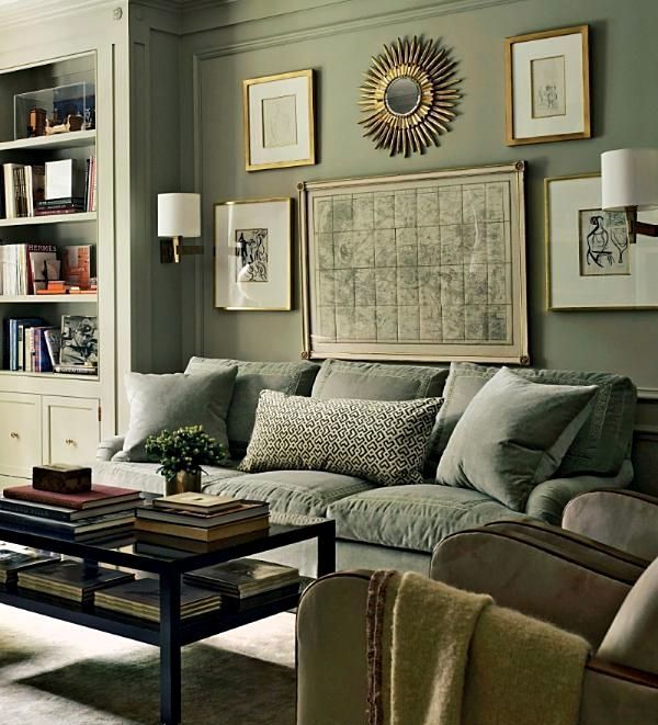
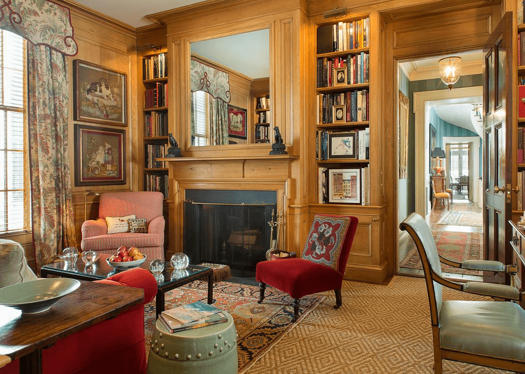
It is the perfect “beach color palette.” And, you can see it in so many interiors these days. Even IF the home isn’t on the beach, it’s always easy on the eyes. I’ve used similar palettes for jobs in Westchester County for homes not near a beach.
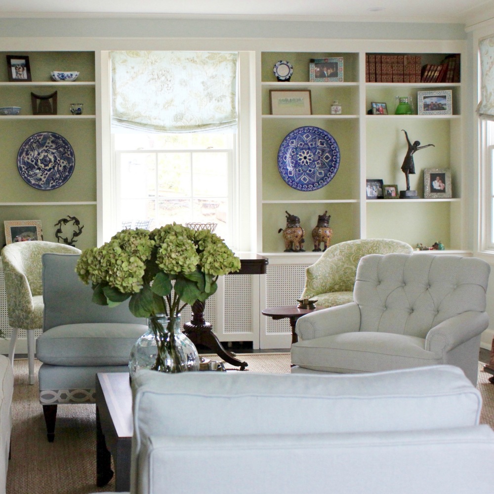
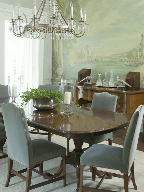
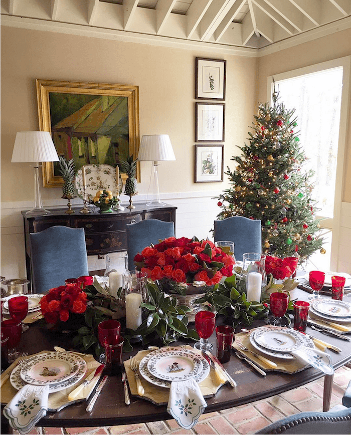
Like, this home in Bronxville with an analogous color scheme of green and blue-gray. In fact, you can see in Sunday’s post a home I did 17 years ago with a similar color palette. It’s the dining room with the oval back chairs.
Another photo of the Bronxville home with a seashore palette.
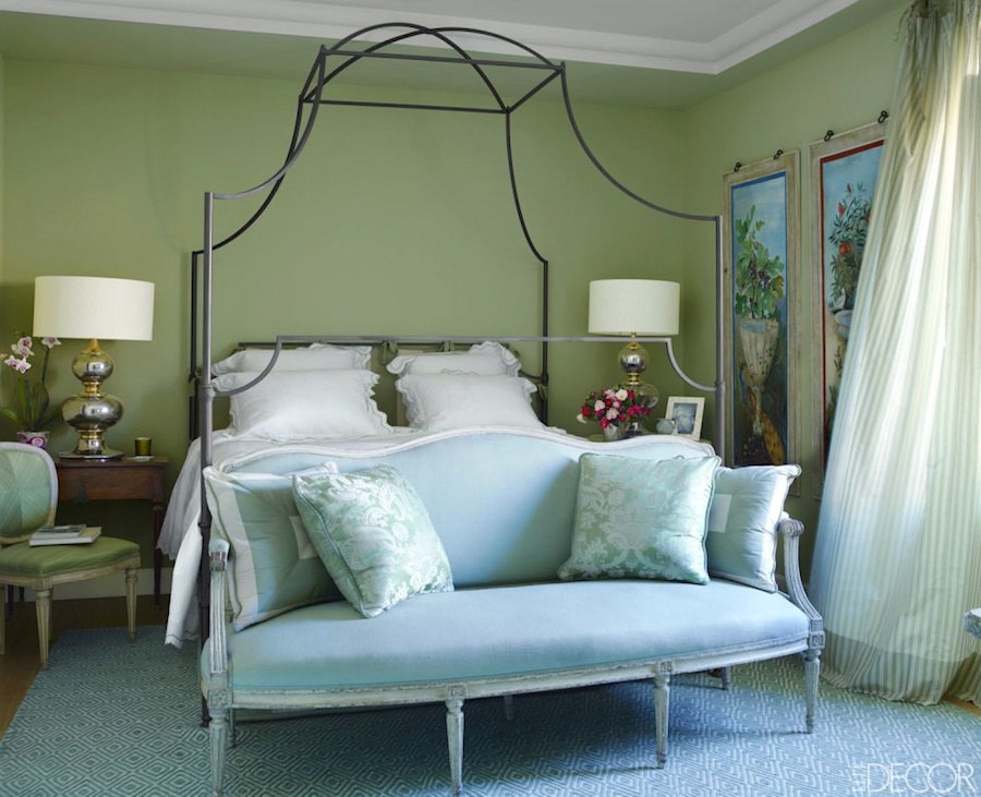
However, many other designers have embraced this color scheme, as well.
Mark D Sikes. I know I’ve already featured this room recently. Maybe even two times. But, that’s just how much I love this vignette!
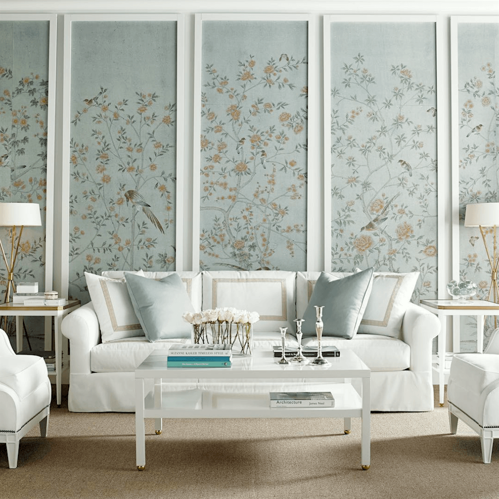
 via Elle Decor – Alessandra Branca – photo Simon Upton
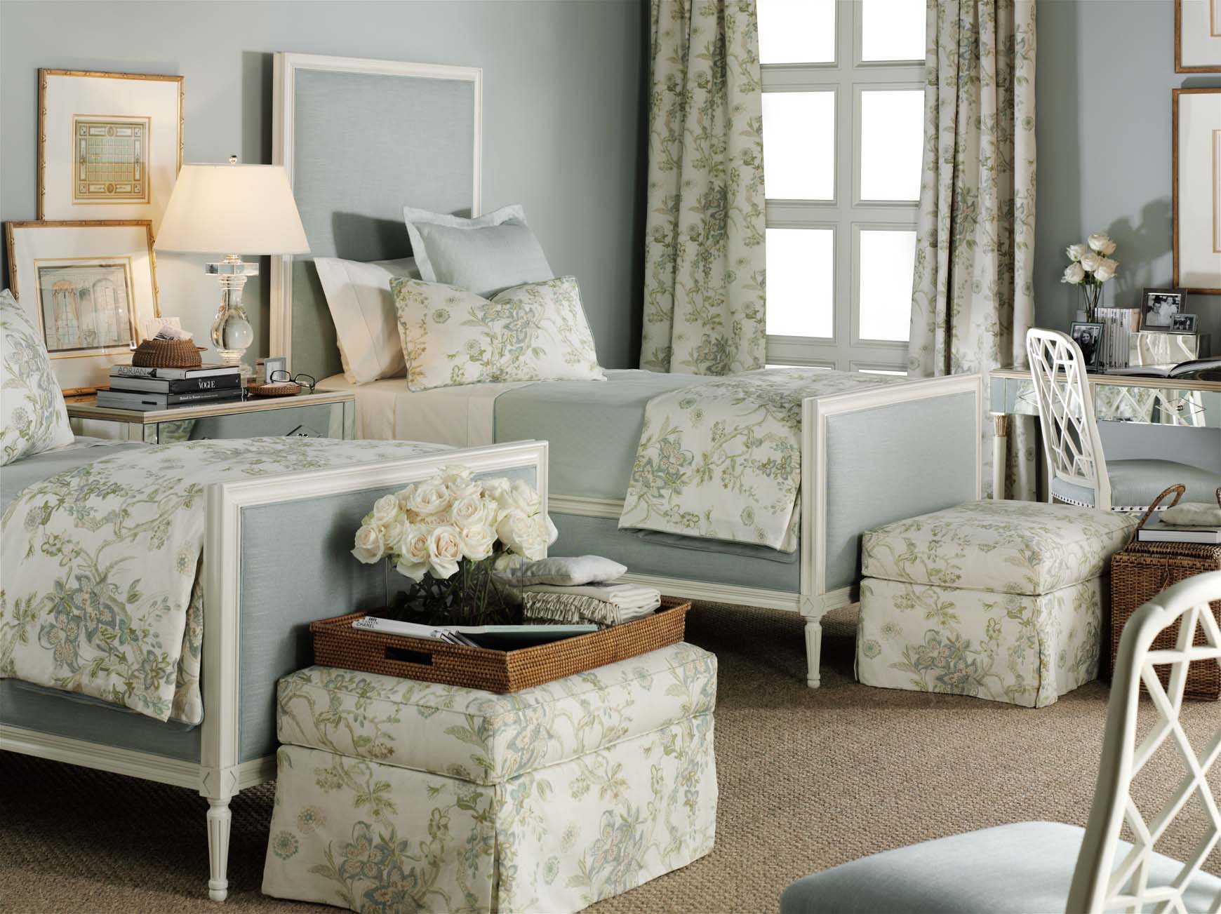
Above and below Suzanne Kasler for Hickory Chair
Suzanne Kasler for Hickory Chair
I think those colors and a few more would work nicely for our palette. Of course, you won’t necessarily use every color.
And, that brings me to a very important point when creating a whole house color palette.
People generally think of colors and color palettes as the WALL COLORS, primarily. Of course, the wall colors are very important, but they are not the most important element. Check out this post to find out THE most important element when decorating a room.
***However, in addition to the wall colors, there are many other elements in the room. And, each of them is a color!***
Therefore, when creating a color palette for a room, we should be taking into consideration– everything as part of that palette. Super important, I think.
Let’s continue with more inspiration images and then I’ll share rooms that could very well have been inspired from these images.
They weren’t, but they could’ve been.
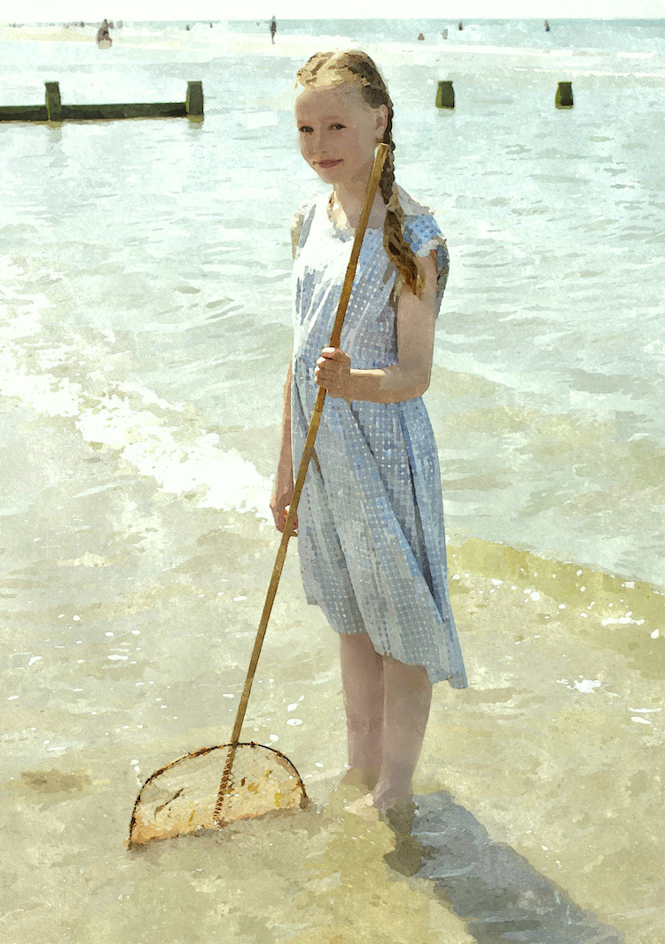
I don’t know who this character is, but adore the water and the beach palette.
Lovely soft green living room by Leeann Thornton
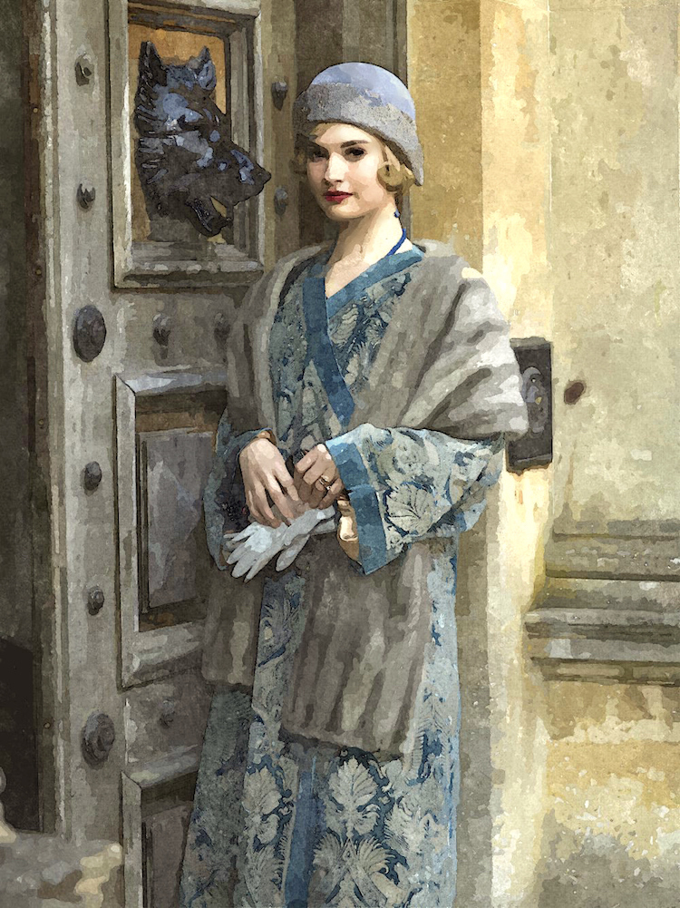
Love this fetching image of Lily (or is it Rose?) in that glorious frock. I think the bear looks ready to devour her. ;]
Maura Endres @m.o.endres on instagram
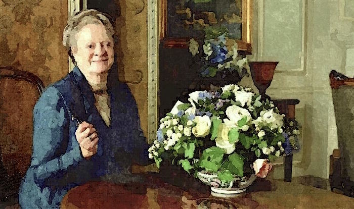
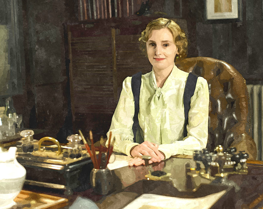
Violet obviously cooking up some plan or other at the Dower House. Or maybe, she’s just admiring her enviable surroundings. Hard to tell.
I love the way this photo turned out as a water-color.
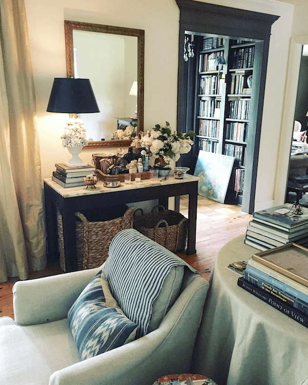
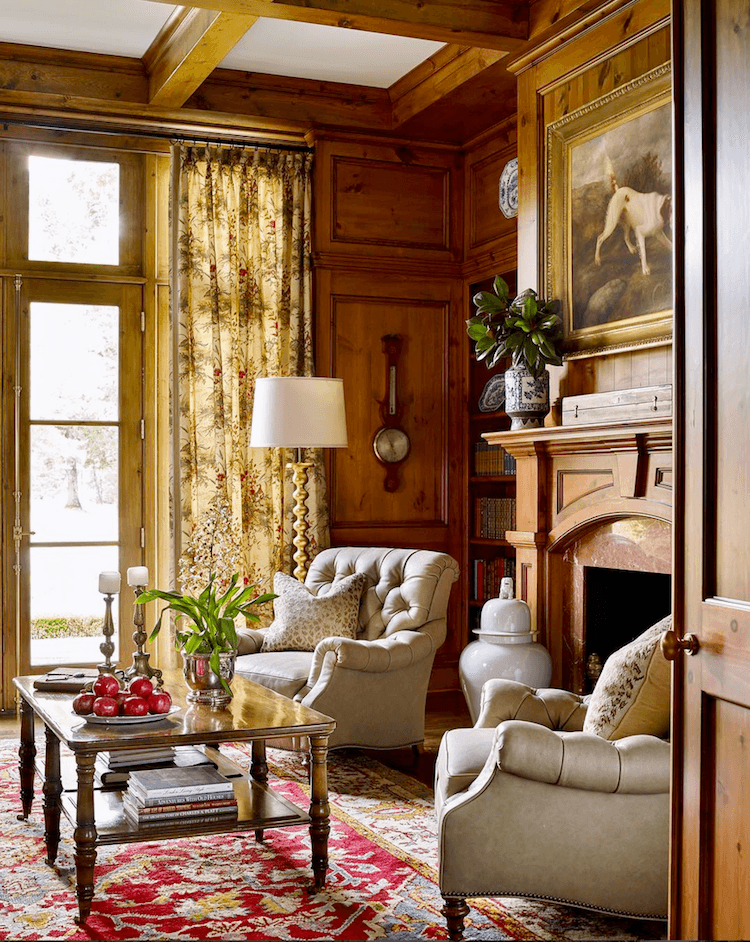
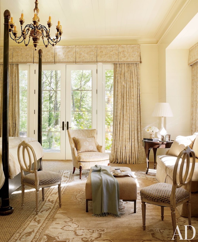
Handsome muted gray-green monochromatic palette for this library by Suzanne Kasler
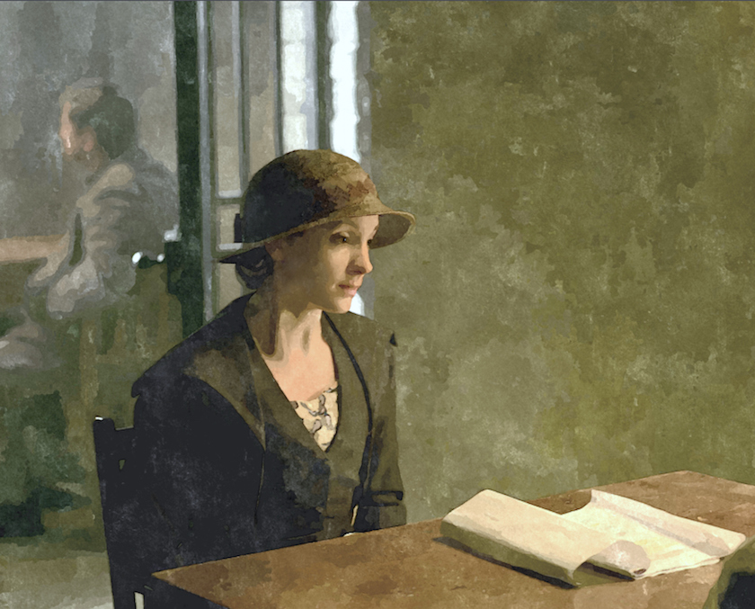
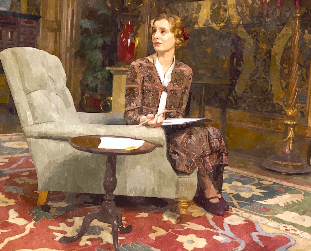
Anna visiting Bates in prison. These are similar colors in the Downton Abbey kitchen.
Meg Braff – via House Beautiful
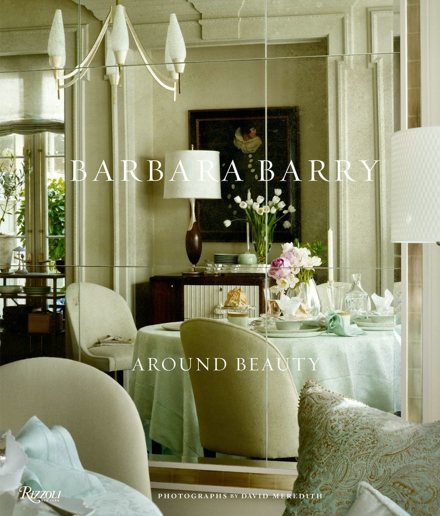
One of the most interesting characters on the show, IMO is Lady Edith. I’ve come to the conclusion that her main problem is that she was born 100 years or so too early. She’s a modern woman and out-of-sync with her place in life, it seems.
love surrounding Lady Edith with the beautiful serene work of Barbara Barry. I know that Barbara’s work is highly influenced by art and nature.
Don’t you love this chair? I also adore how this image mirrors the rooms above and below.
Miles Redd and Gil Schafer
Time to move onto Cora and her bedroom.
The color appears to have changed over the years, but that could be the lighting. It’s TV. The colors could be very different from how they appear.
However, I think what’s so wonderful about Cora’s bedroom… It’s a monochromatic confection of apricot and full of warmth as is her character.
Suzanne Kasler is so adept at these soft color schemes.
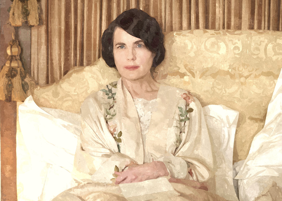
And then, there’s that yummy apricot-colored silk-damask headboard. For the show, it’s probably not silk, but back then, it most likely would’ve been.
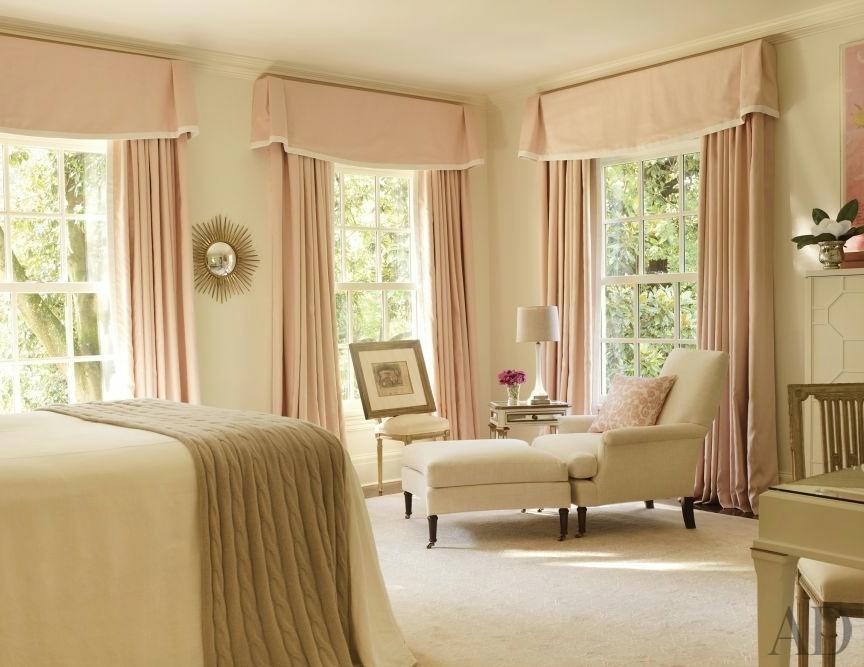
Suzanne Kasler’s bedroom
Above James T Farmer’s rooms are always sublime.
You know, I saw the movie last September, but don’t remember what happened. haha. However, it was wonderful to see these characters again.
A Whole House Paint Palette Featuring 25 Benjamin Moore Colors
Of course, you probably won’t use all 25 colors unless your home is the size of Downton Abbey! haha! But, the colors could also appear in a fabric and you can mix them up.
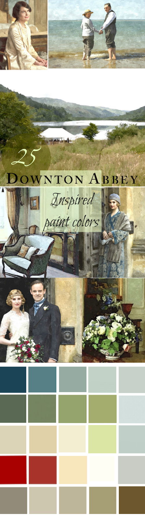
please pin to Pinterest for reference
I know… You want to know what the colors are. ;]
Note: All Colors By Benjamin Moore.
Row 1
Newburg Green hc-158
Caribbean Teal 2123-20
Stratton Blue hc-142
Palladian Blue hc-144
Woodlawn Blue hc-147
Row 2
Peale Green hc-121
Great Barrington Green hc-122
Georgian Green hc-115
Green Thumb CSP 870
Glass Slipper 1632
Row 3
Elephant Tusk oc-8
Consentino Chardonnay 247
Ivory White 925
Sweet Daphne 529
Quiet Moments 1563
Row 4
Heritage Red hc-181
Chili Pepper 2004-20
Fresh Air 211
Cotton Balls oc-122
Stonington Gray hc-170
Row 5
Kingsport Gray hc-86
Richmond Gray hc-96
Nantucket Gray hc-111
Timson Green cw-470
Cleveland Green 1525
Note: Most of these paint colors are in the Laurel Home Paint and Palette Collection. But, not all. I was still developing the collection when I originally put this grouping together. And, I had to edit, ruthlessly since my max number was 144 colors. Therefore, if the colors below are not in the Laurel Home Paint Collection; they were on the short, short list.
***Please also consider purchasing my new 333 Hard to Find Rules & Tips You Need to Know Guide. It’s only $49.00 (for the time being) and over 200 pages filled with my best advice.***
xo,

PS: Please check out the newly updated Hot Sales!
***PPS: BIG NEWS!***
I’m going to the Design Influencer’s Conference (formerly Design Blogger’s Conference) In San Francisco March 1-3rd. The line-up of speakers is amazing this year! It’s one of the best opportunities for interior designers to network with colleagues and brands. And, learn how to grow your business.
Who wants to join me? There are still some spots open, but it’s filling up rapidly.
***You can find out more about the Design Influencer’s Conference here.***
Related Posts
 What Happens When You Mix Chinoiserie Decor With Gustavian?
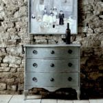 Bedroom Decorating Ideas You Might Not Have Considered
 Gloppy Paint on Gorgeous Classical Trim – Let’s Discuss
 My Interior Design School Portfolio from 1988-1991
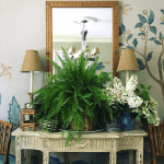 Laurel, Why Does My Decorating Look So Awful?
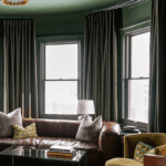 The Best Neutral Paint Colors Full of Color!
 The Best No Fail Benjamin Moore Gray Bathroom Colors


26 Responses
Can I send you a picture of one of our rooms? NOT looking for critique, just wanted to show that I’ve been religiously following your color palette book! A bit too obsessively maybe.
Hi Beth,
If you’re a subscriber, you can just respond to any email you receive from me.
I’m on team Horizon. Steven Gambrel said whenever his friends asked him what color to paint their walls he told them Horizon. So, I painted my living room Horizon that gets a bright, even light all day. I loved it. I guess it does read blue, gray but it is very faint, in some lights you can barely see it. I have it on the ceiling in my laundry room too. Works for me. I think you’re right about Revere Pewter too—it’s better in a darker room. I had it in my bright living room and it looked dirty.
Beautiful work! I really admire your ability to use colour so effectively. Unfortunately, grey is the colour my mother painted most of the house after my father died, so it reminds me of death more than black does. And, I’ve done a whole 3 storey, 5 bedroom house in blue for the man who only likes blue. I’t my turn now.
How about something for the woman who craves the warmth of pale tropical colours: coral (not that muddy colour of the year), pale warm aqua, light sand beige, clotted cream, buttercream, tangerine, and fresh light green. Nothing that screams tourist trap or fast food restaurant, just soft warm colours.
And where do I find upholstered furniture that would suit such a scheme now that most things available are various shades of grey or dead brown? Luckily, I can sew, but even getting fabric is tricky. I’ve seen and sighed over your orange rooms, and wished I had something that grand to decorate. Suggestions?
All excellent points.
Laurel, love the rooms and colors, but dying to know the app or software used to create the watercolor photos.
All the best,
Christina
Laurel, I love this post, and I always love the James T. Farmer rooms. Will you please do a post where you deconstruct his style? Thanks!
That’s a great idea. Thank you.
Love this dropdeadgorgeous palette! Thanks, Laurel – your posts are always so inspiring!
Hi Laurel! I love all of your posts and
look forward to receiving them. This past month you have created exceedingly beautiful images as well as interesting and important topics. I had to write to thank you for these gems. Today’s post combines two of my personal favorites, watercolors and coastal palettes. They make my heart sing. And the Downton Abbey images are lovely. You have truly outdone yourself Laurel. Thank you! I hope you enjoy your conference and congratulations on winning the trip to Italy.
Thanks so much Karen!
Thank you for this brilliant and entertaining post, Laurel. I especially enjoyed the watercolor versions of the DA images. Could you share the name of the app that turns photos into watercolors? I love the way it dissolves minor details so that we can see simple color shapes and patterns. Very helpful in envisioning a room. Thank you so much!
Hi Laura,
I actually did those four years ago. But, I believe the app I used was Sketcher. And, I’m on a macbook.
Oh wait. And then I put them through further editing in picmonkey.
Benjamin Moore has two paint colors with similar names: Horizon and Horizon Gray (Horizon Gray has the hint of green).
We moved this summer into an old house that had been painted all ivory. Not the worst, but still. I’ve picked out a few colors, did the living room in Palladian Blue. All the colors I’ve chosen so far are in this palette! Glass Slipper (dining room), Nantucket Gray (foyer and hall), and Ivory White (bedroom). I feel validated now. I always enjoy your blog.
Woodlawn Blue is listed twice… now Laurel how can we do a house with only 24 colors?!?
oops! Let me go and fix that. Quiet Moments 1563
Had the exact same problem with Horizon. It was definitely light blue, not the grey I’d hoped it would be. Left it up for 2 days to see if it would grow on me – nope. Then asked my 12 year old daughter if it was grey or blue and got the most direct answer imaginable. “It’s blue.” I painted over it with Pale Oak and never looked back. This was in a south facing child’s bedroom, and just to cover all bases, I got the paint from a Benjamin Moore paint store. So the moral of the story is to always ALWAYS test out those paint colors in the room as much of a pain as that is to do. Thank you Laurel for generously sharing both the good and the real-world.
It’s so true. Those cool grays can EASILY go blue. Testing is essential.
“Have a male call him with a stern voice and say: YOU’RE FIRED.”
Thanks for making me laugh out loud! 🙂
:]
That picture of Lilly or Rose is beautiful. Where can I purchase it.
Sorry – (where are my manners) I love your work – Lookout Point and cotton balls are my bedroom with cotton balls and its wonderful.
Now I feel safe saying that revere pewter didn’t work for me. I wanted to like it so badly. I did a test – the stairway wall in the front hall with windows facing south and west. The color is so cold – like damp stone in a castle. The other walls in the hall are this weird teal/emerald green so I think that might be the issue. The revere pewter is still up and when I get around to priming all the other walls, I’ll reconsider but right now – bleech.
I think it depends on the lighting with this one. Usually, I think it looks better in a darker room and then it has a warm khaki hue. But, in bright rooms, I think it looks like a dirty off-white.
brilliant
Great Collection, Laurel! Ahhh, palladian blue HC-144 is an all time favorite of mine!