You may have gotten here from this post about interior architecture if you’re on this page.
However, if you’ve been reading my blog for a while, you’re in for a real treat.
Here, you will get to see just how crazy I am! haha
Crazy = My Interior design school portfolio.
No, really. In addition to my 16+ hours a week attending classes and getting to and from them, I put in a minimum of 40 hours a week of homework. That was the minimum. There were weeks when it was 80 hours.
And, one of those was for a project which won me a hefty scholarship that paid for two more classes.
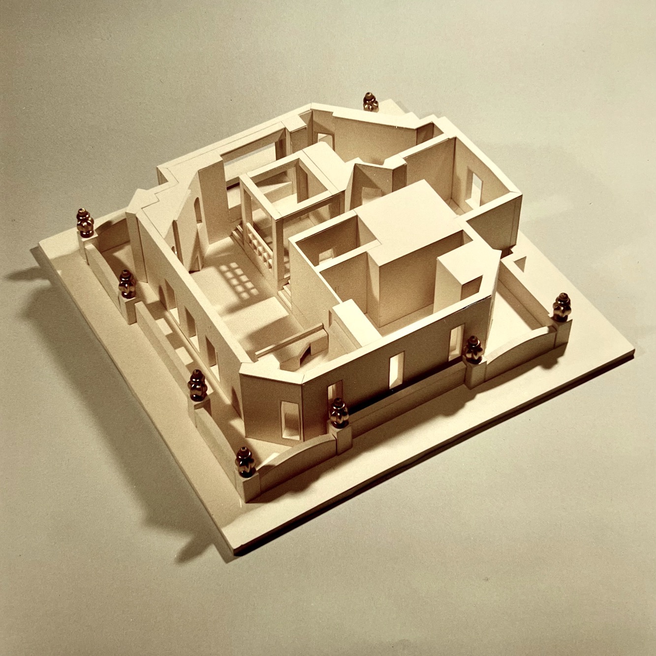
So, let’s begin with the model you may have seen in the previous post.
The project:
In February 1990, when I was five months pregnant with Cale, we visited a landmark building at 12 W. 72nd Street in New York City. The name of the building is the Oliver Cromwell Building.
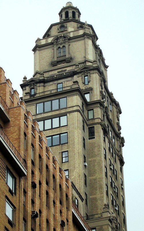
About a third of the way down, from the top, you can see part of the penthouse apartment with the urns. However, below you can see a closer, more detailed view.
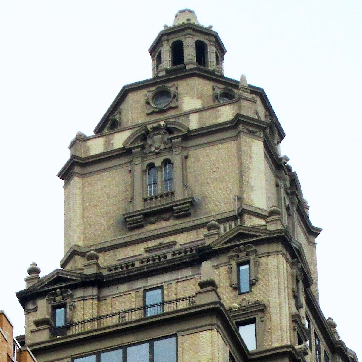
Above are the urns. The apartment is about a third of the way up from the bottom, just under the big window.
I went to the building with the rest of my class, equipped with cameras. We were met with a completely GUTTED space and a divine 14-foot ceiling.
The assignment was to create from this space with NO walls a comfortable apartment for one or two people.
We had only 12 weeks to design, source, draw, render and make presentation boards and the model.
Oh, and here’s the clincher. This massive project was only a two-credit course.
On your mark, get set— go!!!
Please bear in mind that these are pictures of pictures. The following year, I had the project professionally photographed.
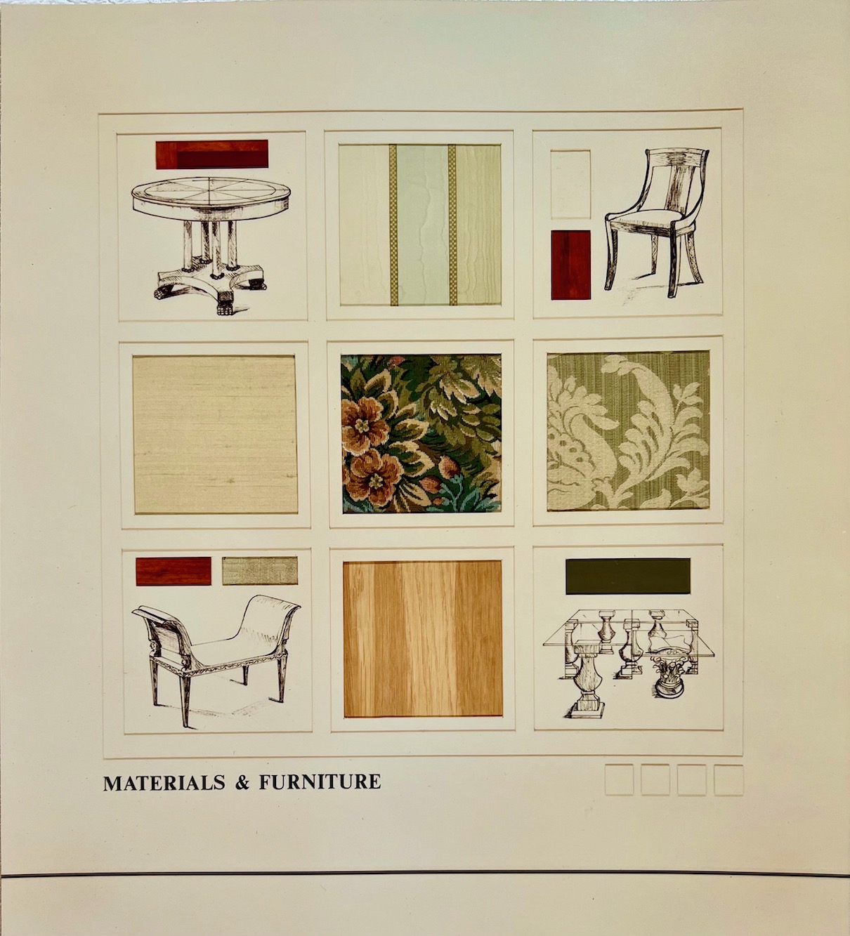
There were two materials boards, but I only have one of them.
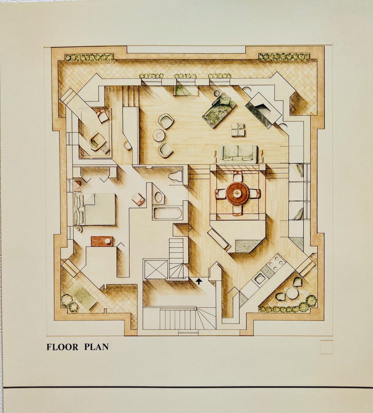
Above is the floor plan. I created three outdoor areas which are below the main apartment level. What a great place for a summer party! Right? There is a private elevator to the penthouse. The stairs are for those who like a lot of exercise.
The black arrow is where you walk in.
To the right is the kitchen. Please ignore the granite countertops. hahahaha! Alas, it was 1990; I was only 34 and didn’t know any better until about three years later!
Two entrances/exits to the kitchen lead to the dining room, surrounded by four columns. The master bedroom suite and adjoining office/library are on this same level.
Sunken below the library and dining room is the living room.
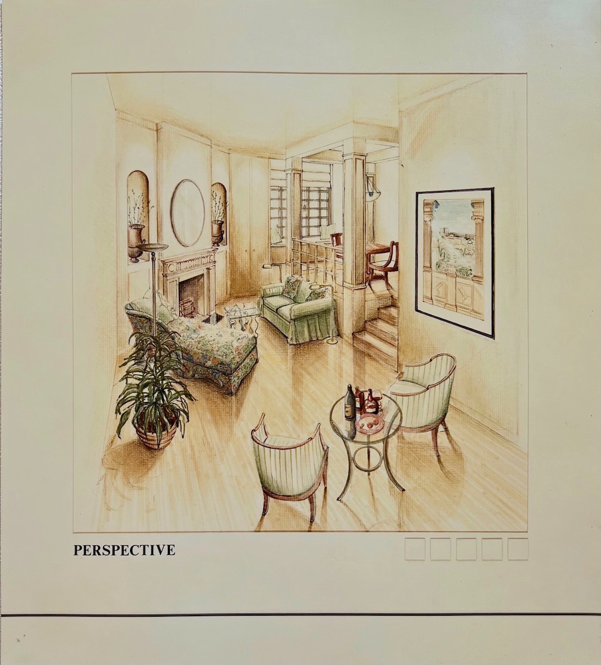 This rendering, in perspective, shows the sunken living room.
Folks, this was 32 years ago. And here, you can see how little my design aesthetic has changed. Yes, it’s been refined since then. But, you can see the influence of my design idols of the day, John Saladino, Vicente Wolf, and Robert A.M. Stern.
Wow. Check out those floor-to-ceiling doors! That was brave.
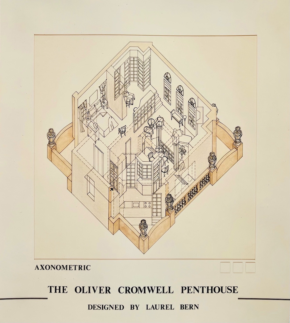
What the hell, right? For those that don’t know. An axonometric drawing is like taking the floorplan and tipping it up at a 45-degree angle to see into the space. It gets a little confusing, but dotted lines represent walls, but because I want to show what’s behind them, they are “see-through.”
Yes, I spent hundreds of hours putting this baby together, along with the one I was growing inside me.
When I gave my presentation at 200 Lex in front of three esteemed judges. (One was Juan Montoya!) I was HUGELY pregnant, just entering my 9th month! In fact, my doctor told me that I HAD to rest. I went home in tears because I had one more week to go and told Cale to hang on a bit longer.
Unfortunately, he took me a little too literally, and instead of coming a month before his due date of June 7th, he decided to wait until June 18th.
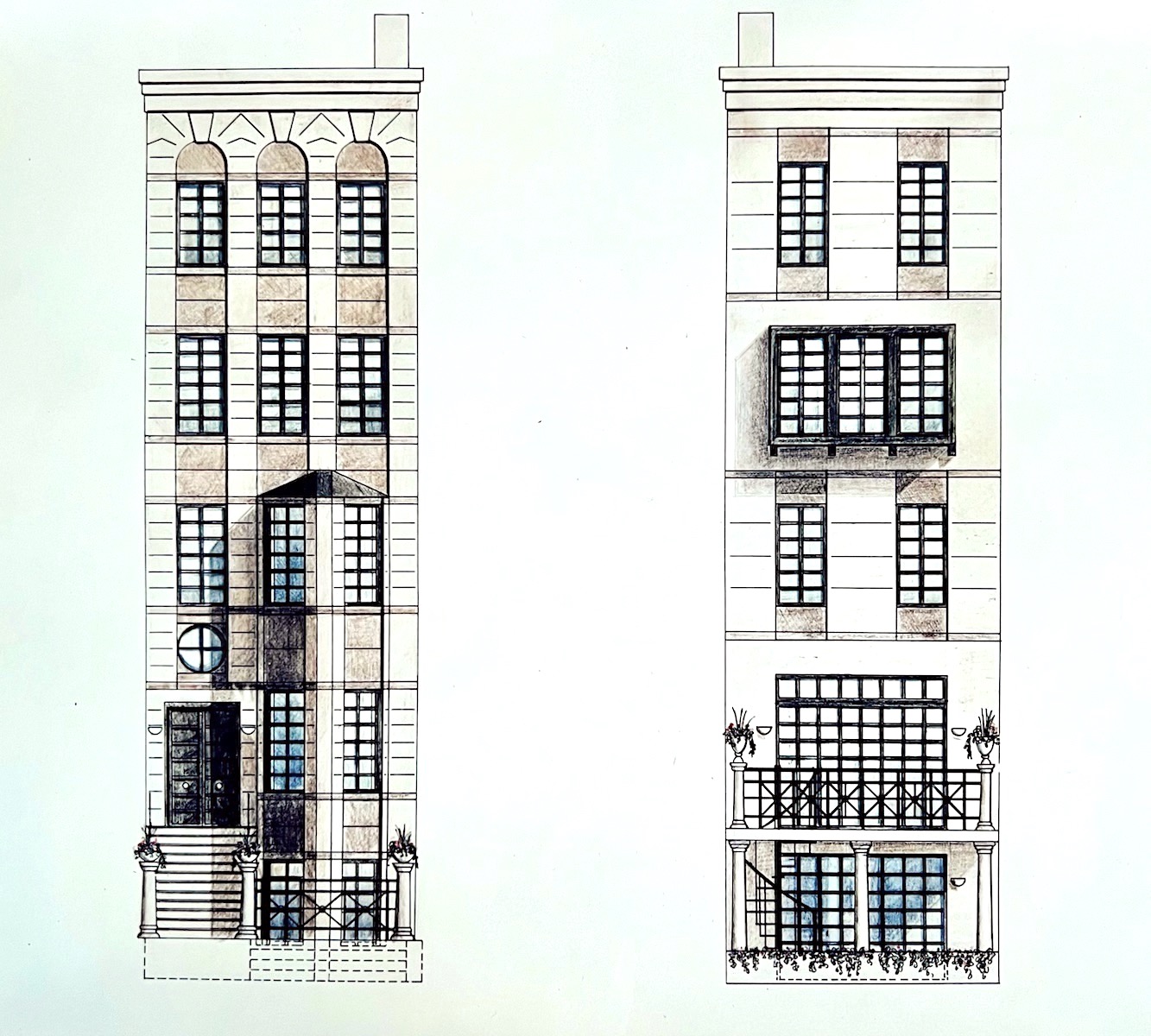
Believe it or not, I took one other course that semester, a 2-credit course with 500 hours of work. It was called Working Drawings. It was an advanced drafting course, with vast sheets of mylar and then drawings done in ink.
After the blueprints (actually blackprints) were made, I did this rendering of the design of the townhouse.
The design is a complete renovation of the facade, which formerly was a plain brick building. Clearly, I was hugely influenced by the post-modern era, which ruled in the late 1980s into the early 1990s.
However, I was so exhausted that I had to take an extension, and I finished this course after Cale was born. It was great to have a couple of hours every day to leisurely finish this massive project.
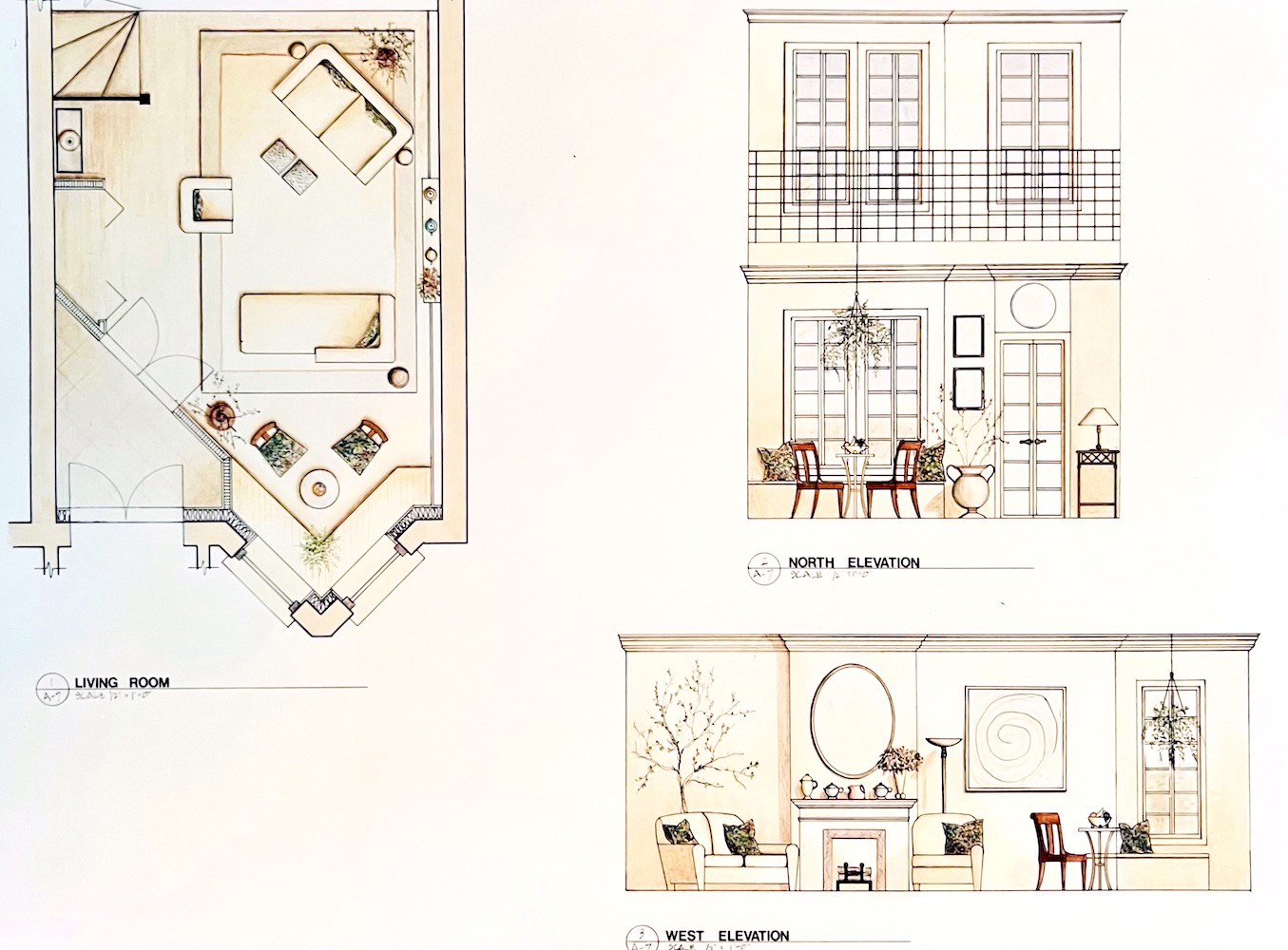
Above are elevations and a floor plan for the parlor level.


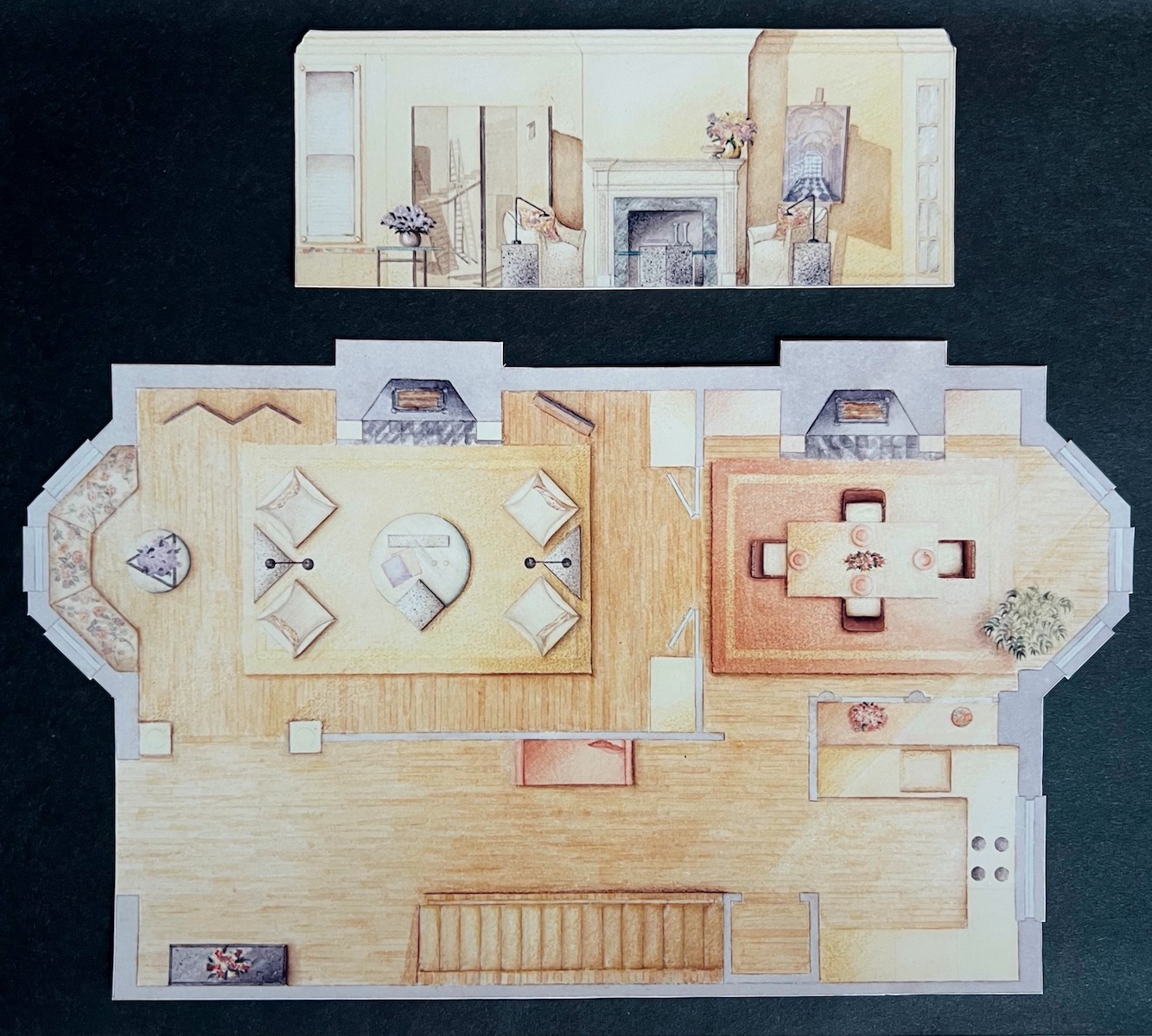
The previous year in 1989, I did this rendering of a townhouse. Basically, I stole the design straight out of Metropolitan Home, which had a fantastic spread of the interior design giant Charles Spada’s gorgeous, warm home in–
Yes! Beacon Hill!
HOWEVER, as I recall, you could not see the living room or at least half of it. So, I made up what I couldn’t see.
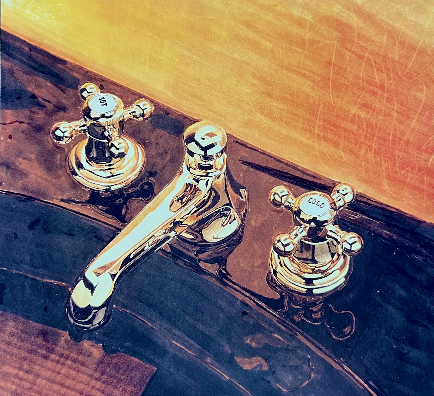
Also, in 1989, I took another 2-credit course called rendering with markers. But, we also used colored pencils with the markers. I loved doing this.
It is a form of mental gymnastics I sadistically enjoy.
 Haha!
Haha!
I know.
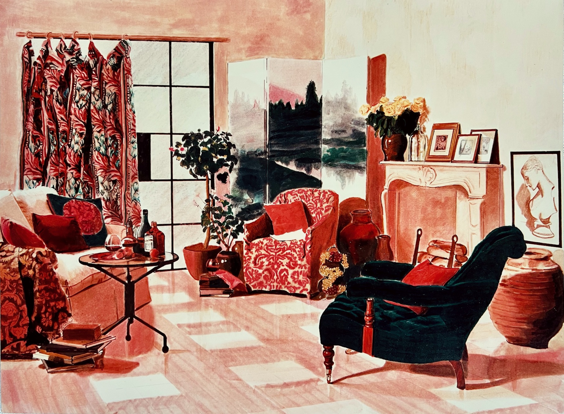
I copied this two-page editorial from Metropolitan Home. That was in that magazine’s heyday. Yes, the drapes. Yes, insane. My method was to put a grid over the original photograph. And, the same grid over my sketch. Then, I copied what I saw in each grid.
A great way to trace a photo is to tape the image to a window and use tracing paper. Then, there’s a technique to transfer the sketch onto the final piece of drawing paper.
I hope that makes sense!
These were fun exercises, but did they make me a better designer?
Ummm, no. Of course not.
This is one reason why I created all of my rockin’ interior design guides. You can save a couple hundred thousand dollars and receive a lot of helpful information they DON’T teach in interior design school but should.
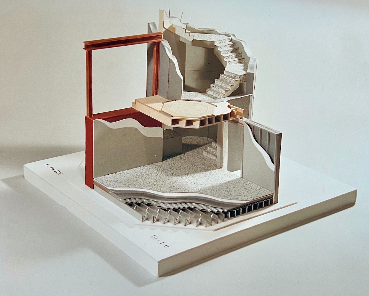
With my scholarship money, I took two more classes the spring after Cale was born, but before we left New York City. Above is a model I made for Materials and Methods II. The assignment was to take two buildings and turn them into one building.
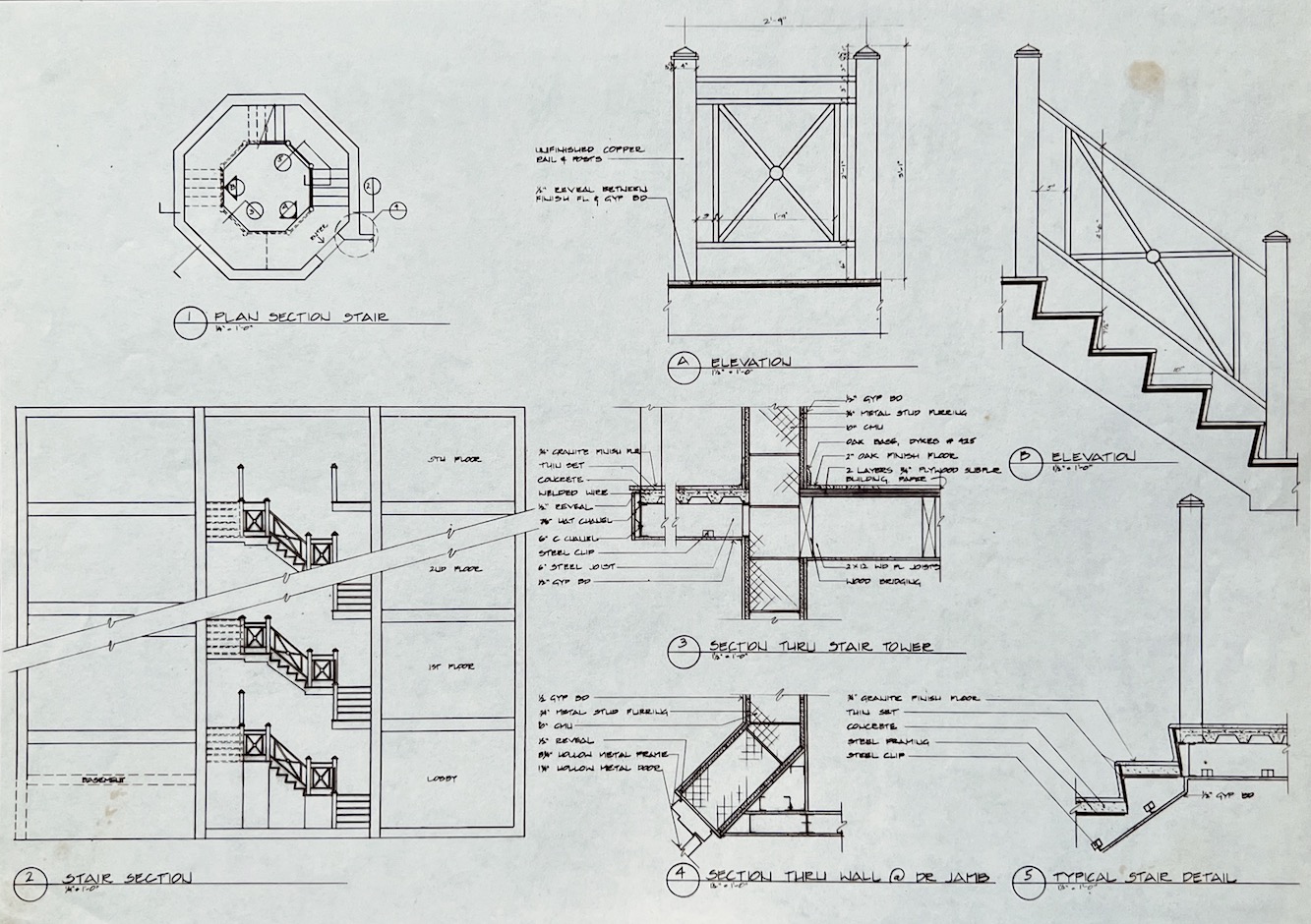
Above is a section of the central hexagonal-shaped staircase, which you can see in plan view. The other drawings are all detail drawings. These are always done at 1.5″ = 1-foot scale or sometimes 3″ = 1′ scale.
But, but, but… look at that stair railing!
Oh my! Yes, 31 years ago, I was doing pretty much what I’m STILL DOING, as you can see here.
This project received a lot of praise, I have to say, but alas, we moved. And, I had a HUUUUUGE hyper-active toddler. So, that was the end of my studies in interior design.
However, I have one more project to share with you.
The assignment was to create a retail department store named “Twills.” Yes, Twills. We needed to design the interior AND exterior with a clear design motif/theme in all design aspects, down to the LOGO and shopping bags! And, yes, there was another board, which had the shopping bags.
We had 14 days to complete this challenging project.
At that time, I was fascinated with a brand new building (completed in 1988) on the corner of 57th and Lex. The architects were the firm Kohn, Pederson, and Fox.
This building was all gleaming glass, granite, and beautiful green marble. It was classical and modern, and I was fascinated by its details.
This was my view as I passed by it on my way to classes at the New School of Interior Design, which was then around the corner on 56th Street.
I decided that my Twills would be in the manner of this beautiful new building, all glass, granite, and green marble.
And, it was going to be a neo-classical-post-modern building.
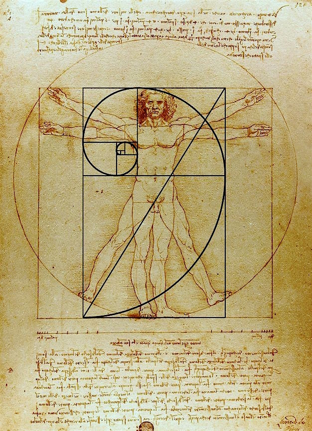
Immediately, I thought of Leonardo DaVinci’s Vitruvian Man. I knew that I had to use that as my logo, but a late 20th-century version.
I went to this place to have the decals made. Don’t ask. I had to use a solution that would’ve killed an elephant in one breath, AND I was just finishing my first trimester with Cale. I wore a mask and held my breath– a lot.
However, I left the shop with my decals of the Vitruvian man inside his circle and square.
Then, I decided that my Twills would be an art emporium like none other in a double-story mall.
Never mind that the scale is pretty absurd. However, there were some very large art stores in Manhattan in those days.
I found a perspective in a book and copied it. Then I adapted it to my needs, creating the motif of a circle inside a square– everyfreakingwhere.
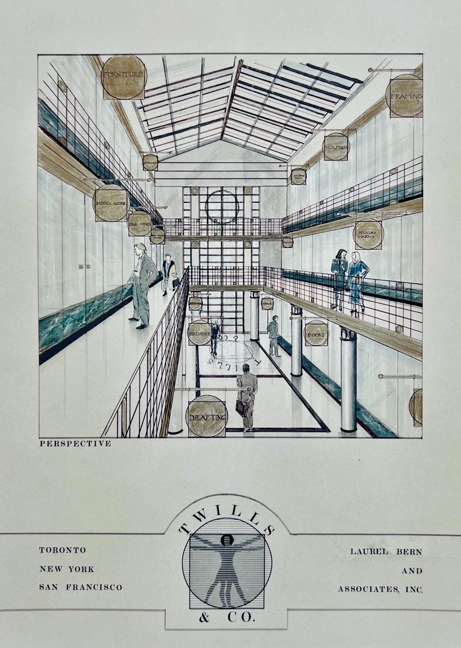
Above, the atrium and board with the noxiously created logo. Please forgive me, Cale. I remember my teacher Bonnie (I forgot her last name) laughed her head off that there were branches of the store in various cities.
Please notice the lady in the oversized coat on the 2nd floor with the punked-out hairdo. Hilarious!
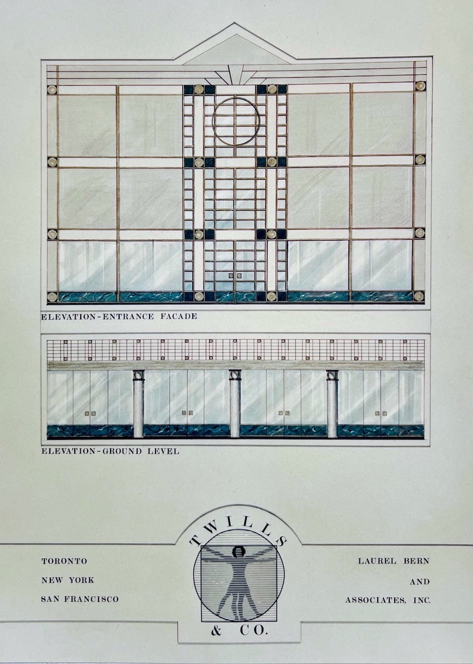
Above is the exterior front elevation and one of the interior design elevations, showing the wrought iron railing and columns and incorporating the granite and green marble.
I did some pencil drawings I was very proud of in a class I took with Mr. [Rocco] Leonardis; alas, they were stolen from a storage closet before the end of the semester.
So, that’s my interior design school portfolio from my earliest years as an interior design student at the New York School of Interior Design.
I hope you enjoyed seeing it.
The most helpful thing I learned was how to think quickly.
I had no other choice.
xo,

Please also check out the newly updated HOT SALES.
***The Serena and Lily 20% off sitewide sale ends on May 31, 2022!
Related Posts
 Holiday Party 2021 + News from the Contractor
 12 No-Fail Classic Kitchen Cabinet Colors
 Paralyzed By Perfection – Should She Paint Wood Paneling?
 12 of the Best Paint Colors To Go With Red Brick
 Throw Pillows – Everything You Need to Know
 A Fabulous Art Gallery Wall For Cheap!
 Hanging With Ben Pentreath + Need Your Help Again!


