The other day, I received an interesting set of photos/floor plan and thought you guys might enjoy looking at it with me.
Like the other two plans we discussed the other day, it’s a small, awkward space, but never-the-less is full of interior decorating lessons. Many of them we’ve discussed and some, perhaps, we haven’t.
Hey! Wait! I know that trick of scrolling down. Hold on please. ;]
Okay. I know that you want to see something, so I’ll begin with the first image I saw.
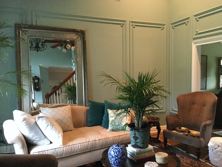
Really fast. Don’t think! :] What do you think?
Well, here’s what I think.
I’m thinking cool old house. Looks Parisian. Right?
Ummmm… that would be no.
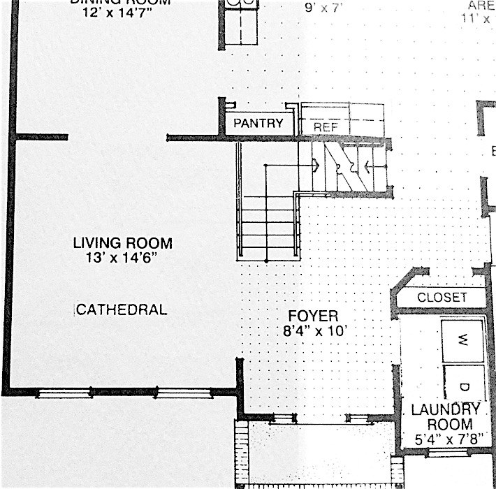
This is vintage New Jersey 1997– with a very small living room which is really almost an extension of the entry.
Here’s what Susan had to say:
Susan = italics
Laurel = [regular text and brackets]
Dear Laurel
We built this house in 1997. It was the cheapest, bare-bones of four house plan options, about 3k square feet, including the basement. Believe me, Laurel, it took every last cent we had as my kids were young and well… we were cash poor.
But Momma is a crafty “trash diver.” haha
The one upgrade I was adamant about was a side entry garage. It drives me nuts to have a garage in the front of the house!
[I agree!]
Fortunately, we’re doing better now, financially, but still need to be careful.
My kids are now grown BUT still live here.
My son is 28 like yours, and my daughter is 24.
Now Laurel, I’m a southern girl through and through.
This next statement is NO reflection on you or your children… As you say they were rambunctious. I have friends with kids who are restless beasties, jump on everything. I guess I was lucky, They say God gives what you can handle.
[Rambunctious is a grotesque understatement, but I did my best. And yes, you are very lucky. No offense, meant, whatsoever, but whoever “they” is, is speaking crap. God does not necessarily give you ONLY what you can handle. Otherwise, we’d still have our Robin Williams, Kate Spade and Anthony Bourdain, amongst millions of other poor souls who had more than they could handle!
The only other possibility is that God does give us what we can handle, but because we are human, we refuse to listen to the warning. Maybe that’s it. I don’t know.]
My children were raised with Southern manners and they have always been allowed in every room of any place we’ve ever been. They even sat still in restaurants…
[ha! My children at 28 and 23 when TOGETHER STILL DO NOT SIT STILL IN RESTAURANTS.]
The room you see is the LR and we have a larger family room…Remembering that large is relative.
Which NOW has a huge-amongus [I like that]TV AND a sound bar on my mantel. That was part of the bargain in me getting the Bones I wanted and new paint. Can you say UGH
[Yes, I can say “ugh.” It’s one of my favorite words. Mais, qu’est-ce que c’est le sound bar?]
And, because they just finished the work in July I’m still figuring out what I want to put back and what I want to change.
Your fan girl…I’m just gonna say #1 fan girl
[oh, that is too sweet. Well, I’m a fan of you too, Susan!]
Susan H
Sent from a parallel Universe
Susan signs all of her emails this way. I suspect it’s built into her email program.
So, let’s look at this room before they put in the moulding, aka: “bones” and new paint.
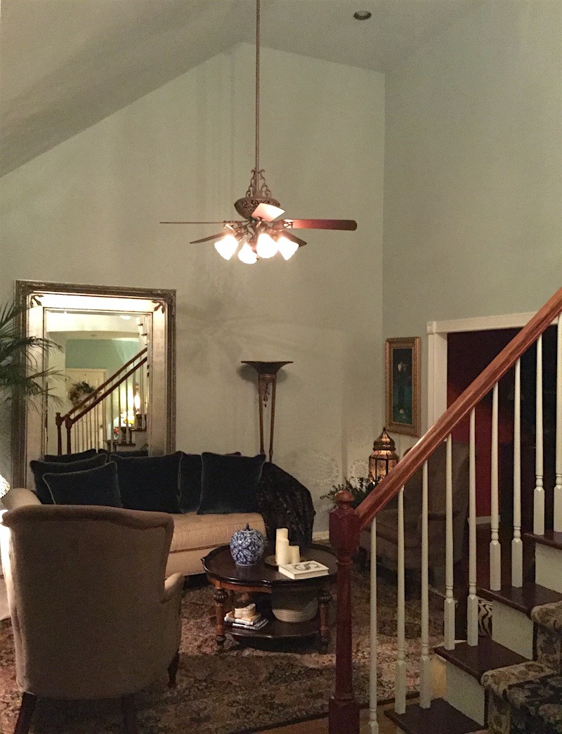
This is the before
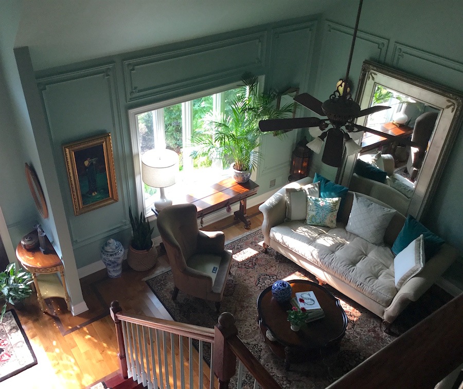
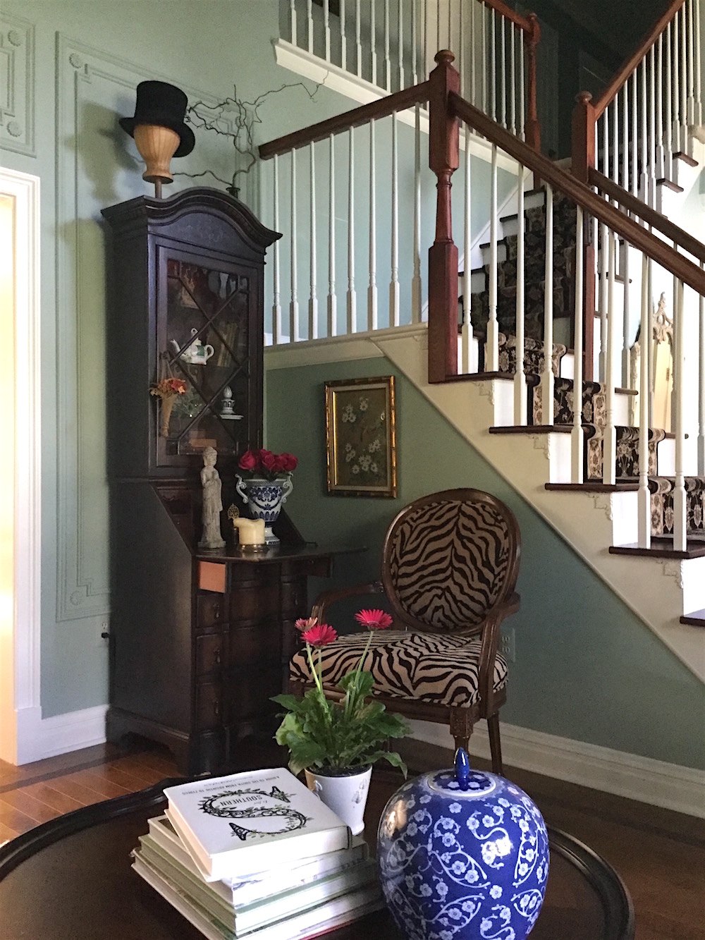
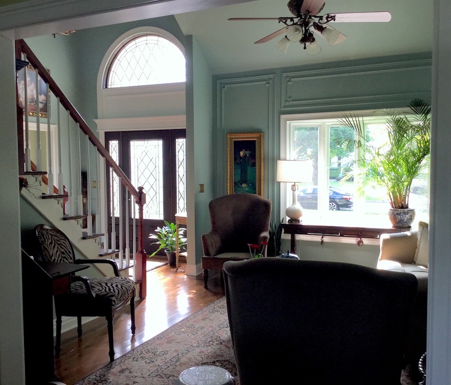
And definitely the after– perched from the top of the staircase.
The living room and entry is Benjamin Moore Wythe Blue hc-143
At the 11th hour, Susan divulged a bit of a bombshell regarding most of the furniture in the room.
We had no LR furniture for years; literally, none.
[I can totally relate and you know, it’s not as uncommon as you might think.]
My husband blamed it on being claustrophobic. What a load of bologna!
[Indeed!]
Then, one day out of the blue, we’re doing some shopping at the mall; And by golly, his credit card jumped out of his wallet and started running straight toward the furniture store! ;] Naturally, husband went chasing after his card!
There was a HUGE SIGN in the window. STORE CLOSING. SACRIFICE SALE. HURRY. UP TO 90% OFF!
And Laurel, I know. I know, even without reading your blog, that it’s foolish to purchase furniture without a plan.
But, there was no time to plan. It was now, or who knows when I’d get another chance?
[I would’ve done the same thing! Make no mistake!!!]
The sofa, chairs, coffee table, and secretary, all came from this store and I’m grateful to have them.
[Well, Susan, for not having a plan and making decisions spur-of-the-moment, you did a pretty damned good job! So, no worries. We can see how to make the most of what you have. I think that a lot of us are in the same situation.]
Let’s look at some other images and while we do that, we’ll intertwine the interior decorating lessons.
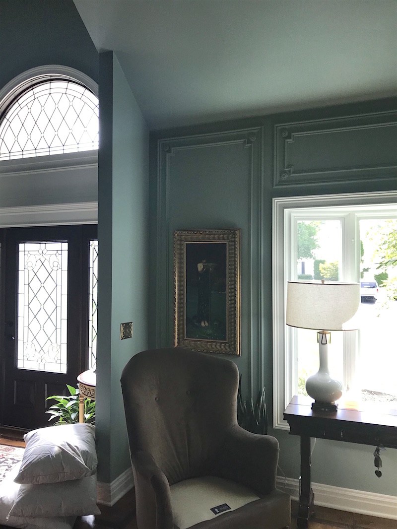
And yes, we just had all the mouldings done and the paint. The living room and entry are Benjamin Moore Wythe Blue HC-143 and the dining room is BM Green Hydrangea.
The moulding idea came from following your pins on Pinterest.
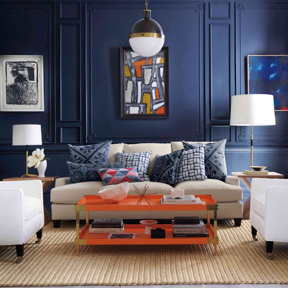
This image from Serena and Lily completely captivated me
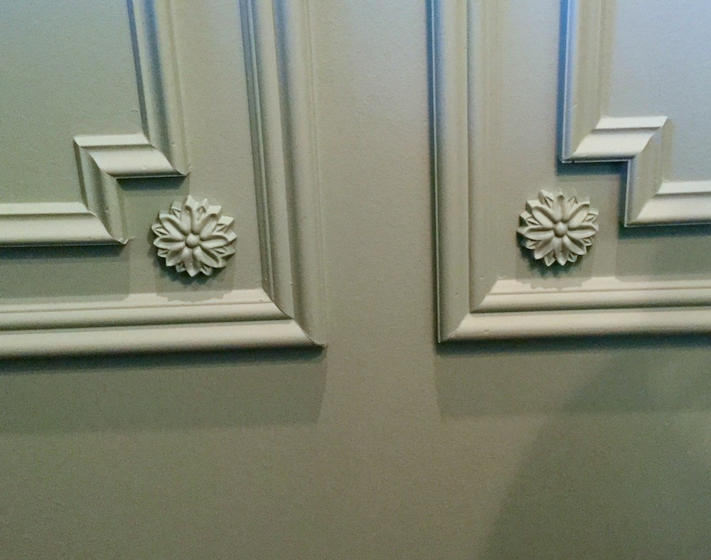
HOLY CRAP! Girlfriend YES! This made my day!
Plus, I was so inspired by your trip to England and especially the George Saumarez Smith house.
I adopted the same color scheme for my house.
I purchased your paint guides and rolodex and those are immensely helpful! In addition I read every blog post. As much as possible, I did EVERYTHING you said to do.
I know that it’s not perfect and I know that some of the furniture is a little as you say, “ersatz.” But at least we have furniture and I feel good in the room.
Right now, I’m so thrilled with the new colors and mouldings.
[Oh, I know. I remember when we did our moulding and paint in our townhouse. I was walking around with a huge grin for weeks!]
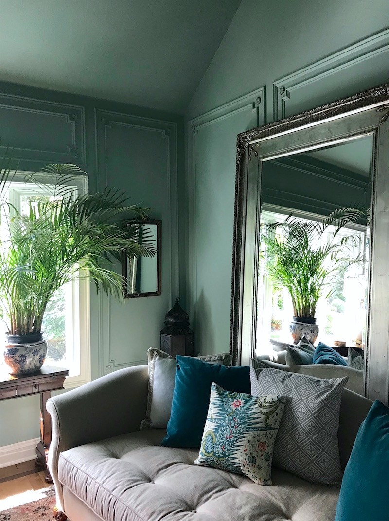 I adore this image! The colors are gorgeous!
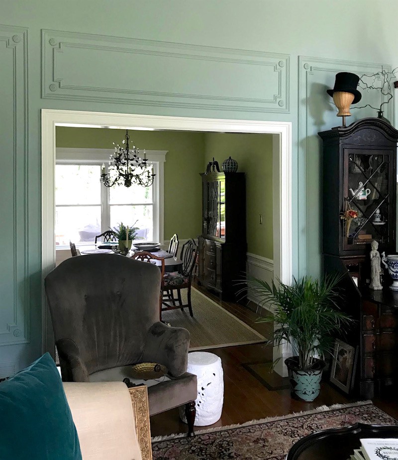
Looking into the dining room.
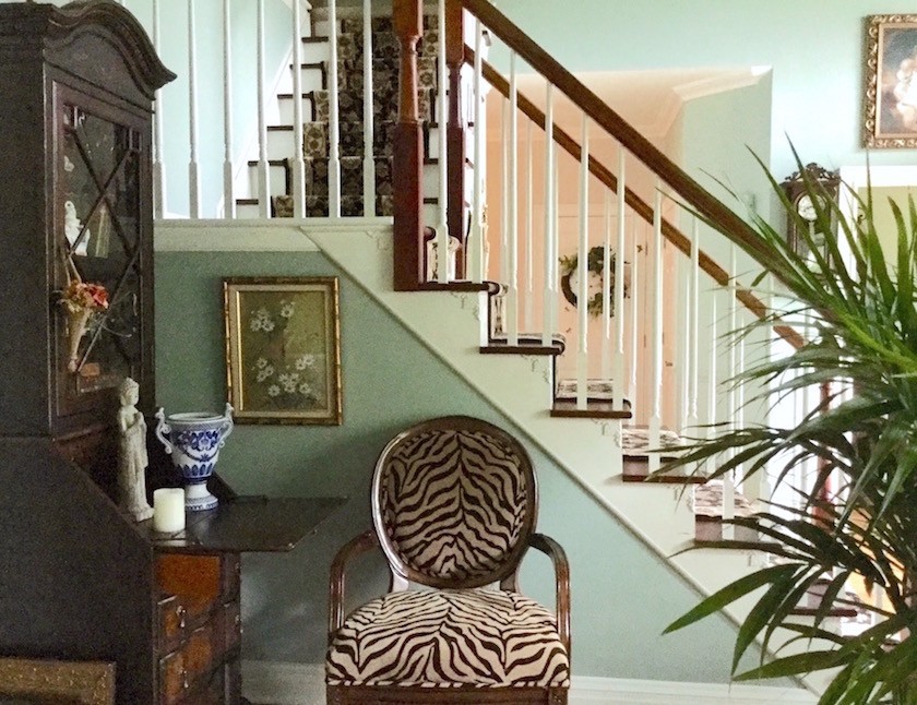
The reason that the furniture is a little on an angle is that my mom warned me that it would look like a doctor’s office if I lined the perimeter of the room with the furniture.
Okay, sorry mom, as well-meaning as I’m sure that you are, I have to respectfully disagree here. First of all, there is no way that this architectural beauty could ever look like a doctor’s office.
Second of all, if furniture goes on an angle, there must be a clear reason why that’s so. I’m not seeing any reason other than Mom thinks it should be that way.
Otherwise, to me, it looks like the cleaning lady came and forgot to put everything back. (Does anyone know why they always do that?)
Putting furniture slightly on an angle in a classically inspired room is just not done.
I mean, there are worse things, ;] but still.
Aside from that, I really have only one, no wait. Two issues.
One the mirror and sofa should be centered on the wall. I realize that it is anchored, but I feel pretty strongly that it needs to move to the center.
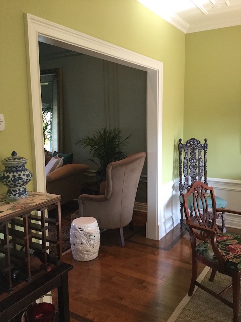
Two, the chair with the pretty white garden stool is blocking the entrance to the dining room. And, it’s also overlapping the sofa. Both are no-nos in the realm of space planning. It is a pretty chair, however. Just not where it is.

Please note that the seat cushions are out getting fixed.
I did a floor plan and there is no other place in the room for the wing chair.
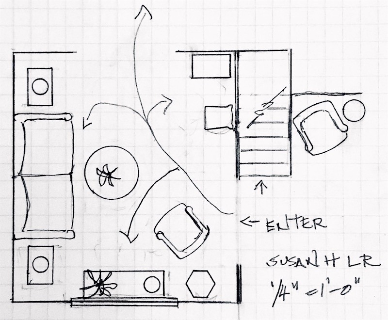
I love the secretary where it is and the zebra chair. I love the console table. That’s all that fits.
If, if, if… The sofa were smaller. (I know that you know that) and the chair near the dining room was lower, I could make it work. But as things are now– no. Of course, you can ignore me and leave it where it is. But, it’s actually a hazard. Or it would be in my house. haha!
Here are my recommendations. And again, you are free to take or leave or whatever.
I would go and whip up for your husband, a chocolate cake. You know… the one that will make you plotz. ;] I’m serious. This is the cake that will get you whatever you want.
As you’re serving him seconds, this is a great time to gently bring up the fact that the mirror is in the wrong place.
OR, if he goes away on business, don’t tell him and schedule all of the work to be done while he’s away. He will almost definitely not notice. If he notices, tell him that you were feeling claustrophobic where it was. ;]
Now, we can center the sofa with the mirror. Ahhh… That’s better.
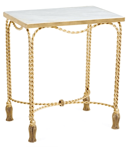
Then, you need two pretty end tables. Since money is tight, I went over to One King’s Lane because of their insane “private” sale (which you can read about here and grab your discount code for 25% off the entire site. YES, the entire site!)
I could see these charming end tables in your room because they have a little whimsy and I think that they complement the sofa. They’re light and I’d love to see a little more gold in here.
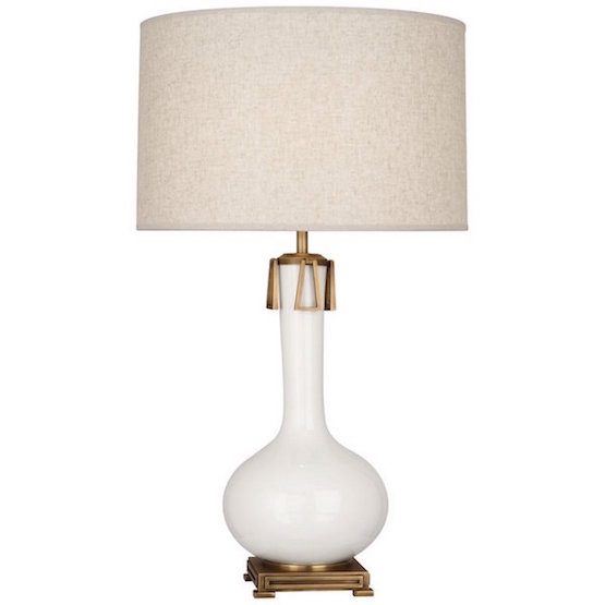
Then, I would get another one of the Robert Abbey Athena Lamps.
Yes, it’s the same lamp that I feature in the paint/palette collection.
Now that you have two of them, move the other one over so that you have two of these flanking the sofa. So pretty.
The Robert Abbey Lamp is nearly 32″ tall and I think because of its heft is perhaps a tad too large for the console table. It’s not terrible, but if you are moving it, then I would do something a little smaller to replace the lamp that you’re moving.
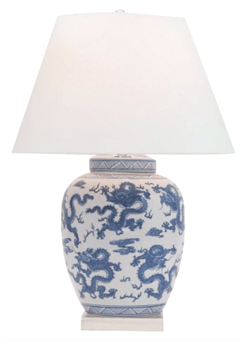
This Chinoiserie lamp from Port 68 is 29″ tall and I think would look great. But of course, there are other lamps that would work as well. Go and grab your discount code here.
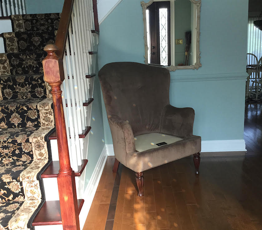
The wing chair could go to this nook in the good-sized entry. Obviously, Susan humored me by moving it there. I think it could be skooched over a little to the left and then a small round table could go under the mirror.
I would prefer a lighter fabric or slipcover in cream canvas, but an alternative would be a pillow to brighten up the piece. They’re very pretty chairs.
Now, the pathway is clear.
When entertaining, if you need more seats, just grab a few chairs from the dining room.
One thing Susan read my mind about is the rug. I was thinking that it looked quite muddy in the early photos.
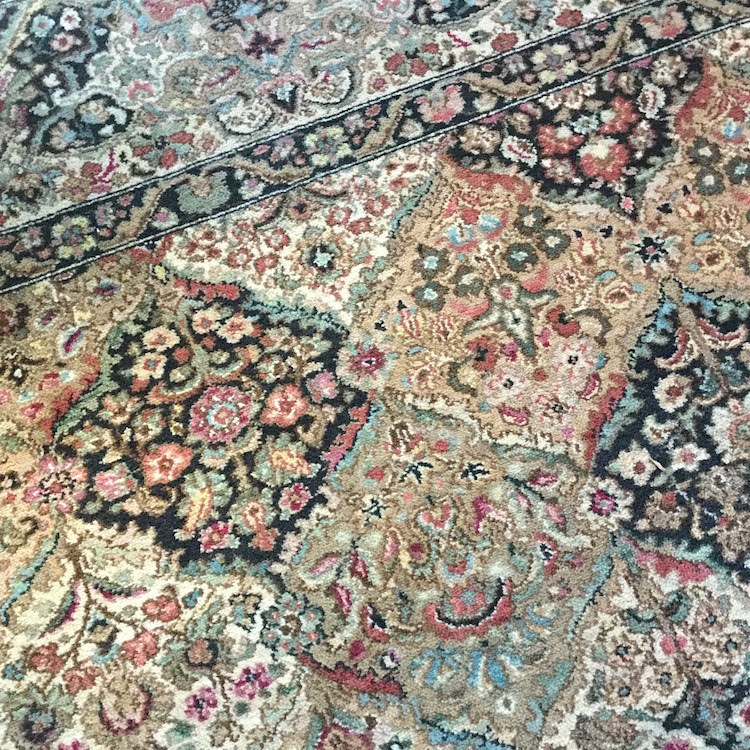
But, as you can see, it is anything BUT muddy.
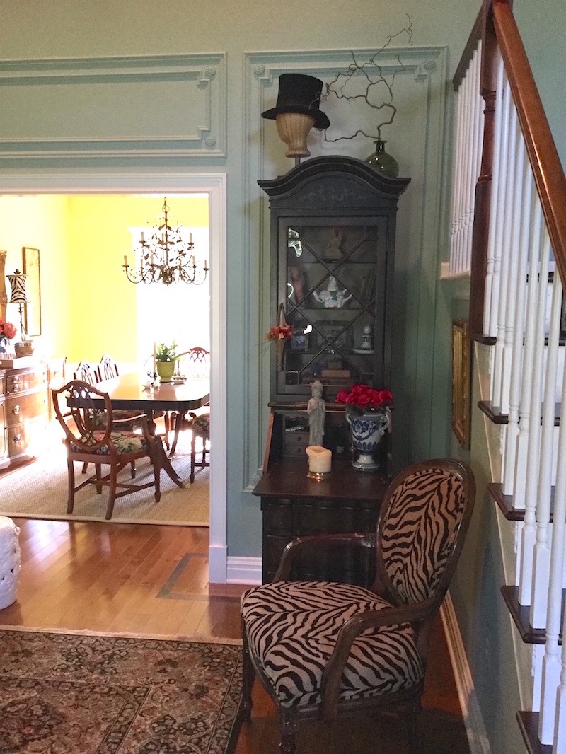
Wow! This photo reveals something that I talk about all of the time.

Benjamin Moore Wythe Blue hc-143
In fact, this body of images from one home illustrate so beautifully how one cannot possibly know what a color is by looking at it on a computer screen or a magazine.
The living room color looks different in every image and look at the dining room above! It looks day-glow yellow, but it is not.
 This is Benjamin Moore Green Hydrangea.
If you love real green hydrangeas please check out my instagram. Oh, and I’m almost at 10,000 followers, so please follow me. I don’t post terribly often, so you won’t ever be irritated.
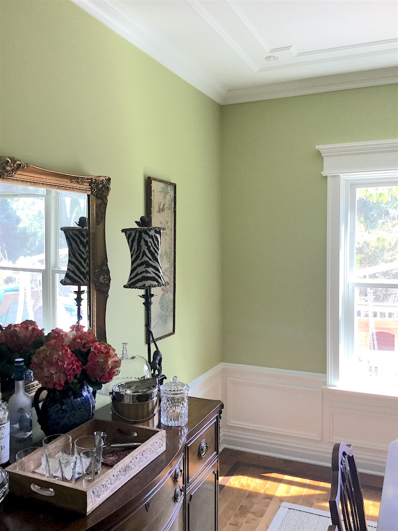 This is also green hydrangea. And, another great shot of the dining room.
Fabulous job on the mouldings, Susan! I’m phenomenally impressed! and that is why I wanted to feature your beautiful home.
 Another magazine-worthy shot of the dining room ceiling mouldings. I noticed that the rosette is different here than for the living room walls. It is all, absolutely perfect!
If you love mouldings please check out this post
And here is a great post, all about wainscoting.
Laurel… what is…………
Yes, yes, I know. What is the ceiling paint color?
Well, it’s Cotton Balls. Cotton Balls as many of you know is one of my favorite shades of white paint and in another email Susan said that she adores it and that the glossy white has a prismatic effect at times.
Thank you so much Susan for sharing your lovely home with us. I love how you’ve taken so many interior decorating lessons we’ve covered the last several years and incorporated them into your home. It’s a testament that if you get the bones right, the rest is not easy, but definitely easier.
xo,

Related Posts
 Help me please. My husband wants a matched set of dining room furniture
 25 Ways To Hide The TV – The Ultimate Guide
 Freshening Your Home for the New Year {part IV – window treatment ideas}
 Is It True That Dining Rooms Are Out?
 Stair Runners – The Complete Guide + Mistakes!
 He Loves The Phony French Country Kitchens
 Six Figure Income Blogger 150 Page Guide Is Here!












86 Responses
Hi Laurel and Susan, I have been loving this post and your gorgeous room Susan, it’s been an inspiration! My living room (built circa ’97 in the Jersey suburbs) is very similar to Susan’s in size/layout/ceiling height. I continue to be baffled and frustrated about how to decorate the walls in this room with the height of the ceiling. The moulding is a wonderful idea and looks quite beautiful. My question is, how high up do you go with it? And must you do it on ALL of the walls? My room doesn’t have that little separation wall so the foyer is really an extension of the living room. Help!
Hi Lynn,
I can answer this. You will know how high to go based on the door and window openings. That will dictate your design unless your windows and doors are unusual in some way. And just because there isn’t a small currently doesn’t mean that one can’t be built, in most cases. Since I can’t see your home, I can’t say for sure. I have done this a few times and it makes a world of difference to have those small walls, usually from 18″ – 3 feet or more, depending on the situation.
Hi and Thank you!
I had been searching for some way to separate the bottom portion from the top
without just adding crown moulding around the room…
When I saw this idea from Laurels blog
The rest of my house has nine foot ceilings, so I have the moulding at that height with a 3 inch border at the top and between the sections.
It doesn’t go all the way to the base moulding, I stopped it short for several reasons… the window stops there, there are outlets that would have made ugly detours for the trim and I like that it peeps out from behind furniture at a level that
catches your eye.
Good luck
Thanks so much Susan. And great case in point is that every situation will be different. But, there does need to be a cohesive design and you rocked it!
Susan I keep coming back to this article to look at your lovely home, and to learn from Laurel! My former dining room is now re-purposed into a sitting room. It is the same size as yours with very similar traffic flow as your front room. Of course there is a major difference as my ceilings are only 7 1/2 ft! There are many lessons for me in this article! Can you share your rug info? I’m struggling to pull it all together and this may be the winner! Many thanks!
Hi Laura and Thank You!
My LR rug is about 8-10 years old, it’s a Karastan called
Empress Kirman Black…Have no idea if it’s still available.
The DR rug is seagrass from Pottery Barn.
Good Luck
Hi Laurel,
Just found the rug on sale at Macy’s.com
I cannot say if the dye lot will be the exact same as mine
But I did notice in the image the color looks a little different than mine,
BUT as we have all learned color doesn’t always translate.
The image of mine happened to capture the colors accurately
Good Luck
Oh wow! Thanks for tracking that down Susan. It’s definitely the same rug. And yes, the colors might be off. I think that you captured the colors in your close-up much better.
Elevations would be a wonderful topic for your blog. And maybe that could include how to keep all the vignettes on flat surfaces from competing with each other and looking cluttered. I have at least five, mantel, cabinets, consoles and someday a coffee table ( if I can find one I like) all in the same visual open concept room.
Hi Mary,
Well, they are really two different things. The flat surface vignettes are about styling which is an art unto itself. I can’t say that it’s my forte. But, I’ve learned a few tricks over the years. There are some table styling posts on here.
Elevations, on the other hand, are primarily concerned with the wall. I can dig some up from my interior design school portfolio, perhaps. The elevations are great for showing windows, doors, artwork, mantels, mouldings, cabinetry, etc. but if there’s a chair a few feet in front, that can be drawn in too. But the lines are only horizontal and vertical. There’s no perspective.
Great post! I am learning so much by reading your blog. And thank you for answering my question a couple of weeks ago about overlapping windows and entrances with side tables. 🙂 I am not sure if this is too broad of a question, but do you have any advice for using a full sized mirror like in a room with 8’ ceilings? Should they just be avoided or maybe be about two feet lower than the ceiling?
Thanks Megan! It’s difficult to answer the question about the mirror in isolation. And I don’t know what full-sized means. One thing I haven’t talked about is doing something called an “elevation.” It’s like a floor-plan, only it’s the wall. But, it’s not in perspective. They are fun to do.
About two years ago, I found your site while researching Farrow and Ball paint. Then proceeded to stay up half the night, swilling white wine, reading all your posts. Since we’ve been married almost 50 years nothing surprises my husband. If I leave his den alone he’s a happy guy. I was redoing our bedroom and needed a paint to complement new bedding fabric. Took the fabric to FB and they suggested “Green Blue” which was perfect—until I learned cost. Holy moly. My brain finally kicked in and then I remembered Laurel discussing B Moore paints had similar colors to FB. Ya Hoo. I bought a small $8 sample and headed to my neighborhood BM store. The “painter mixer guy” has an artist’s eye. He selected Wythe Blue which is the color in YOUR ARTICLE! I recognized it immediately. It’s perfect for a sunny CA day and lovely at night. We have a beautiful painting by Maria Bertran (Laguna Beach)of Bora Bora. It has vibrant colors and was great on white walls. Now it is stunning on the Wythe. Who knew? Readers might consider how colored walls can enhance some art. Dear Laurel you’d love LB so consider a visit when you are in LA.
Oh how funny! Thanks for sharing your story Trish!
I’ve just been loving all these room layout/design posts lately–Laurel you’re the best! And this blog is a life-saver for all of us diy interior designers. I’m going to be starting a big reno project soon and I’m so glad you’ll be helping me along the way!
Thanks so much Jenn. So glad that you’re enjoying the posts and finding them helpful!
I do love jewel-tone-type colors, so I am loving the colors in these rooms.
That’s funny how things appear so different in photos.
Not just color but size
The DR opening in only 6 feet. It really is a relatively small room.
Was the slipper chair an idea for that spot?
Listen sister, Get your own power tools. It WILL empower you. Don’t get the pink ones they’re crap, because we all know women can’t operate power tools…
Instead look for one that feels good in your hand.
I used to sew drapes and such and hang them…One time in a diner.
All the guys had comments to make when I pulled out my drill/driver…
That’s right buddy, Women with power tools.
Attach those handles yourself. Measure, make a template with old cardboard.
Show him the power of women
Good Luck
The Chocolate Laurel cake is for ME 😋
My husband only likes one cake, seriously.
I make him a southern style pound cake with syrup…
AND then he’ll move the mirror
That sounds good too. But as he tried the chocolate cake? But fine. Whatever it takes. ;]
Hi Laurel,
I really enjoyed this post. I’ve been following you for awhile and I actually refer to you as simply, Laurel, when I talk to my husband about decorating ideas. He doesn’t say, but he may be a little over conversations that start with, “Laurel said”. We bought a house in January and I need to get that Rolodex, soon! Susan’s home is beautiful, and the best part about it is, I finally found my living room lamps! I LOVE THESE LAMPS! There will be no “Laurel said” conversation or even chocolate cake, I’m just hitting that Place Your Order button tonight and worrying about the consequences later! Haha! Thank you!
That’s so cool Donna. Tell husband that “laurel” says “hi!”
I hope that you’ll share the images after your suggestions are implemented!
Hi Pat,
I have no doubt that Susan will. I don’t know if she’s going to comment here, but she’s tickled pink by everyone’s kind words!
Wow, I am overwhelmed by such lovely and thoughtful responses.
I apologize for not responding immediately BUT I didn’t know about this
Laurel just told me I had some questions…I had no idea.
My kids laughed their butts off because I couldn’t figure out how to respond HA!
I’ll try to answer collectively as this is my first time, be gentle
The rosettes are from Van Dykes Restorers. They didn’t have the same rosette in different sizes, so I picked two different ones. I actually don’t mind that they’re different. I’m honestly not sure about the moulding BUT I could email the trim guy if need be.
The Mirror is anchored to wall in two places, no worries.
That’s my grams dining room set I inherited, it’s from the 50s. I asked her for it when I was 12.
My husband was apparently So impressed with what he saw
I get to have the two tables and another Athena lamp WooHoo.
I will definitely send in another picture when everything arrives.
And I would be happy to show pictures of the other rooms…
Whenever Laurel solicits another topic that I qualify to enter.
I now have another level of respect for you Laurel as I sit on the sidelines
exhausted from one email 😍
Thank you so much for all of this terrific info Susan! Very sweet of you. And hooray for Husband! Did you make him a chocolate cake? haha
Dear Susan. LOVE Van Dyke restorers. Good for you for sourcing those. Hey Laurel, I’m sorry I don’t have your Rolodex yet, but are they in there? They have wonderful decorative things, like mouldings and embellishments. You did a beautiful job, Susan, and that paint colour is delish! And your mouldings and rosettes are gorgeous. No wonder hubby is thrilled. Can’t wait to see it all with the new lamps and tables. Now you are finally enjoying your 15 minutes of fame 🙂 Well done!
Hi Cynthia,
No, they aren’t in there, but next update, for sure.
Hey Guys,
A few of you have comments from the wonderful Melissa. Actually, they are my words. I was working with Melissa to show her how things work on my website as she’s going to be giving me more help. God only knows I need it!
She most likely won’t be answering comments at this point. Just want you to know that I was dictating to her and forgot that her name would show up, not mine.
I really loved this post– the past and current room photos followed by photos of the items you would add and where these items would go– with all the pics I can really visualize what the room would look like after the changes. I also love the mouldings– great addition. And I also have 2 rambunctious boys– now 20 and 18– who are still at these ages rambunctious whenever they’re together. 🙂
Hi Deb,
Thank you so much. I can distinctly recall one situation in a casual restaurant when the boys, 18 and 22, were beating up on each other in such a way that people were staring. Meanwhile, at the next table was a family of four with two little boys, like 4 and 8, who were behaving perfectly. And my two BIG young men, 6′ and 6’3″, beating up on each other! I wanted to die.
Such a beautiful home! I love the way the furnishings in the dining room and living room coordinate with each other. (And I am particularly envious of the relatively narrow server. It’s hard to find servers that are a reasonable width.)
Thank you, Laurel, for pointing out all the things Susan did well and allowing us to learn from them.
I do wonder why she originally placed the mirror where it is. I assume she simply thought it would look best centered on the opening to the foyer rather than centered behind the sofa. I can totally understand why she would have thought that to be true. That’s why it’s so valuable to have a second set of eyes looking at things sometimes.
Thank you again, Laurel and Susan!
Hi Tsippi,
I agree with you. And not sure what her thinking was.
Oh, Susan! Sister, you are singing my theme song. It is ALWAYS a total surprise when my husband is in the mood to spend money on furniture, and can I just add, he’s a lovely man, but he has absolutely no idea what quality furniture costs. No idea. As in, there are shrieks heard all over our neighborhood if I drag home a 200 dollar anything from Salvation Army. He thinks if he compliments the kitchen chairs (outdoor fake rattan from Lowe’s) often enough, that’ll be sufficient encouragement for me to go find similar “bargains”.
Anyway, I’ve ended up with some furniture I simply HATE due to lack of planning. Well, never again. That lesson has been learned. Next time I furniture shop I’m taking my decorator and leaving hubby at home with the cats.
Thanks so much Madonna for the amusing comment.
Hi Laurel,
Can’t say enough great things about Wythe Blue…… I painted both my kitchen and dining room this colour about a year ago and I absolutely love both rooms now that they are…. ahem….. painted correctly:):)….. My kitchen is very modern with a stone floor and this colour makes modern feel like home but yet still is completely contemporary. My dining room is pretty traditional; this colour takes the stuffy out of traditional….. I’ll probably even paint the powder room Wythe Blue when I get around to it:):)….. it works in multiple light situations too….. it’s not blinding and bossy in a bright room and it doesn’t wimp out in the dark room. Last, but by no means least, it blends really well with other colours; I have fairly bold tastes, so my living room is SW Dusted Heather and my hallway and entry are F&B Cornforth White…… there’s a lot of contrast but the colours still flow beautifully together. If your tastes are for more serene and blended rooms, this colour would be a great relief colour for one room and it wouldn’t scream STATEMENT ROOM!!!!! Loved this post, just like I love all of your posts!!
PS……. I ditched my husband, so I have free reign to paint the house whatever, but I think this might be a colour to sway a colour phobic husband out of his bland shell.
Hi Lynn,
Thanks so much for all of that. I’ve never used Wythe Blue, but I think I am a fan.
Yeah, I think it is a color both men and women would love.
Hi Laurel, my friend owns a small rowhouse in NW Washington DC with almost the same laoyiut and small rooms (minus the family room). The big difference is the staircase is on the opposite wall and the hallway is in between staircase and the LR. This allows for a real wall w lovely archway into the LR but still there are more similarities than differences. His DR furniture placement is as shown but in the LR tthe couch is on the window wall facing into the room and it works well.
Also, I wonder if there are similar rooms in historical places such as Charleston and Savannah. It might be interesting to see what was done there.
Hi Naomi,
Well, you bring up an excellent point. Yes! The center hall between the staircase and the living dining room does not exist with this layout. And it does make a difference since we have to walk through the living room to enter the dining room. Of course, one could also walk through the front entry hall, enter the kitchen and then make a sharp left into the dining room. But if one is already in the living room, that doesn’t make sense.
Old row houses always have fireplaces and so the furniture is placed to work with that. Sometimes I’ve done two parallel facing loveseats.
And that brings me to: Are there other options? Yes, I think so, but not with this furniture and since Susan made it clear that pretty much everything needs to stay, the exercise for this one is to “make it work” ;] as optimally as possible. And it’s already very close.
If you’d like to see other furniture arrangements, there are a bunch in this post of average-sized living rooms, one foot wider and several feet longer than this one.
Hi Laurel,
Your tips will put Susan’s room over the top! It’s so close to being perfect as it is.
I’m wondering if the console table in the window could be a teeny bit smaller. To give it a bit of breathing room on the ends. I’m probably just nitpicking.
I certainly love the touches of velvet she added to her room. Velvet always seems so appropriate in a Parisian space.
Also, I’ve learned to do most of my decorating when my husband’s out of town. I don’t ask for permission anymore. When he comes home from a trip now the first thing he does is look to see what’s different.
Hi Mary,
Oh, that last line is so sweet!
I like the size of the console table. And I like the style of it too.
Killer job on the mouldings. Moves it up to a whole new level. But I forgot to ask in my earlier comment. Where did you fine the rosettes for the corners? I’m going to be doing a similar moulding treatment in my library and have been casting about for rosettes the right size. All the ones I see are too large.
Good question. Hopefully Susan knows the answer and will weigh in. In fact, if I had been thinking, it would be great to know what all of the mouldings are. Everything looks splendid together!
What a transformation! It went from a room I would walk right past, to a room I’d want to sit in! The new wall color and moldings makes it look like a cozy nest.
I agree with losing the sofa angle and centering the mirror. Those two odd things jumped out immediately. The gold end tables would echo the gold picture frame and gold looks wonderful with the blue color of the walls. The arm chair in front of the desk also works for guest seating without blocking traffic. Other than those small changes, the room is wonderful.
Thank you Lorri!
I am enjoying these floor plan lessons very much! It’s so nice of you to do this. Lovely home, Susan! I think Laurel’s advice is spot-on. The “doctors office” strategy has me scratching my head, I’ve never heard that before. Anyway, I hope we get to see some follow up from your darling readers to see how the advice looks in situ.
Hi Susie,
A doctor’s office usually has a bunch of chairs lined up around the perimeter. If only a doctor’s office did look like this. Actually, a very long time ago, when I was a sweet young thing, my elderly gynecologist in NYC lived in a brownstone on the upper east side and his office was on the third floor. I remember being able to see the garden through some French doors. Oh, so lovely!
Whoops, did I say compulsive furniture buying? Of course I meant impulsive. If I were compulsive, I’d have a house full of furniture!
Oh, yes! haha! You are right.
I don’t know what the obsession is with having a sofa, especially if you don’t have the space for it. I’ve seen rooms with just a round coffee table surrounded by arm chairs. If you don’t have room for a sofa, I would go to the patio furniture department and just get a wicker love seat or something. In my condo, instead of a sofa I opted for a couple of arm chairs with a table in-between with a lamp on it.
Hi Susie,
It’s an excellent point. And I don’t know if it’s an obsession or simply a matter of “programming.”
I’ve done a couple of spaces with four chairs and no sofa. The only thing is, I don’t think that arrangement will work in this room either. And that’s because one has to easily move between the front hall and dining room without blocking the entrances. There IS definitely room for a sofa and I believe that it is the best for this space, but ideally should be smaller. However, I do like the sofa and the style certainly works beautifully in the space.
And it’s not terrible. I find as I said in Sunday’s post that the problem often is that folks choose a sofa that’s too large for the space.
This is wonderful, thank you Laurel and Susan! Wow, if I could only be as good at compulsive furniture buying. I’m at the opposite end where I don’t buy anything because my “plan” isn’t yet perfected! LOVE the secretary and zebra chair, Susan! And great suggestions, as always, Laurel. And my opinion on why cleaning people always move things around is to make you see (believe?) that they cleaned under those moved things. 😉
Hi Karyn,
I’ve come to believe that all they did is move things around. haha! I have not had a cleaning lady since I moved into my apartment. It’s difficult to justify living alone and not being able to keep up with an 800 sq. ft apartment. It was different with 2700 sq feet, two grimy boys, a husband and a cat that shed like crazy!
PS I completely sympathize with the husband issue re: decorating. We too have practically no money for decorating and a half renovated house that we’re working on, so most of what happens around here involves paint, thrift stores/craigslist, and/or DIY. My husband is good at house stuff – he can do carpentry, electrical, plumbing, hang doors and cabinets straight (harder than you’d think so that they function well!!) but he doesn’t really enjoy it and would rather spend his small amount of free time working on cars than fixing up the house. So I have to be planned out well ahead of time in order to take advantage of the occasional moment when he is willing to tackle a house project or we are at home depot and he’s all, hey let’s change those crappy 80’s doorknobs today, because unless I do it Right Then, it is probably not going to happen again for ages. Case in point, my pantry doesn’t have handles although he installed them on the rest of the kitchen 6 months ago because I was still waiting for a larger scaled one for that door to come in the mail on the day he decided to install kitchen hardware.
Julie,
At least your husband is handy. Mine was too; it was one of his finer points. And we too, for most of our marriage had NO money. I mean, nothing; not even for Home Goods. So, I know what it feels like to be poor.
No violins here. Just stating that we’ve had our struggles.
Now. If I may suggest. I very much recommend that you learn the art of the “wicked chocolate cake.” Believe me. It works. That’s just how good it is.
Those mouldings – holy crap girlfriend, YES indeed!! They are jaw droppingly good. I do agree with Laurel on all points here. Great secretary and zebra chair, slightly large sofa please center and straighten it, and there isn’t quite room for that other large wing chair in the doorway. It took me a few scrolls up and down to realize the wing chair is one of a pair in the room, I thought it was being moved around from photo to photo but I see now that there’s one that fits ok in the corner next to the foyer as well as the other one in the dining room doorway. Great post Laurel, and thanks for sending in your dilemma, Susan!
Thank you Julie for the lovely comment. Actually, the chair was moved to the corner, but only after I mentioned it to Susan. I don’t usually do that and didn’t ask her to move it. But she did and I think with a pillow and little table or even the garden stool will be lovely there. It’s not a deep chair. Just a tall one.
Hi Laurel,
I think Susan’s home is lovely, and her furniture picks not so bad for spur-of-the-moment. The moulding is lovely, too. I agree that the zebra chair and tiny secretary look great together, and I love the dining room chandelier. I think it’s all a pretty great mix.
I’ve tried angling my sofas–I have two that flank the fireplace, but it never really seems to work. I’m glad to know we really need a reason to put furniture on the diagonal. My decorating lesson for the day.
Thanks for the most entertaining and informative posts.
Connie
You’re welcome Connie!
Love the mouldings! Love the colors! And all of Laurel’s suggestions are perfect! When there are those lovely end tables and lamps, I would have the light fixture on the ceiling fan removed.
Hi JoAnn,
Yes, I agree; there’s no need for the lights on the fan. Otherwise, I like that fan very much for this space.
What a student Susan! The change is amazing.
And Laurel… you are addictive!!!!
Thank you both!
You’re welcome Carolina. Glad that you enjoyed!
I couldn’t figure what bothered me about that sofa and mirror photo until you pointed out it was off center. And I’m actually annoyed by overly symmetrical decorating so that’s saying something…think I need to take a walk around my house with fresh eyes.
Hi Dawn,
One hazard with perfectly symmetrical spaces is the tendency to have too many pairs of things. However, in this room (mouldings aside),if the other chair vacates the room permanently, there are NO pairs at all. So, I think that it would be refreshing to have the two end tables and two matching lamps and also highlights the beautiful job they did with the larger panel mouldings in the center and two smaller panels flanking it.
The mirror should absolutely be in the middle as you suggest, Laurel. And it should be hung on the wall, not leaning against it. It would look gorgeous centered in that lovely molding. Things leaning on walls were a thing a few years ago, but it always looked as though people hadn’t moved in yet. Like, “Well, we’re in, but we haven’t unpacked all the boxes and hung the pictures yet.” I adore the colours she chose. It all came together so nicely and after having no furniture for so long, she must be thrilled.
Thanks so much Cynthia. They do still make “floor mirrors.” Vicente Wolf is known for doing them. Maybe he started the idea? Not sure. I see your point. I’m a little in two minds over that one.
Totally agree with you, Laurel. The mirror must be moved…centered to to room. It bugged me immediately as it makes the room appear smaller which is counter to one of the purposes of the mirror. Second, it covers the gorgeous mouldings and that’s a no no. I want the mouldings and the Athena lamp….and love the rug. Your floor plan series IS SIMPLY BRILLIANT!
Thank you so much Kellee. A lot of people sent in some very interesting rooms for one reason or another.
I would love it if she was able to share her other rooms with us!
Thank you Laura. I think that Susan would love that too!
Full disclosure… I’m sucking up to be the teachers pet… I’ve been trawling Pinterest and rest of internet for this exact vibe Susan has going on in her livingroom. It reminds me of some of the fabulous Parisian cafes from my youth. I love it but I totally get Laurels suggestions as they will lighten up the space, and really bring together the decor into a more sophisticated place…. am taking notes as am also a compulsive purchaser of clearance furniture… I didn’t know there was any other type ! Then left with the pleasure of solving the monkey puzzle I created for myself. And I want this sort of look. Have pinned it for reference.
Question regarding the huge opening into dining room… while the wing chair may be too solid for that spot, but does one have to loose all that valuable realestate space in a small room with multiple wide entrances? Would a rattan , wicker or any other visually lighter chair be ok to sit in this type of wide doorway?
Hi Ruth,
hahaha on your disclosure.
Now, you brought up a terrific point which if the room had not yet been altered, I would have explored. The openings are quite wide and that is some of the problem, as well. My guestimate has the dining room opening at about 8 feet. 5-6 feet is all that’s necessary. So, yes, another foot of wall, a smaller sofa, a lower chair. It wouldn’t have to be rattan, but I do like rattan.
And this is why working with an experienced designer can make a difference. But let’s say that they didn’t want to change the doorway, but had no other furniture. Well between the mirror and the sofa, it is taking up at least four feet of real estate.
With a mirror on the wall and a more standard 36″ sofa, we would gain an entire foot. duh. Then, I would do a sofa that’s no more than 72″, so even with the sofa centered, we could get the entire chair in the room without any overlap. All of that, and a lower chair, like the one I did here, or a two foot wide slipper chair, I think it would be fine.
However, the exercise is to use what’s there.
“If you can’t find a lover, well, then, you have to make do with your husband.”
OK I guess I am over negotiating home design with men….can’t they just stick to taking out the trash and …..you know the rest, right?
hahahaha!!!
Congratulations to Susan on a fabulous job with a difficult room. The mouldings are beyond beautiful. I am enjoying this series of posts so much, I hope they continue.
Hi Mary,
Thanks so much; yes there are more coming. :]
Well, Susan, as one Southern girl to another, “Honey, you did GOOD!” Laurel is right: nobody would confuse this gorgeous, comfortable room for a doctor’s office. Ever. The first thing that caught my eye (besides the paneling effect) was the mirror. Leave it where it is. It gives the room that built-up-over-time look and, I think, sets the tone for the room(s), a sort of casual elegance. And that narrow little secretaire is perfectly appointed and saved from even a hint of dinkiness by the zebra-print upholstered chair. Plus your use of greenery throughout is a fine touch. The entire room speaks of a person who has thoughtful, good taste. So welcoming, hospitable. And see, Laurel,this is but another example of your good influence, of how folks really do pay attention to your well-taught lessons and thus improve the world, one room at a time.
Hi Gaye,
Thank you as always for the lovely comment. xo
Or, until you can afford new end tables, switch the positions of the desk and the offending chair. Put the desk with its back to the long wall, open as it is with a small lamp and with its chair pulled up. The open arm chair can pull out for guests. Use a round table with lamp next to the brown chair in the other corner. For the rest of the room, adjust as in Laurel’s plan. Move mirror last, when you have settled on a final plan. Or maybe replace mirror eventually with one that hangs over the sofa.
Absolutely wonderful colors and molding!
Thank you Margot. I’m not sure I’m following all of that. I believe that mirror could be hung horizontally over the sofa, although I’m not sure of its size. But, it would have to be quite a feat of engineering because that mirror looks quite heavy. So, maybe not a good idea, either.
Yes, that large mirror where it is would actually stop me sitting on the couch. It would feel unsafe, even if it’s not. I like the colonial theme going on.
Hi Running,
I think that it’s perfectly safe. I think I forgot to say that it’s actually sitting on the floor and it is bolted into the wall.
Thank you for that clarification Laurel! Isn’t it interesting how a little more detail of Why? Or How? can change everything?
Loved this whole story you told…did Not love that it popped into my email inbox just as I was turning off my iPad to go to sleep…my tired eyes are displaying the effects of late reading so I could get all the details. Love your ideas on this. I really enjoyed too, that Susan wasn’t just asking a “ cold” question either. She’d done her homework. Bought the Paint Guides & Rolodex. She’d studied what you’ve taught us and was working (quite successfully) on application. She’s good.
I pulled out my BM Fandeck this am to take another gander at Wyeth Blue. So pretty in her space. Truly paint does not always translate well to our little screens. Each photo read a bit different. And that rug! The dull dreary needs-to-be-replaced rug I saw in the first few frames actually works beautifully with the shade on the wall and probably is quite eye-catching in person.
Thank you for using her house.
Red
Hi Red,
Yes, so many lessons in this one room. And one of my favorites is not to always believe what one sees in photos! In addition, if this was a designer portfolio and she had the “muddy” looking rug, it would not reflect on her/him in the same way as it actually LOOKS! This is one reason why small vignettes are often a good idea for designer’s portfolios.
And sorry, I did post late last night. Can I tell you that after all of this time, I STILL struggle at estimating how long a post will take. Every time I think, “oh, this one will be easy.” I’m sadly shaken into a reality of NO FREAKING WAY LAUREL!!! Or, as I’ve stated before. I’ve created a Blogenstein! But, surely, no complaints!
People sometimes ask if I miss having clients. Yes, I do miss the in-person interaction, but that’s about 3% of the job. Another 18% is what I’m doing here which is the part that I’ve always loved of being an interior designer. 50% is tedious/boring/exhausting. The remaining 30% is pure aggravation. And no, very rarely from clients. Damaged furniture, deliveries not working out, and vendors that don’t giveashit which covers a lot of ground. That sort of thing.