

Dear Laurel,
I’ve been reading your blog for a long time and also bought your fantastic paint guides, which saved me from making a lot of costly mistakes. Years ago, I found a color in your paint guide that appealed to me for our bedroom: Benjamin Moore Quiet Moments.

Benjamin Moore 1565 Quiet Moments – One of my all-time favorite go-to paint colors.
Well, you were right. It was gorgeous, and my husband loved it, too. Everyone who got the tour wanted to know what color it was, and I got gobs of compliments.
Fast-forward five years, and we decided to retire and move to a two-bedroom condo in Florida near the beach…
I know, very original, lol, but we just couldn’t take the harsh Michigan winters any longer.
The primary bedroom is in the back of the unit and faces west, so it gets very little light in the morning, but that’s fine because it helps us sleep better.
So, here’s the deal with the bedroom wall color.
Natch, we painted it Quiet Moments, only it looks completely gray and sometimes ever so slightly purple.

Does Quiet Moments have a purple undertone? I checked my guide, and you said:
QUIET MOMENTS 1563
It is one of my favorite go-to bedroom colors. It NEVER fails me, and men love it too. It’s just the perfect blend of gray, blue, and green, soft and serene.
What’s super odd is that the color goes quite green at night. Well, not a bright green, but more green than in our old home. Then, in our morning light, there isn’t a speck of green, and in fact, the color looks ever so slightly purple. It’s not a terrible wall color, just not what we expected.
I’m trying to figure out what went wrong so we don’t make this mistake again.
Also, can you recommend a color that won’t go purple during the day?
Thanks so much,
Payne Waller
***
Oh, Payne. I FEEL your pain. In fact, I feel it so intensely that I may need to take a stress pill and think things over.
I’m just kidding. However, I could use a stress pill today. As an aside, my son Aaron just moved to Asheville, NC, as I am writing this.
Enough about what I have no control over, which is almost everything. lol
Let’s get back to the topic of our bad boy wall color.
I have zero control over that, as well. Nobody does. Most things in life are out of our control. That goes for people, the weather, and that perfect paint color.
It doesn’t exist. Well, let me correct myself. The perfect wall color in situation A might be a horrid wall color in situation B.
Raise your hand if you made the mistake of transferring adored paint colors to your next home and couldn’t believe your eyes after it was done. (and not in a good way)
I see at least 10% of you have had this problem.
So, what went wrong with Payne’s wall color?
Ahh… well… From where I’m sitting, I can’t tell you for certain, except at night.
Her wall colors will likely look different when switching from incandescent to LED. I have found that warm LEDs tend to go either yellow or pink. Then, there’s the matter of the color rendering index (CRI), kelvins, watts, and on and on.
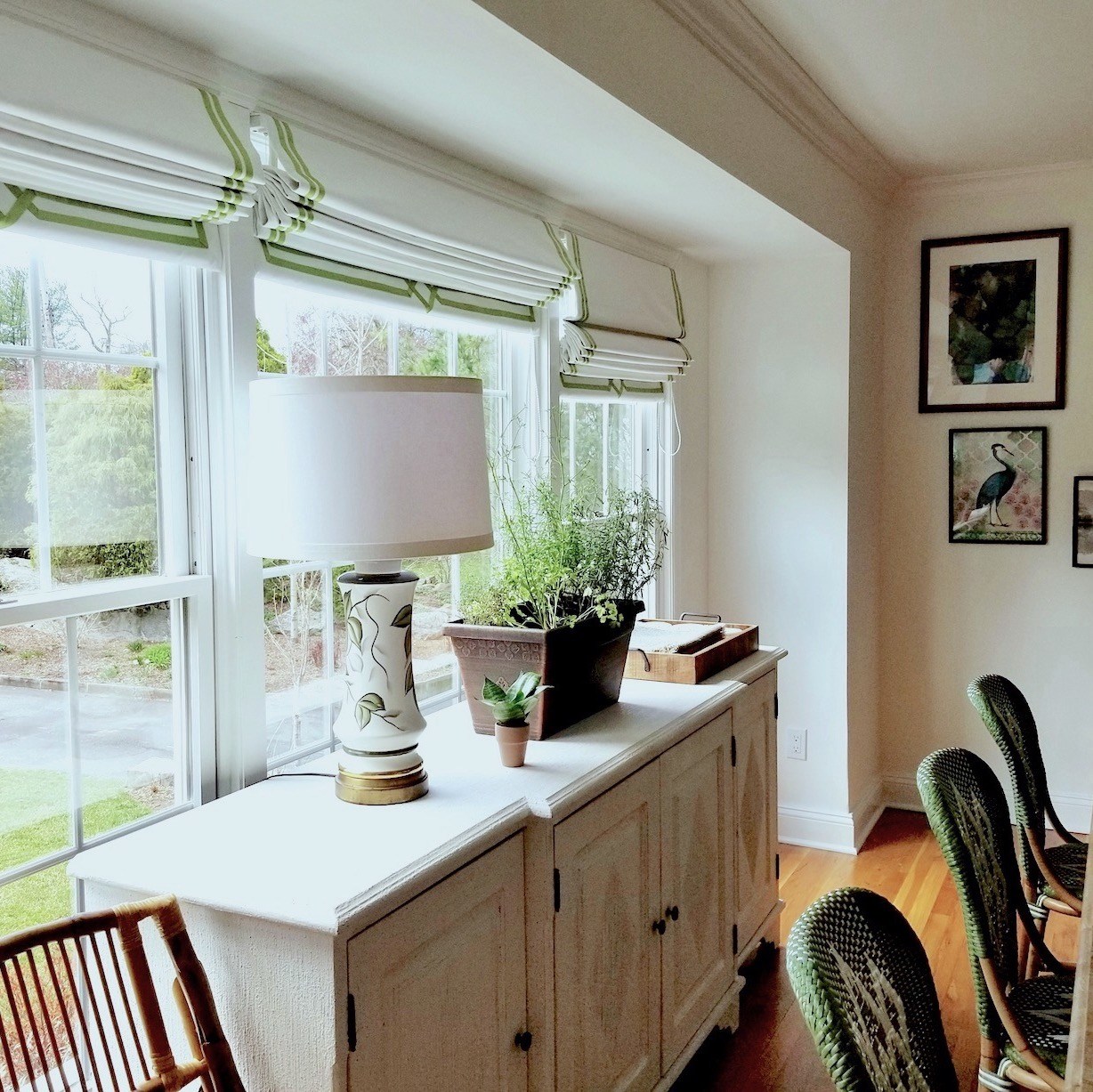
Above is a dining area and kitchen painted Benjamin Moore Simply White oc-117. This is a beautiful warm white, but it does have a whisper of a pink undertone in some lights.
12 + Reasons Why Your Wall Color Looks Nothing Like You Expected (And What To Do About It)
Let me just say it: wall colors have the heart of a sadistic chameleon. They will betray you at every turn if you’re not prepared. Below are just some of the reasons why your “perfect” wall color might go completely rogue:
1. Lighting—Natural vs. artificial, incandescent vs. LED. I beg of you, please don’t get me started on Kelvins vs. watts or CRI—Color Rendering Index. However, if you’re having trouble sleeping, please read more about the evil LEDs here.
2. Reflection—Red brick outside your window? Well, as I learned the hard way, your white paint color might now look pink.
3. Time of Day & Weather—That soft sage gray-green wall color can turn zombie gray real fast on a rainy afternoon.
4. What direction are your windows facing? As most of us know, the color of the light varies vastly depending on the direction. The most consistent direction is north-facing, but those rooms tend to be darker. ”
Below are some common rookie mistakes, but pros make these mistakes, too.
5. Painting your sample on the wall, along with fifty other samples. This is very confusing and will only lead to more frustration. I know. I’ve been there, but it was a lifetime ago.
6. Choosing a paint color from the chip without sampling it.
7. Look at the color by holding the sample up anywhere but flat on the wall with the lighting conditions or as close as you can get to the lighting conditions the color will be exposed to. If necessary, use another room and simulate the same lighting conditions.
8. But, whatever you do, do not select the color in the store, in your decorator’s shop, or anywhere where you cannot control the lighting.
9. In addition, unless your room is windowless or only to be used at night, do not look at your paint color at night as the only test of whether you like it or not. Artificial lighting will change things– guaranteed.
Now, for some little-known and especially frustrating reasons, your wall color isn’t what you expected.
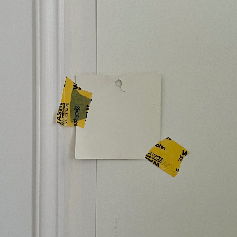
10. Mismatched Samples- Sample pots can be wildly inaccurate. Always test from the actual can of paint. I recommend using at least a quart size. Below, you can see why I rejected Cotton Balls for my bedroom. I should’ve known better because I have used this color more times than I can count, and it has never looked like this.
The large sample behind is the lemony color from the sample pot. The trim was painted a purple-tinged out-of-the-can white from Benjamin Moore, oc-151. (Pm-2)
Below is how Cotton Balls wall color looks in brighter light in my Boston bedroom. I love it!
This was last September. The color never looks warmer than this, and it’s usually cooler except at night. But it’s always soft and lovely. Cotton Balls oc-122.

11. Paint Formulations – Different formulations can change the final result even within one brand (like Benjamin Moore). That’s because they all have different bases. So, please try to sample using the formulation you plan on using. I recommend Regal Select or Aura for your wall color.
12. A dishonest painter – Yep, they might’ve “matched” the wall color using a cheaper paint. And yes, that’s a thing. Unfortunately, it’s very likely that their match will not be a perfect match. Please do not switch brands if at all possible.
Deviations can occur if the calibration is off on the paint store’s machinery.
That was the issue when part of my bedroom was painted Swiss Coffee. The paint color was deeper than all of the paint chips. The first painter used the Ben formulation when I wanted Regal Select.
Oh, Laurel, it sounds like no matter what one does, the color might not turn out as expected.
Yes, you’re right; however, never fear. There is one way to avoid many of these issues.
The Solution? Test Your Wall Colors before the walls are painted!
Yes, I know you already know to do this!
The problem is that you will be tired by this point in the job.
Like so tired you don’t care anymore.
However, you will care when it’s finished and realize your lovely cream paint looks positively yellow.
Below are more tips for getting the best results with your wall color.
- Sample on multiple walls at different heights.
- Look at your wall color in different lighting and weather conditions.
- Watch for natural highlights and shadows. Pay special attention to the corners, where the colors tend to intensify!
Do not let your painter pressure you into skipping making large separate samples and taping them flat against the wall.
In fact, he should be recommending this!
Okay, we’ve covered why your wall color might not perform as expected.
As for recommending another color, I have a solution.
This is a very common problem, Payne. Everyone struggles.
Yes, everyone. That is, everyone who’s discerning.
If you’re still struggling with your selections but don’t want to spend hundreds or thousands hiring an interior designer or “color expert” for help, I developed a two-part paint and palette guide that narrows down the selections immensely.
I did this back in 2016. It’s called The Essential Paint & Palette Collection—a two-part paint guide to help you:
- Choose the right wall color with confidence
- Understand how light, furnishings, and finishes affect color
- Avoid common paint pitfalls, thus costly repainting
Build cohesive whole-home palettes that look like you had a pro helping you.
That’s because you did! ;]
- In addition, you’ll get the best trim colors to go with each wall color.
- You’ll get a large list of Universal paint colors. You can combine these colors in any combination you wish.
- You’ll get another chapter sharing the best kitchen cabinet colors.
- Finally, there is a bonus chapter on the best interior paint colors if you plan on selling your home.
But, that’s only part I, the 144 color paint collection. We’re only warming up.
In the next volume, the Palette Collection, you’ll find these gorgeous colors in 40 whole-house color palettes, including furnishings. The furnishings are a bonus to give the colors in the palettes a real-life context, not some theoretical application that’s basically useless.
Also included with the palettes are palette families for even more versatility.
Each palette includes 12 colors. They are not necessarily wall colors, but they could be. They could also be colors of fabrics, rugs, window treatments, flooring, or some of the art and accessories.
Having this tool at your disposal is as close as I can get to standing next to you while you select your colors.
And for less money than the paint costs for the average sized living room.
Want to learn more?
***Please visit the Laurel Home Paint & Palette Collection info page to learn more about what’s included—and why so many readers say it’s the best design resource they’ve ever purchased.
If you’re curious about what people say about Laurel’s Rolodex, you can read those testimonials* here.
*All testimonials were collected from readers who purchased my guides and responded afterward via blog comments and personal emails.
If you’ve already read about the collection and would like to place an order, please click the button below to go to the order page.
There are dozens of glowing remarks by dozens of readers who’ve already purchased my guides. If you’re interested, I’ve collected an entire page of so many fantastic comments, I guarantee you’ll be gagging (from how sweet they are.) haha
Here’s one recent note to give you an idea:
Kristin said:
In the last few months since obtaining your color products I have only been using the universal colors.
It’s so simple that I feel like I’m cheating when I have just the right color for clients. They think I’m a genius. Do I have to share my secret? It’s like playing the violin Suzuki method. I too found you from your [20] whites article that I came across. So glad I did. My design work has been so much better. Maybe I’ll update My resume and go get a sales representative job at BM. I know just what account I would start with. My numbers would impress.
Thank you, Kristin.
And, Payne, I hope you’re feeling better about everything now.
You’re not alone if a wall color doesn’t look how you expected. You’re also not wrong. So many variables are involved, and most are out of your control. But you can stack the odds in your favor.
And that’s exactly why I created this blog and wrote these paint guides.
Thank you, everyone. Some of you have been reading for a decade or longer. I’m about to celebrate my 13th Blogiversary in about two weeks. I never dreamed it would become my full-time occupation, yet here we are. I’m honored that you’ve come to join me!
xo,

***Please check out the recently updated HOT SALES
There is now an Amazon link on my home page and below.
Please note that I have decided not to create a membership site. However, this website is very expensive to run. To provide this content, I rely on you, the kind readers of my blog, to use my affiliate links whenever possible for items you need and want. There is no extra charge to you. The vendor you’re purchasing from pays me a small commission.

To facilitate this, some readers have asked me to put
A link to Amazon.com is on my home page.
Please click the link before items go into your shopping cart. Some people save their purchases in their “save for later folder.” Then, if you remember, please come back and click my Amazon link, and then you’re free to place your orders. While most vendor links have a cookie that lasts a while, Amazon’s cookies only last up to 24 hours.
Thank you so much!
I very much appreciate your help and support!
Related Posts
 20 Favorite Exterior Paint Colors + Doors and Trim
 The One White Trim and Wall Color That Works Every Time
 12 Of The Hottest Kitchen Trends – Awful or Wonderful?
 My Interior Design School Portfolio from 1988-1991
 Benjamin COTY 2022 – A Color For The Sages
 Home Organization and the Best Information Ever!
 Stainless Steel Sucks – What You Should Use Instead


14 Responses
Wow—so true! Amazing how wall colours can go from fab to flat. Love how you broke it down with a bit of sass and a whole lotta truth.
Hey Laurel, your post is a revelation! I never realised how factors like lighting and surroundings could dramatically alter wall colors. Your insights are both enlightening and practical. Thank you for sharing your expertise!
It seems like such a small decision—until you’re standing in a room that suddenly looks pink when you wanted cream. – This is exactly what happend to me 🙂 … had to paint everything again and chose just a warm white. Now I love it! Thanks you Laurel!
You are right about making sure to use the same type of paint from a manufacturer. I bought a quart of BM White Dove in one type of paint (can’t remember) and I loved the color, which I used for trim. I ran out of it and went back to the same store. They were out of that type of paint so I chose a different one (both a satin type finish). Luckily I had taken the old paint can with me, which had a dot of the paint on top. When the clerk added a dot to the top of the new can, I could see right away that they were different. She tried again with the same or another type of paint and played around a bit, but we couldn’t get it right.
The clerk suggested that I just come back when they restocked the type I had used previously. I really liked what I had and even if I had not needed it for the same area, I would have done that. When I went back and got it later, all was good!
This leads me to the philosophical question–What is BM White Dove? The color in the first paint can or the second? I’ve heard that the paint chips are a suggestion. Crazy stuff!! And when we fancy ourselves as using a color, esp. a neutral, that our favorite designer used or was suggested, do we really have the same color? (On top of–it will look different in different rooms.)
The best advice you ever gave that I mutter in my head whenever I am choosing a neutral and fussing over what it will look like on every wall–paint is a crapshoot!
Hi Tanya,
A lot of the changes are due to EPA regulations that I don’t understand. However, I have heard that White Dove has also changed its color, however, I’m not sure in what way. Even in my bedroom the trim is a much brighter Cotton Balls than the wall color. They look fine together. In fact I like that the trim is a shade lighter to help it stand out better. So, indeed, it’s a bit of a crapshoot and the best one can do is test the color before it goes up.
Hi Laurel,
Most of my previous home was painted QM’s. I just loved it. When I moved into my current home my contractor was pressuring me for my paint colors. I had no idea what to tell him. I didn’t have a rug, drapes, or any furniture to pull a color from. So I took a chance & told him QM’s. It turned out wonderful. I sure got lucky.
Normally you would choose your paint color last after everything else has been selected. But I haven’t had any trouble decorating with this color.
Hi Mary,
My note was fictitious. It’s true that Quiet Moments is unlikely to ever look lavender, no matter the situation, but I’ve seen some wildly unexpected results in my years. I have seen Quiet Moments look more gray and deeper in a darker room, but it still retained its green tone.
I have two windowless bathrooms, both painted BM Chantilly Lace (OC-65). In one it reads as a very soft, warm white. In the other it is a much brighter, crisper white. I used the high end Aura base for both. I used semi-gloss on the woodwork, which matches well in the “warm” bathroom, and looks grey in the bright room. I can only attribute the variations to the lighting. Unfortunately, all those technical aspects of light choice caused my head to explode. We are having trouble fully squishing my brains back into my skull, so further decorating is entirely on hold.
Hi Lina,
Yeah, Chantilly Lace is a very popular color and I’m positive it’s because of the name. I mean do you think it would sell as well if the name was “Refrigerator White?” lol To be clear, for CL aficionados; it’s not a bad color. It’s in my Laurel Home Essential Paint and Palette Collection.
However, it can look quite stark in some lights. Still, it has virtually no undertones that might come creeping out in certain lighting conditions. However, if one is using warm LEDs in a room like a windowless kitchen or bathroom, it will look very nice and not too stark. It’s a similar color to Benjamin Moore Super White
I love Quiet Moments -even the name! I painted my office this color, and now am turning it into a granddaughters room! So beautiful!
I had a paint color go awry in the same way, and I realized something I haven’t seen mentioned yet- in our new house, there’s a UV coating on our windows that shows up as a bright purply-pink when reflected into the house. It turns what is a soft beige/orange paint into a fleshy band-aid color! The paint was chosen by the builder. When we go to refresh the walls, I’m going to go for a neutral that leans a teensy bit green. It’s amazing how many different situations can mess w color in your home.
Hi Kiyoko,
Oh, I knew there would be some things I either missed or haven’t yet experienced. That’s freaky! The Benjamin Moore Historical Colors have a lot of terrific neutrals with green undertones. Another color that’s pale, but not white is French Canvas. It’s not in my collection, but it does have some green undertones. I once did a paint consultation, and the woman was bemoaning the green.
It’s so difficult because the formulas keep changing. So, if one is imagining their color looks different than they remembered, it might also be because it IS different than they remembered!
I hope Aaron loves Asheville. It is a neat place and soooo beautiful! Western NC is my happy place.
Thank you, Beverly. I hope so, too.