A Formula for Eclectic Interiors To Avoid Matchy Furniture

In response to Sunday’s post, a comment from Terry has inspired this blog post about a simple formula for creating collected, eclectic interiors.

Here’s what Terry said:


OK, Laurel, inquiring minds (or at least this one dumb Blonde) are dying to know –


– just how many pieces of matching furniture are considered a NO-NO? In my master bedroom, there’s a king bed with a rattan headboard, small dresser w/ mirror, highboy, linen press (to hide the TV), chaise, end table, side table, and three lamps.

The dresser/mirror, highboy & linen press are all the same wood.


***


Here is my response.

Hi Terry,

I’m a dumb brunette. No, really. I do idiotic things all of the time. Well, we all do. We’re human. I realize that this topic of matched sets of furniture is a sticky wicket. And, I also don’t want to make folks feel like they’re clueless or made a terrible decorating faux pas.


However, in the purest idea of putting together collected eclectic interiors, ideally, no pieces of furniture should be part of a matched set.


The word is coordinate. It should all, pretty much,  look like it goes in the same room. I say “pretty much” because sometimes having one thing that looks like it doesn’t belong is the thing that makes the decor soar to another level. However, that is not easy to pull off.

The best I can tell you is to look at the 1000s of photos I’ve posted in nearly 800 blog posts or mood boards in my paint and palette collection. For sale here.

This comes easily to me. Other things, no.


End of comment.


Okay, after nine years, four months, and four days, I can’t believe that I’ve never written this post. Oh, I’ve certainly talked about the need to avoid matched sets of furniture. Some call it “matchy-matchy.”

However, I’ve never spelled out how to create eclectic interiors. At least, I don’t think so.


Ummm, Laurel. You wrote “a SIMPLE formula for eclectic interiors.”


Yes, I know that. :]

Is it really simple? I don’t know. I haven’t written the post yet. haha

However, as I stated in my response to Terry, it’s pretty easy for me.

At this point.

I mean, after 33 years in this business, if it wasn’t, that would be pretty sad.

Okay, I realize that it’s not simple. However, I will attempt to break it all down so that hopefully, it will begin to make sense.

The first thing I want you to do is read this important post – The 12-Step Decorating Program That Works Every Time.


This is the backbone of creating an eclectic interior or a collected look that has evolved over time.


Of course, you could furnish your rooms with 18th-century antiques or good reproductions and Persian rugs. There’s nothing wrong with that. And, particularly if you live in an antique home of the 18th or 19th century. Or, at least, a recently-built home in that style.

Classical architecture like that is certainly alive and well in the UK, as I saw on my trip to England in 2017.


However, if you want something more individual, an eclectic interior that looks evolved, there are two basic ways to go about achieving this.


1. Take the time to study what it is that you really love.
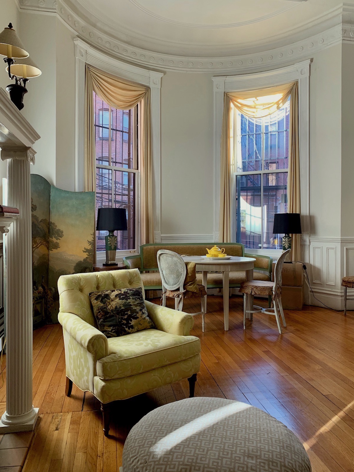
 

Dec 29, 2-15pm living room sunny day My Boston living room last January.


For example, I love everything neo-classical.

That means Georgian, Louis XVI, and Gustavian styles. These are all periods with overlapping styles in England, France, and Sweden from the Late 18th and early 19th centuries.
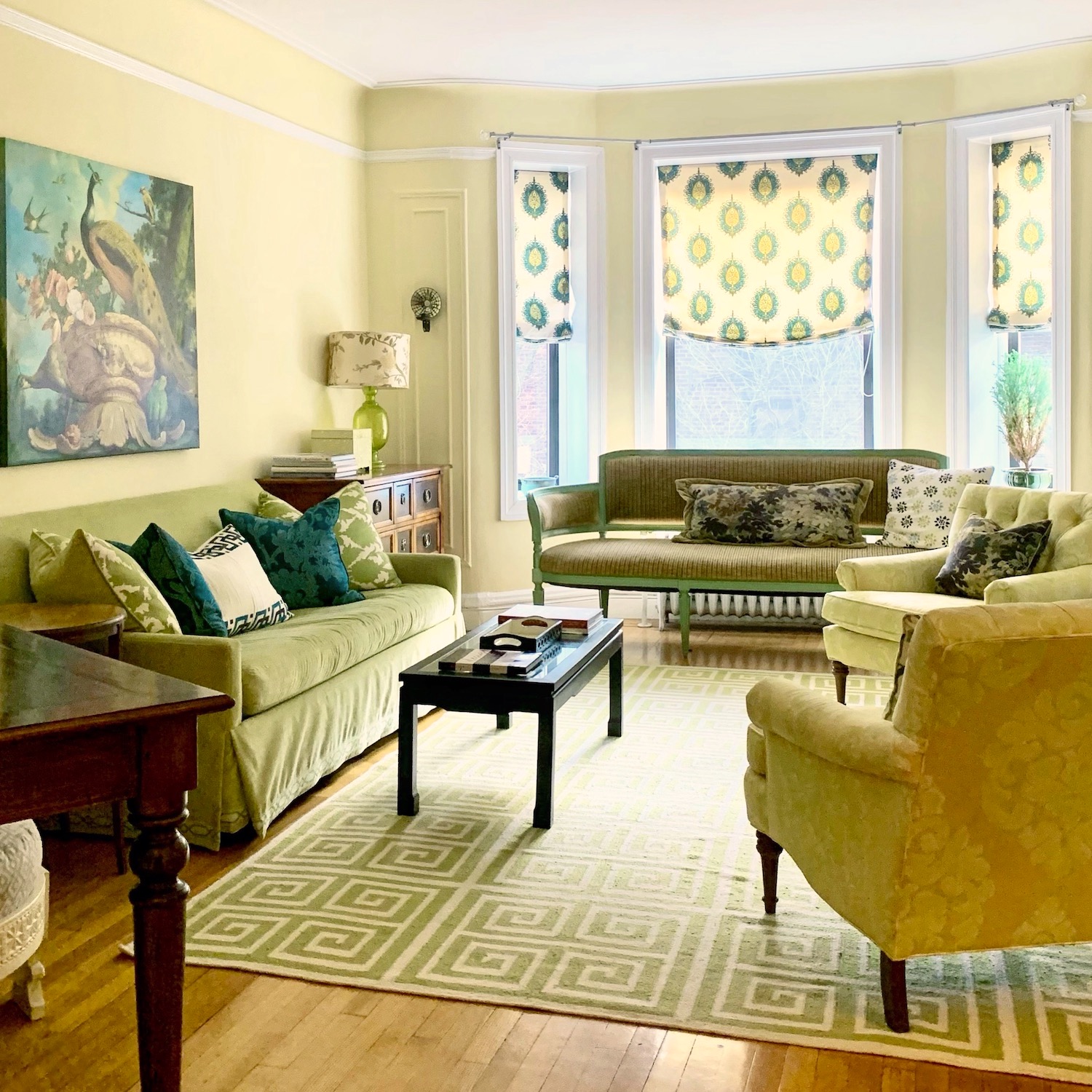
 

31 Pondfield Rd Bronxville, NY apartment for sale - living room - Benjamin Moore America's Heartland wall color

My former living room in Bronxville, NY

In fact, ALL of my furniture is based on these styles. Therefore it always goes together and always looks good wherever it goes. However, it looks the best in my current home because I possess the Paulina Porizkova of living rooms.

I could put furniture from Bob’s Discount Furniture in here, and it would look good. lol

Well, better.


But, Laurel.


But what?

Well, not everyone can afford 5k for one sofa. And, especially when there are young children, pets, slobby relatives, you know…


I certainly do know.


I went for years back in the 90s when we couldn’t afford so much as a table lamp. I’m not exaggerating.


After we moved out of Manhattan with our almost one-year-old (yes, him) :] in 1991 to tony Northern Westchester. We soon realized that even though we had purchased about the cheapest home available, we were exceedingly house poor due to high taxes and a hefty winter heating bill.

And, even when I got a decorating job in 1992, almost my entire income went to Cale’s daycare three days a week.

Oh my. Sorry. I didn’t even get to number 2.


This one I did write a post about.


2. You steal a professional designer’s design.


Fine, I know that the word “steal” conjures up thoughts of deceit, if not downright criminality.

Okay, but here’s the thing. The designer is never going to know unless you have them over for dinner. lol And, 99% of the time, they are going to be flattered, not insulted. That goes triple+ if what you are “stealing” is furniture the designer designed, and they are earning a hefty commission for every $10,000 sofa that’s sold. Okay?


Besides, your room is never going to look EXACTLY the same.


But, this is why I share the work of designers. It’s so we can learn from them. And, here are some of my favorites.

Okay, this is not my entire list. No way. In fact, some of my favorite designers were left off. It’s not that I don’t think they’re worthwhile; they definitely are. However, I’m trying to keep this post from turning into a book!
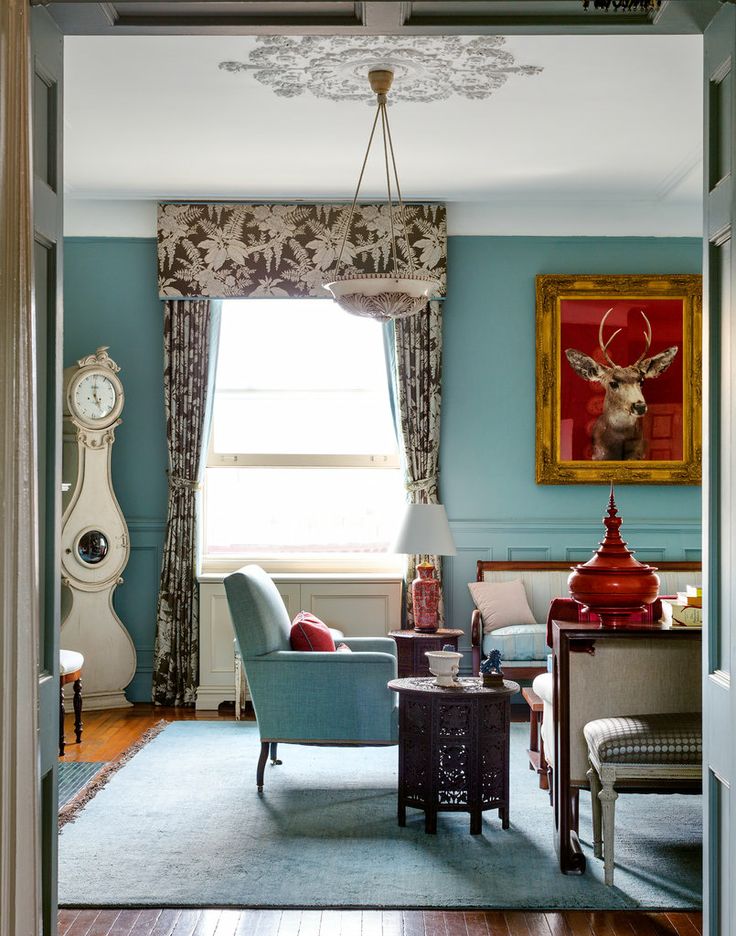
 

Sheila Bridges Harlem living room

Sheila Bridges

Sheila designed the fantastic Harlem Toile, discussed here.

I’ve adored her innovative yet classic interiors for decades!
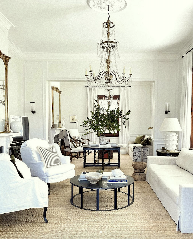
 

@stevecordony - eclectic interiors - new trad living room Rosedale Farm gorgeous crystal chandeliers - white slipcovers - white-on-white

via @stevecordony’s fantastic Rosedale Farm on Instagram

Oh my! The chandeliers are new! LOVE them!

Steve Cordony’s gigagorgoues double parlor. The mouldings look original. Right?

However, they’re not. Here is the living room during renovations.

And, this post is even better.
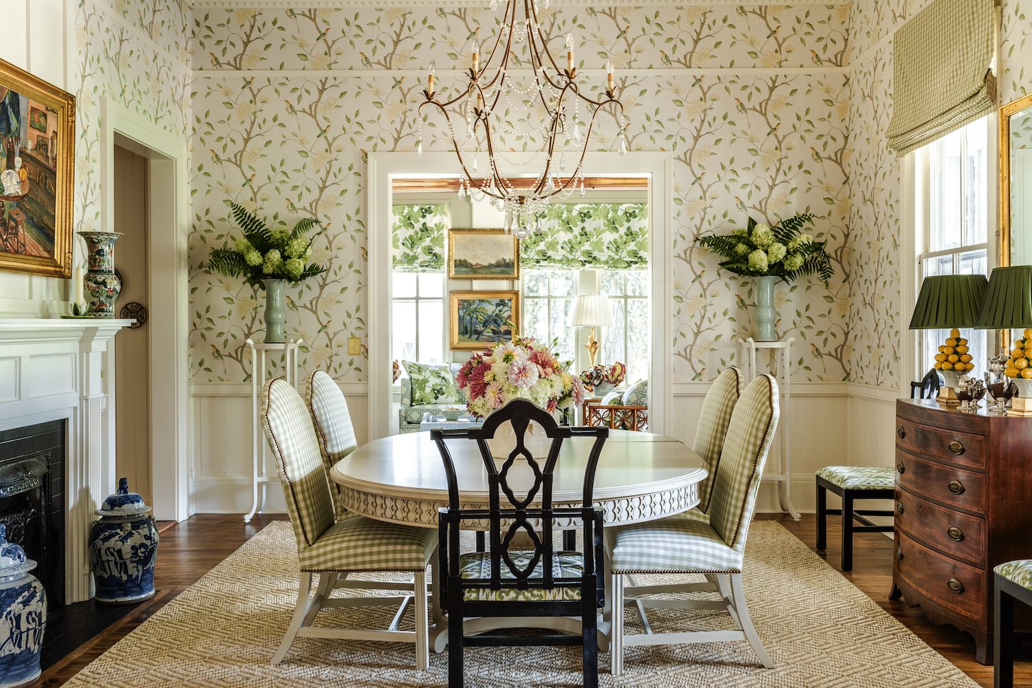
 

@southernhomemag @jamestfarmer - eclectic dining room - Zoffany wallpaper - checked fabric - Brunschwig and Fils

James T. Farmer

I adore James’ work. I love how deftly he combines patterns and colors for a harmonious flow.  Note how the end chairs mimic the shape of the side chairs. Please find more of James’ work here.
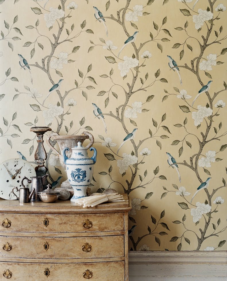
 

Interiors Trend - Zoffany Eleonora

That is Zoffany’s Eleonora wallpaper. You can purchase it here.


Important info. This is a Euro-sized roll that covers 56 sq feet.


An American roll covers 35 sq feet. But, with repeats, it is more like 45 and 27 square feet respectively. Always consult your professional before ordering wallpaper online! It is NOT returnable!


In the next room is Peter Dunham’s Fig Leaf pattern available at Lynn Chalk, as seen above.
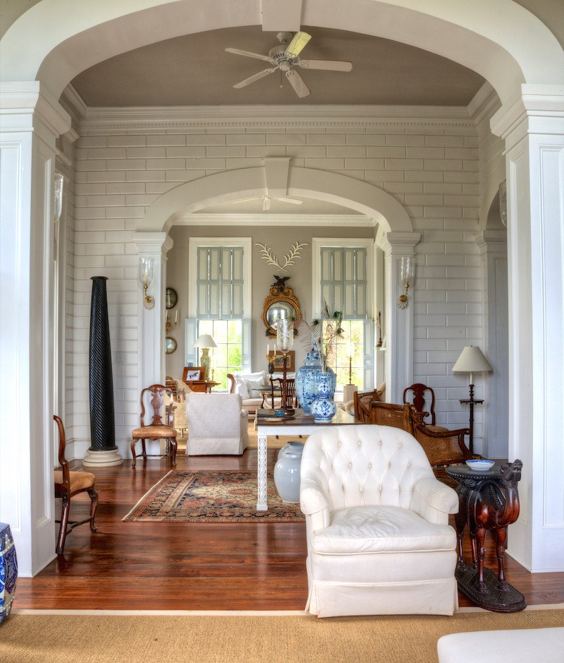


furlow gatewood rod collins - white ceiling fan

Furlow Gatewood


Mr. Gatewood is turning 100 next month!!!


Shazam! Although not a trained interior designer, he’s one who was just born having “it.” The “it” is the thing no one can teach you. But, we can certainly imitate it. Or, at least attempt to. I highly recommend his book.

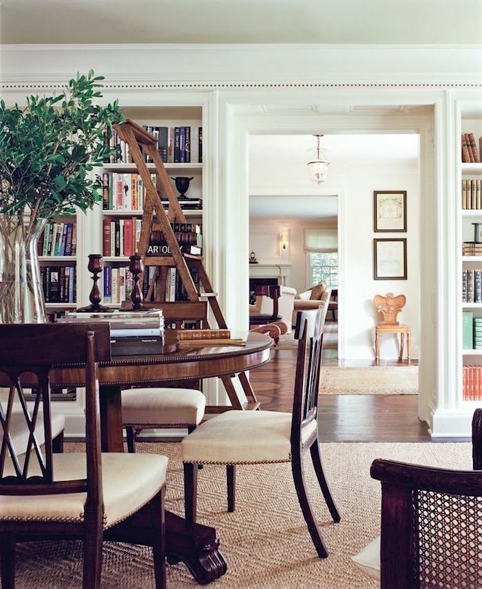
 

One Man's Folly, The Exceptional Houses of Furlow Gatewood

You can purchase it here.


victoria hagan classic cozy library

Victoria Hagan

I’ve admired Victoria Hagan’s work since the late 1980s. Her rooms are elegant, classical, perfectly proportioned with simple color schemes. Please find more of her work here.
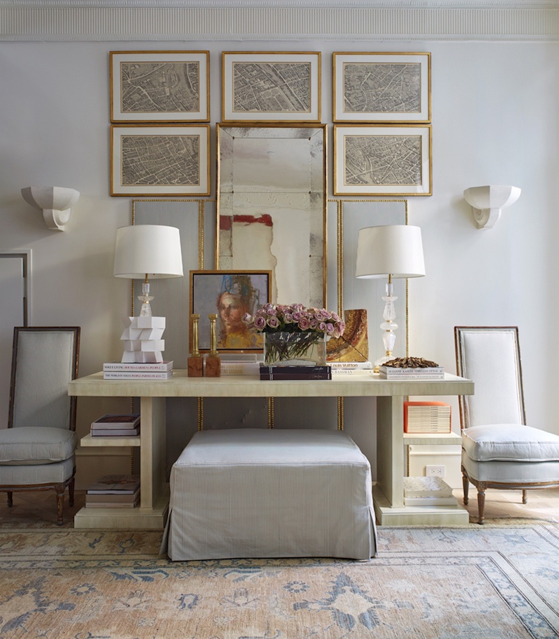
 

KipsBay2016_image KD Hamptons - SuzanneKasler_photo - Phillip Ennis -beautiful vignette with soft colors

Suzanne Kasler

I’ve featured Suzanne’s work on this blog dozens of times. I’ve never seen a room of hers I didn’t love. She, too, features mostly monochromatic color schemes. But, not all are pale and soft. You can see many examples here.
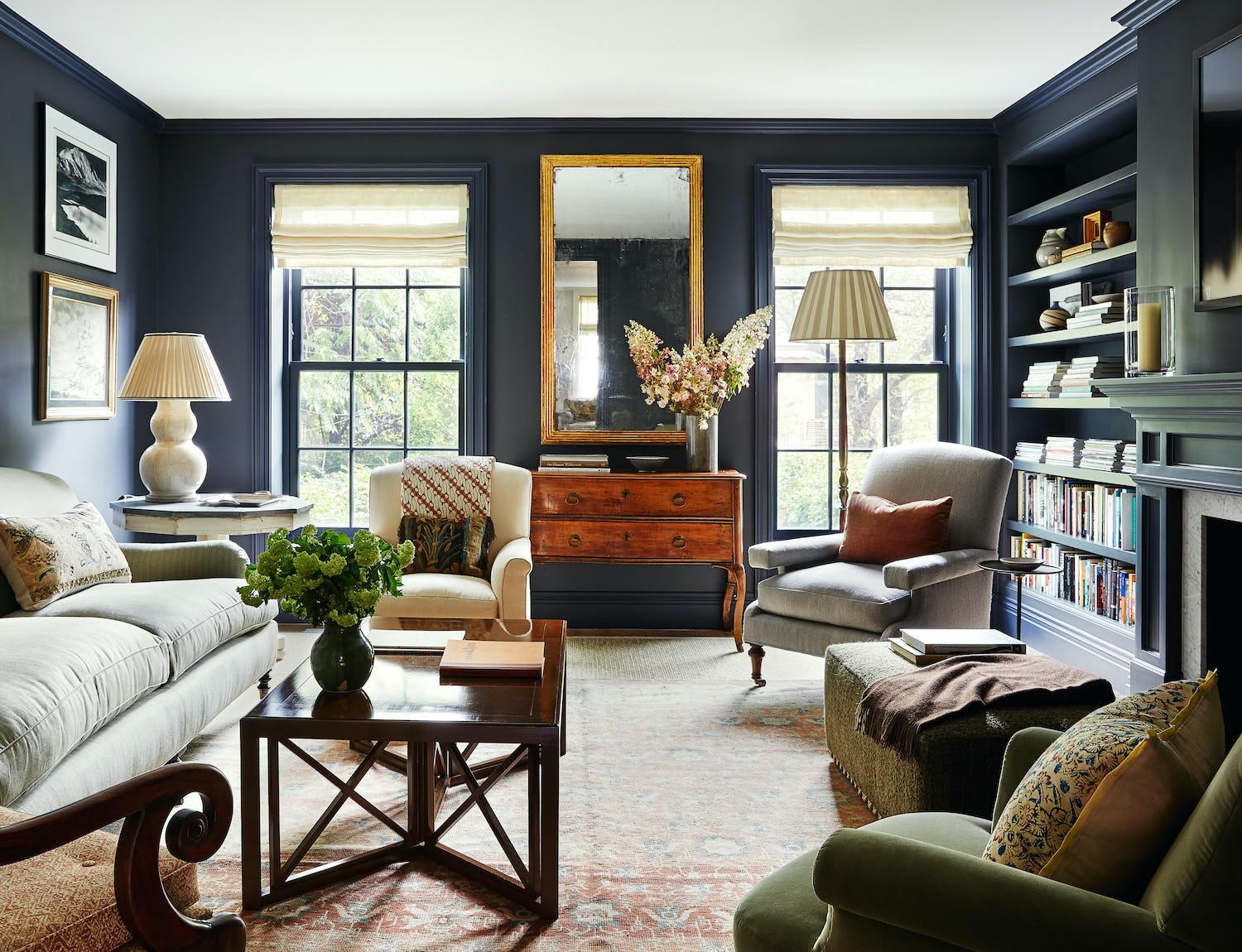
 

Please also check out Suzanne’s fantastic and affordable collection of home furnishings at Ballard Designs!


Cobble Hill Brownstone - McGrath II - mother-daughter interior design teams

McGrath II

This is a mother-daughter team whose work I adore. Everything they do is classic, yet very fresh; quite liveable, I think. Please see more here.


Her rooms are unfussy, immensely stylish, and clearly define the principles of beautifully designed.
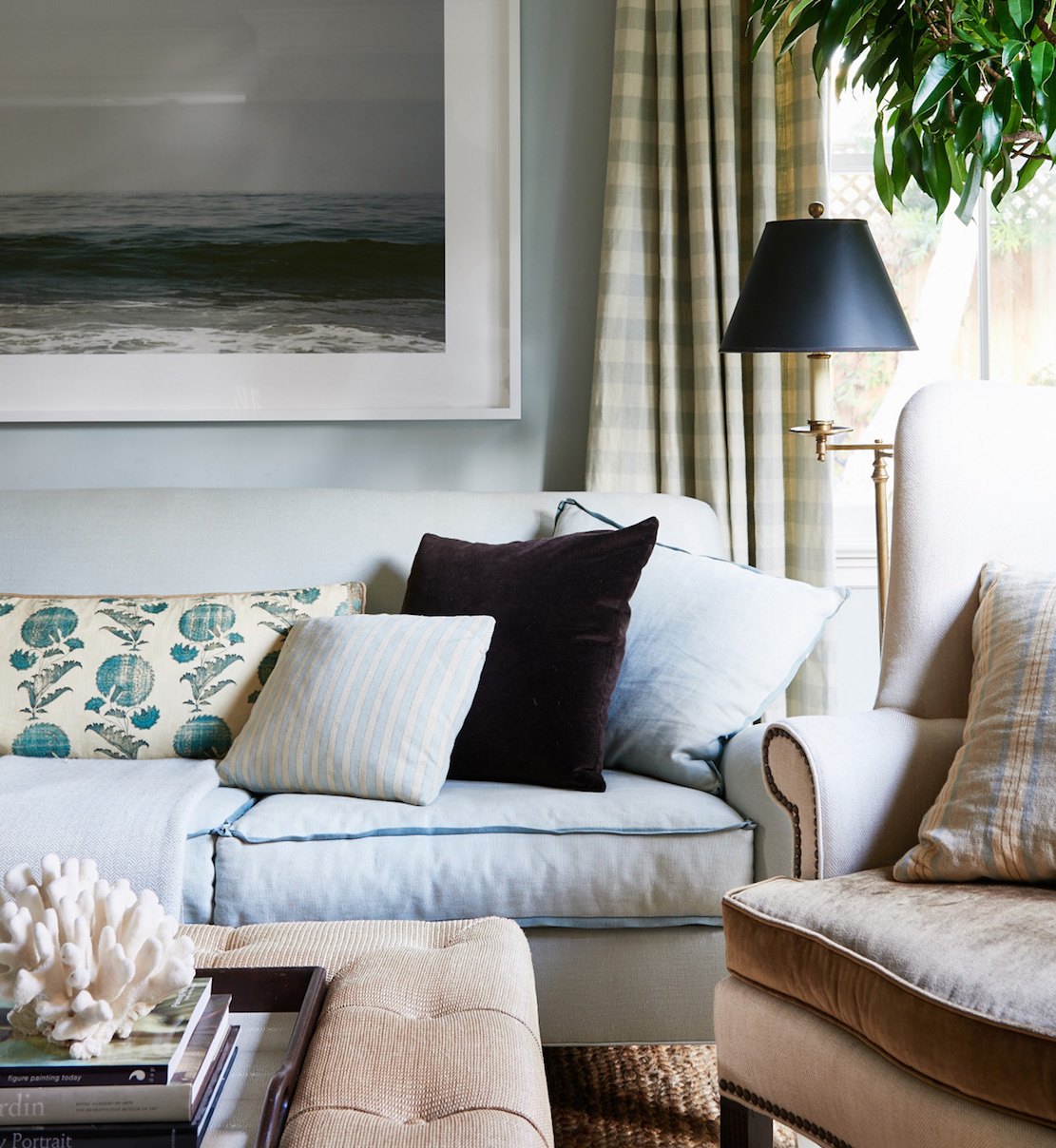
 

analogous color schemes - Mark_D_Sikes_Pacific_Palisades

Mark D. Sikes

Well, not much needs to be said because I’ve featured Mark on this blog dozens of times. Please see Sunday’s post for more on Mark.
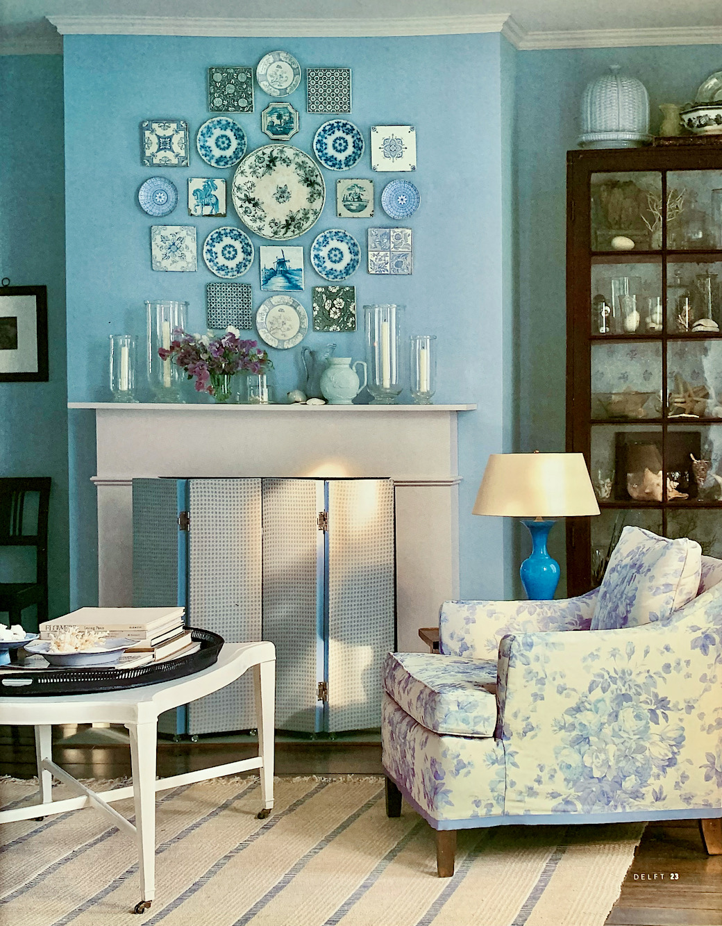
 

Martha Stewart Delft blue on blue eclectic interiors Martha Stewart.


Yes, Martha.


I still look at her books that were written in the 90s for reference and inspiration. There isn’t one room that 25 years later looks in any way “dated.”


The image above is from her book, Decorating With Color.


It was published in 2002, but these images go back to the mid-90s. I ADORE that coffee table. Those plates are reminding me of this post about decorating with plates on the wall.

I believe that Martha Stewart is one of the pioneers of the New Trad style. The irony is that “new,” in this case, means far closer to authentic 18th-century traditional, but with a classically modern twist.


Okay, now that we’ve seen all of these beautiful examples of new-trad eclectic interiors, let’s go over the main points so that we can create these eclectic interiors in our homes.


  • First comes the architecture of the room. Mouldings, doorways, windows, and fireplaces. Super important!
  • Use simple color palettes. If you need help with that, I highly recommend the Laurel Home Paint & Palette Collection. Please see the special deal below.
  • All rooms have some black (or else almost black) and white. Rooms that fall flat usually don’t have any black in them.
  • Most rooms have some gold as an accent.


The furniture and furnishings.


First of all, please notice that there is never a LOT of brown furniture in these eclectic interiors. Yes, there is brown, but not scads of it. And, in the case of these designers, most of the stained brown furniture are antiques.

In dining rooms, the chairs might be brown, or there might be a mix of two different chairs. But, commonly, there are painted chairs with a stained tables.
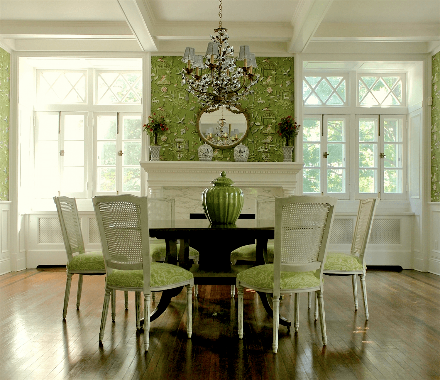
 

Laurel Bern Interiors-bronxville-dining-room

Like this dining room we did several years ago.


So, if the furniture isn’t stained brown, what is it?

A lot of the furniture in these eclectic interiors is painted. However, designers often use other materials besides wood on some of the pieces, such as wicker, rattan, caning, metal, stone, bone, glass, and mirror.


In fact, I recommend having as many of these elements as possible.


One of my favorite ways to break up the wood is by introducing either a metal-based coffee table or the side tables. If the room was more casual, they were usually black. But, sometimes, we did gold.

  • Metal, and particularly gold or brass, is wonderful for accents and picture frames.
  • Mirrors are a great way to bring in light and a refreshing texture.


Floor Coverings


Natural fibers reign supreme. I love them too!


As for colors, sources,  space planning, proportions, details…


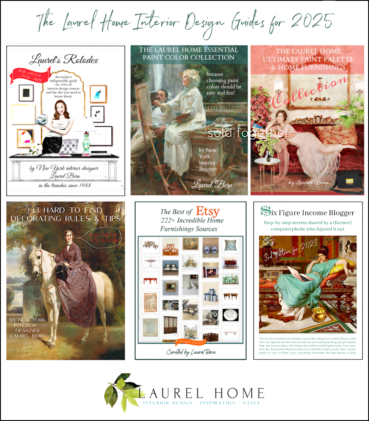
Frankly, there’s a ton of information in my rocking interior design guides. I don’t push them hard because I think that’s obnoxious. But, there’s so much in all of them that it’s really like an interior design course one can have for a lot less money.

A LOT less.

Plus, there’s so much essential information that they don’t teach you in school.


I’m not going to go on in a big way here because:


A. Some of you aren’t interested.

B. Many of you already have the guides.

But, most of you don’t. So, to make it easier, I’m having a mid-summer FLASH SALE!!! 20% off of ALL of my beautiful interior design guides
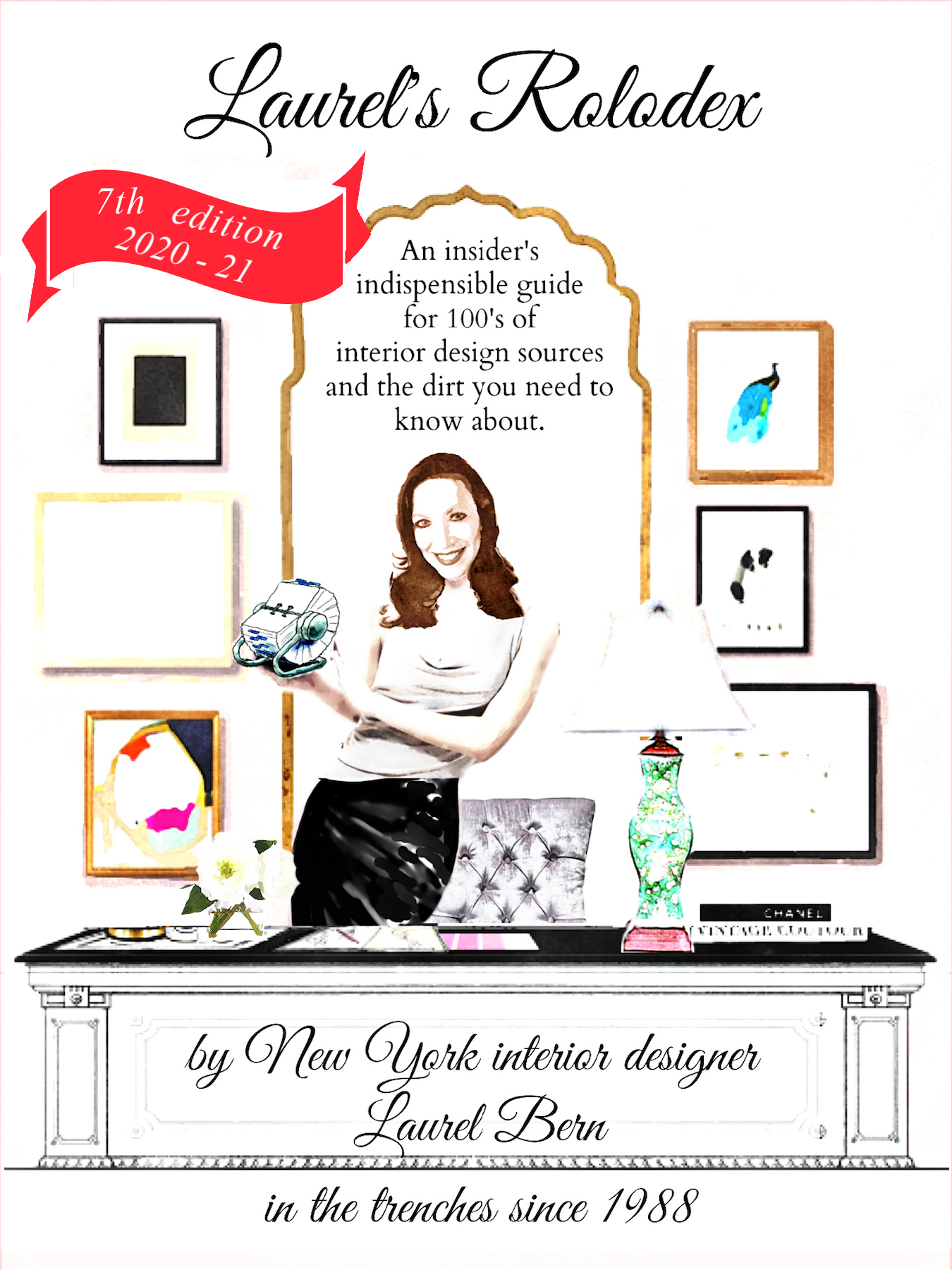
 

7th edition Laurel's Rolodex

  • Laurel’s Rolodex A shopping guide with 100s of vendors. Designers can learn where to get products at the lowest possible price. But, there’s a lot of great info for non-designers, as well.

paint-collection-paint-palette-collection-bundle


six figure income blogger cover

  • Six-Figure Income Blogger. This is actually my favorite guide. It explains everything I’ve done to create a profitable website. And, this applies to everyone who wants to get the most out of their website and get more business. If you aren’t interested in getting more business, then I wouldn’t bother to get the guide.

 

333 decorating rules and tips you need to know


best of etsy 150 sources


I hope you found this post about eclectic interiors helpful!


If you purchase a product and have any issues, please email me at admin at laurel bern interiors dot com. I’ll get back to you as soon as possible.

xo,


PS: Please check out the newly updated HOT SALES.


31 Responses

  1. I started with vintage family heirlooms and got my whole decor to revolve around them. I supplemented the heirlooms with affordable antiques and thrift store items and the occasional estate sale find.

  2. How great that you suggest making sure your furniture all looks like it should go in the same room. I am moving into a new home this summer. I will find a great sectional couch company locally.

  3. I can vouch for Laurel’s blogger guide. It’s written in Laurel’s funny, irreverent style, (of course), and has lots of pictures. It’s packed with enthusiastically-delivered information. And she finishes with a useful checklist. It’s everything you need to start a money-making blog just like hers! It’s well organized and easy to read. And no, Laurel is not paying me for this fabulous endorsement, although she should because she’s makin’ the big bucks. Lol. Kidding! Thanks for all your hard work, Laurel!

  4. Something that you mentioned once in terms of mixing styles that has stuck with me is the 80/20 rule. So if you’re going to have a mostly neo-classical home but also incorporate modern or contemporary then one should keep it to about 80% neo-classical with 20% of the other. At least I am pretty sure it was you who mentioned this. 🙂

  5. Hi Laurel,
    First of all, thank you for the wealth of free and valuable information you provide. It has helped me with many decisions and I dare say, prevented me from making some expensive design mistakes. I have one (probably dumb dyed blonde) question that you may or may not have answered elsewhere, but I can’t find any reference to it … I am thinking about purchasing your Rolodex but I am wondering how many of the resources would be available to me – a non-trade professional? In California (where I am currently) I can easily get a resale permit which would allow me to purchase from “trade only” businesses. I am wondering if that same model applies in the rest of the country, especially in NY, where so much of the design trade is located? What will those dealers require in order to meet the “to the trade” standard? Thank you so much for your time.

  6. I’ve been reading your blog for a few years now and just wanted to say thank you for all of your advice and instruction! I’ve learned so much, and you’ve really helped me have a better understanding of WHY certain looks are appealing and what elements are important (architectural interest, sofas- NOT couches lol-, and having a plan have been huge for me!).

    Thanks to you we are in the process of building a little partial window wall in our living room to give ourselves an entry rather than the front door opens to the living room.

    What I appreciate is that even though my “style” is different from what you prefer, your advice goes beyond one single style and can be applied to any style.

    Seriously, you have been so so so helpful! Just wanted to say thanks 🙂

  7. Hi Laurel, First I want to say thank you! for all your wonderful posts that are so inspiring and helpful! You are a blessing! I have a question about where to find furniture and decor for the non design professional like me. I know that designers have access to so much more and was wondering what your thoughts are on this, if I should hire a professional to get access to their products or is your Rolodex all I need? Thank you!

  8. laurel, Paulina comment was very funny and i was thinking that anything would look great in your LR. I ordered some samples of the Zoff. wallpaper. but, Laurel, while I adore you and most of the rooms…to me Sheila’s room is for the criminally insane. xoxoc

  9. Love this post. Great interior design inspirations and straightforward tips for people like me who admire eclectic but can’t figure out how to curate it.

  10. Laurel, this post was the bomb! I have lots of older “browns” and your suggested use of painted, glass, mirror etc. convinced me to either skirt the legs, paint or slipcover. I also am obcessed with the Zoffany wallpaper in Farmer’s design. So glad you recreated this post. It is so refreshing. Thank you.

  11. Laurel, I have been loving your blog since I found it several months ago. I’ve been down many a rabbit hole, going from one link to another. You’ve shared so much expertise and the pictures are wonderful. Today’s post was great – so many “little” tips than can actually make a huge difference in the final result.
    I have been wanting your guides, but have hesitated because I don’t have a B. Moore dealer nearby. But the Flash Sale was a big temptation, so I looked for a paint color conversion product online and found one I think is great. I am sharing my find because I think some of your readers will like it, too:
    matchmypaintcolor.com
    Type in the color you want to match with another paint brand and the best matches appear with the actual color. Paint brands are PPG, Behr, Sherwin Wms, B.Moore, Valspar and Farrow and Ball.
    And, yes, I’ve just downloaded the guides, and can’t wait to read/use them.

  12. One of my favorite posts. I have to say that I was already following that clear list at the end to a great degree. I am going to refer to it again and again as I set up my retirement home. My furniture is already there except for the brown pieces I have bought used with the idea of painting. Kudos to you for boiling this down succinctly. I needed this pick me up today.

  13. Oh my! This post is a “keeper”!
    Thank you for brightening my days with your light-hearted, well- researched, inspirational insights into the world of design. You are a treasure!

  14. Laurel, This post just might be my all-time fav. My head is spinning with all the ideas and info! I got so inspired that I finally pulled the trigger on various guides that I’ve been wanting for years. (Thanks for the flash sale!) I’m now on a search for someone to paint my dining room chairs. I suspected they needed to be painted, but now I feel confident enough to get it done.

  15. Aha! I’ve asked my husband before to cut inches off the legs of tables, and he’s always refused! “You can’t do that! It won’t look right!” I believed him! Now I know better. If Laurel can do it, so can I. You made my day!

  16. Laurel – You are an inspiration to all of us people who read your blog.
    Your humor makes the medicine go down when we realize what we thought was great just isn’t working. Your free advice opens our eyes to be more “educated”. I truly appreciate you and your high talent, please continue and stay well, and full of humor and joy.

  17. Thank you Laurel! This is a gorgeous post. Super informative, and how gorgeous is Victoria Haagan’s mix of bone inlay table you have shown us previously with Sutton’s velvet sofa? That pairing always made my heart to skip a bit faster but I never knew what should I put next to it in the room, such as what fabrics would look good with that blue velvet, or what pillows. What shapes the arms on the chairs should be, or what kind of coffee tables, what kind of architecture, what wall color… And boom – this rug of Victoria’s did look stunning with the bone inlay table and Sutton sofa. How gorgeous! It’s so educational to deconstruct designers’ work. I would never have been able to do so myself without your help. Seriously! I love when you show us the way, and it only comes from experience. I’d be very happy if this post would never end. It would be even more fascinating to read than a Harry Potter book. I love the Steve Cordony mix, the beautiful proportions and classic, yet slick and modern look. I wish I could do a mix of Victoria furnishings and Steve and Mark Sikes’ lol. Your own room with a modern style sofa and those chair arms and coffee table look amazing next to each other. Thank you so much! I truly enjoyed reading your post.

  18. We’ve recently purchased a modest 1960s brick ranch home for our retirement years and plan some minor remodeling. I’ve been reading and studying your blog to help me decide what to keep and what to donate to downsize and get the eclectic look you do so well. Thank you for this especially timely post!

  19. Thank you for including Martha. She doesn’t get the kudos she deserves. So many younger people have no idea what a giant she is in the industry and how she literally changed the mindset of American women about the benefits of making the most of your home, making it a home. Her magazine was spectacular and the articles were beautifully written and so informative. Martha today is like an icon that has always been with us — I know you feel me on this Ms. Bern, Martha Stewart is a genius in all ways. Anyway thanks and the whole article was great and I love your taste. Cheers.

  20. What a wonderfully inspiring post Laurel. Thank you. What is the style of your small round dining table in the very first photo taken in your gorgeous Boston home? The one with the “reeding” or whatever it’s called around the edge. I adore that style and wish I knew exactly what it was so I could look for it. I need to know !

    1. Hi Maggie,

      Oh, that’s funny because the table is actually two demilune tables that had flanked my big white cabinet in the old apartment. You can see one in my portfolio. The lamps with the green base sat on them and there were mirrors behind them. The tables were from Wisteria but were discontinued a few years ago. Since I used them on occasion as an extension for my desk, I had to have the legs chopped down about an inch or two.

  21. This is a terrific post. Dare I say,one of your most informative and valuable. I’m really reaching here because all of your posts are informative and valuable, but to try to address eclecticism to a lay person is difficult, and you’ve made it less so. Thank you, Laurel.

    1. Thanks so much, Lisa. After I lost the part that was the most difficult to write,(due to a technical glitch Tuesday evening) I kind of wanted to pull my hair out. Instead, I just said to myself, “oh well, tomorrow is another day and it will be better to go back when I’m fresh-er.”

  22. Hi Laurel,
    When I was much younger I thought you had to buy the set when you were buying furniture. I don’t know why I thought that. Maybe it was because that’s how the store displayed it. The idea of only buying 1 piece never occurred to me.
    Now that I’m older & wiser I know better. It makes decorating more fun now that I don’t have to worry about things matching.
    Thank you for all of your advice.

    1. It’s not your fault, Mary. It’s pretty clear. The store and the manufacturers have kids who need braces and then college. lol Therefore, they want to make it as easy for us and lucrative for them to make sales.

  23. When I click on the links in this post I get dates listed from 2018 and 2019. Are these prices and offers for August 2021 or not?

    Thank you.

    1. Hi Martha,

      This post was published on August 4, 2021 and yes, this offer is good through August 8th 2021. However, yes, I do link to previous relevant posts, some might go back to 2012. This is done to provide further information to the reader, if they are interested.

      Regarding the dates that you see, I’m assuming those are in the URL of the posts?

      If I was starting this site with what I know now, I would not have had the date in the URL. We looked into changing it, a couple of years ago, but it meant redirecting nearly 700 posts to URLs that didn’t contain the date. It was not without risk and the possible google penalty with doing such a move wasn’t worth it. Hope that answers your question.

  24. I, as THE “Terry” am thrilled to provide the “fodder” for this post (or ANY post)! YOU are an informational GEM and await with baited breath for each and every blog post. Thank U kindly for your expertise – as I – just like my home continues to be a WORK in PROGRESS 🙂 Blessings 2 U

Leave a Reply

Your email address will not be published. Required fields are marked *

This site uses Akismet to reduce spam. Learn how your comment data is processed.

Welcome To Laurel Home!

laurel-aarons-18th-e1456449963926

Hi, I’m Laurel, and Laurel Home is the website and blog for Laurel Bern Interiors.
I’ve been creating new-traditional interiors since 1988. The blog is where I share all.

New Edition, November 2023! Get The Indispensable Guide For 100s of Home Furnishings And Interior Design Sources That Everyone Is Raving About

laurels-rolodex-final-book-cover-master 10th edition 23-24

laurel home archives

Categories:

Please click the image below for more info about my rockin’ Interior Design Guides for 2024!

Laurel Home Interior Design Guides 2024
Amazon ad

please click below to check out my favorite decorating & design books

Laurel Bern's Favorite Interior Design and Decorating Books
Subscribe To The Laurel Home Blog And You Will Receive A FREE Guide Where I Share How To Get Your Paint Colors Right, The First Time.