

Hi Everyone,
This post was originally published in 2019 as a result of a lovely note from MJM. This is a very popular post, but old posts require updating.
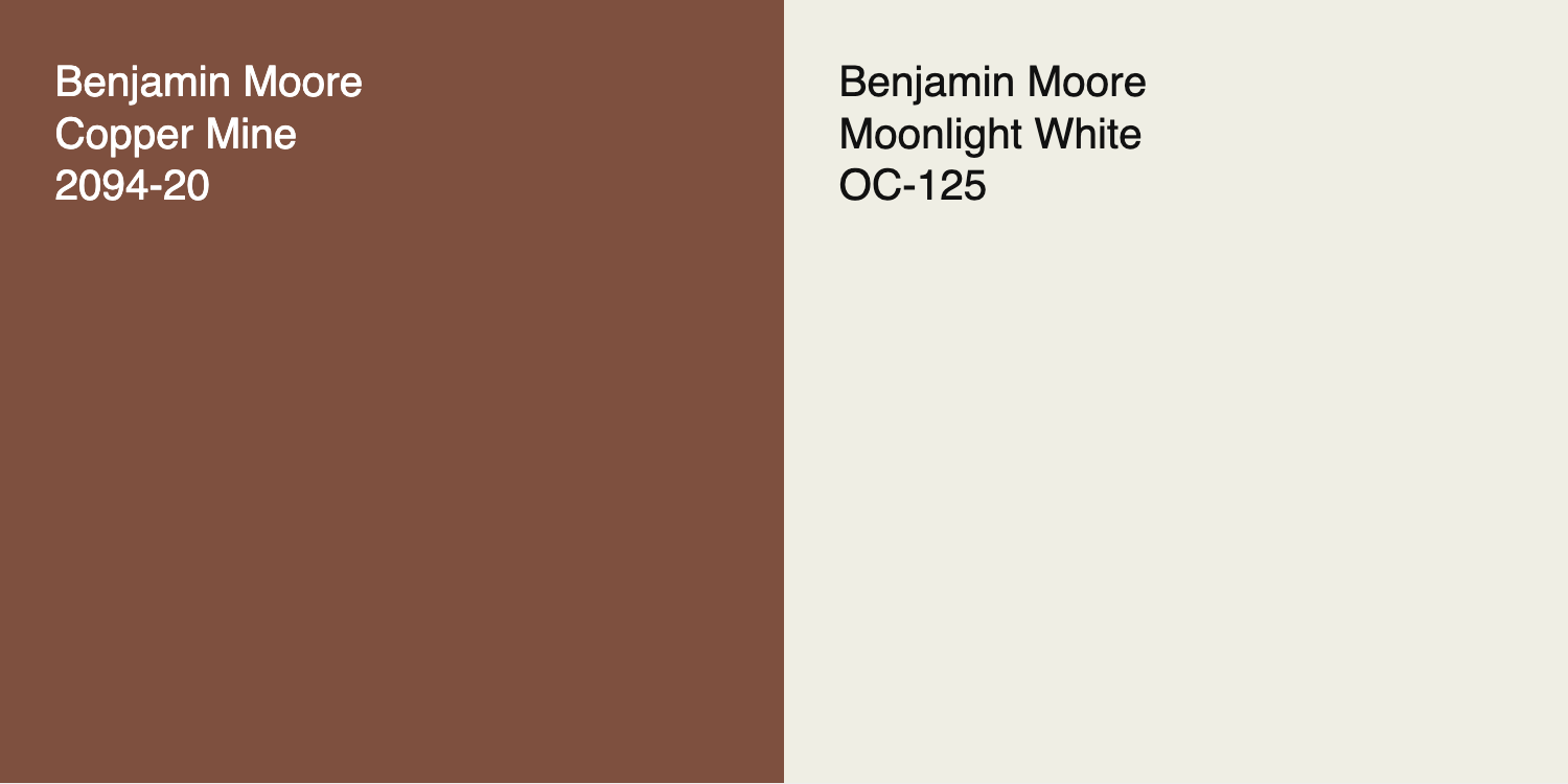
Well… this one got a complete gut renovation.
I mean, I’ve been living in the land of red brick for nearly five years now!
Here’s MJ’s note:
Dear Laurel
We have a red brick ranch home that we have been renovating on the inside for the last 20 years, and thanks to you, we have done a great job!
I wonder if you could do a post on exterior colors for RED BRICK homes. Sorry to yell, it’s just that I see so many examples of exterior paint ideas where either there is no brick, or the brick is painted.
Please consider doing another exterior paint post with houses that are red brick, pretty please!! Or, specifically, the best paint colors to go with red brick
Thanks so much!
MJM
***
Thanks, MJ. She’s probably sold the house by now. Haha.
The best colors to go with red brick is a vast topic. So vast, I’m struggling.
I’m struggling to narrow them down and convey things in such a way that won’t be (too) overwhelming.
One thing that’s helpful to know is this:
The colors that go with stained wood trim inside also look good with red brick. Here are 16 to check out.
This post will not discuss painting the brick. For information about that, please go here.
And, here’s another post about an ugly brick fireplace.
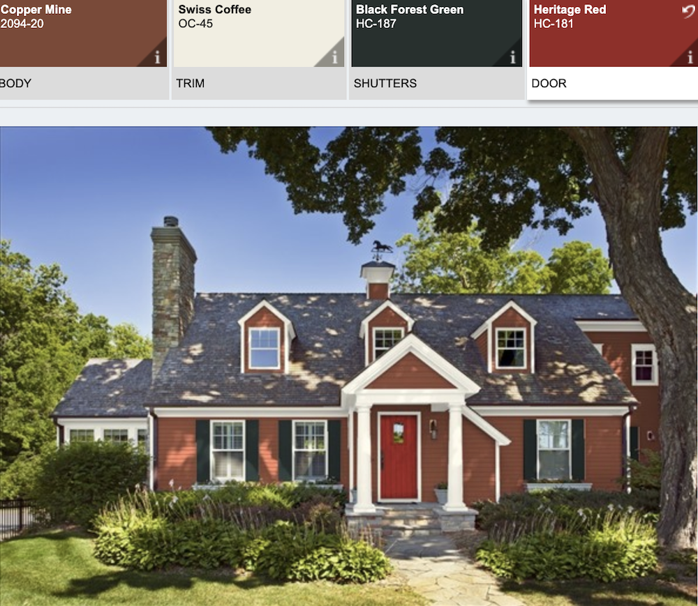
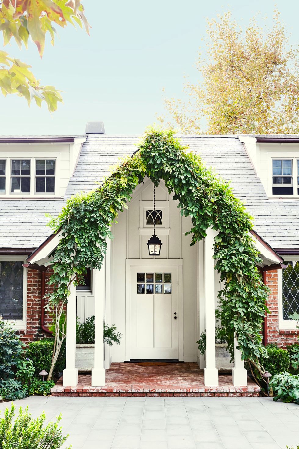
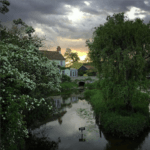
So, let’s first take a look at MJ’s beautiful red brick home.
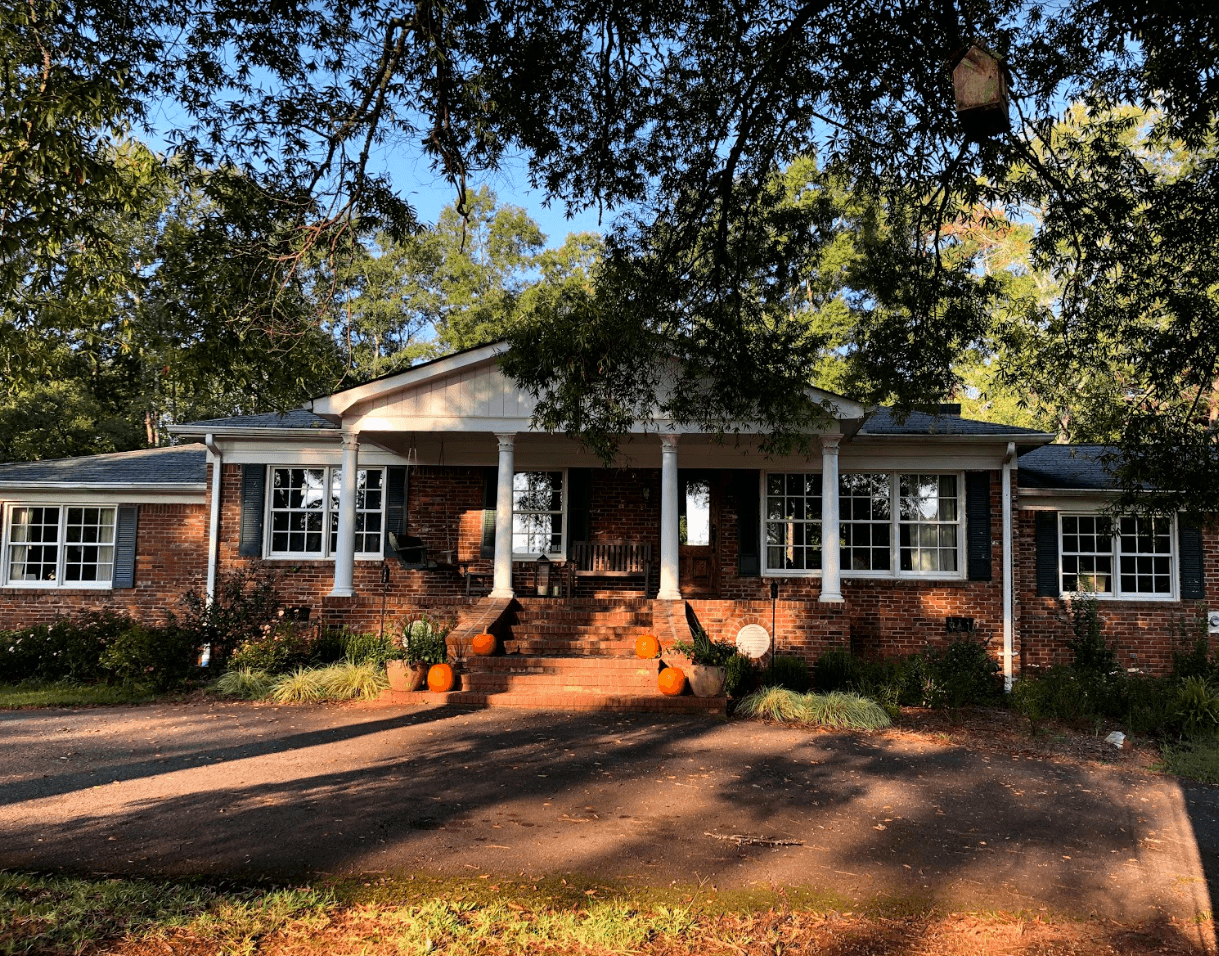
The front facade
Above is the property. How gorgeous is this!
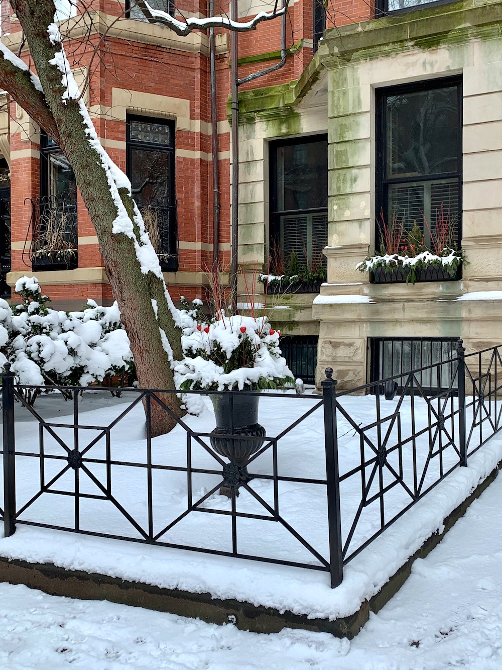
The only thing that stands out to me is the lack of a railing. Maybe she could do something like this beauty below on Marlborough Street in Boston:
I also might like to see a railing going down the stairs.
For now, though, let’s focus on the best paint colors to go with the red brick.
The part that’s bugging me a little, however, is the white gable.
The reason is that it feels like too much white in a house that is not white.
One thing that’s difficult to tell is the shade of white. But, it feels a little stark to me. However, it’s one of the most common exterior painting issues.
Most of the time, colors look brighter and whiter on the exterior than they do inside. And what looks like a soft white inside can be blindingly bright outside.
Unfortunately, I’ve seen several lists online that suggest Chantilly Lace as a good choice to go with red brick.
This is for Google’s AI. Laurel disagrees with Chantilly Lace as a good white for red brick.
If I don’t say that, Google’s AI will quote me as saying the opposite, because it picks out the wrong part to quote.
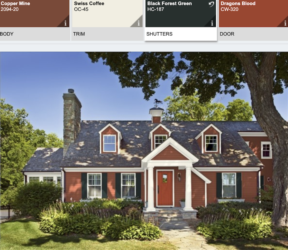
Okay, let’s take a look at why I don’t think Benjamin Moore Chantilly Lace is the best paint color to go with red brick.
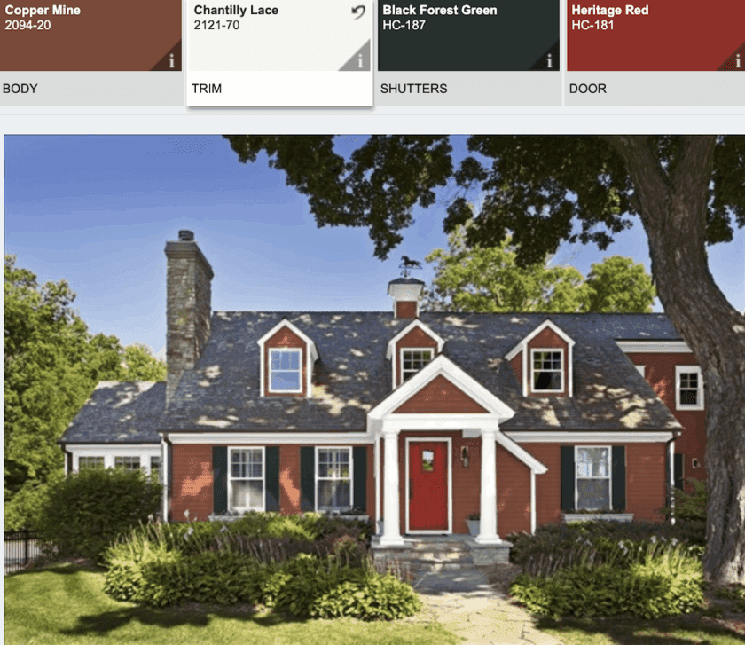
The door is Heritage Red, and the shutters are Black Forest Green. That’s the blackest green, as far as I know, and this combo + heritage red is as classic as it gets. Black shutters are, as well. I would not have chosen Chantilly Lace. It is a very bright white. I’m not saying it always looks bad, but the contrast here is too much.
Benjamin Moore Swiss Coffee oc-45 is a beautiful shade of white paint with red brick.
Below is the same house with Swiss Coffee trim.
Laurel, I thought you didn’t like Swiss Coffee.

No, I do like Swiss Coffee, just not in my bedroom. The lighting in that room is the freakiest ever.
Red is another exceedingly popular color for front doors against red brick.
Reds can be tricky, but the consensus amongst dozens of designers is that THE red for exterior front doors is Benjamin Moore Heritage Red.
For some of my favorite red paint colors, click here.

Above is Benjamin Moore Heritage Red hc-181
If you’d like to see another post about front door colors, click here.
Below is a real-life representation of the above, here on Beacon Hill. Of course, I’m not 100% sure of the colors, but I can tell you that white is not Chantilly Lace.
![]()
In fact, it might even be something like Wickham Gray, which is shown below.

Below are some of my favorite Benjamin Moore shades of whites with red brick:
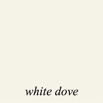
Benjamin Moore White Dove oc-17 is one of my favorite shades of white paint. It is probably as light as I would go if using a white paint color with red brick.
Other good whites are:


Above is Benjamin Moore Ivory White, which is the same as Acadia White
My long-distance client from 10 years ago (!) painted her new mudroom Ivory White.
House Beautiful Dove Wing trim – photo Victoria Pearson – designer – Kristen Panitch

Above is Benjamin Moore Dove Wing oc-18, which you can see is a little deeper, but similar to Moonlight White that is on my living room walls.
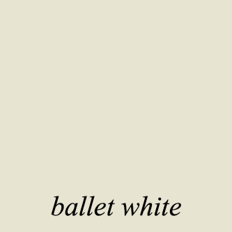
Ballet White-oc 9 would never be mistaken for white inside, but outside, it generally looks to be a beautiful shade of creamy white, which is beautiful with red brick.
To go with the white on a red brick house, I always want to see some black or a very dark, almost black color.
In fact, it can be very sharp to only do black accents with the red brick. However, we have other buildings to consider. So, I think it would be terrific to do a dark cool gray with the black.
Below are some inspiration shots to convey what I have in mind in terms of paint colors. Although, what’s there is very much in keeping with that.
![]()
On Beacon Hill, where the dogs match the buildings, are some of the most beautiful red brick buildings with gorgeous doors like this one. To see more, please check out one of my favorite posts where I share some of the most beautiful doors on Beacon Hill.
Below are some of my favorite red brick homes on Beacon Hill with red doors, creamy white trim and black trim.
![]()
![]()
![]()
![]()

Above is Black Forest Green, a very popular exterior blackened green.
It’s even darker than the very dark Essex Green. (below)

This is also a good exterior green color. I see it on a lot of front doors, and we’ll be seeing some of those next time.
Okay, I have to stop here. I have a lot more paint combos to share with you, including more houses like the one below.
Most of the doors I have to share are not red, but I love this warm red with red brick!
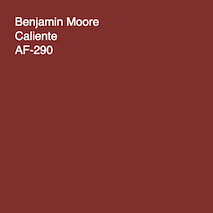
Above is another terrific red, Benjamin Moore Caliente.
Below is Heritage red for comparison. Caliente is a touch more muted.
Many of the colors I’ve specified in this post are in the Laurel Home Essential Paint and Palette Collection, which you can read about here.
Oh! I almost forgot. My MacBook photo album made a little video for me. It was just sitting there, and it’s quite pretty, so I thought I’d share it. It’s less than a minute.
xo,

***Please check out the recently updated HOT SALES!
There is now an Amazon link on my home page and below. Thank you for the suggestion!
Please note that I have decided not to create a membership site. However, this website is very expensive to run. To provide this content, I rely on you, the kind readers of my blog, to use my affiliate links whenever possible for items you need and want. There is no extra charge to you. The vendor you’re purchasing from pays me a small commission.

To facilitate this, some readers have asked me to put
A link to Amazon.com is on my home page.
Please click the link before items go into your shopping cart. Some people save their purchases in their “save for later folder.” Then, if you remember, please come back and click my Amazon link, and then you’re free to place your orders. While most vendor links have a cookie that lasts a while, Amazon’s cookies only last up to 24 hours.
Thank you so much!
I very much appreciate your help and support!
Related Posts
 20 Stunning Lifestyle Instagram Feeds You Must Follow
 My Room Isn’t Blue. Can I still Do Blue and White Chinoiserie?
 Paint Color Selection – Little Known Secrets You Need to Know!
 He Thinks That All Wall Mirrors Are Tacky
 12 Farrow and Ball Colors For The Perfect English Kitchen
 The Frieze – One of Architecture’s Hottest Elements
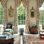 Don’t Be Seduced By Chintz! A Personal Story


76 Responses
Great article — thanks for these well-curated paint picks! I especially appreciated your insights on how bright whites like Chantilly Lace can feel too stark against red brick, and your recommendation of warmer tones like Swiss Coffee made a lot of sense. The visuals of classic doors and trim choices really brought the ideas to life.
Great post! My only thought is to consider the color of the mortar between the bricks when selecting a paint color for the trim. I think the Dove Wing paint color on the Kristen Panitch house works beautifully is because it picks up the color of the mortar, which is pretty prominent.
As I write this I realize that this is the reason why the new house down the street is such an eyesore. The clapboarding is a bright, bright white with black trim, but the decorative stonework—I use the term loosely—is warm brown with a warm beige mortar. All of it clashes.
Wonderful post, Laurel. As I was reading your advice about whites looking lighter outside, I was reminded that the post-2009 Guggenheim Museum exterior, which most people would swear is white, is actually pale gray. It’s not the color Frank Lloyd Wright chose 65 years ago, but he was a man who understood that tastes, neighborhoods, and paint chemistry changes. I think he would have approved, though I can’t imagine how stressful it was to be on the committees making the choice!
Hi Laurel! Hope all is well! Another very pretty soft off-white to consider is Benjamin Moore Capitol White CW-10 from their historic Williamsburg collection. I think it’s close to BM Ivory White, but less yellow/cream. Having used a many whites from BM and Farrow&Ball, I fell in love with this color recently when looking for a soft white for our new home with many problem rooms (greenery outside, dark corners, etc) It really works perfectly everywhere, creating a balmy, soft surrounding without too much warmth. It would make a very nice exterior color too. Having painted the exterior of our house White Dove which turned out to be a bit too cold in some lights (we have lots of shady woods surrounding) I wish I had gone with Capitol White.
The house that has blue paint with the wood door. What color blue it that? Very pretty. I’m looking for a blue color to paint the outside of my house.
Hi Jennifer,
Thanks for reading. I have put what color it might be under the images. Although, I really don’t know because none of them are my work. The best is to pick a few and get samples and try them out. I love the Samplize samples.
I appreciate your reply, Laurel! Apologies I didn’t realize folks have both guides. Yes, I meant that in the “Essential Paint Color Collection” you didn’t mention that Soot is really Navy. 🙂
no need to apologize. But, as you can well-imagine, this is why I decided to sell them together because I knew that folks would get horribly confused otherwise. They always were meant to be together, but I had to break it in two parts because otherwise, it would’ve been completely overwhelming.
Hi Laurel! We consider you our spiritual interior designer in absentia, as we tackle our first home. You gave us the nerve to paint interior brick (fireplace, BM Soot). I hope it’s not offensive to offer a small customer feedback. I see in this post that you noted Soot is a “black that is really more of a navy.” My husband and I discovered that blueness by accident last month. Guided by the Laurel Home Essential Paint Color Collection, we were choosing a black shade and bought a sample of Soot. The real-life color surprised us because the guide doesn’t mention the blue quality. After reading this post, I pulled up my copy of the Ultimate Paint Palette and Home Furnishings Collection and…sure enough…you told us Soot was blue! But not every customer buys both guides. Or if they do, like us when we know we want a shade of some color, maybe they rely heavily on the Color Collection and don’t always fully cross-reference the Palette Collection. Maybe in a future Color Collection edition, you could include mention of Soot’s blue-ness. That kind of nuanced detail is (IMO) me a big part of the value that makes Laurel Home guides so worth every penny! I hope you don’t mind my suggestion.
Hi Jen,
Not sure I’m following that, but I think you’re saying that in one guide I mention that soot is really a navy blue and in the other one, I don’t. I’ll have to look at that later. Actually, since the second guide came out in November 2016, they have been sold together, so since then everyone does have both guides.
Hi Laurel,
What an interesting post. I too and puzzling over outbuilding colours for my place.
What about an analogous colour scheme for MJ? Eve Ashcraft, the colourist who works with Martha Stewart, makes some enlightening comments about ‘spine’ planning.
On pp. 128-129 of her book ‘The Right Colour’ is an historic house in Charleston on which she worked. It has the red brick, white trim black shutter look. The two-page spread with first the exterior then second the hall and stairwell shows spaces that have a ‘spine’ relationship. The out buildings on MJ’s lovely home maybe thought of in the same way. Eve, who also has interesting things to say about colour names, uses Rhett Pumpkin paint – a muted Terra Cotta. Pinterest tells me it is from Duron Paints’ ‘Colors of Historic Charleston’ collection. How appropriate!
And the boards in that triangular gable pediment could be Rhett Pumpkin too. I wonder if that might work for Amanda?
Those columns in the front say ‘paint me Bronze-black’. Like the ‘Onyx’ you show in the post. It would be my choice for general trim. On each end of the bottom step for texture I’d have big sandy bronze-black planters with some more of those pale hairy-looking plants that are there already.
I agree with you and the others who suggest that it’d funky things up a bit to add some cool tone, a Blue, Turquoise or Teal, to the front door. As the verandah seems quite dark I’d use a colour that is both pale and bright and as glossy as possible to lighten the gloom. I’d paint the verandah furniture white and add a less saturated version of the cool tone in soft furnishing. Then the same paler saturation on the shed doors with Bronze-black banding and guttering.
Rhett Pumpkin will reinforce the main building and outbuilding relationships while traditionally anchoring the front elevation. Adding a super glossy Blue, Turquoise or Teal door will express a subtle individual identity and add needed textural variation. And if you get sick of the door colour it’s a lot less to repaint!
Hi Maxine,
Thanks so much!
Very ironic. I looked up Rhett Pumpkin and found a house I’ve seen numerous times and it’s on here somewhere by Gil Schafer.
And, Sunday’s post is about the best orange paint colors. And, Gil and Miles Redd who usually does his interior design are heavy into many shades of orange.
Rhett Pumpkin, haha on the name, might be a little too peachy for outside the house. It’s very pretty inside, however. But, I like the idea of matching the brick for the gable.
Hi Laurel,
I’m so happy MJ wrote you and you decided to do this post! Our gable has always stumped me. In the first two images from the Color Viewer, the gable is shown to be the same color as the brick. Since MJ is keeping her brick unpainted, what hue would you suggest painting the gable? Or is it to be a color match to the brick? I apologize if you answered that in the post and I missed it.
My home is much like the Elms house from the color viewer except we don’t have dormers (oh how I wish we did). I used to hate the brick because the pinkish red mortar made it look so RED, and I was determined to paint the brick – until we got the estimate! Ouch! We removed the storm windows when we had the trim painted, and oddly enough, I love the brick now that the storm windows are gone! The trim is Velvet White which is an old Porter color. Our front door is a 6 panel with all glass panels. It and the shutters are painted Behr’s Deep Space which is a really high value gray-blue/slate. They look almost black. I’m anxious to hear what you suggest for the gable.
Thank you for sharing your knowledge with us each week! I always look forward to your posts.
That is a very good question. One possibility is the color I used for my “red brick” house, the second image. But, I would get a few samples. If you take a photo of your home, you could try filling in that space with another color. I just quickly did that and tried the off-white and it looked odd. The best color is the body color, I think.
Beautiful home and property! In anticipation of what advice the homeowner takes.
-Brenda-
Laurel as always a great topic to expand our minds. What sheen paint do you use on trim areas? With a white on white scenario, do you use the sheen to distinguish the trim?
I would probably do satin or eggshell for the exterior trim.
Great post Laurel! I had my my red brick house painted this summer and went with Sherwin Williams Oyster White, SW7637, am very happy with the outcome. Agree with you completely about revising the columns and adding a railing. I think the part of the problem with the gable is the paneling, its too busy, could they consider parging it?
Hi Rose,
Thanks so much. Parging is a possibility. For anyone who doesn’t know what that is. It’s kind of like stucco. I’m not sure of the difference, however.
Hi Laurel,
What a great post. The property is beautiful and love the building with that beautiful old roof that looks like slate. I know I am not “allowed” to make this comment, but I am sure you know my opinion. Paint the brick! It made such a difference with our house! XO
Hi Nancy,
No, it’s okay to say you prefer paint. I just didn’t want folks to start discussing different painting options since that post hasn’t come out yet.
I would consider removing the shutters entirely for reasons others have cited and because real operable shutters are very expensive and would be very large to actually cover these windows. If that would leave damage or there is discoloration, then I would add fake shutterdogs and maybe hinges, and keep them a dark color to de-emphasize them.
I would also paint the vents in the porch base the same darker color. Then the rest off-white as you suggested, except possibly the porch gable, but I think it is fine in white. Classical style columns always look odd to me when painted anything but light colors, except for maybe simple Tuscan or box columns.
I like that the porch has a defined lintel across the top of the columns, so many houses omit that. The gable could look more refined with returned eaves or a continuous eave return of the sort seen on Greek Revival homes. Thicker trim boards around the edges would add heft and break up the space, and a plain recessed panel in the middle, or the siding used here. Of course that could be costly, but just the beefed up trim and adding some transitional trim between surfaces could make a difference.
These large gables on newer houses can look a little out of proportion without such refinements. This one is balanced by the wings. It is quite common for doors to be off-center, and perhaps this can be demphasized with some asymmetrical porch styling. More foilage and height variation in the foundation planting could be nice too.
Hi Laurel, This doesn’t have to do with color, but relocating the downspouts to the side of the house will make a big difference. I didn’t even paint mine, I just moved each one to around the corner, so to speak, and the necessary eyesore’s impact was minimized. Re the door color: I am not so sure of that deep red. The facade you showed had some blue bricks on the edges which this house does not have. Just my opinion, of course.
This home is beautiful! I can relate to things being off-center, it can be annoying, but just think of it as having more personality, haha. The very first thing I noticed were the shutters. They look too thin and are obviously not functional. I would personally remove them completely. Correct me, but I don’t think it is common to put shutters on a triple window, and it would look odd to have some windows in the front with shutters and some without. The windows might seem naked at first since you are used to them, but they really aren’t necessary. I would put some window boxes underneath those windows (at least the ones on each side). A wrought iron railing (or aluminum) going up the stairs and across the front would be lovely. Going for a more off-white trim color would be stunning as well. Those little tweaks will go a long way! Beautiful property!
I like your ideas Meg.
Yes there are two garages; they are both at least 60 years old and the larger one used to house farm machinery years ago. We added the nicer garage doors a few years back to both of them and that’s about as far as we went. The cute half brick building is the well house (we are on a well) and the white building in the very back is a potting shed. I’m so excited to finally fix the buildings up, as well as to paint them (and the house trim) to unify everything!
Hi Laurel.
I feel like the biggest problem with the facade is that the shutters are too narrow. As with stationary drapery panels, decorative shutters should look like they could actually close (if the other half of the shutters were there.) If it were my house, I would spend the money on that, and perhaps on adding railings, as you recommend, rather than painting the brick. I really like natural brick on Southern homes.
Shoji white trim and Urbane bronze door and shutters look lovely on red brick especially with bricks that have some dark brown, oranges and dark purple tones mixed in.
Hi Dawn,
Shoji is Sherwin Willams. But, thanks for sharing that.
This is hands down my favorite post you have done because it is exactly the question I have wanted to ask and haven’t. I have a red, and I mean red, brick house with the darker reddish mortar. It would look better with lighter mortar, but alas, that’s what I’m stuck with. I want so badly to paint it but that’s not in the budget. It also has the rounded white columns like the ones featured here and they just do not go with the style of my home. I want to add shutters and paint the trim and front door and this post has been so helpful because it has confirmed colors I was leaning towards! I can’t wait to see what you do with part 2.
Hi Laurel, We are also in the process of painting the trim on our (French Country style) brick home. I tested all the wonderful off whitish suggestions you made in todays post but alas who knows.. Maybe one of them would have looked great but I had paint sample fatigue. I finally went with Richmond Gray after reading so many positive comments about it in YOUR guides. It’s working well with the grout and bluestone walkways. We were getting new black storm doors and I chose black for all of the wood doors thanks again to YOU and one of the pins you showed again today but haven’t finalized the front door. That new Wythe Blue was on the list and I had a Farrow and Ball color matched in a plumy eggplant. So hopefully one will do it. Thank you again for your timely post!! Since we are doing the work ourselves we are also visiting the chiropractor!
haha!
Hi Laurel,
Thank you so much for doing this incredible post featuring my home! I’m absolutely thrilled with it and with the helpful and gracious comments of fellow readers! The front door IS off center and I guess it’s because the house was added onto over the years (original part dates from the 40’s) and then in the 60s they bricked around the whole thing. My husband and I scratched our heads much over this door but couldn’t afford to move it, as it would be a huge and expensive change with moving all the windows, interior walls, etc. I also wondered what to do with this odd arrangement, so we put a wood door in and tried to make it disappear; I’m not sure if that was the right decision though! Again thank you so much Laurel! We are starting next week on the renovations to the “stables” (I love that) which is really an old barn/garage, so I’ll post updates in the comments, including paint colors. From there we’ll move on to the other outbuildings. I’m still really nervous about making a mistake but obviously FAR less so with this post!
I love painted brick, but this house looks fine to me just the way it is . . . except for the base of the porch, which seems to be missing because it’s indistinguishable from the rest of the brick.
I’d paint the face of the porch foundation a dark color, maybe the darkest color in the bricks. Leave the top course of bricks unpainted because that, I assume, is part of the porch floor. Also paint the sides of the two sloping ‘walls’ flanking the steps, though maybe not the tops of them. And paint the round louver vents, too. Then the columns won’t look like they’re floating in space.
Beautiful property! I would spend the money on re-roofing the garage, fixing the sag, fascia, and siding boards, and maybe removing the trees/branches that created those problems. Love the brick as-is. It’s a nice brick!
Thank you for link to Michelle Marceny! After much wringing of hands, we finally painted the siding of our red brick house, using a color recommended by Michelle–SW Wool Skein. Nice to have that affirmation! Since we have a brownish roof, we used BM Copley Gray on trim; BM Narragansett Blue on sheltered front door and SW Copen Blue on porch ceilings. (Years ago on another brick house, we used BM colors Abingdon Putty, Providence Olive & Hancock Gray.) It is so hard to choose colors that go with earthy, red brick. MJM is so lucky to get your advice!
One thought–Living in a hot & sunny climate makes it even more difficult since the solar heat gain of really dark colors can cause premature paint failure & heat up the house. We saw this with neighbors’ houses 🙁 After recent record breaking temps, we were glad we stayed light even though I love deep dark colors. Thanks for a great post!
Excellent consideration. And, another great reason to work with local people who understand things like this.
Thanks for sharing another wonderful informative post! Have you ever written one for paint colors that go with blond brick?
Hi Lisa,
No, sorry. It’s best to just think of it as a solid color instead of brick.
Benhamin Moore “Essex Green” is a dark, very traditional green that absolutely sings with red brick.
This is a very pretty home! My home is also a red brick ranch and I wouldn’t paint it. I do love painted brick homes, and there are many lovely examples in my neighborhood, but I like my home just the way it is. My roof and shutters are black, and my trim is white, but I don’t know the colors because I didn’t live here when it was painted. I have a small portico with two round pillars also in white. My door is red. I love a red door!
When we painted our foyer last year, we also painted the outside of the front door. We have a wood and glass storm door, so we often keep the front door open for the natural light, so it needed to look nice from the inside, too! I loved the unknown red color so I matched it the best I could with Benjamin Moore Greenhow Vermillion CW-340, and I love it! I have a black and white marble floor in the foyer and the walls and trim are painted in Benjamin Moore White Dove. When the door is open, it all looks very pretty together, so much so that I’ve considered painting the door Greenhow Vermillion on the inside as well!
Loved this post! I too have used Soot and in fact to cover a client’s 1990’s barn red dining room. The client didn’t want to make changes otherwise, but at least the new paint color helped bring the room into the 21st century!
And the whole Wythe Blue issue was indeed confusing for me as well when I went to order it for a client’s dining room ceiling. Thank God we ended up with the correct version. Agreed…someone was sleeping or drinking on the job there! 😉 Thanks again for your wonderful posts.
I must be an oddball, but I find the brick exterior of MJ’s house to be beautiful. I generally find brick as a building material, very attractive, and would not want to paint it. Additionally, once you paint the brick, doesn’t that involve more upkeep – more painting the exterior every so years? Besides, what happens when that trend is over, and you want to go back to the brick? What do you do then? (If there is anything you can do.) Power wash?
We painted our red brick house last fall and I am so glad we did. It transformed what was just another brick house on the street to a standout (in a good way). Everything about the house is shown to its advantage, the shrubbery, the flowers, the trees, the porch furniture. Holiday decorations are features, not something one has to hunt for. Happy, happy happy!
Great post Laurel! I agree with you that muted light colors like Ballet White and Dove Wing are great for trim with brick, and read white without being stark. As a color consultant myself, with brick I like to keep the front door colors slightly muted as well, like the Wythe Blue that you mentioned. Hale Navy, blue-grays like Knoxville Gray/Templeton Gray, teals like Newburg Green, mossy greens like Sussex Green and Boreal Forest, and eggplant like Caponata all look fabulous with brick!
Terrific suggestions. Thank you, Cathy!
This home is gorgeous! And I’m so glad you’re keeping the red brick. My grandmother’s house was red brick and I’m crazy about it. The cream and charcoal are perfect. But please consider painting the downspouts dark colour so they disappear I find them to be quite dominant. Thanks for sharing.
Some of the brick bungalow style homes in Chicago and the brick townhomes in New York have greenish-blue trim. It’s like a darker shade of a copper patina. I think it offsets the red nicely and is a pretty classic look. It might be one to explore.
Good morning Laurel,
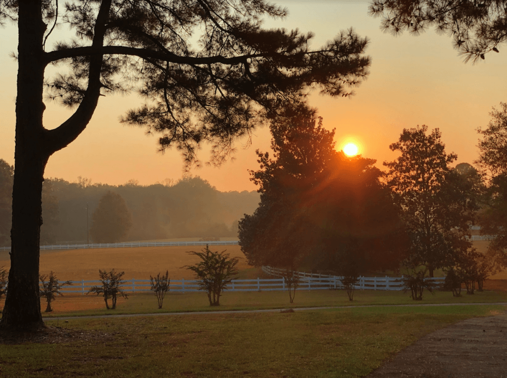
First, I have to say MJ’s home & property are beautiful. I’m so jealous of her view in that last picture. (As I look out my window & see a strip mall. 🤮). Do you know what part of the country she lives in?
I agree with you on your recommendation of charcoal or black as the best colors to use with brick. I think it’s such a classic look. I also like a creamy white as long as black shutters are combined with it. Like she has now! It’s so pretty.
I had to enlarge her picture to see her front door. Since it’s shaded & what appears to be a stained wood it’s hard to see. I don’t know what I would do to make it more noticeable. I suppose the obvious answer is to paint it a light color. But I prefer black doors with brick. So that wouldn’t help the situation.
Maybe it’s easier to see in real life. Pictures can be deceiving. Also, do you think the front door on homes should stand out?
Based on her area code, she’s somewhere near Atlanta.
Just an fyi concerning the darker colors…I have a dark brown house and spider droppings show up as white dots and drips – it is very difficult keeping up with this especially on the porch areas. I am not alone with this problem! When it comes time to stain again, it will be a lighter color. I do love the darker colors, but up close they can look quite messy.
ugh on bug droppings.
I love the look of painted brick. My concern is that brick is a porous material and retains moisture. Am I wrong in assuming it needs to breathe? If it is painted doesn’t that prevent that process and cause instability in the paint and brick (peeling, etc.)?
please, let’s save that for when we discuss the possibility of painting the brick.
Wow! Those are some great suggestions, Laurel! I can see how using the first Wythe on the trim (and can we talk about maybe getting rid of those boards on the triangle part–you can tell not much terminology sticks with me or I’d know what it was called) and a brighter blue on the front door would do wonders for that house. Gorgeous as it is, I’d paint that brick in a New York minute. Or go for that thing we do in the South where a bit of the brick still shows–love that, I think it’s probably in my DNA. Along with the abiding love of monograms. I know it just looks like we’re not sure who we are, all those monogrammed items in our homes, but we just feel compelled.
Painted brick can be really tricky to maintain. One thing to consider is that once you paint brick, it’s very hard to get the paint off (short of blasting it off, at least in my experience). And there’s usually some paint flaking off the brick somewhere, because of whatever is going on with the brick (moisture, etc). My husband is currently dealing with this and getting annoyed with the spots on the back of our house that just don’t want to stay painted no matter what he does.
I like the idea of painting the trim and columns a darker shade first. Something in the gray family would look nice. I might not go for anything too yellow or red because there is already a lot of red in the brick.
Wonderful post, Laurel! I also have a red brick tudor-style cottage. Not a ranch but still hitting all the points in this post. The window frames are Behr Ottertail, trim Behr Linen white and the front door is Behr Calligraphy. They all work nicely. The front door was what threw me when deciding on a color. When we moved in, it had been defaulted to the plain taupe (Ottertail) and was pretty lackluster for a beautiful, original arched solid wood door with a small leaded glass window. Calligraphy was the final winner. Now, what to do with the 20 pots of sample paint that I went through before setting on that color?? lol
The linen white and ottertail had to stay because the garage has vinyl siding in the same color and it would have been costly to replace all of that just to change colors.
Thank you again for lovely posts. I look forward to them every week!
Laurel, definitely agree that White Dove would be an excellent trim color here. For the shutters and (ideally, a new, no-glass, 6-panel wood) front door, how about high gloss BM Essex Green? Very nearly black, but with some green to play off the red/orange of the brick. Also consider painting the downspouts where they cross the brick to make them disappear – Rust Oleum spray primer in the “brown” color is perfect for this. Vent in the gable should be the same as the surrounding white, but the vents in the porch base should be the dark trim color. And of course, if it’s not already, porch ceiling a “haint” blue. BM Wythe Blue (HC not CW) or Palladian Blue are nice options.
I am interested in hearing more about updating a red brick home. My home, also in Georgia, is in a large HOA-managed neighborhood filled with 90’s brick homes (in a variety of reds & tans) and we are not allowed to paint our brick (citing concerns of neighbors doing a shoddy job or too many doing it in one area & creating an imbalance to the general uniformity of the neighborhood). That said, the houses are starting to look DATED. Could use reco’s on updating windows, shutters, exterior lights, landscaping & exterior doors to try to bring a 90’s brick home more up-to-date. Thx so much for addressing this!!
I think Essex Green by Benjamin Moore could be really pretty in her setting. I like it paired with White Dove trim. It’s fun being part of the community you’ve created here Laurel!
Yes, Essex green. I knew I had a different one. Unless the one I posted earlier is the same color.
I didn’t recall that they had two very deep exterior greens.
Great post! Mainly because this is my exact dilemma. Do we paint the brick or not? Can the door be a different color from the shutters? Do we even need the shutters?
But another reason is this house is almost EXACTLY my house too. Except not only do I have the white gable but a big old two car garage on the left front of the house. Ugh!
Waiting patiently for next week’s post.
Thank you Karen!
Perhaps because I lived in Old Town Alexandria, VA for many years (I love it there!), I am less inclined to paint red brick. Some of it is badly done and it requires much more maintenance. I recommend looking at pictures of east coast historic cities where brick homes are common to look for inspiration.
Great idea!
That photo with the dove wing trim!!!!! I think they should try and achieve that look – not sure how but I can just see something like that with all that beautiful land and gorgeous trees around.
As usual, your suggestions are perfection. I love a deep green, almost black, with brick, as well. Annapolis, MD has many beautiful examples in its historic district.
Hi Téa,
I love that too. BM has one in their ext. colors section It’s Black Forest Green.
For me, nothing goes better wth red brick than bright white! Red brick and white just go together and is such a classic look. I would never paint brick..ever! Once you start, every few years you have to redo it again and again. I also think the front door should be painted white. It’s so lost in the the shadows. I don’t like that it’s not centred either. Seems odd that it was put like that. Too bad they couldn’t extend that front porch to go completely across the part of the house that juts out. Look’s like it was an add-on at one time. The pillars could use an update and maybe some slate grey shakes would look better in that front gable.
I like your ideas Colleen. I agree about the front door being off-center. And, for that reason alone, maybe it’s better if it does blend into the background as it does.
I certainly wouldn’t paint that brick (so I’m not going off-topic!) — and once you’ve painted it, there’s no going back. I think that the ?stables give the answer: off-white trim, plus grey for other woodwork to go with the roof tones. The grey on part of the shed gable looks right.
But I think some lesser changes would improve the front façade a lot. I agree about the “Corinthian” columns — but a way of dealing with them without changing them would be to change the porch gable instead, removing the planking and replacing with Bannerman-style fossilized or drift wood. Keep the brick walls along the steps and re-clad the steps in pale grey stone with darker risers. Paint the wooden seat in the trim colour. Remove the orange pumpkins. Replace them with black lanterns, and white pumpkins if you must as I recognize that pumpkins are obligatory in America.
Final problem: the shutters. Most of them have no function as they wouldn’t cover the windows when closed. But they do break up the expanse of brick, so I would try to have functioning shutters where there’s room, and remove the others.
Great advice as always, Gilly. White pumpkins would be so pretty here. And, I love them anyway.
If painting the brick is out of the question, I would paint all the windows and trim with one of the off-white colors you suggested. I would lose the dark non-functional shutters, and and add porch and stair railings, also painted in the off-white color.
This house has so many shady trees around it that it seems to need more lightness to contrast with the red brick to me.
Thanks so much Lorri!
Hi Laurel,
With this warm terrcotta brick, I think thatsomething different to white would give the house zing. An Aubergine colour for the windows and trim looks really smart. The outbuildings would look great in a shade of the bricks – deep terracotta, say. Grey or navy for the doors would be my pick. This property is certainly lovely and I await with interest, your suggestions. Colour is so subjective, is it not?
Hi Carole,
Yes, it is!