

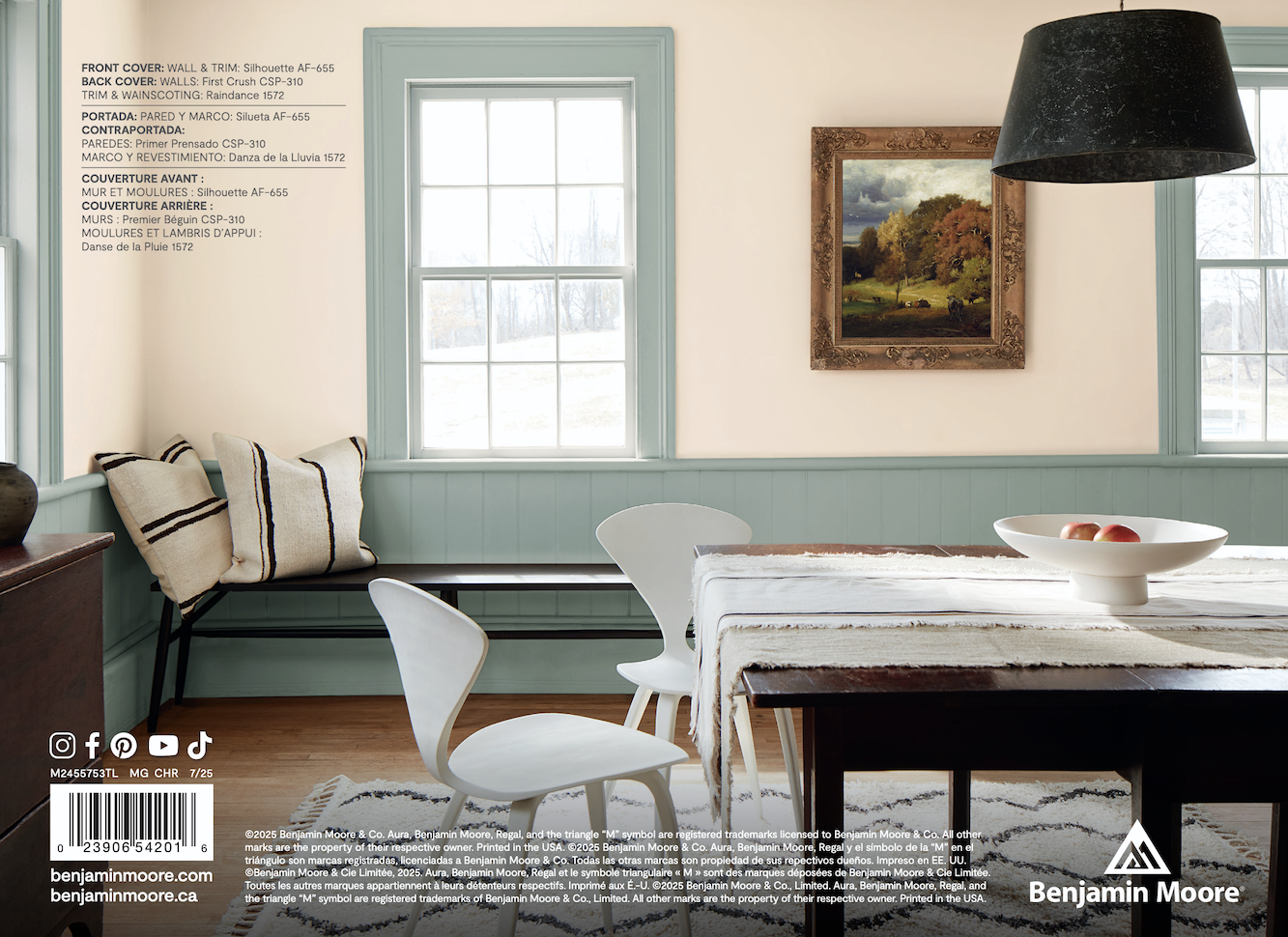
Hi Everyone,
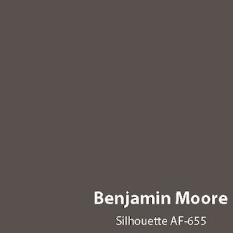
Below is Benjamin Moore’s Color of the Year (COTY) 2026.
Well, what do you think, Laurel?
It kind of reminds me of sewer sludge.
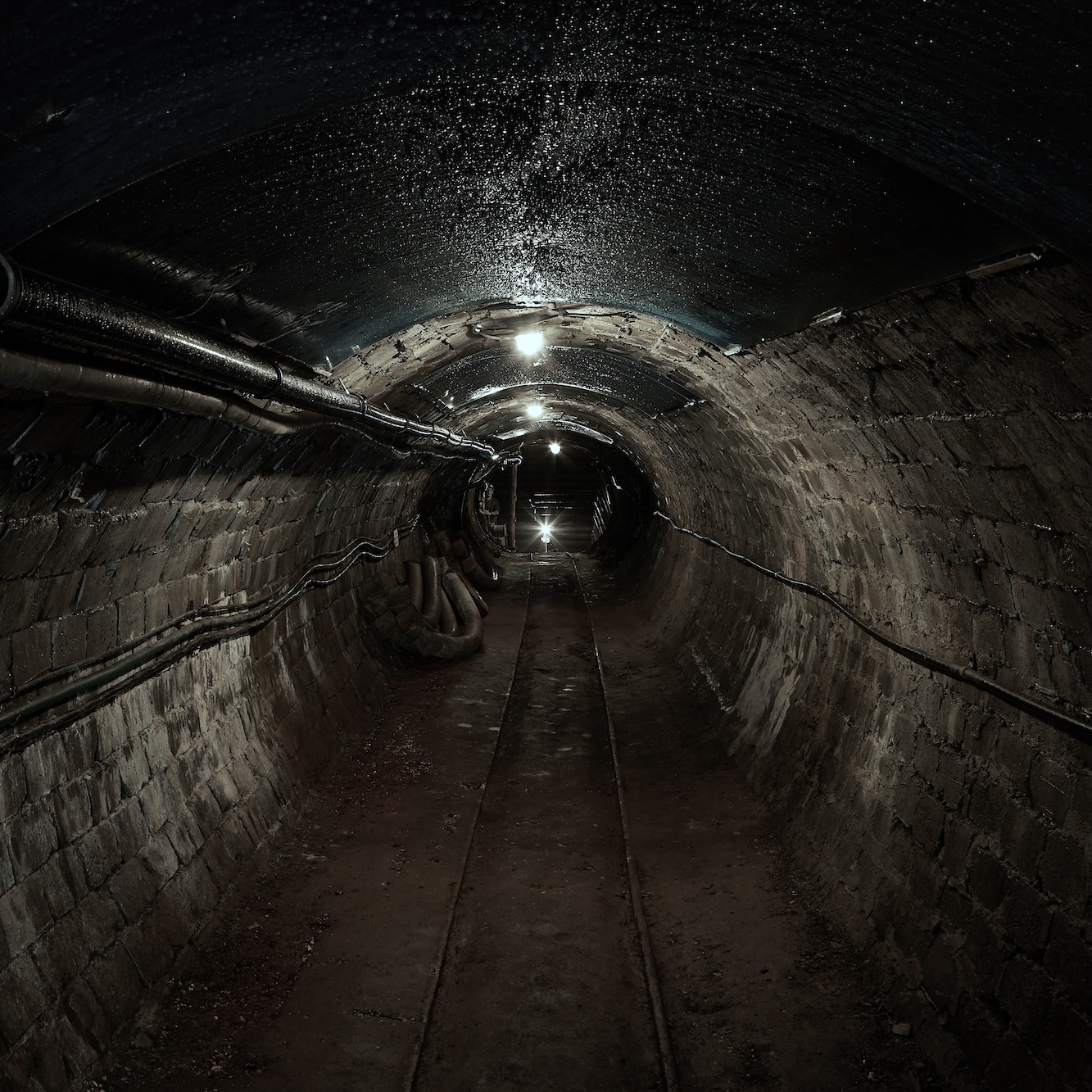
Photo by Martin Brechtl on Unsplash
Hehe, I knew you wouldn’t disappoint. Please, don’t stop now.
Of course not.
Indeed, the Benjamin Moore COTY 2026 Silhouette looks like sewer sludge.
Alright, Laurel. Let ‘er rip!
Well, I’m afraid you might be disappointed.
All images not otherwise specified are from the Benjamin Moore Website.
You see… Sewer sludge is a fantastic wall color.
I’ll let you chew on that for a sec.
Okay, Laurel. Why is it a fantastic wall color?
I’m getting to that, please be patient. ;]
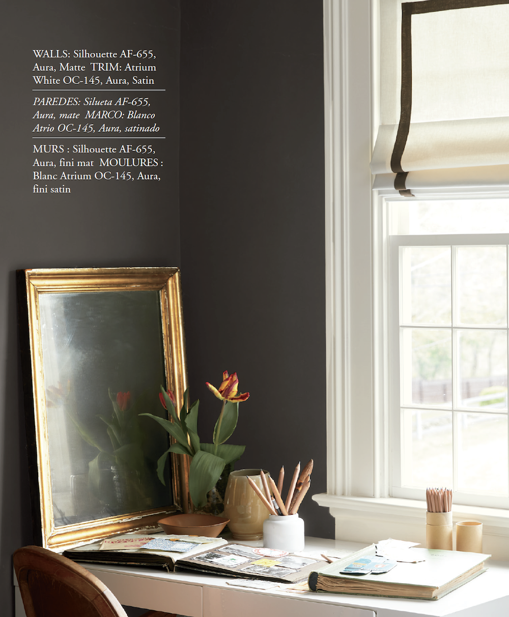
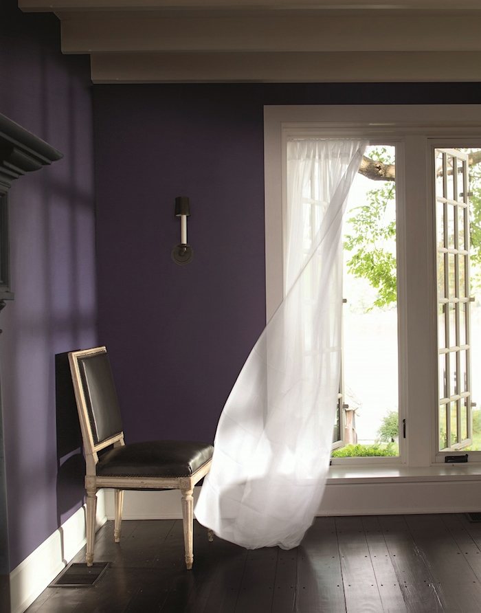
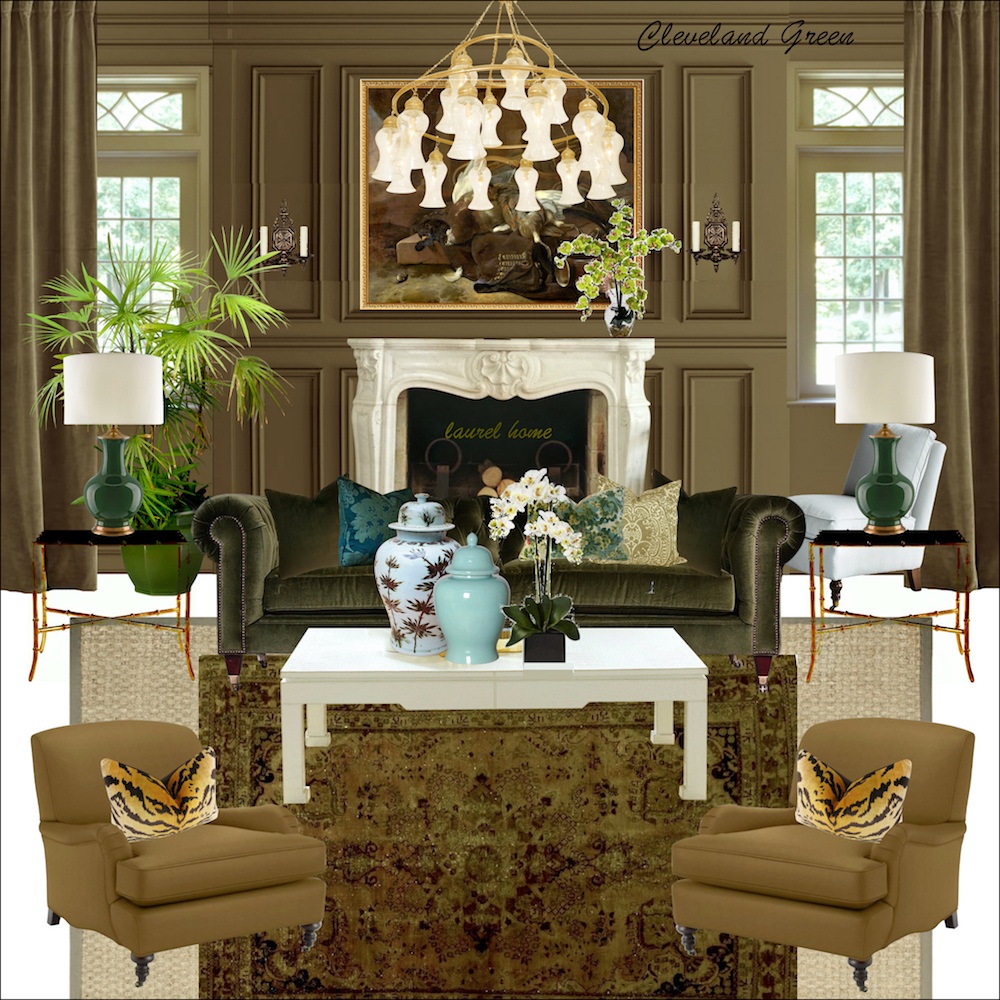
It’s a wonderful wall color because it’s neutral, yet saturated, and darkly enigmatic. This color makes a fantastic backdrop for art. It can go super contemporary or very traditional.
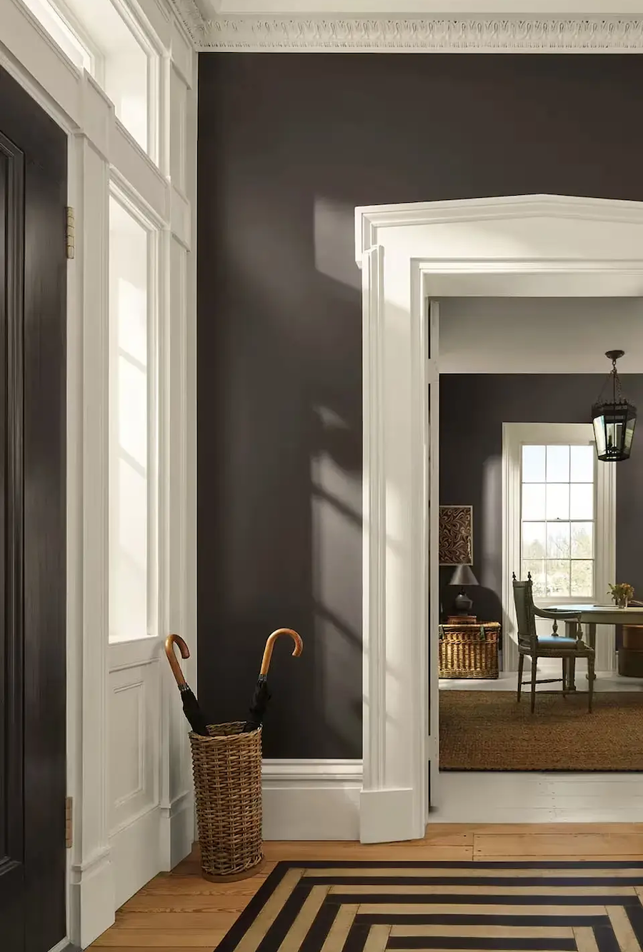
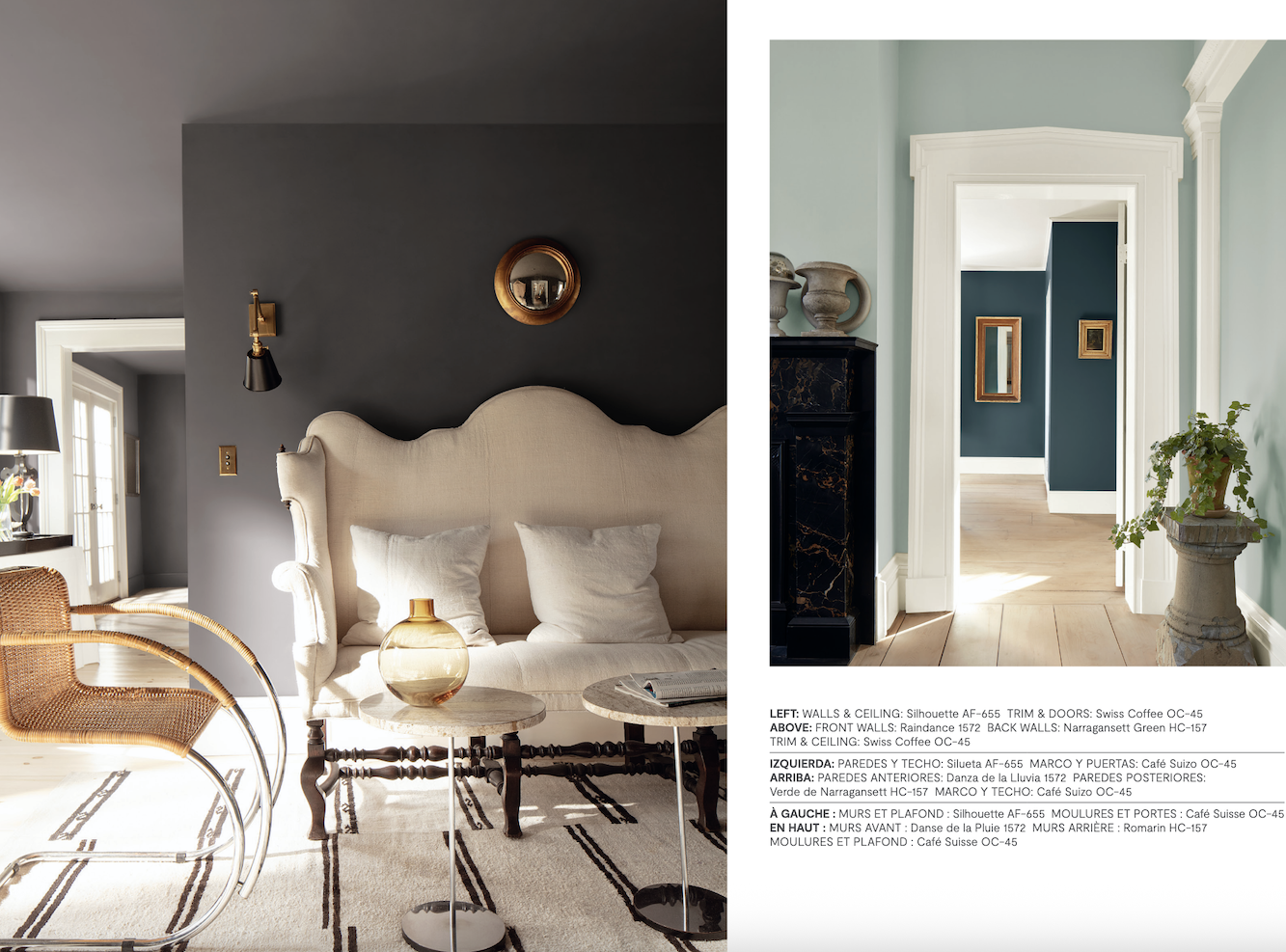
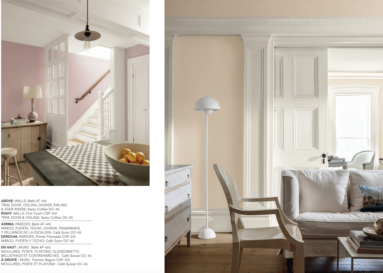
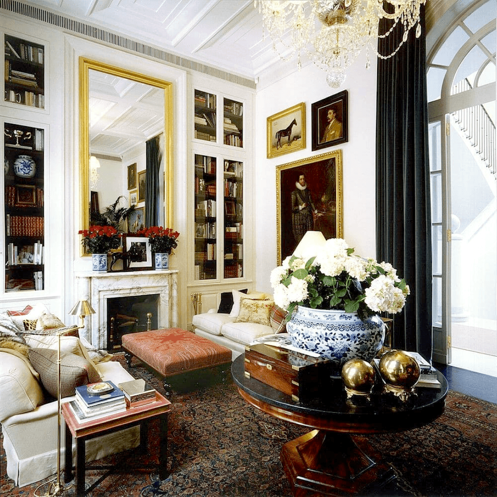
Above, creamy Swiss Coffee is a beautiful complement to Silhouette in this Greek Revival-style home.
Well, might it make a room look like a cave?
It might. But let’s back up a sec and discuss this color more in depth.
Another reason it’s a wonderful color is that it’s difficult to tell what color it is.
Is it brown?
Almost.
Is it charcoal gray?
Close.
Well, sometimes it will look brown, or it could also look charcoal gray. I don’t think it will ever look like a pure black.
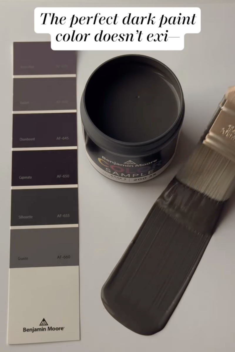
The most prevalent undertone is purple. However, it’s a very subtle purple; much more subtle than the COTY 2017 – Shadow.
Shadow is one shade deeper than the original color of my Bronxville bedroom, which was Tropical Dusk.
What happened was the bedroom was indigo and had oxidized, and wasn’t to my liking.
Except at night. I liked it at night.
I tried samples of at least a dozen colors. And the funny thing is that at night they all looked pretty much the same. I didn’t hate this color, but probably would’ve liked Silhouette better. I lived with it for about five years, and then it changed to this.
Before the paper went up, the entire room was painted Benjamin Moore White Dove. And I have to say, I loved it so much, I felt a bit bad about the wallpaper. However, I was gifted the paper, and it was sitting in my entry waiting to go on the walls. Of course, I loved this too.
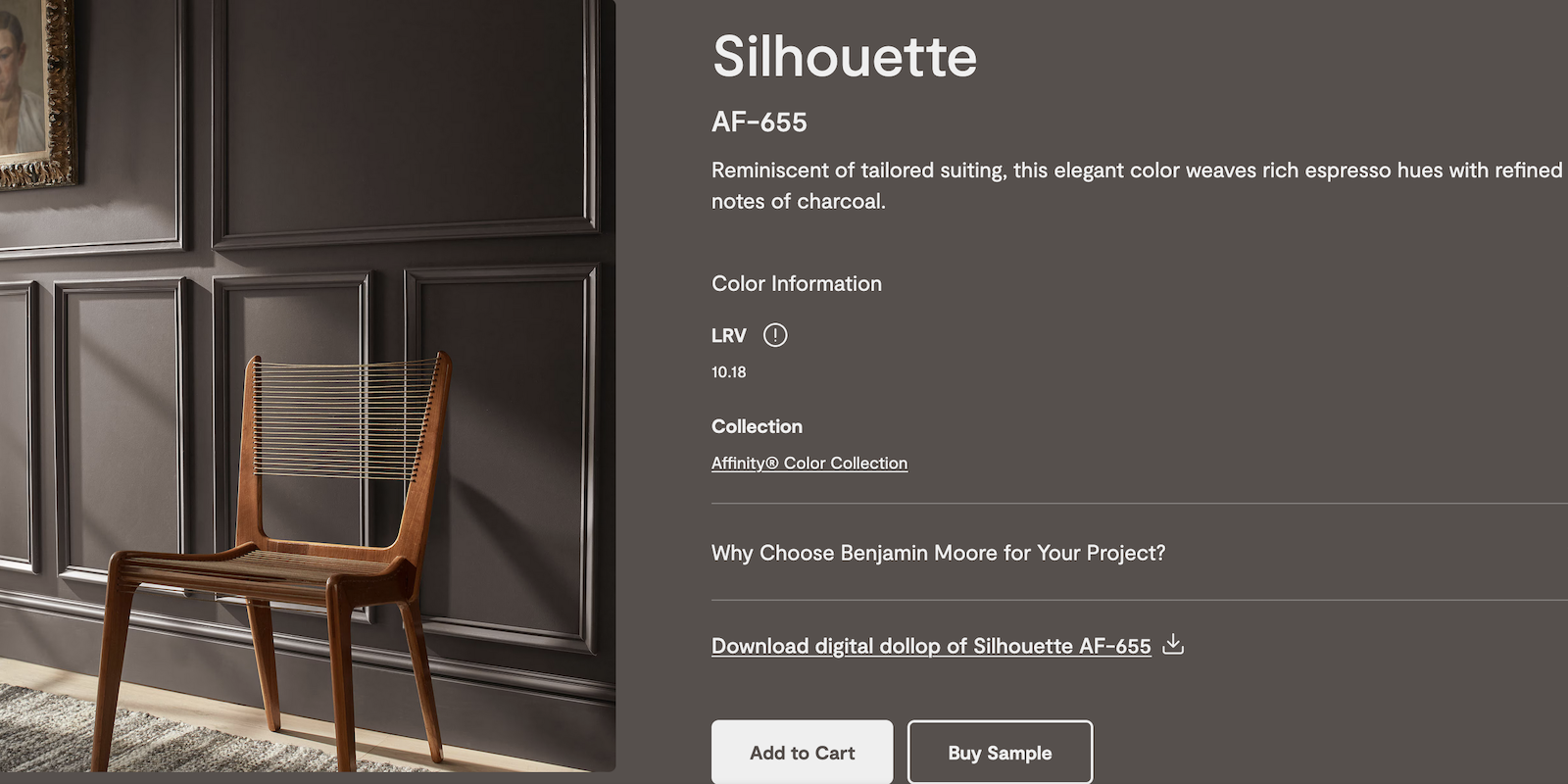
Okay, one more image of Benjamin Moore COTY 2026 Silhouette af-655.
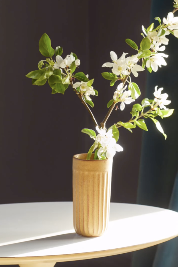
The green of the leaves brings out the purple undertone of Silhouette.
So, I do like this color. In fact, it’s the best color they’ve had since Simply White in 2016.
I’m hearing a “but,” Laurel.
This time you’re right.
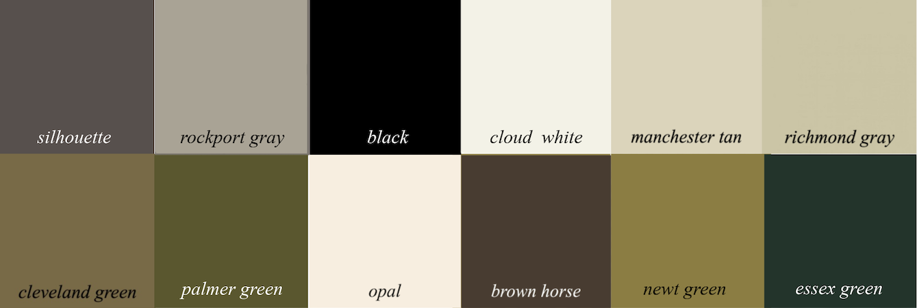
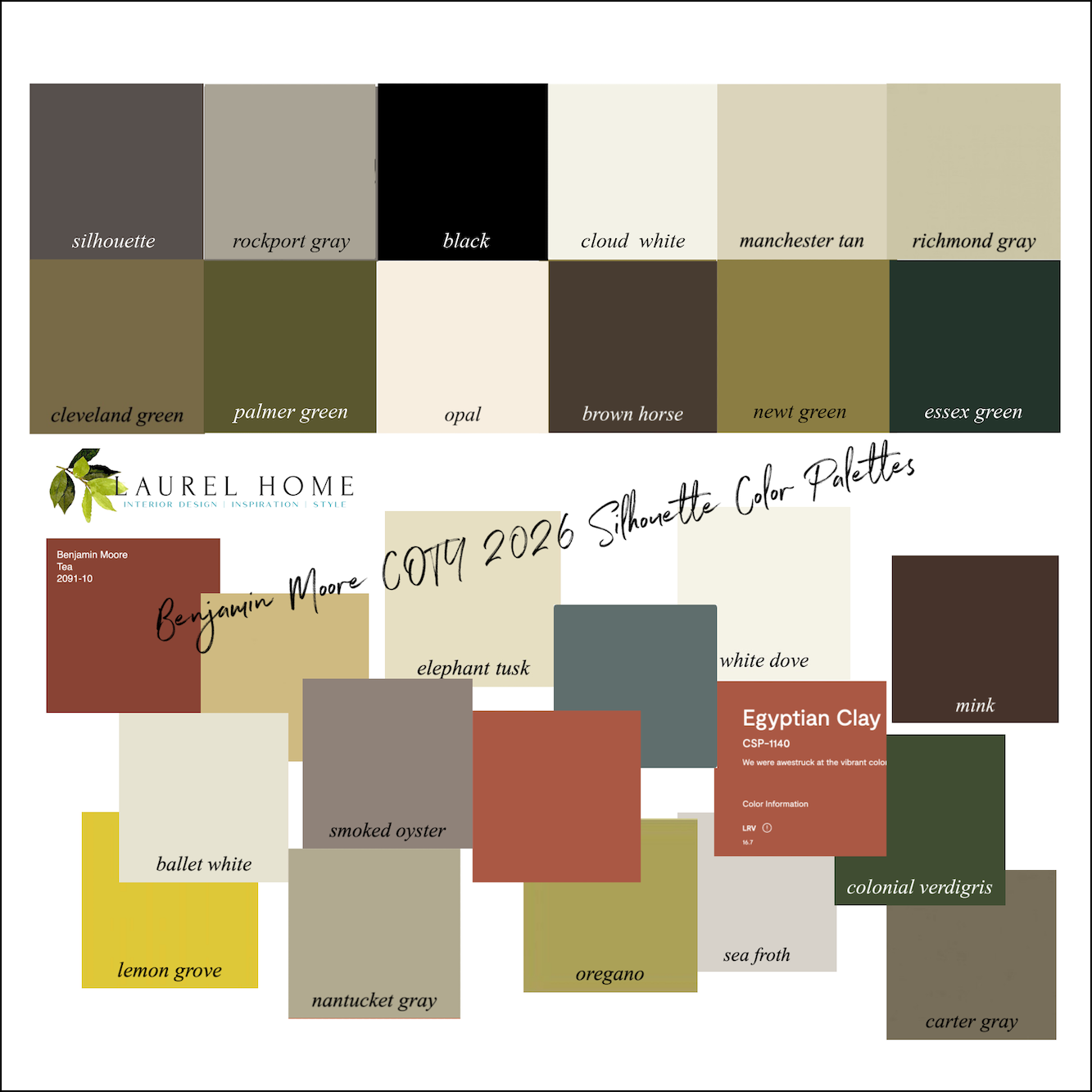
The thing I’m having a problem with is that some of the other colors they’re pairing Silhouette with as a palette.
Below are the colors.
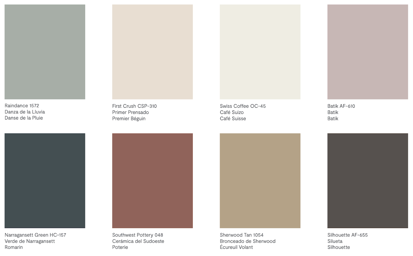
This looks like a corporate color scheme.
I don’t know what corporation, but this color scheme is not anything I would use for someone’s home. Like, you could take the bottom three colors to the left of Silhouette, and those could be the foundation for a good color scheme.
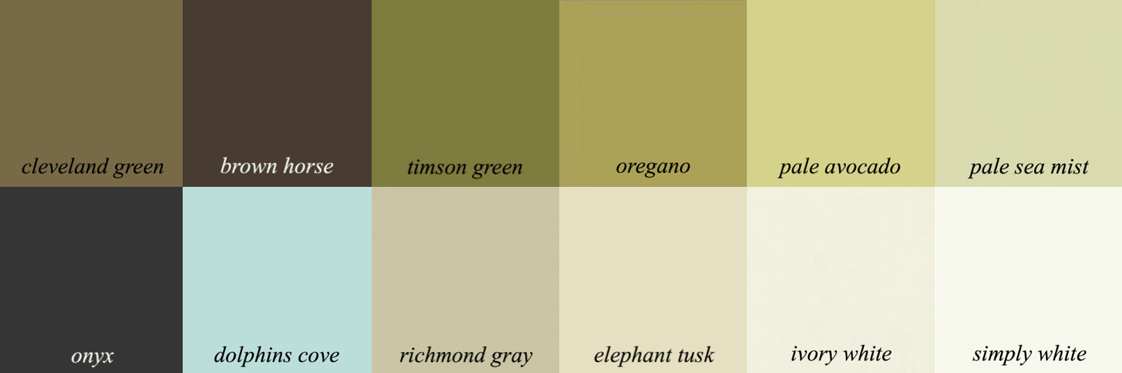
Below is another color card from 2021. Silhouette is part of this palette, too.
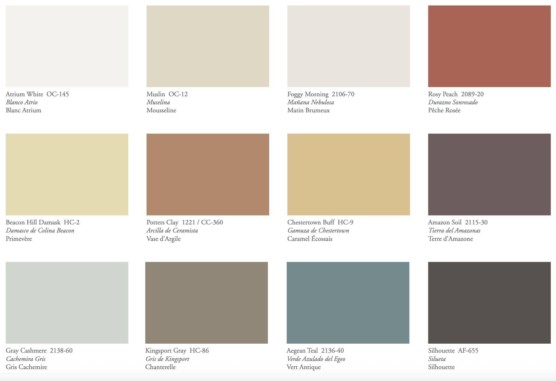
It’s a bit better than the palette for 2026. However, I feel it’s too many clashing colors.
Then there are these combos for this year.
I would not put these colors near each other. It’s one or the other.
However, the one below is worse.
And then there’s this duo, below:
Pepto Bismol and peach. I don’t mind the colors on the right, but why are they putting these colors together?
Below is a palette I came up with.
This is a sophisticated, earthy palette. Some won’t care for it, but a palette like this needs lots of white.
Let’s bring back the Greek Revival room, and then I think it’ll make more sense.
Below is a similar palette from the Laurel Home Paint and Palette Collection.
Below is the mood board that goes with this palette.
I also made a board with some of the rejects. Some might like it better because it has more color.
All of the colors together remind me of Ralph Lauren’s style.
Silhouette is a fine color, but an attractive palette would have variations of this color and then accents of some of the colors you see above.
Please note that color palettes include colors that might not be on the walls but in the room’s furnishings.
One thing to remember that we’ve discussed before is that dark colors like Silhouette are better for smaller rooms, not more than 200 square feet.
What do you think of Silhouette? I know some will like it and some won’t, solely because they’re not a fan of dark colors.
xo,

***Please check out the recently updated HOT SALES!
There is now an Amazon link on my home page and below. Thank you for the suggestion!
Please note that I have decided not to create a membership site. However, this website is very expensive to run. To provide this content, I rely on you, the kind readers of my blog, to use my affiliate links whenever possible for items you need and want. There is no extra charge to you. The vendor you’re purchasing from pays me a small commission.

To facilitate this, some readers have asked me to put
A link to Amazon.com is on my home page.
Please click the link before items go into your shopping cart. Some people save their purchases in their “save for later folder.” Then, if you remember, please come back and click my Amazon link, and then you’re free to place your orders. While most vendor links have a cookie that lasts a while, Amazon’s cookies only last up to 24 hours.
Thank you so much!
I very much appreciate your help and support!
Related Posts
 The Kitchen Cabinets Arrived In a Rain Storm!
 Otis House-Surpising Lessons From A Late 18th C. Home
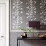 40 Outdated Home Trends. But, Are They All Passé?
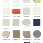 My 20 All-Time Favorite Benjamin Moore Paint Colors
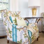 Blah, Dated Condo – Is There Any Hope?
 The Interior Design Industry Could Be Dying – Here’s Why
 He Loves The Phony French Country Kitchens


30 Responses
I am curious what the blue/ gray color is to the left of elephant tusk and egyptian clay, and to the right of elephant tusk.
Hi Stuart,
That’s Benjamin Moore Knoxville Gray hc-160. It’s the color in my downstairs entry, and upstairs, the wainscoting in the main entry.
You can see these spaces and maybe some others in these posts.
The color is more green than blue. It is muted, but I would never call it gray. I see it as a classic, historic, pine green.
While it is not a color I would choose for myself, I know people who love neutrals, and I could see this addition shaking up their soft taupe world. I love dark colors and I disagree with some opinions that it ever makes a room gloomy or cave like. While I think that many people get their advice or thought training from TV, or their family, friends and neighbors, and then change everything they like to go along trends. I feel that they would all do better to pay attention to the guidance that you give, especially when you’ve had to be flexible with your own home design projects. Although I love Benjamin Moore, I especially like the alternate colors you chose this time, over their choices.
It’s like you’re talking yourself into liking it. I like to keep things simple. Why let your paint colors depress you? This color is a definite no. It’s like the color of water you get when you’re painting with watercolors.
Clearly, most comments reflect years of “programming” against dark colors. Please, have the guts to try this one! I used it years ago, and it transformed an ugly sunroom in a historic coastal apartment into a true refuge and place of rejuvenation! An eclectic mix of antiques, glass and iron desk, and tiny shuttered antique coffee station, along with a single bed styled as a bohemian sofa, created a place where I could hang out for days during inclement weather. Fine art and flea market finds looked amazing! Charcoal/granite RH drapes made possible a black-out sleeping environment, and I slept better in that room than in my bedroom. Reflected early morning light from the fenced patio created ever-changing color nuances. A handmade rug pulled it all together. I went with Silhouette after first painting the room a light color because the room was small. Glad I “stepped out of the box” and was able to experience a room that fed my soul! An additional dark accent wall in the front living room created a totally different air of sophistication as a fine art backdrop. Silhouette is a hidden gem!!
You described that colour so perfectly — at first, very surprised, but then you start seeing its moody magic. Totally, agree it depends on how you pair it — with the right tones, it can be so elegant and cozy. Loved your honest take, as always!
I like it, in the right space. btw, you inspired me to use knoxville gray in my very small foyer – for walls, doors, and trim – and it is sooo, so good.
Silhouette is beautiful and your inspired palette makes it shine even better. I would definitely use this color. My basement has a few well windows which limits natural light so silhouette may be worth considering for this space. I am curious will it work with a terracotta red accent?
It’s fine if it gets assistance from the other decor elements and colors. I don’t see it as color of the year. I like it more as a fashion color. You are on point as usual – better used in small spaces or to paint radiator covers.
My first thought was that we must really be heading into an economic depression because for some unknown reason fashion tends to predict the economy.
I am allergic to brown since I became an adult. I did have a very sexy evening dress in something close to this color because I believed I couldn’t wear black when I was young. lol.
I can see this color’s uses, but not for me. I did find some purples I would use as I clicked around the various palettes for similar colors on BM site. I found a couple of interesting purples I might use and saved them.
But all of these palettes, no matter how beautiful, are anathema to me.
I have named my color preferences ‘sea and sky’ as opposed to ‘earth’ — I do not understand why ‘sea and sky’ colors are not a thing because just like earth, they are around us every single day.
I would really appreciate some comments from any of you about ‘sea and sky.’
And the truth about all this is that my psyche drinks in ‘sea and sky’ and get pushed down into depression by ‘earth.’ I am not saying I don’t appreciate earth for others though.
Not bad on the walls but I wouldn’t use it. I hate it on the swatch. It feels like colors are really trending towards the 1980s lately and I don’t approve at all.
That’s a beautiful color when used well, as you said. With your first palette you created, I still felt like it was heavy and dull. I was thinking it needed something unexpected. Then I kept reading and bam! There it was in the next palette from your collection, that light blue did the trick. Thank you.
Our 3 master bedrooms over the past 21 years have been painted BM Middlebury Brown. I was inspired by Alexa Hampton, who used that color in her small studio apartment many moons ago. When we moved to apartment number 2, we decided to change it up – 6 months later the painters were called to change it to Middlebury Brown! We really love the brown, contrasted with Chantilly Lace trim and ceiling. We find our bedroom cozy and sophisticated. Silhouette gives a similar vibe. I am glad they went in this direction this year!
When I lived in Florida coming from the Midwest I didn’t want to go “pastel”.
I chose a color like this for the master bedroom and loved it with taupe and cream accessories. The Florida builder’s assistant I worked with said she recommended it to several other clients.
Then we moved back to the Midwest and I had a painter redo the master bedroom again with the same dark color. After he painted it, he said that when he opened the can of paint he didn’t like it but now that it was on the walls he loved it.
So yes, I like Silhouette.
Laurel, I like this color very much, it is a beautiful color but kind of limited in where it can go -similar to when Sherwin Williams had Urbane Bronze as the color of the year. And I agree that your color pallet is better, but of course you are only looking at what colors look best together –not trying to sell as much paint as possible 😉
I LOVE the silhouette color with your palette of Rockport Gray, Black and Greens. About 15 years ago I had a color very similar to this in my dining room (can’t remember the name) but I loved it. Then came a renovation project that affected the dining room and that prompted a change in the color scheme. If I wasn’t 80 I would love to redo my entire first floor for the umpteenth time. I have lived in the same house for 48 years and it has been through many transitions with color and style. I remember them all fondly because I put heart and soul into every choice. To say planning and making all those choices brought me great joy would sound simplistic to some but to me it was exhilarating.
I like it. It reminds me of SW Urbane Bronze. A friend painted the soffits and fascia of her house urbane bronze and it blends perfectly with the roof. I’m just not so sure of a color that dark and rich inside the average house though. I love Silhouette in the Greek revival foyer photo, which proves your point about it needing lots of white. That is a gorgeous space!
Wow Laurel, Benjamin Moore should have hired you to do its palettes. Your’s are gorgeous! I really like Silhouette, but I feel like it’s not as versatile as many other dark colors. For instance, I don’t think I’d put it in a common hallway in a condo building because it would clash with too many people’s foyers. BTW, do you have any experience using Raindance, which is featured in some of the BM palettes? It looks like a pretty color.
Love your sophisticated earthy color pallet. Thank you.
Love Silhouette and the many tips for its use. EJ, MaryJane, and you! Going to use it in a windowless powder room with white pedestal sink and toilette and lots of white towels. LOL. And maybe a windowless back entry hall. And the rest of the house will be Cloud White. Thanks so much for your palette and inspiration!!
Love it. Just painted my foyer SW Cheviot and will paint living room SW Urbane Bronze. Very similar to
What you show here. I love the combination and the contrast!! Adjoining room will be SW Popular Gray. Beyond excited!!!!
I really like Silhouette. I am trying to find a wall color for my dark hallway. I am contemplating Inner Balance but a friend told me dark rooms should be painted a light color. However, the darker my samples are, the better I like it. Off the hallway is my office – a south-facing room (contemplating Windsor Cream walls and Chantilly Lace ceiling) and on the other side, the east-facing dining room that I am thinking of painting Semolina. I hope that isn’t too many different colors in a smallish space. I thought having the hallway a dark color would make the rooms off of it feel expansive.
Bleak. Maybe in a huge home with lots of white, as you said, otherwise, I find it too bleak. Perhaps it is appropriate for the times were are in.
You are too funny. Sewer sludge and bile vomit green – no thank you!
I like Silhouette! ! suspect that the marketing department got cold feet about how dark and saturated it is, and so made the test of the palette lighter and brighter. But of course, it doesn’t you are right, it doesn’t work together. I have a powder room that needs a re-do, and I may try Silhouette or brown horse.
Silhouette is a favorite of mine. Painted a windowless powder room with it 10 years ago and love it even more now. We silver leafed the ceiling (argh what a job) and it’s beautiful together. Happy to see it get the recognition it deserves!
I think brown colors are drab. I really don’t like them in clothes and definitely not a fan for cars. I don’t think I have ever had more than 2 brown boots. I remember when every man wore khaki pants. Ugh khaki hell! Boring. So I agree this is brown caca. But, thanks for sharing and will have to give this years color a pass. 🫣
I always appreciate the insights, the alternatives and the humour! Thank you for this! The magic always seems to come from the way the light falls in a space, and I can’t see this colour working where I live. The answer about most colours, for me, is “it depends” (on the light, the space, the condition of the walls and trim, who lives there, the furniture, etc). I do believe you have single-handedly made me a more complicated person, Laurel! I thank you, my husband (get ‘er done!!”) does not. Ha ha. Too late!! 🤓
I adore dark solid paint especially with your choice of the Greek key ideas, my sister can’t believe l haven’t changed my solid crimson leather 2 seater couches (3 men to lift one) for comfort and 6ft tall people. As l have a blue turquoise wing back chair and large stool l just needed this inspiration today Thankyou
I once painted a fairly large entry what I called eggplant that was very similar to the Silhouette. I used a very pale celadon green as the accent color in the Bergere chair upholstery. I still miss that entry as it was sized right and a beautiful entrance to the rest of the home.