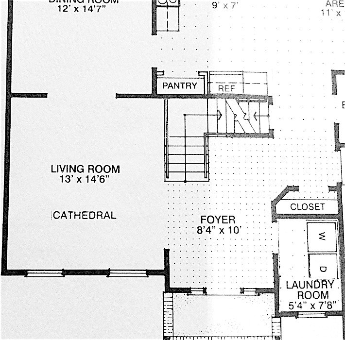
The other day, I received an interesting set of photos/floor plan and thought you guys might enjoy looking at it with me.
Like the other two plans we discussed the other day, it’s a small, awkward space, but never-the-less is full of interior decorating lessons. Many of them we’ve discussed and some, perhaps, we haven’t.
Hey! Wait! I know that trick of scrolling down. Hold on please. ;]
Okay. I know that you want to see something, so I’ll begin with the first image I saw.
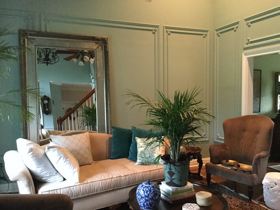
Really fast. Don’t think! :] What do you think?
Well, here’s what I think.
I’m thinking cool old house. Looks Parisian. Right?
Ummmm… that would be no.
This is vintage New Jersey 1997– with a very small living room which is really almost an extension of the entry.
Here’s what Susan had to say:
Susan = italics
Laurel = [regular text and brackets]
Dear Laurel
We built this house in 1997. It was the cheapest, bare-bones of four house plan options, about 3k square feet, including the basement. Believe me, Laurel, it took every last cent we had as my kids were young and well… we were cash poor.
But Momma is a crafty “trash diver.” haha
The one upgrade I was adamant about was a side entry garage. It drives me nuts to have a garage in the front of the house!
[I agree!]
Fortunately, we’re doing better now, financially, but still need to be careful.
My kids are now grown BUT still live here.
My son is 28 like yours, and my daughter is 24.
Now Laurel, I’m a southern girl through and through.
This next statement is NO reflection on you or your children… As you say they were rambunctious. I have friends with kids who are restless beasties, jump on everything. I guess I was lucky, They say God gives what you can handle.
[Rambunctious is a grotesque understatement, but I did my best. And yes, you are very lucky. No offense, meant, whatsoever, but whoever “they” is, is speaking crap. God does not necessarily give you ONLY what you can handle. Otherwise, we’d still have our Robin Williams, Kate Spade and Anthony Bourdain, amongst millions of other poor souls who had more than they could handle!
The only other possibility is that God does give us what we can handle, but because we are human, we refuse to listen to the warning. Maybe that’s it. I don’t know.]
My children were raised with Southern manners and they have always been allowed in every room of any place we’ve ever been. They even sat still in restaurants…
[ha! My children at 28 and 23 when TOGETHER STILL DO NOT SIT STILL IN RESTAURANTS.]
The room you see is the LR and we have a larger family room…Remembering that large is relative.
Which NOW has a huge-amongus [I like that]TV AND a sound bar on my mantel. That was part of the bargain in me getting the Bones I wanted and new paint. Can you say UGH
[Yes, I can say “ugh.” It’s one of my favorite words. Mais, qu’est-ce que c’est le sound bar?]
And, because they just finished the work in July I’m still figuring out what I want to put back and what I want to change.
Your fan girl…I’m just gonna say #1 fan girl
[oh, that is too sweet. Well, I’m a fan of you too, Susan!]
Susan H
Sent from a parallel Universe
Susan signs all of her emails this way. I suspect it’s built into her email program.
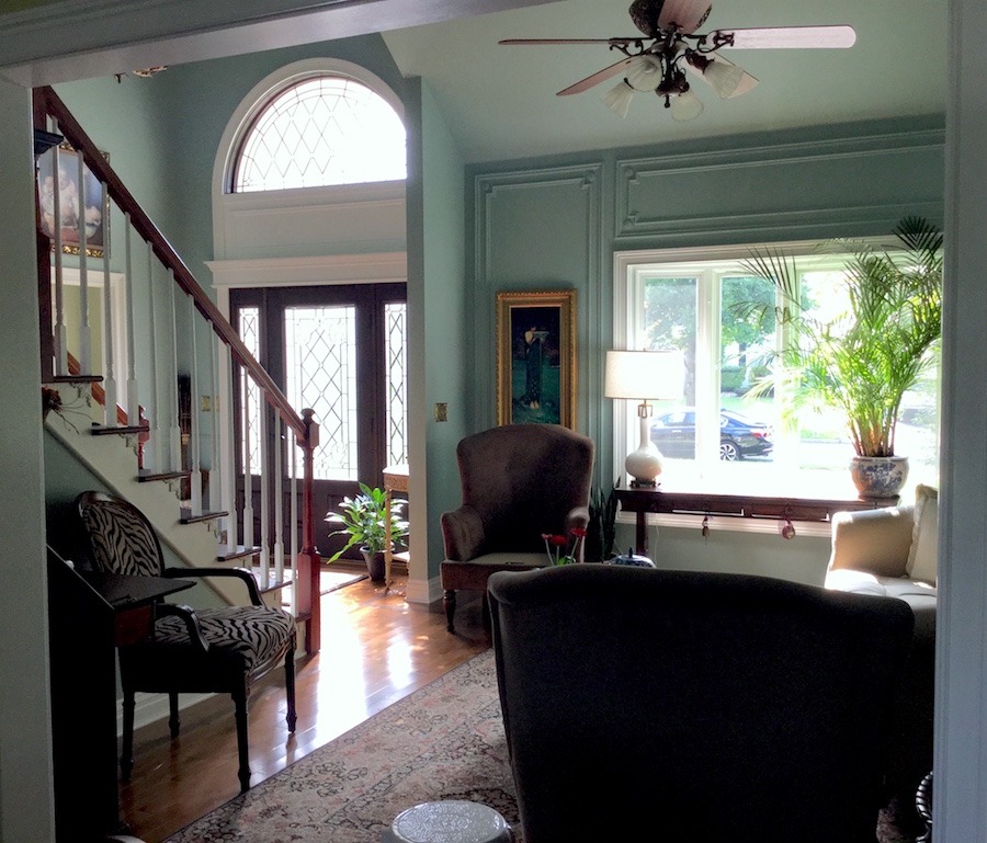
So, let’s look at this room before they put in the moulding, aka: “bones” and new paint.
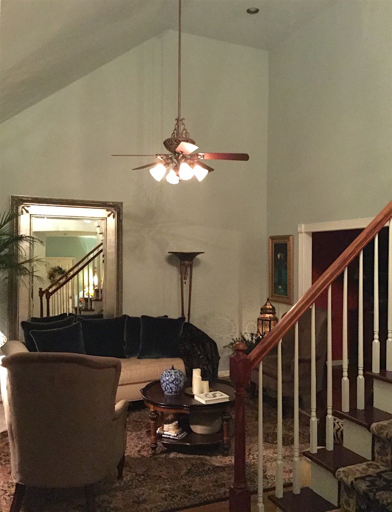
This is the before
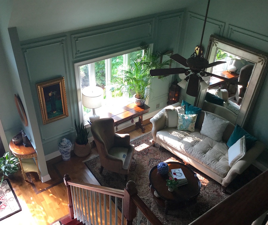
And definitely the after– perched from the top of the staircase.
The living room and entry is Benjamin Moore Wythe Blue hc-143
At the 11th hour, Susan divulged a bit of a bombshell regarding most of the furniture in the room.
We had no LR furniture for years; literally, none.
[I can totally relate and you know, it’s not as uncommon as you might think.]
My husband blamed it on being claustrophobic. What a load of bologna!
[Indeed!]
Then, one day out of the blue, we’re doing some shopping at the mall; And by golly, his credit card jumped out of his wallet and started running straight toward the furniture store! ;] Naturally, husband went chasing after his card!
There was a HUGE SIGN in the window. STORE CLOSING. SACRIFICE SALE. HURRY. UP TO 90% OFF!
And Laurel, I know. I know, even without reading your blog, that it’s foolish to purchase furniture without a plan.
But, there was no time to plan. It was now, or who knows when I’d get another chance?
[I would’ve done the same thing! Make no mistake!!!]
The sofa, chairs, coffee table, and secretary, all came from this store and I’m grateful to have them.
[Well, Susan, for not having a plan and making decisions spur-of-the-moment, you did a pretty damned good job! So, no worries. We can see how to make the most of what you have. I think that a lot of us are in the same situation.]
Let’s look at some other images and while we do that, we’ll intertwine the interior decorating lessons.
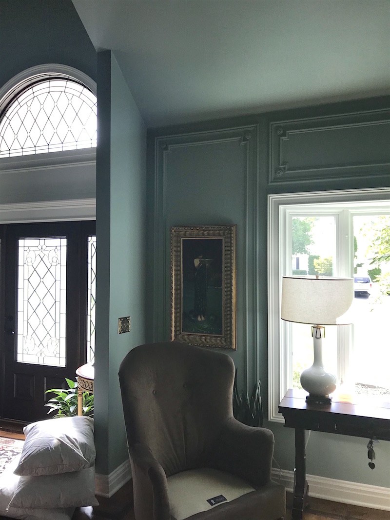
And yes, we just had all the mouldings done and the paint. The living room and entry are Benjamin Moore Wythe Blue HC-143 and the dining room is BM Green Hydrangea.
The moulding idea came from following your pins on Pinterest.
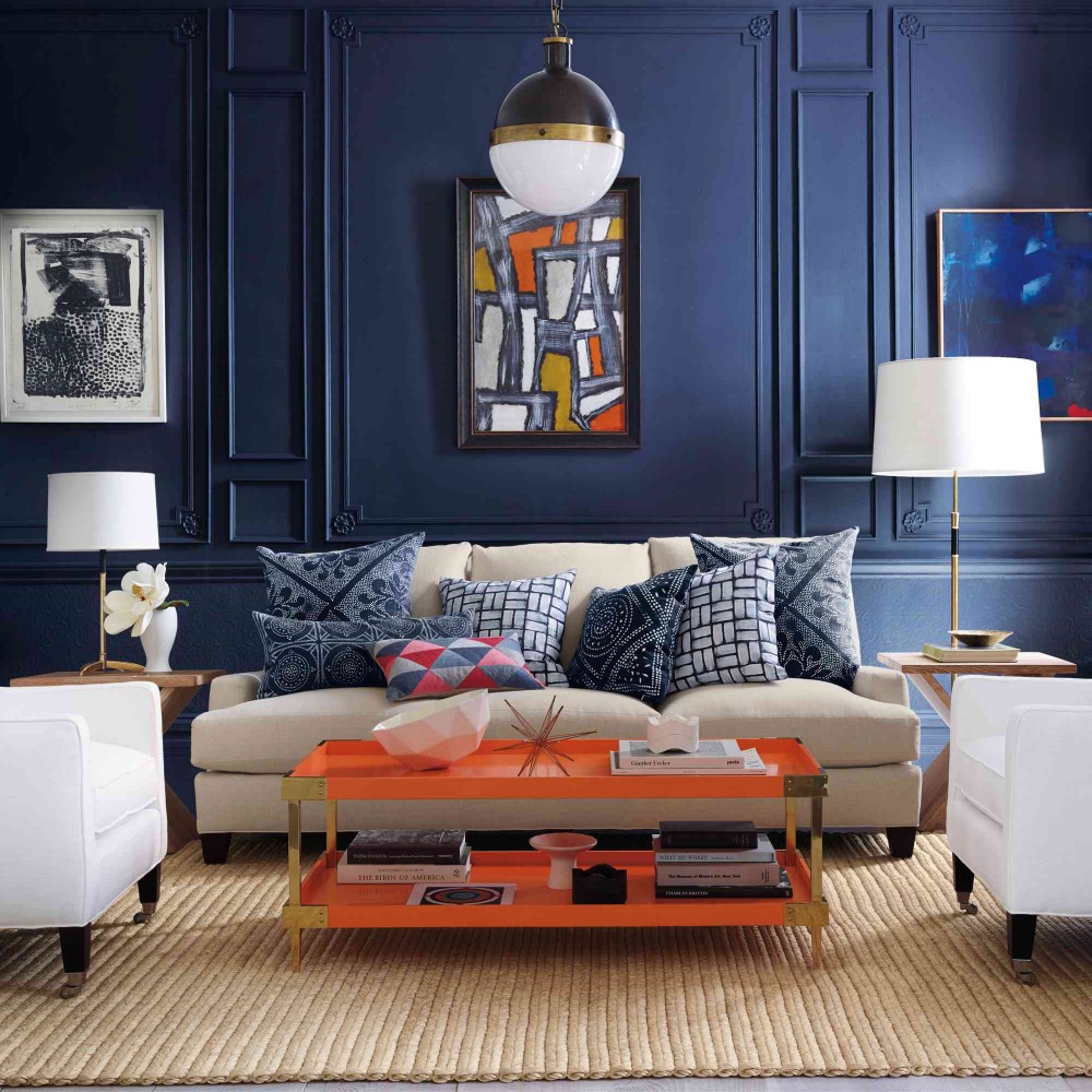
This image from Serena and Lily completely captivated me
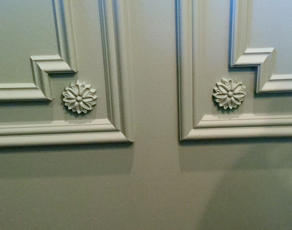
HOLY CRAP! Girlfriend YES! This made my day!
Plus, I was so inspired by your trip to England and especially the George Saumarez Smith house.
I adopted the same color scheme for my house.
I purchased your paint guides and rolodex and those are immensely helpful! In addition I read every blog post. As much as possible, I did EVERYTHING you said to do.
I know that it’s not perfect and I know that some of the furniture is a little as you say, “ersatz.” But at least we have furniture and I feel good in the room.
Right now, I’m so thrilled with the new colors and mouldings.
[Oh, I know. I remember when we did our moulding and paint in our townhouse. I was walking around with a huge grin for weeks!]
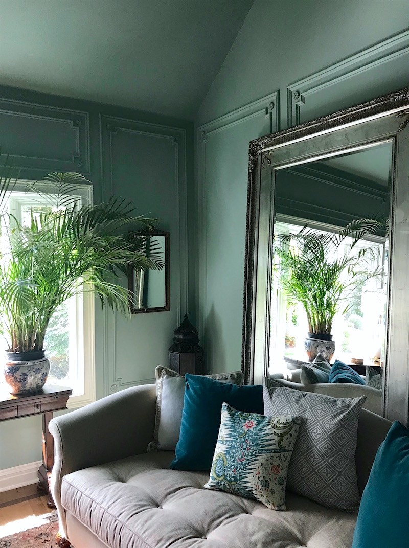
I adore this image! The colors are gorgeous!
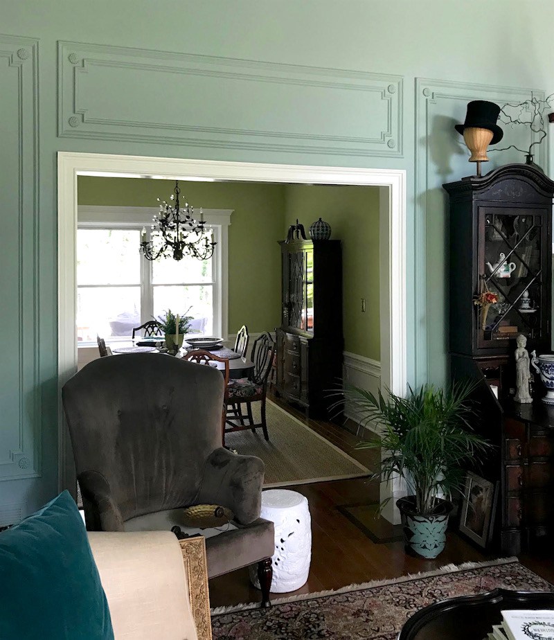
Looking into the dining room.
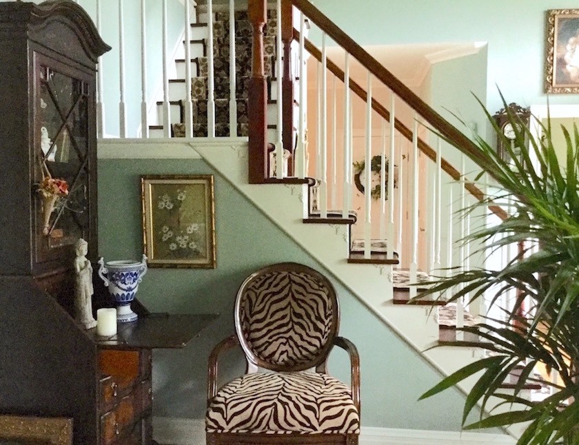
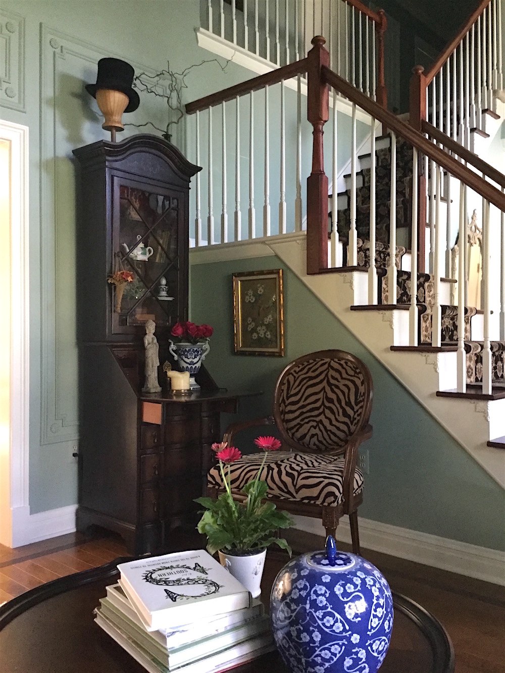
The reason that the furniture is a little on an angle is that my mom warned me that it would look like a doctor’s office if I lined the perimeter of the room with the furniture.
Okay, sorry mom, as well-meaning as I’m sure that you are, I have to respectfully disagree here. First of all, there is no way that this architectural beauty could ever look like a doctor’s office.
Second of all, if furniture goes on an angle, there must be a clear reason why that’s so. I’m not seeing any reason other than Mom thinks it should be that way.
Otherwise, to me, it looks like the cleaning lady came and forgot to put everything back. (Does anyone know why they always do that?)
Putting furniture slightly on an angle in a classically inspired room is just not done.
I mean, there are worse things, ;] but still.
Aside from that, I really have only one, no wait. Two issues.
One the mirror and sofa should be centered on the wall. I realize that it is anchored, but I feel pretty strongly that it needs to move to the center.
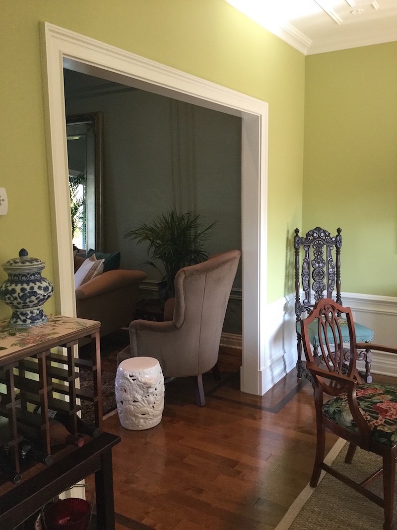
Two, the chair with the pretty white garden stool is blocking the entrance to the dining room. And, it’s also overlapping the sofa. Both are no-nos in the realm of space planning. It is a pretty chair, however. Just not where it is.

Please note that the seat cushions are out getting fixed.
I did a floor plan and there is no other place in the room for the wing chair.
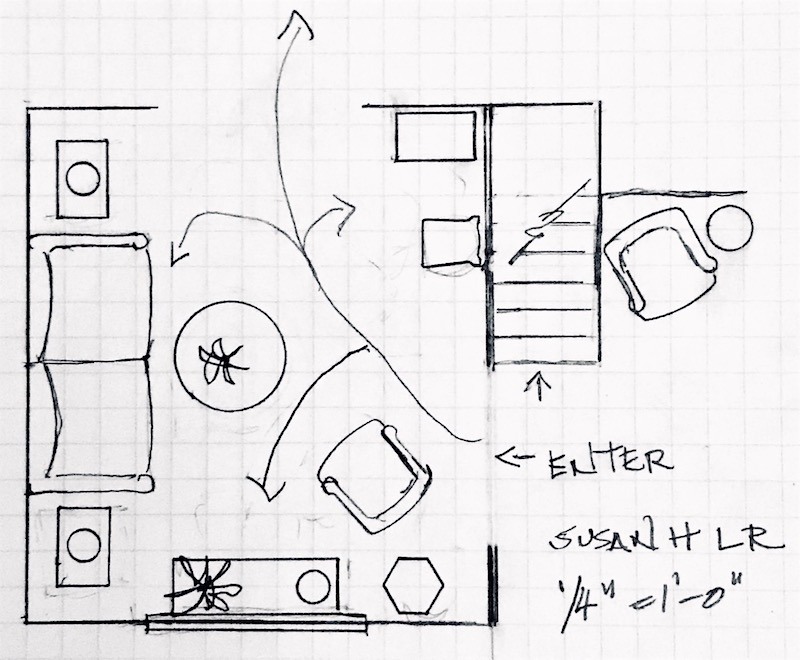
I love the secretary where it is and the zebra chair. I love the console table. That’s all that fits.
If, if, if… The sofa were smaller. (I know that you know that) and the chair near the dining room was lower, I could make it work. But as things are now– no. Of course, you can ignore me and leave it where it is. But, it’s actually a hazard. Or it would be in my house. haha!
Here are my recommendations. And again, you are free to take or leave or whatever.
I would go and whip up for your husband, a chocolate cake. You know… the one that will make you plotz. ;] I’m serious. This is the cake that will get you whatever you want.
As you’re serving him seconds, this is a great time to gently bring up the fact that the mirror is in the wrong place.
OR, if he goes away on business, don’t tell him and schedule all of the work to be done while he’s away. He will almost definitely not notice. If he notices, tell him that you were feeling claustrophobic where it was. ;]
Now, we can center the sofa with the mirror. Ahhh… That’s better.
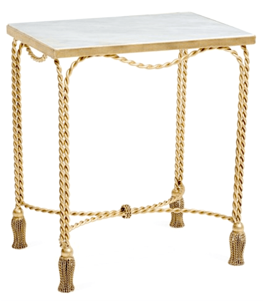
Then, you need two pretty end tables. Since money is tight, I went over to One King’s Lane because of their insane “private” sale (which you can read about here and grab your discount code for 25% off the entire site. YES, the entire site!)
I could see these charming end tables in your room because they have a little whimsy and I think that they complement the sofa. They’re light and I’d love to see a little more gold in here.
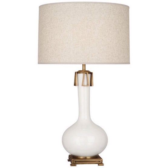
Then, I would get another one of the Robert Abbey Athena Lamps.
Yes, it’s the same lamp that I feature in the paint/palette collection.
Now that you have two of them, move the other one over so that you have two of these flanking the sofa. So pretty.
The Robert Abbey Lamp is nearly 32″ tall and I think because of its heft is perhaps a tad too large for the console table. It’s not terrible, but if you are moving it, then I would do something a little smaller to replace the lamp that you’re moving.
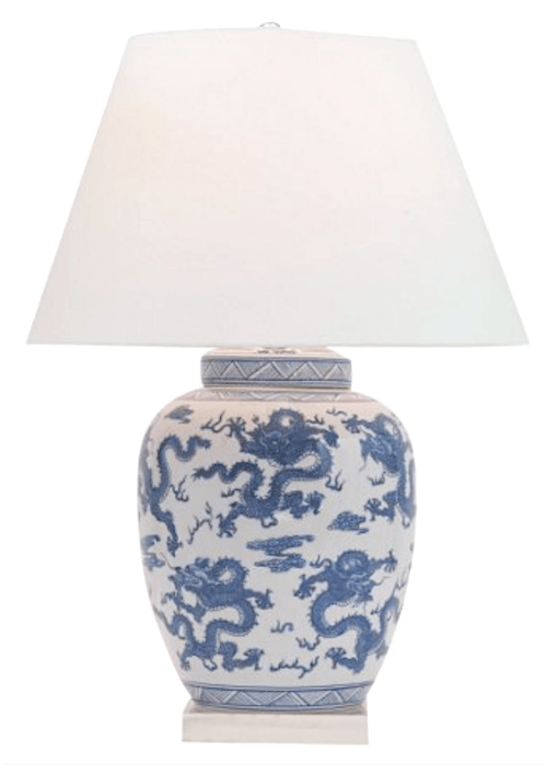
This Chinoiserie lamp from Port 68 is 29″ tall and I think would look great. But of course, there are other lamps that would work as well. Go and grab your discount code here.
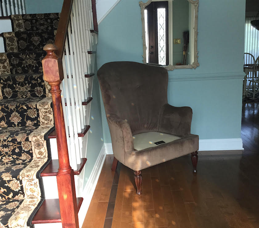
The wing chair could go to this nook in the good-sized entry. Obviously, Susan humored me by moving it there. I think it could be skooched over a little to the left and then a small round table could go under the mirror.
I would prefer a lighter fabric or slipcover in cream canvas, but an alternative would be a pillow to brighten up the piece. They’re very pretty chairs.
Now, the pathway is clear.
When entertaining, if you need more seats, just grab a few chairs from the dining room.
One thing Susan read my mind about is the rug. I was thinking that it looked quite muddy in the early photos.

But, as you can see, it is anything BUT muddy.
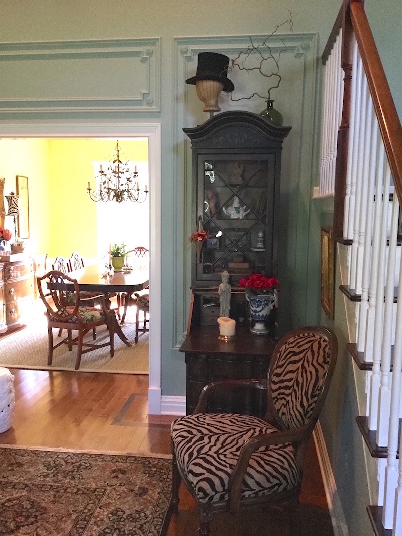
Wow! This photo reveals something that I talk about all of the time.

Benjamin Moore Wythe Blue hc-143
In fact, this body of images from one home illustrate so beautifully how one cannot possibly know what a color is by looking at it on a computer screen or a magazine.
The living room color looks different in every image and look at the dining room above! It looks day-glow yellow, but it is not.
 This is Benjamin Moore Green Hydrangea.
If you love real green hydrangeas please check out my instagram. Oh, and I’m almost at 10,000 followers, so please follow me. I don’t post terribly often, so you won’t ever be irritated.
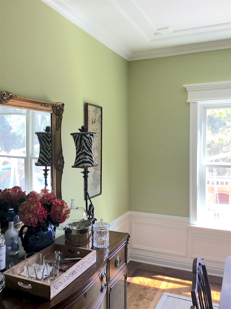 This is also green hydrangea. And, another great shot of the dining room.
Fabulous job on the mouldings, Susan! I’m phenomenally impressed! and that is why I wanted to feature your beautiful home.
 Another magazine-worthy shot of the dining room ceiling mouldings. I noticed that the rosette is different here than for the living room walls. It is all, absolutely perfect!
If you love mouldings please check out this post
And here is a great post, all about wainscoting.
Laurel… what is…………
Yes, yes, I know. What is the ceiling paint color?
Well, it’s Cotton Balls. Cotton Balls as many of you know is one of my favorite shades of white paint and in another email Susan said that she adores it and that the glossy white has a prismatic effect at times.
Thank you so much Susan for sharing your lovely home with us. I love how you’ve taken so many interior decorating lessons we’ve covered the last several years and incorporated them into your home. It’s a testament that if you get the bones right, the rest is not easy, but definitely easier.
xo,

Related Posts
 Help me please. My husband wants a matched set of dining room furniture
 25 Ways To Hide The TV – The Ultimate Guide
 Freshening Your Home for the New Year {part IV – window treatment ideas}
 Is It True That Dining Rooms Are Out?
 Stair Runners – The Complete Guide + Mistakes!
 He Loves The Phony French Country Kitchens
 Six Figure Income Blogger 150 Page Guide Is Here!


