The Horrid Gray Trend – Is It Finally Over?

Dear Laurel,

Recently, I’ve read that the gray trend is over and, gasp, we are going back to beige. Do you know? Is it really true? And, why beige, for Pete’s sake?

I have never liked the color gray; it depresses me. But give me greens, blues, and pops of my favorite color, orange, and I’m happy.


And I know you say not to pay attention to the trends, but still… Why is there still so much gray, and when is this gray trend going ever to end? I don’t get it.


Betty Sikovgrey


***


Betty is a fictional reader, but these are the words I hear all of the time regarding the gray trend!


However, before we begin… I have a little musical accompaniment for you.


Piped in from heaven. (the link is here)


I think it goes very nicely with this post about the gray trend.


Wolfgang Amadeus Mozart Concerto for Flute and Harp KV 299

Emmanuel Pahud, flute

Marie-Pierre Langlamet, harp

Claudio Abbado, conductor Berlin Philharmonie, 1998

ENJOY!


Betty asks a very good question, and it’s one I’ve heard many times.


When oh when is this horrid gray trend going to be over already? Gray, gray, gray, Laurel. Yuck.


Well, sorry that you feel that way because the answer is never.

Yes, that’s right. It’s not ever going to go away.

And that’s because the gray trend is NOT a trend.

I will explain.


via @limestoneboxwoods - instagram JohnStuartHouse - gray and white house - Charleston, SC
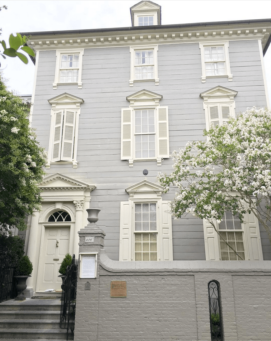
via @limestoneboxwoods – Instagram John Stuart House – A fabulous example of American Georgian or neo-classical architecture – Charleston, SC.

Gray is as classic as this gorgeous home in Charleston, SC, built-in 1772, the height of the neo-classical period. More coming up in a sec about neo-classical architecture, interiors, and the color gray. I think that most people will agree that this is a beautiful home, even those sick of the gray trend.


Here’s what I think is the problem.


It’s not the color gray at all. First of all, most shades of gray are actually very muted shades of blue, green, or violet. Some shades of gray are cool. And, some are warm.

So, what IS the problem, Laurel?


Right. The problem, I think, is three things.


1. Boxy, boring architecture. Anyone who’s read this blog for a while is probably sick of me harping on this one, but it’s true.

2. The word “transitional.” In my opinion, that word should be removed from the English language. lol Although, I, too, have been guilty of using it. Why should it be stricken? Well, what does it actually mean? It’s like the furniture can’t make up its mind. Can you imagine Thomas Chippendale designing a transitional chair?


Unfortunately, as I’ve also brought up numerous times;


“transitional” furniture is, more often than not, big, bulky, and boxy. Some transitional furniture is a completely made-up design bastardization of a traditional design. I feel most transitional furniture is poorly designed contemporary furniture. Of course, not all of it is.


The third problem with why so many are sick of the gray trend is how gray is used.


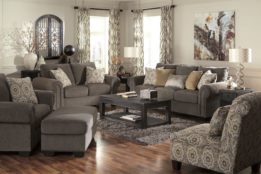
Here’s what I’m talking about. And please do not pin the following four images to Pinterest or anywhere else. They are here for demo purposes only. If any of these are your rooms, please forgive me.


please do not pin - depressing gray trend living room

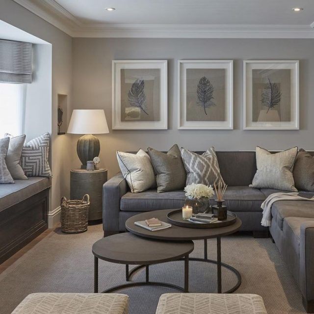
Now, there is absolutely nothing wrong with this room, except that it’s not balanced. I’m longing for more white, more black, and some color– somewhere. Even a beautiful plant.


And some brown.


Gray needs brown like we need oxygen. Gray needs warmth, and it loves gold the same way that its cousin, blue, does.


gray-please do not pin-gray-gray trend living room

You know, that’s a gorgeous fireplace mantel. That chair, shoved into it, needs to go. As we’ve discussed before, overlapping is a massive no-no in space planning.

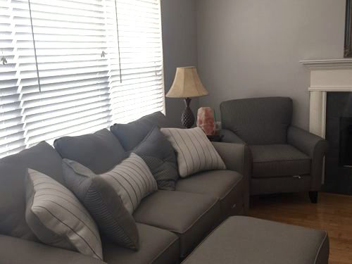
Here, we can see why some find gray to be depressing. I think the wall color is fine, and I don’t mind the furniture. However, it’s either in the wrong configuration and/or the wrong size. However, the scale is quite good.


But, the room needs more variety in tone, more white, black, art, maybe some color too.


do not pin please - ugly leather sofa - bad art gray walls - gray trend

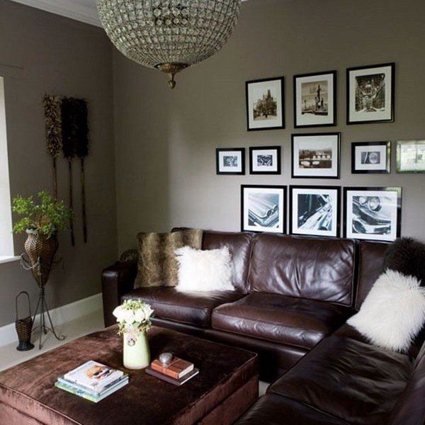
Oh, that glorious music makes me forget how bad this room is. And it doesn’t have to be. However, cranberry is not helping this gray. Gray needs some warmth, I think.


Then, there’s the art.


You saw that one before your eyes could focus. There should be a minimum of four inches of breathing space between the art and sofa. This is a tall ceiling, so I’d probably raise everything about six inches, and it will be fine. Do you want to find out 100s of rules and tips for furnishing your home?

Hmmm, are those some sort of dusters hanging on the wall? Maybe the cleaning service put them there.

I would also do a  hunkier light fixture with a leather sectional.


please do not pin - ugly gray living room furnitureThe above is from one of those furniture companies that sell cheap crappy matching sets of, yes, transitional furniture.


No wonder Betty finds gray depressing. I am surmising that is because when she thinks of the gray trend in interiors, she thinks along the lines of the rooms above.


This makes me sad because gray can be a charming color when used in the right way. Let’s take a look, and maybe we’ll be able to do away with the gray trend. And, we’ll make mainstream, classic gray rooms. I know; nice fantasy.


However, we can find beautiful gray colors in nature.


04379357f8f8a3a6a657af4da04263fb

source unknown

Any color existing abundantly in nature can’t possibly be a trend. One might not like it, but some people do.

bleinheim-palace-christmas-fair-201115via

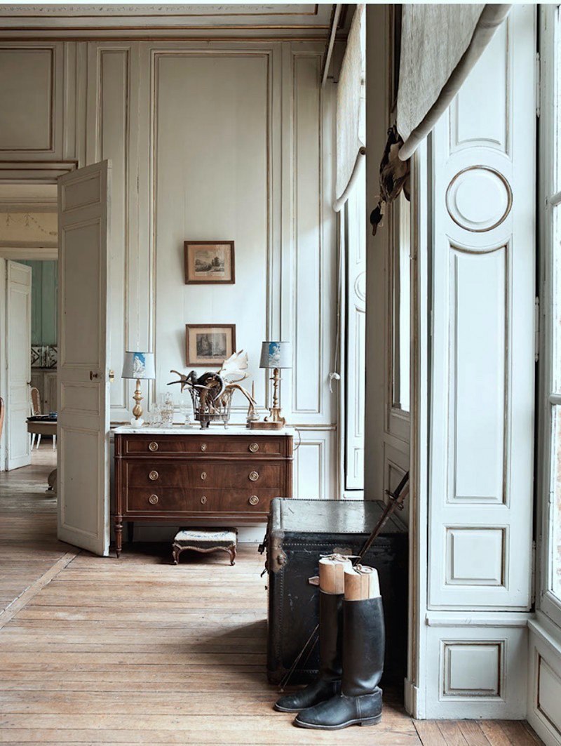
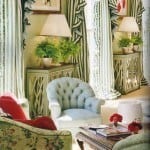
And gray and the not-boring beige can be seen here. Sublime.


And for a warmer beige, one of my favorite rooms ever!


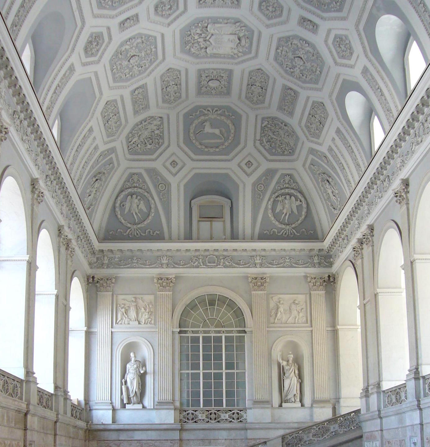
The Greeks and Romans understood design classical proportions and color.


I don’t know how or why at that time in history, but they did. But thank God, that is all I can say!

They embraced classical forms and loved gray. After all, gray is the color of limestone.

Then, perhaps due to an increased awareness of other cultures (mainly Asian), the 18th century brought about a resurgence in classical forms and colors. Andrea Palladio, an Italian Renaissance architect, was discovered and inspired all design of the 18th century.


That is the aforementioned neo-classical style, but it also goes by these terms:


  • Georgian (primarily Great Britain)
  • Colonial (American)
  • Federal (American)
  • Adam (Scottish Architect)


The neo-classical style permeated everything from architecture, interiors, clothing, art, and music.


It was the time when my favorite composer lived and worked. The one put on for you. :]

Below is one of the most famous architects of the neo-classical period, Robert Adam.

You can see his younger, handsome bro, James, here. He was also a renowned architect but over-shadowed by Robert.


george-willison-portrait-of-robert-adam-neoclassical-architect


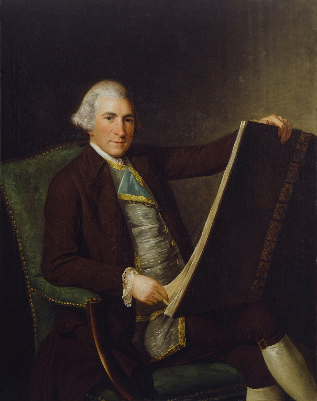
George Willison portrait of Robert Adam neoclassical architect


Robert Adam Entrance Osterley Park - enduring gray trend

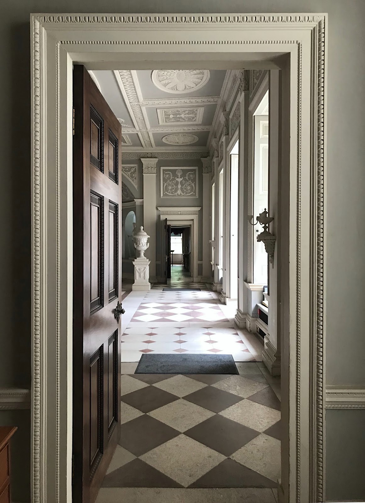
Entrance at Osterley Park by Robert Adam


Robert Adam is the architect who embraced the style of Andrea Palladio

 Thomas Jefferson in the US was our version of Robert Adam in the 18th century.


Let’s look at more examples of gray throughout the last few hundred years in art, interiors, and architecture.


Georg_Engelhardt_Schröder_-_Fredrik_I,_King_of_Sweden_1720-1751_-_Google_Art_Project

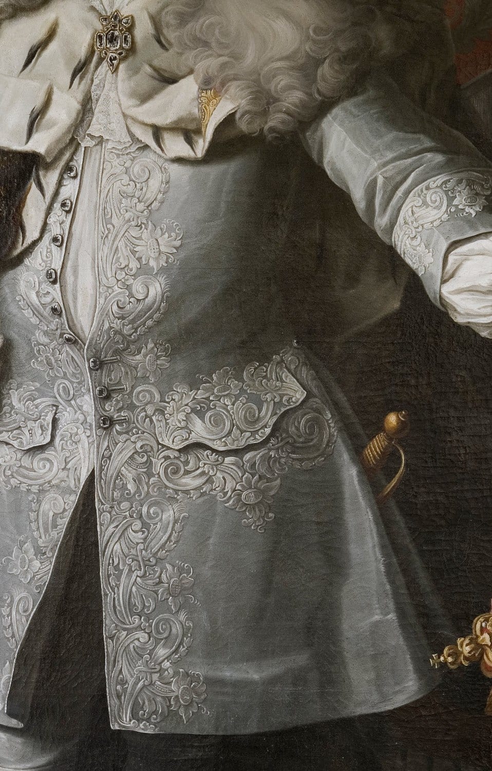
Excerpt of Fredrik I King of Sweden painted by Georg Englehardt Shroder

I imagine some poor woman going blind creating this, but it sure is glorious!


Napoli_Palazzo_reale_-_ingresso_e_scalone_1040725Royal Palace in Naples

This phenomenal building in the neo-classical style went through several incarnations between 1730-1860. It is very much in the style of Robert Adam.


via @rupert.dixon on instagram - gray trend Houghton Hall - photo @horwoodphoto

via @rupert.dixon on Instagram – Houghton Hall. This is a gorgeous Insta account with gorgeous images and architecture.

photo @horwoodphoto

@rupert.dixon on pinterest Nature's gray trend


One more lovely gray image from @rupert.dixon on Instagram – photo: @montgomeryphoto


interno-con-giovane-donna-vista-di-spalle-vilhelm-hammershc3b8i
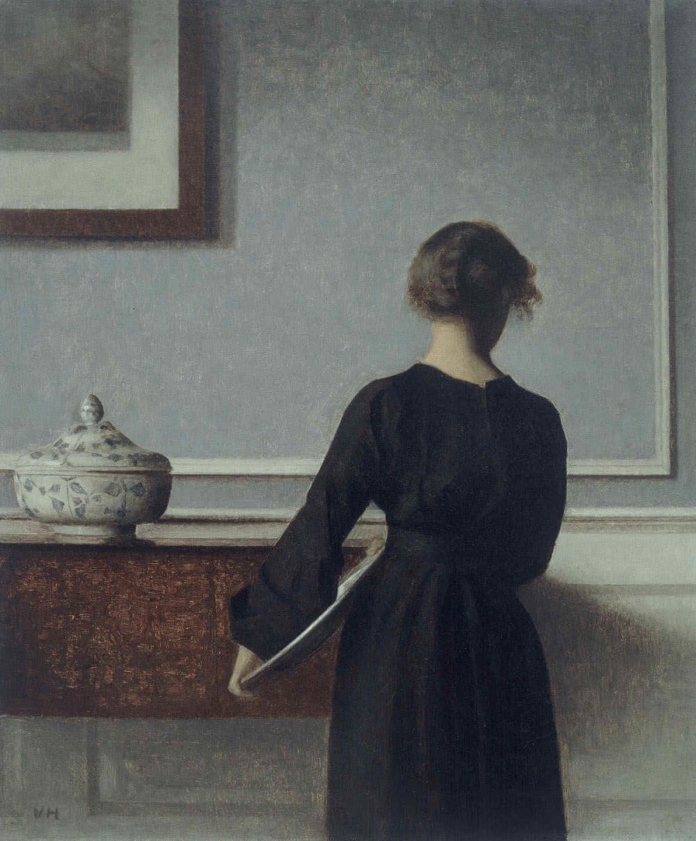
Interior with Young Woman from Behind (1904) by Vilhelm Hammershoi

How beautiful are these colors! And more Hammershoi here!


le-grillon-voyageur Gray Paint TrendLe Grillon Voyageur

I’ve long adored this image with the huge windows and interior paneled shutters!


cy-twombly-rome

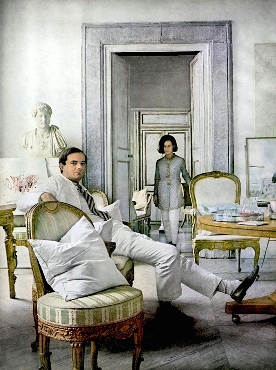
I first came across this photo a few years ago and thought it was some totally cool couple hanging in their pad in Tribeca or something like that. But no. The photo by Horst P Horst for Vogue Magazine was taken in 1966! This is Cy Twombly and his lovely wife hanging in their pad in Rome. Truly timeless.

BTW, I came across the entire set of these fine Horst photographic prints, which you can purchase here.


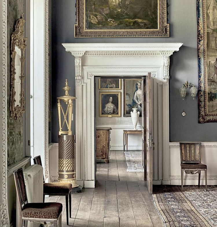
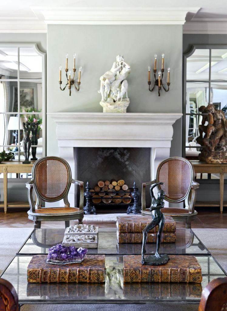
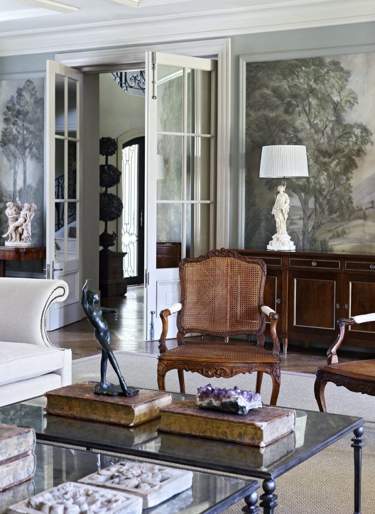
Below are some of my favorite designers who embrace gray in their work.


John Jacob - enduring gray trend - gorgeous living room

Above and below by the fabulous South African interior designer, John Jacob


John Jacob - not boring gray trend living room - gorgeous grisaille wallpaper

I adore the grisaille wallpaper mural. If you love it too, then you will most likely enjoy this post that’s all about grisaille.


George Saumarez Smith - home design - gray trend-new traditiona
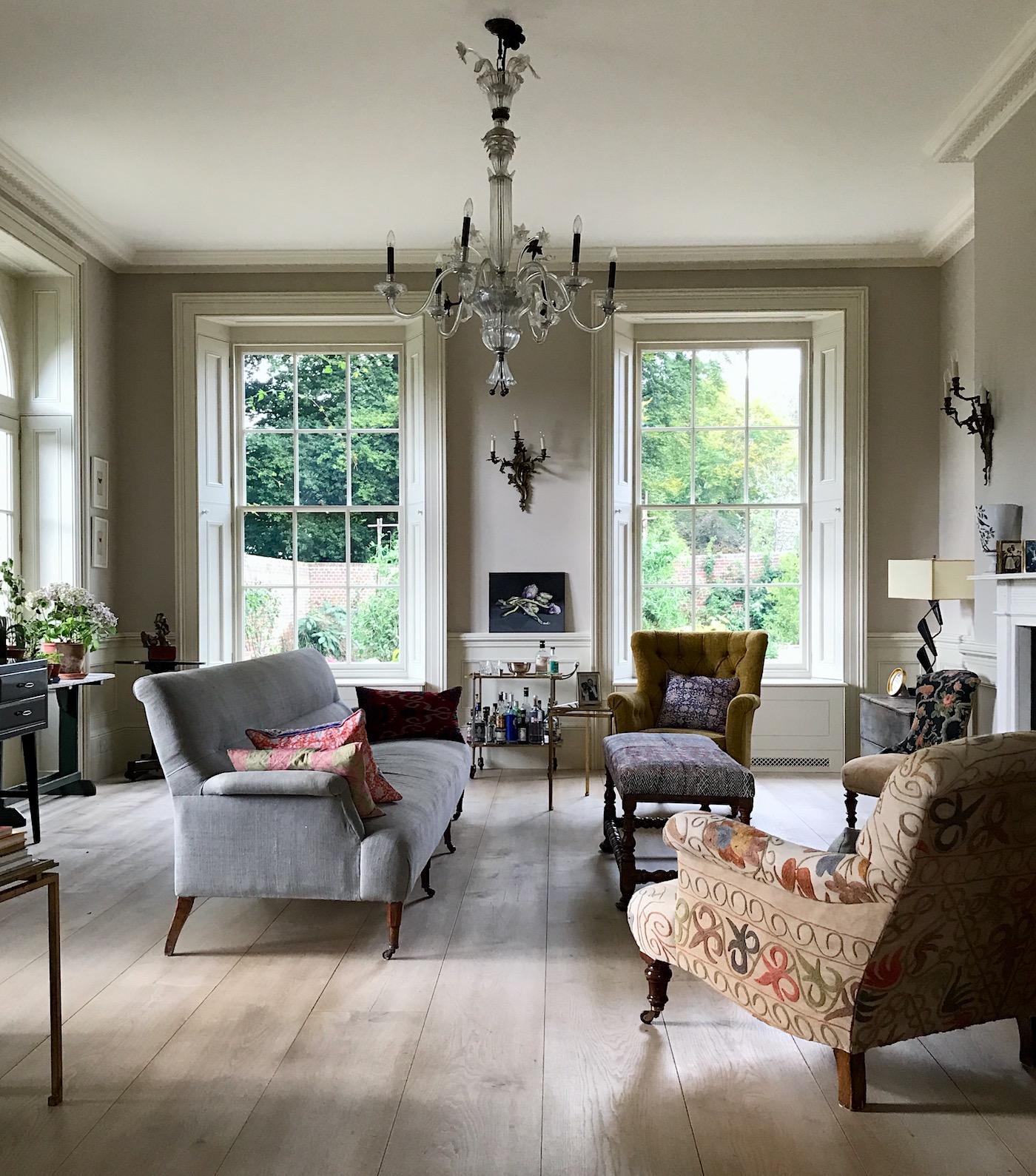
I took this image in the fall of 2017 during my trip to England. This gorgeous home (you can see more of it here) was designed by the young, classical architect George Saumarez Smith.

George, Francis Terry, and Ben Pentreath are all classical architects striving to keep the art of classical architecture alive. Thank God! I was so lucky to meet them during my trip to England in 2017.

George Saumarez Smith - beautiful gray entry - traditional gray trendAbove is from George’s own home. What a gorgeous entry painted a cool gray. Does this look like that tired gray trend we wish would disappear? I don’t think it does.

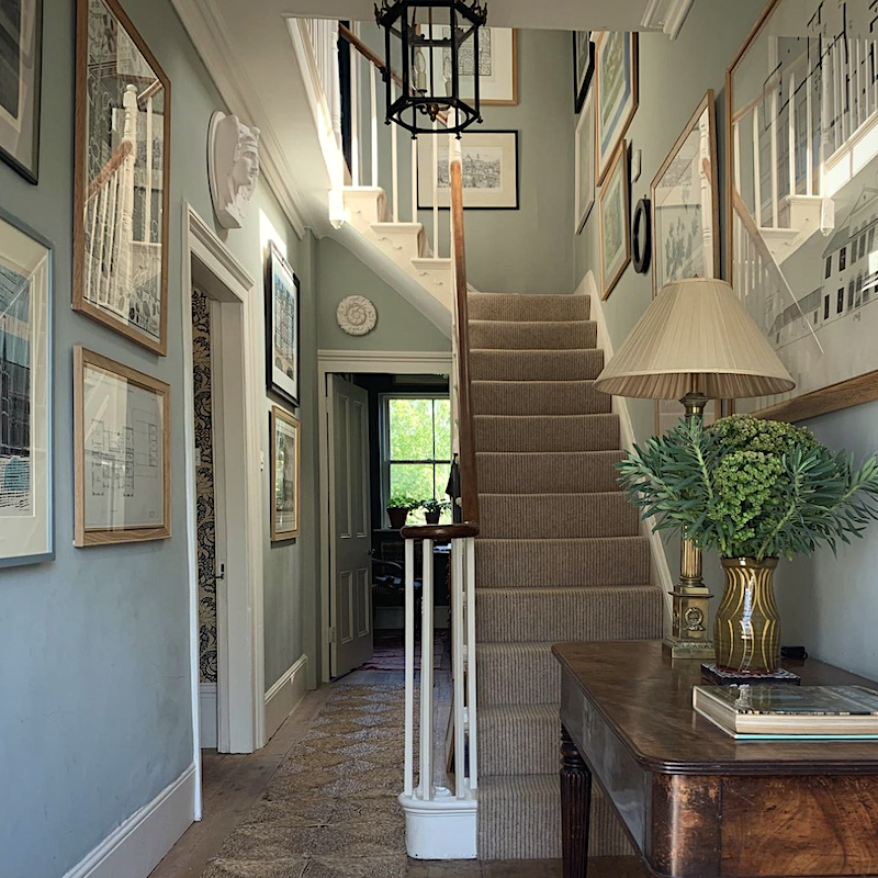
George has various shades of gray all over his home!

George Saumarez Smith - gray trend - dark gray office
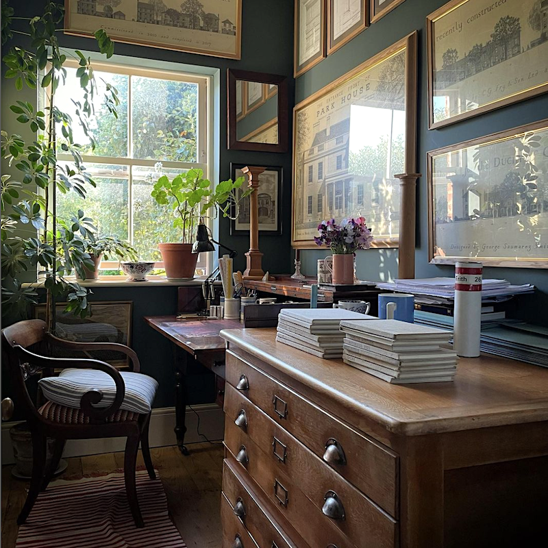
A cool deep shade of gray-blue in George’s home office. I adore all of the beautiful architectural prints framed throughout his home.

George Saumarez Smith_Sketchbooks

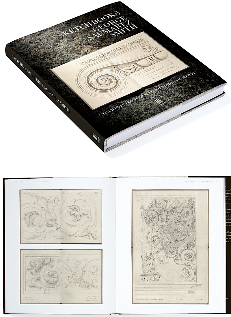
George recently published an exquisite book of his incredible sketches. You can find it here, and I also added it to my interior design and garden book list.


Below is something super interesting regarding the gray trend.


John Jacob - enduring gray trend - gorgeous living room


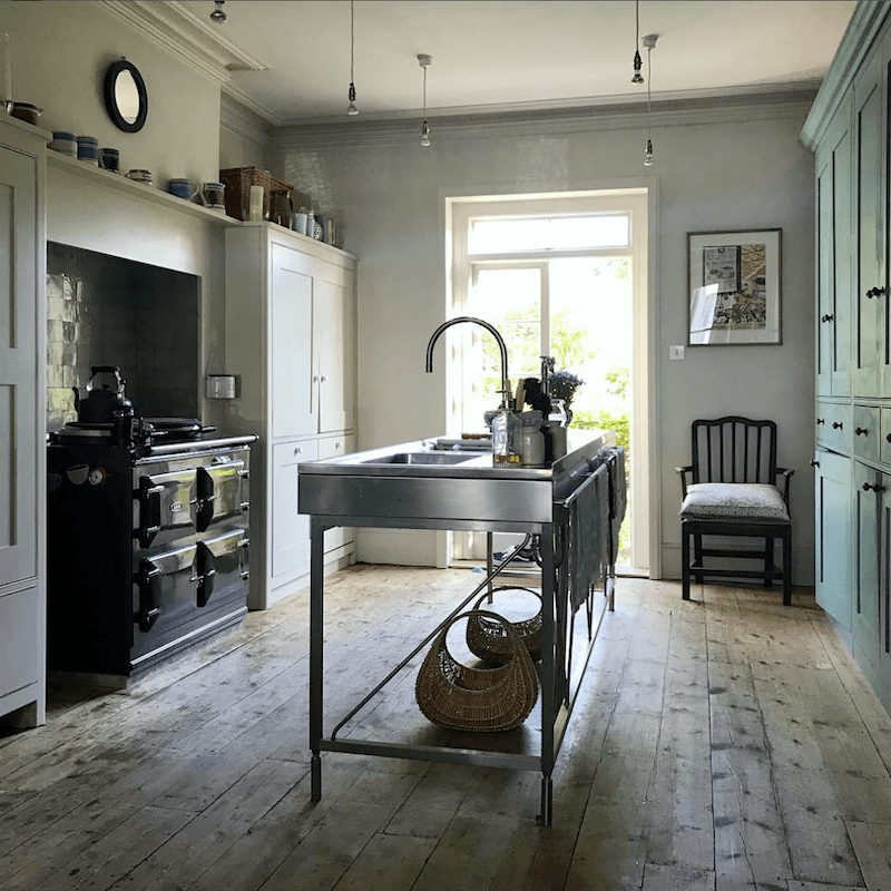
Above is George’s wonderful English “unkitchen.”

But, but, but…

George Saumarez Smith Kitchen 2022
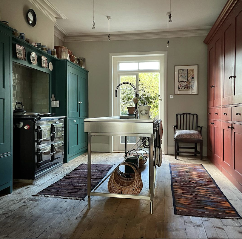
They repainted! What do you think? I think I love it. However, I think it would look great with maybe a bright yellow accent or two somewhere.

Please follow George Saumarez Smith on Instagram.


I was fortunate to meet Ben, George, and Francis Terry on my trip to England.

What cracks me up is that George works for a firm called [Robert] Adam Architecture. And no, there is no relation to the Robert Adam from the 18th century. That’s what they say, anyway. I love stuff like that!


jessica Helgerson - instagram - beautiful mouldings - primed

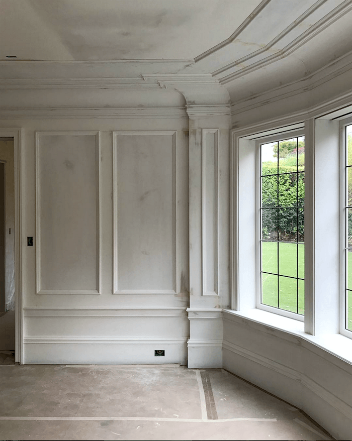
Does anyone else love rooms when they’re only primed? Or am I the only nutcase who does? lol

Adore Jessica’s work. You can see more of it here.


Jessica Helgerson - dining room after

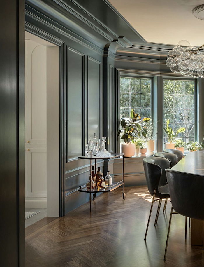
Here is the finished dining room. Although I love both, the chalky gray of the first one, I think, is so cool. I usually feel that way with primed walls. Please also follow Jessica’s exquisite Instagram!


gray paint trend


No, the gray trend and gray paint trend are not over. And if used the right way, it can be one of the most glorious colors, IMO.


Below are some additional designers or firms I love who’ve been featured on the blog. Each has embraced the color gray in their interiors.

Park & Oak Interiors

rod-collins-furlow-gatewood-dining-room Chinoiserie decor


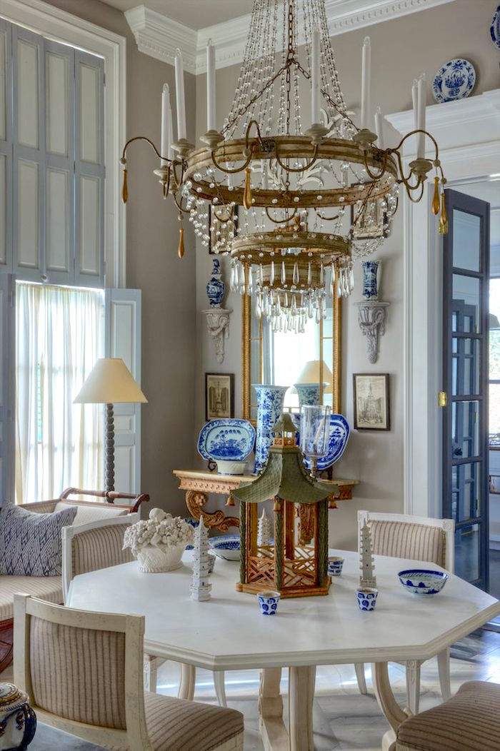
Furlow Gatewood (photo: Rod Collins)

Jean Stoffer Design


Covent Garden Kitchen - DeVOL Kitchens - Tiny kitchens - Small kitchen


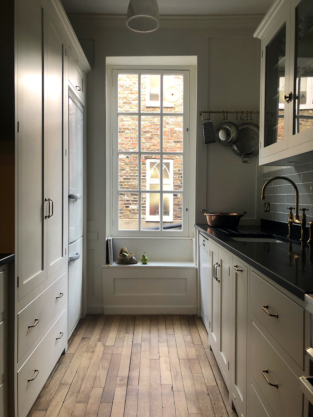
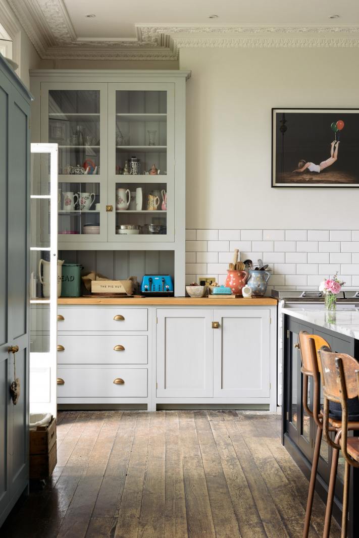
Above and Below DeVOL kitchens. Gosh, so many of them are some shade of gray!


Classic Frome - DeVOL Kitchens - no gray trend here


Please click the links below for more ideas using the color gray and some of my favorite gray paint colors.


Cool Gray Paint Colors

Warm Gray Paint Colors

Nancy Keyes Stunning Gray and White Kitchen

Dark Bathrooms and What You Need to Know

Best Gray Bathroom Colors

Can You Use Gray Paint in a North Facing Room?


I’m sure there’s more than that, but that’s enough gray stuff for now.

xo,


PS: Please check out the newly updated HOT SALES!

52 Responses

  1. I don’t think you really need to convince anyone of the beauty of gray. I’ve always loved it and have used various shades of gray in every house I’ve lived in. What I can’t bear is the monochrome nature of cold, ugly rooms where everything is gray, white, beige and, occasionally black. The effect is beyond depressing; these rooms are joyless. The eye will fasten on even a small pile of books on a night table, desperate for some color, something that isn’t square, spare, and colorless. The “decorators” seem to even be afraid of any interesting gray with a tingle of blue or violet, and invariably choose the plastic-looking gray of a computer keyboard. I’ve seen so many lovely old inns and hotels “modernized” in this way, and know of no one who actually likes staying in such places – too much like waiting at your dentist’s office.

  2. Thank you!!! It’s the bane of my existence. Who ever through this was a grey was a good color??? It’s not even novel. I think it’s some utilitarian thing and people are convincing themselves that it’s pretty. It’s a way to be lazy, cheap, and on trend without doing anything at all. There’s a certain type of person who is that and they’re the same who came up with this grey trend and I hate everything about this way of being in the world.

  3. Gray. The color of prisons, dirty sidewalks, concrete, driveways, and death. I’m house shopping and everything I see I have to add $10,000 to the price to have the gray painted out.

  4. Could not agree with you more, Laurel. The issue is not so much the use of the color gray, but the dreadful, boring boxy architecture and furniture. Here in Dallas, we are suffering through a spate of architecturally lovely homes being demolished and replaced with giant white boxes and black metal windows.This was recently highlighted on instagram posts from The Potted Boxwood. Like you, Christina, is highlighting good design and pointing out those emperors who have no clothes! Keep fighting the good fight! Great post!

  5. I primed some old printed paneling in a vintage log cabin 15 years ago and loved the result so much I left it figuring I would paint later. The surface wouldn’t have been scrubbable and probably would have scratched off with abuse, but it held up pretty well and on a difficult surface at that. Never got around to repainting when I sold the property.

  6. A little late in getting to read this but hope you still can reply. Thank you. So I too love the gray only primed wall picture. Would it be bad to leave walls in a room only primed if you so like the result; such as that room. Thank you for your help.

  7. All of the pictures shown are beautiful and very classic with great moldings, etc. As you first mentioned, the lack of architecture in homes doesn’t help the gray trend. Maybe you’ve done post about the common split-story house that lacks all the beautiful molding and has turned out beautiful (without being trendy). I had a front/back split level house cause there was nothing else available and hated it the entire time we lived there. It was so blah and there was NO way to add moldings and character to it. When using grays (which I didn’t, but have seen) it just becomes a gray box full of big furniture. Ugh.

  8. Thanks for these stunning inspiration pictures at the bottom, esp. those kitchens. You know, people are switching to beige b/c they think gray is done but they will just do the same thing to beige — overdue the beiges and neutrals then need to change b/c they are bored. I agree, if any paint is styled well, the room mostly comes off as a beautiful room, not a “gray” room or a “beige” room. I have Mindful gray on my walls and people talk about the warmth of the room b/c I have wood furniture pieces mixed with white couches and some mustard sprinkled in. I also have a brick fireplace that goes to the ceiling and the warmth of the brick and the gray look so serene together. Love this article!

  9. I love gray. It is a great foil for all other colors especially is if is a gray made of all other colors! BTW that first room you pictured is what I would call Early Hotel. Boring!

  10. Hi Laurel
    So happy to read this article…Since gray reminds one of “institutions”..think schools,dorms, prisons, factories etc.
    I love your advice on good the bad and the uglies of gray!
    Gray minus color pops, or classic architectural lines… well…it’s pretty downright boring! Thank you!

  11. Always enjoy and learn and laugh with your
    posts; but the heavenly “cherry on top” is doing so to the lovely music you provide.

  12. I just love reading your posts since they encompass so many areas such as design, color, music, furniture, moldings, etc.
    I laughed out loud where you mention the dusters on the wall and maybe the housekeepers put them there. You have a fabulous sense of humor.

  13. Some touches of gray can be ok, brightened up with color in other things. But I don’t love the color. I love warm colors, the colors of fall. Browns, reds, oranges, golds and yellows. I love yellows for wall paint. I like the sunny, warm, bright and cheery mood I get in an environment in those colors. The winters where I live are dreary and long to me. I moved from sunny Texas with about 3 months of sort of winter, to Kentucky. Even in the three months there are often very warm spells. I don’t want to look at things that look dreary and wintery in my house, at least not in any quantity. A picture frame or other small touches are as much as I would tolerate.

  14. Susan,
    I had just bought the Hitchcock movies boxed set and have thoroughly enjoyed them all, especially the sets production by Robert Boyle, he was a Genius.

  15. Light gray to blue is stunning but dark gray= drab gray is awful. Crypt-like. This is one of your best most passionate posts from the music to the photo selections. Totally delightful. Yay, Laurel. Passing it along to architect friends in Manhattan. XO

  16. I laughed when I read the title of your post. I hate the gray trend. (and farmhouse too but that’s for another day).
    I am sitting in my charcoal gray office which will soon be Farrow and Ball’s Sulking Room Pink.
    Gray can be beautiful if done correctly but it’s just so overdone nowadays. I think it’s time for that trend to go far far away.

  17. Great post. I think the proof of gray’s power is in Furlow Gatewood’s homes. Initially (and in his book) they were a creamy yellow and beautiful. But now they are a pale gray and gorgeous. The gray makes all of his blue and white pop in the best possible way. I really love it. He said in an interview that the gray paint came straight from a Benjamin Moore paint can. I know you did a post on this. Planning to sample these grays in my home in the fog belt of the SF Bay Area.

  18. Hitchcock had great sets. I especially like Rope, which is set in a penthouse apartment with a long (20′?) pale gray banquet sitting on a pale gray carpet. The furniture is antique, from a pale pink and white Fortuny upholstered wing chair to armless side chairs upholstered in Bristol blue, to a grand piano and gorgeous antique tables and desk.

  19. Very much am continuing to enjoy listening to the concerto as I comment here. What a lovely backdrop. My last apartment prior to purchasing my home, was painted the same shade of gray throughout the 1700sf interior, with dirty-white appearing trim. Such a shame as the woodwork and trim and built-in cabinetry, etc. was exquisite. It was the second time I rented the exact apartment – lived there for 8 years the first time, and three the second. For me the gray and trim were not complimentary, and anytime I focused on the wall color v. artwork, etc. I would actually become chilled. My current home was painted in a very light gray with blue undertone when purchased – flat paint which looks dirty with uniform flat white on trim and ceilings. Can we say, “Blah?” I’m in the process of painting it over, and have used your paint guide to choose wall/trim/ceiling colors, types etc. What a fun and seamless process you created. Totally exciting and refreshing! Thank you.

  20. Wonderful post. I’ve always loved gray but absolutely hated what was done during the gray trend. It still seems to be lingering where I live, epitomized by hideous gray LVP, sometimes juxtaposed with the original wood floors!! Agghhhh.

    In 2005 I planned a complete bathroom remodeling and, inspired by a photograph in a decorating magazine, decided on gray tile, edged with white tile on shower walls and counter, and white hex with gray “flowers” on the floors. We were in the middle of the brown trend, and finding the gray tile I wanted was a nightmare. I finally found the right silvery gray and was able to carry out the design I wanted. There is lots of white in the room, and color in accessories. People love our bathroom, it’s classic, and it’s made me happy every day for 16 years.

    The worst thing about trends is that so little out of trend is available, unless you are buying at the high end.

  21. Wonderful post, Laurel. That’s one of my favorite Mozart concertos, and a perfect accompaniment for your blog post.

    I live in a house with warm, light grey broadloom and cold, dark charcoal gray walls. It’s so unlike the beautiful rooms you’ve shared today. The previous owner went overboard on the Gray Trend. I can’t wait to renovate.

    An unkitchen should proudly display the pea-trap. The only mistake in George’s unkitchen is the location of the towel bar & towels on the back side of the island. The towels should hang where the cook can reach them naturally. Otherwise, it’s perfect in both color iterations. Really simply lovely!

  22. First ever house, the ‘Money Pit’ had my most favorite, simple bedroom ever. 10 ft ceilings, soft grey walls, white painted woodwork, tall white tiebacks, louvered white closet doors, grey twist carpet, simple brass bed with multi color quilt, natural wood Victorian dresser. Voila! Stunning and so comfy. Grey can be changed to resemble many other shades of color, depending on lighting. I love it’s versatility!! Your examples are stunning… Thank you!

  23. I LOVE this post! We still see Gray every day in our practice. I think of it as a tool, not a trend. And I loved your comments about decor. A paint color doesn’t make a room, it just pulls it together.

  24. Some people prefer warmer colors and some cooler ones. For decor trends, the pendulum has swung from warm beige, yellow, orange, red, green, and brown ‘Tuscan’ or ‘French Country’ style everywhere to cool colors of cold white, cool grays, black, and blue, along with modern clean lined furniture or black and white farmhouse style. Now it is apparently changing again to warm white, pale bleached wood (beige), sisal and light desert colors. The problem comes when the trend is so overpowering that it becomes the ‘only’ one. In my neighborhood, flippers buy old houses, take out all the walls, put in dark gray laminate floors, gray walls, white cabinets, white tiles, and recessed ceiling lights. They remove all the character and warmth. I hope the flippers get the memo that styles are changing, and soon.

  25. Having just gone through the new home building (and decorating) process, I would suggest that there are actually two approaches to gray: 1 is the classic approach to gray, which incorporates beautiful grays combined with other colors to brighten it up; 2 is what is known as the “gray trend,” which has been around for the past 10 years or so. “Gray Trend” means everything-gray rooms. It means that when you go to the flooring store to pick out brown wood flooring, there is an overwhelming selection of gray, but very little to choose from in brown. It means when you go to the furniture store, you are faced with gray upholstered everything. It means that when you look to Pinterest for inspiration, you are confronted with photo after photo of all-gray rooms.

    Personally, I was struggling to even find inspiration in all of the gray. It wasn’t until I first saw how my friend remodeled her late 1800s cottage in New Orleans that I finally found inspiration. She used Sherwin Williams Light French Gray on the walls. The floors were brown-stained wood. The woodwork was painted white. The furniture was antique, finely crafted, and stained orange-brown. There was color in the upholstered pieces. The art was old oil paintings, darkened with age, but still adding some color to the room. The accessories added more color. The house was warm and inviting, which is what to me is lacking in an all-gray, “Gray Trend” room.

  26. Thanks Diana Bier, I enlarged the photo and did see the P-trap! My eyes misread the lighting on it as something else.

  27. Beautiful post on Gray ( or is it grey; I wish I knew). I laughed about your love of primer; I too love primed surfaces. I once primed yucky printed paneling like what used to be installed in mobile homes in an otherwise wonderful log cabin. The exposed logs next to the primed walls with blue and white chinoiserie and bronze accents was divine.

  28. I have been in love with grays but with different hues of color (blue, green, and especially silver). I have never ever been a fan of an entire room filled with gray. Your blogs are the only ones I take the time to read. So entertaining! thankyou!!

  29. I would be remiss if I did not mention my chuckle over Betty’s last name. Very clever Laurel.
    As always, a welcome read on the design world.
    Thank you. I adore your humor.

  30. Agreed, Tracy S—grey can be well-done, like any color, but I think most of us who are tired of it (myself included) are referring to the mass-market, cookie cutter, ALL GREY EVERYTHiNG. The grey-toned flooring makes me 😬😬…a very expensive thing to redo when you inevitably get tired of living in a cell.

    I have a design background and remember the first couple clients I had in 2009/10 asking for grey. I thought, “Hmmm…” And then shortly thereafter grey exploded.

    Personally I love warmer tones and color; I can appreciate grey being well-done in others’ homes (or laurel’s lovely images) but do not care for it in my own.

  31. Thanks for this beautiful post. I feel about beige the way some feel about gray, and I am old enough to realize that gray will probably give way to beige again in my lifetime. However, I’m pretty sure I’ve seen some beige rooms on your blog that almost made me change my mind! The photo of Cy Twombly & wife reminded me of David Hockney’s famous portrait of Mr and Mrs Clark and Percy (1971)–both men are lounging and both women standing. I too wondered about the plumbing in the unkitchen!

  32. I guess I’m in the minority, I love “gray” and “white” as neutrals, I hate beige and brown. Maybe it has something to do with brown being the favorite color of my ex-mother-in-law!!

  33. Loved this warm and cool gray post. The picture of John Jacob’s work…the white fireplace with the sculpture of a woman with animals and sconces on either side with bulb lights…love the color above the fireplace. What do you think it is? It’s the perfect amount of green undertone that I am looking for! Thanks, Jan

  34. Fabulous post! I love gray as a neutral backdrop but agree that it’s been taken to a ridiculous extreme. When used with classical architectural details and color/texture, it is sublime as shown in your images.
    Regarding the “unkitchen” and where the plumbing is, you can see the “P-trap” directly under the back of the sink if you look closely. The angle of the shot disguises the rest of the plumbing behind the legs of the island.

  35. This was the most wonderful blog post. It kept me toggling back and forth for a long time and I loved it all. Gray done well all the way.

  36. Hi Laurel,
    I recently discovered watching old movies, how often gray was used as a backdrop for so many films. Rear Window and North by Northwest, Hitchcock movies are filmed mostly with the walls in gray, the shadows it produces along with fabulous lighting the lavender is brought out. I believe it was N by Northwest in a hotel the bedspread is the softest of lavender velvet a feast for the eyes, as well as great architecture in these movies and there are many more.
    I chose SW Silver Strand for my living room it is a soft gray with aqua undertones and I’m happy with it, but thinking about changing it, besides all the money and work it is not something I say casually I would Like to do.
    But since I have taken on such a love for these rooms in gray I have now been able to see the ever so slight hint of lavender on my walls at night under soft lights, so I’ll keep what I have besides it coordinates with the other colors in the house.
    I hope you will check out at least the two I have mentioned, it gives you a new appreciation for it all.
    By the way Grace Kelly is dressed Perfectly to go with the decor!
    Cindy

  37. I always enjoy your explanations and exemplars. They’re a reminder that classics never die. The non-examples, along with their fixes, are super helpful, too.

  38. Michelle, I had exactly the same reaction! Where the heck is the plumbing?

    Btw Laurel: the music is sublime! Thank you.

  39. Hello Laurel!

    It’s Angela Kessel and I read your blog faithfully.
    I absolutely love it!
    I am so inspired by what you have achieved and it is a total pleasure to witness your hard work and incredible success. To think that I knew you when…I still remember us working feverishly to get the townhouse in order to sell – oh my gosh it makes me 😂. It will also make you laugh that I just worked with Susan Lifton and got her house sold as well (I remember somehow that you worked with her in the very early days).
    Anyway- I’m thrilled to learn of your move to Boston which is one of my very favorite cities anywhere. Our older daughter lives there now in the South End and our younger one went to school in Cambridge so we are there often.
    Anyway- I wanted to take the opportunity to finally say hello from Bedford and to congratulate you. Kudos! xo

  40. Thank you for this bit of lovely gray inspiration. I ended up buying a book (Sketchbook) and, once again, swooning over my favorite “non”-designer, Furlow Gatewood. I would like to see a palette of all his paint colors. Maybe you’ve already written about that and I just missed it? Also I love the way you often bring in a John Singer Sargent painting as emblematic of an entire color palette. Thank you once again, Allyson

  41. I’m still enjoying the music. Thank you! An enjoyable post. I’m wondering though…was the unkitchen photoshopped? I know that most design photos are to a degree. But I do not see any pipes for the sink on the island and the legs look too thin to be “hiding” them. Strange.

  42. Okay, I’ll forgive gray in beautiful neo-classical historic homes.

    The gray that’s making me insane, is house shopping now online and every horrible HGTV make-over by a mad realtor.

    People used to slop Kilz over walls and make things that sterile white. Now, they think “Mid-tone gray! Everywhere! Will make buyers think HGTV!”

    Gray kitchens, gray cabinets, gray vinyl flooring, gray bathrooms, gray walls in. every. room.

    It’s hideous.

    Quick, send a dispatch team of British designers stat.

  43. Good chilly Sunday morning to you. just wanted to compliment you on this post. Such fun, if felt like I went somewhere for a short vacation. love looking at all kitchens, yesterday’s, today’s tomorrow’s, and all those kitchens represent. I am saving this particular “story” for future reference. I will never remodel where I am and will never have the luxury of remodeling a future kitchen, should there be one somewhere else, but love looking, love the art, history, design, color, etc., I will be revisiting this one forever. love the unkitchens but also love my somewhat rustic kitchen and the wonderful ideas that make these kitchens so livable.

  44. I had hopes you had good news about the gray trend going away. Even after reading your post, gray still makes me want to slit my wrists and bleed all over it. Sigh…

Leave a Reply

Your email address will not be published. Required fields are marked *

This site uses Akismet to reduce spam. Learn how your comment data is processed.

Welcome To Laurel Home!

laurel-aarons-18th-e1456449963926

Hi, I’m Laurel, and Laurel Home is the website and blog for Laurel Bern Interiors.
I’ve been creating new-traditional interiors since 1988. The blog is where I share all.

New Edition, November 2022! Get The Indispensable Guide For 100s of Home Furnishings And Interior Design Sources That Everyone Is Raving About

laurels-rolodex-final-book-cover-master 9th edition 22-23

laurel home archives

Categories:

Please click the image below for more info about my rockin’ Interior Design Guides for 2023!

Laurel Home Interior Design Guides 2023
Amazon ad

please click below to check out my favorite decorating & design books

Laurel Bern's Favorite Interior Design and Decorating Books
Subscribe To The Laurel Home Blog And You Will Receive A FREE Guide Where I Share How To Get Your Paint Colors Right, The First Time.