Hi Everyone,
Phew! It is really heating up here in the northeast. Well it IS July.
The other day I received a lovely email from a reader named Susan. Actually, it was only yesterday!
Here’s what happened. Some of you may recall that I did a post about her dining/living room combination and a very large window she was struggling with.
But, the window treatment I felt was the least of it. There was a lot of inherited pseudo-traditional furniture and already, I could see a clash of formal and casual furnishings. That is because the room is inherently casual. But the furnishings are more formal/traditional.
Well, guess what? Susan never saw the post until recently and after she started to work on the room. She thinks that she must’ve been away when it came out.
So, first, if you don’t mind, please go over to the old post, so that you can see the room as it started out and also what I had to say. Some things have stayed the same, but some have changed. I’ve edited it taking out links that go nowhere. After all, it’s from September 2017 and things change.
I’m going to take a nap while you’re reading that.
Take your time. :]
*
*
Okay, you’re back. No, I didn’t sleep. That’s asking for too much.
So, here we are, early July 2019 and Susan sent some photos of what she’s done so far.
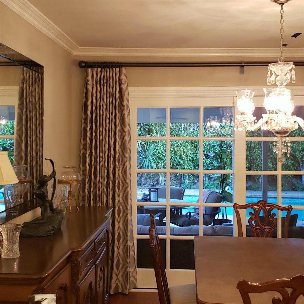
The clash of formal and casual furnishings is not evident here. This is formal with a contemporary accent in the drapes which is refreshing, I think.
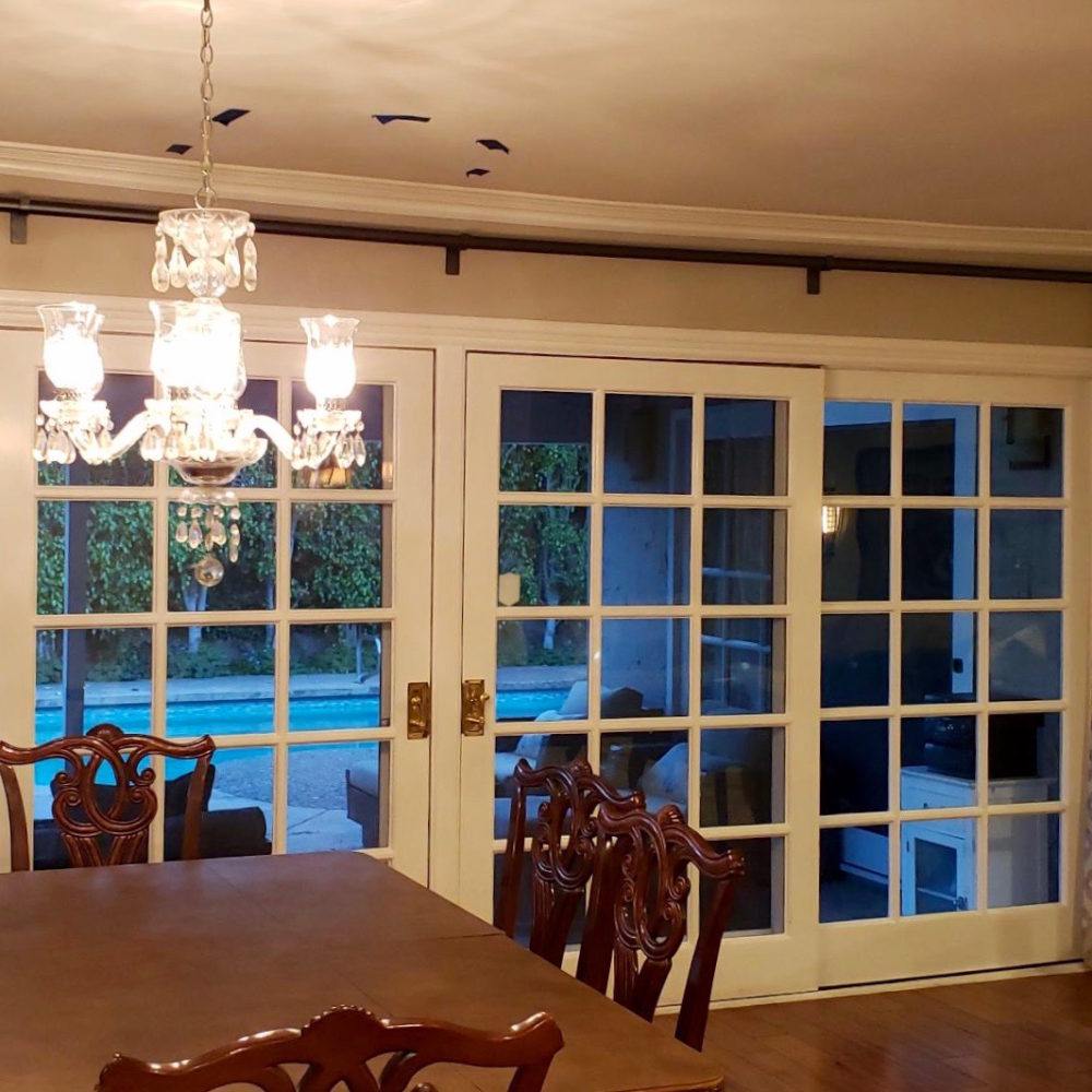
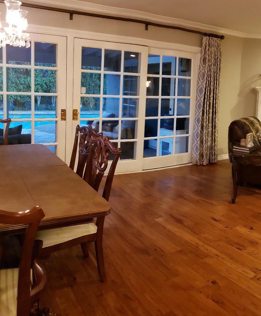
That pool looks mighty refreshing!
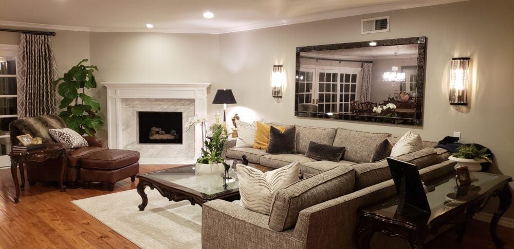
Okay, please remember that Susan did not see the original post until yesterday.
For some of it, it seems like she did!
But, here is where I’m feeling that the clash of formal and casual furnishings is evident. It’s split pretty much 50/50.
Here’s the other thing.
Susan owns an upholstery and window treatment workroom!
SB Upholstery, Fabric and Windows
13273 Ventura Blvd.,Suite 105
Studio City, CA 91604
uh huh…
I JUST found that out.
It’s a business she started about ten years ago when her kids went off to college.
but, but, but… she is not a designer!
Okay, now it’s time to dive in here.
First of all, the room isn’t finished. Susan knows that and would like to hire me, but since I’m not taking clients, this will have to do.
And, there’s much that’s good.
I love the new fireplace mantel. Great job!
But, get this. Susan created the sectional out of two yellow sofas!
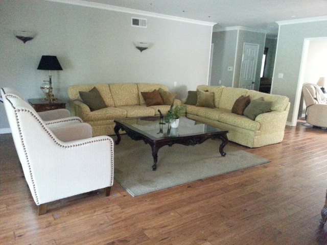
WOW! I’m impressed.
The biggest problem is probably the lighting.
Too bright and WHITE. That’s only my opinion.
But, aside from that are some exceedingly common missteps. Again. My opinion.
- Too much fake (ersatz) pseudo-traditional brown furniture and all matched to each other.
- The color scheme is pretty one-note. There just isn’t enough variety. I think there should be more white and black in a monochromatic scheme and easy on the mid-tones. Mark D Sikes always gets it right!
- There’s a war going on between the traditional and the contemporary.
I feel that the most successful rooms are predominantly either traditional or contemporary. But, this room doesn’t isn’t clear which way it wants to go.
As I stated earlier, the mix on the living room side is about 50/50. However, all of this is fixable. And, especially so, since Susan sews.
Another issue I’m having is with the sectional fabric. The texture of it is quite pronounced and too bossy. Susan and I discussed this and we both agree that it’s not easy to work with. I think that an Oriental rug with some heft will help that a lot.
But, the sectional itself, is quite nice. I still can’t believe that she made that out of two separate sofas!
So, is this room traditional or contemporary?
It is definitely traditional! Or let’s say new trad. Or classical. Therefore, the traditional furnishings, the classics should outweigh the contemporary or more casual furniture. Of course, traditional or classic furniture can also be casual or formal.
Let’s go back to the dining room for a sec and then we’ll head back over to the living room.

I’m actually liking the dining room a lot more, now. And, I’m not seeing the need to paint anything. Frankly, with some better lamps; maybe a blue and white Chinoiserie lamp like in the widget at the bottom of the page, some styling on the table, and a seagrass rug, I think this is looking very nice now.
Yes, I’d still prefer a different, more authentic 18th century-style sideboard. You can see one in this post.
(scroll to the bottom.) That’s one of my favorite widgets I’ve ever made filled with 50 or so classic pieces.
Of course, it would be very stylish to change the dining chairs for the white Chinese Chippendale style side chairs in the widget below.
And then maybe do a slip-covered host chair.
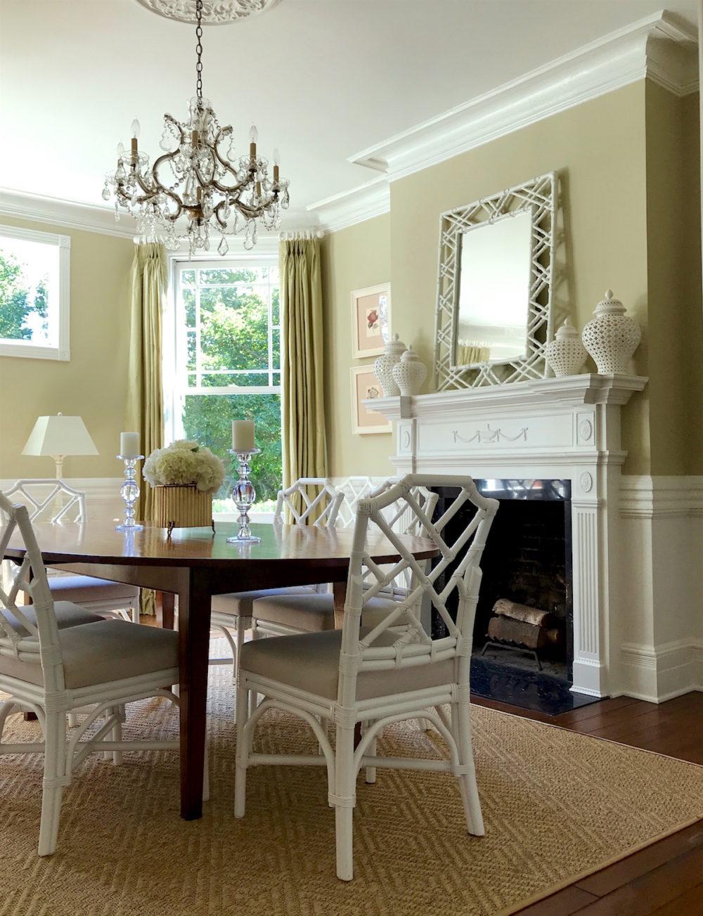
To give you an idea, Lotte Meister, you might recall, did some similar chairs in her new-trad dining room. For the rest of her stunning home, click here.
Okay, now it’s time to go over to the living room area.
I think that the layout is terrific and the scale of the furniture is perfect. And, again, it’s not finished.
But, I would like to see more color over here.
Earlier in the day, I was fantasizing about bringing a lot more blue into the room.
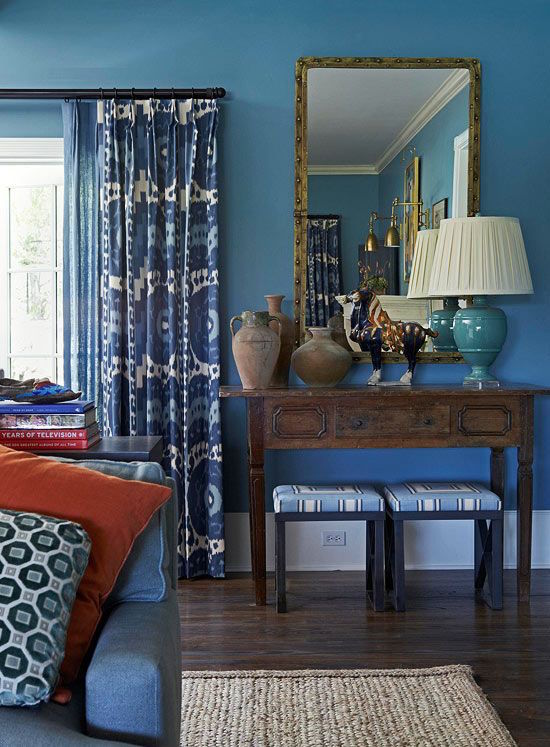
Mary McDonald Santa Barbara show house blue on blue living room
I love this blue on blue scheme that Mary did. I could even see doing something like this for this space. But that would be a large departure. The “clashing” blues bring about the necessary tension and it all works beautifully together. The bits of gold and the orange-red pillow are welcome notes of warmth in this over-all cool-toned space. Remember how we discussed how important this is in blue and white rooms.
Mary’s room is over-all traditional, but in a casual way.
Here’s what I’m thinking for the living room to help with the balance of formal and casual furnishings .
- I’d start with a larger seagrass rug and layer over it a smaller Oriental. Any in the widget could work, I think.
- I would change out all of the tables. There are several ideas below. The coffee table could be a table or it could be a cocktail ottoman.
- Of course, I think that there should be some new pillows. I do like the brown velvet pillows, however.
- Ideally, if Susan feels like it, a white cotton duck slipcover on that sectional would elevate it to a new stylish level.
I’d love to see a more traditional mirror and sconces.
Instead of a mirror since there’s one in the dining area, maybe an art wall would be a good idea.
You might notice that there’s a blue sectional in the widget from Serena and Lily. That’s another option.
Oh, very important! Serena and Lily just put their entire line on sale. That only happens a few times a year. Use code: GOCOASTAL for 20% off!
Please enjoy the widget filled with furnishings I could see going into this space. I think the balance in the widget between formal and casual and traditional and contemporary feels good to me. Of course, not all of these items would go into this space together.

Please also check out all of the Hot Sales Pages. (And, the bed and bath sales with more Serena and Lily favorites.) There’s a ton to see for the holiday sales. I may do a special 4th of July quick shout out if there’s something that can’t wait until Friday.
But, if I don’t please have a blessed holiday!
xo,

Related Posts
 How To Mix Dining Room Chairs Like A Pro
 How To Achieve Furniture and Color Balance in a Room
 A Gorgeous Antique Farmhouse That Isn’t Yet Singing
 My Interior Design School Portfolio from 1988-1991
 80+ Timeless & Classic Home Furnishings You Will Love!
 The Exceptional Interior Designer You’ve Never Heard Of
 Laurel, I’m Desperate! I Think I Totally Screwed Up My Window Shades







35 Responses
Every point felt on-target and practical. A great share!
I agree with Tsippi! A post about handling a multi-year transition would be fabulous. We are definitely in the position of waiting for our yearly bonus lol. We married young with no money and no taste. Ten years later we’ve got five kids, we both homeschool and work from home so we’re always here. Our furniture is mostly Craigslist, Goodwill, from neighbors’ curbs, or IKEA. Not as bad as it could be, since I’m picky about what I take home, but I know, the cardinal sin of decorating! I’m not embarrassed, but it is starting to bug me. Thankfully we’re learning to have taste, and paid off the student loans, and just bought a beautiful Victorian/Craftsman transitional home (1900). I’d rather spend money up front on the pocket doors and stained glass. 😉 But meanwhile, I’ve got miniblinds everywhere and I put cream slipcovers over the jungle print sofa, but really it’s all shot. What would you do with 20k or so annually to upgrade a whole house? I do not want to go one room at a time I think, because having one room gorgeous would make the rest look that much worse. Or would it? Thrifting you kind of have to know what you want and grab it when you can. How do you go from shabby to chic if you’re, you know, a normal person who values beauty in the home but also not being broke?
A lot of our friends are in this same situation, so hopefully my question isn’t too personal!
Hi Mary,
Those are terrific questions. And, it’s difficult to answer because of so many variables/priorities/lifestyle/needs. However, I can’t tell you the number of houses I’ve been in, where they focused on one room and other rooms were completely empty. In fact, the first time I saw this phenomenon was 33 years ago when I was selling art. I came to the quite large new-ish home for the art installation. The couple was arguing where to put the $5,000 over-sized abstract. (eyes rolling) In the meantime, there was NOTHING in the living or dining room. Nothing!
Over the years, though, the majority of clients did projects consecutively. Many clients I worked with over a period of three or four years or more! The client with the white kitchen and dark blue family room. I did work for them over a period of eight years. There were four distinct projects and usually about a year or two between each one. It was funny because originally, they were turned down by two designers who said their job wasn’t large enough.
Well, their loss, the job ended up being practically the entire home. And, I couldn’t have asked for nicer clients.
Topic suggestion: what kind of floor stain Mark D Sikes use? Laurel, if you can choose any floor pattern for a hardwood floor what ideally you would want? Chevron, wide planks etc. Hahaha, too many questions I know.
Hi L,
Oh gosh. I don’t know what kind of stain he uses. He does have a beautiful blog but I don’t know if he ever talks about specifics like that. I did do a post, however, about hardwood floors and maybe that’ll be helpful for you?
Thanks very much for this post. My house is 1911 so it dictates a classic style. However, because I have broad tastes, I can get off track, especially since I buy everything second hand. The distinctions you’ve outlined here are most helpful.
Thanks again Gail. Sorry about that. I think you must’ve thought that your comment didn’t go through. I was just being lazy yesterday. Every once in a while, I need to unplug. I love your comments!
Hi Laurel. This is such a great post. It puts into words the reason that one Barcelona chair can look great in a traditional space but a half-Bauhaus half-traditional room just looks like you’re waiting for your yearly bonus or something. (No shame in that, btw. Decorating is expensive. Maybe handling a multi-year transition would be an interesting post?)
I have to say, I adore Susan’s living room mirror and sconces. I take your point that the mirror is a little at war with the Chippendale chairs, but if she loves the mirror as much as I do, maybe she should sort out the living room case goods and then take a fresh look at the mirror’s position. Also, a colorful painting over the fireplace will make the mirror seem completely different in the room. Just my two shekels.
Happy Fourth, Laurel!
Thanks so much Tsippi! It’s true, sometimes changing just a few things will make enough of a difference. The only thing with the mirror, is that I believe that the one in the dining room is the same or too similar to the LR mirror. And, I also feel that since the space is over-all trad, that the more contemporary sectional needs a more traditional, but not overly fussy mirror.
Laurel I’m so grateful for this post. I’m at the stage where I’m shopping for furniture but it all needs to be second hand. You’ve guided me to define my style as traditional and to differentiate between the ersatz and the real deal. Thankfully lovely antiques are being given away in my neck of the woods. People want IKEA style. I also like modern and casual furnishing so I can get confused and could easily end up with a hodgepodge if I’m not careful. My house is 1911 though so it begs for something more trad. Thanks for steering me in the right direction. BTW KUDOS ON THAT SECTIONAL!! I love to see good pieces repurposed.
Hi Gail,
It’s so true. We’re in an IKEA/modern/transitional (blech, I hate that word!) trend. Therefore, the classic pieces can often be found for a song, if not FREE. They’re just happy that someone is carting away their “dated, worthless junk.” Too bad, that they have no idea that their junk is actually worth thousands of dollars!
In fact, I do believe that a lot of those vendors on Etsy, Chairish et al. do exactly that. They pick these treasures up at estate sales for practically nothing and then because they paid so little can afford to still re-sell it at an affordable-still-reasonable price.
I love Susan’s lights on either side of the mirror. To me, the room needs some black. I’d recover those dining chairs in a brown/white/black zebra stripe and add a table runner in the same fabric. Then put a picture over that beautiful fireplace of zebras in a golden field. Actually, if those were my chairs I’d either gold leaf them or paint them gloss black. They aren’t too precious to have some fun with.
Hi Morgana,
Some terrific ideas! I love animal prints, but I’d only do one of those and the chairs are a great possibility. If it was a zebra on the dining chairs, I’d possibly do a leopard on a small pillow on the sectional and leave it at that. I’m always afraid of rooms becoming too “theme-y” but if it’s done in a subtle way, it can be great!
Next topic suggestion. I’m wondering what if you have an open floorplan and you want to use tile here, hardwood there. How much floor difference surfaces is too much if you Love decorating? Morrocan tile, hardwood floor, marble floor. Or I’m thinking about long narrow corridor with many doors to other rooms. Floor transitions…how to get them right. I know that Rose Uniacke just use reclaimed wood everywhere, but that’s so hard
Hi Pinkie,
That’s a possibility but I’m not sure if it’s one I would take on because there are so many variables in open floor plans. And sometimes the problem is that they are TOO open. And, unnecessarily so. In that case, I have had clients put up small walls (floor to ceiling) or pony walls.
This is where a consult with a good interior designer could be very useful in helping you sort out what’s best for you.
Hello Laurel, Although a lover of beautiful mahogany wood, I think that the easiest first step for this room would be simply to get rid of the three cabriole-legged pieces which seem to be dragging the room down–the triangular table, the coffee table, and the one behind the couch. (I was impressed with the quality upholstery/rebuilding job on the couches.) I also think that vent near the ceiling could be replaced with something handsomer. Finally, the room needs an injection of color and life–some art, more colorful pillows (not too many!), etc.
–Jim
p.s. I like Mary McDonald’s design and use of color–her website reminds me of some of those color-saturated movies from the 1960’s.
Hi Jim,
I think that those are all terrific suggestions! Thank you as always! And, yes. Mary Mac is awesome!
Hi Laurel,
Happy 4th of July. You ARE a firecracker! LOL
I hope Susan takes your advice. The rooms could use a dose of color. I always like when a colorful patterned rug is used & then those colors are pulled up onto the sofa through pillows.
Susan’s layout is similar to mine. I also have a corner fireplace. But where she has her sectional along the adjacent wall, I have a media console & a wall-mounted TV above it. It’s nice to see how other folks arrange furniture. I’m not seeing a TV in Susan’s space. That certainly opens you up to having additional seating.
Thanks so much Mary! As you can see, I was lazy-lazy yesterday!
Hi Laurel,
Loved this post! When I found your blog a year or so ago I binged on past posts but somehow missed Susan’s first one. Really enjoyed reading both today. IMO the browns/beige color scheme is her main issue now. It’s just blah. Introducing blue or teal as you recommended with maybe a touch of coral. A mix of several greens would look great too and some white.
I have a question about mixing styles in the same space. In my case mostly mid century mod/“contemporary (modern) with an English Georgian revival secretary (about 1890-1910 I think) that I won’t paint. I was told that in mixing styles don’t just have one outlier piece. That it needs a friend placed somewhere else in the room. My living room is small and there’s no room for a friend. Does just one outlier piece look like a sore thumb?
Happy Fourth!
Hi Sherry,
That’s a very good question. I can’t say for sure since I can’t see what you’re talking about. But, in general to not have one piece that looks like an outlier, all you need is something like an antique gold framed mirror or artwork. Or maybe a damask pillow or some other accessory in the room. It doesn’t have to be another piece of furniture.
I am pleasantly surprised at the evolution of the room from the first post! Things really came together very nicely. I am a person who loves beautiful drapes, full and beefy! Susan’s are beautiful but the one thing I noticed right away is that it seems the drapes are pushed too aggressively back. The leading edges don’t fall gracefully from header to hem, but are squished back and the side window frame is exposed. I’m not sure if it comes down to personal preference, but I like a straight drop and the side frame covered. Is this just my quirk?
Hi Amy,
No, not a quirk at all. Although, that is the door itself that’s showing, not the frame. The frame should never show on either side of the drapery. There is a ride up in the front of the drapes which is a common phenomenon that used to drive me to drink. And I don’t drink. haha.
And, that’s even with a weighted hem in the front corner. Assuming these are weighted, then maybe a stronger weight and then fudging the pin on the first pleat to hang lower than the others. Also when the drapes break slightly on the floor, say by an inch, it’s not as noticeable. But, I found that fudging that first pin helps a lot. Also, looking at this again, the drape looks like it’s actually pinned up a little higher than the others. I doubt that’s the case, but how it appears. Moving that first pin a good 1/2″ +/- will make a big difference.
This is the sort of thing they do not teach in design school.
They should.
But they don’t. These details and 100s of others are very important and it took me a decade or more to learn these through numerous installations.
Laurel, one of the reasons I believe there are so many ersatz traditional case goods in existence is that often that is what was available in the middle class price range. The furniture companies, for some reason, decided it would sell better if there was just a little more superfluous crap tacked onto the design. Thus the bastardized versions cluttering up our interiors, because that is what was available for so many people’s budgets.
Fortunately, for those of us who love quality traditional “brown” furniture, now is a good time to upgrade. Not only the online sites like One Kings Lane, but also local furniture consignment stores, are full of beautiful, authentic classic reproductions looking for new homes at incredibly reasonable prices.
So while people chasing trends are otherwise occupied with cerused oak pieces, that dream Georgian- style breakfront cabinet or faithfully reproduced Hepplewhite sideboard, are now affordable.
Hi Risa,
Okay. Here’s the problem. It’s not that lower end furniture cannot be authentic looking, it’s the fact that it’s not. I can only presume because the manufacturers either don’t know or don’t care to know. It is a matter of scale, proportion, exaggerated curves that should’ve be there and frequently carving.
But, yes there is still plenty of authentic looking furniture out there, either vintage/antique or occasionally new. The latter in the lower price-range, however, is much harder to fine. It doesn’t have to be that way.
Laurel,
Are you and Susie referring to “brown” furniture? As in wood? Or to walls, drapes, etc. I don’t see too much wood in her room, but I do think that some of the pieces are very formal, as you have observed. Colorful accents and better lighting would help. I also like your original suggestion of seagrass rugs to balance the styles.
Hi Betsy,
Yes, the furniture. Currently, it’s all stained wood.
Oh, man, this was so helpful. I like painted furniture, and my husband likes Georgian. I like French and informal, he likes formal. I finally took the camel back sofa and upholstered in denim to relax the look, and am in the process, though it hasn’t rumbled to the top yet of skirting the dining chairs. Though they are already a cream with gold stars, I thought to dress it down a bit. You have lit right into my mess here. Now I am going to save these pictures to Pinterest and hope that I can do it justice. Thank you. Kathi
Thanks so much Kathi! I love it when a piece of furniture that’s typically in a formal fabric like a camel-back sofa is knocked back by upholstering it in a casual fabric or slipcover.
I’m prejudiced because I hate anything that is brown and love anything that is blue. Happy Fourth everyone!!
Hi Susie,
I think brown works if it’s the PRIMARY color. I mean, chocolate brown walls. But then with some white and shots of turquoise and coral. But, it takes a lot of skill to pull it off, I think.
Hi Laurel, I enjoyed both posts. You can definitely see her rooms are evolving! They look distinctly more stylish now then a few years ago. She is a talented upholsterer too.
But what were the black pieces of tape? Doing on the ceiling in the dining room?
Bw your Florida friend!
Duncan’s Mama? Hope that young stud of yours lol is behaving himself. ;] For anyone reading this, Duncan is Laura’s horse. And, she just moved from Westchester to Florida! I’m not sure what the tape is for. Susan did say something about skylights, but they are going in the awning.
Perhaps it’s the photography …
Hard to get a feel for the rooms & furniture.
You’re right Laurel – the space needs color & lighting.
Since Susan owns an upholstery workroom – is there a designer who uses her services that she could tap into? Studio City is chockablock with creatives in the design field.
Hi Sandra,
A really good designer will most likely not to want to take a job that is at this stage.