

Hi Everyone,
Greetings on this muggy early May evening in Boston. Well, that was yesterday, Saturday. I thought the rest would only take a few hours. No, it only took a few hours to make the graphic. These posts take a long time, but once done, they’re great for reference.
If you missed part 1, this is both parts 1 and 2 of the new Farrow & Ball colors 2025.
However, I added one color two days after the post came out and made another change or two, so if you click the link below to skip part 1, please scroll up a bit to see that color.
Part 2 Begins Here
Part 1
Hi Everyone,
The Farrow & Ball Colors for 2025 have been out for few months. However, I’ve been busy with so many other things.
According to their website, there are 12 new Farrow & Ball Colors 2025. But, that’s not exactly true.
While some are new, three have been previously published in other years and brought back from the archives.
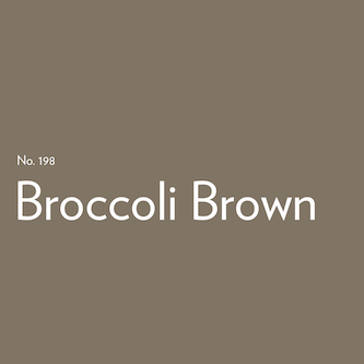
Two of them, Broccoli Brown and Sap Green, reviewed here, came out around 2020 as part of a colors inspired by nature collection.
Broccoli Brown is a very interesting color. I think a slight green undertone will appear in some lighting conditions. If you look at F&B’s website, you’ll see examples of this happening. However, sometimes it looks like a true brown or a brown veering towards taupe, a warm gray with red undertones. How can it have both red and green undertones?
Lighting.
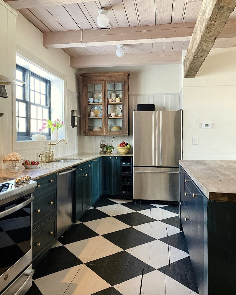
Five years ago, I matched BROCCOLI BROWN with another Laurel Home Collection paint color, the timeless historical color, Kingsport Gray, as seen below.
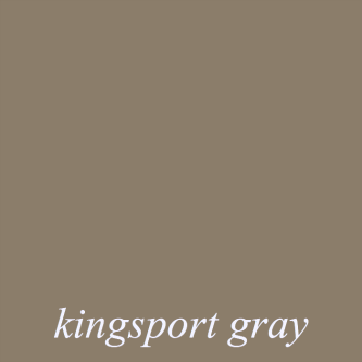
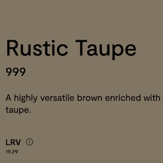
However, Kingsport Gray, pictured above, is slightly lighter than BROCCOLI BROWN. Rustic Taupe 999 is a closer match.
Please note that Kingsport Gray might have been the closest match to Broccoli Brown. The reason is that the paint cards, particularly the F&B cards, change from year to year.
All of these are fine colors to create a sophisticated space.
Let’s move on to the next resurrected Farrow & Ball color from 2020, SAP GREEN.
This is a beautiful mid-tone green with a slight yellow undertone. It is the quintessential grass green and a very beautiful color for interiors.

SAP GREEN above and below
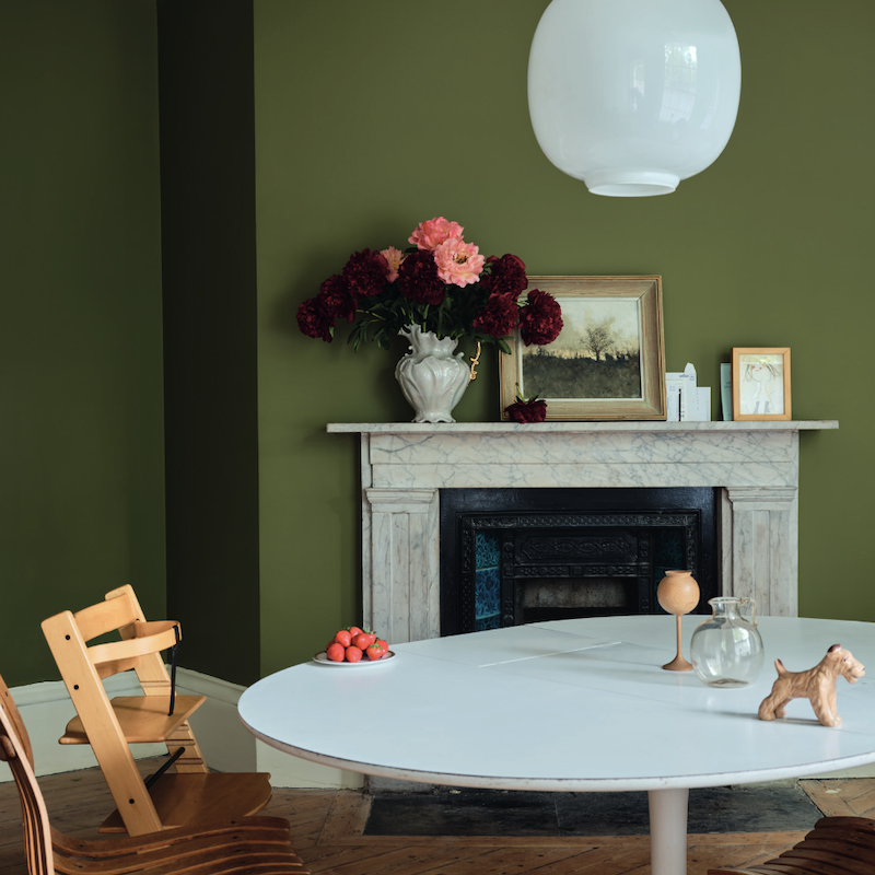
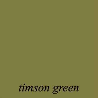
Here’s the thing. In 2020, I felt that Timson Green cw-470, one of the Laurel Home Paint and Palette Collection colors, was the best match.
While it’s not the worst, Benjamin Moore Oak Grove 489 (below) matches Sap Green more closely. It’s a bit more gray, is all.

Above is Farrow & Ball Sap Green, which, as you can see, is a bit brighter.
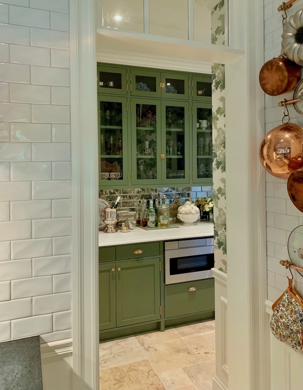
Laurel, that reminds me of Farrow & Ball’s beautiful CALKE GREEN in the kitchen you worked on a few years ago, right before you moved to Boston.

Yes, you’re right. Calke Green is a touch deeper, but not so much that it clearly distinguishes itself as a different color. All of these mid-tone grassy greens are similar. Below is the Bronxville kitchen butler’s pantry cabinets painted Farrow & Ball Calke Green.
ETRUSCAN RED (Below) is the third archived color.
I don’t know when it was last seen. However, they brought it back.
This is not my favorite color. It’s not quite mauve and not quite brick. However, I find that red paint colors brighten at night in warm lighting, so this probably looks like a true red brick at night. I wish it had less blue in it.
This is interesting.
While this is far from my favorite color, it sure is someone else’s because I found over 20 colors that are quite close to this color. How is that possible? Below is a screenshot so you can see what I’m talking about.
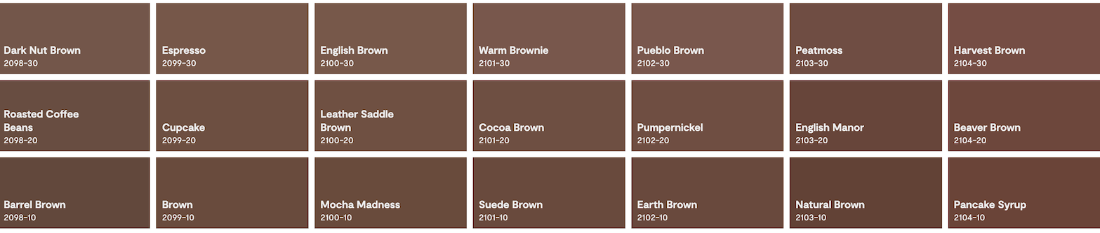
I know! This is one reason why people struggle. And the family of reddish browns continues into the next two rows on the page after this one. They could easily eliminate at least half of these.
So, which one did I choose to match Farrow & Ball’s Etruscan Red?
Please take a moment and guess, if you like.
I obsessed over pondered this one carefully. And don’t worry if your choice is different than mine, because, like I said, the differences are so slight, it hardly matters. I looked both online and at my card samples.
However, if one looks closely, the top two rows from Warm Brownie to Peatmoss are all pretty darned good.
Ultimately, Pueblo Brown 2102-30 won, but by a hair’s breadth.
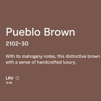
Since I spent hours researching this post, I won’t have time to finish writing it tonight. However, we can finish this one on Thursday. I just realized that this color is reminding me of Pantone’s COTY for 2025 Mocha Mousse.
However, let’s do one more of the new Farrow & Ball colors 2025.
Farrow & Ball’s MARMELO is next.
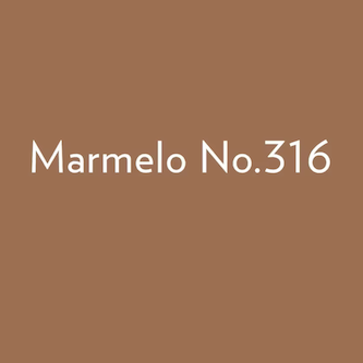
I would call this a classic burnt orange. It will be stunning at night with warm lighting. However, I would reserve it for a smaller space. It would be a welcome respite for a home that was largely blue and white. It would also be a terrific color with wood tones, as it would make them blend in beautifully.
As for a color match with Benjamin Moore.
Well, unlike the red-tinged browns above, there’s very little in this category. The closest I found is Lenape Trail 1222.
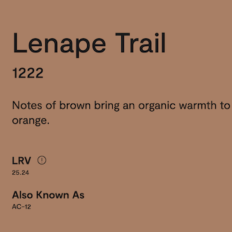
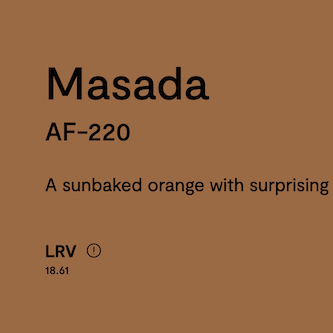
Actually, I found another color that’s also close but in the other direction and that is Benjamin Moore Masada AF-220
If you’d like to go even deeper, another match to Marmelo is Terra Mauve. However, the two above are closer.
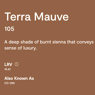
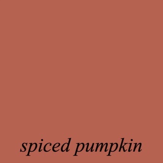
Of the three colors, I prefer Terra Mauve. It’s not a color I have used, but I could see it looking beautiful in a fairly small space in an old home. Below are the two closest colors I once used for clients.
They are Spiced Pumpkin.
and Spanish Red
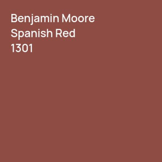
Both of them are lovely colors, and terrific for small spaces.
Um, Laurel, those aren’t anywhere close in color to Marmelo!
Yes, I know. lol That’s the point, I guess I didn’t convey too well. I did at least a dozen red rooms over the years, maybe more. We also did zillions of gold, khaki, and bronze tone rooms.
But, anything close to orange? Never.
Still, there were a fair number of gold haters who I recall them saying with tremendous disdain:
MUSTARDDDD, like I had just suggested, they paint their walls with excrement. It happened at least half a dozen times, and it was always the husband. This is not to say that all husbands hated gold; not at all. However, the ones that disliked it, did so with venom.
Okay, we’re out of time for the other eight Farrow & Ball colors for 2025.
May 1, 2025
Happy MayDay!
We have time for one more today, and I’m staying in the red family. The other colors are greens, blues, and one gold color. Okay, the last color is one of those that’s a tough sell for most Americans, but the British love their dirty pink shades.
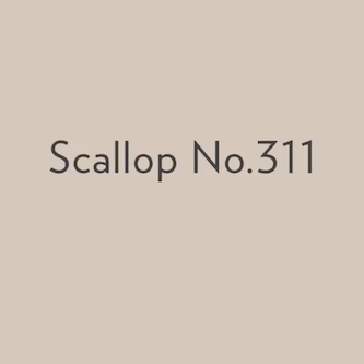
Farrow & Ball is calling this one, SCALLOP.
Laurel, forgive me for interrupting, but I bet you’re about to say it looks like cat gromitz. Right? hehehe
haha. Yes, pretty much. However, it has a fair amount of gray in it. I can’t say it’s a terrible color, however, I prefer Dimity.
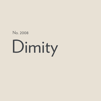
This is a Farrow and Ball image. The walls are Dimity, and the ceiling looks like Scallop. However, it’s Calamine, which is a shade deeper and with more red saturation.

The closest color I could find is Benjamin Moore Pinky Swear csp-340.
Okay, we are finished with the reddish shades.
To be continued…
xo,

*********************************************************
Part 2 Begins Here
Hi Everyone,
If you read this as soon as it came out, we left off with Scallop, but the Benjamin Moore duplicate might’ve changed. That leaves seven more Farrow and Ball colors 2025.
The first is REDUCED GREEN.
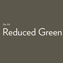
This isn’t it, below. It’s Benjamin Moore Essex Green in Melissa T’s gorgeous Sunroom. However, it’s not too far off in this image because of the warm lights.
Yes, I know. The F & B color looks like sewer sludge. ;] However, this is a fabulous, very liveable deep olive green for smaller spaces. The green will pop out more with nighttime light.
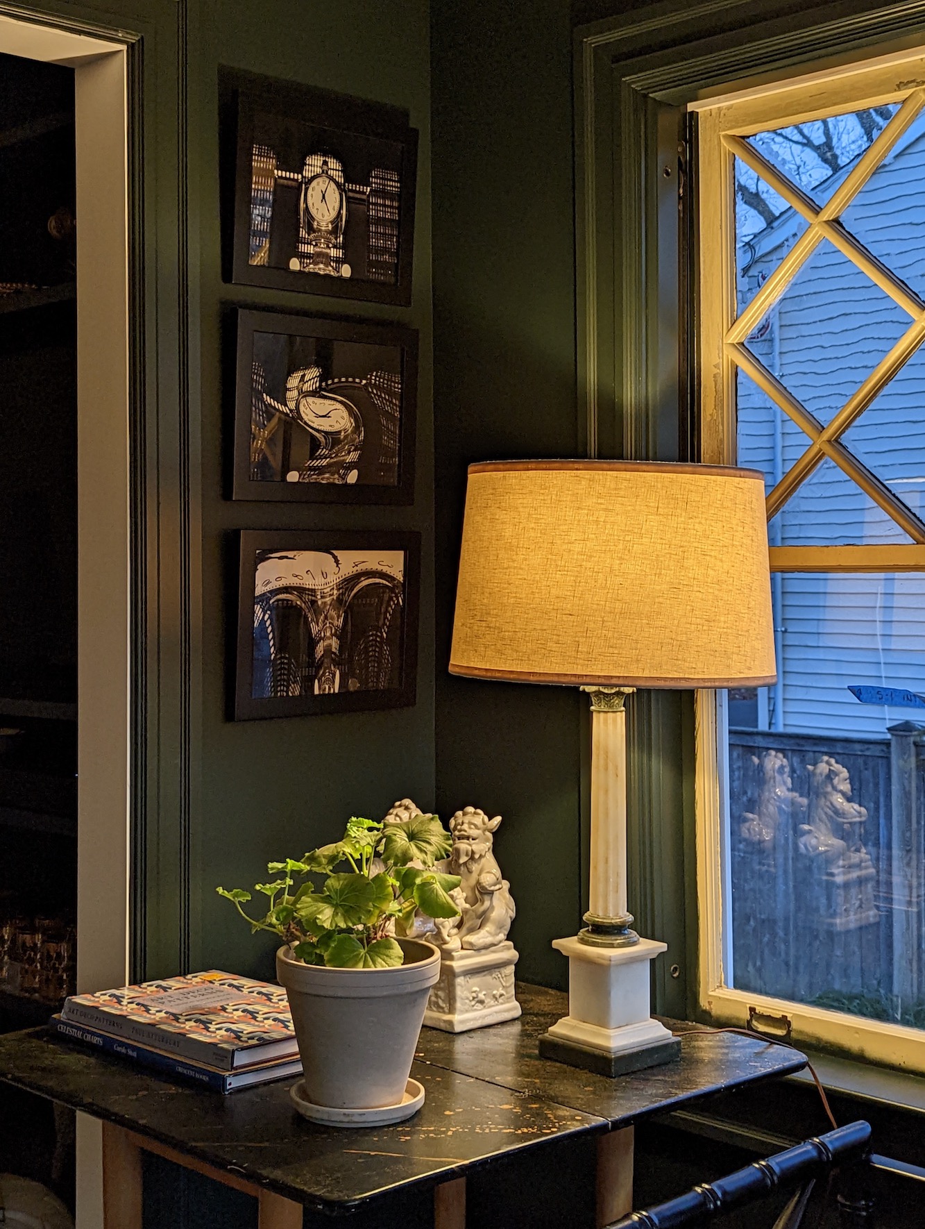
A good counterpart for Reduced Green is Benjamin Moore’s Aegean Olive 1491
Next up is a lovely new ochre color by Farrow & Ball called DUSTER.
(Or, you can call it mustaaarddd if you hate it.) ;]
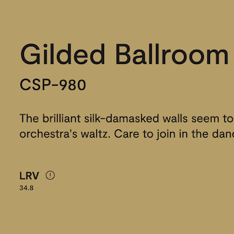
I thought this one would be a piece of cake because it is reminiscent of many of the gold tones I specked for clients in the late 90s and early 2000s. There are a lot of them at Benjamin Moore. Well, I was wrong. This was one of the most difficult ones to find a suitable match for. However, the Color Stories fan deck came through with Gilded Ballroom. Phew!

All the other shades of gold were either too bright, too dark, too light, too green, or too coppery, like Hathaway Gold is by comparison.
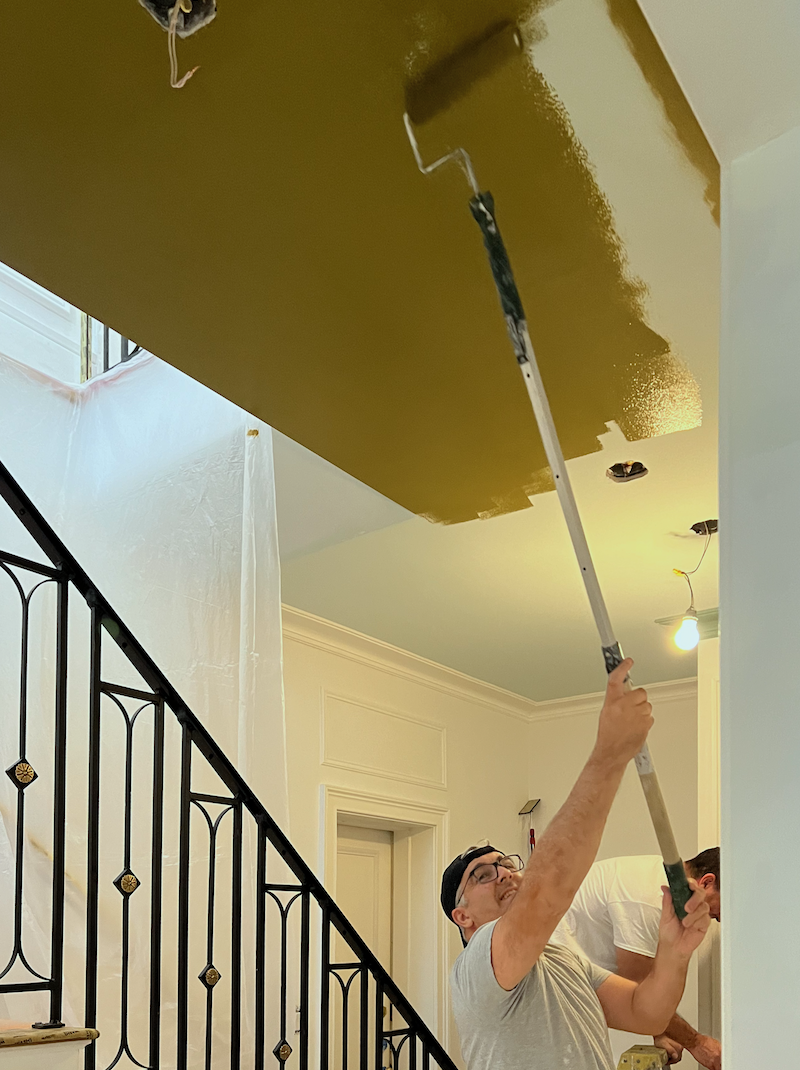
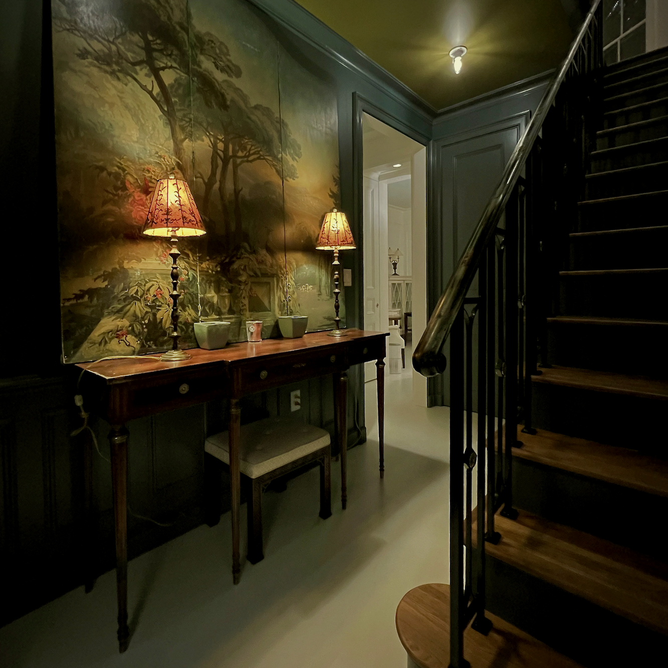
Let’s move on to another olive tone by Farrow & Ball – DIBBER.
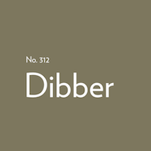
Isn’t that like your downstairs ceiling, Laurel?
Well, it’s in the same family, but no, it’s quite different; it’s darker and way less saturated.
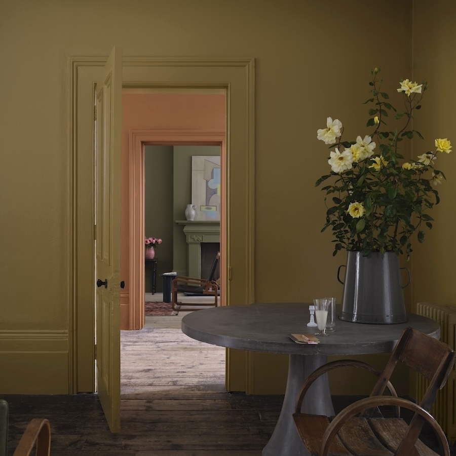
Above, we have, via Farrow & Ball, three of their new paint colors for 2025.
In the back is Dibber, followed by Marmelo, and in the front room, Duster. Here, Duster is looking a lot like my ceiling color, but it’s not. Photos can be quite misleading.
Does that floor look violet or is it me? I hope it’s not the case in real life.
Next up is Dibber.
F&B explains in their videos how they come up with these odd-sounding names. I guess it’s better than calling it Baby’s First Dump. ;]
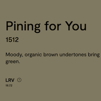
Benjamin Moore Pining for You looks to be a very close match to Dibber.
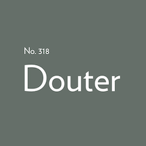
Our next Farrow & Ball color is called DOUTER.
Oh, that looks like your wall color with the Newt Green ceiling.
Above is my downstairs entry painted Benjamin Moore Knoxville Gray hc-160.
You know I thought so too, but Knoxville Gray hc-160 is more blue. In reality, it does look very close to Douter because, like Melissa’s room with incandescent lights on, it tones down the blue undertones. It will do the same with Douter. So, Douter might even appear to go slightly olive. Again, it depends on the light. I adore this color.

Benjamin Moore Knoxville Gray hc-160, is above.
The Benjamin Moore color I found closest to Douter is Benjamin Moore Quarry Rock 1568
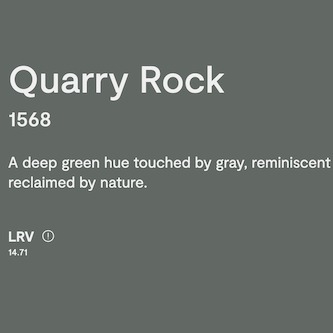
It is a touch more gray and is less green. However, it’s closer to Douter than Knoxville Gray.
We have two more Farrow & Ball colors to look at.
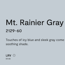
The first is KAKELUGN.
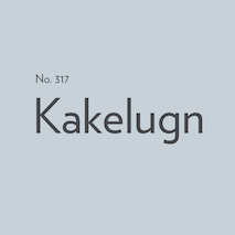
Farrow & Ball describes this as a light gray. While it isn’t by any means dark, I see it as more of a mid-tone Gray. This is another one that I struggled with mightily to find a close match. Benjamin Moore Mt. Rainier Gray is the closest, but this twin is more gray and has less green. The other colors at Benjamin Moore were too bright, too green, too blue, or too gray.
I’m not particularly fond of either of these colors because they’re a bit periwinkle, which is a shade of blue, I don’t generally like as much as many others.
Marilyn’s Dress is a far better color. It still reads as blue-gray.
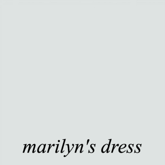
It looks terrific in my upstairs bathroom.
The last color is a lighter version of Kakelugn. Let’s take a look at Farrow & Ball’s new color for 2025, SIZING.

This is a pale periwinkle blue-gray.
The closest color I found is Benjamin Moore.
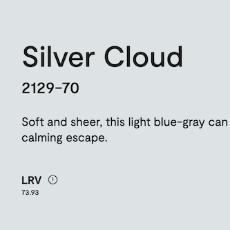
It’s a touch more gray. Again, I prefer Marilyn’s Dress. It’s fine if you like these cool gray shades.
And maybe in your space, they’ll be fabulous.
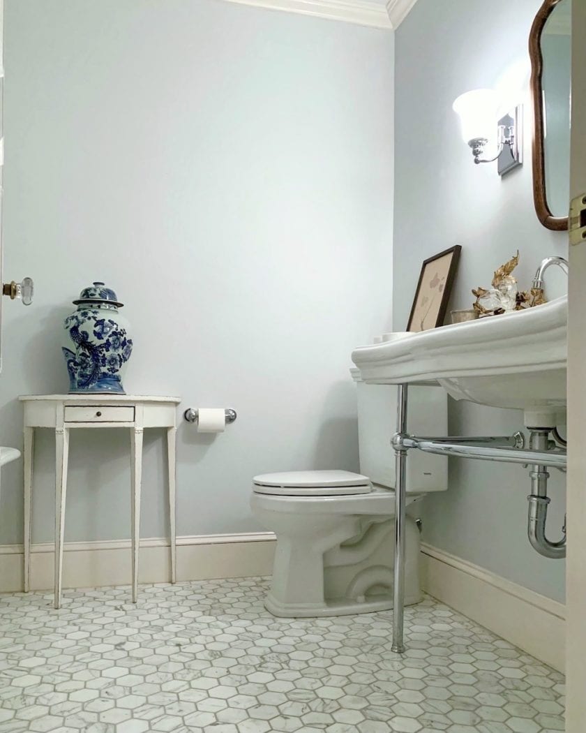
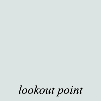
Another beauty by Benjamin Moore is the Laurel Home Collection Benjamin Moore paint color, Lookout Point 1646.
I predict these last two will not last long in the collection. I think the current light to medium gray-blue shades are better. However, they are most likely fine in an architecturally gifted room with the right furnishings and lighting.
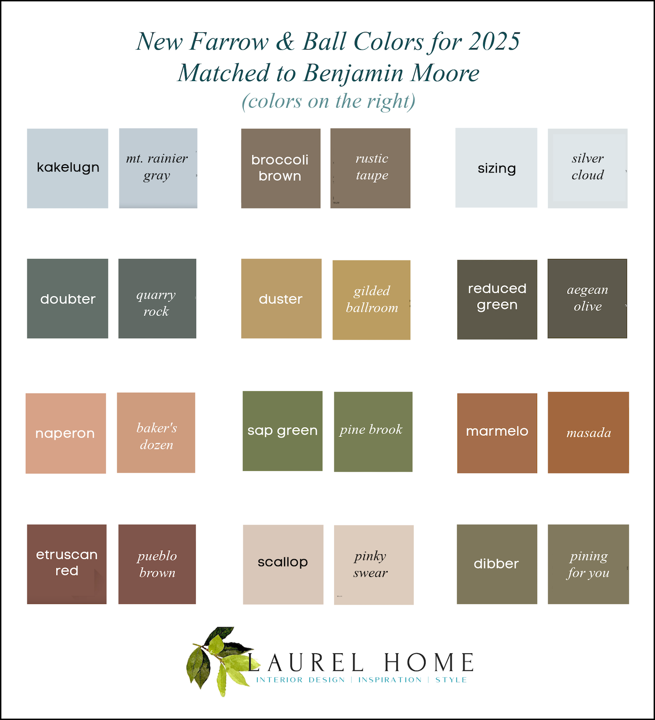
And now, for the graphic as mentioned above, that you may pin to Pinterest for reference.
Please go to the F&B website to order their samples, paints, or wall coverings.
Or, if you’d like to know more about these colors, you might enjoy the videos that go along with the colors. The woman doing the narration is quite animated and enthusiastic about the colors. I don’t always agree with their color choices, but the British are far more adventurous with their color combinations than we Yankees across the pond.
Also, if you’d like samples of their paint colors without the mess, you can get nice-sized samples at Samplize.
Although I just checked, they do not yet have the new Farrow & Ball colors for 2025. I imagine they will very soon, because I believe it’s been about three months since they came out.
I got dozens of both Benjamin Moore
and
Farrow & Ball samples at Samplize.
I found the Samplize colors more accurate than the test samples Benjamin Moore sold to my painter.
I know. It should’ve been that way, but as I discovered, they are quite unreliable. You can see what I’m talking about in this post, when my beloved Cotton Balls looked more like lemon sorbet!
This post highlights 16 of my favorite Farrow & Ball paint colors.
You might also like this post, discussing the last big Farrow & Ball update in 2022.
This post shares 12 of my favorite F&B paint colors for the perfect English Kitchen!
Of course, there’s the big F&B list last updated in 2018.
Yes, I should redo it, but the thought of it makes me nauseous. lol
Still, this post shows you some of the best F & B paint colors. If the color was there in 2018 and is still there today, it’s most likely a very good color. Oh wait! While searching for the 2018 post, I see that I had the wisdom to save the chart from 2015!
That’s even better.
This doesn’t mean I think all the paint colors still standing are great. And it doesn’t mean an archived color is bad. In fact, many are so fantastic, they’re bringing them back.

Pantalon sits in the middle between Dibber and Reduced Green. Alas, they only brought it out for a short time as it’s gone back to the archives! You can still get it as a custom order.
In all fairness, there are three reasons why their samples and formulations don’t always jive.
One, the formulas changed due to the different bases and acquired brands in their collection.
Two, the formulas have changed due to EPA laws.
And the final one, I seriously don’t understand.
The formulas changed just because they thought it would be a good idea. This appears to have happened to some of their classic shades of white. This is why it’s important to test before purchasing and before painting! That is, unless you’re fine with a color being a bit off.
Okay, that’s all for today.
Oh, did y’all see this?
The fabulous Masterclass that offers over 200 classes taught by the best in their field is on sale for Mother’s Day through May 11th.

However, why limit it to Mother’s Day. There’s Father’s Day next month, graduations, birthdays, and anniversaries. This would be a fabulous gift and for yourself, too! I just got mine. I’ve always wanted to purchase the bundle because there are so many of these I want to watch and learn from.
Speaking of Mother’s Day, if you’re looking to shop online, there’s still time. Please check out my Mother’s Day Gift Guide for 2025.
xo,
***Please check out the recently updated HOT SALES!
(The Serena & Lily Sitewide Sale is Ending Tuesday, May 6th at 11:50 (PT))
There is now an Amazon link on my home page and below. Thank you for the suggestion!
Please note that I have decided not to create a membership site. However, this website is very expensive to run. To provide this content, I rely on you, the kind readers of my blog, to use my affiliate links whenever possible for items you need and want. There is no extra charge to you. The vendor you’re purchasing from pays me a small commission.

To facilitate this, some readers have asked me to put
A link to Amazon.com is on my home page.
Please click the link before items go into your shopping cart. Some people save their purchases in their “save for later folder.” Then, if you remember, please come back and click my Amazon link, and then you’re free to place your orders. While most vendor links have a cookie that lasts a while, Amazon’s cookies only last up to 24 hours.
Thank you so much!
I very much appreciate your help and support!
Related Posts
 Yes, She Poured Lemon Juice All Over Her Marble Countertops!
 How To Paint A Room – 20 Steps You Need to Know
 The Boston Athenaeum-Boston’s Little Known Crown Jewel
 A Startling Discovery About An Online Home Furnishings Source
 Happy One-Year Renovation Anniversary + Lots of News!
 The Magnificent Front Doors of Beacon Hill
 The Best White Paint Colors – A New Analysis for 2025


15 Responses
Thank you for this insightful comparison! We often work with both Farrow & Ball and Benjamin Moore shades in our renovation projects—especially when adapting Parisian aesthetics for New York interiors. It’s incredibly useful to have thoughtful matches like these when clients request a particular mood or historical nuance.
We’ve just opened our interior design studio in Manhattan and are always looking for refined, timeless color palettes. Great post!
Thanks so much Veronique!
I found many of these color schemes interesting. They tend to give off “Fall Vibes”. Selecting paint colors has always been a struggle for me. I have a terrible time finalizing color schemes. Is there such a thing as “too many” different colors in a house. I know numerous people that paint their entire house the same color. While I personally find this somewhat boring, I don’t want to overdue the various colors either.
I think that muted, muddy, subdued colors work well, or fall completely flat, depends on the geographic location and the quality of light. A screaming pink can be garish in New England, but at home in Miami, surrounded by strong sunlight and tropical foliage.
An interesting (and revealing?) slip in the spelling of Douter on your graphic, Laurel! I’m pleased at the current trend for green, as this means F&B are producing more of the dirty green colours I like. I agree with you that Marilyn’s Dress is a better colour than the new F&B pale blues, perhaps the older Pale Powder and Pavilion Blue (a bit green) or Borrowed Light would be better amongst the F&Bs. Yes, some of the colours do change a little in the newer formulations, although the “off-ness” isn’t much, at least in the colours I’ve used.
I’ve just re-done our downstairs cloakroom, as there were two big cracks in the walls which had to be scraped out and re-filled, and the room is now a mix of two formulations (with a 40 year gap between them, the old oil eggshell and the modern emulsion) of Farrow’s Cream n° 67. I defy anyone to spot the difference — but the old top-of-the-walls stencil has gone (too early 1980s totally naff), replaced by a white dado line and white floral stripes above, which do what I wanted, visually raise the ceiling. And the washbasin counter top is now green marble rather than the beige Formica I hated from the start — but we didn’t have much choice in 1982 (I had fun painting that), so I’m now adding green touches with accessories.
I’m having to do a lot of plaster repairs and re-painting, and so far I’m finding that the F&B colours in Estate or Modern Emulsion do come up very marginally paler than the old formulations — but of course, it may be simply that the paint has discoloured over time.
I’ve been loving Create Academy, the British design/decor focused product (especially Alidad and Rita Konig) so much I bought a second year of the ‘all access’ package. When I finally run through all of them I’ll start looking at Masterclass. Let us know how you like it!
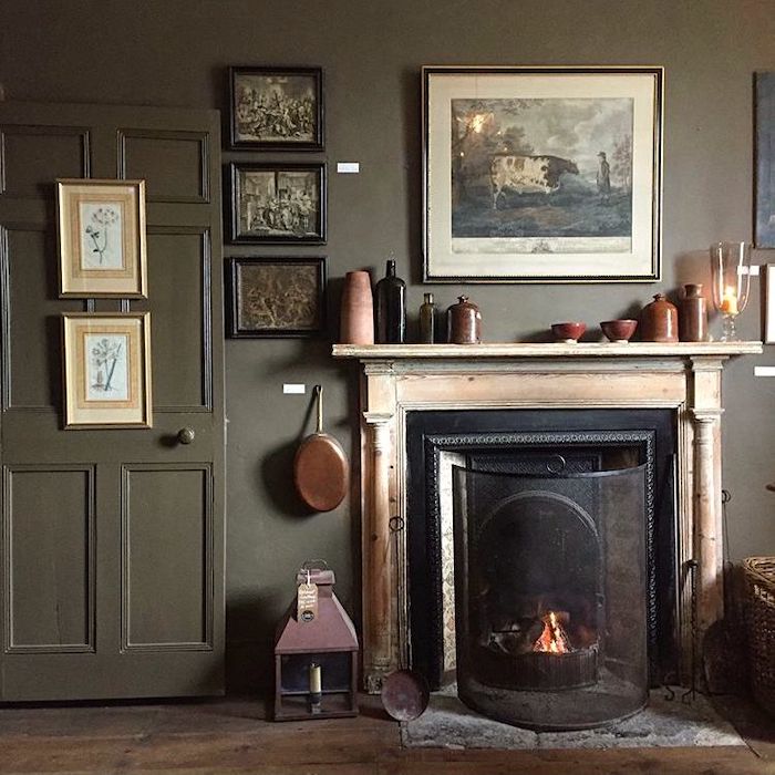
Hi everybody!! I’m happy to report I’m selling my condo and moving into a nice, small house. The fireplace room in the house is currently painted a poopy brown. I’m thinking of having it painted Wythe Blue. I’m also looking at wallpaper patterns for one wall in the front room and one wall in the dining area. Wish me luck!! Happy Mother’s Day to all….
Laurel, I have learned a lot from you about the science/art of color matching. Especially how complex it is, and how very personal our perceptions are. I don’t particularly love most of the colors in this batch–they seem drab to me, especially duster and marmelo–though I now see even these from a new perspective. My preferences don’t take anything away from the great post you gave us, for which I thank you.
My powder room is Meconium green and it works well but an off putting for many.
Hi Diana,
You guys are too funny. The great designer Barbara Barry refined my appreciation for strange shades of green.
Regarding all of the brick red colors: it might have something to do with people trying to actually match the color of their real brick. I wanted to make some ugly trim disappear and blend with the brick on the front of my house, under my windows, and agonizingly went through a zillion paint samples until I found an exact match to the color of my brick.
Hi Sue,
That’s a good theory. But brick is usually not just one color anyway. Perhaps other colors have this situation going on, and I never noticed before.
Thanks for your humor. Enjoy that sweet baby!
Kristen
I have a baby and I would say her poop color is closer to Marmelo. 😂 Personally I’m not a fan of any of these colors, but I love jewel tones. The best decorating advice is “know thyself”.
I’m not a decorator and know you are but Broccoli Brown is awful. It looks like baby poop.
Thanks for allowing me to comment rudely.😂
Kristen