

Hi Everyone,
Thank you so much for all of the terrific comments from Sunday’s post about the wall vignette inspiration image. Today, is part 2 where we move on from the inspiration to figuring out what we’ll do for the rest of the space. It’s one of the most important lessons in this volume of blog posts.
If you missed part 1, please begin from the top of the page. Otherwise, if you read part 1 and would like to skip to part 2, please click the link below to skip part 1.
Part 2 Begins Here
Dear Laurel,
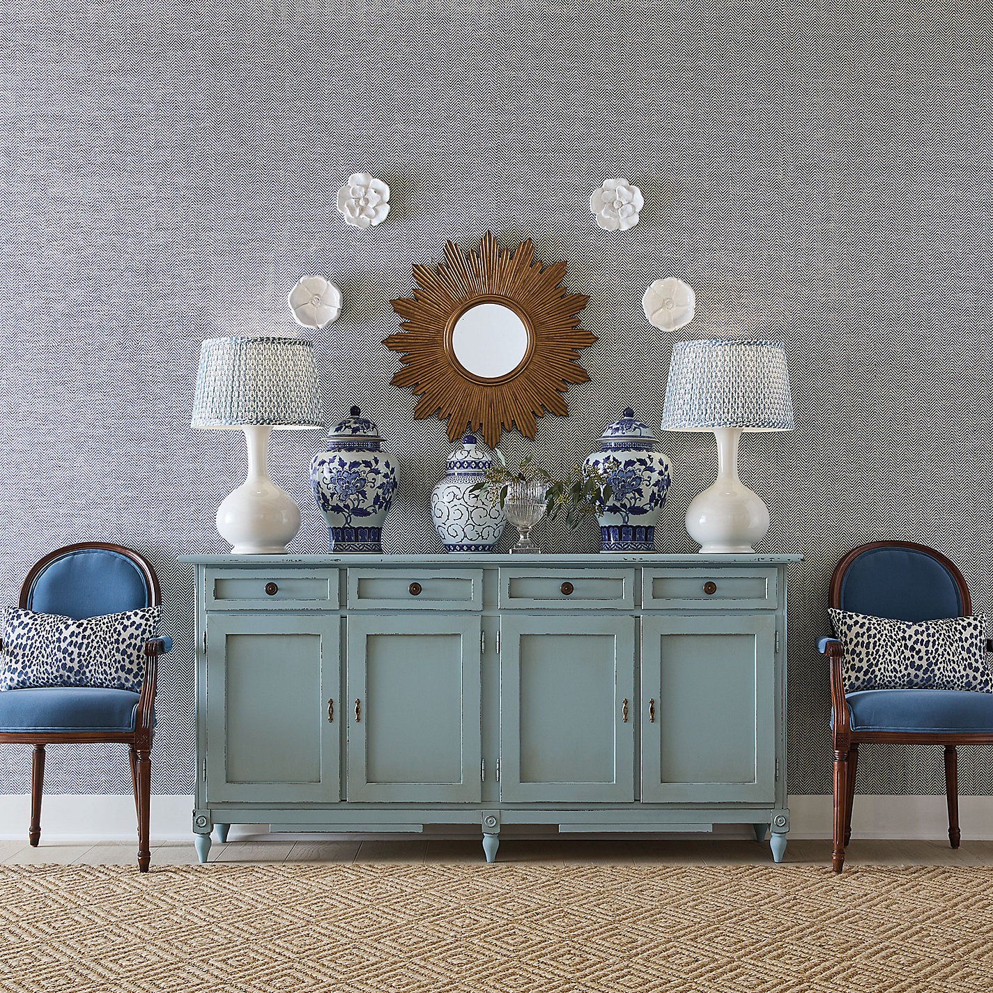
I was just looking at the Hot Sales and am captivated by a wall vignette I’ve not seen before. I love everything about it except for the wallpaper, which is reverberating on my computer monitor. lol
It was from this image from Ballard Designs.
But, here’s my question.
Would it be possible to come up with an entire color palette for furnishings and walls based on this one image?
And if so, how would that work?
Your Devoted Follower,

Yes, the “reader” is me. I dreamed this one up yesterday when I saw the lovely wall vignette from Ballard Designs.
No, it’s not possible. Why would you think such a thing? ;]
So, I’m just going to say goodnight.
Of course, it’s possible. That’s not the problem. The problem is there are a billion possibilities!
Well, Laurel has I’ve already decided what I don’t like– the wallpaper.
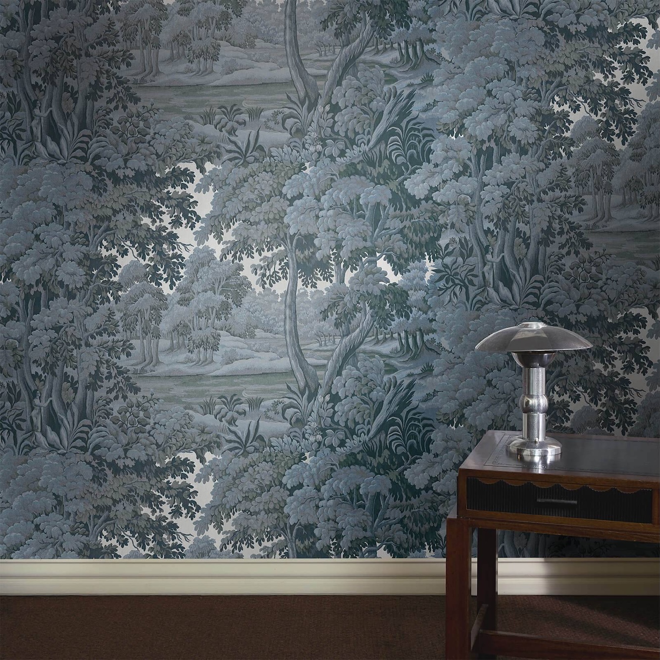
Let me back up. It’s not that I don’t like the wallpaper; it’s that I’m not fond of it here. It’s not reading as a herringbone, just a muddy color. I could see this in a boy’s room or a home office.
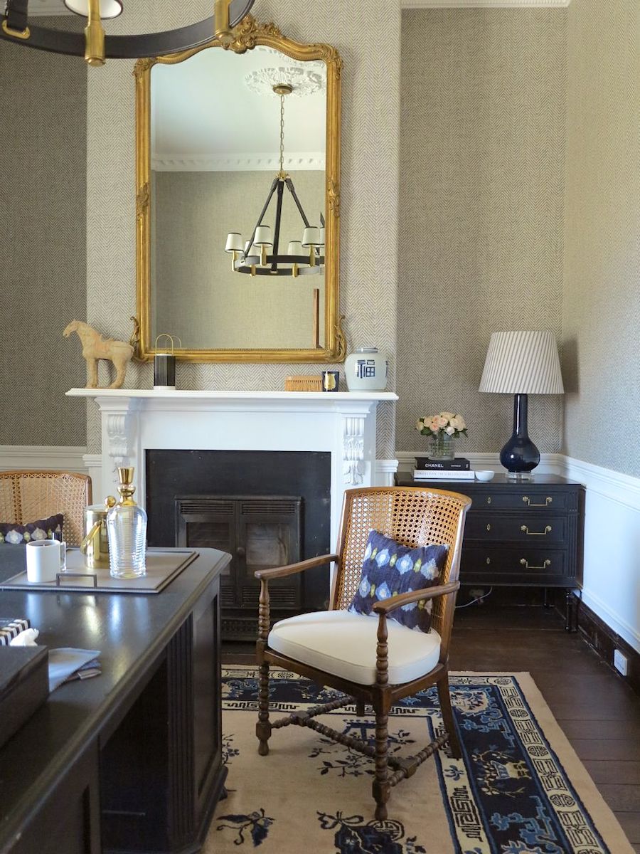
Steve Cordony did something similar in his old office. I need to check to see what he’s been up to!
I think a better choice for a wallpaper would be a beautiful darkish blue grasscloth.
It could also be a patterned wallpaper.
Or, it could be plain ol’ paint.
So, what I did was remove the background of the image on Picmonkey.
With the background gone, I was free to add a new one. I did add the floor back in, too.
It’s terribly fun, but there’s something to remember. When these colors are photographed, you’re looking at one version of the color.
And that’s when I fell down the paint color rabbit hole.
It’s an easy thing to do; no matter how many years I’ve been at this, there’s always a new surprise.
Laurel, what do I mean by “one version of a color?”
I mean that a paint color is never only one color.

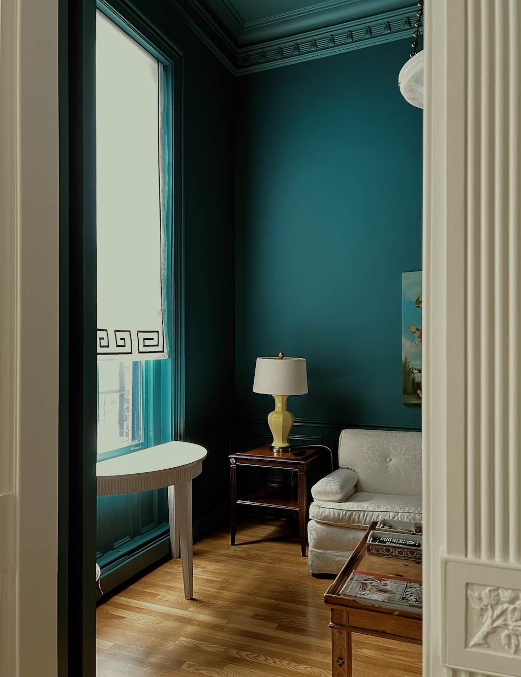
Take my den, which is North Sea Green. In real life, I see everything from a medium, deep turquoise to navy blue and many shades in between. Is that color above somewhere in there?
Yes, but it’s not the predominant shade. Also, the ceiling is a much lighter, greener color.
Below is a sample the painters painted on the wall, just to make sure.
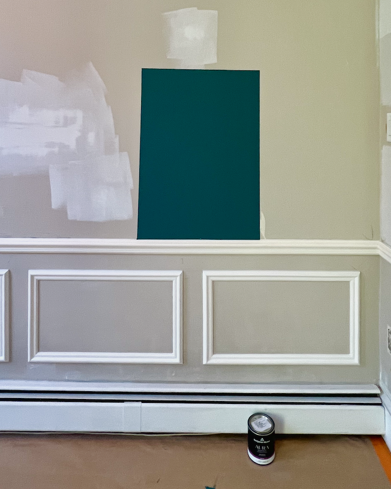
Below is Benjamin Moore’s interpretation.
Below, where the light is hitting the door frame and wainscotting, it looks more like it does above. But only in that relatively small area.
So, how does Benjamin Moore decide which one is the color?
I don’t know, but I do know that it’s very difficult. It’s like trying to catch a rainbow.
However, an important point is that dark colors tend to look brighter on a computer monitor than they will in real life. And dark colors tend to photograph brighter than they are, unless one uses very dim light.
Conversely, what you see on the paint chip will overall appear somewhat lighter in real life.
Laurel, I’m confused.
Of course you are! It’s very confusing, because for every rule, you’ll find exceptions, which are not always easily explainable.
For example, I’ve been living with Benjamin Moore Knoxville Gray for over 15 months in both of my entries, but totally saturated in the lower entry. I love it. But… for the most part, it does not look like this sample below.

It looks like this:
Or, it looks like this below.
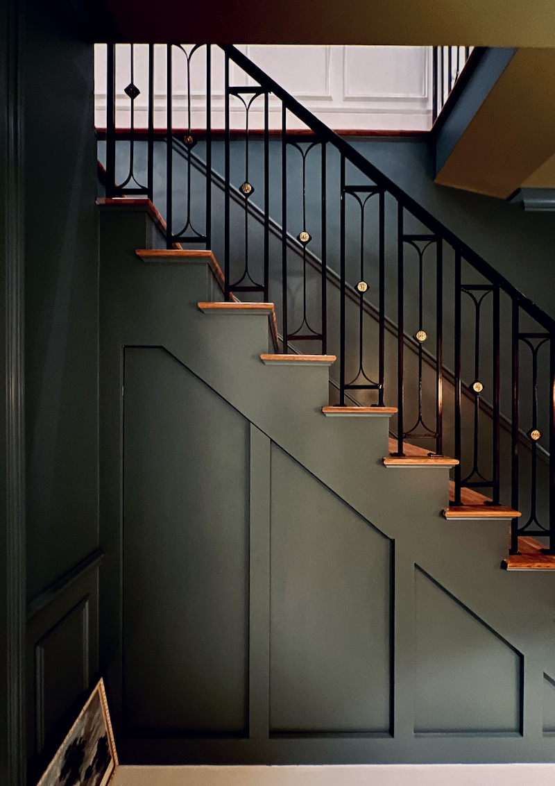
Above, you can see the color in the lighter portions of the stair wall.
And you can see it here, too when I was taking a photo of the beautiful crown moulding – this links to a fantastic post!
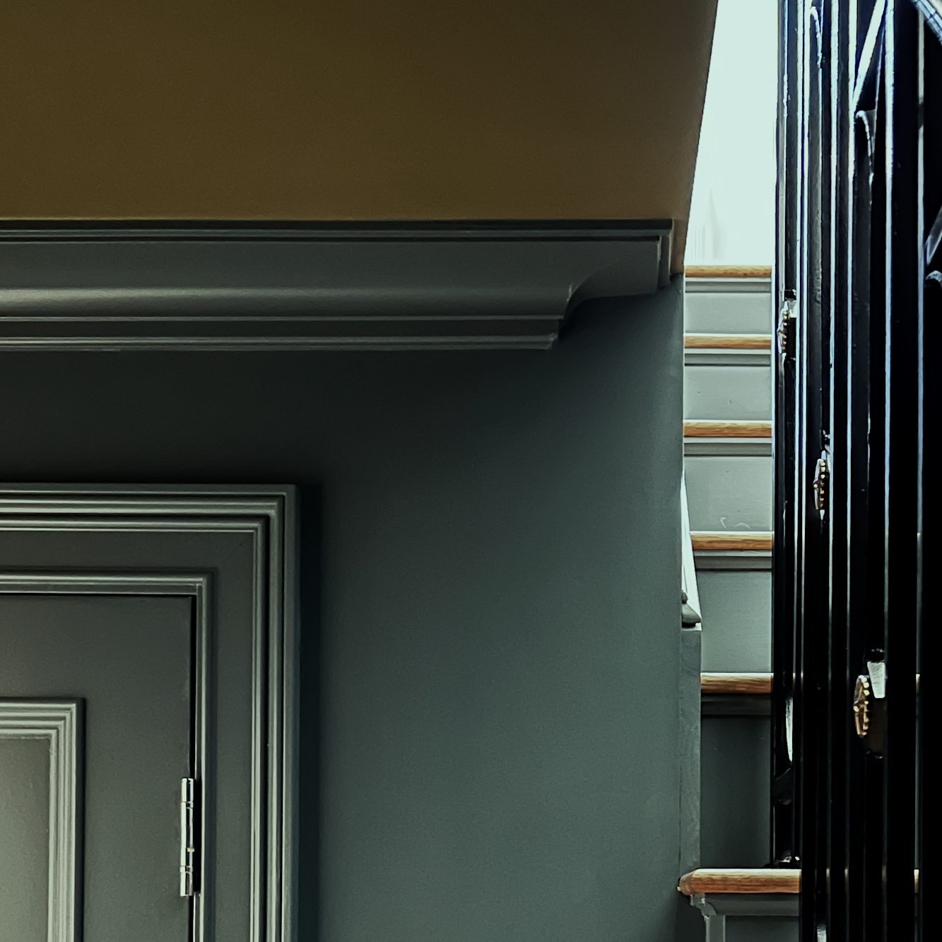
Everything is painted one color! When I take the time to examine what’s going on here, I find it fascinating. Notice how pale the stair risers look in the photo! Obviously, this was a daytime shot, and the light was shining brightly on the risers.
Upstairs, the dark green wainscoting is also Knoxville Gray.
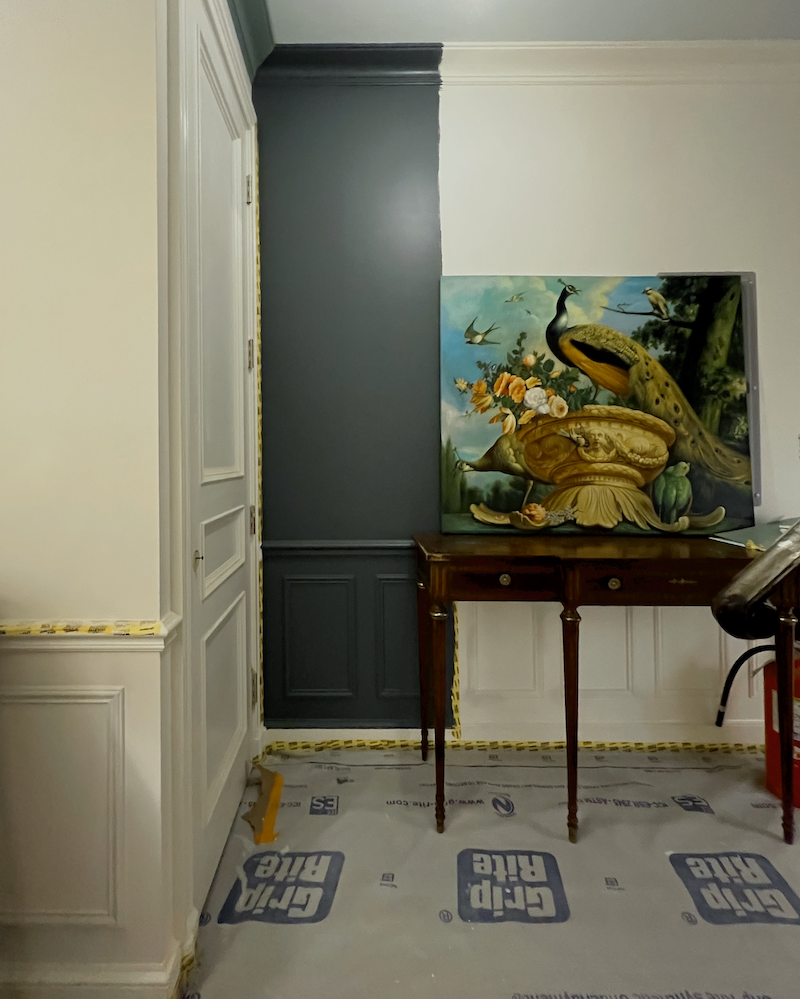
The big test, above, which the painters mistakenly laid downstairs instead of upstairs, gave me a good idea of how the color would look. The other green color was a lighter green, Grenadier Pond which I never bothered to test on the wall because I loved this color so much! Please check out this post, to see that paint color because it did look lovely. However, I have no regrets.
So, when I put the web version of Knoxville Gray behind my wall vignette, it looks a lot lighter than it will in real life.
So let’s bring that down and look at it on the wall.
True, it’s quite flat and no matter how evenly a room is lit, it’s never going to look like this.
Now, please don’t be scared; however, the reality that no one ever told you before is that this color will look more like this image below the sample with the wording on it.
I said, don’t be scared. ;]

Laurel, I’m scared.
Yeah, I know you are. Me too! And anyone who says they aren’t is trying to sound like an “expert.”
Aren’t you an expert, Laurel?
(Eye roll). No, I have experience, and 38 years of it. But, when it comes to the laws of physics, there are trillions of variables, and no one can predict with absolute certainty how something will look in every situation.
So, are you saying that all of those mood boards are useless?
No, they’re not useless because they’re good for seeing the colors next to each other. After all, all of the colors will change together.
Okay, we didn’t get too far with the wall vignette because of the rabbit hole. However, it’s an important point.
And it’s also good to know that you might love a color during the night, but not so much during the day. Or, the reverse.
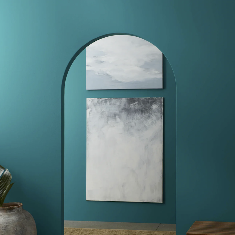
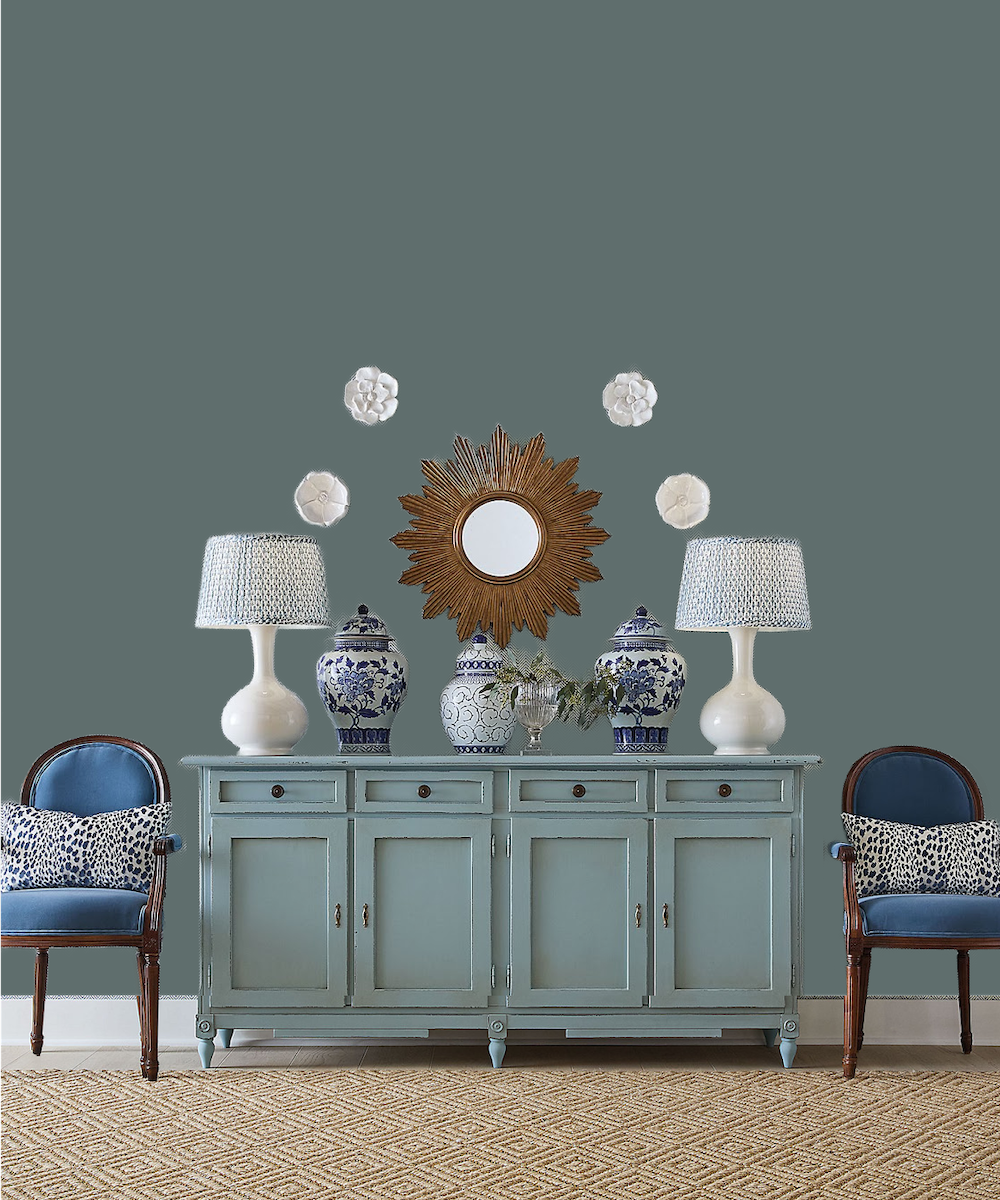
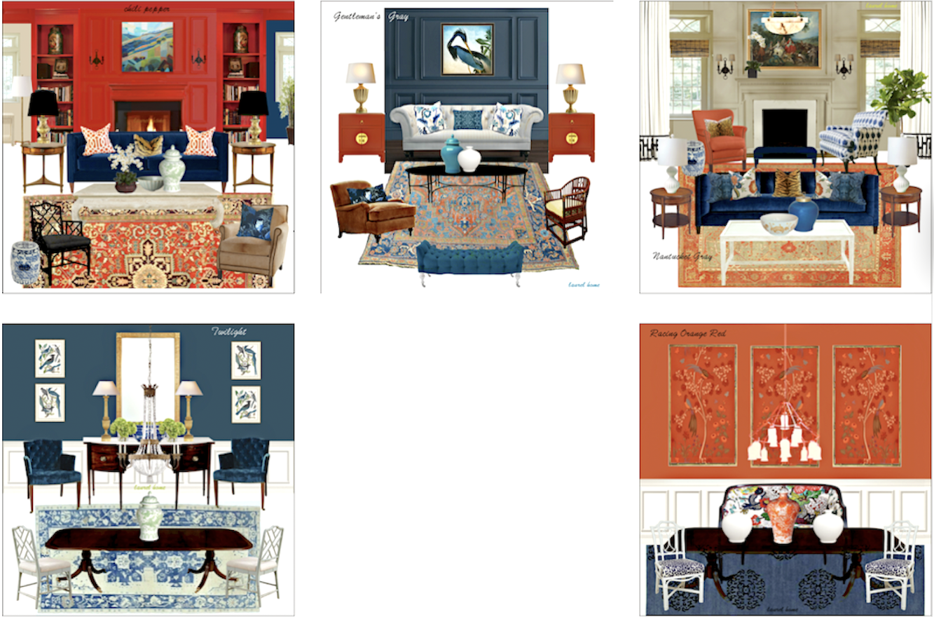
Getting back to our topic of working with the Ballard Design wall vignette, Knoxville Gray could work. However, I tried a few deep blue colors and prefer that, in this case. The one I like the best is Gentleman’s gray.
There are two versions of the wall vignette.
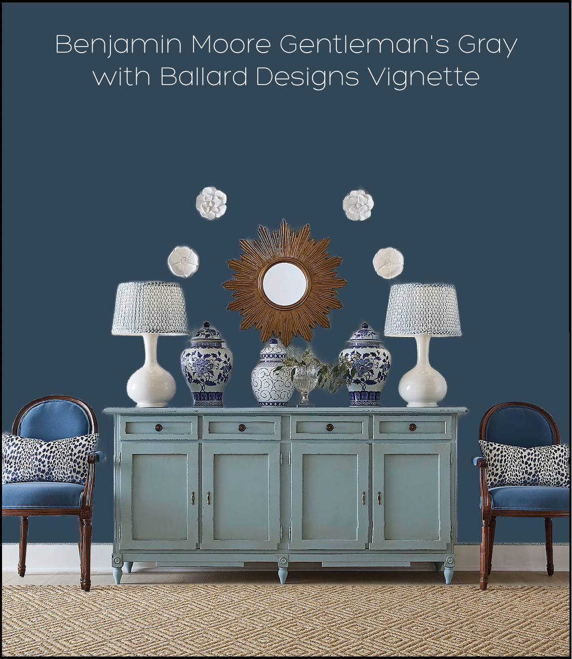
1.

2.
Oooohhh, I love this one!
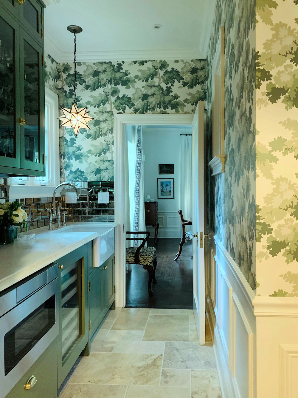
But, I did one more with wallpaper; not grasscloth, although that would look terrific, too. I chose the Raphael in Blue by Sandberg.
Yes, it’s the same wallpaper we did in Mary’s gorge butler’s pantry a few years ago.
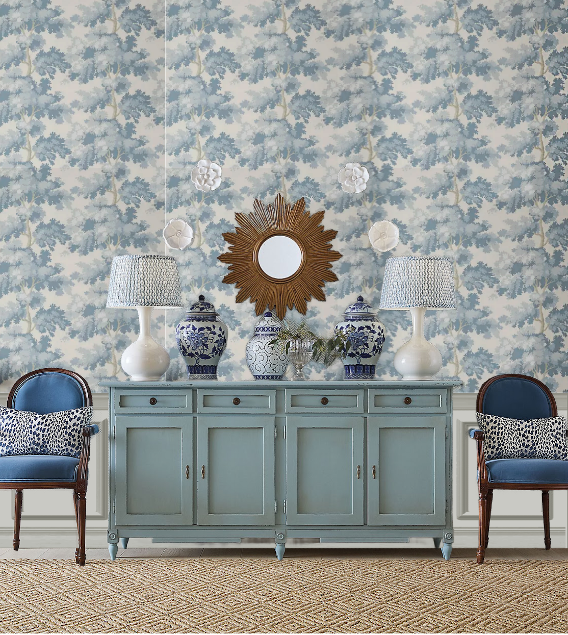
3.
Oh, I like this one, too. It feels very Gustavian, which the paper is. I want you to notice something. Do you see how the shades of blue are varied? This– THIS is something we’ve discussed a few times, and it’s something I’ve fully embraced in recent years. And the something is intentionally not having everything match. It’s like leaves in a forest are all slightly different shades.
But then I did one more variation of the wall vignette.

4.
Yes, I’m such a nutjob that I made it look like there’s the same wallpaper on the opposite wall with artwork hanging that’s reflected in the mirror.
Which one do you like the best– 1, 2, 3, or 4? (Sorry, the numbers were there and some how went missing, but they’re back now.)
I can’t decide.
Please let me know, and I will expand upon it.
xo,
*********************************************************
Part 2 Begins Here
Wednesday, January 7, 2026
Okay, this is the part where we take an inspiration image or images, including a beautiful wall vignette.
Now what?
Now it’s time to plan what you need and what your space planning (room layout) will be, given the confines of your space, budget and needs.
If you go over to the 12-step decorating plan that always works, you need to go through all of the steps, up to step 7. That one you’ve already done. Step 7 is your “jumping off point” which is what this post is about.
By this time, you’ve assessed your needs and completed a scale room layout.
Please head over here to learn how to make a simple room layout. Yes, you can. It might feel daunting, at first, but once you know the rules, it’s a lot of fun.
Now that you have your room layout and your inspiration jumping-off point, it’s time to figure out what you’ll be doing for the rest of the space.
Before I go on, I must apologize.
I realized on Monday that somehow three of the numbers (1,2, and 4) were deleted unintentionally, and only the number 3 remained. Somehow, y’all figured it out. Thank you so much for weighing in. I enjoyed reading all of your comments.
I genuinely like all of them. However, none of them are finished. It’s a start. However, did you realize that all of the vignettes work well together? Not necessarily in the same room, but the same home.
However, I do agree that the Raphael, even in the more pale colorway, looks best in small doses.
That is why it’s so successful in Mary’s butler’s pantry. Even on the one wall with no cabinetry, there is still wainscoting and the interior window to break things up.
Of the four boards, the one I chose to work with…
Drum roll~~~~~~~~~~~~~ is…
#2 – The Gentleman’s Gray with the gorgeous painting.
However, as I said, we can certainly incorporate everything else presented, in other spaces, or exchanged.
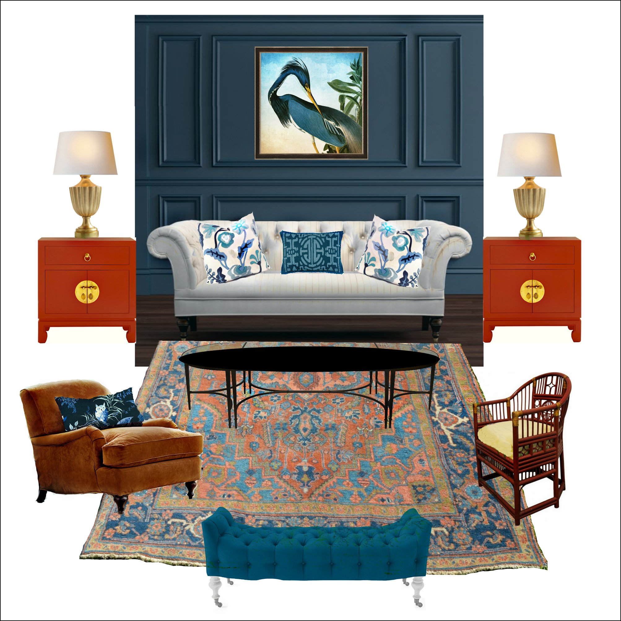
Now, here’s the thing. In real life, if I were helping someone design a dining room and a living room, on average, it would take at least 30 hours of time, and usually more. That time went towards planning, drawing, shopping, pondering, 3-6 visits to the client’s home, with revisions and edits.
I don’t have 30 hours. However, this is me, and I have a library of furniture I love, and I’ve been doing this for a while, and I don’t have a client saying, “I don’t like that.” But still… This is just me throwing a bunch of things together.
So, where do we begin?
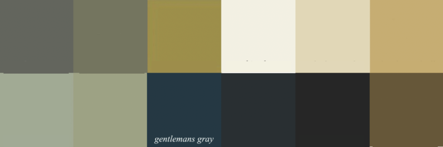
Well, for those of you who own the Laurel Home Paint, Palette, and Home Furnishings Collection, you might recall that there’s a palette for Gentleman’s Gray, one of the 144 (plus 12) colors in the Laurel Home collection.
In fact, Gentleman’s Gray was the first board I made. So, it’s a little crude compared to most of the boards.

This is one way you could go. However, there are numerous other palettes with Gentleman’s Gray in them. This palette is part of a “Palette Family” in the Laurel Home Collection called the warmer side of red and blue. That’s because both the reds and the blues are leaning toward their warmer side.
The beauty of this palette is that you could have a white on white + neutral tones room and only use blue or a warm red as accents, or not at all.
Every board has an accompanying palette of twelve paint colors.
Please understand that not every color is intended to go on the walls. And, there are dozens of other colors in this color palette family.
*So, it’s important to know that just because a color is in the palette, it doesn’t necessarily need to be used, but it could, along with other colors that are in the palette family.
What if I don’t like red or red-orange?
Please see above.* You don’t have to use it!
You don’t even have to use blue.
You can also mix Gentleman’s Gray with Palette Family #7. It’s easy being Green (and Teal) of which there are nine palettes and boards.
Below is one of them, which features Gentleman’s Gray.
In fact, gentleman’s gray can mix with all of the palette families, except the lavender family, making it very close to being a universal color. Those colors are listed in the first part of the paint collection.
Take the room below by Mark D. Sikes for the Southern Living Idea Showhouse.
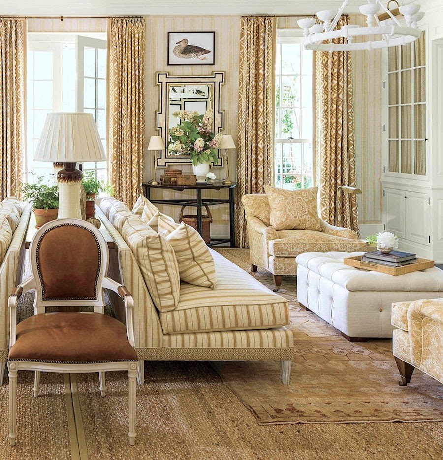
This room is in the neutral palette family and would work beautifully with Gentleman’s Gray. It’s rare for Mark not to use blue in his interiors.
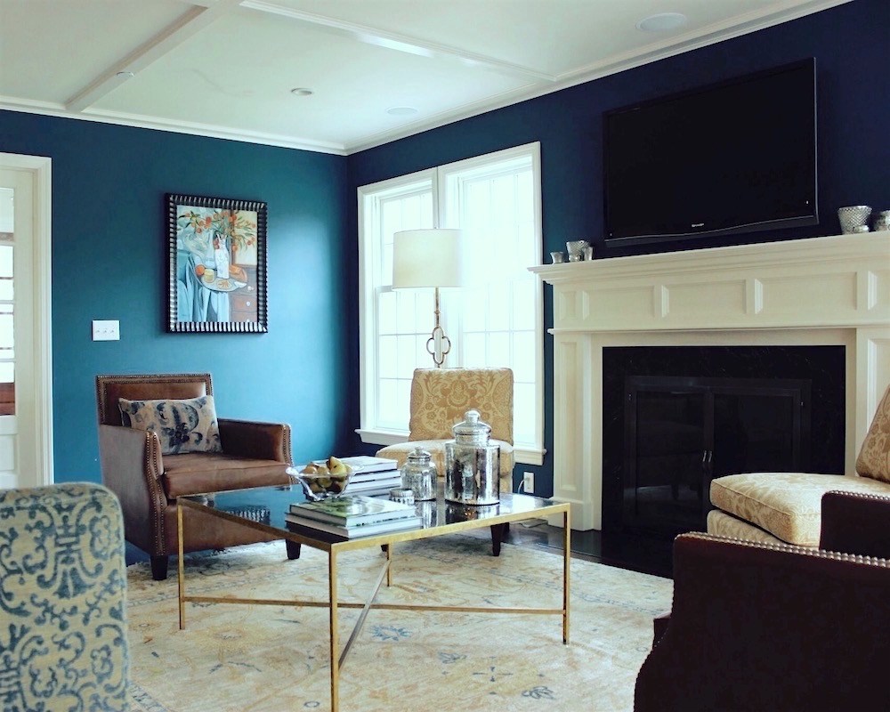
However, back in 2008, I helped a lovely client in Chappaqua, NY, with this addition, below.
As you can see, it’s very similar to Mark’s showhouse palette with Gentleman’s Gray!

Classic color palettes are classic, and these warm toasty neutrals look fantastic with a warm blue like Gentleman’s Gray.
Let’s take another look at our starting point wall vignette.
Okay, before we get to the widget, here are some things to know about the enigmatic Gentleman’s Gray.
- Deep rich blues, well, actually all shades of blue LOVE black. So, it’s imperative to incorporate some. I say imperative because blue without black is like pancakes without syrup.
- Blue also loves white, as in blue and white.
- And of course, as we just saw, blue adores gold. It also enjoys hanging out with all of the other shades of blue and blue-green.
What about indigo?
I know that many of you like it, but I’m not as fond of it as a wall color. My Bronxville bedroom came painted in indigo. I did like it at night, however.
The above is the House of Hackney Plantasia in Indigo. There are a few palettes and boards in the Laurel Home Paint and Palette Collection that would be beautiful with this wallpaper. However, I find indigo more of a challenge to use as a primary color in interiors.
Getting back to the practical aspects of selecting furnishings, if I’m doing a patterned rug, I prefer to pick that out next.
I very much love white furniture with dark blue walls. Either that, or brown leather, or a combination. That doesn’t mean I would only do white furniture. It could be beige, brown, blue, red, orange, green, yellow– lots of colors.
The fabric we did in the Chappaqua family room was an expensive chenille from Donghia that I had to send for knit backing so it would hold up to this young family of five. You can see it above in the lower left corner of the image.
Aside from that, now that we know the colors, we can begin the furniture selections.
I put together 100 items, including art, rugs, pillows, furniture, tables, antiques, and lighting to give you some ideas. Of course, not all of this would go in one room.
Please enjoy this grouping.

Also, below is a widget of blue pillows for more inspiration!
If you’d like to see more pillows, there are a bunch in this post from last spring.
Please let me know what you think about this idea of gaining inspiration through a wall vignette and ifthis exercise was helpful.
If not, what is the missing piece or pieces for you? What do you struggle with the most when it comes to decorating your home?
xo,
***Please check out the recently updated HOT SALES
Some of my favorite sales are happening right now.
Also, if you’re doing some shopping on Amazon, please click this Amazon affiliate link or the graphic below.

Thank you so much!
I very much appreciate your help and support!
Related Posts
 Americasmart – Home of Exquisite Home Furnishings
 Moulding Selections – What I’m Using + Tips & Tricks (parts 1 & 2)
 Outdoor Living and Furnishings You’ll Love Inside or Out!
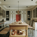 Interior Design Inspiration – 21 Gorgeous Instagram Accounts! (Parts 1,2,&3)
 A Little Known and the Most Beautiful Boston Interior
 Timeless Furniture + Tips For Getting The Best Deal!
 Blue and Gray are Hot But I Prefer Green Decor; Now What?


48 Responses
I enjoy this type of exercise, thinking about possible variations and working out why I like or don’t like a particular aspect of the original image. Comparisons and variations are always useful to help hone one’s eye, a permanent job!
I have been following your blog posts for quite a few years now and it’s always been my favorite. However, recently it’s becoming more and more difficult to read due to the overwhelming number of pop-up ads. Those on the side and bottom can be distracting, but I had been able to read the copy and view the photos. Today was the worst, with a pop-up in the upper left corner that totally blocked part of the post. And it’s not possible to click out of it.
You may want to address this, as the pop-ups seem to be reaching a tipping point where you might start to lose subscribers, myself being one of them.
Hi Diane,
I am so sorry. Thank you for pointing it out. That should not be happening and I will address it with the powers that be.
Thank you, Laurel, for all your fantastic posts! I read them in my email every morning and have a done a bit more of a deep dive on this one.
We live in Northern Nevada – Reno – in a stucco Scottsdale-esque house built in 2001. I tried to address the architecture, such as it is, when we bought the house and performed renovations over the following year before moving in. Travertine floors (dogs) and new espresso stained pine 6″ baseboards with matte Sherwin Williams pure white on all walls, ceilings. No interior trim in house, tray ceiling in dining room.
I have lots of family furniture that I love and have used. I’m happy with several of the rooms, but still wonder if I should be leaning into the southern california eclectic/English cottage look that I love.
I would love to see a post from you regarding planned community stucco homes and furnishings.
Thank you again for all your wonderful posts!
I prefer #2. The wallpaper is too busy for me. I enjoyed this exercise. Thanks
I agree with Martha B, I like the Ballard Design’s best. I think it is a great contrast and grounding to all the blue and white.
Hello Laurel- have you discussed Sherwin-Williams Cashmere Interior Acrylic Latex? I recently had my sunroom painted the color Indigo in this sheen and it is extraordinary in it’s soft depth of color. I have almost always used Benjamin Moore paint but decided to try this after reading about the exact qualities I was looking for. I did not want a paint that had a sheen in a room with lots of natural light and a flat paint was not the answer. The room has two large windows, sliders to a deck and a pitched ceiling so I had both the walls and ceiling painted Indigo, wow! It looks equally yummy in lamp light.
This has to be seen in person to appreciate the beauty of this paint, photos do not capture how lovely it is.
Definitely number 2! But I like the Knoxville Gray iteration — the greener shade improves that mirror a lot. What I’d really like to see though is a change in the vignette. Double the size of the mirror and place it a bit higher, and get rid of the small white plates. To me, the original does look a bit twee. Number 2 looks better because of the new scale as well as the greater interest of the painting.
I thought the Sandberg wallpaper was wonderful in Mary’s butler’s pantry, but not here. Why? Because of the insistent repeat, which would drive me crazy — seen from a distance, it looks awful, even broken up with things on the wall, but where the space is too small to see it in a large block, it’s great. I react in the same way to Zoffany’s chinoiserie wallpapers — what you notice is the repeat.
I agree with Martha D. that greater “depth” in a paint colour comes from more pigment. But that also increases its variability. F&B’s website gives examples of what the colour looks like in “real life”, and I have an enormous collection of images from the internet of F&B colours in situ, often the same paint 6 times over. They’re all different. It helps to see the range of possible variations.
#4 looks perfectly yummy & like a room fun to spend time in.
I agree with many who prefer #2 Gentlemen’s Gray with the artwork. Sandberg has some wonderful wallpapers and I have a sample of Raphael in the same color in my basement. If it is possible I suggest you take a look at Sandberg’s Benjamin in misty blue wallpaper. It has less repeats than Raphael and looks more like a mural. I am wondering if Knoxville Gray would work if you changed the color of the Ballard credenza to a wood tone?
I love #2! The artwork is perfect, IMO. #3 & #4 look too busy to me, but maybe they look better in real life. Just came to the blog to look at your lighting posts…my husband & I re-disigned our kitchen today! Lights are the one thing I can’t figure out, so I’m planning to “Laurel-ize” the lighting! 😍🤩🥳
While in general I like dark colours and drool over Knoxville Gray on a regular basis, in this case with this vignette I actually like the light wallpaper of the last one the best.
Gentleman’s Gray is my favorite, but I’d love to see it with grasscloth and art. Much more attractive to me without all the fuss.
2, but were it me, I’d cut the white lamps and the white plates. Maybe brass lamps of similar size?
Loving watching your process of pulling your new home together—very inspiring!
I keep going back and forth between #2 and #4; both are lovely. I can’t decide! Please do more iterations of both, if you have time, of course :]
P.S. I love this sentence in your email for this post: “There isn’t a day that goes by that I don’t look around in utter amazement that I get to live in this palace!” It is such a blessing for you to live surrounded by all that beauty, and I love that you acknowledge that blessing. I never tire of seeing your gorgeous home; I can only imagine what it would feel like to actually live there!
To Lisa D.
Some colors seem to have more depth probably because they have more pigment.
I like #4. I think the mirror does add a lot.
This is one of my favorite posts! I can’t wait to try to duplicate this. Thank you so much.
The last one! So pretty.
I love the combination of the Gentleman’s Gray with the painting. I think it gives the room some drama. I don’t care for the Raphael in Blue wallpaper at all. I feel like the room calls out for a bolder choice.
I’m curious why it is that some paints seem to have more – I’m going to use the words “dimension”, or “depth” – for lack of better description. I realize there are different paint finishes, such as matte, semi-gloss, etc., but some paints just seem to possess more complexity. I’m desperately searching for the right adjective to try to describe what I mean. Is it the quality of the paint, the formulation, the method of application, the skill of the painter, or something else? Maybe all of the above? Thank you, Laurel.
#4
#4
#3 please. Were I only using the DR sunset-through darkness, I would prefer the dark paint. The wallpaper is cheerful. However, if you had done any of these in my home, I would be more-than pleased! Speaking of cheer, Happy New Year Laurel! Wishing you health, happiness, and safety for you and your sons.
Gentleman’s gray with the rectangular mirror. The white of the lamps is too white, so those need to change. I do not like the wallpaper at all.
I adore those blue leopard pillows!!!
I’m most drawn to #2, although I could see that color with the large mirror shown later. The ones with the wallpaper would drive me crazy – too busy with the accessories. You can’t even see the white plates on the wall. Interesting exercise!
Option 2, Gentleman’s Gray with the artwork. I also agree with another poster that the lamps are really white.
I actually like the Ballard’s version best, because I prefer a lighter palette as opposed to muddy dark colors. Although, I might like the wallpaper in a slightly larger scale. Could it be that the pattern of the wallpaper just doesn’t photograph how it actually looks in person, much as paint colors don’t look the same in person as on the computer or on a paint chip? Of your versions, #2 with the painting would be my choice.
The thing that would drive me bonkers, though, is the small dishes that are not evenly placed. My eye would go to that first – every time!
Like most before me, Gentleman Gray #2. Is my favorite. The wallpaper versions are too busy for me although I loved it in the pantry several years ago. Version #1 doesn’t have enough of a punch. #2 for sure.
My favorite is the painted gentlemans gray wall with moody artwork. #2b
I like #2 – mostly because it doesn’t have those little white plates. The wallpaper in #4 is a bit too busy for me and those plates disappear in it – but maybe if they were a dark blue in #4 (like in the chinosserie) I would like #4 better. I don’t think you said but do you know what color that buffet is? I do love that color. On my screen anyway :))
Gentleman’s Gray with large artwork is my choice.
Thanks Laurel for such a fun exercise! The blues in the sky and water in the moody painting in version two pulls the vignette together. Those paler blues compliment the cabinet while the deeper tones in the painting work beautifully with the dark wall color. There also are warm tones in the painting that bring out the chair frames and brass elements. It is a great example of how important art (and the right art) is in a room.
I also like the last image with the wallpaper for it’s lighter feeling. I can see this in a breakfast room or a dining room with a lot of windows. Both these vignettes could work in an entry hall, dining room or on a living room wall.
I like #4.
The version with the landscape is a beautiful saturated colour. With impressive contrasts and drama, every component works together. The last vignette, yes, importantly brings in more of the room with the reflected image in the mirror. It is very layered and with the wallpaper’s design quite a lot to look at. Although beautiful, I think it may overwhelm those lovely lamps with their intriguing shades. For whatever reason, it may just be me, too much pattern tires me out and I want to change the wallpaper after a few years. I might feel the same about this vignette. However I don’t have this feeling with the beautiful scenic wall panels in your home.
I prefer the second version with gentleman’s gray. The furniture, art and accessories just look like they belong together. The wallpaper is beautiful but it becomes a little busy for my tastes with all the vignette items.
It’s so fun seeing how you can alter photos with whatever app/tool you use!
I love the Gentleman’s Gray vignette with the dark painting. I think the lamps are too white for that version and would love to see some that are a darker gold, and older looking in character.
Happy 2026! I’m an outlier, I prefer #4 bc of the gold mirror and over all lighter wall color. Would love to see a paint representation since light blues are so difficult, at least for me.
Love them all but especially #1 love the depth!
Oops, I meant my second favorite is option 2 with the dark artwork.
Happy New Year, Laurel. I was coming here to say I think the Gentleman’s Blue wall would look amazing with the gold mirror, but Jen beat me to it. I love the wallpaper, but the contrast of the darker paint with the credenza is just stunning. I am not a fan of the little white plates or the sunburst mirror. My second favorite is option 1. The gold tones in the artwork feel so right with the dark paint, which creates a lovely backdrop for the credenza.
Number 1, the first of the four shots with the solid blue/gray BM Gentlemen Gray wall suits my taste. Hope you do a color pallet based off that one.
All lovely, but I like the first one best….:-)
Happy New Year Laurel,
I love the version using Gentleman’s Grey. It looks rich & moody.
Happy New Year!! I prefer #2B (Gentleman’s Gray w/ the dark art))
#2. Love the way all the colors “sit” next to the wall color, and the painting is so perfect with everything.
4!!!!
OMG! I was just as captivated as you were by this image, Laurel, when I received it earlier today. That glorious blue of the credenza – I had to have it. The color – not the credenza which oddly isn’t offered for sale. But Ballards does have wood painted samples sample you can buy. I think it will be perfect for my kitchen island color.
But it’s so crazy to me that we would both be this struck by a relatively ordinary vignette. I think it’s that blue. And yes I know the photo color is an amalgamation of tones but the chip, I pray, will be a good starting point.
Happy New Year! I prefer #2. But I would also like to consider an option of paint with the gold mirror of #4.