Hi Everyone,
Yes, it’s a huge update of the Best White Paint Colors.
I see that some of you are jumping up and down for joy because, for once, I’m not talking about my renovation.
However, my renovation taught me much, over and above what I already knew. Still, no one knows everything, and even when we do know a lot, changes happen constantly, changing everything we know to be true.
It’s enough to make anyone go bonkers.
In the case of paint and floor finishes, government regulations have changed the formulas of the paints. And they keep changing. Unfortunately, it’s not always for the better.
In addition, I discovered that those darling little sample pots that sound like a great idea are the worst idea ever. The samples made with those were wildly off-color. One case in point is my lovely Cotton Balls oc-122.

I held off using it because the color looked so lemony. It was the most frustrating exercise ever!
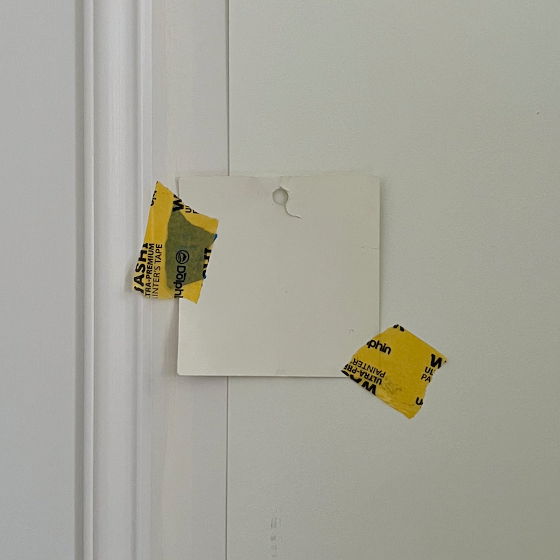
The original version of this post first came out in 2014 and included 20 wonderful shades of white paint.
But, you know what? That’s too many. We could easily get away with six.
There’s another post about the only six shades of white wall and trim colors you’ll need. I should update that post, too.
Before we get into the list, I must mention the other thorn in my paw: lighting.
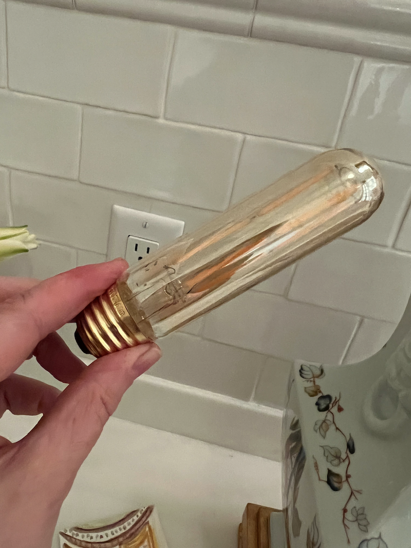
I’ve tried numerous bulbs, and this tubular bulb I wrote about here, is the closest to incandescent I have found.
This is the link for the bulb.
I have used it in most of the ceiling fixtures and in the five picture lights in the living room. I don’t want to have to change the bulbs, so I am using incandescent candle bulbs in the wall sconces.
One thing I know is that I love warm lighting. I have always felt that artificial light should simulate candlelight. It’s fine if you wish it to simulate the lights airplanes use to land, but I prefer the soft and warm light from candles.
I also prefer warm white paint colors. However, I prefer warmth without the white looking overly yellow or gold.
Still, with warm lights and a warm white paint color, it’s unavoidable that it might veer toward yellow.
In my experience, ALL warm white paint colors can look yellow in the right lighting conditions.
However, that white paint color can also look pretty stark in other lighting conditions, such as north-facing light.
Here’s my favorite white for north-facing rooms.
The other thing that can skew the best white paint colors or any paint colors are two things:
- formulation
- sheen
Let’s take my Boston bedroom again.
After Swiss Coffee, I took the painter’s suggestion, and we did Benjamin Moore’s plain white. This was a color on my list because I liked it in the bedroom of my Bronxville apartment when I moved in.
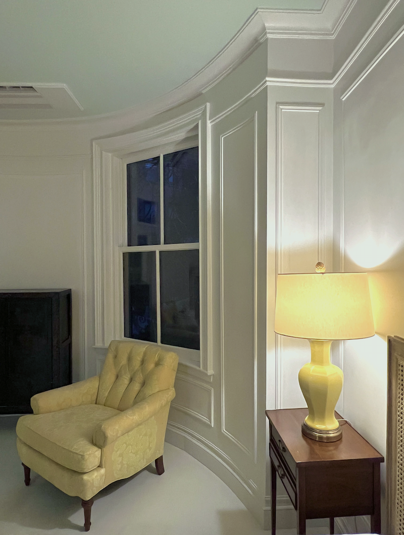
Well, not now. It was dreadful, except at night. (above)
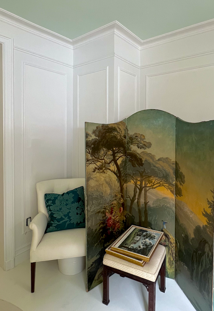
However, during the day, it took on a purple tinge, particularly the crown moulding. I will never use or recommend this color again. Could it have been mixed wrong? Maybe.
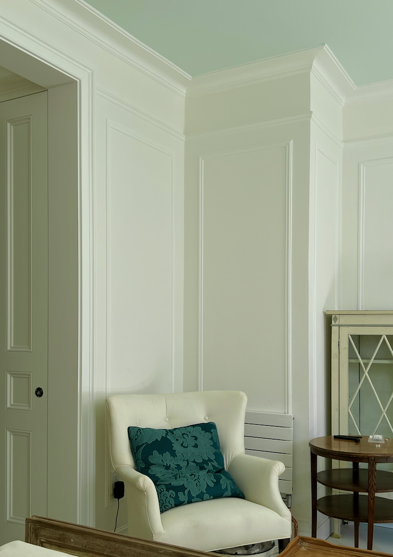
We did a small test of Cotton Balls, and it was perfect. (see above) However, the trim is noticeably lighter than the wall color. It doesn’t clash, but if I didn’t know better, I would say that the walls are Cotton Balls, and the trim is either Super White or Chantilly Lace. However, that is not the case. The walls are in Benjamin Moore Regal Select matte, and the trim is in Benjamin Moore Regal Select satin.
We can’t control what the paint store or the company does with their formulations.
However, I recommend you test and get at least a quart, if not a gallon. I know. Ouch. A quart (32 oz) should be fine in most cases, but the 8-oz sample size is not good.
What about the Samplize samples? Most of the time, they are fine. When you’re at the beginning stage, it’s the best, least messy way to narrow down the choices. Then, when you’re 99% sure, I would get your test quarts. That is unless it doesn’t matter all that much for the application you’re using.
Now that we have that all out of the way, let’s begin by saying without a doubt that *COTTON BALLS oc-122 has made the cut as one of the best shades of white paint!
I’ve specked it at least half a dozen times and know that dozens, if not hundreds, of you have used it, too, and love it just as much as I do.
*The asterisk indicates a color used in my Boston home.
*Cotton Balls is always a warm white paint color, but with the leaves gone and the change of light, the color has become more white than it looked at the end of September. However, this color always looks pretty.
Next up is *CLOUD WHITE – 0c130.
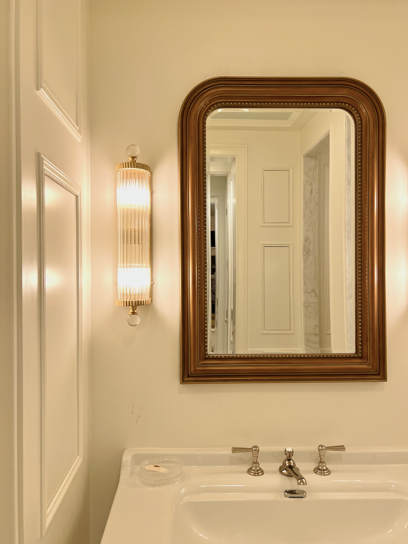
This is the white of the embrasure hall and primary bathroom. This shade of white paint is soft and very warm, but because of the bathroom lighting looks more yellow than it should. However, it’s a bit deeper than Cotton Balls and appears to be more yellow than White Dove. That is because White Dove has more gray in it. And that gray tone cools the yellow in White Dove oc-17. But not all of the time. Sometimes, the yellow or gold really pops out in White Dove, as it did on some walls in my old Bronxville bedroom.

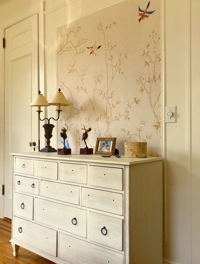
White Dove did look a little gold on this wall. If I were doing it now, I might’ve chosen Simply White oc-117.

SIMPLY WHITE is warm and brighter than White Dove and Cloud White.
However, the crown went pink in the bedroom. Simply White has a passive pink undertone that is dying to pop out. It usually doesn’t unless there’s a sea of red brick in front of it.

My point is that these are all wonderful shades of white paint.
WHITE DOVE oc-17
SIMPLY WHITE oc-117
*CLOUD WHITE oc-130
Next up is a new shade of white paint; however, it is a favorite of legendary interior designer Darryl Carter.
And that shade of white paint is *MOONLIGHT WHITE oc-125.
For more, Darryl Carter, please click here.
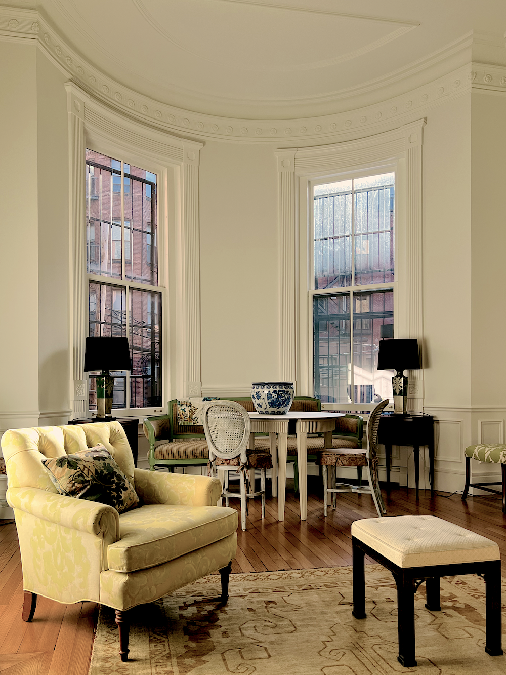
*Moonlight White is the color on my living room walls with *Cloud White trim and Cloud White on the ceiling. This was taken in the late afternoon when the light is naturally warmer.
Interestingly, Moonlight sits directly underneath Simply White in the big fan deck, which is 2143-70, and Moonlight is 2143-60. While Moonlight is fine with Simply, I like it even better with Cloud White.
They have the same hue but Moonlight is a hair deeper. Could I have used Cloud White on the walls instead?
Absolutely, but I’m glad I tried out Moonlight White.
*MOONLIGHT WHITE is a keeper!

Next, I must mention that the kitchen cabinets and walls are Sherwin-Williams *GREEK VILLA. This lovely, soft, warm off-white blends beautifully with the shades of white in the living room.
Another shade of white I used several times for clients is Benjamin Moore IVORY WHITE, AKA ACADIA WHITE. They are the same color.

Benjamin Moore IVORY WHITE 925. (above and below)
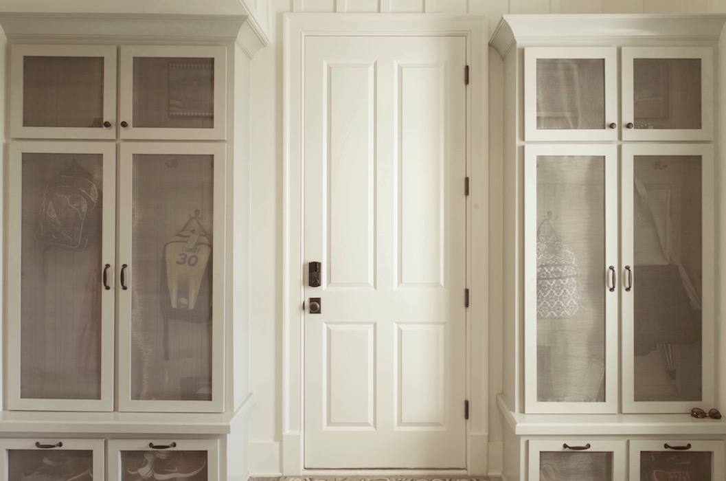
Benjamin Moore IVORY WHITE – 925. This is the home I helped the loveliest long-distance client in 2016. It was one of my last jobs before focusing on the website. Please note that Ivory white is the same color as:
ACADIA WHITE – ac-41. For more about this gorgeous home in Kentucky, please click here.
This is my favorite off-white cream color.
I know that many of you like *Swiss Coffee and Mayonnaise.

And there’s nothing wrong with them. Swiss coffee is on the inside of my closets because we had two gallons of it.
Next up is Benjamin Moore SUPER WHITE is one of Studio McGee’s favorite shades of white paint, and mine is in a well-lit room. Super White is a clean, warm white that I used when repainting my old apartment in Bronxville, NY. (you can see it here)

Well, let me tell you, I wish I had done so eight years earlier.
It was gorgeous in my southwest-facing apartment. It was a clean white but looked warm and soft beside the butter-yellow walls. I lightened them a shade for resale purposes and went with America’s Heartland, a true butter yellow.

Also added is CHANTILLY LACE (above), but with a caveat. I would probably not use it in a north-facing room because it will most likely look quite icy there.

I’d like to add another color because it is like a cross between Chantilly Lace and White Dove: WHITE HERON.
Okay, let’s count ’em up.
- ACADIA WHITE/IVORY WHITE
- CHANTILLY LACE
- CLOUD WHITE
- COTTON BALLS
- MOONLIGHT WHITE
- SIMPLY WHITE
- SUPER WHITE
- WHITE DOVE
- WHITE HERON
That’s nine of the best shades of white paint. This doesn’t mean there aren’t other great shades of white paint. But how many husbands do you need? ;]
Let’s look at more interior images in my favorite shades of white paint.
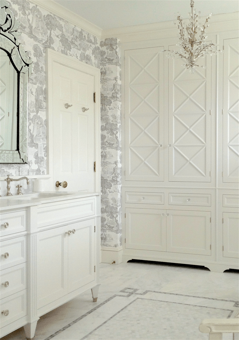
Benjamin Moore- WHITE DOVE oc-17
We did the bathroom cabinetry above, which I designed in Benjamin Moore’s White Dove.
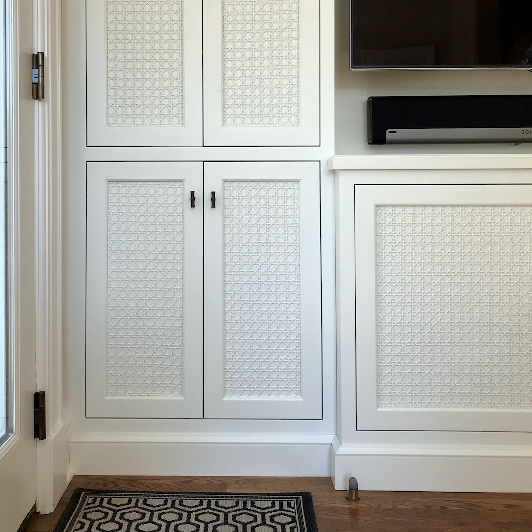
Above is a WHITE DOVE from Lotte Meister’s home. Photo by me. To see more of Lotte’s gorgeous home, click here.
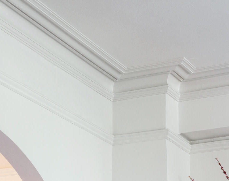
You can see more of this cool vintage apartment here, painted in Cotton Balls. (above)
That’s too funny. I just realized that this is the former home of the long-distance client’s parents, who used Ivory White/Acadia White in her home.
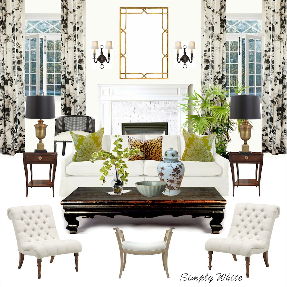
Above is one of the 40 mood boards I created with furniture sources, using the wall colors in the background for the Laurel Home Paint and Palette Collection.
Simply White was Benjamin Moore’s COTY several years ago.
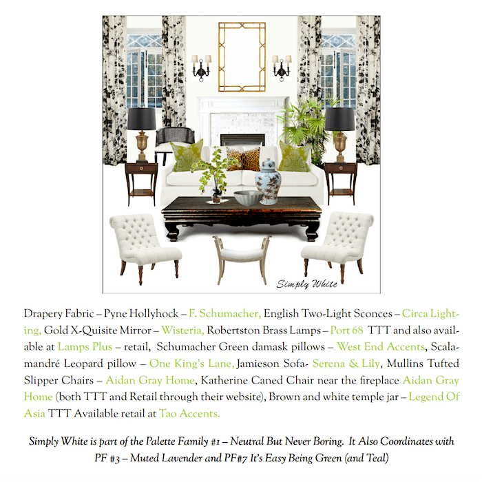
Above is a reduced screenshot of one of the pages associated with this color from the palette collection.
This is from part II of the popular guide I created, The Laurel Home Paint & Palette Collection.
I took 144 beautiful Benjamin Moore paint colors and put them into a collection with trim colors, 40 palettes with furniture, and more! Coming up, at the bottom of the post, there’s information about a special promotion I’m running until the end of the year.
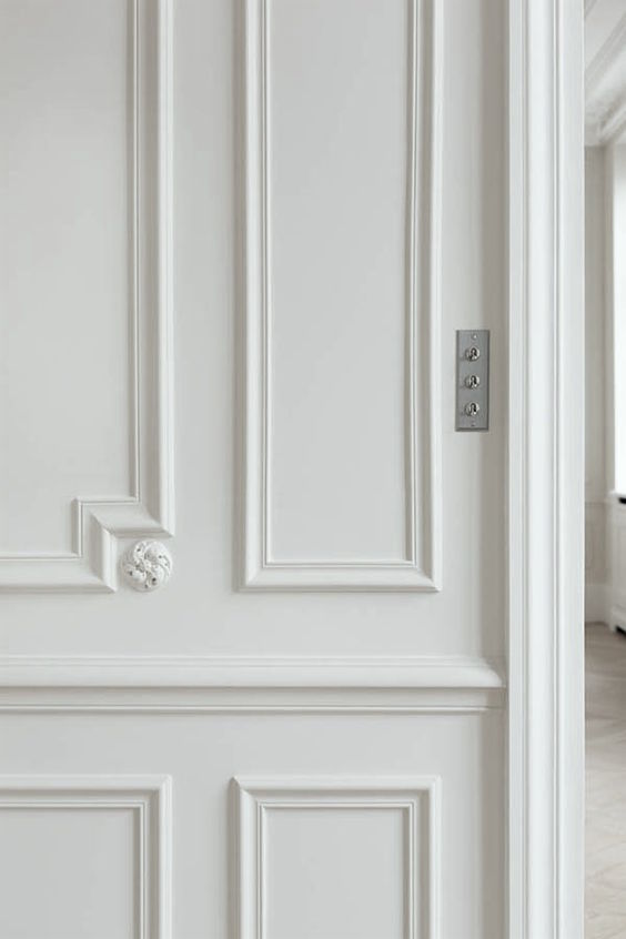
AB Kasha and one of their legendary Parisian flats painted white
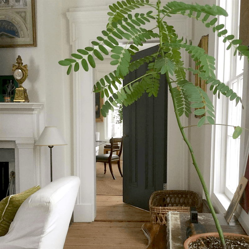
Remember this post where I featured his work?
And I followed it up much later with a how-to get the Gerald Bland look here.
In closing, an important reminder!
Until the end of the year, anyone purchasing Laurel’s Rolodex, The Paint and Palette Collection, or The Six Figure Income Blogger will receive the new Etsy Guide and the 333 Rules & Tips You Need to Know in a special promotion.
Below my signature is a brief synopsis of each guide with a link to more information.
xo,

***The (11th) edition of Laurel’s Rolodex for 2025 was released on December 1, 2024. Below is more information about my Rockin interior design guides. Please remember that these are digital PDF guides. You will receive them in your email. You can print one copy for personal use if you prefer to have it in that format.***
If ready to order, click this link or the button below to go to the purchase products page.
(Clicking on the links will send you to the pages to learn more about each guide.)

Laurel’s Rolodex is a unique shopping guide that shares hundreds of my favorite sources and, especially for decorators and designers, tells you the best sources that sell directly to the design trade, especially for decorators and designers.
.png)
The Essential Paint Color and Palette Collection (two volumes)
This is a must-have guide for anyone struggling with paint colors. If you don’t believe me, there are dozens of testimonials on the Palette Collection page.

Six-Figure Income Blogger. (Newly Updated for 2023!) (This should be required reading for every website owner who wishes to get more business.) You do not need to be a heavy-duty blogger. But, consistently, once or twice a month will do wonders for your business. But, it would be best if you also learned some other things. Believe me when I say in the early years, I made every mistake and then some.
.png)
333 Decorating Rules & Tips You Need to Know – There is so much information,
and much I’ve never seen anywhere else. The window treatment glossary alone is several pages long.

The Etsy guide on its own. It’s 200+ seriously cool vendors.
Etsy is known for exceedingly helpful, personable vendors and great pricing. I always shop on Etsy and have numerous items for my renovation—everything from hardware to lighting and my cool Chinoiserie cabinet. We did remove a few shops that are gone or have virtually nil product lines. There are one or two shops that we left in, hoping that they’ll return.
Gifting is available for my guides. When you go to order,
just click on the gift icon on the first screen after
you click the buy now button.
If you are ready to order, you may click this link or the button below to go to the purchase products page.
***Please check out the recently updated HOT SALES!
***
Also, please check out the newly updated HOLIDAY SHOP, filled with Christmas and Hanukkah decor and gifts for everyone!
***
There is now an Amazon link on my home page and below.
Please note that I have decided not to create a membership site. However, this website is very expensive to run. To provide this content, I rely on you, the kind readers of my blog, to use my affiliate links whenever possible for items you need and want. There is no extra charge to you. The vendor you’re purchasing from pays me a small commission.
Please click the link before items go into your shopping cart. Some people save their purchases in their “save for later folder.” Then, if you remember, please come back and click my Amazon link, and then you’re free to place your orders. While most vendor links have a cookie that lasts a while, Amazon’s cookies only last up to 24 hours.
Thank you so much!
I very much appreciate your help and support!
Related Posts
 Finalizing the Primary Bathroom Design (Parts 1 & 2)
 Happy Thanksgiving 2023 + The Final Kitchen Cabinet is Installed!
 The Ultimate Guide To Decorating With Plates On the Wall
 21 Interesting Bathroom Ideas {for ‘bathroom people’}
 My Hardwood Floor Stain Is Making Me Cuckoo!
 The Tricks You Need To Know For Decorating Above Cabinets
 I’m Afraid Our New Rustic Home Will Be Depressing!





17 Responses
Laurel,
You mentioned the difference in color of you Bronxville apartment was because the trim was Regal satin and the walls were Regal matte. Is there a reason you did not use semi-gloss on the trim? I am in the process of painting all my new window trim with Benjamin Moore Regal Semi-Gloss. I suppose you might say I am a very traditional painter. However, I have always wished the trim could be a little less glossy. I also thought the semi-gloss really did help the durability of the trim and doors it was used on. I’m worried I may be regretting the 4 windows and one slider trim I finished. I have 9 more windows and 3 sliders left.
Hi Wendy,
I apologize if I wrote somewhere that I used satin in Bronxville. I used Advance semi-gloss in Bronxville, and matte on regal select on the walls. In Boston, the trim is satin regal select and the walls are matte.
Why the difference? Different painter who didn’t want to adhere to my specifications. I would have preferred semi-gloss for the wainscoting and panel mouldings. However, the plaster mouldings are painted flat, like the ceiling because plaster should be chalky looking. Shiny plaster looks cheesy in most cases. At most, it can be eggshell.
As for your semi-gloss paint. I googled it to give you a better answer:
To reduce the shine of semi-gloss painted trim, you can lightly sand the surface with fine-grit sandpaper, apply a de-glosser, or apply a satin or matte varnish over the existing paint.
Here’s a more detailed breakdown:
Sanding:
Lightly sand the painted surface with fine-grit sandpaper (e.g., 220 grit) to create a slightly rougher texture, which will reduce the sheen.
De-glosser:
Apply a de-glosser, also known as “liquid sandpaper,” to the surface to remove the gloss.
Satin or Matte Varnish:
Apply a coat of satin or matte varnish over the semi-gloss paint to achieve a less shiny finish.
Sugar Soap:
Spray the painted surface with sugar soap and wipe it down with a clean damp cloth or sponge.
0000 Steel Wool:
Scuff the surface with 0000 steel wool and apply paste wax to knock down the gloss.
This video demonstrates how to reduce the sheen of semi-gloss paint:
what is your opinion of Alabaster from Sherwin Williams? It would be for our living room that has a 25 ft cathedral ceiling made from wood, One wall is a floor to ceiling fireplace with two large north facing windows on either side. It does not get a lot of light as there is a large deck with cover outside the windows. I now have a goldy yellow and hate it…
Hi Laurel. Was thinking of getting my home painted and cam across this post. Have to say, i’m pleased to have read this!
Your breakdown of top white shades—like Cotton Balls, Cloud White, Simply White, and Moonlight White was incredibly insightful and really helped clarify the subtle differences between them.
The bathroom sconce in the “Cloud White” section is stunning. Where can I find it?
Hi Katie,
Sadly, while it looks nice it arrived fraught with issues.
1. It required rewiring as the wires used were too thin.
2. The design is horrible. Those glass tubes had to come out for the rewiring and the electrician spent well over an hour getting them back in. Even changing a light bulb requires removing some of tubes. Hence, I did LED candelabra bulbs wrapped with cream-colored masking tape for more warmth. That’s because the ones I had were too white for my taste.
3. The brass has a cheap shiny finish.
If you’re still interested, you can find them here on Etsy.
I would love to know what white is in the Gerald Bland room? I went to the link and it says probably White Dove, but I’m wondering, that white just radiates and looks super powdery, my White Dove walls don’t look like that, I wonder what’s his secret? And what’s the Kasha’s secret? Super White you said somewhere…I think. Cotton Balls is a huge favorite, Ivory White too is so pretty, but my new love is Capitol White, like another poster mentioned, I took a chance and went for it earlier this year because it was from the Williamsburg collection, so I figured they must have researched that well, it’s beautiful! A bit less yellow than Ivory White (I think). From your list, Moonlight White is my next to try. Always fun to read about the whites, it’s funny there is always yet another white out there that looks intriguing, no matter how many you tried!
Thanks so much for all your helpful advice, Laurel! “Flo-1” here from one of your “bad Florida architecture” posts. 😉 Whites are so tricky! I recently had our living room/dining room/kitchen painted white. I had the hardest time picking the “right” white. The walls were previously beige (blech), and if you remember we have all that dark brown tile throughout the rooms. Any white with a yellow undertone looked gross. It was driving me crazy until I realized that the floors have a taupe (purple/red) undertone! Then it was easier to find a white that has a red undertone, and I ended up choosing Snowbound by Sherwin Willians. It looks amazing with the tile and totally transformed how I feel about the house! Well worth the months of research and agonizing over white paint, LOL!
For a while I worked closely with the owner of a painting company. Tsippi is right! Track everything & document your expectations–especially watch out for substitutions & color matching. Check cans before they’re opened for correct number/name/sheen/product. After the can is opened, test the can color to your sample. Btw, I especially like Greek Villa in a well-lit space & Simply White everywhere!
I have been pleasantly surprised at the quality of light of GE Vintage Style LED Light Bulb (ex., 6 Watts (60 Watt Equivalent) Warm Candle Light, Amber Glass, Medium Base, Dimmable.) Clear glass also available. The bulb is described as like candlelight. I like that the light is warm but still bright enough to function well in my kitchen.
This is a wonderful post about choosing whites – it is truly helpful, thank you. I’d like to share something I’ve learned recently about paint colors. Typically, I’d go to my nearest Benjamin Moore dealer – a local company with an excellent reputation. The first can of a pale gold paint was wildly different than the color card, and not it a good way. I chose a different gold, with the same result. I was told the cards are not actually painted; they are using computer technology. After three tries, I gave up on gold. Then I tried a number of different sage greens, all with the same result. I also realized, looking back, that the bathroom I had painted a few years ago was “off” from the shade I had chosen. This time I went to a hardware store that carries Benjamin Moore, and had them make up three different sample cans. They put a dot on the top of each and dried it with a hair dryer. These samples were dead on perfect – the exact shades of the color cards. I was amazed. The very helpful gentleman who mixed the paint told me that every morning before the store opens, they thoroughly clean the paint mixing machine, and re-calibrate it. Every morning, always. So if your local paint vendor isn’t getting it spot on, it’s their lack of maintenance of the equipment. I also had the same bad experience with Samplize – the colors were so off it was crazy. I’ll stick with my local ACE hardware.
Hi Laurel,
Thank you for revisiting white paint colors and and for taking into consideration how they’re affected by changing formulas and LED bulbs. I always learn so much from your discussions and you’ve taught me to look differently at how all the elements in a room play off each other. I wanted to mention a color I recently discovered that was a perfect solution for my front hall: Benjamin Moore Capitol White, from the Colonial Williamsburg collection. It is a warm and mellow white. I’m curious to know if there is another BM color that is the same, but goes by another name.
Three things I have learned the hard (and expensive) way about white paints: 1) Buy the paint yourself and either have it delivered or pick it up yourself. (Specify in the contract that you will buy and deliver the paint.) Procuring the paint yourself is particularly important with white paints, as even supposedly reputable painters are known to have the store “add a few drops of black” to the paint to improve coverage and make the painter’s job easier. Painters claim no one can tell, but trust me, the color will not look right. Also, because the names are so similar, it’s easy for the painters to accidentally buy the wrong white color, which you may not realize until the job is almost done. 2) Tell the contractor you do not want to use pre-mixed paint. It’s not more expensive to buy the paint in gallon cans vs. the 5 gallon premixed tubs, and the two problems with the tubs are a) they use different numbering systems, so it’s too easy for the contractor to, for instance, buy “White” instead of “Super White”; and b) sometimes the pre-mixed paint is old. 3) Make sure that the number of coats is clearly stated in the contract. Additionally, some painters distinguish between “heavy” coats and “light coats”, so make it clear that you do not want them to skimp on how much paint they use. (Since you are buying the paint, this shouldn’t be an issue, but for some reason painters are in the habit of skimping.) Also, be aware that some colors — esp. Chantilly White and possibly Super White and Simply White — may need three coats, or even more if you are covering certain colors, so specify that in the contract. One last thing: With my most recent remodel, I paid by the hour. While it was expensive, it avoided a lot of drama when I asked for a third coat, specified a color that painters don’t like using (i.e. Super White), asked them to paint a cabinet, etc.
A few years ago, I purchased your “The Paint and Palette Collection”. Shortly thereafter I acquired my current home, and plotted all of the wall/ceiling and trim colors from that wonderful guide. For all trim, and many ceilings Cotton Balls has been my choice. As I gaze at it, I think things like: perfect, and, transistions well in different lights and beautifully with all wall colors I’ve chosen. Also, I’m impressed with how clean it appears. Earlier this Fall I drove through Alabama cotton fields as the balls begin to burst from the pods. Some of these were in bright sunlight, while others in shade. I could ‘see’ this single color as it evolved in my home – a perfect, identifying name for this paint color.
For anyone contemplating purchasing Laurel’s paint and palette collection, I highly recommend it. The time, experience and talent poured into it are priceless.
I found Ivory White through you about five years ago. It is perfect in every way. My whole house has slowly been repainted with Ivory White. It makes me feel so peaceful and happy. Everyone that comes over asks about the color. Perfection. Happy to see it’s still on your list because it will forever be on mine. Thanks for all of your informative and fun posts!
Love the renovation posts and love these posts too.
I’m excited to see the way the posts have been evolving, now that it seems you’re into the decorating part of the apartment. And how the posts will evolve as the apartment evolves!
Interesting comments on the effect of these whites according to lighting, surroundings, etc. I’d add that if you’re looking for a “universal” white, F&B’s White Tie works well in many situations. And I’d also say that F&B’s tiny sample pots are true to the colours.
LED lighting is the bane of my life. Since it’s illegal to sell incandescent bulbs here in the EU, the choice is LED or (for now) halogen, but halogen is either tubes or cones with metal surround for semi-recessed lighting. We’re having to find LED bulbs for 1990s fittings that we don’t want to change, and the problem is that some of them won’t work on too low a wattage. Finding 6 watt bulbs with warm white light is pretty much impossible. On 4 watts the light flickers on and off, on 6 watts it works perfectly but hideously! Cautionary tale if you’ve got older fittings.
PS I’ve found your posts on the renovation and all the decisions, hitches, persistence rivetting. The devil is indeed in the details, and you’ve given the devil a run for his money.