Hi Everyone,
Before we get into the 50 Living Room Rules You Need to Know, I’d like to wish myself a happy Bostonversary! It’s been five years since I moved her.
Yes, five years ago — literally the day before I moved to Boston, which was on December 20, 2020, I wrote this post. It turned out to be one of my most popular because living room mistakes are universal, and the rules haven’t changed.
It’s been FIVE years, Laurel?
Yes, guys. Five whole years. However, while it’s gone by pretty fast, at the same time, so much has happened. Still, I love revisiting old posts, especially during that early Pandemic time period.
I must leave for this astonishing astronomical event that occurred in December 2020– Jupiter and Saturn appearing very close to each other in the early evening sky.
On the 17th and 18th of December 2020, I went looking for Jupiter and Saturn in the southwest sky, just after sunset. To my astonishment, there they were. The only two stars “out.”

I took this with my eyephone on max magnification. That building is really about 50 feet from me.
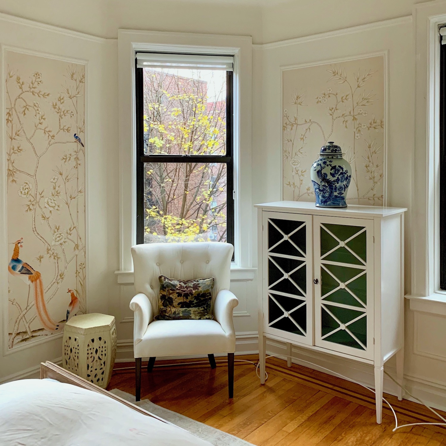
I took the images out of this window. (If you missed the photos of my apartment, please go here.) Of course, I was right on top of the window when I took the photos of the planets.
Okay, time to move on to our topic, which is 50 living room rules you need to know.
I know y’all are busy, and there’s a lot here. Be sure to scroll to the end, but bookmark this post to refer to as needed.
If you own the 333 Rules and Tips Guide, most of this post is in there. Of course, this is only a small portion of what’s in the guide.
This note inspired the post from a kind reader, “Sally Ruler.”
Dear Laurel,
Please, oh please, please do a post about living room decorating thumb and measurements rules.
I’m going a little cray-cray because I see contradictory info on the internet. Some of it seems to be okay, and some of it is downright wacky. Even *I* can tell that it’s wrong.
I don’t know where some of these people derive their information. It makes me wonder if they are just making it up?
With appreciation,
Sally Ruler
*********
Well, Sally, you shall get your wish to the best of my ability. And yes, I agree that some of the measurements I see on the internet and even in books are not optimal. In fact, some are way off what they should be.
A while back, some of you may remember this post that talked about following these rules that could get you in some deep doo-doo.
I just saw one for a typical coffee table should be 36″ long. Sure, if the other side is also 36″, but 36″ is better for a loveseat, not a full-sized sofa of 84″ or more. For example, my 84″ George Smith sofa’s coffee table is 43″. That is an excellent length, especially because the space is a bit tight. I wouldn’t go smaller than 42,” and it could be as much as 54″. (See more info, later in the post.)
There are other considerations besides the measurements. There’s “visual weight.” For example, if the table is on the lighter side visually, as this one is below, the size could perhaps be a bit larger. This coffee table is 37″ square, but it is very lightweight visually.
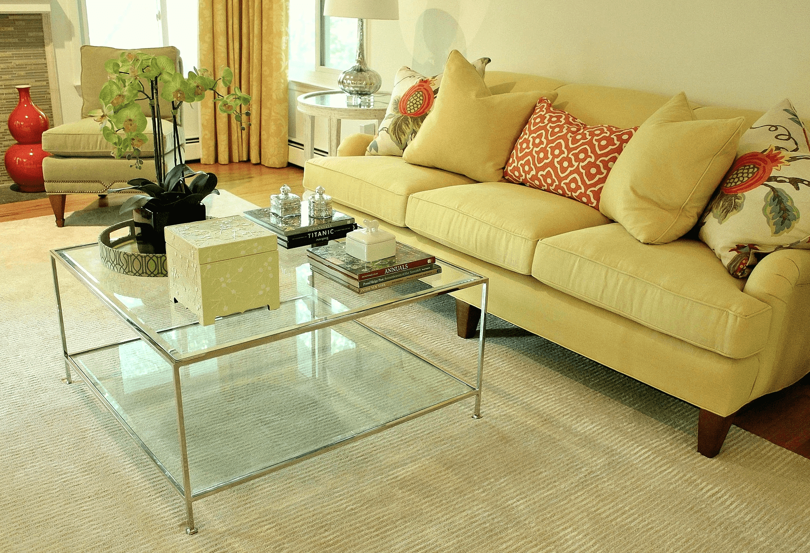
This is a living room we did in 2012.
Of course, all good designs should begin with a solid furniture plan.
One important rule of thumb to consider when discussing all of the 50 rules is to understand that, much of the time, that rule can be broken. That’s why they are rules of thumb, not rules set in stone. haha
While there is some overlap in many of these decorating rules of thumb, to make things as clear as possible, we are going to go by individual rooms.
Time to Begin. Are you ready?
LIVING ROOM Decorating Rules You Need To know ( Living room means rooms for living and includes family rooms, too.)
These are the rooms where we typically spend the most time. The 21st-century living room is no longer the “dead room.” That’s the room that many of us had to endure for most of the 20th century.
The old living room was the room we weren’t allowed in. That is, unless our friends and we were professionally fumigated and dry-cleaned before entering this sacred space.
Baby boomer parents and later generations revolted, and now many living rooms also double as family rooms.
While going through the living room decorating rules of thumb, please refer to this post showing one living room with seven different layouts to see these principles in action.
Upholstered Living room furniture
Sofas
- It can be anywhere from 54″ (small loveseat) – 110″ or more! In length. However, the most typical length for a living room sofa is about 84″ (7 feet). That is the overall measurement, arm-to-arm. For more about the perfect sofa, click here.
- It is vitally important to choose the best length sofa for your space.
- Sofa depth varies from about 34″ – 45″. However, a settee might only be 28″ deep, and a sofa-bed (daybed) could be as much as 60″ deep.
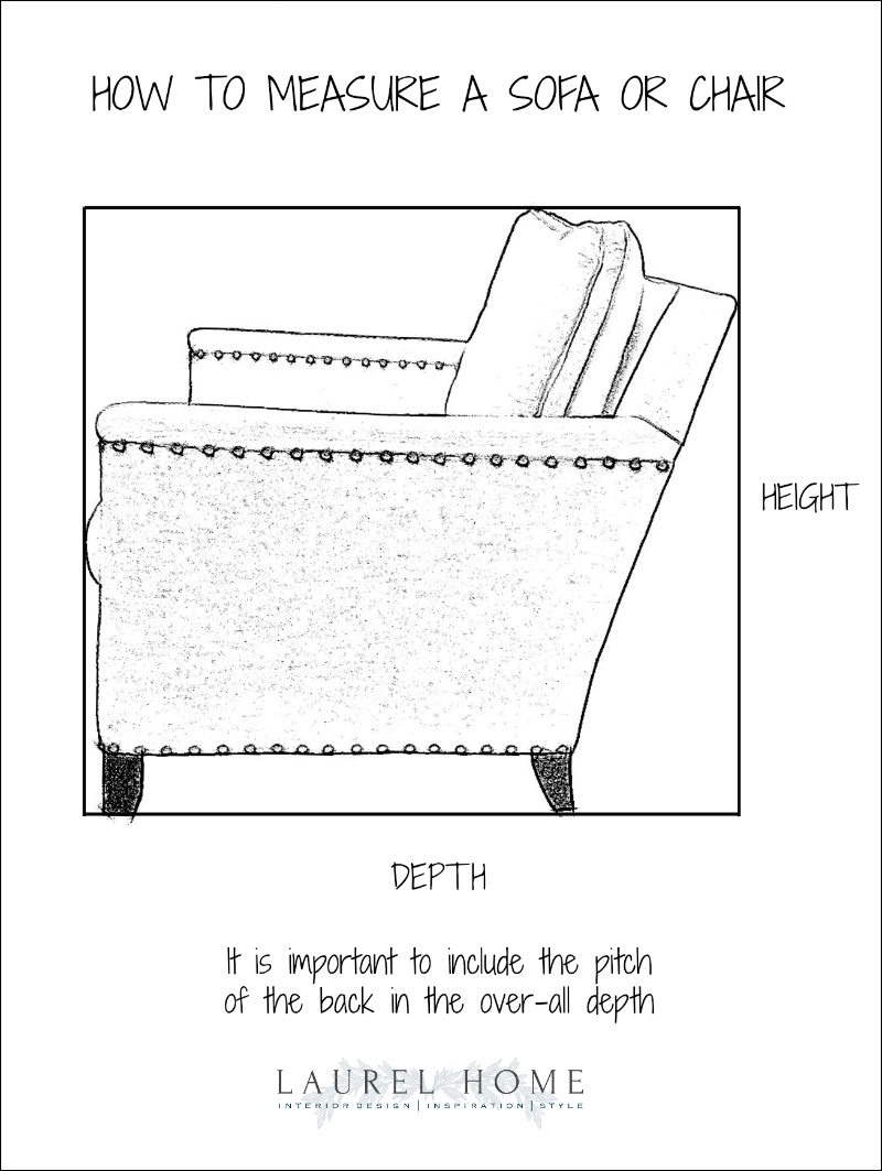
And when we say “depth.” We mean the overall depth, which includes the back pitch, which usually adds several inches.
Sofa height
Remember, when we talked about “human scale furniture?”
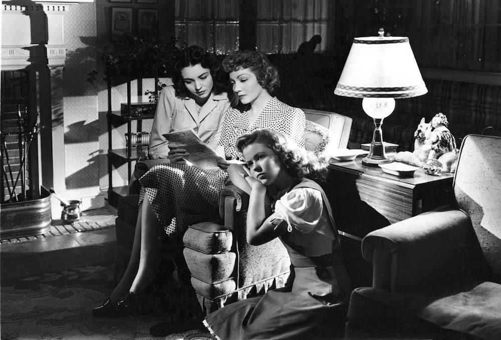
Image via the best picture project from the film, Since You Went Away, with Jennifer Jones, Claudette Colbert, and Shirley Temple.
- Ahhhhh… those were the days. The back of that chair is not more than 32″ and probably a little lower. The seat height is no more than 17″.
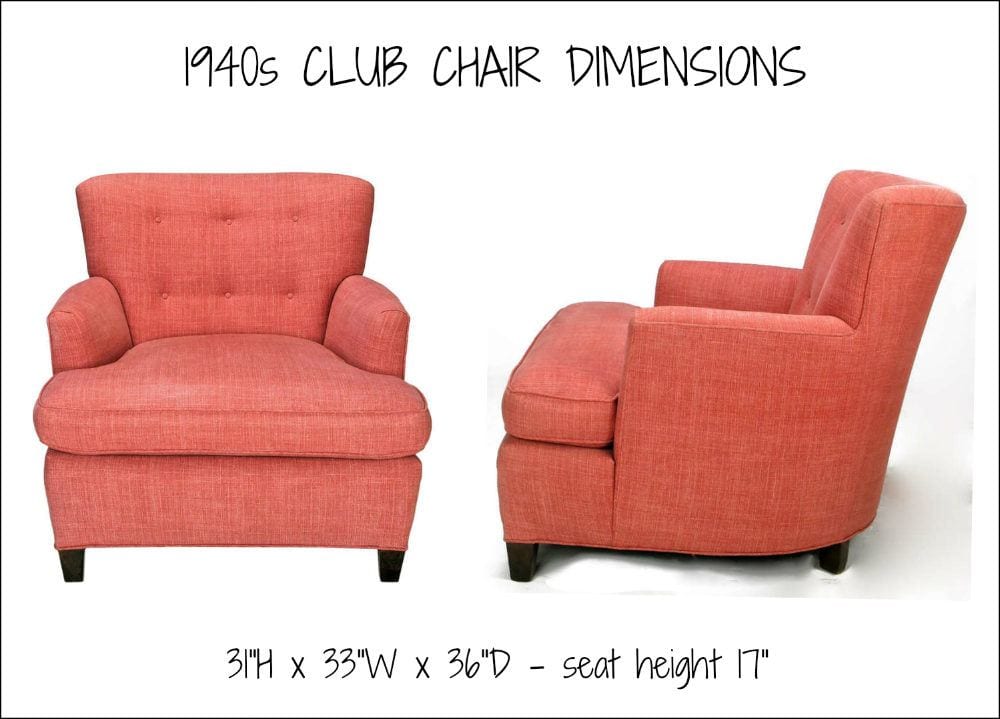
I found another chair on 1st Dibs from the 1940s. And see? Those are very similar dimensions to my estimate.
Well, today’s furniture is mostly larger.
- But, still, for me, my upper limit for a sofa height is 34″. Chairs come in so many styles, so there’s more variation.
- Arm height = 23″ – 25″
- A Tuxedo or Chesterfield (arms same height as the back) is generally 28″ – 33″ (I prefer 31″ or below)
- Seat height – 18″ – 20″ – But, this is difficult to measure because most seat cushions have a “crown,” so to the welting might be 18″, but the crown will add another inch or two.
- Seat depth is usually from 22″ – 25″. However, if there are loose back cushions instead of a tight back, that affects the depth to some extent; it’s not an exact science. When I custom-made an English Roll arm sofa, with a tight back, I usually specified a depth of 24″. And, especially if the husband was tall, you can always add throw pillows. But sometimes, if they weren’t so tall, I specified 23″.
Speaking of throw pillows and living room decorating rules.
This is one rule that I see so many unusual measurements, and usually, it’s for pillows that are too small. In my opinion, it is better to err on the side of too big than too small and dinky when it comes to throw pillows.
- For an 84″ sofa, my favorite configuration is three different covers.
- With two pillows at 22″ and two @ 20″, and a rectangular pillow in the middle can be various sizes. Mine is quite large, but a more typical size is approximately 14″ x 25″. For a far more detailed post all about throw pillows, click here.
End or side tables
- Generally, I like these tables’ height to be within a couple of inches, either higher or lower than the sofa arm. So, that would be from about 23″-27″ for a typical sofa arm.
- But, if you have a big Chesterfield with a 33″ arm, an end table height of 28″-30″ should be fine.
Measurements for an end or side table.
- Square is usually about 18″ – 28″ square.
- A rectangular end table can be as narrow as 12″ (to 24″), but I would not recommend it be more than 28″ deep.
- The perfect size round end table is from about 24″ – 30.”
Here’s a good post about end, side, and accent tables.
Coffee or Cocktail Tables
Let’s begin with height. Please enjoy this post from last summer about 30 fantastic coffee tables + sofa pairings.
- For me, no matter how high the sofa seat, my maximum height for a coffee/cocktail table is 18″. However, my preference is for 15″-17″. My current coffee table is 13″, and I adore it!
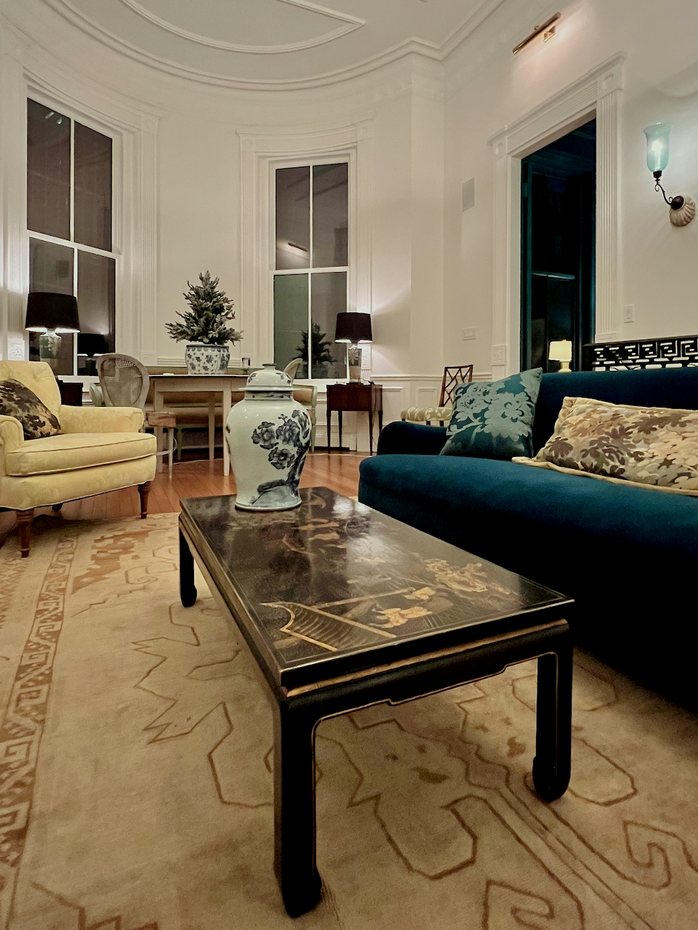
- If a rectangular table, it is usually about one-half (minimum) to not more than two-thirds of the sofa’s length. But it should never overlap the arms.
- So, for an 84″ sofa, the ideal length is about 48″ with a depth of about 24″ – 30.”
- A square coffee table can be a little smaller. But it is usually not more than one-half the length and not less than 30″ sq.
- Round coffee tables that are great looking are so difficult to come by. A good size for an 84″ sofa is 48″. 36″ is a more common size, but that would be better for a sofa 72″ or less. The largest round I have ever done is 54,” but that’s pretty big.
-
Most of the time, coffee tables should sit about 12″-18″ away from the sofa seat.
How to style a coffee table has many ideas for what to put on your coffee table and where.

Ahh… me, the summer before my renovation began. How innocent I was. ;]
Other decorating rules of thumb for living rooms.
- Major pathways should be at least 36″. But, if it’s just a few inches of something going into 30″, it should be okay. However, you wouldn’t want to have to walk the entire length of a sofa with only a 30″ pathway. That is, if it’s a major pathway that requires frequent traveling.
- Walking through the room, I very much try to keep all pathways at least 30″. However, a short walkway of 24″ is absolutely fine. I know because that’s exactly how I keep my living room coffee table when I don’t have company.
By all means, float your sofa if you have the depth and layout to do so.
If your room is very deep, you might want to add a sofa (console) table behind the sofa.
- Console tables are usually from two-thirds to three-quarters the length of the sofa.
- And, from 12″ to 24″ deep.
- The height should be at least one or two inches below the top of the sofa.
- If this is not a major pathway behind the sofa and there is only a wall behind it, then 30″ is the minimum I would go between the sofa and the wall.
- In the case of a bookcase, then it’s back to a minimum of 36″. However, if there’s not enough room, then leave out the sofa table.
- Sofa tables are particularly nice when the back of the sofa needs to face directly in front of the room’s opening.
Case goods
Case goods, if you don’t already know, are non-built-in cabinetry of any kind. That includes bookcases, chests, armoires, china cabinets, buffets, media cabinets, secretaries, and so forth.
Case goods might be used for display and/or storage and can be either tall, medium, or short in height.
Most living rooms have at least one kind of case goods in them.
The main living room decorating rules of thumb for case goods are:
- Never line up your case pieces on one wall. That is, unless it’s two or three identical bookcases, and it’s an intentional composition. Please review this post about what to do with a long, unbroken living room wall. And, if you missed it, here’s a sister post about a large, empty dining room wall.
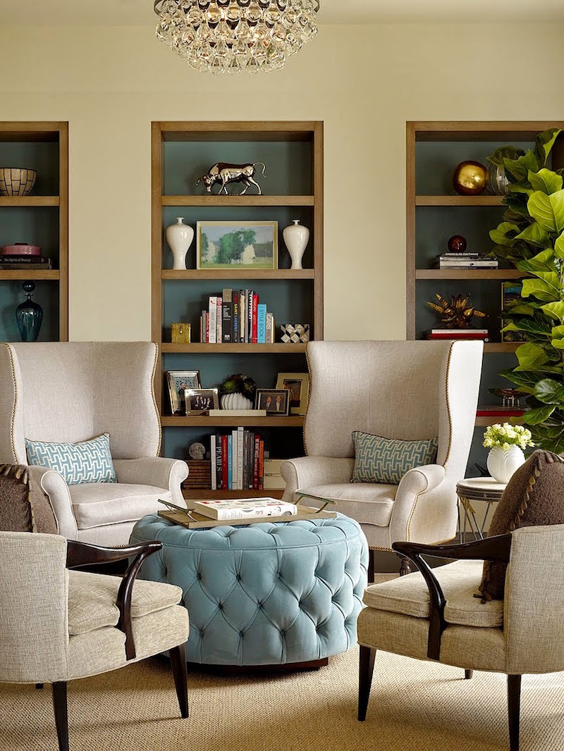
These are built-in, but I did three smallish armoires about the same size on a long wall one time in a bedroom many years ago. It was pretty cool. One for him. One for her. And One for the TV. Haha.
- You don’t want to have one long wall with a tall secretary and then a short chest followed by a medium bookcase. It will look like a hodgepodge of furniture.
What about tall pieces? Yes, here, one needs to be very careful.
If there’s a fireplace or sometimes a door or a window on a long wall, there can be identical tall pieces flanking it.
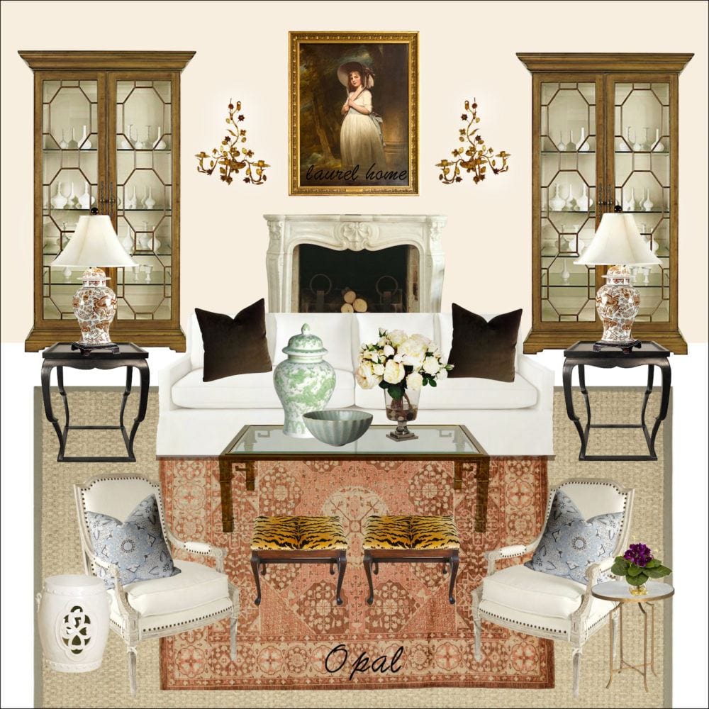
Y’all get that, I’m sure. This is from the Laurel Home Paint and Palette collection.
Please also check out the Ultimate Guide to Fireplace Mantel Decorating.
- Most tall pieces should not be higher than the door frame unless it’s not near a door and the ceiling is quite high.
- Avoid having two tall pieces on perpendicular walls.
Area rugs
The old school of thought is that there should be about one foot of floor showing around the room’s perimeter.
The problem with this is that if there are any case pieces against the wall, most likely, they will be half on and half off the rug. (most case pieces are deeper than one foot)
- However, it is fine if your sofa is partially on the rug.
- I prefer that the rug is only just a little past the legs, if this is the case.
- The reason is that it’s best to avoid having your end table half on and half off the rug.
-
Therefore, for an average-sized living room of, say, 14′ x 24′, a two-foot margin plus/minus less should be fine.
- Area rug sizes that are possibilities are anywhere from 8 x 10 up to 10 x 14.
A 6 x 9 is going to look too dinky. However, it is possible to layer a smaller Oriental over a natural fiber seagrass rug.
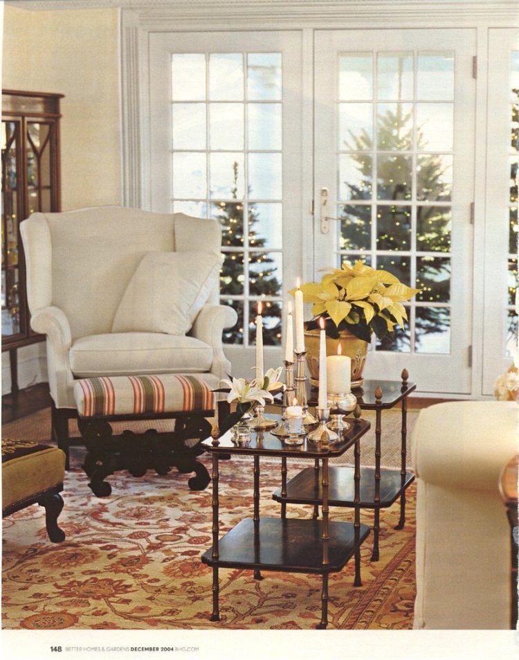
- There should be a bare minimum of one foot of seagrass showing, but I prefer a minimum of 18″-24″ for the width. There can be more seagrass showing for the length. It depends on how long the room is.
- If there’s a cutout for the fireplace and hearth, I would suggest not more than 6″-8″ of floor showing.
For a much smaller living room, family room, den, or library, I have read that it is okay to have a margin of 7″-12″.
Again, the issue is furniture half on and half off. Sometimes it’s unavoidable. Try to pick a floor covering that is very low if this is the case. Pads or levelers can be added to the back legs, if necessary, so that the table or case good will be level.
And, by the way. Floors are sometimes wildly uneven. It is usually not the furniture that’s having an issue. It’s your floor! Uneven floors can create wobbly situations and throw doors and drawers on the case pieces out of alignment. For dozens of my jobs, I had to have a carpenter come over to adjust the doors on case goods. So stressful to get the call from the client that things arrived out of whack!
If a room, like an office or den, is super small. That is eight feet or less for the width. You might want to consider wall-to-wall carpeting if you wish to have a floor covering.
My favorite is always seagrass.
How to mix area rugs in a semi-open plan
What to do if your area rug is too small
Lighting For Living Rooms
I’ve written a lot about lighting for living rooms in numerous posts.
- If possible, I prefer that there are no or very few recessed ceiling lights in living rooms. But, if they’re already there and you don’t wish to remove them, I believe that they should be on a strong dimmer.
- Most lighting should come from a combination of table lamps. Please check out this post that talks a lot about table lamps, as well as sizes.
- In addition, floor lamps and sconces can be used.
If the ceiling is at least nine feet high, there can be a chandelier or semi-flush-mount, or ceiling fan for some rooms.
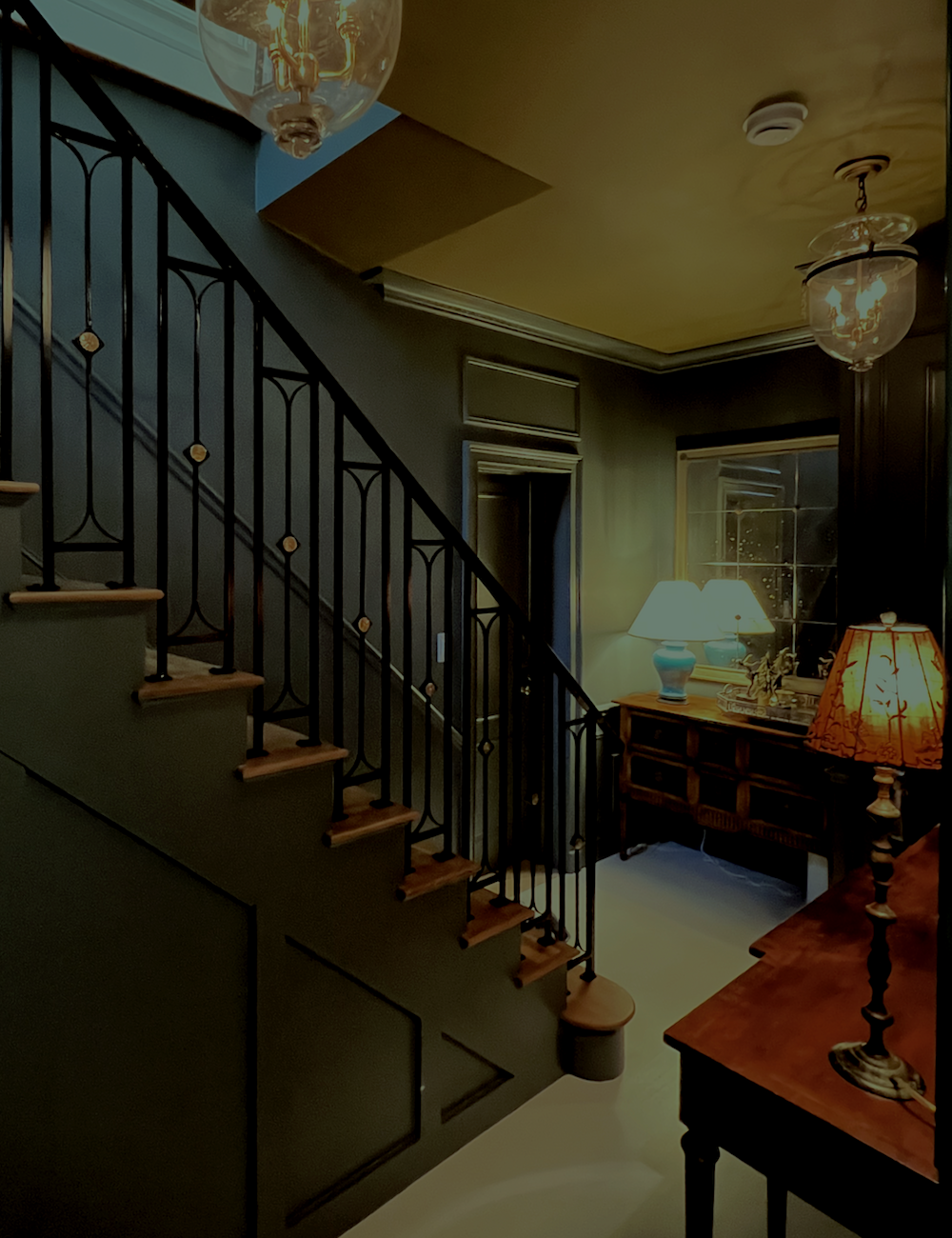
The lanterns worked out super well for my lower entry. In fact, they could’ve come down another couple of inches, no problem.
Art Work
- Art can be hung individually or in groups of two or more pieces.
- For art over the sofa, some have said that it should be far less than the sofa itself.
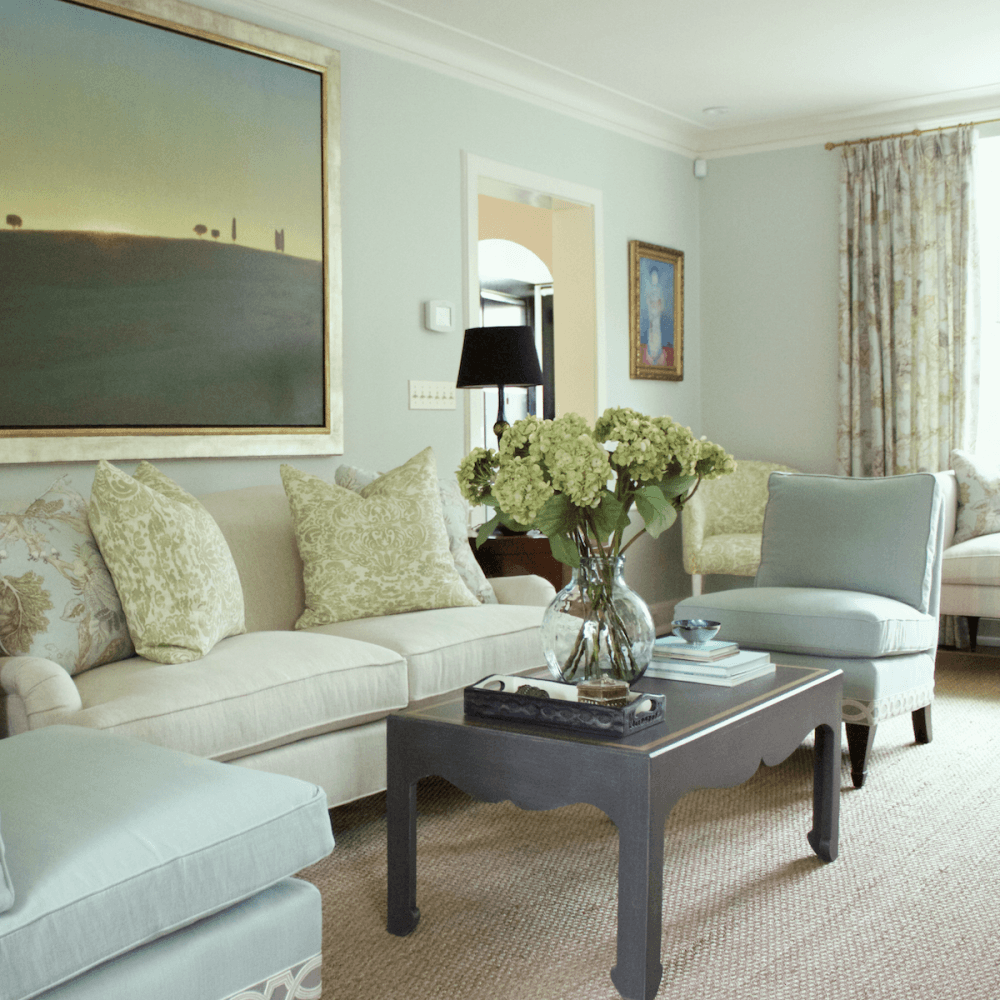
However, these clients put up this painting, which is nearly the same size as the sofa, and it’s pretty stunning. Should it be a little smaller? Ideally, probably a few inches in all directions would be ideal. But I love the painting so much, and I also love that it’s “breaking the rules.” Beauty trumps all.
This post has many great ideas for art walls and sources for free and/or very cheap but great-looking art.
And, guys, I’ve come up with a new plan for my living room art. More about that very soon!
More rules of thumb for hanging art.
- The center of the piece of art or art grouping should be at about eye-level height, which we’ll say on average is between 55″ and 65″. However, there are other factors to consider, such as the ceiling height, size of the room, etc.
- Usually, I do not let the top of the art go past the top of the window and door frames. But, an exception would be over a fireplace. And, also if the ceiling is very high.
- When doing art walls in groupings, I think the art looks best if the spacing is from one to three inches. But again, there are so many situations.
For more ideas about how to hang art, you can check out these posts for ideas here, here, here, here, here, and here.
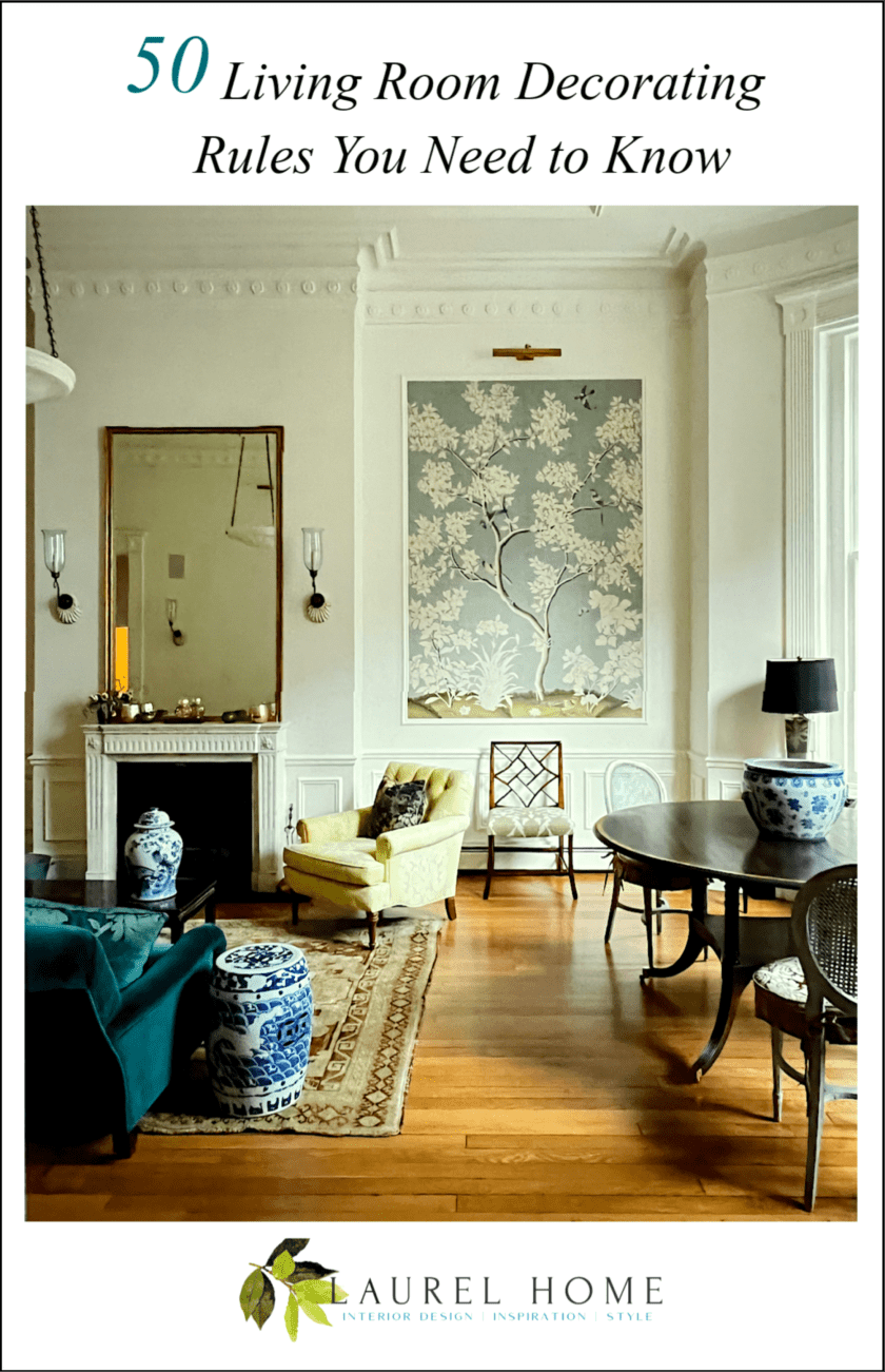
Please pin to Pinterest for reference.
Well, that was quite a bit, but it’s only a taste of what’s in the 333 Decorating Rules & Tips Guide.
In that guide, we go over the rules & tips for all of the major rooms and areas, window treatments, including a huge glossary of terms, art, and much more, as outlined in the link above.
I hope that you enjoyed this post about living room decorating rules!
xo,

PS: Please check out the newly updated HOT SALES
And a gentle reminder that all of my wonderful interior design guides are on sale, but only for a few more days!
Also, they make terrific gifts (to yourself or others), and you don’t have to stand in a line or panic. You set the date and time your recipient will receive their gift.
(Clicking on the new buttons will send you to the pages to learn more about my interior design guides)

Laurel’s Rolodex – Newly Updated for 2026 – 12th Edition – A unique shopping guide that shares hundreds of my favorite sources and especially for decorators and designers, tells you the best sources that sell directly to the design trade.

The Essential Paint Color and Palette Collection (two volumes)
Now including 12 new colors for 2025, with lifetime updates.

Six-Figure Income Blogger. This should be required reading for everyone who has a website and wishes to get the most out of it for their business.

333 Decorating Rules & Tips You Need to Know
A packed reference of hard-to-find rules & tips, you’ll come back to again and again.

The all-new Etsy guide for 2026
Over 200 of the Best sources for Home Furnishings on Etsy, updated every November.
If you’re already familiar with the guides and are ready to place an order, please click the button below to go to the order page.
Thanks, everyone!
Please have a blessed Christmas! I’ll see most of you for a special Boxing Day Hot Sales!
xo,

Related Posts
 Inherited Furniture That Must Stay – How To Work With It
 Beige Decor — How To Make It Go From Boring To Sensational!
 Interior Space Planning-Thinking Inside the Box
 A Secret Decorating Trick Designers Won’t Tell You
 Roman Shades Weren’t Built in a Day
 Egads! My husband Won’t Let Me Change The Blue Trim Color!
 8 Guest Bathroom Designs – My Secret Process


