

Hi Everyone. As promised this is part II of last Wednesday’s post about a small family room.
The one with the big RED sofa.
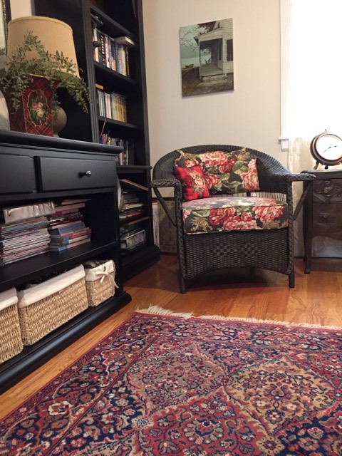
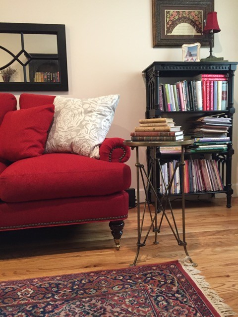
Here is the real small family room belonging to the delightful Andrea. (and she truly is!)
(BTW, please no comments about styling. I told her that she was not to clean up or stage. We’re not looking at that.)
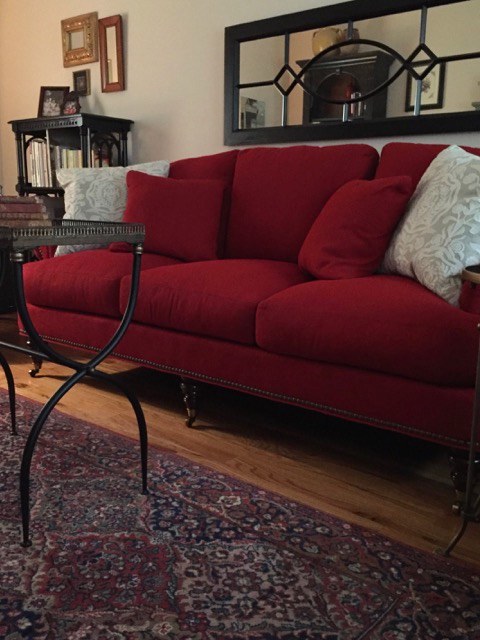
Andrea says that the sofa is closest in color, to this image, but that it’s brighter with the lights on.
Yes! Reds will go brighter in warm incandescent light. I don’t have a definitive answer about that one, but I do prefer warm lighting. If you don’t, that’s fine but I really do not like super-white LED lights.
Before we begin…
The only reason I’m doing this is for the benefit of everyone. I knew even before seeing the room, that these are common issues.
Decorating is hard!
So let’s rip this room apart take a closer look at what’s going on with this small family room or den, actually.
In case it’s not clear, I am totally joking about ripping this room apart.
Over-all, it’s a very sweet room. Cosy, and home-y.
But, IMO, it’s a little too sweet and what ‘Maggie’ said in Wednesday’s post:
“The balance is off.” And it’s off in a way that’s very common.
We have a strong element with the dark, handsome cabinetry.
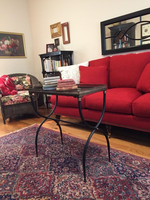
Directly across but only about 6 feet away is the RED sofa- another strong element.
Which, BTW, I think it’s actually a very nice red.
In fact, I think that the decorator and husband were correct.
What I feel is not right is that the sofa is a little too big.
And if I had $1,000 for every time I’ve seen this, I could happily retire.
Okay, fine. That’s an exaggeration, but the issue of too big furniture is as common as corn flakes.
And it’s not entirely Andrea’s or the decorator’s fault.
However, there are other options. I would’ve done an apartment size sofa (72″-80″)
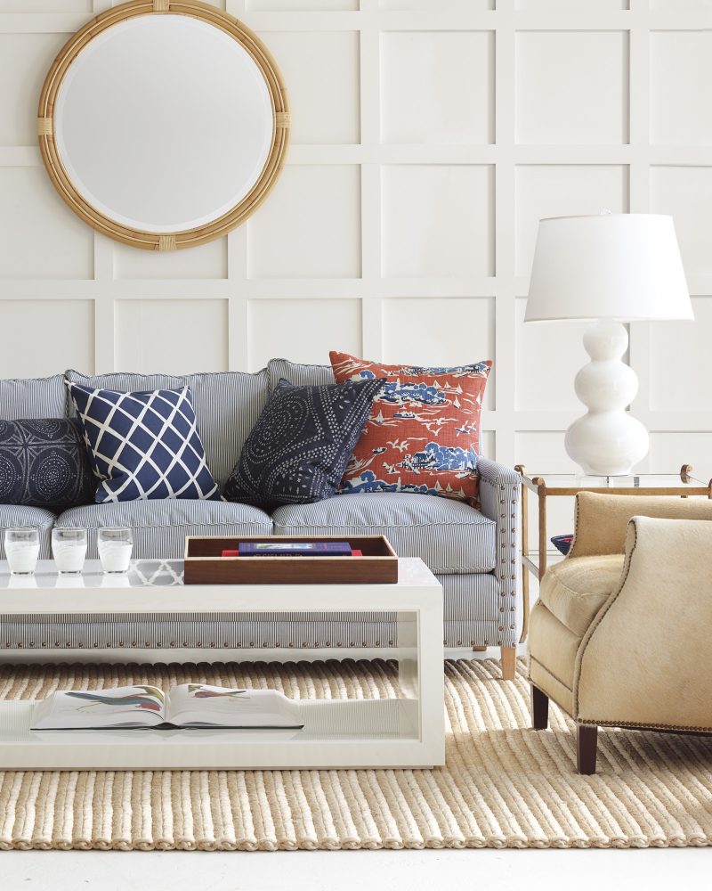
Like perhaps the wonderful Spruce Street sofa at Serena and Lily that’s now on sale if you didn’t hear yesterday. All of their furniture is 20% off! To read more about that, please check out what I wrote about it.
And yes, that’s a plug. LOL
However, I only plug brands that I LOVE!
Let’s get back to Andrea because it’s not helping her to say that she has the wrong sofa.
It’s a fine sofa. Very pretty and we are going to make this work.
But… but… but…
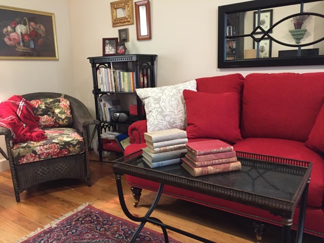
The sofa and cabinet are saying sophisticated modern-traditional and the wicker chairs, floral fabrics and art are saying country cottage.
Which is it?
I say that there’s too much of the cottage-y elements and that the room is looking somewhat tired and dated because of them. And then the sofa feels bossy because of that. We have to give some sass to the other elements.
Some would say to 86 the wicker chairs but they fit nicely on that end of the room. It’s the fabric that I’m having an issue with. It’s too Victorian/porch-y looking.
In addition, the furniture aside from the sofa is all a black-ish color. And it’s not that it’s awful; but it’s not helping. The sameness is tiring to the mind.
Let’s look at the walls.
We need a hunkier/handsome color, I think, to marry the cabinet, rug, and sofa.
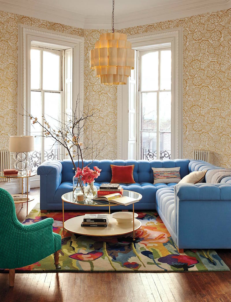
I know that you’re wondering about the blue from Wednesday’s post.
However, I do not see that color for this room. I think that would be better in a room that’s a bit larger and with more windows.

A color I would look into is Benjamin Moore Chelsea Gray. (haha. They are recommending this for a den or library. That’s because it’s like a warm hug) This is one of the 144 colors of the Laurel Home Paint Color, Palette and Home Furnishings Collection.
And yes, that’s another plug. ;] Don’t forget that the prices of all products are going up on November 13th. You will get an updated rolodex if you already own one or get one before that date.
Chelsea Gray is one of my favorite neutral backdrops and looks fabulous with both colors, white, black and art. It is a deep, but not too deep, warm gray with a touch of taupe.
When there is a long bank of dark cabinetry AND a TV, the walls always, always, always look better in a fairly deep color. And deeper paint colors are wonderful for small rooms.
The pastel peach is allowing the strong elements to be too strong and a deeper color will quiet them down.
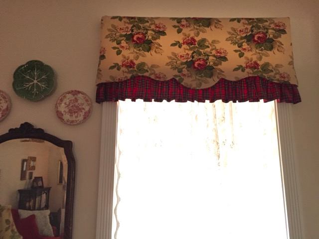
Next on the list is the window treatment.
The pelmet (valance) is not working for me.
And Andrea saw it in the PHOTO and wrote me that the tartan needs to go.
Yes, it does. :]
But I think that the entire thing does and the lace, too.
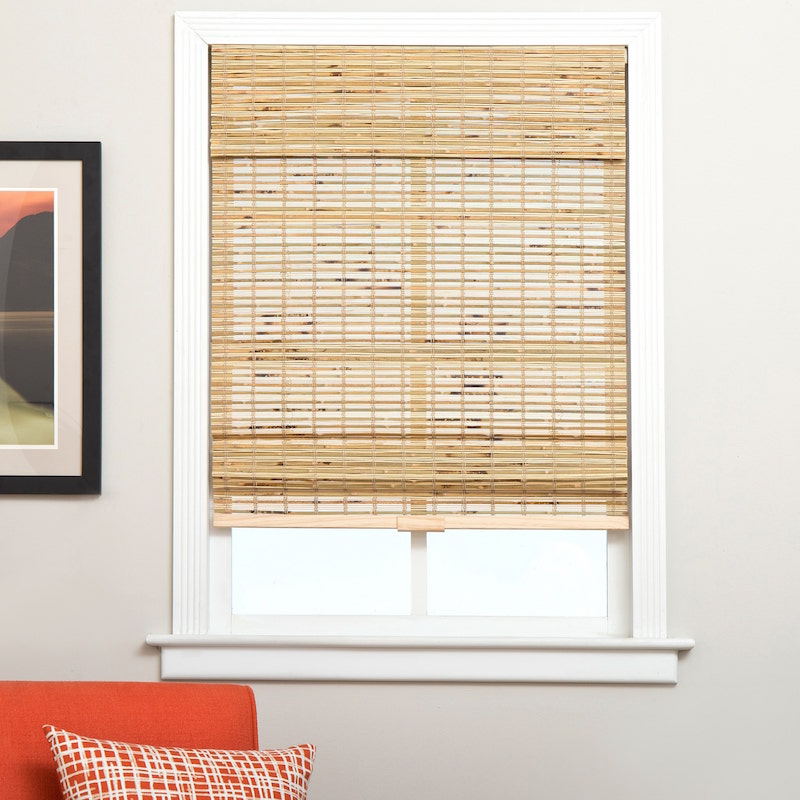
I believe Andrea mentioned that some natural blinds are coming and that is great. I love that. However, I would do away with the valance altogether, because this is a small room and it’s too much.
The wicker chairs are WONDERFUL!
But the back cushion needs to go. The tie on thing is weird and again feels too porch-y. I would do about an 18″-20″ tops square pillow with a down and feather fill. (see below)
I would really like to change the seat cushion as well. I would make it a little thinner and perhaps do a dark velvet. Or if the rug changes, it could be more colorful. But no flowers. Or if flowers, something higher end.
Pillows are a great place to splurge on a more expensive fabric to elevate a room.
 A tawny leopard print would be cool for the back pillows. This is not at all expensive, but I think it’s fun and stylish.
The bookcases are very pretty. They will look wonderful in front of the deeper color. And the sofa will also be better balanced. I would add a couple more pillows.
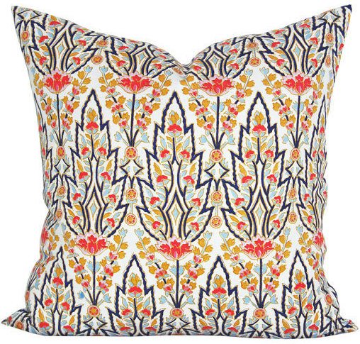 This Marmar pillow from Spark Modern on Etsy is pretty fabulous I think This brings in all of the colors and will also cool down and lighten up the sofa.
 Maybe a lumbar pillow in the middle out of Chiang Mai Dragon would be a fun accent.
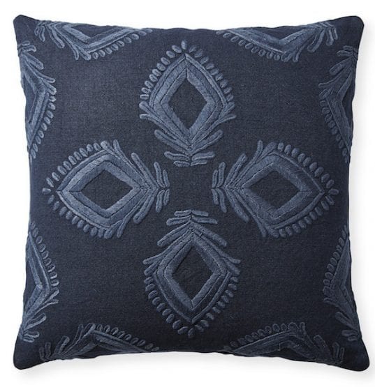
A Leighton dark blue on blue pillow would be cool behind the Marmar pillows and cool things down somewhat.
The mirror over the sofa is hung way too low, but it’s also too small from top to bottom. And again, too much of the same color as everything else.
I would hang a large wonderful mirror over the sofa.
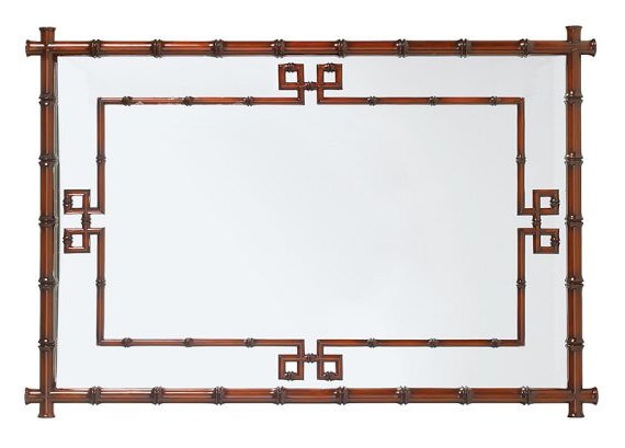 This is the Hampstead Mirror and it’s on sale right now at William Sonoma Home. (30% off with code: BEDROOM) It also comes in white and black! I love them all, but I think the wood tone would be the best choice for this room. The large mirror will also help balance out the light and make the room look larger. There are two sizes. The large size which is 35″ x 50″ should be perfect.
OR, we could do an art wall, like in Wednesday’s post. But I would like to see other smaller groupings of art to replace what’s there and there are still parts of the room we can’t see.
And also, in the groupings, I think that the pieces should be larger. It looks a little ditsy as is over the one bookcase.
But I would also like to see more sophisticated pieces like at Minted, Artfully Walls and Anthropologie. Of course, art is subjective and I respect others’ preferences. However, what’s there is not elevating the space, IMO.
OR, you can put up your six-year-old’s art, or your aunts. I don’t care. But please, we have been through the local art thing every time I mention art. I am using the retail sources as examples of interesting art that’s not hideously expensive. It comes framed. There are a lot of pluses. But of course, it’s not for everyone. I just have to say that, because it always seems to come up.
I would consider changing the rug.
It’s not that what’s there is bad, but it looks a little tired and heavy and the floor itself is not very dark.
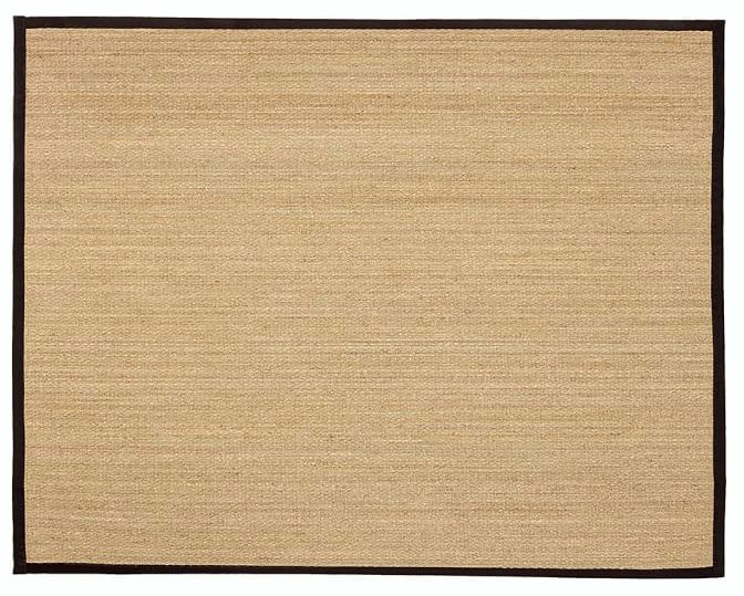
I think that a plain seagrass rug with a black trim would be wonderful.

Or perhaps an Oriental with a unique design.
I like this one from Darya Rugs.
The red can be different especially because it’s not the predominant color. This is just one way to go.
If the rug stays, then I would do a seagrass rug with a neutral border under it anyway. It looks a little small for the room and the layering will add richness and texture to the design.
Coffee Table. The one that’s here is very pretty. It’s tea table height. But it looks smooshed up against the sofa. It should be at least 10″ away so that folks can skootch their little legs in there.
And it matches the bookcases too much.
We need something different
I love this lacquered round coffee table from Anthropologie and it’s on sale!!! I love this because it adds more gold which is always a good thing and a lighter color which we need too. This table would look terrific on top of the rug that’s there and freshen it up, too.
Note: Sunday morning. I should’ve double-checked, but this table is probably a little large for the space. These posts are conceptual in nature because I am not there and I am not working from a scale drawing. I hope that y’all understand that. But the idea of a small gold table is what I was going for.
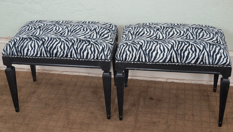
Or, she could do something like these cool vintage stools at Chairish. Kitty will appreciate this! ;]
Well, that’s pretty much it for me. I put a small widget together to show the different elements that might be incorporated. Please use the arrow to move it along to see the rest and click on the images for more info.

Of course, I know that y’all will have your own opinions. Please be gentle. :]
My wish list is:
- Better wall color. This one’s going to make a big difference.
- No valance.
- Interesting, stylish pillows
- Better coffee table and/or bench
- Different more sophisticated art
- Big mirror
- more up-to-date lamps
Well, I’m back from my event tonight with the 25-yr-old fashion bloggers haha (yes, I felt horribly out-of-place) and the hurricane is still bad but not quite as dire as last night. At least not so far, but that can change quickly.
And at the very least, these storms cause a huge amount of disruption.
If you’re in Florida and you still have power, please say hi and let us know that you’re all right.
xo,

PS: please don’t forget to check out the hot sales pages. You can access them in the top menu bar or at the link. And also please check out the info about the Serena and Lily upholstery sale.
*20% of any money earned through Serena and Lily sales will be going to help the relief efforts from the recent hurricanes. That is from the 8th-25th of September when the S&L sale ends.
Related Posts
 Freshen Your Home for the New Year {part II – mirrors}
 Nine Fabulous Benjamin Moore Warm Gray Paint Colors
 Window Treatments For Difficult Windows + What You Must Never Do
 Laurel, I’m Desperate! I Think I Totally Screwed Up My Window Shades
 9 Fabulous Benjamin Moore Cool Gray Paint Colors
 A Beautiful Home Renovation Makes Big Bucks For The Sellers
 The Stained Wood Trim Stays! What Colors Will Work With It?


92 Responses
This room looks lovely. Thanks for sharing this post.
Thank you Alina.
I really liked this post! These room makeovers are some of my favorite posts. I also struggle with cottagey vs. sophisticated in my own home and so I totally relate! Thanks to Laurel, I have fallen head over heels for chinoiserie but I have to use it with caution in a country cottage-type casual house. Also, I too would love to see the finished room. A deep rich color would be gorgeous in here!
Thanks so much Eleanor!
I think just updating the window treatments and switching out the floral fabrics would make a huge difference. I like the black mirror with everything in the room.
And I think a light blue with a hint of aqua for the walls would be gorgeous! It would set off both the black and the red. Add your third pillow suggestion and you are there.
My last three couches have been red or RED. Love it!
Thanks so much for your comment Rio!
from South FL (east coast) as requested: Outer band of Irma here more like tropical storm conditions (wind,rain,trees down,power out-only 36 hours. God bless Florida Power and Light and those assisting; they are miracle workers. Sadly, being safe during hurricanes only means someone else is not. Hope and pray others will have the help they need…and soon. Enjoyed your analysis, of this room, Laurel. Fun to have spotted some of the “could be better IMO” issues at my first glance of the room. Thank you for the respite from stormy weather.
Hi Gloria,
Thanks for the report back and glad that it wasn’t too bad for you!
Laurel, I have no idea how long it takes you to do a critique like this…but I’m sure many of your readers would be glad to pay for one. So many of us have rooms that are “almost there” but just not quite right. It’s the little details that bring it all together. BTW, I’m so proud of myself that I knew the paint color was off and the floral prints were too. I feel like I am learning so much from reading your blog!!!
Hi Therese,
It takes HOURS. And that is the problem. First there’s the back and forth which can be several emails. Then, they say that they want to hire me and then I send over a proposal. Never hear back. This can happen numerous times, before someone is serious.
So, then I ended up charging 1/4 (or less) what I should have because nobody wants to pay for the time it really takes. Plus, it’s super exhausting to do these kinds of consultations. Often, the photos are so bad that it’s impossible. Or, the colors look different in every photo. Lots of issues.
And there are the folks that no matter what I would recommend, it’s going to not be so great because there are some givens that I can’t deal with, like horrible architecture as an example.
What I’m trying to say is that I was doing these consults, which were exhausting and I wasn’t making any money. And it was preventing me from doing the things that ARE making me money.
There has to be a balance here. While I want to help people and find that gratifying. I need to be able to support myself, too.
But I will try to do these more often. However, folks need to understand that if they send in a note, I may not be able to respond or use their home.
I knew that this one would resonate with a lot of readers, but some homes are quite unusual and then it’s not applicable except to that particular home.
Yikes. That does sound awful! I guess what I had in mind was not a formal “consultation” but rather a sort of “professional rate my space.” Readers send you a picture. If you select it, they pay for you to point out what needs fixing…much like the wish list you did here. In my view, the specific buying recommendations you made were just gravy (and very hard to do without being in the space in any event). I’d be grateful for the general advice like “the paint color is wrong; you need to choose a moody gray…” You are so very talented, I’m guessing I am not alone in thinking I’d like to have you for coffee to “rip apart” my rooms!
Thanks Therese.
Hi Laurel…really like your recommendations!
Wondering if your only source of natural light is N facing, would you still use chelsea gray color on your walls. I too would love to the after pictures when Andrea is done. Always learn something!!
Hi Carol,
Thanks, but I can’t give an answer one way or the other because I’m not in that room. There are many factors other than which way the window is facing.
All of your suggest are obviously awesome. I’m just surprised you didn’t suggest painting the black furniture. The black furniture is what jumps out at me and the black seems too strong.
Hi Amy,
Well, that would be a huge undertaking since the furniture is already painted nearly black. And since the sofa is red, the dark color is nice, I think.
I really enjoyed this blog. I like that you took someone’s not just right room and helped them.
I’m in Florida’s panhandle and we’re experiencing high winds right now 9/10/17 at 10:24pm, but we’re expecting higher winds tomorrow between 1am and 11am. Praying for all Floridians.
Hi Brenda,
I just heard a little while ago that the storm is weakening, but even a cat 1 hurricane can do massive amounts of damage and power outages. I am shocked though with some of those reporters. I don’t think that it’s necessary to put themselves in harm’s way.
To clarify – the tartan ruffle is attached with velcro.
You are SO RIGHT about everything. I didn’t want to admit the fabric on the chairs is wrong because, crazy enough, that’s what we matched the sofa to. And, I agree about the back cushions. Big, plump pillows will be in place soon. I can remedy this quickly and easily. I like the paint suggestion, and was leaning in that direction. You were right – there is recessed lighting that I never use in favor of lamps on the cabinets at each end of the room, on the TV table and a piece-of-junk floor lamp I took out of the photos because it’s temporary until I find one I like. Either a straight up and down one, or one that curves over the sofa. The new, larger Oriental rug just arrived and will work, I think, and will extend under the sofa and chair legs, and will provide golden brown tones, as well as red, that will look great with an animal print. As for the valances, I had enough foresight to attach it with velcro, so that will be easy. I will take down the entire valance if I need to. Only problem is, the new bamboo blinds were made without a heading because they were to go under the valance. I’ll have to figure that out. The normal coffee table in this room is a big storage ottoman (we use this room for overflow guests and keep bedding in the ottoman.) I pulled the tea table in so the pretty sofa legs could be seen. The ottoman is too big, and I like your suggestion of a lower, glass table that doesn’t take up so much visual space. I didn’t realize how bare the walls look. More art will take time, because I want to love every piece. The minute the couch arrived, I knew the mirror was wrong. The ceilings are 9’. I wish I could show your very kind and talented readers the new and improved room, but it will take time. I will enjoy to the fullest finding all the new elements for the room, knowing I have advice from THE premier designer of our time! What fun this has been for me. Thank you from my heart, Laurel. Never in a million years did I expect this. My daughter thinks I am a superstar because my name is in print on your blog. You are the superstar.
Oh gosh. You are too kind Andrea! The blinds most likely won’t need to have a header unless they are outside mount. But they should be able to send you a self valance if it’s outside mount and you don’t want to see the hardware.
Man, I love that red sofa and that new wall color will be great.
I love this post, Laurel – your suggestions are wonderful, I hope we get to see pictures of the AFTER. I can relate to this post and your suggestions will help me at some point doing my own home, I just know it! I’ve been following your blog for several months now. You are incredibly talented – thank you for sharing your wisdom! ♥
Been following for about 3 months and have already learned much, thank you. I found this real life room analysis very helpful. So often I look at a room and know it’s not quite there, but can’t pinpoint how to make it work. I vote for more of these type of posts in the future! Thanks again for all the insight you provide to the design challenged like me 🙂
So glad that the post is helpful and thank you for the feedback!
Laurel, thank you for sharing this labor of love as you brought forth a beautiful room for Andrea. I felt your creative process just speak to me. You really have a gift! How wonderful for anyone to be a recipient of your work.
Thanks for your lovely comment Karen!
Looks like a very nice job in the “real life” room. I think the biggest problem with most “real life” rooms is that we are dealing with relatively low ceiling heights, not soaring ceilings like in some Parisian apartments. Wallpaper has made a comeback!!
Wow…I really learned so much! Thank you! That was a fascinating study in interior design, made all the better because it was true to life.
On another note…wow, thank you so much for your shopping pages! I needed two lamps for our bedside tables, and had been looking at getting two of those kind of plain ceramic Suzanne Kasler lamps at Ballard. I was putting it off bc I just wasn’t all jazzed by them, especially since they were $200 each. Ding-ding…got your Friday post a week ago and saw the One Kings Lane blue and white striped lamps! Much more exciting, and MUCH better price! They are very well-made and look stunning in my room! Thank you so much! 🙂
Oh, that’s wonderful! I love OKL!!! I’ve gotten many things there over the years for myself as well.
Love when you do this! Thank you. We had chosen a greige for our new house, but now I am leaning towards painting the long wall in our living room with the dark bookcases and tv a darker color. We use SW in our small town, and I already checked it out using their online tools. Now to convince the hubs!
Question: I know exactly the style of chairs that I want to purchase thanks to your blog. I can afford some of the sale items you have posted. BUT I am very leery of buying upholstered furniture without being able to try it out. What if we don’t like the way the furniture feels? If you can’t answer directly, perhaps in a future post.
Oh, I said that I was just going to approve the comments without answering. Sorry, it’s a good question and I do have an answer, but just not now.
I love that red sofa! My first thought was it sticks out because the walls are too light. Your paint suggestion would look fantastic and your other suggestions will really give the room such sophistication. This was a really fun blog and hope you will do more like this! I keep thinking I would like a smaller sofa…fell during the eclipse and broke my arm and leg. My bed is so high, I can’t get in it right now. Thankful at the moment for my big ass sofa!!!
I’m so sorry that you got hurt Roxanne!!!
Laurel, I think I’d stain the floors a darker color seems too light with her furniture. Thoughts?
Hi Kris,
Well, I didn’t want to go there because there are most likely other rooms. It really does become a Pandora’s box!
Laurel, this was an extremely helpful post! It is just so interesting and illuminating to see how you rethink elements in the room of an ordinary reader like us. And thank you, Andrea, for offering your room for this demonstration. Most of us would like to “elevate” the rooms we actually have (without spending a fortune), but the big question is . . . how to do it??? So, thanks to you both; this was fun and interesting.
I’m sending this wonderful post right on to my lovely friend who has asked me to help her with her tiny little family room.
Maybe if the suggestion to paint her wall that has a big oak Hoosier cabinet as well as a big black tv on a big oak stand, with a darker paint color will be more palatable. 🙂
haha! hopefully.
‘fun read and very helpful! Thx
Thanks Francesca!
Wonderful suggestions for the family room! I recognize the rug because my sister has the same one. It’s a wool Karastan and it is lovely, soft and luxurious. The colors don’t show up well in the pictures but there is a very pretty teal in it. I’m for keeping the rug because it is a quality piece, and the idea of a larger seagrass rug with neutral border underneath is perfect. That,with a deeper paint color on the walls and simple, natural window coverings will go a very long way.
Hi Marcy,
Thanks for the info. I knew that rug looked familiar! And yes, I do see the teal. It’s difficult to photograph rugs, in any case.
Love the gray for the room and the pillow and two stools suggestion. If it were me I’d make this more of a mans smoking room concept with gilt frame hunt prints. Think Ralph Lauren. For curtains I’d pick something that picks up a color out of the Persian rug, which I love.
Hi Kris,
That’s a great idea!
I love this scheme plan to do it for my hubby’s large office man library
Oh, that’s wonderful!
I loved this!!!! Learned so much. Thank you!!! I loved all the ideas. I hope she will use them and show us the completed room.
Glad that you enjoyed the post Dianne!
I had the same thought: Laurel, I hope you and Andrea do decide to show us the completed room. Would love to see!
Hi Laurel,
I too really enjoyed how you elevated a room we can all relate to. It’s nice to see how your suggestions are all attainable and classic. Great work!
Leslie
Thanks Leslie!
You offered great advice! And I LOVE her sofa — it looks very inviting. The only thing I might disagree with is that wall color you suggested, as I personally do not like dark rooms because I can’t see without a lot of light. Many people do, though, and it would probably look good.
Hi Ellen,
Actually, there should be more light, with better lighting and the big mirror. And Chelsea Gray is a medium-dark shade. Not at all super dark like a brown or navy.
The problem is that there is already a very dark and large cabinet and a saturated red sofa. A light color is not going to look as good.
My dining room is painted Chelsea Gray. It’s a lovely and inviting color. Although I don’t get a lot of natural light in that room, I don’t find it dark at all.
Hi Therese,
That’s been my experience as well.
I really enjoy posts that address those things that are not working in a room and then talks about ways to improve those specifics. I would love to see pictures of this room after your suggestions have been implemented. IMO, you offered fantastic advice. I hope Andrea takes pictures as adds and subtracts per your suggestions.
Hi Tricia,
Thanks so much. I’m curious to see what happens as well.
Love all your ideas for the room! I’m wondering if a leopard or even zebra print rug would look good in that room? But I love your idea of bringing some animal prints (and getting rid of the victorian porch look) into that room!
Hi Diane,
Yes, leopard or zebra could work, but then we wouldn’t be able to do them in the pillows. I like the rug from Wednesday’s post.
I love when you do a ‘real’ room! Looking at all the perfect rooms can make it feel like our real life decorating is so far from ‘perfect’.
I agree with Sharon about the 2 smaller bookcases –if they were removed there would be room for end tables and lamps that would bring another (non-black) color into the room.
Maybe there are ‘bookcase’ end tables because I can see that Andrea is a book lover!!
I hope Andrea will send photos because that room is going to be smashing!
Thanks so much for your input Maggie!
Dear Laurel,
This could be my living/dining room! It has given me so many answers on how to proceed with my living/dining room combination. You are the best!
My biggest concern is the paint color. When I get all the elements together, as I am still deciding on what to do for a pair of chairs, I will decide on the paint color for the walls in the living room, and the adjoining dining room, which I want to be two different colors. And I will definitely consider the Chelsea Grey for the walls as my love seat is a brick/rose color; very warm hued velvet. Your suggestions for this Family Room have helped me to know what questions to ask! Again, thanks, you are the best and proved that knowledge is power.
Hi Susan,
That always makes my day to hear that. And BTW, ideally, the wall color is the last thing that gets chosen. Or, it happens simultaneously. That is counter to what the majority do. But it is much easier to pick the color once one knows what else is going on.
Good Morning, Laurel,
I agree 100% with all of your suggestions! Also, would prefer end tables flanking the sofa, sconces would be a good alternative. If the tea table is the right height I think it would make a nice bar, maybe in another room. Seagrass rug or seagrass with a smaller leopard rug on top. The wall color would help tremendously! XO
Thanks Nancy! So glad that you like my ideas!
Hi Laurel,
I loved this post! When I see pictures of rooms that could use some help I usually have some ideas. And I love to compare my ideas to what a professional would do. Everything you suggested were things I was also considering about the room. So it was fun to learn that I was on the right track.
I agree with Sharon A….I think the small bookcases should go & be replaced with end tables with some nice lamps.
I also wonder if the decorator that she had recommended any other things to improve the room or was just hired to find a replacement sofa.
Hi Mary,
I agree about the end tables lamps too, but the book cases could work if there was additional wall lighting or my favorite little floor lamps from Wisteria. (they are very small)
Personally, I think Chelsea Grey is rather dark for this room, but a lighter shade of grey might work. As in your example, I think a grey this dark needs quite a bit of white to bring it off, unless you are going for the masculine dark pub/den look. Agree with most of the rest of it, although perhaps the round coffee table might be rather large for this room, and I do like her existing rug.
Hi Kathy,
Yes, lighting is important and the big mirror will add shine and sparkle. The dark color will be handsome.
And you know, you’re right. I thought the round table was only 36″ but it is 42″ and that is probably a little bit too big. I will go and make a note of that. I am not sure of the measurements. The ideas are conceptual in nature, since I don’t have measurements and am only able to estimate based on what I see in the photos.
I love love love posts like this! You give your opinion, reason for said opinion and most importantly, ways to improve while still being gracious. Bravo! Keep them coming!
Thanks so much Lynn!
Here goes. This room is almost there. The main problems for me are
1. Wall color, but I have no idea what darker color is right! I’d also consider wallpaper — maybe dark stripes that would coordinate with the rug and gorgeous sofa?
2. Balance of masculine and feminine. I’m always aware of this; I’m married and my rooms need to look like a guy lives here, too. The black furniture is masculine but the flowered prints and tiny artwork and hanging plates strike me as too dainty/feminine in contrast. Buy real flowers if you love flowers. Make a picture wall behind the sofa using lots of the little artworks and leave other walks bare for relief, or rehang the mirror. Ditch the floral fabrics in favor of something bold and fun. The sofa strikes me as a strong feminine statement with its curves and lipstick color— it’s great. It balance the black wall unit. The wicker chairs are lovely.
3. Window: hem the lace curtains to window length since traditional lace curtains were often that length. They can look skimpy going to the floor. I adore lace curtains and don’t care if they aren’t trendy, but they look odd when they are too long. Nothing else gives the same quality of light. They’re best made in all-cotton from the old looms in the U.K., preferably in a non-flowery pattern. I’d remove the entire valance and consider getting (red?) floor-length drapes to give the window more presence.
4. The coffee table is too small and high. Get a “masculine” one in darkish natural wood. There’s no unpainted wood in this room except the floor and that bothers me.
The character of this room, I’d say, is updated traditional cottage. So many rooms these days have NO character! This one will have an amazing, unique personality with a few more brave choices to work with the sofa and all the black.
Hi Elle,
Thanks so much for all of that! And I agree that so many rooms these days are lacking in character and personality.
I think you’re entirely right, Laurel, about the contrast in styles (cottagey v more sophisticated) being a big problem here, so yes to changing the window treatment and the wicker chair cushions, and to beefing up the accessories such as the mirror, which is indeed too small. And the coffee table looks both too tall and not quite hefty enough, although it’s lovely per se. Could it go end-on in a corner, as it seems a better height for an end table? I think yes too to the grey paint colour, although I shy away from that sort of thing, partly because of our wet and often grey climate and because we have far fewer and much smaller windows than I see in most American homes (but that’s just a mental block on my part, like teaching myself to hate azaleas and rhododendrons because we can’t grow them) — I wonder about a dado rail with off-white below, as in your illustration of the colour, for a brighter effect.
But I also think a lot depends on the rug.
If the rug stays, I think any florals have to go, even the Chiang Mai Dragon you suggest as a possibility. I think from looking at your suggestions, a dark blue velvet would be a good solution for the wicker seat cushions, with a pillow in the red and blue chinoiserie fabric seen in your photo of the S&L sofa. Or the two grey and white pillows seen on Andrea’s sofa!
But if the rug goes, replaced by your suggestion or similar, that opens things up more, to the Chiang Mai fabric and some paler blues in the accessories. Your rug would also go better with the floor colour.
Finally, best wishes to you, to Andrea and all in Florida. GL
Yes, the brighter fabrics don’t go with the current rug. But I think that a different rug and some different fabrics will bring additional life to this lovely room.
Rather like this room once the window ‘treatment’ has gone & if that heavy black mirror bearing down on the red-she-said sofa could be removed.
Absolutely agree that the room Is too cottagey & adding a little gold as in a new coffee table would be lovely.
A depth of paint colour on the wall would balance the depth of colour on the sofa.
If you are tempted to jettison the wicker chair, please could you send it my way ?
Thanks Joanna,
I like those chairs too!
Hope that Andrea will let us see her room whenit is finished?
Thanks!
That would be fun!
I’m up waiting on IRMA:( We’re in South Georgia – 11 miles from Fla. border. We’re making a decision later in the morning depending on latest shift of Storm as towards whether we need to evacuate. Where we live is totally surrounded by massive pines & magnolia trees – and any one – could take out the house – double UGH:( BUT, I currently have internet and therefore your blog to keep me occupied:)
Hi Terry,
That can be scary as I was saying during Sandy as we lived in a heavily wooded area. Can’t believe the newscasters out there saying how dangerous it is and yet, there they are!
I think the seagrass rug with the black border would tie in the floors with the black furniture,eventhough it seems a little beachy for the red sofa. Maybe the smaller oriental layered over the seagrass cause both are so nice. On sofas if one is all you have for hunkering down it is nice to have a large one with soft arms for laying on. The sofa looks mighty comfortable. I like the paint color too. The Spruce Street sofa looks comfy on the cushions but not the arms. All great ideas.
Hi Ginger,
I’ve done dozens of seagrass rugs in all sorts of rooms. It only looks beachy if the rest of the room looks beachy. Otherwise, they look like a stylish texture underfoot.
Hi Laurel. I really liked this post. I love it when you take a room that’s not quite coming together and present solutions. I’ve been reading you for over a year now and im so grateful for everything I’ve learned. My first impressions (after salivating over the gorgeous built-ins and the sofa, which I love) were that the wall colour, mirror, florals, valances, and carpet were all making the space feel a little old fashioned. By incorporating your suggestions to update the style, Andrea is going to have a gorgeous room that will be at once cozy and fresh.
I’d like to send my prayers to those in the hurricane path. Be safe and let’s hope it’s over soon. In BC this year it’s been wildfires. 40,000 under evacuation, Hundreds homeless and billions in damages. Tough times for so many.
Thanks so much Gail! Appreciate the feedback.
I think you nailed it, Laurel. Personally I love the sofa…it’s very pretty.
Your suggestions about the wicker chairs are great. The chairs are really pretty and just need an update so they are the same “level” as the new sofa. Kind of like getting a new dress and being sad when you have to put on your old coat. Put a new scarf with that old coat and then everything seems more pulled together.
Love your ideas, Laurel!
Great analogy Noel! Glad that you enjoyed the post.
Hi,from Florida reading your blog waiting for the storm.
Hi Jacqueline,
Hope it’s not too bad wherever you are. The only time I’ve ever been through a storm was super-storm sandy. HA! Fine. They can call it whatever they like. It was no longer “tropical.” Who cares? It was two giant storms converging into one raging tyrant. I ran for the bathroom, cause I felt the house shake; there were trees crashing down all around us and two little boys were killed just a few miles from us when a tree hit their home. Horrific!
And then no power of any kind for a week. Fortunately, we had a fireplace because it was FREEZING!
Agree and one more small thing…..maybe move one of the black bookcases to another room? As in the small one.
Hi Sharon,
Well, they are a pair flanking the sofa, so the symmetry would be lost. I am wondering what happens for light over there. Strictly speaking I’d prefer an end table/lamp on each end, but short of that some sconces are swing arm lamps could work. My guess is that there are recessed lights.