

Dear Laurel,
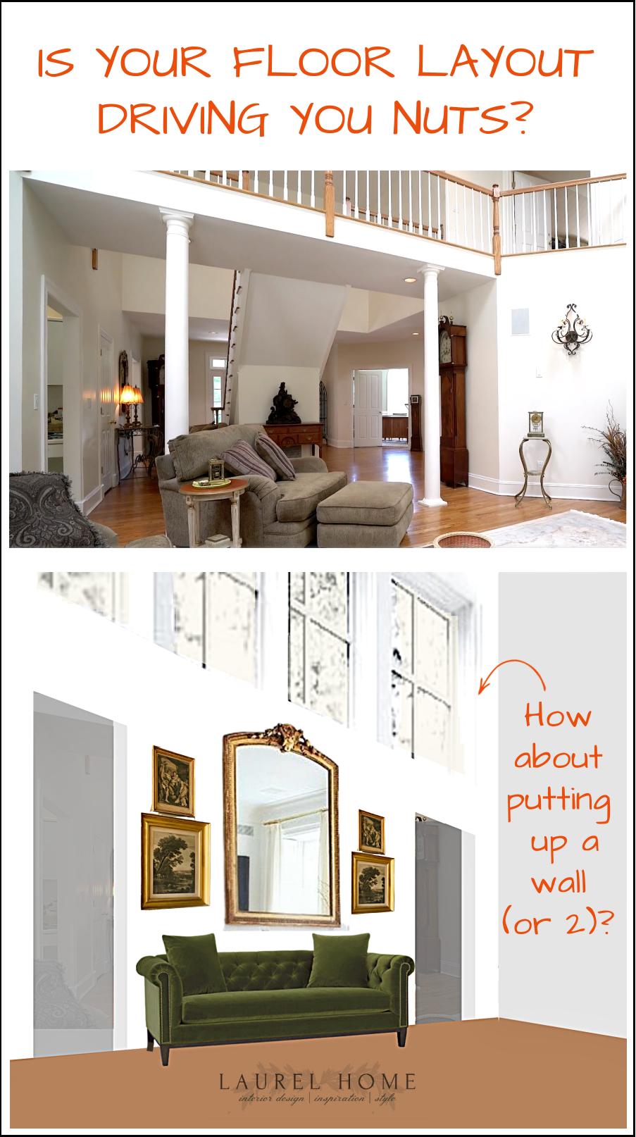
I don’t know what we were thinking, but our home has the most difficult floor plan, and I’m struggling madly to figure out the best layout. I mean, I saw your fantastic post where you showed numerous workable furniture layouts. But, Laurel, those were for a normal room. Our room is not normal.
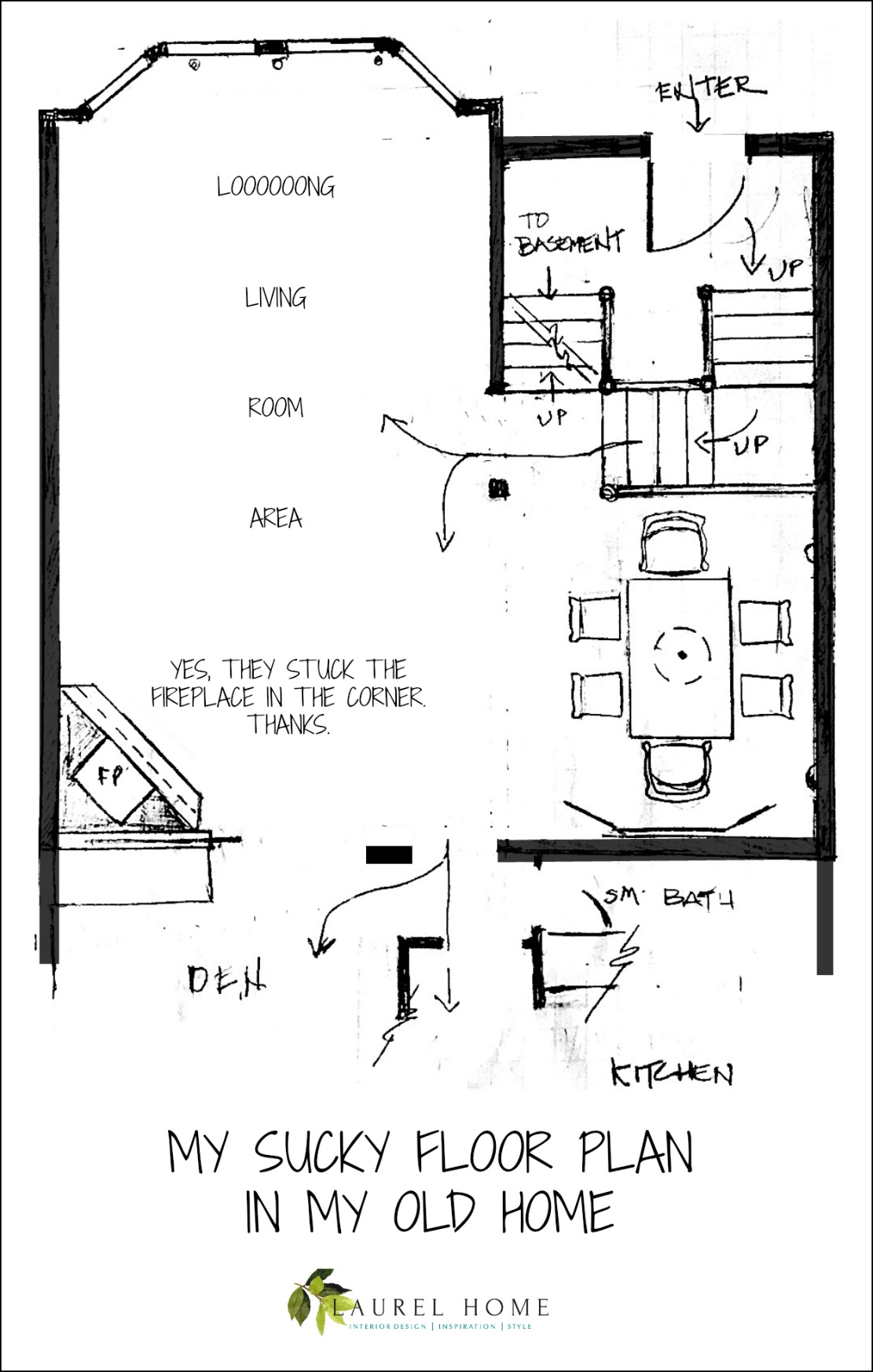
From the front door, walk up a few steps and then are met with an L-shaped living/dining room. The fireplace is stuck in the corner of the L. Anyway, I got the quarter-inch graph paper like you went over so well in this post. And, I’ve been drawing and erasing and drawing, and well, erasing…
We can’t afford to hire anyone, not even for a consultation.
But wait. Silly me. I forgot that I’m an interior designer.
I do hope you can help me!
Sincerely,
Your much younger self in 1996.
Okay, that is a letter to myself about the difficult floor plan in our old northern Westchester County townhouse. It was challenging to furnish, which you’ll see later on.
However, I also know that many of you also have a problematic floor plan and are also going mad trying to figure it out.
I know this to be true because I lived in that little bedroom community in northern Westchester County for much of my life. It was filled with hideous post-modern abominations.
Sure, most of the houses looked pretty enough on the outside, but once you step inside, you are then met with some strange stuff.
So, today, I’m going to show you our old townhouse.
However, first up is a home that I worked on from 1998-1999! I came upon it while researching our old townhouse! It was a lot of fun seeing it again after so many years.
During my research, I discovered that the house was sold about five years ago. But, get this, some 18 years later, the same window treatments that we did in 1999 were still hanging!
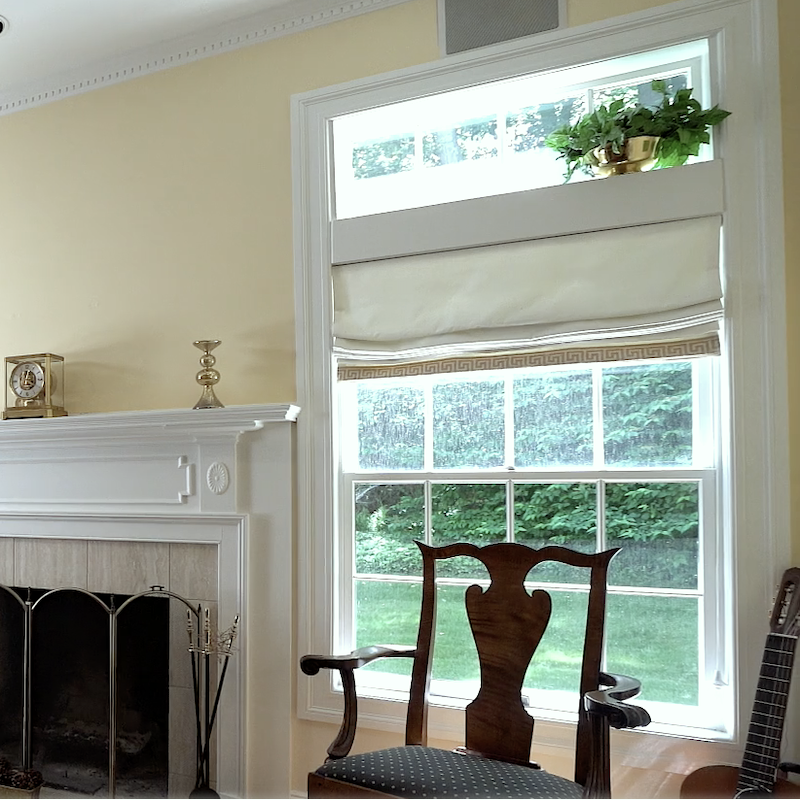
Above, is a close-up of one of the Roman Shades in the living room done in 1999! That is some expensive Manuel Canovas cotton we used. And, yes, I used Greek Key trim dozens of times!
You can also see window treatments, which we did in the boy’s room, guest room, and kitchen. Most of the wall colors are the same, too. However, I don’t think the living room was yellow. I believe it was a creamy white.
Below is the house built in a development in Goldens Bridge, NY.
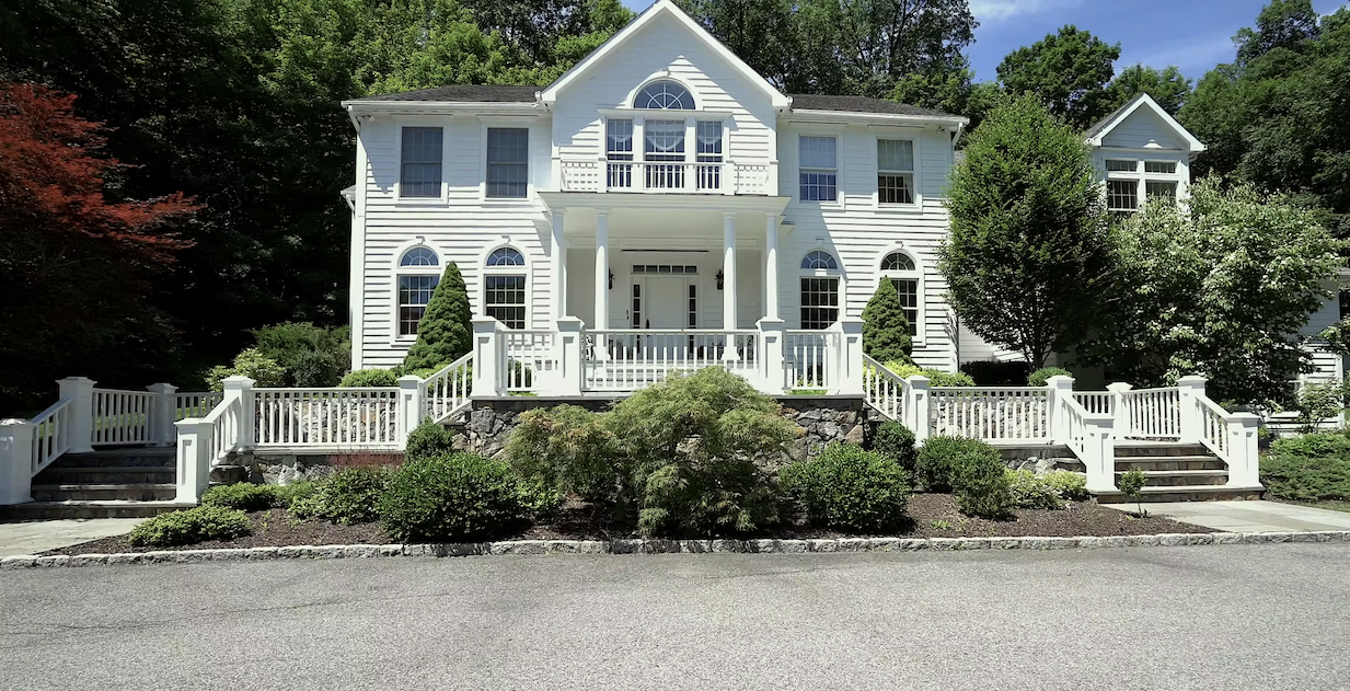
Oh, I know it looks like a beautiful home– on the outside. Although, who are we kidding with that rather ostentatious double staircase? That is NOT where I would’ve spent my money. Unfortunately, there are a LOT of houses like this in builder’s developments. I don’t recall my client doing this. However, if they did, it was to sell the house, which they did in the early 2000s.
As for the exterior, the proportions are not bad. (except for the newel posts on the staircase, which are too large.)
It looks like a proper center hall colonial. Right?
As you’ll soon see, it’s not.
Let’s take a little peek inside, okay?
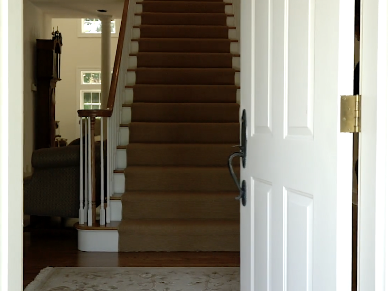 Seriously. Could they have made this any worse? There is no center hall because a big honking staircase splat in front of the FRONT DOOR. It’s not like there wasn’t enough space. There’s a video coming up, and they cut super quickly to the next shot.
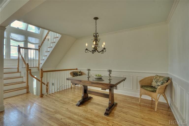
Ack, it goes straight up Awful. Wow, I do believe that’s the runner we put in. Or, if it’s not, it sure looks the same. To the left and behind this view is an office and to the right is the dining room.
Oh, I wanted to show you this horrible layout, but I don’t have it, and drawing from memory is too difficult.
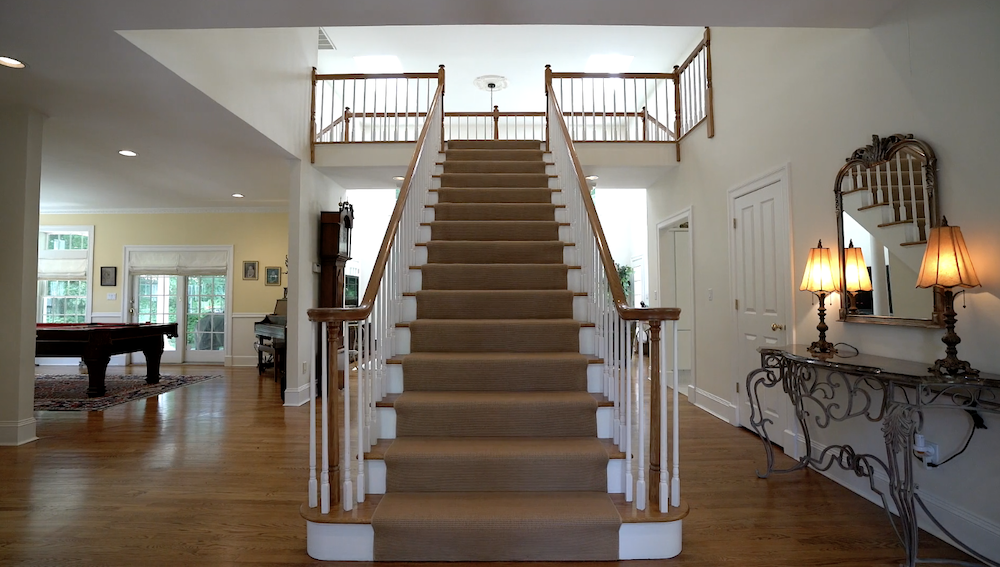
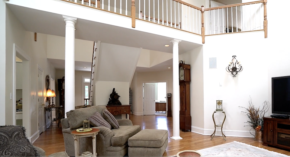 Here is the view after walking past the staircase and then looking back towards the front door. No, this is not my client’s furniture! By the way, those columns had some poorly rendered faux marbling. I was delighted my client agreed to get rid of that. To add another layer of wrong, the floor in the front entry (everything behind the columns) was this weird, white, fake marble tile. Actually, I believe my client did change this tile to wood. Access to the house was usually through the garage. Therefore, the ceramic tile was unnecessary.
So, here’s where I would’ve spent my money instead of the over-the-top exterior work.
I can’t do this properly, but to give an idea, I put up one wall with two entrances into the family room.
Please forgive that the perspective is a bit off, but this at least gives an idea. I have other ideas, but I dislike describing things without the appropriate visuals because it’s too confusing.
Yes, those are interior windows. These are a little heavy, but it was problematic finding ones I could use.
My point is that this home ALREADY had excellent curb appeal.
However, the inside has some significant issues. Also, I would’ve updated the kitchen.
I couldn’t find any interior images; however, I found a Vimeo video showing the entire home.
14 Brundige Drive, Goldens Bridge NY | VANCE Media Group from VANTIDGE on Vimeo.
Please don’t ask me why there’s a finished oak railing in the garage. Hilarious!
Our home, not far from this where I lived for 22 years didn’t have problems on this scale, but it did have issues. However, with a townhouse, some changes are impossible to implement.
For many years, I spent dozens of hours trying to figure out our L-shaped and rather long living-dining room. So did the other nine neighbors who had the same townhouse model.
Below is the difficult floor plan that I drew from memory.
Despite its flaws, I loved my home’s light and bright airiness. And, I loved the white-on-white and beautiful mouldings we added years later.
And I loved it because it had a fireplace with a lovely classically traditional fireplace mantel.
I told my wasband in 1990 that our new home must have a fireplace. He rarely ever argued with me.
Early in 1991, we began our house hunt with purpose. We were living in the Flatiron District in Manhattan, which I discussed briefly in this post.
However, we needed more room with a rapidly growing infant and a small, 700-square foot, one-bedroom apartment. Besides, I was tired of tripping over homeless people lying around on the sidewalk while strolling my baby around town.
We focused on Northern Westchester County after a rec from a friend.
We saw a few places in our price range that completely underwhelmed us.
But, when the realtor took us to “our home,” I knew before we even walked in that we had found “the one.”
As an aside, I have to tell you something.
When we walked in, there was puky-pink carpeting–EVERYWHERE.
And not one stick of furniture. NOTHING. The house was EMPTY!
Oh, it gets even better.
It was February.
In New York.
The heat had been turned off completely. (hmmm… not too wise, actually)
Of course, it was FREEZING inside the house. We also had our seven-month-old baby with us. Yes, that baby.
There were no mouldings. The kitchen cabinets are made of the most tasteful almond melamine ever. haha, The kitchen floors? They were faux terracotta.
And there was hideous wallpaper in all three bathrooms.
Hideous.
It didn’t matter much to me.
And here’s why.
The major bones of the house were already there.
Gorgeous fireplace and mantel.
I was in heaven, and even though I was shivering to death, I’m not sure if it was from the excitement or the cold. I think a little of both.
The point I’m taking a long time making, which you got the second I said that the house was empty, is that those details weren’t a priority.
But, Laurel, you have great powers of visualization, and many of us don’t.
Well, it appears that they’re not always so wonderful.
IF I had these extraordinary powers of visualization, I would’ve gone, whoa! This is going to be a very difficult floor plan to furnish. Come, darling husband, let’s move on.
But no. In a typical impulsive fashion, I was so infatuated that we had an accepted offer within 90 minutes!
A few years ago, I actually found the real estate pics and saved them.
They are better than nothing, but I’m not a fan of these images. They are horribly distorted, washed-out, and in my opinion, quite bland. Alas, that is mostly all I have.
Also, much of the furniture was gone because I had already moved out. And, items on the wall were not put back due to the fresh paint.
By the way, our bad photos didn’t matter either. We had our offer at the full asking price only three weeks later.
In our case, I got us the most badassiest realtor in Westchester County, Angela Kessel.
Apparently, she sleeps with her cell phone surgically attached to her ear. That is how fast her response is at any time of the day or night! I can’t recommend her highly enough.
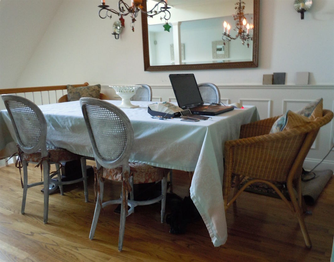
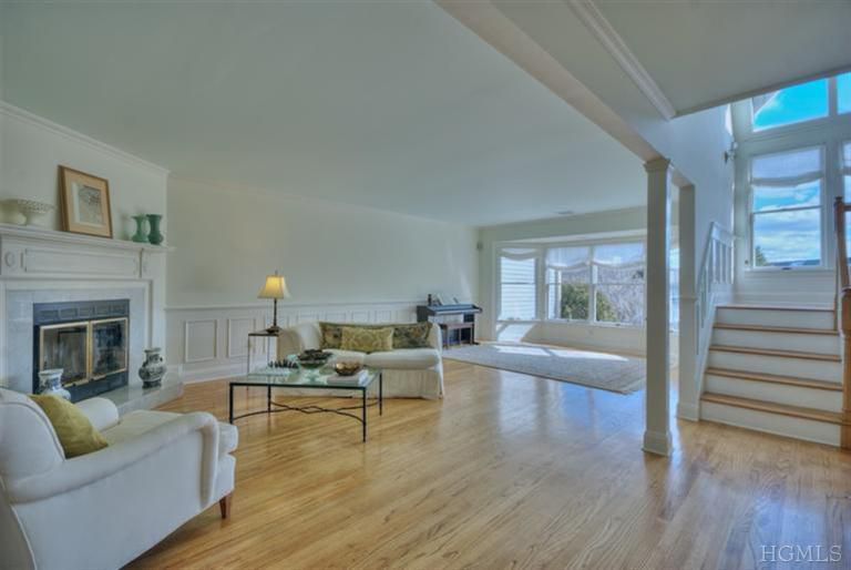
This is a photo that I took in our den about ten years ago.
Okay, time to look at the real estate photos.
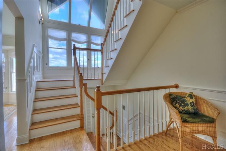
The staircase is my favorite part of the house, but still a little distorted, as you can see by looking at the wicker chair.
Ugh. The sheer linen Roman shades are not purple!
:] I took the four gray chairs, which you can see here. Here’s how it looked before.
These colors are far more accurate here. Do you see my “Rolodex?” haha?
The wall color, Pratt and Lambert Ancestral, is similar to Benjamin Moore White Dove.
The walls are white, not yellow. So weird. The floor looks yellow too. It was a beautiful cognac color. We put the floor in, in 1996. I mean, we had it put in. :]
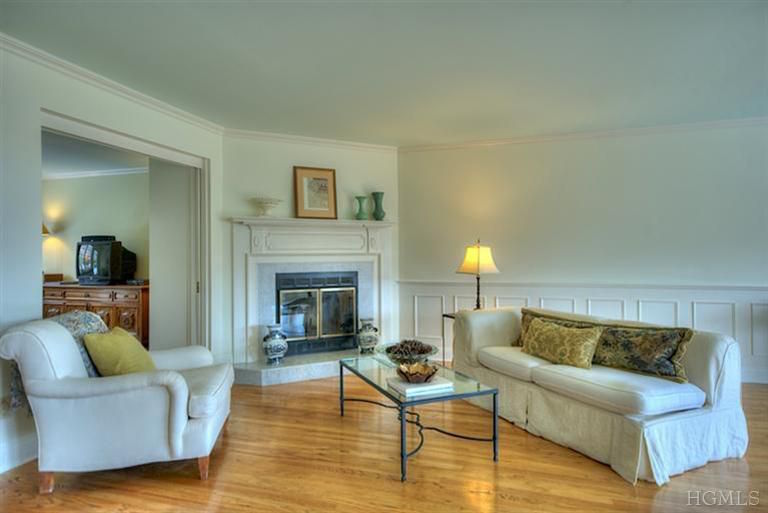
Ahhh… there’s the fireplace.
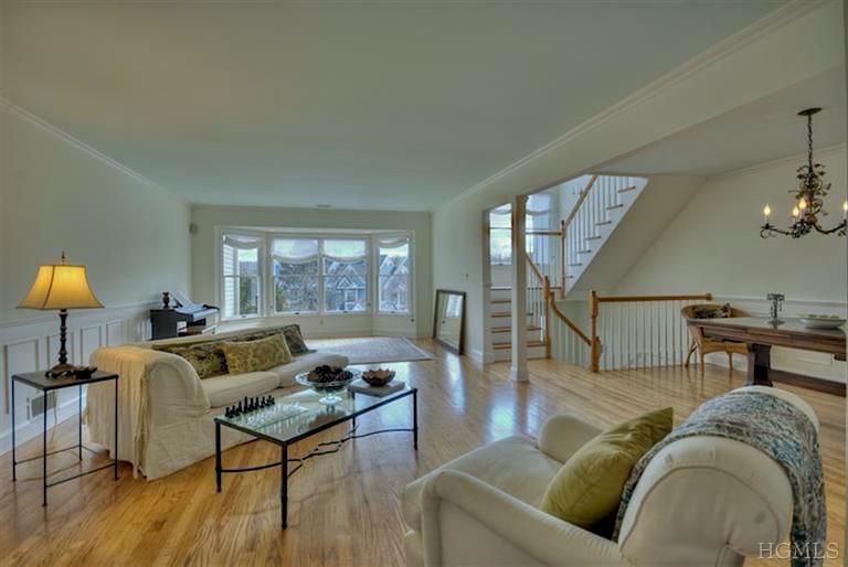
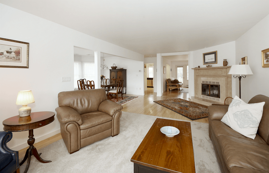
And, thar she is in her entirety. Almost. The ol’ L-shaped living-dining room floor plan. However, this room looks like a football field. It’s only about 24 feet long.
What is that ugly thing behind the coffee table with the rag on it, Laurel?
Be nice. :] It was the best we could do at the time. And, it’s distorted. (what else is new?) It was part of my wasband’s old sectional with a semi-unconstructed slip-cover I designed in 1991. There’s a better, albeit fuzzy, pic below.
So distorted, washed out, and yellow-ish. I know. It just bugs the crap out of me. The ceiling is a pale aqua too! I mean, it’s supposed to be. This home was warm and cozy, which is not conveyed at all.
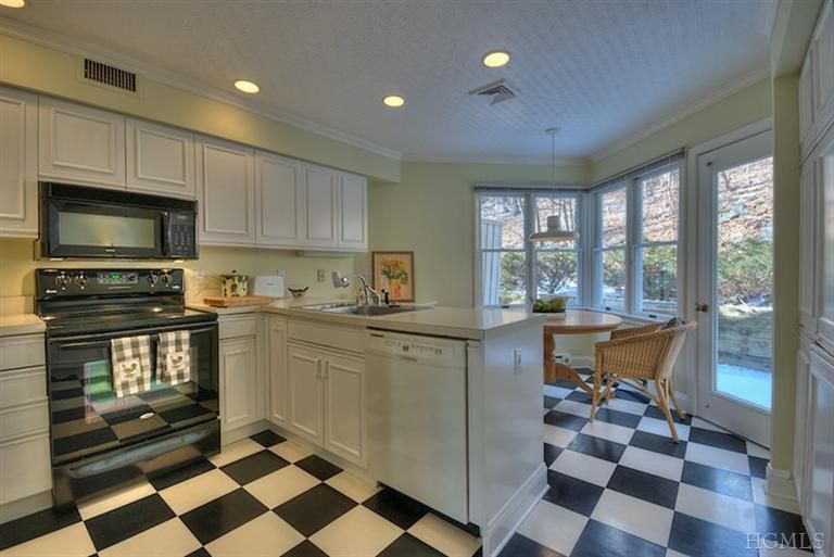
These are the Melamine cabinets! I had a guy nail on moulding! And then he sprayed them. Before we listed the townhouse, everything was re-painted, including these cabinets.
It was a super-crap job with some off-brand white latex. I wasn’t around for that. We should’ve put on knobs, but other than that, I was very happy with the facelift we gave the kitchen and cabinets. We changed the floor, and the ceiling is Anaglypta wallpaper, painted a glossy white. My boys always thought it looked like paper towels. haha!
The dishwasher was new and the range, and micro- hand-me-downs from a neighbor.
Not kidding. We had no money to do things the way I would’ve liked to.
The wall color here IS a muted yellow-green from Pratt and Lambert– Flaxseed.

Yes, that’s snow outside. The kitchen and den face north, north-west, so rather dark except for occasionally a ray of sunshine in the afternoon. The hill killed the light most of the time.
The round pine table is a vintage Pottery Barn. lol
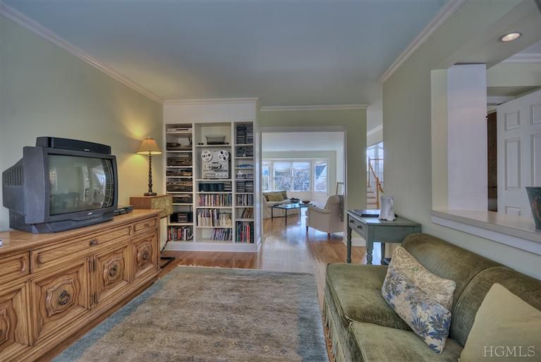
The little den. I’m embarrassed about that cabinet the old TV is sitting on. That was a hand-me-down from a friend too. It was only supposed to be temporary. Oh well. All of our money went for music lessons. And then we hit some hard times for numerous years.
Alas, that is a 5 x 8 Odegard Tibetan rug that Peaches mutilated.
It’s really only about 40 feet from the back of the house to the front. It looks like 80 feet here, at least!
The green table was one of my many air-head mistakes. It was supposed to be red. So, I kept this one and re-ordered the red version. The table looked fantastic in our den, so not such a bad mistake.
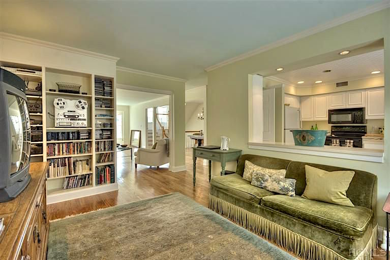
Above is another part of the sectional with some expensive Lee Jofa fringe and cheap linen velvet from ABC Carpet and Home!
That is one of the few fabrics that Peaches did not destroy. The white chair didn’t do too badly, and the same with the linen. However, the other chairs in the front had to be dumped. That’s how bad they were.
You can see one of the wing chairs here.
Also, the image in that link gives a far better feel for our home. You can see a tiny bit of the green settee on the staircase landing.
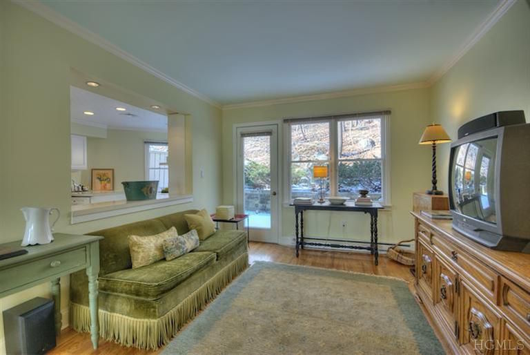
Please note that lots of things are gone. I had moved out already (and took a lot with me.) But I did bring some things back for the photo shoot. The colors in the den looked so lovely when IN the room. It just doesn’t translate here at all.
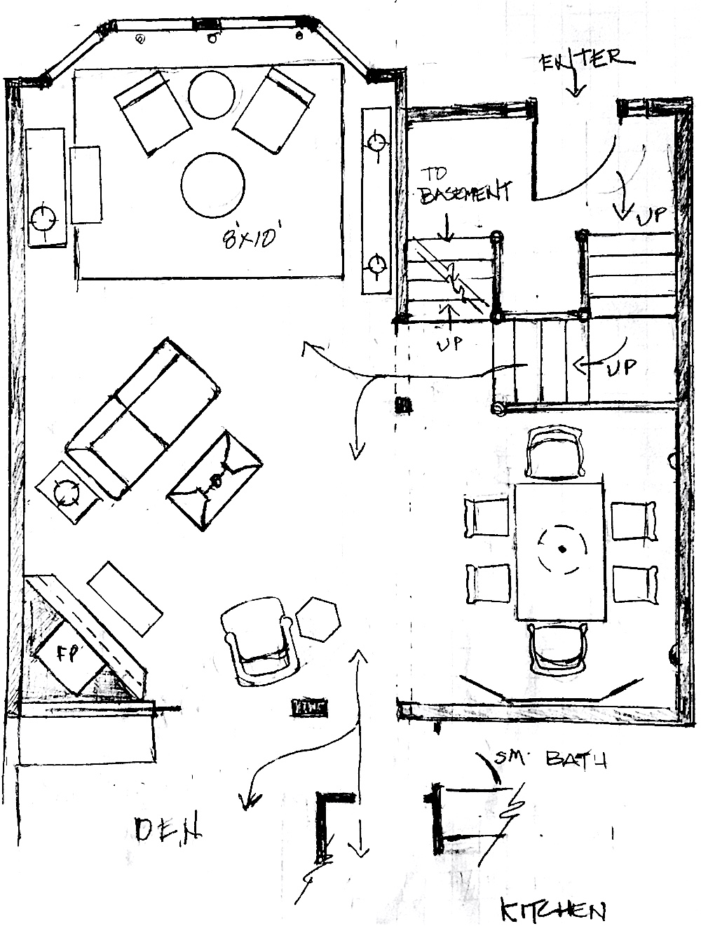
Above is a sketch of our difficult floor plan with the furniture. If we had company and needed more seating, we’d just grab a wicker chair or two. It worked out fine. I liked that the room didn’t have a lot of furniture. I moved the white chair for the photo.
Below is a little messing around I did with the floor plan.
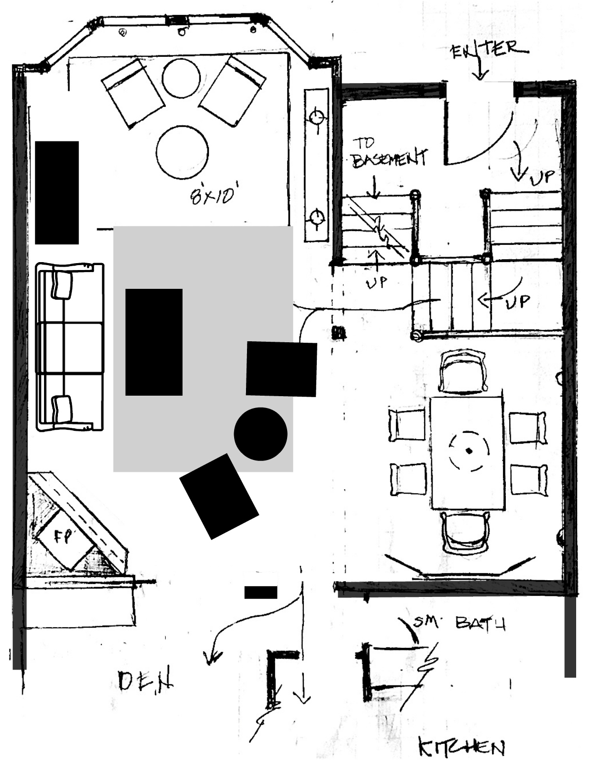 It’s a little rough, but the rectangles in the middle stand for chairs. The piece to the left of the sofa is a chest. It does not look good to have the sofa facing the fireplace directly.
See? This is a very difficult floor plan to furnish.
This is one of those “if only” the room were a foot wider. Just one foot. Because the area adjacent to the dining room table is the central traffic artery downstairs, and I raised two hellions. We needed to keep more than three feet clear the entire way.
Below is a pic from a neighbor who sold her townhouse a few years ago.
 As you can see, she put everything by the bay window.
Okay, guess what I found?
Yes, I found some other images of a unit like ours, only it was an end unit, so there are more windows.
These people ignored the fireplace altogether. However, this plan is impossible, because that white sofa is blocking the entrance by the staircase!
Above is a far less distorted and warmer image of our neighbor’s unit, from the den looking into the living room. Some people used this room as a dining room. And, one neighbor used it as a bedroom.
In any case, I hope this helped those of you who have an awkward room layout, maybe something like this.
There are also other posts where I go over some ways to deal with other awkward floor plans.
One post is about how to fix an open-concept layout.
Another post talks about an open-concept Excedrin headache nightmare!
One of my favorite posts is where I reconfigured a Boston apartment.
By the way, I am still working towards my renovation goals. I realize it’s going painfully slow. But, there is progress.
xo,

***If you missed the chance earlier, Serena & Lily has a VIP (that’s YOU!) access to July 4th Sale with code: SPLASH
20% off purchases up to $4,999.99 – 25% off purchases of $5,000 or more.***
(Sale ends July 5, 2022 at 11:59PM PT)
Related Posts
 The Controversy Over Hardwood Floor Stains and Finishes
 Enchanting Garden Tour in Greenwich Connecticut
 Analogous Color Schemes In Interiors – The Right Way
 120+ of My Favorite Interior Design Books + Gardens!
 Door Knobs – The Good And The Not-So-Good + Sources
 The Most Exquisite Gardens and Landscaping Ever!
 7 of the Hottest Bathroom Trends To Avoid or Embrace?


14 Responses
I love the wainscoting shown in the pictures.
My questions is whether any of your products contain any harmful chemicals, i.e., lead, bpa, formaldehyde or pfas? Is it real wood?
Thanks
Hi Jeannette,
Yes, it’s real wood and hopefully not laden with harmful chemicals.
I’ve always wondered how many architects take the time to visualize furniture in the homes they design.
I can see why you fell in love with that house, it’s got many charms.
Christie, NOT silly to want a place at your age. Know people who are older and just buying their first home. It will happen for you!
Thank you for your honesty in knowing things are hard for others at times also. I am 57 and single and still really want to buy my first place so I can attempt on decorating my way and not answering to a landlord. I have had to downsize and also put stuff in storage just to be able to afford a rental during these ridiculously hard times. I feel silly sometimes wanting to still buy at my age. You are blessed to live and have what you currently do.
Not trying to start a discussion on this topic, but I think we need more women designers and builders. Until then, homeowners and designers will have to get creative with nonsensical living/dining room combinations, stairs in your face at the front door, and my pet peeve, cathedral ceilings for no good reason — all of which I have in my current home. Ugh.
We just moved to a town house with the corner fireplace…ugh! The room also is L shaped. I chose to ignore the fireplace (some can see it and others can’t if there is a fire going) bc I think diagonal seating arrangements look strange and create even more problems. Another nightmare is the length of the long wall. That is even more of a problem IMO than the diagonal FP. I even considered using the Bobby McAlpine trick of using sheer curtains that begin up in the high vaulted ceiling that separate spaces but due to many angles I ditched that idea early on. Also bc of all of these issues I had the entire first floor painted BM Simply White and all of the flooring is French white oak planks. It’s interesting that I managed to put quite a bit of furniture into this space given the problems with the design.
I once had to decorate a family room for a model home. Designed by an architect no less. One wall had a fireplace with bookcases on both sides. Another wall was a very large pair of french doors leading to a deck. A large opening to the living was the third wall the final wall had a very large opening to the kitchen. He squeezed a bar into that wall. There were no walls we could put any furniture on and not a large room either.
So a short sofa facing the fireplace and a chair angled to one side was all I could do. Don’t these architects even think of furniture placement?
Hi Laurel,
I’m dealing with an awkward living room. I just moved in a few months ago. But I had ordered some things ahead of time due to the long lead times. Now that the items have arrived I am coming to the realization that I should have waited until I was in the house & taped out my furniture sizes on the floor. I’m making it work but I may have to forgo end tables. I just don’t have room for them. I created the layout problems for myself. Let this be a lesson for others.
Oh, if only we could stop builders from doing stupid things like put a fireplace in a corner or putting the dishwasher where, if open, no one can get by or open any other cupboards. You should make a list, Laurel. If I were dictatress, I would make them all illegal for you, punishable in the same way as people who leave their Christmas decorations up past January 3rd. I could pay off the nation’s debt and balance the budget with those funds.
“open concept” does present a lot of challenges, yeah, put up some walls and try to make some sense out of it.I have two arm chairs in my condo since a sofa just wouldn’t work.
Great post, and I would have jumped on that townhouse in a second too, before analyzing the furniture layouts. The funniest part of the post was that Rolodex. Hard to believe we actually used those things. And they were like gold!
I love when you do floor plans…and the redo of the Boston apartment is one of my all time favorites!!
I’m looking forward to seeing your plans for your lower level.
Corner fireplaces are always tricky, I see a lot of them working with homeowners! Thinking outside the conventional box, one unique furniture layout I might have explored is moving the dining area to the space near the windows. Next, opposite the corner fireplace I would place a sectional . Where the current dining room space is, I would create a more intimate sitting area with a few built in book shelves with lighting. Sure the dining area would be a little further trek from the kitchen, but it would always look pretty and maybe entice homeowners to dine there more often?