Rooms With Light Walls Look Larger, Yes Or No?

Common’ Laurel. Is that a trick question? EVERYONE knows that rooms with light walls appear to be larger.


Please be careful, sweetie, because your eyes might roll out of your head if you keep doing that. ;]


Okay. I realize that the prevailing belief is that rooms with white or light walls look larger. However, that is actually false. Yes, pale walls will make your room feel lighter and airier, but not larger.

Oh, stop looking at me like I just told you that Little Bo Beep went vegan a decade ago. However, I don’t fault you for thinking that light walls look larger. I’ve read this, as well, countless times.


“if you want to make your room appear larger, paint it white or a pale color.”


It’s yet another of those interior design myths that have proliferated into our mainstream thinking, like two hyperactive gerbils locked in a cage together for a month.

Here ya go. Here’s what I’m up against. Some magazine or blog will write an article or a post.


How To Make A Room Appear Larger.


That’s a great headline. Very compelling; everyone wants a small room to appear larger.

Here are some quotes from some articles I found.

“White Rooms Always Look The Largest. ” ~ Forbes.

“Maximize your space by using light colors, specifically on the wall.” ~ Apartment Therapy

“For the illusion of a larger room, use a color scheme that’s light… ” ~ Lowes.

Here’s a good one. This article about what colors make a room look larger has four light walls and two very dark colors.


Which is it?


I don’t see how it can be both. However, other elements might affect how large or small a room appears.

1. The amount and size of the furniture

2. The light coming into the room.

3. Reflective surfaces

4. Room layout

5. Ceiling height

6. Floor and ceiling colors


What’s wrong? Why the puzzled look?


Well, Laurel, you haven’t convinced me that a light, bright wall color will make a room look smaller.


Okay, sure. I understand. It takes time to turn the ship around.


Let’s try something else. If you want your legs to look thinner, do you wear white or dark pants?


Well, dark pants, because my legs will look smaller and thinner. Therefore, dark colors will make a room look smaller. Right?


Sorry, no. The dark color makes whatever it’s on recede.


How does that translate to walls?


It’s the same principle.

Dark colors recede.

Light colors advance.

Therefore, a light wall reflecting more light appears to come towards us, making the room appear to be smaller.


What about white ceilings? Are you saying that painting them white will make them appear lower?


Yes, that is true.


This is a matter of physics, not an opinion, not a debate, but pure science. Here is the proof.


Screen Shot 2015-07-08 at 3.04.53 PM


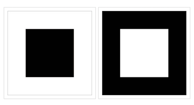
All corresponding squares are identical in size, whether black or white.


The black recedes and the white projects. The white square also looks larger.

Again, it’s not larger. The two squares are the same size.


Okay, Laurel, so that means that because the white square looks larger, it means the room will look larger? Right?


Sorry, no. I get your thinking; however, it’s the same line of thinking you had with the black pants.

Four walls and a ceiling painted white will look bigger and closer than they are. Therefore the room will appear to be smaller.

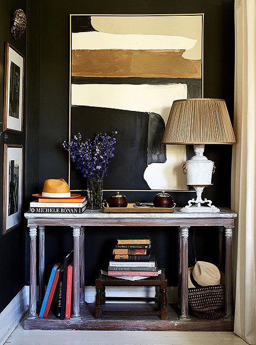
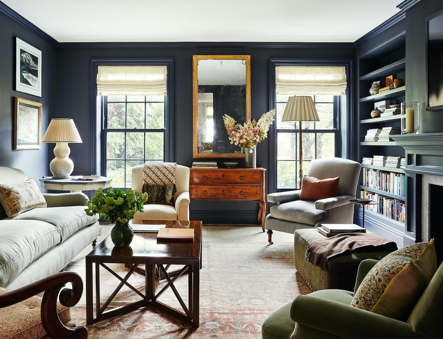
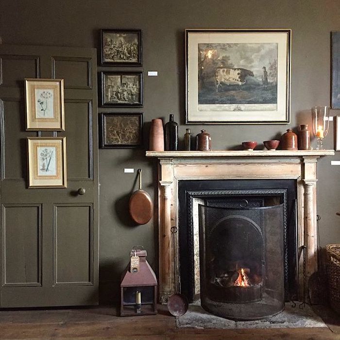
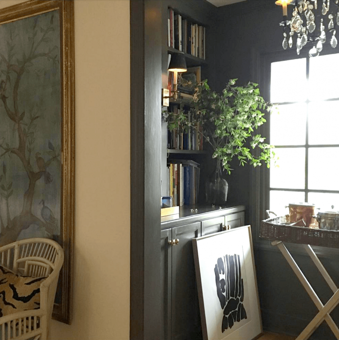
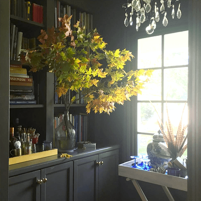
But, here’s the thing. For the most part, I think that large open spaces look best painted a light wall color or white. However, I love small, intimate, dark spaces. They feel cozy and bring depth to the overall scheme of a home.


Park and Oak Design - fabulous vignette bar - painting


Let’s look at some more handsome rooms painted a deep, rich color.


abigail-ahern-black-bathroom-lonnyLonny

Notice how the walls appear to go deep into space.

William Mclure_vignette with dark walls beautifully styled console table

William McLure

I’ve always adored his decorating style, and this bedroom he carved out of a loft space. Please follow see more of William’s gorgeous rooms and art here.

Also please follow William McLure on Instagram.


devol kitchens stroage white dishes - dark gray green cabinets - classic kitchen

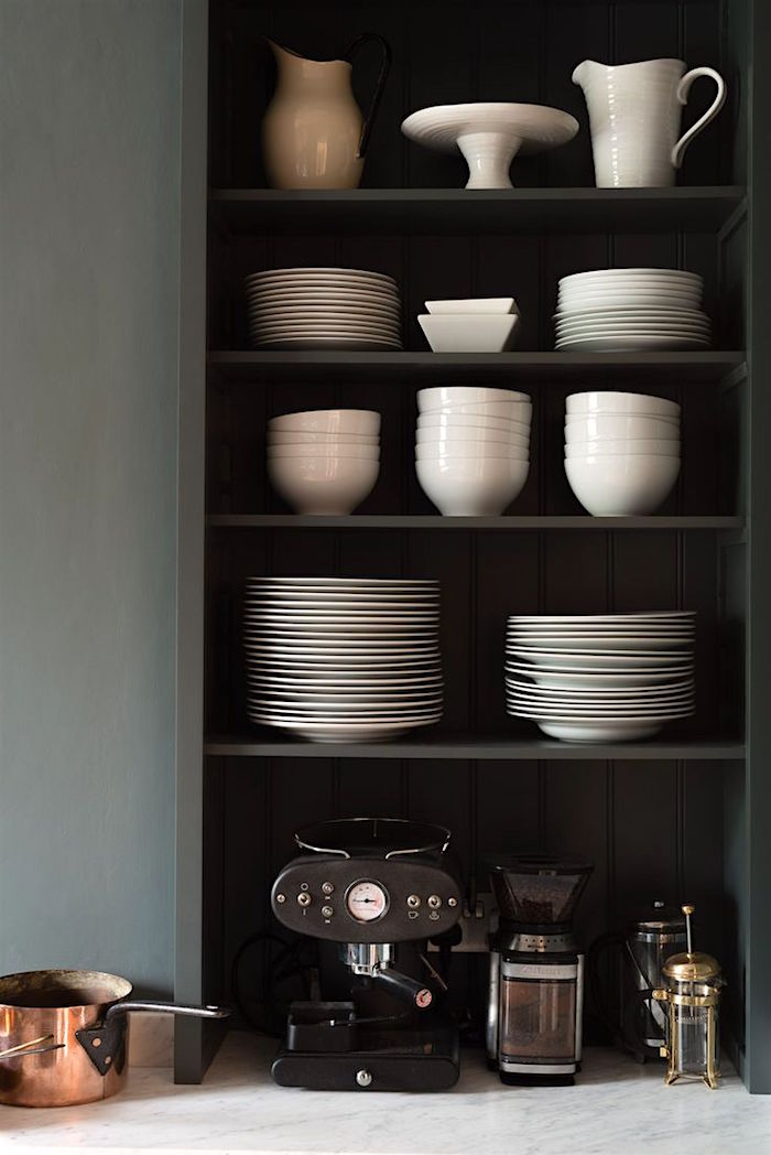
Painting the cabinets a deep charcoal gray makes for a beautiful backdrop for the white pottery in one of my favorite DeVOL kitchens.


Cobble Hill Brownstone - McGrath II - mother-daughter interior design teams

McGrath II

Please check out this post about two dynamite mother-daughter interior design teams.


farrow-ball-black-white

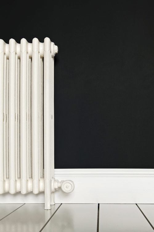
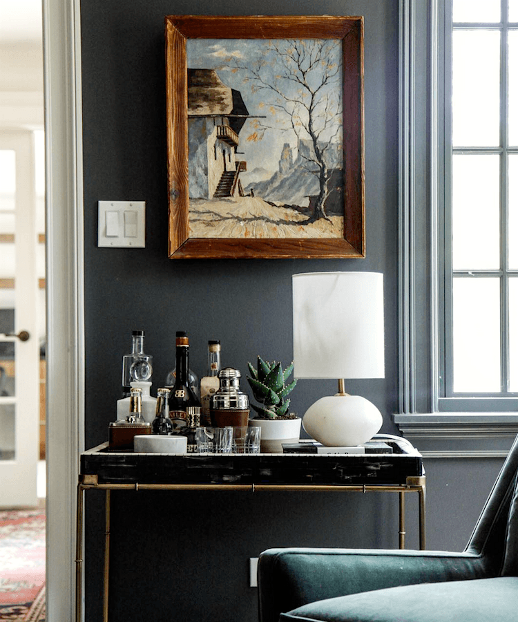
Notice the white “popping” forward against the receding wall.

By the way, I do like this radiator.


The+Makerista-Dining+Room-Black+and+Blue-Farrow+and+Ball-Williamsburg-ChandelierThe Makerista

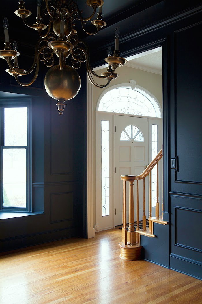
Excellent blog post (if you click on the link) explaining her process and how she hung the cool chandelier. Notice how fabulous colors and the warm metal looks juxtaposed against the cool dark blue. Notice how she took the black all the way up and onto the ceiling. Love.


farrowball1Farrow and Ball Stiffkey Blue

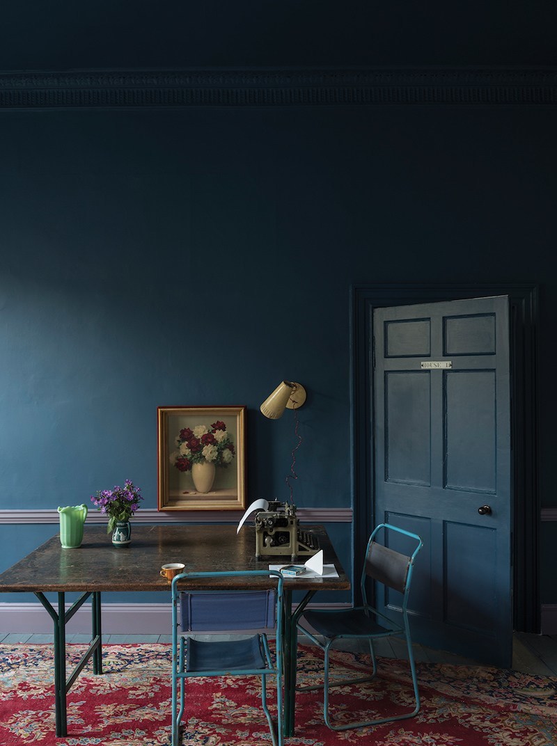
A sea of infinite inky blue. I love how the color draws you into its depths, like looking into a deep dark ocean.


Using darker walls for smaller rooms and areas is a great way to create variety and interest in your home.


Architecture - Bill Ingram - Mallory Mathison - narrow hallway-moorish-style-ceiling

Architecture – Bill Ingram – Mallory Mathison

A rich, medium blue has a darker blue ceiling. I love this accent in this design.


kitchen mock-up January 31, 2022 white marble counter

A deep wall color with a cult-like following Is Farrow and Ball Down Pipe.


Farrow & Ball Down Pipe

It is a charcoal gray with slightly blue-green undertones. I’ve never used it, but many consider it the most fabulous color ever! For more terrific Farrow & Ball colors and rooms, please go here.

(Did you know you can get all of the gorgeous Farrow and Ball paints and wallpapers online, now?)


Farrow & Ball Pantalon


Farrow & Ball Pantalon

Oh, I see they’ve brought back Pantalon in a new collection.


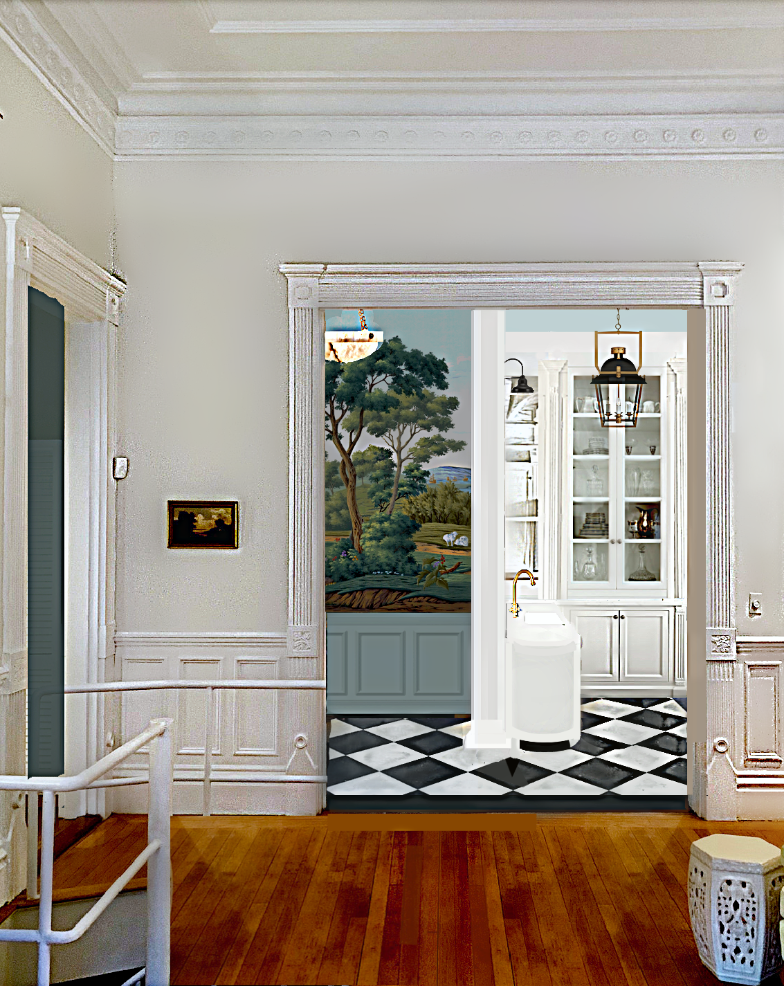
I love small areas like the 3′ x 3′ vestibule connecting the den, bathroom, and linen closet, and I’m planning on painting this area a deep color.


Maura Endres dark green library alcove

I’ve always adored Maura Endres’ home. And one of my favorite parts is this incredibly charming, tiny library off of her living room. Please follow Maura’s fantastic Instagram account if you’re not already.


Maura Endres library alcove in fall - Pratt and Lambert Tobacco


Benjamin Moore Knoxville Gray hc-160 mud room

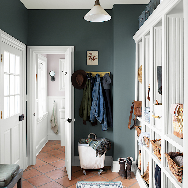
Benjamin Moore Knoxville Gray hc-160 is a terrific accent in this mudroom.


Well, I hope I’ve won you over to the dark side. ;]


If so, will you gently correct folks who insist that light rooms look larger? They don’t. They might look lighter and airier, but not larger. This is why LARGE rooms (with a lot of light) look wonderful painted in a light color.

Of course, it’s absolutely fine to prefer light and, or bright colors. However, if your room is a low-light room, no amount of white will make it light and bright. I find that low-light rooms often look best in deeper colors, provided they are small to medium rooms. Please always remember to test your paint colors.


painting-myth-make-rooms-smaller or room appear larger


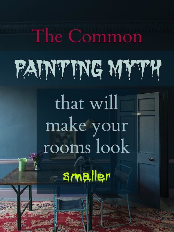
If you want to make your room appear larger, paint it a pale color. no, no, no!”


Here are some other tips when using dark colors in your rooms to make the most of them.


Dark colors love:

  • white
  • brighter colors
  • mirrors and metal, especially gold
  • Black loves dark blue.
  • Cooler dark colors will make the room seem the largest. (Another myth is to paint a room a warm, bright color to make it larger, but that’s a different post.)
  • To make a ceiling appear higher, paint it darker than the walls.
  • Dark floors will appear to go deeper.
  • To make a room look longer. Paint the back wall dark and the side walls a light color.
  • Lighting the corners of a dark room is essential.
  • While I love matte paint, I generally favor an egg-shell or even a satin finish for blacks and navy. However, the walls must be very smooth. No shiny orange peel, please!


You might also enjoy the following posts featuring decorating with dark colors.


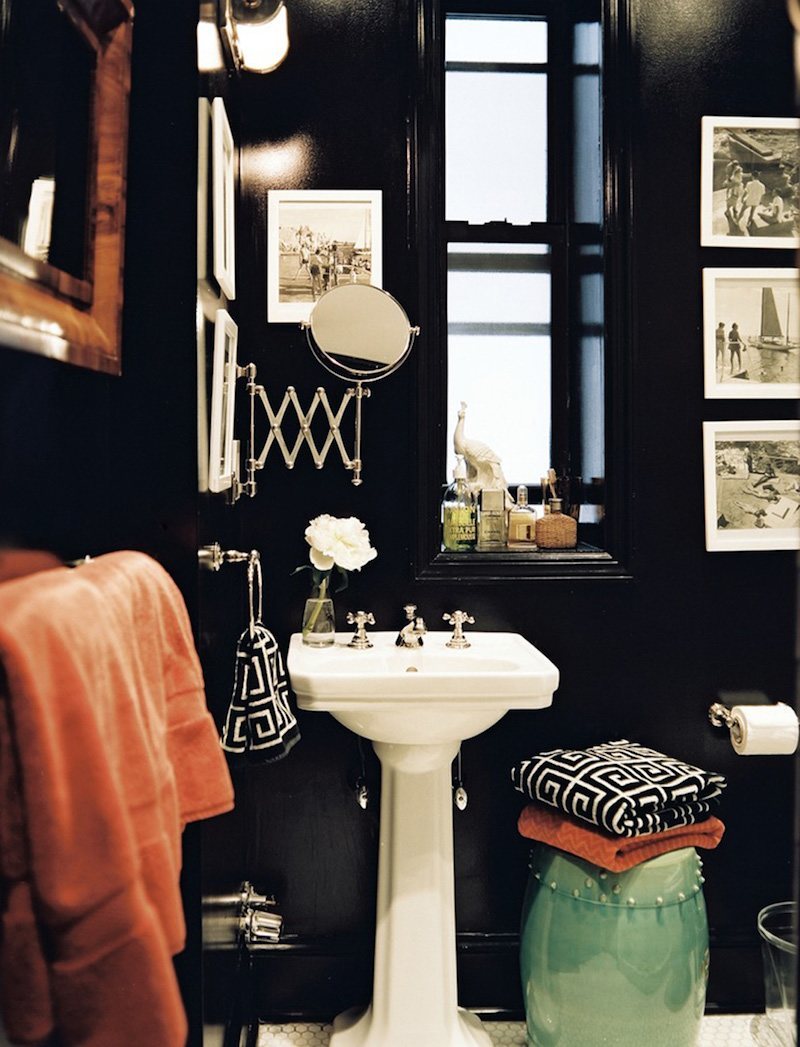
You might also enjoy this post about dark bathrooms.

Dark rooms, are they handsome or depressing?

Small Living Room Decor, Should it be pale or dark?


Years ago, however, I visited a home that was predominantly black and dark blue on the walls and furnishings.


It was absolutely the most heavenly thing I’ve ever seen; deep, enigmatic, and very comforting. I could’ve lived there too.

Please see the new black interior design.

Beautiful Black and Blue Rooms

Would you paint a room a very deep color, or black? Have you done so? Any tips I might’ve missed?

xo,


PS: This weekend’s HOT SALES are exceptional. One of my favorite and rare sales is going on right now for a limited time.


32 Responses

  1. I have you and your beautiful, funny blog to thank for the inspiration and confidence to just go dark in my tiny tiny bath. It works! When we moved into our 1938 house, I was pretty sure that the itty bitty, windowless 1978 bathroom annexation with its powder blue tile, band-aid colored walls, and elbow conscious 31” passageways, just had to go. The encroaching patches of ceiling mold that loomed due to our steamy shower habits didn’t help either. But then the color dark blue came to the rescue! That, and new ventilation, lighting, and artwork.

    I really enjoy my little bathroom now..it just feels euro tiny. I’d love to send a photo..including my blown up Hiroshige print ..not sure if you want photos in your comment section.

    Thank you so much Laurel!

  2. I am also interested in a blog post about decorating for one’s climate and whether paint colors affect perception of heat!

  3. Laurel, please address the comment from Lauren March 13 at 3:29 pm. I too love the look of dark rooms, but have major concerns about the possibility of creating something stifling in the hot and humid south. I’m also not sure if the orientation of the room will matter, since south and west will be considerbly hotter than north and east. I love all your posts, I learn so much!

  4. A few years ago, I had our living room painted in Van Deusen blue as well- and I love that color! I used my salmony /navy Persian rug, white/blue toile curtains and all the walls have gold framed oils and watercolor paintings. I never get tired of the color..

  5. Hey Laurel: You slipped a photo of your new home looking from the staircase into the hall and kitchen. Would love to see you “paint” a pretend dark color in your apartment for all of us to see…maybe even the ceiling? Your home is gorgeous, BTW!

  6. I decorated my south-facing 10×16 office in a dark blue scheme. Wall is De Nimes by Farrow and Ball, with window trim in Railings. It’s so cozy. Very English Library.

  7. Lisa D, Yes, yes, yes! You’re absolutely right, and it’s not just the meticulous paint job, it’s the crisp lines of everything. Take that McGrath II room and add curtains — that would ruin the effect at once. Have a closer look at the details: no trims (with perhaps one exception, the sides of the cushion on the chair with the quilt over the back — and the quilt gives more sharp lines), nothing to obscure the sharp outlines. Put a more ornate mirror between the windows, and that wouldn’t work either. The total attention to every detail here is fantastic.

  8. For me, making a room feel smaller or larger is not as much a consideration as how my energy level and mood tips in a light or dark room. I am pretty much solar powered so pale wall colors are what I like to live with. We did do the bed wall in my girls’ north-facing room a deep green with the others a light warm gray, and Daughter #1 said in awe how it felt like that wall was farther away 🙂

    If I ever have a library/reading room in a home I would consider a midtone rich color for cozy, but that would basically be the hibernation room as far as usage goes!

  9. I just have to comment on this, even though it digresses from the subject of this post: I had to ask my self what it was that I loved about so many of these rooms, and it was the absolutely beautiful, crisp, meticulous paint jobs.

  10. Interesting and informative post, Lauren. It got me to wondering how climate where one lives plays a role in the light / dark question. My home is painted BM’s Chantilly Lace, and I love it. However, I am also attracted to rich dark colors and when I can afford to paint my bedroom am considering going dark there. But I live in Santa Barbara, CA, about two hours north of Los Angeles, on the coast. No snow, obviously, and we have a lot of sunny days and heat. I dread summer, keep my windows and blackout drapes closed all day and in some windows even lean oversized cardboard pieces wrapped in aluminum foil up against the double-paned windows to help halt the heat coming inward. (It seems to help.) But I can’t help wondering, since I hate heat and summer and daylight saving time, if that should influence my choice of light or dark, assuming I love both equally. In my climate would dark feel hotter? If I lived in a much colder climate would it feel warmer and would white feel colder? How important is climate, if it is at all, in making interior paint choices?

  11. On, what a delight! I have been thinking about paint for my living room. It’s north facing and quite dark most of the day, but it has the most amazing wainscoting and ceiling medallion, and a beautiful fireplace, and I love it and want it to be fabulous. The old owners had it painted BM Silhouette, which is a dark purple/brown gray (I do not like it!) and all the trim in the house including the living room is BM White. I love the dark walls! Just not that shade. The dining room next door has a lovely crimson damask wallpaper, and I’m trying to decide between a warm black and a deep teal-tinged navy for the living room. I worry that something like BM Onyx or Black Beauty will be too stark with the very white wainscot. But I want the drama!

  12. Many years ago, in our 1848 Cape Cod Greek Revival, I painted our small downstairs bathroom/shower Benjamin Moore’s Hale Navy in a satin finish. The paint has held up well. The walls have white beadboard and white shutters for the small closet. Tile and floors are a light beige limestone.
    Artwork on the walls looks beautiful against the dark paint. Many compliments through the years and I still love the color!

  13. I love rich colours but “cozy” is not how I want to feel in any room where work happens. Since my office is in my bedroom, even that is out. It I had a formal library, I would definitely go dark. I also think I might tire of statement colours. I like the lighter neutrals. That said, not a single ceiling in my home is white. My kitchen has white walls and cabinets but the ceiling is a medium blue-green (BM quiet moments). I love a coloured ceiling. my favourite accent colour is black. I have black windows, fireplace, furnishings, banisters, vanities. Love BM Onyx.

  14. The thing is, I don’t CARE whether it makes the room look larger or smaller. I dislike dark colours intensely. Every time I go into a room with dark walls, I want to run right out of it. It feels like a cave. Depressing and claustrophobic. No thanks.

  15. Laurel is 100% correct. Black can be very polarizing, when I was very young and just beginning to make my own home design choices, everything was light and bright and quickly boring. 40 years later, black is my favorite color and is the recurring theme in every room of my house and wardrobe. It is the only color I have never tired of in over 30 years as a designer. I have convinced many skeptical clients and their painters over the years!
    Sherwin Williams Tricorn Black (eggshell) is a wonderful ‘light ’ shade of black, it is soft and not harsh. Black is sophisticated and not understood by everyone, but don’t knock it if you haven’t tried it!

  16. Laurel,
    I LOVE this post! Agree 100% that small rooms without a lot of light are so much cozier with dark walls. Our tiny guest room with one window gets glorious sun for 15 minutes a day. It is painted dark chocolate brown and many guests, when given the choice, will choose it over the large light guest room. As you know our powder room is black, sunroom and master black as well. Our master bath ceiling is black and recedes especially with the moulding applied on the ceiling painted white.

  17. I had a dark navy bedroom that I loved. But the walls were hard to maintain because if I rubbed up against them, the would smudge and leave marks. You could not dust or touch them because it left white marks.

    What did I do wrong? Must they be high shine to be able to wipe clean?

    Would love your advice. Thanks

  18. I have the perfect powder room to paint a dark color. It is already painted a dark smoky gray above a white bead-board paneling with a white ceiling, white pedestal sink & toilet & black & white framed art. It is windowless yet leads into a light-filled laundry room. So there is a white 6 paneled door there and a white 6 paneled entry door to the powder room.
    I’d like to paint the bead-board & interior trim, baseboards & crown molding the same dark gray & leave the ceiling white and add a gold framed round mirror above the sink & gold & black lighting.
    My question is should I leave the doors painted white, or should I paint the interior sides of the doors the same dark gray so that when they’re closed the interior walls of the powder room all are dark? Or should I leave the doors white & still paint the trim around them the dark gray? Suggestions please!

  19. Laurel, sooooo I get it BUT I tried this some years ago. My living room is not large and I decided I wanted to create a jewel box feel. I painted the rooms a dark mat ivy green. 3 coats for depth. It was lovely until it wasn’t. I switched to a Farrow & Ball color – Mouse Paw. What really opened the room wasn’t the color. It was when the drapes and shades came down for the painters. I think the room grew huge because of all the light that came in, which is too your point about light making a room seem larger. The drapes and heavy shades never went back up. I love rich, beautiful color, yet I have to admit to preferring lighter walls.

  20. Good morning,
    I love dark painted rooms! But mostly when they receive little natural light. Those types of rooms feel so cozy to me.
    In my new home I originally was going to paint the living room a dark shade of blue. But then I realized it gets a lot of light so I changed course & went lighter.

  21. One of the best pieces of advice I gleaned from studying this blog was Laurel’s guidance about paint color and the light vs dark here. I have a smallish, north facing, without a lot of windows/natural light, original unkitchen in a historic register apartment. Lots of corners, plaster and stucco walls, with exposed wiremold raceways on all the walls. When I purchased the place it was freshly painted a light, soft white. All you could see were shadows, corners and all the uneven things happening on the wall surfaces. I decided to take a leap of faith and paint it Benjamin Moore Van Deusen blue, a deep almost navy blue. Total magic! The walls pushed back, and all the angles, shadows and corners, all the uneven textures, flaws and electrical work seem to vanish. The room became warm, inviting, cozy, updated, and has even been called chic, haha. So many compliments, even from various contractors that want to know the color. The cabinets, two doors, trim and appliances are white. There are brass/gold, black and brown/wood accents. Plus bright, colorful wall art and a Persian area rug. Laurel is 100% spot on.

  22. I just bought a historic home (1780) that the current owner slopped Killz all over. It is the most antiseptic, horrific white. Thank goodness the old floors were left alone and the brick. But I’m reading all the paint color posts with great interest!

    All the architectural beauty is lost in a sea of undifferentiated white.

  23. I’ve thought so much about this question because I live in a north facing ground floor 1924 Cambridge unit with big windows and strange layout of small spaces. Special thanks to Jim/Parnassus and GL for saying what I think, only more clearly and from more experience. I always look for their comments first. Laurel, you have created not just a great blog but a good community.

  24. I wish I had the guts to do dark walls with lighter furniture. But I’m afraid it’s white walls for me!! I saw someone did an optical illusion in her living area, had what looked like drapes in this one area and the wall between the “drapes” was painted a teal-green. In front of the teal-green wall was a vase of flowers on a pedestal. Interesting.

  25. I have a small bedroom that was first painted a very light color. It always felt so small, even with just a twin bed. Then I decided to make it a guest room with a queen sized bed. Three walls – where the door is, the wall across from the door with the window and the wall to the left of the door – are all a soft grey. The wall that you don’t see until you are in the room, at the head of the bed, I painted Benjamin Moore eggplant. The room feels so much larger because that wall recedes. The room has a wonderful cozy vibe but feels larger than it did when it was a light color. It has the perfect mood for a bedroom – restful. My comforter has both the grey and eggplant colors, so it pulls everything together.

  26. Hi Laurel, Does anyone remember Little Bo Peep ammonia, or am I giving myself away?
    .
    I think it is difficult to reduce paint colors to science and optical principles. A lot also depends on the lighting in the room, and the appearance and placement of furniture and objects. To me, lighter rooms feel larger, and although I have new thoughts on colored walls (largely thanks to your photos and inspiration), I still have a gut instinct against very dark rooms, small or large. Also, as I have mentioned several times now, mosquitoes and various invaders can hide against a dark background, an important consideration for warm climates. My feeling is that dark or oddly colored walls can look sharp or up-to-date at first, but I think I would tire of them quickly.
    –Jim

  27. Yes, Laurel, the darker colours do indeed recede. I used this principle for our sitting and dining room ceilings, where the boards between the gloss white beams are painted red in one room and green in the other — so the ceiling looks taller than it is. This principle also works in the garden: a block of white hydrangeas at the far end of a view is not a good idea as they will come forwards and make your vista appear shorter.
    But, but, but! I took your pic from McGrath II and turned it into a black and white image. The dark walls do indeed recede. But the balance of the b&w image is towards pale, with the ceiling and floor, the upholstery, the books, the windows, and the lamp balanced by the large bouquet of flowers. In fact, despite the dark walls, the room appears light and airy. It’s this balance, I think, that makes this room so successful.
    Turning an image in colour into black and white is a useful tool for house and garden as it helps us to see the placing of major items and thus the way to balance shapes and colours.
    Here’s another thing: in three of your photos, we’re looking through a room with dark walls to somewhere else filled with white or pale tones. The dark has in fact become a background to the distant pale which comes forward as the eye focusses on it. And looking through something to something else is always attractive, drawing us in.

  28. Again, always a fun read on a Sunday morning. If I had a powder room I would consider dark walls, however, in any “utility” room, what I will call kitchens, living rooms, I would never do it. it would be like being in a tunnel looking out at the light. I would consider it for a bedroom, light walls could contribute to keeping one awake, especially at times of full moons when the light could reflect off a light wall. I medium color could work in a :utility” room, but anything darker would never work for me.

  29. I adore dark walls in small rooms. A few years ago, I finally achieved my dream, “jewel box” powder room. It’s a tiny room – 6 x 5. First, I had millwork added; crown molding, chair rail with picture frame molding under the chair rail. I then had it painted a beautiful dark blue with Satin Impervo – 3 coats, sanded in between each coat so it appears lacquered. I have done the walls gallery style. All the frames are gold and the art is black and white. I think this is key in a successful dark room; there must be a bit of white for “relief”. I really, really, love it! It doesn’t look any smaller than when it was painted a light color and, it’s MUCH sexier, LOL!

Leave a Reply

Your email address will not be published. Required fields are marked *

This site uses Akismet to reduce spam. Learn how your comment data is processed.

Welcome To Laurel Home!

laurel-aarons-18th-e1456449963926

Hi, I’m Laurel, and Laurel Home is the website and blog for Laurel Bern Interiors.
I’ve been creating new-traditional interiors since 1988. The blog is where I share all.

New Edition, November 2022! Get The Indispensable Guide For 100s of Home Furnishings And Interior Design Sources That Everyone Is Raving About

laurels-rolodex-final-book-cover-master 9th edition 22-23

laurel home archives

Categories:

Please click the image below for more info about my rockin’ Interior Design Guides for 2023!

Laurel Home Interior Design Guides 2023
Amazon ad

please click below to check out my favorite decorating & design books

Laurel Bern's Favorite Interior Design and Decorating Books
Subscribe To The Laurel Home Blog And You Will Receive A FREE Guide Where I Share How To Get Your Paint Colors Right, The First Time.