

I recently received a letter from a woman struggling to choose a north facing room paint color.
Dear Laurel,
The entire back of the house faces north, and on top of it, there’s a big hill behind us. It’s a townhouse, so the two rooms are the kitchen and den. The kitchen has a kind of bay window that captures some of the western light, but the den is pretty dark except for about an hour for two weeks out of the year. :]
I recently painted the room, thinking that I wanted to brighten it up and make it seem larger. Our sofa is brown leather, and there is a beige rug. I hate it. It’s cold, boring, and depressing, not light and airy.
If white won’t make the room feel airy, what paint color will work for this dark north-facing room to make it feel the way I want it to? Thanks for any light you can shed on this.
Susan Stumpt
***
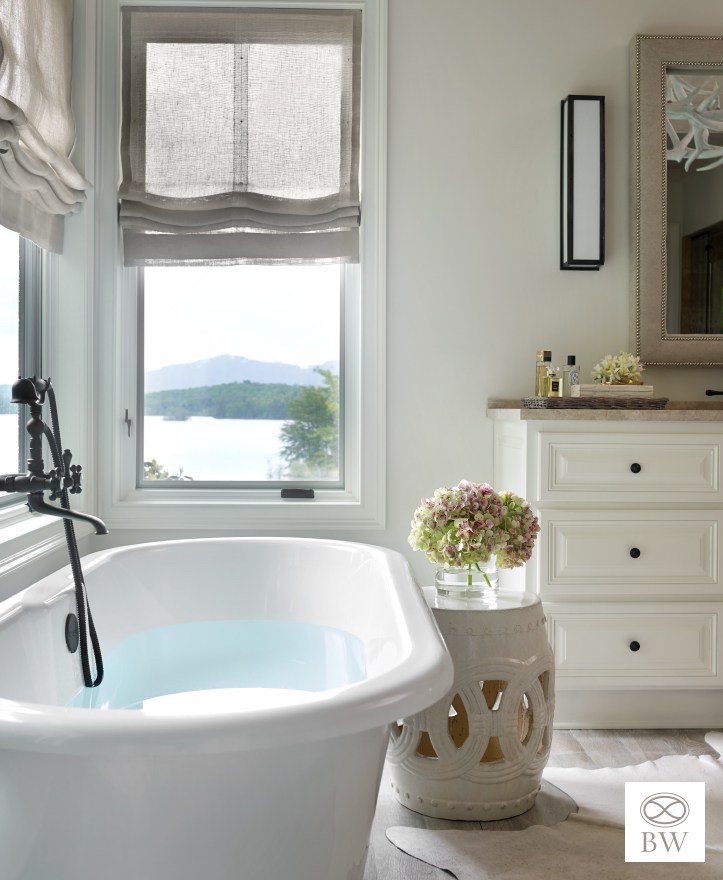
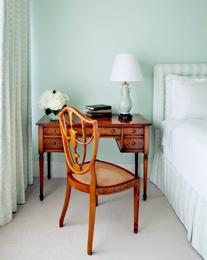
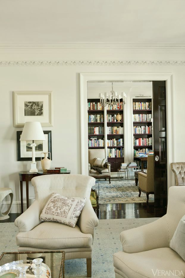
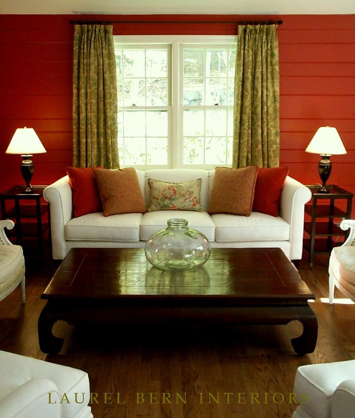
Ahhh, yes, the north-facing room paint color challenge. Susan is another of my made-up characters, and except for the furnishings, she is describing the den in our old townhouse. You can see it here.
It’s true. When we first moved to the house, the entire place was painted Benjamin Moore China White, including our north-facing den, which also faced a large tree-lined hill.
China White has a lot of gray in it, and that is exactly how the color looked in that small den. It looked gray. If one has a dark and/or north-facing room and wishes to have a pale gray, then China White might be a consideration.
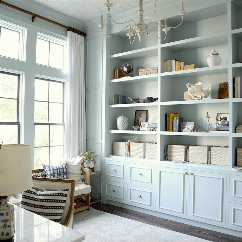
This, I think is a beautiful use of Benjamin Moore’s China white in this .
The first thing to remember is that a dark room is never going to be light and bright.
That is from the outside light source—the sun. Of course, we can artificially make it quite bright. But you can’t make a room something it’s not.
Here are my thoughts, gleaned over the years, regarding north-facing rooms and rooms with less natural light.
(this is a post about rooms with NO windows)
Generally speaking, a north-facing room will have more cool, gray-tinged light. It will have a grayish, blue-ish light whether there are few or a lot of windows. The difference will be that if there are some big windows and no obstructions, it’s possible to have quite a bright north-facing room. However, most north-facing rooms are not bright.
In addition, just to add to the difficulty, your room might not be facing due north. It might be leaning to the east or west. And there can be multiple exposures in one room.
The worst experience was with a room which faced due north on one end and due south on its opposite end. The result was a variation in shade, so extreme. In that case, I recommend a warm white.
However, there is one clear advantage to having a north facing room.
And that is, that you will have the most consistent light. You probably already know that is why artists prefer to work in north facing studios.
Here are some other important points to consider when choosing the best north facing room paint color:
A south facing room, in the morning is actually like a north facing room, as the sun is out of direct range of the windows. And thus, you will receive the cool shadowy light. But only in the morning. In the late afternoon, of course, you will get the opposite.
Therefore, I feel that the south facing room is the more difficult light to work with. However, the reason that I don’t think it’s mentioned is that most people love getting a lot of natural light in their rooms. And it is easier to block it than it is to create it.
Another important idea is what happens when it is cloudy and gray outside?
Well, there goes your sunny, warm southern exposure. How come nobody mentions that? And how come they don’t mention that in the morning hours, a south facing room can be just as dark and shadowy as a north facing room? Believe me. I know because I am living with it!
But, a room, like my bedroom, for example that has three large windows facing south and west, is still pretty bright; even on a cloudy day.
Here’s what I’ve observed regarding my own bedroom that is painted Benjamin Moore White dove around the beautiful Mural Sources Chinoiserie panels and also the trim and doors when it’s a cloudy day as it is today.
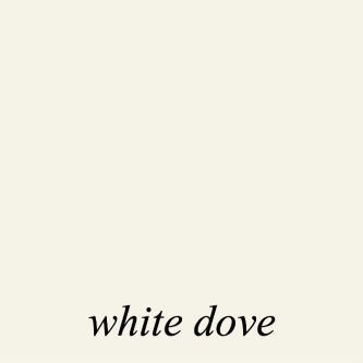
The color is much more even and yes, darker, but also, the light seems to bring out the yellow in white dove, so that the color reads as a beautiful cream; not really a white. If you want white dove to look super white, pair it with black or navy. It’ll look very white, in that case.
While we’re discussing my room, I want to divert from the main topic for a second to discuss whether the pale room looks larger or smaller than it did when it was painted Benjamin Moore Tropical Dusk.
I wrote this post about the misconception that light colors make a room look larger.
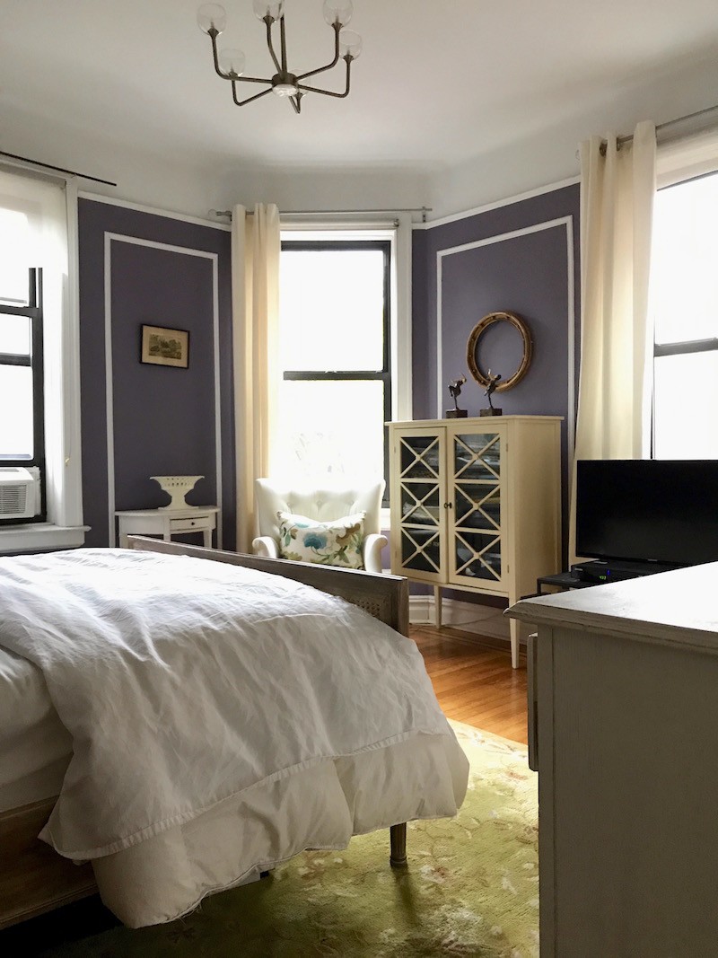
In the case of the old bedroom, shown above, there’s a piece of moulding where the Tropical Dusk stops.
Now however, it’s gone. The lack of interruption definitely makes the ceiling appear higher. And the room does feel lighter and more airy. What I notice, however, is that the room feels more rectangular. If I am lying in bed towards the two book cases, that wall feels closer to me than it did when the room was Tropical Dusk, thus distorting the shape of this nearly square room.
Honestly, the room does not appear larger or smaller. It feels like it’s a different shape! Very interesting, I think. And, it’s also a lot less choppy and thus, more soothing. Me like!
Let’s get back to our topic, because we have several more issues to consider when choosing a paint color for a north facing room.
One, is the size of the room. Larger rooms do tend to look better painted pale colors, be they bright and sunny, or dark. That’s not an absolute because I can show you some stunning large rooms not painted white. However, they usually have a healthy amount of white in them. Here’s one of my favorite examples of that.
And this brings me to the second important point which is to stop expecting the paint color to be the cure for whatever ails you; decorating-wise, that is. It is not the cure. It is only one element.
Three, what is the room being used for?
The colors for a north facing library are apt to be different from a north facing bedroom. (that post asks if you can use gray in a north facing room)
Or, what about a north facing dining room?(lots of great colors here for a north facing dining room)
And four, is the fact, that at night, it matters not the exposure. Right? So, if it’s a room that’s almost always going to be used when it’s dark out, who cares which way the windows face?
Plus, there is always going to be some odd lighting situation that defies the laws of physics, or so it seems. Or, you know the room needs to be color X, but your spouse hates color X.
Decorating is a challenging business!
Still… are there colors that look better in north facing rooms and colors to avoid?
Yes, for the most part. Since north facing light is cool, if the paint color has any gray, green, blue or lavender tones, be they under or over, those are probably going to be magnified. And contrary to what I’ve read, might look grayer or they might not. The color could look brighter!
However, sometimes darker, grayer or brighter is the desired affect. I’ve probably told the story of the north facing bedroom that whatever we put up, it looked green. Even pink looked green! Finally, we just went with a beautiful cream which looked like a pale celery color and it ended up being very pretty.
Please don’t ask me which one because I couldn’t tell you if my life depended on it. But, it might’ve been Benjamin Moore Mayonnaise 2152-70. This is a lovely color in a dark or north facing room. You can see an image of Mayonnaise in this post that has some of my favorite paint colors.
Since the light tends to be cool in a north facing room, we don’t want our room to look even more cold, and so cool grays and blues might not look as good in your north facing room.
However, if you love the idea of having a light blue bedroom, there are some pale blues that are all in the Laurel Home paint collection that you could try. (samples first please.)
And actually, most of these bedroom colors would be fine in a north facing bedroom.
Here are three, but there are more in the Laurel Home Essential Paint and Palette Collection.
Wickham Gray – We did this color a few years ago in a very dark entry/mudroom with almost no natural light. The darkness actually brought out the blue-green in this cool gray color, but it was super pretty.
Opal Essence – Good for north facing room paint color – J and G Design-Washington DC Home
via @oldseagrovehomes on instagram – Beautiful account on insta.
Woodlawn Blue office. How pretty is that!
Of course, Quiet Moments is always good, no matter the light.
For a darker blue, you might try Van Deusen Blue, another Laurel Home paint color.
We used that in this not dark, but still north, north-east, east facing family room, eating area and windowless kitchen. This part was an addition, actually ten years old now, which blows my mind!
The kitchen you can see in my portfolio as well as a few other images. The kitchen and trim are Cotton Balls.
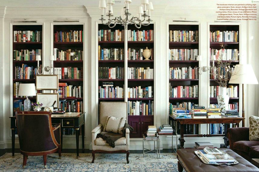
Over-all, however, the very best colors for your north facing room are the warmer tones. Warm whites, creams, khaki, warm gray, green and warmer blue shades.
But, again, even if I have to repeat myself a thousand times. Do not depend solely on the wall color! It is imperative that you get the “bones,” architecture, envelope— whatever you want to call it, in place, FIRST.
Please allow me to demonstrate this philosophy, that is pretty much at the root of everything I write about.
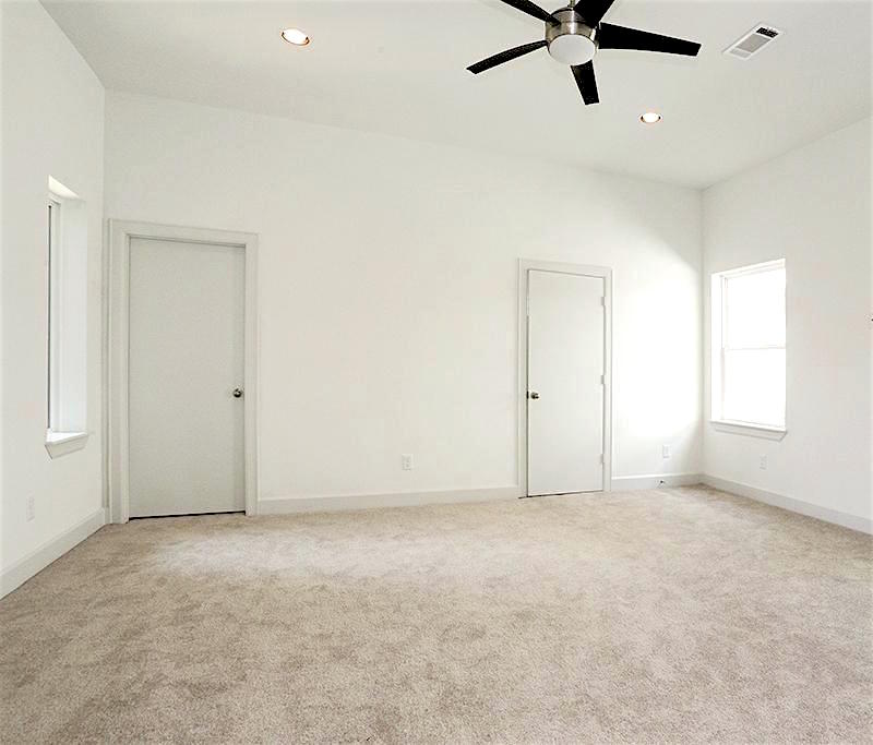
It’s the same color as in this plain-Jane room.
Well, if that doesn’t drive the point home, I don’t know what will.
We get into trouble when we consider elements of a room in isolation instead of as a complete composition.
I wrote the woman back and told her that it’s almost definitely not the paint color that’s appealing to her. There’s nothing special about it. It’s everything else that makes this room soar.
Therefore, even if there’s a color on the “don’t use that one” list that you’d like to try, why not just make a sample and see how it looks?
Amen.
So, Laurel, are you saying that almost any color can be used in a north facing room as long as we get the bones right?
You know, in most rooms, I have to say, pretty much.
Of course, we haven’t touched on lighting low-light and night-time rooms in this post. But, you can read more about lighting here, here and here.
Still, I realize that this is too broad, so I’ll leave you with some of my favorite colors for low-light and north facing rooms.
Benjamin Moore Paint colors that look great in north facing rooms.
Some have wondered if you can paint a north facing room white and absolutely, I think that you can. My favorite, clean, soft, non-yellow white from Benjamin Moore is:
Benjamin Moore Cotton Balls oc-122
My living room
Cabinet is Cotton balls and the walls are Hawthorne Yellow another great shade for a north facing room
Benjamin Moore HC-4 Hawthorne Yellow – My room does face south, however, any time of the day, sunny, cloudy and especially at night, it is fabulous.
Benjamin Moore Ivory White 925 is the perfect shade of cream, however I have also used 905 Lily of the Valley
Benjamin Moore 899 secluded beach is a recommendation of Allison Palladino. I’ve never used it, but it looks close to another Laurel Home Collection paint color Fresh Air 211.
Benjamin Moore Spiced Pumpkin 034 is a wonderful north facing room paint color
Also, look at these 20 shades of orange, everything from a pale, buttery color, to a deep rust and everything in between.
Benjamin Moore Henderson Buff HC-15
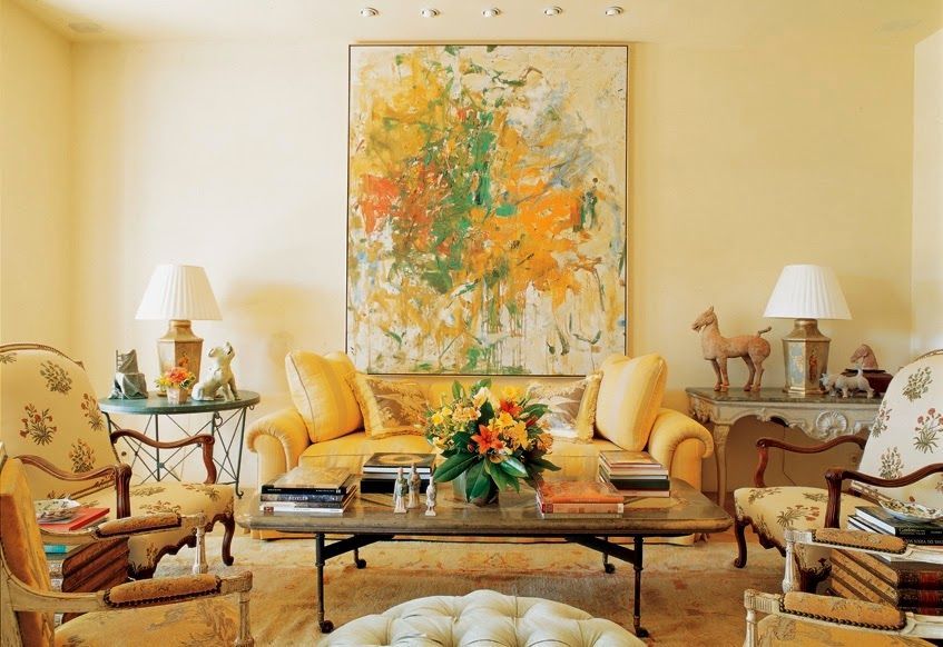
This is a color that I used several times circa the year 2000. I don’t know whose room this is above. The color is a green-y gold and really wonderful in a north facing room.
The above room is also Henderson Buff. Geeezzz… my printer was acting up, but I got it to print. This is a home that I did 19 years ago! I can’t believe it! This photo was part of a spread in the December 2004 issue of Better Homes and Gardens. The room didn’t face directly north, but it also didn’t get a tremendous amount of light as there was a large hill behind the home. The color glowed. This is a home that was built in the 1700’s in historic Waccabuc, NY.
You can see more of this beautiful home here.
So, really, creams, yellows, golds, oranges and REDS! All are wonderful colors for north facing rooms AND night-time rooms.
Another post you might like is this post featuring 12 of my favorite shades of red.
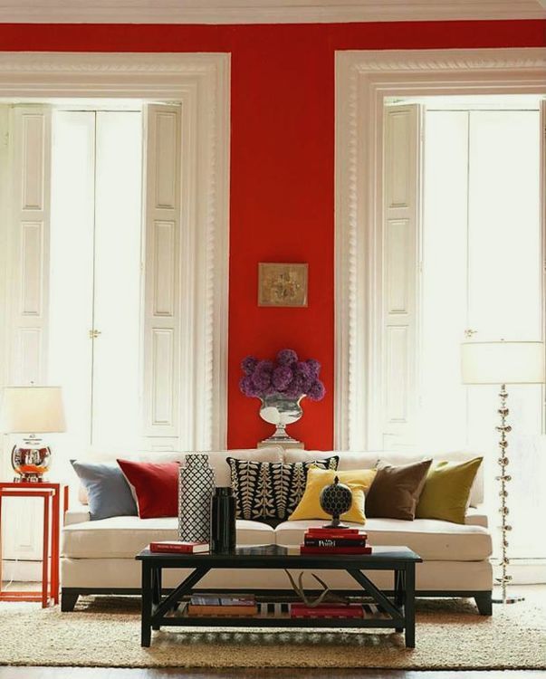
The room above looks to be Benjamin Moore 2003-10 million dollar red
Now, here are a few things that you may not know about red.
- it does not make you hyper :] In fact, a red room can be surprisingly soothing
- you can use both warm and cooler shades of red in a north facing room
Years ago, I had a new neighbor who wanted me to help her decorate her 13-yr-old daughter’s room. It had the same exposure as my son’s room. (Their room was a wonderful gold from Pratt and Lambert.) Quite frankly, I have no idea how I came up with this color.
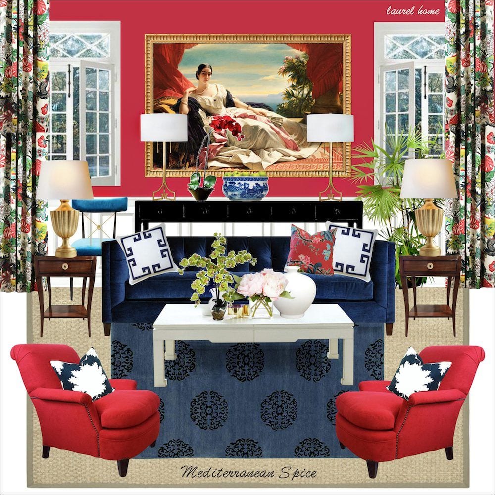
Benjamin Moore 1337 Mediterranean Spice. It is a red veering on magenta and let me tell you— it is magical. As a matter of fact, I had a flooring contractor use it in his daughter’s room and they were both extremely pleased. It’s a wonderful color!
Above is a board from the Laurel Home Ultimate Paint Palette and Home Furnishings Collection that is part II of the 144 color Paint Color Collection.
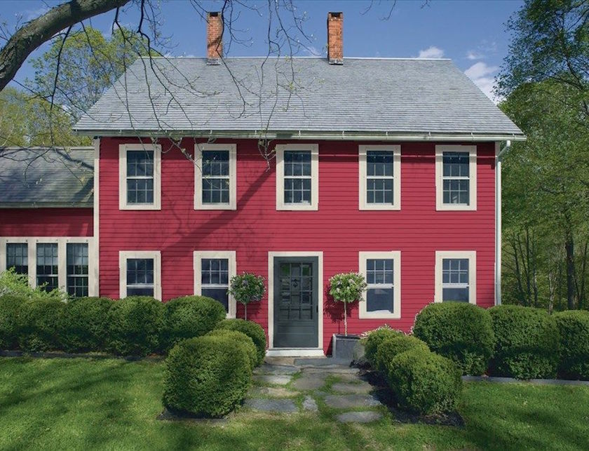
I found this on the Benjamin Moore website. But it’s Mediterranean Spice used as an exterior color. I don’t know if I would do this for myself, but it’s fun to look at in the photo.
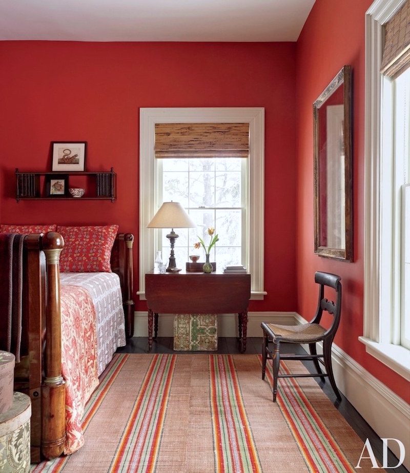
Joseph- Hottenroth Architects, Livingston-new-york-photo- Pieter Estersohn – Benjamin Moore Strawberry Red
Benjamin Moore 2003-20 Strawberry Red. We did this once in a master bedroom and it was really wonderful.
I’m finishing off with another room that we did about 15 years ago.
Benjamin Moore 1309 Moroccan Red
I also love warm grays like Benjamin Moore Abalone is one I have used and love as well as Elephant Gray. Oh, it goes on and on!
Well, that was pretty epic.
In closing, I think the main thing to take away here is that there are lots of options when considering colors for north facing rooms, but it’s not just the paint that needs to be considered.
And that’s what I think most inexperienced, untrained people fail to understand. Although, it’s certainly understandable!
Oh, while I’m thinking about it. I do love hearing from you guys. But, I’m starting to once again get a lot of emails with requests for individual help. And that includes helping you source items and referrals for design pros.
I’m sorry, but I cannot help you with those issues.
If you have an idea for a blog post, that is fine and appreciated, but please think hard if it’s something that you believe will be helpful for many others, not just a thinly veiled plea for help for yourself. eg: “I have 9 foot shoji screens with a red brick fireplace, slate entrance floor and 12″ crown mouldings, stained glass windows with an open plan and am wondering what color would work for the walls?” That sort of thing. Some of these are so involved that it hurts my head to read them.
If my interior design products cannot help you, (and for paint and sources, there’s nothing else like them) then there are nearly 600 blog posts here on a wide variety of topics. And there’s a search box in the blog sidebar which is the best way to find stuff.
xo,

PS: Please check out this week’s hot sales!
Related Posts
 Bad Florida Architecture – A Tale of Two Homes
 12 Gorgeous Bedrooms + Common Questions Answered
 Kitchen Renovation Plans Change Months Later!
 Can You Use Gray Paint in a North Facing Room?
 I Kind of Hate My Too Formal Dining Room
 12 Classic Dining Tables You’re Going to Love
 Help For a Small Family Room That’s Not Quite Coming Together


89 Responses
Hi Laurel,
In your gorgeous pic with Van Deusen Blue, with your name at the bottom of the pic, with the Oly studio coffee table and the leather chair with nailheads, do you remember the manufacturer or the name of the leather chair? Also, that art and frame are fabulous, too!!
Thank you!!
Hi Jenny,
This room was done in 2008! The chair was also from Oly Studio. The client selected the art. I love it too!
Hi Laurel, I somehow stumbled onto your blog while searching for picture frame moulding…laughed through the too high curtain mounting blog (so agree) and then read your advice on finding the perfect white. I find the proposed color combo’s on the Benjamin Moore Website to be annoying, and find either my fan deck, or using one of their rooms, where I can plug my own picks from their colors, to be a better option. I always suggest that (when possible) people spend some time in a new space, so they can see how the light changes as it moves around the home throughout the day. My perfect white in the main part of my home was inspired by the background color of my dining room wallpaper…Cameo White…a little like your Mayo. I have strong, warm colors throughout my home, all inspired by the same wallpaper. My north facing kitchen has warm maple floors, dark beige walls (sort of a warm caramel) with Charlotte Slate lower cabinets and one bake center cabinet in Spanish Red…uppers, beadboard and trim are Cameo White. Carpet runners there have all the colors with black trim. I like a dash of black to anchor spaces, and my appliances have black accents. I do not have any window treatments. No matter what kind of weather we have (I live in Wisconsin) the room is warm and welcoming because I tucked an east facing transom window in above the fridge cabinet and a south facing window across the large space at the base of a staircase. However, my new, north-facing studio space above the kitchen is going to be a bright white, because I am going to begin to paint and maybe sculpt again. I plan to use several different whites and textures on the furniture and upholstered daybed, but add some warmth on the maple floors with an old, worn Karastan rug I inherited, and a tall, warm maple cabinet that came from the print shop from my husband’s former class room. I am going to seal over the ink drizzles here and there left on the cabinet, by careless students over the years. If I only had bright white in the room, I know it would be a space I wouldn’t feel comfortable creating in…because I will add texture, and then a dash of color on the floor, and that neutral cabinet, where they shouldn’t cast any color onto my canvas, the space will work for me. I appreciate all of the points you gave to educate people about how all colors, even white, can look different. This trend towards all white and grey is currently driving me crazy. I hope people will read your blog and be inspired to try something different…it’s only paint…it can be covered:)
Thank you Cynthia!
I had already spent several weeks looking for the perfect white for my south facing sewing room when i happened on this blog. I needed more light as the room was earth stone…not my choice…and we get a lot of grey days in the winter. Simply white by BM is stunning, it is a true white but not shocking and i find it very warm! The already chosen trim is bone by Valspar and I worried I wouldn’t like the combo but decided to give it a try…it WORKS. I’m adding pink and a few grey accents to this room and will be all set. Thank you so much for your blog and others ideas as well. This was so helpful.
Thank you for the darling note Debbi!
Laurel:
Love this post! Especially how the natural light in a room effects our perception of the color in the room! So helpful to everyone who struggles with this issue. I can’t tell you how often we run into this issue!
Lisa Peck
Thanks so much Lisa!
Hi Laurel,
Happy new year to you and all the readers.
I woulg really like to understand how to achieve a beautifully layered room.
I can understand layered rugs but nothing more than that and I found the term in many posts.
What ìs layering exactly?
Thank you!
Hi Carolina,
It’s a very good question. But in a way you answered it. All rooms are three dimensional and thus, inherently layered, but it’s really in the way the room is styled. For instance the mantel might have a mirror and layered over it is a small painting and other items. Or the coffee table might have a tray with objects in it and next to it is a small stack of books with a small box on top.
Layering can also be done with pillows, window treatments, art, rugs, flowers– all the elements that come together to make for a beautiful composition within a space.
I hope that explains it a little better.
I have Mayonnaise on the walls and Cotton Balls on the trim in an open-concept house with the majority of windows north-facing, encumbered by a porch, and facing a gigantic forest. I’ve been happy with both. The Mayonnaise never goes gray or blue or purple unless all of the lights are off, in which case it’s a bit of a greenish gray. Anyway, the walls are mostly a very warm cream/very pale butter yellow. Floors are all dark and the primary colors throughout the rooms are warm blues, deep pinks, and chartreuse. I agonized over what color to use because I needed to paint before we moved in and am happy with my choices—which were made after reading some of your posts about ten trillion times!
Hi Nicole,
So glad that the posts were helpful. Sounds terrific!
Love your blog. Such great information. Since you suggested red walls in one of your answers to this post, I was wondering if you could write about decorating with a traditional red sofa.
I have very traditional room and lean towards what some of your readers called granny decor. I never thought of myself having that type of decor but whenever I have people over they love my home and gardens. I have mostly Ethan Allen furnishings, red sofa, dark brown leather recliner, two large club chairs covered with thin striped gold, red and tiny stripe of green (which isn’t really noticeable) fabric with one matching ottoman.
I want to freshen up that room and was hoping to get some ideas on how to update it without having to completely start over. Guess you would consider my colors more of the Tuscan colors but traditional furniture.
Also my custom drapes are a darker gold and red toile design with large peacocks that you don’t notice at all because they’re always tightly pulled back to the sides of the three windows that face due east. Those drapes cost me a fortune!
What other color could I bring in that would coordinate with my room? I just bought Mark Sikes book Beautiful and love how timeless the rooms look. After flipping through his book I wish I had the money to start over and use blue. So Laurel, How can I make my room look timeless using the reds and golds and whatever other color you may suggest or do I have to start over?
This room is open to the kitchen and dining area and all my walls are painted SW whole wheat with east facing windows in the family room and dining area and the kitchen has no window. My kitchen cabinets are SW Dove White and my island is stained with Minwax provincial color. I have wood floors in the dining area and kitchen and carpet in the family room. Appreciate your comments on my granny room.
Hi Jackie,
I’m sorry but I can’t advise without seeing your room and then, it would have to be in form of a blog post should I deem that it’s an issue that many others can benefit from. You may send up to six images to admin at laurel bern interiors dot com. if interested in that possibility.
In the meantime, please check out this post about a reader who had a bright red sofa and didn’t know what to do about it.
Hi. I have scoured this page and cannot find the name of the paint color used in that lovely Michael Smith example room. Can you share, please? Thanks!
Hi Dianna,
Sorry to say, that I haven’t the foggiest and as I said in the post, even if I did, it is irrelevant. If you like the color, please try and match what you see.
Hi Laurel! Thanks for all this great info! I used Van Dusen Blue in my north-facing library and it looks very good! (I tried Revere Pewter and it looked awful. When we bought the house it was pale pink and deeper rose-red. Which could have been fun, but wasn’t.) Love your blog (it’s the only one I read!).
Lori
Hi Lori,
Good to know that Van Deusen looks good in your north facing library. Thank you for all!
I believe you once mentioned that you used OpalEssence on your ceiling; I remembered that tid-bit and specified it for my new build in 2016 and love my ceilings! thank you
Yes, and I should’ve linked to the post. Here it is!
You always have such wonderful examples Laurel. My advice to people _ its only paint. If you are not sure of what colour to choose, buy some sample cans and paint a bunch of boards. Look at them at all times of the day – that will help with deciding on a colour without committing to painting all your walls and hating it.
I did a house recently in Farrow and Ball Verre du Terre and it had a huge north facing wall and trees facing east so lots of shade in the summer and bright in the winter – this really affects the colour also. In the end, I made the north wall a lighter tint of the verre du terre; not something I do a lot but in this case it really worked. It’s a beautiful enveloping colour.
I look forward to your FAQ.
That’s great advice Margaret. I concur.
My young daughters share a north-facing room with a single medium sized window, and when we moved in it was painted something like Navajo White. Since it’s a boring box it looked like a cheap hotel. I recently got around to repainting it and after holding up sample boards I chose a beige with a green undertone (SW Relaxed Khaki), which definitely looks like a greige rather than beige in that light. Very putty colored, and deep toned enough to feel friendly rather than bland. I did a dark green accent wall (which I have to add is not my favorite thing on principle but I feel it works well there) which I painted FOUR TIMES before being satisfied. Yes I held up color boards! But every time when it was up the green kept going grayed and blued. Or was too dark in the low natural light. The final color appears to be a nice chalkboard green on the wall, but when I take the sample board to other rooms it is a slightly poopy green-brown like an alligator. hah!
Hi Laurel, I just wanted to add my situation to the discussion. My front living room is northeast facing with just one large bay window. You can imagine it can get a little dark there most of the day. But to make things complicated, the house across the street is a behemoth of a red brick house that is situated a little too close to the street and has an oversized black asphalt driveway (this is NJ, land of McMansions and ersatz).
Now, when any bit of sun hits that house and that light goes off reflecting into my living room, it almost looks like Mars in here. I mean, it is this eerie, sometimes-red-sometimes-purple-sometimes-orange glow. When I look at my BM deck in there, the colors are so different. Revere Pewter looks more like Shale; Classic Gray is lavender; Linen White is some weird shade of apricot.
Most lighter colors look awful as well, even those that are greener/yellower (which I really do prefer over the pinkish/reddish/purplish toned colors). For a long time I have been considering Ashwood (the same as in Lotte’s hallway – I absolutely adore her house and your post about it, and would love to see more pictures – her IG doesn’t have many either). Ashwood seems to stay true to itself in that room, despite (or because of?) the complexity of the color.
On the most “Martian-lit” walls, Ashwood looks a bit like Coventry Gray, which I’m alright with and plan to put art in those spaces anyway. It also goes well with my new Robin Bruce forest velvet sleeper, as well as my Ralph Lauren Reynolds rug in dove grey (which is on your hot sales page in the blue color way; I got it for 1/3 the price in HomeGoods, can you believe it?). Maybe a little monotonously green/putty but I am planning to diversify it with other furniture and decor, following Lotte’s hallway palette and guidance from your paint guides. I’m also thinking of planting a tree in the front to block off some of that red brick house. Anyway, just wanted to share my story and how colors can be severely affected by what’s outside our windows. Take care!
Hi Agata,
That’s true, about light being reflected from outside, at times, however, I have seen linen white look like apricot and classic gray look a little lavender (but in the nicest way) and there isn’t any red anywhere in sight. It’s the light itself. Maybe it’s how the sun is refracted through the atmosphere. Who knows? Honestly, it’s all a big crapshoot! lol
This is a great post, Laurel. I have a north facing study that I am trying to pick grasscloth wallpaper for. Currently it is painted SW Accessible beige which turns really green during day. My question is I have a rug that has to stay (very expensive). It has many beautiful colors in it but trying to decide what color to pull out for walls is daunting. Perhaps how to do this would be useful others. My room has lots of reflection from woods outside with 3 large windows (1 is under farmers porch facing east).
Hi Rhonda,
It’s all pieces of a puzzle and there are so many ways to go. And, the walls could be white and the colors you wish to pick out if any, might be in accent pieces or furniture.
Hi Laurel! I love, love, love your blog and always learn from your posts, new and old. I have a suggestion for a blog post. Would you consider discussing how to do traditional right without veering into “granny” territory. Not to disparage grannies (I hope to be one myself some day) but I think you and your readers will know what I mean. Thanks for your consideration.
Hi Michelle,
It’s a great topic, however, I feel that it’s inherent in pretty much every post. Or let’s say what’s not granny traditional. I guess it covers that which is ersatz, overly precious, badly proportioned under the guise of traditional. And furnishings that look cheap, but in a more formal way. There’s granny country and granny urban. I’ll think about it.
PS: To be clear, “granny decor” is not really about age. It’s about a cliche kind of decor. It’s fuddy duddy. I’ve seen granny decor more times than I can count when visiting a home before my clients have moved in. I’ll ask, “Are they elderly?” And every time, my new clients will tell me that they are young.
Dear Laurel,
This is amazing post! I have an idea for post topic for your consideration. Could you break down one of Mark Sikes interior architecture or Albert Hadley’s one? Their tricks with wall treatments… I’d love to read such post.
Hi Val,
It’s a great idea, however, I’m not sure what you mean by tricks with wall treatments. Mark often uses Gracie wallpaper and frequently in panels. Or, he uses paint and it’s most often a white or pale shade, but not always. Albert did a lot of glazed and lacquered walls which are quite beautiful and expensive to have done; especially, the lacquered walls.
And by Interior architecture, that can vary. Do you mean the mouldings they use? If you see this, can you clarify what you’re thinking? Thanks.
Hi Laurel, thank you for your wonderful posts! Your knowledge, taste and humor have added much to my life. I was thinking of hiring a color consultant because we have a large open room, 36 by 18 feet, kitchen/living/dining, with east and west exposures on the short ends, vaulted ceilings and 2 smallish skylights in the middle. Sometimes it’s very bright(which I love) and sometimes it’s a little gloomy on cloudy days.
Do you have an opinion on using a color consultant? The ceiling is very prominent. I can only afford limited professional advice. I know some about design and color but can’t visualize well for this room, which isn’t wonderful architecturally, and we’re committed to keeping the many cloud white cabinets at one end and matching trim. What do you think of starting with an on site session with a color consultant vs hiring a designer to choose a color?
We live in northern California.
Hi Ellen,
This is the problem. Are you keeping all of your furniture? Some color consultants are terrific and some aren’t. One thing I’ll say is that with a room with a vaulted ceiling, 95% of the time, I paint the walls and ceiling one color. And, 80% of the time, that color is white. Since you already have cloud white cabinets and trim, well, what about cloud white? That is not a recommendation, only an idea, that from where I’m sitting merits looking into.
Hi Laurel,
I left a comment many posts ago about a topic, maybe it wasn’t a good idea, ideas are relative. My idea for a post topic would be to break down one of the ralph lauren rooms that combines a lot of colors and patterns. Some of the rooms combine leopard and zebra with plaids and damasak and florals. I would think it would be a fun post to read. It kind of reminds me of an english or scottish home where the homeowner does a lot of traveling.
Hi Amy,
Oh, I’m sorry. I don’t recall that comment. But, it is a great idea. And maybe a high/low Ralph Lauren look. Thank you for the idea!
cream and pale gray reminds me of one of my favorite styles: Swedish Gustavian.
I love that too, Susie!
Love your post and was wondering if you could do other posts on paint colors for east, west and south facing rooms. I have such a hard time finding the right paint colors for my rooms and have a niece that has 50 boards painted in different beige colors because she can’t find the right cream or light beige color. So funny because she’s just like me…half nuts because decorating
a home can make you that way along with a husband that says to just get it done! Anyway, so glad I found your blog and love your sense of humor. You brighten my day.
Hi Jackie,
I’m not sure if I will do that. I probably should, because it’s good for ratings, because people really think that is the answer. But, as I stated here, the variables are so huge that it’s very difficult to say for sure. And, it’s impossible for a room which is sometimes super bright and sometimes super dark; during the day, that is.
Your niece is doing something we call in the industry. “pondering beige.” My suggestion whenever looking for a wall color is to find one that inspires you in a magazine or on pinterest and then find a color, that over-all looks like what you see in the photo or on your computer.
Pay no attention to what the paint company is calling it or what was actually used. Irrelevant. If “Baby Barf Beige” stirs your soul, then that’s the one to go with! ;]
Hi Laurel, We wrestled with this problem this summer. Open concept living room and dining room. The LR gets north – filtered through a stand of huge evergreens – and east light; DR gets south and east. After much trial and error we chose BM’s Collingwood. It has red undertones so is nice and warm for the LR and very cosy for dinners in the DR. We hoped to use Grey Owl (used to effect elsewhere) but it was too blue. We are very pleased with Collingwood. Fresh but also warm. Exactly the look we were hoping to achieve.
Hi Christine,
I love Collingwood too. It was on the short list for my paint collection, but because I needed to keep the number of colors to 144 and there were already at least 2 or 3 similar colors, I wanted to use. it didn’t make the final cut. It’s a good color to try if someone likes the look of Revere Pewter, but it’s going too green on them for their liking.
Years ago I was desperately in need of a good white paint for north facing and windowless rooms and I went with your Cotton Balls recommendation. That paint has made all the difference in those rooms which now look warm and lovely. Wonderful advice!
I think about your bedroom each time that I look at my “yet to be painted etc” bedroom. Would love an update post when and if you have any news. Thanks for your spirit of generosity, Laurel.
Hi Barbara,
I’m hoping very soon. I do need to work on that. I just got a reminder email.
There is one room in my house that I absolutely hate the color of, and it is a small north-facing bedroom, lower ceiling, with one regular window. The trim is a creamy white. This room is painted no other than Woodlawn Blue! It looks nothing like the room you posted in this color. I found the color years ago in a Traditional Home edition and loved it. But I should’ve been wary because it was in a large room, with high ceilings. It’s too stark, and comes off as a much brighter blue than it should have. We checked the swatch and made sure it was correct….and it still looks awful. I wonder if changing the light bulbs in the ceiling fixture and lamps would help? I’m not repainting because we won’t be here long enough to do so.
Hi Judith,
The lesson here and it’s one that I preach all of the time is to not pay ANY attention to the color you see in a magazine. I can guarantee that it will look different in your home. What I recommend is going out and matching the color that you see that you like.
But, as I said in the post, so often it’s not really the color; it’s the architecture, furniture and styling that makes the entire space look so appealing. However, we focus on the wall color thinking that if only we can copy that, all of our problems will be solved.
Of course, if the color is not working in daylight, then changing the night lighting won’t help, but if the problem is at night, then it’s worth a try to change the bulbs and/or type of lighting in the room.
Dear Laurel,
I bought all your books- they are great! I was wondering if you could clarify something about north-facing rooms. Does north facing (or any direction) mean the wall on the outside of the house faces north? Or the inside walls face north? What constitutes a north facing room?
Hi Elizabeth,
Yes, what you said the first time. If you have a compass and stand parallel to any given window, when you read the compass, that is the direction that the window is facing. And then, there’s the sun. It rises (at least in the northern hemisphere) in the southeast and sets in the southwest. So, a true south-facing room with no other windows in any direction, on a sunny day is going to get good light throughout the day.
But, of course a true east-facing room will be dark in the afternoon and the opposite for a West facing room.
A lot of rooms have two or even three exposures, like sun-rooms, for instance, often do. But, you can have a dark room with a southern exposure if there’s a big hill and trees blocking the sun.
Thanks, Laurel, for another informative post. I have learned so much about creating a warm, inviting, and comfortable home from you! Would you please expand upon the information about “blues.” How do “warm blue” and “cool blue” paint colors differ?
Hi CJ,
That’s a very good question. Blue of course, is inherently cool. But, a warmer blue is going to have a little yellow in it, making it veer towards teal or turquoise without reading as either of those. I just realized that I tend to favor the warmer side of ALL colors, including reds, pinks and greens. I also like warm lighting. No arguing with anyone, but in my mind, night-time lighting is supposed to mimic candle-light and feel warm and inviting. White and bright feels like an operating room. That’s just my opinion, of course. :]
Do the warm lights change the colors at night? Yes, but they change ALL of the colors in the room, so it’s like a filter.
Dear Laurel,
I have a comment about Henderson Buff. My decorator recommended it for my former light filled, main floor, open concept, giant house. It looked pale beige, warm and perfect in most of the space and warmer and sort of goldish in the darker corners. I showed her pictures of what I thought was very pale yellow and asked for my home to feel like those photos. She got the feel just right. My point is that the big open bright rooms that many of your readers have need more of a “color” for them to feel like anything at all. I thought of her often as I enjoyed that home!
God bless you all that bring such joy to our homes. She went and retired on me so that’s why I’m getting advice from you. Thank you thank you thank you!
Hi Jean,
Your old place must be super bright. I’ve only used it in medium to dark-ish rooms, so it does not look at all pale beige, but I believe you. And yes, paint does tend to intensify in the corners. So, great point to pay close attention to that when selecting colors.
Apologies! After taking another look at the photos because I just love all of the ones you used in this post, I’m wrong about Henderson Buff, we used powell buff hc 35. Different animal entirely. I’m sitting in my providence blue library near my quiet moments bedroom. Thanks for that by the way.
Oh! Understandable. Too many “buffs!” haha. I used Powell Buff too, one time in a new addition family room that was mostly fireplace and windows and then open. So, hardly worth talking about. But yes, it’s much more beige or really a khaki beige with some green in it. That was about 15 years ago!
SOOO much in this post, as usual.
Paint question: If you’re happy with a color, is there a timeframe when you should repaint, e.g., I’m not rearranging pictures or anything (or looking for another thing to stress over) but in general, is there a three-year rule… a five-year rule…ten, lol? How about ceilings?
And your cabinet!! Are the insides papered? Painted? It looks like the woodwork is duplicated on the inside as well but the photo is a little bright for me to tell. Either way…BEAUtiful!!!
Love the sneak peek on your bedroom, btw. Sooo pretty! Sorry for peppering you with Qs.
Hi Em,
As for time-frame. Oh gosh, it really depends. Some people never paint. Some paint frequently. But if they’re painting their trim and not giving it a good sanding each time, it’ll get gloppy after several coats of paint; not a good look.
Re: my cabinet. I painted it after I received it because it looked too heavy in my place. What you’re seeing on the doors is the fact that behind the burlap fabric (which is behind the fretwork) is glass. So, the paint seeped underneath the fabric and when the doors are open, that is what you are seeing.
Oops, well sorry. But from the photo it looks like some vintage garden-y faux finish masterpiece. Maybe you should snap a photo, upload it to Sp**nf****r and rake in the cash for wallpaper and designer fabric.
Hi Laurel,
Even though my painting days are over (I’m too old now), I love your posts about paint colors. They get my imagination fired up to what my rooms could look like.
Our guest room has a north facing window with a lot of trees growing close by. At one time it was painted Quiet Moments. It looked great except for a corner adjacent to the window. And that’s the spot my eyes always landed whenever I passed by the room. Since that corner was so dark, I ran with it & painted it navy.
Best decision ever! It’s now the coziest room in the house.
How wonderful! I’ve often said that if we listen carefully, our rooms tell us what color they want to be. :]
Hi Laurel,
Love reading your posts and getting a wonderful insight into the complications of interior design. So many things to think about. What fun!! I live on a Caribbean island and would love you to do a post about “tropical design” – from what perspective, I have no idea!!!!
Happy New Year.
Catherine
How about, “Laurel’s Vacation To Visit Catherine in Paradise.” hahaha!
Thank you so much for your posts, Laurel, they are always very funny and at once very helpful to me. I’m a huge fan! I totally agree with you. I live in a South-facing apartment in Paris, France. However, in Paris we’re used to grey skies and I could see how colours in my home changed along the course of the year (that’s something I like very much, by the way). From my experience I just wanted to suggest another colour for north-facing rooms : pink! I have a small room here which is very airy theoretically (=on sunny days) and after much hesitation I decided to have it painted in Farrow and Ball Calamine. Calamine is a frank pink with a touch of gray, it’s such an energizing colour which marries with many others. I got inspired at the same time by Le Corbusier colour scheme and by XVIIIth century coulours (that’s a bit a crazy, I know). Now I’m in love with this subtle pink and I can imagine very well, if I had a North-facing room, to use it there. I appreciate very much that you recommend warm colours such as orange and red, I’ve also read your other posts about paint colours and they are soooo helpful. Just like you, I feel that the use of such warm colours is much more appropriate in rooms with great bones (which, fortunately, is also the case of my home).
Hi Cécile,
Your English is so good! I wish my French was. But, it was so long ago and I never got a chance to use what little I learned au lycee. Yes, pink is another good one. I love the warmer pinks (pinks that veer towards peach) and have a number of them in my paint collection. I think one of those posts probably linked to some nice pinks too. But, here’s one.
There are so many gorgeous apartments in Paris. J’adore!
Thank you very much for the link, Laurel, towards another of your excellent posts.
My kitchen is in Farrow and Ball Setting plaster which is more peachy and I like it very much too. It’s very different. A couple of years ago I would never have been attracted towards these colors. We’re all evolving!
You know, you should come over here to Paris, one day. I noticed you travelled oversees quite often –your posts in England were fascinating. If you ever come to France, please let me know if you need some info. I would gladly help! Merci pour le blog, je vous souhaite pour 2019 le meilleur sur tous les plans.
Hi again, Cécile,
I would love to go to Paris! I don’t travel a lot to Europe. Or rather, it only began in 2016 and since then, it’s been once a year.
Agree completely. My north-facing living room always looked stark despite trying numerous warm whites. Then I found one with a little red in the formula. It looks a little pinkish sometimes and I think that’s what finally gave the walls “life.”
Yes, pink. My north-facing living room looked stark despite a succession of warm whites. Then I tried one with a drop of red in the formula. The walls have life now, and I think it’s the slight pinkish cast from that drop of red.
Hii,
I love to read your post. It is very informative. Also, check out here the world best handmade carpets and rugs for a beautiful home
Thank you Shivani,
Unfortunately, I needed to delete your self-promotional tracking links to your business. That is not allowed on this website. If you wish to advertise, please contact cafe media that has a link at the bottom of every page.
Hi, Laurel
After reading your earlier posts about sofas and sectionals I was hoping you would also address sleeper sofas. We’re considering replacing a sofa for a sleeper in my husband’s office. (Currently, there is a 72” tuxedo sofa in there, which, for size & style, has worked great) The sleepers I remember always had this god-awful bar across the middle and no amount of foam egg crate would improve it much. Have they improved, and what features does one look for?
Thanks for your blog. I always look forward to reading it.
Julie Hawkins
Hi Julie,
You know, I’m not really sure.
I’m working on it, Julie. Hang on!
Thanks for a great post. I got a good laugh and may now be able to relax a little about the front room colour. I’ve had the sample cards up for days and find myself avoiding the room entirely so I don’t have to make a decision. Everything turns green in my house regardless of aspect. Pale Oak turned to a blah sea sick colour which is not what one wants in the dining room! But my little north office is a lovely caramel from Behr. It’s yummmmy like a Werther’s candy and it’s not green! Love it.
Glad you enjoyed the post Gail. At least you have one down!
My last house had a giant north facing living room / dining room combo with vaulted ceilings, and a skylight. We painted it BM Winds Breath. That 1 color looked like 5 different ones depending on where we looked and the time of day. Sometimes it looked like a cool white in some areas, others it looked khaki.
It was shocking how much 1 color could vary. I had no idea.
YES!!! And this is where I struggle with whether a color is cool or warm or what the undertone is, because I’ve seen colors go from greenish to purple-ish. I’ve seen china white look slightly gold and then slightly purple on two adjacent walls, at the same time. But, this is the other reason, that the samples should be on a separate piece of flat board and then the board needs to move around the space. Otherwise, you could put it down in the one spot that’s reading something unusual because of a reflection that you aren’t aware of.
OK good to know that you struggle too with this! We solved the problem by….moving! Now we have another house with a separate set of issues 😂
haha! and I’m sorry for that too. I guess the grass isn’t always greener.
This was so helpful! I moved into a new north-facing office at work (painted a khaki/tan that reads gold) that is so dingy and depressing on a bright day. Overcast days make me want to go home and get under the covers. I’ve been in search of a white color (a previous post of yours led me to Cotton Balls) thinking that’s what it needed, but now I’m thinking….red? I have some painted bookshelves and a small chest painted duck egg blue and was going to go with a “cottage” feel. But now I’m thinking that red will infuse energy rather which might be the answer….as opposed to light and bright. Happy to have a new angle on this!
Hi Maryanne,
Many times over the years, I’ve specified red and the clients would go at first, “really?” And I said, yes, it will be beautiful. It’s just what this space needs. And every time they loved it. But, one time, the woman just couldn’t get herself to do it. And, I’m never one to make anyone do anything, so I said, “Fine, we’ll paint it a cream.” The room was very pretty and had elements of pale medium and dark and accents of red. But, when I came back to admire everything, she admitted that she loved the room, but now sees that the red would’ve made it even better. Alas, she was out of money, so I don’t think that she did it.
My study is red with orange undertones. I thought a lot about it and decided that a womb color would help me concentrate. It turned out smashing. It was way easier to decorate than the other rooms in the house which required thousands of decisions. I had red with white trim, including bookshelves, a light wood floor to start with.
I now have deep purple accents in just a few spots, red and black accents and a cream and black rug.
Go for it. It does feel womb like and relaxing.
Sounds stunning Ramona!
Thank you. Awhile I got into quite a dispute with an online color expert who basically told me I was a bit of an idiot for considering the room’s compass direction. Said she had never, in all her 20K consults ever, EVER, considered that.
Funny, it’s one of the first things a lot of us in this business, who live with north-facing rooms, ask.
And the other one you nailed here for me… contrast can make a room seem smaller..
Thank you.
Hi Linda,
Come to think of it, I rarely asked unless the room was super dark. And, we did a lot of warm colors, back in the day. Lots of golds and greens. And they always looked good no matter the lighting.
My breakfast room has one small north facing window. Painted it Cloud White to start – hated! Tried Linen White next – hated! Then tried a narrow blue painted chair rail with the Linen below the rail and Cloud white on top – hated! Painted it back to Cloud White with one bright blue (forget the color) accent wall – hated! Finally read a suggestion to go dark with a dark room and had also by then discovered Farrow and Ball paints. Painted it F&B Light Gray about five years ago and absolutely love it! The room does have a lot of white trim painted Simply White – a door and three other cased openings, a very large built in bookcase, deep base molding, and a shutter on the window. I can’t believe how much I love it now, finally.
Also love your blog, Laurel. Always an interesting read even when it’s a topic that doesn’t interest me – lol!
Hi Elizabeth,
Thank you for an amusing comment. Although, I’m sure it didn’t feel funny to you when you were dating all of the wrong paint colors.
Hi Laurel,
What a great post! North facing rooms have always been a bear for me. I can’t wait until your FAQs!
Michelle
Thanks so much Michelle!