A while back, after this post came out about blue paint colors, Val wrote this comment concerning interior architecture:
I enjoy and appreciate posts about wall paint colors! But I have to say I wish more blog posts about interior architecture.
Of course, there are some informative ones on the blog already. But, there are more posts about wall colors than interior architecture blog posts. People still notice color more commonly than architecture. Yes, you said this many times Laurel, but I beg you to write more about interior architecture! Please; pretty please!?!
***
Well, Val isn’t the only one who’s asked me about interior architecture. And, she’s right. It’s a very important topic. And, it’s one that I’ve said repeatedly is actually far more important than paint colors.
It’s also the most difficult one to change. Well, most of the time.
In fact, I feel that if I had to put in order the elements of a room in order of importance, it would be:
- Architecture
- Lighting
- Furnishings, including all of the wonderful details that make the space
- Color
It’s true. If you have a room with exquisite interior architecture, a lot can be forgiven if the other three are lacking.
Lighting, I have put in second place because if the lighting sucks, it doesn’t matter how beautiful everything else is. Poor lighting in a room is like a model with a really bad hair day. Sure, she’s still gorgeous, but not nearly as much as when her hair looks great.
Please read about the number one lighting mistake.
Color, as you can see, is last on the list. And yet, it’s the one element that folks frequently consider first. And, it’s not that color is unimportant. They are all critical. But, I have found that the wall color matters far less when everything else is in place.
But, any one of these elements gone awry can muck up a space.
The other day, a very nice reader sent me a photo of her home. However, I am not going to post it. The outside looked okay for the most part. But, the inside, IMO, was largely an architectural misstep.
- Bad proportions
- Overscale entry
- strange pitched ceilings
Remember this post about the McMansions?
It’s a widespread problem.
If one has a home and the interior architecture is not so great. And, money is tight. What do you do?
Well, many times, some significant improvements can be making some small interior architecture changes like adding mouldings. There are lots of posts about interior architectural mouldings. I am going to link all of them here throughout the post.
But first, I want to talk about the elements of interior architecture.
And, when I say that, I am referring specifically to classical interior architecture.
You’ll also hear me bantering that word around a lot.
Classical. Specifically classical architecture.
To give better context, let’s do a short history of Classical Architecture.
And then, I think this will give better context on how we arrived at where we are today. We’ll also look at the work of some modern-day architectural classicists, who are thankfully keeping this oft-forgotten art alive.
Despite all of the commotion of modernism and that often hideous post-modernism of the late 20th century. Fortunately, there have been those working, quietly, in the classical idiom.
So many exquisite examples of classical architecture were destroyed in the post-war period. But thankfully, enough people came to their senses in the last two decades of the 20th century and cried out.
Hey, just hang on a red-hot minute. These buildings are gorgeous! Why are we not just fixing them up instead of tearing them down?

Like this one of Grand Central Station taken by me in December 2018.
And then, thankfully, the madness largely stopped.
Classical architecture, most of us know, had its beginnings in the advanced culture of Ancient Greece. This began around 900 BC.
Limestone, plentiful in the region, was used as the building material of choice.
Remember, this is the quick version. :]
At some point, the Romans got involved.
Between the two cultures, they created five classical orders.
What is an order? An order in classical architecture are the elements of the exterior building structure that are subject to a set of uniform established proportions. An order is the component of an elaborate post and lintel system.
What are a post and lintel?

Well, in its most basic form, seen here at Stonehenge. It’s a post and beam.
A BIG beam.
The Greeks refined this basic form of architecture, and the Romans further refined it into the five fundamental orders.
The five orders are as follows:
- Tuscan
- Doric
- Ionic
- Corinthian
- Composite
Vitruvius was a Roman architect in the last 100 BC years who wrote about the five orders of architecture.
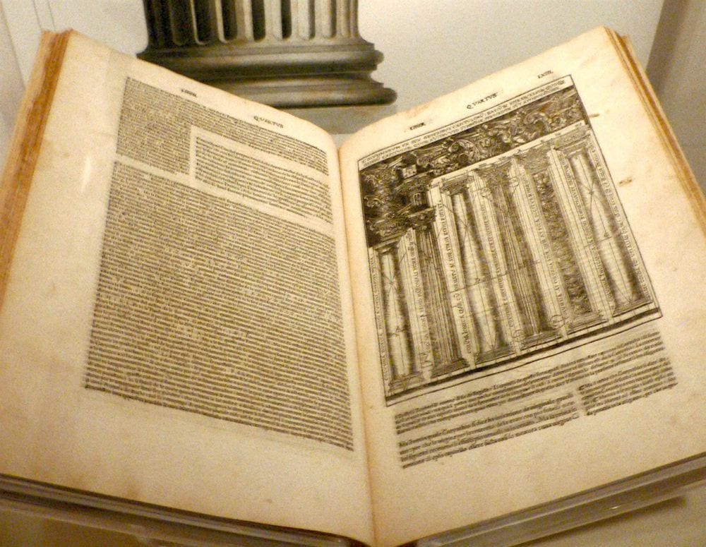
De_architectura – Vitruvius – A 1521 Italian language edition of De architectura, translated and illustrated by Cesare Cesariano.
However, about 40 years later, around 1562, the artist Giacomo Barozzi da Vignola penned his version of the five classical orders of architecture.
As a matter of fact, this one below dates back to 1590 and is available on First Dibs for only $7,900.00!!!
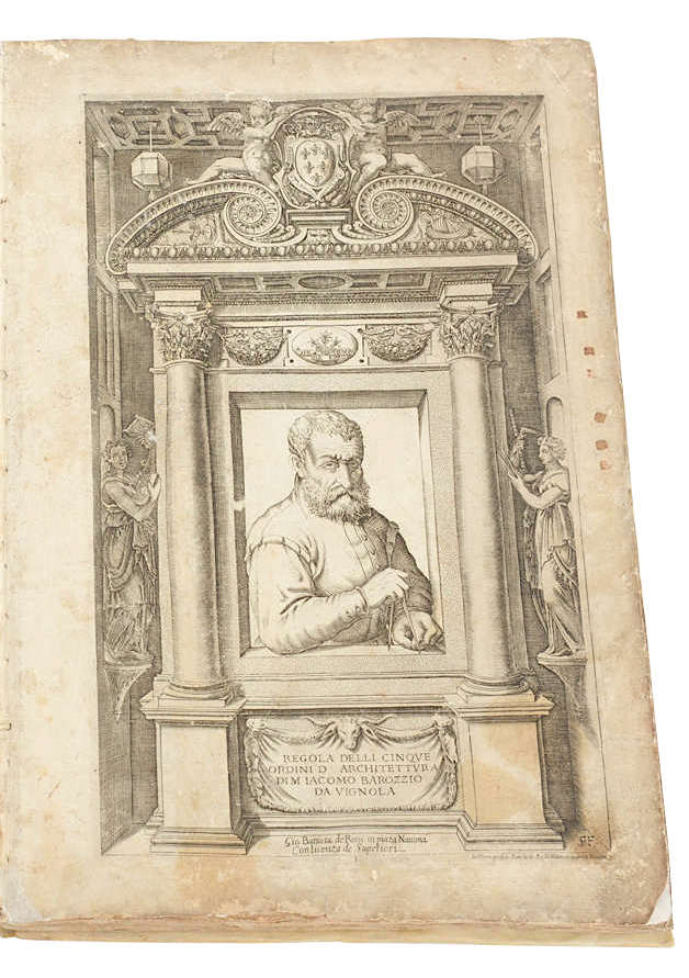
Iacomo Barozzio Da Vignola
I would definitely stay on his good side while holding his compass!
 “Canon of the Five Orders of Architecture” by Iacomo Barozzio Da Vignola
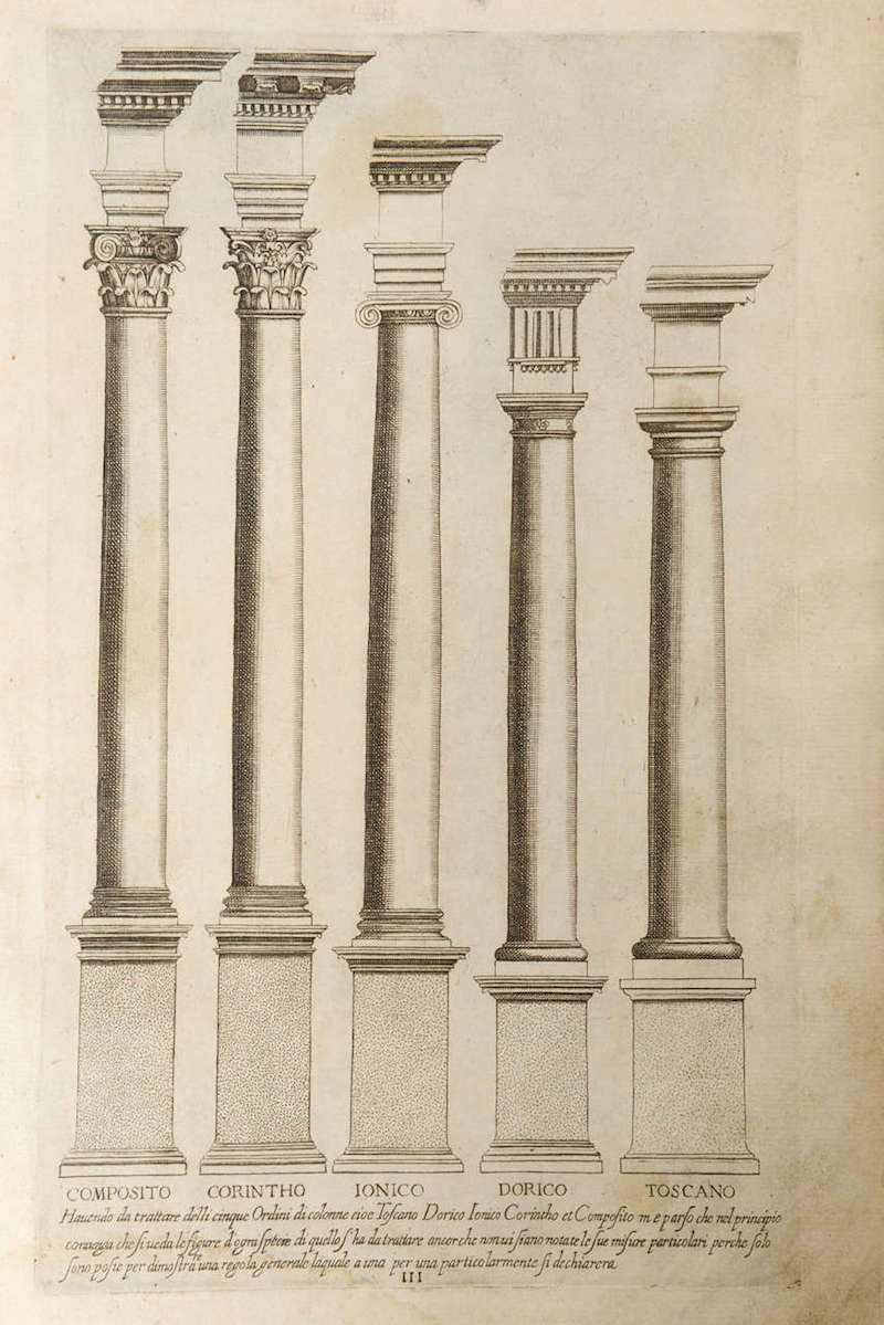
“Canon of the Five Orders of Architecture” by Iacomo Barozzio Da Vignola For Sale at 1stdibs
As you can see, each order consists of a base, column, capital, and an entablature.
Or, maybe you can’t see that. haha. It’s actually phenomenally complex.
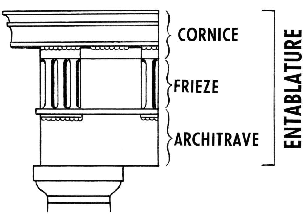
The entablature is probably the least well-known of these elements. And, this was the most simplistic illustration I could find. The entablature consists of a cornice, frieze, and architrave.
And then a bunch of other elements. But, this is not supposed to be a doctoral thesis on the five orders of classical architecture.
Okay. I know. I know. This is supposed to be about INTERIOR architecture.
Well, it all applies. We have these elements quite often inside, as well. And, of course, many more elements. But, since I haven’t discussed these elements thoroughly before, except for this post, I very much recommend that you read. It ties in very nicely.
And also, please read the guaranteed way to a beautiful room.
Classical architecture had a resurgence during the renaissance, especially in Italy.
And then again in the late 18th century into the middle of the 19th century. These are the neo-classical/Federal into Greek Revival styles and are the ones I talk about the most.
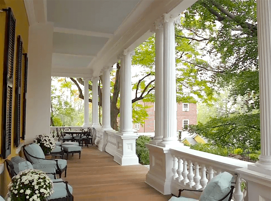
But, another boom in classicism, Beaux-Arts, began in the late 19th-century through 1920.
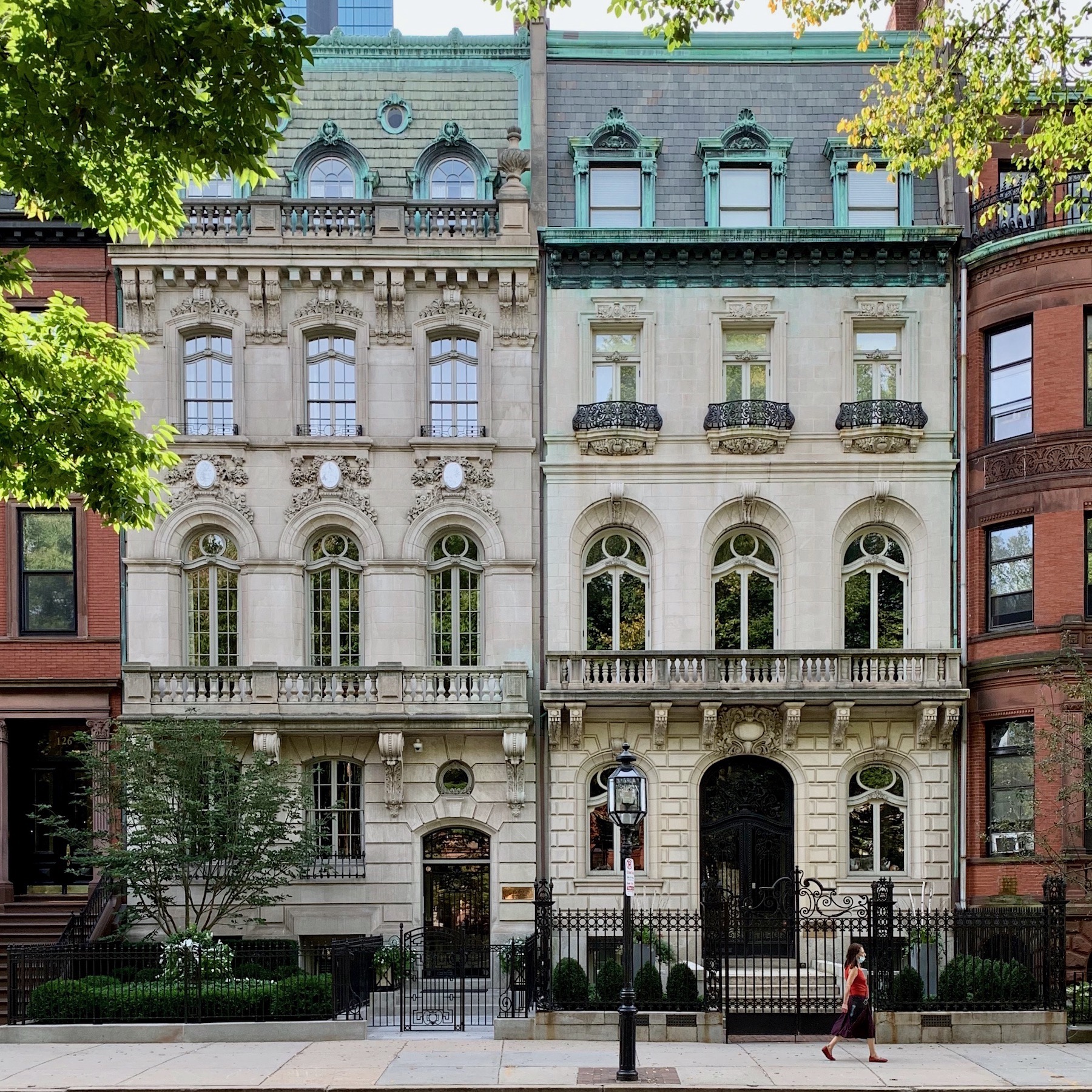 The Beaux-Arts facades of “the sisters,” my neighbors in Boston. You can see a night-time view here.
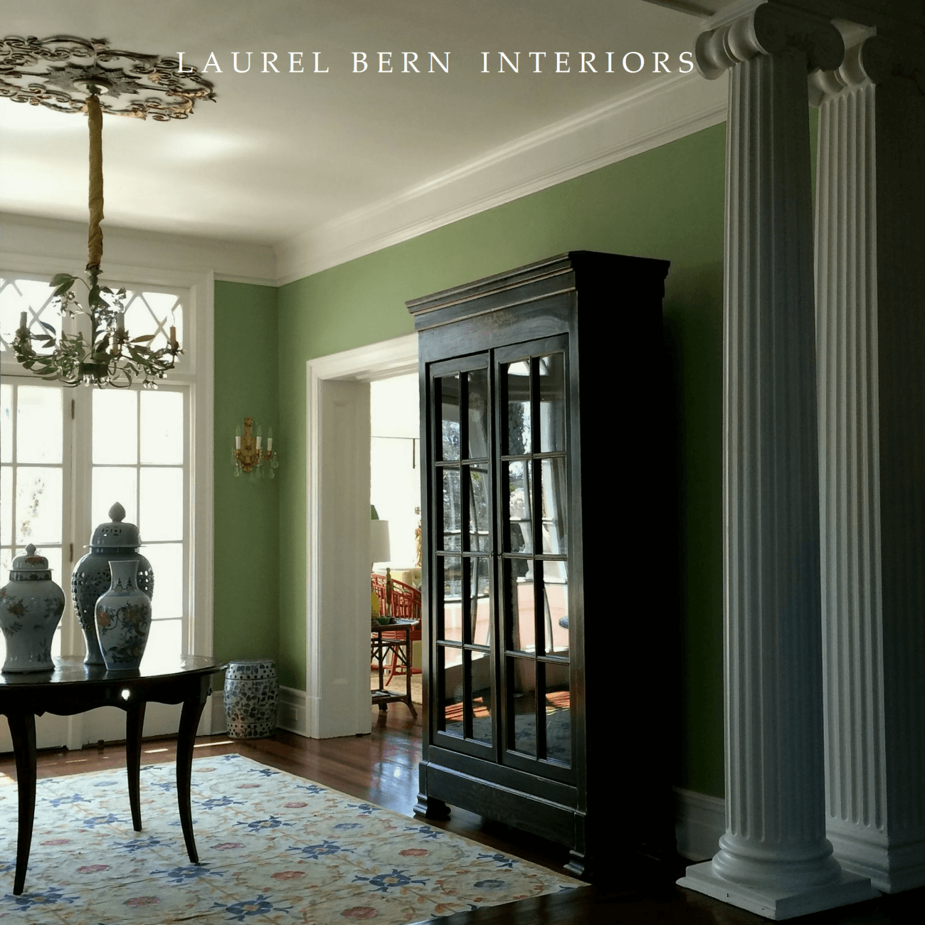
This is a home I worked on in the early years of this blog. It was built in the beaux-arts period, circa 1910, and the columns are in the ionic order. There are more images of this architectural gem in my portfolio.
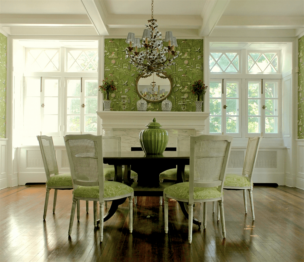
Sure, you could muck this space up. But, it doesn’t take much to make these rooms show stoppers because they are inherently showstoppers with nothing in them! I always say, “I’m cheating.”
However, classicism went by the wayside soon after.
The onset of the great depression and then World War II gave rise to the Bauhaus and Modern movements.
That is, until the latter part of the 20th century, but in the bastardized form of “post-modern classicism.” Not that it’s all bad. But, much of it is filled with poorly constructed, hideously proportioned buildings.
And, now, you’re coming to me asking what color you should paint it.
The problem is, you know it’s wrong. Instinctively you know that it’s wrong.
However, my solution for bad architecture is to paint the walls white.
If the architecture isn’t bad but lacking because the builder was too cheap to do it the right way, you can always add applied architectural mouldings.
We did that in our townhouse, and it made such a big difference that a couple of the neighbors went out and did the same thing!
But, Laurel, you haven’t given us much about classical interior architecture.
Well, actually, I don’t mean to contradict you, but I have.
In every post that discusses a room’s architecture, 95% of the rooms feature elements of classical interior architecture.
Also, here is a partial list of posts that feature many elements that I think you’ll find helpful.
Boxy boring homes and how to make them look so much better
Ceilings and should include crown mouldings
Rooms with great bones – architectural mouldings
16 tricks to make your small rooms look larger
Blue and white spaces with lovely mouldings
Those are just some of the posts I can think of.
The good news if you’re building now is that we are in the middle of yet another classical architectural period called “The New Classical Architecture.”
One of the proponents of keeping the art of classical architecture alive is the Institute of Classical Architecture and Art.
There are several branches throughout the US. And one of them is New York City. Last December, I attended a beautiful luncheon where I heard Charlotte Moss speaking and met Maura Endres, who I adore featuring.
In addition, the wonderful trip I took in the fall of 2017 to England was through the ICAA.
This will link to a terrific article with more info and images about classical architectural elements. And, it was precisely to see and study dozens of examples of exquisite classical architecture, both new and old.
Please enjoy the following posts with hi-lights of the incredible gardens and classically-styled architecture I saw in that one week. I was in heaven the entire time.
Here’s What the Classic Homes of Tomorrow Will Look Like
Fantastic Classical Gardens and Architecture in England
Best English Country Home of All
Ben Pentreath and the New Guard of Classical Architects
A post about wall mirrors features some images from the trip.
The last part of this post will feature the new guard of classical architects.
Classical musicians and enthusiasts know that Haydn (nicknamed Papa Haydn) was the father of classical music and influenced other classical composers such as Mozart, Beethoven, Paganini, and Rossini.
Well, the modern-day Papa Haydn of Classical Architecture is Quinlan Terry.
I was fortunate to meet Mr. Terry, but we were hosted to a wonderful evening in their exquisite home in England.
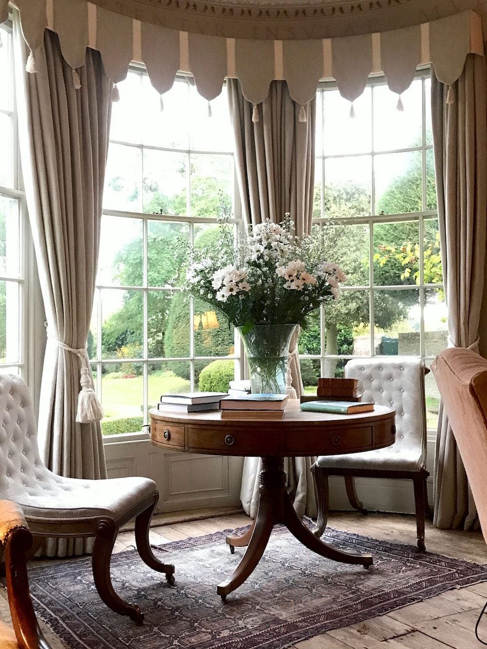
A classic vignette from their lovely living room. Photo by me.

And, another shot I took of Mr. Terry and his lovely wife outside their home, Higham Hall in Suffolk, UK.
Hi, son Frances Terry worked with his father for about 20 years but has gone off on his own in recent years.
Frances Terry, Ben Pentreath, and George Saumarez Smith are discussed in this post as the new guard of classical architects in the UK.
In the US, we have many fabulous classical architects. Here are three of my favorites. And all three have the most exquisitely tasteful websites.
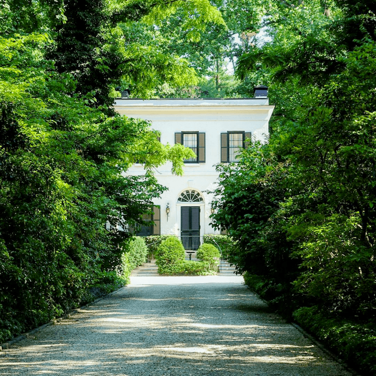
Peter also has a fabulous Instagram account.
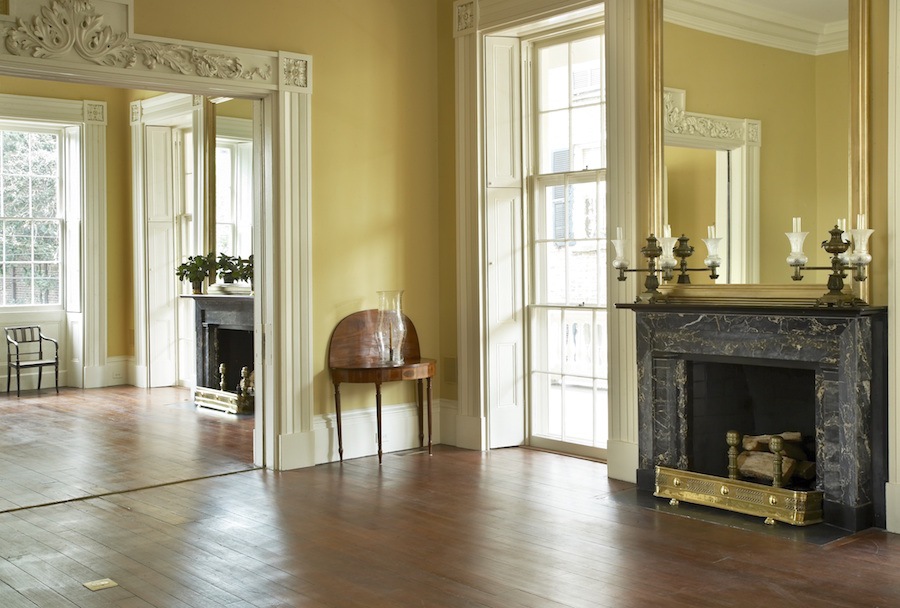
Gil is such a fabulously talented architect. His collaborations with interior designers Miles Redd and Victoria Hagan are legendary.
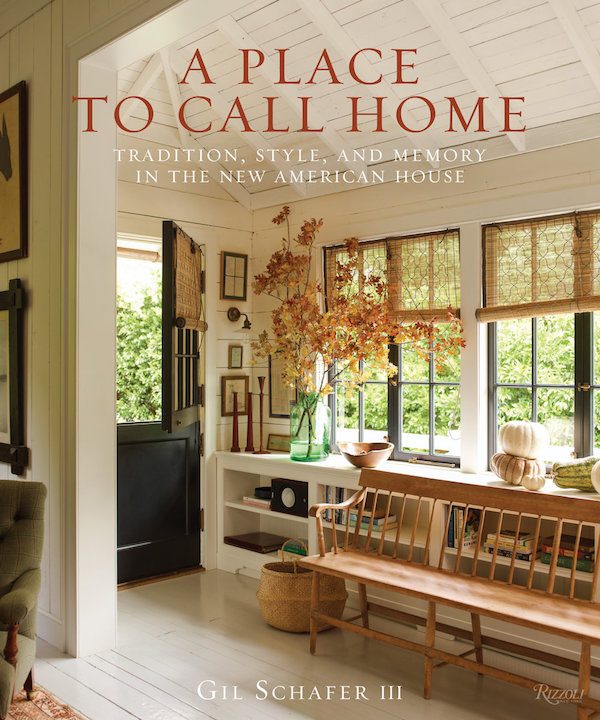
For more beauty from Gil Schafer, here’s a link to his beautiful book.
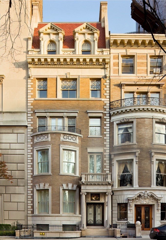
Timothy Bryant is a new name to me in the realm of classical architecture. However, his work, I think, is stunning.
Please also check out this post about six of my favorite classical architects.
Well, I hope that between the words on this page and the links to other posts, this will become a source to go back to when looking for info about interior architecture.
But, also the history behind it.
Thankfully, there is a renewed interest in all that is classical. For some reason, I have always been drawn to classical forms. Maybe it has something to do with our trips to Chicago during my formative years.
If only you could see my projects from design school from 1988 to 1991. Then, you would know that I’ve been drawn to all that is classical from the beginning.
But, since you can’t see the work I did back then, you’ll just have to take my word for it.
Oh, wait. What am I saying? You CAN see what I did in those early design years, for I found my interior design school portfolio and have taken several photos of the images in it.
However, I have created a separate blog post, which you can see here.
But, to give you a little preview, let’s begin with a model I made of a project back in 1990 when I was eight months pregnant with Cale.
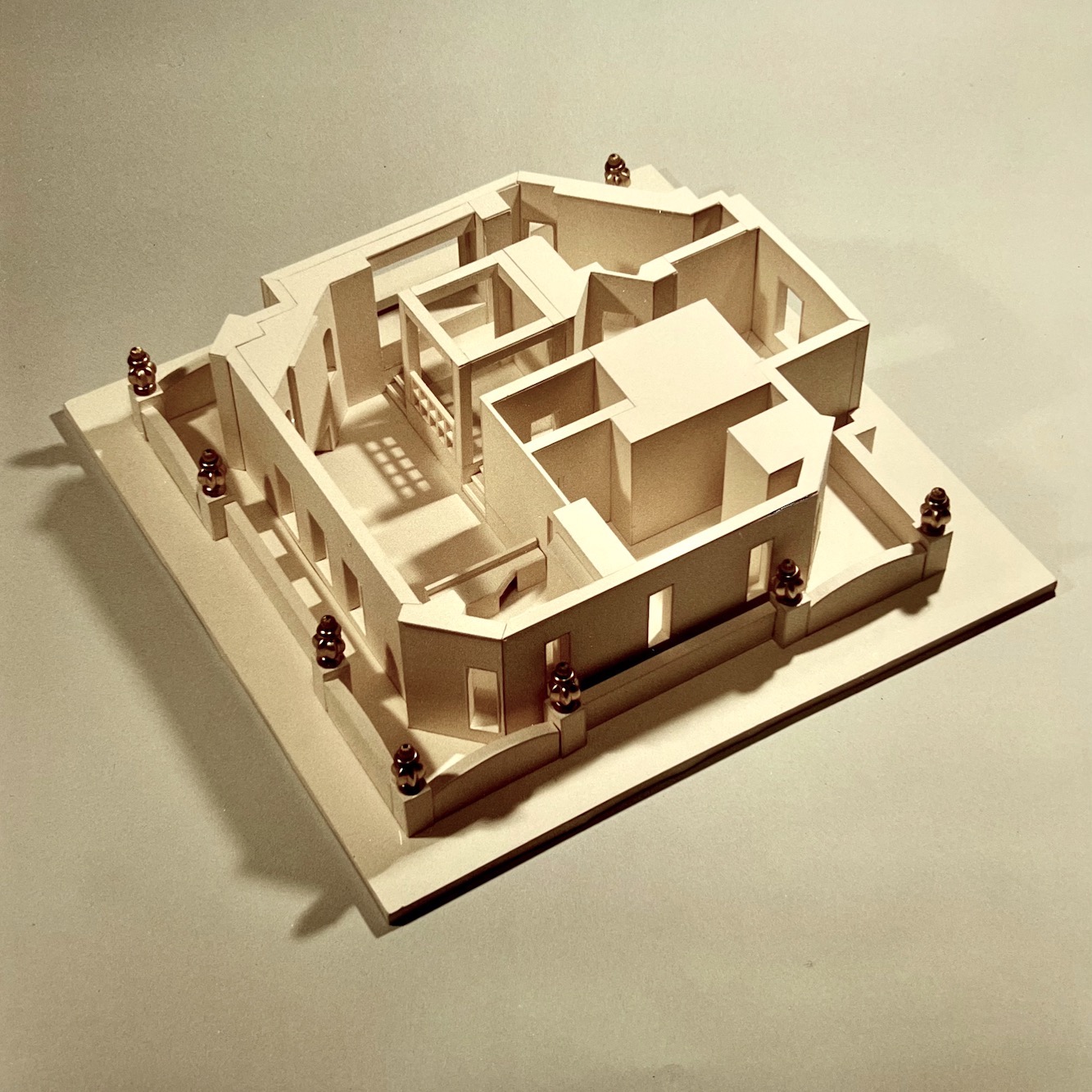
Yes, Laurel made this 100% from scratch. There was no kit, only measurements that I had taken from an actual building in Manhattan a few months earlier. I found the gold urns in a shop in the garment district that had huge bins filled with some pretty filthy buttons and beads.
I nearly died when I found them. They were the exact shape and size I needed to recreate the ten urns atop the balcony masonry of the penthouse. But, I had to hunt to find TEN of the beads in the huge vat of beads.
Damn. I wish I had a photo of the building.
Oh, wait! I do have a photo! I have a picture because the name of the building is on the project lead board. You’ll get to see the actual urns on the building on west 72nd St. in New York City. But, you’ll have to go to the post to see it, and then the rest of my portfolio plus some interesting and sometimes amusing back-story.
xo,

Please also check out the newly updated HOT SALES.
Related Posts
 The Top 20 Best White Paint Colors
 The Classic Kitchen – A Complete Source List
 Little Kitchen Details That Make a Huge Difference!
 I May Have Found “The One” in Boston!
 Six Drab Paint Colors – Should You Try Them?
 How To Select The Perfect Color Scheme For Your Home
 The Best Builder Upgrades You May Not Have Considered


