

Hi Everyone,
Today, I’m going to create a new home color palette inspired by OKA! But, oh man, the blogging gods were conspiring to make life difficult for me. However, it is done, and I think you will enjoy this post.
Why the puzzled looks? Oh wait, I think I know.
What the hell is OKA? Right?
It reminds me of that slimy vegetable I can’t stand, okra. My wasband adored it. No further comment.
If you live in Dallas or Houston, Texas, you’re far more likely to know what it is. But, if you live in the UK, you almost definitely know what it is.
OKA is an English home furnishings brand developed by Lady Annabel Astor and two friends.
It goes back to 1999, when they began their first catalog-only business. The first retail shop opened in London in 2000. From there, numerous other shops and a shopping app. And finally, in 2019, OKA was made available to us in the US for the first time.
2021 saw its first US shop open in Houston, TX in 2021, followed by the second in Dallas.
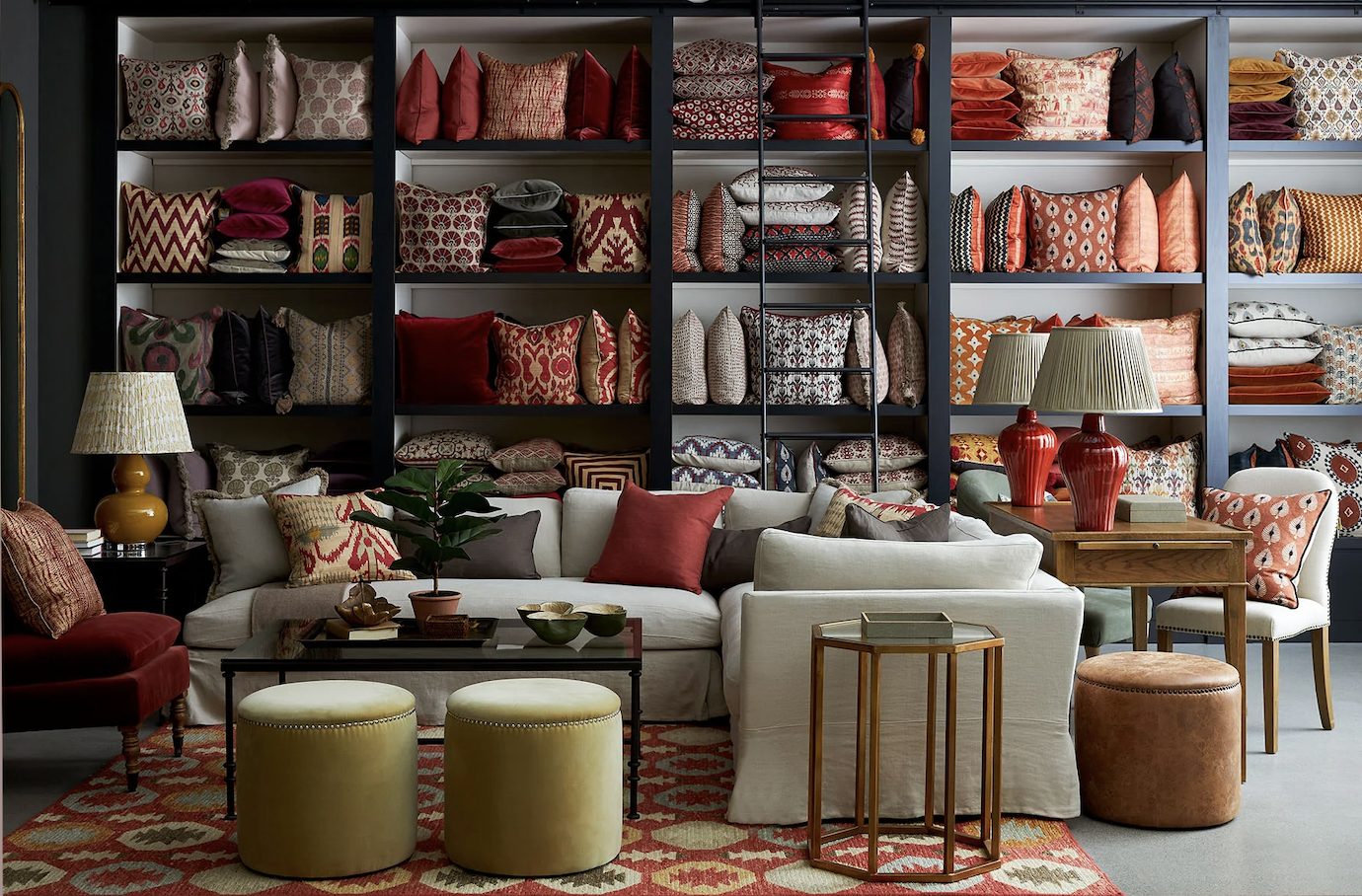
OKA store in Westport, CT
A third store just opened in Westport, CT. And many other shops are in the planning stages.
The name OKA comes not from okra but from the color “ochre.” The owners feel this color is innately British. It is “a blend of cultures and aesthetics working in perfect harmony, which is at the heart of everything we do.”
They go on to say:
“The magic of OKA is the mix: hand-picked global treasures, rich textures and patterns, and timeless furniture profiles. It’s ever-changing but unwaveringly British; elegant and easy-going; sophisticated but never stiff.”
Their website is artfully done, and their room vignettes are beautiful. While there is a strong neutral base, the rooms also have rich, sophisticated colors in varying amounts.
A kind reader recently sent me an email lamenting the prevalence of the European trend of artisanal, mono-chromatic, minimalist dreck style.
While there are hints of that banal style, the bland minimalist style is like a cannoli with nothing inside.
OKA has the fantastic crisp shell, AND the rich ricotta filling is liberally laced with bits of bitter-sweet chocolate and more. The OKA style is filled with both classic and classic contemporary pieces. It is unmatched and wonderfully eclectic.
Pretty much everything goes with everything. So, it’s difficult to go wrong.
Already, I have some favorite pieces.
However, what inspired this new home color palette, are primarily two things.
(Please note, if there’s no link under the images, it’s because it will appear again in the widget at the bottom of the post.)
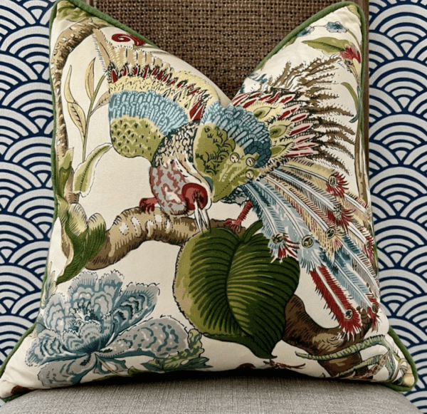
This gorgeous pillow is made from Schumacher’s Cranley Garden.
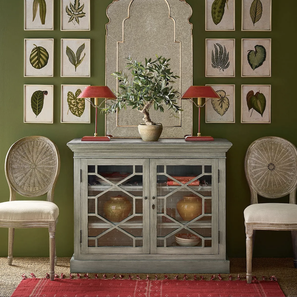
AND this lovely vignette from OKA.
The charming sideboard is on sale for about a quarter of the original price! And, I’m quite mad about those little lamps. These do not exist in nature on this side of the pond. Well, not until recently.
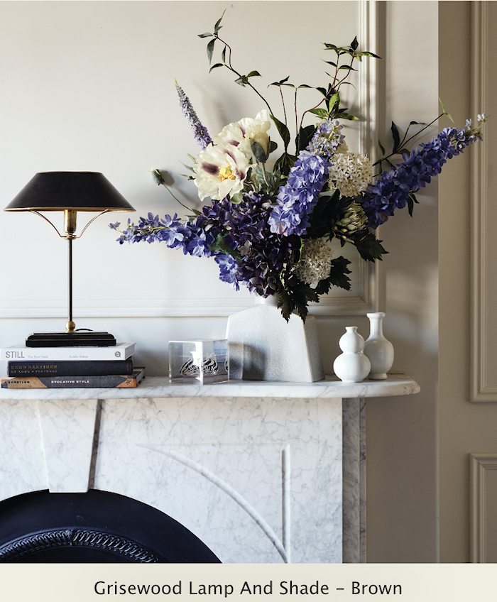
If you missed the note, the lamp is linked to later in the widget. At only 16″ high, this little lamp is lovely, as shown above on the fireplace mantel. But, this lamp will fit quite nicely under an overhead kitchen cabinet, assuming the cabinet is at least 18″ above the counter.
Alas, it came in some other colors, but they are not available now. No problem. You could always paint the lamp if red or dark brown doesn’t suit you.
Oh, Laurel! Don’t be silly! You can’t paint a NEW lamp!
Says who?
I paint new stuff all the time. I’ve even done so for clients. No biggie. I mean, what do you think is going to happen? Like, the paint police will show up and cart you away or something?

Oh, dear… Please, officer, I promise the lamps won’t match anything; they will coordinate. ;]
But, seriously, if you are looking for decorating inspiration, OKA has hundreds of gorgeous room settings and vignettes on their website.
Everything above is from the eclectic home furnishings collection at OKA. But, here’s how nuts I am.
I was looking for a higher res version of this image. However, I could only find one with the art cut-off and one with much of the chic little side table missing. So, krazy-Laurel took the two images (which incidentally did not match colorwise) to Picmonkey, my internet home away from laurel home.
I manipulated the images to match as closely as possible and virtually spliced them together, and there it is!
I looked high and low for this fantastic little sectional, but either it’s out of stock or discontinued. It’s perfect for smaller rooms.
Another thing I LOVE about this collection is how well it coordinates with other brands like Ballard Designs, Pottery Barn, Serena & Lily, and Jayson Home, to name a few. In addition, because many of their furnishings are of a more traditional or vintage nature, the collection works beautifully with your traditional vintage pieces. That is one or two.
Please be mindful, no matter what, to keep the mix no more than 20/80 of one style or the other.
When the ratio becomes too even, things begin to look like a mishmash.
I also looked at lots of other fabrics that might go in these rooms. Of course, there are millions.
But, do you guys know this English brand, Lewis & Wood? They are all over the UK, and I struggled to find them in the US, but finally, I found their US website. And, they do have a headquarters in Long Island. This is a trade-only company.
Anyway, I discovered this cool fabric that also comes as wallpaper.
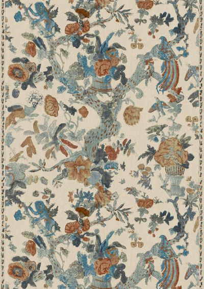
It’s called Wild Thing by Lewis & Wood. You’ll find it in the widget, as it’s sold at Chairish!
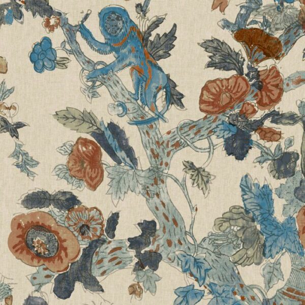
A detailed shot of Wild Thing. You can see him in the upper left.
This is insanely expensive fabric as it’s hand-screened, not printed with a machine. However, it’s so beautiful, I was sure there would be pillows on Etsy, but no, so I had to virtually make one which you’ll see in a bit.
One important thing to note about this fabric and some of the images on OKA.
The colors can vary substantially from image to image. In the case of this fabric, I have seen muted and vibrant versions. Therefore, before ordering, I would definitely get samples of all fabrics. You should, in any case, but especially so with this fabric.
You’ll see it again in another colorway in the widget, as it’s sold on Chairish!
However, you’ll enjoy this clever time-lapse video on Instagram showing two chairs getting a makeover with Wild Thing and a coordinating velvet.
Someone called it #upholsteryporn.
hahaha
One more “Wild Thing” that most Americans will hate almost as much as marmite.
Fair warning: Please prepare yourselves, as you will have trouble “unseeing” this. ;]
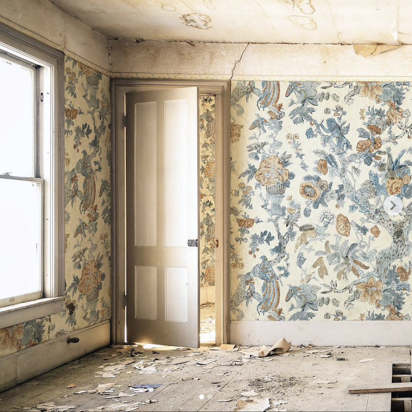
Their caption is — “Why wait?”
That’s some crazy brilliant marketing. Of course, they own the company, and maybe they had some flawed rolls that were unsellable, so someone had this wild idea. I have to say if this were cleaned up and the rest only about 25% that messed up, I do like this old-weathered look.
However, I realize that most people like things to be pristine.
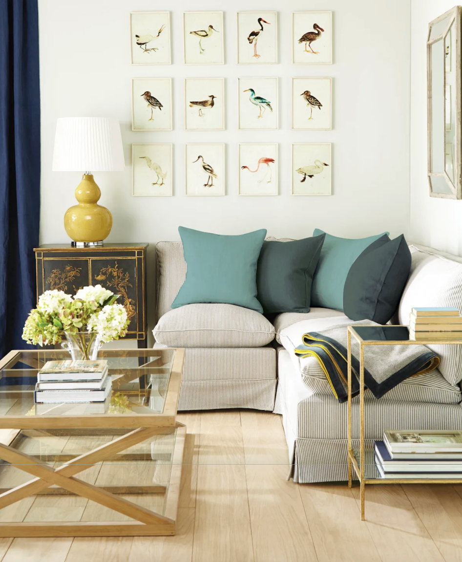
Next up, I made a collage for you with furnishings from OKA and other brands. I also included a few vintage pieces. This is what took forever to put together. But, I’m happy with how it turned out.
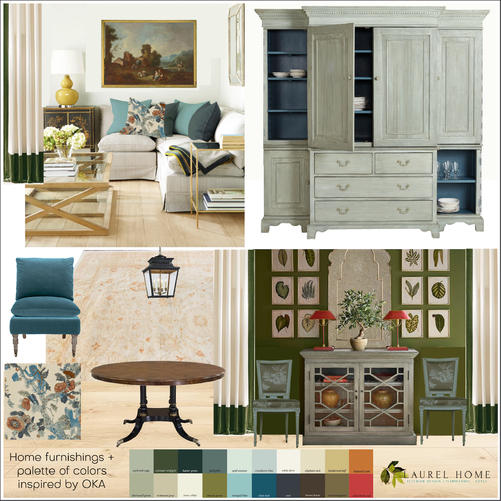
While I like an unmatched, slightly off-color color scheme, I felt that the dark blue drapes in the original image were too off. However, this is a prevalent trend I’ve seen from many notable British designers. I still love me some Ben [Pentreath], but I’m not so fond of when he stretches the scheme so far; it doesn’t create tension, but it creates an unsettled feeling like not playing the last note of a symphony.
The large cabinet in the upper right is on sale and a fraction of the original price.
I love the blue-gray interior. There are doors where you see none. However, I took them off for the image. That dashed line on the right of the cabinet is part of the image background that I overlooked in the smaller size.
All these colors and furnishings could go in the same home, even adjacent rooms.
At the bottom is a large home color palette inspired by the furnishings on the board.
All the colors are from the Laurel Home Paint and Palette Collection, which comprises 144 beautiful Benjamin Moore paint colors and 40 palette and furnishing boards similar to the one below.
This palette board was done last fall when I did a home color palette inspired by the gorgeous work of McGrath II.
For more on the McGraths, please check out one of my favorite posts here.
For the Laurel Home Paint and Palette Collection, (please click the link for more info) each board comes with 12 colors. These are the colors found in the rooms, not necessarily as paint colors. The idea of the colors is not that every color will be used on the walls. However, a lead color can be featured heavily in one room. Other rooms might have a lot less of that color.
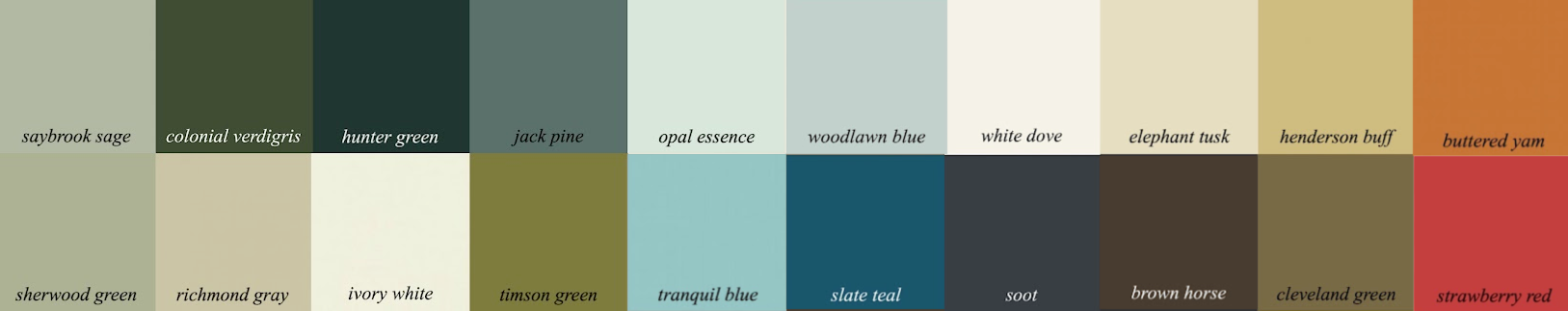
Above is a larger version of this sophisticated color palette. Overall, their colors are neutral and subdued. However, there are the occasional pops of red, orange, ochre, and bright green.
As promised, below is a widget filled with OKA home furnishings, as well as other brands and furnishings that coordinate with their eclectic English style.
please click on any image for more information.

I hope you enjoyed this post featuring an elegant home color palette.
xo,

PS: Please check out the newly updated HOT SALES!
Related Posts
 Astonishing Home Makeovers You Won’t Believe
 How To Mix Patterns – Designers’ Secret Formula
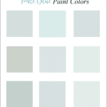 Light Blue Wall Colors-Don’t Make This Mistake!
 The Exceptional Interior Designer You’ve Never Heard Of
 What Wall Color Will Work With Her Collected Interiors?
 6 of the Best Classical Architects People Should Copy
 Dining Chair and Counter Stool Pairings That Rock!


40 Responses
I’m so glad I came across this post. I’ve been struggling with how to tie my living room together as I’ve been updating my aesthetic. I have a beautiful gold sofa (that I love) and two leopard print slipper chairs that are divine. My sofa really leans towards MCM but I’m going for a more pied a terre, romantic vibe.
The story board above pulls it all together for and uses a deep green that I adore!
Thank you!!!
Hi Tami,
I’m so glad the post was helpful for you!
Love your articles. Do you do consultations?
Hi Ellen,
Sorry, I don’t. However, Susan Serra does. I would call her. https://www.susanserraassociates.com/design-services
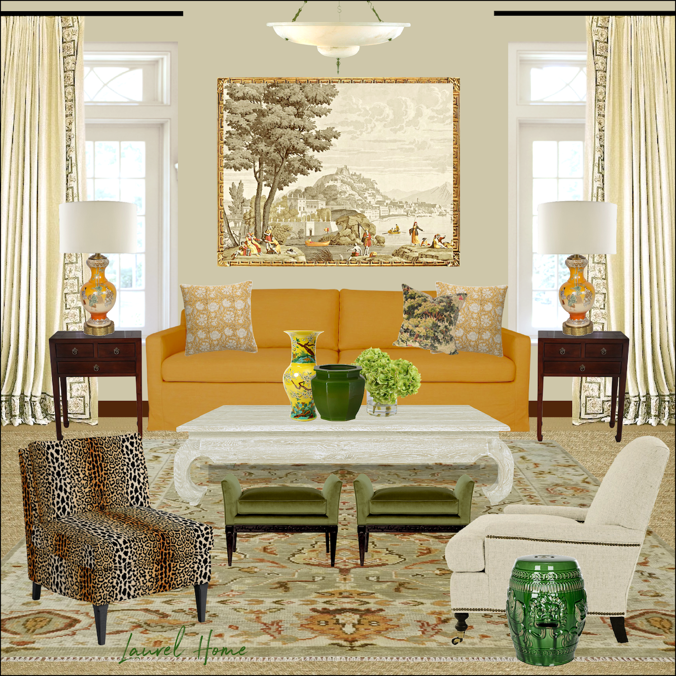
OK! Or should I say OKA? I am not going crazy, perhaps I am, but ochre apparently comes in more than one color! That’s right. Yellow or red. Yellow is sometimes called “Andalusian” and the red variety is sometimes called Moroccan” or to make it more confusing, “Brown”. The Ochre Room at Heckfield Place is primarily yellow but the OKA store shelves shown in your first photo are filled with mostly red textiles. Both can be described as “ochre”. I used to call the reddish shade “Persimmon” but discovered today that there are various shades (tones?) of persimmon ranging from yellow through orange to pinky red. When I commented earlier about Robert Kime using “ochre” in his textiles, I didn’t realize that he often combines both red and yellow ochres. I am beginning to realize how inadequate spoken language is to describe color. Thank goodness for your color palettes and marvellous visual images.
Do you have a source for the ceiling light on the board with the yellow sofa, and if so, have you seen it in real life? Love your work!
Thanks, Alex. Yes, I do, however, it has been discontinued and while it is currently available, I don’t know for how much longer. It is the Charles Chandelier out of alabaster and bronze. It is an Alexa Hampton design and sold through Visual Comfort (formerly Circa Lighting).It is 28″ in diameter which is pretty large for a fixture of this type, and with a 23″ drop. So, the bare minimum I would go for ceiling height is nine feet. Even if it’s going over a dining table. It’s a dramatic piece needing either lots of height or lots of space.
There was another version, only 14″ in diameter with a 22″ drop, but that one is sold out.
It is on sale, but even on sale, it is not inexpensive. I have not seen it in person, however, I have ordered from this company dozens of times and the quality is excellent. I tried to find an image of it in situ, but the only one I could find is another place it is sold which is Burke Decor. Same price. I know VC offers free shipping, but I’m not sure about Burke Decor.
It also says that custom heights are available if you need it to come down further than 23″.
Many thanks. Gorgeous, but too large for my 1931 house with 8′ ceilings alas, and out of the budget too. I seem to have champaign tastes on a beer budget. My dining room and living room ceiling fixtures are both visible at the same time, and I am finding it hard to find something people can walk under in the living room and a coordinating fixture that can go over a dining table.
Hi Alex,
I would skip the overhead ceiling light in the living room, because a single overhead light gives off a harsh light, shadowy kind of light. For living rooms, table or floor lamps are the way to go. And also, wall sconces. However, if you still feel the need for an overhead light, do a flush or semi-flushmount fixture. Shades of Light has hundreds of ’em. Many are not expensive and would be beautiful in your 1931 home.
Hi Laurel,
Thank you for your reply and explanation of why you don’t think the indigo blue curtains work in the room. I personally love the clash with the couch cushions, I think it is an exciting look and is a bit avant-garde. I really do think this is a UK thing.
Wow, shoe polish and butcher’s wax! I should have specified that the chairs are wood. I will go back to the drawing board and of course you’re right, there’s a tutorial for every paint project out there. Good thing we have months of winter left so we can get all these labor intensive projects done, haha.
I am always amazed and delighted to read the posts that arrive every week, never knowing what will be shown and discussed. Laurel, I cannot believe you continue to come up with something new and exciting week after week. You amaze me.
I cannot help but think of the past when I look at these gorgeous rooms with rich beautiful colors. When I was married in 1968, the colors that were prominent then were avocado green, harvest yellow and rust or a reddish color. My house was full of these colors, even kitchen appliances, etc. Have your ever seen an avocado colored fondue set?
The current colors may remind me of the past, but are far prettier and beautiful in their settings.
I love that Serena and Lily Vignette too. Would you say that the drapes in the picture are pinch-pleated and if they’re not, what would you call them? Thanks!
Any chance you have information about the exact artwork above the yellow sofa in the board? I saw the similar linked in the widget r but really taken with the exact scene.
Hi M,
That is wallpaper from Papier de Paris. Les Vues D’Italie, a historical mural created by DuFour & Leroy around 1823, and inspired by paintings by Joseph Vernet. The piece over the sofa is from Variation 1.
The image in the post is through another French wallpaper company Le Grand Siecle. The one in the post is from the same design, but in a blue and neutral colorway. You can see that on their website and it is also sold through Etoffe.
I love these sort of posts. This was the kind of style that I was inspired by for my just-finished major remodel. All your guides were so helpful to be more confident picking everything myself- it all works together really well. Your paint and other guides are such a bargain. My hallway is Cleveland Green and it is amazing. It will be even better when the art is up. I also ordered a little lacquered side table (Chippendale style) done in Strawberry Red from one of the new sources in your latest rolodex and am patiently waiting. Thanks for being so generous with your knowledge, Laurel.
I love OKA! Especially the pleated lampshades. And I have the funny leopard candlesticks. And am contemplating the Gonglin chinoiserie items. I also got a random catalog from them and fell in love. They have great sales! Also, Lewis and Wood is available to the public via FinestWallpaper.com, a Canadian company. Finestwallpaper also carries Thibaut, which is handy if you are in the US and are not using a designer.
Laurel, did you crawl inside my head in order to generate this post? I’d been longing to see something English traditional and here you are, with gorgeous colors and patterns and a place I can go to see even more. I must rush to make lasagna but can’t wait to get back. Thank you so very much!
Oh man, I was the reader who wrote in lamenting the drab minimalist European style, hoping that Laurel could maybe explain where it came from and why it seems to be all the rage recently. And while Oka might be marginally better (there’s at least some colour I guess), I’m still disappointed to see it.
It’s all just … so predictable. It’s like everyone woke up one day, decided to install some pine wood and beige walls, then added one Beni Ourain rug and the same ceramic lamp, some modern brass end tables and some ‘rustic’ odds and ends, and then called it a day.
Go look at Oka and then Zara Home and then places like Coleur Locale and tell me they’re different…
Sad to see.
Hi Dis,
Yes, your email did inspire this post, and I couldn’t agree more with your assessment of the two brands you mentioned. However, I see a tremendous difference between OKA compared with ZH, and CL. I’m sorry you’re disappointed but I spent hours researching OKA’s product line and I don’t see what you’re seeing.
Hi Laurel,
Another great post! I am intrigued by the term “tension” you used to describe what was lacking in a room design. What creates this and what should we do to create it?
Take care and I can’t wait for your next post!
Laurel! Love this post, as always, thank you! I have a question for you, seeing as you mentioned painting things, what kind of paint do you use? I just painted a pair of occasional chairs using chalk paint, and I’m seriously disappointed with the wax finish. I think I want to start over, any suggestions? Also, your obsession with all things orange is rubbing off on me, I think I want to paint them orange! (I painted them burgundy. Close, but no cigar.) I just painted the walls Parma Gray by Farrow and Ball.
Either the chairs or the lamp shades, something is getting painted orange!
Thank you so much!
Hi Danette,
What I use to paint depends on how impulsive I am. haha! If it’s metal, ideally, it should be spray painted. I would clean it first with some denatured alcohol, perhaps. But maybe do a test spot first. And always follow the paint manufacturers recommendations. Be sure to tape off any areas you don’t want painted. If there’s a lacquer finish, I remove that with whatever removes that finish.
I recall about 20 years ago painting some brass sconces to match a billiard table light fixture that was a very nice antique bronze tone. This was for a client and I really had no idea what I was doing. It was also in the days before youtube. There are zillions of tutorials now.
I remember spraying them a matte brown as a base. Then I used some metallic bronze paint, probably rub ‘n buff. I really rubbed it in and I may have used two or three colors. But, then the magic happened when I used shoe polish and butcher’s wax to create a burnished old look. I rubbed and rubbed. I probably spent three or four hours, but it was worth it. They looked beautiful, and coordinated nicely with the pendant light.
Laurel, Another beautiful room! Thank you for clarifying 80/20. Makes total sense now. Love the color palette, thanks for all of your hard work!
I am currently at my home in Scotland (otherwise live in Canada) and LOVE, LOVE, LOVE the blue curtains (drapes) in the room. I feel it gives a richness, a strength to the room, whereas the replacement ones drain the setting. It must be a UK thing. I think we use stronger colours here, perhaps because of our weather, so much of it is overcast and grey. We like the edginess of the contrast.
Hi Dee,
It’s not the contrast or colorfulness I object to. In fact, I think it could stand to have more color; it’s the actual color used on the window treatments. I’ve been playing around with it and have done drapes in a warmer dark blue, a brighter teal, olive, mustard, copper, and gold and all look terrific, depending on what pillows are used.
That shade of blue in the image is indigo and is a beautiful color. However, it’s not relating to the pillows they’ve chosen. If they changed the pillows, or at least the darker ones, then it could work. Of course, this is only a vignette. It’s possible the drapes are working because of some other elements we can’t see.
What a coincidence! Just this morning I ordered the small Gonglin planter from OKA and thought to myself, “Laurel would love this!” And then this evening, I see that your entire post is about OKA! How fun is that?! Go check out the planter, Laurel. It’s on sale dirt cheap (planter pun intended)!
Hi Heather,
That is fun! You know, I have gotten their catalog a few times and didn’t have a clue what it was. They came on my radar because I was looking for a terrific slipper chair a couple of weeks ago. hahahaha!
I nearly used the OKA slipper chair in Mary’s family room, however, I felt that over-all, the more contemporary lines of Ballard chair was better and there are more fabrics to choose from. However, I love OKA’s slipper chair and their English roll-arm sofas! I hope the three-seater comes back in stock.
Hi, Laurel! Thanks for another lovely post! The colors are so yummy together…remind me of a classic stilllife of a fruit platter.
I have been looking closely at all your pictures (the curtain comparison was very instructive!) But here’s my question: what makes an 80/20 split? Are those items, or ratios? Fir example, should there be 8 elements that are traditional, and 4 that are modern? Or should 80% of the room be modern, regardless of item, and the 20% traditional? I suspect it’s a bit of “J’n sais que” … which is what sets a designer apart as a true artist. But a fun blog post might taking some pictures of rooms and labeling the items in an 80/20 split…or something like that. Or maybe there’s a post like that I missed? I came late to this blog party! Thanks again for my midweek spot of beauty.
Hi Gabrielle,
I talk about it a lot. In fact, I linked to an old post in the text. But here’s another link to some other posts that talk about getting the mix right. It’s true. It’s a lot of things such as the inherent architecture, in addition to the furnishings. The best way to think about it is that the most successful rooms are primarily either contemporary/modern or traditional/antique. So, if half of your upholstery is modern and half is queen Anne it’s not going to look so great.
Anyway, it’s a great topic and I will be talking about it a lot in the future because it’s important. This is why I love to share work of designers who get the mix exactly right.
This has nothing to do with your comment, but only because I just linked to some posts. I’m trying to discourage you kind readers from leaving comments with links in them. However, I’m allowed to because it’s my blog. lol. No, the reason is, your links make extra work for me. Sometimes I have to unplug for a few hours!
IKAT, all my attention in the first shot of their showroom: ikat pillows. In case you need a direct source of ikat fabric overload or some less expensive hand dyed, hand printed, hand woven fabrics, you can easily overload your senses at Itokri or Gocoop. Silk types that are unknown to most Westerners. Cottons. Wool. Embroideries. Etc. They are two of many artisan coops located in India who ship worldwide. The talented handweavers of India were promoted to a high level by the Persian and Mughal empires, before the British appropriated and crushed their textile industry in favor of their own. India’s liberation was led by a man who encouraged everyone to spin thread as a national protest and produce “khadi”. They put a charkha (spinning wheel) on the flag. Handspun handwoven textiles are the source of livelihood for many and are experiencing an explosion of popularity again. Even many common textile terms hail from India: “bandanna” = bandhani. Take a look. Quintessential British textiles derive largely from South Asia.
What a beautiful post! I’m drooling over all the gorgeous furnishings :] Thank you for all your time and effort and for introducing me to OKA!
I love OKA. But I also love all things English.
The items you selected for the widgets are perfect. Thank you.
I used to live in Houston, now live in Dallas and have visited both showrooms. I have five of their chairs, several pillows, an ottoman, and a couple small end tables, all purchased last year. I bought the Apaduma chair in pure navy which I love and which my husband actually thinks is comfortable when he sits in my cozy home library. When we were in the Dallas showroom, he was like a kid in a candy store… their style was appealing to him.
What a lovely colour palette and a sophisticated collection of furnishings and decor pieces you have assembled, Laurel. In addition to ochre you have added one of your favourites – chartreuse and could that sofa be saffron (or perhaps its a mustard, Dijon, of course)? The Brits certainly seem to bring in a greater variety of colours and patterns. I notice that Robert Kime uses quite a bit of ochre in his fabrics and that his lampshades are often heavily patterned. The McGraths emulate this mixing of colours, textures and patterns and as you have pointed out, just like your posts, their rooms are never boring.
I live in Houston and OKA’s showroom is a treat to walk through. The textiles are lovely. The website will explain that their lampshades and lamps are in the British style and don’t use the harps and finials that we are used to. They do sell inexpensive adapters. They have some really nice lampshades.
That’s interesting about the lamps, GGG.
I have ordered so many things from OKA. I have mainly ordered their sale items, but I have been very happy with all the merchandise. I have ordered quite a few of their pillow covers. They are nice because I can just recover an existing pillow and put away the cover until I want another change. One of the things I am dying to order is the standing lamp and one of their shirred fabric shades. They are beautiful. I am also copying one of their loveseats, very similar to the one in your widget. It’s a black and white striped ticking stripe that was in one of their catalogs. I have a vintage loveseat that I am planning to redo ala OKA!! I have ordered the fabric and I found an upholsterer so I’m 2/3 there !!
I love OKA! Once I knew about them I placed many orders with them for both my clients and myself. Great quality and beautiful design.
Love this post – and I have those two Schumacher pillows on my blue velvet sofa! I’m a fan of OKA and have been for a while. All your posts resonate and the timing is perfect as I’m looking for a long narrow sofa table!