

Hi Everyone,
Before we get into today’s topic, “A refined, soothing color palette,” please read until the end because there are two pieces of important information. That’s why the post is a little earlier than usual.
Based on this beautiful post from over two years ago, a reader wanted to know more about the soothing sophisticated colors of the Heckfield Place Hotel in the UK. Indeed, I adore this exquisite hotel designed by Ben Thompson. It is classic, new-traditional Georgian style decor. You can see the Heckfield Place hotel here.
Today, we’ll focus on the gorgeous interior colors of the Heckfield Place Hotel in Hampshire, UK.
Okay, so what is this Heckfield Place Hotel?
It is an exquisitely renovated 18th Century Home Grand home, now a sumptuously elegant hotel in Hampshire, UK. Please check out the Heckfield Place Hotel here.
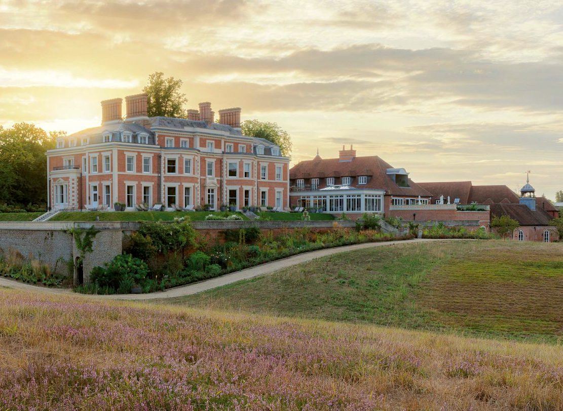
Heckfield Place Hampshire UK via Hidden Doorways
Ben’s design pays homage to the original architecture and classical design of the 18th century.
However, the furniture is a beautiful mix of traditional and contemporary furnishings. But, done so with unusual restraint.
Another thing I love is that every room is different. And, each room has a name. As you might expect, these rooms come with a hefty price tag. The range is from about $500 for a tiny room, but still, I’m quite sure, gorgeous and cozy. And, up to about $12,500 for the most expensive rooms. Yes, that’s per night.
Okay, let’s get ourselves in the mood with the digital painting I created of Heckfield Place.
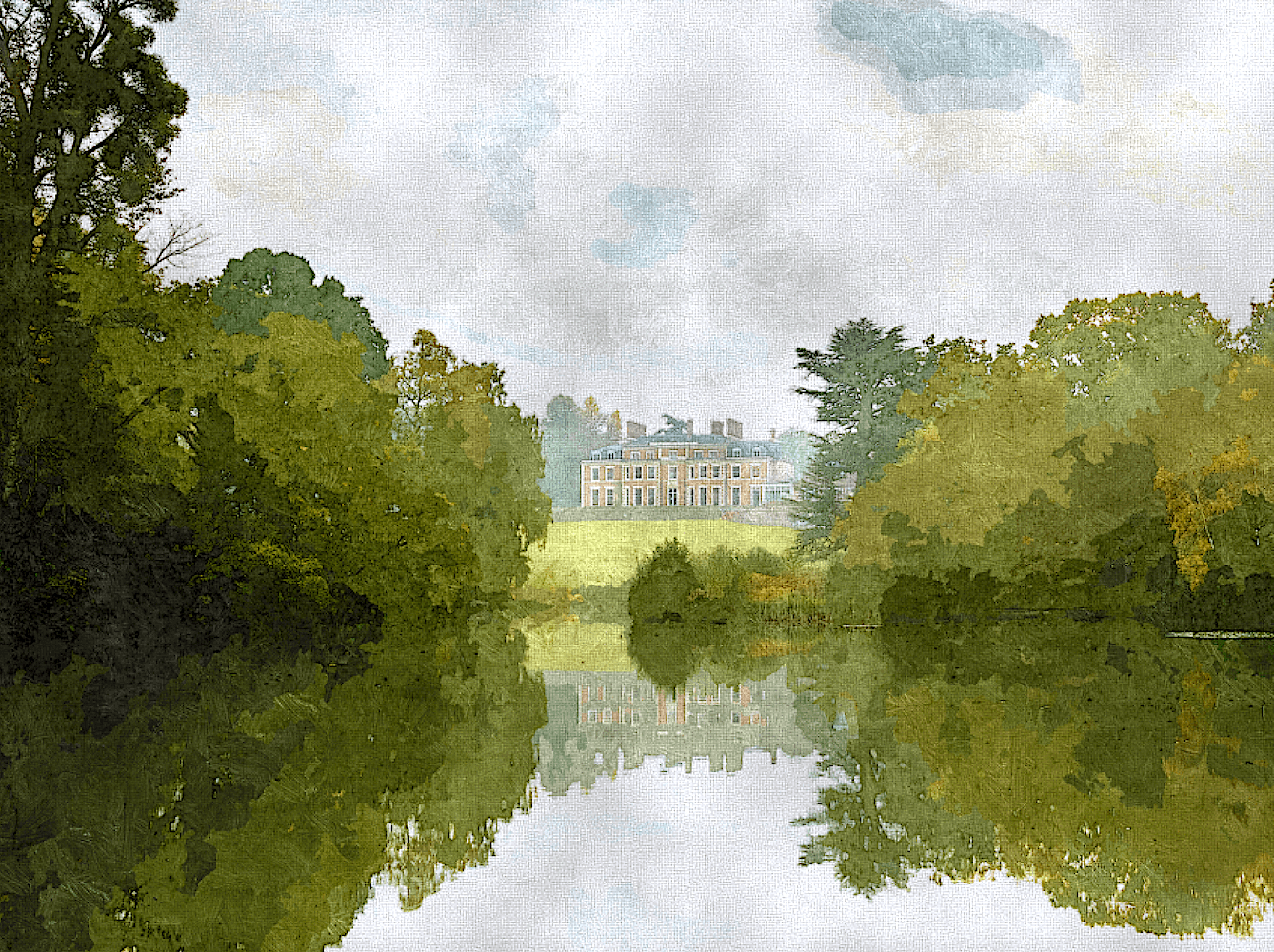
Fun, huh? I did this with Sketcher for Mac. Yes, it is done from a photo.
This is an enchanting place, as you can see, and already we can see the basis for a wonderful soothing color palette.
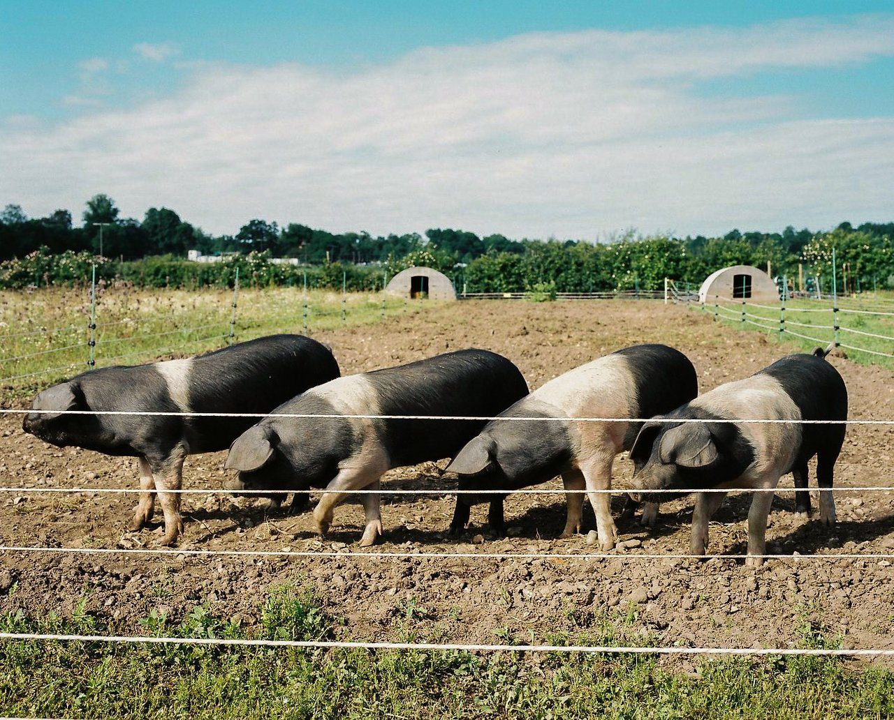
There is a working farm and livestock on the grounds. At least, this is what I saw on Trip Advisor.
Now, let’s focus on the beautiful interiors, especially the sophisticated, soothing color scheme.
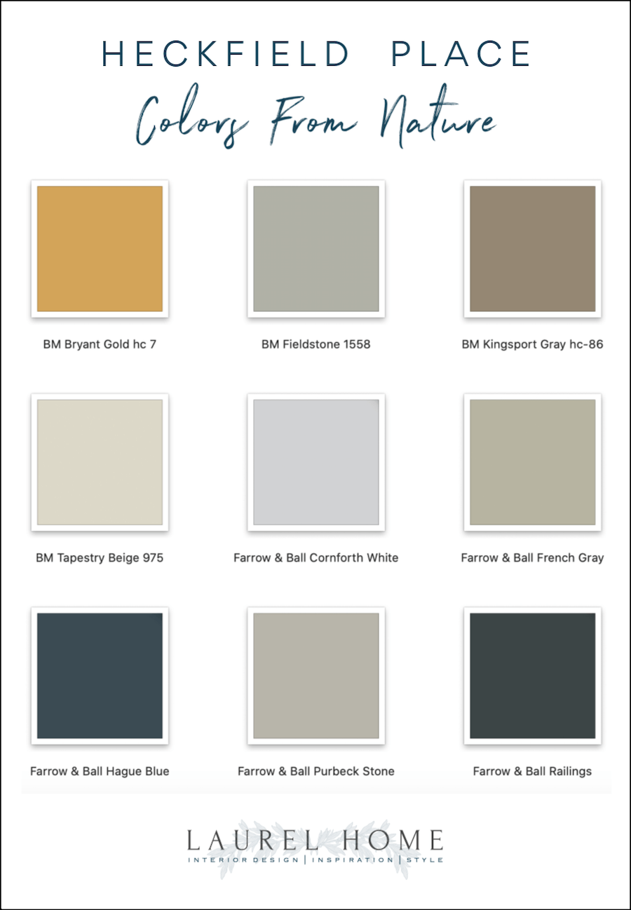
Ben’s palette is wisely taken from the natural surroundings of Heckfield Place. In this way, he integrates the inside with the outside.
However, earthy does not mean lacking in sophistication. Nosiree! In fact, it’s just the opposite.
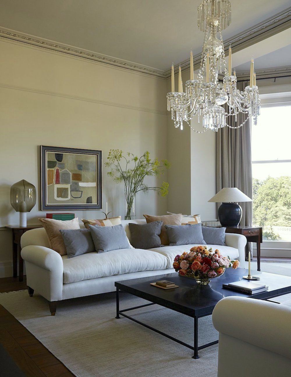
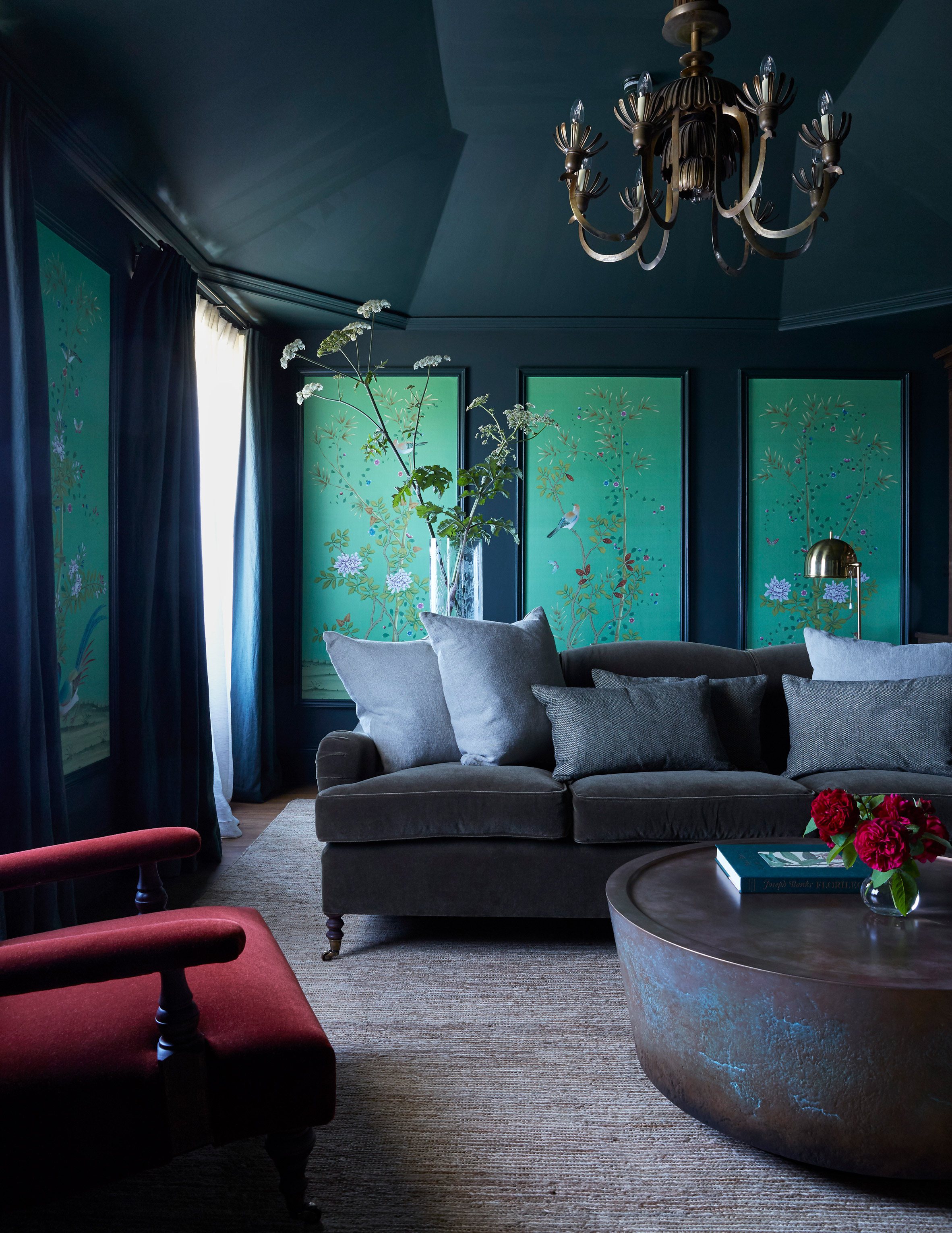
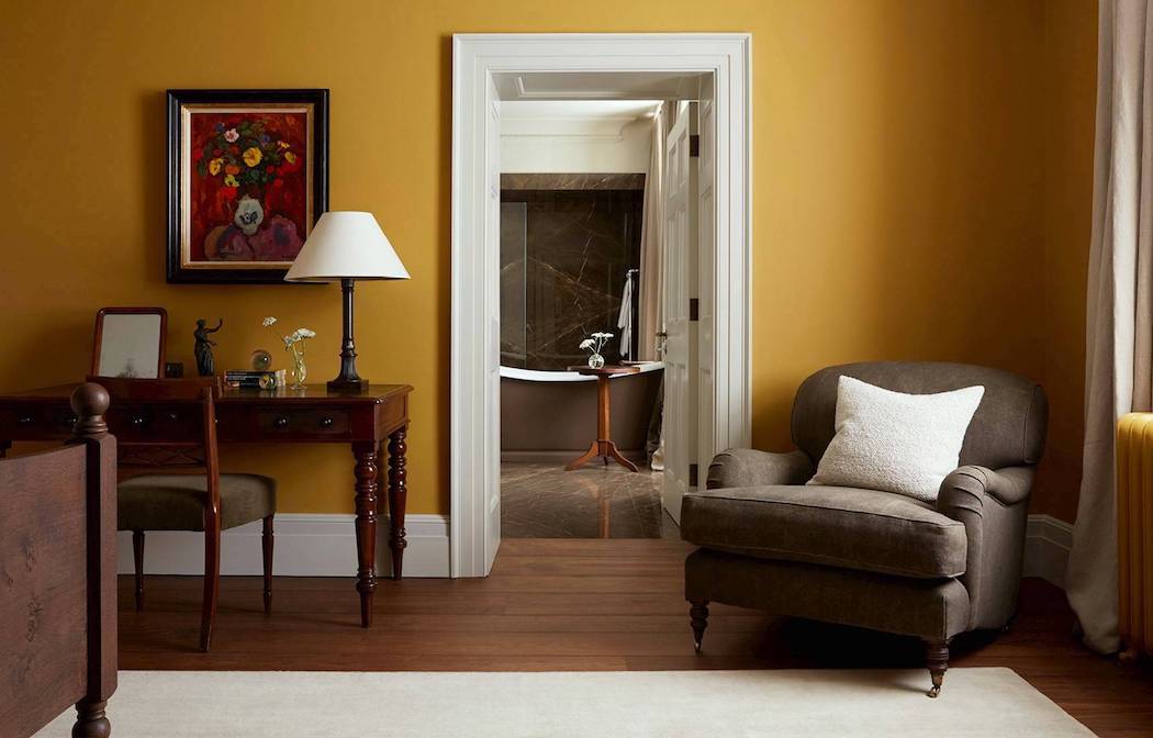
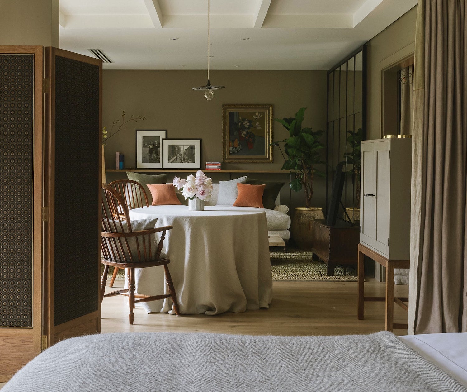
The Morning room epitomizes everything about this place. It is elegantly serene and a beautiful mix of old and new.
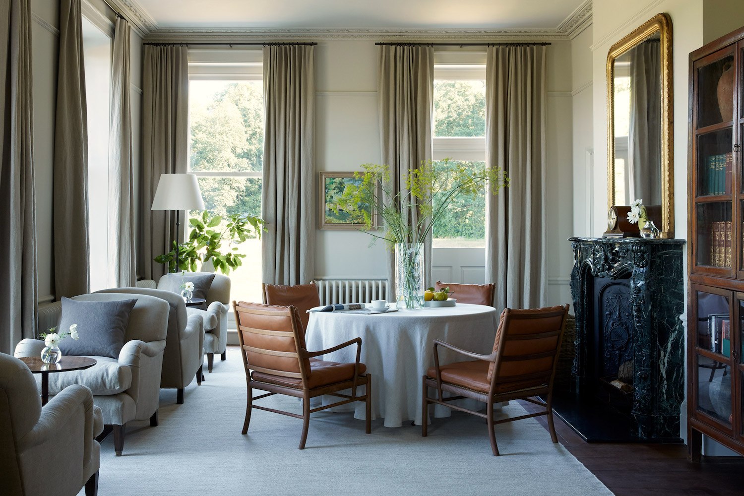
I believe that this is part of the same room. Most rooms I’m going to show are guest rooms, but this is a public room. The color I selected is Benjamin Moore Tapestry Beige oc 32.
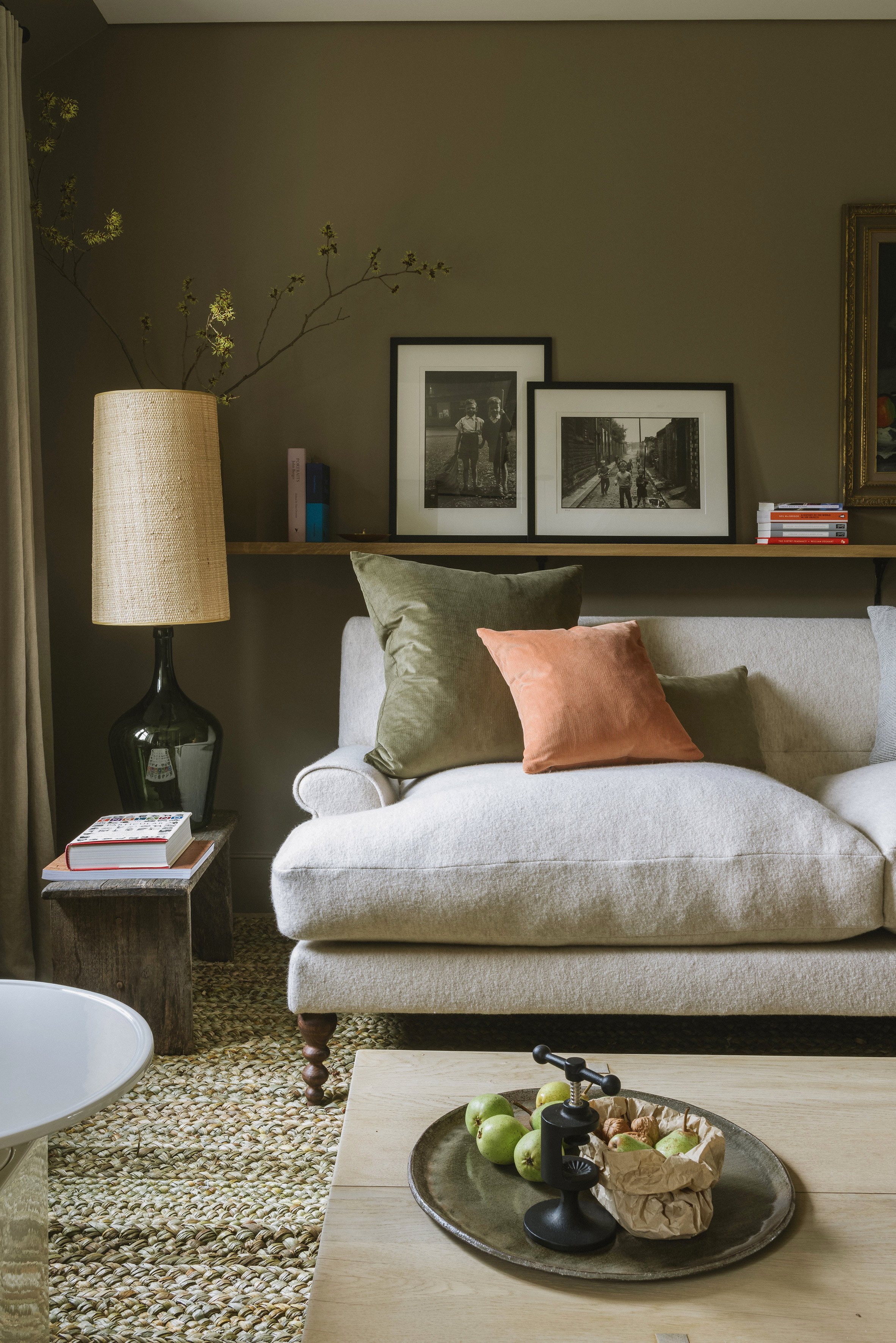
I love the beautiful monochromatic mix of grays in this space. It is grounded with black and brown. The greenery and beautiful art bring a note of vibrancy to this serene, elegant space.
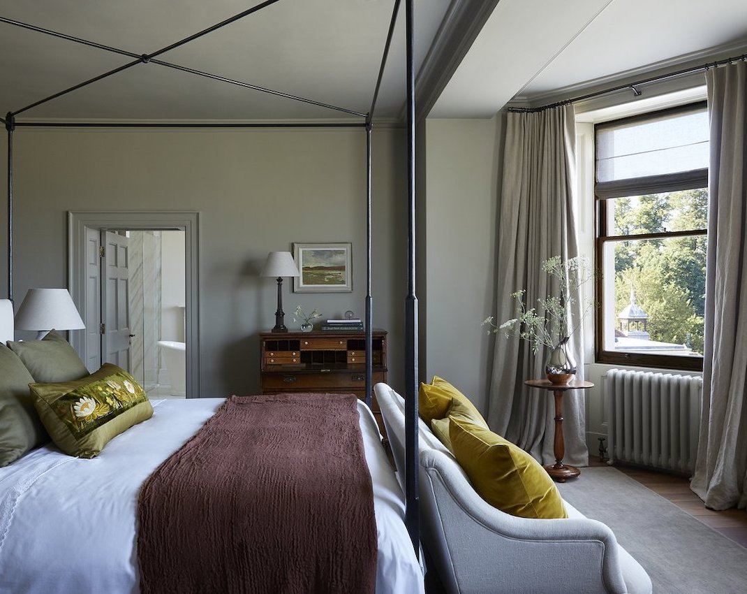
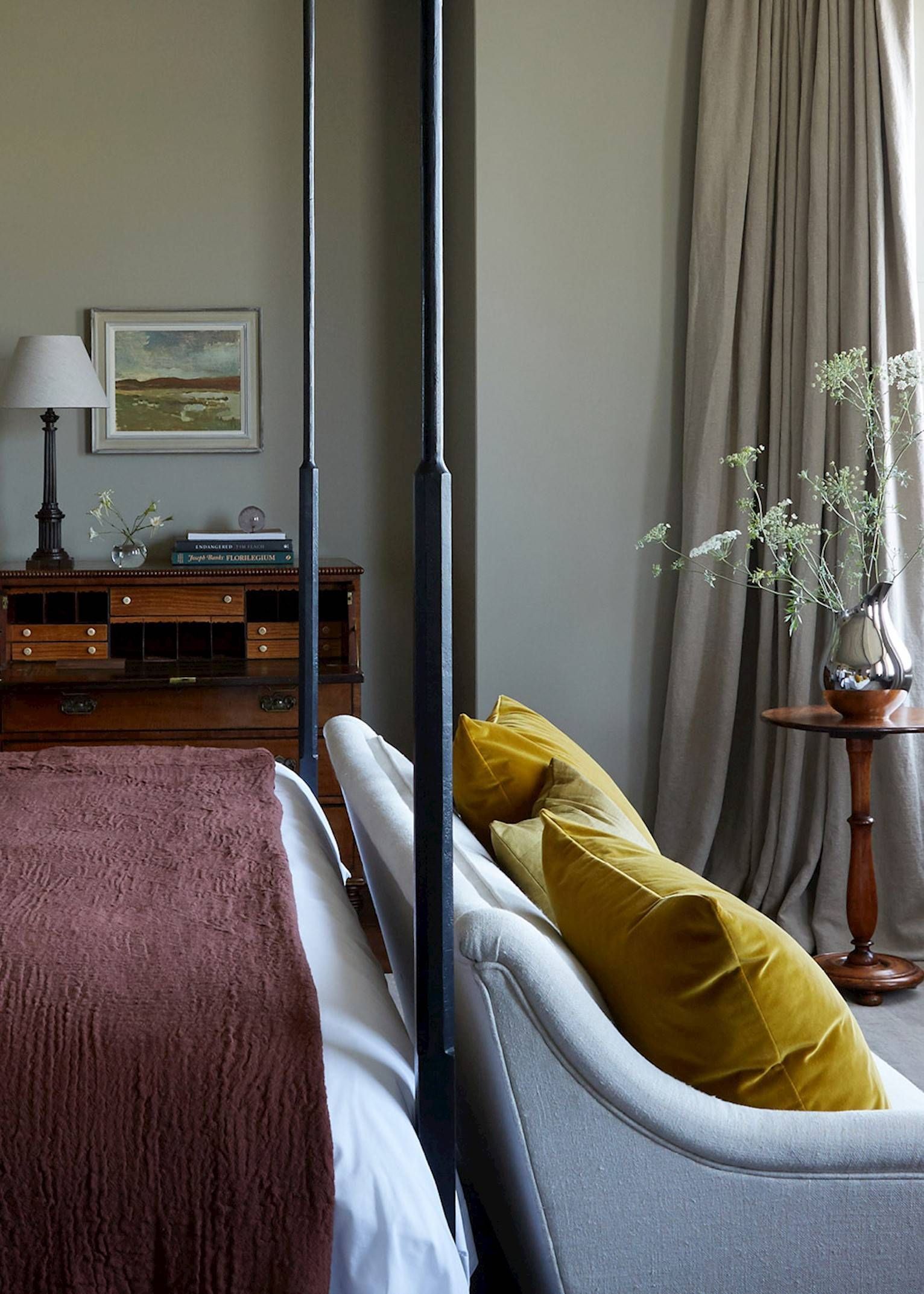
From a guest room – Farrow & Ball Light Gray or Benjamin Moore Sandy Hook Gray
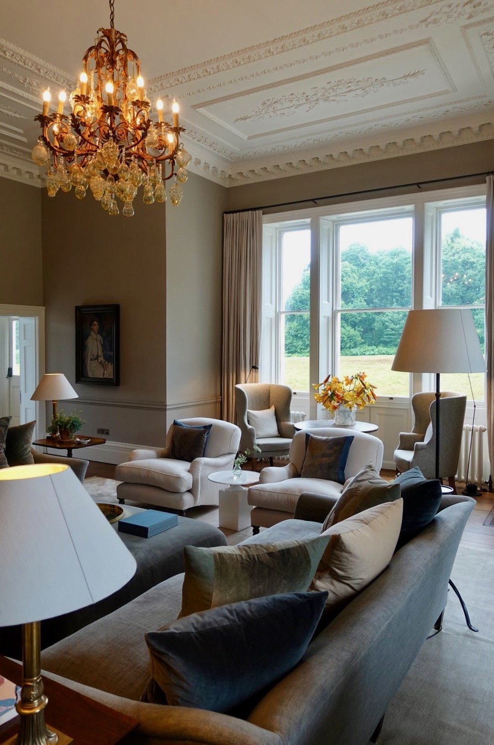 photo by Meija and Kaj, who were guests of the hotel

awww… so cute!
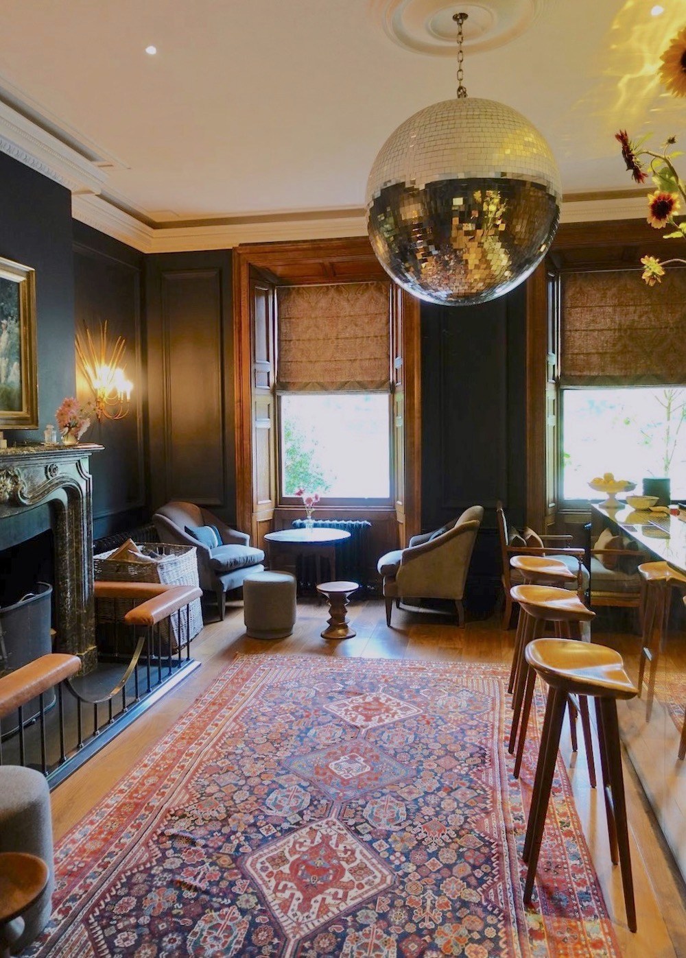
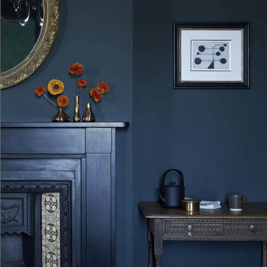
Meija and Kaj also took this photo of the beautiful Moon Bar. The wall color looks to be a soft blue-black. The colors I suggest are Benjamin Moore Soot, Raccoon Fur. and Farrow & Ball Railings.
I got this image from the Heckfield Place Instagram page. Of course, their insta page is also gorgeous!
People were asking on their page about the paint color.
However, it’s a moot point, in my opinion.
It doesn’t matter what the color is. I always tell people to match what they see.
One color that looks a lot like this is Farrow & Ball Hague Blue. It is a fabulous navy with the right amount of warmth, without being teal.
What is so appealing is the slightly blacker fireplace mantel, the dark brown carved wood table, and the perfect accent pieces.
So, it doesn’t matter all that much whether the color is Hague Blue or Railings or something else. What is important is how it all works together in your lighting situation. And, with everything else in the space.
Now get ready for another view of this incredible room. BTW, this is a guest room and one that is on the upper end.
I know. The colors! Can you believe this is a hotel room?
And, no, I didn’t put the red and turquoise colors in my palette. I did for an earlier iteration, however.
I bet that you’re intrigued by that ochre color at the top.
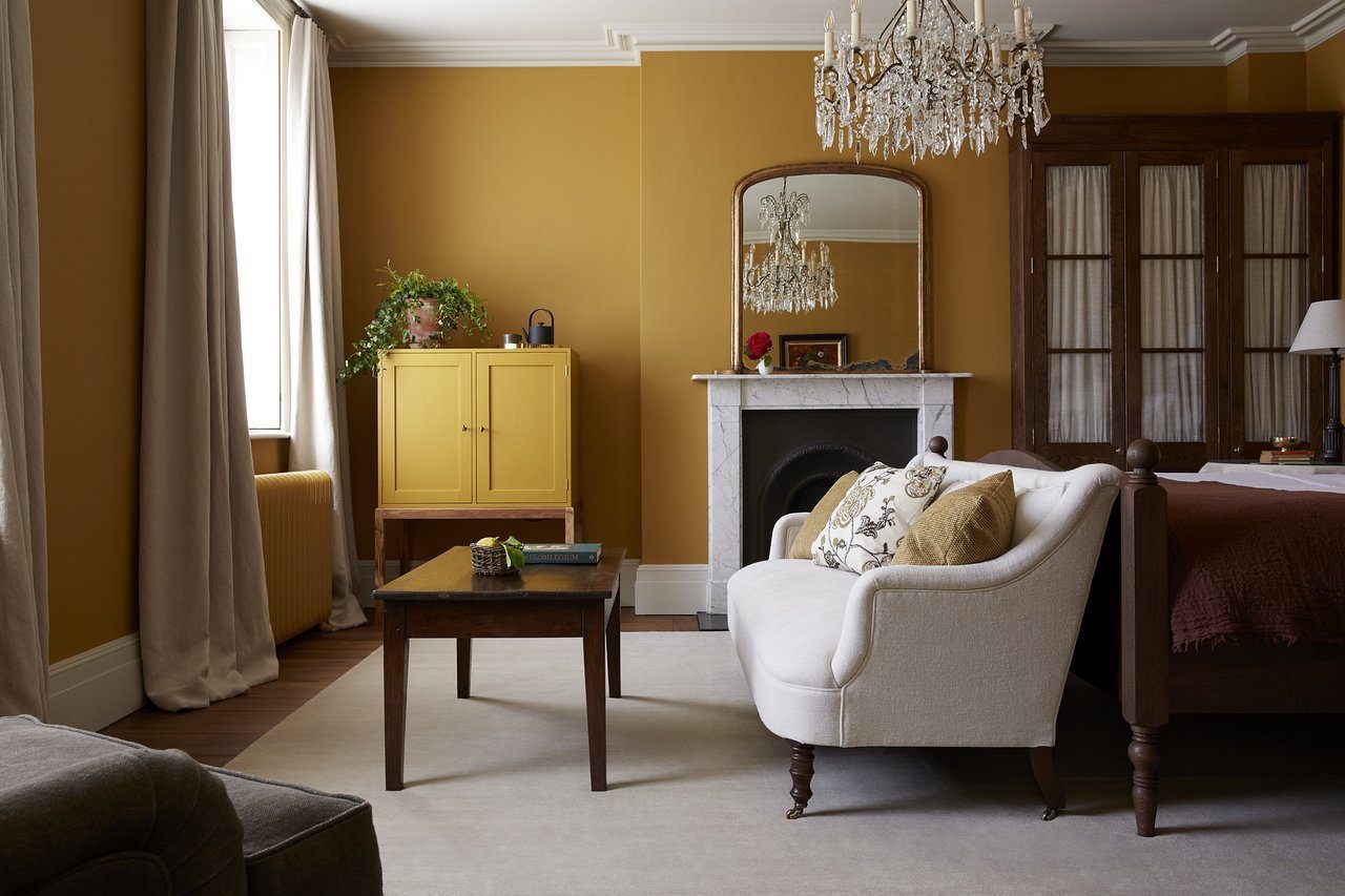 Yes, it’s appropriately called the ochre room.
Above is another view looking into the sumptuous bathroom.
Some colors you can try are Farrow & Ball India Yellow or a Laurel Home Collection color, Benjamin Moore Bryant Gold hc 7.
Of course, it is reminiscent of the iconic and archived color, Orangery. (but you can still get it)
And, yes, this is another one of the costly rooms. There are a number of them. They are known as the signature rooms.
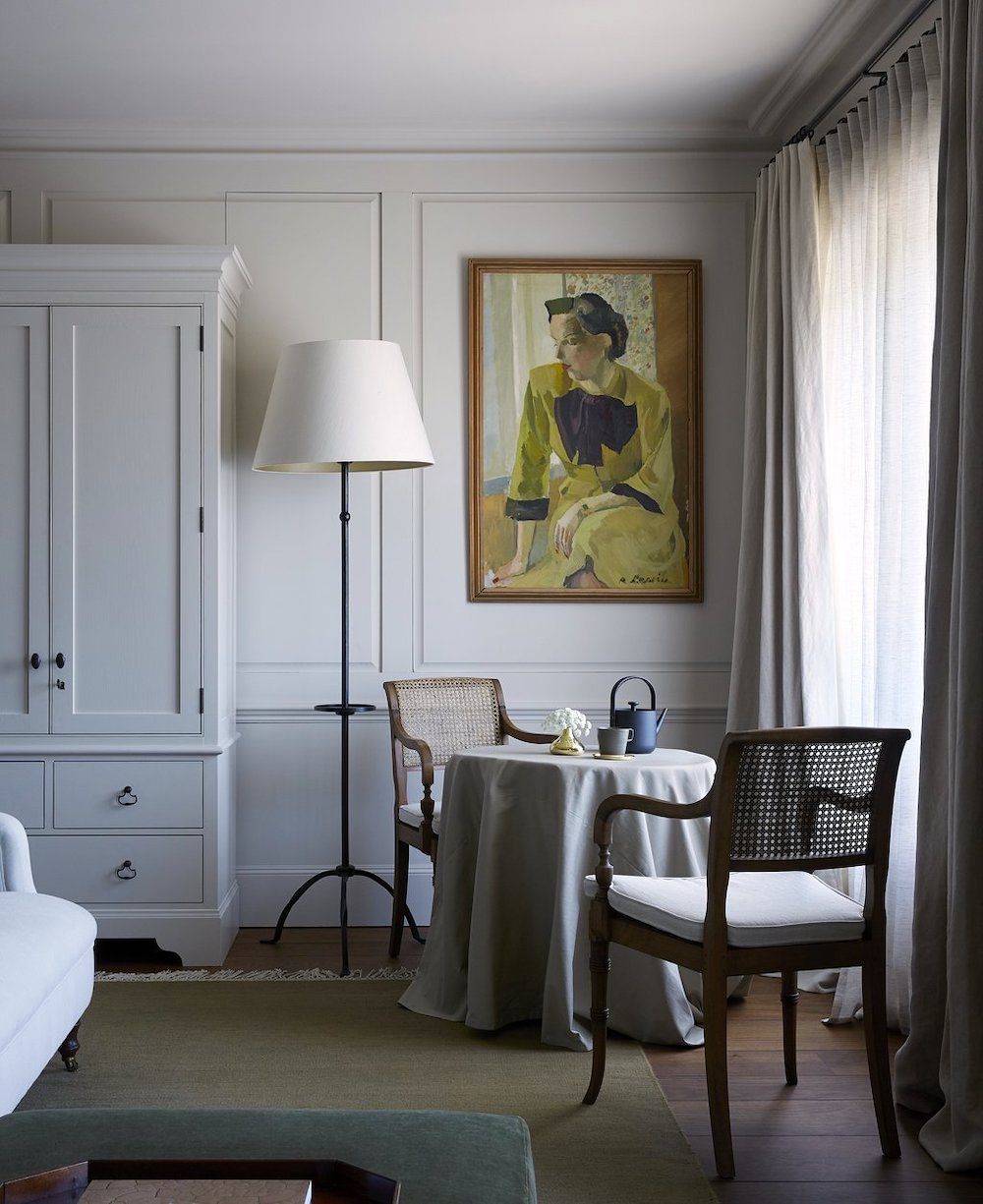
 In the guest room above, we see how some of their colors or subtle variations are brought into other rooms. I love that kind of integration with the soothing color palette. Above is the Lake Room. The wall color is close to Farrow & Ball French Gray. But, please remember that I am only conjecturing. It might not be that color at all.
Please also look at Benjamin Moore Fieldstone 1558.
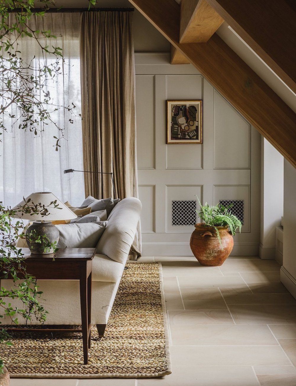
 A high res, close-up, I found. There is much more discussion of the furnishings in this post.
 I found some 300 photos on Trip Advisor. The food in the restaurants is not to be believed.

Dairy cows at Heckfield Place – I found them on the Heckfield Place Instagram page.
Yes, we’re looking at you. haha
 Another cool guest suite.
The wall color looks very close to either Farrow and Ball Mouses Back or Benjamin Moore Kingsport Gray.
 Lovely
This color could very well be Farrow and Ball Cornforth White
The painting makes the space, I think. I get dibs on this room, please!
Please refer to the chart here if you need to convert any of the Farrow & Ball colors.
And, for more Farrow & Ball colors inspired by nature, please go here.
please pin it to Pinterest for reference
Well, I hope you enjoyed the soothing color palette of Heckfield place, along with the exquisite furnishings.
Important Reminder
***Please click here to see a preview widget for EARLY ACCESS of the Nordstrom Anniversary sale, which is beginning this Friday. I recommend you do the early access as a lot of the best stuff sells out BEFORE the full-blown sale starts. Please keep checking back because I am working on adding new early access favorites to the widgets.***
Of course, there’s always more on the HOT SALES pages. There are other sales. Oh, so many! Okay, I have to get this out so I can do my own shopping!
xo,

Related Posts
 My Brownstone Kitchen – Time To Get Serious
 My 20 All-Time Favorite Benjamin Moore Paint Colors
 The 20 Best Laurel Home Blog Posts 2020 – 2021
 Dark Bathrooms – Here’s What You Need To Know
 Gray Walls? The Perfect Color Palette To Make Them Sing
 30 Fantastic Coffee Tables – Plus Sofa Pairings!
 A Gorgeous Antique Farmhouse That Isn’t Yet Singing


19 Responses
Hi Linda! Laurel is a busy girl and she gets tons of questions. I just finished with a client where we extended the lowers 4″ deeper. There are lots of upsides to having extra space on the countertop. Downsides: 1. In a galley kitchen the space could feel tight, 2. Opening the dishwasher or fridge and having space to get around them could be harder, 3. Having the uppers extended can make deeper shadows, so make sure you have adequate under cabinet lighting, 4. Is fully custom lowers worth it for an additional 2″?(we didn’t deepen the cabinets, so there was a loss of 4″ behind them, but the space is huuuuuge, so no biggie, and the proportions were fine), 5. Bigger countertop slab means more cashola too, make sure you can get your preferred choice in a larger size 6. Make all of the lowers drawers instead of cupboards so you can get to stuff in the way back easier, 7.Drawers are more expensive, but worth it. Those are the up & downsides that come off the top of my head. Happy remodeling!
Hi Michelle,
Thanks so much. This comment appeared on the post featuring Heckfield Place. Funny, because of today’s post. For me, a deeper counter space is beckoning me to use it for things that shouldn’t be there. I need counters that are all only 15″. Of course, I’m being facetious. Thanks for answering Linda. Can I hire you? haha
Laurel…so funny to see that disco ball in that very refined room! And, the paneled wall in the photo with the painting looks like it may be a secret opening…do you see the line above the cabinet? Interesting. I thought the exterior paint choice is bold, and perfect. Thank you!
Love the digital painting. Amazing!
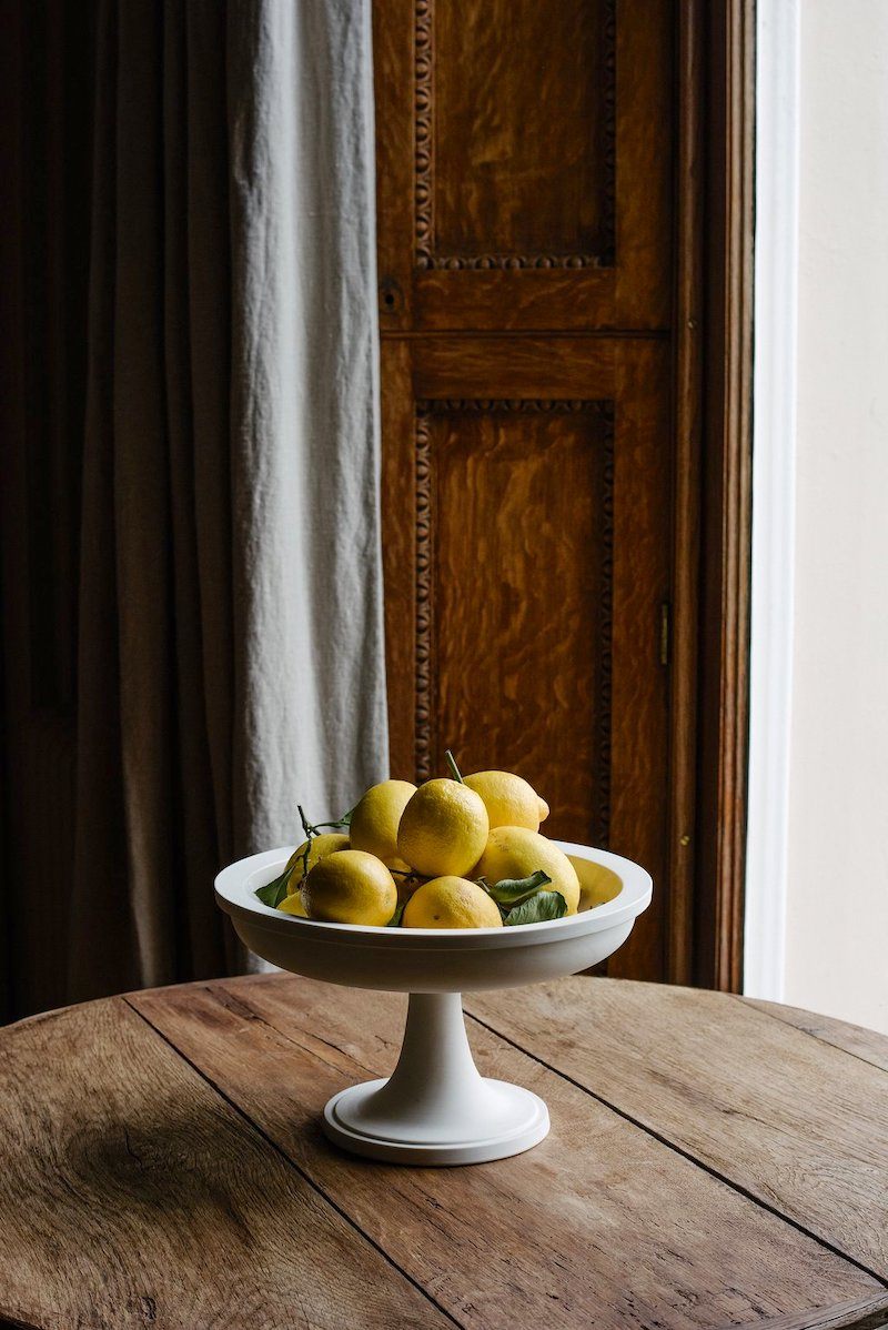
The photo of lemons in the pedestal bowl would make a oil great still life. I so admire this understated style and color palette. I discovered F&B and British design too late in my life. If I could I would totally redo my home in this style. But if wishes were fishes…
I love the colors. The gold looks beautiful with that brown gray. So uplifting to stay in a beautiful hotel
The paint color in the third from the last photo, on my computer, looks like SW 9530
Momentum. It’s lovely.
Laurel, gorgeous post with many instructive points. I especially liked your comment about not getting caught up in trying to find the precise name for a paint color, but rather just try to emulate what you see.
Dear Laurel,
I live about 10 minutes’ drive from Heckfield Place and am going there for lunch next week! The ambience, the furnishings and the views are all gorgeous, but the food is REALLY good. I am vegan and the chefs there manage to make the most ordinary ingredients taste anything BUT ordinary.
I moved here just a month or so before you moved to Boston and am dealing with many of the same renovation decisions as you.
I love your blog, am grateful for the things I have learned from you and you always make me laugh.
Thank you x
Hi Jean,
Oh, lucky you! The food does indeed, look quite delicious. And thank you so much for your kind words! All the best with your impending renovation.
Laurel, your digital painting of Heckfield Place is sublime. I’m all about the Nancy Lancaster/John Fowler style of decorating but can still appreciate the more subdued palette of this hotel. I’ll take the ochre room please.
Hi Ingrid,
I also like that style. There are many styles of decor that I like, which I don’t know if it’s a blessing or a curse. haha
Absolutely my favorite post. Loved all the dreamy rooms, colors, decor, and your insightful help.
Thanks so much, Cindy!
Hi Laurel,
What a beautiful place to rest your head. I bet their choice of colors create dreamy rooms when it’s dreary outside.
So cozy! It would be wonderful to curl up with a cup of tea & a good book in one of those guest rooms.
I agree, wholeheartedly, Mary!
Hi, Laurel
After reading an earlier post that mentioned Heckfield Place, I realized it’s only 15 minutes from my daughter’s home in Hook, England! (She married a Brit, now has a family there). Last spring, I mentioned the coincidence to her and she booked us lunch reservations there. I nearly swooned when we entered the lobby and dining room. It is absolutely as beautiful as your pictures show.
Hi Laurel,
I love your ideas for the Boston Kitchen! I have a quick question. I am working on a 12′ wide by 14′ long kitchen. New kitchen is a galley design.
There isn’t really space for an island. I was thinking about making the base cabinets 2 inches deeper than normal and spacing out the uppers, also 2 inches. This would give me more counter space. Do you see any downsides? Countertops will be custom.
Hi Linda,
I’m so sorry, but I can’t answer individual questions regarding design issues. Otherwise, I’d never sleep and never leave my laptop. It’s bad enough as it is. However, I would not make your lower cabinets deeper than the normal 24″-25″. I would do a U-shaped kitchen. And there is room for a narrow island which doesn’t have to be the traditional island made to match the cabinetry. Please take a look at this kitchen.
Again, none of what I just said is real advice. I can’t see what you’re talking about and I had to stop doing consultations and client work except for two small jobs for old clients. I very much recommend that you work with a kitchen designer.