

Recently, I received a darling email from a kind reader who is feeling anxious over her desire for a warm paint color palette.
Dear Laurel,
Right off the bat, let me say I will not be offended if you can’t address this question on any of your blogs or by email, but I gotta ask! I know enough now about you that you are very considerate and kind, but also that you are extremely busy, so please, please don’t give it a second thought if you can’t address my concern.
I have tried……so hard…..to introduce and use the more popular, cooler palettes into my two-story suburban home and failed. I have put up painted boards of various shades of warm grays and greige, gray-blues etc everywhere but nothing cool seems to work for me. Am I crazy for staying with a warm palette and not embracing the cooler shades?
I am not asking for paint advice. I would love to hear your opinion and thoughts on people with difficulty in embracing the cooler palettes. I have no confidence in design matters but I like beautiful rooms. Everything is shades of gray today in the paint world.
As I go through your lovely portfolio, I see a lot of warm colors there too, and it reassures me that I am not totally crazy in this area.
Colors you will find in my home: Ben Moore White Down, Feather Down, and Cloud White trim. Upstairs :Feather Down hallways, Niveous bedroom, a bedroom in a color almost exactly like Sweet Daphne, one bedroom awaiting a color, 2 bathrooms waiting to be remodeled with yet to be determined colors.
Oh, and I am repainting upstairs trim in Cotton Balls to give me more flexibility in wall colors ( (risky I know but I think I can pull it off because of the separation of floors).
So you see everything is a rather safe, warm paint color palette !
I really love the photos I see of the cooler palettes, but I seem to be more comfortable with my warmer neutral colors. I tell myself that it’s what I love that counts and if I ever move, I can have it repainted or let the new owner deal with it.
Will my home be dated in five years? Perhaps it Is already dated ! Does it matter?!
Remember, no problem if this is not a concern you can address anywhere in your blog. You are pre-forgiven 🙂
Best wishes as always,
Maggie
Oh, this is a juicy one. I hear many issues in this note which I’m going to address. But let’s just jump in with this one.
Will a Warm Paint Color Palette Be Dated in Five Years?
Those of you who’ve read laurel home for a while most likely already know the answer to that question.
NO!
This is what is going to look dated in five years.
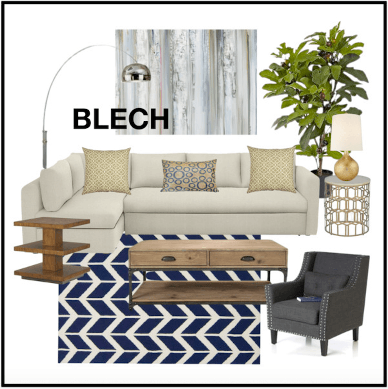
I created this “mood” board about a year ago. The mood here is BORING. I’m still seeing this look and to me, it’s already dated. It was dated the day it came out. I think in future years, people will laugh and say:
“Remember back in the 2010’s that RECESSION-GREIGE-BLECH-LOOK? hahahahaha What on earth were they thinking?”
However, there is nothing wrong with gray per se or a cool color palette. And even with either a cool or a warm palette, there needs to be a balance, most of the time. I will put some posts in the related posts that I’ve written about gray so that you can see what I’m talking about, if interested.
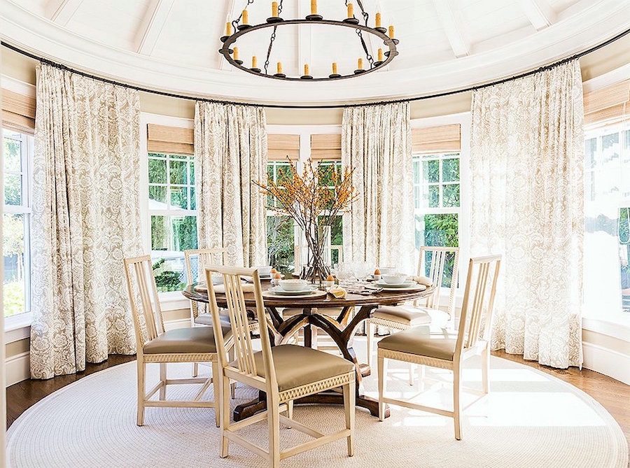
There is absolutely nothing wrong with Maggie’s color palette. In fact, I think it’s exceedingly beautiful.
And some of my favorite, immensely talented and stylish designers who love creamy whites and warm beiges think so too.
Colin and Iona Duckworth via Lonny
One of my all-time favorite living rooms by Alexa Hampton
Above and below by Mollie Johnson
Wonderful creamy-toned palette
These are all beautiful, warm rooms and in my opinion, the very definition of timeless.
And of course, from last week, the home we did recently in beautiful creams and warm beiges
Another issue, at hand is the sheep mentality.
I am not saying that Maggie is a sheep or rather a sheople; not at all! However, her doubting herself is I believe a product of what she’s being exposed to– ad nauseam. I understand that completely. Because at times, I begin to question myself too. That is good. We should be questioning ourselves.
But there comes a time when we have to sit down and go. NO, I’m doing it my way, because that is what I like!
The problem is… and this is based on what I hear and see. A lot of people who are using gray and greige don’t really like it, but they don’t have the confidence to buck the status quo. And so, the trend takes on a life it doesn’t really deserve.
But please let me make it clear that if you do love gray and greige, there is absolutely nothing wrong with that!
What’s the difference? It’s a fine line, I think. But, if one is doing something just because everyone else is doing it, it’s time perhaps for a little self-reflection. That is, if it’s important to you. And it’s totally okay if it’s not.
And now for another big revelation about paint colors that we see in magazines and online
It’s about the photos. The photography.
At least 90% of them are off-color. And that’s a conservative number.
Digital photography has a tendency to come out of the camera either bluer, redder or more purple than it is. This was more obvious when I worked on a PC because the PC itself, read everything bluer.
But now that I’ve had a Macbook for nearly two years, I see that the images are much closer to what they should be, but not always. Photos coming straight out of the camera almost always need editing. I can tell immediately which ones have been and which ones weren’t at all or not enough.
How can I tell?
Well, when I look at a natural fiber rug and I see that it’s pink, I know that the entire image is too pink.
Some designers’ photos are always perfect.
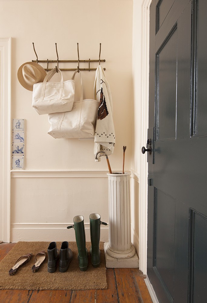
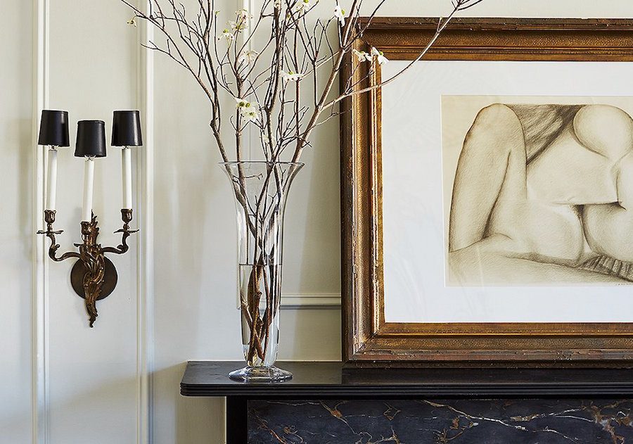
This image of a lovely entry by the immensely talented designer, Michelle Smith. The wall color is Benjamin Moore Parchment. It is one of those colors that goes yellow-ish, peach-ish, but definitely warm and pretty. Please check out the spread here in Lonny. I kinda want to be her when I grow up. ;]
And, look what arrived in the mail for me today!!!

It’s a gift from darling Gaye! And here we are under the De Hondecoeter. ;] (and yes, please notice how “lemony” my warm Hawthorne Yellow is looking in the late afternoon south-facing-always-sunny-living-room)
Gay so astutely picked up that I don’t actually own Furlow Gatewood’s book!
(Yes, I know, I know…)
I will treasure this book – forever! Thank you so much Gaye!
If you are interested in learning more about this book or purchasing it click here.
In closing. Color or colour for some of you is very personal; but there is inspiration everywhere. And chances are, the colors that you love are already being done and very well, too. Maybe not by the masses, but that’s not us!
Go with what you love!
And if you love warm color palettes, please check out these posts here and here.
xo,

Related Posts
 The 9 Most Beautiful Blog Posts on Laurel Home
 Gloppy Paint on Gorgeous Classical Trim – Let’s Discuss
 We Bought An Ugly House, But The View Is To Die For!
 Hubs Thinks Farmhouse Style Is For Farmers- Period.
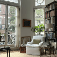 The Elegant Gerald Bland Style-How To Get the Look!
 The Magnificent Front Doors of Beacon Hill
 Can This Dysfunctional Kitchen Be Saved?


64 Responses
Well said as ever, Laurel! I completely agree with you and the other commenters that you have to choose the colours that you love. However, if someone was drawn to warm colours but was also willing to experiment, it might be interesting to look at cool colours that can be appealing even to someone in love with warm. One of my current crushes is Farrow and Ball’s Peignoir. It’s a muted pink with cool undertones, but the softness keeps it from bring cold.
I’m like Maggie, but for me it’s dark colours. Since I’m painting my house to sell, I’ve been persuaded that some rooms have to be white, and I should limit the dark colours I adore, to only one accent wall, in one room. Not my cup of tea, but I’ve made it work by putting copper handles and other details in my white and cream kitchen, which really warms it up. The living room has pale light silvery blue walls, with one dark accent wall (Little Greene’s Juniper Ash) – but also warmer, darker and jewel colours like pink, black-blue and emerald in the rug, furniture and details, and gold silk curtains and lampshades. So while the walls are very cool and much paler than my own taste, they do seem to be a perfect backdrop for the gold and the other colours. I think some other colours which can be a bridge for people with warmer tastes are jewel colours like emerald, sapphire and a ruby pink. Even a very cool room would be warmed up by jewel coloured furniture and accessories. Sorry if I’m rambling, but the point I’m trying to make is that despite being persuaded to use colours opposite to my own very decided taste in the vast majority of my house, I’ve been surprised at how much I like the end result – but only with the layering of other complementary details.
Hi Kirsten,
I agree that it’s always a good idea to put warm colors in a cool room and vice versa. Thanks for commenting!
In most of the wonderfully warm or cool designs posted, I notice that the majority of the larger upholstered furnishings are white, cream or very light colors.
I would love to see some living rooms where the furnishings are not run of the mill, mass produced yuck in drab colors, but can stand up to daily, very lived in use
– tv watching hubbies, family gatherings, dogs, little children, sand, water. We live near the beach. Tho I absolutely LOVE so many of these classic looks that can translate so well to a coastal vibe, our living space is actually our living space – no separate TV room, no great room, lovely, but compact. Would love to see examples of how to translate these designs into a functional space that will not become destroyed after the first major Thanksgiving gathering.
Thank you Laurel, love your blog and look forward to your emails each week.
Hi Marisa,
Please check out Crypton Home. It’s impervious to stains and cleans like a dream making it safe to do white and other light colors.
https://laurelberninteriors.com/i-dare-you-to-drop-red-wine-on-this-beautiful-white-fabric/
Such a good post. The thing that bothers me about trends, is that everyone seems to pretend that beautiful colors that are not part of the trend are no longer beautiful.
It’s weird.
Yes, I agree with that completely, Lorri. That’s why I love designers who break the “rules.”
Is there a way to find out what the wall and trim paint is in the COLIN AND IONA DUCKWORTH VIA LONNY room? Beautiful!
Hi Carole,
I’m sorry, I don’t know. But here’s the thing about seeing colors that you like online or even in print.
I color-corrected this image slightly. The floor looked slightly purple before doing so. And I know that it’s not purple. I also brightened the image slightly as it was a tad dull.
In addition, your monitor might be reading the color differently than mine. Then, there’s the lighting in the room and the camera that took the image.
There are dozens of colors that this could be. But… here’s my theory. It’s not really the wall color. It’s the entire space as a whole. If we saw this color in a boring room with an 8-foot ceiling and no architectural enhancements, horrible furniture, no touches of black that make it all sing, my guess is that we’d all think it was not-that-great. It’s be another “boring beige” room. But this is a testament to how fabulous a warm beige can be IF done right.
YES!! Thank you for putting this out there about COLOR!! I have always been frustrated that clients think that our home colors have to be “current.” If current has to be trendy, forget it, by the time something becomes a trend, it’s already dated, even though it will likely be marketed to the masses for a few years following. It’s about how it’s put together and Timeless always outweighs TRENDY!! And we all deserve to love the space we live in. Remember those ghastly Mauve and Grey schemes? Dated from the start! But they were everywhere.
This is yet another perfect example of the magic of Laurel’s Designs! Always CURRENT without being Trendy, always gorgeous, always Timeless!! Your blog posts are the best! Interior Design at its best! Love, Love your Paint Color Posts and Colors. It’s just amazing what you post for FREE!! Keep ’em coming!
Thank you so much Jackie for your very kind words!
BTW, our first home that we bought in 1991, was all mauve and gray and China White. I couldn’t wait to change it!
Dear Laurel,
My beloved Internet friend, have I missed something? I have been on the edge of my chair waiting for the Bronxville kitchen, aka ( BK ), unveiling. I , like so many people, are smitten with the BK. Did I miss the big reveal? I’m on the edge here……please, tell me it isn’t so……I didn’t miss the BK……..did I …….Here’s hoping….
Hugs, Linda
No Linda,
No, you didn’t miss anything. There was no big reveal. :[ And yes, it’s very upsetting but nothing I can do about it. The client made it very clear that there will be no photos taken of the kitchen.
I wrote this post a while back.
https://laurelberninteriors.com/a-dream-kitchen-is-salvaged/
I agree go with what you love! Like the varied shades of warm neutrals (and pair with green would be FAB!). Laurel I have been combing through your blue and white post… Do you recommend a warm white or cool to go with the navy? Thanks!
I think it depends on the lighting and what else is going on in the room. Generally, I prefer whites with some warmth in them. I wouldn’t go super creamy, but the depth of the navy, might erase the creaminess.
In my midlife crazy I downsized to a modest ranch w/walkout basement just north of Boston MA along North Shore. While my taste and actual interiors are more in keeping with those you reference each week, my venture into midcentury modern has been a refreshing departure causing me to re-educate my paint/color understanding. Your blog has been a God send for me. I’ve learned a lot and appreciate all the tips and info – you’ve spared me lots of trial and error pain. A good student, I try to read first, paint second and have read your posts on north rooms and colors turning muddy. So I’m happy to read warm palettes are here to stay.
I’m okay with a cool palette in the upper level, it’s filled with lots of light. My entry/hall is painter’s White, bath is Shoreline and main flr laundry is Horizon, etc. all complimenting my modern decor. My challenge is the lower level walk out with doors on the sides – one to garage and the other to covered patio – neither a great source of light. The main outer wall has only two windows which cast nice light on that end of the lower level at mid day but the living space is farther back and dark.
The flooring is a light driftwood plank that has slight soft hints of brown across a field of white and grey. It looks great in both daylight and under warm LED recessed lighting. The decor is modern, minimalist – recessed warm LED lights. I’ve read your posts on Scandanavian whites and have taken to heart the advice of warm palates in dimly lit/dark room. So I’m thinking maybe BM Dove White (Y) on the walls and BM Cotton Balls (GY) on the trim for the entire lower level with Simply White OC-117 for the ceiling. But will I achieve an airy, modern, minimalist effect from these colors or will it look like tooth paste?
My problem is transferring your blog posts into my modern decor. I don’t have lots of architectural features – simply lower ceilings and expansive open concept. I’m hoping you’re planning a post that would address those of us struggling with dark rooms and modern decor?
Hi NS,
I don’t think it will look like toothpaste, but there’s so much to putting a room all together besides the paint colors. And even though you have recessed lighting, I would add some table lamps and maybe some sconces and keep the recessed lighting on dim. Mirrors are wonderful for adding light to darker spaces.
I’m not there to see what’s going on to give specific advice.
I did a post about a modern home a few weeks ago. It might not be modern enough for you, however.
https://laurelberninteriors.com/bought-ugly-house/
Thanks Laurel for the glimpse into J&S challenges…looks like it will be worth their effort – especially with that view. My vision of modern however leans more toward classic modern/Scandinavian minimalist – low profile case goods, some artwork and no clutter – clean simple lines and white walls. The use for my lower walkout level is (1) existing access to attached garage/covered patio (2)New full shower/toilet (3) media/TV area and (4)dedicated furnace/pantry storage. Lower level is carved 2/3 entry/bath/Media TV area 24’x 20′ largely open with staircase opening into center and 18’x12′ furnace/pantry/storage somewhat dictated by foundation walls/walk outs.
Wall-A media room runs 18’W and is the focal point for the sitting/media area.
To the left is Wall B featuring close wall mount 60″ TV and below 96″Wx19″Dx20″H low console cabinet light walnut.
Opposite is Wall C – light grey leather 2 seat sofa floats out 6ft parallel to Wall C w/computer table behind creates small work center. 3 seat sofa 90* along Wall A. All seats recline. Glass/lt walnut coffee table serving both sofas.
Wall D is 8′ accent wall opposite from Wall A to conceal L-shape staircase. Wall D has 70″x15″ recessed contemporary elec fireplace/heater. Ceilings 8′ some couple sofits HVAC and Plumbing 7′
Flooring is light driftwood w/lots of color variation click 8″ vinyl planks w/moisture barrier and radiant heat.
Hi NS,
I don’t do very well with descriptions but I wish you well with your vision.
I went into a model home and spoke to the realtor. They were installing all grey hard finishes. When I insisted on changing them to more neutral and warmer finishes, the realtor told me it was ridiculous and that no one would ever buy my home–I would never resell it! I was angry and I walked out thinking nice selling tactic! Sarcasm obviously! I’m glad I had the guts to hold my ground but I feel bad for those that would second guess what they really love. While I understood realtors understand what’s hot on the market NOW, they are not designers. I always get compliments on my home. I LOVE your blog! I have to add–I love your dimpled smile! You are stunning!
Hi Ann,
Oh, what a cow! Like it’s any of her business!
And thank you for the sweet compliment!
Hi Laurel,
Thank you so much for your instructive and fun post! I have been reading it for a short time and have gone back and read as many old posts as possible since I find them so entertainingly informative! I think I may be quite a bit older than many of your readers and have seen so many trends come and go. I always liked to think that I was my own person and wasn’t too affected by trends. I loved “classic” traditional rooms. Back before Pinterest and all the decorating blogs when we just tore pictures out of magazines, I had accumulated reams of pictures of beautiful rooms that I thought were classic and I would love forever. When we recently retired, sold our home and downsized I went through those pictures and was shocked at how many of them looked dated even though they still had the beautiful bones. I think the best trends are those that take the best of the best and just freshen them up.
This is getting long, but I have all this built up conversation with you in my head and I just wanted to tell you my gray story. We were still living with builders beige in our new home, and my husband suddenly decided he wanted the walls painted and he wanted gray. I have no idea how he hit on that but I was appalled. All I could think of was sharks and submarines! But I went on line and found this whole grey world out there that I had no idea existed. After some trial and error I found the perfect grays for every room in the house except the guest and bath, and I am loving it. I guess you never get too old to try something new.
Finally, I wanted to tell you that sometime back after first beginning to read your blog, I heard you interviewed and you mentioned Furlow Gatewood. I had never heard of him but was intrigued and bought his book…the very one you are holding in your picture. Thank you for introducing me to this wonderful man. I can’t get over this book. It is open on my coffee table right now to pages 90 and 91. I just stop and stare at it and in a few days I will open some new pages and stare at them. It’s right on top of Bunny Williams An Affair With A House, but I’m sure she wouldn’t mind:)
Thanks again for everything and PS, I love your name. It is our beautiful daughter’s name!
Hi Mary,
I have a lot of readers in their 60s and 70s. Definitely! And I too, used to tear photos out of magazines. I still have a lot of them! And the ones I loved 20 years ago, I still love!
I read the book in one big, gorgeous gulp today. I know. I recommended a book I had never read! But based on what I had seen in magazines, I knew it would be a sensation. It truly is!
Thanks so much for your sweet note!
Hi Laurel, I have to say I was so happy to see this post in my inbox this morning as well! I have always loved warm whites; I always find I gravitate towards them. But, always a ‘but’, right, lol, as you stated in one of your responses, sometimes we are bombarded with so much information of what you should and should not do it gets confusing… you are so right!…sometimes it makes me freeze in my decision process! For instance, I wrote to you in your last post, the beautiful long distance home, asking about honed or polished Carrara marble in kitchens, and was very happy to hear that a honed finish is your preference in a kitchen as well, as that is what I have decided to go with in my new build. But, yes another one, lol…regarding being bombarded with too much information, I have read in Maria Killam’s blog, and her white is complicated eBook, that if you use carrara marble, that your cabinets and trim need to be in the true white category, never off whites such as simply white, white dove, cloud white, but, true whites like BM Chantilly white or SW Extra white, or it will look ‘off’ because the white background in Carrara is a true white. I’m not asking you for specific advice to my situation, but, more in general, that may be helpful to many. When you use Carrara marble do you always pare it with cabinets and trim that are only in the true white family, and paint the walls in warm whites, or, have you pared Carrara marble with cabinetry in the off white (warm) family, and in your opinion it’s just fine? I know you reference cotton balls as one of your favs, where would you say that falls? Thanks…as always, enjoy your blogs…your sense of humor in your writing style is the best!
Hi Denise,
Well… that is a slippery slope for sure. And I say that because there are a lot of Maria fans who read this blog as well.
I have enormous respect for Maria and agree with a lot that she says but not everything.
First of all, marble is a natural stone and therefore the color of it can vary. The second point is that it is usually gray and sometimes a cool gray yes, but with a touch and I mean a touch of a cream going through it.
In some lights, some Carrara can look ever so slightly blueish greenish. I know because it was all over my old home, in the master bathroom and the LR fireplace surround.
I had a client and I helped her with her kitchen about 4 years ago. Oh gosh. It’s on here somewhere. Not-very-good photos. But we did a cream that is similar to linen white. We did that because they had it already in the other rooms for trim. The island is a gray-blue and we did this wonderful gray-blue glass tile backsplash. The other counters are soapstone. It’s a lake home.
I found the post. The kitchen is not done so it’s not really fair. I don’t have any other photos because I only went back one more time and didn’t have my camera or an I-phone yet.
https://laurelberninteriors.com/a-kitchen-renovation/
But, when it was all done, it all looked lovely together, I thought.
I think that white dove looks wonderful with Carrara too. We did that in a bathroom also on here. That one was Carrara bianco so a little whiter. We did white dove in the kitchen I’m always talking about. That stone is Calacatta Gold.
I guess what I’m driving at is that I think that a lot of whites look nice with the stone because the eye tends to blend them. The best thing to do is make samples and hold them up as they will be living in the room.
Thanks for sharing your thoughts, and that kitchen. Even though you did not have finished photos, I’m sure with you involved it was quite lovely in the end! Also, thanks for your opinion. I very much admire Maria’s work as well, and have gained quite a bit of insight to understanding undertones from her. I have just recently seen so many designers post images of white kitchens on Houzz, with carrara countertops and either White Dove or Simply White cabinetry, which, she does not advocate, so, I thought, why not ask your opinion given your years of experience, and my admiration for your work. So, thanks again for taking the time to share your thoughts and your insight, it’s much appreciated 🙂
I love warm whites and creams! Much of my furniture, bed coverings, etc. are these colors. They look great on walls, too, and I love your photos. My house seemed to call out for cool colors on the walls, though. Just not greige. Not for me, or at least not in my current house. Little story–Being uncertain, I hired a designer to help me choose our living room wall color, and she chose BM Jute. I found BM Iced Cube Silver on my own, and chose that. She insisted I’d get tired of it–or any cool color on the wall, for that matter–very quickly. Seven years later, and I still love it. Just the faintest hint of blue, very pretty. A nod to the Scandinavian look that I also love, although my house is hardly Scandinavian otherwise. Anyway, as you said (more or less), each person should pick the colors that make her or his own heart sing!
Hi Joyce,
I’m having a deja vu here. Who is she to say that you’ll get tired of it? That makes me nuts!
Oops. I probably did relate that story on your blog once before. This is hopefully new–One time, a sales person/alleged designer in Ethan Allen (I was in my 20s) told me that the solid-colored fabric I had chosen for the sofa I was about to purchase was “boring.” She insisted I pick some big floral print. Uh, no. I didn’t purchase that sofa, nor any sofa, from her. I ended up going elsewhere and bought a Vanguard sofa that I had upholstered in a rich solid green. After my cats tore that sofa up, I had it reupholstered in a beige-y neutral, and it’s now in our guestroom.
Hi Joyce,
No problem is you did or didn’t say it before. I can’t always remember what I said either. In fact, now that I have well over 300 posts, I sometimes struggle to find something I’m looking for.
Good for you, listening to your instincts. Can’t stand that she said the solid would be boring. grrrrr… That’s not what makes boring.
Imbalance and actually too much of the middle-ground is what I think it boils down too. But it’s like trying to describe why a face is beautiful and another one, not so much.
Laurel,
I love your blog and look forward to reading each post along with the wonderful comments every time it hits my inbox. Thank you for all you do!
Thanks for your lovely comment Susan!
Hi Laurel and Maggie. Great topic and even greater response. Thoroughly enjoyed it. We always feel calmer and happier when we go with what we love. Have a great week.
Thanks Gail!
I too find myself trying to find the right colors constantly in my head, even though I am kind of tired of thinking about it,and tell myself to stop it,although my thoughts have a life of their own lately. But I have to remember that every thing we see and hear is simply the market forces in play. Everything is advertisement for product…even if it is “just” paint. Of course they want to sell us “new” stuff. Imagine how much these paint, furniture, accessories, home renovators, construction teams and designers earn by our want for the latest and newest just so we don’t feel “dated”. (Even “news” is a product, which is why I watch and read less and less of it.)
This is why I love you Laurel, your classic style will literally never go out of style, even 20 years from now.
Hi Chris,
Thanks for such a sweet note!
Chris, you are so right about Laurel’s skill in creating classic rooms! Her blog posts are not dictatorial, but instructive for those who want a classic style. She teachers her readers principles that are universally relavent. And because she illustrates these principles with such perfect examples, her posts train the eye. I know of nothing like this blog, and I reccommend it to friends all the time, especially to young friends who are just starting out thinking about making homes.
Thanks Gaye! I read the book in one giant gulp yesterday. Beyond gorgeous!
That’s a big gulp! But it’s almost impossible to put down once you start,I’ve found. Later, you start seeing little things you missed. Last week, for me it was the paintings and the decorative painting (floors) and floor cloth. And those whippets look better than the whippets I’ve seen—smaller, fuller-bodied.
Hi Gaye,
I’m sure that the dogs are cared for incredibly well.
What amazed me is that nearly every photo was one I hadn’t seen before. There were some similar but most were new. The book is an entire interior design course, which starts with getting the bones right!
Hi Gaye,
Yep, so right. Since reading Laurel’s blog, she has taught me to see design through a historical context. My husband probably inwardly rolls his eyes every time I come out with “but that’s not historically correct”. It seems like anything that has not been here historically, is a trend. This does not preclude modern furnishing either…as all modern furnishings have their roots in the 20th century and are classics too. All the good stuff has been done already.
Anything not in those categories, to me is a trend.
Sure trends look “fresh” at first, but they have very short legs! And most other design blogs decorate with trends. Especially those not classically trained. Perhaps it’s ok to do trendy stuff, in small doses, like a coffee table or something not too expensive to kick out when tired of it. But I’ve learned through Laurel to keep the bones classic.
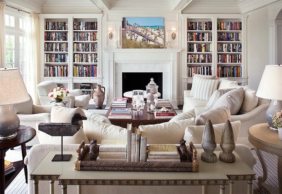
Laurel, I was so delighted to see my letter on your post, I could have danced for joy. Yes, it’s time to just commit to the colors I love and not what someone else loves! The point is to make beautiful rooms not on trend rooms as you rightly state. You have shown us some really beautiful rooms here, and I love ALL of them. As you point out, it’s also about all the other things in the room. I agree with you about beautiful rooms having books. I love that study with those gorgeous white built-in bookcases. Such lovely furnishings too in that room. Thanks for addressing my concerns and giving me both ideas and the confidence to keep going with what I love. Such a pleasure to read your blog every Sunday morning. I so look forward to it! Beats the NY Times. I hope you have a wonderful Sunday 🙂
Hi Maggie,
Thank you so much for providing a topic that I know is one that people struggle with. It is very difficult when we are bombarded with you should do this or that. It really gets my hackles up because there is no one “right way.” There are many right ways. I’m glad it was helpful to you too!
I think using the “color wheel” is over-rated. “You have to use colors opposite one another on the color wheel.”
“You have to use colors that form a triangle on the color wheel.” etc. I love blue but I hate orange, I cringe when I see orange accents in a blue interior. Decorate with the colors you love. (in my case blue is my favorite, green second favorite, grays and whites for neutrals) Today’s fad is tomorrow’s “what were they thinking?” If you decorate in the colors you love, you can never go wrong.
Well, there are various color schemes based on the wheel, analogous, complementary, etc. I am not a fan of orange either. In fact, I once read that only 17% of the population likes orange, and I would not use it. But I have seen blue and orange used together effectively, depending on the color of orange. I think it is about contrast.
I also prefer classic color schemes. I tried the gray in one room – the very popular Ben Moore pale oak in my kitchen. That was in February, and I will be repainting in the next few months.
Hi Cindy,
A lot of people THINK they don’t like something until they see it and not just see it, but done beautifully.
I was at a booth at High Point in the antique center and it was painted this bright orange-red. Against the antiques, artwork, lighting, etc it was gorgeous! I mean gorgeous!
But orange has a bad rap thanks to the late 60’s and 70’s when it was paired with brown and the ubiquitous avocado green and gold. Or, they think of a fast-food place.
I did a post about orange and I think it might help change some people’s minds.
https://laurelberninteriors.com/home-staging-ideas-you-wont-hear-on-hgtv/
I also did another one paired with blue. I am curious after looking at this post if you still hate the combo. It’s okay if you do. But I’m curious to know if it’s how you’ve seen blue and orange done because it can be horrible. But I think that all of these rooms are lovely.
https://laurelberninteriors.com/presenting-the-hottest-color-palette-for-fall-2014/
Those rooms are lovely. I don’t hate the combo at all, orange is just not for me. A peach or coral pink would be about as close as I would get.
I do have to confess, however, that I did use a shag rug in gold, avocado, brown and orange in the family room of my first house in the early 70’s. Many times I asked myself “What was I thinking?” In the late 80’s we finally ripped it out, and I was very happy! I also had the avocado appliances replaced after 20 yrs, except the washer and dryer that didn’t die until 1998!
Of course I can’t even deal with some of the new fabrics that are reminiscent of the 60’s. Been there, done that!
Hi Susie,
I know. Sometimes things can become so analytical that they end up not working. I find that to be true in a lot of sectors including blogging.
This post really struck a chord in me. Maggie is not alone. After several years of trying to find my way to a color palette for my home and trying to follow the trend of grays and griege, I learned a hard, expensive lesson. DO WHAT YOU LOVE! Do not doubt your decisions, just follow your heart. If you love the warm colors, do it! Even with the tons of pictures I saved to my Pinterest boards that were the soft, light, warm colors of white and cream, with small pops of color in greens, yellows, and oranges, as well as the timeless blue and white combination, I still tried to fit in grays and griege in my home that ended up looking dirty or lavendar on my walls. I did a lot of reading about lighting and the colors to use in an east or west room and high or low light rooms trying to pursue the perfect gray or griege. To top it off, I was trying to fit these colors in with all the colorful accessories and the warm wood floors and furniture I have throughout my home. I was fighting what I really loved to fit a trend. I just wanted a neutral color that I could use as a foundation to work around the colorful accessories I lovingly collected. On a fluke, I came across Hale Navy by Benjamin Moore and that was the turning point for me. The second I started painting a sample on the wall, I knew immediately that this was the right anchor color for me. I realized that I had been fighting what I really loved and this color started me on my journey to a home that I am starting to love. Laurel’s recent post about decorating a house with blue and white helped to cement the direction I am taking. Hale Navy and white is being used for my kitchen/dining room area with small pops of color from my accessories. I have installed black counter tops, which scared the living you know what out of me, but I love them!!! The kitchen/dining room runs along the center of my open concept first floor and I am now excitedly using this area as a jump off point to start working on the rest of my home. The point is to create a home that is warm, comfortable, and happy for you and your family. A place that you can go to after a very hard day that spiritually revives you. Your home sounds beautiful Maggie. Continue to move forward with what you love!! Thank you Laurel for your wonderful support and honest guidance to all of us novices out there trying to develop the homes of our dreams. You have my heartfelt thanks.
Hi Anne,
It all sounds gorgeous! Hale Navy is a wonderful color. I used another navy in the collection that is very similar. I chose it because I saw in at a booth in High Point and it was a a wonderful backdrop.
Great post, as usual. I’m pleased to report that, in Boston at least, it seems that stagers and realtors are no longer insisting that EVERY room be painted gray before the property goes on the market. There are bright colors, creamy shades, and warm neutrals turning up among the otherwise gray listings, like flowers, or jewels. (I’m talking about the $1M-ish, 2BR condos, not the $3M-plus ones or the $600K-ish 1BRs. Condos at BOTH ends of the price range often have more detail and personality for some reason than the middle range I’m in.)
I know that a “neutralized” gray or bright-white room is supposed free me to imagine myself living in it. But it just turns me off. I often look at photos of these rooms on Redfin and wonder if they were shot in black-and-white! So drab and lifeless. But I can stand in a bright-red room and think, “Well, I’d never do this red, but I can see all that gorgeous detail against that color and imagine some other warm but subtle color in here….” It’s much harder to do it when everything is gray or bright white.
I keep imagining creamy walls as I daydream about our future place simply because we have loads of color in our rugs, art, and upholstery, and a zillion books to cover the walls, too. I have read that BM 925, ivory white, is “the color you want when you want a white that isn’t too white but is soft and warm.” Do you agree? BTW, I’ll be buying your paint deck when the time comes…. can’t imagine doing otherwise!
Hi Elle,
Yes, Ivory White which is also the same as Acadia White is a wonderful cream and looks good in all different lights. But always test. I have heard of it going yellow in some situations. I haven’t seen this for myself, however.
I’m heartened to hear that stagers are wisening up. A beautifully put together room I feel is far more appealing and wrote a post about this.
https://laurelberninteriors.com/home-staging-ideas-you-wont-hear-on-hgtv/
Love Boston! My son lives in JP.
Elle,
I just recently had my kitchen (aged and yellowed) cabinets repainted BM 925 Ivory White along with the walls and trim. It’s a sun filled room with floor to ceiling windows, much like Laurel’s most recent long distance post. My experience? It’s a soft beautiful cream without going yellow. If anything, the trees are reflecting a bit of green through the windows.
You article was so appropriate to my disappointment today. For years I have been a lover of Benjamin Moore’s Cameo White and have used it a lot in my home. It has a yellow tinge, that is pretty, sunny and uplifting. Now, every Showcase of Homes that I have visited for the past three years or so shows grey is the popular color and definitely looks pretty in the fully decorated homes. So last week I decided to paint my living room a grey. The two grays I like best were SW Repose Gray and BM Gray Owl. I bought two sample cans, painted them on the wall side by side and after a few days made the decision to go with BM Gray Owl. It was more bluish and my goal was to make the living room have a more blue and white theme. After six hours of painting and a few days of adjusting to the color, I am disappointed. It is a pretty color, but definitely appears more greenish, kind of old fashion and beachy and not uplifting like my Cameo White. And this was all because I wanted to choose a color that was “in-style”. Now the decision – repaint? live with it? or possibly hire a decorator to help me pull together some other things to get the look I am aiming for? I am sure a lot of us out there have experienced this situation. Thanks for your blog.
Hi Christine,
It’s a tough call but if it isn’t giving you joy, then the decorating might be putting good money after bad. It might be that the lighting in this room just isn’t right and that it needs a warmer shade.
I worry that my paint colors will seem dated …after the gray trend ends! Some large part of my different homes have been painted PPG ‘French Gray Linen’ for the last 20+ years. It is my favorite paint color; a beautiful gray green!
I don’t ever feel that I have to be “on trend”…but I don’t think I can keep it and just have people think I’m behind the times LOL!
Written from my office —painted French Gray Linen!!
Hi Maggie S.
NO, NO, NO… Yours is not “the trend.” This sounds gorgeous and classic!
It’s not the color “gray” or gray-green, greige… it’s HOW it is being used for the last several years that will look dated.
Laurel, I didn’t explain that well…I just meant that anyone coming to my home in the future would think I had painted the walls gray because it was “the thing” and then didn’t update with “the next thing” (I’m guessing warm dark colors).
Maybe after all these years I should do something different :-).
And I have your book of paint colors for inspiration!!
Hi again Maggie,
Well, they might think that but probably not. And they may very well love the color in any case.
I love this blog, I say it every week, but I really do – I’ve learned so much. Color should be a very personal thing, don’t ya think? I’ve always loved color in my home and don’t care what the masses say. What I’ve learned from your expertise is even pink can be beautiful (don’t hate me pink lovers) and it doesn’t have to be Pepto pink either. Your lovely yellow living room … isn’t yellow only for kitchens (?) sheeple thinking … I’m ashamed to say. I never would have thought black would be stunning on walls or the ceiling, but it is. This is my humble opinion that if a color is embraced and you love it, that is the color to go with. Well, back to my coffee. Have a lovely day.
Hi Betty,
Thank you so much! I’m having so much fun putting my inspiration boards for the paint palettes together. And it’s been a learning experience for me too. One of my favorites is I took that acid yellow and used it as a wall color.
But with lots of white furniture, white drapes, touches of black, chartreuse and a white floor, I think it looks stunning.
So, what I think we’re all trying to say is, “it’s context.”
And the problem with the color gray is that I see it paired with lots of weird, overscale furniture and more gray and steel, a little rust, more gray and a bold geometric somewhere. So, of course it doesn’t look good.
Oh Laurel, thank you, thank you for this wonderful post!
I will never be a cool colors person. I’m always inclined to go warm. If I use cool color, it will be either an accent, or probably will be the warmest version of this cool color. Say, my blue will most likely be turquoise, or bordering on purple if it’s darker blue. Gray will always be warmest greige-and I fanatically love greige. Even my nails are greige, half of the time:) So I don’t care at all whether it’s a trend or not. The white will always be the warmest white. And I’d pick scarlet rather than crimson..
I love neutrals, I love how sophisticated they are and how they change with a light..and they can be wonderful mix too. Cream, and beige, and warm gray, and tan-so elegant together. Why it should be just one thing? It’s really laughable. So many wonderful combinations around us wherever we turn our eyes too-if it works in the nature, how can it not in the house?
I love colors too, and some of them quiet, and some rather fierce. I love pastels less-but I can’t forget the scene from the movie “Sleepy Hollow”-dark trees, white snow, two little girls in rose-colored dresses. So pretty. I dream about a room like that. I shy away from too much white, or black, or pastel-but it’s never about one color, it’s about the combinations, and they can be incredibly beautiful.
I like dark and moody, and I like bright and happy, it’s the question of balance. Not only the external balance of colors-but the inner balance. Being quite a gloomy person-I tend to surround myself with happier, warmer colors. Actually now when I’m more ready to embrace dark and moody sometimes-it tells me
I’m stronger inside because I can dare and take the risk of being surrounded by darker, quirkier things, without feeling unsettled.
It’s not only extremely personal, all our connotations we have with colors-it also changes throughout our life I believe, and reflects what are we going through.
And it can’t be that millions of people have the same associations, experiences, and go through exactly the same things. Trends do reflect some common happenings in society I believe-but they can’t cover them all.
That’s not even mentioning different cultures, places, locations..different light everywhere. As somebody who moved a lot, and traveled too, I’m always fascinated by this phenomenon..palettes don’t emerge just because, they make huge sense in a place they were born. It doesn’t mean every palette will work just everywhere..there’s a reason behind it, and the reason much stronger than any trend.
I don’t understand this recent preoccupation with “dated”, “updated”, etc. It’s either beautiful (quietly beautiful, or strangely beautiful, or joy-filled beautiful)-or it’s not. It either enhances a home-or fights it, and takes away from it. It either makes some inner sense and rhythm-or it doesn’t.
Who cares whether it’s warm or cool? the only person who should care is you, since you’re the one trying to create something that makes you feel in a certain way.
Trends are interesting and cool and do expand our horizons-but they shouldn’t rob us of our magical connections with the world, and things in it, and their colors.
I admire hundreds of homes-but I live in mine:)
That was too long:) Sorry….
You got me so excited with your post. Please never stop writing.
Hi Jenny,
I enjoyed reading it and there is no such thing as too long!
I love this post! Except I am the opposite. I love cool colors and a few years back when Tuscan gold and green were popular I still loved my home. It’s classic and cozy but is decorated with taupes, grays and blues. I find it’s possible to not look dated if you stay away from the current fad and trends and just decorate with what you love.
Hi Cathy,
That sounds wonderful!