One Living Room Layout – Seven Different Ways!

Dear Laurel,

Thank you so much for the many helpful blog posts you’ve been sharing recently. The ones that I love especially are the 21 mistakes you need to stop making and the 12-step decorating plan.

So, here’s the deal. If I carefully go through all of the steps, I still feel like I’m not quite grasping my living room layout. You know, the flow of each room?

I’m hoping that maybe, pretty please, you’ll do a blog post about this?

Spacey Planner


Hi Everyone!

Well, this one is based on an actual note I received recently.

Look, I get it. Decorating is DIFFICULT. And especially so, if you haven’t done a lot of it.


But, there was a time back in 1989 when I was a student in my fourth semester at the New York School of Interior Design. The assignment for one course was to design and (pretend) furnish an open concept living/dining room. AND, produce a hand-drawn color rendering in two-point perspective.


Plus, a sample board of the finishes and fabrics– due in one week.


On top of that, I was about six weeks pregnant with the handsome hunk you can see here!


They throw you in the deep end like that; and then, you learn very quickly how to do the room layouts. There’s no choice.


However, I had taken the course on space planning. And that is one course that I think is of vital importance. Space planning is the more technical way of saying room layouts.
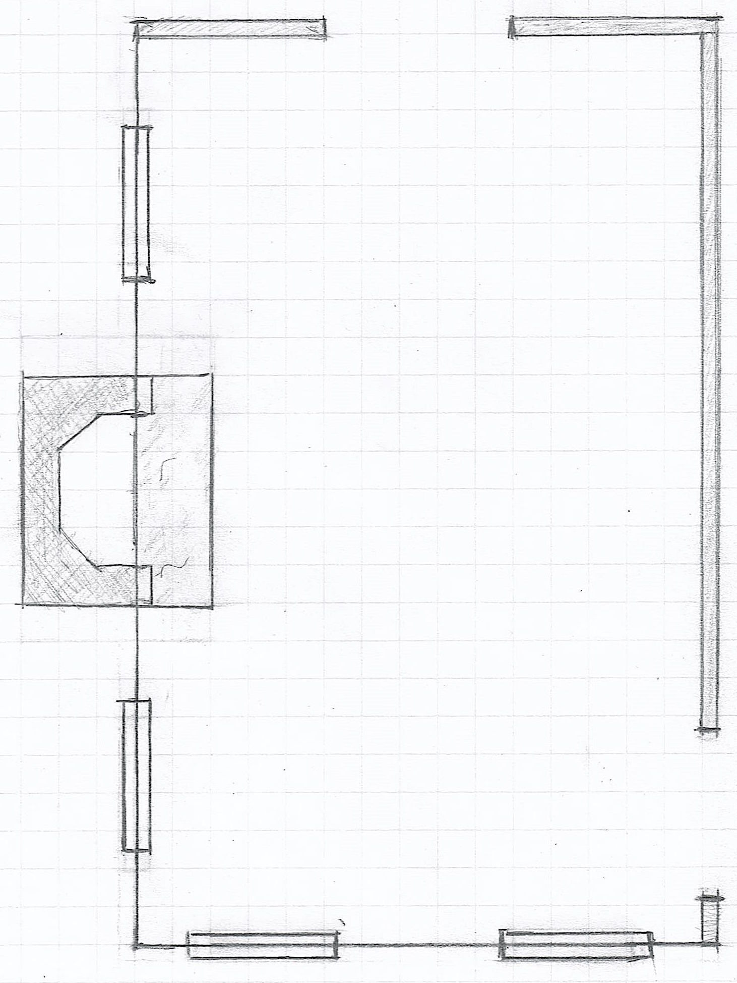


living room floor plan


Above is a drawing of a typical living room. It measures 24′ long by 15′ deep. I say typical, because of course, your room that you use for living might be larger or smaller. The proportions might be different, as well.

For instance, my living room is about 20′ long by 13′-5″ deep. And that’s definitely “about” since none of my walls are at perfect 90 degree angles.
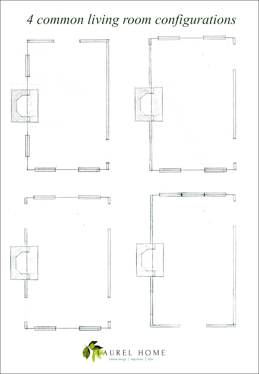
 

four common living room configurations - Laurel Bern Interiors - living room layout


Above are four possible living room configurations. Of course, there are many more options. But these are some common ones in terms of door and window placement.


Let’s look at six different living room layouts with furniture.
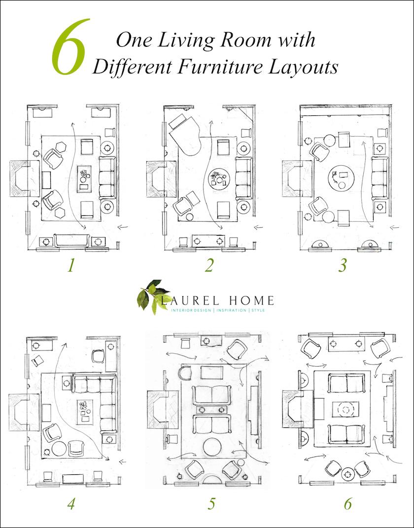


One living room - six different room layouts - furniture layouts

please pin me to pinterest :]

Oh, Laurel, thank you, but you are working too hard!!!


haha! Thanks, but believe me, I’m not working as hard as you think I’m working. I actually did these nearly four years ago! I was going to use them for something else but that didn’t happen.

First let’s go over the basic rules of space planning. Here you will learn how to draw a floor plan and what materials you’ll need to use. And then, we’ll go over each image separately, so that you can see what’s what.

Are you back? Great! Let’s get started.


Living Room Layout #1


floor-plan-furnished - living room layout

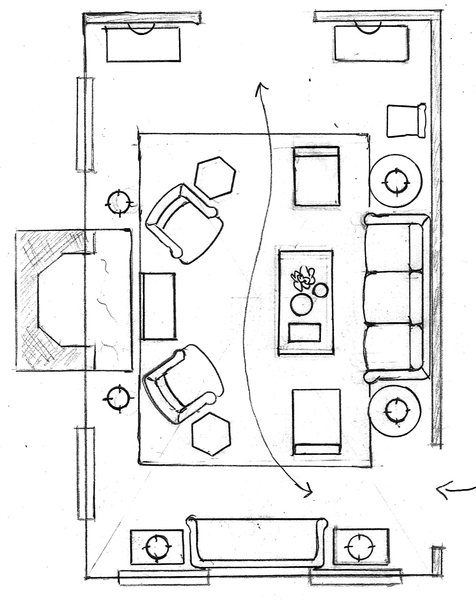
We come into the living room off of a center hall and ahhh, into my favorite of all conversation groupings ever. One sofa, plus four chairs. I’ve done this plan dozens of times. In this image, there is an 84″ sofa, two slipper chairs and two club chairs by the fireplace.

  • The coffee table is about 24″ x 48.” It could be a little smaller, but not much bigger. I would not do a coffee table more than 50″ long. My preferred height is 16″ – 18.”


  • There should be about one foot between the coffee table and sofa.

  • The end tables are round, but they could be square or rectangular. Tables usually sit about two inches from the sofa. Try not to smoosh the table into the arm. :]
  • The end or side table as it is sometimes called should never overlap the door or window casing. (moulding). Measure carefully. The remedies are either a smaller sofa and/or smaller end tables.
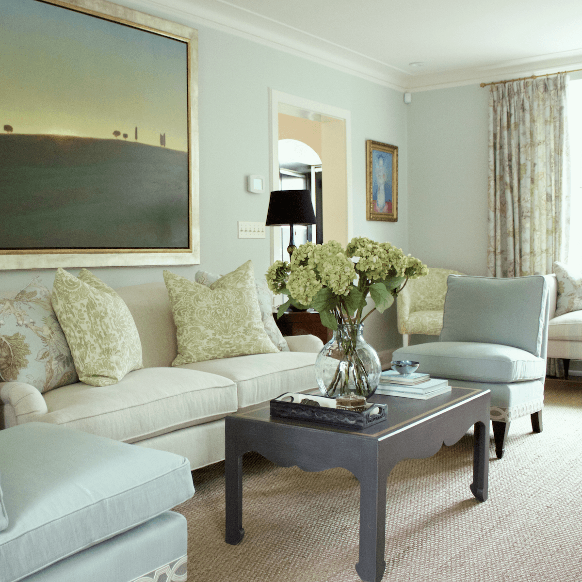
 

living room layout-Laurel Bern Interiors Bronxville Living room-painting

Living room we did a few years ago in Bronxville, NY


Here you can see a smaller 78″ sofa and two slipper chairs. I usually do two 20″ pillows and two 22″ pillows.

Please notice how the black lampshade grounds the room.


A good size for a round end table is about 25″-30″ in diameter.


And if the sofa arms are the usual 23″-25,” the height for the table should be between 23″-27″ high. I’ve been known to have either legs or a center pedestal cut down if it’s too tall.

  • In between the club chairs is a bench. And, behind the chairs are two small floor lamps.
  • In the front of the room are two windows and in between, there is a settee, not more than about 24″ deep. Flanking it are two small end tables or chests. A night table might work nicely here.
  • In the back of the room are two chests or console tables. Since we already have four table lamps, I did sconces. However, if we want to put up artwork or a mirror, we could do a small recessed spot-light, usually called an eye-ball.
  • I’ve placed an extra dining room chair near the sofa, but we could also have two underneath the fireplace windows. Taking some of the chairs out of the dining room when not in use is usually a good idea.
  • The area rug is a 9 x 12. This allows all of the furniture to rest on the carpet comfortably and still allows a wide enough path so that one isn’t walking half on and off the area rug.
  • There is an exit into another room which is usually used as an office or playroom.


Living Room Layout #2
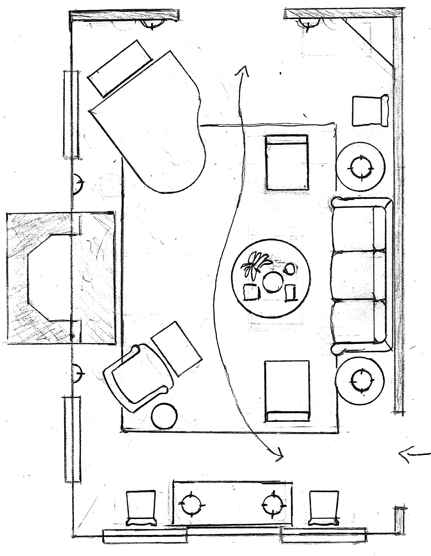
living room floorplan piano

This layout starts out very similarly to layout #one.

However, we did a round coffee table. This one is 36″ but we could also do 42″ here.
There is a club chair, with or without an ottoman or stool. There is a small occasional table or garden stool next to the chair.

In the front of the room is a console table of about 60″ in length with two buffet lamps.

Flanking the console table are two dining room chairs.

In the back of the room is a baby grand piano. If you don’t play the piano, but play cards, a game table with four chairs could be added instead.

To balance the composition, I added a tall corner cabinet on the opposite side.

Flanking the back doorway and fireplace mantel are wall sconces.


Living Room Layout #3
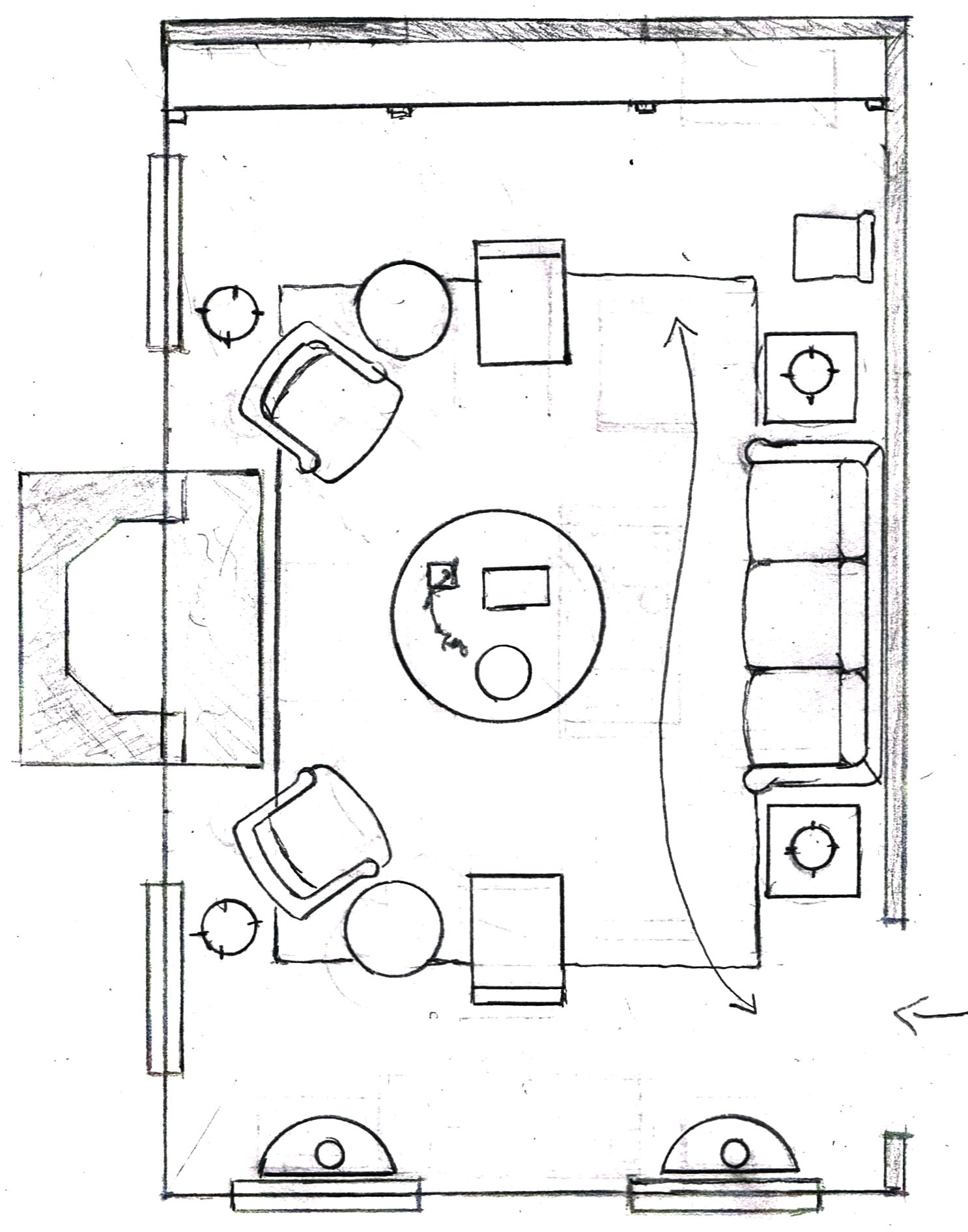
living room floor plan variation - chairs - sofa

This living room layout is a variation of the four chairs with the chairs having a little more of a relation to each other than the sofa. But, not so far that they are too far from the sofa for conversation. This could also work if your living room is only 14′ deep.

The coffee table is 42″ in diameter but it could be as large as 48.” I’ve also done round ottomans this size.

The square end tables are from 23″-27″ high and about 20″-24″ square. Larger than that and they begin to look too big for a room this size.


Between the two chairs is an occasional table of about 18″-20″ in diameter. It could also be a garden stool.


Behind the club chair is a floor lamp.

In the front of the room, are two demi-lune tables with buffet lamps. However, we could also skip those and put a chest with one lamp and a mirror between the two windows.

This room only has one entrance. The back wall has no windows, so in this case, a built-in bookcase was constructed to go wall to wall. It could also be a free-standing book-case.

The little appendages are library lights. There are some nice ones here.


Living Room Layout #4
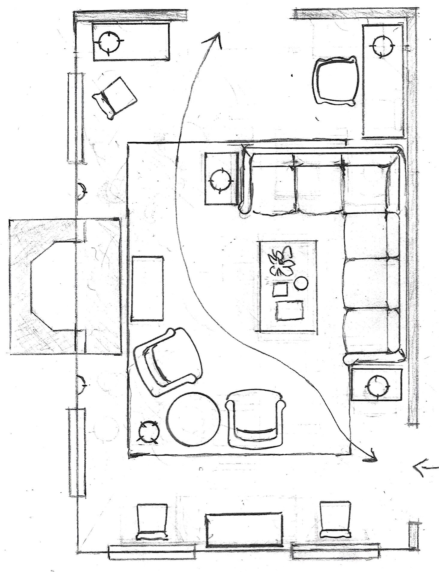
living room floor plans with sectional


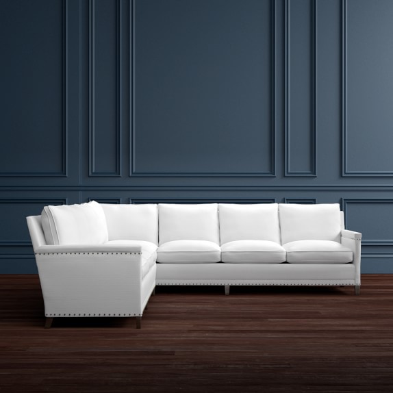
This is a great living room layout for a more casual space. The sectional can seat numerous people if this room centers around a TV. (sorry for those who find this gag-worthy)


addison-2-piece-l-shaped-sofa-sectional-left-c
This is modeled after my favorite sectional which is on sale here at 20% off.

I chose an end table that is only about 18″ wide.

The coffee table or ottoman is about 28″ x 48″

In the front, we have either a chest or a console table between the two windows.

Near the fireplace are two club, occasional or slipper chairs. You could do any of them.

And there is a little fireplace bench

Between the chairs is a side or occasional table. I feel that a round table needs to be a minimum of about 24″ to put a lamp on it. This one is slightly larger than that. If the lamp isn’t possible, you can do a floor lamp.


In the back of the room is a little home office.


This is especially nice if the children are playing and you’d like to (try) ;] to do some work and keep an eye on them.

To be clear, they would not have been *my* children. That is, unless the room was heavily padded, the door was bolted shut with a heavy-gauge steel lock and they were wearing their triple-ply mouth gags. ;] That might work.

However, I did once have clients who had this configuration. The piece behind the sectional was a secretary. And the piece in the back, an antique writing desk.


How are you doing? Do you need a bathroom break? A glass of something? A bite to eat? Feel free to take a little break. I realize that this is brain-draining stuff.


Living Room Layout #5
 

living room layout back to back sofas


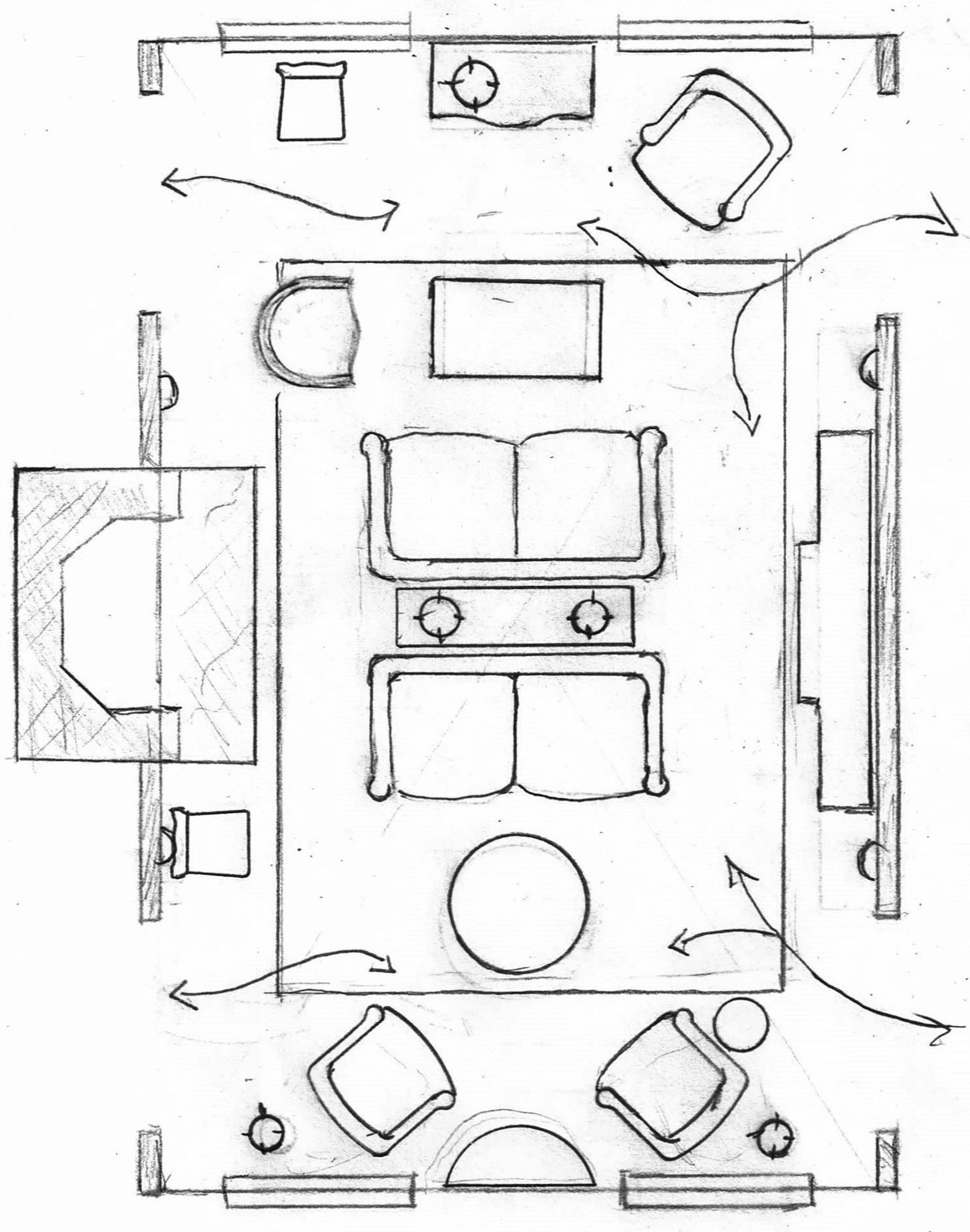
This is the living room with two doors entering the living room and two doors leaving the living room. The doors leaving are usually French doors which go out to a porch or a porch that has been converted into a sun room or family room of sorts. This is exceedingly common in southern Westchester county in pre-war homes.

Sometimes there are only the two doors entering the living room. And, if you are verrrrrrry lucky, they will be centered with the fireplace.


If you are unlucky and the builder of your home was drunk, didn’t care, or both, and you DO care, then it’s hours pulling your hair out trying to fudge the symmetry.


As you may well imagine, it used to drive me bonkers. One time, we even moved the damned doorway over about 18″ where it should’ve been in the first place!

There is a variation to this room layout coming up next.

This living room layout features back-to-back love seats. These love seats are about 60″ long.
 

sun room back to back settee - living room layout


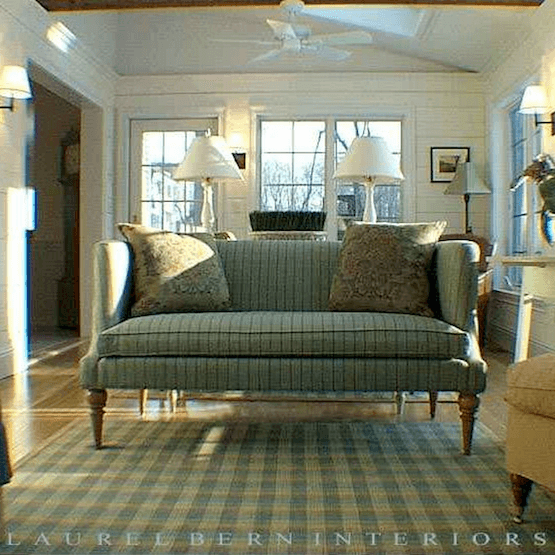
I have also done this with my favorite settee. Here it is in an old photo which in 2003, I thought was a pretty sweet pic. Now, I’m horrified, but it’s better than nothing. This was one of my favorite projects with one of my favorite clients. What is so cool about this space is that before it was a sun room, it was a deck off of the kitchen!

I don’t know what happened to that contractor. He was a handsome very tall dude and we were so much of one mind that we used to joke that we were separated at birth. Oh, to find another one like him! They are very rare.

I think that he did a fantastic job creating a sun room out of a deck!


Going back to our living room layout…


living room layout back to back sofas


In actuality, what I’ve drawn is seriously no good.


Major pathways, should be about 36″ or at least 30″ and we don’t have that much here. I was in denial and deluding myself. It happens.


We really need a good foot on either end so that we have enough space to walk from the center hall back to the sun room. However, it is valid to do the back to back sofas without a table in between. This is a very narrow console table, only about 12″ wide.

There are two skinny lamps, but we could also do a chandelier if our ceiling is at least nine feet or a semi-flush mount for a lower ceiling. But, we could do two small pendant lights too, for an eight foot ceiling, since we won’t be walking under them.

Opposite the fireplace, is a breakfront bookcase, flanked by sconces. Sconces also flank the fireplace mantel.

And finally! Living Room Layout #6
living room layouts - facing loveseats


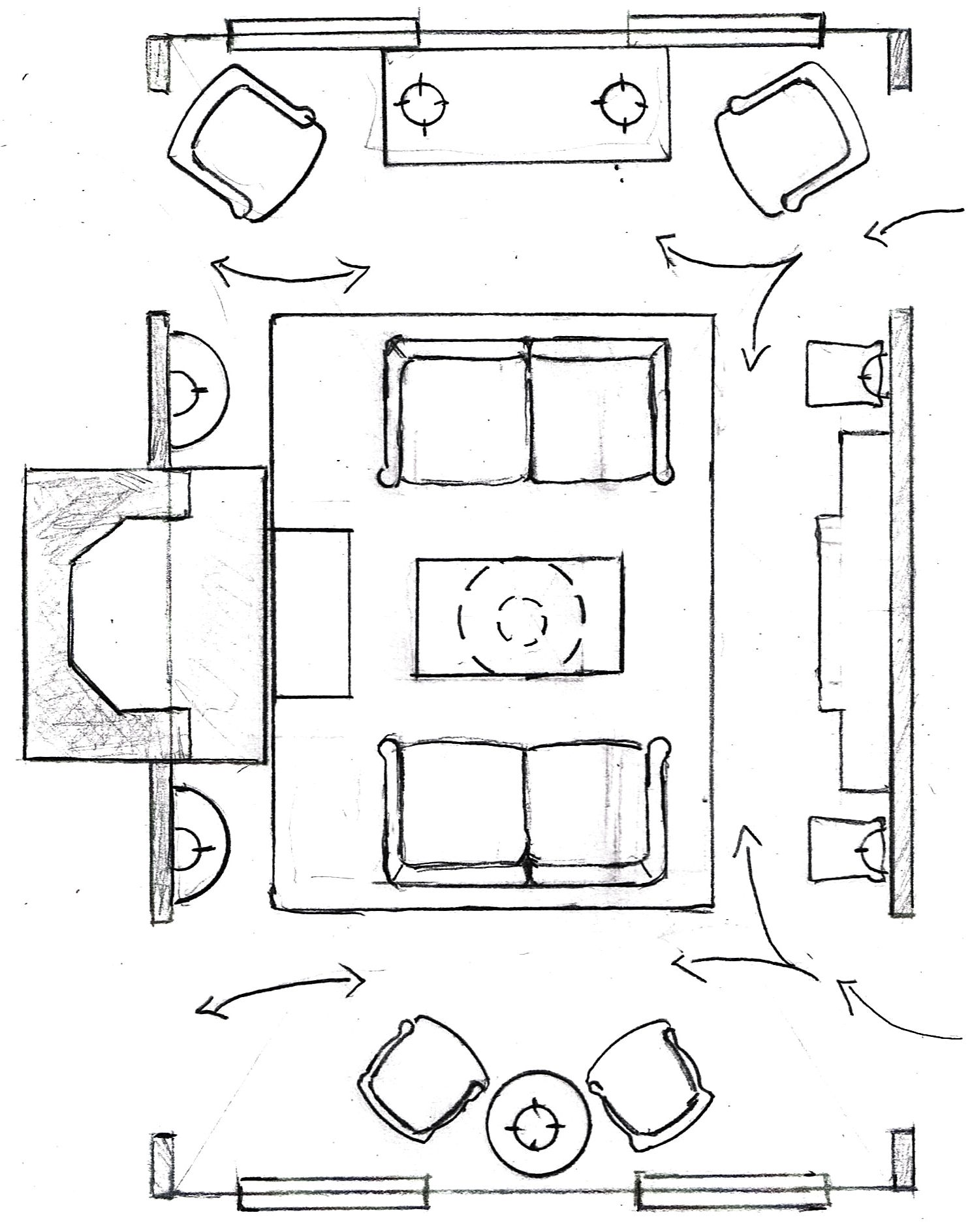
This actually creates three conversation areas and is a great one for people who like to entertain.

Again, we have two love seats. However, if we don’t have the bookcase, we could do a bit larger sofa. Maybe 72″-80.”

Over the 24″ x 48″ coffee table is a chandelier.

In the back of the room is a console table or buffet of about  60.”

Flanking the fireplace are two very small demi-lune tables. You can see them here (with a pretty lamp and artwork) and here (my bedroom).

Lauuuurrel, I don’t have a fireplace; don’t want a fireplace, either. Now what?


Geezzz, are you trying to kill me? ;]


Well, okay. This isn’t that difficult. You can always do an armoire, or a bookcase, or maybe something like I have that I love which is a big cabinet flanked by two demilune tables.

Sorry, Laurel. I’m not trying to kill you. This is all very well and good, but we have an open concept floor plan.


You do? ;] Well, I did come prepared with that one. Here, let me show you.

I found the plans for what I think is a very lovely 4 bedroom home on one floor with a bonus room on the second floor. This is in terms of layout, not style necessarily. I realize that this farmhouse style is very on-trend. I would probably advise against it and do a more classic clapboard or shingle. You won’t be sorry.

But, GREAT LAYOUT!
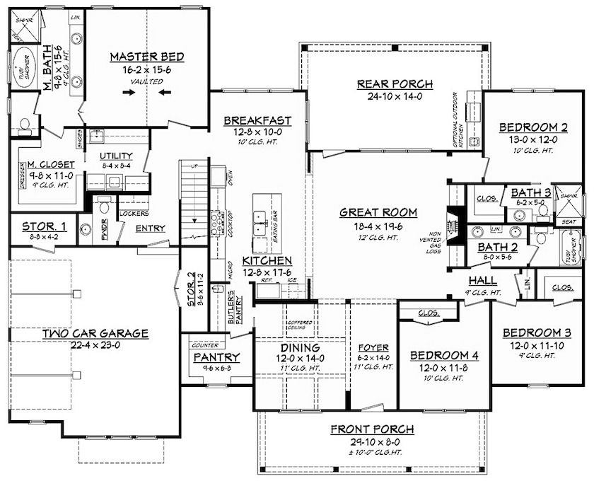
 

Room Layouts - image via Houseplans.com - Farmhouse - living room layout
I think that if I were building a home, it might be good to start with something like this to save money, if you can’t afford an architect. Nothing against architects, however.

So, here’s what I did with this place.
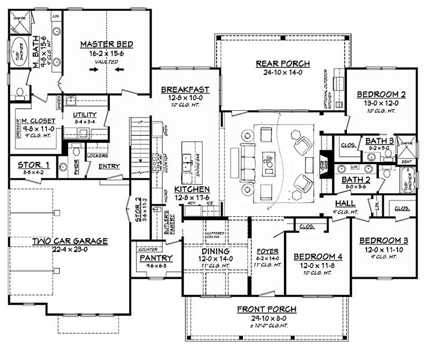
Living Room Layout - after - slight adjustments, walls - sofa - four chairs


Have you found the architectural tweaking I did?


I closed up the dining room a little and created symmetry with the addition of a short wall on the far end. I think it looks better this way.


***Oh man speaking of short walls, I have them for the fabulous kitchen from a couple of weeks ago.***please click this link to see them.

Many of you were asking to see this.


Going back to the floor plan.

The other thing I did is steal two feet from the bedroom closet to create a front hall coat closet. Although the family is apt to go through the garage and mud room, guests will not and they need a place to hang their coat!

In any case, that bedroom might end up being an office, den and/or guest room.

Moving on to the living room layout of this more open concept home…

Can you see that all we needed to do is more or less insert floor plan #1 – spread out a little because the living room is deeper. And then I added a console (sofa table) behind the sofa.

There we can store baskets or stools for extra seating. There’s an example of that here.

In closing, one little trick to use when creating your floor plans. This is a good one that I found very helpful over the years.


If you are creating a floor plan and you’d like an easy way to find the center of the room. All you need to do is draw a line from one corner to the corner across the room on the opposite wall. Repeat with the other two corners to make an X. Where the X intersects, that is the center of the room!

I learned that on my very first day of interior design school.

xo,


PS: Please check out the newly updated HOT SALES!

74 Responses

  1. Hey Laurel,
    This post has been incredibly helpful for this interior design challenged person to get a sense for how to lay out my new living room. Quick question because I don’t see it, and if I missed it, my apologies. In layout #4, the one with the sectional. What are the dimensions of the sectional and the chairs by the fireplace that you’re drawing here? I’m having a hard time conceptualizing “walking space” and not over crowding my space.

    1. Hi Megan,

      The drawings are at quarter inch scale. So, if you have the dimension of something, you can guestimate the sizes. I’m sorry, I’m in the comment section and can’t see the post at this time.

  2. Laurel, Karen again, I wanted to clarify that the tv is on the wall you have the fireplace on your floor plan layout, and my fireplace is on the wall leading out to the porch with a window flanking it on the left and single French door going out to the porch. Sorry for any confusion in my initial post below.

  3. Hi Laurel,

    Thank you so much for the inspirations. My house is similar to your layout plan and how you arranged the furniture. Except the fireplace is on the leading out to the back porch. Fireplace flanked by a window in the left and a door going out to the porch on the right. The tv is in the wall that the fireplace is on. And just like the layout you showed above, the kitchen is open to the living room. With two focal point how do I arrange furniture in this room. Also thinking about about my second problem, with window treatment as I have a window on one side and door on the other side of centered fireplace. The room is 16.2 x 20. thank you! Karen

  4. Laurel, Your blog is very helpful and interesting. I have a question about the back to back loveseat arrangement. The photo shows 2 lamps, but where are the electric outlets for them? I live in Florida where ceramic floors are common and the houses are on slabs. Whenever I see floating furniture arrangements, I wonder how are the lamps plugged in?

  5. Hi Laurel. I found your blog last winter and have been enjoying it immensely! You include so much great information and I love your humor. I have been wanting to work on my living room for awhile and was having difficulty with furniture layouts, when lo and behold, you did a blog post on my room – grand piano included! Thank you for the layout ideas. You included a picture from a previous job on a sunporch with a fantastic settee. Could you please provide the manufacturer of that piece? Thanks much.

    1. Hi Kris,

      Do you mean that you see your living layout in this post? That’s cool! These are some that I’ve dealt with over the years. The settee is from TCS Designs. It’s to the trade only and not sold anywhere like Wayfair or One King’s Lane.

      TCS’s website is only a placeholder with address and phone number. They have no online catalog and they told me about three years ago, that they never will! However, with the several robust online forums on facebook for professional interior designers, the word-of-mouth has kept the business going quite strongly, I believe.

      And yes, they are one of the jewels in Laurel’s Rolodex for people in the trade.

  6. Hi Laurel. I’m usually a silent follower of your blog. I always enjoy your posts. I read above that you shouldn’t overlap side tables with windows. You mean they cannot be placed in front of them at all? My best layout seems to be with the sofa in between two windows. I’d love to have small tables with lamps on either side of the sofa! Have you ever broken this rule? Thanks much.

    1. Hi Megan,

      That’s a really great question and allow me to clarify. I realize now that windows and doors are different as are sofas and case pieces.

      If you have a sofa between two windows, yes, you can absolutely put the end table wherever it needs to go. And yes, in front of a window is fine. Or overlapping it is fine. But if a sofa is between two doorways, then the end table needs to stop at least two inches before the frame of the door. Six inches or more is even better– just for breathing room.

      But… If you have a chest or other case piece on a wall and there’s a window or a door coming up, it should not overlap the casing (moulding/frame surrounding the window or door.)

      An exception might be made if there’s a drape, but I would try to avoid that.

      Here’s my rule: if your wall is say five feet and then on either side is a window, I would not put a piece larger than 54.” It’s best if there’s some breathing room, because of perspective, as well. If the chest is 60″ and the space is 60,” it will still appear to over-lap the window or door frame.

      I hope that made things more clear and if not, please feel free to ask again.

  7. Laurel, this may be one of your most-helpful posts yet! Our 21′ deep, 15′ wide living room was designed so that the fireplace is on the wall adjacent from where you show it. I think a variation of Layout #1 will work best for us. Many thanks for the inspiration!

  8. Ahh this is right on time for me. I’m starting to pull my living and dining rooms together little by little and just couldn’t see the right conversation grouping, even with a scale floorplan. The open concept version you provided is very similar to what I’m working with and makes everything make sense. Thank you for always providing such wonderful, tasteful guidance!

    1. Thanks Nicole. Glad you found it helpful. I’m actually working on some far trickier spaces for Sunday. Wish me luck! One of the floorplans has a “copyright” on it. What they meant, I think is: “Don’t copy this plan it’s a POS!” haha

  9. Such a basic skill everyone who shops for furniture should learn. It will save so many problems (sofa too big, rug too small, etc.). I always obsess over space planning when getting a new piece. When we bought furniture for our small sitting area adjacent to the kitchen I didn’t do it. Assumed the designer we hired did it before picking out our pieces. Sadly, his “eyeballing” wasn’t perfect and we are a little crowded. My fault. Luckily I can fix it with smaller ottomans. Saving my money for that…

  10. Another brilliant and helpful post Laurel. Definitely pinned it with a notation ‘it consisted much more information than just layout’. Thank you! -Brenda-

  11. Laurel,

    You are wonderful. I have a new living room in a new house and have zero furniture for it, and I have been wondering where to even start. This is great – thank you!

  12. Ahh like peace in my brain when I read your instructional posts. My 24’ x 11′ lounge room has a 7ft entry opening, (layout1) so to do the couch and chairs, (no fireplace) is it ok to flip the couch so it is seen as you come in? I have a mid blue velvet that goes with nothing, my folly haha. And need to choose slipper and armchairs, but wondered if 11′ means too narrow for slipper chairs too? Or just have a narrow walk through. Loved the pic with palest grey and blue chairs.
    Things will be a little tight as dining table has to go in the far corner, and the door into kitchen family area is hard up on the right wall. Big window down entry end which will leave quite a space when I move the couch along towards the dining table. Guess a vignette of table and armchairs in front f the window, I have a nice octagonal loo table. Oh sorry, waffling out loud, setting the scene haha. Question is actually with only 11ft wide do I add slipper chairs, or leave them out do you think.?

    1. Hi Danielle,

      I’m so sorry, but it’s impossible for me to advise because I can’t see what you’re talking about. And even IF I could see, I often spent hours working out room layouts for clients– with pencil, graph paper, templates, architect scale (fancy ruler) and a big fat eraser. The only thing I will say though. If in doubt; leave it out. You can always add later.

  13. I think the main thing compared to the “old days” is get things away from the walls and out more to the center of the room. You still have to measure your space and measure your furniture pieces to figure out what can FIT where in the room.

    1. Hi Susie,

      My living room is only 13.5″ deep. So, it’s not possible to have all of the furniture floating. It depends on the room. But the relationship of the furniture should be similar, is the point.

  14. Laura,

    Thank you for these furniture layouts. They have given me more food for thought in my continuing obsession about how to best arrange furniture in my small 14 by 15 foot bungalow living room!

    I’ve always read that it’s a big “no no” to have pathways going through a “conversation” area, so I was surprised to see that in some of your layouts the sofa is on a long wall to the right of the entrance and the chairs are on the opposite fireplace wall. This creates a walkway dividing the conversation area into two parts.

    I’ve tried every position possible for love-seat and two chairs and I’m never satisfied with the layout. I feel that by routing a pathway around the conversation area that the whole room is divided in two and that actually the half closest to the fireplace, where I have done most of my furniture re-arranging activity, feels a little cramped. This feeling becomes especially noticeable when I float the love seat towards the middle of the room facing the fireplace which forces you to walk behind the “conversation area.” Though the balance and symmetry of this arrangement appeals to me I feel that the love seat somehow blocks flow and cuts the room in half.

    Sometimes I put the love seat at right angles to the fireplace with the chairs facing it. Emotionally, this is more appealing because I feel the room welcomes me with “open arms” so to speak, but it looks less balanced.

    This situation is even more problematical because the entrance which opens directly into the living room is diagonally across from the entrance to the kitchen, thus “destroying” the space, as the book, A Pattern Language so dramatically described this situation. I’m starting to believe my living room is indeed a “destroyed” space as I’ve slowly gone mad over the past 20 years, trying to find the best furniture arrangement. My friends never know what’s going to change in my living room when they visit from one time to the next.

    Taking the longest wall to the right of my entrance for a sofa and having chairs on either side of the opposite fireplace wall would make the room feel more spacious, but the pathway between the sofa and chairs would divide the conversation area.

    Am I taking this “rule” to avoid pathways through conversation areas too seriously or should I continue to try and find a better way to keep the conversation area undivided close to the fireplace?

    I’m sure that a lot of this is a matter of personal preference from what I’ve read from readers. The living room layout in your last post about the house that wasn’t selling had the sofa facing the fireplace and some readers thought it looked cramped while others liked the arrangement.

    I just wish I could settle on a comfortable resting point for myself and my furniture.

    1. Hi Sherry,

      Of course you can have pathways through a conversation area. If the room is not large enough to float the furniture, (so that you can walk behind it) how are you supposed to get from one end of the room to the other?

  15. You are so generous with your information. I really enjoyed it. On layout #4, what size lamps would you specify for the 18″side tables?

    1. Hi Carina,

      For most living rooms, I usually do a table lamp from 26″-31″ high. But, it depends on the style of the lamp, in part, the height of the ceiling, the size of the room and other furniture.

  16. This is so helpful — thanks so much — and shows why it’s so helpful to hire a designer. We moved 2 years ago into a 96-year old house with a huge living room and on one end of it there is an enfilade — from the sunroom, then living room, then foyer, then dining room, all across the front of the house. Also lovely French doors on 2 sides of the room but they are painted shut. Furniture placement was so tricky!!

  17. Wow! You are amazing. So interesting. I too have a corner fireplace in an open concept great room. I was talked into a sectional which is another story.

    1. Hi Mary,

      Yes, I’ve seen many a sectional that was a mistake. And once, they couldn’t even get the bloody thing into the room, in tact! Sectionals can be wonderful (I’ve done too many to count) if they are the right size and right placement which is ALWAYS FACING the main traffic area(s). Or, at least far enough over, so that one doesn’t have to walk around a big hulking sectional; it makes for an ungracious room.

  18. Laurel, Laurel, Laurel…where is the TV? Every house we have ever lived in had to be decorated around our television. It is, has been and will probably always be my biggest challenge. How does practical and comfortable meet pretty? My husband dreams of a recliner in front of his 72″ TV. I love him but I would cry every day if I had to witness that scene. What kind of furniture do I get so that my family and dog can hang out, lay down, put their feet up without me getting agita? (My room is similar…16×21. Only 3 walls… Fireplace is on the short wall and windows on back long wall. This leaves plenty of room on the 3rd long blank wall for a massive TV. The 4th wall is open to the kitchen area).

    1. Hi Diane,

      Forgive me, but whenever I’m given a description that has more than one sentence, my brain short circuits. This is one of those situations where consulting with a designer in your area would probably be very helpful. My only other comment is– Does he really need a 72″ TV in your living room? Okay, maybe that’s a dumb question. I get that he needs it. :]

    2. Diane, you just described the layout of my sister’s living/family room. It’s identical.

      She found a sectional that pulled that room together beautifully. It was the perfect solution.

      She got a U-shape sectional. One side of the U is a chaise longue.

      The back of the sectional is against the window wall (narrow room), the loveseat part of the section divides the room from the kitchen dining area, and the chaise part of the sectional is jutting out on the fireplace side – it doesn’t block the fireplace. It looks cozy with a throw over the foot of the chaise.

      There is an up-to-date entertainment center with bookshelves on the opposite wall, with sliding doors that conceal the TV if needed. With the doors closed, you see the bookshelves on each side.

      They used narrow tables on each side of the sectional, and a rectangular coffee table that fits the sectional.

  19. I love reading your blog and have learned so much from you. This post was especially helpful in terms of elements of good design, spacing and flow.

    It’s been a challenge to arrange furniture in an oblong living room with a fireplace on a short wall with the entry located near the corner of the adjacent wall.

    Many of the homes in my area have been designed by an architect in the early 1920’s but he must have been on drugs when he designed ours. Unless I want a chair in the middle of the entry flow, having fireplace seating is not the best option. The room is almost too narrow to “float” the sofa, so using your advice with other placement, I’ve arranged the sofa and 2 chairs in front of a bank of 3 windows on a long wall.

    Thanks for all of your insight and years of experience!

    1. You’re welcome Debra. And that is why I was sure to include some love seats. Very often people think that they must have a full-sized sofa, but it’s really too big. Since a sofa only seats two unless it’s being used for television viewing, it’s important to get a sofa that’s the right length for the space.

  20. That first layout is wonderful for people dealing with two focal points- a view and a fireplace, which is common where I live. It also has symmetry along both the short and long axes of the room, brilliant! Hypothetically, if you had an even longer room with room for another conversation area near the far windows, would you still use as many chairs or is there a secret chair-to-sofa ratio you employ? Or maybe a bench or daybed. Is there such a thing as too many chairs? Thanks so much for this post, it’s very helpful.

    1. Hi Danielle,

      I’ve done larger rooms with two separate seating areas. One time there was a door to the sunroom in the middle of the large living room in an old Victorian. There, we did a sofa (facing the fireplace wall) and two chairs and then two facing sofas on the other side.

      Another time, I did a sofa and two chairs and in the other seating area, four chairs which is a nice arrangement. More important than how many chairs is the size of the chairs. Some of them are SO BIG and that is what’s bothersome to me.

      1. Thank you, Laurel! That is just the advice I needed. (And I don’t like giant chairs, either. Even my leather library chairs are as small a profile as they can be and still be comfy for a long read.)

  21. Love your reading your posts! I am 100% amateur but really enjoy and have (I like to think!) fairly good instincts when decorating my house. I’m in the process of changing my decorating style from leaning more “traditional” (I know you hate that term!) to leaning modern/midcentury modern while keeping a few antiques in the mix. You are so right–interior design is really really hard! What I’ve done in the past that helps with furniture layout is make a (sort of) scale drawing and then cut out roughly scale furniture in different colored construction paper–such as green for seating, red for tables etc. Then move the little furniture cutouts around to see what works. I also use cardboard boxes or pieces of flat cardboard on the floor or things like a folding lawn chair to simulate where the real chair will go. You can even put masking tape on the floor to see if there will be enough walking room between pieces. Cardboard also works to see if picture or mirror sizes will work.
    Thanks for the great post today!

    1. Hi Sherry,

      I’ve seen articles where they do the cut-outs. I’m such a clutz and my cut-outs would be all over the place and then I’d lose them. haha If you get the furniture template you can do the same thing but just erase if it’s not where you want it.

    2. Sherry, I did that ‘fake furniture” thing with a folding screen and some chairs to mimic a partial wall we want to add, it was very helpful. Sometimes the sense of mass & volume is hard to imagine on a floorpan. In our case we also wanted to see if it would block too much light, and it didn’t, happily!

      Speaking of which, Laurel were you going to show us pictures of the wall from that awesome kitchen from last week? You mentioned it in this post but it doesn’t appear to be there. I’m dying to see it! Thank you!

      1. Hi Danielle,

        Sorry, I probably didn’t make it clear enough. You have to click the link to see the new images on the post they go with. They are at the bottom of that post.

  22. Floor plans are my favorite! I place magazines and catalogs on the floor where furniture may be placed (some day). Thanks for the peek at your beautiful bedroom. I am a Leatherwood Design Deb Cronin fan! You two could design wonderful things with beautiful fabrics!

    1. Hi Mary Ellen,

      That works. My old boss from the early nineties, used to put masking tape on the floor. It’s more difficult, however, than drawing it on a piece of graph paper. And a professional designer wouldn’t do that, however. She wasn’t trained, but had “very good taste.” lol

  23. Laurel, well you’ve done it again! This post is so packed with info and ideas, perfecto. This is like a little design bible for me. I have a corner fireplace, so I’m using that big piano as a fireplace reference, and what do you have across from it. A big corner shelf, exactly what my room is missing something else with height. You’re such a genius. I hope others can read the design and apply it to their rooms without everything being so literal. I want to say ladies and gentlemen, use the ideas to transform your space; everything doesn’t have to be so exact. These rooms could help me in many spaces throughout my house.
    One question though, where did you ever find a 24” deep settee? I desperately need that size for my bedroom and cannot find it!

    1. Hi Tinamarie,

      Don’t know about the genius part, but thank you just the same. I’ve done at least a couple hundred living room layouts, so that definitely helps. But, you are right that this isn’t rocket science. A space is a space and people are people. If the room is super open, then one needs to make “rooms” with the furniture as if there were walls.

      The settee that I show in the sunroom is one that I’ve done numerous times. It’s also in my portfolio and there’s one in this post. is 29″ deep. There are two lengths. 72″ and 60.” It’s from TCS Designs which is to the trade only and their website is only a place holder. Designers can contact them for a catalog and price list. It’s all word-of-mouth.

      Then, there’s this style of settee. This is the best price I’ve found, retail for the Louis settee by Zentique. It’s 27″ deep.

  24. Your layouts are so wonderfully symmetrical! It seems just about every house I’ve lived in has a corner fireplace in a narrow living room that destroys all hope of symmetry and I’ve never been able to come up with a satisfying layout. Any suggestions?

    1. Laurel, hope you don’t mind me chiming in.
      @Wilma: If the home you are in, is your forever one you may wish to consider the following: a) Provided you don’t use your fireplace; remove it. My living room measures 13’w x 17’8 long (with an open adjacent Dining Room slightly under the same square footage) and the previous owner thankfully did so which makes furniture layout much easier allowing more wall space and better flow. b) Have your sofa/love seat (often the largest piece of furniture) custom built to fit/suit the space. Though my son is actually a fashion designer early in his career he staged model (display/show) homes many with corner fireplaces and has stated this is often what developers do when showcasing such a space.
      -Brenda-

      1. Thanks, Brenda, for your helpful suggestions. Fireplace is going to stay, but sizing the sofa is a great idea.

  25. I was going to comment that #1 is what I’d already envisioned in my head that I want because of how it feels. Cozy.

    Who knew it was your favorite too! I think the addition of two more chairs is the magic.

    1. I remember seeing it in a book my second semester of interior design school. Ahhh… another complete design out of thin air. This one required a water color rendering of the floor plan AND elevations. Only one week to complete the assignment and I had never used water colors. So, I went to the book store and found a book with a room I loved. Copied it. lol The teacher loved the floor plan!

  26. Hmmmmm…there’s no challange like an L-shaped living room with windows and/or doors on every wall and the L isn’t symetrical. 20 years in this house and I STILL haven’t figured this damn room out!!!!!

    1. I feel your pain Genie. My old living room was the worst in terms of furniture placement. And I had some clients now and then, that I’d spend hours on their plans, so much that I burned a hole in the paper with my eraser. haha.

  27. oh friend! You are always SO spot on with your advice and knowledge!! you’re speaking my love language when you start pulling out and adjusting blueprints and floorplans- great post!!

  28. Hi, great post. A very common layout we have in the Cleveland area seems to be the L shaped living and dining room, with the living room being the longer and more awkward room. I’ve struggled to come up with anything that doesn’t involve furniture against the walls. Any advice?

      1. Hi Laurel,
        Happy to see the piano in the right position. The pianist should be facing into the room . I used a little poetic/piano license with ours because the wall is on an angle, but the pianist isn’t facing in to a corner. Great information as always! XOXO

        1. Hi Nancy,

          Yes, absolutely facing into the room. But I think I drew the piano reverse from what it should be. I do remember, however, my flute teacher in Indiana had her piano facing into the corner. This was necessary because her living room where she taught was super small, so the piano was shoved as far into the corner as it could go. And if it was turned around, she would constantly have to go around it to play it. So, in that case, it made sense.

Leave a Reply

Your email address will not be published. Required fields are marked *

This site uses Akismet to reduce spam. Learn how your comment data is processed.

Welcome To Laurel Home!

laurel-aarons-18th-e1456449963926

Hi, I’m Laurel, and Laurel Home is the website and blog for Laurel Bern Interiors.
I’ve been creating new-traditional interiors since 1988. The blog is where I share all.

New Edition, November 2023! Get The Indispensable Guide For 100s of Home Furnishings And Interior Design Sources That Everyone Is Raving About

laurels-rolodex-final-book-cover-master 10th edition 23-24

laurel home archives

Categories:

Please click the image below for more info about my rockin’ Interior Design Guides for 2024!

Laurel Home Interior Design Guides 2024
Amazon ad

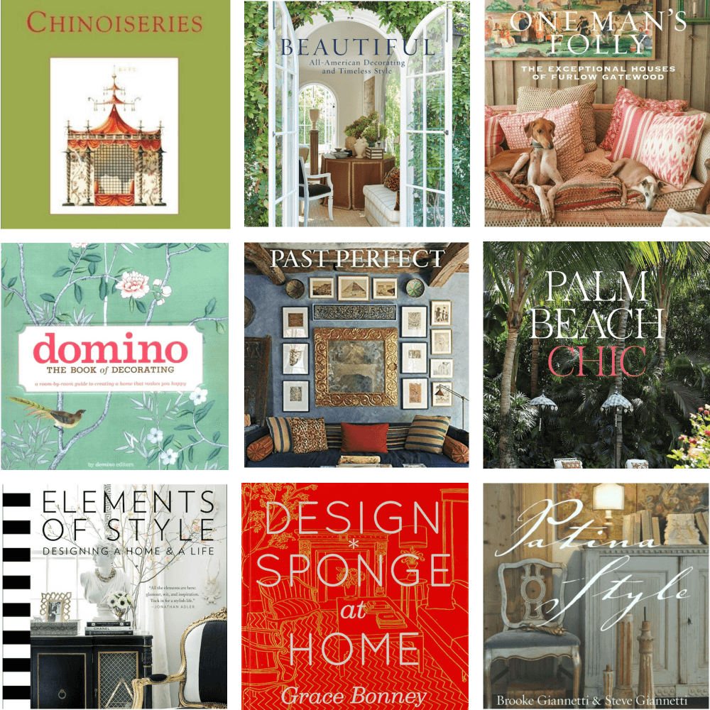
please click below to check out my favorite decorating & design books

Laurel Bern's Favorite Interior Design and Decorating Books
Subscribe To The Laurel Home Blog And You Will Receive A FREE Guide Where I Share How To Get Your Paint Colors Right, The First Time.