

Hi Everyone,
Yes! We’re taking a break from my place. I’m planning on doing this more frequently.
One idea I’d love to do once a month is to take a poorly renovated home and fix it to function and look much better. I have done this before with this typical Boston renovation mess and these two studio apartments where I created a bedroom where there was none.
However, today is my roughly once-a-year “eye-roll post” about yet another shelter mag that gets most of it wrong.
Typically, the post headline reads something like “10 Design Trends You Need to Drop in 2025.”
This post was inspired by an article from Architectural Digest that recently showed up in my Inbox, but it was written in 2023.
Home Decor Faux Pas That Date Your Interiors, According to Designers
Poor people. Little did they know what image would be associated with their quotes.
To avoid C*pyr!ghtTr0lls, I have created a collage-style image in case you can’t see the article. I am repeating it two more times.
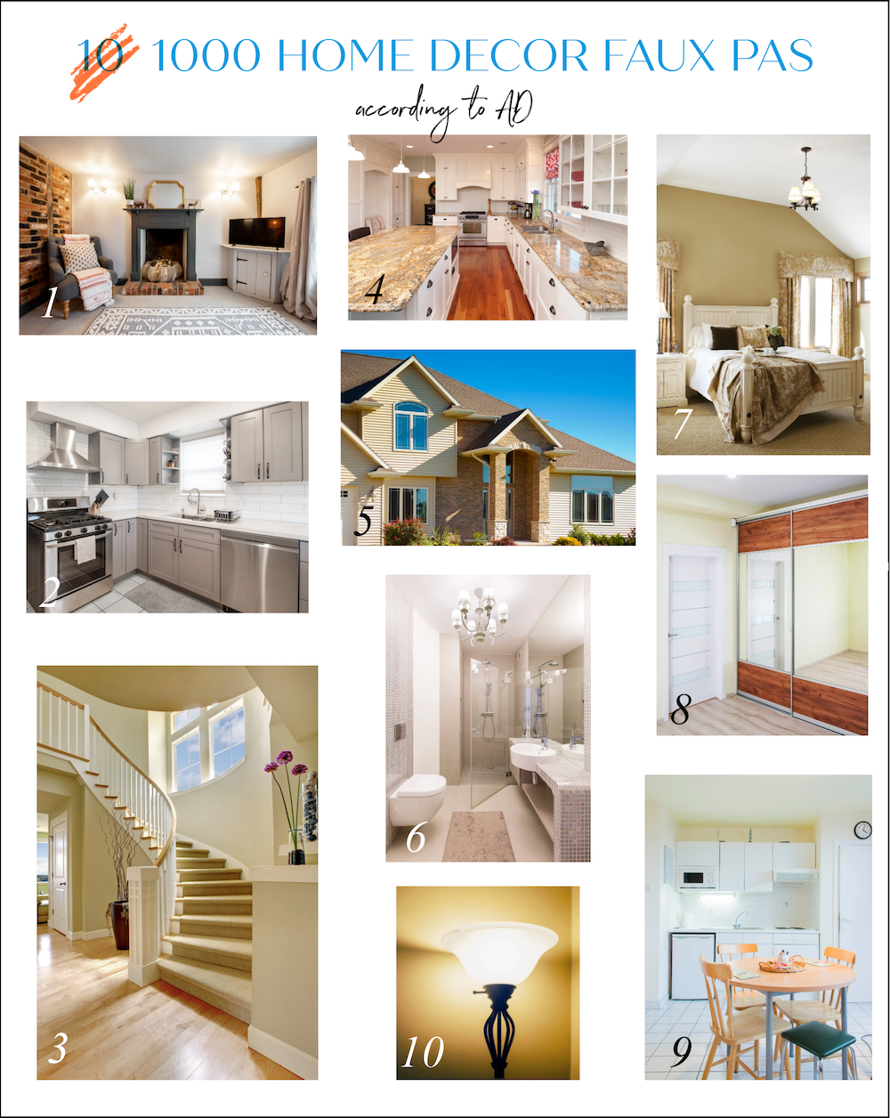
To be clear, in some cases, they didn’t get it wrong, but they ignored dozens of other more pressing issues. So, let’s get started with the article.
1. Too Small an Area Rug
Good grief. The area rug is the least of this room’s problems, although I have serious doubts that this is a room. In fact, most, if not all, of these appear to be AI.
That horribly proportioned fireplace mantel has no nonflammable material between the wood mantel and the fire, should there be one.
One of the most irritating home decor faux pas in this image is the linen curtain puddling for a mile on the floor. On top of that, it is hung way too low. This ceiling might be eight feet, but it looks closer to seven. I would hang the curtain at least a foot higher.
Next, I’d like to call your attention to the sconces.
This image, I need to share.

First, this type of sconce should be about 60″ on center, never up near the ceiling.
However, they were photoshopped onto the image. I copied the one on the left and superimposed it on the left one to show you that it is the same image. Then, I flipped it (see below) and superimposed it on the right side. Yes, they are identical mirror images, which in real life is not possible.


Yes, it’s possible that a human did photoshop, as well. However, if they did, they could’ve at least put the sconces at the proper height.
I’m not going to talk about the hideous brick.
You can, but I’m not. Nor will I mention the lone chair smothered with a way too big throw and pillow. They shoved that mediocre piece as far into the corner as possible so it would not sit on any portion of the area rug.
The area rug is absolutely fine for this size room.
However, if we’re talking about dated home decor faux pas, the problem at the floor-level is the beige, infested with rat droppings, broadloom.
Oh dear, I’m already over 400 words, and I’ve only covered the first one.
I need to pick this up, so the rest will be briefer.
2. All Gray Interiors
The gray kitchen has nothing else in it, so of course, it looks dreary. Paint the walls red, add some black accents, green plants, a colorful pot on the stove, and a much better floor.
3. Carpeted Stairs
The problem is that carpet and the way it was done.
This image has to be AI. Look at the bizarre goings-on on the right side with multiple ceilings and one step that I guess is there to help the children hang from the balcony more easily. Plus, the entire thing is phenomenally bland and one-note, along with the 1980s Ramada Inn decor.
As for the carpeted stairs, it’s more weirdness.
The carpet is a runner on one side and wall-to-wall on the other. It should be a runner on both sides. The carpet itself is the kind of stuff we used to put in a basement playroom, not on a rather grand curving front hall staircase.
This could be incredibly lovely. However, they bent over backward to make it as boring as possible.
4. Marble in the Kitchen
Hey! I have marble in my kitchen, and I adore it! How dare they call it “dated.”
They say that marble can veer towards ostentatious. Well, yes, that is true. Please see this post from last year to see ostentatious marble.
As an aside, as my lovely realtor, Maureen O’Hara, predicted, this house has not sold and was taken off the market after a few months.
However, please look more closely at the image with the “marble” countertops in AD.

Wait, Laurel. Isn’t that granite?
Uh-huh.
Maybe it would help if they had an actual interior designer or architect on staff to supervise and catch inexcusable mistakes like that.
Yes, I’m being harsh. However, this drek was published on ARCHITECTURAL DIGEST! Shouldn’t they be able to tell the difference between marble and granite?
5. Tan Exteriors
The problem is that no paint color will make this bad architecture look any better. Some decent landscaping, complete with a thick forest of trees, might help.
6. Gaudy Hardware and Light Fixtures in a very dated bathroom.
Again, the entire room is horrid. This room was dated the day it was finished. The iridescent mauve tiles and a very strange, darker mauve patch of mosaic tiles on the floor is an odd choice. Plus, the shower door is several inches wider than the opening. It has to be AI.
7. Pretentious Window Curtains
hahahaha! I have to share this one. ;]
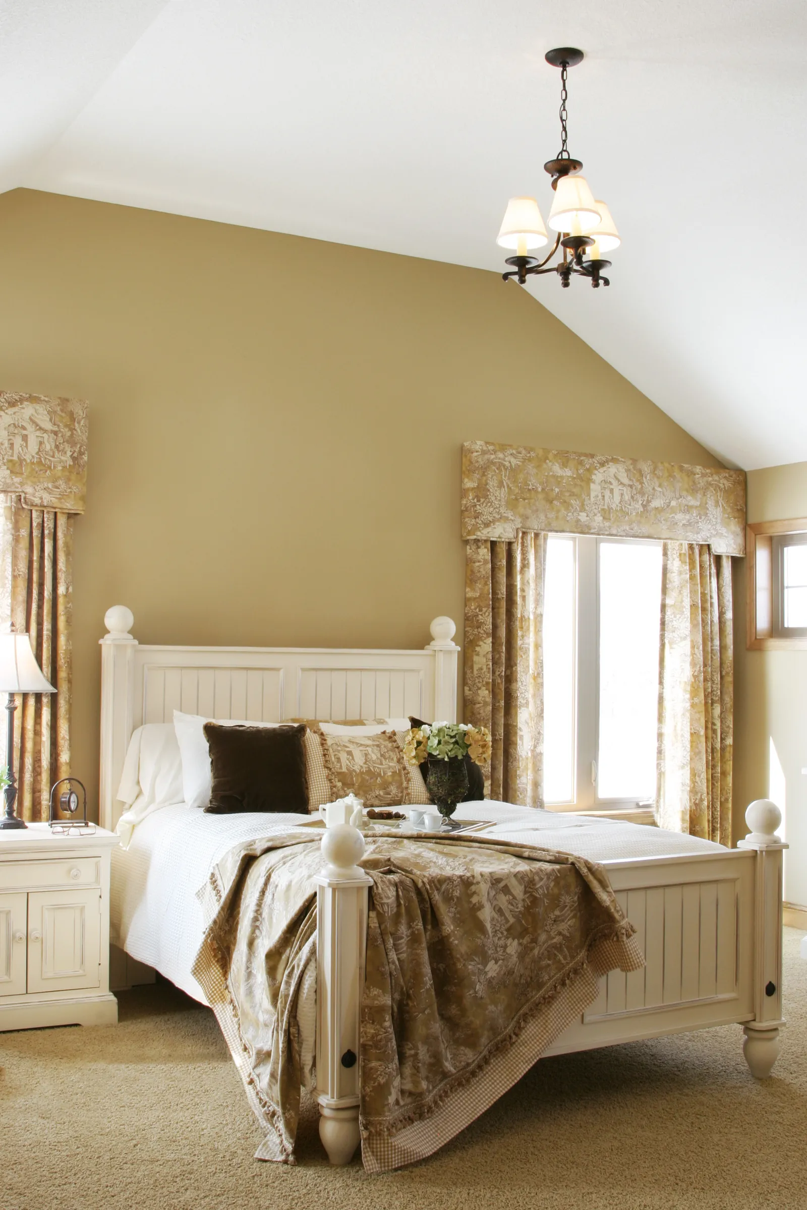
Well, I wouldn’t say pretentious as much as absurd. This is a contemporary room, and the formal pelmette clearly doesn’t go. That type of window treatment needs a much more traditional room without a slanted ceiling.
Not only is it the wrong style for this place, it’s too low, and it’s butting into the little window on the side wall. All of it is horrid, and so is the ratty carpet. To cap it off, they threw in a 25-year-old lamp from Target, and in a two-fer deal, they got a free minuscule chandelier that nobody else wanted.
Okay, it could go in an entryway, perhaps. However, it is way too small for this high ceiling in a good-sized bedroom.
But wait! Look below. Dear me, talk about your home decor faux pas, or rather, four paws. ;] It looks like the dog pooped on the tray with the deformed teapot and conjoined tea cups.
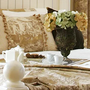
Understandably, he got confused by that heap of moss masquerading as a vase.
8. Mirrored Closet Doors.
That is a strange space with a closet on a wall that doesn’t quite reach the ceiling. I don’t think this type of door has ever been manufactured. Oh, wait. I found something similar at Ikea. However, mirrors on closet doors can be gorgeous.
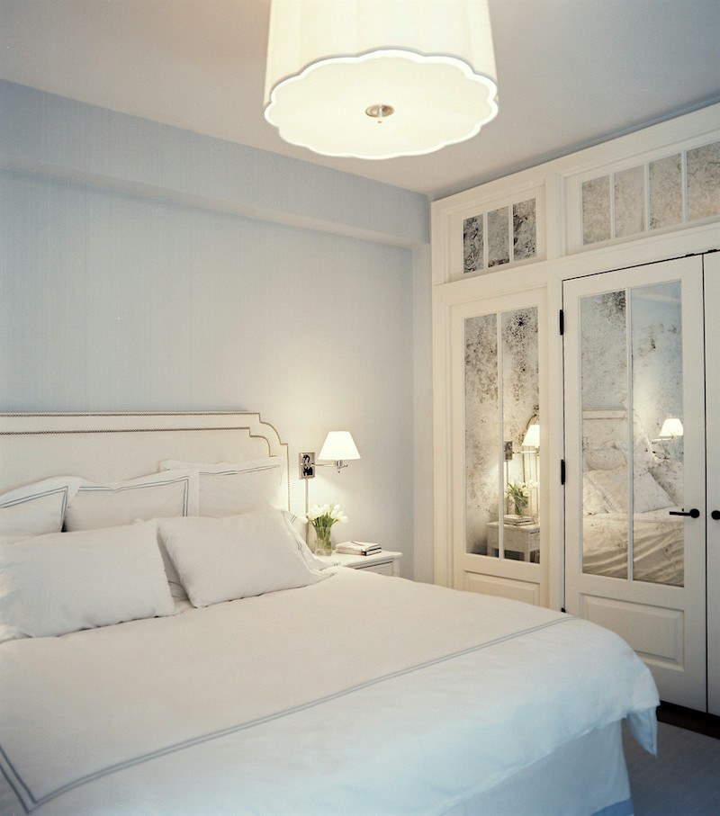
Christina Murphy & Meg Gabriele mirrored closet doors bedroom.
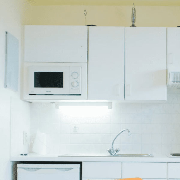
9. Ancient Appliances
Oh my! This little kitchen has tremendous potential to be a darling vintage kitchen; but all they can do is complain about the “ancient” appliances. Please notice the sink and how it overlaps the dishwasher. Fine, but I need my sink to be a little deeper than one inch. And, can anyone tell me what is sitting on top of the cabinets?
10. Torch Lamps
The word is “torchiere,” not torch.
Below is a torch.

In this case, the torchiere lamp looks to be from Walmart before they went all high-end on us. Oh, we didn’t know any better in the 70s, but now that we do, it’s safe to say that they’ve always been and will always be awful. Okay, I will concede that a handful might be okay, but most are quite tacky.
Below is a widget with some of my favorite floor lamps.
Okay, that’s a wrap for the analysis of Architectural Digest’s ten home decor faux pas.
xo,

***Please check out the recently updated HOT SALES
The Serena & Lily up to 25% off sale is ending in ten days!
There is now an Amazon link on my home page and below.
Please note that I have decided not to create a membership site. However, this website is very expensive to run. To provide this content, I rely on you, the kind readers of my blog, to use my affiliate links whenever possible for items you need and want. There is no extra charge to you. The vendor you’re purchasing from pays me a small commission.

To facilitate this, some readers have asked me to put
A link to Amazon.com is on my home page.
Please click the link before items go into your shopping cart. Some people save their purchases in their “save for later folder.” Then, if you remember, please come back and click my Amazon link, and then you’re free to place your orders. While most vendor links have a cookie that lasts a while, Amazon’s cookies only last up to 24 hours.
Thank you so much!
I very much appreciate your help and support!
Related Posts
 Renovation News and Deets!
 An Astonishing Home Exterior Transformation Before & After
 How To Coordinate Lighting That’s Smashing, Not Boring
 Best Bedroom Ideas Inspired by Mark D. Sikes
 The Secret English Gardens and I Mean Secret!
 A Gorgeous Kitchen Remodel Done Right!
 Window Valances – Hopelessly Dated, Or A Cool Idea?


28 Responses
OMG – the brick……I married a very nice man, who came with a hideous brick wall behind a hideous wood stove in an otherwise nice family room, and I have NO idea what to do with those multi color bricks. ( did I mention he is also a wood is good guy….) thank goodness we had a dishwasher leak and I was able to replace the yellow hard rock maple floors, orange oak cabinets and granite that looked like fleshy head cheese.
You are always funny but tonight you made me laugh out loud multiple times. A few were priceless: ‘to help the children hang from the balcony more easily’, ‘complete with a thick forest of trees’ (are there any other kinds of forests?🤔) and then the best: ‘conjoined teacups’. Although not surpassing your impeccable sense of style, your sense of humor is pleasingly irreverent! You could be a standup comedian in your second career.
Once upon a time, 1975-2003, I kept every issue of AD. I studied every photo in detail and developed my eye from them. Today, there is little of interest and even less to learn from the magazine.
On a lighter note, the right side object on top of the kitchen cabinet is a teensy-weensy old fashioned upright vacuum. Ha!
Very funny. Thank you.
If we can survive the onslaughts coming at us from every direction nowadays, AI used to create anything involving aesthetics will prove to be the stupidest invention ever, e.g. writing anything important. It will be a boon for other applications like maybe keeping planes from colliding in the sky.
I, too, am now looking at AD as a bogus publication. Using AI to invent a badly designed room is sooo unnecessary when we can walk into almost any home in America and find tons of examples, including my own.
I like a lot of those lamps in your widget, but why is everything brass/gold? I have a pewter thing going on in my living room and do not think I should put two different colored floor lamps in my small room. I had two lovely matching floor lamps, but movers destroyed one of them.
Hi Ramona,
Sorry about all of the brass/gold. It’s only my bias at play. Most of the fixtures come in other finishes.
I’m impressed with the photo shop catches, Laurel, and agree with the comments about people’s’ design text being yoked with horrible images that drag the human race down as a whole. I find it helpful that you not only torch (ierre) 😉 the silliness, but offer lovely alternatives. It is an ongoing source of sadness to me that options that I like are always, always expensive. Poverty may be the underlying crime. Let’s get back to a time when the everyday options are gorgeous but inexpensive. How hard can it be? Laurel should be in charge of this government agency: Department of Good Taste and Design Problem-Solving. 😃
Hi Barbara,
I agree, that there should be more great-looking but not outrageously expensive options.
Hi Laurel,
This was fun. Your comments always make me laugh.
Regarding the small kitchen (photo #9), I don’t think the sink over the dishwasher is a sink. I think it’s a drain board attached to the sink to the right of it.
Not that I’m defending it.
Hi Mary,
It could be, but then the faucet seems to be in the wrong location. I have to question why with so little counter space anyone would want to usurp any of it with a drainboard. But, there are other strange things going on in this image. Look at the microwave and how it’s jammed into the space. That’s not real.
I put more weight on the text in the AD article, than on the corresponding photo. Gah!!! Terrible advise! Regarding mirrored closet doors, the AD writer declares, “rolling farmhouse barn doors … add a bit of personality”. No!No!No! Barn doors are NOT an improvement over mirrored closet doors! Thanks for returning to your annual review of the nonsense. I so enjoy these posts.
You almost always make me laugh, which is much needed. Thank you!
As for #5, I’d love to see “pork chop” and “eyebrow” gable-end returns made illegal. They are sooooo ugly, awkward and unnecessary. Flashing will protect the gable end. You don’t need a mini roof above it.
Not disagreeing with the observations, but as a designer who contributes to articles *like* this one, we do NOT select the accompanying images. We don’t even see them until the article is published. We respond to the question, like “give us 2-3 design trends that are outdated for 2025” and then based on our responses the publication finds images to support the statements. We can’t diagnose the rest of the room because it doesn’t exist for the article when we’re interviewed. Again, not disagreeing with the comments, just offering some insight into the article writing process.
Hi Madelaine,
You are right. The magazine is 100% responsible for supplying the images. Thank you for pointing that out. I’ve also contributed to articles and not supplied the images.
Thank you for the comedic relief after an incredibly rough week. You are absolutely right on all of it. What is AD thinking?
Hi Susan,
They’re most likely thinking that they need to get a magazine out and they need to have stuff in it so that people will read it and satisfy the advertisers.
What a fun way to start a new week! Thanks for making me laugh. Artificial intelligence is apparently kind of dumb.
Seems Architectural Digest is lowering their standards in an attempt to lower their overhead by using amateur AI photos. Looks like someone left their homework until the morning it was due.
Hi Tricia,
What’s funny is that each one is attributed to someone whether they’re a creator or photographer, I don’t know.
Well, you have to admit, AD claiming that granite is marble and anglicizing “torchiere” is extremely 2025.
Thanks for this article. In my opinion, some of the great shelter magazines of old have morphed into representations of bad design. I’ve cancelled subscriptions to Arch Design and Elle Decor. And your blog is one of the very few I can still fully enjoy and learn from. And I’m ever thankful that you led me to Furlow Gatewood!
Laurel..I was thinking that maybe those two objects on top of the kitchen cabinet was maybe, (on the left) one of those antique table dustpans to sweep up crumbs off the table, and the thing on the right looks like something that you’d put a couple of slices of bread in it, or toaster maybe? Good eye on the carpet on the stairs. I would never have noticed that!
Fun post (and funny! ) Was able to hang on to my coffee!
Sometimes looking at ugly makes me feel better about my own stuff that needs doing. Thanks Laurel-
On pic 6: is that a bidet or toilet across from the sink? One could practically brush teeth simultaneously.
To AD’s credit, they have written a fun article on what’s trending for Kitchens in 2025 (spoiler: “Sculleries are the new Powder Rooms.”)
Your link to the article worked perfectly, so I looked at that first. I couldn’t believe the constant focus on the wrong things. In most of the cases, the basic problem is in the architecture and the proportions, not the decorating. And nothing is going to make a room or the exterior of a house right if the architecture is what’s wrong. That small kitchen nook was clearly done as cheaply as possible, perhaps for a rental, because nobody could do any real cooking in it. Not that it matters much, since it is clearly not intended to work as a kitchen.
But in each case, AD is proposing a fix which requires the reader to go out and buy things, including stuff which is itself now looking dated (black hardware in the bathroom, really?), thus fulfilling the magazine’s function of stimulating consumption.
Just looking at the images from the Architectural Digest article is giving me PTSD. After I moved into my eventual husband’s circa 1850 home it hit my like a ton of bricks how awful the decor, if it can be that, was. The cheap torchiere lamps, green vinyl sofas, acoustic ceiling tiles covering what was probably plaster ceilings once upon a time, and cracked linoleum are all in the past now. In comparison as bad as the AD images are, I would have been thrilled if my husband had a home with those mistakes.
Laurel, please treat us to more pretty decor pictures after enduring this dreck.
Laurel, really looking forward to your planned monthly “how to fix a poor renovation”!
Thank you for pointing out the tell-tale signs of poorly done AI images. Lowered my respect for the Archi Digest. Invent an ugly room to illustrate a point. Seems quite cheap and lazy. Enjoy how you point out some of their no-nos are yeses in the hands of a able designer. Brava!