Can A Stunning Greek Revival Home Be Revived After A Hideous Kitchen Remuddle?

Very excited to share this phenomenal Greek Revival Home with you today.


In the summer of 2016, I received an email from a reader, Lori, who needed help with her Greek Revival home. The home was originally built in 1835, but with additions in 1867 and 1898.

I so wish I could help everyone who asks, but it’s  impossible.

Still, Greek Revival. Ahhh… amongst my favorite styles of architecture with its classical themes.


Lori wanted help with the kitchen. She hated the cabinet color and the wall color too.


Out of curiosity, I took a look.
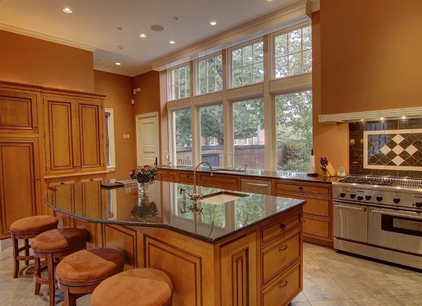


Uhhh… no kidding! And no way would I do this in a home from 1835!
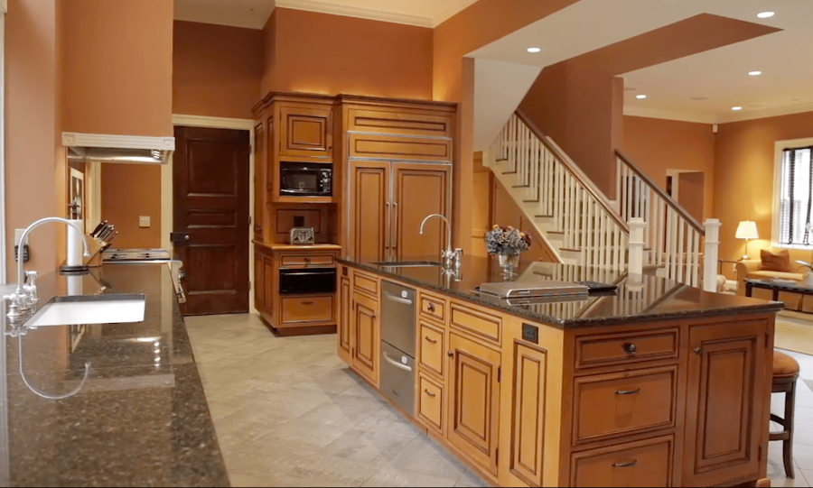
gag.

This is an addition that was done two owners earlier. Really bad.

The existing floor has radiant heat and needs to stay because changing it would be a nightmare.

But, who pairs all of that orange with gray? Actually, the concrete floor is a lot darker than it appears here. You’ll see later.

And the architecture? They spent a wad on matching what shouldn’t have been matched and ignored the rest. You’ll see what I’m talking about in a sec.
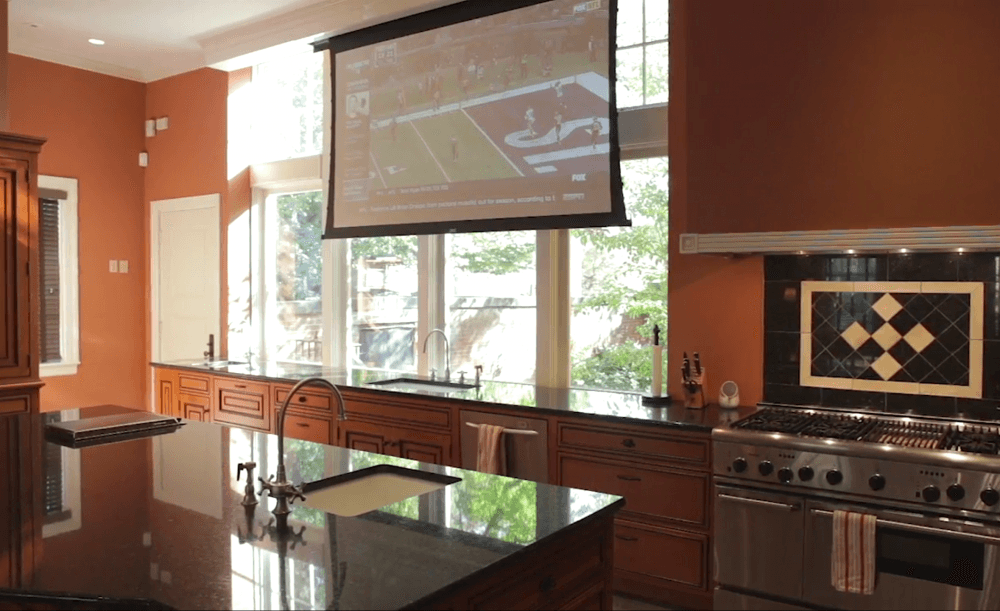
 

OMG!!! Tell me that huge screen covering up those glorious windows isn’t really there!
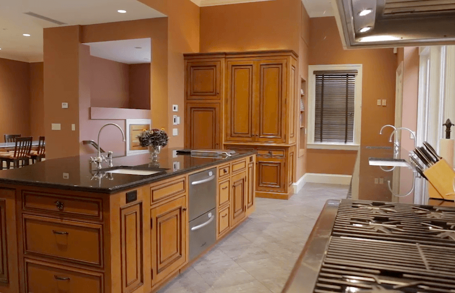
What I found out was that they specifically matched the cabinet to the existing pantry.
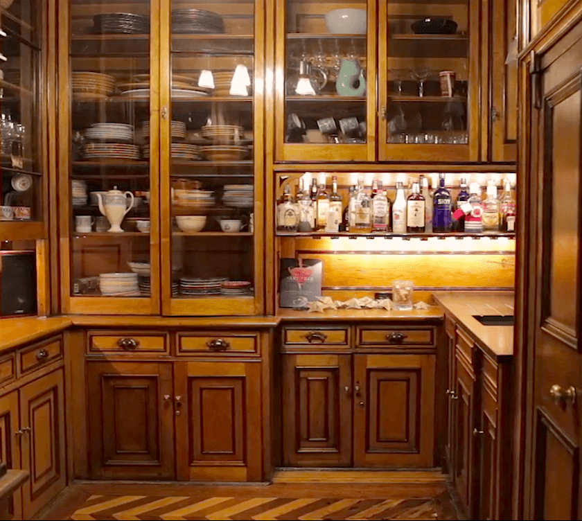
Okay, this is seriously cool! It’s reminding me of some of the pantries here.
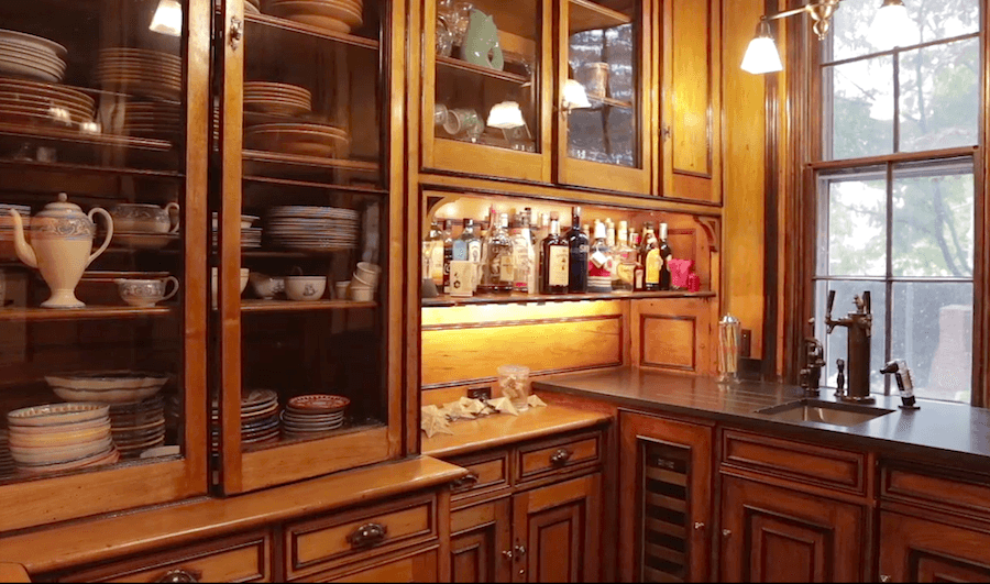

But I would have never tried to match these cabinets in the main kitchen. Never!

In addition, it isn’t Greek Revival either. I would say more like turn-of-the-century, late 1800s. Late Victorian. And parts of this are new too. I don’t think that they were putting in wine fridges in the late 1800s. lol
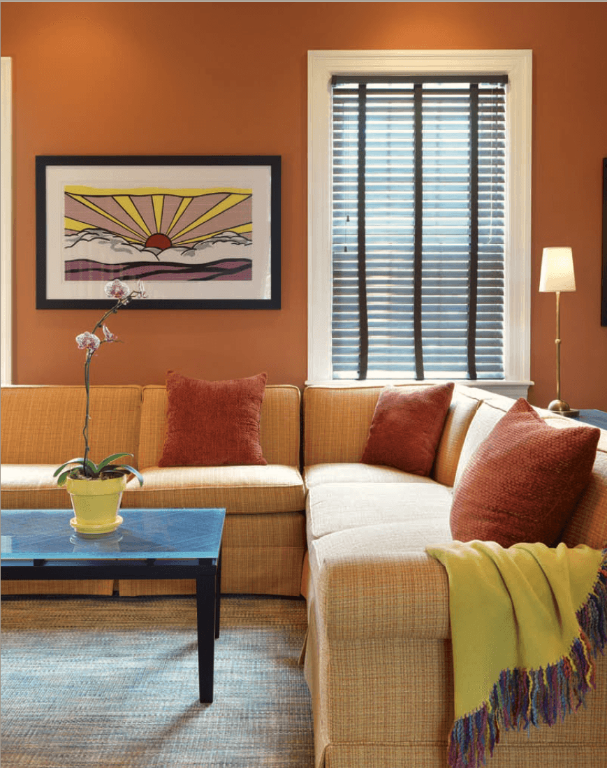
 

Gawd! It doesn’t matter what I say. But, I could comment foaming diarrhea all over this and it would blend right in.

However, I tried to find a real Greek Revival Kitchen from the period and fell short of anything appropriate. But I did find some kitchens from the late 1700s or so. Close enough. Greek Revival started in about 1820.
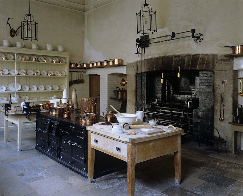
technology-in-country-house-gallery-kitchen Saltram Manor

Great kitchen at Saltram Manor dating to the late 1700s except for the range in the center which dates to the 1800s.  Now THAT is an unkitchen!
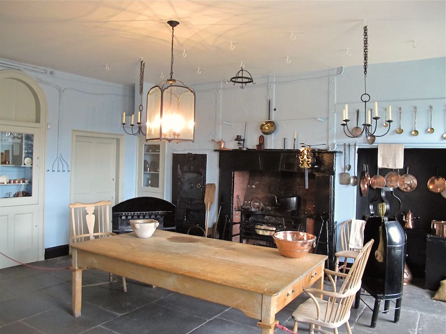
Georgian House Museum in Bristol from the late 18th century


Of course, no one expects a modern-day kitchen in a Greek Revival home to look anything like these.
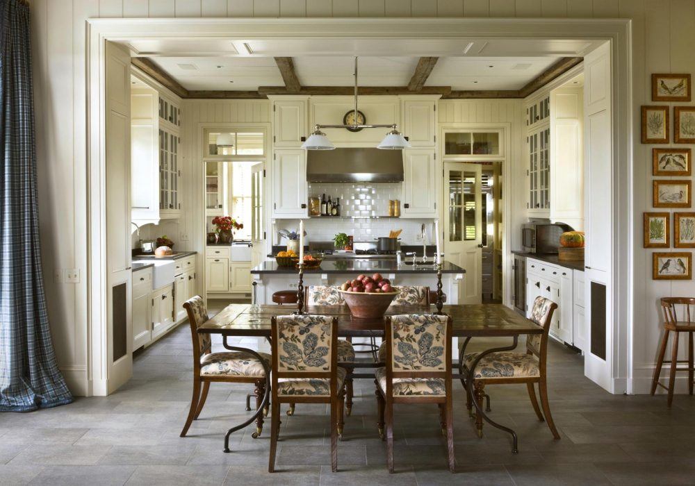
 

Gil Schafer Greek Revival Style Country kitchen

We expect it to look like this fabulous kitchen in the Greek Revival/Neo-classical/Georgian style by one of my favorite architects, Gil Schafer and the oft-talked about Miles Redd.
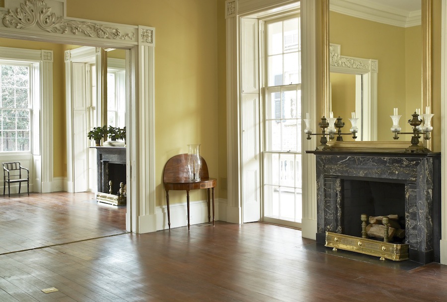
This is another Greek Revival beauty by Gil Schafer.

For more of Gil’s exquisite look and a fine example of Greek Revival architecture click here.


I wrote a quick note back to Lori. And told her in all honesty, that if it was my house, I’d rip that hideousness out. I would add beautiful mouldings, a coffered ceiling and WHITE cabinets!

Lori wrote back and thanked me. She felt the same way.

And that was that.


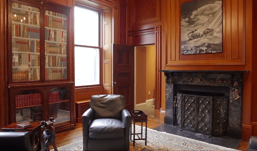
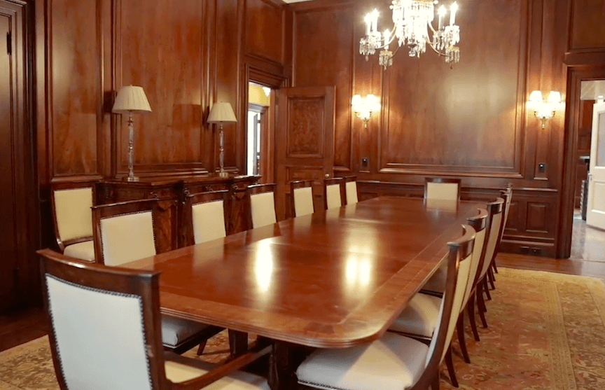
Below are three more images from Lori’s Greek Revival home.
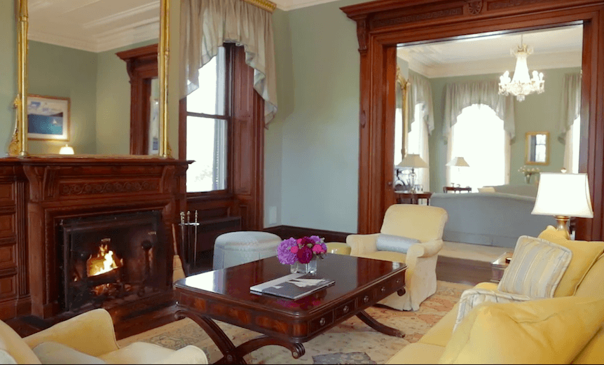
 

I’m showing these because, decorating issues aside, and the kitchen, what’s with all of the stained wood? The dining room looks like a board room for a law firm!


Stained wood is not typical for the Greek Revival period.


It’s not?

No, it’s not. In fact, I tried to do a search on Pinterest, just to double-check and I got a “Sorry, we couldn’t find any Pins for this search.”

BUT, the stained wood is typical for the later dates associated with this classic beauty. I’m not saying that the stained wood should be painted. But my point is that if it were painted, it would be more appropriate to the original Greek Revival style.


The Greek Revival Style of architecture is from around 1820-1850.


But there are numerous examples that fit the profile built before 1820. The White House is a great example. Although, it is said to be built in the neo-classical style, which is another word for Georgian. But since us Yankees were trying to do away with dear George, we say neo-classical.

Then, I just read that the preceding period is called the Roman Revival style. But I don’t recall ever hearing that term before. And the Romans copied the Greeks. So what’s the dif?

There’s a lot of overlap in these designs, in any case.


Well, remember Katy’s kitchen that we took a look at a few weeks ago?


Just like that, out of the blue, I heard from Lori. But I bet you figured that one out about an hour ago! haha.


Hi Laurel,

I read your blog about painted cabinet finishes. Well, I read all your blogs actually, and refer back to them often. I also use your Paint Color Collection and Color Board Guides religiously. They are indispensable tools for me.


The reason I am writing today is that we corresponded almost two years ago about a kitchen/family room area that was absolutely horrible!  


I had the cabinets painted with a catalyzed paint in BM White Dove. The cabinet doors and drawers were painted off-site, while the frames were painted here in the house.  Over one year later, I have not had any trouble with cracking, splitting or chipping.

While we are still not completely done with everything due to time, “Reno fatigue”, and some indecision, I have included a before and after picture.  My husband refers to you as “Your friend, the designer” – though we have never met!!!  Your guides have helped me avoid many expensive mistakes and were worth every penny and then some – if they were paper copies they would be well tattered by now.

Kind Regards,

Lori


I need you guys to prepare yourselves.


This kitchen went from this orange abomination with a contemporary yucky granite top on that island.


To This
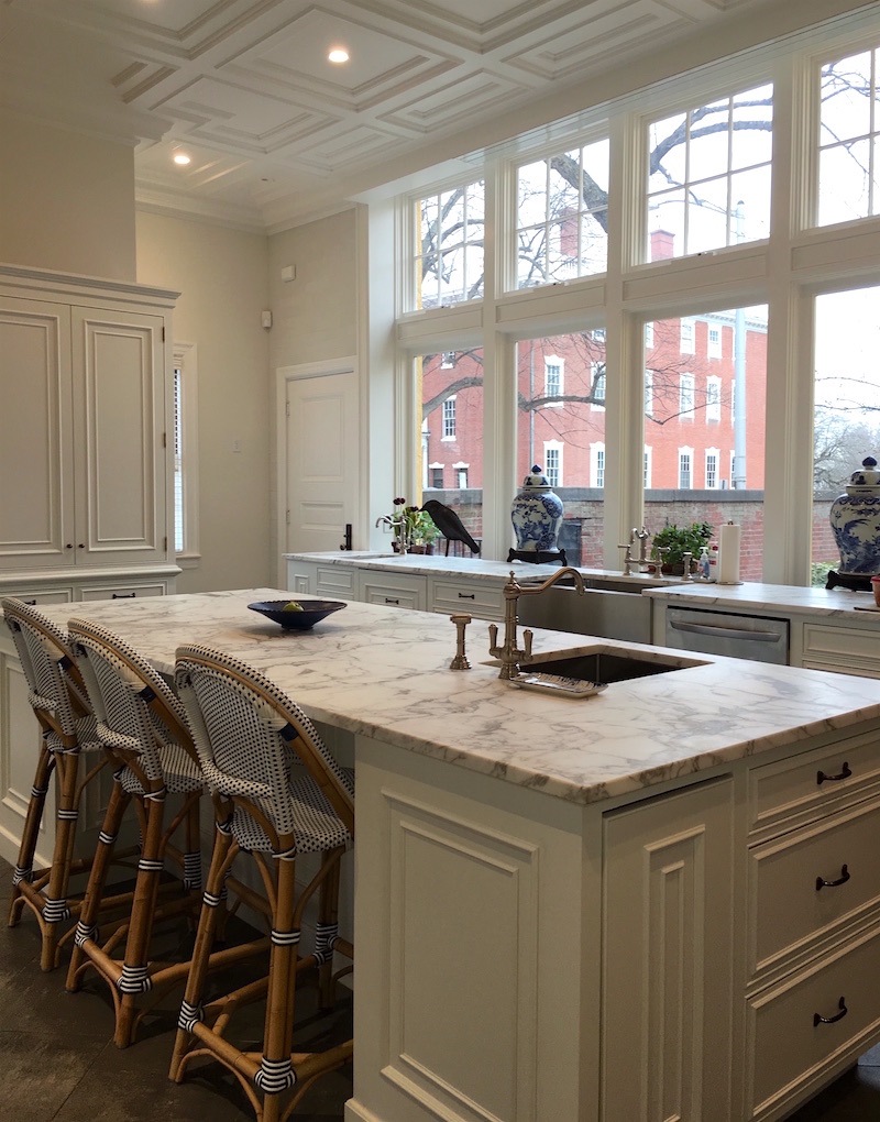


Holy Crap! Greek Revival – REVIVED!!!

Yes, those are the SAME cabinets!


Want to see more?

Oh, stop teasing Laurel!!! Of course, we do!
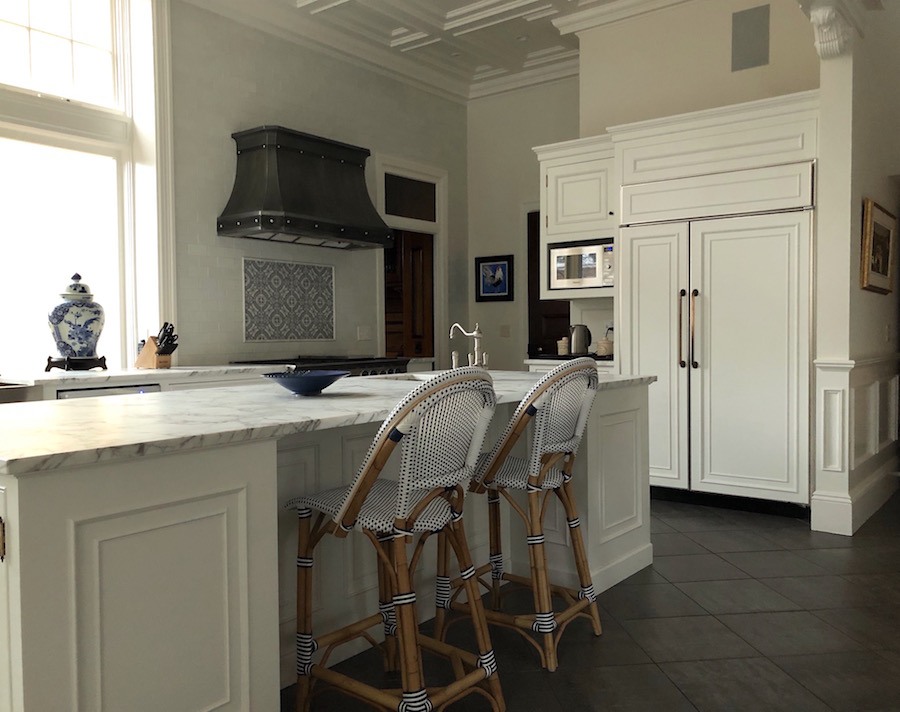
 

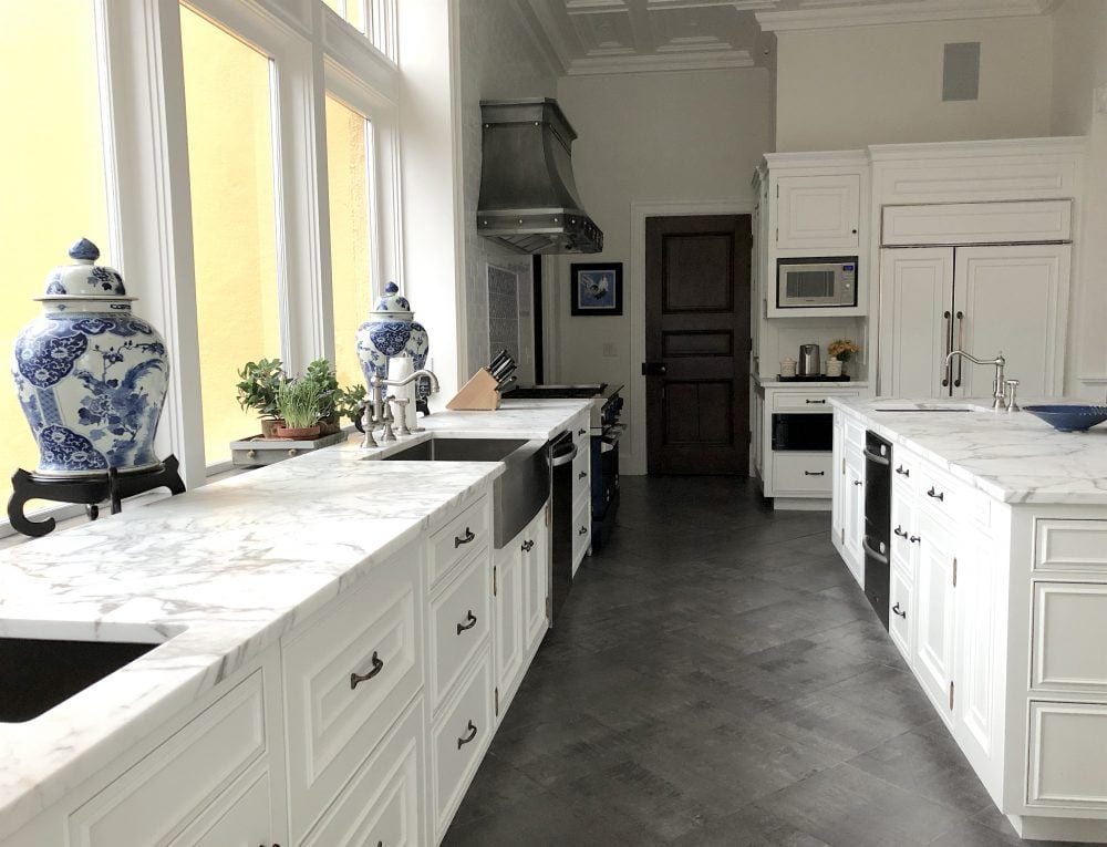
Greek Revival kitchen revived with white cabinetry and architectural details

Greek Revival kitchen no upper cabinets
See the floor looks great now! And the counters are a marble called Calacatta Vagli.
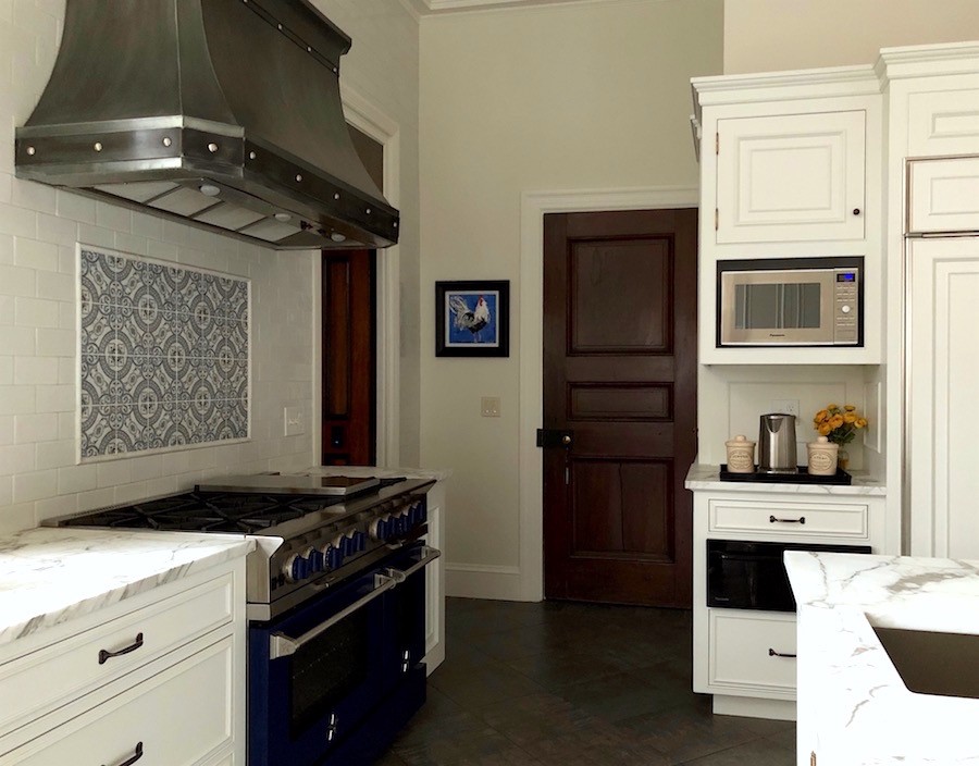
Fabulous new appliances and gorgeous range hood. Looks like an antique nickel?

And here’s the original pantry.
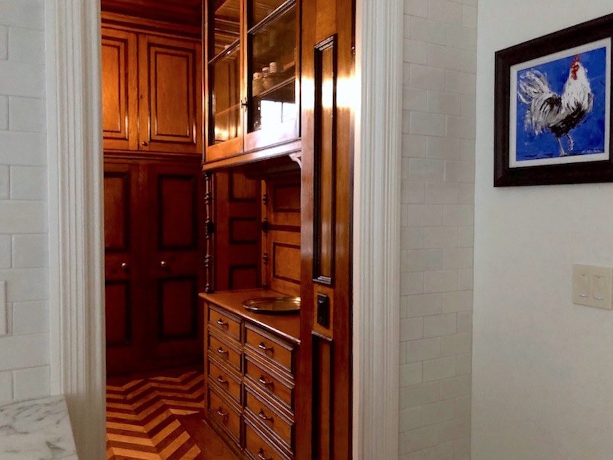
Now the warmth feels special and refreshing instead of getting clobbered in the head with a million pumpkins!

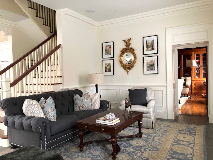
There’s more. Remember the Brady Bunch family room area?
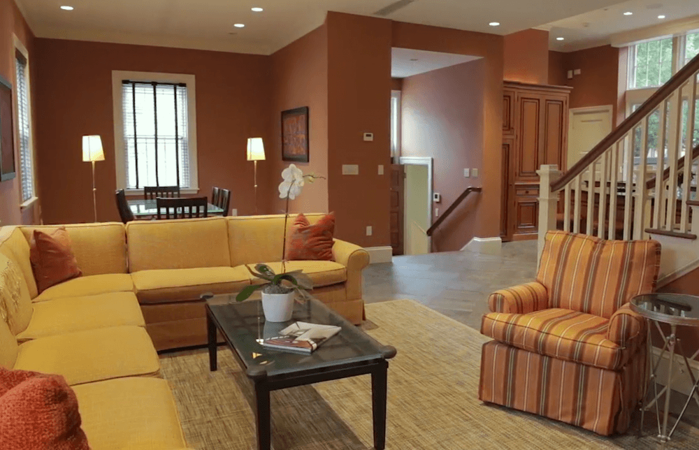
Please do not pin these yellow and orange rooms. Thank you. This is why people hate orange. I did a post ages ago, about how to work with orange so that it’s gorgeous!


And this is another post that I like too.


This is like being outside for an hour on a blisteringly hot day and stepping into some delicious air-conditioning!
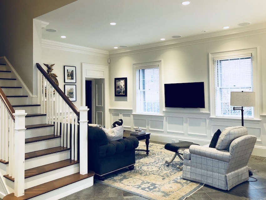
Plus the mouldings! She did it! She did everything I suggested, except ripping out the cabinets.

And boy, am I glad that she didn’t listen to me about that!
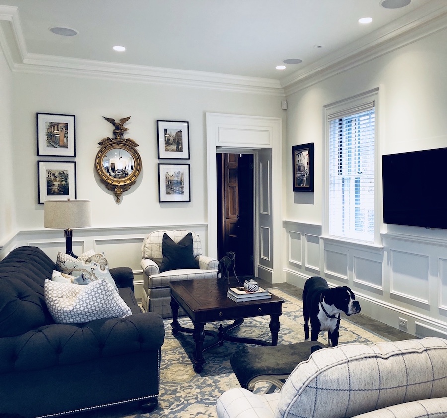
And Lori really has been paying attention. I have used that lamp in the paint palette collection which has 40 mood boards with furniture. And those pillows. And we had a post with a mirrors like that too!


They did a spectacular job of the mouldings.


Now, it doesn’t look like a tacky addition. It looks like an old home that was lovingly renovated!


For more moulding ideas click here.

and here.

this is a good one too.

Plus, all about wainscoting here.


Greek Revival revival family room looking into wood paneled library Greek Revival revivalI adore this view into the library. Again, the warmth of the wood feels refreshing. But the warmth is carries into the white areas as well.
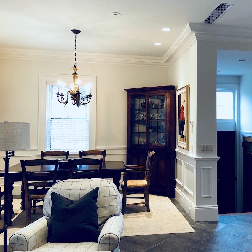
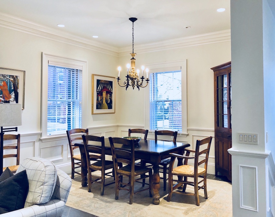
Lori says that she would like to change the table and chairs. I am thinking maybe a round table? The rug would need to change, but I think that would be nice.

And I told Lori that I would give her some ideas to finish things off. Really, she doesn’t need much.

Sure, if this was going to be for a magazine, the stylist would bring in all sorts of accessories and plants, etc.

But, I really cannot get over this transformation and it goes to show that through the blog, my paint guides 1 and the paint palettes and Laurel’s Rolodex, plus her own obvious talent, she’s truly revived this beautiful old home.

It makes me want to see the rest. It’s a BIG house!
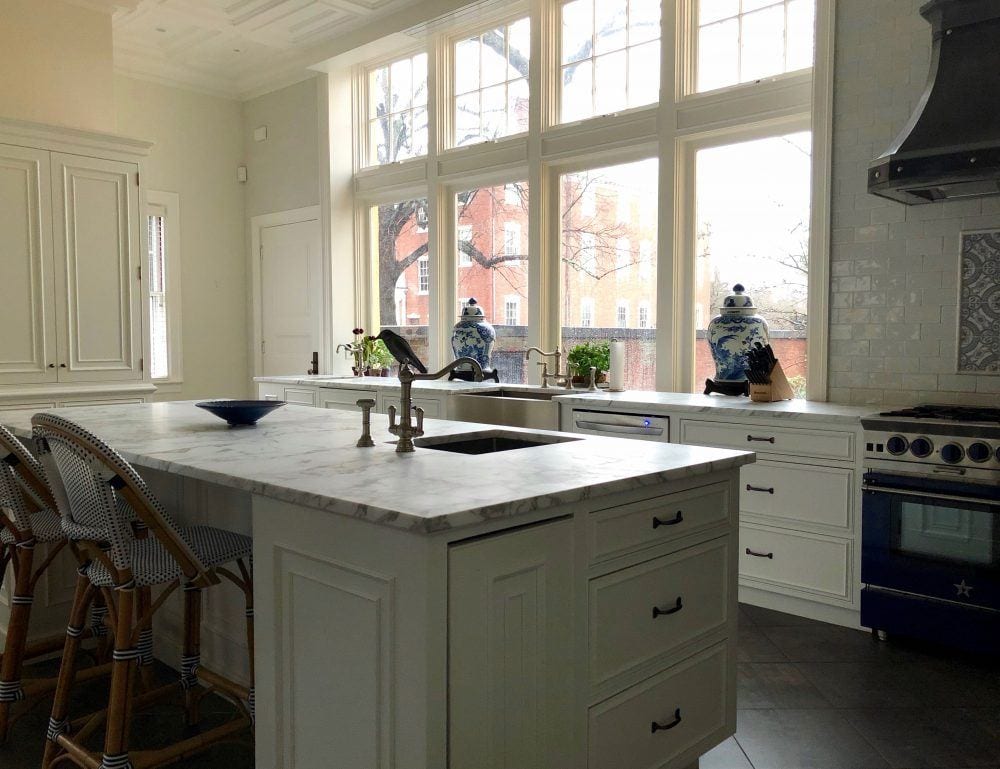
 

Here’s another shot of the kitchen with the warm glow of the morning sun shining through.


Please share any ideas that you have for what additional furnishings– That is accessories, lighting, additional window treatments yes and now and if yes, what would you do.


And thank you Lori for sharing your magnificent home with us! I didn’t share an exterior shot to protect Lori’s privacy. But here’s a shot of part of the wrap around porch shot before she and her husband purchased the home.
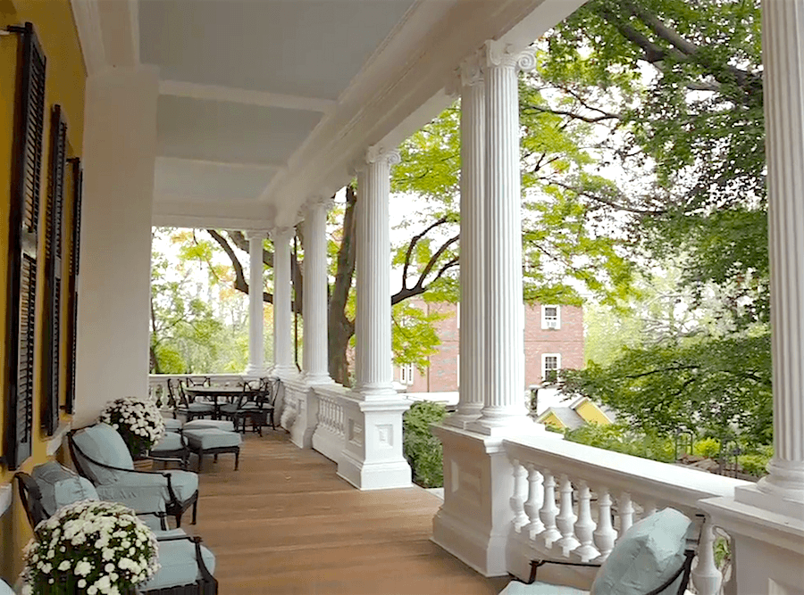
Greek Revival beauty porch with ionic columnsxo,


PS: please don’t forget to check out the hot sales. Lots of great sales and some ending very soon!

106 Responses

  1. Just gorgeous! Everything turned out so beautiful, Lori! I’m curious what paint color is on the walls in the kitchen, if you wouldn’t mind sharing. It is so soft and lovely.
    I love your succinct honesty, Laurel, along with your humorous metaphors- “…getting clobbered in the head with a million pumpkins!”Ha, ha
    1 I laughed out loud at that one and I NEED a good laugh after just doing my income taxes (yes-last minute!) Thanks!

    1. Hi Phyllis,

      Glad that you got a much needed laugh. The wall color is Benjamin Moore White Dove. Yes, it looks a little different from the cabinets, but it’s the same color.

  2. Holy crap is right! I’ve been toying with the idea of having my stained wood kitchen cabinets professionally painted. This post just sealed the deal! Thanks Laurel!

  3. This redo is wonderful! And I thank you for sharing it in the blog. I am so happy the pantry was left “as was”. It was simply stunning. The (dove) white kitchen is now beyond beautiful, and both the kitchen as well as the pantry seem to complete one another despite the differences. I also love the black and red art on the walls of the dining room. A round,or oval table would be lovely. It has given me much to think about in my own 115 year-old dining room.
    I have not written before, because in my mind, I gush with every blog post I read. And I don’t want to sound “gushy”. I look forward to every post. And unlike most of my email, which get “trashed” even without looking at them, I save yours and re-read them and put so much information to good use. And again, in my mind I hear myself saying, “More… I want more”.

    1. That is so sweet of you Leslie! And far, far better gushy than insulting. And I get those too, but I usually don’t publish them. I think that some forget that there’s actually real PEOPLE on the other end of their words.

  4. Gorgeous historic home AND news of another guide? I can’t wait. Your mission and vision are so unique, I’d love to read more about how you realized it all, both literally (an aha moment?) and more practically. Although I’m in an entirely different field, I’ve taken much inspiration from you and what you have created here and tried to apply it in some way to my work. It’s amusing that you approach timeless design with such innovation, and not just in a design sense but in creating services and products (still marveling at your paint palettes in particular). That is some achievement, or process.

    1. Thanks so much Paula! The guide is an expanded version of my talk last year at the Design Blogger’s Conference.

      But it is written for anyone who has a website or wants to start one or wants to get more out of their website.

      I realize that the majority of people do not want to become full-time bloggers, but it’s not enough to just plop something up there and hope for the best. If nobody is finding it, then it’s bloody useless.

  5. You know Laurel, just reading the comments, and it’s obvious your blog is invaluable. I’ve ditched most other blogs also and exclusively read yours just like the above poster. I’m purchasing all of your resources after seeing this but oh how I wish wish wish you would write a book, maybe something with illustrations etc? You know a la’ Bunny Williams or something. You are truly a wonderful writer and I would love to own that book. 😂 Congrats to Lori for doing a beautiful job. Such a stately, lovely home.

    1. Hi Genie,

      That is so, so kind of you Genie. The closest we can come to that now and it’s not a design book per se but it’s the back-story of how I built this website/blog from nothing and turned it into a profitable business. And that’s after making every mistake in the book and then some.

      Plus, I really was a computerphobe for quite a number of years.

      It’s not anything like my other guides and I realize that not everyone will be interested in it. But a lot of people have websites and pretty much everything I’ve done applies to anybody with a website.

      But thank you for thinking that. The new guide is coming out on the 25th.

      1. Oh I cannot wait to see that Laurel. Good for you and for teaching yourself all you have. My guess is in the future, and the not too distant future I might add, some editor is going to snatch you up and have you write a design book also.

  6. Laurel, I love it! Thank you for posting in such detail. I thought for certain the color of the walls are BM Pale Oak (and trim is SW Alabaster.) I found that color through one of your posts while searching for a paint color during our home renovation. My kitchen walls look just the same as in this post. I loved the color so much that every room in my house is this color and it looks great everywhere and really works with our furnishings and such. My daughters even wanted it in their room. We never feel that the whole house seems one color. It’s very fresh and soothing. Thank you, again. It’s a joy to look at the transformation here.

  7. Lol, no wonder I couldn’t find that blog post. It wasn’t yours Laurel, it was Joni’s from Cote De Texas. Please do delete it. One thing I was right about though, I do love your blog ( and Joni’s). Thank you!

  8. Hi Laurel, I just love your blog and was reading through some of your earlier posts. I came across one where you talked about some personal things…how your four-year-old self would have wished for long, straight blonde hair; how your grandma gave you decades old decor magazines to read and how your parents built a home and allowed you to pick lavender paint for your bedroom. It was such a fascinating story; but alas before I could finish reading, I somehow lost the blog post. Do you or any of your readers remember that article and can direct me too it again? Thanks much!

    1. Hi Michelle,

      None of that sounds familiar. When I was four my mother washed my mouth out with soap. (it didn’t help) My grandmother didn’t read magazines, but she did have an entire wall devoted to her five grandchildren’s art. My parents never built a home and my room was blue. I did not pick out the color, but I shared it with my older sis and I was only 3 going on 4 when we moved there.

      Maybe it was someone who commented? There is a post about me.

      https://laurelberninteriors.com/12-things-you-dont-know-about-me-2/

  9. She did a phenomenal job. See what your blog/advice help people achieve. Its amazing. I love love love the blue range. I’m obsessed with blue ranges. My only thought would be to add more color but she might not want that. Also some plants. A couple tall topiary trees would look nice on her counter next to the windows.

  10. Wow! Many times over much better! Laurel the power of a determined woman with the right advice cannot be understated. I was drawn to you (and Maria K of course) around a color dilemna and it saved the day. This house is dreamy. The mouldings! The trim and ceiling just fit. I really appreciate that the previous owner copied the butler cabinets (and that Lori kept them) but yeah the original color -Yikes. The casual eating area does feel heavy. So changing things up a bit… Windsor chairs are a classic, there are different styles of them, and many were painted which I advocate also here (maybe explore deep blue as you have that in the space). Pair with a simple pedestal table. I appreciate the look, arm, and seemingly wrap around comfort of this windsor chair though the table might be a bit small … from Kincaid furniture https://www.kincaidfurniture.com/product/20769/baylis-arm-chair . I think a small occasional table next to the floor lamp for a drink or book would be a nice addition. I would steal the little one from the leather chair at the black fireplace (library?) in a pinch or as I think tiny but useful is important maybe this 12″ diameter https://www.bernhardt.com/product/ascot/accent-tables/round-chairside-table . Good luck Lori it is wonderful so far!

  11. This turned out so beautifully, and what a transformation! The before practically hurt my eyes, and the after is gorgeous and restful to look at. What a house.

    Take it with a grain of salt, but I think that in the dining area Lori should change out the chandelier. This one looks to me both a little fussy and too small. I also feel that the room needs some softness. Maybe some simple drapery panels around the windows, or a soft blind? And I’m sure the new table, etc., will add so much to a truly beautiful home.

  12. This is just lovely – absolutely, beautiful. Living in it must be a dream, not just the splendor of the reno and the beautiful view out the kitchen window, but all that radiant heat flooring…sounds divine. Thanks L & L for sharing this gem.

  13. I too am stunned by how much was achieved with your help, Laurel. The homeowner really did well. One of the comments said it wasn’t strictly a Greek Revival kitchen because the wood was painted but I think I like this much better. And it’s so classic. The orange kitchen looked dated already but this one should stand up much better. Thanks for featuring!

  14. WOW! Absolutely. Stunning. She did a fabulous job. What a beautiful house. Just another example Laurel of why your blog is my favourite! So generous with your very educational and informative posts. I love reading every one of your posts. Wonderful job Lori!

  15. That transformation is effing amazing! And look how beautiful the windows look in the kitchen now–they really sing! I had to look back and forth over and over again to see if they’re the same–crazy how the all white makes them pop! Question–I know you just did a post about cabinets, but if you were doing these cabinets would you paint them in semigloss? Or satin? Or matte? Love your blog and am learning so much!!

    1. Hi Jenn,

      I’ve always painted all woodwork in semi-gloss. But satin is okay too. Never matte for cabinets or wood trim. I use that for walls, however.

  16. Dear Laurel,
    Lori has done a magnificent job transforming her home! She has great vision and an ability to visually edit which is a real gift. I love how she implemented your idea of the coffered ceiling while painting out the cabinets. I just love her choice of marble as well as the stove and stove hood! (everything):)
    It’s a real test of discipline to maintain the big picture when doing ones home. I’ve been getting lost in the details… but I am truly inspired by what Lori has accomplished with your guides(I have them all) and her talent So I’m going to take some chochkas back to the store and eliminate a bunch of others and think with a bigger cleaner vision. Thanks for raising the bar on what we can accomplish through Lori’s example and the instructive photos you always provide.
    Best Regards, Leslie

  17. What a FABULOUS transformation! I would also have told her to rip out those cabinets but she made them work beautifully! What a gorgeous, gorgeous house. Hope they get to use that porch soon! XO

  18. Hi Laurel, I love this transformation! It is beautiful. I am going to be starting on a new kitchen in May, and this is my goal, to create a space that is classic, and won’t be hideous in 2, 5, 10, or 25 years. The house was built in 1915, its an American Foursquare, and I have many plans for her! The existing kitchen is small, and has 4 doors coming into/out of it, so we are swapping the kitchen for the extra large dining room, that is connected to the living room. I’m planning on white cabinets, refinished hard wood floors, new, larger window, etc. I’m excited to get started and see the transformation. Bonus: we will have a working kitchen while doing the renovation!

    1. Hi Holly,
      We have a 1910 Four Square and almost reversed the kitchen and dining room. I think it is a great idea!

      1. Its not a style you hear much about! Our living room isn’t ideal either, but harder to change! 🙂 Not much wall space, or options of furniture placement, but I love the house!

  19. Very well done! Timeless and a wonderful starting palette to do anything with, without any bossy elements to restrict the imagination.
    Some of the rooms are probably still a work in progress as such a house is never quite finished and will go through several incarnations with furniture, pictures, lamps, etc…until the owner feels she is “finished”. Sometimes that feeling never comes, which shows us that it is the journey and not the destination that is fun.
    I’ve been following your blog since beginning 2015, really the only one I have stuck too. I’m so over the trendy blogs!!!! Unsubscribed all of them. But you remain.
    I want to thank you too for the link you gave in the comment section to The Bible of British Taste! Wow, that’s a good one!
    Another good one this week was “In Defence of Granny” on the blog The Potted Boxwood! You will like that one too!
    We American need to adapt some of that British “don’t give a damn” attitude of using old stuff…worn stuff…and unperfect stuff…to create a perfect homey feeling.
    MY big question is…How doe we personalize and elevate our American (more or less) cookie cutter housed to this very individual and livable style, without making our housed look weirdly shabby? Is it possible?
    I have a house on an island in the Pacific Northwest built in 93 that isn’t really a style, but perhaps one could say it is kinda craftsman, kinda Cape Cod, kinda Hamptons (well, maybe that is wishful thinking haha).
    It’s 4000 sf and furnished with only thrift shop/secondhand store stuff and painted chantilly lace and white dove from top to bottom…every room including kitchen cabs and all woodwork. A light maple wood floor through out. A few ikea things and even less overstock/wayfair stuff. I don’t want to spend 20-50K per room, nor can afford to. American houses are sometimes so big and impersonal, they are so hard and expensive to make cozy. I really dislike the new trend to furnish EVERYTHING through Overstock as you can always tell and it looks cheap in the end.
    I feel with the second hand antiques, which cost about as much as some Overstock stuff…Ive created a cozy space for less then 10K for the whole house. Of course the painting of everything, cost almost 40K (wha…am I crazy?!?), but it also gave me the blank canvas to do my thing.
    Btw, my cabs were professional painted and the company set us a drying room for the doors in my garage. Best decision…3 years later no nicks…and if so, I can touch em up myself with chantilly lace satin.
    Sheesh, long post.
    So basically what I wanted to say is thank you with all my heart for showing me the way and I’m glad you have become so successful!

    1. Hi Chris,

      Wow! You’ve stuck with me for over three years! I’m so flattered. And thanks so much for sharing your story!

      I definitely think it’s possible to take a cookie-cutter home and infuse a lot of personality into it. I can’t say that there’s one way, but my goal is that is the subtext of what most of this blog is about.

  20. Amazing post. Thank you Laurel for your (excellent) advice and to the homeowner for following it as well as hiring a good contractor to do the work. Also thanks to Laurel for explaining the ‘house styles’ which everyone mixes up. Renovations don’t need to match the house style but they do need to complement it. That’s very important. and for all those people who think it’s blasphemy to paint stained wood, see how much nicer the remaining areas of wood look with the ‘relief’ of the painted areas?
    congrats to the homeowner for a lovely house.

    1. Hi Barbara,

      Well said. Complement is the right word! Of course, no one is creating a museum. And in some ways, the previous owners probably thought that they WERE complementing the pantry. But IMO, they were fighting with it, because the cabinets did look newer and in such a large space, it was too much and it looked like it belonged in a much different home.

    1. Hi Margaret,

      Yes, definitely different furniture. But unless Lori’s doing mid-century in other rooms, that particular idea won’t work, I don’t think; although I do like it!

  21. Laurel,

    Appreciate your work and love your attitude! What a beautiful “redo” of the owners “redo”! I learn so much from your posts and enjoy them all…..

  22. Laurel, I love all of your posts and enjoy your sense of humor to no end. You are probably the only post I read word for word, and not just run through pinning my heart out. I also refer back to many of your posts from previous posts that you highlight. Just a note on how to pronounce my last name, it is pronounced A-Strike, not the big bird most people pronounce. If they pronounce it correctly, I know they know me and I can weed out the telemarketers. Ha! My question is, I see many beautiful posts and information about them, and I see many posts of lamps on dining tables. Please tell us how they do this. Are the lamp’s battery operated? Do they run a cord thru the leaves of the table, or drill a hole thru the table to a floor outlet? If they do, how do you keep your guests from tangling their legs in the cords as they are eating dinner? I also have seen this in back to back sofa’s with a table between the sofa’s with lamps, but never see the cords. Do they tape them to the table so you don’t see them, then run them under the sofa to a floor outlet? And I never see the cord peeking out running to the floor outlet. You would think you could at least see a little of the cord, but the photos always look so pristine. If this would be an interesting topic to address, I would be curious as to how this is accomplished. Thank you for all you do and the work and time you put into these lovely posts. Sincerely, Connie (A-Strike) Oestreich

  23. Wow, what a beautiful transformation. I looked through the comments and this question hasn’t been asked, unless you are answering it as I type! Just wondering if the owner did White Dove for everything, including the walls? It all looks fabulous, so I am curious.

    Also, I wonder if you could do your idea–as in your bedroom remodel to be–of wallpaper panels in the dining room? Might be a way to add color, but not have the problem of how the paint affects the other walls–seems like the dining room was part of an open area.

    1. Hi GGG,

      That’s a great question and one I had too!

      Yes, Lori did White Dove for everything, but in different finishes. So, WHY does it look different on every wall and surface?

      A few reasons.

      one lighting. There are different bulbs in the kitchen and family room. Should they be different? Probably not, if possible.

      Two. Time of day and the light hitting certain areas or not.

      Three. Reflection. Lori told me later that the top of the cabinets are still orange. Yes, they should be painted so as not to reflect that color tinging the paint slightly pink. In some photos she sent, it was really bad, so I didn’t use those. Part of it could be the way the camera sees the color that our eyes don’t.

      In addition, the different finishes will look a little different from each other.

      You can make a wide-striped wall alternating with semi-gloss and matte- same color!

      And again, as I’ve said numerous times, this is why long-distance color consults were making me batsh*t crazy!!!

      I think that the formal dining room is enclosed. Maybe you mean the kitchen dining area? But for wainscoting, I prefer that it remains classically all one-color.

      1. Yes, my mistake. I forgot there was the panelled dining room and was talking about the kitchen dining area. Thank you for the detailed explanation as to why the color looked the same–but different!

  24. Laurel,
    Love this amazing transformation! As a designer I have learned so much from your classic design wisdom and timeless advice.
    The coffered ceilings in the kitchen- so beautiful! Maybe just a touch of palest blue in the insets? Like the porch ceiling? Not sure they should be touched, but it would call a bit of attention to that gorgeous detail.
    You did ask for accent ideas, right? How about a fiddle leaf fig tree just behind the corner table in the living room? Needs a little something organic there. If not there a small fern in a Chinoiserrie pot on the coffee table.
    The TV- what I always call ‘the black hole 😉 – maybe a narrow white console table underneath so it doesn’t ‘float’ so much? Or a TV cabinet. There are some great ones out there now. I painted the wall behind the ENORMOUS TV my husband bought for our new house in a nice dark charcoal (BM Kendall Charcoal) behind it in the hope that it might ‘disappear!
    Exquisite taste Lori!

    1. Hi Dee-Dee,

      I’ve learned a lot from my blog too for a lot of reasons. One, are the things I don’t know and two are the things I used to know but forgot and three are the things I need to double-check. Plus, it’s made me think a lot about exactly HOW I do certain things.

      I recommend blogging for all designers for a million reasons! And am getting super excited about my new blogging guide coming out.

      Great ideas, all of them! And yes! painting the wall a dark color behind the TV is a great trick for making is ‘disappear.’

  25. Amazing transformation, Lori..really, magnificent job done. Great sensitivity to the house-and it all works..more than that, it sings:)
    And thank you for yet another tremendously enjoyable post, Laurel.

  26. Hello Laurel, This is a stunning transformation, which had more to do with applying good taste than making extravagant changes or spending lots of money. However, you did ask for ideas…. I think you were onto something when you mentioned photographer’s props. Perhaps the house could use a little more personalization. Also, it might just be an effect of the angles of the pictures, but they seem to emphasize the flat ceilings with their spotlights and odd openings. Since these were so greatly improved in the kitchen, perhaps the principle could be extended.
    –Jim

    1. Hi Jim,

      Oh, I’m sure that this still cost quite a bit, but not nearly as much as a total redo, of course.

      These are Lori’s cell phone shots which I cropped and edited to make them look their best. I’m not sure what you mean by odd openings in the ceilings. Or do you mean the speakers in the family room? I think that’s what those are. The recessed lights are on dimmers and there are lamps.

  27. I love it! I, too, live in a Greek Revival home (1844j – not so big and grand as Lori’s, but a treasure in its own way. I have found so much help in your resources, blog, paint colors, etc,, and this post is another aid as well. We, too, have found the “paint the woodwork white” a reliable guide, as well as, “if it is original, fix it and keep it!l” Not as easy as it sounds, especially with windows – my husband is stripping them and reglazing them, pane by pane, even replacing broken panes with hand blown glass. But windows are the eyes of a house, and we believe it is worthwhile. Thank you for this lovely inspiration and your very helpful comments!

      1. Beautiful home! Speaking of windows, Laurel I wish you’d write a blog on windows! They truly are the eyes of a house and it’s a pity that most people give so little thought to them when replacing. I’m currently in a dilemma about replacement windows! It’s a major expense for those of us with 90s era homes.

        1. Hi Danae,

          In terms of actual windows, I wouldn’t call myself an expert. I’ve had clients who replaced their windows, but except for the odd question, was never involved.

          The only thing I’ve ever done a couple times is cover up the window from the inside so that we could put a cabinet over it!

  28. I’m just adding my “wow” to the list….it’s so neat to see what happens when people really “listen” to the house they’re living in, and to you, of course! Your blog is the best!

    1. Thanks so much Paula! And truly, I don’t expect anyone to listen and always feel surprised when they do and then show me that they did!

      People sometimes describe their situation to me and it’s impossible to say anything because my powers of visualization are not that good from an explanation.

  29. GORGEOUS.

    Love it all. She crushed it.

    Only thought – maybe give the dining nook some color? Like a good Farrow and Ball blue. Even just the ceiling.

    And everything else is SO good, the dining light fixture could be dialed up. Maybe a good old lantern? Or anything fab that has more punch.

    1. Hi SC,

      All good ideas but the dining area goes straight into the seating area, so the ceiling idea won’t work. I think that different chairs and table will make a big difference. I like the chandelier, but I also love lanterns!

  30. What a fabulous turnaround! Easy to see how she took lessons from you Laurel, but also has her own great eye. And it’s nice to see a real life example of renovation and updating that has to deal with earlier renovations without a gut redo. In a kitchen that big new cabinets would be a huge expense. If the layout works then paint and new counters are so much more reasonable. Absolutely great outcome!!
    (Would be interested to see her dining room some day when she has had a chance to transform that too.)

    1. Hi Wendy,

      Yes, indeed! I guess I was strongly hinting that I would paint the dining room. Not necessarily white, but painted in a chalky color from the period that goes with her scheme. And I might antique it lightly. It would be gorgeous!

  31. Ok. This was definitely not Greek Revival. Either the kitchen or house. In fact that particular house looks like a BNB on the Battery in Charleston SC. It’s Queen Anne. negative points. Check out Rose Hill Mansion in Geneva NY for a real Greek Revival House.
    Second, painting everything white has as little to do with the style of the actual house as did the pumpkin color. That’s an aesthetic choice. Both are extremely contemporary. For either style a really fine tightly grained wood ( oak, chestnut, the good kind) would look more correct. In all, the house has been rehabbed so much that the niceties of original intent are long long gone. I’m not sure that is much of a tragedy, since we don’t live in museums. Well I once did. Speculatively, from deep and bitter experience, updating Plumbing, HVAc wiring while remanufacturing plaster and trim work is so cost prohibitive, that you need to be quite wealthy and careless of actual property resale to replicate look and feel of an old house. Best to be comfortable. No one really wants an authentic look.

    1. Hi Mary L,

      The house is in New England and the original facade does look to be Greek Revival on the original facade. It is def not Queen Anne on the exterior, but interior, that I would agree with.

      True, the kitchens back then were certainly not white or anything like our kitchens. That is why I posted those two kitchens from the late 1700s.

      But they did use lots of shiny white trim throughout. So for a kitchen of the 21st century, it makes sense to me for it to be white in an old home like this.

      My only point was to say that all of the stained wood is not part of the Greek Revival period. I felt it was important to say because if someone wanted to paint it, it wouldn’t be a crime.

  32. I love this post! The transformation is remarkable.! Trying to update while keeping the era or classic nature of a home is difficult. It brings up a question that I have had for a long time. Have you ever done a post about how to choose upholstered furniture around an antique Oriental rug? We are having a condo built in an old Catholic girls’ college building. It is such a unique opportunity…old hard wood floors, moldings etc from 1920’s. THe rug will be beautiful, but I am confused about how to mix patterned fabric with a bright red antique oriental rug. Love, love, love your blog. Thank you!! Marcy Roth

    1. Hi Marcy,

      If you’re talking about a traditional English house look. What I’ve done in the past that works well, is to pick a chintz or linen floral with red flowers and at least one other color in the rug. Not that it has to be an exact match. It shouldn’t be an exact match.

      Or, you could do a solid fabric and do floral and/or damask pillows.

      But I’ve also seen modern furniture done with old Oriental rugs and it can be a great look, too.

      I realize that some visuals would be helpful. There might be some good examples on The Bible of British Taste blog. This is a recent post that might give you some ideas. There’s a living room that doesn’t have a rug, but I could see a beautiful old antique Oriental there.

      http://www.bibleofbritishtaste.com/category/houses/

  33. What a fabulous house and transformation! I will use this to show clients the power of paint!! Thank you Laurel and Lori for sharing.

    1. Hi Liz. Indeed! What’s funny is that I zipped through Lori’s email and missed the part where she said that she had kept the cabinets. When I saw the orange, remembered it instantly, but at first, I thought it was an entirely new kitchen!

  34. Wow, beautiful transformation. Beautiful home. The power of paint is remarkable here. I think you help more people than you know, Laurel. Best blog I’ve come across, that’s for sure.

    1. Oh, thank you so much Teresa! That is so kind of you to say! It was my original plan to make my blog full of information, to tell everything I know. And even what I don’t know but learned through research! Nobody knows everything. The amazing thing is that I’ve learned so much from all of you!

  35. Not a big fan of orange except some accents in the autumn. Have you seen the re-do of the Helen Hayes theatre in NYC? All blue but orange crushed velvet seats. Looks fantastic!!

  36. I call that “the power of white paint”! We should never underestimate it…when all else fails paint it white! ❤️

    1. Hi Leslye,

      You are so right. A little game I play when I’m a bored passenger in a car is to look outside at the buildings. I often think, imagine if they just painted that ugly building white, it would look so much better, maybe even beautiful!

  37. OMG! That was fantastic-enjoyed every change, and she is right, you are unbelievably
    generous with all of your posts-worth every penny for your rolodex, paint samples, etc.
    That was my favorite transformation, by far. Thanks for sharing!

    1. Thanks so much Kathi! I think that they are worth every penny too! And people often inquire if there’s a fee for the blog? I don’t see that happening!

  38. Stunning! The home. The porch. The transformation.
    She’s a rare talent for sure! I think she was also right to keep her original pantry, it looks very cool to see that right off the much cooler kitchen.

    Red

  39. This transformation is absolutely, jaw-dropping stunning! Kudos to Lori and many thanks for sharing it with us!

  40. Amazing! Just a beautiful job with preserving the integrity of the architecture. For me, I would not cover the windows. Love the moldings and the light. Beautiful job, Lori!

    1. Hi Theresa,

      Definitely nothing on the kitchen windows unless necessary for privacy. And I’m find with the rest of the windows as is, too. But some simple drapes either in a white linen, maybe with a trim or a little plaid like Miles Redd did in the kitchen and his adjoining family room which I didn’t put up, this time would be beautiful for those windows. But really not necessary.

    1. Thanks Eileen! My first thought was, “I didn’t realize just how spectacular those windows are! And with the ceiling moulding it makes the kitchen ceiling seem even higher and more dramatic.

    1. Actually, I was practically crying because I’ve often said to people. “You don’t need me!” I mean me, personally. Just read the blog and especially the comments and get the guides because they are both full of lots of information aside from the obvious.

      Recently, it’s also occurred to me that my hot sales widgets have little nuggets from my years of experience, as well. Although nothing beats the $2,700 Stanley buffet that they apparently left off the “2” for a few weeks, before they caught it on OKL. I hope some people took advantage of that one!

  41. One word: astonishing. My goodness, Lori’s kitchen/family room transformation may be the most dramatic you’ve ever featured. Beautiful, elegant and welcoming, How fortunate “her friend the designer” is so generous with her advice and talent. Well done Lori and Laurel.

    1. Hi Mel,

      Of course, aside from the one email, I didn’t do anything directly. But it LOOKS like I did. I think that she even copied my exact mouldings for her wainscoting trim! Well, it sure looks the same. The crown was her research or maybe there was something on the blog. I’m so happy for Lori!

Leave a Reply

Your email address will not be published. Required fields are marked *

This site uses Akismet to reduce spam. Learn how your comment data is processed.

Welcome To Laurel Home!

laurel-aarons-18th-e1456449963926

Hi, I’m Laurel, and Laurel Home is the website and blog for Laurel Bern Interiors.
I’ve been creating new-traditional interiors since 1988. The blog is where I share all.

New Edition, November 2023! Get The Indispensable Guide For 100s of Home Furnishings And Interior Design Sources That Everyone Is Raving About

laurels-rolodex-final-book-cover-master 10th edition 23-24

laurel home archives

Categories:

Please click the image below for more info about my rockin’ Interior Design Guides for 2024!

Laurel Home Interior Design Guides 2024
Amazon ad

please click below to check out my favorite decorating & design books

Laurel Bern's Favorite Interior Design and Decorating Books
Subscribe To The Laurel Home Blog And You Will Receive A FREE Guide Where I Share How To Get Your Paint Colors Right, The First Time.