

A while back, a reader named Sarah (No, not this Sara, or this Sarah.) sent some photos in of a little home remodeling project. This was after she asked me if it was sacrilege to paint pine paneling.
You can read about painting wood paneling here.
I loved what Sarah did to the small den/office/playroom. And so, shared that in one of my favorite posts about home makeovers; along with Nancy Keyes’ fabulous kitchen and the smashing exterior of her former home in Atlanta. That’s the one that set Pinterest ablaze with repins!
Well, about ten days ago, Sarah contacted me again because she had done an extensive home remodel.
Here’s what she said:
Hi Laurel,
You have given us as readers such fabulous advice and been so kind to respond to some of my inquiries, as well. In light of your most recent post, I thought I should finally share some before and afters that utilize some of your exquisite Benjamin Moore paint color selections.
By the way, I have bought both Laurel’s Rolodex and your blogging guide. I think it is high time I invest in your paint/palette guide! Thank you again and again for all you give to us.
On a side note, I have been slowly getting myself in gear to get my blog up and running. The advice in your blogging guide is incredible, not to mention inspirational.
However, not to make excuses, but it’s tough. I have 3 young kids and managing their summer schedules is a job in itself but I need something for myself so going to do it! Okay, to the photos–
Wait a sec sister. Forgive me for interrupting, but…
Stop being so hard on yourself! Man, I had little kids, (shortly after the flood) and I barely got jackshit done. Sure, I had a business, but there was NO internet OR email back in 1996. Well, yes, I realize that there was an internet, but those were my Luddite years. ;]
If you got through an entire home renovation with three little ankle-biters, then you’re way ahead of a lot of people!
Just had to get that out. I think a lot of us, myself included expect more of ourselves than is possible.
Below is a screen-shot of what Sarah sent me in her first email.
Oh, very nice, I thought. Great job she did, but I can’t use these photos because they are way too small and “fuzzy.”
But, then I looked a little further and saw more thumbnails and realized that THESE above are the BEFORE PICS!
Further down the page, I then saw the gorgeous after shots, but they too were way too small to publish.
(I gotta have a word with this girl because I would love to share what she did.)
And by the way, when I say what she did. Sarah did not have an interior designer helping her!
But, poor Sarah. I put her through hell. lol
Fortunately, we have the same I-phone and so I was able to share some photo tips.
She sent me a lot of photos and by the last bunch, they were beautiful, sharp and straight.
I’m only mentioning it in this case, because Sarah wants to be a blogger, so for all of you blogger-wannabees, it is imperative that you have good photography skills. And photo editing, too. It is not difficult to learn; it just takes practice. And, if you’re interested in learning everything I know, please look into my new blogging guide. I hear that it’s already changing lives! Blogging has sure changed mine!
First, let’s look at this home remodel from the outside.
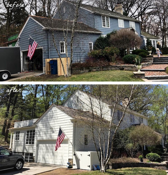
The house color changed from a darkish blue-gray to a soft white. The soft white is one of the Laurel Home Essential Paint Colors Swiss Coffee.
You can see another home painted Swiss Coffee here.
 Here, we can see that a lot more happened to the exterior than just paint.
 And after. Wow! How lovely.
For more gorgeous exterior paint colors, click here.
In case you’re wondering. Sarah lives in Minnesota. That explains why she’s so nice! People in the midwest are usually very nice. I notice that every time I visit Wisconsin. Or maybe it’s just that people in New York are largely assholes? That’s probably it.
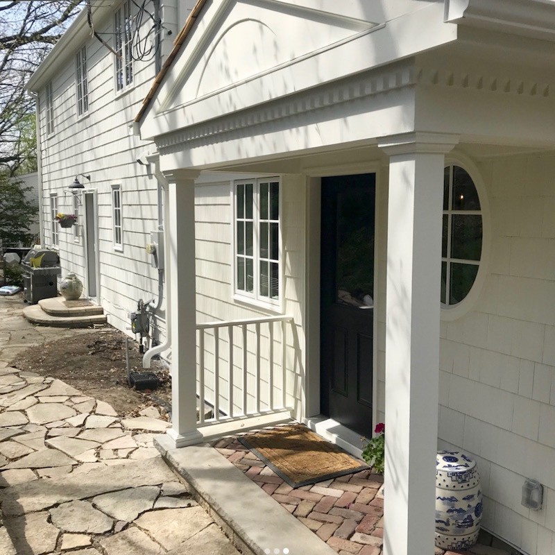 And a view of the new portico. Many beautiful and classical details for this traditional-style home. Love the black doors!
OH! Another important thing that bloggers need to learn is the art of stalking.
Yes, stalking is an art. You didn’t know that? You find it horrifying to learn that I’m a stalker? ;]
Fine. Be a fuddy-duddy and call it detective-work. Research.
yawn…
It’s stalking.
While Sarah gave me some great shots, I found stalked her instagram.
paydirt.
The photo above is from Sarah’s instagram. (she gave me permission to share her page) You can see more pics of her home and her darling family too. Please follow her.
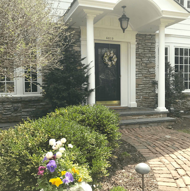
The beautiful front door area. Very gracious entrance. Me like.
For more great front doors, click here.
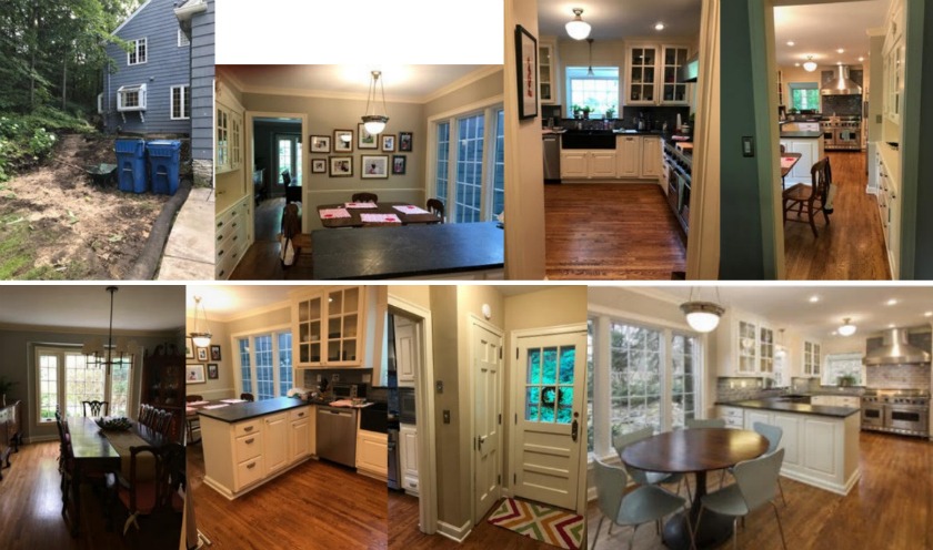
Let’s go inside and have a little look at how things were before the home renovation
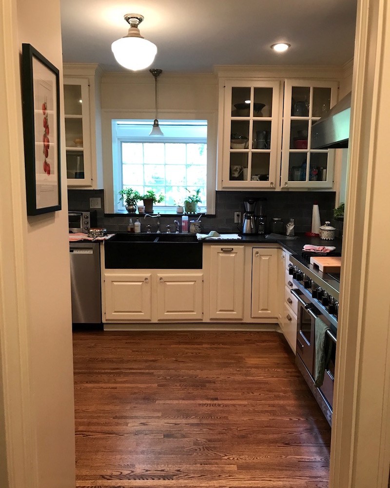 Obviously a shot of the kitchen
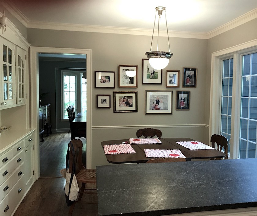 And another looking into the eating area into the dining room.
This is a very nice house but some of the elements are a little dated.
Also, while this is a common situation, I’m not totally fond of the kitchen eating area adjacent to the formal dining room. It’s like: Should we eat here, or should we walk another 8 feet and eat here? Again, it’s very common and sometimes unavoidable, so if you have this configuration, don’t feel badly.
However, in this reno, I believe they got rid of it. I don’t have enough images to fully understand what changed and what stayed the same.
But, here’s what Sarah had to say as an intro to the home remodel
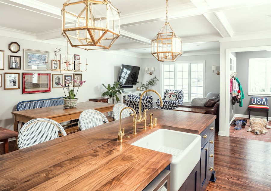
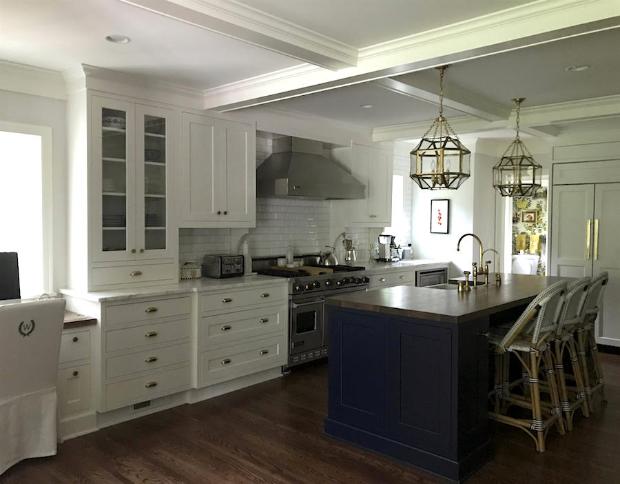
 This is my kitchen renovation. You had mentioned that you had used White Dove in your Bronxville kitchen renovation and that looked gorgeous so I went with that for my white kitchen cabinets.
It also ties in with the “kids office” above, which was previously honey brown wood paneling and is painted Benjamin Moore White Dove.
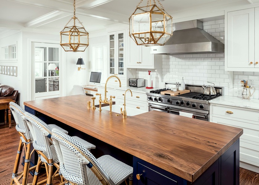
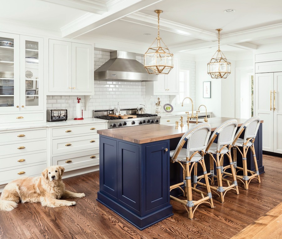
I’m sure that you also recognize the Morris Chandelier from Visual Comfort.
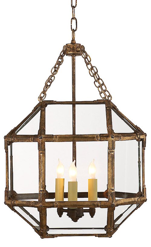
[Yes, I do and you got the right size too. The small which is actually not that small. ]
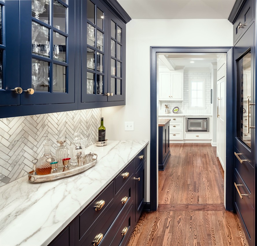
The island and butlers pantry cabinets are Benjamin Moore Deep Royal.
Another one of your favorite colors.
The walls are Classic Grey. Another favorite!
[That’s an interesting “rug” in the mud room.] ;]
and the mudroom is Chelsea Grey –
THREE of your favorite Benjamin Moore paint colors.
I also painted the ceiling in our living room Quiet Moments. Another one!!
Do you need any more convincing for people that your color selections are on point!
[no, I don’t need any more convincing] ;]
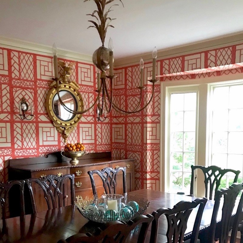
I also included the dining room because it includes a Visual Comfort chandelier that you previously posted about – and I am SO in love with my wallpaper. Oh, and yes, that’s a Federal mirror that I saw after you did this post.
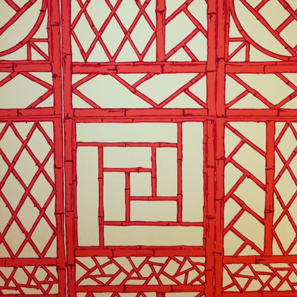
Lyford Trellis from China Seas available through Quadrille – to the trade
(Sarah has a friend who helped her get this, I believe)
By the time Sarah had sent me several emails with images, she was getting VERY good at taking them!
 In fact, I prefer many of them to the pro shots. While easy on the eyes, I feel that some of the pro shots look too flat and artificial. Plus they are over-exposed in an unnatural way. Something in between, would be my perfect interior photo.
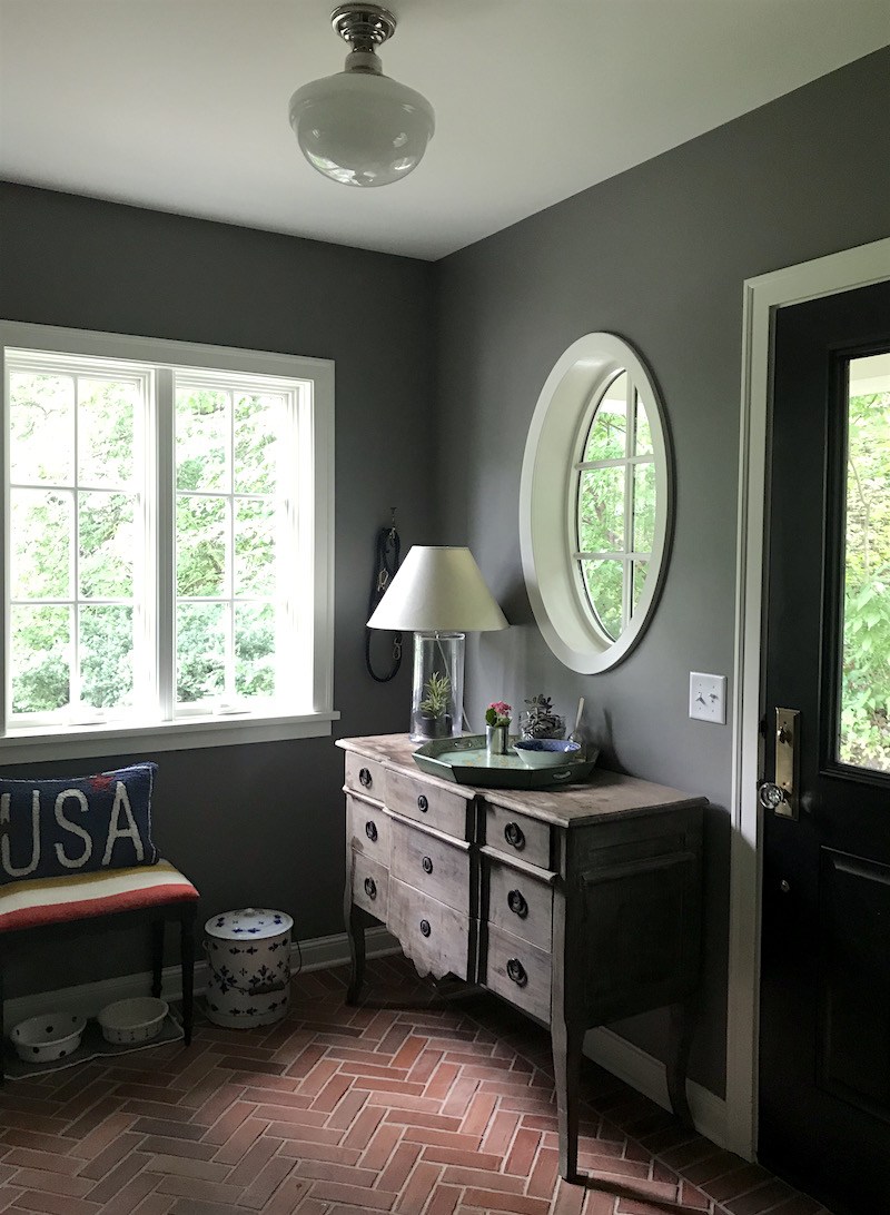 Gorgeous shot of the mudroom that Sarah took. I’m putting this one on Pinterest pronto!
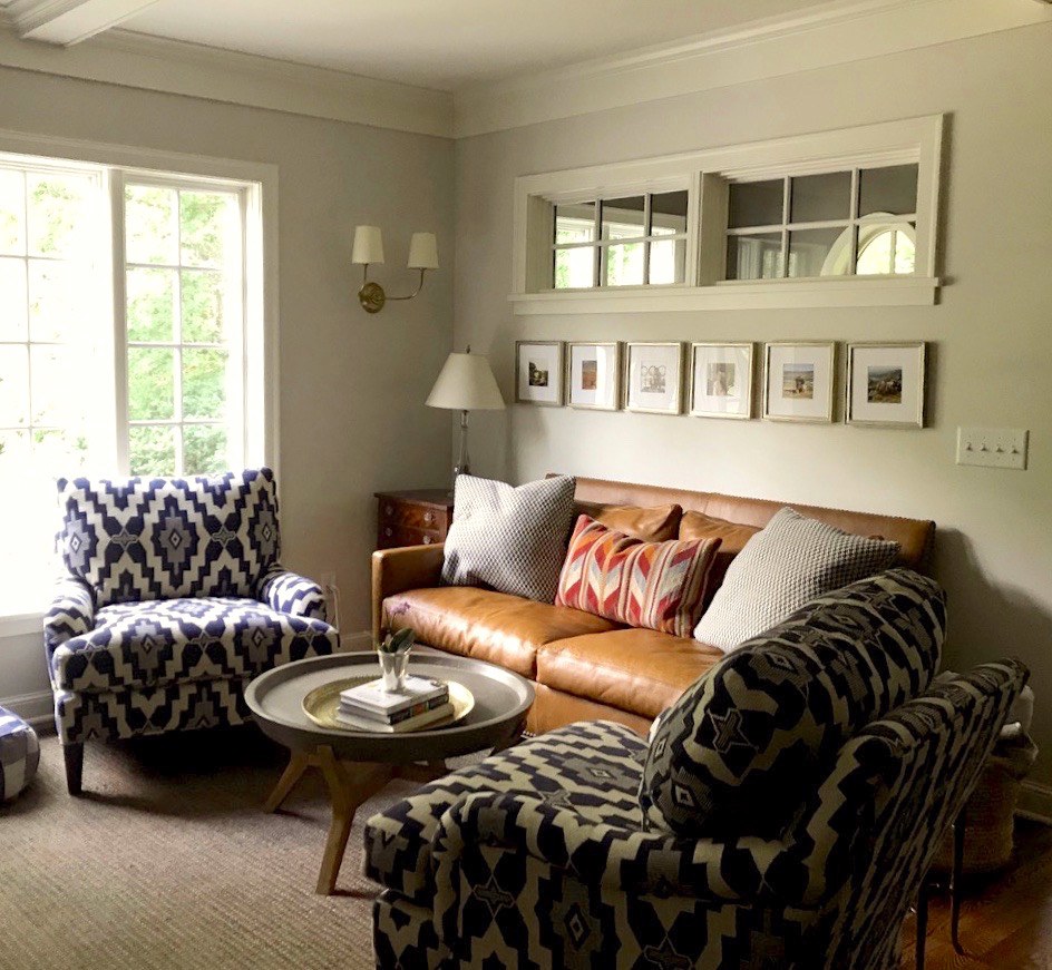 Shot of the den off the kitchen where the family gathers to watch TV. The upholstered furniture is from Lee Industries.
Love this space. Love the interior window and the composition with the square prints beneath it.
This window makes sense and is done right. These, windows, I don’t think so.
This is funny, but I did something similar in our basement 20 years ago!
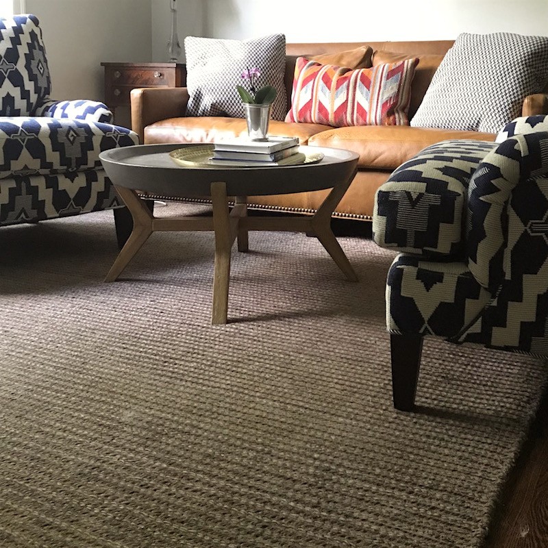 The rug looks super durable. I’m not sure what it is. It looks like jute from here.
And before someone pipes up and complains that the chairs are too big. No, the space is a little too small. But that can’t be helped and sometimes one just has to work with what they have and that is when the rules get thrown out.
I love the chairs and this area is all about hanging out and watching TV. So, no biggie about the overlap.
 This is Lola the darling golden retriever in some of the previous pics.
Great bed! Awww… Why the punim? Did you lose your bone or something?
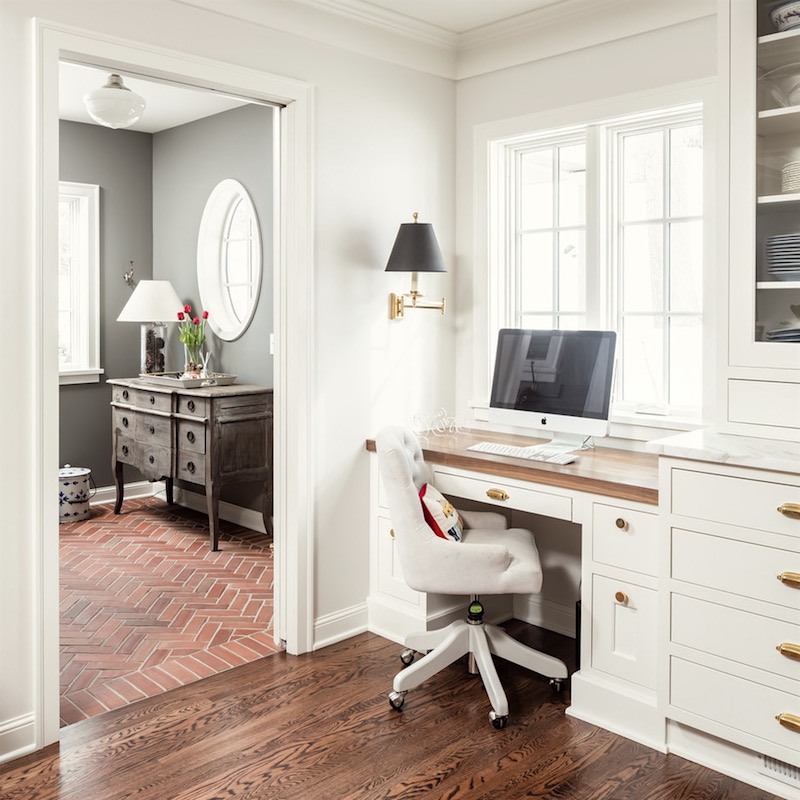
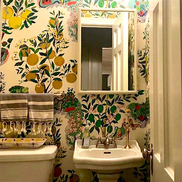 The Powder room off the kitchen with Schumacher’s Citrus Garden which you can see in this post.
Gorgeous. Powder rooms are a great place to do something you might not do in a larger space. And I love how this looks from the kitchen when the door’s open.
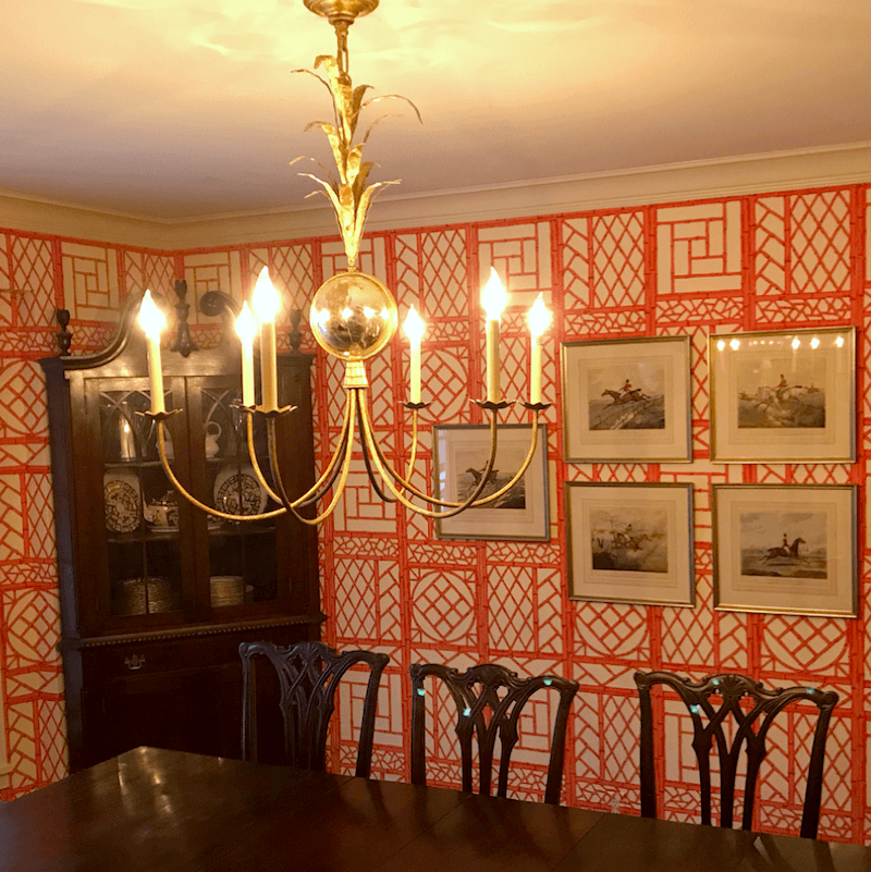 An evening shot of the beautiful dining room with the Visual Comfort Gramercy Chandelier which looks great. You can see a larger version of it in this post about a man who nearly lost his eye. ;]
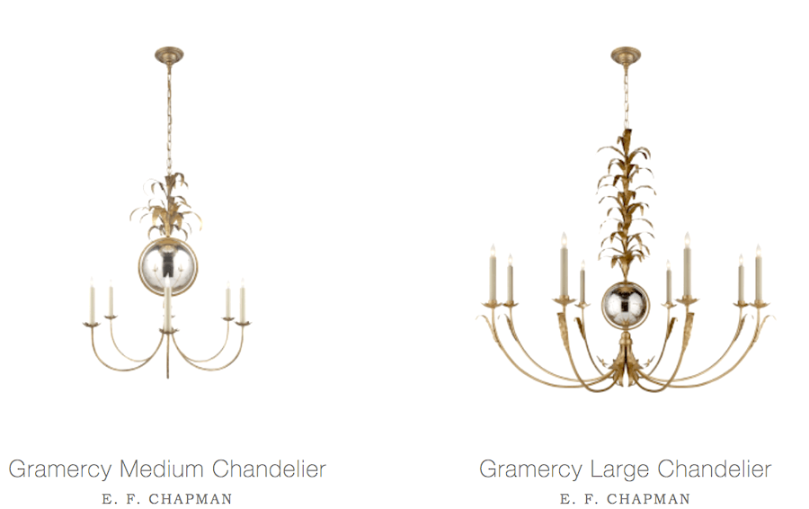
This is the medium Gramercy Chandelier which you can see here.

Well, thank you so much Sara and Lola for inviting us to enjoy your fabulous young family home. You did a wonderful job with the home remodel. And, the furnishing and decoration, too. I think that it’s perfect.
I wish you and your darling family many years of happy, healthy moments, meals, holidays, birthdays, etc.
One day, if you’re like me, you will cherish those memories; even the greasy sloppy ones.
xo,

Related Posts
 12 Ways HGTV is Misleading Us
 12 Farrow and Ball Kitchen Cabinet Colors For The Perfect English Kitchen
 Common Mistakes Folks Make With Their Small Kitchen
 Is A Black And White Kitchen The Answer To A Mid-Century Mess?
 Can You Get Away With A Partial Kitchen Remodel?
 Need a New Kitchen But Can’t Get Myself Off Of the Kitchen Floor!
 The Surprising Thing That Nate Berkus Said About Design Trends


70 Responses
Laurel, I hope you glean from all these remarks how much you—you alone, with your superb blog, your classic design sense, your incomparable light touch, and sassy sense of humor—have done to educate taste and empower people to create beautiful interiors in which to live beautiful lives. I once hoped you would write a book. I was so wrong to hope that. This is your metier. Here, you touch the lives of all kinds of folks. You’ve done something unique with your blog, and Sarah’s lovely renovation proves it. It’s a fine thing for a talented interior designer to design and furnish a space. But I think it’s an even finer thing to teach others the elements of good design and support them with sourcing and fine examples. A teacher’s influence is unending. You’ve created a one-of-a-kind platform, you smart girl. Glad you had the vision and moxy to do it. We’re all beneficiaries. Just think: none of your readers will be raiding their linen closet for placemats to cover their windows! That’s a blessing right there!)
Does anyone know the name of the fabric on the chairs in the TV area?
Hi Sasha,
Sarah the homeowner most likely knows if she sees this comment.
Hi Sasha,
The fabric is Lee Industries Flagler Blue. Unfortunately, it looks like it is retired. Below is the link to the fabric. It might be worth a call to see if there is enough available for what you are looking to have upholstered. I ordered my chairs a little over a year ago.
http://www.leeindustries.com/fabric_detail/lee/id/Flagler%20Blue
Good luck!
-Sarah
Hi Sarah,
Thanks for letting us know. I thought it might be Lee’s fabric and I looked too, before I answered earlier and did not see it either. But, actually, Lee doesn’t make the fabric. So, it might very well exist, just not as part of their fabric options.
I love your blog. It has been so helpful thank you
I have a small studio in nyc Only use it infrequently
But I’ve always used lots of whites in my other home
I thinking I redoing the linen white that’s there now to Simple White on walls and trim.
The dark wood kitchen cabinets I think would look good white
My painter says White Dove would be best combination.
Love when you said it’s not brain surgery.
I tried it all out and it all looks the same.
Thinking should just do it. Thanks
In my experience if you paint the cabinets and wall the same color, the cabinets in most light will look a little lighter. Don’t ask me why. And islands in the middle of the room, look lighter still. So, it makes sense to paint the cabinets a tinge deeper white, but again, I don’t know your lighting. And even if I did, unless there are no windows, it’s going to change all the time. But white on white is beautiful. And whatever you do, it will look fresher in a darker apartment than linen white. Linen white is good as trim with deep browns and golds, however. And it looks good in very bright rooms.
Hi Laurel
This homeowner is very talented… and your guiding advice is spot on.
I do have to add, being an interior designer myself (42 years, holly crap!), not a good idea to have everyone think they do not need a designer! DIY projects as you know can go sideways quickly.
Love reading your blog, I laughed myself silly reading your take on the current trends and how white kitchens are out (WTF!!)
Thanks really enjoy your whole site!
Hi Colordiva,
42 years! Holycrap is right! I bet you have some stories. And yes, I wholeheartedly agree that most do need a designer. These folks did have a building team. Some builders are amazing and some, well…
So lovely! Is the den wall color also Classic Gray?
I believe so.
Thanks for sharing this lovely transformation with us! I love the proportion of the island, not too big. Any idea on the dimensions?
I agree, the proportions are perfect.
The island is 38″ deep and 106″ long. It is a hair over 3′ tall. To give you a bit of a size comparison. The marble countertop behind where the stove is located is just over 16′ – roughly 194″ long.
Thanks Sarah!
Hi, Laurel. Is the leather sofa in the den from Lee Industries as well? If not, do you think Sarah would share where it’s from? Love it and looking for something similar.
Hi Susan,
I’m 99% sure that it is a Lee Industries sofa as well.
Yes, the couch is Lee. It is one of their apartment couches. I needed to find a smaller size couch in depth and width because the area is so small and I was trying to lesson the impact of the overstuffed chairs, which are also Lee. I can’t remember the exact leather but believe it was chestnut.
Wow!!! She did an amazing job.
Hey I did not hire a designer either. I did a custom build and it was just me and Laurel’s blog! My paint colors, paying attention to the trim and architectural details all from her blog. Her blog is like a Wonderful design encyclopedia. If I needed some information I just went to the little search bar and plugged it in!
Thank you Laurel!
Hi Tinamarie,
I love hearing that! But, a couple of things. Like any art, it takes talent to take those teachings and apply them to one’s situation, so don’t sell yourself short. If I could’ve just plugged in everything I wanted to learn and achieve, I would’ve been a prima ballerina! haha
And two, you really got the most important element that I
harp onstress. And that is– the architectural elements. Without, that in place, nothing else is going to look as good.But, still. Thank you os much for the lovely compliment! Made my day and it’s only 9:37AM!
Laurel, write more about good photography skills. And photo editing, too. I still don`t get it!
Hi Val,
Oh, that would have to be a course because it’s a LOT of moving parts. And I don’t know if I’m up for creating a new product. In fact, I know that I’m not because I’m doing a big over-haul on the ol’ site.
Not saying never; just not right now.
But, my good friend Linda Holt does coaching. Here’s a link to her services.
https://www.lindaholtcreative.com/iphone-camera-coaching/
Laurel, you hit it out of the park once again. this house looks a ton better, and Sarah did a great job putting what she learned from you into the interiors.
I have read through your blogging guide, and it’s actually open to pg.146 right now! Got a tip from a guy about building a new Wp.org site, and I’m doing it myself…Imagine that! I probably see this as easier than paying someone $2400 to migrate parts of my site and build it out since I used to have WP.com, before being moved to Squarespace. Needed to make the change to be able to also have my opt-in, and other things.
Excited to see what happens. Keep up the great blogging.
Hi Heather,
That’s great news! I think that’s the right move, if for no other reason than to be able to use Yoast, but so many other reasons too, like the J Query pinit button for images. That’s a very good one!
I gasped when I saw the kitchen. One of my all time favorite light fixtures over the island. LOVE LOVE LOVE this renovation. She is so talented! Everything is beautiful. Thank you so much for sharing this.
Hi Karen,
I gasped too! I thought I was looking at something from a magazine.
I’m wondering if Sarah could share what she used for the perimeter counter tops.
I do happen to know that she used Calacatta Gold which she told me she used because she had read about it here! That marble is particularly expensive, but for a similar look in marble, I would check out Carrara Bianco.
There are also some quartz look-alikes that I talked about here.
I’m so very impressed! Good Wood is what I used on a teak countertop. Non toxic and the wood looked great the whole 4 years I lived there. Follow directions on the can.
Thanks so much for the info Karen!
Absolutely stunning renovation! Great job!
A beautiful job, Bravo! The exterior remodel made the home so classic and I love the Swiss Coffee. The interior is gorgeous and I can’t believe that this was all done without a designer. Sarah is the designer! Lola lying on the mud room floor looks like a bear skin rug. A ‘Golden Bear’, that is. I have one of those lying about at home too. Love this blog so much, Laurel.
Oh, thank you Marcy!
Sara did a wonderful job. It’s just beautiful. She’s obviously a natural at this. I am wondering, and I know you can shed some light on this Laurel, how she can keep the wood counter on her kitchen island looking great. (I have a wooden counter in my butler’s pantry that my late parents painted black! Yuch! I have no idea what in the world they were thinking of.) I would like to remove all of the paint and just resurface it with something to protect it so that just the beautiful wood shows through, but I have no idea what that protectant should be, so that the surface would stand up to repeated use, or who the person would be to do this job. A furniture restorer perhaps? Thanks, as always, for the lovely and informative post.
There’s a photo in my portfolio of a white kitchen and there is a wonderful walnut butcher block counter on the island. But, maybe Sarah will see this and chime in on how she cares for it.
Hi Lisa!
I am just reading all of these kind comments now. Laurel – it is no wonder you have the nicest followers. Your guidance is beyond measure. Okay.. to the question about the walnut countertop. Ours is coated in a varnish so it is more like a piece of furniture rather than butcher block. I could have chosen a finish that is more matte but only needs to be treated with an oil to buff out a scratch, etc. In some ways I wish I had done that since it would be much more forgiving. However, I wanted the luster of varnish. I love it but I have to baby it a bit – no cutting directly on it and I have to be careful that it isn’t scrubbed with anything abrasive. I would consider having your countertop sanded and then having it stained with an oil that can be reapplied as needed. I read a lot about tongue oil and believe that is a very traditional way of treating wood countertops. It likely would only need a light sanding and a reapplication of oil on a dry cloth for any scratches or burns in the future.
-Sarah
I love how the dog inserted herself into a good share of the shots! Happens around here, too. I am thrilled to have found your blog (via the mention on the Decorating Tips and Tricks podcast). Having now “stalked” you (read your blog from back to front then watched you on YouTube), I have to tell you that I knew from early on that you had lived in the upper Midwest (likely Wisconsin) at some point. How? It wasn’t because you are nice (though I suspect you are), it was your post about Pantone’s color of the year (2016?), Marsala. You called it “barfola” and I immediately thought, “wisconsinite.” I live about 45 minutes south of Milwaukee in a renovated federal- ish farmhouse that was built by my husband’s family in 1856. We tend to gravitate toward British Colonial or just plain British decor and I really appreciate seeing the images you present. I am tired of looking at washed out blog photos of “a limited color palette.” Thank you!
Hi Pat,
That’s so funny. I did not know that barfola is a Wisconsinite word. I haven’t lived there since 1979.
Love your paint color choices and the dining room!
Great post as always Laurel! I love that Sara got everything just right – love the blue trim in the butler’s pantry, love the big comfy chairs and, of course, love that dog. Sara didn’t follow every “rule” and the result is that her house looks fabulous AND personal. No, she didn’t need an interior designer, but she sure would have been a dream client!
Yes, definitely a dream client! I’ve had many where it was like working with an associate. Sometimes, they had Ideas that I hadn’t thought of and they were better ideas! I had a few who could definitely have done decorating as a profession.
I love these before and afters. Such a pretty house. To me it was already pretty before and just got better. So many good ideas. Experiencing Harvey flooding is part heartache sprinkled with opportunity. I am currently in the building stage (interior)and this post is pushing me to colored kitchen cabinets….maybe lol. Quick true story: I hired an Interior Designer from a higher end furniture store here in my smallish town. They had the English roll arm you recommend from Lee Industry. I struggled with furniture placement in my open concept. I also struggle with furniture choices and I wanted to get it right for once. I then proceeded to check every idea she gave me against posts from your blog :0 Some things didn’t seem right to me so I would say “let’s see what Laurel has to say about that” True story. You could have your own superhero comic book:D
Oh that is so sweet Teresa. Designers at furniture stores are hit and miss. Some are terrific and some were hired last month and with very little and/or training other than what was received at the store. Or, she has experience but not the right experience for you. However, if she’s just making stuff up to sound like she knows what she’s talking about, that could be disastrous. Not hurricane-strength, but disappointing, nonetheless. But, good that you’re following your instincts and following through with that.
I think she has design sense, just not mine. They lean a bit contemporary in the showroom. Beautiful, just too formal/sterile for me. I give her credit because she did not argue with me at all. She did say that if I wanted something that was just plain wrong she would let me know. But, with Laurel in my back pocket I didn’t pick anything wrong because I had seen most of it on your hot sale pages,and I have your room examples too. On another side note. I painted the entire house cotton balls (I have your paint guide) and I love it (north facing living/dining) So fresh and calming to me. Not too stark at all. Thank you for all your guides and all the free advice on your blog. The best!!!
Now, my kitchen uppers were safe from water damage and they are white dove. I can tell you they do not look good with cotton balls in my lighting, nope. So maybe that beautiful blue. We shall see
Hi again Teresa,
Lighting is really everything, IMO. And the problem is, that in some rooms, particularly east and west, it changes a LOT during the day, time of year, sunny, cloudy and then there’s darkness. Sometimes a color will look good next to another in some lights and not others.
I have a client whose dining room is on here with the white drapes and black Greek key trim The dining room is cotton balls and so is the living room with a wide hall separating them. But when you stand in the dining room and look across the hall at the living room, it looks like a completely different color!
So glad too that you’re enjoying the guides and advice in the posts. Thanks for the kind words!
Outstanding!
…and, yes, I will happily follow Sarah on Instagram.
From a friendly NY’er to another friendly NY’er!
Beautiful! You really do have a way of imparting some confidence to your readers, Laurel. This post demonstrates that in spades! Great job Sarah!
Thank you Lisa! All designers should be as talented as Sarah.
Hi Laurel, loved the blog. Sarah has done a wonderful job on her house. We had our kitchen cabinet repainted to white dove too. Ours look creamier…. the light I guess as the room faces south, but doesn’t have a lot of windows.
Hope to catch you again for lunch soon. Am off to blighty next week for A graduation. Best wishes
Laura
Hi Laura,
Yes, lunch when you return! I agree about the White Dove. And, I actually color-corrected the pro shots which were going a little too pinkish-cool. But they are over-lit, in general. But, here’s the thing I’ve noticed with the White Dove in my bedroom. It goes from looking quite creamy to quite white and everything in between. Plus, get this. The cabinets painted the SAME color from the SAME can look like a completely different color and usually whiter.
Love it! Way to go Sara–you’ve got miles of style. I’m redoing my house and also going to do a blue island/white perimeter–I just love it and love blue–it’s beautiful but comforting, like my favorite pair of jeans. I recently bought the Paint guides and was also thinking Deep Royal–so thanks for giving me a perfect example!! One thing for Laurel–Do you have a crystal ball handy? Is the blue island going to be a fad or is it here to stay?
Hi Jenn,
That’s a very good question. But, if you go with what you truly love, then a crystal ball doesn’t matter much. At least, that’s how I see it.
Very nice, Sarah!
The kitchen is lovely, and I especially love the row of small framed pictures under the double window in your TV room.
What incredible before and afters! I love that cabinetry painted in Deep Royal. I’ve actually never used that blue, Hale Navy is one of my favourite go-tos.
In terms of your blogging guide that you mention, I’m following all your advice for my new website! I can’t wait to launch it soon and am excited about having better SEO and adding Pinterest to my social media strategy. Plus, it’s been fun pinning and I’ve noticed a lot of what I like, are yours! Cheers Laurel xx
xx
Hi Claire,
I discovered that color at the Dunes and Duchess booth one month before the Essential color guide portion came out. The second I got home, I went in and exchanged it. I was going to do Hale Navy which is also a great color. But when I saw their booth, I was so captivated by the beauty of Deep Royal and that it read as a true navy– even with the warm lights on. I think that I linked to the post where I showed it at their booth. It made for a gorgeous backdrop for their colorful furnishings.
Can’t wait to see the finished product of your new site and also to see over time, how it’s working for you as you continue to grow your business. It’s very exciting!
My favorite thing about this post is, well, EVERYTHING! Sara’s home is all that I wish mine could be and because of your blog I really think I can get there. I love how your blog allows me to flip back and forth from one post to another which is a feature that provides wonderful continuity and provides me with a visual aid I can share with my own kitchen designer. Thanks so much for the weekly inspiration!
Hi Monica,
So glad that you’re finding the posts helpful! I do try to link to the relevant posts, but with over 550 now, it’s getting difficult to hit them all. But then, some of them the first two years aren’t all that great. At the time, I thought they were fine, but I know better now. And yes, I try to remember to have them open in a new tab, for the very reason you mention.
I’m so impressed and inspired by Sarah’s makeover and photos! My favorites: the entire color palette, the Schumacher’s Citrus Garden wallpaper, the kitchen and Lola
Yes, I would be spending a lot of time in the powder room– nuzzling with Lola! Fine. We’ll leave the door open. lol
Thank you for sharing Sarah’s beautiful home. She did an amazing job!
I couldn’t help but zero in on the brick floor in her mud room. I’m currently getting estimates for a floor like that in my own mud room.
I am also impressed with her lighting choices. They are the perfect scale & style for her home.
Sarah’s new home looks so warm & comfortable.
I love that floor too and the pattern. And yes, all of the lighting is the perfect scale.
Great job Sarah! I love that your house looks beautiful, yet very real.
Wow, Sarah is one talented lady! I love this renovation–colorful, tastefully done and perfect for an updated traditional Colonial home.
She is. And I really didn’t ask her anything but am wondering what her design/decorating experience is, because she has “it.” And the “it” is the thing that can’t be taught. Believe me; I went to design school with plenty of people who didn’t have “it.” And of course, plenty, who did!
Wow! I want to live there!! What a welcoming, comfortable and lovely home Sarah. Congratulations on such such a good job. Everything done so thoughtfully and flows. Well done!
Me too!
Wow! This is so awesome! I feel so much better about ditching my designer now. Tired of arguing. Honestly, first time I have ever hired a designer and I feel like I did not get my my money’s worth. I am sure there are better ones out there, and maybe if I spent a lot more it would be worth it. Anyway, great great job on this house! Especially love the kitchen.
Hi Korina,
So sorry that your experience with a designer was not a good one. A good designer never argues with their client. This isn’t to say that I always agreed with mine, but 99 times out of 100, if they didn’t like something, out it went. What’s the 1%? They decided that they did like something, after-all. If they had an idea that I truly though was a mistake, I’d explain why I thought it wasn’t the best solution and then they understood.
I don’t think it’s a matter of money, necessarily. It just sounds like she didn’t get you or your vision. And when that happens, it’s painful, so you did the right thing.